Australia

Highlights Butterflies & Yield Curve Models: With bond market volatility now back to the subdued levels seen prior to the COVID-19 market turbulence earlier in 2020, it is a good time to update our global yield curve valuation models to look for attractive butterfly trade ideas. Valuations: The models generally indicate that flattener trades offer better value across all countries. Our medium-term strategic bias, however, is towards steeper yield curves with policy rates on hold and depressed global inflation expectations likely to continue drifting higher over the latter half of the year. Yield Curve Trades: We are initiating the first set of yield curve trades within our rebooted Tactical Trade Overlay: going long a 7-year bullet vs. a 5-year/10-year barbell in the US; long a 2-year/30-year barbell vs. a 5-year bullet in France; long a 5-year/30-year barbell vs. a 10-year bullet in Italy; and long a 3-year/20-year barbell vs. a 10-year bullet in the UK. Feature In a Special Report published back in February of this year, we dusted off our model-based framework to find value in trades focused on the shape of government bond yield curves.1 By comparing the market-implied short-term interest rate expectations extracted from our curve models to our own macro views, we are able to come up with actionable buy or sell signals across the yield curve in nine developed markets: the US, Germany, France, Italy, Spain, the UK, Japan, Canada, and Australia. Table 1Most Attractive Butterfly Trades
Global Yield Curve Trades: Netting Returns With Butterflies
Global Yield Curve Trades: Netting Returns With Butterflies
Given the extreme market turbulence around the time we published that report, as the full scope of the COVID-19 pandemic was becoming evident, we chose not to recommend any curve trades from our models until global volatility subsided to acceptable levels. The vigorous action from central banks to manipulate bond yields since then - quantitative easing, aggressive forward guidance, outright yield curve control in Japan and Australia, and other unconventional monetary policy measures - introduced another layer of difficulty in implementing successful curve trades using models estimated in more normal times. With global bond market volatility now back down to pre-COVID levels, we feel that the time is right to use our curve models to help identify opportunities. Specifically, we are implementing new recommended yield curve trades in the US, France, Italy, and the UK. Table 1 shows the most attractive butterfly trades across all the markets covered in this analysis. Note that three of the four trades we are initiating include very long-dated bonds where yields are less susceptible to direct central bank influence. The only exception is our US long 7-year bullet vs. 5-year/10-year barbell trade, the reasoning for which we outline later in this report. Three of the four trades we are initiating include very long-dated bonds where yields are less susceptible to direct central bank influence. The only exception is our US long 7-year bullet vs. 5-year/10-year barbell trade. Before delving into our analysis proper, a quick note: in the interest of brevity, we will limit ourselves to a simple explanation of butterfly strategies and our yield curve models in this report. For those interested in a deeper explanation of the curve modeling framework, please refer to our February 25, 2020 Special Report. A Recap On Butterflies And An Update On Our Yield Curve Models A butterfly fixed income strategy involves two main components: a barbell (a weighted combination of long-term and short-term bonds) and a bullet (a medium-term bond that sits within the yield curve segment selected in the barbell). To implement a butterfly strategy, a bond investor would go long (short) the barbell while simultaneously going short (long) the bullet. By weighting the combination of the long- and short-term bonds in the butterfly such that the weighted sum of their duration equals the duration of the medium-term bond in the bullet, we achieve immunization to parallel shifts in the yield curve. At the same time, due to the relatively higher duration of the longer-term component of the butterfly, we get exposure to specific changes in the slope of the yield curve. In general, the barbell will outperform the bullet in a flattening yield curve environment, and vice-versa. Chart of the WeekButterfly Spreads & Yield Curves
Butterfly Spreads & Yield Curves
Butterfly Spreads & Yield Curves
To actually decide how, and on which parts of the yield curve, to implement our butterfly strategies, we make use of our yield curve models. These models rely on the positive relationship typically observed between the butterfly spread and the slope of the yield curve. When the curve steepens, the butterfly spread widens, and vice-versa (Chart of the Week). This has to do with mean reversion: as the curve steepens, it increases the odds that the curve will flatten in the future since it cannot steepen indefinitely. Consequently, investors will ask for greater compensation to enter a curve steepener trade when the curve is already steepening. As a result, we can create simplified models of the yield curve by regressing any butterfly spread on its corresponding curve slope. Deviations from these fair value models indicate which butterfly strategies are cheap or expensive. However, the model output does not by itself constitute a buy or sell signal and must be integrated with our macro view on the slope of the curve. For example, a butterfly strategy with an expensive bullet implies that there is already a certain amount of steepening discounted in the yield curve. If the yield curve flattens, or even steepens by an amount smaller than what is discounted in the yield curve over the investment horizon, the barbell will outperform, as expected. However, if we see more steepening than is discounted in the yield curve, the bullet will outperform, even though it was already at relatively expensive levels. Therefore, it is crucial to integrate our macro view on how much the curve will steepen or flatten over the investment horizon into our curve trade selection framework. In recent reports, we have emphasized our high-conviction view that global inflation expectations will drift higher in the coming months, driven by reflationary fiscal and monetary policy and a continued rebound in global commodity prices (most notably, oil).2 However, a rise in inflation expectations does not necessarily translate to a “one-to-one” rise in nominal yields if it is offset by a compression in real bond yields. To disentangle this, we look at the 3-year rolling betas of nominal 10-year government bond yields to the corresponding 10-year breakeven inflation rates using inflation-linked bonds (Chart 2). The data suggest a currently weaker relationship between inflation expectations and nominal yields, with all betas well below their post-crisis maxima. Our overall macro bias is towards a global steepening in yield curves, but given our strong belief in a rebound in inflation expectations, we would be more willing to enter steepener trades in higher-beta regions such as Germany, Canada, the US, and Australia where it is more likely that a rise in inflation expectations will translate to higher nominal yields. Conversely, we are less hesitant to enter flatteners in the lower-beta regions such as the UK, France, Italy, and Japan. Chart 2The Link Between Nominal Yields And Inflation Expectations Has Weakened
Global Yield Curve Trades: Netting Returns With Butterflies
Global Yield Curve Trades: Netting Returns With Butterflies
When we said earlier this year that we were “dusting off” our yield curve models, that was not just a figure of speech. The models date back originally to 2002, meaning that they are old enough to vote—perhaps even for a popular rapper. Even though we have been refining and updating it along the way, one of our concerns was that this model was estimated for a pre-crisis sample period before near-zero rates became ubiquitous in developed markets. Our overall macro bias is towards a global steepening in yield curves, but given our strong belief in a rebound in inflation expectations, we would be more willing to enter steepener trades in higher-beta regions such as Germany, Canada, the US, and Australia. To test that the curve relationships within our models are maintained when global central banks are pinning policy rates near 0%, we have re-estimated all the regressions for the post-financial crisis period from 2009 to 2017 when most central banks kept rates near the zero bound. Chart 3 shows the results for the representative 2-year, 5-year and 10-year portions of the yield curve. On the whole, the coefficients are weaker but still positive with the exception of Japan, where many years of zero rates and quantitative easing have caused the 2-year/5-year/10-year butterfly spread to become largely unmoored from the 2-year/10-year slope. Chart 3Looking For Structural Shifts In Our Yield Curve Models
Global Yield Curve Trades: Netting Returns With Butterflies
Global Yield Curve Trades: Netting Returns With Butterflies
Therefore, we still see value in our curve modeling approach, even in the current environment where central banks are likely to be on hold for a period measured in years, not months. Bottom Line: Butterfly strategies are an effective way to position for changes in the slope of the yield curve without exposure to shifts in the curve. Our current strategic bias is to expect steepening of developed market yield curves through rising longer-term inflation expectations, but our global yield curve models indicate better value in most flattening trades. Thus, we need to be extremely selective in recommending trades based on the results of our yield curve models. Yield Curve Models And Trades By Region In the remaining pages of this report, we present the current read-outs from of our yield curve models for each of the major developed markets. More specifically, we provide the deviations from fair value for different combinations of bullets and barbells and highlight the most attractive butterfly strategy. The deviations from fair value shown in Tables 2-10 are standardized to facilitate comparisons between the different butterfly combinations. In addition, for each country we provide a quick assessment of the performance of these butterfly strategies over time by applying a simple mechanical trading rule. Every month, we enter the most attractive butterfly strategy, i.e. the one with the highest absolute standardized deviation from its model fair value. The overall message from the models is that barbells appear attractive relative to bullets across all the countries shown. However, we will only initiate trades in cases where the model output and our macro outlook complement each other. US Looking solely at our model output, US Treasury curve flatteners appear most attractive, with the long 3-year/30-year barbell vs. 5-year bullet trade displaying the greatest deviation from fair value with a residual of -1.55 (Table 2). However, we are inclined to agree with our colleagues at BCA Research US Bond Strategy on how to interpret Treasury curve valuation in the current environment. They argue that even though steepeners in the US are currently expensive, valuations can become even more overstretched with the Fed signaling no rate increases for at least the next two years and the market priced for an extended period of near-zero rates.3 Table 2US: Butterfly Strategy Valuation: Standardized Residuals
Global Yield Curve Trades: Netting Returns With Butterflies
Global Yield Curve Trades: Netting Returns With Butterflies
Our fundamental bias is towards US Treasury curve steepening, with the Fed locking down the front end of the curve and rising inflation expectations putting upward pressure on longer-term yields. Thus, we are entering into the long 7-year bullet vs. 5/10 barbell trade which has a small but positive model residual of +0.17. That represents a better valuation starting point than the other US butterfly spreads, and is therefore a more efficient and profitable way to position for steepeners becoming even more expensive going forward. As highlighted earlier, nominal yields in the US are also more sensitive to rising inflation expectations—another reason to enter into a curve steepener. The specific securities used to execute this trade, as well as the weights for the barbell component used to the make both legs of the trade duration-equivalent, can be found on Page 27 within our Tactical Trade Overlay table. Nominal yields in the US are also more sensitive to rising inflation expectations—another reason to enter into a curve steepener. The 7-year bullet appears just 1bp cheap according to our model and would only underperform its counterpart given a flattening in the 5-year/10-year Treasury slope greater than 22bps, which we believe is unlikely given the reasons outlined above (Chart 4A). Chart 4AUS 5/7/10 Spread Fair Value Model
US 5/7/10 Spread Fair Value Model
US 5/7/10 Spread Fair Value Model
Chart 4BUS Butterfly Strategy Performance
US Butterfly Strategy Performance
US Butterfly Strategy Performance
Following the mechanical trading rule has delivered steady returns with only a few periods of negative year-over-year returns (Chart 4B). Germany The most attractively valued butterfly combination on the German yield curve is going long the 1-year/30-year barbell and shorting the 5-year bullet, which is almost one standard deviation above its model-implied fair value, with a standardized residual of -0.97 (Table 3). Table 3Germany: Butterfly Strategy Valuation: Standardized Residuals
Global Yield Curve Trades: Netting Returns With Butterflies
Global Yield Curve Trades: Netting Returns With Butterflies
The 5-year bullet appears 29bps expensive according to our model and would only outperform its counterpart given a steepening in the 1-year/30-year German curve slope greater than 50bps (Chart 5A). Chart 5AGermany 1/5/30 Spread Fair Value Model
Germany 1/5/30 Spread Fair Value Model
Germany 1/5/30 Spread Fair Value Model
Chart 5BGermany Butterfly Strategy Performance
Germany Butterfly Strategy Performance
Germany Butterfly Strategy Performance
Following the mechanical trading rule has been quite profitable, delivering consistently positive year-over-year returns for all but the initial period of our sample (Chart 5B). France The most attractively valued butterfly combination on the French OAT yield curve is going long the 2-year/30-year barbell and shorting the 5-year bullet (Table 4). This combination is a little less than one standard deviation over its model-implied fair value with a standardized residual of -0.84. Nominal yields in France are also relatively less correlated with inflation expectations, which makes this a prime candidate for a flattener trade. The specific securities used to execute this trade, as well as the weights for the barbell component used to the make both legs of the trade duration-equivalent, can be found on Page 27 within our Tactical Trade Overlay table. Table 4France: Butterfly Strategy Valuation: Standardized Residuals
Global Yield Curve Trades: Netting Returns With Butterflies
Global Yield Curve Trades: Netting Returns With Butterflies
The 5-year bullet appears 21bps expensive according to our model and would only outperform its counterpart given a steepening in the 2-year/30-year French curve slope greater than 48bps (Chart 6A). Chart 6AFrance 2/5/30 Spread Fair Value Model
France 2/5/30 Spread Fair Value Model
France 2/5/30 Spread Fair Value Model
Chart 6BFrance Butterfly Strategy Performance
France Butterfly Strategy Performance
France Butterfly Strategy Performance
As with Germany, following the mechanical trading rule in the French OAT market has also been profitable, with only three periods of negative year-over-year returns in our sample period (Chart 6B). Italy And Spain In Italy, the most attractively valued butterfly combination is going long the 5-year/30-year barbell and shorting the 10-year bullet – a combination with a standardized residual of -0.79 (Table 5). In Spain, going long the 3-year/30-year barbell and short the 5-year bullet seems most attractive with a standardized residual of -0.83 (Table 6). Of the two peripheral euro area countries, we are choosing to put on a trade in the relatively larger and more liquid Italian government bond market. As with France, Italian nominal yields also display a relatively low beta to inflation breakevens. The specific securities used to execute this trade, as well as the weights for the barbell component used to the make both legs of the trade duration-equivalent, can be found on Page 27 within our Tactical Trade Overlay table. Table 5Italy: Butterfly Strategy Valuation: Standardized Residuals
Global Yield Curve Trades: Netting Returns With Butterflies
Global Yield Curve Trades: Netting Returns With Butterflies
Table 6Spain: Butterfly Strategy Valuation: Standardized Residuals
Global Yield Curve Trades: Netting Returns With Butterflies
Global Yield Curve Trades: Netting Returns With Butterflies
In Italy, the 10-year bullet appears 22bps expensive according to our model and would only outperform its counterpart given a steepening in the 5-year/30-year Italian curve slope greater than 153bps (Chart 7A). Following the mechanical trading rule in Italy has yielded strong excess returns, with only one very short period of negative year-over-year returns in our sample period (Chart 7B). As with Italy, following the mechanical trading rule in Spain has yielded some of the strongest excess returns on a cumulative and year-over-year basis. Chart 7AItaly 5/10/30 Spread Fair Value Model
Italy 5/10/30 Spread Fair Value Model
Italy 5/10/30 Spread Fair Value Model
Chart 7BItaly Butterfly Strategy Performance
Italy Butterfly Strategy Performance
Italy Butterfly Strategy Performance
In Spain, the 5-year bullet appears 14bps expensive according to our model and would only outperform its counterpart given a steepening in the 3-year/30-year Spanish curve slope greater than 47bps (Chart 8A). As with Italy, following the mechanical trading rule in Spain has yielded some of the strongest excess returns on a cumulative and year-over-year basis (Chart 8B). Chart 8ASpain 3/5/30 Spread Fair Value Model
Spain 3/5/30 Spread Fair Value Model
Spain 3/5/30 Spread Fair Value Model
Chart 8BSpain Butterfly Strategy Performance
Spain Butterfly Strategy Performance
Spain Butterfly Strategy Performance
UK On the UK Gilt yield curve, the most attractive butterfly combination is holding a 3-year/20-year barbell versus a 10-year bullet, which currently displays a standardized residual of -1.08 (Table 7). As with France and Italy, not only is this flattener trade attractively valued, the UK is also one of the countries where inflation breakevens are relatively less correlated with nominal yields, making this another excellent candidate for our Tactical Trade Overlay. The specific securities used to execute this trade, as well as the weights for the barbell component used to the make both legs of the trade duration-equivalent, can be found on Page 27. Table 7UK: Butterfly Strategy Valuation: Standardized Residuals
Global Yield Curve Trades: Netting Returns With Butterflies
Global Yield Curve Trades: Netting Returns With Butterflies
The 10-year bullet appears 13bps expensive according to our model and would only outperform its counterpart given a steepening in the 3-year/20-year Gilt curve slope greater than 52bps (Chart 9A). Chart 9AUK 3/10/20 Spread Fair Value Model
UK 3/10/20 Spread Fair Value Model
UK 3/10/20 Spread Fair Value Model
Chart 9BUK Butterfly Strategy Performance
UK Butterfly Strategy Performance
UK Butterfly Strategy Performance
Following the mechanical trading rule in the UK has produced consistent returns on a year-over-year basis (Chart 9B). Canada The most attractively valued butterfly combination on the Canadian yield curve is favoring the 5-year/30-year barbell versus the 7-year bullet, which currently displays a standardized residual of -1.41 (Table 8). Table 8Canada: Butterfly Strategy Valuation: Standardized Residuals
Global Yield Curve Trades: Netting Returns With Butterflies
Global Yield Curve Trades: Netting Returns With Butterflies
The 7-year bullet appears 7bps expensive according to our model and would only outperform its counterpart given a steepening in the 5-year/30-year Canadian curve slope greater than 42bps (Chart 10A). Chart 10ACanada 5/7/30 Spread Fair Value Model
Canada 5/7/30 Spread Fair Value Model
Canada 5/7/30 Spread Fair Value Model
Chart 10BCanada Butterfly Strategy Performance
Canada Butterfly Strategy Performance
Canada Butterfly Strategy Performance
Following the mechanical trading rule in Canada has historically been a good strategy, but we do note two periods of minor losses in 2013 and 2019 (Chart 10B). Japan The most attractively valued butterfly combination on the JGB yield curve is the 5-year/20-year barbell versus the 7-year bullet, which currently has a standardized residual of -1.03 (Table 9). As we noted earlier, however, valuations in the JGB market are likely distorted due to the Bank of Japan’s long-running programs of quantitative easing, zero policy rates and Yield Curve Control that aims to keep the 10-year JGB yield around 0%. Table 9Japan: Butterfly Strategy Valuation: Standardized Residuals
Global Yield Curve Trades: Netting Returns With Butterflies
Global Yield Curve Trades: Netting Returns With Butterflies
The 7-year bullet appears 6bps expensive according to our model and would only outperform its counterpart given a steepening in the 5-year/20-year Japan curve slope greater than 23bps (Chart 11A). Following our mechanical trading rule has produced decent returns, especially given the dormant nature of the JGB market, with only a couple minor periods without positive year-over-year returns. Chart 11AJapan 5/7/20 Spread Fair Value Model
Japan 5/7/20 Spread Fair Value Model
Japan 5/7/20 Spread Fair Value Model
Chart 11BJapan Butterfly Strategy Performance
Japan Butterfly Strategy Performance
Japan Butterfly Strategy Performance
Following our mechanical trading rule has produced decent returns, especially given the dormant nature of the JGB market, with only a couple minor periods without positive year-over-year returns (Chart 11B). Australia The most attractively valued butterfly combination on the Australian yield curve is going long the 2-year/10-year barbell versus the 7-year bullet, displaying a standardized residual of -1.73 (Table 10). Table 10Australia: Butterfly Strategy Valuation: Standardized Residuals
Global Yield Curve Trades: Netting Returns With Butterflies
Global Yield Curve Trades: Netting Returns With Butterflies
The 7-year bullet appears 15bps expensive according to our model and would only outperform its counterpart given a steepening in the 2-year/10-year Australian curve slope greater than 101bps (Chart 12A). Chart 12AAustralia 2/7/10 Spread Fair Value Model
Australia 2/7/10 Spread Fair Value Model
Australia 2/7/10 Spread Fair Value Model
Chart 12BAustralia Butterfly Strategy Performance
Australia Butterfly Strategy Performance
Australia Butterfly Strategy Performance
Compared to the other markets in our analysis, following the mechanical trading rule in Australia has not produced stellar returns (Chart 12B). However, excess returns on a year-over-year basis have been positive barring two periods. Shakti Sharma Research Associate ShaktiS@bcaresearch.com Footnotes 1 Please see BCA Research Global Fixed Income Strategy Special Report, "Global Yield Curve Trades: Follow The Butterflies", dated February 25, 2020, available at gfis.bcaresearch.com. 2 Please see BCA Research Global Fixed Income Strategy Weekly Report, "How To Play The Revival Of Global Inflation Expectations", dated June 23, 2020, available at gfis.bcaresearch.com. 3 Please see BCA Research US Bond Strategy Weekly Report, "Take A Look At High-Yield Technology Bonds", dated June 23, 2020, available at usbs.bcaresearch.com. Recommendations The GFIS Recommended Portfolio Vs. The Custom Benchmark Index
Global Yield Curve Trades: Netting Returns With Butterflies
Global Yield Curve Trades: Netting Returns With Butterflies
Duration Regional Allocation Spread Product Tactical Trades Yields & Returns Global Bond Yields Historical Returns
Highlights Our intermediate-term timing models suggest the US dollar is broadly overvalued. We are maintaining a modest procyclical currency stance (long NOK, GBP and SEK), but also have a portfolio hedge (short USD/JPY). Go long a basket of petrocurrencies versus the euro. Stay short the gold/silver ratio. Feature Our fundamental intermediate-term timing models (FITM) are one of the toolkits we use in currency management. These simple models enable us to time shifts in developed-market currencies using two key variables. Real Interest Rate Differentials: G10 currencies tend to move with their real rate differentials. Under interest rate parity, if one country is expected to have high interest rates versus another, its currency will rise today so as to gradually depreciate in the future and nullify the interest rate advantage. Risk factor: The ebb and flow of risk aversion affects the path of currencies, as it does their domestic capital markets. Procyclical currencies tend to perform better during risk-on periods. We use high-yield spreads and/or commodity prices as a gauge for risk. For all countries, the variables are highly statistically significant and of the expected signs. These models help us understand in which direction fundamentals are pushing the currencies we look at. These models are more useful as timing indicators on a three-to-nine month basis, as their error terms revert to zero quickly. For the most part, our models have worked like a charm. On a risk adjusted-return basis, a dynamic hedging strategy based on our models has outperformed all static hedging strategies for all investors with six different home currencies since 2001.1 The US Dollar Chart I-1USD Is Overvalued By 4.4%
USD Is Overvalued By 4.4%
USD Is Overvalued By 4.4%
The dollar is a sell, according to the model, with a fair value that is falling much faster than the DXY index itself. Going forward, the Federal Reserve’s dovish stance should keep real interest rate differentials moving against the dollar. This will especially be the case if the authorities move to some form of yield curve control. The wildcard is how risk aversion gyrates as we navigate the volatile summer months, especially given rising geopolitical tensions and the potential for an equity market correction (Chart I-1). One of the factors holding up the dollar is that US domestic growth has been relatively strong, with the Citigroup economic surprise index at the highest level since the inception of the series. For the dollar to decline meaningfully, these positive surprises will need to be repeated abroad. On the data front this week, pending home sales rose 44.3% month-on-month in May, following a 21.8% decline the previous month. House prices are rebounding, to the tune of 4%. The ISM manufacturing index broke out to 52.6 in June from 43.1 the prior month. Job gains for the month of June came in at 4.8 million versus expectations of 3.23 million, pushing the unemployment rate down to 11.1%. These strong numbers provide a high hurdle that non-US growth will need to overcome in order for dollar weakness to continue. The Euro Chart I-2EUR/USD Is Undervalued By 3.8%
EUR/USD Is Undervalued By 3.8%
EUR/USD Is Undervalued By 3.8%
The euro is not excessively undervalued versus the US dollar (Chart I-2). Usually, strong buy signals for the euro have been triggered at a discount of about 10% or so relative to the greenback. That said, the euro can still bounce towards 1.16, or about 3%-4% higher, to bring it back to fair value. The biggest catalyst for the euro remains that interest rate differentials with the US are quite wide and can continue to mean revert. The Treasury-bund spread peaked at 2.8%, and has since lost around 1.7%. Yet, a gap of 100 basis points remains wide by historical standards. On the data front, the CPI numbers from the euro area this week were quite instructive. German inflation came in at +0.8% versus a decline of -0.3% in Spain. In a general sense, inflation in Germany has been outperforming that in the periphery for a few months now, which is a sea-change from the historical trend in eurozone inflation, where both the core and periphery have seen CPI tied at the hip. If rising competitiveness in the periphery is a key driver, then the fair value of the Spanish “peseta” is rapidly catching up to that of the German “Deutsche mark,” which is positive for the euro. The Yen Chart I-3USD/JPY Is Overvalued By 10.3%
USD/JPY Is Overvalued By 10.3%
USD/JPY Is Overvalued By 10.3%
The yen’s fair value has benefited tremendously from the plunge in global bond yields, making rock-bottom Japanese rates relatively attractive from a momentum standpoint (Chart I-3). This has pushed the yen to undervalued levels, supporting our tactically short USD/JPY position. The data out of Japan this week suggest that deflationary forces remain quite strong, which will continue to boost real rates and support the yen. The jobs-to-applicants ratio, a key barometer of labor market health, plunged to 1.20 in May from a cycle high of 1.63. Industrial production fell 25.9% year-on-year in May, the worst since the financial crisis. Meanwhile, the second quarter all-important Tankan survey suggests small businesses will continue to bear the brunt of the economic slowdown. With most of the increase in the Bank of Japan’s balance sheet coming from USD swaps with the Fed rather than asset purchases, it suggests little ammunition or appetite for more stimulus. Fiscal policy remains the wild card that could help lift domestic demand. The British Pound Chart I-4GBP/USD Is Undervalued By 5.9%
GBP/USD Is Undervalued By 5.9%
GBP/USD Is Undervalued By 5.9%
Our model shows the pound as only slightly undervalued, putting our long cable position at risk. The drop in UK real rates since the Brexit referendum has prevented our model from flagging the pound as being much cheaper. Given the potential for added volatility this summer, we are looking to book modest profits on long cable (Chart I-4). Data out of the UK remains grim. Mortgage approvals fell to 9.3K in May, well below expectations. Consumer credit is falling much faster than during the depths of the financial crisis, suggesting all the BoE’s liquidity measures are still not filtering down to certain pockets of the economy. Meanwhile, the trend in the trade balance suggests that the pound has not yet started to reflate the economy. The Canadian Dollar Chart I-5USD/CAD Is Overvalued By 8.1%
USD/CAD Is Overvalued By 8.1%
USD/CAD Is Overvalued By 8.1%
The Canadian dollar is undervalued by about 8% (Chart I-5). Going forward, movements in the Canadian dollar will be largely dictated by interest rate differentials and crude oil prices, which remain supportive for now. We are going long a petrocurrency basket today, one that includes the Canadian dollar. Canadian data have been slowly improving, with housing starts up 20.2% month-on-month in May and existing home sales up 56.9% month-on-month. House prices have also remained resilient. More importantly, foreign investors have used the plunge in oil prices to deploy some fresh capital into Canadian assets. International security transactions in April stood at C$49 billion, the highest on record, and will likely continue to improve as oil prices recover. The Swiss Franc Chart I-6USD/CHF Is Undervalued By 20.6%
USD/CHF Is Undervalued By 20.6%
USD/CHF Is Undervalued By 20.6%
Our models suggest the Swiss franc is tactically at risk (Chart I-6). The main reason is that the franc has remained strong, despite the pickup in risk sentiment since March. Even if strength in the franc is sniffing market turbulence ahead, the yen remains a better and cheaper hedge. The Swiss National Bank continues to intervene in the foreign exchange market, but this week’s data shows that growth in sight deposits is rolling over. This is happening at a time when the economy remains weak. The June PMI came in at 41.9, well below expectations. Deflation has returned to Switzerland, with the CPI print for June at -1.3%, in line with the May number. While this is boosting real rates, the strength in the franc is an unnecessary headache for the SNB, especially against the euro. The Australian Dollar Chart I-7AUD/USD Is Undervalued By 7.3%
AUD/USD Is Undervalued By 7.3%
AUD/USD Is Undervalued By 7.3%
Despite the 20% rally in the Aussie dollar since March, it still remains 7%-8% cheap, according to our FITM (Chart I-7). Typical reflation indicators such as commodity prices and industrial share prices are showing nascent upturns. This suggests that so far, policy stimulus in China has been sufficient to lift commodity demand. Meanwhile, 10-year Aussie government bonds sport a positive spread vis-à-vis 10-year Treasurys. Recent data in Australia have been holding up. The private sector is slowly releveraging, the CBA manufacturing PMI went to 51.2 in June, and the trade balance continues to sport a healthy surplus, at A$8 billion for the month of May. Meanwhile, LNG is a long-term winner from China’s shift away from coal and will continue to benefit Australian terms of trade. We are currently in an LNG glut due to Covid-19, but should electricity generation in China, Japan, and other Asean countries recover to pre-crisis peaks, this will ease the glut. The New Zealand Dollar Chart I-8NZD/USD Is Overvalued By 4.9%
NZD/USD Is Overvalued By 4.9%
NZD/USD Is Overvalued By 4.9%
Unlike the AUD, our FITM for the NZD is in expensive territory. This favors long positions in AUD/NZD (Chart I-8). The New Zealand economy will certainly benefit from having put Covid-19 mostly behind it. Both the ANZ business confidence and activity outlook indices continue to rebound strongly from their lows, with the final print for June released this week. However, the hit to tourism will still impact national income. Meanwhile, the adjustment to housing, especially given the ban to foreign purchases, will continue to constrain domestic spending, relative to its antipodean neighbor. In terms of trading, long CAD/NZD and AUD/NZD remain attractive positions. The Norwegian Krone Chart I-9USD/NOK Is Overvalued By 16.9%
USD/NOK Is Overvalued By 16.9%
USD/NOK Is Overvalued By 16.9%
Our fundamental model for the Norwegian krone shows it as squarely undervalued. This favors long NOK positions, which we have implemented via multiple crosses in our bulletins (Chart I-9). The Norwegian economy remains closely tied to oil, and the negative oil print in April probably marked a structural bottom in prices. With inflation near the central bank’s target and our expectation for oil prices to grind higher, the Norwegian currency will likely fare better than a lot of its G10 peers. In terms of data, the unemployment rate ticked higher in April, but at 4.8%, it remains much lower than other developed economies. Our bet is that once the global economy stabilizes, the Norges Bank might find itself ahead of the pack, in any hiking cycle. The Swedish Krona Chart I-10USD/SEK Is Overvalued By 10.6%
USD/SEK Is Overvalued By 10.6%
USD/SEK Is Overvalued By 10.6%
Like its Scandinavian counterpart, the Swedish krona is also quite cheap and is one of our favorite longs at the moment (Chart I-10). Meanwhile, since the Fed extended its USD swap lines, SEK has lagged the bounce in AUD, NZD, and NOK, suggesting some measure of catch up is due. The export-driven Swedish economy was hit hard by Covid-19, despite no widespread lockdowns being implemented. As such, the Riksbank expanded its QE program this week, boosting asset purchases from SEK 300 billion to SEK 500 billion, until June 2021. In September, it will start purchasing corporate bonds in addition to government, municipal, and mortgage bonds. While the repo rate was left unchanged at zero, interest rates on the standing loan facility were slashed 10 basis points and on weekly extraordinary loans by 20 basis points. These measures should provide sufficient liquidity to allow Sweden to recover as economies open up across the globe. Chester Ntonifor Foreign Exchange Strategist chestern@bcaresearch.com Footnotes 1 Please see Foreign Exchange Strategy / Global Asset Allocation Strategy Special Report titled, "Currency Hedging: Dynamic Or Static? – A Practical Guide For Global Equity Investors (Part II)", dated October 13, 2017. Trades & Forecasts Forecast Summary Core Portfolio Tactical Trades Limit Orders Closed Trades
Highlights Recommended Allocation
Quarterly Portfolio Outlook: Cash Injections Versus COVID Infections
Quarterly Portfolio Outlook: Cash Injections Versus COVID Infections
The coronavirus pandemic is not over. Enormous fiscal and monetary stimulus will soften the blow to the global economy, but there remain significant risks to growth over the next 12 months. The P/E ratio for global equities is near a record high. This suggests that the market is pricing in a V-shaped recovery, and ignoring the risks. We can, therefore, recommend no more than a neutral position on global equities. But government bonds are even more expensive, with yields having largely hit their lower bound. Stay underweight government bonds, and hedge downside risk via cash. The US dollar is likely to depreciate further: It is expensive, US liquidity has risen faster than elsewhere, interest-rate differentials no longer favor it, and momentum has swung against it. A weakening dollar – plus accelerating Chinese credit growth – should help commodities. We raise the Materials equity sector to neutral, and put Emerging Market equities on watch to upgrade from neutral. Corporate credit selectively remains attractive where central banks are providing a backstop. We prefer A-, Baa-, and Ba-rated credits, especially in the Financials and Energy sectors. Defensive illiquid alternative assets, such as macro hedge funds, have done well this year. But investors should start to think about rotating into private equity and distressed debt, where allocations are best made mid-recession. Overview Cash Injections Vs. COVID Infections The key to where markets will move over the next six-to-nine months is (1) whether there will be a second wave of COVID-19 cases and how serious it will be, and (2) how much appetite there is among central banks and fiscal authorities to ramp up stimulus to offset the damage the global economy will suffer even without a new spike in cases. A new wave of COVID-19 in the northern hemisphere this fall and winter is probable. It is not surprising, after such a sudden stop in global activity between February and May, that economic data is beginning to return to some sort of normality. PMIs have generally recovered to around 50, and in some cases moved above it (Chart 1). Economic data has surprised enormously to the upside in the US, although it is lagging in the euro zone and Japan (Chart 2). Chart 1Data Is Rebounding Sharply
Data Is Rebounding Sharply
Data Is Rebounding Sharply
Chart 2US Data Well Above Expectations
US Data Well Above Expectations
US Data Well Above Expectations
New COVID-19 cases continue to rise alarmingly in some emerging economies and in parts of the US, but in Europe and Asia the pandemic is largely over (for now) and lockdown regulations are being eased, allowing economic activity to resume (Chart 3). Nonetheless, consumers remain cautious. Even where economies have reopened, people remain reluctant to eat in restaurants, to go on vacation, or to visit shopping malls (Chart 4). While shopping and entertainment activities are now no longer 70-80% below their pre-pandemic levels, as they were in April and May, they remain down 20% or more (Chart 5). Chart 3Few COVID-19 Cases Now In Europe And Asia
Few COVID-19 Cases Now In Europe And Asia
Few COVID-19 Cases Now In Europe And Asia
Chart 4Consumers Still Reluctant To Go Out
Quarterly Portfolio Outlook: Cash Injections Versus COVID Infections
Quarterly Portfolio Outlook: Cash Injections Versus COVID Infections
Chart 5Spending Well Below Pre-Pandemic Levels
Quarterly Portfolio Outlook: Cash Injections Versus COVID Infections
Quarterly Portfolio Outlook: Cash Injections Versus COVID Infections
So how big is the risk of further spikes in COVID-19 cases? Speaking on a recent BCA Research webcast, the conclusion of Professor Peter Doherty, a Nobel prize-winning immunologist connected to the University of Melbourne, was that, “It’s not unlikely we’ll see a second wave.”1 But experts can’t be sure. It seems that the virus spreads most easily when people group together indoors. That is why US states where it is hot at this time of the year, such as Arizona, have seen rising infections. This suggests that a new wave in the northern hemisphere this fall and winter is probable. Offsetting the economic damage caused by the coronavirus has been the staggering amount of liquidity injected by central banks, and huge extra fiscal spending. Major central bank balance-sheets have grown by around 5% of global GDP since March, causing a spike in broad money growth everywhere (Chart 6). Fiscal spending programs also add up to around 5% of global GDP (Chart 7), with a further 5% or so in the form of loans and guarantees. Chart 6Remarkable Growth In Money Supply...
Remarkable Growth In Money Supply...
Remarkable Growth In Money Supply...
Chart 7...And Unprecedented Fiscal Spending
Quarterly Portfolio Outlook: Cash Injections Versus COVID Infections
Quarterly Portfolio Outlook: Cash Injections Versus COVID Infections
But is it enough? Considerable damage has been done by the collapse in activity. Bankruptcies are rising (Chart 8) and, with activity still down 20% in consuming-facing sectors, pressure on companies’ business models will not ease soon – particularly given evidence that banks are tightening lending conditions. Household income has been buoyed by government wage-replacement schemes, handout checks, and more generous unemployment benefits (Chart 9). But, when these run out, households will struggle if the programs are not topped up. Central banks are clearly willing to inject more liquidity if need be. But the US Congress is prevaricating on a second fiscal program, and the Merkel/Macron proposed EUR750 billion spending package in the EU is making little progress. It will probably take a wake-up call from a sinking stock market to push both to take action. Chart 8Companies Feeling The Pressure
Quarterly Portfolio Outlook: Cash Injections Versus COVID Infections
Quarterly Portfolio Outlook: Cash Injections Versus COVID Infections
Considerable damage has been done by the collapse in activity. We lowered our recommendation for global equities to neutral from overweight in May. We are still comfortable with that position. Given the high degree of uncertainty, this is not a market in which to take bold positioning in a portfolio. When you have a high conviction, position your portfolio accordingly; but when you are unsure, stay close to benchmark. With stocks up by 36% since their bottom on March 23rd, the market is pricing in a V-shaped recovery and not, in our view, sufficiently taking into account the potential downside risks. P/E ratios for global stocks are at very stretched levels (Chart 10). Chart 9Households Dependent On Handouts
More Stimulus Forthcoming? Households Dependent On Handouts
More Stimulus Forthcoming? Households Dependent On Handouts
Chart 10Global Equities Are Expensive...
Global Equities Are Expensive...
Global Equities Are Expensive...
Nonetheless, we would not bet against equities. Simply, there is no alternative. Most government bond yields are close to their effective lower bound. Gold looks overbought (in the absence of a significant spike in inflation which, while possible, is unlikely for at least 12 months). No sensible investor in, say, Germany would want to hold 10-year government bonds yielding -50 basis points. Assuming 1.5% average annual inflation over the next decade, that guarantees an 18% real loss over 10 years. The only investors who hold such positions have them because their regulators force them to. Chart 11...But They Are Cheap Against Bonds
...But They Are Cheap Against Bonds
...But They Are Cheap Against Bonds
The Sharpe ratio on 10-year US Treasurys, which currently yield 70 BPs, will be 0.16 (assuming volatility of 4.5%) over the next 10 years. A simple calculation of the likely Sharpe ratio for US equities (earnings yield of 4.5% and volatility of 16%) comes to 0.28. One would need to assume a disastrous outlook for the global economy to believe that stocks will underperform bonds in the long run. Though equities are expensive, bonds are even more so. The equity risk premium in most markets is close to a record high (Chart 11). With such mathematics, it is hard for a long-term oriented investor to be underweight equities. Garry Evans, Senior Vice President Chief Global Asset Allocation Strategist garry@bcaresearch.com What Our Clients Are Asking Chart 12Premature Opening Of The Economy Is Risky
Quarterly Portfolio Outlook: Cash Injections Versus COVID Infections
Quarterly Portfolio Outlook: Cash Injections Versus COVID Infections
COVID-19: How Risky Is Reopening? Countries around the world are rushing to reopen their economies, claiming victory over the pandemic. It is hard to be sure whether a second wave of COVID-19 will hit. What is certain, however, is that a premature relaxation of measures is as risky as a tardy initial response. That was the lesson from our Special Report analyzing the Spanish Flu of 1918. The risk is certainly still there: Herd immunity will require around 70% of the population to get sick, and a drug or vaccine will (even in an optimistic scenario) not be available until early next year. China and South Korea, for example, after reporting only a handful of daily new cases in early May, were forced to impose new restrictions over the past few weeks as COVID-19 cases spiked again (Chart 12, panel 1). We await to see if other European countries, such as Italy, Spain, and France will be forced to follow. Some argue that even if a second wave hits, policy makers – to avoid a further hit to economic output – will favor the “Swedish model”: Relying on people’s awareness to limit the spread of the virus, without imposing additional lockdowns and restrictions. This logic, however, is risky since Sweden suffered a much higher number of infections and deaths than its neighboring countries (panel 2). The US faces a similar fate. States such as Florida, Arizona, and Texas are recording a sharp rise in new infections as lockdowns are eased. In panel 3, we show the daily number of new infections during the stay-at-home orders (the solid lines) and after they were lifted (dashed lines). To an extent, increases in infections are a function of mass testing. However, what is obvious is that the percentage of positive cases per tests conducted has started trending upwards as lockdown measures were eased (panel 4). Our base case remains that new clusters of infections will emerge. Eager citizens and rushed policy decisions will fuel further contagion. If the Swedish model is implemented, lives lost are likely to be larger than during the first wave. Chart 13W Or U, Says The OECD
Quarterly Portfolio Outlook: Cash Injections Versus COVID Infections
Quarterly Portfolio Outlook: Cash Injections Versus COVID Infections
What Shape Will The Recovery Be: U, V, W, Or Swoosh? The National Bureau of Economic Research (NBER) Business Cycle Dating Committee has already declared that the US recession began in March. The economists’ consensus is that Q2 US GDP shrank by 35% QoQ annualized. But, after such a momentous collapse and with a moderate move back towards normalcy, it is almost mathematically certain that Q3 GDP will show positive quarter-on-quarter growth. So does this mean that the recession lasted only one quarter, i.e. a sharp V-shape? And does this matter for risk assets? The latest OECD Economic Outlook has sensible forecasts, using two “equally probable” scenarios: One in which a second wave of coronavirus infections hits before year-end, requiring new lockdowns, and one in which another major outbreak is avoided.2 The second-wave scenario would trigger a renewed decline in activity around the turn of 2020-21: a W-shape. The second scenario looks more like a U-shape or swoosh, with an initial rebound but then only a slow drawn-out recovery, with OECD GDP not returning to its Q4 2019 level before the end of 2021 (Chart 13). Chart 14Unemployment Will Take A Long Time To Come Down
Unemployment Will Take A Long Time To Come Down
Unemployment Will Take A Long Time To Come Down
Why is it likely that, in even the absence of a renewed outbreak of the pandemic, recovery would be faltering? After an initial period in which many furloughed workers return to their jobs, and pent-up demand is fulfilled, the damage from the sudden stop to the global economy would kick in. Typically, unemployment rises rapidly in a recession, but recovers only over many years back to its previous low (Chart 14). This time, many firms, especially in hospitality and travel, will have gone bust. Capex plans are also likely to be delayed. Chart 15Sub-Potential Output Can Be Good For Risk Assets
Sub-Potential Output Can Be Good For Risk Assets
Sub-Potential Output Can Be Good For Risk Assets
However, a slow recovery is not necessarily bad for risk assets. Periods when the economy is recovering but remains well below potential (such as 2009-2015) are typically non-inflationary, which allows central banks to continue accommodation (Chart 15). Is This Sharp Equity Rebound A Retail Investor Frenzy? The answer to this question is both Yes and No. From a macro fundamental perspective, the answer is No, because coordinated global reflationary policies and medical developments to fight the coronavirus have been the key drivers underpinning this equity rebound. “COVID-on” and “COVID-off” have been the main determinants for equity rotations. Chart 16Active Retail Participation Lately
Retail Investors Have Driven Up Trading Volumes Active Retail Participation Lately
Retail Investors Have Driven Up Trading Volumes Active Retail Participation Lately
But at the individual stock level, the answer is Yes. Some of the unusual action in beaten-down stocks over the past few weeks may have its origin in an upsurge of active retail participation (Chart 16). Retail investors on their own are not large enough to influence the market direction. Many online brokerages do not charge any commission for trades, but make money by selling order flows to hedge funds. As such, the momentum set in motion by retail investors may have been amplified by fast-money pools of capital. Retail participation in some beaten-down stocks has also provided an opportunity for institutions to exit. BCA’s US Investment Strategy examined the change in institutional ownership of 12 stocks in three stressed groups between February 23 and June 14, as shown in Table 1. In the case of these stocks, retail investors have served as liquidity providers to institutional sellers seeking to exit their holdings. The redeployment of capital by institutions into large-cap and quality names may have pushed up the overall equity index level. Table 1Individuals Have Replaced Institutions
Quarterly Portfolio Outlook: Cash Injections Versus COVID Infections
Quarterly Portfolio Outlook: Cash Injections Versus COVID Infections
How Will Inflation Behave After COVID? Some clients have asked us about the behavior of inflation following the COVID epidemic. Over the very short term, inflation could have more downside. However, this trend is likely to reverse rapidly. Headline inflation is mainly driven by changes in the oil price and not by its level. Thus, even if oil prices were to stay at current low levels, the violent recovery of crude from its April lows could bring headline inflation near pre-COVID levels by the beginning of 2021 (Chart 17, top panel). This effect could become even larger if our Commodity strategist price target of 65$/barrel on average in 2021 comes to fruition. Chart 17Rising Oil Prices And Fiscal Stimulus Will Boost Inflation
Rising Oil Prices And Fiscal Stimulus Will Boost Inflation
Rising Oil Prices And Fiscal Stimulus Will Boost Inflation
But will this change in inflation be transitory or will it prove to be sustainable? We believe it will be the latter. The COVID crisis may have dramatically accelerated the shift to the left in US fiscal policy. Specifically, programs such as universal basic income may now be within the Overton window3 of acceptable fiscal policy, thanks to the success of the CARES Act in propping up incomes amid Depression-like levels of unemployment (middle panel). Meanwhile there is evidence that this stimulus is helping demand to recover rapidly: Data on credit and debit card trends show that consumer spending in the US has staged a furious rally, particularly among low-income groups, where spending has almost completely recovered (bottom panel). With entire industries like travel, restaurants and lodging destroyed for the foreseeable future, the political will to unwind these programs completely is likely to be very low, given that most policymakers will be queasy about an economic relapse, even after the worst of the crisis has passed. Such aggressive fiscal stimulus, coupled with extremely easy monetary policy will likely keep inflation robust on a cyclical basis. Global Economy Overview: March-May 2020 will probably prove to be the worst period for the global economy since the 1930s, as a result of the sudden stop caused by the coronavirus pandemic and government-imposed restrictions on movement. As the world slowly emerges from the pandemic, data has started to improve. But there remain many risks, and global activity is unlikely to return to its end-2019 level for at least another two years. That means that further fiscal and monetary stimulus will be required. The speed of the recovery will be partly determined by how much more aggressively central banks can act, and by how much appetite there is among fiscal authorities to continue to bail out households and companies which have suffered a catastrophic loss of income. US: The economy has shown signs of a strong rebound from the coronavirus slump in March and April. Q2 GDP probably fell around 35% quarter-on-quarter annualized, but Q3 will almost certainly show positive growth. The Economic Surprise Index (Chart 18, panel 1) has bounced to a record high, after stronger-than expected May data, for example the 16% month-on-month growth in durable goods orders, and 18% in retail sales. But the next stage of the recovery will be harder: continuing unemployment claims in late June were still 19.5 million. Bankruptcies are rising, and banks are tightening lending conditions. One key will be whether Congress can pass a further fiscal program before the emergency spending runs out in July. Euro Area: Although pandemic lockdowns ended in Europe earlier than in the US, recovery has been somewhat slower. The euro zone PMI rebounded to close to 50 in June but, given that activity had collapsed in February-May, it is surprising (since the PMI measures month-on-month change) that it is not well above 50 (Chart 19, panel 1). Fiscal and monetary stimulus, while large, has not been as aggressive as in the US. The ECB remains circumscribed (as least psychologically) by the German constitutional court’s questioning the justification for previous QE. Germany and France have agreed a EUR750 billion additional package to help the periphery, but this has still to be finalized, due to the opposition of some smaller northern EU members. Chart 18Economic Data Has Started To Surprise To The Upside...
Economic Data Has Started To Surprise To The Upside...
Economic Data Has Started To Surprise To The Upside...
Chart 19...But From Dramatically Low Levels
...But From Dramatically Low Levels
...But From Dramatically Low Levels
Japan: Although Japan escaped relatively easily from pandemic deaths and lockdowns, its economy remains notably weak. New machinery orders in April were still falling 18% YoY, and exports in May were down 28% YoY. The poor economic performance is due to its dependence on overseas demand, distrust in the government, the lingering effects of the ill-timed consumption tax rise last October, and limited room for manoeuvre by the Bank of Japan. The government has announced fiscal stimulus equal to a barely credible 40% of GDP, but much of this is double-counting, and less than half of the household and small-company income-replacement handouts announced in March have so far been paid out. Emerging Markets: India, Brazil, and other Latin American countries are now bearing the brunt of the coronavirus pandemic. Economies throughout Emerging Markets have weakened dramatically as a result. Two factors may come to their aid, though. China is again ramping up monetary stimulus, with a notable acceleration of credit growth over the past three months. Its economy has stabilized as a result, as PMIs show (panel 3). And the US dollar has begun to depreciate, which will take pressure off EM borrowers in foreign currencies, and boost commodities prices. The biggest risk is that many EM central banks have now resorted to printing money, which could result in currency weakness and inflation at a later stage. Interest Rates: Central banks in advanced economies have lowered policy rates to their effective lower bound. It is unlikely the Fed will cut into negative territory, having seen the nefarious effects of this on the banking systems in Japan and the euro zone, and particularly due to the large money-market fund industry in the US, which is unviable with negative rates. Reported inflation everywhere, both headline and core, has fallen sharply, but this is somewhat misleading since the price of items that households in lockdown have actually been buying has risen sharply. Markets have started to sniff out the possibility of inflation once the pandemic is over, and inflation expectations have begun to rise (panel 4). For now, deflation is likely to be the bigger worry and so we do not expect long-term rates to rise much this year. But a sharp pickup in inflation is a definite risk on the 18-24 month time horizon. Global Equities Chart 20Stretched Valuation
Has Earnings Growth Bottomed?
Has Earnings Growth Bottomed?
Valuation Concern: Global equities staged an impressive rebound of 18% in Q2 after the violent selloff in Q1, thanks to the “whatever-it-takes” support from central banks, and massive fiscal stimulus packages around the globe. Within equities, our country allocation worked well, as the US outperformed both the euro Area and Japan. Our sector performance was mixed: The overweight in Info Tech and underweight in Utilities and Real Estate generated good profits, but the overweights in Industrials and Healthcare and the underweight in Materials suffered losses. As shown in Chart 20, even before the pandemic-induced profit contraction, forward earnings were already only flattish in 2019. The sharp selloff in Q1 brought the valuation multiple back down only to the same level as at the end of 2018. Currently, this valuation measure stands at the highest level since the Great Financial Crisis after a 37% increase in Q2 2020 alone. Such a rapid multiple expansion was one of the key reasons why we downgraded equities to Neutral in May at the asset-class level. Going forward, BCA’s house view is that easy monetary policies and stimulative fiscal policies globally will help to revive economic activity, and that a weakening US dollar will give an additional boost to the global economy, especially Emerging Markets. Consequently, we upgrade global Materials to neutral from underweight and put Emerging Market equities (currently neutral) on an upgrade watch (see next page). Warming To Reflation Plays Chart 21EM On Upgrade Watch
EM On Upgrade Watch
EM On Upgrade Watch
Taking risk where risks will most likely be rewarded has been GAA’s philosophy in portfolio construction. As equity valuation reaches an extreme level, the natural thing to do is to rotate into less expensive areas within the equity portfolio. As shown in panel 2 of Chart 21, EM equities are trading at a 31% discount to DM equities based on forward P/E, which is 2 standard deviations below the average discount of past three years. Valuation is not a good timing tool in general, but when it reaches an extreme, it’s time to pay attention and check the fundamental and technical indicators. We are putting EM on upgrade watch (from our current neutral stance, and also closing the underweight in Materials given the close correlation of the two (Chart 21, panel 1). Three factors are on our radar screen: First, reflation efforts in China. The change in China’s total social financing as a % of GDP has been on the rise and BCA’s China Investment Strategy Team expects it to increase further. This bodes well for the momentum of the EM/DM performance, which is improving, albeit still in negative territory (panel 3). Second, a weakening USD is another key driver for EM/DM and the Materials sector relative performance as shown in panel 4. According to BCA’s Foreign Exchange Strategy, the US dollar is likely to churn on recent weakness before a cyclical bear market fully unfolds.4 Last but not least, the recent surge in the number of the coronavirus infections in EM economies, especially Brazil and India, has increased the likelihood of a second wave of lockdowns. Government Bonds Chart 22Bottoming Bond Yields
Bottoming Bond Yields
Bottoming Bond Yields
Maintain Neutral Duration. Global bond yields barely moved in Q2 as the global economy rebounded from the COVID-induced recession low (Chart 22, panel 1). The upside surprise in economic data releases implies that global bond yields will likely go up in the near term (panel 2). For the next 9-12 months, however, the upside in global bond yields might be limited given the increasing likelihood of a new set of COVID-19 lockdowns due to the recent surge in new infections globally, especially in the US, Brazil, and India. As such, a neutral duration stance is still appropriate (Chart 22). Chart 23Inflation Expectations On The Rise
Inflation Expectations On The Rise
Inflation Expectations On The Rise
Favor Linkers Vs. Nominal Bonds. To fight off the risk of an extended recession, policymakers around the world are determined to continue to use aggressive monetary and fiscal stimulus to boost the global economy. The combined effect of extremely accommodative policy settings and the rebound in global commodity prices, especially oil prices, will push up inflation expectations (Chart 23). Higher inflation expectations will no doubt push up nominal bond yields somewhat, but according to BCA’s Global Fixed Income Strategy (GFIS), positioning for wider inflation breakevens remains the “cleaner” way to profit for the initial impact of policy reflation.5 According to GFIS valuation models, inflation-linked bonds in Canada, Italy, Germany, Australia, France, and Japan should be favored over their respective nominal bonds. Corporate Bonds Chart 24Better Value In A-rated and Baa-rated Credit
Better Value In A-rated and Baa-rated Credit
Better Value In A-rated and Baa-rated Credit
Investment-grade: Since we moved to overweight on investment-grade credit within the fixed-income category, it has produced 8.8% in excess returns over duration-matched government bonds. We remain overweight, given that the Federal Reserve has guaranteed to rollover debt for investment-grade issuers, essentially eliminating the left tail of returns. Moreover, the Fed has begun buying both ETFs and individual bond issues, in an effort to keep financial stress contained during the pandemic. However, there are some sectors within the investment-grade space that are more attractive than others. Specifically, our Global Fixed Income Strategy team has shown that A-rated and Baa-rated bonds are more attractive than higher-rated credits (Chart 24). Meanwhile, our fixed-income strategist are overweight Energy and Financials at the sector level.6 High-yield: High-yield bonds – where we have a neutral position - have delivered 11.5% of excess return since April. We are maintaining our neutral position. At current levels, spreads no longer offer enough value to justify an overweight position, specially if one considers that defaults in junk credits could be severe, since the Fed doesn’t offer the same level of support that it provides for investment-grade issuers. Within the high-yield space, we prefer Ba-rated credit. Fallen angels (i.e. bonds which fell to junk status) are particularly attractive given that most qualify for the Fed’s corporate buying program, since issuers which held at least a Baa3 rating as of March 22 are eligible for the Fed’s lending facilities.7 Commodities Chart 25Commodity Prices Will Rise As Growth Revives
Commodity Prices Will Rise As Growth Revives
Commodity Prices Will Rise As Growth Revives
Energy (Overweight): A near-complete lack of storage led WTI prices to go into freefall and trade at -$40 in mid-April: The largest drawdown in oil prices over the past 30 years (Chart 25, panel 1). Since then, oil prices have picked up, reaching their pre-“sudden stop” levels, as the OPEC 2.0 coalition slashed production. Nevertheless, excess supply remains a key issue. Crude inventories have been on the rise as global crude demand weakens. Year-to-date inventories have increased by over 100 million barrels, and current inventories cover over 40 days of supply (panel 2). As long as the OPEC supply cuts hold and demand picks up over the coming quarters, the excess inventories are likely to be worked off. BCA’s oil strategists expect Brent crude to rise back above $60 by year-end. Industrial Metals (Neutral): Last quarter, we flagged that industrial metals face tailwinds as fiscal packages get rolled out globally – particularly in China where infrastructure spending is expected to increase by 10% in the latter half of the year. Major industrial metals have yet to recover to their pre-pandemic levels but, as lockdown measures are lifted and activity is restored, prices are likely to start to rise strongly (panel 3). Precious Metals (Neutral): The merits of holding gold were not obvious during the first phase of the equity sell-off in February and March. Gold prices tumbled as much as 13%, along with the decline in risk assets. Since the beginning of March, however, there have been as many positive return days as there has been negative (panel 4). However, given the uncertainty regarding a second wave of the pandemic, and the rise in geopolitical tensions between the US and China, as well as between India and China, we continue to recommend holding gold as a hedge against tail risks. Currencies Chart 26Momentum For The Dollar Has Turned Negative
Momentum For The Dollar Has Turned Negative
Momentum For The Dollar Has Turned Negative
US Dollar: The DXY has depreciated by almost 3% since the beginning of April. Currently, there are multiple forces pushing the dollar lower: first, interest-rate differentials no longer favor the dollar Second, liquidity conditions have improved substantially thanks to the unprecedented fiscal and monetary stimulus, as well as coordinated swap lines between the Fed and other central banks to keep USD funding costs contained. Third, momentum in the DXY – one of the most reliable indicators for the dollar – has turned negative (Chart 26– top & middle panel). Taking all these factors into account, we are downgrading the USD from neutral to underweight. Euro: The euro should benefit in an environment where the dollar weakens, and global growth starts to rebound. Moreover, outperformance by cyclical sectors as well as concerns about over-valuation in US markets should bring portfolio flows to the Euro area. Therefore, we are upgrading the euro from neutral to overweight. Australian dollar: Last quarter we upgraded the Australian dollar to overweight due to its attractive valuations, as well as the effect of the monetary stimulus coming out of China. This proved to be the correct approach: AUD/USD has appreciated by a staggering 13% since our upgrade – the best performance of any G10 currency versus the dollar this quarter (bottom panel). Overall, while we believe that Chinese stimulus should continue to prop up the Aussie dollar, valuations are no longer attractive with AUD/USD hovering around PPP fair value. This means that the risk-reward profile of this currency no longer warrants an overweight position. Thus, we are downgrading the AUD to neutral. Alternatives Chart 27Opportunities Will Emerge In Private Equity
Opportunities Will Emerge In Private Equity
Opportunities Will Emerge In Private Equity
Return Enhancers: Over the past year, we have flagged that hedge funds, particularly macro funds, will outperform other risk assets during recessions and periods of high market stress. This played out as we expected: macro hedge funds’ drawdown from January to March 2020 was a mere 1.4%, whereas other hedge funds’ drawdown ranged between 9% and 19% and global equities fell as much as 35% from their February 2020 peak. (Chart 27, panel 1). However, unlike other recessions, the unprecedented sum of stimulus should place a floor under global growth. Given the time it takes to move allocations in the illiquid space, investors should prepare for new opportunities within private equity as global growth bottoms in the latter half of this year. In an earlier Special Report, we stressed that funds raised in late-cycle bull markets tend to underperform given their high entry valuations. If previous recessions are to provide any guidance, funds raised during recession years had a higher median net IRR than those raised in the latter year of the preceding bull market (panel 2). Inflation Hedges: Over the past few quarters, we have been highlighting commodity futures as a better inflation hedge relative to other assets (e.g. real estate). Within the asset class, assuming a moderate rise in inflation over the next 12-18 months as we expect, energy-related commodities should fare best (panel 3). This corroborates with our overweight stance on oil over the next 12 months (see commodities section). Volatility Dampeners: We have been favoring farmland and timberland since Q1 2016. While both have an excel track record of reducing volatility, farmland’s inelastic demand during slowdowns will be more beneficial. Investors should therefore allocate more to farmland over timberland (panel 4). Risks To Our View The risks are skewed to the downside. After such a big economic shock, damage could appear in unexpected places. Banking systems in Europe, Japan, and the Emerging Markets (but probably not the US) remain fragile. Defaults are growing in sub-investment grade debt; mortgage-backed securities are experiencing rising delinquencies; student debt and auto loans are at risk. Emerging Market borrowers, with $4 trn of foreign-currency debt, are particularly vulnerable. The length and depth of recessions and bear markets are determined by how serious are the second-round effects of a cyclical slowdown. If the current recession really lasted only from March to July, and the bear market from February to March, this will be very unusual by historical standards (Chart 28). Chart 28Can The Recession And Bear Market Really Be All Over Already?
Can It Really Be Over Already?
Can It Really Be Over Already?
Upside surprises are not impossible. A vaccine could be developed earlier than the mid-2021 that most specialists predict. But this is unlikely since the US Food and Drug Administration will not fast-track approval given the need for proper safety testing. If economies continue to improve and newsflow generally remains positive over the coming months, more conservative investors could be sucked into the rally. Evidence suggests that the rebound in stocks since March was propelled largely by hedge funds and individual day-traders. More conservative institutions and most retail investors remain pessimistic and have so far missed the run-up (Chart 29). One key, as so often, is the direction of US dollar. Further weakness in the currency would be a positive indicator for risk assets, particularly Emerging Market equities and commodities. In this Quarterly, we have moved to bearish from neutral on the dollar (see Currency section for details). Momentum has turned negative, and both valuation and relative interest rates suggest further downside. But it should be remembered that the dollar is a safe-haven, counter-cyclical currency (Chart 30). Any rebound in the currency would not only signal that markets are entering a risk-off period, but would cause problems for Emerging Market borrowers that need to service debt in an appreciating currency. Chart 29Many Investors Are Still Pessimistic
Many Investors Are Still Pessimistic
Many Investors Are Still Pessimistic
Chart 30Dollar Direction Is Key
Dollar Direction Is Key
Dollar Direction Is Key
Footnotes 1 Please see BCA Webcast, "The Way Ahead For COVID-19: An Expert's Views," available at bcaresearch.com. 2 OECD Economic Outlook, June 2020, available at https://www.oecd-ilibrary.org/economics/oecd-economic-outlook/volume-2020/issue-1_0d1d1e2e-en 3 The Overton window, named after Joseph P. Overton, is the range of policies politically acceptable to the mainstream population at a given time. It frames the range of policies that a politician can espouse without appearing extreme. 4 Please see Foreign Exchange Strategy Weekly Report, “DXY: False Breakdown Or Cyclical Bear Market?” dated June 5, 2020 available at fes.bcaresearch.com 5 Please see Global Fixed Income Strategy Weekly Report, “How To Play The Revival Of Global Inflation Expectations” dated June 23, 2020 available at gfis.bcaresearch.com 6 Please see Global Fixed Income Strategy, "Hunting For Alpha In The Global Corporate Bond Jungle," dated May 27, 2020, available at gfis.bcaresearch.com. 7 Fallen angels also outperform during economic recoveries. Please see Global Asset Allocation Special Report, "Even Fallen Angels Have A Place In Heaven," dated November 15, 2020, available at gaa.bcaresearch.com. GAA Asset Allocation
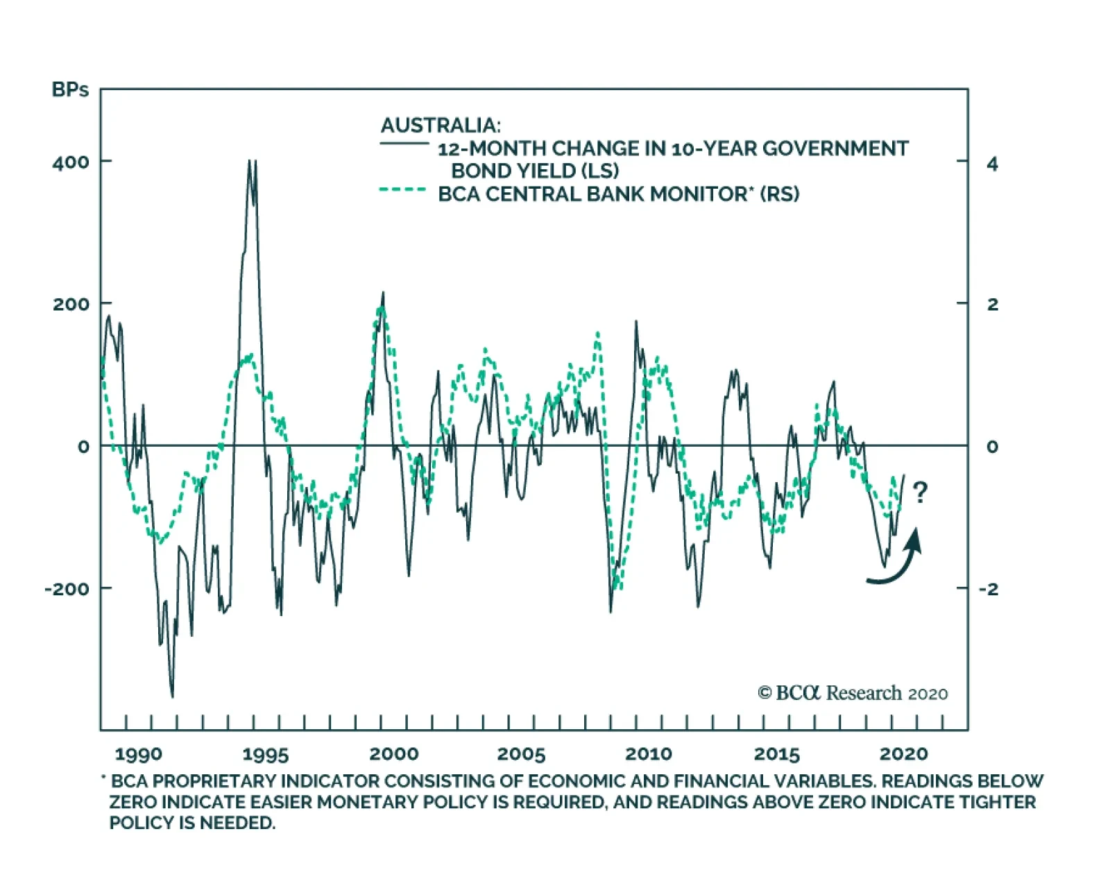
BCA Research's Global Fixed Income Strategy service's Reserve Bank of Australia (RBA) monitor may be turning the corner after Australia delivered 125bps of stimulus since June 2019. The Australian unemployment gap has widened dramatically, owing to job…
Highlights In this Weekly Report, we present our semi-annual chartbook of the BCA Central Bank Monitors. All of the Monitors are now below the zero line, indicating the need for continued easy global monetary policy to help mitigate the COVID-19 recession (Chart of the Week). Central bankers have already responded in an intense and rapid fashion to the crisis, delivering a series of rate cuts, increased asset purchase programs and measures to support bank lending to businesses suffering under quarantines. All of these vehicles have helped trigger a powerful rally in global bond markets that helped revitalize risk assets as well. After the coordinated global easing response of the past few months, the optimal policy choices now differ from country to country. This creates opportunities to benefit from country allocation decisions even in a world of puny government bond yields. The overall signal from our Central Bank Monitors is still bond bullish, however – at least over the next few months until there is evidence of how fast global growth is rebounding from the COVID-19 lockdowns. An Overview Of The BCA Central Bank Monitors Chart of the WeekUltra-Accommodative Monetary Policies Are Still Required
Ultra-Accommodative Monetary Policies Are Still Required
Ultra-Accommodative Monetary Policies Are Still Required
Chart 2A Bond-Bullish Message From Our CB Monitors
A Bond-Bullish Message From Our CB Monitors
A Bond-Bullish Message From Our CB Monitors
The BCA Central Bank Monitors are composite indicators designed to measure the cyclical growth and inflation pressures that can influence future monetary policy decisions. The economic data series used to construct the Monitors are not the same for every country, but the list of indicators generally measure the same things (i.e. manufacturing cycles, domestic demand strength, commodity prices, labor market conditions, exchange rates, etc). The data series are standardized and combined to form the Monitors. Readings above the zero line for each Monitor indicate pressures for central banks to raise interest rates, and vice versa. Through the nexus between growth, inflation, and market expectations of future interest rate changes, the Monitors do exhibit broad correlations to government bond yields in the Developed Markets (Chart 2). All of the Monitors are indicating intense pressure to maintain very easy monetary policies in response to the global COVID-19 recession. While the bad economic and inflation news is largely discounted in the depressed level of bond yields worldwide, there are still opportunities to position country allocations within a government bond portfolio based on the message from our Monitors (overweighting the US, the UK and Canada, underweighting Germany and Japan). All of the Monitors are indicating intense pressure to maintain very easy monetary policies in response to the global COVID-19 recession. In each BCA Central Bank Monitor Chartbook, we include a new chart for each country that we have not shown previously. In this edition, we show the components of the Monitors, grouped into those focusing on economic growth and inflation, plotted alongside our estimate of the appropriate level of central bank policy interest rates derived using a Taylor Rule. Fed Monitor: Policy Must Stay Accommodative Our Fed Monitor has collapsed below the zero line to recessionary levels (Chart 3A) in response to the coronavirus crisis. The Fed has already delivered a series of aggressive policy responses since March to help support an economy ravaged by the virus, including: interest rate cuts; quantitative easing (QE), including buying corporate and municipal debt; and setting up lending schemes for small businesses. The lockdown of almost the entire country has helped “flatten the curve” of the spread of COVID-19, but at a painful economic cost. The unemployment rate rose to 14.7% in April, the highest level since the Great Depression, and is expected to peak at levels above 20%. The result is unsurprising: a massive increase in spare economic capacity with a threat of deflation as headline CPI inflation plummeted to 0.3% in April (Chart 3B). Chart 3AUS: Fed Monitor
US: Fed Monitor
US: Fed Monitor
Chart 3BUS Realized Inflation Flirting With 0%
US Realized Inflation Flirting With 0%
US Realized Inflation Flirting With 0%
Within the components of our Fed Monitor, weakening growth has been the main driver of the decline (Chart 3C). Our Taylor Rule estimate suggests a deeply negative fed funds rate is “appropriate”, although the Fed is likely to pursue other avenues of easing like yield curve control before ever attempting a sub-0% policy rate. Chart 3CNegative Rates Are 'Required' In The US, But The Fed Has Other Options
Negative Rates Are 'Required' In The US, But The Fed Has Other Options
Negative Rates Are 'Required' In The US, But The Fed Has Other Options
The fall in US Treasury yields over the past few months has been in line with the decline in our Fed Monitor (Chart 3D). While the US economy is slowly awakening from lockdowns, consumer and business confidence are likely to remain fragile given the numerous risks from a second wave of COVID-19, worsening US-China relations and, more recently, social unrest. Thus, we continue to recommend an overweight strategic allocation to the US within global government bond portfolios. The fall in US Treasury yields over the past few months has been in line with the decline in our Fed Monitor Chart 3DTreasury Yields Fully Reflect Pressure For More Fed Easing
Treasury Yields Fully Reflect Pressure For More Fed Easing
Treasury Yields Fully Reflect Pressure For More Fed Easing
BoE Monitor: Negative Rates On The Horizon? Our Bank of England (BoE) Monitor has collapsed to the lowest level in its history on the back of the severe COVID-19 recession (Chart 4A). The BoE already cut the Bank Rate to 0.1% in March, ramped up asset purchases, and introduced a Term Funding scheme to support business lending. Any additional easing from here might entail negative policy rates, which markets are already discounting. The UK unemployment rate is expected to peak around 8%, with the BoE projecting the economy to shrink by -14% this year, which would be the worst recession in modern history. Inflation has dropped sharply on the back of the dual collapse of energy prices and economic growth, ending a period of currency-fueled inflation increases (Chart 4B). Chart 4AUK: BoE Monitor
UK: BoE Monitor
UK: BoE Monitor
Chart 4BUK Realized Inflation Is Slowing Rapidly
UK Realized Inflation Is Slowing Rapidly
UK Realized Inflation Is Slowing Rapidly
The components of our BoE Monitor fully reflect the dire economic situation (Chart 4C), with weak growth – led by sharp falls in business confidence – driving the collapse of the Monitor more than falling inflation pressures. Our Taylor Rule estimate of the policy rate is not yet calling for negative rates, but that is because we are using the New York Fed’s estimate of r* as the neutral real rate, which is a relatively high 1.4% (by comparison, r* in the US is estimated to be 0.5%). Chart 4CNegative Rates Are Not Yet Required In The UK
Negative Rates Are Not Yet Required In The UK
Negative Rates Are Not Yet Required In The UK
The sharp fall in the BoE Monitor suggests that Gilt yields will remain under downward pressure in the coming months (Chart 4D). New BoE Governor Andrew Bailey has stated that a move to negative rates is not imminent, but markets will continue to flirt with the notion of sub-0% interest rates until the economy and inflation stabilize. We maintain an overweight stance on UK Gilts. Chart 4DBoE Monitor Suggests Continued Downward Pressure On Gilt Yields
BoE Monitor Suggests Continued Downward Pressure On Gilt Yields
BoE Monitor Suggests Continued Downward Pressure On Gilt Yields
ECB Monitor: Continued Monetary Support Is Needed Our European Central Bank (ECB) Monitor is now well below the zero line, signaling a strong need for easier monetary policy to fight the COVID-19 downturn (Chart 5A). The ECB has delivered multiple measures to ease monetary conditions, including a new €750bn bond-buying vehicle and liquidity operations to help banks maintain lending to European businesses. The recession has hit the region hard, with real GDP declining by -3.8% in Q1, the sharpest fall since records began in 1995. Unemployment rates have climbed higher, although to much lower levels than seen in the US thanks to more generous government labor support programs that have helped to limit layoffs. The sharp downturn has resulted in both a surge in spare economic capacity and plunge in headline inflation to 0.3% in April (Chart 5B). Chart 5AEuro Area: ECB Monitor
Euro Area: ECB Monitor
Euro Area: ECB Monitor
Chart 5BEurope Is On The Edge Of Deflation
Europe Is On The Edge Of Deflation
Europe Is On The Edge Of Deflation
Within the individual components of our ECB Monitor, both weaker growth and near-0% inflation have both contributed to the Monitor’s decline (Chart 5C). Our Taylor Rule measure shows that the ECB’s current stance of having policy rates modestly below 0% is appropriate. Chart 5CThe ECB Needs To Keep Its Foot On The Monetary Accelerator
The ECB Needs To Keep Its Foot On The Monetary Accelerator
The ECB Needs To Keep Its Foot On The Monetary Accelerator
Despite the ECB’s easing measures, and in contrast to the message from our ECB Monitor, the downward momentum in core European bond yields has been fading (Chart 5D). With the ECB reluctant to push policy rates deeper into negative territory, and with reliable cyclical indicators like the German ZEW and IFO surveys showing signs that euro area growth is starting to recover from the lockdowns, the case for even lower core European yields in the coming months is not strong. We maintain our recommended underweight stance on German and French government bonds. We maintain our recommended underweight stance on German and French government bonds. Chart 5DNo Pressure For Higher German Bund Yields
No Pressure For Higher German Bund Yields
No Pressure For Higher German Bund Yields
BoJ Monitor: What More Can Be Done? Our Bank of Japan (BoJ) Monitor has fallen further below zero, indicating easier policy is required (Chart 6A). The BoJ has already introduced additional easing measures in the past couple of months: extending forward guidance (inflation is projected to remain below the BoJ’s 2% target for the next three years), increasing asset purchases and enhancing loan programs to small and medium sized companies. New cases of COVID-19 have slowed sharply in Japan, prompting an end to the national state of emergency last week. Importantly, the virus did not hit Japan's labor market as severely as in other developed countries. The unemployment rate did reach a two-year high in April, but is still only 2.6% (Chart 6B). Fiscal stimulus and measures to protect job losses have played a major role in preventing a bigger spike in joblessness. Even with those measures, growth remains weak and realized inflation is heading back towards deflation. Chart 6AJapan: BoJ Monitor
Japan: BoJ Monitor
Japan: BoJ Monitor
Chart 6BJapan Nearing Deflation Once Again
Japan Nearing Deflation Once Again
Japan Nearing Deflation Once Again
Looking at the components of our BoJ Monitor, contracting growth, more than weakening inflation pressures, is the bigger driver of the fall in the Monitor below zero (Chart 6C). However, our Taylor Rule estimate does not suggest that the current level of the policy rate is out of line. Chart 6CBoJ Needs More Easing (Somehow) Until The Economy Revives
BoJ Needs More Easing (Somehow) Until The Economy Revives
BoJ Needs More Easing (Somehow) Until The Economy Revives
The BoJ’s current combined policies of negative rates, QE and yield curve control are keeping JGB yields at near-0% levels. Those policies are also suppressing yield volatility and preventing an even bigger fall in JGB yields (with larger capital gains) as suggested by our BoJ Monitor (Chart 6D). We continue to recommend a maximum underweight in Japanese government bonds in a yield-starved world. Chart 6DJGB Yields Will Be Anchored For Some Time
JGB Yields Will Be Anchored For Some Time
JGB Yields Will Be Anchored For Some Time
BoC Monitor: Deflationary Pressures Intensifying Our Bank of Canada (BoC) Monitor has collapsed into “easier policy required” territory, reaching levels last seen during the 2009 recession (Chart 7A). The central bank has already introduced several easing measures to help boost the virus-stricken economy, including cutting the Bank Rate to a mere 0.25% and starting a QE program to buy government bonds for the first time ever. Before the COVID-19 outbreak, some softening of the economy was already underway. Now, after the imposition of nationwide lockdowns to limit the spread of the virus, the unemployment rate has spiked to 13% - a level last seen in the early 1980s. The result is a massive deflationary output gap has opened up (Chart 7B), with realized headline CPI inflation printing at -0.2% in April. Chart 7ACanada: BoC Monitor
Canada: BoC Monitor
Canada: BoC Monitor
Chart 7BOutright Headline CPI Deflation In Canada
Outright Headline CPI Deflation In Canada
Outright Headline CPI Deflation In Canada
The fall in our BoC Monitor has been driven by both collapsing economic growth and weakening inflation pressures (Chart 7C). Our Taylor Rule estimate suggests that one of new BoC Governor Tiff Macklem’s first policy decisions may need to be a move to negative interest rates. Macklem and other BoC officials have not played up the possibility of cutting rates below 0%. However, the fact that the BoC provided no economic growth forecasts in the most recent Monetary Policy Report highlights the extreme uncertainties surrounding the economic impact from COVID-19 – even with the Canadian government providing a large fiscal response to the pandemic. Chart 7CBoC Monitor Plunging Due To High Unemployment & Low Inflation
BoC Monitor Plunging Due To High Unemployment & Low Inflation
BoC Monitor Plunging Due To High Unemployment & Low Inflation
We upgraded our recommended stance on Canadian government debt to overweight back in March, and the collapse of the BoC Monitor suggests continued downward pressure on Canadian yields (Chart 7D). Stay overweight. The collapse of the BoC Monitor suggests continued downward pressure on Canadian yields. Chart 7DCanadian Yield Momentum In Line With The BoC Monitor
Canadian Yield Momentum In Line With The BoC Monitor
Canadian Yield Momentum In Line With The BoC Monitor
RBA Monitor: Rate Cutting Cycle Is Done Due to a slump in export demand and a weakening housing market, our Reserve Bank of Australia (RBA) monitor has been consistently calling for rate cuts since April 2018 (Chart 8A). Australia began its easing cycle early, having delivered a total of 125bps of stimulus since June 2019, with the two most recent cuts coming directly in response to the COVID-19 crisis. As in other developed markets, the unemployment gap in Australia has widened dramatically, owing to job losses concentrated in tourism, entertainment, and dining out (Chart 8B). Although inflation briefly breached the low end of the RBA’s 2-3% target band in Q1, this will not be a lasting development. The RBA sees headline CPI deflating by -1% year-on-year in Q2/2020 and, even as far as 2022, only sees it growing at 1.5%. Chart 8AAustralia: RBA Monitor
Australia: RBA Monitor
Australia: RBA Monitor
Chart 8BInflation Will Remain Stuck Below RBA 2-3% Target
Inflation Will Remain Stuck Below RBA 2-3% Target
Inflation Will Remain Stuck Below RBA 2-3% Target
Although both the growth and inflation components of our RBA Monitor are below zero, the former drove the most recent decline (Chart 8C) led by consumer confidence almost touching the 2008 lows. The RBA has already responded by cutting rates to near 0%, well below the Taylor Rule implied estimate, and initiating yield curve control with a cap on 3-year government bond yields at 0.25%. Chart 8CNo Pressure For The RBA To Go To Negative Rates
No Pressure For The RBA To Go To Negative Rates
No Pressure For The RBA To Go To Negative Rates
Overall, Australian bond yields have accurately priced in the dovish signal from our RBA Monitor (Chart 8D). With COVID-19 relatively well contained in Australia, there is less pressure on the RBA to ease further. Governor Lowe has also ruled out negative rates, which will put a floor under yields. Owing to these factors, we confidently reiterate our neutral stance on Australian government debt within global fixed income portfolios. Australian bond yields have accurately priced in the dovish signal from our RBA Monitor. Chart 8DAustralian Bond Yields Are Unlikely To Move Much Lower
Australian Bond Yields Are Unlikely To Move Much Lower
Australian Bond Yields Are Unlikely To Move Much Lower
RBNZ Monitor: Cause For Concern After a resurgence late last year, our Reserve Bank of New Zealand (RBNZ) Monitor has declined to a level slightly below zero (Chart 9A). The RBNZ responded to the pandemic by delivering a massive -75bps cut in March, but has since left the policy rate untouched, preferring to deliver further stimulus by doubling the size of its QE program. Forward guidance is signaling that the policy rate will remain at 0.25% until 2021, but the central bank has not ruled out negative rates in the future. Although the actual unemployment numbers do not yet capture the impact of the pandemic, both consensus and RBNZ forecasts call for a blowout in the unemployment gap (Chart 9B). The RBNZ expects the steady improvement in inflation seen up to Q1/2020 to be wiped out, with headline CPI projected to remain below the 1-3% target range until mid-2022. Chart 9ANew Zealand: RBNZ Monitor
New Zealand: RBNZ Monitor
New Zealand: RBNZ Monitor
Chart 9BRealized NZ Inflation Was Drifting Higher, Pre-Virus
Realized NZ Inflation Was Drifting Higher, Pre-Virus
Realized NZ Inflation Was Drifting Higher, Pre-Virus
Surprisingly, the inflation component of our RBNZ Monitor is actually calling for tighter monetary policy, owing to significant strength in the housing market (Chart 9C). However, this trend is likely to reverse - the RBNZ foresees a -9% decline in house prices over the remainder of 2020. Meanwhile, growth components such as consumer confidence and employment will remain depressed, holding down our RBNZ monitor. Chart 9CGrowth, Now Inflation, Has Driven The RBNZ Monitor Lower
Growth, Now Inflation, Has Driven The RBNZ Monitor Lower
Growth, Now Inflation, Has Driven The RBNZ Monitor Lower
Overall, the momentum in New Zealand bond yields seems to have overshot the message from our RBNZ Monitor (Chart 9D). However, with so much uncertainty about business investment and cash flows from key sectors such as tourism and education, it is too early to bet on an improvement in yields. We therefore maintain a neutral recommendation on NZ sovereign debt. Chart 9DNZ Bond Yields Are Unlikely To Move Lower
NZ Bond Yields Are Unlikely To Move Lower
NZ Bond Yields Are Unlikely To Move Lower
Riksbank Monitor: Worries For The Coronavirus Mavericks Amid the global pandemic, our Riksbank Monitor has collapsed to all-time lows (Chart 10A). In its April monetary policy decision, the Riksbank opted for continued asset purchases and liquidity measures to support bank lending to companies over a move to negative rates. One of the primary concerns for the Riksbank is headline CPI inflation, which fell into mild deflation (-0.4% year-over-year) in April on the back of lower energy prices and weaker domestic demand (Chart 10B). This could spill over into a lasting decline in long-term inflation expectations if the economy does not quickly improve. Chart 10ASweden: Riksbank Monitor
Sweden: Riksbank Monitor
Sweden: Riksbank Monitor
Chart 10BSwedish Realized Inflation Back To 0%
Swedish Realized Inflation Back To 0%
Swedish Realized Inflation Back To 0%
Both the growth and inflation components of our Riksbank Monitor are calling for further easing, with the growth component now at post-crisis lows (Chart 10C). The collapse on the growth side can be attributed to historic falls in retail confidence, the manufacturing PMI and employment while the inflation component remains depressed due to low headline numbers and inflation expectations. Chart 10CThe Riksbank Hates Negative Rates, But Could Still Need Them If The Economy Worsens
The Riksbank Hates Negative Rates, But Could Still Need Them If The Economy Worsens
The Riksbank Hates Negative Rates, But Could Still Need Them If The Economy Worsens
The sharp downward move in our Riksbank Monitor suggests Swedish bond yields should remain under downward pressure in the coming months (Chart 10D). The key factor for yields will be the effect of the relatively lax measures implemented by Sweden to combat the pandemic. Sweden saw positive GDP growth in Q1/2020 due to fewer restrictions on the economy. However, infection and mortality rates are much higher in Sweden than in neighboring countries and, as a result, Denmark and Norway excluded Sweden from their open border agreement. Continued restrictions of the sort are bearish for growth – and bullish for bonds – in this trade-dependent economy. Chart 10DSwedish Bond Yields Will Remain Under Downward Pressure
Swedish Bond Yields Will Remain Under Downward Pressure
Swedish Bond Yields Will Remain Under Downward Pressure
Robert Robis, CFA Chief Fixed Income Strategist rrobis@bcaresearch.com Ray Park, CFA Research Analyst ray@bcaresearch.com Shakti Sharma Research Associate ShaktiS@bcaresearch.com Recommendations The GFIS Recommended Portfolio Vs. The Custom Benchmark Index
BCA Central Bank Monitor Chartbook: Collapse
BCA Central Bank Monitor Chartbook: Collapse
Duration Regional Allocation Spread Product Tactical Trades Yields & Returns Global Bond Yields Historical Returns
Highlights Investment Grade Sector Valuation: Our investment grade corporate bond sector valuation models for the US, euro area, UK, Canada and Australia show some common messages, as markets have adjusted to a virus-stricken world. The most attractive valuations can be found within Energy and Financials, with defensive sectors like Utilities and Consumer Non-Cyclicals looking expensive everywhere. Global Corporate Bond Strategy: Investors should focus global investment grade corporate bond allocations along country lines, while keeping overall spread risk close to benchmark levels, over the next 6-12 months. Specifically, we favor overweighting the US (especially at maturities of five years or less where the Fed is buying) and the UK, while keeping a neutral allocation to euro area corporates. We also like Australian and Canadian corporate debt versus sovereigns in both countries. Feature Chart 1A Swift Policy Response Has Brought Spreads Under Control
A Swift Policy Response Has Brought Spreads Under Control
A Swift Policy Response Has Brought Spreads Under Control
Global policymakers have responded swiftly and aggressively to the COVID-19 outbreak and associated deep worldwide recession. This includes not only fiscal stimulus and monetary easing, but central banks buying corporate debt outright and providing other liquidity backstops. Coming at a time of collapsing economic growth and deteriorating corporate credit quality, these combined policy initiatives have reduced the negative tail risk for growth-sensitive assets like corporate debt. The result: a sharp tightening of corporate bond spreads across the developed markets (Chart 1). After such a large and broad-based rally, the easiest gains from the “beta” of owning corporate credit have been exhausted. Additional spread tightening is still expected in the coming months as governments begin to restart their economies after the COVID-19 quarantines start to loosen and global growth slowly begins to improve. Spreads are unlikely to return all the way to the pre-virus tights, however, as the recovery will be uneven and there is still the threat of a second wave of coronavirus infections later this year. To that end, it makes sense for investors to begin seeking out the “alpha” in corporate debt markets by looking at relative valuations across sectors to find opportunities. It makes sense for investors to begin seeking out the “alpha” in corporate debt markets by looking at relative valuations across sectors to find opportunities. In this report, we will conduct a review of our entire suite of global investment grade corporate sector relative value models. We will cover the US, provide fresh updates of our recently published look at the euro area1 and the UK,2 while also revisiting our relative value framework for Canada first introduced last year.3 We will also apply the same corporate bond sector value methodology to a new country: Australia. In addition, we will examine value across credit tiers using breakeven spread analysis for each of these regions. A Brief Note On Our Corporate Bond Relative Value Tools Before delving into the results from our models, we take this opportunity to refresh readers on the methodology underpinning these analyses. Our sector relative value framework determines “fair value” spreads for each of the major and minor industry level sub-indices of the overall investment grade universe of individual developed market economies (using Bloomberg Barclays bond indices). The methodology takes each sector’s individual option-adjusted spread (OAS) and regresses it with all other sectors in a cross-sectional model. The models vary slightly across countries/regions, as the independent variables in the regression are selected based on parameter significance and predictive power for local sector spreads. Using the common coefficients from that regression, a risk-adjusted "fair value" spread is calculated. The difference between the actual OAS and fair value OAS – a.k.a. the residual from the regression - is our valuation metric used to inform our sector allocation ranking. We then look at the relationship between these residuals and duration-times-spread (DTS), our primary measure of sector riskiness, to give a reading on the risk/reward trade-off for each sector. We then apply individual sector weights based on the model output and our desired level of overall spread risk to come up with a recommended credit portfolio. The weights are determined at our discretion and are not the output from any quantitative portfolio optimization process. The only constraints are that all sector weights must add to 100% (i.e. the portfolio is fully invested with no use of leverage) and the overall level of spread risk (DTS) must equal our desired target. To examine value across credit tiers, we use a different metric - 12-month breakeven spread percentile rankings. Specifically, we calculate how much spread widening is required over a one-year horizon to eliminate the yield advantage of owning corporate bonds versus duration-matched government debt. We then show those breakeven spreads as a percentile ranking versus its own history, to allow comparisons over periods with differing underlying spread volatility. With the key details of our models squared away, we will now present the results of our models for each country/region, along with our recommended allocation across sectors. We also discuss our recommended level of overall spread risk for each country/region, which helps inform our specific sector weightings. A Country-By-Country Assessment Of Investment Grade Corporates US In Table 1, we present the latest output from our US investment grade sector valuation model. In keeping with the framework used by BCA Research US Bond Strategy, we use the average credit rating, duration, and duration-squared (convexity) of each sector as the model inputs. To determine our US sector recommendations, we not only need to look at the spread valuations from the relative value model, but we must also consider what level of overall US spread risk (DTS) to target. Table 1US Investment Grade Corporate Sector Valuation & Recommended Allocation
Hunting For Alpha In The Global Corporate Bond Jungle
Hunting For Alpha In The Global Corporate Bond Jungle
With the Fed now purchasing investment grade corporates with maturities of up to five years in the primary and secondary markets, it makes sense to take advantage of that explicit support by focusing exposures on shorter-maturity bonds. Thus, we recommend targeting a relatively moderate level of spread risk (within an overweight allocation to US investment grade corporates) by favoring sectors with a DTS less than or equal to that of the overall US investment grade index. The sweet spot, therefore, is the upper-left quadrant in Chart 2 - sectors with positive risk-adjusted spread residuals from the relative value model and a relatively lower DTS. Chart 2US Investment Grade Corporate Sectors: Risk Vs. Reward
Hunting For Alpha In The Global Corporate Bond Jungle
Hunting For Alpha In The Global Corporate Bond Jungle
Chart 3US IG: More Value In The Lower Tiers
US IG: More Value In The Lower Tiers
US IG: More Value In The Lower Tiers
On that basis, some of the most attractive overweight candidates are Cable Satellite, Media Entertainment, Integrated Energy, Diversified Manufacturing, Brokerage/Asset Managers, and Other Financials. Meanwhile, the least attractive sectors within this framework are Railroads, Communications, Wirelines, Wireless, Other Industrials and Utilities (including Electric, Natural Gas, and Other Utilities). While we have chosen to underweight much of the Energy space (with the exception of Integrated Energy) because of generally high DTS numbers, investors who are comfortable with taking on a higher level of spread risk can find some of the most attractive risk-adjusted valuations within oil related sectors. Our colleagues at BCA Research Commodity & Energy Strategy expect oil prices to continue to steadily rise in the months ahead, with Brent oil trading, on average, at $40/bbl this year and $68/bbl in 2021.4 We recommend targeting a relatively moderate level of spread risk (within an overweight allocation to US investment grade corporates). Across credit tiers, the higher-quality portion of the US investment grade corporate bond market appears unattractive, with spreads ranking below the historical median for Aaa- and Aa-rated debt (Chart 3). Conversely, Baa-rated debt appears most attractive, with spreads almost in the historical upper quartile. Euro Area In Table 2, we present the results of our euro area investment grade sector valuation model. The independent variables in this model are each sector’s duration, trailing 12-month spread volatility, and credit rating. Note that we will be using the same independent variables in our UK model. Table 2Euro Area Investment Grade Corporate Sector Valuation & Recommended Allocation
Hunting For Alpha In The Global Corporate Bond Jungle
Hunting For Alpha In The Global Corporate Bond Jungle
Spreads have already tightened significantly since our last discussion of euro area corporates in mid-April, with credit markets more fully pricing in greater monetary stimulus from the European Central Bank (ECB) – including increased government and corporate bond purchases. Thus, we believe it is reasonable to target a neutral level of overall portfolio DTS close to that of the benchmark index (within a neutral allocation to euro area investment grade). This means that, visually, we can think about our overweight candidates as sectors that are in the top half of Chart 4 - with positive residuals from our relative value model - but close to the dashed vertical line denoting the euro area benchmark index DTS. Target a neutral level of overall portfolio DTS close to that of the benchmark index (within a neutral allocation to euro area investment grade). Chart 4Euro Area Investment Grade Corporate Sectors: Risk Vs. Reward
Hunting For Alpha In The Global Corporate Bond Jungle
Hunting For Alpha In The Global Corporate Bond Jungle
Chart 5Euro Area IG: All Credit Buckets Are Attractive
Euro Area IG: All Credit Buckets Are Attractive
Euro Area IG: All Credit Buckets Are Attractive
Within this framework, the most attractive sectors are Diversified Manufacturing, Packaging, Media Entertainment, Wireless, Wirelines, Automotive, Retailers, Services, Integrated Energy, Refining, Other Industrials, Bank Subordinated Debt and Brokerage/Asset Managers. The most unattractive sectors are Chemicals, Metals & Mining, Lodging, Restaurants, Consumer Products, Pharmaceuticals, Independent Energy, Midstream Energy, Airlines, Electric Utilities, and Senior Bank Debt. On a breakeven spread basis, all euro area investment grade credit tiers look attractive and rank well above their historical medians (Chart 5). The greatest value is in the upper rungs, with Aa-rated spreads ranking in the historical upper quartile; Aaa-rated and A-rated spreads almost meet that qualification as well, with Baa-rated spreads lagging a bit further behind (but still well above median). UK In Table 3, we present the latest output from our UK relative value spread model. With the Bank of England’s record expansion of corporate bond holdings still underway, we see good reason to maintain our overweight allocation to UK investment grade corporates on a tactical (0-6 months) and strategic basis (6-12 months). We are also targeting an overall portfolio DTS higher than that of the benchmark index—which we accomplish by overweighting sectors in the upper right quadrant of Chart 6. Table 3UK Investment Grade Corporate Sector Valuation & Recommended Allocation
Hunting For Alpha In The Global Corporate Bond Jungle
Hunting For Alpha In The Global Corporate Bond Jungle
Chart 6UK Investment Grade Corporate Sectors: Risk Vs. Reward
Hunting For Alpha In The Global Corporate Bond Jungle
Hunting For Alpha In The Global Corporate Bond Jungle
Chart 7UK IG: Value In All Tiers Except Aaa
UK IG: Value In All Tiers Except Aaa
UK IG: Value In All Tiers Except Aaa
Based on this framework, some of the most attractive overweight candidates are Diversified Manufacturing, Cable Satellite, Media Entertainment, Railroads, Financial Institutions, Life Insurance, Healthcare and Other Financials. Meanwhile, the most unattractive sectors are Basic Industry, Chemicals, Metals and Mining, Building Materials, Lodging, Consumer Products, Food & Beverage, Pharmaceuticals, Energy, and Technology. On a breakeven spread basis, Aa-rated spreads appear most attractive while A-rated and Baa-rated spreads also rank above their historical medians (Chart 7). Canada Table 4 shows the output from our Canadian relative value spread model. The independent variables in this model are: sector duration, one-year ahead default probability (as calculated by Bloomberg) and credit rating. Table 4Canada Investment Grade Corporate Sector Valuation & Recommended Allocation
Hunting For Alpha In The Global Corporate Bond Jungle
Hunting For Alpha In The Global Corporate Bond Jungle
This week, the Bank of Canada (BoC) will join peer central banks in purchasing investment grade debt via its Corporate Bond Purchase Program (CBPP). First announced in April, the program has a maximum size of C$10 billion, equal to only 2% of the Bloomberg Barclays Canadian investment grade index. Nonetheless, the BoC’s actions have already helped rein in corporate spreads. Yet given this unprecedented support from the central bank, with room to add more if necessary to stabilize Canadian financial conditions, we feel comfortable recommending an overweight allocation to Canadian investment grade corporates vs. Canadian sovereign debt, but with spread risk close to the overall index. Consequently, we are targeting sectors in the upper half of Chart 8 with a DTS close to the corporate average denoted by the dashed line. Chart 8Canada Investment Grade Corporate Sectors: Risk Vs. Reward
Hunting For Alpha In The Global Corporate Bond Jungle
Hunting For Alpha In The Global Corporate Bond Jungle
Chart 9Canada IG: Great Value Across Tiers
Canada IG: Great Value Across Tiers
Canada IG: Great Value Across Tiers
Our top overweight candidates are concentrated within the Financials category: Life Insurance, Healthcare REITs and Other Financials. Meanwhile, we recommend underweighting Construction Machinery, Environmental, Retailers, Supermarkets, Wirelines, Transportation Services, Cable Satellite, and Media Entertainment. On a breakeven spread basis, there is value in all credit tiers in the Canadian investment grade space, with Aaa-rated, Aa-rated, and Baa-rated spreads all in the uppermost historical quartile (Chart 9). Australia Table 5 shows the output from our new Australia relative value spread model. The independent variables in this model are sector credit rating, one-year ahead default probability (as calculated by Bloomberg), and yield-to-maturity. Due to the relatively small size of the Australian corporate bond market, we are focusing our analysis on Level 3 sectors within the Bloomberg Barclays Classification System (BCLASS) rather than the more granular Level 4 analysis we have employed for other markets. Table 5Australia Investment Grade Corporate Sector Valuation & Recommended Allocation
Hunting For Alpha In The Global Corporate Bond Jungle
Hunting For Alpha In The Global Corporate Bond Jungle
We recently recommended going overweight Australian investment grade corporate debt vs. government bonds.5 We feel comfortable reiterating that overweight stance while maintaining a neutral level of overall spread risk. As with Canada, we are looking for sectors in Chart 10 that show positive risk-adjusted valuations and have a DTS close to the Australian corporate benchmark. Chart 10Australia Investment Grade Corporate Sectors: Risk Vs. Reward
Hunting For Alpha In The Global Corporate Bond Jungle
Hunting For Alpha In The Global Corporate Bond Jungle
Chart 11Australia IG: Favor A-Rated and Baa-Rated Credit
Australia IG: Favor A-Rated and Baa-Rated Credit
Australia IG: Favor A-Rated and Baa-Rated Credit
Based on that, our top overweight candidates are Capital Goods, Consumer Cyclicals, Energy, Other Utility, Insurance, Finance Companies, and Other Financials. Meanwhile, we are avoiding sectors such as Technology, Transportation, Electric and Natural Gas. On a breakeven spread basis, Baa-rated spreads look incredibly attractive, ranking at the 99.9th percentile; A-rated spreads are also above their historical median (Chart 11). Meanwhile, the higher quality Aaa and Aa tiers are relatively unattractive. As the relevant data by credit tier are not available in the Bloomberg Barclays Indices, we have instead used the Bloomberg AusBond Indices for this particular case, which unfortunately limits the history of our analysis to mid-2014. Bottom Line: Investors should focus global investment grade corporate bond allocations along country lines, while keeping overall spread risk close to benchmark levels, over the next 6-12 months. Specifically, we favor overweighting the US (especially at maturities of five years or less where the Fed is buying) and the UK, while keeping a neutral allocation to euro area corporates. We also like Australian and Canadian corporate debt versus sovereigns in both countries. Comparing Sector Valuations Across Markets The above analyses have allowed us to paint a picture of sector valuation within regions. However, there is added benefit in looking at risk-adjusted valuations across the three major corporate bond markets—the US, euro area and UK—with the intent of spotting broader sector level trends in the global investment grade universe that are not limited to just one market. Looking at Table 6, we can see some clear patterns: Table 6Valuations Across Major Corporate Bond Markets
Hunting For Alpha In The Global Corporate Bond Jungle
Hunting For Alpha In The Global Corporate Bond Jungle
Chart 12Canada, Euro Area, and UK Win Out On A Breakeven Spread Basis
Canada, Euro Area, and UK Win Out On A Breakeven Spread Basis
Canada, Euro Area, and UK Win Out On A Breakeven Spread Basis
The most attractive sectors across the board are concentrated in the Financials space. Brokerage/Asset Managers, Insurance—especially Life Insurance - REITs and Other Financials all look well positioned. Valuations for Oil Field Services and Refining within the Energy space are also creating an attractive entry point ahead of the steady rebound in oil prices. Conversely, the most expensive sectors are the traditionally “defensive” ones, such as Utilities, Consumer Non-Cyclicals, and even Technology, which is now debatably a defensive sector. Most interesting are the idiosyncratic stories. These are sectors which have benefited or lost in outsized ways due to the unique impacts of COVID-19 on the economy, but which also have relatively wide or tight risk-adjusted spreads across all three countries. For example, Packaging and Paper, which should benefit from the increased demand for online shopping, and Media Entertainment, which benefits from a captive audience boosting streams and ratings, both have attractive spreads. On the other hand, we have Restaurants, with unattractive spread valuations at a time where more people will choose to stay home rather than take the health and safety risks associated with eating out. The most expensive sectors are the traditionally “defensive” ones, such as Utilities, Consumer Non-Cyclicals, and even Technology, which is now debatably a defensive sector. Finally, we can also employ our breakeven spread analysis to assess value across investment grade corporate bond markets and the country level (Chart 12). Within this framework, all the regions we have covered in this report appear attractive – especially Canada, the euro area and the UK – with Australia only appearing fairly valued. Bottom Line: Our investment grade corporate bond sector valuation models for the US, euro area, UK, Canada and Australia show some common messages, as markets have adjusted to a virus-stricken world. The most attractive valuations can be found within Energy and Financials, with defensive sectors like Utilities and Consumer Non-Cyclicals looking expensive everywhere. Shakti Sharma Research Associate ShaktiS@bcaresearch.com Robert Robis, CFA Chief Fixed Income Strategist rrobis@bcaresearch.com Footnotes 1 Please see BCA Research Global Fixed Income Strategy Weekly Report, "Buy What The Central Banks Are Buying", dated April 14, 2020, available at gfis.bcaresearch.com. 2 Please see BCA Research Global Fixed Income Strategy Weekly Report, "Global Inflation Expectations Are Now Too Low", dated April 28, 2020, available at gfis.bcaresearch.com. 3 Please see BCA Research Global Fixed Income Strategy Weekly Report, "The Great White North: A Framework For Analyzing Canadian Corporate Bonds", dated August 28, 2019, available at gfis.bcaresearch.com. 4 Please see BCA Research Commodity & Energy Strategy Weekly Report, "US Politics Will Drive 2H20 Oil Prices", dated May 21, 2020, available at ces.bcaresearch.com. 5 Please see BCA Research Global Fixed Income Strategy Special Report, "Australia: All Good Streaks Must Come To An End", dated May 13, 2020, available at gfis.bcaresearch.com. Recommendations The GFIS Recommended Portfolio Vs. The Custom Benchmark Index
Hunting For Alpha In The Global Corporate Bond Jungle
Hunting For Alpha In The Global Corporate Bond Jungle
Duration Regional Allocation Spread Product Tactical Trades Yields & Returns Global Bond Yields Historical Returns
Yesterday, BCA Research's Global Fixed Income Strategy service concluded that among the major countries without negative interest rates (the US, UK, Canada, and Australia), longer-term borrowing rates do not need to fall further to boost credit growth, even…
Highlights Fed/BoE NIRP: It is too soon for either the Fed or Bank of England to consider a move to a negative interest rate policy (NIRP), even with US and UK money markets flirting with pricing in that outcome. Lessons from “NIRP 1.0”: In the countries that did go to negative rates in 2014-16 (Japan, Switzerland, the euro area, Sweden and Denmark), there existed some combination of weak economies, near-0% inflation, anemic credit growth or unwanted currency appreciation. Negative rates were needed to help fight those trends by driving down longer-term bond yields. NIRP 2.0?: Among the major countries without negative rate policies in effect (the US, UK, Canada and Australia), there is no evidence that longer-term borrowing rates need to fall further to boost credit growth, even in the midst of deep recessions. However, additional strength of the stubbornly resilient US dollar could be the deflationary shock that eventually forces the Fed into NIRP. Feature Chart 1NIRP 2.0 Would Trigger A Surge Of Negative Yielding Bonds
NIRP 2.0 Would Trigger A Surge Of Negative Yielding Bonds
NIRP 2.0 Would Trigger A Surge Of Negative Yielding Bonds
Within a 20-month window in 2014-16, the central banks of Japan, Sweden, the euro area, Switzerland and Denmark all cut policy interest rates to below 0% - where they remain to this day. Fast forward to 2020, in the midst of a global pandemic and deep worldwide recession that has already forced major developed market central banks to cut rates close to 0%, there is now increased speculation that the negative interest rate policy (NIRP) club might soon get a few new members. The Federal Reserve has been front and center in that group. Fed funds futures contracts had recently priced in slightly negative rates in 2021, despite Fed Chair Jerome Powell repeatedly saying that a sub-0% funds rate was not in the Fed’s plans. The Bank of England (BoE) has also seen markets inch toward pricing in negative rates, although BoE officials have been more open to the idea of negative rates as a viable policy choice. Even the Reserve Bank of New Zealand has suggested that negative rates may be needed there soon. An expansion of the list of countries that have moved to negative rates, beyond the “NIRP 1.0” group of 2014-16, has the potential to drive down global bond yields even further. Already, there is $11 trillion of negative yielding debt within the Bloomberg Barclays Global Aggregate index, representing 20% of the total (Chart 1) If there is a shift to negative rates in the potential “NIRP 2.0” group of major developed economies with policy rates now near 0% – a list that includes the US, the UK, Canada and Australia – then the amount of negative yielding debt worldwide will soar to new highs. An expansion of the list of countries that have moved to negative rates, beyond the “NIRP 1.0” group of 2014-16, has the potential to drive down global bond yields even further. In this report, we take a look at the conditions that led the NIRP 1.0 countries to shift to negative rates in the middle of the last decade, to see if any similarities exist in non-NIRP countries today. We conclude that the conditions are not yet in place for a shift to sub-0% policy rates in the US, the UK, Canada or Australia – all countries where central banks still have other policy tools available to provide stimulus before resorting to negative rates. How Negative Interest Rates Can “Work” To Revive Growth Broadly speaking, central banks around the world have had difficulty meeting their inflation targets since the 2008 Global Financial Crisis. The main reason for this has been sub-par economic growth, much of which is structural due to aging demographics and weak productivity. Since central bankers must stick to their legislated inflation targeting mandates, they are forced to cut rates when economic growth and inflation are too low. If real economic growth remains weak for structural reasons, then central banks can enter into a cycle of continually cutting rates all the way to zero, or even below zero, in order to try and prevent low inflation from becoming entrenched into longer-term inflation expectations. If growth and inflation continue to languish even after policy rates have reached 0%, then other tools must be used to ease monetary conditions to try and stimulate economies. These typically involve driving down longer-term borrowing rates (bond yields) through dovish forward guidance on future monetary policy, bond purchases through quantitative easing (QE) and, if those don’t work, moving to negative policy interest rates. A nice summary indicator to identify this intertwined dynamic of real economic growth and inflation is to look at the trend growth rate of nominal GDP. Chart 2 shows the policy interest rates three-year annualized trend of nominal GDP growth for the NIRP 1.0 countries, dating back to before the 2008 crisis. Japan stands out as the weakest of the group, with trend nominal growth contracting during and after the 2009 recession, while struggling to reach even +2% since then. The euro area, Sweden and Switzerland all enjoyed +5% nominal growth prior to 2008, before a plunge to the 1-2% range during and after the recession. After that, the three countries had varying degrees of economic success. Between 2016 and 2019, Sweden saw trend nominal growth between 4-5%, while the euro area struggled to achieve even +3% nominal growth and Switzerland maintained a Japan-like pace. Chart 2Fewer Tools Left For NIRP 1.0 Countries To Boost Growth
Fewer Tools Left For NIRP 1.0 Countries To Boost Growth
Fewer Tools Left For NIRP 1.0 Countries To Boost Growth
Chart 3NIRP 2.0 Candidates Can Still Expand QE First
NIRP 2.0 Candidates Can Still Expand QE First
NIRP 2.0 Candidates Can Still Expand QE First
The European Central Bank (ECB), Swiss National Bank (SNB), the Bank of Japan (BoJ) and Sweden’s Riksbank all cut policy rates aggressively in 2008/09, helping spur a recovery in nominal growth. The central banks had to keep rates lower for longer because of structurally weak growth, leaving far less capacity to ease aggressively in response to the growth downturn a few years later. Eventually, the ECB, SNB, BoJ and Riksbank all went to negative rates between June 2014 and February 2016. The BoJ and SNB, facing persistent headwinds from strengthening currencies, also resorted to aggressive balance sheet expansion to provide additional monetary stimulus – trends that have continued to this day, with both central banks having balance sheets equal to around 120% of GDP. The experience of these four NIRP 1.0 countries showed that the move to negative rates was a process that began in the 2008 financial crisis. Central banks there were unable to raise rates much, if at all, after the recession, leaving little ammunition to fight the varying growth slowdowns suffered between 2012 and 2016. Eventually, rates had to be cut below 0% which, combined with QE, helped generate lower bond yields, weaker currencies and, eventually, a pickup in growth and inflation. Looking at the NIRP 2.0 candidate countries, nominal GDP growth has also struggled since the financial crisis, unable to stay much above 3-4% in the US, Canada and the UK. Only Australia has seen trend growth reach peaks closer to 5-6% (Chart 3). The Fed, BoE, Reserve Bank of Australia (RBA) and Bank of Canada (BoC) all also cut rates aggressively in 2008/09, with the Fed and BoE doing QE buying of domestic bonds. Rates were left at low levels after the crisis in the US and UK, with only the RBA and, to a lesser extent, the BoC hiking rates after the recession ended. When growth slowed again in these countries during the 2014-16 period, the RBA and BoC did lower policy rates, but negative rates were avoided by all four central banks. Today, nominal growth rates have collapsed because of the COVID-19 lockdowns that have shuttered much of the world economy. Central banks that have had any remaining capacity to cut policy rates back to 0% have done so, yet this recession has already become so deep that additional declines in rates may be necessary to stabilize unemployment and inflation. The experience of the NIRP 1.0 countries shows that negative rates can also be effective in boosting growth – especially in countries suffering unwanted currency strength. One way to see the problem that monetary policymakers are now facing is by looking at Taylor Rule estimates of appropriate interest rate levels (Charts 4 and 5). Given the rapid surge in global unemployment rates to levels that, in some cases, have not been seen since the Great Depression (Chart 6), alongside decelerating inflation, Taylor Rule implied policy rates are now deeply negative in the US (-5.6%), Canada (-2.9%) and euro area (-1.7%).1 Taylor Rules show that moderately negative rates are also needed in Sweden (-0.5%), Switzerland (-0.2%) and Japan (-0.2%). Only in Australia (+1.3%) and the UK (+0.3%) is the Taylor Rule indicating that negative rates are not currently required. Chart 4Taylor Rule Says More Rate Cuts Needed Here …
Taylor Rule Says More Rate Cuts Needed Here ...
Taylor Rule Says More Rate Cuts Needed Here ...
Chart 5… But Rates Are Appropriate Here
... But Rates Are Appropriate Here
... But Rates Are Appropriate Here
Chart 6The Main Reason Why Taylor Rule Implied Policy Rates Have Plunged
The Main Reason Why Taylor Rule Implied Policy Rates Have Plunged
The Main Reason Why Taylor Rule Implied Policy Rates Have Plunged
Among the potential NIRP 2.0 candidates, the negative rate option has been avoided and aggressive QE balance sheet expansion has been pursued by all of them – including the BoC and RBA who avoided asset purchase programs in 2008/09. Balance sheet expansion can be an adequate substitute for policy interest rate cuts by helping drive down longer-term bond yields and borrowing rates, which helps spur credit demand and, eventually, economic growth. Yet the experience of the NIRP 1.0 countries shows that negative rates can also be effective in boosting growth – especially in countries suffering unwanted currency strength. How negative rates worked for the NIRP 1.0 countries For the ECB (Chart 7), BoJ (Chart 8), Riksbank (Chart 9) and SNB, the path from negative policy rates in 2014-16 to, eventually, faster economic growth and inflation followed a similar process: Chart 7The Euro Area's Negative Rates Experience
The Euro Area's Negative Rates Experience
The Euro Area's Negative Rates Experience
Chart 8Japan's Negative Rates Experience
Japan's Negative Rates Experience
Japan's Negative Rates Experience
Chart 9Sweden's Negative Rates Experience
Sweden's Negative Rates Experience
Sweden's Negative Rates Experience
Moving to negative policy rates resulted in a sharp decline in nominal government bond yields The fall in yields helped trigger currency depreciation Nominal yields fell faster than inflation expectations, allowing real bond yields to turn negative Credit growth eventually began to pick up in response to the decline in real borrowing costs Inflation bottomed out and started to move higher. In Japan, the euro area and Sweden, this process played out fairly rapidly with credit growth and inflation bottoming within 6-12 months of the move to negative rates. Only in Switzerland (Chart 10), where the SNB gave up on currency intervention in January 2015, was the process delayed, as the surge in the currency triggered a move into deeper deflation and higher real bond yields. It took a little more than a year for the deflationary impact of the franc’s surge to fade, allowing real bond yields to decline and credit growth and inflation to bottom out and recover. The implication is clear – negative rates are good for real assets, but troublesome for banks. Of course, we are talking about the pure economic effect of negative rates as a monetary policy tool. There are side effects of having negative nominal interest rates and deeply negative real bond yields, like surging asset values (especially for real assets like housing). Bank profitability is also negatively impacted by the sharp fall in longer-term bond yields that hurts net interest margins, even with higher lending volumes and reduced non-performing loans. Chart 10Switzerland's Negative Rates Experience
Switzerland's Negative Rates Experience
Switzerland's Negative Rates Experience
Chart 11Negative Rates Are Good For Real Assets
Negative Rates Are Good For Real Assets
Negative Rates Are Good For Real Assets
This can be seen in Charts 11 & 12, which compare the performance of real house prices and bank equities (relative to the domestic equity market) in the years leading up to, and following, the move to negative rates in 2014-16 for the NIRP 1.0 countries. The implication is clear – negative rates are good for real assets, but troublesome for banks. Chart 12Negative Rates Are Bad For Bank Stocks
Negative Rates Are Bad For Bank Stocks
Negative Rates Are Bad For Bank Stocks
Nonetheless, the experience of the NIRP 1.0 countries suggests that the potential NIRP 2.0 countries could see similar benefits on growth and inflation – but not before other policy options are exhausted first. Bottom Line: In the countries that did go to negative rates in 2014-16 (Japan, Switzerland, the euro area, Sweden and Denmark), there existed some combination of weak economies, near-0% inflation, anemic credit growth or unwanted currency appreciation. Negative rates were needed to help fight those trends by driving down longer-term bond yields and helping spur credit growth and, eventually, some inflation. Depreciating currencies had a big role to play in generating those outcomes. Negative Rates Are Not Necessary (Yet) In The NIRP 2.0 Countries As discussed earlier, the sharp surge in unemployment because of the COVID-19 global recession means that negative interest rates may now be “appropriate” in the US and Canada, based on Taylor Rules. Negative rates are not needed in the UK and Australia, however, although policy rates need to stay very low in both countries. A similar divergence can be seen in inflation. Headline CPI inflation rates were already under severe downward pressure from the recent collapse in oil prices. The surge in spare economic capacity opened up by the current recession can only exacerbate the disinflation trend. However, the drop in inflation has been more acute in the US and Canada relative to the UK and Australia, suggesting a greater need for the Fed and BoC to be even more stimulative than the BoE or RBA (Chart 13). A renewed breakout of the currency to new cyclical highs could be the deflationary signal that triggers the Fed into an even more aggressive policy response. There is one area where the Fed stands alone in this group. The relentless strength of the US dollar, even as the Fed’s rate cuts have taken much of the attractive carry out of the greenback, hurts US export competitiveness in a demand-deficient recessionary global economy. The strong dollar also acts as a dampening influence on US inflation. A renewed breakout of the currency to new cyclical highs could be the deflationary signal that triggers the Fed into an even more aggressive policy response (Chart 14). This would mirror the experience of the NIRP 1.0 countries prior to the move to negative rates, where unwanted currency strength crippled both economic growth and inflation. Chart 13The Threat Of Deflation Could Trigger NIRP
The Threat Of Deflation Could Trigger NIRP
The Threat Of Deflation Could Trigger NIRP
Chart 14Could More USD Strength Drag The Fed Into NIRP?
Could More USD Strength Drag The Fed Into NIRP?
Could More USD Strength Drag The Fed Into NIRP?
For now, the Fed has many other policy options open before negative rates would be seriously considered. The reach of its QE programs could be expanded even further, even including equity purchases. The existing bond QE could be combined with a specific yield target (i.e. yield curve control) for shorter-maturity US Treasuries, helping anchor US yields at low levels for longer. Summing it all up, we do not see the need for any of the NIRP 2.0 candidates to move to negative rates anytime soon. The need for such extreme policies is not yet necessary, though, both in the US and the other NIRP 2.0 candidate countries. Bank lending is expanding at a double-digit pace in the US, and still at a decent 5-7% pace in the UK, Canada and Australia, even in the midst of a sharp recession (Chart 15). This may only be due to the numerous loan guarantees provided by governments as part of fiscal stimulus responses, or it may be related to companies running down credit lines to maintain liquidity. The experience of the NIRP 1.0 countries, though, suggests that credit growth must be far weaker than this to require negative policy rates to push down longer-term borrowing costs. Chart 15These Already Look Very "NIRP-ish"
These Already Look Very "NIRP-ish"
These Already Look Very "NIRP-ish"
Chart 16Too Soon For Global NIRP, Maintain Neutral Global Duration Exposure
Too Soon For Global NIRP, Maintain Neutral Global Duration Exposure
Too Soon For Global NIRP, Maintain Neutral Global Duration Exposure
Summing it all up, we do not see the need for any of the NIRP 2.0 candidates to move to negative rates anytime soon. In terms of investment implications, we continue to recommend an overall neutral stance on global duration exposure, as we see little immediate impetus for yields to move lower because of reduced expectations of future interest rates or inflation (Chart 16). We will continue to watch currency levels and credit growth as a sign that policymakers may need to shift their tone in the coming months. Bottom Line: Among the major countries without negative rate policies in effect (the US, UK, Canada and Australia), there is no evidence that longer-term borrowing rates need to fall further to boost credit growth, even in the midst of deep recessions. However, additional strength of the stubbornly resilient US dollar could be the deflationary shock that eventually forces the Fed into NIRP. Robert Robis, CFA Chief Fixed Income Strategist rrobis@bcaresearch.com The GFIS Recommended Portfolio Vs. The Custom Benchmark Index
Negative Rates: Coming Soon To A Bond Market Near You?
Negative Rates: Coming Soon To A Bond Market Near You?
Footnotes 1 Our specification of the Taylor Rule uses unemployment rates relative to full employment (NAIRU) levels as the measure of spare capacity in the economies. For the neutral real interest rate, we use the New York Fed’s estimate of r-star for the US, Canada, the euro area and the UK; while using the OECD’s estimate of potential GDP growth as the neutral real rate measure for countries where we have no r-star estimate (Japan, Sweden, Switzerland and Australia).
BCA Research's Global Fixed Income Strategy service concludes that easing funding costs will likely help the Australian housing market. Australian banks have been more stringent on mortgage lending standards over the past couple of years, which…
Yesterday, BCA Research's Global Fixed Income Strategy service argued that Australia’s particularly aggressive monetary and fiscal support give the economy a better chance of seeing a “v”-shaped recovery as the lockdown restrictions are eased. Monetary…