Australia

Highlights Central banks globally have turned dovish, with the Fed virtually promising to cut rates in July. But this will be an “insurance” cut, like 1995 and 1998, not the beginning of a pre-recessionary easing cycle. The global expansion remains intact, with the fundamental drivers of U.S. consumption robust and China likely to ramp up its credit stimulus over the coming months. The Fed will cut once or twice, but not four times over the next 10 months as the futures markets imply. Underlying U.S. inflation – properly measured – is trending higher to above 2%. U.S. GDP growth this year will be around 2.5%. Inflation expectations will move higher as the crude oil price rises. Unemployment is at a 50-year low and the U.S. stock market at an historical peak. These factors suggest bond yields are more likely to rise than fall from current levels. The upside for U.S. equities is limited, but earnings growth should be better than the 3% the bottom-up consensus expects. The key for allocation will be when to shift in the second half into higher-beta China-related plays, such as Europe and Emerging Markets. For now, we remain overweight the lower-beta U.S. equity market, neutral on credit, and underweight government bonds. To hedge against the positive impact of China stimulus, we raise Australia to neutral, and re-emphasize our overweights on the Industrials and Energy sectors. Feature Overview Precautionary Dovishness – Or Looming Recession? Recommendations
Quarterly Portfolio Outlook: Precautionary Dovishness – Or Looming Recession?
Quarterly Portfolio Outlook: Precautionary Dovishness – Or Looming Recession?
Central banks everywhere have taken a decidedly dovish turn in recent weeks. June’s FOMC statement confirmed that “uncertainties about the outlook have increased….[We] will act as appropriate to sustain the expansion,” hinting broadly at a rate cut in July. The Bank of Japan’s Kuroda said he would “take additional easing action without hesitation,” and hinted at a Modern Monetary Theory-style combination of fiscal and monetary policy. European Central Bank President Draghi mentioned the possibility of restarting asset purchases. There are two possible explanations. Either the global economy is heading into recession, and central banks are preparing for a full-blown easing cycle. Or these are “insurance” cuts aimed at prolonging the expansion, as happened in 1995 and 1998, or similar to when the Fed went on hold for 12 months in 2016 (Chart 1). Our view is that it is most likely the latter. The reason for this is that the main drivers of the global economy, U.S. consumption ($14 trillion) and the Chinese economy ($13 trillion) are likely to be strong over the next 12 months. U.S. wage growth continues to accelerate, consumer sentiment is close to a 50-year high, and the savings rate is elevated (Chart 2); as a result core U.S. retail sales have begun to pick up momentum in recent months (Chart 3). Unless something exogenous severely damages consumer optimism, it is hard to see how the U.S. can go into recession in the near future, considering that consumption is 70% of GDP. Moreover, despite weaknesses in the manufacturing sector – infected by the China-led slowdown in the rest of the world – U.S. service sector growth and the labor market remain solid. This resembles 1998 and 2016, but is different from the pre-recessionary environments of 2000 and 2007 (Chart 4). There is also no sign on the horizon of the two factors that have historically triggered recessions: a sharp rise in private-sector debt, or accelerating inflation (Chart 5). Chart 1Insurance Cuts, Or Full Easing Cycle?
Insurance Cuts, Or Full Easing Cycle?
Insurance Cuts, Or Full Easing Cycle?
Chart 2Consumption Fundamentals Are Strong...
Consumption Fundamentals Are Strong...
Consumption Fundamentals Are Strong...
Chart 3...Leading To Rebound In Retail Sales
...Leading To Rebound In Retail Sales
...Leading To Rebound In Retail Sales
Chart 4Manufacturing Weak, But Services Holding Up
Manufacturing Weak, But Services Holding Up
Manufacturing Weak, But Services Holding Up
Chart 5No Signs Of Usual Recession Triggers
No Signs Of Usual Recession Triggers
No Signs Of Usual Recession Triggers
China’s efforts to reflate via credit creation have been somewhat half-hearted since the start of the year. Investment by state-owned companies has picked up, but the private sector has been spooked by the risk of a trade war and has slowed capex (Chart 6). China may have hesitated from full-blown stimulus because the authorities in April were confident of a successful outcome to trade talks with the U.S., and a bit concerned that the liquidity was going into speculation rather than the real economy. But we see little reason why they will not open the taps fully if growth remains sluggish and trade tensions heighten.1 Chinese credit creation clearly has a major impact on many components of global growth – in particular European exports, Emerging Markets earnings, and commodity prices – but the impact often takes 6-12 months to come through (Chart 7). A key question is when investors should position for this to happen. We think this decision is a little premature now, but will be a key call for the second half of the year. Chart 6China's Half-Hearted Reflation
China's Half-Hearted Reflation
China's Half-Hearted Reflation
Chart 7China Credit Growth Affects The World
China Credit Growth Affects The World
China Credit Growth Affects The World
Chart 8Fed Won't Cut As Much As Market Wants...
Fed Won't Cut As Much As Market Wants...
Fed Won't Cut As Much As Market Wants...
The Fed has so clearly signaled rate cuts that we see it cutting by perhaps 50 basis points over the next few months (maybe all in one go in July if it wants to “shock and awe” the market). But the futures market is pricing in four 25 bps cuts by April next year. With GDP growth likely to be around 2.5% this year, unemployment at a 50-year low, trend inflation above 2%,2 and the stock market at an historical high, we find this improbable. Two cuts would be similar to what happened in 1995, 1998 and (to a degree) 2016 (Chart 8). In this environment, we think it likely that equities will outperform bonds over the next 12 months. When the Fed cuts by less than the market is expecting, long-term rates tend to rise (Chart 9). BCA’s U.S. bond strategists have shown that after mid-cycle rate cuts, yields typically rise: by 59 bps in 1995-6, 58 bps in 1998, and 19 bps in 2002.3 A combination of rising inflation, stronger growth ex-U.S., a less dovish Fed that the market expects, and a rising oil price (which will push up inflation expectations) makes it unlikely – absent an outright recession – that global risk-free yields will fall much below current levels. Moreover, June’s BOA Merrill Lynch survey cited long government bonds as the most crowded trade at the moment, and surveys of investor positioning suggest duration among active investors is as long as at any time since the Global Financial Crisis (Chart 10). Chart 9...So Bond Yields Are Likely To Rise
...So Bond Yields Are Likely To Rise
...So Bond Yields Are Likely To Rise
Chart 10Investors Betting On Further Rate Decline
Investors Betting On Further Rate Decline
Investors Betting On Further Rate Decline
The outlook for U.S. equities is not that exciting. Valuations are not cheap (with forward PE of 16.5x), but earnings should be revised up from the currently very cautious level: the bottom-up consensus forecasts S&P 500 EPS growth at only 3% in 2019 (and -3% YoY in Q2). We have sympathy for the view that there are three put options that will prop up stock prices in the event of external shocks: the Fed put, the Xi put, and the Trump put. Relating to the last of these, it is notable that President Trump tends to turn more aggressive in trade talks with China whenever the U.S. stock market is strong, but more conciliatory when it falls (Chart 11). For now, therefore, we remain overweight U.S. equities, as a lower beta way to play an environment that continues to be positive – but uncertain – for stocks. But we continue to watch for the timing to move into higher-beta China-related markets as the effects of China’s stimulus start to come through. Chart 11Trump Turns Softer When Market Falls
Trump Turns Softer When Market Falls
Trump Turns Softer When Market Falls
Garry Evans Chief Global Asset Allocation Strategist garry@bcaresearch.com What Our Clients Are Asking Chart 12Temporary Forces Drove Inflation Downturn
Temporary Forces Drove Inflation Downturn
Temporary Forces Drove Inflation Downturn
Why Is Inflation So Low? After reaching 2% in July 2018, U.S. core PCE currently stands at 1.6%, close to 18 month lows. This plunge in inflation, along with increased worries about the trade war and continued economic weakness, has led the market to believe that the Fed Funds Rate is currently above the neutral rate, and that several rate cuts are warranted in order to move policy away from restrictive territory. We believe that the recent bout of low inflation is temporary. The main contributor to the fall in core PCE has been financial services prices, which shaved off up to 40 basis points from core PCE (Chart 12, panel 1). However, assets under management are a big determinant of financial services prices, making this measure very sensitive to the stock market (panel 2). Therefore, we expect this component of core PCE to stabilize as equity prices continue to rise. The effect of higher equity prices, and the stabilization of other goods that were affected by the slowdown of global growth in late 2018 and early 2019, may already have started to push inflation higher. Month-on-month core PCE grew at an annualized rate of 3% in April, the highest pace since the end of 2017. Meanwhile, trimmed mean PCE, a measure that has historically been a more stable and reliable gauge of inflationary pressures, is at a near seven-year high (panel 3). The above implies that the market might be overestimating how much the Fed is going to ease. We believe that the Fed will likely cut once this year to soothe the pain caused by the trade war on financial markets. However, with unemployment at 50-year lows, and inflation set to rise again, the Fed is unlikely to deliver the 92 basis points of cuts currently priced by the OIS curve for the next 12 months. This implies that investors should continue to underweight bonds. Chart 13Turning On The Taps
Turning On The Taps
Turning On The Taps
Will China Really Ramp Up Its Stimulus? The direction of markets over the next 12 months (a bottoming of euro area and Emerging Markets growth, commodity prices, the direction of the USD) are highly dependent on whether China further increases monetary stimulus in the event of a breakdown in trade negotiations with the U.S. But we hear much skepticism from clients: aren’t the Chinese authorities, rather, focused on reducing debt and clamping down on shadow banking? Aren’t they worried that liquidity will simply flow into speculation and have little impact on the real economy? Now the government has someone to blame for a slowdown (President Trump), won’t they use that as an excuse – and, to that end, are preparing the population for a period of pain by quoting as analogies the Long March in the 1930s and the Korea War (when China ground down U.S. willingness to prolong the conflict)? We think it unlikely that the Chinese government would be prepared to allow growth to slump. Every time in the past 10 years that growth has slowed (with, for example, the manufacturing PMI falling significantly below 50) they have always accelerated credit growth – on the basis of the worst-case scenario (Chart 13, panel 1). Why would they react differently this time, particularly since 2019 is a politically sensitive year, with the 70th anniversary of the founding of the People’s Republic in October and several other important anniversaries? Moreover, the government is slipping behind in its target to double per capita income in the 10 years to end-2020 (panel 2). GDP growth needs to be 6.5-7% over the next 18 months to achieve the target. The government’s biggest worry is employment, where prospects are slipping rapidly (panel 3). This also makes it difficult for the authorities to retaliate against U.S. companies that have large operations, such as Apple or General Motors, since such measures would hurt their Chinese employees. Besides a significant revaluation of the RMB (which we think likely), China has few cards to play in the event of a full-blown trade war other than fully turning on the liquidity tap again.
Chart 14
Aren’t There Signs Of Bubbliness In Equity Markets? Clients have asked whether the current market environment has been showing any classic signs of euphoria. These usually appear with lots of initial public offerings (IPO), irrational M&A activity, and excess investor optimism. The IPO market has some similarities to the years leading up to the dot-com bubble, but it is important to look below the surface. The percentage of IPOs with negative earnings in 2018 was similar to the previous peak in 1999. However, the average first-day return of IPOs in 2019, while still above the historical average, has been much lower than that during the dot-com bubble period (Chart 14, panel 1). There is also a difference in the composition of firms going public. There are now many IPOs for biotech firms that have heavily invested in R&D, and so have relatively low sales currently but await a breakthrough in their products; by their nature, these are loss-making (panel 2). Cross-sector, unrelated M&A activity has also often been a sign of bubble peaks. It is a consequence of firms stretching to find inorganic growth late in the cycle. Such deals are characterized by high deal premiums, and are usually conducted through stock purchases rather than in cash. The current average deal premium is below its historical average (panel 3). Additionally, 2018 and 2019-to-date M&A deals conducted using cash represented 60% and 90% of the total respectively, compared to only 17% between 1996 and 2000. Investor sentiment is also moderately pessimistic despite the rally in the S&P 500 since the beginning of the year (panel 4). This caution suggests that investors are fearful of the risk of recession rather than overly positive about market prospects, despite the U.S. market being at an historical high. Given the above, we do not see any signals of the sort of euphoria and bubbliness that typically accompanies stock market tops. Will Japan Benefit From Chinese Reflation? Japan has been one of the worst-performing developed equity markets since March 2009, when global equities hit their post-crisis bottom in both USD (Chart 15) and local currency terms. Now with increasing market confidence in China’s reflationary policies, clients are asking if Japan is a good China play given its close ties with the Chinese economy. Our answer is No.
Chart 15
Chart 16Downgrade Japan To Underweight
Downgrade Japan To Underweight
Downgrade Japan To Underweight
It’s true that Japanese equities did respond to past Chinese reflationary efforts, but the outperformances were muted and short-lived (Chart 16, panel 1). Even though Japanese exports to China will benefit from Chinese reflationary policy (panel 5), MSCI Japan index earnings growth does not have strong correlation with Japanese exports to China, as shown in panel 4. This is not surprising given that exports to China account for only about 3% of nominal GDP in Japan (compared to almost 6% for Australia, for example). The MSCI Japan index is dominated by Industrials (21%) and Consumer Discretionary (18%). Financials, Info Tech, Communication Services and Healthcare each accounts for about 8-10%. Other than the Communication Services sector, all other major sectors in Japan have underperformed their global peers since the Global Financial Crisis (panels 2 and 3). The key culprit for such poor performance is Japan’s structural deflationary environment. Wage growth has been poor despite a tight labor market. This October’s consumption tax increase will put further downward pressure on domestic consumers. There is no sign of the two factors that have historically triggered recessions: a sharp rise in private-sector debt, or accelerating inflation. As such, we are downgrading Japan to a slight underweight in order to close our underweight in Australia (see page 16). This also aligns our recommendation with the output from our DM Country Allocation Quant Model, which has structurally underweighted Japan since its inception in January 2016. Global Economy Chart 17Is Consumption Enough To Prop Up U.S. Growth?
Is Consumption Enough To Prop Up U.S. Growth?
Is Consumption Enough To Prop Up U.S. Growth?
Overview: The tight monetary policy of last year (with the Fed raising rates and China slowing credit growth) has caused a slowdown in the global manufacturing sector, which is now threatening to damage worldwide consumption and the relatively closed U.S. economy too. The key to a rebound will be whether China ramps up the monetary stimulus it began in January but which has so far been rather half-hearted. Meanwhile, central banks everywhere are moving to cut rates as an “insurance” against further slowdown. U.S.: Growth data has been mixed in recent months. The manufacturing sector has been affected by the slowdown in EM and Europe, with the manufacturing ISM falling to 52.1 in May and threatening to dip below 50 (Chart 17, panel 2). However, consumption remains resilient, with no signs of stress in the labor market, average hourly earnings growing at 3.1% year-on-year, and consumer confidence at a high level. As a result, retail sales surprised to the upside in May, growing 3.2% YoY. The trade war may be having some negative impact on business sentiment, however, with capex intentions and durable goods orders weakening in recent months. Euro Area: Current conditions in manufacturing continue to look dire. The manufacturing PMI is below 50 and continues to decline (Chart 18, panel 1). In export-focused markets like Germany, the situation looks even worse: Germany’s manufacturing PMI is at 45.4, and expectations as measured by the ZEW survey have deteriorated again recently. Solid wage growth and some positive fiscal thrust (in Italy, France, and even Germany) have kept consumption stable, but the recent tick-up in German unemployment raises the question of how sustainable this is. Recovery will be dependent on Chinese stimulus triggering a rebound in global trade. Chart 18Few Signs Of Recovery In Global Ex-U.S. Growth
Few Signs Of Recovery In Global Ex-U.S. Growth
Few Signs Of Recovery In Global Ex-U.S. Growth
Japan: The slowdown in China continues to depress industrial production and leading indicators (panel 2). But maybe the first “green shoots” are appearing thanks to China’s stimulus: in April, manufacturing orders rose by 16.3% month-on-month, compared to -11.4% in March. Nonetheless, consumption looks vulnerable, with wage growth negative YoY each month so far this year, and the consumption tax rise in October likely to hit consumption further. The Bank of Japan’s six-year campaign of maximum monetary easing is having little effect, with core core inflation stuck at 0.5% YoY, despite a small pickup in recent months – no doubt because the easy monetary policy has been offset by a steady tightening of fiscal policy. Emerging Markets: China’s growth has slipped since the pickup in February and March caused by a sharp increase in credit creation. Seemingly, the authorities became more confident about a trade agreement with the U.S., and worried about how much of the extra credit was going into speculation, rather than the real economy. The manufacturing PMI, having jumped to almost 51 in March, has slipped back to 50.2. A breakdown of trade talks would undoubtedly force the government to inject more liquidity. Elsewhere in EM, growth has generally been weak, because of the softness in Chinese demand. In Q1, GDP growth was -3.2% QoQ annualized in South Africa, -1.7% in Korea, and -0.8% in both Brazil and Mexico. Only less China-sensitive markets such as Russia (3.3%) and India (6.5%) held up. Interest rates: U.S. inflation has softened on the surface, with the core PCE measure slipping to 1.6% in April. However, some of the softness was driven by transitory factors, notably the decline in financial advisor fees (which tend to move in line with the stock market) which deducted 0.5 points from core PCE inflation. A less volatile measure, the trimmed mean PCE deflator, however, continues to trend up and is above the Fed’s 2% target. Partly because of the weaker historical inflation data, inflation expectations have also fallen (panel 4). As a result, central banks everywhere have become more dovish, with the Australian and New Zealand reserve banks cutting rates and the Fed and ECB raising the possibility they may ease too. The consequence has been a big fall in 10-year government bonds yields: in the U.S. to only 2% from 3.1% as recently as last September. Global Equities Chart 19Worrisome Earnings Prospects
Worrisome Earnings Prospects
Worrisome Earnings Prospects
Remain Cautiously Optimistic, Adding Another China Hedge: Global equities managed to eke out a small gain of 3.3% in Q2 despite a sharp loss of 5.9% in May. Within equities, our defensive country allocation worked well as DM equities outperformed EM by 2.9% in Q2. Our cyclical tilt in global sector positioning, however, did not pan out, largely due to the 2% underperformance in global Energy as the oil price dropped by 2% in Q2. Going forward, BCA’s House View remains that global economic growth will pick up sometime in the second half thanks to accommodative monetary policies globally and the increasing likelihood of a large stimulus from China to counter the negative effect from trade tensions. This implies that equities are likely to rally again after a period of congestion within a trading range, supporting a cautiously optimistic portfolio allocation for the next 9-12 months. The “optimistic” side of our allocation is reflected in two aspects: 1) overweight equities vs. bonds at the asset class level; and 2) overweight cyclicals vs. defensives at the global sector level. However, corporate profit margins are rolling over and earnings growth revisions have been negative (Chart 19). Therefore, the “cautious” side of our allocation remains a defensive country allocation, reflected by overweighting DM vs. EM. Our macro view hinges largely on what happens to China. There is an increasing likelihood that China may be on a reflationary path to stimulate economic growth. We upgraded global Industrials in March to hedge against China’s re-acceleration. Now we upgrade Australia to neutral from a long-term underweight, by downgrading Japan to a slight underweight from neutral, because Australia will benefit more from China’s reflationary policies (see next page). Chart 20Australian Equities: Close The Underweight
Australian Equities: Close The Underweight
Australian Equities: Close The Underweight
Upgrade Australian Equities To Neutral The relative performance of MSCI Australian equities to global equities has been closely correlated with the CRB metal price most of the time. Since the end of 2015, however, the CRB metals index has increased by more than 40%, yet Australian equities did not outperform (Chart 20, panel 1). Why? The MSCI Australian index is concentrated in Financials (mostly banks) and Materials (mostly mining), as shown in panel 2. Aussie Materials have outperformed their global peers, but the banks have not (panel 3). The banks are a major source of financing for the mining companies (hence the positive correlation with metal prices). They are also the source of financing for the Aussie housing markets, which have weighed down on the banks’ performance over the past few years due to concerns about stretched valuations. We have been structurally underweight Australian equities because of our unfavorable view on industrial commodities, and also our concerns on the Australian housing market and the problems of the banks. This has served us well, as Australian equities have done poorly relative to the global aggregate since late 2012. Now interest rates in Australia have come down significantly. Lower mortgage rates should help stabilize house prices, which suffered in Q1 their worst year-on-year decline, 7.7%, in over three decades. Australian equity earnings growth is still slowing relative to the global earnings, but the speed of slowing down has decreased significantly. With 6% of GDP coming from exports to China, Aussie profit growth should benefit from reflationary policies from China (panel 4). Relative valuation, however, is not cheap (panel 5). All considered, we are closing our underweight in Australian equities as another hedge against a Chinese-led re-acceleration in economic growth. This is financed by downgrading Japan to a slight underweight (for more on Japan, see What Our Clients Are Asking, on page 11). Government Bonds Chart 21Limited Downside In Yields
Limited Downside In Yields
Limited Downside In Yields
Maintain Slight Underweight On Duration: After the Fed signaled at its June meeting that rates cuts were likely on the way, the U.S. 10-year Treasury yield dropped to 1.97% overnight on June 20, the lowest since November 2016. Overall, the 10-year yield dropped by 40 bps in Q2 to end the quarter at 2%. BCA’s Fed Monitor is now indicating that easier monetary policy is required. But that is already more than discounted in the 92 bps of rate cuts over the next 12 months priced in at the front end of the yield curve, and by the current low level of Treasury yields. (Chart 21). We see the likelihood of one or two “insurance” cuts by the Fed, but the current environment (with a record-high stock market, tight corporate spreads, 50-year low unemployment rate, and 2019 GDP on track to reach 2.5%) is not compatible with a full-out cutting campaign. In addition, the latest Merrill Lynch survey indicated that long duration is the most crowded global trade. Given BCA’s House View that the U.S. economy is not heading into a recession but rather experiencing a manufacturing slowdown mainly due to external shocks, the path of least resistance for Treasury yields is higher rather than lower. Investors should maintain a slight underweight on duration over the next 9-12 months. Chart 22Favor Linkers Over Nominal Bonds
Favor Linkers Over Nominal Bonds
Favor Linkers Over Nominal Bonds
Favor Linkers Vs. Nominal Bonds: Global inflation expectations have dropped anew in the second quarter, with the 10-year CPI swap rate now sitting at 1.55%, 41 bps lower than its 2018 high of 1.96%. However, historically, the change in the crude oil price tends to have a good correlation with inflation expectations. BCA’s Commodity & Energy Strategy service revised down its 2019 Brent crude forecast to an average of US$73 per barrel from US$75, but this implies an average of US$79 in H2. (Chart 22). This would cause a significant rise in inflation expectations in the second half, supporting our preference for inflation-linked over nominal bonds. We also favor linkers in Japan and Australia over their respective nominal bonds. Corporate Bonds Chart 23Profit Growth Should Still Outpace Debt Growth
Profit Growth Should Still Outpace Debt Growth
Profit Growth Should Still Outpace Debt Growth
We turned cyclically overweight on credit within a fixed-income portfolio in February. Since then, corporate bonds have produced 120 basis points of excess return over duration-matched Treasuries. We believe this bullish stance on credit will continue to pay dividends. The global leading economic indicators have started to stabilize while multiple credit impulses have started to perk up all over the world. Historically, improving global growth has been positive for corporate bonds (Chart 23, panel 1). A valid concern is the deceleration in profit growth in the U.S., as the yearly growth of pre-tax profits has fallen from 15% in 2018 Q4 to 7% in the first quarter of this year. In general, corporate bonds suffer when profit growth lags debt growth, as defaults tends to rise in this environment. Is this scenario likely over the coming year? We do not believe so. While weak global growth at the end of 2018 and beginning of 2019 is likely to weigh on revenues, the current contraction in unit labor costs should bolster profit margins and keep profit growth robust (panel 2). Additionally, the Fed’s Senior Loan Officer Survey shows that C&I loan demand has decreased significantly this year, suggesting that the pace of U.S. corporate debt growth is set to slow (panel 3). How long will we remain overweight? We expect that the Federal Reserve will do little to no tightening over the next 12 months. This will open a window for credit to outperform Treasuries in a fixed-income portfolio. We have also reduced our double underweight in EM debt, since an acceleration of Chinese monetary stimulus would be positive for this asset class. Commodities Chart 24Watch Oil And Be Wary Of Gold
Watch Oil And Be Wary Of Gold
Watch Oil And Be Wary Of Gold
Energy (Overweight): Supply/demand fundamentals continue to be the main driver of crude oil prices. However, it seems as though the market is discounting something else. President Trump’s tweets, OPEC+ coalition statements, and concerns about future demand growth are contributing to price swings (Chart 24, panel 1). According to the Oxford Institute for Energy Studies, weak demand has reduced oil prices by $2/barrel this year. That should be offset, however, by a much larger contribution from supply cuts, speculative demand, and a deteriorating geopolitical environment. We see crude prices tilted to the upside, as OPEC’s ability to offset any supply disruptions (besides Iran and Venezuela) is limited (panel 2). We expect Brent to average $73 in 2019 and $75 in 2020. Industrial Metals (Neutral): A stronger USD accompanied by weakening global growth since 2018 has put downward pressure on industrial metal prices, which are down about 20% since January 2018. However, we now have renewed belief that the Chinese authorities will counter with a reflationary response though credit and fiscal stimulus. That should push industrial metal prices higher over the coming 12 months (panel 3). Precious Metals (Neutral): Allocators to gold are benefiting from the current environment of rising geopolitical risk, dovish central banks, a weaker USD, and the market’s flight to safety. Escalated trade tensions, falling global yields, and lower growth prospects are some of the factors that have supported the bullion’s 18% return since its September 2018 low. Until evidence of a bottom in global growth emerges, we expect the copper-to-gold ratio – another barometer for global growth – to continue falling (panel 4). The months ahead could see a correction, as investors take profits with gold in overbought territory. Nevertheless, we continue to recommend gold as both an inflation hedge as well as against any uncertain escalated political tensions. Currencies Chart 25Stronger Global Growth Will Weigh On The Dollar
Stronger Global Growth Will Weigh On The Dollar
Stronger Global Growth Will Weigh On The Dollar
U.S. dollar: The trade-weighted dollar has been flat since we lowered our recommendation from positive to neutral in April. We expect that the Fed will cut rates at least once this year, easing financial conditions, and boosting economic activity. This will eventually prove negative for the dollar. However as long as the global economy is weak the greenback should hold up. Stay neutral for now. Euro: Since we turned bullish on the euro in April, EUR/USD has appreciated by 1.5%. Overall, we continue to be bullish on EUR/USD on a cyclical timeframe. Forward rate expectations continue to be near 2014 lows, suggesting that there is little room for U.S. monetary policy to tighten further vis-à-vis euro area monetary policy, creating a floor under the euro (Chart 25, panel 1). EM Currencies: We continue to be negative on emerging market currencies. However, some indicators suggest that Chinese weakness, the main engine behind the EM currency bear market might be reaching its end. Chinese marginal propensity to spend (proxied by M1 growth relative to M2 growth), has bottomed and seems to have stabilized (panel 2). The bond market has taken note of this development, as Chinese yields are now rising relative to U.S. ones (panel 3). Historically, both of these developments have resulted in a rally for emerging market currencies. Thus, while we expect the bear market to continue for the time being, the pace of decline is likely to ease, making EM currencies an attractive buy by the end of the year. Accordingly, we are reducing our underweight in EM currencies from double underweight to a smaller underweight position. Alternatives
Chart 26
Return Enhancers: Hedge funds historically display a negative correlation with global growth momentum. Despite growth slowing over the past year, hedge funds underperformed the overall GAA Alternatives Index as well as private equity. Hedge funds usually outperform other risky alternatives during recessions or periods of high credit market stress. Credit spreads have been slow to rise in response to the slowing economy and worsening political environment. A pickup in spreads should support hedge fund outperformance (Chart 26, panel 2). Inflation Hedges: As we approach the end of the cycle, we continue to recommend investors reduce their real estate exposure and increase allocations towards commodity futures. Our May 2019 Special Report4 analyzed how different asset classes perform in periods of rising inflation. Our expectation is that inflation will pick up by the end of the year. An allocation to commodity futures, particularly energy, historically achieved excess returns of nearly 40% during periods of mild inflation (panel 3). Volatility Dampeners: Realized volatility in the catastrophe bond market is generally low. In fact, absent any catastrophe losses, catastrophe bonds provide stable returns, with volatility that is comparable to global bonds (panel 4). In a December 2017 Special Report,5 we tested for how the inclusion of catastrophe bonds in a traditional 60/40 equity-bond portfolio would have impacted portfolio risk-return characteristics. Replacing global equities with catastrophe bonds reduced annualized volatility by more than 1.5%. Risks To Our View Chart 27What Risk Of Recession?
What Risk Of Recession?
What Risk Of Recession?
Our main scenario is sanguine on global growth, which means we argue that bond yields will not fall much below current levels. The risks to this view are mostly to the downside. There could be a full-blown recession. Most likely this would be caused either by China failing to do stimulus, or by U.S. rates being more restrictive than the Fed believes. Both of these explanations seem implausible. As we argue elsewhere, we think it unlikely that China would simply allow growth to slow without reacting with monetary and fiscal stimulus. If current Fed policy is too tight for the economy to withstand, it would imply that the neutral rate of interest is zero or below, something that seems improbable given how strong U.S. growth has been despite rising rates. Formal models of recession do not indicate an elevated risk currently (Chart 27). We continue to watch for the timing to move into higher-beta China-related markets as the effects of China’s stimulus start to come through. Even if growth is as strong as we forecast, is there a possibility that bond yields fall further. This could come about – for a while, at least – if the Fed is aggressively dovish, oil prices fall (perhaps because of a positive supply shock), inflation softens further, and global growth remains sluggish. Absent a recession, we find those outcomes unlikely. The copper-to-gold ratio has been a good indicator of U.S. bond yields (Chart 28). It suggests that, at 2%, the 10-year Treasury yield has slightly overshot. In fact, in June copper prices started to rebound, as the market began to price in growing Chinese demand. Chart 28Can Bond Yields Fall Any Further?
Can Bond Yields Fall Any Further?
Can Bond Yields Fall Any Further?
Chart 29Are Analysts Right To Be So Gloomy?
Are Analysts Right To Be So Gloomy?
Are Analysts Right To Be So Gloomy?
For U.S. equities to rise much further, multiple expansion will not be enough; the earnings outlook needs to improve. Analysts are still cautious with their bottom-up forecasts, expecting only 3% EPS growth for the S&P500 this year (Chart 29). This seems easy to beat. But a combination of further dollar strength, worsening trade war, further slowdown in Europe and Emerging Markets, and higher U.S. wages would put it at risk. Footnotes 1 Please see What Our Clients Are Asking on page 9 of this Quarterly for further discussion on why we are confident China will ramp up stimulus if necessary. 2 Trimmed Mean PCE inflation, a better indicator of underlying inflation than the Core PCE deflator, is above 2%. Please see What Our Clients Are Asking on page 8 of this Quarterly for details. 3 Please see U.S. Bond Strategy Weekly Report, “Track Records,” dated June 18, available at usb.bcaresearch.com. 4 Please see Global Asset Allocation Special Report “Investors’ Guide To Inflation Hedging: How To Invest When Inflation Rises,” dated May 22, 2019 available at gaa.bcaresearch.com 5 Please see Global Asset Allocation Special Report “A Primer On Catastrophe Bonds,” dated December 12, 2017 available at gaa.bcaresearch.com GAA Asset Allocation
Highlights We update our long-range forecasts of returns from a range of asset classes – equities, bonds, alternatives, and currencies – and make some refinements to the methodologies we used in our last report in November 2017. We add coverage of U.K., Australian, and Canadian assets, and include Emerging Markets debt, gold, and global Real Estate in our analysis for the first time. Generally, our forecasts are slightly higher than 18 months ago: we expect an annual return in nominal terms over the next 10-year years of 1.7% from global bonds, and 5.9% from global equities – up from 1.5% and 4.6% respectively in the last edition. Cheaper valuations in a number of equity markets, especially Japan, the euro zone, and Emerging Markets explain the higher return assumptions. Nonetheless, a balanced global portfolio is likely to return only 4.7% a year in the long run, compared to 6.3% over the past 20 years. That is lower than many investors are banking on. Feature Since we published our first attempt at projecting long-term returns for a range of asset classes in November 2017, clients have shown enormous interest in this work. They have also made numerous suggestions on how we could improve our methodologies and asked us to include additional asset classes. This Special Report updates the data, refines some of our assumptions, and adds coverage of U.K., Australian, and Canadian assets, as well as gold, global Real Estate, and global REITs. Our basic philosophy has not changed. Many of the methodologies are carried over from the November 2017 edition, and clients interested in more detailed explanations should also refer to that report.1 Our forecast time horizon is 10-15 years. We deliberately keep this vague, and avoid trying to forecast over a 3-7 year time horizon, as is common in many capital market assumptions reports. The reason is that we want to avoid predicting the timing and gravity of the next recession, but rather aim to forecast long-term trend growth irrespective of cycles. This type of analysis is, by nature, as much art as science. We start from the basis that historical returns, at least those from the past 10 or 20 years, are not very useful. Asset allocators should not use historical returns data in mean variance optimizers and other portfolio-construction models. For example, over the past 20 years global bonds have returned 5.3% a year. With many long-term government bonds currently yielding zero or less, it is mathematically almost impossible that returns will be this high over the coming decade or so. Our analysis points to a likely annual return from global bonds of only 1.7%. Our approach is based on building-blocks. There are some factors we know with a high degree of certainly: such as the return on U.S. 10-year Treasury yields over the next 10 years (to all intents and purposes, it is the current yield). Many fundamental drivers of return (credit spreads, the small-cap premium, the shape of the yield curve, profit margins, stock price multiples etc.) are either steady on average over the cycle, or mean revert. For less certain factors, such as economic growth, inflation, or equilibrium short-term interest rates, we can make sensible assumptions. Most of the analysis in this report is based on the 20-year history of these factors. We used 20 years because data is available for almost all the asset classes we cover for this length of time (there are some exceptions, for example corporate bond data for Australia and Emerging Markets go back only to 2004-5, and global REITs start only in 2008). The period from May 1999 to April 2019 is also reasonable since it covers two recessions and two expansions, and started at a point in the cycle that is arguably similar to where we are today. Some will argue that it includes the Technology bubble of 1999-2000, when stock valuations were high, and that we should use a longer period. But the lack of data for many assets classes before the 1990s (though admittedly not for equities) makes this problematic. Also, note that the historical returns data for the 20 years starting in May 1999 are quite low – 5.8% for U.S. equities, for example. This is because the starting-point was quite late in the cycle, as we probably also are now. We make the following additions and refinements to our analysis: Add coverage of the U.K., Australia, and Canada for both fixed income and equities. Add coverage of Emerging Markets debt: U.S. dollar and local-currency sovereign bonds, and dollar-denominated corporate credit. Among alternative assets, add coverage of gold, global Direct Real Estate, and global REITs. Improve the methodology for many alt asset classes, shifting from reliance on historical returns to an approach based on building blocks – for example, current yield plus an estimation of future capital appreciation – similar to our analysis of other asset classes. In our discussion of currencies, add for easy reference of readers a table of assumed returns for all the main asset classes expressed in USD, EUR, JPY, GBP, AUD, and CAD (using our forecasts of long-run movements in these currencies). Added Sharpe ratios to our main table of assumptions. The summary of our results is shown in Table 1. The results are all average annual nominal total returns, in local currency terms (except for global indexes, which are in U.S. dollars). Table 1BCA Assumed Returns
Return Assumptions – Refreshed And Refined
Return Assumptions – Refreshed And Refined
Unsurprisingly, given the long-term nature of this exercise, our return projections have in general not moved much compared to those in November 2017. Indeed, markets look rather similar today to 18 months ago: the U.S. 10-year Treasury yield was 2.4% at end-April (our data cut-off point), compared to 2.3%, and the trailing PE for U.S. stocks 21.0, compared to 21.6. If anything, the overall assumption for a balanced portfolio (of 50% equities, 30% bonds, and 20% equal-weighted alts) has risen slightly compared to the 2017 edition: to 4.7% from 4.1% for a global portfolio, and to 4.9% from 4.6% for a purely U.S. one. That is partly because we include specific forecasts for the U.K., Australia, and Canada, where returns are expected to be slightly higher than for the markets we limited our forecasts to previously, the U.S, euro zone, Japan, and Emerging Markets (EM). Equity returns are also forecast to be higher than 18 months ago, mainly because several markets now are cheaper: trailing PE for Japan has fallen to 13.1x from 17.6x, for the euro zone to 15.5x from 18.0x, and for Emerging Markets to 13.6x from 15.4x (and more sophisticated valuation measures show the same trend). The long-term picture for global growth remains poor, based on our analysis, but valuation at the starting-point, as we have often argued, is a powerful indicator of future returns. We include Sharpe ratios in Table 1 for the first time. We calculate them as expected return/expected volatility to allow for comparison between different asset classes, rather than as excess return over cash/volatility as is strictly correct, and as should be used in mean variance optimizers. Chart 1Volatility Is Easier To Forecast Than Returns
Volatility Is Easier To Forecast Than Returns
Volatility Is Easier To Forecast Than Returns
For volatility assumptions, we mostly use the 20-year average volatility of each asset class. As discussed above, historical returns should not be used to forecast future returns. But volatility does not trend much over the long-term (Chart 1). We looked carefully at volatility trends for all the asset classes we cover, but did not find a strong example of a trend decline or rise in any. We do, however, adjust the historic volatility of the illiquid, appraisal-based alternative assets, such as Private Equity, Real Estate, and Farmland. The reported volatility is too low, for example 2.6% in the case of U.S. Direct Real Estate. Even using statistical techniques to desmooth the return produces a volatility of only around 7%. We choose, therefore, to be conservative, and use the historic volatility on REITs (21%) and apply this to Direct Real Estate too. For Private Equity (historic volatility 5.9%), we use the volatility on U.S. listed small-cap stocks (18.6%). Looking at the forecast Sharpe ratios, the risk-adjusted return on global bonds (0.55) is somewhat higher than that of global equities (0.33). Credit continues to look better than equities: Sharpe ratio of 0.70 for U.S. investment grade debt and 0.62 for high-yield bonds. Nonetheless, our overall conclusion is that future returns are still likely to be below those of the past decade or two, and below many investors’ expectations. Over the past 20 years a global balanced portfolio (defined as above) returned 6.3% and a similar U.S. portfolio 7.0%. We expect 4.7% and 4.9% respectively in future. Investors working on the assumption of a 7-8% nominal return – as is typical among U.S. pension funds, for example – need to become realistic. Below follow detailed descriptions of how we came up with our assumptions for each asset class (fixed income, equities, and alternatives), followed by our forecasts of long-term currency movements, and a brief discussion of correlations. 1. Fixed Income We carry over from the previous edition our building-block approach to estimating returns from fixed income. One element we know with a relatively high degree of certainty is the return over the next 10 years from 10-year government bonds in developed economies: one can safely assume that it will be the same as the current 10-year yield. It is not mathematical identical, of course, since this calculation does not take into account reinvestment of coupons, or default risk, but it is a fair assumption. We can make some reasonable assumptions for returns from cash, based on likely inflation and the real equilibrium cash rate in different countries. After this, our methodology is to assume that other historic relationships (corporate bond spreads, default and recovery rates, the shape of the yield curve etc.) hold over the long run and that, therefore, the current level reverts to its historic mean. The results of our analysis, and the assumptions we use, are shown in Table 2. Full details of the methodology follow below. Table 2Fixed Income Return Calculations
Return Assumptions – Refreshed And Refined
Return Assumptions – Refreshed And Refined
Projected returns have not changed significantly from the 2017 edition of this report. In the U.S., for the current 10-year Treasury bond yield we used 2.4% (the three-month average to end-April), very similar to the 2.3% on which we based our analysis in 2017. In the euro zone and Japan, yields have fallen a little since then, with the 10-year German Bund now yielding roughly 0%, compared to 0.5% in 2017, and the Japanese Government Bond -0.1% compared to zero. Overall, we expect the Bloomberg Barclays Global Index to give an annual nominal return of 1.7% over the coming 10-15 years, slightly up from the assumption of 1.5% in the previous edition. This small rise is due to the slight increase in the U.S. long-term risk-free rate, and to the inclusion for the first time of specific estimates for returns in the U.K., Australia, and Canada. Fixed Income Methodologies Cash. We forecast the long-run rate on 3-month government bills by generating assumptions for inflation and the real equilibrium cash rate. For inflation, in most countries we use the 20-year average of CPI inflation, for example 2.2% in the U.S. and 1.7% in the euro zone. This suggests that both the Fed and the ECB will slightly miss their inflation targets on the downside over the coming decade (the Fed targets 2% PCE inflation, but the PCE measure is on average about 0.5% below CPI inflation). Of course, this assumes that the current inflation environment will continue. BCA’s view is that inflation risks are significantly higher than this, driven by structural factors such as demographics, populism, and the advent of ultra-unorthodox monetary policy.2 But we see this as an alternative scenario rather than one that we should use in our return assumptions for now. Japan’s inflation has averaged 0.1% over the past 20 years, but we used 1% on the grounds that the Bank of Japan (BoJ) should eventually see some success from its quantitative easing. For the equilibrium real rate we use the New York Fed’s calculation based on the Laubach-Williams model for the U.S., euro zone, U.K., and Canada. For Japan, we use the BoJ’s estimate, and for Australia (in the absence of an official forecast of the equilibrium rate) we take the average real cash rate over the past 20 years. Finally, we assume that the cash yield will move from its current level to the equilibrium over 10 years. Government Bonds. Using the 10-year bond yield as an anchor, we calculate the return for the government bond index by assuming that the spread between 7- and 10-year bonds, and between 3-month bills and 10-year bonds will average the same over the next 10 years as over the past 20. While the shape of the yield curve swings around significantly over the cycle, there is no sign that is has trended in either direction (Chart 2). The average maturity of government bonds included in the index varies between countries: we use the five-year historic average for each, for example, 5.8 years for the U.S., and 10.2 years for Japan. Spread Product. Like government bonds, spreads and default rates are highly cyclical, but fairly stable in the long run (Chart 3). We use the 20-year average of these to derive the returns for investment-grade bonds, high-yield (HY) bonds, government-related securities (e.g. bonds issued by state-owned entities, or provincial governments), and securitized bonds (e.g. asset-backed or mortgage-backed securities). For example, for U.S. high-yield we use the average spread of 550 basis points over Treasuries, default rate of 3.8%, and recovery rate of 45%. For many countries, default and recovery rates are not available and so we, for example, use the data from the U.S. (but local spreads) to calculate the return for high-yield bonds in the euro zone and the U.K. Inflation-Linked Bonds. We use the average yield over the past 10 years (not 20, since for many countries data does not go back that far and, moreover, TIPs and their equivalents have been widely used for only a relatively short period.) We calculate the return as the average real yield plus forecast inflation. Chart 2Yield Curves
Yield Curves
Yield Curves
Chart 3Credit Spreads & Default Rates
Credit Spreads & Defaykt Rates
Credit Spreads & Defaykt Rates
Bloomberg Barclays Aggregate Bond Indexes. We use the weights of each category and country (from among those we forecast) to derive the likely return from the index. The composition of each country’s index varies widely: for example, in the euro zone (27% of the global bond index), government bonds comprise 66% of the index, but in the U.S. only 37%. Only the U.S. and Canada have significant weightings in corporate bonds: 29% and 50% respectively. This can influence the overall return for each country’s index. Table 3Emerging Market Debt
Return Assumptions – Refreshed And Refined
Return Assumptions – Refreshed And Refined
Emerging Market Debt. We add coverage of EMD: sovereign bonds in both local currency and U.S. dollars, and USD-denominated EM corporate debt. Again, we take the 20-year average spread over 10-year U.S. Treasuries for each category. A detailed history of default and recovery is not available, so for EM corporate debt we assume similar rates to those for U.S. HY bonds. For sovereign bonds, we make a simple assumption of 0.5% of losses per year – although in practice this is likely to be very lumpy, with few defaults for years, followed by a rush during an EM crisis. For EM local currency debt, we assume that EM currencies will depreciate on average each year in line with the difference between U.S. inflation and EM inflation (using the IMF forecast for both – please see the Currency section below for further discussion on this). After these calculations, we conclude that EM USD sovereign bonds will produce an annual return of 4.7%, and EM USD corporate bonds 4.5% – in both cases a little below the 5.6% return assumption we have for U.S. high-yield debt (Table 3). 2. Equities Our equity methodologies are largely unchanged from the previous edition. We continue to use the return forecast from six different methodologies to produce an average assumed return. Table 4 shows the results and a summary of the calculation for each methodology. The explanation for the six methodologies follows below. Table 4Equity Return Calculations
Return Assumptions – Refreshed And Refined
Return Assumptions – Refreshed And Refined
The results suggest slightly higher returns than our projections in 2017. We forecast global equities to produce a nominal annual total return in USD of 5.9%, compared to 4.6% previously. The difference is partly due to the inclusion for the first time of specific forecasts for the U.K., Australia and Canada, which are projected to see 8.0%, 7.4% and 6.0% returns respectively. The projection for the U.S. is fairly similar to 2017, rising slightly to 5.6% from 5.0% (mainly due to a slightly higher assumption for productivity growth in future, which boosts the nominal GDP growth assumption). Japan, however, does come out looking significantly more attractive than previously, with an assumed return of 6.2%, compared to 3.5% previously. This is mostly due to cheaper valuations, since the growth outlook has not improved meaningfully. Japan now trades on a trailing PE of 13.1x, compared to 17.6x in 2017. This helps improve the return indicated by a number of the methodologies, including earnings yield and Shiller PE. The forecast for euro zone equities remains stable at 4.7%. EM assumptions range more widely, depending on the methodology used, than do those for DM. On valuation-based measures (Shiller PE, earnings yield etc.), EM generally shows strong return assumptions. However, on a growth-based model it looks less attractive. We continue to use two different assumptions for GDP growth in EM. Growth Model (1) is based on structural reform taking place in Emerging Markets, which would allow productivity growth to rebound from its current level of 3.2% to the 20-year average of 4.1%; Growth Model (2) assumes no reform and that productivity growth will continue to decline, converging with the DM average, 1.1%, over the next 10 years. In both cases, the return assumption is dragged down by net issuance, which we assume will continue at the 10-year average of 4.9% a year. Our composite projection for EM equity returns (in local currencies) comes out at 6.6%, a touch higher than 6.0% in 2017. Equity Methodologies Equity Risk Premium (ERP). This is the simplest methodology, based on the concept that equities in the long run outperform the long-term risk-free rate (we use the 10-year U.S. Treasury yield) by a margin that is fairly stable over time. We continue to use 3.5% as the ERP for the U.S., based on analysis by Dimson, Marsh and Staunton of the average ERP for developed markets since 1900. We have, however, tweaked the methodology this time to take into account the differing volatility of equity markets, which should translate into higher returns over time. Thus we use a beta of 1.2 for the euro zone, 0.8 for Japan, 0.9 for the U.K., 1.1 for both Australia and Canada, and 1.3 for Emerging Markets. The long-term picture for global growth remains poor, but valuation at the starting-point, as we have often argued, is a powerful indicator of future returns. Growth Model. This is based on a Gordon growth model framework that postulates that equity returns are a function of dividend yield at the starting point, plus the growth of earnings in future (we assume that the dividend payout ratio stays constant). We base earnings growth off assumptions of nominal GDP growth (see Box 1 for how we calculate these). But historically there is strong evidence that large listed company earnings underperform nominal GDP growth by around 1 percentage point a year (largely because small, unlisted companies tend to show stronger growth than the mature companies that dominate the index) and so we deduct this 1% to reach the earnings growth forecast. We also need to adjust dividend yield for share buybacks which in the U.S., for tax reasons, have added 0.5% to shareholder returns over the past 10 years (net of new share issuance). In other countries, however, equity issuance is significantly larger than buybacks; this directly impacts shareholders’ returns via dilution. For developed markets, the impact of net equity issuance deducts 0.7%-2.7% from shareholder returns annually. But the impact is much bigger in Emerging Markets, where dilution has reduced returns by an average of 4.9% over the past 10 years. Table 5 shows that China is by far the biggest culprit, especially Chinese banks. Table 5Dilution In Emerging Markets
Return Assumptions – Refreshed And Refined
Return Assumptions – Refreshed And Refined
BOX 1 Estimating GDP Growth We estimate nominal GDP growth for the countries and regions in our analysis as the sum of: annual growth in the working-age population, productivity growth, and inflation (we assume that capital deepening remains stable over the period). Results are shown in Table 6. Table 6Calculations Of Trend GDP Growth
Return Assumptions – Refreshed And Refined
Return Assumptions – Refreshed And Refined
For population growth, we use the United Nations’ median scenario for annual growth in the population aged 25-64 between 2015 and 2030. This shows that the euro zone and Japan will see significant declines in the working population. The U.S. and U.K. look slightly better, with the working population projected to grow by 0.3% and 0.1% respectively. There are some uncertainties in these estimates. Stricter immigration policies would reduce the growth. Conversely, greater female participation, a later retirement age, longer working hours, or a rise in the participation rate would increase it. For emerging markets we used the UN estimate for “less developed regions, excluding least developed countries”. These countries have, on average, better demographics. However, the average number hides the decline in the working-age population in a number of important EM countries, for example China (where the working-age population is set to shrink by 0.2% a year), Korea (-0.4%), and Russia (-1.1%). By contrast, working population will grow by 1.7% a year in Mexico and 1.6% in India. For productivity growth, we assume – perhaps somewhat optimistically – that the decline in productivity since the Global Financial Crisis will reverse and that each country will return to the average annual productivity growth of the past 20 years (Chart 4). Our argument is that the cyclical factors that depressed productivity since the GFC (for example, companies’ reluctance to spend on capex, and shareholders’ preference for companies to pay out profits rather than to invest) should eventually fade, and that structural and technical factors (tight labor markets, increasing automation, technological breakthroughs in fields such as artificial intelligence, big data, and robotics) should boost productivity. Based on this assumption, U.S. productivity growth would average 2.0% over the next 10-15 years, compared to 0.5% since 1999. Note that this is a little higher than the Congressional Budgetary Office’s assumption for labor productivity growth of 1.8% a year. Chart 4AProductivity Growth (I)
Productivity Growth (I)
Productivity Growth (I)
Chart 4BProductivity Growth (II)
Productivity Growth (II)
Productivity Growth (II)
Our assumptions for inflation are as described above in the section on Fixed Income. The overall results suggest that Japan will see the lowest nominal GDP growth, at 0.9% a year, with the U.S. growing at 4.4%. The U.K. and Australia come out only a little lower than the U.S. For emerging markets, as described in the main text, we use two scenarios: one where productivity grow continues to slow in the absence of reforms, especially in China, from the current 3.2% to converge with the average in DM (1.1%) over the next 10-15 years; and an alternative scenario where reforms boost productivity back to the 20-year average of 4.1%. Growth Plus Reversion To Mean For Margins And Profits. There is logic in arguing that profit margins and multiples tend to revert to the mean over the long term. If margins are particularly high currently, profit growth will be significantly lower than the above methodology would suggest; multiple contraction would also lower returns. Here we add to the Growth Model above an assumption that net profit margin and trailing PE will steadily revert to the 20-year average for each country over the 10-15 years. For most countries, margins are quite high currently compared to history: 9.2% in the U.S., for example, compared to a 20-year average of 7.7%. Multiples, however, are not especially high. Even in the U.S. the trailing PE of 21.0x, compares to a 20-year average of 20.8x (although that admittedly is skewed by the ultra-high valuations in 1999-2000, and coming out of the 2007-9 recession – we would get a rather lower number if we used the 40-year average). Indeed, in all the other countries and regions, the PE is currently lower than the 20-year average. Note that for Japan, we assumed that the PE would revert to the 20-year average of the U.S. and the euro zone (19.2), rather than that of Japan itself (distorted by long periods of negative earnings, and periods of PE above 50x in the 1990s and 2000s). Earnings Yield. This is intuitively a neat way of thinking about future returns. Investors are rewarded for owning equity, either by the company paying a dividend, or by reinvesting its earnings and paying a dividend in future. If one assumes that future return on capital will be similar to ROC today (admittedly a rash assumption in the case of fast-growing companies which might be tempted to invest too aggressively in the belief that they can continue to generate rapid growth) it should be immaterial to the investor which the company chooses. Historically, there has been a strong correlation between the earnings yield (the inverse of the trailing PE) and subsequent equity returns, although in the past two decades the return has been somewhat higher that the EY suggested, and so in future might be somewhat lower. This methodology produces an assumed return for U.S. equities of 4.8% a year. Shiller PE. BCA’s longstanding view is that valuation is not a good timing tool for equity investment, but that it is crucial to forecasting long-term returns. Chart 5 shows that there is a good correlation in most markets between the Shiller PE (current share price divided by 10-year average inflation-adjusted earnings) and subsequent 10-year equity returns. We use a regression of these two series to derive the assumptions. This points to returns ranging from 5.4% in the case of the U.S. to 12.5% for the U.K. Composite Valuation Indicator. There are some issues that make the Shiller PE problematical. It uses a fixed 10-year period, whereas cycles vary in length. It tends to make countries look cheap when they have experienced a trend decline in earnings (which may continue, and not mean revert) and vice versa. So we also use a proprietary valuation indicator comprising a range of standard parameters (including price/book, price/cash, market cap/GDP, Tobin’s Q etc.), and regress this against 10-year returns. The results are generally similar to those using the Shiller PE, except that Japan shows significantly higher assumed returns, and the U.K. and EM significantly lower ones (Chart 6). Chart 5Shiller PE Vs. 10-Year Return
Shiller PE Vs. 10-Year Return
Shiller PE Vs. 10-Year Return
Chart 6Composite Valuation Vs. 10-Year Return
Composite Valuation Vs. 10-Year Return
Composite Valuation Vs. 10-Year Return
3. Alternative Investments We continue to forecast each illiquid alternative investment separately, but we have made a number of changes to our methodologies. Mostly these involve moving away from using historical returns as a basis for our forecasts, and shifting to an approach based on current yield plus projected future capital appreciation. In direct real estate, for example, in 2017 we relied on a regression of historical returns against U.S. nominal GDP growth. We move in this edition to an approach based on the current cap rate, plus capital appreciation (based on forecasts of nominal GDP growth), and taking into account maintenance costs (details below). We also add coverage of some additional asset classes: global ex-U.S. direct real estate, global ex-U.S. REITs, and gold. Table 7 summarizes our assumptions, and provides details of historic returns and volatility. Table 7Alternatives Return Calculations
Return Assumptions – Refreshed And Refined
Return Assumptions – Refreshed And Refined
It is worth emphasizing here that manager selection is far more important for many alternative investment classes than it is for public securities (Chart 7). There is likely to be, therefore, much greater dispersion of returns around our assumptions than would be the case for, say, large-cap U.S. equities. Chart 7For Alts, Manager Selection Is Key
For Alts, Manager Selection Is Key
For Alts, Manager Selection Is Key
Hedge Funds Chart 8Hedge Fund Return Over Cash
Hedge Fund Return Over Cash
Hedge Fund Return Over Cash
Hedge fund returns have trended down over time (Chart 8). Long gone is the period when hedge funds returned over 20% per year (as they did in the early 1990s). Over the past 10 years, the Composite Hedge Fund Index has returned annually 3.3% more than 3-month U.S. Treasury bills. But that was entirely during an economic expansion and so we think it is prudent to cut last edition’s assumption of future returns of cash-plus-3.5%, to cash-plus-3% going forward. Direct Real Estate Our new methodology for real estate breaks down the return, in a similar way to equities, into the current cash yield (cap rate) plus an assumption of future capital growth. For the cap rate, we use the average, weighted by transaction volumes, of the cap rates for apartments, office buildings, retail, industrial real estate, and hotels in major cities (for example, Chicago, Los Angeles, Manhattan, and San Francisco for the U.S., or Osaka and Tokyo for Japan). We assume that capital values grow in line with each’s country’s nominal GDP growth (using the IMF’s five-year forecasts for this). We deduct a 0.5% annual charge for maintenance, in line with industry practice. Results are shown in Table 8. Our assumptions point to better returns from real estate in the U.S. than in the rest of the world. Not only is the cap rate in the U.S. higher, but nominal GDP growth is projected to be higher too. Table 8Direct Real Estate Return Calculations
Return Assumptions – Refreshed And Refined
Return Assumptions – Refreshed And Refined
REITs We switch to a similar approach for REITs. Previously we used a regression of REITs against U.S. equity returns (since REITs tend to be more closely correlated with equities than with direct real estate). This produced a rather high assumption for U.S. REITs of 10.1%. We now use the current dividend yield on REITs plus an assumption that capital values will grow in line with nominal GDP growth forecasts. REITs’ dividend yields range fairly narrowly from 2.9% in Japan to 4.7% in Canada. We do not exclude maintenance costs since these should already be subtracted from dividends. The result of using this methodology is that the assumed return for U.S. REITs falls to a more plausible 8.5%, and for global REITs is 6.2%. Private Equity & Venture Capital Chart 9Private Equity Premium Has Shrunk Around
Private Equity Premium Has Shrunk Around
Private Equity Premium Has Shrunk Around
It makes sense that Private Equity returns are correlated with returns from listed equities. Most academic studies have shown a premium over time for PE of 5-6 percentage points (due to leverage, a tilt towards small-cap stocks, management intervention, and other factors). However, this premium has swung around dramatically over time (Chart 9). Over the past 10 years, for example, annual returns from Private Equity and listed U.S. equities have been identical: 12%. However, there appears to be no constant downtrend and so we think it advisable to use the 30-year average premium: 3.4%. This produces a return assumption for U.S. Private Equity of 8.9% per year. Over the same period, Venture Capital has returned around 0.5% more than PE (albeit with much higher volatility) and we assume the same will happen going forward. Structured Products In the context of alternative asset classes, Structured Products refers to mortgage-backed and other asset-backed securities. We use the projected return on U.S. Treasuries plus the average 20-year spread of 60 basis points. Assumed return is 2.7%. Farmland & Timberland Chart 10Farm Prices Grow More Slowly Than GDP
Farm Prices Grow More Slowly Than GDP
Farm Prices Grow More Slowly Than GDP
As with Real Estate and REITs, we move to a methodology using current cash yield (after costs) plus an assumption for capital appreciation linked to nominal GDP forecasts. The yield on U.S. Farmland is currently 4.4% and on Timberland 3.2%. Both have seen long-run prices grow significantly more slowly than nominal GDP growth. Since 1980, for example, farm prices have risen at a compound rate of 3.9% per acre, compared to U.S. nominal GDP growth of 5.2% and global GDP growth of 5.5% (Chart 10). We assume that this trend will continue, and so project farm prices to grow 1.5 percentage points a year more slowly than global GDP (using global, not U.S., economic growth makes sense since demand for food is driven by global factors). This produces a total return assumption of 6%. For timberland, we did not find a consistent relationship with nominal GDP growth and so assumed that prices would continue to grow at their historic rate over the past 20 years (the longest period for which data is available). We project timberland to produce an annual return of 4.8%. Commodities & Gold For commodities we use a very different methodology (which we also used in the previous edition): the concept that commodities prices consistently over time have gone through supercycles, lasting around 10 years, followed by bear markets that have lasted an average of 17 years (Chart 11). The most recent super-cycle was 2002-2012. In the period since the supercycle ended, the CRB Index has fallen by 42%. Comparing that to the average drop in the past three bear markets, we conclude that there is about 8% left to fall over the next nine years, implying an annual decline of about 1%. Our overall conclusion is that future returns are still likely to be below those of the past decade or two, and below many investors’ expectations. We add gold to our assumptions, since it is an asset often held by investors. However, it is not easy to project long-term returns for the metal. Since the U.S. dollar was depegged from gold in 1968, gold too has gone through supercycles, in the 1970s and 2002-11 (Chart 12). We find that change in real long-term interest rates negatively affects gold (logically since higher rates increase the opportunity cost of owning a non-income-generating asset). We use, therefore, a regression incorporating global nominal GDP growth and a projection of the annual change in real 10-year U.S. Treasury yields (based on the equilibrium cash rate plus the average spread between 10-year yields and cash). This produces an assumption of an annual return from gold of 4.7% a year. We continue to see this asset class more as a hedge in a portfolio (it has historically had a correlation of only 0.1 with global equities and 0.24 with global bonds) rather than a source of return per se. Chart 11Commodities Still In A Bear Market
Commodities Still In A Bear Market
Commodities Still In A Bear Market
Chart 12Gold Also Has Supercycles
Gold Also Has Supercycles
Gold Also Has Supercycles
4. Currencies Chart 13Currencies Tend To Revert To PPP
Currencies Tend To Revert To PPP
Currencies Tend To Revert To PPP
All the return projections in this report are in local currency terms. That is a problem for investors who need an assumption for returns in their home currency. It is also close to impossible to hedge FX exposure over as long a period as 10-15 years. Even for investors capable of putting in place rolling currency hedges, GAA has shown previously that the optimal hedge ratio varies enormously depending on the home currency, and that dynamic hedges (i.e. using a simple currency forecasting model) produce better risk-adjust returns than a static hedge.3 Fortunately, there is an answer: it turns out that long-term currency forecasting is relatively easy due to the consistent tendency of currencies, in developed economies at least, to revert to Purchasing Power Parity (PPP) over the long-run, even though they can diverge from it for periods as long as five years or more (Chart 13). We calculate likely currency movements relative to the U.S. dollar based on: 1) the current divergence of the currency from PPP, using IMF estimates of the latter; 2) the likely change in PPP over the next 10 years, based on inflation differentials between the country and the U.S. going forward (using IMF estimates of average CPI inflation for 2019-2024 and assuming the same for the rest of the period). The results are shown in Table 9. All DM currencies, except the Australian dollar, look cheap relative to the U.S. dollar, and all of them, again excluding Australia, are forecast to run lower inflation that the U.S. implying that their PPPs will rise further. This means that both the euro and Japanese yen would be expected to appreciate by a little more than 1% a year against the U.S. dollar over the next 10 years or so. Table 9Currency Return Calculations
Return Assumptions – Refreshed And Refined
Return Assumptions – Refreshed And Refined
PPP does not work, however, for EM currencies. They are all very cheap relative to PPP, but show no clear trend of moving towards it. The example of Japan in the 1970s and 1980s suggests that reversion to PPP happens only when an economy becomes fully developed (and is pressured by trading partners to allow its currency to appreciate). One could imagine that happening to China over the next 10-20 years, but the RMB is currently 48% undervalued relative to PPP, not so different from its undervaluation 15 years ago. For EM currencies, therefore, we use a different methodology: a regression of inflation relative to the U.S. against historic currency movements. This implies that EM currencies are driven by the relative inflation, but that they do not trend towards PPP. Based on IMF inflation forecasts, many Emerging Markets are expected to experience higher inflation than the U.S. (Table 10). On this basis, the Turkish lira would be expected to decline by 7% a year against the U.S. dollar and the Brazilian real by 2% a year. However, the average for EM, which we calculated based on weights in the MSCI EM equity index, is pulled down by China (29% of that index), Korea (15%) and Taiwan (12%). China’s inflation is forecast to be barely above that in the U.S, and Korean and Taiwanese inflation significantly below it. MSCI-weighted EM currencies, consequently, are forecast to move roughly in line with the USD over the forecast horizon. One warning, though: the IMF’s inflation forecasts in some Emerging Markets look rather optimistic compared to history: will Mexico, for example, see only 3.2% inflation in future, compared to an average of 5.7% over the past 20 years? Higher inflation than the IMF forecasts would translate into weaker currency performance. Table 10EM Currencies
Return Assumptions – Refreshed And Refined
Return Assumptions – Refreshed And Refined
In Table 11, we have restated the main return assumptions from this report in USD, EUR, JPY, GBP, AUD, and CAD terms for the convenience of clients with different home currencies. As one would expect from covered interest-rate parity theory, the returns cluster more closely together when expressed in the individual currencies. For example, U.S. government bonds are expected to return only 0.8% a year in EUR terms (versus 2.1% in USD terms) bringing their return closer to that expected from euro zone government bonds, -0.4%. Convergence to PPP does not, however, explain all the difference between the yields in different countries. Table 11Returns In Different Base Currencies
Return Assumptions – Refreshed And Refined
Return Assumptions – Refreshed And Refined
5. Correlations Chart 14Correlations Are Hard To Forecast
Correlations Are Hard To Forecast
Correlations Are Hard To Forecast
We have not tried to forecast correlations in this Special Report. As discussed, historical returns from different asset classes are not a reliable guide to future returns, but it is possible to come up with sensible assumptions about the likely long-run returns going forward. Volatility does not trend much over the long term, so we think it is not unreasonable to use historic volatility data in an optimizer. But correlation is a different matter. As is well known, the correlation of equities and bonds has moved from positive to negative over the past 40 years (mainly driven by a shift in the inflation environment). But the correlation between major equity markets has also swung around (Chart 14). Asset allocators should preferably use rough, conservative assumptions for correlations – for example, 0.1 or 0.2 for the equity/bond correlation, rather than the average -0.1 of the past 20 years. We plan to do further work to forecast correlations in a future edition of this report. But for readers who would like to see – and perhaps use – historic correlation data, we publish below a simplified correlation matrix of the main asset classes that we cover in this report (Table 12). We would be happy to provide any client with the full spreadsheet of all asset classes . Table 12Correlation Matrix
Return Assumptions – Refreshed And Refined
Return Assumptions – Refreshed And Refined
Garry Evans Chief Global Asset Allocation Strategist garry@bcaresearch.com Footnotes 1 Please see Global Asset Allocation Special Report, “What Returns Can You Expect?”, dated 15 November 2017, available at gaa.bcaresearch.com 2 Please see Global Asset Allocation Special Report, “Investors’ Guide To Inflation Hedging: How To Invest When Inflation Rises,” dated 22 May 2019, available at gaa.bcaresearch.com 3 Please see GAA Special Report, “Currency Hedging: Dynamic Or Static? A Practical Guide For Global Equity Investors,” dated 29 September 2017, available at gaa.bcaresearch.com
"Tariff Man" Is On Fire
"Tariff Man" Is On Fire
While the media has zeroed in on the newly announced tariffs on Mexico late last week, tariffs on Indian imports and the narrowly avoided Australia trade war front barely made the news. This heightened policy uncertainty has taken investors aback. Worrisomely, the recent May update of the “Baker, Bloom, and Davis” categorical trade policy uncertainty index surged, which bodes ill for the overall market (trade policy uncertainty shown inverted, top panel). Similarly, we updated the article count that mention “trade war” using Bloomberg data and the message is similar: the opening up of new trade war fronts will continue to weigh on the broad market (trade war article count shown inverted, bottom panel). Bottom Line: Refrain from trying to catch a falling knife, a tactically cautious equity market stance is still warranted.
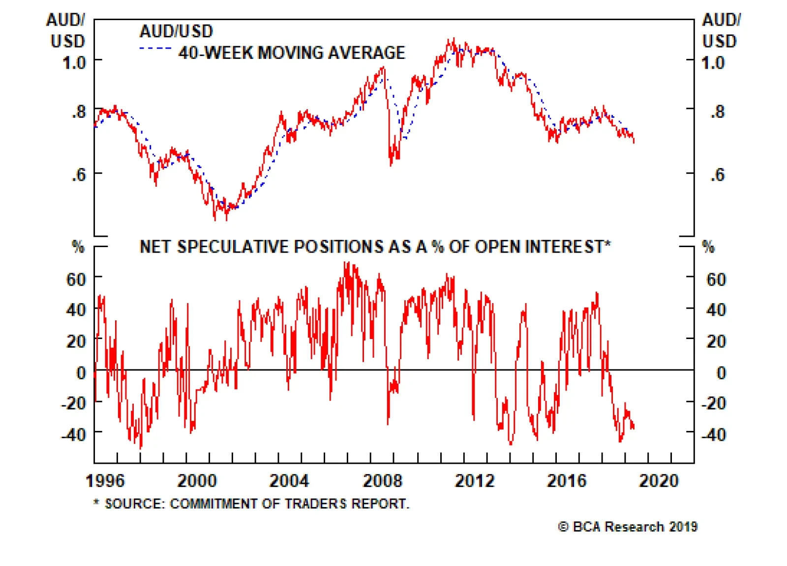
For more than two decades, the Australian dollar has been mostly driven by external conditions, especially the commodity cycle. But for the first time in several years, domestic factors have joined in to exert powerful downward pressure on the currency. …
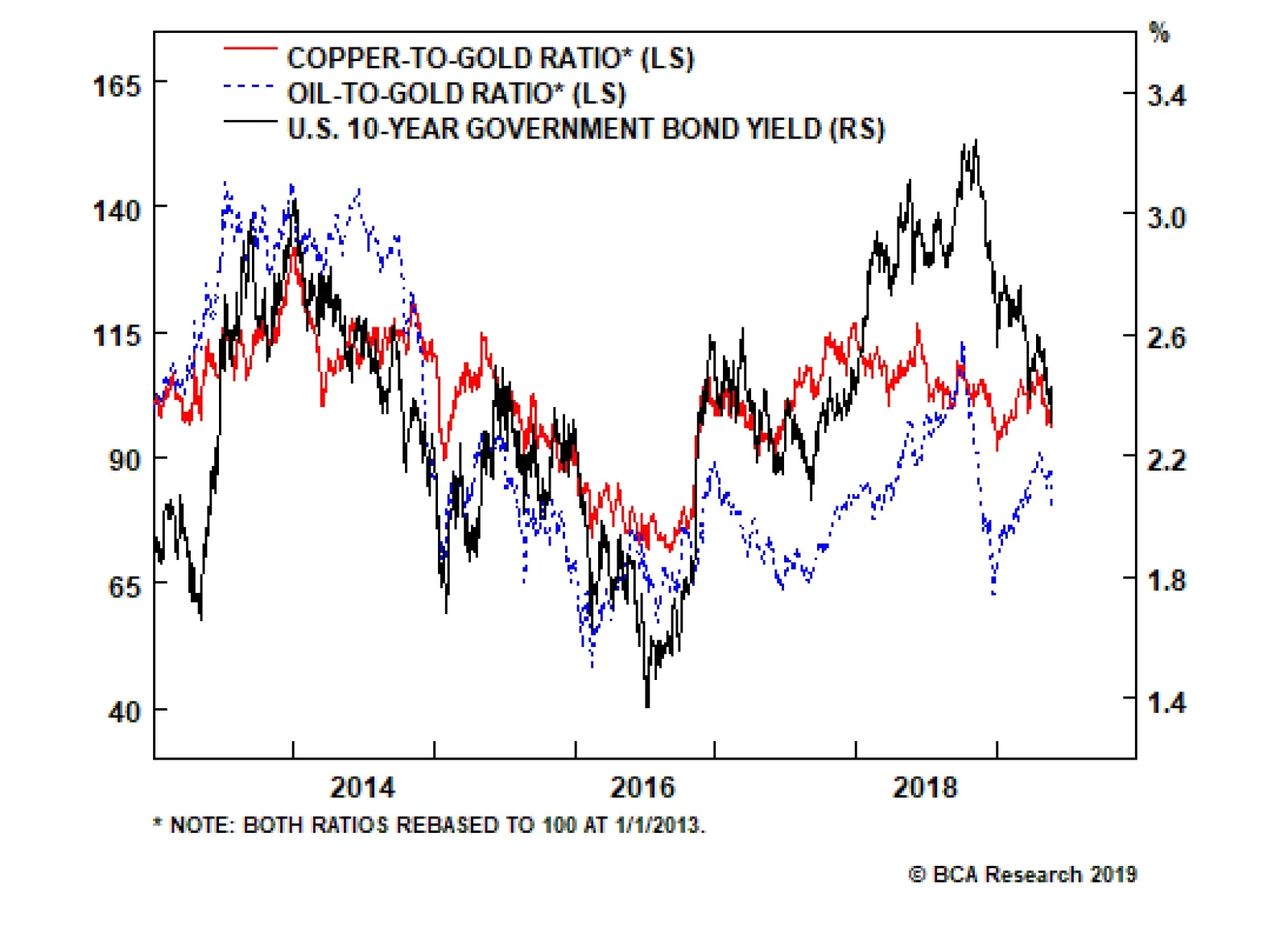
Typical reflation indicators such as commodity prices, emerging market currencies, and industrial share prices are breaking down after a nascent upturn earlier this year. One of our favorite indicators on whether or not easing liquidity conditions will lead…
Highlights Currency markets continue to fight a tug of war between weak incoming data but easier financial conditions. Our thesis remains that the path of least resistance for the dollar is down, but the rising specter of global market volatility suggests it could catapult to new highs before ultimately reversing. Most of our pro-cyclical trades have been put offside in this environment of rising volatility. Maintain tight stops until more evidence emerges that global growth has bottomed. Large net short positioning in the Swiss franc and yen, together with cheap valuations, make them attractive from a contrarian standpoint. Hold on to CHF/NZD positions recommended on April 26. Feature Our thesis remains that global growth is in a volatile bottoming process. However, incoming data pretty much across the globe has been very weak, with the latest specter of a global trade war suggesting that economic softness could linger for longer than we originally anticipated. Given the shifting market dynamics, it is important to revisit our thesis on how to be positioned in currency markets. We do so this week via the lens of the Australian dollar, one of the market’s favorite short positions. Future reports will focus on additional global growth barometers, and when to time the shift towards a more pro-cyclical stance. Positive Divergences Chart I-1Global Growth Barometers Flashing Amber
Global Growth Barometers Flashing Amber
Global Growth Barometers Flashing Amber
On the surface, most data points appear negative for the Aussie dollar. Typical reflation indicators such as commodity prices, emerging market currencies, and industrial share prices are breaking down after a nascent upturn earlier this year. One of our favorite indicators on whether or not easing liquidity conditions will lead to higher growth are the CRB Raw Industrials index-to-gold, copper-to-gold, and oil-to-gold ratios. It is disconcerting that these indicators have moved decidedly lower together with U.S. bond yields, another global growth barometer (Chart I-1). On a similar note, currencies in emerging Asia that sit closer to the epicenter of Chinese stimulus are breaking down. This suggests that so far, policy stimulus in China has not been sufficient to lift global growth, and/or the transmission mechanism towards higher growth is not working. Not surprisingly, the Australian dollar has been breaking down at a rapid pace, putting our long AUD/USD position offside. We will respect our stop-loss at 0.68 if breached, but a few indicators suggest the bearish view on the Australian dollar is very late: Chart I-2Australian Stocks Hitting New Highs
Australian Stocks Hitting New Highs
Australian Stocks Hitting New Highs
Election Results: The recent general election outcome was a big surprise to the market, and has eased risks to both the country’s banks and housing market. The center-left Labour party, which moved further to the left in this electoral cycle, was defeated by a substantial margin. This has a few important implications. First, “negative gearing” – the practice of using investment properties that are generating losses to offset one’s income tax bill – will remain in place. This was a big overhang on the housing market, which likely exacerbated the downturn in Aussie house prices. Second, the capital gains tax exemption from selling properties will probably not be reduced from 50% to 25%, as previously pledged. Finally, the Liberal-National coalition government will maintain the policy of reimbursing investors for corporate taxes paid by the underlying company. This keeps the incentive for retirees to own high dividend-yielding equities such as those of Australian banks. Australian equities hit a new cyclical high following the election results. This suggests the return on capital for Aussie companies may have inched higher following the more pro-market leadership shift (Chart I-2). At low levels of interest rates, fiscal policy is much more potent than monetary policy. Interest Rates: The latest Reserve Bank Of Australia (RBA) minutes suggest that rate cuts are back on the agenda. But the question is, with the markets pricing in two rate cuts by the end of this year, does it still pay to be short the Aussie dollar on widening interest rate differentials? More importantly, fiscal policy is set to become decisively loose this year. The new government is slated to introduce income tax cuts as early as July. This is skewed towards lower-income households, meaning the fiscal multiplier may be larger than what the Australian economy is normally accustomed to. Meanwhile, infrastructure spending will remain high, which will be very stimulative for growth in the short term. At low levels of interest rates, fiscal policy is much more potent than monetary policy, and the RBA will be loath to cut rates more than is currently expected by the market, at a time when consumer indebtedness remains quite high, and policy rates are already close to rock-bottom levels. The key for the RBA will be the job market, which at the moment remains a pillar of support for the Aussie economy. Job growth is accelerating, and labor force participation is hitting fresh highs (Chart I-3). So long as these trends continue, the RBA can afford to remain on the sidelines for a while longer. Meanwhile, while Aussie rates continue to drift downward, it has not been particularly profitable to buy U.S. Treasurys on a hedged basis (Chart I-4). Chart I-3Australia Employment Remains Robust
Australia Employment Remains Robust
Australia Employment Remains Robust
Chart I-4It is Expensive To Short The Aussie
It is Expensive To Short The Aussie
It is Expensive To Short The Aussie
Housing Market: For more than two decades, the Australian dollar has tended to be mostly driven by external conditions, especially the commodity cycle. But for the first time in several years, domestic factors have joined in to exert powerful downward pressure on the currency. The Australian Prudential Regulation Authority (APRA) has been on a mission to surgically deflate the overvalued housing market, while engineering a soft landing in the economy. Initially, their macro-prudential measures worked like a charm, as owner-occupied housing activity remained resilient relative to “investment-style” housing. What has become apparent now is that the soft landing intended by the authorities has rapidly morphed into a housing crash (Chart I-5). This is negative for consumption, both via the wealth effect and as well as for the outlook for residential construction activity. Chart I-5Could Australian Housing Bottom Soon?
Could Australian Housing Bottom Soon?
Could Australian Housing Bottom Soon?
The good news is that policy is supposed to become supportive for Aussie homebuyers at the margin, with the government slated to introduce new initiatives to help first-time homebuyers. Should labor market improvements continue, it will also help household income levels. Over the past few decades, house prices in Australia have generally staged V-shaped recoveries when at this level of contraction. Betting on at least some stabilization going forward seems reasonable. Commodity Prices: One bright spot for the Aussie dollar has been rising terms of trade. Admittedly, most measures of Chinese (and global) growth remain weak. However, there have been notable improvements in recent months that suggest economic velocity may be picking up: Production of electricity and steel, all inputs into the overall manufacturing value chain, are inflecting higher. Intuitively, these tend to lead overall industrial production. If these advance any further, they will begin to exceed GDP growth, indicating a renewed mini-cycle (Chart I-6). Production of electricity and steel, all inputs into the overall manufacturing value chain, are inflecting higher. In recent months, both steel and iron ore prices have been soaring. Many commentators have attributed these increases to supply bottlenecks and/or seasonal demand. However, it is evident from both the manufacturing data and the trend in prices that demand is also playing a role. Meanwhile, Beijing’s clear environmental push has lifted the share of liquefied natural gas in Australia’s export mix (Chart I-7). Given that the reduction – if not the outright elimination – of pollution is a long-term strategic goal in China, this will be a multi-year tailwind. As the market becomes more liberalized and long-term contracts are revised to reflect higher spot prices, the Aussie dollar will get a boost. Chart I-6Some Green Shoots From China
Some Green Shoots From China
Some Green Shoots From China
Chart I-7Australian LNG Will Buffet Terms Of Trade
Australian LNG Will Buffet Terms Of Trade
Australian LNG Will Buffet Terms Of Trade
Valuation: In terms of currency performance, a lot of the bad news already appears priced in to the Australian dollar, which is down 15% from its 2018 peak, and 38% from its 2011 peak. Meanwhile, Australian dollar short positions appeared to have already hit a nadir. This suggests outright short AUD bets are at risk from either upside surprises in global growth or simply the forces of mean reversion (Chart I-8). One of our favorite metrics for the Australian dollar’s fair value is its real effective exchange rate relative to its terms of trade. On this basis, the Aussie dollar is cheap by about 10% (Chart I-9). Chart I-8Short AUD: ##br##A Consensus Trade
Short AUD: A Consensus Trade
Short AUD: A Consensus Trade
Chart I-9AUD Is Attractive From A Terms Of Trade Perspective
AUD Is Attractive From A Terms Of Trade Perspective
AUD Is Attractive From A Terms Of Trade Perspective
China Credit Cycle: We have discussed at length how a revival in the Chinese credit cycle will help global and Australian growth. On the real estate front, residential property sales remain soft, but evidence from tier-1 and even tier-2 cities is signaling that this may be behind us, given robust sales. Over the longer term, the ebb and flow of property sales have usually been in sync across city tiers. A revival in the property market will support construction activity and investment. Chart I-10How Long Will The Weakness In China Last?
How Long Will The Weakness In China Last?
How Long Will The Weakness In China Last?
House prices have been rising to the tune of 10%-15% year-on-year, and may be sniffing an eventual pick-up in property volumes. Finally, Chinese retail sales including those of durable goods remain very weak. Car sales are deflating at the fastest pace in over two decades. But the latest VAT cut by the government is being passed through to consumers, with an increasing number of car manufacturers cutting retail prices. This should help retail sales (Chart I-10). Other Global Growth Barometers Investors looking for more clarity on the global growth picture from the April and May data prints remain in a quandary. And the preliminary European PMI numbers this morning offered no glimmers of hope. That said, the most volatile components of euro area growth tend to be investment and net exports. Should they both pick up on the back of stronger external demand, GDP could easily gravitate towards 1.5%-2%, pinning it well above potential. The German PMI is currently among the weakest in the euro zone. But forward-looking indicators suggest we may be on the cusp of a V-shaped bottom over the next month or so (Chart I-11). Chart I-11German Manufacturing Might Be At The Cusp Of A V-Shaped Recovery
German Manufacturing Might Be At The Cusp Of A V-Shaped Recovery
German Manufacturing Might Be At The Cusp Of A V-Shaped Recovery
The broad message is that global growth is in the midst of volatile bottoming process. However, before evidence of this fully unfolds, markets are likely to be swayed by the ebbs and flows of higher-frequency data. We recommend maintaining a pro-cyclical bias at the margin, but having tight stop losses as well as positions in both the Swiss franc and yen as insurance. Housekeeping Our buy-limit order on the British pound was triggered at 1.30 on March 29th. As we argued at the time, the pound was sitting exactly where it was after the 2016 referendum results, but the odds of a hard Brexit had significantly fallen. Since then, policy-induced volatility has led to a significant depreciation in the pound, with our position at risk of being stopped out at our 1.25 stop-loss this week. Given the rising specter of political volatility, we will respect our stop-loss if breached at 1.25. On the domestic front, economic surprises in the U.K. relative to both the U.S. and euro area continue to soar. The reality is that the pound and U.K. gilt yields should be much higher – solely on the basis of hard incoming data. Employment growth has been holding up very well, wages are inflecting higher, and the average U.K. consumer appears in decent shape (Chart I-12). The CPI data this week confirm that the domestic environment is hardly deflationary. That said, given the rising specter of political volatility, we will respect our stop-loss if breached at 1.25. Chart I-12Hold GBP/USD, But Stand Aside At 1.25
Hold GBP/USD, But Stand Aside At 1.25
Hold GBP/USD, But Stand Aside At 1.25
Chester Ntonifor, Foreign Exchange Strategist chestern@bcaresearch.com Currencies U.S. Dollar Chart II-1USD Technicals 1
USD Technicals 1
USD Technicals 1
Chart II-2USD Technicals 2
USD Technicals 2
USD Technicals 2
Recent data in the U.S. have been soft: The Michigan consumer sentiment index jumped to 102.4 in May. However, the Chicago Fed national activity index fell to -0.45 in April. The Redbook index increased by 5.4% year-on-year in May. Existing home sales contracted by 0.4% month-on-month to 5.2 million in April. Moreover, new home sales fell by 6.9% month-on-month in April. The Markit composite index fell to 50.9 in April. The manufacturing and services PMI fell to 50.6 and 50.9 respectively. Importantly, this a just a nudge above the 50 boom/bust level. DXY index initially increased by 0.3%, then plunged on the weak PMI data, returning flat this week. The FOMC minutes released on Wednesday reiterated that the recent drop in core inflation is mostly transitory, and that no strong evidence exists for a rate change in either direction. With the forward market already pricing an 82% probability of a rate cut this year, any hawkish shift by the Fed will be a surprise. However, this will not necessarily be bullish for the dollar, if accompanied by a global growth bottom. We remain of the view that the path of least resistance for the dollar is down. Report Links: President Trump And The Dollar - May 9, 2019 Take Out Some Insurance - May 3, 2019 Currency Complacency Amid A Global Dovish Shift - April 26, 2019 The Euro Chart II-3EUR Technicals 1
EUR Technicals 1
EUR Technicals 1
Chart II-4EUR Technicals 2
EUR Technicals 2
EUR Technicals 2
Recent data in the euro area have been mixed: Headline consumer price inflation was unchanged at 1.7% year-on-year in April, while core inflation increased to 1.3%. The current account balance narrowed to a surplus of 24.7 billion euros in March. However, this was above expectations. German GDP was unchanged at 0.6% year-on-year in Q1. The euro area Markit composite PMI was flat at 51.6 compared to the last reading of 51.5. Below the surface, both the manufacturing and services PMIs fell to 47.7 and 52.5, respectively. German composite PMI was held up at 52.4 by the services component that came in at 55. However, the manufacturing component fell to 44.3. German IFO current assessment dropped to 100.6 in May, and the business climate dropped to 97.9. In France, the Markit composite PMI came in at 51.3. The manufacturing and services PMIs both increased, to 50.6 and 51.7 respectively. This was the one bright spot in euro area data. EUR/USD has been flat this week, with recent data being on the softer side. The PMI data remain subdued, in particular. Meanwhile, political uncertainties continue to weigh on investors’ sentiment. Report Links: Take Out Some Insurance - May 3, 2019 Reading The Tea Leaves From China - April 12, 2019 Into A Transition Phase - March 8, 2019 The Japanese Yen Chart II-5JPY Technicals 1
JPY Technicals 1
JPY Technicals 1
Chart II-6JPY Technicals 2
JPY Technicals 2
JPY Technicals 2
Recent data in Japan have been mixed: Q1 annualized GDP grew by 2.1% quarter-on-quarter, well above estimates. Industrial production fell by 4.3% year-on-year in March, but was higher than the previous reading of -4.6% in February. Capacity utilization fell by 0.4% month-on-month in March. Exports contracted by 2.4% year-on-year in April, while imports increased by 6.4% year-on-year. The total trade balance thus narrowed from ¥528 billion to ¥64 billion. Notably, the exports to China fell by 6.3%, while exports to the U.S. increased by 9.6%. Machinery orders fell by 0.7% year-on-year in March. Nikkei manufacturing PMI fell below 50, coming in at 49.6 in May. USD/JPY fell by 0.5% this week. Yutaka Harada, a dovish member of the BoJ, warned during a news conference that by hiking the consumption tax rate at this critical juncture, Japan could risk sliding into a recession. With core CPI far from its 2% target, more monetary easing is probably exactly what the doctor ordered. Report Links: Beware Of Diminishing Marginal Returns - April 19, 2019 Tug OF War, With Gold As Umpire - March 29, 2019 A Trader’s Guide To The Yen - March 15, 2019 British Pound Chart II-7GBP Technicals 1
GBP Technicals 1
GBP Technicals 1
Chart II-8GBP Technicals 2
GBP Technicals 2
GBP Technicals 2
Recent data in the U.K. have been firm: The Rightmove house price index increased by 0.1% year-on-year in May. The orders component of the CBI industrial trends survey decreased to -10 in May. Retail sales increased by 3% year-on-year in April. Producer prices and input prices increased by 2.1% and 3.8%, year-on-year respectively in April. Headline inflation and core inflation increased by 2.1% and 1.8% year-on-year in April, both below expectations. GBP/USD decreased by 0.6% this week. Teresa May offered MPs a vote on a second referendum on Brexit, which considers a tighter customs union with the EU. The ongoing Brexit chaos has increased volatility in the pound. Report Links: Take Out Some Insurance - May 3, 2019 Not Out Of The Woods Yet - April 5, 2019 A Trader’s Guide To The Yen - March 15, 2019 Australian Dollar Chart II-9AUD Technicals 1
AUD Technicals 1
AUD Technicals 1
Chart II-10AUD Technicals 2
AUD Technicals 2
AUD Technicals 2
Recent data in Australia have been mostly negative: ANZ Roy Morgan weekly consumer confidence index increased to 117.2 this week. Westpac leading index fell by 0.1% month-on-month in April. Completed construction work fell by 1.9% in Q1. AUD/USD fell by 0.3% this week. During this week’s federal election, the coalition government led by Prime Minister Scott Morrison won. Besides the political development, the RBA governor Philip Lowe gave a speech on Monday, highlighting external shocks to Australian economy. He also expressed the positive outlook for Australian economy in the second half of 2019 and 2020, supported by the ongoing capex in infrastructure and resources sectors, together with strong population growth. More importantly, he mentioned that the RBA would consider the case for lower interest rates, which is a dovish shift from previous speeches. We are long AUD/USD with a tight stop at 0.68. Report Links: Beware Of Diminishing Marginal Returns - April 19, 2019 Not Out Of The Woods Yet - April 5, 2019 Into A Transition Phase - March 8, 2019 New Zealand Dollar Chart II-11NZD Technicals 1
NZD Technicals 1
NZD Technicals 1
Chart II-12NZD Technicals 2
NZD Technicals 2
NZD Technicals 2
Recent data in New Zealand have been mixed: Credit card spending growth missed expectations, coming in at 4.5% year-on-year in April. Retail sales increased by 0.7% quarter-on-quarter in Q1. Retail sales excluding autos increased by 0.7% quarter-on-quarter in Q1. NZD/USD fell by 0.3% this week. NZD/USD is currently trading at a 7-month low around 0.65. A bleak external picture is worrisome for the kiwi. We continue to favor the AUD/NZD cross, from a strategic standpoint. Report Links: Not Out Of The Woods Yet - April 5, 2019 Balance Of Payments Across The G10 - February 15, 2019 A Simple Attractiveness Ranking For Currencies - February 8, 2019 Canadian Dollar Chart II-13CAD Technicals 1
CAD Technicals 1
CAD Technicals 1
Chart II-14CAD Technicals 2
CAD Technicals 2
CAD Technicals 2
Recent data in Canada have been solid: Retail sales increased by 1.1% month-on-month in March. In particular, retail sales excluding autos increased by 1.7% month-on-month, well above estimates. USD/CAD appreciated by 0.3% this week. The better-than-expected retail sales data in March sparked a small rally in the loonie. However, the rally proved to be short-lived following softer oil prices. Positive data surprises in Canada will have to be sustained for the loonie to find some measure of support. Report Links: Currency Complacency Amid A Global Dovish Shift - April 26, 2019 A Shifting Landscape For Petrocurrencies - March 22, 2019 Into A Transition Phase - March 8, 2019 Swiss Franc Chart II-15CHF Technicals 1
CHF Technicals 1
CHF Technicals 1
Chart II-16CHF Technicals 2
CHF Technicals 2
CHF Technicals 2
Recent data in the Switzerland have been positive: Money supply (M3) growth was unchanged at 3.5% year-on-year in April. Industrial production increased by 4.3% year-on-year in Q1, albeit lower than the last reading of 5.1%. USD/CHF fell by 0.8% this week. As we argued in last week’s research note, the increasing global market volatility has reignited interest in the Swiss franc. We continue to recommend the franc as an insurance policy amid rising geopolitical risk. Report Links: What To Do About The Swiss Franc? - May 17, 2019 Beware Of Diminishing Marginal Returns - April 19, 2019 Balance Of Payments Across The G10 - February 15, 2019 Norwegian Krone Chart II-17NOK Technicals 1
NOK Technicals 1
NOK Technicals 1
Chart II-18NOK Technicals 2
NOK Technicals 2
NOK Technicals 2
There was little data out of Norway this week: The unemployment rate came in at 3.5% in March, well below consensus of 3.7% and the previous reading of 3.8%. USD/NOK fell by 0.4% this week. Rising geopolitical risks will be supportive of the oil market and put a floor under the krone. Aside from the U.S.-Iran tensions, the world faces the prospect of the loss of Venezuelan production, and significant outages in Libya, which are all bullish. Meanwhile, Norway remains one of few G10 countries that can hike interest rates in the near term. Report Links: Currency Complacency Amid A Global Dovish Shift - April 26, 2019 A Shifting Landscape For Petrocurrencies - March 22, 2019 Balance Of Payments Across The G10 - February 15, 2019 Swedish Krona Chart II-19SEK Technicals 1
SEK Technicals 1
SEK Technicals 1
Chart II-20SEK Technicals 2
SEK Technicals 2
SEK Technicals 2
Recent data in Sweden have been positive: Capacity utilization increased by 0.5% in Q1. Moreover, the unemployment rate fell to 6.2% in April. This was well below expectations of 6.8% and the previous month’s reading of 7.1%. USD/SEK fell by 0.3% this week. While we favor both the NOK and SEK against the U.S. dollar, near-term factors are more bullish for the krone. Our long NOK/SEK position is currently 4.38% in the money. Stick with it. Report Links: Balance Of Payments Across The G10 - February 15, 2019 A Simple Attractiveness Ranking For Currencies - February 8, 2019 Global Liquidity Trends Support The Dollar, But... - January 25, 2019 Trades & Forecasts Forecast Summary Core Portfolio Tactical Trades Closed Trades
Highlights Recent data suggest central bankers remain behind the curve in boosting inflation expectations. Ergo, expect a dovish bias to persist over the next few months. Our thesis remains that global growth is in a volatile bottoming process. However, market focus could temporarily flip towards short term data weakness, which warrants taking out some insurance. Meanwhile, in an environment where volatility is low and falling, it also pays to have insurance in place. Rising net short positioning in the yen and Swiss franc is making them attractive from a contrarian standpoint. Maintain a limit-buy on CHF/NZD at 1.45. The path of least resistance for the dollar remains down. This is confirmed by incoming data that suggests the euro area economies have bottomed, which should boost the EUR/USD. The rising dollar shortage remains a key risk to our sanguine view. But the forces driving dollar liquidity lower are largely behind us. Feature Investors looking for more clarity on the global growth picture from the April data print have been left in a quandary. In the U.S., the headline first-quarter real GDP growth number of 3.2% was well above consensus but was boosted by volatile components such as inventories and net exports. Real final sales to domestic purchasers, a cleaner print for final demand, came in at 1.5%, the lowest increase since 2015. Assuming trend growth in the U.S. is around 2%, a view shared by the Federal Open Market Committee (FOMC), then the increase in first-quarter final sales was a big miss. Most importantly, the U.S. ISM manufacturing index fell to 52.8 in April, a drop that was broad-based across seven of the 10 components. Chart I-1At The Cusp Of A V-Shaped Recovery?
At The Cusp Of A V-Shaped Recovery?
At The Cusp Of A V-Shaped Recovery?
Across the ocean, European growth was a tad stronger. Italy managed to nudge itself out of a technical recession, while Spanish year-on-year growth of 2.4% helped drive euro area GDP growth to the tune of 1.2%. The most volatile components of euro area growth tend to be investment and net exports. Should both pick up on the back of stronger external demand, then GDP could easily gravitate towards 1.5%-2%, pinning it well above potential. The German PMI is currently one of the weakest in the euro zone. But forward-looking indicators suggest we are at the cusp of a V-shaped bottom over the next month or so (Chart I-1). China remains the epicenter of any growth pickup and the headline PMI numbers were soft, with the official NBS manufacturing PMI falling to 50.1 from 50.5, and the private sector Caixin manufacturing PMI falling to 50.2 from 50.8. Still, the numbers remain above the critical 50 threshold level, and well beyond the 45-48 danger zone. Export growth numbers across southeast Asia remain weak, and after a brisk rise since the start of the year, many China plays including commodity prices, the yuan, emerging market stocks, and Asian currencies are all rolling over. The bearish view is that there are diminishing marginal returns to Chinese stimulus, and the authorities need to be more aggressive to turn the domestic economy around. The reality is that policy stimulus works with a lag, and we need about three to six months before we see the effects of the current policy shift. Southeast Asian exports track the Chinese credit impulse with a lag of six months, and there is little reason to believe this time should be different (Chart I-2). Chart I-2Global Trade Should Soon Bottom
Global Trade Should Soon Bottom
Global Trade Should Soon Bottom
The broad message is that global growth likely bottomed in the first quarter. However, before evidence of this fully unfolds, markets are likely to be swayed by the ebbs and flows of higher-frequency data, making for a volatile bottoming process. We recommend maintaining a pro-cyclical bias, but taking out some insurance against a potential spike in volatility. The Fed On Hold This week’s FOMC meeting focused on the lack of inflationary pressures in the U.S. but was largely a non-event for financial markets, aside from a spike in volatility. Nonetheless, there were three key takeaways. First, the dip in inflation appears to be “transitory,” driven by lower clothing prices and financial services fees. Second, Chair Powell made it clear that the Fed will only feel the need to ease policy if inflation runs “persistently” below target. Finally, the Fed’s interpretation of its “symmetric” inflation target is slowly shifting. Many FOMC members increasingly believe that the Fed should explicitly pursue an overshoot of its 2% inflation target to make up for past misses. Taken together, we expect the Fed to remain on hold for the time being, but to eventually start raising rates again as inflationary pressures pick up. Chart I-3Inflation Should Be Higher In The U.S. Versus The Euro Area
Inflation Should Be Higher In The U.S. Versus The Euro Area
Inflation Should Be Higher In The U.S. Versus The Euro Area
The bigger picture is that in a very globalized world with fully flexible exchange rates, it is becoming more and more difficult for any one central bank to independently achieve its inflation objective. This is because, should inflation be on the rise and moving higher in one country, expectations of higher interest rates should lift its currency, which eventually tempers inflationary pressures, and vice versa. This is obviously a very simplistic view of the world economy, since other factors such as demographics, productivity, labor mobility, openness of the economy, and policy divergences among others, play important roles. However, it is remarkable that almost every developed market central bank has continued to attempt to boost inflation to the 2% level since the Global Financial Crisis, but very few have been able to achieve this independently. In a very globalized world with fully flexible exchange rates, it is becoming more and more difficult for any one central bank to independently achieve its inflation objective. Take the case of Europe versus the U.S., two economies that could not be more different. Euro area imports constitute about 41% of GDP, while the number in the U.S. is only 15%, so tradeable prices matter a lot more for the former. Meanwhile, the demographic profile is worse in Europe, with the old-age dependency ratio at 32% in Europe versus 23% in the U.S. Finally, other measures of supply-side constraints such as labor market slack or capacity utilization suggest the euro area is well behind the U.S. on the path toward a closed output gap (Chart I-3). Despite this, since 2015, headline inflation in both the U.S. and euro area have moved tick-for-tick. Yes, policy divergences between the two countries have been very wide, either via the lens of quantitative easing or simply the differential in policy rates (Chart I-4). But the fact that the magnitude and direction of overall inflation has moved homogenously, begs the question of the ability of either central bank to influence overall prices. One explanation could be that variations in headline CPI are largely driven by volatile items that tend to be exogenous, while variations in core CPI tend to be mostly driven by endogenous factors. This is confirmed by most research that suggest there is a weak link between rising commodity prices and longer-term inflation.1 That said, over the shorter run, commodity price gyrations can dominate and be the main driver of inflation expectations (Chart I-5). Chart I-4U.S. And Euro Area Overall CPI Are Broadly Similar
U.S. And Euro Area Overall CPI Are Broadly Similar
U.S. And Euro Area Overall CPI Are Broadly Similar
Chart I-5In The Short Term, Commodity Prices Matter For Inflation Expectations
In The Short Term, Commodity Prices Matter For Inflation Expectations
In The Short Term, Commodity Prices Matter For Inflation Expectations
The bottom line is that muted inflationary pressures are a global phenomenon, and not centric to the U.S. This means that as a whole, global central banks are set to stay accommodative for the time being, which will be bullish for global growth (Chart I-6). This warrants maintaining a pro-cyclical stance but being extremely selective in what might be a volatile bottoming process. Chart I-6Global Monetary Policy Needs To Ease Further
bca.fes_wr_2019_05_03_s1_c6
bca.fes_wr_2019_05_03_s1_c6
Maintain A Pro-Cyclical Stance With the S&P 500 breaking to all-time highs, crude oil prices up around 40% from their lows, and U.S. 10-year Treasury yields rolling over relative to the rest of the world, this has historically been fertile ground for high-beta currency trades. That said, the lack of more pronounced strength in pro-cyclical currencies like the Australian, New Zealand, and Canadian dollars suggest that caution prevails. Our bias is that currency markets continue to fight a tug-of-war between strong dollar fundamentals and fading tailwinds. Our portfolio consists mostly of trades along the crosses, but we have been cautiously adding to U.S. dollar short positions over the past few weeks: Long AUD/USD: Our limit-buy on the Aussie was triggered at 0.70. Data out of Australia are showing tentative signs of a bottom. Last week’s important jobs report showed that the economy continues to offer more employment than the consensus expects. Meanwhile, the credit growth data out of Australia this week suggests that macro-prudential policies continue to drive a wedge between owner-occupied and investor housing (Chart I-7). House prices in Australia are already deflating to the tune of around 6%. Once the cleansing process is through, we expect house price growth to eventually converge toward levels of credit and/or natural income growth. Moreover, the Australian dollar remains a commodity currency, and will benefit from rising terms-of-trade. Iron ore prices remain firm on the back of supply-related issues. Meanwhile, a rising mix of liquefied natural gas in the export basket will provide tailwinds as China continues to steer its economy away from coal. Finally, Chinese credit growth has been a key determinant of the re-rating of Australian equities. Ergo, a rising Chinese credit impulse will ignite Australian share prices, and by extension the Australian dollar (Chart I-8). Chart I-7Australian Credit Growth Converging To Steady State
Australian Credit Growth Converging To Steady State
Australian Credit Growth Converging To Steady State
Chart I-8More Chinese Credit Will Help Australian Equities
More Chinese Credit Will Help Australian Equities
More Chinese Credit Will Help Australian Equities
Long GBP/USD: Our buy-limit order on the British pound was triggered at 1.30 on March 29th. As we argued back then, the pound is sitting exactly where it was after the 2016 referendum results, but the odds of a hard Brexit have significantly fallen since then. On the domestic front, economic surprises in the U.K. relative to both the U.S. and euro area continue to soar. The reality is that the pound and U.K. gilt yields should be much higher – solely on the basis of hard incoming data. Employment growth has been holding up very well, wages are inflecting higher, and the average U.K. consumer appears in decent shape. Full-time employees continue to creep higher as a percentage of overall employment (Chart I-9). This view was echoed in yesterday’s Bank Of England (BoE) policy meeting, where the central bank raised its growth forecast while striking a more hawkish tone. Chart I-9U.K.: What Brexit?
U.K.: What Brexit?
U.K.: What Brexit?
Chart I-10Sweden: Volatile Bottom
Sweden: Volatile Bottom
Sweden: Volatile Bottom
Long SEK/USD: The Swedish krona should be one of the first currencies to benefit from any bottoming in European growth (Chart I-10). The Swedish economy appears to have bottomed relative to that of the U.S., making the USD/SEK an attractive way to play USD downside. From a technical perspective, the cross is trading at its lowest level since the global financial crisis (Chart I-11). Economic surprises in the U.K. relative to both the U.S. and euro area continue to soar. The main appeal of the Swedish krona is that it is extremely cheap. Meanwhile, despite negative interest rates, Swedish household loan growth has been slowing as consumers are increasingly financing purchases through rising wages. This will alleviate the need for the Riksbank to maintain ultra-accommodative policy, despite its recent dovish shift. Buy Some Insurance Given current low levels of volatility and elevated equity market valuations, the dollar would have been a great insurance policy for any stock market correction. But with U.S. interest rates having risen significantly versus almost all G10 countries in recent years, the dollar has itself become the object of carry trades. This has also come with a good number of unhedged trades, as the rising exchange rate has lifted hedging costs. Chart I-11How Much Lower Could The Swedish Krona Go?
How Much Lower Could The Swedish Krona Go?
How Much Lower Could The Swedish Krona Go?
Chart I-12Buy Some##br## Insurance
Buy Some Insurance
Buy Some Insurance
It will be difficult for the dollar to act as both a safe-haven and carry currency, because the forces that drive both move in opposite directions. As markets become volatile and some carry trades are unwound, unhedged trades will become victim to short-covering flows. Currencies such as the Japanese yen and the Swiss franc that could have been used to fund carry trades are ripe for reversals. This suggests at a minimum building some portfolio hedges. One such hedge is going long the CHF/NZD. This trade has a high negative carry, so we do not intend to hold it for longer than three months. But it should pay off handsomely on any rise in volatility (Chart I-12). Maintain a limit-buy at 1.45. Chester Ntonifor, Foreign Exchange Strategist chestern@bcaresearch.com Footnotes 1 Stephen G Cecchetti and Richhild Moessner, “Commodity Prices And Inflation Dynamics,” Bank Of International Settlements, Quarterly Review, (December 2008). Currencies U.S. Dollar Chart II-1USD Technicals 1
USD Technicals 1
USD Technicals 1
Chart II-2USD Technicals 2
USD Technicals 2
USD Technicals 2
Recent data in the U.S. continue to moderate: Annualized Q1 GDP came in at 3.2% quarter-on-quarter, well above estimates. Personal income increased by 0.1% month-on-month in March, below the estimated 0.4%. On the other hand, personal spending increased by 0.9% month-on-month in March. PCE deflator and core PCE deflator fell to 1.5% and 1.6% year-on-year, respectively in March. Michigan consumer sentiment index slightly increased to 97.2 in April. Markit manufacturing PMI increased from 52.4 to 52.6 in April, while ISM manufacturing PMI fell to 52.8. Q1 nonfarm productivity increased by 3.6%, surprising to the upside. DXY index fell by 0.3% this week. On Wednesday, the Fed announced their decision to keep interest rates on hold at current levels, further suggesting that there is no strong case to move rates in either direction based on recent economic developments. Moreover, Fed chair Powell reiterated their strong commitment to the 2% inflation target. Report Links: Currency Complacency Amid A Global Dovish Shift - April 26, 2019 Beware Of Diminishing Marginal Returns- April 19, 2019 Not Out Of The Woods Yet - April 5, 2019 The Euro Chart II-3EUR Technicals 1
EUR Technicals 1
EUR Technicals 1
Chart II-4EUR Technicals 2
EUR Technicals 2
EUR Technicals 2
Recent data in the euro area are improving: Money supply (M3) in the euro area increased by 4.5% year-on-year in March. The sentiment in the euro area remains soft in April: economic sentiment indicator fell to 104; business climate fell to 0.42; industrial confidence fell to -4.1; consumer confidence was unchanged at -7.9. Q1 GDP came in at 1.2% year-on-year, surprising to the upside. Unemployment rate fell to 7.7% in March. Markit PMI increased to 47.9 in April. EUR/USD appreciated by 0.3% this week. European data keep grinding higher. Italian GDP moved back into positive territory in Q1. Spanish GDP also rebounded in Q1. Positive Chinese credit data suggests the euro will soon benefit from rising Chinese imports. Report Links: Reading The Tea Leaves From China - April 12, 2019 Into A Transition Phase - March 8, 2019 A Contrarian Bet On The Euro - March 1, 2019 Japanese Yen Chart II-5JPY Technicals 1
JPY Technicals 1
JPY Technicals 1
Chart II-6JPY Technicals 2
JPY Technicals 2
JPY Technicals 2
Recent data in Japan have been positive: The unemployment rate in March increased slightly to 2.5%; job-to-applicant ratio was unchanged at 1.63. Tokyo consumer price inflation increased to 1.4% year-on-year in March, the highest level since October 2018. Industrial production fell by 4.6% year-on-year in March. However, projections for April suggest a 2.7% month-on-month jump. Retail sales grew by 1% year-on-year in March, higher than expected. Housing starts grew by 10% year-on-year in March. This is the highest growth level since February 2017. USD/JPY fell by 0.2% this week. The Japanese government’s intention to raise sales tax this October could be a highly deflationary outcome. However, there is still an outside chance that the tax hike will be postponed. We continue to recommend yen as a safety hedge. Report Links: Beware Of Diminishing Marginal Returns - April 19, 2019 Tug OF War, With Gold As Umpire - March 29, 2019 A Trader’s Guide To The Yen - March 15, 2019 British Pound Chart II-7GBP Technicals 1
GBP Technicals 1
GBP Technicals 1
Chart II-8GBP Technicals 2
GBP Technicals 2
GBP Technicals 2
Recent data in the U.K. have been positive: U.K. mortgage loans in March increased to 40K. Nationwide housing prices increased by 0.9% on a year-on-year basis in April. Markit manufacturing PMI came in above expectations at 53.1 in April, even though it fell; Markit construction PMI however increased to 50.5. Money supply (M4) increased by 2.2% year-on-year in March. GBP/USD increased by 1% this week. The Bank of England kept rates on hold at 0.75% this week. In the May inflation report, the BoE mentioned that U.K.’s economic outlook will depend significantly on the nature and timing of EU withdrawal, and the new trading agreement with EU in particular. But governor Carney struck a slightly hawkish tone, revising up GDP estimates and guiding the next policy move as a rate hike. Report Links: Not Out Of The Woods Yet - April 5, 2019 A Trader’s Guide To The Yen - March 15, 2019 Balance Of Payments Across The G10 - February 15, 2019 Australian Dollar Chart II-9AUD Technicals 1
AUD Technicals 1
AUD Technicals 1
Chart II-10AUD Technicals 2
AUD Technicals 2
AUD Technicals 2
Recent data in Australia have shown tentative signs of recovery: Private sector credit growth fell to 3.9% year-on-year in March. However, this is heavily biased downwards by lending to home investors that has slowed to a crawl. The Australian Industry Group (AiG) manufacturing index increased to 54.8 in April. RBA commodity index increased by 14.4% year-on-year in April. AUD/USD fell by 0.4% this week. The data are starting to look brighter in Q2, suggesting that the economy might have bottomed in Q1. The Australian dollar is likely to grind higher, especially driven by rising terms of trade. Report Links: Beware Of Diminishing Marginal Returns- April 19, 2019 Not Out Of The Woods Yet - April 5, 2019 Into A Transition Phase - March 8, 2019 New Zealand Dollar Chart II-11NZD Technicals 1
NZD Technicals 1
NZD Technicals 1
Chart II-12NZD Technicals 2
NZD Technicals 2
NZD Technicals 2
Recent data in New Zealand are mixed: ANZ activity outlook increased by 7.1% in April. ANZ business confidence in April improved to -37.5. On the labor market front in Q1, the employment change fell to 1.5% year-on-year; unemployment rate was unchanged at 4.2%, but participation rate fell to 70.4%; labor cost index fell to 2% year-on-year. Building permits contracted by 6.9% month-on-month in March. NZD/USD depreciated by 0.4% this week. The data from New Zealand continue to underperform its antipodean neighbor. We anticipate this trend will persist. Stay long AUD/NZD, currently 0.5% in the money. Report Links: Not Out Of The Woods Yet - April 5, 2019 Balance Of Payments Across The G10 - February 15, 2019 A Simple Attractiveness Ranking For Currencies - February 8, 2019 Canadian Dollar Chart II-13CAD Technicals 1
CAD Technicals 1
CAD Technicals 1
Chart II-14CAD Technicals 2
CAD Technicals 2
CAD Technicals 2
Recent data in Canada continue to underperform: GDP in February contracted by 0.1% on a month-on-month basis. Markit manufacturing PMI fell below 50 to 49.7 in April. USD/CAD fell by 0.1% this week. During Tuesday’s speech, Governor Poloz acknowledged recent negative developments in the Canadian economy, and blamed it on the U.S.-led trade war, as well as the sharp decline in oil prices late last year. While a bottoming in the global growth could be a tailwind for the Canadian economy near-term, a Ricardian equivalence framework will suggest fiscal austerity over the next few years, will be a headwind for long-term CAD investors. Report Links: Currency Complacency Amid A Global Dovish Shift - April 26, 2019 A Shifting Landscape For Petrocurrencies - March 22, 2019 Into A Transition Phase - March 8, 2019 Swiss Franc Chart II-15CHF Technicals 1
CHF Technicals 1
CHF Technicals 1
Chart II-16CHF Technicals 2
CHF Technicals 2
CHF Technicals 2
Recent data in Switzerland have been negative: KOF leading indicator fell to 96.2 in April. Real retail sales contracted by 0.7% year-on-year in March. SVME PMI fell below 50 to 48.5 in April. USD/CHF fell by 0.1% this week. The reduced volatility worldwide could make the Swiss franc less attractive. Moreover, the relative outperformance of the euro area is a headwind for the franc. Our long EUR/CHF position is now 1% in the money. We intend to trade the franc purely as an insurance policy near-term. Report Links: Beware Of Diminishing Marginal Returns - April 19, 2019 Balance Of Payments Across The G10 - February 15, 2019 A Simple Attractiveness Ranking For Currencies - February 8, 2019 Norwegian Krone Chart II-17NOK Technicals 1
NOK Technicals 1
NOK Technicals 1
Chart II-18NOK Technicals 2
NOK Technicals 2
NOK Technicals 2
Recent data in Norway has been positive: Retail sales increased by 0.6% in March, in line with expectations. This was a marked improvement from the 1.2% drop in February. The unemployment rate held low at 3.8% USD/NOK increased by 1% this week. We expect the Norwegian krone to pick up based on the strong fundamentals and positive oil price outlook. Report Links: Currency Complacency Amid A Global Dovish Shift - April 26, 2019 A Shifting Landscape For Petrocurrencies - March 22, 2019 Balance Of Payments Across The G10 - February 15, 2019 Swedish Krona Chart II-19SEK Technicals 1
SEK Technicals 1
SEK Technicals 1
Chart II-20SEK Technicals 2
SEK Technicals 2
SEK Technicals 2
Recent data in Sweden have been mostly positive: Retail sales increased on a month-on-month basis by 0.5% in March, but fell to 1.9% on a yearly basis. Producer price index was unchanged at 6.3% year-on-year in March. Trade balance came in at a large surplus of 7 billion SEK in March. Manufacturing PMI fell to 50.9 in April, but notably, import orders and backlog orders rose. USD/SEK increased by 0.4% this week. Despite the RiksBank’s dovish shift last week, we continue to favor our long SEK position. Our conviction is rooted in the fact that the Swedish krona is undervalued, and relative PMI trends favor Sweden vis-à-vis the U.S. Report Links: Balance Of Payments Across The G10 - February 15, 2019 A Simple Attractiveness Ranking For Currencies - February 8, 2019 Global Liquidity Trends Support The Dollar, But... - January 25, 2019 Trades & Forecasts Forecast Summary Core Portfolio Tactical Trades Closed Trades
Highlights Solid credit growth numbers from China last week suggest an emerging window for pro-cylical currency trades. However, since 2009, these currency pairs have tended to work in real time rather than with a lag. Continued muted currency action over the next few weeks will be cause for concern. Our favorite currency pairs to play U.S. dollar downside for now are the SEK, NOK and GBP. With the Aussie dollar close to the epicenter of Chinese stimulus, data down under is increasingly stabilizing. Place a limit buy on AUD/USD at 0.70. Improving global growth will eventually put downward pressure on the broad trade-weighted U.S. dollar. Meanwhile, the risk-reward profile for safe-haven currencies has been greatly augmented in this low-volatility environment. Rising net short positioning on the yen and swiss franc is making them attractive from a contrarian standpoint. Feature The unambiguous message from incoming data is that we are entering a reflationary window. Our report last week highlighted the fact that the Chinese economy is in a bottoming process.1 Since then, data out of China has come out much stronger than expected. Export growth in March surged from -21% to 14%, new yuan-denominated loans came in at 1.7 trillion RMB versus 886 billion RMB the previous month, and industrial production in March grew at 8.5% on an annual basis – the strongest print since July 2014. Retail sales were also stronger and house prices are re-inflating, suggesting construction activity will pick up steam. Historically, March data is a cleaner print compared to prior months since it evades nuances from the Chinese lunar new year. As such, these numbers are consistent with a re-acceleration in domestic demand in the Chinese economy in the coming months. As we embrace confirmation that the Chinese economy has bottomed, it will be important to monitor if this cycle plays out like those in the past. Since 2009, the evolution of the Chinese credit cycle has been an important driver of pro-cyclical currency trades. However, in recent years there appears to have been diminishing returns to these trades. Continued lack of more pronounced strength in the Australian, New Zealand, and Canadian dollar exchange rates in light of solid hard data out of China will be genuine reason for concern. Our general assessment is that while the credit impulse in China has clearly bottomed, the magnitude of the rise is unlikely to be what we saw in 2015-2016. Given this backdrop, not all pro-cyclical currency pairs are going to benefit equally. We are long the SEK, NOK, and GBP and recommend adding AUD to the list of pro-cyclical favorites. Paradoxically, the risk-reward profile for safe-haven currencies has also been greatly augmented in this low-volatility environment, but it is still too early to begin putting on currency hedges. Pro-Cyclical Trades Need Broad Dollar Weakness Chart I-1 highlights the fact that pro-cyclical currencies have had diverging performances over the evolution of the business cycle since 2009.
Chart I-1
The aftermath of the global financial crisis was most bullish for commodity currencies, with the AUD, CAD, NOK, and NZD rising around 20%-30% versus the U.S. dollar. The DXY index was roughly flat during this period, but the broad trade-weighted dollar did weaken. The biggest driver back then was rising commodity prices, driven by Chinese demand and a revaluation of these currency pairs from deeply oversold levels. The weakest currencies were the euro and yen. Chart I-2New Lows In Currency Volatility
New Lows In Currency Volatility
New Lows In Currency Volatility
The second phase of the business cycle upswing occurred from July 2012 to February 2014, using the global Purchasing Managers’ Index from J.P. Morgan. During this phase, the best-performing currency pairs were the euro and swiss franc, and the worst was the Japanese yen. Commodity currencies fared poorly back then. The driver then was monetary policy, with European Central Bank Governor Mario Draghi’s “whatever it takes” put and the launch of “Abenomics.” Notably, the 4% weakness in the DXY did not help pro-cyclical currencies much, given commodity prices had peaked. From February 2016 to December 2017, the upswing was driven again by Chinese stimulus. Commodity prices rallied and the dollar did weaken significantly, which helped pro-cyclical currencies. However, the returns were modest compared to 2009-2010 episode. The yen was flat during the period. Finally, NOK, SEK and NZD have been winners throughout all three business cycle upswings. This time around, more evidence will need to emerge that the broad trade-weighted U.S. dollar has peaked for pro-cyclical currencies to outperform. For now, the calm in developed currency markets seems very eerie, given the flow of incoming economic data. We have highlighted in recent bulletins that most currency pairs have been narrowly trading towards the apex of very tight wedge formations, which has severely dampened volatility (Chart I-2). In the post-Bretton Woods world, it has been very rare for periods of extended currency stability to persist. We eventually expect the U.S. dollar to weaken, but we will need to closely monitor the forces that have so far been keeping a bid under it. Liquidity, Global Growth And The Dollar Most measures of relative trends still favor the dollar. The April Markit manufacturing PMI releases this week showed that while both Japan and the euro area remain in contraction territory, the U.S. reading of 52.4 puts it solidly above the rest of the world. It is true that the momentum of this leadership has been rolling over recently, but historically such growth divergences between the U.S. and the rest of the world have generated anywhere from 10%-15% rallies in the greenback over a period of six months (Chart I-3). So far, the DXY dollar index is up 1% for the year. Repatriation flows have had a non-neglible influence on the broad trade-weighted dollar. Meanwhile, even though the Federal Reserve has paused hiking interest rates, relative policy trends still favor the greenback. The interest rate gap between the U.S. and the rest of the world pins the broad trade-weighted dollar index at 128, or 7% above current levels (Chart I-4). And even today, unless the Fed moves toward outright rate cuts, the dovish shift by other central banks around the world remains an immediate tailwind for the U.S. dollar. It will be important for yield curves to steepen globally as confirmation that other central banks are getting ahead of the curve, which should be a headwind for the dollar. Chart I-3U.S. Growth Leadership ##br##Is Rolling Over
U.S. Growth Leadership Is Rolling Over
U.S. Growth Leadership Is Rolling Over
Chart I-4Interest Rate Differentials Still Favor The Dollar
Interest Rate Differentials Still Favor The Dollar
Interest Rate Differentials Still Favor The Dollar
Internationally, dollar liquidity will need to increase significantly for the greenback to meaningfully weaken. The Fed’s tapering of asset purchases has been a net drain on dollar liquidity, despite a widening U.S. current account deficit. This is expected to end by September, but has already triggered a severe contraction in the U.S. monetary base. Our preferred measure of international liquidity is foreign central bank reserves deposited at the Fed, and this is still contracting at its worst pace in over 40 years (Chart I-5). At a minimum, an end to the balance sheet runoff will steer growth in the U.S. monetary base from deeply negative to zero. A rising external profit environment will be needed for an increase in foreign central bank reserves. Finally, data from the U.S. Treasury International Capital (TIC) system show that on a rolling 12-month basis, the U.S. continues to repatriate back a net of about $400 billion in assets, or close to 2% of GDP. Repatriation flows have had a non-neglible influence on the broad trade-weighted dollar (Chart I-6). Unless these flows roll over and begin to weaken, it will make it very difficult for the greenback to depreciate. Chart I-5International Dollar Liquidity Remains Tight
International Dollar Liquidity Remains Tight
International Dollar Liquidity Remains Tight
Chart I-6Repatriation Flows Still Favor The Dollar
Repatriation Flows Still Favor The Dollar
Repatriation Flows Still Favor The Dollar
Chart I-7Watch The Gold-To-Bond Ratio
Watch The Gold-To-Bond Ratio
Watch The Gold-To-Bond Ratio
The bottom line is that pro-cyclical currencies will need broad dollar weakness to outperform. Our favorite indicator for gauging ultimate downside in the dollar is the gold-to-bond ratio (Chart I-7). Any sign that the balance of forces are moving away from the U.S. dollar will favor a breakout in the gold-to-bond ratio. For now, our favorite currency pairs to play U.S. dollar downside are the SEK, NOK, and GBP. What About Safe Havens? During bull markets, countries that have negative interest rates are subject to powerful outflows from carry trades. The impact of these outflows are difficult to measure, but it is fair to assume that periods of low hedging costs (which tend to correspond to periods of lower volatility) can be powerful catalysts. As markets get volatile and these trades get unwound, unhedged trades become victim to short-covering flows.
Chart I-8
With many yield curves around the world flattening, the danger is that the frequency of this short-covering implicitly rises, since long bond returns are falling short of spot rates. One winner as volatility starts to rise is the yen (Chart I-8). Investors should consider initiating small short USD/JPY and USD/CHF positions in the coming weeks as a portfolio hedge. Back in late 2016, global growth was soft, the yen was very cheap and everyone was short the currency on the back of a dovish shift by the Bank of Japan. Having recently introduced yield curve control (YCC), the market was grappling with the dovish implications for the currency, arguably the most significant change in monetary policy by any central bank at the time in several years. Given that backdrop, the yen strengthened by circa 10% from December 2016 to mid-2017, even as equity markets remained resilient. When the equity market drawdown finally arrived in early 2018, it carried the final legs of the yen rally. Dollar weakness was a significant reason for yen strength given global growth was accelerating, a negative for the counter-cyclical dollar. But with a net international investment position of almost 60% of GDP, and yearly income receipts of almost 4% of GDP, any volatility in markets could lead to powerful repatriation flows back to Japan. Chart I-9The Consumption Tax Hike Will Hurt Japanese Growth
The Consumption Tax Hike Will Hurt Japanese Growth
The Consumption Tax Hike Will Hurt Japanese Growth
We expect the BoJ to remain on hold at next week’s policy meeting, but the incentive for the central bank to act preemptively this time around is getting stronger. The starting point is that the consumption tax hike, scheduled for October this year, will be disastrous for the economy. Since the late 1990s, every time the consumption tax has been hiked, the economy has slumped by an average of over 1.3% in subsequent quarters. For an economy with a potential growth rate of just 0.5-1%, this is a highly unpalatable outcome (Chart I-9). More importantly, similar to past episodes, the consumption tax is being hiked at a time when the economy is slowing. This week’s data show that exports continued to contract for the month of March. Machine tool orders, a good proxy for Japanese machinery sales, are still falling by almost 30% year-on-year. The Japanese PMI remains below the 50 boom/bust line, even though it has ticked marginally higher in April. Both household and business confidence are falling. The Economy Watcher’s Survey is currently at 44.8, well below the 50 boom/bust line and the lowest reading since 2016. In its April regional outlook, the BoJ downgraded most of the prefectures in Japan, with only Hokkaido receiving an upgrade in the aftermath of the earthquake. As domestic deflationary pressures intensify, this should nudge the BoJ towards more stimulus. This also raises the probability that the government defers the consumption tax hike. However, the yen could benefit from any short-covering rallies in the interim. We expect the BoJ to remain on hold at next week’s policy meeting, but the incentive for the central bank to act preemptively this time around is getting stronger. Bottom Line: The risk-reward profile for safe-haven currencies has been greatly augmented in this low-volatility environment. The rise in net short positioning on the yen and Swiss franc is becoming attractive from a contrarian standpoint. Investors should consider initiating short USD/JPY and short USD/CHF positions in the coming weeks as a hedge. Place A Limit-Buy On AUD/USD At 0.70 Data out of Australia are showing tentative signs of a bottom. This week’s important jobs report showed that the economy added 25,700 jobs, more than double the consensus forecast. Importantly, this was driven by full-time jobs, with a net gain of 48,300. And despite the participation rate ticking higher, unemployment stayed near a six-year low at 5%. Admittedly, the most recent Reserve Bank of Australia minutes showed there was discussion about rate cuts, but this could change if the economy begins to benefit from an acceleration in Chinese growth. Outright short AUD bets are at risk from either upside surprises in global growth or simply the forces of mean reversion. For more than two decades, the Australian dollar has tended to be mostly driven by external conditions, especially the commodity cycle. But for the first time in several years, domestic factors have joined in to exert powerful downward pressure on the currency. The Australian Prudential Regulation Authority (APRA) succeeded in its mission to deflate the overvalued housing market, and with house prices deflating by over 5% year-on-year, Australia may already be far along its adjustment path, especially vis-à-vis its antipodean counterpart (Chart I-10). In terms of currency performance, a lot of the bad news already appears priced in to the Australian dollar, which is down 12% from its 2018 peak and 35% from its 2011 peak. This suggests outright short AUD bets are at risk from either upside surprises in global growth or simply the forces of mean reversion (Chart I-11). We are already long the Aussie dollar versus the kiwi and suggest placing a limit-buy on AUD/USD at 0.7. Chart I-10The Aussie Housing Market Has Already Adjusted
The Aussie Housing Market Has Already Adjusted
The Aussie Housing Market Has Already Adjusted
Chart I-11Chinese Growth Will Benefit The Aussie Dollar
Chinese Growth Will Benefit The Aussie Dollar
Chinese Growth Will Benefit The Aussie Dollar
Chart I-12LNG Exports Will Benefit The Aussie Dollar
LNG Exports Will Benefit The Aussie Dollar
LNG Exports Will Benefit The Aussie Dollar
Finally, the AUD/USD cross will benefit from rising terms-of-trade. Iron ore prices are already surging, reflecting supply-related issues but also rising demand in China. Meanwhile, Beijing’s clear environmental push has lifted the share of liquefied natural gas in Australia’s export mix (Chart I-12). Given that eliminating pollution is a strategic goal in China, this will be a multi-year tailwind. As the market becomes more liberalized and long-term contracts are revised to reflect higher spot prices, the Aussie dollar will get a boost. Chester Ntonifor, Foreign Exchange Strategist chestern@bcaresearch.com Footnotes 1 Please see Foreign Exchange Strategy Weekly Report, titled “Reading The Tea Leaves From China,” dated April 12, 2019, available at fes.bcaresearch.com Currencies U.S. Dollar Chart II-1USD Technicals 1
USD Technicals 1
USD Technicals 1
Chart II-2USD Technicals 2
USD Technicals 2
USD Technicals 2
Recent data in the U.S. suggest a slower pace of growth: The preliminary U. of Mich. consumer sentiment index fell to 96.9 in April. The NY empire state manufacturing index surprised to the upside, coming in at 10.1 in April. Industrial production contracted by 0.1% month-on-month in March. Trade balance came in at a lower-than-expected deficit of $49.4B in February. Retail sales increased by 1.6% month-on-month in March. Preliminary April Markit composite PMI fell to 52.8; manufacturing component and services component fell to 52.4 and 52.9, respectively. DXY index edged up by 0.35% this week. The Fed’s Beige Book was released on Wednesday, summarizing that economic activity expanded at a slight-to-moderate pace in March and early April, with some states showing more signs of relative strength. The Book suggests that going forward, a similarly muted pace of growth should be anticipated for the coming months. Report Links: Not Out Of The Woods Yet - April 5, 2019 Tug OF War, With Gold As Umpire - March 29, 2019 Into A Transition Phase - March 8, 2019 The Euro Chart II-3EUR Technicals 1
EUR Technicals 1
EUR Technicals 1
Chart II-4EUR Technicals 2
EUR Technicals 2
EUR Technicals 2
Recent data in the euro area remain soft: Industrial production came in at -0.3% year-on-year in February, outperforming expectations. April ZEW economic sentiment index improved to 4.5 in euro area. The German ZEW current conditions component fell to 5.5, while sentiment improved to 3.1 nonetheless. The current account balance fell to €26.8B, while trade balance increased to €19.5B in February. March headline inflation and core inflation were unchanged at 1.4% and 0.8% year-on-year, respectively. The euro area April composite PMI fell to 51.3; the services component fell to 52.5; the manufacturing component increased to 47.5. German composite PMI increased to 52.1; manufacturing and services components increased to 44.5 and 55.6, respectively. French composite PMI increased to 50; manufacturing component fell to 49.6; services component increased to 50.5. EUR/USD fell by 0.34% this week. As the Chinese economy bottoms, this should benefit European exports and the euro. Report Links: Reading The Tea Leaves From China - April 12, 2019 Into A Transition Phase - March 8, 2019 A Contrarian Bet On The Euro - March 1, 2019 The Yen Chart II-5JPY Technicals 1
JPY Technicals 1
JPY Technicals 1
Chart II-6JPY Technicals 2
JPY Technicals 2
JPY Technicals 2
Recent data in Japan have been neutral: The adjusted trade balance decreased, coming in at a ¥177.8 billion deficit in March. Exports contracted by 2.4% year-on-year, while imports grew by 1.1% year-on-year. Industrial production fell by 1.1% year-on-year in February. The preliminary Nikkei manufacturing PMI improved to 49.5 in April. USD/JPY has been trading flat this week. During the most recent IMF meeting, global finance chiefs have warned that global growth uncertainties remain at a high level. With currency volatility at record lows, any flight to safety could support safe-haven currencies like the yen. Report Links: Tug OF War, With Gold As Umpire - March 29, 2019 A Trader’s Guide To The Yen - March 15, 2019 Balance Of Payments Across The G10 - February 15, 2019 British Pound Chart II-7GBP Technicals 1
GBP Technicals 1
GBP Technicals 1
Chart II-8GBP Technicals 2
GBP Technicals 2
GBP Technicals 2
Recent data in the U.K. have been mostly positive: Rightmove house price index slightly improved to -0.1% year-on-year in April. On the labor market front, 179K jobs were created in February; ILO unemployment rate was unchanged at 3.9%; average weekly earnings came in line at 3.5% year-on-year. On the inflation front, headline inflation and core inflation were unchanged at 1.9% and 1.8% year-on-year, respectively, underperforming expectations. Retail sales came in at 6.7% year-on-year in March, surprising to the upside. GBP/USD fell by 0.5% this week. With Brexit being kicked down the road, the volatility of sterling has dropped, and attention is moving towards U.K. fundamentals. Economic surprises in the U.K. relative to both the U.S. and euro area are soaring. This will put a bid under sterling. Report Links: Not Out Of The Woods Yet - April 5, 2019 A Trader’s Guide To The Yen - March 15, 2019 Balance Of Payments Across The G10 - February 15, 2019 Australian Dollar Chart II-9AUD Technicals 1
AUD Technicals 1
AUD Technicals 1
Chart II-10AUD Technicals 2
AUD Technicals 2
AUD Technicals 2
The labor market in Australia remains robust: Westpac leading index increased by 0.19% month-on-month in March. 25.7K jobs were created in total in March, with 48.3K new full-time jobs and a loss of 22.6K part-time jobs. The participation rate increased to 65.7% in March, slightly higher than expected which nudged the unemployment rate to 5%, in line with expectations. AUD/USD appreciated by 0.7% this week, now approaching 0.72. The RBA published its meeting minutes on Tuesday. The minutes stated that the Australian dollar is still near its recent lower end. However, the strength in commodity prices and improving trade terms are supporting the currency. Report Links: Not Out Of The Woods Yet - April 5, 2019 Into A Transition Phase - March 8, 2019 Balance Of Payments Across The G10 - February 15, 2019 New Zealand Dollar Chart II-11NZD Technicals 1
NZD Technicals 1
NZD Technicals 1
Chart II-12NZD Technicals 2
NZD Technicals 2
NZD Technicals 2
Recent data in New Zealand are slowing: Q1 inflation fell to 1.5% year-on-year, underperforming expectations. NZD/USD fell by 0.8% this week. The relative underperformance of New Zealand growth could further weaken the Kiwi on a cyclical basis. Our long AUD/NZD position is now 1.6% in the money. Report Links: Not Out Of The Woods Yet - April 5, 2019 Balance Of Payments Across The G10 - February 15, 2019 A Simple Attractiveness Ranking For Currencies - February 8, 2019 Canadian Dollar Chart II-13CAD Technicals 1
CAD Technicals 1
CAD Technicals 1
Chart II-14CAD Technicals 2
CAD Technicals 2
CAD Technicals 2
Recent data in Canada have been mostly positive: The Teranet/National Bank HPI fell to 1.5% year-on-year in March. Existing home sales in March grew by 0.9% month-on-month, higher than the previous reading of -9.1% while still lower than the expected 2%. Trade balance came in at a smaller deficit of 2.9 billion CAD. Headline inflation and core inflation climbed to 1.9% and 1.6% year-on-year respectively. The ADP number of new jobs created fell to 13.2K in March. Retail sales increased by 0.8% month-on-month in February, outperforming expectations. USD/CAD fell by 0.3% this week. The spring 2019 BoC Business Outlook Survey was released on Monday. It’s worth mentioning that the Business Outlook Survey Indicator fell from a strongly positive level in the winter survey to slightly negative, implying the softening in recent business sentiment. Report Links: A Shifting Landscape For Petrocurrencies - March 22, 2019 Into A Transition Phase - March 8, 2019 Balance Of Payments Across The G10 - February 15, 2019 Swiss Franc Chart II-15CHF Technicals 1
CHF Technicals 1
CHF Technicals 1
Chart II-16CHF Technicals 2
CHF Technicals 2
CHF Technicals 2
Recent data in Switzerland have been positive: Producer and import prices came in at -0.2% year-on-year in March, higher than the previous reading of -0.7%. Trade balance increased to a surplus of 3.2 billion CHF in March. Exports increased to 21 billion CHF, and imports increased to 17.9 billion CHF. Swiss watch exports increased by 4.4% year-on-year in March. USD/CHF rose by 1% this week. The global growth stabilization and improving sentiment in the euro area are offsetting the attractiveness of the safe-haven franc. We are long EUR/CHF for a 1% profit. Report Links: Balance Of Payments Across The G10 - February 15, 2019 A Simple Attractiveness Ranking For Currencies - February 8, 2019 Waiting For A Real Deal - December 7, 2018 Norwegian Krone Chart II-17NOK Technicals 1
NOK Technicals 1
NOK Technicals 1
Chart II-18NOK Technicals 2
NOK Technicals 2
NOK Technicals 2
There is little data from Norway this week: Trade balance in March fell to 13.9 billion NOK. USD/NOK fell after the spike overnight, returning flat this week. The Norwegian krone is still trading at around one sigma band below its fair value, while the economic activity is improving with rising oil prices. Our long NOK/SEK position is now at a 3.6% profit. Report Links: A Shifting Landscape For Petrocurrencies - March 22, 2019 Balance Of Payments Across The G10 - February 15, 2019 A Simple Attractiveness Ranking For Currencies - February 8, 2019 Swedish Krona Chart II-19SEK Technicals 1
SEK Technicals 1
SEK Technicals 1
Chart II-20SEK Technicals 2
SEK Technicals 2
SEK Technicals 2
Recent data in Sweden have been negative: The unemployment rate increased to 6.7% in March. USD/SEK appreciated by 0.2% this week. Like the Norwegian krone, the Swedish krona is undervalued, trading at a large discount to its fair value. We remain overweight the SEK, which will benefit from a bottoming in global growth. Report Links: Balance Of Payments Across The G10 - February 15, 2019 A Simple Attractiveness Ranking For Currencies - February 8, 2019 Global Liquidity Trends Support The Dollar, But... - January 25, 2019 Trades & Forecasts Forecast Summary Core Portfolio Tactical Trades Closed Trades
Highlights Evidence continues to mount that the Chinese economy is in a bottoming process. This suggests the path of least resistance for the RMB is up. Meanwhile, as the U.S. and China move closer to a trade deal, any geopolitical risk premium in the RMB will slowly erode. The ultimate catalyst for CNY longs will be depreciation in the U.S. dollar, which we believe is slowly underway. The ECB is turning more dovish at a time when euro area growth is hitting a nadir. This will be bullish for the euro beyond the near term. Our limit buy on the pound was triggered at 1.30. Target 1.45 with stops at 1.25. With the Aussie dollar close to the epicenter of Chinese stimulus, data down under is increasingly stabilizing. We are closing our short AUD/NOK position for a small profit. Feature Chart I-1The Chinese Yuan Is Pro-cyclical
The Chinese Yuan Is Pro-cyclical
The Chinese Yuan Is Pro-cyclical
In addition to the dovish shift by global central banks, most investors are rightly fixated on China at this juncture in the economic cycle. For one, it has been mostly responsible for the mini cycles in the global economy since 2014. And with improvements in both Chinese credit and manufacturing data in recent months, the consensus is drawing closer to the fact that we may be entering a reflationary window. Looking at risk assets, MSCI China is up 25% from its lows, while the S&P 500 is up 20%. Commodity prices are also rising, with crude oil hitting a new calendar-year high this week. The corollary is that if the improvement in Chinese data proves sustainable, it will propel these asset markets to fresh highs. The evolution of the cycle has important implications for the yuan exchange rate, because the RMB has been trading like a pro-cyclical currency in recent years. The USD/CNY has been moving tick for tick with emerging market equities, Asian currencies, and even some commodity prices (Chart I-1). Ever since its liberalization over a decade ago, the RMB may finally be behaving like a free-floating exchange rate. Therefore, a simple evaluation of how relative prices between China and the rest of the world evolve will be valuable input for the fair value of the RMB exchange rate. Reading the tea leaves from Chinese credit data can be daunting, but we agree with the assessment of our China Investment Strategy team that while the credit impulse has clearly bottomed,1 the magnitude of the rise is unlikely to be what we saw in 2015-2016. That said, a higher credit-to-GDP ratio also requires a smaller increase in credit growth to have an outsized effect on GDP. As such, monitoring what is happening with hard data in the economy concurrently – in particular, green shoots – could add valuable evidence to the reflation theme. A Repeat Of 2016? Cycle bottoms can be protracted and volatile, but also V-shaped. So it is useful when economic data is at a nadir to pay attention to any green shoots emerging, because by the time the last piece of pertinent economic data has turned around, it may well be too late to call the cycle. Admittedly, most measures of Chinese (and global) growth remain weak. But there have been notable improvements in recent months that suggest economic velocity may be picking up: Production of electricity and steel, all inputs into the overall manufacturing value chain, are inflecting higher. Intuitively, these tend to lead overall industrial production. Overall industrial production remains weak, but the production of electricity and steel, all inputs into the overall manufacturing value chain, are inflecting higher. Intuitively, these tend to lead overall industrial production (Chart I-2). Electricity production for the month of February grew 5% after grinding to a halt in 2015-2016. Production of steel also rose by 7%. If these advance any further, they will begin to exceed Q4 GDP growth, indicating a renewed mini-cycle. Chart I-2A Revival In Industrial Activity
A Revival In Industrial Activity
A Revival In Industrial Activity
Chart I-3Metal Prices Are Sniffing A Rebound
Metal Prices Are Sniffing A Rebound
Metal Prices Are Sniffing A Rebound
In recent weeks, both steel and iron ore prices have been soaring. Many commentators have attributed these increases to supply bottlenecks and/or seasonal demand. However, it is evident from both the manufacturing data and the trend in prices that demand is also playing a role (Chart I-3). Overall residential property sales remain soft, but evidence from tier-1 and even tier-2 cities is signalling that this may be behind us, given robust sales. Over the longer term, the ebb and flow of property sales has tended to be in sync across city tiers. A revival in the property market will support construction activity and investment. House prices have been rising to the tune of 10% year-on-year, and real estate stocks in China may be sniffing an eventual pick-up in property volumes (Chart I-4). Over the last 20 years or so, Chinese credit growth has been a reliable indicator for car sales with a lead of about six months. Government expenditures were already inflecting higher ahead of last month’s China National People’s Congress (NPC). Again, this suggests stimulus this time around may be more fiscal than monetary (Chart I-5). In addition to the recent VAT cut for manufacturing firms from 16% to 13%, a string of policy easing measures will begin to accrue, including a cut to social security contributions effective May 1st, and perhaps a pickup in infrastructure spending. Already, real estate infrastructure spending growth is perking up, with that in the mining sector soaring to multi-year highs. Chart I-4Real Estate Volumes Could Pick Up
Real Estate Volumes Could Pick Up
Real Estate Volumes Could Pick Up
Chart I-5The Fiscal Spigots Are Opening
The Fiscal Spigots Are Opening
The Fiscal Spigots Are Opening
Finally, Chinese retail sales including those of durable goods remain very weak. Car sales are deflating at the fastest pace in over two decades. But the latest VAT cut by the government is being passed through to consumers, with an increasing number of car manufactures cutting retail prices. Chart I-6Car Sales Typically Have V-Shaped Recoveries
Car Sales Typically Have V-Shaped Recoveries
Car Sales Typically Have V-Shaped Recoveries
Over the last 20 years or so, Chinese credit growth has been a reliable indicator for car sales with a lead of about six months (Chart I-6). The indicator right now suggests we could witness a coiled-spring rebound in Chinese car sales over the next few months. Bottom Line: Both Chinese stocks and commodity prices have been suggesting a bottoming process in the domestic economy for a while now. Incoming data is beginning to corroborate this view. This has important implications for both the Chinese yuan and other global assets. Capital Flows Improving domestic and external conditions will likely offset any renewed pressure on the Chinese yuan from capital outflows. Our China Investment Strategy team reckons that even after adjusting for cross-border RMB settlements and illicit capital outflows, there is less evidence of capital flight today than there was in 2015-2016.2 Chart I-7Offshore Markets Don't See RMB Weakness
Offshore Markets Don't See RMB Weakness
Offshore Markets Don't See RMB Weakness
Typically, offshore markets have had a good track record of anticipating depreciation in the yuan. Back in 2014, offshore markets started pricing in a rising USD/CNY rate, and maintained that view all the way through to 2018, when the yuan eventually bottomed. Right now, no such depreciation is being priced in (Chart I-7). The reason offshore markets in Hong Kong and elsewhere can be prescient is because more often than not, they are the destination for illicit flows out of China. For example, one of the often-rumored ways Chinese money has left the country is through junkets, key operators in Macau casinos.3 These junkets bankroll their Chinese clients in Macau while collecting any debts in China allowing for illicit capital outflows. This was particularly rampant ahead of the Chinese 2015-2016 corruption clampdown, when Macau casino equities were surging while equity prices in China remained subdued. Historically, both equity markets tend to move together, since over 70% of visitors to Macau come from China (Chart I-8). Right now, both the Chinese MSCI index and Macau casino stocks are rising in tandem, suggesting gains are more related to fundamentals than hot money outflows. Chart I-8Macau Casinos: A Good Proxy For Chinese Spending
Macau Casinos: A Good Proxy For Chinese Spending
Macau Casinos: A Good Proxy For Chinese Spending
A surge in illicit capital outflows could also be part of the reason for an explosion in sight deposits in Hong Kong ahead of the 2015-2016 clampdown (Chart I-9). Admittedly, most of these deposits were and still are due to cross-border RMB settlements, but it is also possible that part of these constituted hot money outflows. With these sight deposits rising at a more reasonable pace, it suggests little evidence of capital flight. Chart I-9The Chinese Government Has Clamped Down On Illicit Flows
The Chinese Government Has Clamped Down On Illicit Flows
The Chinese Government Has Clamped Down On Illicit Flows
Trade Truce A trade truce between the U.S. and China will be the final catalyst for a stronger yuan. The news flow so far has been positive, with both U.S. President Donald Trump and Chinese President Xi Jinping publicly acknowledging they are closer to a deal. Even well-known China hawk Peter Navarro, head of the U.S. National Trade Council, has admitted that the two sides are in the final stages of talks. But with a still-ballooning U.S. trade deficit with China, Trump will want to take home a win (Chart I-10). Chart I-10Trump Needs To Take A Win Back To America
Trump Needs To Take A Win Back To America
Trump Needs To Take A Win Back To America
Concessions on the Chinese side so far seem reasonable, allowing us to speculate that there is a rising probability of a deal. They have agreed to increase agriculture and energy imports from the U.S. by about $1 trillion over the next six years, announced a cut on import tariffs, revised their Patent Law to improve protection of intellectual property, and provided a clear timeline for when foreign caps will be removed in sectors such as autos and financial services. These seem like very reasonable concessions that will allow Trump to go home and declare victory. Trade wars are usually synonymous with recessions. As such, there are acute political constraints inching both sides towards an agreement. For President Trump, a deteriorating U.S. manufacturing sector in the midwestern battleground states is a thorn in his side. For President Xi, rising unemployment is a key constraint. On the currency front, the details of any agreement are still unknown, but should Chinese economic fundamentals start to genuinely improve, it will put upward pressure under rates – and ergo the yuan (Chart I-11). A gradually rising yuan exchange rate will further assuage any doubts or concerns that Trump may have. Bottom Line: Our fundamental models show the yuan as undervalued by about 3%. This means China could allow its currency to gradually appreciate towards fair value, with little impact on the domestic economy or even exports. Given some green shoots in incoming economic data, little risk of capital flight, and the rising likelihood of a trade deal between the U.S. and China, our bias is that the path of least resistance for the Chinese RMB is up (Chart I-12). Chart I-11Rising Chinese Rates Will Favor The Yuan
Rising Chinese Rates Will Favor The Yuan
Rising Chinese Rates Will Favor The Yuan
Chart I-12The RMB Is Not Expensive
The RMB Is Not Expensive
The RMB Is Not Expensive
Another Dovish Shift By The ECB In another dovish twist, the European Central Bank kept monetary policy unchanged following this week’s meeting, while highlighting that it might be on hold for longer. Unsurprisingly, incoming data has been weak of late, which the ECB (like other central banks) blamed on the external environment. It did fall short of speculation that it will introduce a tiered system for its marginal deposit facility, which would have alleviated some cash flow pressures for euro area banks. Our bias is for the new Targeted Long Term Refinancing Operation (TLTRO III – in other words, cheap loans), to remain a better policy tool than a tiered central bank deposit system. In the case of a TLTRO, the ECB can effortlessly decentralize monetary policy, since liquidity gravitates towards the countries that need it the most. While a tiered system can allow a bank to offer higher rates and attract deposits, there is no guarantee that these deposits will find their way into new loans. It is also likely to benefit countries with the most excess liquidity. In the case of a TLTRO, the ECB can effortlessly decentralize monetary policy. Beyond any short-term volatility in the euro, we think the ECB’s dovish shift could be paradoxically bullish. If a central bank eases financing conditions at a time when growth is hitting a nadir, it is tough to argue that it is bearish for the currency. Meanwhile, fiscal policy is also set to be loosened. Swedish new orders-to-inventories lead euro area growth by about five months, and the recent bounce could be a harbinger of positive euro area data surprises ahead (Chart I-13). Chart I-13Euro Area Growth Will Recover
Euro Area Growth Will Recover
Euro Area Growth Will Recover
Bottom Line: European rates are further below equilibrium compared to the U.S., and the ECB’s dovish shift will help lift the euro area’s growth potential. Meanwhile, investors are currently too pessimistic on euro area growth prospects. Our bias is that the euro is close to a floor. House Keeping Our buy-stop on the British pound was triggered at 1.30. We recommend placing stops at 1.25, with an initial target of 1.45. As we argued last week,4 the odds of a hard Brexit continue to fall, with U.K. Prime Minister Theresa May explicitly saying this week that the path for the U.K. going forward is either a deal with the EU or with no Brexit at all. As we go to press, EU leaders have granted the U.K. an extension until the end of October, with a review in June. Chart I-14What Next For The Pound?
What Next For The Pound?
What Next For The Pound?
Back when the referendum was held in June 2016, even the pro-Brexit Tories, a minority in the party, promised continued access to the Common Market. Fast forward to today and there are simply not enough committed Brexiters in Westminster to deliver a hard exit. Given that the can has been kicked down the road, markets are likely to turn their focus on incoming economic data. On that front, economic surprises in the U.K. relative to both the U.S. and euro area are soaring (Chart I-14). Elsewhere, we are also taking profits on our short AUD/NOK position. Since 2015, the market has been significantly dovish on Australia, in part due to a more accelerated downturn in house prices and a marked slowdown in China. The reality is that the downturn in Australia has allowed some cleansing of sorts and has brought it far along the adjustment path relative to its potential. Any potential growth pickup in China will light a fire under the Aussie dollar, which is a risk to this position. Chester Ntonifor, Foreign Exchange Strategist chestern@bcaresearch.com Footnotes 1 Please see China Investment Strategy Special Report, titled “China: Stimulating Amid The Trade Talks,” dated February 20, 2019, available at fes.bcaresearch.com 2 Please see China Investment Strategy Special Report, titled “Monitoring Chinese Capital Outflows,” dated March 20, 2019, available at fes.bcaresearch.com 3 Farah Master, “Factbox: How Macau's casino junket system works,” Reuters, October 21, 2011. 4 Please see Foreign Exchange Strategy Weekly Report, titled “Not Out Of The Woods Yet,” dated April 5, 2019, available at bca.bcaresearch.com Currencies U.S. Dollar Chart II-1USD Technicals 1
USD Technicals 1
USD Technicals 1
Chart II-2USD Technicals 2
USD Technicals 2
USD Technicals 2
Recent data in the U.S. have been mostly positive: In March, 196K nonfarm jobs were created, surprising to the upside; unemployment rate stayed low at 3.8%, though average hourly earnings growth fell to 3.2% year-on-year. The factory orders in February contracted by 0.5% month-on-month. More importantly, headline consumer price inflation in March rose to 1.9% year-on-year, however this was mostly lifted by rising energy prices. Core inflation excluding food and energy dropped by 10 basis points to 2%. JOLTs job openings unexpectedly fell to 7.1 million in February, from 7.6 million. However, initial jobless claims fell to 196K. After a 3-month lull, producer prices are inflecting higher at a pace of 2.2% year-on-year for the month of March. DXY index fell by 0.44% this week. Global risk assets are on the rise this week. Meanwhile, the Fed minutes highlighted that members are in no rush to raise rates. Stalling interest rate differentials will be a headwind for the dollar. Report Links: Not Out Of The Woods Yet - April 5, 2019 Tug OF War, With Gold As Umpire - March 29, 2019 Into A Transition Phase - March 8, 2019 The Euro Chart II-3EUR Technicals 1
EUR Technicals 1
EUR Technicals 1
Chart II-4EUR Technicals 2
EUR Technicals 2
EUR Technicals 2
Recent data in the euro area have been positive: The Sentix Investor Confidence index continues to inflect higher, coming in at -0.3 from -2.2. German industrial production grew by 0.7% month-on-month in February. Trade balances improved across the euro area. In France, the trade deficit fell to €-4.0B in February. In Germany, the trade surplus increased to €18.7B. Italian retail sales increased by 0.9% year-on-year in February. On the inflation front, consumer price inflation in Germany and France both stayed at 1.3% year-on-year in March. EUR/USD rose by 0.57% this week. On Wednesday, the ECB has decided to leave policy unchanged as expected. Mario Draghi also highlighted more uncertainties and downside risks to the euro area amid the ongoing trade disputes. While the global trade war might add volatility to the pro-cyclical euro, easier financial conditions should eventually backstop growth. Report Links: Into A Transition Phase - March 8, 2019 A Contrarian Bet On The Euro - March 1, 2019 Balance Of Payments Across The G10 - February 15, 2019 The Yen Chart II-5JPY Technicals 1
JPY Technicals 1
JPY Technicals 1
Chart II-6JPY Technicals 2
JPY Technicals 2
JPY Technicals 2
Recent data in Japan have been negative: Preliminary cash earnings fell by 0.8% year-on-year in February, the only decline since mid-2017. Household confidence continues to tick lower, coming in at 40.5 in March. The trade balance in February came in at a surplus of ¥489.2B. Capex is rolling over. Machinery orders fell by 5.5% year-on-year in February. Machine tool orders remain extremely weak, at -28.5% year-on-year for the month of March. Lastly, the foreign investment in Japanese stocks increased to ¥1,463.7B. USD/JPY fell by 0.46% this week. In its April regional outlook, the BoJ downgraded most of the prefectures in Japan, with only Hokkaido that had an upgrade in the aftermath of the earthquake. As domestic deflationary pressures intensify, this will favor the yen. This also raises the probability the government defers the consumption tax hike. Report Links: Tug OF War, With Gold As Umpire - March 29, 2019 A Trader’s Guide To The Yen - March 15, 2019 Balance Of Payments Across The G10 - February 15, 2019 British Pound Chart II-7GBP Technicals 1
GBP Technicals 1
GBP Technicals 1
Chart II-8GBP Technicals 2
GBP Technicals 2
GBP Technicals 2
Recent data in the U.K. have been strong: In February, manufacturing production increased by 0.6% year-on-year; industrial production also increased by 0.1% year-on-year, both surprising to the upside. Both were deflating in January. The goods trade balance in February fell to £-14.1B, however the total trade balance came in at a smaller deficit of £4.86B. Monthly GDP also came in higher at 2% year-on-year in February. House prices gains have pared the increase of previous years, but the Halifax house price index still increased by 2.6% year-on-year for the month of March. GBP/USD rose by 0.41% this week. Theresa May got an extension for Brexit to October 31. Meanwhile, U.K. data have been stronger than consensus recently. We are long GBP/USD from 1.30, with a 0.6% profit. Report Links: Not Out Of The Woods Yet - April 5, 2019 A Trader’s Guide To The Yen - March 15, 2019 Balance Of Payments Across The G10 - February 15, 2019 Australian Dollar Chart II-9AUD Technicals 1
AUD Technicals 1
AUD Technicals 1
Chart II-10AUD Technicals 2
AUD Technicals 2
AUD Technicals 2
Recent data in Australia have continued to improve: Investment lending for homes in February grew by 2.6%. Home loans in February increased by 2% month-on-month, surprising to the upside. Westpac consumer confidence came in at 100.7 in April, increasing by 1.9%. AUD/USD surged by 0.64% this week. The RBA Deputy Governor Guy Debelle hinted that a wait-and-see approach for interest rates seemed like the appropriate path, signaling that policy will continue to be accommodative. Meanwhile, the Australian dollar is probably anticipating better upcoming data from China, as it is Australia’s largest trading partner. If the world’s second largest economy can turn around, the Aussie dollar is likely to grind higher. Report Links: Not Out Of The Woods Yet - April 5, 2019 Into A Transition Phase - March 8, 2019 Balance Of Payments Across The G10 - February 15, 2019 New Zealand Dollar Chart II-11NZD Technicals 1
NZD Technicals 1
NZD Technicals 1
Chart II-12NZD Technicals 2
NZD Technicals 2
NZD Technicals 2
There was little data out of New Zealand this week: The food price index came in at 0.5% month-on-month in March, shy of the estimate of 1.3%. NZD/USD plunged after rising by 0.5% initially this week, returning flat. Incoming data in New Zealand is likely to lag its commodity currency counterparts pushing the kiwi relatively lower. Our long AUD/NZD position is now 0.7% in the money since entry last Friday. Report Links: Not Out Of The Woods Yet - April 5, 2019 Balance Of Payments Across The G10 - February 15, 2019 A Simple Attractiveness Ranking For Currencies - February 8, 2019 Canadian Dollar Chart II-13CAD Technicals 1
CAD Technicals 1
CAD Technicals 1
Chart II-14CAD Technicals 2
CAD Technicals 2
CAD Technicals 2
Recent data in Canada have been negative: On the labor market front, the participation rate in March fell slightly to 65.7%; 7,200 jobs were lost, underperforming the estimated creation of 1,000 jobs; unemployment rate was unchanged at 5.8%. On the housing market front, starts in March increased by 192.5K year-on-year, underperforming the expected 196.5K; building permits dropped by 5.7% month-on-month in February. USD/CAD rebounded quickly after falling by 0.7% earlier this week, offsetting the loss. While the dovish shift by the BoC and looser fiscal policy, together with rising oil prices are likely to be growth tailwinds, the data disappointment coming from the housing market and overall economy limit upside in the CAD. Report Links: A Shifting Landscape For Petrocurrencies - March 22, 2019 Into A Transition Phase - March 8, 2019 Balance Of Payments Across The G10 - February 15, 2019 Swiss Franc Chart II-15CHF Technicals 1
CHF Technicals 1
CHF Technicals 1
Chart II-16CHF Technicals 2
CHF Technicals 2
CHF Technicals 2
There was scant data in Switzerland this week: The foreign currency reserves came in at 756B CHF in March. Unemployment rate in March was unchanged at 2.4%, in line with expectations. USD/CHF appreciated by 0.44% this week. With the euro area economy slowly recovering, the franc is likely to underperform as risk appetite rises. We are long EUR/CHF for a 0.1% profit. Report Links: Balance Of Payments Across The G10 - February 15, 2019 A Simple Attractiveness Ranking For Currencies - February 8, 2019 Waiting For A Real Deal - December 7, 2018 Norwegian Krone Chart II-17NOK Technicals 1
NOK Technicals 1
NOK Technicals 1
Chart II-18NOK Technicals 2
NOK Technicals 2
NOK Technicals 2
Recent data in Norway have been strong, with inflation grinding higher: Headline consumer price inflation increased to 2.9% year-on-year in March; core inflation also rose to 2.7% year-on-year, both surprising to the upside. Producer price index grew by 5.2% year-on-year in March, outperforming expectations. USD/NOK depreciated by 1.16% this week. The improving domestic economy, rising oil prices, and the tick up in inflation are all the reasons why we favor the Norwegian krone. We are playing the NOK via a few pairs, notably long NOK/SEK and short AUD/NOK, which are currently 3.11% and 0.75% in the money, respectively. Report Links: A Shifting Landscape For Petrocurrencies - March 22, 2019 Balance Of Payments Across The G10 - February 15, 2019 A Simple Attractiveness Ranking For Currencies - February 8, 2019 Swedish Krona Chart II-19SEK Technicals 1
SEK Technicals 1
SEK Technicals 1
Chart II-20SEK Technicals 2
SEK Technicals 2
SEK Technicals 2
Recent data in Sweden have been mixed: Industrial production fell to 0.7% year-on-year in February, lower than the previous reading of 3%. New manufacturing orders contracted by 2.8% year-on-year in February. However, the leading manufacturing new orders to inventory ratio is rising suggesting we might be near a bottom. Consumer price inflation came in higher at 1.9% year-on-year in March. USD/SEK fell by 0.21% this week. We remain bullish on the Swedish krona due to its cheap valuation and the imminent pickup in the euro area economy. Report Links: Balance Of Payments Across The G10 - February 15, 2019 A Simple Attractiveness Ranking For Currencies - February 8, 2019 Global Liquidity Trends Support The Dollar, But... - January 25, 2019 Trades & Forecasts Forecast Summary Core Portfolio Tactical Trades Closed Trades
For starters, over the past five years or so, whenever this cross has broken below the 1.04 support level, going long proved to be a profitable strategy over the ensuing 6-to-12 months. Meanwhile, over the last 35 years, the cross has spent more than 95% of…