Currencies

Highlights Global growth is peaking, but US growth is losing momentum relative to its peers. This has historically been negative for the greenback. Chinese monetary policy is no longer on a tightening path, and might ease going forward. As discounting mechanisms, cyclical currencies should outperform. Our bias is that non-US growth will outperform growth in the US over the next 12-18 months. This will lead to capital reallocation away from the US dollar. While US bond yields could rise towards 2%, real interest rates will remain low compared to history. Our recommendations remain the same: the DXY will struggle to punch above the 94-95 level, but will ultimately touch 80. Feature Chart I-1US Growth Momentum And The Dollar
US Growth Momentum And The Dollar
US Growth Momentum And The Dollar
The DXY index is up for the year, but has twice failed to punch the 94 level. The first leg of the rally from January to March occurred within a context of rising global yields, led by the US. The second leg, starting in June was triggered by a perceived hawkish shift from the Federal Reserve. The common denominator for both legs of the rally was that US growth was outperforming growth in the rest of the world. But that is beginning to change. Bloomberg consensus forecasts show a sharp reversal in US growth momentum, relative to its peers (Chart I-1). Historically, this has put a firm ceiling on the greenback. Cycles And The US Dollar The dollar tends to fare worse early in the cycle when growth is rising but inflation is falling (Chart I-2). Admittedly, inflation prints in some developed markets like the US and Canada have been rather strong. But to the extent that these prints reflect transitory factors, it should allow global central banks to remain accommodative, supporting growth. The remarkable thing about Chart I-1 is that the rotation in growth from the US towards other countries has been broad based. Countries such as Canada, New Zealand, Brazil and Mexico are seeing a bottoming in growth momentum relative to the US (Chart I-3). Chart I-2The Dollar Fares Poorly Early In The Cycle
Why The Ultimate Low In The Dollar Is Nigh
Why The Ultimate Low In The Dollar Is Nigh
Chart I-3A Rotation Of Growth From The US
A Rotation Of Growth From The US
A Rotation Of Growth From The US
This bottoming in growth momentum is occurring at the same time as local central banks are becoming more orthodox about monetary policy. The Reserve Bank of New Zealand has ended quantitative easing. The Bank of Canada has cut asset purchases in half. Brazil, Mexico and Russia, among other emerging market countries are hiking interest rates. While it is true that inflation in some developed and emerging markets like Canada, the UK, Brazil and Russia is perking up, for most developed markets as a whole, inflation is actually surprising to the upside in the US (Chart I-4). China has been tightening policy amidst very low inflation. Currencies tend to be driven by real rates. A growth rotation away from the US, in addition to more orthodox monetary policies outside the US, will be negative for the greenback. Chart I-4US Relative Inflation And The Dollar
US Relative Inflation And The Dollar
US Relative Inflation And The Dollar
What About Chinese Growth? Chinese growth expectations are still cratering relative to the US. The fiasco around the China Evergrande Group has also led to speculation that this could become a systemic event. For developed market currencies, especially those linked to China like the Australian dollar, this is a market-relevant event. Admittedly, offshore markets have started discounting a bigger depreciation in the RMB (Chart I-5). That said, the RMB has been rather resilient against the dollar suggesting that the risk of this becoming a systemic event is rather low (Chart I-6). Chart I-5The Evergrande Risk Is Not Yet Systemic
The Evergrande Risk Is Not Yet Systemic
The Evergrande Risk Is Not Yet Systemic
Chart I-6Chinese Equities And The RMB Have Decoupled.
Chinese Equities And The RMB Have Decoupled.
Chinese Equities And The RMB Have Decoupled.
We believe currency markets are sending the right signal. For one, the Evergrande debacle is occurring at a time when China is no longer tightening monetary policy. Chart I-7 shows that cyclical currencies in developed markets tend to be coincident with the Chinese credit impulse. As such, any easing in monetary policy will put a bottom in these currencies. Over the years, the Chinese bond market has become more and more liberalized. This two-way risk implies that zombies companies should be allowed to fail while unicorns flourish. It is true that regulatory control has been front and center in the current Chinese equity market malaise. That said, our bias is that liberalization is a reason why portfolio inflows into China continue to accelerate, as the economy moves closer to market-determined prices (Chart I-8). This has supported the RMB, a big weight in the Fed trade-weighted dollar. Chart I-7Chinese Policy And DM Currencies
Chinese Policy And DM Currencies
Chinese Policy And DM Currencies
Chart I-8An Unrelenting Increase In Chinese Inflows
An Unrelenting Increase In Chinese Inflows
An Unrelenting Increase In Chinese Inflows
A lot of EM debt is denominated in US dollars, which could be reprised for default risk. But on this basis, the Fed is ahead of the curve. This was the very reason the Federal Reserve introduced swap lines in 2020 with foreign emerging market central banks and made swapping FX reserves for dollars a permanent facility in its toolkit for monetary policy this year. Non-US domestic authorities have ample ability to decide which entities they allow to fail, and which they bail out from their USD obligations. Cross-currency basis swaps, a proxy for the cost of obtaining dollars offshore, remain well behaved (Chart I-9). Chart I-9No USD Funding Stress So Far In Developed Markets
No USD Funding Stress So Far In Developed Markets
No USD Funding Stress So Far In Developed Markets
For developed market currencies, the implication is that China risks are currently overstated, while any upside surprise has not been meaningfully discounted. Gauging Investor Positioning The dollar tends to be a momentum currency. But at turning points, it pays to be a contrarian. Let’s begin with what is priced in. First, the overnight index swap curve (OIS) suggests that markets expect the Fed to hike interest rates faster than other G10 central banks (Chart I-10). This will not occur in a world where growth is stronger outside the US, and other central banks are well ahead in their tapering of asset purchases, pursuing much more orthodox monetary policy. Chart I-10The Market Remains Bullish On Fed Rate Hikes
The Market Remains Bullish On Fed Rate Hikes
The Market Remains Bullish On Fed Rate Hikes
Chart I-11Speculators Are Bullish On ##br##The Dollar
Speculators Are Bullish On The Dollar
Speculators Are Bullish On The Dollar
Second, at the beginning of this report, we highlighted the fact that the dollar is up this year. Part of the reason has been a pilling in of speculators into long greenback positions (Chart I-11). As a trading rule, it has usually been profitable to wait for net speculative positioning and moving averages to roll over before entering fresh dollar short positions (Chart I-12). On this basis, tactical investors might be a bit early, but its is also the case that the macroeconomic environment is moving against the dollar. Once markets start paying attention to the fact that global growth will rotate from the US, pinning the Fed into a more dovish stance, the dollar will quickly depreciate. Chart I-12A Sentiment Trading Rule Will Wait For The Dollar To Roll Over More Broadly
A Sentiment Trading Rule Will Wait For The Dollar To Roll Over More Broadly
A Sentiment Trading Rule Will Wait For The Dollar To Roll Over More Broadly
Often forgotten is that the dollar has tended to move in long cycles, usually 10 years between bull and bear markets. The US trade deficit (excluding oil) is hitting new fresh highs this year. These deficits need to be financed by foreign purchases of US securities, either by debt issued or equity raised. Investors could demand a discount to keep financing these deficits. Should the Congressional Budget Office estimates of the current trajectory of US deficits hold true, the dollar has about 10-15% downside from current levels (Chart I-13). Chart I-13Balance Of Payments Bode Negatively For The Greenback
Balance Of Payments Bode Negatively For The Greenback
Balance Of Payments Bode Negatively For The Greenback
Our geopolitical strategists assign 80% odds to the passage of a bipartisan infrastructure bill, and 65% odds to the passage of a reconciliation bill. Either way, the US fiscal picture is set to deteriorate at a time when the Fed is comtemplating scaling back Treasury purchases. Interestingly, 10-15% downside in the US dollar is exactly what is needed to realign the currency competitively (Chart I-14). Consumer prices have been rising globally, but this has been especially pronounced in the US. To the extent that we live in a globalized world with flexible exchange rates, this should allow more competitive countries to see an increase in their trade balances. This is exactly what is occurring, with the US trade deficit hitting new lows. Chart I-14The Dollar Is Expensive On A PPP Basis
The Dollar Is Expensive On A PPP Basis
The Dollar Is Expensive On A PPP Basis
Risks To The View Currency forecasts are obviously fraught with risks. The biggest risk to the view is a broad-based equity market correction, that reinvigorates inflows into US safe-haven bonds. We are cognizant that this is a risk worth monitoring. For example, investors are preferring to park cash in US Treasurys over gold, two competing safe-haven assets (Chart I-15). This has usually been positive for the greenback. But it also suggests investors view the Fed is going to be orthodox in monetary settings, tightening policy faster than the market expects. This boils down to a judgment call. The US market is much more vulnerable to rate changes than other markets (Chart I-16). As such, a hawkish shift by the Federal Reserve could significantly tighten financial conditions (through a stock market correction), setting the stage for an ultimate low in the dollar equity outflows. Chart I-15Safe-Haven Dollar Flows Face Technical Resistance
Safe-Haven Dollar Flows Face Technical Resistance
Safe-Haven Dollar Flows Face Technical Resistance
Chart I-16Higher Bond Yields Will Be Negative For The US Market.
Higher Bond Yields Will Be Negative For The US Market.
Higher Bond Yields Will Be Negative For The US Market.
Given this two-way risk, we are reintroducing our long CHF/NZD position that correlates well with currency volatility (Chart I-17). We are also long the yen on this basis. In terms of housekeeping, our long AUD/NZD trade was stopped out for a loss. As we iterated in our Aussie report, a lot of pessimism is embedded in the AUD, making it a potent candidate for a powerful mean-reversion rally. We recommend reinstating this position at current levels (a nudge above our stop loss). Chart I-17Buy CHF/NZD As A Hedge
Buy CHF/NZD As A Hedge
Buy CHF/NZD As A Hedge
Chester Ntonifor Foreign Exchange Strategist chestern@bcaresearch.com Currencies U.S. Dollar Chart II-1USD Technicals 1
USD Technicals 1
USD Technicals 1
Chart II-2USD Technicals 2
USD Technicals 2
USD Technicals 2
Data out of the US this week was strong: PPI continues to accelerate in the US, rising 8.3% year on year in August while CPI also remains strong at 5.3% on the headline print. Pricing pressures remain acute in the US. The empire manufacturing survey surprised to the upside in September. The headline number was 34.2 versus expectations of a 17.9 reading. Admittedly, this was driven by an increase in selling prices. Retail sales were surprisingly strong in August, with the control group rising 2.5% month on month versus expectations of a flat number. The US dollar DXY index was relatively flat this week. The markets are at a crossroads, gauging whether strong US data will maintain momentum or revert to a lower equilibrium. Our bias is towards the latter, but admittedly, there are two-way risks to this view. Report Links: Arbitrating Between Dollar Bulls And Bears - March 19, 2021 The Dollar Bull Case Will Soon Fade - March 5, 2021 Are Rising Bond Yields Bullish For The Dollar? - February 19, 2021 The Euro Chart II-3EUR Technicals 1
EUR Technicals 1
EUR Technicals 1
Chart II-4EUR Technicals 2
EUR Technicals 2
EUR Technicals 2
Euro area data remains robust: Industrial production printed a solid 7.7% year-on-year growth in July. The trade surplus for July rose to €20.7 bn. The euro fell by 0.6% this week. The ECB has engineered a dovish tapering of asset purchases, but it remains the case as the interest rate expectations between the euro area and the US are at bombed out levels. This should support positive euro area surprises. Report Links: Relative Growth, The Euro, And The Loonie - April 16, 2021 The Euro Dance: One Step Back, Two Steps Forward - April 2, 2021 On Japanese Inflation And The Yen - January 29, 2021 The Japanese Yen Chart II-5JPY Technicals 1
JPY Technicals 1
JPY Technicals 1
Chart II-6JPY Technicals 2
JPY Technicals 2
JPY Technicals 2
Recent Japanese data has been on the weak side: Core machinery orders rose 11.1% year on year in July. Exports were strong in August, rising 34% while imports rose 40%. The yen was flat against the dollar this week. Currency volatility is currently depressed, and Japan has been performing poorly economically. To the extent that this is pandemic related, it sets the JPY up for a playable coil spring rebound. Report Links: The Case For Japan - June 11, 2021 The Dollar Bull Case Will Soon Fade - March 5, 2021 On Japanese Inflation And The Yen - January 29, 2021 British Pound Chart II-7GBP Technicals 1
GBP Technicals 1
GBP Technicals 1
Chart II-8GBP Technicals 2
GBP Technicals 2
GBP Technicals 2
UK data remains on the mend: Industrial production came in at 3.8% year on year, above expectations. Average weekly earnings, including bonus payments, are rising 8.3% year on year as of July. Job gains continue. The July report pushed the unemployment rate from 4.7% to 4.6%. CPI and RPI remain rather sticky around the 3-5% level. House prices rose 8% year on year in July. The pound fell by 0.4% this week. The broad trend in the pound will now be dictated by what happens to both the dollar and the euro. The BoE is more hawkish than the Fed and the ECB should support gilt yields and the pound. A slowing in US economic momentum is also bullish for the sterling. Report Links: Why Are UK Interest Rates Still So Low? - March 10, 2021 Portfolio And Model Review - February 5, 2021 Thoughts On The British Pound - December 18, 2020 Australian Dollar Chart II-9AUD Technicals 1
AUD Technicals 1
AUD Technicals 1
Chart II-10AUD Technicals 2
AUD Technicals 2
AUD Technicals 2
Australian data was slated to slow as we expected, and recent numbers highlight this: There were 146K job losses in August. This was well split between part time and full time. NAB business confidence and current conditions moderately improved in August. House price inflation is tracking the global wave, rising 16.8% year on year in Q2. The AUD fell 1% this week. We discussed the AUD at length in our report two weeks ago and believe current weakness is unwarranted. We are reinstating our long AUD/NZD trade this week. Report Links: The Dollar Bull Case Will Soon Fade - March 5, 2021 Portfolio And Model Review - February 5, 2021 Australia: Regime Change For Bond Yields & The Currency? - January 20, 2021 New Zealand Dollar Chart II-11NZD Technicals 1
NZD Technicals 1
NZD Technicals 1
Chart II-12NZD Technicals 2
NZD Technicals 2
NZD Technicals 2
The was scant data out of New Zealand this week: The current account deficit widened in Q2 to -3.3% of GDP. Q2 GDP was an upside surprise but will likely be torpedoed in Q3 by COVID-19. The NZD was down 0.25% this week. We continue to believe the NZD will fare well cyclically, likely touching 75 cents, but our bias remains that hawkish expectations from the RBNZ are already well priced. This will make the kiwi lag other commodity currencies like the Aussie. We are reinstating our long AUD/NZD trade. Report Links: How High Can The Kiwi Rise? - April 30, 2021 Portfolio And Model Review - February 5, 2021 Currencies And The Value-Versus-Growth Debate - July 10, 2020 Canadian Dollar Chart II-13CAD Technicals 1
CAD Technicals 1
CAD Technicals 1
Chart II-14CAD Technicals 2
CAD Technicals 2
CAD Technicals 2
Data out of Canada this week has been robust: The labor report was strong. Hiring came in at 90K, with a favorable tilt towards full-time work. The unemployment rate fell from 7.5% to 7.1%. The CPI report was equally robust. Core CPI was at 3.5% year on year with most measures of the BoC’s underlying gauge inching higher. Housing starts remained strong in August at 260K, a slight dip from July’s 271K. The CAD was up by 0.44% this week. Last week’s currency report was dedicated to the loonie. With strong oil prices, a relatively hawkish central bank, and easing on tightening pressures from China, the loonie should remain well bid. A minority government will also be bullish for the loonie, as we highlighted last week. Report Links: Relative Growth, The Euro, And The Loonie - April 16, 2021 Will The Canadian Recovery Lead Or Lag The Global Cycle? - February 12, 2021 The Outlook For The Canadian Dollar - October 9, 2020 Swiss Franc Chart II-15CHF Technicals 1
CHF Technicals 1
CHF Technicals 1
Chart II-16CHF Technicals 2
CHF Technicals 2
CHF Technicals 2
There was scant data out of Switzerland this week: PPI came in at 4.4% in August, an increase from July. The Swiss franc was down 0.22% this week. We are going long CHF/NZD as a hedge against rising currency volatility. Being long the yen also makes sense in this environment. However, given our view that risk sentiment will stay ebullient, the franc will lag the bounce in other cyclical currencies on a longer-term horizon. Report Links: An Update On The Swiss Franc - April 9, 2021 Portfolio And Model Review - February 5, 2021 The Dollar Conundrum And Protection - November 6, 2020 Norwegian Krone Chart II-17NOK Technicals 1
NOK Technicals 1
NOK Technicals 1
Chart II-18NOK Technicals 2
NOK Technicals 2
NOK Technicals 2
Norwegian data is surprising to the upside: CPI was 3.4% year on year in August, above expectations. PPI rose 50% year on year in August. The trade balance posted a healthy surplus of NOK 42.6bn in August. The NOK was up 0.5% this week. We continue to be bullish Scandinavian currencies as a cyclical play on a lower US dollar. The NOK benefits from bombed-out valuations and a more orthodox central bank. Report Links: The Norwegian Method - June 4, 2021 Portfolio And Model Review - February 5, 2021 Revisiting Our High-Conviction Trades - September 11, 2020 Swedish Krona Chart II-19SEK Technicals 1
SEK Technicals 1
SEK Technicals 1
Chart II-20SEK Technicals 2
SEK Technicals 2
SEK Technicals 2
The most important data from Sweden this week was the CPI report: CPI rose from 1.7% to 2.1% in August. CPIF, the Riksbank’s preferred measure, accelerated to 2.4%. The SEK was flat this week. A bottoming in the Chinese credit impulse will be a positive impact on growth-sensitive Sweden. Meanwhile, this week’s positive CPI report should pare back expectations of more stimulus from the Riksbank. We are short both EUR/SEK and USD/SEK as reflation plays. Report Links: Revisiting Our High-Conviction Trades - September 11, 2020 More On Competitive Devaluations, The CAD And The SEK - May 1, 2020 Sweden Beyond The Pandemic: Poised To Re-leverage - March 19, 2020 Trades & Forecasts Forecast Summary Strategic Holdings Tactical Holdings Limit Orders Closed Trades
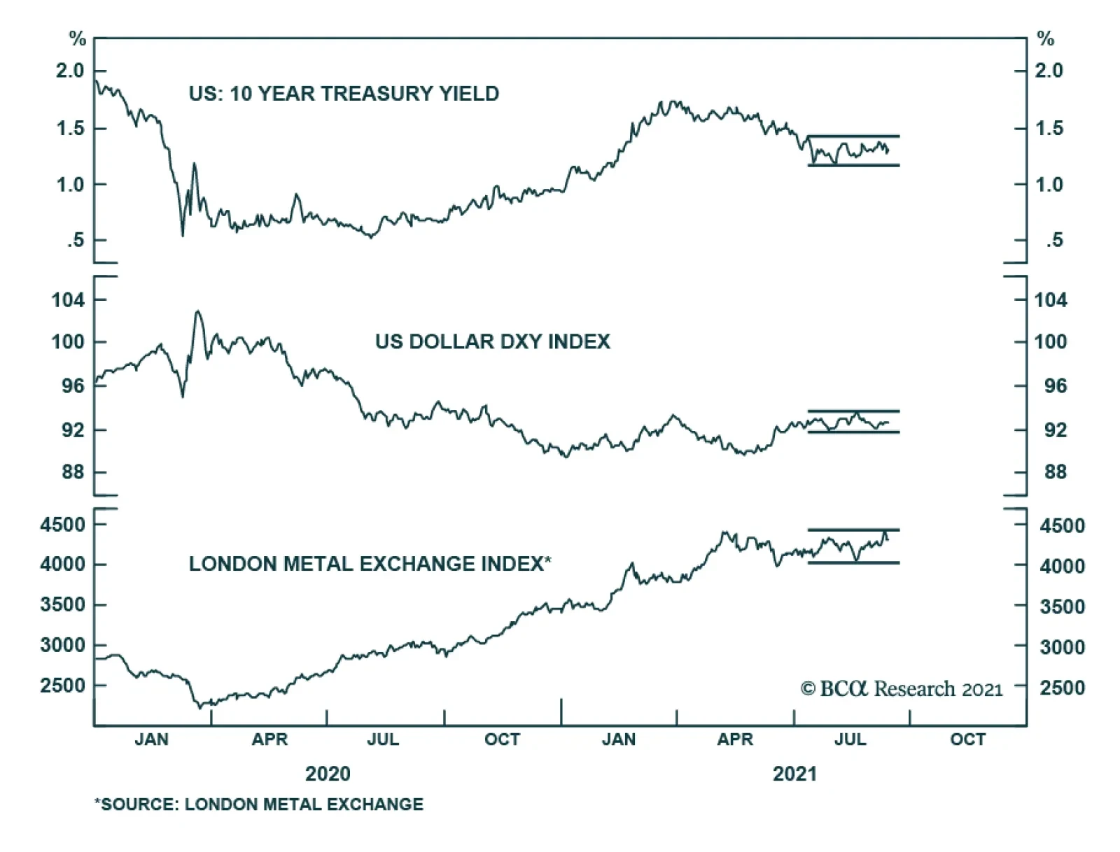
Several key financial assets are failing to send a strong signal and instead have been in a state of stasis. Abstracting from day-to-day moves, Treasury yields, the LMEX, and EUR/USD have not been on a clear trajectory since the beginning of July. Similarly,…
Please note that next Friday September 24 at 10am EDT, we will host a webcast featuring a debate between my colleague Peter Berezin and me. The topic of debate is whether investors should overweight EM in a global portfolio. Please join us by registering via this link. Highlights Chinese internet companies’ ROE will drop, warranting lower equity valuations. However, their ROE and equity multiples will not fall to the levels of listed state-owned enterprises (SOEs). Evergrande’s partial default on its liabilities will likely reinforce credit tightening that has been underway in China over the past 12 months. EM ex-TMT stocks also remain vulnerable. Continue underweighting EM in global equity and credit portfolios. Feature This is the September issue of Charts That Matter. We begin by addressing the issues concerning Chinese internet companies that have been subject to intense debate among investors. We then present key charts on overall EM and various asset classes along with brief commentary. Are Chinese Internet Stocks Investable? There is an ongoing debate in the investment community as to whether Chinese equities in general and Chinese TMT stocks in particular will remain investable. Our short answer is: they will remain investable but mind their valuations. In our opinion, “investable” means that they will from time to time offer medium- and long-term investment opportunities. Our hunch is that they may do so in the future. Nevertheless, we do not think that Chinese TMT stocks presently offer a good buying opportunity. In fact, their share prices have material downside from current levels. In our recent report and webcast, we identified the primary risks to Chinese platform companies: Higher uncertainty about their business model = a higher equity risk premium. Government regulating their profitability like those of mono- and oligopolies = low multiples. These companies performing their social duties in the form of redistributing profits from shareholders to Chinese peoples. Beijing’s involvement in their management and in the prioritization of national and geopolitical objectives over shareholder interests. Risks of delisting from US stock exchanges. Although these companies will remain investable, investors should bear these risks in mind and give careful consideration to what multiples they pay for such stocks. Going forward, Chinese platform companies’ return on equity will be considerably lower than they have been or what their current multiplies imply. A lower return on equity warrants a lower equity multiple. Chart 1Chinese Growth Stocks Are Not Cheap
Chinese Growth Stocks Are Not Cheap
Chinese Growth Stocks Are Not Cheap
On the whole, the current valuations of Chinese internet stocks are still high. Chart 1 shows trailing and 12-month forward P/E ratios for Chinese MSCI Growth Investable Index at 34 and 31, respectively. A downshifting return on equity and high uncertainty around these businesses herald lower equity valuations to come. Besides, in the case of several companies, there are also political underpinnings of this regulatory crackdown. In the case of Alibaba, a mainland government official has recently noted that Alibaba’s chairman, Jack Ma, has been acquiring media companies across the country, and now owns nearly 30 provincial-level media companies, as well as the South China Morning Post in Hong Kong. Beijing will not tolerate the control of or influence over domestic media from anyone outside the inner leadership circle. In this context, it is probable that Alibaba’s businesses will remain subject to severe regulatory pressures. How much lower should these companies’ multiples drop to become attractive? Meaningfully lower, but not to the level of multiples of listed state-owned enterprises (SOEs). Here are two reasons why these platform companies will not trade at multiples of SOEs in China: First, many existing SOEs operate in cyclical industries – commodities, industrials, autos, and banks – that structurally have low equity multiples. By contrast, platform companies operate in non-cyclical sectors that structurally have lower business cycle volatility and, therefore, should trade at higher equity multiples than cyclical industries. Second, many SOEs often had losses because they operated in non-oligopolistic industries. Faced with intense competition they had to cut prices to support volumes and employment. By contrast, platform companies’ profitability will be suppressed and capped by new government policies, but they will remain profitable because they operate in oligopolistic industries. In short, platform companies’ ROEs will be higher than those of traditional/”old-economy” SOEs. All in all, our bias is that platform companies’ valuation multiples will contract further but will not be as low as Chinese, Russian, or Brazilian SOEs have been. Bottom Line: Investors should be mindful of further de-rating in Chinese TMT/platform company stocks. These stocks are not yet out of woods. On Property Market Clampdown And Evergrande's Default Evergrande will likely default on some of its liabilities but there will be a bailout or roll-over of its other debt. Is the partial default by Evergrande, a very large Chinese property developer, a sign of a bottom in Chinese offshore equity and bond markets or will it produce a full-blown credit crisis in China? This is a valid question because both outcomes are possible: a partial bankruptcy can be a culmination of all existing negatives and can trigger policy stimulus that will produce an economic recovery and a major rally (an example of this is the LTCM crisis in the US in 1998); or a partial bankruptcy can lead to a credit crunch escalation becoming a systemic event. An example of this is Lehman Brothers’ bankruptcy in 2008. We will assign the highest probability to a third scenario: the well-telegraphed Evergrande default might not create a systemic crisis or crash. However, it will likely reinforce chronic credit tightening that has been underway in China over the past 12 months. This is negative for China and EM risk assets. Predicting the trajectory and speed of market adjustments – a crisis (wholesale selloff) versus a regular bear market interrupted by short-term rebounds – is impossible. That said, investors should stay put for now. On another note, during our webcast last week, a client asked whether restrictions on property developers’ leverage will hinder their ability and willingness to build. In turn, limited property supply will likely push up property prices, which is contrary to Beijing’s goals of curbing property price inflation. So, why are authorities pursuing this clampdown on property developers? Chart 2Property Starts And Prices Are Positively Correlated
Property Starts And Prices Are Positively Correlated
Property Starts And Prices Are Positively Correlated
This is a very good question, and we have the following observations. In our view, authorities are clamping down on property developers’ leverage because historically there was a strong positive correlation between property starts and house prices (Chart 2). The basis for this positive correlation is that when property developers start more projects, they raise expectations via aggressive marketing of higher prices in future. As a result, people become more inclined to buy houses. In fact, more supply has not precluded property prices from surging and vice versa, as shown in Chart 2. Provided housing valuations (the house price-to-income ratios) are exceptionally high in China and high-income households have been buying multiple apartments, we can argue that (speculative) expectations for higher prices in the future have often been an important driver of demand. So, authorities are probably hoping to break this speculative cycle where higher prices breed higher prices. Aggressive marketing on the part of property developers – creating an atmosphere of euphoria around new property launches – has been an essential driver for surging house price expectations. Hence, authorities’ reasoning is that curbing property developers’ relentless debt financed expansion activity is essential for both (1) to restrain excessive house prices inflation (a social stability goal) and (2) to reduce risks of a future credit crisis (a financial stability goal). Finally, with many households/investors who own multiple properties (that are vacant rather than rented out), authorities hope that diminished expectations for future house price appreciation will bring some of these vacant properties to the market. If this occurs, the supply of residential properties for sale and rent will not drop dramatically despite lower starts by property developers. It is also critical to assess the implications of the ongoing carnage in Chinese offshore corporate bonds, where the epicenter of the selloff is property companies. The fact that property developers are experiencing a credit crunch and will be forced to deleverage has implications for China’s business cycle and other EM economies. Chart 3 illustrates that the periods of rising emerging Asian USD corporate bond yields (shown inverted on the chart) coincide with lower emerging Asian ex-TMT share prices. The link is as follows: the ongoing credit stress and deleveraging by mainland property developers means less construction and diminished demand for raw materials and industrial goods as well as possibly household white goods. There are thus negative implications not only for emerging Asian non-TMT stocks but also for overall EM. Bottom Line: Property construction in China will continue contracting (Chart 4). This will weigh on raw materials and industrial goods demand in China and beyond it. Chart 3Rising Emerging Asian Corporate Bond Yields Point To Lower Asian ex-TMT Stocks
Rising Emerging Asian Corporate Bond Yields Point To Lower Asian ex-TMT Stocks
Rising Emerging Asian Corporate Bond Yields Point To Lower Asian ex-TMT Stocks
Chart 4Chinese Housing: Sales And Starts Are Contracting
Chinese Housing: Sales And Starts Are Contracting
Chinese Housing: Sales And Starts Are Contracting
Arthur Budaghyan Chief Emerging Markets Strategist arthurb@bcaresearch.com Have EM Stocks Bottomed? Investor sentiment on EM equities has plunged close to its previous lows. However, this is a necessary but not sufficient condition to issue a buy recommendation. Critically, EM narrow money growth points to EPS deceleration in the next nine months. Yet, analysts’ net EPS revisions remain elevated and have not yet dropped to negative levels. Our bias is that EM net EPS revisions will be downgraded in the coming months. From a technical perspective, the EM equity index has failed to break above its 200-day moving average. This is a negative technical signal. Chart 5
Have EM Stocks Bottomed?
Have EM Stocks Bottomed?
Chart 6
Have EM Stocks Bottomed?
Have EM Stocks Bottomed?
Chart 7
Have EM Stocks Bottomed?
Have EM Stocks Bottomed?
Chart 8
Have EM Stocks Bottomed?
Have EM Stocks Bottomed?
EM Underperformance Is Broad-Based Not only have EM TMT stocks massively underperformed their global peers, but also EM ex-TMT stocks have been underperforming their global counterparts. Besides, the EM equal-weighted stock index has failed to break above its previous highs. Failure to break above a resistance line is often a bad omen. Finally, EM ex-TMT share prices correlate with the average of AUD, NZD and CAD, and the latter remains in a corrective phase. Chart 9
EM Underperfomance Is Broad-Based
EM Underperfomance Is Broad-Based
Chart 10
EM Underperfomance Is Broad-Based
EM Underperfomance Is Broad-Based
Chart 11
EM Underperfomance Is Broad-Based
EM Underperfomance Is Broad-Based
Red Flags For EM Periods of rising EM USD corporate bond yields coincide with lower EM share prices. EM corporate USD bond yields are rising (shown inverted below) and we expect more upside. Either US Treasury bond yields will rise and EM corporate spreads will stay broadly constant, or EM credit spreads will widen and US Treasury yields will stay range-bound. Either of these scenarios will produce higher EM corporate bond yields and, thereby, herald lower EM equity prices. Further, a breakdown in platinum prices is also raising a red flag for EM risk assets. Chart 12
Red Flags For EM
Red Flags For EM
Chart 13
Red Flags For EM
Red Flags For EM
Have Chinese And Asian Stocks Hit An Air Pocket? Relative performance of emerging Asian equities versus the global stock index has broken below its previous lows. Technically, this entails a protracted period of underperformance. Neither emerging Asian ex-TMT nor Chinese investable ex-TMT share prices have been able to break above their major resistance lines. Failure to break above a resistance line is often a bad omen. Meantime, Chinese onshore stocks and corporate bonds have not sold off enough so that authorities panic and stimulate aggressively. Chart 14
Have Chinese And Asian Stocks Hit An Air Pocket?
Have Chinese And Asian Stocks Hit An Air Pocket?
Chart 15
Have Chinese And Asian Stocks Hit An Air Pocket?
Have Chinese And Asian Stocks Hit An Air Pocket?
Chart 16
Have Chinese And Asian Stocks Hit An Air Pocket?
Have Chinese And Asian Stocks Hit An Air Pocket?
Chart 17
Have Chinese And Asian Stocks Hit An Air Pocket?
Have Chinese And Asian Stocks Hit An Air Pocket?
The US Dollar As A Litmus Test EM risk assets negatively correlate with the US dollar. The broad trade-weighted US dollar is holding above its 200-day moving average. Plus, investor sentiment on the greenback remains negative. Finally, the US dollar moves inversely with relative performance of global cyclical sectors versus global defensives (the dollar is shown inverted on chart below). The ongoing slowdown in China is bullish for the US dollar because the US economy is the least vulnerable to China’s economy. Overall, we expect the US dollar to continue firming in the coming months. Chart 18
The US Dollar As A Litmus Test
The US Dollar As A Litmus Test
Chart 19
The US Dollar As A Litmus Test
The US Dollar As A Litmus Test
Chart 20
The US Dollar As A Litmus Test
The US Dollar As A Litmus Test
Global Mining Stocks, Commodity Currencies And Commodity Prices The share prices of BHP and Rio Tinto have fallen dramatically in absolute terms. This reflects the plunge in iron ore prices and might also be a harbinger of a broader selloff in industrial metals. Further, the average of AUD, NZD and CAD also signals a correction in the broad commodities price index. Chart 21
Global Mining Stocks, Commodity Currencies And Commodity Prices
Global Mining Stocks, Commodity Currencies And Commodity Prices
Chart 22
Global Mining Stocks, Commodity Currencies And Commodity Prices
Global Mining Stocks, Commodity Currencies And Commodity Prices
Chart 23
Global Mining Stocks, Commodity Currencies And Commodity Prices
Global Mining Stocks, Commodity Currencies And Commodity Prices
Is This Decoupling Sustainable? Industrial metals prices were historically correlated with the Chinese business cycle but have decoupled since early this year. Several commodity prices – like coal, steel and aluminum – have shot up due to production shutdowns as a part of the Chinese government’s decarbonization policies. However, it will be extraordinary if commodity prices continue advancing amid a protracted slowdown in China’s old economy. Chart 24
Is This Decoupling Sustainable?
Is This Decoupling Sustainable?
Chart 25
Is This Decoupling Sustainable?
Is This Decoupling Sustainable?
Chinese Commodity Imports Have Contracted Reflecting a demand slowdown and the government’s willingness to dampen commodity price inflation, China has been shrinking its imports of several commodities. It has also released some of its strategic reserves for oil and certain industrial metals. High commodity prices are hurting profit margins of manufacturing and industrial companies leading them to lower output. Beijing is determined to curb and bring down key commodity prices to lessen the negative impact on overall growth and employment. Chart 26
Chinese Commodity Imports Have Contracted
Chinese Commodity Imports Have Contracted
Chart 27
Chinese Commodity Imports Have Contracted
Chinese Commodity Imports Have Contracted
Chinese Stimulus: How Fast And How Large? In recent months, China has been injecting more liquidity into the banking system. Rising commercial banks’ excess reserves at the PBOC point to a bottom in the credit impulse in Q4 of this year. However, the credit impulse leads the business cycle by about nine months. This implies that the economy will not revive before Q2 next year at best. In fact, the aggregate building floor area started and the installation of electricity transmission lines are already contracting and will continue shrinking till Q2 next year. Chart 28
Chinese Stimulus: How Fast And How Large?
Chinese Stimulus: How Fast And How Large?
Chart 29
Chinese Stimulus: How Fast And How Large?
Chinese Stimulus: How Fast And How Large?
Chart 30
Chinese Stimulus: How Fast And How Large?
Chinese Stimulus: How Fast And How Large?
Chart 31
Chinese Stimulus: How Fast And How Large?
Chinese Stimulus: How Fast And How Large?
An Inflation Dichotomy Between China And The US In China, consumer price inflation remains largely contained. However, in the US core consumer price inflation measures are still rising and are above 2%. An optimal exchange rate adjustment to redistribute inflation pressures from the US into China will require a stronger US dollar and a weaker RMB. Chart 32
An Inflation Dichotomy Between China And The US
An Inflation Dichotomy Between China And The US
Chart 33
An Inflation Dichotomy Between China And The US
An Inflation Dichotomy Between China And The US
Inflation And Monetary Tightening In EM ex-China Core measures of inflation have been rising in many Eastern European and Latin American economies. Their central banks will hike interest rates further. This will hurt their domestic demand at a time when the recovery in these economies has been underwhelming. Monetary and fiscal tightening will offset benefits from reopening as their vaccination rates ameliorate. Chart 34
Inflation And Monetary Tightening In EM ex-China
Inflation And Monetary Tightening In EM ex-China
Chart 35
Inflation And Monetary Tightening In EM ex-China
Inflation And Monetary Tightening In EM ex-China
Chart 36
Inflation And Monetary Tightening In EM ex-China
Inflation And Monetary Tightening In EM ex-China
Chart 37
Inflation And Monetary Tightening In EM ex-China
Inflation And Monetary Tightening In EM ex-China
What Drives EM Credit Markets? We downgraded our allocation to EM credit, currencies and equities from neutral to underweight on March 25, 2021. This strategy remains intact. The outlook for the key drivers of EM credit – EM/China business cycles and EM exchange rates – remains downbeat. In fact, EM credit markets – both investment grade and high-yield – have been underperforming their US counterparts and this trend will persist. Chart 38
What Drives EM Credit Markets?
What Drives EM Credit Markets?
Chart 39
What Drives EM Credit Markets?
What Drives EM Credit Markets?
Chart 40
What Drives EM Credit Markets?
What Drives EM Credit Markets?
Chart 41
What Drives EM Credit Markets?
What Drives EM Credit Markets?
Our Relative Equity Value Strategies We have been recommending investors go long Chinese A shares / short Chinese investable stocks since March 4, 2021 and this strategy has been extremely profitable. The same is true for the short Chinese property developers / long overall index and short Chinese investable value stocks versus global value stocks strategies. Finally, our recommendation to be long global industrials / short global materials has so far been flat but we expect it to play out for the reasons elaborated in the linked report. Chart 42
Our Relative Equity Value Strategies
Our Relative Equity Value Strategies
Chart 43
Our Relative Equity Value Strategies
Our Relative Equity Value Strategies
Chart 44
Our Relative Equity Value Strategies
Our Relative Equity Value Strategies
Chart 45
Our Relative Equity Value Strategies
Our Relative Equity Value Strategies
Retail Equity Mania In Korea And Taiwan The retail mania continues in the Korean and Taiwanese stock markets. Retail investors are the main buyers while foreign investors and domestic institutional investors have been scaling back their exposure. Surging margin loans and equity trading volumes in Korea confirm ongoing equity euphoria. We continue overweighting Korean stocks and are neutral on Taiwanese stocks within an EM equity portfolio. The difference in our strategy is due to the potential geopolitical risks that Taiwan is facing. Chart 46
Retail Equity Mania In Korea And Taiwan
Retail Equity Mania In Korea And Taiwan
Chart 47
Retail Equity Mania In Korea And Taiwan
Retail Equity Mania In Korea And Taiwan
Chart 48
Retail Equity Mania In Korea And Taiwan
Retail Equity Mania In Korea And Taiwan
Chart 49
Retail Equity Mania In Korea And Taiwan
Retail Equity Mania In Korea And Taiwan
The Semi Cycle And Risks To The Absolute Performance Of Korean And Taiwanese Stocks DRAM and NAND prices have rolled over. This is a near-term risk to the absolute performance of Korean tech stocks. However, if global industrial stocks outperform, as we expect, Korean share prices will outperform the EM equity benchmark because the KOSPI is a good proxy play on global industrials within the EM universe. Although global semiconductor shortages remain widespread, the 6-month outlook for Taiwanese technology companies has rolled over too. Chart 50
The Semi Cycle And Risks To The Absolute Performance Of Korean And Taiwanese Stocks
The Semi Cycle And Risks To The Absolute Performance Of Korean And Taiwanese Stocks
Chart 51
The Semi Cycle And Risks To The Absolute Performance Of Korean And Taiwanese Stocks
The Semi Cycle And Risks To The Absolute Performance Of Korean And Taiwanese Stocks
Chart 52
The Semi Cycle And Risks To The Absolute Performance Of Korean And Taiwanese Stocks
The Semi Cycle And Risks To The Absolute Performance Of Korean And Taiwanese Stocks
Chart 53
The Semi Cycle And Risks To The Absolute Performance Of Korean And Taiwanese Stocks
The Semi Cycle And Risks To The Absolute Performance Of Korean And Taiwanese Stocks
Footnotes Equities Recommendations Currencies, Credit And Fixed-Income Recommendations
Highlights Since June, 6 structured recommendations achieved their profit targets: short building and construction (XLB) versus healthcare (XLV); long USD/CAD; long USD/HUF; long Nike versus L’Oréal; short corn versus wheat; and short marine transport versus market. Additionally, short AMC Entertainment expired in profit, while short Australian versus Canadian 30-year bonds expired flat. Within the open trades, 3 are in profit. Against this, 2 structured recommendations hit their stop-losses: short Austria versus Chile; and short lead versus platinum. Additionally, short France versus Japan expired in loss. Within the open trades, 6 are in loss. This results in a ‘win ratio’ at a very pleasing 59 percent. Even more commendably, the 9 unstructured recommendations have all anticipated reversals or exhaustions – most notably for the ZAR, BRL, and stocks versus bonds. Feature Chart of the WeekFractal Fragility Correctly Signalled The Exhaustion Of Stocks Versus Bonds
Fractal Fragility Correctly Signalled The Exhaustion Of Stocks Versus Bonds
Fractal Fragility Correctly Signalled The Exhaustion Of Stocks Versus Bonds
A major advance in our understanding of financial markets is that the Efficient Market Hypothesis (EMH) is only partly true. The market is efficient only when a wide spectrum of investment horizons is setting the price, signified by the market having a rich fractal structure. The market is efficient only when a wide spectrum of investment horizons is setting the price, signified by the market having a rich fractal structure. The eponymous Fractal Market Hypothesis (FMH) teaches us that when the fractal structure becomes extremely fragile, the information and interpretation of longer-term investors is missing from the recent price setting. Meaning that the market has become inefficient. When the longer-term investors do re-enter the price setting process, the question is: will they endorse the most recent trend as a justification of a change in the fundamentals. In which case, the trend will continue. Or will they reject it as an unjustified deviation from a fundamental anchor. In which case, the trend will reverse. In most cases, it is the latter: a rejection and a reversal. As most investors are unaware of the FMH, it gives a competitive advantage to the few investors that use it to signal a potential countertrend reversal. On this basis, we have used it – and continue to use it – to identify countertrend investment opportunities with truly excellent results. Fractal Trade Update This a brief review and update of the 29 short-term trades that we have recommended since our last update on 3rd June 2021, including recommendations that were open on that date. The 29 recommendations have comprised 20 structured trades – which include profit-targets, symmetrical stop-losses, and expiry dates – plus a further 9 recommendations without structured exit points. In summary, 6 structured recommendations achieved their profit targets: short building and construction (XLB) versus healthcare (XLV); long USD/CAD; long USD/HUF; long Nike versus L’Oréal; short corn versus wheat; and short marine transport versus market. Additionally, short AMC Entertainment expired in profit, while short Australian versus Canadian 30-year bonds expired flat. Within the open trades, 3 are in profit. Against this, 2 structured recommendations hit their stop-losses: short Austria versus Chile; and short lead versus platinum. Additionally, short France versus Japan expired in loss. Within the open trades, 6 are in loss. This results in a ‘win ratio’ at a very pleasing 59 percent – counting a win as achieving the profit target, a loss as hitting the (symmetrical) stop-loss, and pro-rata for partial wins and losses. Even more commendably, the 9 unstructured recommendations have all anticipated reversals or exhaustions. The sections below review the structured and unstructured recommendations in chronological order. The 20 Structured Trades 1. 6th May: Short Building and Construction (PKB) vs. Healthcare (XLV) Achieved its profit target of 15 percent. 2. 6th May: Short MSCI France vs. Japan Expired after three months in partial loss but went on to become very profitable – implying that a longer holding period was required (Chart I-2). Chart I-2Short France Versus Japan Became Very Profitable
Short France Versus Japan Became Very Profitable
Short France Versus Japan Became Very Profitable
3. 13th May: Long USD/CAD Achieved its profit target of 3.7 percent and went on to reach a high-water mark of 5.7 percent. 4. 20th May: Long 10-year T-bond vs. TIPS Open, in profit, having reached a high-water mark of 2.7 percent (versus a 3.6 percent target). 5. 3rd June: Short MSCI Austria vs. Chile Hit its stop-loss of 7 percent, albeit after previously reaching a high-water mark of 5.3 percent – implying that the profit target needed to be tighter. 6. 10th June: Short AMC Entertainment Expired at a 4 percent profit, having reached a high-water mark of 65.3 percent (versus a 100 percent target) (Chart I-3). Chart I-3Fractal Analysis Works Very Well For Meme Stocks
Fractal Analysis Works Very Well For Meme Stocks
Fractal Analysis Works Very Well For Meme Stocks
7. 10th June: Long USD/HUF Achieved its 3 percent profit target, before continuing to a high-water mark of 7.6 percent (Chart I-4). Chart I-4HUF/USD Corrected By 7.6 Percent
HUF/USD Corrected By 7.6 Percent
HUF/USD Corrected By 7.6 Percent
8. 17th June: Long Nike vs. L’Oréal Achieved its 9 percent profit target, before continuing to a high-water mark of 31.3 percent (Chart I-5). Chart I-5L’Oréal Underperformed Nike By 31 Percent
L'Oreal Underperformed Nike By 31 Percent
L'Oreal Underperformed Nike By 31 Percent
9. 24th June: Short Corn vs. Wheat Achieved its 12 percent profit target, before continuing to a high-water mark of 38.7 percent (Chart I-6). Chart I-6Corn Underperformed Wheat By 39 Percent
Corn Underperformed Wheat By 39 Percent
Corn Underperformed Wheat By 39 Percent
10. 1st July: Short US REITs vs. Utilities Open, in profit, having reached a high-water mark of 3 percent (versus a 5 percent target). 11. 8th July: Short Marine Transport vs. Market Achieved its profit target of 16.5 percent. 12. 15th July: Short Lead vs. Platinum Hit its stop loss of 6.4 percent. 13. 15th July: Short Australia vs. Canada 30-year T-Bonds Expired flat. 14. 5th August: Short Tin vs. Platinum Open, in loss, albeit having reached a high-water mark of 9.3 percent (versus a 16.5 percent target). 15. 12th August: Long MSCI Hong Kong vs. MSCI World Open, in loss. 16. 12th August: Long New Zealand vs. Netherlands Open, in loss. 17. 19th August: Short India vs. China Open, in loss (Chart I-7). Chart I-7The Outperformance Of India Versus China Is Fractally Fragile
The Outperformance Of India Versus China Is Fractally Fragile
The Outperformance Of India Versus China Is Fractally Fragile
18. 26th August: Short Sugar vs. Soybeans Open, in loss. 19. 2nd September: Short Aluminum vs. Gold Open, in loss (Chart I-8). Chart I-8The Outperformance Of Base Metals Versus Precious Metals Is Fractally Fragile
The Outperformance Of Base Metals Versus Precious Metals Is Fractally Fragile
The Outperformance Of Base Metals Versus Precious Metals Is Fractally Fragile
20. 9th September: Short US Medical Equipment vs. Healthcare Services Open, in profit. The 9 Unstructured Trades 1. 10th June: Short ZAR/USD ZAR/USD subsequently corrected by 12 percent. 2. 24th June: Short Copper Copper’s rally subsequently exhausted. 3. 1st July: Short MSCI ACWI vs. 30-year T-bond The rally in stocks versus bonds has subsequently exhausted (Chart of the Week). 4. 8th July: Short BRL/COP BRL/COP subsequently corrected by 4 percent. 5. 8th July: Short Saudi Tadawul All-Share vs. FTSE Malaysia All Share KLCI The rally in Saudi Arabian equities versus Malaysian equities subsequently exhausted. 6. 12th August: Long NOK/GBP NOK/GBP has subsequently rallied by 3 percent. 7. 26th August: Short Hungary vs. EM Hungary’s outperformance is losing steam. 8. 26th August: Short USD/PLN USD/PLN subsequently corrected by 3 percent. 9. 2nd September: Short Trade Weighted US Dollar Index The dollar rally is meeting near-term resistance. Dhaval Joshi Chief Strategist dhaval@bcaresearch.com Mohamed El Shennawy Research Associate Fractal Trading System Fractal Trades 6-Month Recommendations Structural Recommendations Closed Fractal Trades Closed Trades Asset Performance Equity Market Performance Indicators To Watch - Bond Yields Chart II-1Indicators To Watch - Bond Yields ##br##- Euro Area
Indicators To Watch - Bond Yields - Euro Area
Indicators To Watch - Bond Yields - Euro Area
Chart II-2Indicators To Watch - Bond Yields ##br##- Europe Ex Euro Area
Indicators To Watch - Bond Yields - Europe Ex Euro Area
Indicators To Watch - Bond Yields - Europe Ex Euro Area
Chart II-3Indicators To Watch - Bond Yields ##br##- Asia
Indicators To Watch - Bond Yields - Asia
Indicators To Watch - Bond Yields - Asia
Chart II-4Indicators To Watch - Bond Yields ##br##- Other Developed
Indicators To Watch - Bond Yields - Other Developed
Indicators To Watch - Bond Yields - Other Developed
Indicators To Watch - Interest Rate Expectations Chart II-5Indicators To Watch - Interest Rate Expectations
Indicators To Watch - Interest Rate Expectations
Indicators To Watch - Interest Rate Expectations
Chart II-6Indicators To Watch - Interest Rate Expectations
Indicators To Watch - Interest Rate Expectations
Indicators To Watch - Interest Rate Expectations
Chart II-7Indicators To Watch - Interest Rate Expectations
Indicators To Watch - Interest Rate Expectations
Indicators To Watch - Interest Rate Expectations
Chart II-8Indicators To Watch - Interest Rate Expectations
Indicators To Watch - Interest Rate Expectations
Indicators To Watch - Interest Rate Expectations
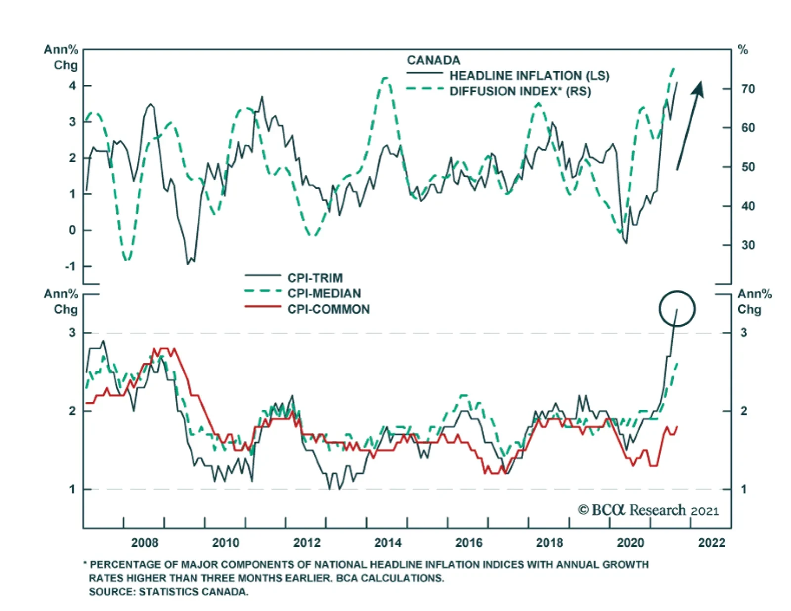
Inflationary pressures are likely to keep the Bank of Canada at least as hawkish - if not more hawkish - than the Fed. Headline CPI accelerated to a 18-year high of 4.1% y/y in August. The diffusion index's extremely elevated reading is in line with…
Highlights Canada has been a G10 leader in innoculating its population. This should allow economic activity to resume, boosting the CAD/USD. A cresting in COVID-19 infections should permit the Bank of Canada to reintroduce a hawkish bias in upcoming policy meetings. While the CAD/USD is likely to strengthen, it will underperform at the crosses. Feature The Canadian dollar has been rather resilient amid broad US dollar strength this year. While the DXY is up 2.8%, the loonie has still managed to outperform marginally. This is a remarkable feat, given that the Canadian dollar is very much a procyclical currency, and is usually held hostage by broad movements in the trade-weighted dollar. The vaccination campaign in Canada has been very successful, pinning the country as a leader in the G10. This has partly helped curtail the number of new infections from the Delta variant of COVID-19, allowing the economy to reopen faster than its peers (Chart I-1). This is important because there has been a very clear correlation between currency markets and vaccination rates. In general, the countries with higher vaccination rates (UK, Canada, US) have seen better currency performance than countries with the worst vaccination rates (Australia, Japan, Chart I-2). Chart I-1Vaccinations Have Worked For Canada
Vaccinations Have Worked For Canada
Vaccinations Have Worked For Canada
Chart I-2CAD/USD An Outperformer This Year
An Update On The Canadian Dollar
An Update On The Canadian Dollar
In our October 20, 2020 report, we suggested the loonie will hit 82 cents, a level around which it peaked this year. Going forward, the key question is whether Canada’s vaccination success will allow the loonie to eventually overtake these highs. The outlook hinges on two critical calls: What happens to natural resource prices, specifically crude oil; and the Bank of Canada’s (BoC) monetary policy stance relative to the Federal Reserve. Our bias is that a cresting in COVID-19 infections should allow the BoC to reintroduce a hawkish bias in upcoming policy meetings, while oil prices should stay well bid over a cyclical horizon. This will allow the loonie to strengthen in a 12-18 month timeframe. This said, we also expect the loonie to underperform other commodity currencies. Improving Domestic Conditions The latest GDP report out of Canada was surprisingly weak, but by most measures, this represents a temporary blip. Canada is adding jobs at the fastest pace in decades, an average of 102 thousand per month this year. This is leading to the quickest recovery in the unemployment rate on record (Chart I-3). A total of 18.9 million Canadians are currently employed, a smidgen away from the February 2020 high of 19.1 million. At the current pace of job additions, employment should overtake pre-pandemic levels during the next couple of job reports. There remains a sizeable deficit of jobs in service-producing industries (Chart I-4). This suggests that as mobility trends improve, job gains should accrue. The majority of job losses since the pandemic have been in the accommodation, food services, wholesale trade, and retail trade sectors. Chart I-3Canadians Are Quickly Getting Back ##br##To Work
Canadians Are Quickly Getting Back To Work
Canadians Are Quickly Getting Back To Work
Chart I-4Pent Up Recovery In Services Jobs Still Ahead of Us
An Update On The Canadian Dollar
An Update On The Canadian Dollar
Strong employment growth has spurred an improvement in consumer demand. Consumer confidence is rebounding in Canada. Retail sales are robust, having handily overtaken pre-pandemic levels. Mortgage credit has also rebounded amidst low interest rates (Chart I-5). Chart I-5Lower Rates Are Boosting Household Borrowing
Lower Rates Are Boosting Household Borrowing
Lower Rates Are Boosting Household Borrowing
It is therefore no surprise that inflationary pressures have begun to surface in the Canadian economy. In the latest Business Outlook Survey, capacity pressures were at a decade high. Firms reported that shortages in skilled and specialized labor will persist. There are obviously fewer workers with the skills needed in a post-COVID-19 world, but government support schemes have also eaten up labor supply in traditionally fluid labor demand/supply sectors such as hospitality. Meanwhile, supply bottlenecks have also led to production constraints. This is beginning to show up in the key inflation prints to which the BoC pays attention (Chart I-6). Both the trimmed-mean and median CPI are well above the midpoint of the central bank’s 1%-3% target. While the BoC maintains that some upward pressure on inflation is due to temporary factors, the Canadian unemployment rate is declining faster than that in the US, giving scope for the BoC to normalize policy before the Fed, and putting upward pressure on the CAD (Chart I-7). Asset purchases have already been cut in half from C$4 billion to C$2 billion a week. Chart I-6CPI Is Above Midpoint Of The BoC Target Range
CPI Is Above Midpoint Of The BoC Target Range
CPI Is Above Midpoint Of The BoC Target Range
Chart I-7Canada Versus US ##br##Employment
Canada Versus US Employment
Canada Versus US Employment
Meanwhile, house prices are rising quite strongly. The rise in prices has been very broad based, making housing unaffordable for most Canadians (Chart I-8). Residential investment represents almost 9% of Canadian GDP, a significant chunk of aggregate demand (Chart I-9). This suggests that if left unchecked, a housing market bust will deal a severe blow to the Canadian economy. Chart I-8Surging Home Prices A Headache For The BoC
Surging Home Prices A Headache For The BoC
Surging Home Prices A Headache For The BoC
Chart I-9Canadian GDP Is Highly Exposed To Residential Housing
Canadian GDP Is Highly Exposed To Residential Housing
Canadian GDP Is Highly Exposed To Residential Housing
In a nutshell, despite the BoC standing aside this week, the path of least resistance for Canada is towards tighter monetary policy. This dovetails with the recommendation from our Global Fixed Income Strategy colleagues, who recommend an underweight position in Canadian bonds. Elections And Fiscal Policy A snap federal election will be held in Canada on September 20. Prime Minister Justin Trudeau’s bet is that an astute handling of the pandemic, combined with massive fiscal stimulus, gives him a legitimate shot at a majority government. During his Throne Speech last year, he vowed to do “whatever it takes” to support people and businesses throughout the crisis. The rationale is to deliver on this promise going into 2022. The Conservatives have taken a slight lead over the Liberals in the opinion polls, even though a similar state of affairs did not secure them a victory back in the 2019 election (Chart I-10). In general, the Liberals are pushing for more fiscal spending, but are also focused on issues that Canadians care about, such as housing and climate change. The Conservatives, on the other hand, are focused on balancing the budget, which could jeopardize the nascent economic recovery that Canada currently enjoys. Historically, minority governments tend to be positive for the Canadian dollar, while majority governments generally nudge the loonie lower post-election (Chart I-11). In the current context, a Liberal minority will allow fiscal policy to stay easy, giving room for the BoC to curtail accommodative monetary conditions. Tighter monetary policy and easy fiscal policy tend to be positive for a currency in a Mundell-Fleming framework. Meanwhile, a Conservative minority might dial back a little on fiscal stimulus, but not by much due to political gridlock. Chart I-10Polling Ahead Of The ##br##Election
An Update On The Canadian Dollar
An Update On The Canadian Dollar
Chart I-11Historically, The Market Likes A Minority Government
Historically, The Market Likes A Minority Government
Historically, The Market Likes A Minority Government
In a nutshell, a Liberal minority is likely to be positive for the loonie. Should the Trudeau government win a majority, then fiscal policy might become much more profligate, which will boost inflation expectations in Canada and depress real rates. This will be negative for the loonie, unless the BoC aggressively tightens monetary policy. The Canadian Dollar And Crude Oil The above synopsis highlights that a key driver of the Canadian dollar is the BoC’s monetary policy stance, particularly vis-à-vis the Fed. The other critical variable is what happens to natural resource prices, specifically crude oil. The loonie has a strong correlation with the price of oil, chiefly the Western Canadian Select (WCS) blend (Chart I-12). Chart I-12The Loonie Tracks WCS Oil Prices
The Loonie Tracks WCS Oil Prices
The Loonie Tracks WCS Oil Prices
Going forward, the path for oil prices will be highly dependent on the interplay between demand and supply, especially given the various waves of COVID-19. Oil demand tends to follow the ebbs and flows of the business cycle, with over 60% of global petroleum consumed by the transportation sector. A population under lockdown is negative for crude. Nonetheless, our commodity strategists expect oil prices to average $73 per barrel next year, around today’s levels for Brent, as supply dynamics adjust to the current paradigm. With the WCS blend trading at a discount to this price, there is room for upside surprises due to the following reasons: Investment in the Canadian oil sands has dropped tremendously, while the environmental efficiency (emissions per barrel) has been improving (Chart I-13). This has narrowed the spread between WCS and Brent, something that is likely to persist. Canadian producers have gained market share in the heavy crude oil market, on the back of a drop in Venezuelan production. Production cuts in Alberta have also helped mitigate the oversupply of heavy crude. Canadian oil exports remain near record highs, even though the US is rapidly becoming energy independent (Chart I-14). A lot of refining capacity in the US has been fine-tuned to handle the cheaper, heavier blend from Canada. Finally, pipeline capacity remains a major hurdle in Canada but it is slated to ease. The Trans Mountain Expansion project (590K additional barrels), connecting Alberta to the Westridge Marine Terminal and Chevron refinery in Burnaby, is slated to be competed by the end of 2022. Both the Liberals and the Conservatives support the project. This could narrow the discount between WCS and WTI crude oil. Chart I-13Will A Cleaner Oil Sector See A Bottom In Investments?
An Update On The Canadian Dollar
An Update On The Canadian Dollar
Chart I-14The Energy Independent US Still Likes Canadian Oil
The Energy Independent US Still Likes Canadian Oil
The Energy Independent US Still Likes Canadian Oil
Netting it all out, we expect crude oil prices to stay firm, in line with our colleagues at the Commodity and Energy Strategy team, and the Canadian discount not to widen by much. This should provide modest upside for the Canadian dollar, which has lagged the improvement in terms of trade (Chart I-15). It is remarkable that long-term portfolio flows into Canadian assets have started picking up, a sign of bargain hunting by international investors (Chart I-16). This should provide a modest tailwind to the Canadian dollar over the next 9-to-12 months. Chart I-15The Loonie Is Undervalued Based On Terms Of Trade
The Loonie Is Undervalued Based On Terms Of Trade
The Loonie Is Undervalued Based On Terms Of Trade
Chart I-16Will The Rising Capital Inflow Provide A Support For The Loonie?
Will The Rising Capital Inflow Provide A Support For The Loonie?
Will The Rising Capital Inflow Provide A Support For The Loonie?
Investment Implications We expect the CAD/USD to break above the recent 82-cent high, towards 85 and eventually 90 cents. The key catalysts are both favorable interest rates versus the US and a gradual recovery in WCS oil prices as global economic activity picks up. According to our fundamental models, the CAD is still very undervalued (Chart I-17). Chart I-17The Loonie Is Undervalued By 19% According To Our Model
The Loonie Is Undervalued By 19% According To Our Model
The Loonie Is Undervalued By 19% According To Our Model
Chart I-18The NOK Will Lead The CAD ##br##For Now
The NOK Will Lead The CAD For Now
The NOK Will Lead The CAD For Now
Relative to other commodity currencies, the CAD should lag the AUD as the green energy revolution exhibits staying power, which will benefit metals more than oil over the longer term. In the shorter term, Canadian crude is likely to remain trapped in the oil sands for now, while North Sea crude will face fewer transportation bottlenecks. This suggests that the path of least resistance for the CAD/NOK is down (Chart I-18). Rising oil prices are a terms-of-trade boost for oil exporters, but lead to demand destruction for oil importers. In general, a strategy for playing oil upside is to be long a basket of energy producers versus energy consumers. This suggests that the CAD has upside against the euro, the Indian rupee, and the Turkish lira. But given that the latter currencies are oversold, we will wait for a better buying opportunity. Chester Ntonifor Foreign Exchange Strategist chestern@bcaresearch.com Trades & Forecasts Forecast Summary Core Portfolio Tactical Trades Limit Orders Closed Trades
9 September 2021 at 10:00 EDT Emerging Markets Strategy/Webcast EM/China: See The Forest For The Trees 9 September 2021 at 21:00 EDT Emerging Markets Strategy/Webcast Emerging Asia: See The Forest For The Trees Highlights Structural inflation in India has abated noticeably since the mid-2010s. The cyclical inflation outlook is also benign (Chart 1). As such, the specter of inflation does not pose a material threat to this stock market. Indian stocks’ high valuation is a risk; yet this bourse’s structurally high premium relative to EM will likely continue as India’s earnings growth will stay strong and its volatility low. Investors should stay overweight Indian stocks in an EM equity portfolio, and local currency bonds in an EM domestic bond portfolio. Feature Chart 1India's Cyclical Inflation Outlook Is Benign
Can Inflation Upset The Indian Applecart?
Can Inflation Upset The Indian Applecart?
In a recent Emerging Markets Strategy report we showed that India stands out as the only country in Asia with rather high inflation. Indeed, core CPI in India, at about 6%, is higher than all other major EM and DM countries, save Turkey and Russia. The question is, with the economy re-opening, will Indian inflation rise further and thus derail the rally in Indian equities? Our research indicates that both the structural and cyclical inflation outlook for India remains benign. Our models for headline and core CPI both point to lower inflation in the coming months (Chart 1). As such, inflation is unlikely to pose any major threat to Indian assets in the foreseeable future. Investors should remain overweight Indian stocks in an EM equity portfolio. Fixed-income investors should also continue to overweight Indian local bonds in an EM domestic bond portfolio. Currency traders should favor the rupee versus its EM peers. Inflation Outlook: Structural … The first of the two principal drivers of India’s structural inflation trend is the country’s productivity. The stronger the productivity gains, the more contained has been its structural inflation. The second major driver is broad money supply. The higher the money growth, the steeper have been inflationary pressures – especially during those periods when productivity gains were timid. Top panel of Chart 2 shows that up until the early-2000s, India’s average productivity gains used to be rather low: of the order of 3% annually. That period was also marked by very strong broad money growth: at times, the latter would rise to 20% annually (Chart 2, bottom panel). This growth was due to chronically high fiscal deficits that were monetized, coupled with intermittent surges in bank credit. Chart 2Slower Money Supply Amid Decent Productivity Led To A Structural Decline In Inflation
Can Inflation Upset The Indian Applecart?
Can Inflation Upset The Indian Applecart?
The consequence of persistently low productivity gains amid strong money supply was structurally high inflation, with occasional flare-ups well into double digits (Chart 2). Chart 3Steady Fall In Budget Deficits In Post-GFC Era
Can Inflation Upset The Indian Applecart?
Can Inflation Upset The Indian Applecart?
From the early 2000s, however, that dynamic began to change. A surge in capital spending in infrastructure and other productive capacity propelled India’s productivity trend up by several notches. In the past 15 years, the productivity growth rate has averaged around 6% a year; even though more recently that rate has slowed. In the post-GFC period, both major sources of money creation were stymied. First, successive Indian governments, regardless of political affiliation, adopted a rather tight fiscal policy. They reined in fiscal outlays substantially. Non-interest expenditures of the central government fell from 14% of GDP in 2010 down to 9% by 2019, just before the pandemic (Chart 3, top panel). As a result, during that period, fiscal and primary deficits narrowed significantly: from almost 7% of GDP to 3%, and from almost 4% of GDP to nearly zero, respectively (Chart 3, bottom panel). In addition, a myriad of reasons1 caused commercial bank credit to decelerate materially – from as high as 30% before the GFC to a mere 6% by 2019. The upshot of all this was a secular decline in broad money growth. That eventually led India’s inflationary pressures to decline structurally since the mid-2010s (Chart 2, bottom panel, above). Going forward, those major drivers (both productivity and money growth) will warrant a benign inflation outlook. The country has been continuing its high capital spending for over a decade now (around 30% to 35% of GDP, a rate second only to China). This year, India’s capital spending has already revived. Other corroborating indicators such as imports of capital goods have also recovered robustly. This indicates a new capex cycle is unfolding. Therefore, odds are that the productivity growth rate will stay decent. Prudent fiscal policy, on the other hand, will keep the money growth in check. Chart 4Low Wages Will Help Keep Inflation Subdued
Can Inflation Upset The Indian Applecart?
Can Inflation Upset The Indian Applecart?
Finally, wage pressures in India will also stay muted. In rural areas, both farm and non-farm nominal wages have been growing at a very slow pace; and are now flirting with outright contraction (Chart 4, top panel). Industrial wage expectations have also been tepid over the past several years (Chart 4, bottom panel). The broader picture is unlikely to change in the future as tens of millions of young people continue to join the work force every year. Taken together, these factors point to subdued structural inflation ahead. … And Cyclical The chance that inflation in India will flare up over a cyclical horizon (12 months) is also low: First, one of the major cyclical drivers of inflation in India, the government’s food procurement prices (called Minimum Support Price or MSP) have stayed low for the past several years. The announced MSPs for some of the crops for the 2021-22 agriculture season (July-June) have also shown no marked increase. This will surely help keep the wholesale prices for food in check, which, in turn, will keep a lid on consumer inflation expectations and ultimately on both headline and core consumer inflation (Chart 5). Second, the country’s money growth is also unlikely to witness an immediate, major boom. While the budget deficit has swelled over the past year or so, odds are that the government will revert to the tighter fiscal stance that prevailed over the past decade – as soon as the pandemic is brought under control. Chart 6 shows that government non-interest spending leads core CPI. Reduced expenditure growth will cap inflation. Chart 5Low Food Prices Will Keep A Lid On Inflation Expectations
Can Inflation Upset The Indian Applecart?
Can Inflation Upset The Indian Applecart?
Chart 6Slowing Fiscal Spending Will Cap Core Inflation
Can Inflation Upset The Indian Applecart?
Can Inflation Upset The Indian Applecart?
Chart 7Fuel Price Inflation Is Set To Decelerate
Can Inflation Upset The Indian Applecart?
Can Inflation Upset The Indian Applecart?
The other contributor to money growth, bank credit, is expected to accelerate; but its expansion will not be rapid as banks are still suffering from elevated NPLs. Third, fuel price inflation has likely peaked in India. Last year authorities imposed substantial new taxes on local gasoline and diesel prices, which artificially raised consumer inflation (Chart 7). Since there is little chance of new fuel levies this year and given that crude prices are unlikely to rise much from the current levels (which is EMS’s view), fuel inflation will subside materially next year. And as fuel costs often eventually spill into core inflation, this deceleration will help check the latter as well. Finally, given the massive negative output gap that opened up in the economy during the pandemic-related lockdowns, it will take a while before the economy overheats again. Odds are therefore low that India’s inflation will accelerate much in the coming months. Notably, our cyclical inflation models for both headline and core CPI – built using the drivers discussed above – also vouch for a modest decline in inflation (Chart 1, on page 1). Does Inflation Hurt Stocks? Currently, the Indian economy is not plagued by any major excesses and therefore has no major macro vulnerability. The only potential vulnerability that the economy and stock markets face stem from any possible rise in inflation. Notably, the primary driver of Indian stocks is economic growth and corporate profits. Historically, inflation (CPI) in low- and mid-single digits did not hurt Indian stocks. However, once inflation approached a high-single digit mark (usually 8%), a sell-off in stocks typically occurred. Chart 8 shows that, during India’s high-inflation era (from 1994 to 2013), every time CPI breached the 8% mark (the dotted line in the chart), stocks fell in absolute USD terms, or at the minimum, were weak. Chart 8Indian Stocks Faced Major Headwinds When Headline CPI Approached 8%
Can Inflation Upset The Indian Applecart?
Can Inflation Upset The Indian Applecart?
Chart 9In Recent Years Inflation Has Ceased To Be A Headwind For Indian Stocks
Can Inflation Upset The Indian Applecart?
Can Inflation Upset The Indian Applecart?
Interestingly, the above correlations have changed dramatically since 2014. The top panel of Chart 9 shows that core CPI does not have any steady correlation with stock prices anymore. And core PPI, in fact, has developed a strong positive correlation with stocks (Chart 9, bottom panel) – in complete reversal of the dynamics that prevailed in the previous two decades. The adverse impact of inflation on stock prices is via multiple compression, as rising interest rates lead to equity de-rating. What’s notable is that the multiple compressions do not begin as soon as a rate hike cycle commences. Rather, it takes a meaningful rise in interest rates before it starts to hurt multiples (Chart 10). Given the above, one can expect a material multiple compression only if inflation rises a few notches above the central bank’s target (Chart 11). The odds of that happening now are low. Therefore, policy rates will remain lower for longer, and stock valuations will remain at a higher level than usual. Chart 10Interest Rates Usually Needed To Rise Several Points Before Stock Multiple Compression Began
Can Inflation Upset The Indian Applecart?
Can Inflation Upset The Indian Applecart?
Chart 11India's Inflation Remains Within RBI Target Bands
Can Inflation Upset The Indian Applecart?
Can Inflation Upset The Indian Applecart?
Incidentally, thanks to material rate cuts, real interest rates paid by Indian firms – deflated by both core producer and core consumer prices – have plummeted. Lower real rates benefit the borrowers (i.e., non-financial listed companies) (Chart 12). The bottom line is that, with India’s inflation now being both structurally low (by Indian history) and cyclically tame, it is unlikely to be a cause of any major equity sell-off. Are Indian Equity Valuations Justified? With a trailing P/E of 31, and P/Book of 3.9, there is no doubt that Indian stocks are expensive. Yet, part of the multiple expansion in India, like most other DM countries, has been a direct outcome of a sharply lower policy rate, as discussed above. Incidentally, if one were to look at the cyclically adjusted valuation measures (CAPE), Indian markets appear to be only moderately expensive (Chart 13, top panel). Chart 12Lower Real Rates Boost Firms' Profits And Warrant Higher Stock Prices
Can Inflation Upset The Indian Applecart?
Can Inflation Upset The Indian Applecart?
Chart 13Cyclically-Adjuted P/E Ratio
Can Inflation Upset The Indian Applecart?
Can Inflation Upset The Indian Applecart?
Chart 14Relative Equity Multiples: India vs. EM
Can Inflation Upset The Indian Applecart?
Can Inflation Upset The Indian Applecart?
In terms of relative valuation vis-à-vis the rest of the EM, Indian stocks continue to command a high premium: around 90% in the case of P/E and P/Book multiples. (Chart 14). In terms of cyclically adjusted valuation (CAPE) relative to the EM, India also appears to be quite pricey (Chart 13, bottom panel). The bottom line is that Indian stocks are expensive; and that is a risk to this bourse. A pertinent question here is whether India still merits the structurally high premium that it has enjoyed over the years relative to its peers. Our answer is in the affirmative. One reason this bourse has continued to enjoy a high premium, especially since the mid-2000s, is because the growth of Indian corporate earnings has been superior to those of most other EM countries. But more importantly, the volatility of those earnings has been much lower than its peers. These strong, yet less volatile earnings are what investors have been willing to pay a premium for. Going forward, we see both traits remaining intact. Long-term growth in India will likely stay as one of the highest in the EM world. Earnings volatility is also unlikely to change anytime soon. The reason is, first, lower inflation going forward will entail relatively lower interest rate volatility, and therefore, lower business cycle / earnings volatility. Second, India’s currency volatility will also likely stay lower. Part of the reason is the near absence of foreign investors on government bonds in India. This has precluded India from suffering a major currency sell-off during global risk-off episodes – as few bond investors head for the exit. We discussed this and several other issues related to Indian bond markets and the rupee in much greater detail in our last report on India. Taken together, lower volatility in both local currency earnings and the exchange rate entails lower overall volatility for US dollar-denominated earnings. That will help Indian stocks’ premium to stay elevated beyond any short-term fluctuations. Inflation And The Rupee Chart 15The Rupee Strengthens When Relative Inflation In India Versus US Decelerates
Can Inflation Upset The Indian Applecart?
Can Inflation Upset The Indian Applecart?
The impact of inflation on the rupee is nuanced. It’s not the absolute level of India’s CPI or PPI that affects the rupee-dollar exchange rate; it’s the relative inflation between these two economies that does so. Chart 15 shows that the rupee usually strengthens versus the dollar when inflation in India falls relative to that of US (shown in inverted scale in the chart). These relative inflation dynamics could also provide insight into the exchange rate outlook. Chart 16 shows that the rupee is currently 10% cheaper when measured against what would be its “fair value” (Chart 16, bottom panel). The fair value has been derived from a regression analysis of the exchange rate on the manufacturers’ relative producer prices of the two countries. Investment Recommendations Indian stocks have decisively broken out both in absolute terms and relative to their EM counterparts (Chart 17). Notably, the outperformance is not just due to a sell-off in Chinese TMT stocks. It is even more impressive relative to the ‘mainstream EM’ bourses (i.e., EM excluding China, Taiwan and Korea). Given India’s relatively superior structural and cyclical backdrops, this outperformance should continue for a while (Chart 17, bottom two panels). Investors should stay overweight this bourse in an EM equity portfolio. Chart 16The Indian Rupee Is Now About 10% Below Its Fair Value Versus The US Dollar
Can Inflation Upset The Indian Applecart?
Can Inflation Upset The Indian Applecart?
Chart 17Indian Stocks' Breakout Is Decisive And The Relative Outperformance Is Broad-based
Can Inflation Upset The Indian Applecart?
Can Inflation Upset The Indian Applecart?
Chart 18Higher Carry And A Better Currency Outlook Will Lead To Indian Domestic Bonds' Outperformance
Can Inflation Upset The Indian Applecart?
Can Inflation Upset The Indian Applecart?
The medium-term outlook for the rupee is also positive. The currency is cheap and competitive –an added incentive for both foreign direct investors and portfolio investors. Finally, Indian domestic bonds offer value – both relative to their EM peers and the US treasuries. 10-year government bonds yields, at 6.2%, offer an enticing 480 basis points over similar duration US Treasuries. Given the sanguine rupee and inflation outlooks, Indian bonds will likely continue to outperform EM local bonds (Chart 18). Investors should stay on with our recommendation of overweighting India in an EM local currency bond portfolio. Rajeeb Pramanik Senior EM Strategist rajeeb.pramanik@bcaresearch.com Footnotes 1 The reasons include a surge in bank NPLs, lack of bankable projects, a kind of policy paralysis resulting in delay in various regulatory clearances for capital projects etc.
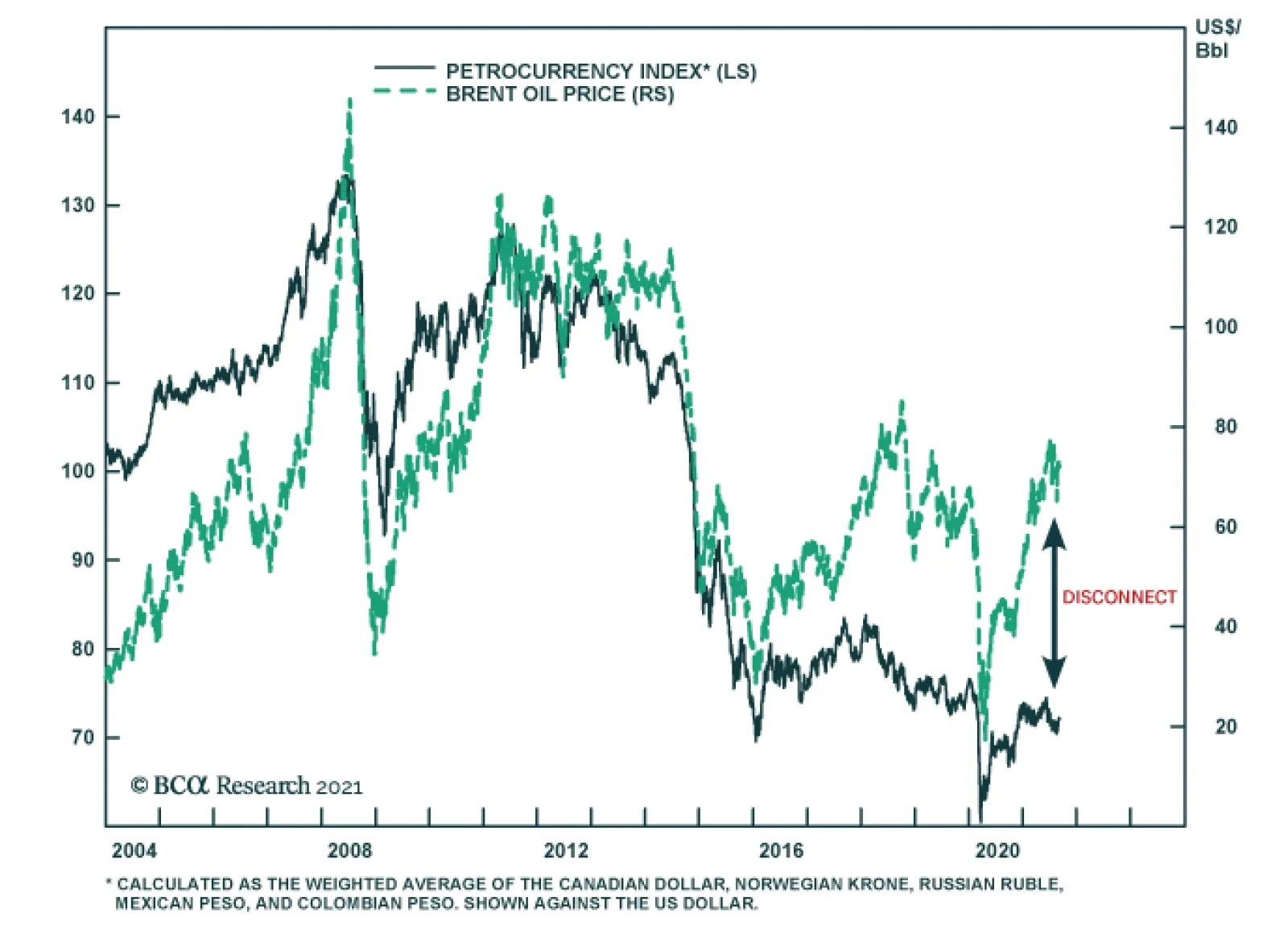
Two factors explain why petrocurrencies have failed to benefit fully from the sharp increase in oil prices this year. First, our foreign exchange strategists previously highlighted that in recent years, the positive correlation between oil prices and…
Highlights A trio of ECB hawks raised the prospect of an ECB taper. In the past, the current set of economic conditions in the Euro Area would have prompted the ECB to tighten policy. A potential economic deceleration this fall, the transitory nature of the Eurozone’s inflation spike, and the level of inflation expectation in the region limit the ECB’s ability to taper this week. We expect a one-off return to the pre-Q2 2021 level of asset purchases couched in a very dovish forward guidance. Peripheral bonds and European corporate bonds will outperform German and other core European paper. Stay long European curve steepeners, while buying US curve flatteners. Overweight German Bunds versus US Treasury Notes, on a USD-hedged basis. European productivity will remain structurally hampered compared to that of the US. US real bond yields will rise relative to Europe. Feature Last week, a chorus of ECB Governing Council members raised the idea among investors that the central bank may soon begin to taper its asset purchases, which prompted Bund yields to hit -0.35% on Wednesday. Robert Holzmann of Austria, Klaas Knot of the Netherlands, and Jens Weidmann of Germany all suggested that monetary conditions were too accommodative for the Eurozone and that the ECB needed to remedy this problem. The complaints of this hawkish trio reflect the current environment. In August, the Eurozone HICP reached a 3% annual rate while the preliminary estimate for core CPI clicked in at 1.6%. Meanwhile, July PPI rose to 12.1%. Such robust inflation readings are at odds with the low level of interest rates in the Eurozone, where the yields on European IG credit and 10-year Italian BTPs average a paltry 0.45% (Chart 1). Beyond the level of inflation, its broad geographic nature is an additional source of concern. Headline CPI is accelerating across all the bloc’s nations, and it stands above 2% in 82% of the members’ states. Historically, this kind of inflationary backdrop resulted in either higher interest rates or some tapering of asset purchases, especially when economic activity was also improving in the Eurozone (Chart 2). Chart 1A Gap For The Hawks
A Gap For The Hawks
A Gap For The Hawks
Chart 2In The Past, The ECB Would Have Tightened
In The Past, The ECB Would Have Tightened
In The Past, The ECB Would Have Tightened
Will the ECB listen to its most hawkish members and follow its past script? We do not believe that the Governing Council is about to start a sustained period of decreased bond buying, even if a return to the pre-Q2 2021 pace of buying is likely this fall. Thus, a dovish taper is the most likely outcome of this week’s meeting. The ECB’s Three Constraints The outlook for growth, the temporary nature of the current spike in European inflation, and the low-level of Euro Area inflation expectations limit the ECB’s ability to remove monetary accommodation. First, European economic growth is at its apex and will decelerate over the next six months. Currently, domestic activity as approximated by the Services PMI stands at near a 15-year high of almost 60. Moreover, despite the spike in COVD-19 cases linked to the Delta variant, mobility remains very robust. If anything, the decline in cases in Spain and France should lead to further improvement in mobility (Chart 3). Nonetheless, the recent fall in consumer confidence and the recent US experience, which the European economy usually follows, point to a deceleration in the Services PMI. The case for a decline in manufacturing activity is more pronounced. The European manufacturing sector responds strongly to the fluctuation of the global industrial sector. US consumer spending on durable goods is 21% above its pre-pandemic trend and is beginning to weaken as pent-up demand for such products has been satiated and households shift their spending back toward services. Moreover, the Chinese credit cycle, which leads the Eurozone Manufacturing PMI by nine months, indicates a greater deceleration in the coming quarters, because European exports to China will slow (Chart 4, top and middle panels). In response to these two forces, Europe will not diverge from the deterioration in our Global Activity Nowcast (Chart 4, bottom panel). Chart 3So Far, No Delta Impact
So Far, No Delta Impact
So Far, No Delta Impact
Chart 4The Coming Manufacturing Slowdown
The Coming Manufacturing Slowdown
The Coming Manufacturing Slowdown
Chart 5Abnormal Goods Inflation
Abnormal Goods Inflation
Abnormal Goods Inflation
Second, most evidence still suggests that the current inflation increase will be temporary, despite its violence. To begin with, the spike in inflation remains consigned to the goods sectors, while services inflation stands at 1.1%, in line with the experience of the past 10 years (Chart 5). Even within goods prices, the spike in CPI is limited to sectors facing bottlenecks or linked closely to commodity and shipping prices. As Chart 6 illustrates, the categories experiencing abnormal inflation are directly related to higher energy prices, cars, complex machinery, hotels, and fresh food. Meanwhile, underlying inflation as estimated by our trimmed-mean CPI measure is bottoming, but remains at a very low 0.2% annual rate (Chart 7). Chart 6Inflation Remains A Commodity and Bottleneck Story
The ECB Taper Dilemma
The ECB Taper Dilemma
In the same vein, the surge in Selling Price Expectations of the European Commission Business Survey is a function of commodity inflation (Chart 8). In other words, companies feel they can increase their selling prices, because natural resource prices have spiked. However, inflation across many commodities is currently peaking, which suggests that Selling Price Expectations will soon do so as well. Moreover, this process indicates that headline inflation should hit its summit by year end, because Selling Price Expectations are a coincident indicator of inflation (Chart 8, bottom panel). Chart 7Narrow Inflation
Narrow Inflation
Narrow Inflation
Chart 8Rising Selling Prices And Commodities
Rising Selling Prices And Commodities
Rising Selling Prices And Commodities
A wage-inflation spiral also remains far away. Historically, rapidly accelerating wage growth marked periods of elevated inflation. Despite current fears, such a development is not taking place in the Eurozone. For the whole bloc, negotiated wages are growing at a modest 1.7% annual rate (Chart 9). Even in Germany, negotiated wages are only increasing at the same rate. While some labor shortages have been reported, total hours worked remain below the equilibrium level based on the Euro Area demographic profile (Chart 9, bottom panel). Furthermore, the past ten years reveal that labor shortages only caused stronger salary growth with a multi-year delay. Third, the market doubts the credibility of the ECB when it comes to achieving a 2% inflation target. So far, survey-based inflation expectations remain below 2% at all tenors (Chart 10, top panel). The same is true of market-based measures, which are still lower than the levels that prevailed before the sovereign debt crisis of the past decade (Chart 10, bottom panel). Chart 9No Wages/Inflation Spiral
No Wages/Inflation Spiral
No Wages/Inflation Spiral
Chart 10The ECB's Inflation Mandate Is Not Yet Credible
The ECB's Inflation Mandate Is Not Yet Credible
The ECB's Inflation Mandate Is Not Yet Credible
Bottom Line: Risks to growth over the winter, the transitory nature of the recent inflation shock, and inflation expectations that remain significantly below target are constraints limitating the ability of the ECB to announce a true tapering of its asset purchases this Thursday. A Dovish Taper? Considering the current set of conditions prevailing in the Eurozone, we expect the ECB to announce a return to the pace of asset purchases that existed prior to Q2 2021. However, the Governing Council (GC) will go out of its way to issue clear forward guidance that strongly indicates this is not the beginning of a taper campaign. Instead, the GC will hint at the transmutation of a large proportion of the PEPP monthly buying into the PSPP after March 2022. The inflation target change enacted at the conclusion of the ECB’s strategy review in July limits the central bank’s ability to go back to its old rule book and tighten policy at the first hint of inflation. First, the ECB must believe that inflation will overshoot 2% on a durable basis, which will necessitate an upgrade to its long-term inflation forecast above the target. Too many members of the GC do not share this view, which makes it unlikely that inflation forecasts will rise this much this week. Moreover, inflation expectations are also too low to warn of a meaningful change in the behavior of European economic agents, especially if the current spike in inflation proves to be transitory. Another problem for the ECB is the Fed. If the ECB were to announce a durable tapering of its asset purchase this week, it would be doing so ahead of the Fed. The GC fears that this action would put considerable upward pressure on EUR/USD, which would create a grave deflationary tendency in the Eurozone (Chart 11). Despite these shackles, the ECB will also acknowledge that the current emergency pace of asset purchases is no longer warranted. Starting Q2 2021, the ECB increased its average monthly purchase from EUR80 billion in the August 2020 to March 2021 period, to EUR95 billion since April 2021 (Chart 12). However, these increased purchases followed a 0.1% GDP contraction in Q1 in the wake of a spike in COVID-19 cases and deaths, which prompted a large reduction in mobility. Moreover, the larger bond buying also followed large increases in bond yields across the main economies of the continent, a rise which, if it had been left unchecked, would have exacerbated the economic malaise. Chart 11The ECB Fears A Strong Euro
The ECB Fears A Strong Euro
The ECB Fears A Strong Euro
Chart 12Normalizing Purchases
The ECB Taper Dilemma
The ECB Taper Dilemma
None of these factors are still present. The increasing level of vaccination has dulled the economic impact of the third wave of infection. The economy is expanding robustly and, even if it slows in the months ahead, growth will remain well above trend. Crucially, financial conditions are much more generous than in the first half of the year, with a euro that trades 4% below its January peak and with yields in the bloc’s four largest economies 25 to 45 basis points below their spring peaks. Bottom Line: In response to the aforementioned crosscurrents, we anticipate the ECB to announce a return of its monthly asset purchases to the level that prevailed in the August 2020 to March 2021 period. However, the GC will also clearly indicate, as it did last March, that this policy shift is a one-off, and that investors must not anticipate any further curtailment of asset purchases over the next six months. To reinforce this guidance, we expect the ECB’s inflation forecast to show a return of HICP below 2% by the end of 2023. The GC might also hint at the roll-over of the PEPP program into the PSPP after March 2022. Investment Implications An ECB that conducts a dovish taper on Thursday will support our main fixed-income themes in Europe. First, it will remain a tailwind behind an overweight position in peripheral government bonds versus German bonds. The combination of continued purchases of EUR80 billion a month of bonds over the foreseeable future, above-trend growth, and the fiscal risk mutualization from the NGEU and REACT EU programs means that investors can continue to safely pocket the yield premium offered by BTPs and BONOs. Moreover, our geopolitical strategists expect a left-wing coalition to govern Germany after the September 26 election, which will limit the pressures to tighten budgets in the periphery over the coming years. Chart 13European Corporates Remain Attractive
European Corporates Remain Attractive
European Corporates Remain Attractive
Second, continued liquidity injections by the ECB are also consistent with a preference for European corporate credit over government securities, especially in Germany, France, and the Netherlands. European breakeven spreads for IG and high-yield debts are in the 18th and 13th percentile rank, respectively (Chart 13). Easy monetary conditions and above-trend growth will facilitate further yield-seeking behavior in the Eurozone. This process will allow these securities to offer continued excess returns over at least the next six months. Third, we hold on to our box trade of being long Eurozone curve steepeners and long US curve flatteners. In our base case scenario, the Fed will soon indicate the beginning of its tapering campaign and will be on track to raise rates by early 2023, while the ECB will still conduct a very easy monetary policy. In this context, the US yield curve will flatten relative to the European one, driven by a more rapid increase at the short end of the curve. Chart 14Still Favor Bunds Over T-Notes
The ECB Taper Dilemma
The ECB Taper Dilemma
Finally, in a global bond portfolio, it still makes sense to overweight German Bunds (hedged into USD) relative to US Treasury Notes. Bunds display a significantly lower yield beta than their US counterparts, which creates an attractive defensive feature in an environment in which global yields are likely to rise. Moreover, as the model in Chart 14 highlights, the US/German 10-year yield spread is roughly 50bps below an equilibrium estimate based on relative inflation, unemployment and policy rates, and the size of the Fed and ECB balance sheets. US inflation is likely to remain perkier than that of Europe over the coming quarters, and the US unemployment rate will decline faster as well. Additionally, in the unlikely scenario that the Fed declines to taper its purchases this year, but the ECB does, inflation expectations will rise in the US relative to the Euro Area, which will put upward pressure on yield spreads. Bottom Line: A dovish ECB taper, whereby the GC executes a one-off adjustment in asset purchases with an easy forward guidance, will support our overweight in peripheral government bonds relative to bunds, our preference for European corporate credit relative to government paper, our Europe / US box trade, and BCA’s underweight in Treasurys relative to Bunds. Europe’s Productivity Deficit Is Not Over Compared to the US, GDP growth in the Eurozone has been trending lower since the introduction of the euro in 1999. While a weaker demographic profile has hurt Europe, so has slower productivity growth. Going forward, the gap between European and US productivity growth will somewhat narrow compared to last decade, but it will still favor the US. The cross-Atlantic gap in output per hour growth between has a cyclical and a structural component. The cyclical element is set to ebb. Last decade, the Eurozone suffered a double-dip recession, as the European sovereign debt crisis raged. As a result, capex and debt accumulation in Europe lagged that of the US, which hurt demand and, thus, output-per-hour worked (Chart 15, top panel). Going forward, the European debt crisis has been addressed, the ECB has demonstrated its willingness to do “whatever it takes” to support the monetary union and both the European Commission and the German government have thrown their full weight behind the integrity of Europe, even if it means bailing out their profligate southern neighbors. Despite this positive, some structural headwinds will continue to handicap European productivity. Since 2000, total factor productivity in the major Euro Area economies has lagged that of the US (Chart 15, bottom panel). Many factors suggest this will not change: Chart 15Europe’s Productivity Deficit
The ECB Taper Dilemma
The ECB Taper Dilemma
The Eurozone’s big four economies continue to linger well behind the US in terms of ICT investment, which in recent decades has been a crucial driver of productivity. R&D represents a significantly lower share of GDP in the Eurozone than it does in the US (Chart 16). More investment in intangible assets has been linked to higher productivity growth. Additionally, Ortega-Argilés et al. have shown that EU companies do not convert R&D into productivity gains as well as US businesses do, because they generate lower return on investments.1 Confirming this insight, an empirical study using microdata on R&D spending for EU and US firms highlights that both R&D intensity and productivity are lower for EU firms than for their US counterparts.2 For a 10% increase in R&D intensity, US businesses generated a 2.7% increase in productivity, while EU firms enjoyed a much smaller 1% gain. The gap is larger for high-tech companies, where the same rise in R&D intensity produced a 3.3% productivity gain in the US, but only a 1.2% one in the EU. The European economy remains much more fragmented than that of the US, and the greater prevalence of small firms in the Euro Area results in a less efficient use of the human and capital stocks. Finally, the low rate of investments in recent years has caused the European capital stock to age faster than that of the US. An older pool of assets is further away from the technological frontier and thus weighs on TFP and overall labor productivity (Chart 17). Chart 16Lagging European R&D
The ECB Taper Dilemma
The ECB Taper Dilemma
Chart 17The Ageing European Capital Stock
The Ageing European Capital Stock
The Ageing European Capital Stock
Notwithstanding cyclical fluctuations related to the global debt cycle, the Eurozone profit margins and RoEs will not converge meaningfully toward US levels on a structural basis because of this productivity problem. Europe’s lower industry concentration ratios, lower markups, and greater share of output absorbed by wages will only accentuate this problem. Chart 18TIPS Yields Vs Real Bunds
TIPS Yields Vs Real Bunds
TIPS Yields Vs Real Bunds
As a result of the lower trend growth rate caused by lower productivity and its inferior return on invested capital, Europe’s R-Star is unlikely to catch up meaningfully to US levels. Consequently, the gap between US and Germany real rates will remain wide and will drive the increase in US yields relative to those of Germany, as the Fed begins to tighten policy while the ECB stands pat (Chart 18). Bottom Line: Europe’s productivity deficit is not the only consequence of last decade’s sovereign debt crisis. Thus, the Euro Area’s potential GDP growth and return on invested capital will lingers behind those of the US. As a corollary, the Eurozone’s R-star is well below that of the US. Hence, we expect higher real rates to drive the increase in US yields over Germany as the Fed tightens policy ahead of the ECB. Mathieu Savary, Chief European Strategist Mathieu@bcaresearch.com Footnotes 1R. Ortega-Argilés, M. Piva, and M. Vivarelli, “The Transatlantic Productivity Gap: Is R&D the Main Culprit?,” Canadian Journal of Economics 47.4 (2014), pp. 1342-71. 2D. Castellani, M. Piva, T. Schubert, and M. Vivarelli, “The Productivity Impact of R&D Investment: A Comparison between the EU and the US,” IZA Discussion Papers 9937 (2016). Tactical Recommendations
The ECB Taper Dilemma
The ECB Taper Dilemma
Cyclical Recommendations
The ECB Taper Dilemma
The ECB Taper Dilemma
Structural Recommendations
The ECB Taper Dilemma
The ECB Taper Dilemma
Closed Trades
The ECB Taper Dilemma
The ECB Taper Dilemma
Currency Performance Fixed Income Performance Equity Performance
Highlights A lot of pessimism is embedded in the Aussie dollar, making it a potent candidate for a powerful mean-reversion rally. The key catalyst will be a reversal in COVID-19 infection rates which are holding the Aussie economy hostage. Marginally, there is good news on that front. On a terms-of-trade basis, the Australian dollar is very cheap. Falling commodity prices are a handicap, but the valuation margin of safety makes the AUD a safer bet on a reflationary theme. At the crosses, we are already long AUD/NZD, but AUD/JPY and AUD/CHF should be winners in the next six-to-nine months. Feature The Australian economy was on a strong recovery path before a resurgence in Covid-19 infections handicapped this improvement. Australian GDP recovered to pre-pandemic levels in Q1 and the latest Q2 release suggests the Australian economy was on the path to achieve escape velocity (Chart I-1). Chart I-1The Aussie Economy Has Recovered
Is The Australian Dollar A Buy?
Is The Australian Dollar A Buy?
The bounce in the Australian dollar has mirrored the improvement in the economy. From a low of 55 cents in early 2020, the Aussie rose over 40% to a high of 80 cents in earlier this year. However, more recently, there has been a strong correction in the AUD, reflecting both domestic and global concerns about growth. The key question for investors is whether the decline in the Aussie represents an excessive move or heralds a more malignant outcome for the currency. In our view, if risk sentiment stays ebullient, then the Australian dollar will be a potent candidate for a coiled-spring rebound. However, on the downside, there has already been a lot of bad news priced into the Aussie, making the reward/risk picture more favorable (Chart I-2). The Delta Variant The Delta variant of Covid-19 is ravaging across most countries, and the Australian economy has been particularly susceptible. While in absolute terms, Australia’s infection rates are faring better than most developed markets, the momentum of the latest wave has knocked down a nascent boom in Aussie economic conditions (Chart I-3). Chart I-2The Aussie And Global Stocks Have Diverged
The Aussie And Global Stocks Have Diverged
The Aussie And Global Stocks Have Diverged
Chart I-3The Delta Variant Is Ravaging Australia
The Delta Variant Is Ravaging Australia
The Delta Variant Is Ravaging Australia
Sydney is now entering its third month of lockdown, and the state of Victoria has just extended mobility restrictions for another three weeks. However, the population is getting vaccinated quickly, with almost 40% having received two jabs. Should the current trajectory of vaccinations continue, Australia could fully lift restrictions on its citizens by the fourth quarter. It is noteworthy that Australia has been here before, and during the last two waves in March and August of last year, the country was able to weather the storm with lower vaccination rates. As such, the latest wave should prove transient, allowing economic conditions to normalize after a weak Q3. AUD And The Global Cycle As a premier commodity producer, the Australian economy is intricately linked to the global economic cycle, especially what happens in China. Chart I-4 shows that both the Caixin and National Bureau of Statistics manufacturing PMIs in China lead Australian manufacturing activity. With the majority of Australian exports going to China, it makes the Aussie economy very sensitive to Chinese domestic conditions. Our China Investment Strategy colleagues believe that fiscal policy will be eased going forward, while the tightening in monetary conditions is past its peak, especially in the face of Covid-19 and floods ravaging China. Chinese bond yields have already dropped, reflecting an easing in domestic financial conditions. With the Chinese bond market becoming more and more liberalized, it is becoming a good proxy for monetary conditions in China. As such, the trend in bond yields has tended to lead Chinese imports. This suggests that Aussie exports should remain robust in the coming months (Chart I-5). Chart I-4How Long Will The China Slowdown Last?
How Long Will The China Slowdown Last?
How Long Will The China Slowdown Last?
Chart I-5Easing Financial Conditions In China
Easing Financial Conditions In China
Easing Financial Conditions In China
Chart I-6Chinese Policy And The AUD
Chinese Policy And The AUD
Chinese Policy And The AUD
A similar pattern to March of last year might be repeated this year, should Covid-19 fears remain persistent. China led the pack vis-à-vis other countries by injecting stimulus much earlier on, which helped ease domestic financial conditions. As a result, imports of key raw materials such as copper, iron ore, steel, and crude oil rose higher, helping Australian export volumes. This time around, excess money supply in China is rebounding from extremely depressed levels. While the near-term trajectory suggests some more volatility for the Aussie, the cyclical outlook is improving (Chart I-6). A Terms-Of-Trade Boom Despite a slowing Chinese economy, commodity prices remain resilient. Australian terms-of-trade have outperformed that of other commodity-producing nations (Chart I-7). Australia is relatively competitive in supplying the types of raw materials that China needs and wants. For example, Australian exporters produce higher-grade ore, which is more expensive, pollutes less, and is in high demand in China. Similarly, Australia is a big exporter of liquefied natural gas, whose prices have been soaring in recent months. Going forward, Australia’s terms-of-trade improvement is likely to continue. China’s clear energy policy shift away from coal and towards natural gas will buffet LNG export volumes. Also, given that reducing, if not outright eliminating, pollution is a long-term strategic goal in China, this will provide a multi-year tailwind for both cleaner ore and gas exports. The pattern of an improving terms-of-trade picture but deteriorating domestic fundamentals has placed the AUD in a tug-of-war scenario. One of the key primary drivers of the AUD exchange rate has been the basic balance, the sum of the current account and long-term capital flows. The basic balance is making secular highs, suggesting the AUD should be above its 2011 peak near 1.10 (Chart I-8). This suggests that room for mean reversion is substantive. Chart I-7A Boom In Aussie Terms Of Trade
A Boom In Aussie Terms Of Trade
A Boom In Aussie Terms Of Trade
Chart I-8The AUD Has Lagged Terms Of Trade
The AUD Has Lagged Terms Of Trade
The AUD Has Lagged Terms Of Trade
In a nutshell, Australia sports the best improvement in both trade and current account balances in the G10 over the last few years (Chart I-9). Investment in projects in the resource space are now bearing fruit, easing the external funding requirement. This has ended the 35-year-long deficit in the current account. A rising current account naturally increases the demand for the Australian dollar, which buffets the currency. Domestic Considerations And The RBA By most accounts, the Reserve Bank of Australia (RBA) has achieved its objectives. Most measures of inflation are near target, unemployment is close to NAIRU, and wages have bottomed and are marginally inflecting higher (Chart I-10). The next batch of numbers coming out of Australia will likely be weak, as the RBA will outline next week, but any weakness in the Aussie will represent a buying opportunity. Chart I-9A Record Surplus In Australias Basic Balance
A Record Surplus In Australias Basic Balance
A Record Surplus In Australias Basic Balance
Chart I-10Fundamentals In The Aussie Economy Are On The Mend
Fundamentals In The Aussie Economy Are On The Mend
Fundamentals In The Aussie Economy Are On The Mend
Taking a step back, the recovery in the Australian jobs market has been spectacular. Unemployment is at 4.6%, very close to NAIRU. Meanwhile, the participation rate has recovered to pre-pandemic levels as pandemic-aid schemes wear off. The Liberal-National coalition government was very proactive, especially with the “Job Seeker” and “Job Keeper” schemes, providing a valuable cushion for domestic economic conditions. With a very low government debt burden, there is obviously scope to expand the scheme further should conditions dictate. House prices are rebounding in a trajectory the RBA likes to see, driven by credit from owner-occupied housing (Chart I-11). This suggests that at least at the margin, house prices are being driven by domestic demand/supply fundamentals. The key takeaway is that relative to its commodity-currency peers, Australia is well along its house-price adjustment path, having been one of the first developed market countries to introduce macroprudential measures. This suggests that beyond the very near term, emergency policy settings are no longer appropriate for the Aussie economy. The RBA is likely to taper asset purchases from $A5 billion a week, to $A4 billion as telegraphed (Chart I-12), but there is scope for a hawkish surprise at next week’s meeting. Markets are already discounting an increasing path for interest rates starting next year, but not so relative to the US. This could change as the RBA responds to improving economic conditions. Chart I-11A Sustainable Increase In House Prices
A Sustainable Increase In House Prices
A Sustainable Increase In House Prices
Chart I-12The RBA Could Unexpectedly Change Policy Settings
The RBA Could Unexpectedly Change Policy Settings
The RBA Could Unexpectedly Change Policy Settings
Meanwhile, real rates are already more attractive in Australia compared to the US, especially at the short end of the curve. A Valuation Cushion The cherry on the cake for the Aussie is that it is cheap according to most of our valuation measures. As we highlighted in a recent report, trading the Aussie on a valuation basis alone has added significant alpha over the last several years. One of our favorite metrics for the Australian dollar’s fair value is its real effective exchange rate relative to its terms of trade. On this basis, the Aussie dollar is cheap by about 20% (Chart I-13). Our intermediate-term timing models, published a fortnight ago, shows the Australian dollar as 9% cheap, or near one standard deviation below the mean. Our purchasing power parity (PPP) models point to a slight undervaluation in the Australian dollar. It also helps that speculators are very short the Aussie, which is bullish from a contrarian perspective (Chart I-14). Chart I-13The AUD Is Cheap
The AUD Is Cheap
The AUD Is Cheap
Chart I-14Investors Are Short The AUD
Investors Are Short The AUD
Investors Are Short The AUD
How Should Investors Position Themselves? AUD/USD will close its undervaluation gap in the medium-to-long term, as happens with most currencies. This will lift the AUD towards 85 cents. In the short term, long AUD/NZD and long AUD/JPY remain attractive bets for those not willing to take directional dollar bets. In our portfolio, we are already long AUD/NZD for the following reasons: The markets have already priced in a very hawkish RBNZ and a very dovish RBA (Chart I-15). Our bias is that as Covid-19 proves to be a global problem, there will be a renormalization in interest rate expectations. Terms of trade in Australia will continue to outperform that of New Zealand. AUD/NZD and relative terms of trade tend to move together (Chart I-16). Chart I-15AUD/NZD Remains A Buy
AUD/NZD Remains A Buy
AUD/NZD Remains A Buy
Chart I-16Terms Of Trade And AUD/NZD
Terms Of Trade And AUD/NZD
Terms Of Trade And AUD/NZD
AUD/NZD is very cheap on a historical basis. This level of valuation has provided strong support in the past (Chart I-17). Meanwhile, the Australian yield curve has steepened, albeit with some recent flattening, but banks have still underperformed the improvement in the interest rate term structure (Chart I-18). A bottoming economy will benefit banks, which make up almost 35% of the Australian MSCI index, and thus there could be renewed foreign inflows. Chart I-17AUD/NZD Is Cheap
AUD/NZD Is Cheap
AUD/NZD Is Cheap
Chart I-18Stay Long Aussie Banks
Stay Long Aussie Banks
Stay Long Aussie Banks
Chester Ntonifor Foreign Exchange Strategist chestern@bcaresearch.com Currencies U.S. Dollar Chart II-1USD Technicals 1
USD Technicals 1
USD Technicals 1
Chart II-2USD Technicals 2
USD Technicals 2
USD Technicals 2
Data out of the US this week was mixed: The payrolls report was well below expectations. Non-farm payrolls came in at 235K, versus an expected increase of 733K. Both the labor force participation rate and average hourly earnings remained steady at 61.7% and 4.3% year-on-year, respectively. The ISM report was robust for August. The manufacturing PMI improved from 59.5 to 59.9. New orders rose from 64.9 to 66.7 The PCE deflator came it at 3.6% year-on-year, in line with estimates. The US dollar DXY index fell this week. The weak payrolls report reiterates the fact that risks from tighter monetary policy in the US are overstated. This was the conclusion from the Jackson Hole meeting last week, that saw a drop in both the US dollar and bond yields. Report Links: Arbitrating Between Dollar Bulls And Bears - March 19, 2021 The Dollar Bull Case Will Soon Fade - March 5, 2021 Are Rising Bond Yields Bullish For The Dollar? - February 19, 2021 The Euro Chart II-3EUR Technicals 1
EUR Technicals 1
EUR Technicals 1
Chart II-4EUR Technicals 2
EUR Technicals 2
EUR Technicals 2
Euro area data remains robust: Core CPI came in at 1.6% year-on-year in August. Headline CPI was a more robust 3%. The final read from the Markit manufacturing PMI remained at a robust 61.4 in August. The services PMI did decline from 59.5 to 59. Retail sales increased by a robust 3.1% in July. The euro rose by almost 1% this week. Covid-19 cases seem to be rolling over in Europe while firing in other nations. This will increase support for the euro, as well as expectations the ECB could dial back monetary accommodation. Report Links: Relative Growth, The Euro, And The Loonie - April 16, 2021 The Euro Dance: One Step Back, Two Steps Forward - April 2, 2021 On Japanese Inflation And The Yen - January 29, 2021 The Yen Chart II-5JPY Technicals 1
JPY Technicals 1
JPY Technicals 1
Chart II-6JPY Technicals 2
JPY Technicals 2
JPY Technicals 2
Recent Japanese data has been on the strong side: Retail sales rose 2.4% year-on-year in July. The employment report was strong. The unemployment rate fell to 2.85 and the job-to-applicant ratio rose from 1.13 to 1.15. Housing starts rose 10% year-on-year in July. Capital spending for Q2 was 5.3% year-on-year, well above expectations. The yen was flat against the dollar this week. In an environment where global risk is ebullient, the yen tends to underperform other pro-cyclical currencies. This was very evident this week. Report Links: The Case For Japan - June 11, 2021 The Dollar Bull Case Will Soon Fade - March 5, 2021 On Japanese Inflation And The Yen - January 29, 2021 British Pound Chart II-7GBP Technicals 1
GBP Technicals 1
GBP Technicals 1
Chart II-8GBP Technicals 2
GBP Technicals 2
GBP Technicals 2
Data out of the UK this week was encouraging: The Lloyds business barometer improved from 30 to 36. Nationwide home prices rose 11% year-on-year in August. The Markit services PMI was steady at 55 in August. The pound rose by 0.6% this week. UK will continue to benefit from higher vaccination rates, compared to the rest of the G10. That said, other pro-cyclical currencies, such as the AUD, could benefit from a robust vaccination campaign, outperforming GBP. Report Links: Why Are UK Interest Rates Still So Low? - March 10, 2021 Portfolio And Model Review - February 5, 2021 Thoughts On The British Pound - December 18, 2020 Australian Dollar Chart II-9AUD Technicals 1
AUD Technicals 1
AUD Technicals 1
Chart II-10AUD Technicals 2
AUD Technicals 2
AUD Technicals 2
Australian data is slated to slow, but the recent numbers have been encouraging: Private sector credit rose 4% year-on-year in August. Q2 GDP was a robust 9.6% year-on-year. Exports rose 5% month-on-month in July. The AUD was the best-performing currency this week, rising almost 2%. We discuss the AUD at length in this week’s front section. Our bias is that the AUD will benefit from easing monetary policy in China and high commodity prices. Report Links: The Dollar Bull Case Will Soon Fade - March 5, 2021 Portfolio And Model Review - February 5, 2021 Australia: Regime Change For Bond Yields & The Currency? - January 20, 2021 New Zealand Dollar Chart II-11NZD Technicals 1
NZD Technicals 1
NZD Technicals 1
Chart II-12NZD Technicals 2
NZD Technicals 2
NZD Technicals 2
The was scant data out of New Zealand this week: Building permits rose 2.1% month-on-month in July. CoreLogic house prices are inflecting 27% year-on-year in August. ANZ Business confidence slipped from -3.8 to -14.2 in August. The NZD was up almost 2% this week. We like the NZD cyclically, but our bias is that hawkish expectations from the RBNZ could be watered down, which could make the kiwi lag other commodity currencies like the Aussie. Report Links: How High Can The Kiwi Rise? - April 30, 2021 Portfolio And Model Review - February 5, 2021 Currencies And The Value-Versus-Growth Debate - July 10, 2020 Canadian Dollar Chart II-13CAD Technicals 1
CAD Technicals 1
CAD Technicals 1
Chart II-14CAD Technicals 2
CAD Technicals 2
CAD Technicals 2
Data out of Canada this week has been weak: Q2 GDP missed expectations, falling 1.1% versus an expected increase of 2.5%. The Markit manufacturing PMI increased from 56.2 to 57.2 in August. Net trade deteriorated in July, but Canada is still booking a C$0.8bn surplus. The CAD rose by 0.7% this week. The backdrop for the loonie is positive as the Bank of Canada continues to taper asset purchases and remains on a path to increase interest rates. The upcoming election could also usher in more fiscal stimulus for Canada. Report Links: Relative Growth, The Euro, And The Loonie - April 16, 2021 Will The Canadian Recovery Lead Or Lag The Global Cycle? - February 12, 2021 The Outlook For The Canadian Dollar - October 9, 2020 Swiss Franc Chart II-15CHF Technicals 1
CHF Technicals 1
CHF Technicals 1
Chart II-16CHF Technicals 2
CHF Technicals 2
CHF Technicals 2
The data out of Switzerland this week was weak: The KOF indicator declined from 129.8 to 113.5 in August. This was well below expectations. CPI in August was slightly above expectations at 0.4% year-on-year for the core and 0.9% for headline. GDP for Q2 was in line with expectations, at 1.8% quarter-on-quarter. The Swiss franc was flat this week. The franc will continue to benefit from rolling bouts of volatility, but at the margin, it will lag the bounce in other currencies as global risk sentiment stays ebullient. Report Links: An Update On The Swiss Franc - April 9, 2021 Portfolio And Model Review - February 5, 2021 The Dollar Conundrum And Protection - November 6, 2020 Norwegian Krone Chart II-17NOK Technicals 1
NOK Technicals 1
NOK Technicals 1
Chart II-18NOK Technicals 2
NOK Technicals 2
NOK Technicals 2
Data out of Norway this week was positive: Credit growth improved 5.3% year-on-year in July The current account balance was a healthy NOK 93.2bn in June. The unemployment rate fell from 3.1% to 2.7%. The NOK was up around 1% this week. We are long Scandinavian currencies on a bet that the dollar will fall cyclically. Meanwhile, the Norges Bank has signaled they will increase interest rates ahead of both the Federal Reserve and the ECB. This will benefit real rates in Norway. Report Links: The Norwegian Method - June 4, 2021 Portfolio And Model Review - February 5, 2021 Revisiting Our High-Conviction Trades - September 11, 2020 Swedish Krona Chart II-19SEK Technicals 1
SEK Technicals 1
SEK Technicals 1
Chart II-20SEK Technicals 2
SEK Technicals 2
SEK Technicals 2
Recent data from Sweden have been improving: The Swedbank manufacturing and services PMI remained robust in August at 60.1 and 64.7 respectively. The August current account balance showed a healthy surplus of SEK 80.3 billion. The economic tendency survey for August came in at 121.1 from 119.8. Consumer confidence rose from 106.5 to 108.6 in August. The SEK was up almost 1% this week. There are many signs the Swedish economy is improving. This is paring back expectations of more stimulus from the Riksbank. We are short both EUR/SEK and USD/SEK as reflation plays. Report Links: Revisiting Our High-Conviction Trades - September 11, 2020 More On Competitive Devaluations, The CAD And The SEK - May 1, 2020 Sweden Beyond The Pandemic: Poised To Re-leverage - March 19, 2020 Trades & Forecasts Forecast Summary Core Portfolio Tactical Trades Limit Orders Closed Trades Footnotes