Currencies

Highlights The global recovery has legs, but it will follow a stop-and-go pattern. Global fiscal policy will ultimately remain loose enough to create an appropriate counterweight to three major risks. Risk assets are still attractive on a 12-month investment horizon despite short-term dangers. The dollar cyclical downtrend will be tested, but it will prevail. 10-year Treasury yields will be range bound between 0.5% and 1%. Industrials, materials, gold and Japanese equities are attractive. Feature Chart I-1Ebbing Surprises
Ebbing Surprises
Ebbing Surprises
The S&P 500 correction remains minimal in the face of Washington’s inability to reach a much-needed fiscal compromise. This resilience reflects that economies in the G-10 and China have pleasantly surprised investors despite rolling second waves of infections across the world, fiscal policy paralysis and generalized unease (Chart I-1). Strong growth has fueled higher earnings expectations. Meanwhile, global central banks are promising to keep accommodative monetary conditions in place indefinitely, which has allowed valuations to balloon. The cyclical outlook for stocks remains attractive. Nonetheless, global equities have entered a period of heightened volatility and downside risk until year-end. The S&P 500 had overshot its fundamentals, but now the momentum of the economic surprise index is deteriorating and central banks have deployed their full arsenal. Investors are concerned by a lack of fiscal support and rising policy uncertainty created by the approaching US election in November. This nervousness will spark powerful fluctuations in stock prices. Avoid Binary Judgments The global economy is at a complex juncture, buffeted between forces that will either propel its recovery or sink it. The positives will predominate in this contest, which suggests that the business cycle remains in an upswing, albeit, a volatile one. The Good… Five main positive forces underpin the nascent economic bounce and thus, the profit outlook. Pent-up demand and the inventory cycle: The economy is making up for the collapse of both cyclical spending and production at the end of Q1 and into Q2. Inventories of finished products have sharply declined in the past six months. In the US, rapidly shrinking inventories are supercharging the uptick in the new-orders-to inventories ratio. Similar dynamics are occurring in China, Europe and Japan (Chart I-2). China’s stimulus-driven recovery will provide a crucial boost to the global business cycle. The Chinese engine is revving: An aggressive stimulus campaign followed Beijing’s swift actions to contain the domestic spread of COVID-19. China’s policies are generating economic dividends that will percolate through the global industrial and commodity sectors. Sales of floor space are already expanding by 40% annually, driven by a 60% jump in Tier-1 cities. In response, construction is forming a trough. Moreover, the large issuance of local government bonds is financing an increase in infrastructure spending. Thanks to an upturn in building activity, the equipment purchases, construction and installation components of China’s real estate investment are all bottoming (Chart I-3). Chart I-2The Inventory Adjustment Is Advanced
The Inventory Adjustment Is Advanced
The Inventory Adjustment Is Advanced
Chart I-3China: A Policy-Driven Recovery
China: A Policy-Driven Recovery
China: A Policy-Driven Recovery
BCA Research’s Emerging Markets team recently showed that the expenditure rebound is not limited to the real estate sector.1 Vehicle sales are healthier and tech infrastructure outlays are reaccelerating (Chart I-4). Retail sales also moved back into positive territory in August. Thus, China’s cyclical spending has regained its footing. China’s stimulus-driven recovery will provide a crucial boost to the global business cycle. Beijing’s unconstrained credit easing is the source for the turnaround in China’s cyclical and capital expenditures outlook. Hence, the sharp increase in China’s credit and fiscal impulse foreshadows a powerful rebound in imports and in global industrial production because Chinese capex demands plentiful commodities, industrial goods and capital goods (Chart I-5). Chart I-4More Chinese Recovery
More Chinese Recovery
More Chinese Recovery
Chart I-5Chinese Stimulus Matters Globally
Chinese Stimulus Matters Globally
Chinese Stimulus Matters Globally
Chart I-6Robust American Households
Robust American Households
Robust American Households
Consumer balance sheets are robust: Unlike the aftermath of the Great Financial Crisis (GFC), US households do not need to rebuild destroyed balance sheets. This time around, the low level of household debt and the limited hit to net worth has allowed consumers to withstand an even greater income shock than during the GFC (Chart I-6). As a result, expenditures are rebounding much quicker than most investors anticipated six months ago. An extremely vigorous policy response: Policymakers in the G-10 did not wait to deploy their economic arsenal when the economic crisis erupted. Governments have racked up their largest budget deficits since World War II (Chart I-7). Monetary authorities also moved quickly to ease financial conditions. Broad money supply growth among advanced economies has skyrocketed, global corporate bond issuance stands at a record $2.6 trillion, and excess liquidity points to continued industrial production strength. In the US, our Financial Liquidity Index is climbing higher alongside the ISM Manufacturing Index. Even the performance of EM carry trades (a financial variable that shows whether funds are flowing into EM economies) is consistent with a stabilization in global IP (Chart I-8). Chart I-7Exceptional Fiscal Stimulus
October 2020
October 2020
Chart I-8Liquidity Helps Growth
Liquidity Helps Growth
Liquidity Helps Growth
Stronger industrial production models: Our industrial production models for the major advanced economies are all moving up after experiencing massive collapses this past spring. These models encapsulate many influences and their uniformly positive message is very encouraging. In all likelihood, a virtuous cycle has been unleashed. As IP recovers, then so will income, which will fuel the demand expansion and thus, more production. We expect the models to rise even more in the coming quarters. … And The Bad Three near-term concerns still hang over the global economy. Hence, while Q3 is set to deliver stunningly strong numbers boosted by advantageous base effects, growth will recede in Q4.2 While fiscal policy was on point in late Q1 and Q2, Washington’s performance in the past three months has been questionable. Fiscal stimulus hiccups in the US: While fiscal policy was on point in late Q1 and Q2, Washington’s performance in the past three months has been questionable. The CARES Act’s expanded $600 per week unemployment benefit lapsed at the end of July. This benefit, along with one-time $1200 stimulus checks, pushed disposable income higher by 7.5% during the past five months. Thankfully, households managed to save a large proportion of the government support. Consequently, consumption remained strong in August, despite limited help from the federal government. The short-term outlook for consumption is fragile because households cannot continue to tap into their savings. In August, US retail sales disappointed. Calculations by our US fixed-income strategist show that in the coming months, Washington must spend almost $800 billion just for consumer expenditures to match its growth rate of -3% recorded at the depth of the last recession.3 Moreover, a potential wave of eviction of renters looms. Thus, the economy could relapse violently as long as Democrats and Republicans remain apart on a compromise for a new stimulus bill. The upcoming Senate confirmation process to fill the Supreme Court seat left vacant by Ruth Bader-Ginsburg’s passing only complicates the passage of these needed spending measures. Chart I-9Permanent Joblessness Is A Threat
Permanent Joblessness Is A Threat
Permanent Joblessness Is A Threat
Rising permanent job losses: The US unemployment rate has fallen from a high of 14.7% in April to 8.4% in August. This bright picture hides a negative development. The number of permanent job losses has quickly escalated, reaching 4.1 million last month (Chart I-9). Moreover, continuing unemployment insurance claims are barely declining. Mounting long-term unemployment is not associated with an economic recovery. Furthermore, permanent joblessness could easily push down consumer confidence, which would lift the household savings rate and hurt consumption. This problem is not unique to the US. In the UK, an unemployment cliff looms on October 31 when there will be an end to government schemes allowing firms to receive funds as long as they do not permanently severe their links with furloughed workers. The UK’s unemployment rate of only 4.1% is bound to surge when these support measures disappear. In continental Europe, similar stimulus programs could also be rescinded this fall. The weak health of small businesses accentuates risks to the labor market. In the US, 21% of very small firms will run out of money by the end of the year if the government does not dispense supplemental help. Closing these businesses will push up permanent joblessness even more and thus, further weaken consumption. Either weaker stock prices or a deterioration in the economy will be the catalyst for Washington to strike a deal. COVID-19 and the service sector: Many major countries are now fighting a second wave of infections, which may surpass the first wave. Many schools have re-opened and winter in the Northern Hemisphere is approaching (which will force people to congregate inside), bringing with it the regular flu season. Chart I-10The Service Sector Is The Weakest Link
The Service Sector Is The Weakest Link
The Service Sector Is The Weakest Link
This epidemiological backdrop still represents an elevated hurdle to overcome for large swaths of the service sector, especially leisure, food, hospitality and travel. While these industries account for only 10% of GDP in the US, they contribute roughly 25% of employment. If governments toughen social distancing rules and implement localized lockdowns, then the service sector will act as a drag on GDP and employment (Chart I-10). Which Side Will Win? Ultimately, we anticipate that the tailwinds supporting the economy will overcome the headwinds. On the policy front, governments will pass more stimulus. Our Geopolitical strategists believe that the following constraints will force greater spending in the US by mid-October: The Democrats face an election and they want to deliver benefits to their voters. The White House needs to prevent financial turmoil in the final month of the campaign. If the Republicans fail to agree on a second stimulus bill, there is a significant risk they will lose the White House and their majority in the Senate. Chart I-11No Constraints There
No Constraints There
No Constraints There
The package should total nearly $2 trillion. The Democrats have reduced their demands to $2.3 trillion, while the GOP has moved up its offer to $1.3 trillion. Moreover, a bi-partisan “Problem Solvers Caucus” has emerged in Congress with a $1.5 trillion bill proposal that the White House is considering. Either weaker stock prices or a deterioration in the economy will be the catalyst for Washington to strike a deal. Fiscal stimulus will also remain generous outside the US. In Europe, France is providing an attractive template. On September 3, the Macron government announced an additional EUR100 billion stimulus package, whereby 40% of the funds would come from the common bond issuance recently announced by the EU. In Japan, Prime Minister Yoshihide Suga will continue the policies of his predecessor. Finally, in emerging economies, the absence of inflation and well-behaved sovereign yields and spreads have provided room for local authorities to alleviate any economic pain created by COVID-19 (Chart I-11). Monetary policy will remain extremely stimulative. Central banks will not meaningfully ease policy further, but our monetary indicators are already at their most accommodative levels on record (see Section III). Plus, the US Federal Reserve’s switch to an average-inflation target last month raised the bar that inflation must reach before the FOMC tightens policy. The European Central Bank is contemplating a similar change. Furthermore, the continued woes of service-sector employment constitute another hurdle to clear before central banks can remove accommodation. Chart I-12US Housing Is The New Locomotive
US Housing Is The New Locomotive
US Housing Is The New Locomotive
Finally, COVID-19 currently has a limited impact on the lion’s share of cyclical spending, which will continue to recover. Cyclical sectors include residential investment, business capex and spending on consumer durable goods. In the US, they account for only 20% GDP, but they generate 70% of the variance in its fluctuations. These sectors are heavily geared toward manufacturing, which is crucial for cyclical spending. Importantly, the robustness of household balance sheets and record low borrowing costs have allowed mortgage applications for purchases to rise sharply, home sales to recover and homebuilder confidence to surge to an all-time high (Chart I-12). Hence, residential activity will remain an important driver of domestic demand, especially because residential investment also often galvanizes other forms of cyclical spending. Bottom Line: The global economy remains buffeted between five positive forces that bolster the recovery and three negatives that hamper it. Ultimately, the authorities will have no choice but to add supplementary fiscal stimulus and monetary conditions will remain extremely accommodative. The recovery will then slow from its heady Q3 pace, but cyclical spending will still power ahead next year. In a nutshell, the economy will not be weaker nor much stronger than the base case presented by the IMF. Investment Implications Our somewhat upbeat position on the global economic outlook remains consistent with a favorable stance toward risk assets in the next 12 to 18 months, because adverse economic outcomes are unlikely to materialize, not because growth will be stronger than expected. Nonetheless, we are conscious that the market place remains fraught with many risks and that growth will stay volatile. As a result, episodic violent corrections will punctuate the upward path in risk asset. We are currently in the midst of such a correction. Chart I-13The Dollar Remains Expensive
The Dollar Remains Expensive
The Dollar Remains Expensive
The Dollar We are still bearish on the dollar on a cyclical investment horizon. The USD remains expensive despite its recent weakness. Against major currencies, the dollar has climbed by 30% since 2008. On a broad, trade-weighted basis, it is up 36% in the same period. Therefore, the US currency trades 15% above its Purchasing Power Parity equilibrium, the most among the major currencies (Chart I-13).4 The US balance of payments picture is becoming increasingly problematic for the dollar. After a surge this spring, US private-sector savings are set to decline. Low interest rates and asset bubbles will increasingly incentivize consumption, while rising capex intentions point to a drop in the corporate sector’s savings. Given that we anticipate the fiscal balance to remain negative in the coming years, the national savings rate will sag, which will worsen the US current account (Chart I-14).5 In other words, the US twin deficits will balloon as the recovery progresses. Despite our bearish view on the dollar, our base case still anticipates a short-term bounce in the USD. The US capital account will not offset the impact on the dollar of a wider current account deficit. US real interest rate differentials have collapsed and foreigners have shunned the Treasury market (Chart I-15, top panel). The Fed conducts the loosest monetary policy among the major economies, which is pushing the US shadow rate lower versus the euro area. Such a trend is euro bullish (dollar bearish) because it draws capital outside of the US economy (Chart I-15, middle panel). Additionally, the USD’s counter cyclicality will be its final undoing during the global economic recovery and will create another hurdle for the US capital account. Chart I-14A Dollar-Bearish Savings Backdrop
A Dollar-Bearish Savings Backdrop
A Dollar-Bearish Savings Backdrop
Chart I-15No Love For The Greenback
No Love For The Greenback
No Love For The Greenback
Chart I-16The Dollar Is Ripe For A Rebound
The Dollar Is Ripe For A Rebound
The Dollar Is Ripe For A Rebound
Despite our bearish view on the dollar, our base case still anticipates a short-term bounce in the USD. Our dollar capitulation index is overextended and if stocks experience heightened volatility (see equities on page 32), then a safe-haven asset such as the greenback will catch a temporary bid (Chart I-16). A correction in the euro to 1.15-1.14 is a reasonable target. Government Bonds Our reluctance to overweight bonds or duration is intact. The BCA US 10-Year Government Bond Valuation index is consistent with higher yields in the next 12 months (Chart I-17). Moreover, bond prices are losing momentum, which creates a technical vulnerability for this asset class. The economy is the potential catalyst to expose the underlying valuation and technical risks of government bonds. Inflation is still a distant danger, but our BCA Pipeline Inflation indicator highlights that deflationary pressures are receding (Chart I-18, top panel). Likewise, our Nominal Cyclical Spending proxy already warns that yields have upside; and an expanding recovery implies that bond-bearish pressures will progress (Chart I-18, bottom panel). Chart I-17The Traitorous Treasury Market
The Traitorous Treasury Market
The Traitorous Treasury Market
Chart I-18Problems For Treasurys
Problems For Treasurys
Problems For Treasurys
The Fed’s switch to an average inflation target is also consistent with higher long bond yields. The Fed’s newfound tolerance for loftier inflation should lift long-term inflation expectations and medium-term inflation uncertainty, especially given current fiscal trends. Higher long-term inflation expectations and inflation uncertainty have the potential to generate a broader range of policy-rate outcomes, therefore they will also normalize the extraordinarily depressed term premium and lead to a steeper yield curve (Chart I-19). Thus, 10- and 30-year yields have room to increase even if current short rates remain anchored near their lower bounds for the next three years. Over the next 12 months, 10- and 30-year Treasury yields will be capped at 1% and 2%, respectively. The expected yield upside will be limited in the next year. While investors should anticipate some curve steepening, the most violent selloffs only take hold of the Treasury market when the Fed generates hawkish surprises, which is very unlikely in 2021 (Chart I-20). Moreover, the stock market creates its own constraints. As our European Investment strategist has reasoned, higher yields will hurt growth stocks that derive a disproportionate share of their intrinsic value from long-term cash flows.6 If bond prices fall too quickly, then these growth stocks would plunge and drag down the equity market. In essence, elevated bond yields can generate a deflationary shock that undoes the primary reason why yields would rise. Therefore, over the next 12 months, 10- and 30-year Treasury yields will be capped at 1% and 2%, respectively. Chart I-19Average-Inflation Targeting Hurts Long-Dated Bonds
Average-Inflation Targeting Hurts Long-Dated Bonds
Average-Inflation Targeting Hurts Long-Dated Bonds
Chart I-20Limited Upside For Yields
Limited Upside For Yields
Limited Upside For Yields
Equities Several factors underpin our positive stance on global equities in the next 12 months. The lack of investment alternatives or TINA (There Is No Alternative) is a crucial support under stock prices. As BCA Research’s Global Investment Strategy service recently discussed, the S&P 500’s dividend yield stands at around 100 basis points above 10-year Treasury yields.7 Conservatively assuming that dividends per share remain constant in the next 10 years and inflation averages 2%, the real value of the US equity benchmark must decline by 25% during that period before it underperforms Treasurys. Given that gaps between dividend yields and bond yields are even larger outside the US, many foreign bourses must experience deeper real depreciation before they underperform their respective bond markets (Chart I-21). Corporate pricing power is returning, which is positive for the earnings outlook. The ability of firms to boost prices will be enhanced by the combination of a weak dollar, declining deflationary forces, rebounding commodity prices and a surge in the sales-to-inventory ratio. The pickup in pricing power is broadly based; 59% of the S&P 500 groups analyzed by our US equity strategist are experiencing mounting prices.8 When higher pricing power meets mending sales volumes, operating leverage allows profit margins to expand, which lifts earnings per share and stock prices (Chart I-22). Chart I-21TINA Flatters Stocks
TINA Flatters Stocks
TINA Flatters Stocks
Chart I-22Corporate Pricing Power Is Coming Back
Corporate Pricing Power Is Coming Back
Corporate Pricing Power Is Coming Back
Chart I-23Liquidity Underpins This Rally
Liquidity Underpins This Rally
Liquidity Underpins This Rally
The global monetary environment also supports stocks. The swell in our US Financial Liquidity index is consistent with additional equity gains because it forecasts stronger economic activity (Chart I-23). Expectations of an upswing in the business cycle let earnings forecasts climb and can also improve the anticipated growth rate of long-term earnings while encouraging risk-taking, which compresses the equity risk premium. Moreover, generous liquidity limits the upside to real yields, which further boosts equity multiples. Another consequence of ample liquidity is a marked increase in corporate actions. Firms engage in greater M&A activity, which can generate gains in accounting earnings while withdrawing equity from the market. Businesses around the world have tapped the corporate bond market at a record pace this year, creating both large war chests and the capacity to deploy funds for capex. Higher capex boosts demand and cyclical spending, which creates a positive environment for earnings. Our positive cyclical view on stocks does not preclude a period of heightened volatility and further downside risk in the coming three months. The US and G-10 economic surprise indices are elevated, but they are losing momentum. This deterioration in the second derivative of activity is problematic when there is a non-trivial chance of a policy error in Washington. Importantly, the upcoming US election will raise questions about the regulatory environment for the two market heavyweights: technology and healthcare stocks. As we wrote last month, a shift of leadership away from these sectors will translate into episodic corrections for stocks at large.9 Additionally, investors must price in the risk of gridlock in Washington. If Senate Republicans are reluctant to write a check while an unpopular President Trump faces an imminent election, then their willingness to expand spending if Biden clinches the White House will be nonexistent. A complete refusal to add fiscal stimulus would nearly guarantee a double-dip recession. Equities must embed a risk premium against this scenario ahead of the election. Therefore, the S&P 500 is likely to test 3000 in the coming weeks before rebounding. Our positive cyclical view on stocks does not preclude a period of heightened volatility and further downside risk in the coming three months. Sector Considerations We are positive on the medium-term outlook for value versus growth stocks. The cheapness of value versus growth makes the former attractive, but is not enough to allocate funds to it aggressively. Instead, our bias takes root in our economic view. The forward earnings of global value stocks are very depressed relative to growth stocks. However, the ratio of value EPS to growth EPS is extremely pro-cyclical. Thus, our positive stance on global growth is consistent with a rebound in relative profits that will help value equities (Chart I-24, top panel). Moreover, higher yields correlate with a re-rating of relative equity multiples in favor of value stocks, which are less sensitive to rising discount rates than their growth counterparts (Chart I-24, bottom panel). In this context, we continue to favor industrials and materials; consumer discretionary stocks are also appealing.10 Investors should underweight the US, especially in common currency terms. Gold mining equities remain attractive long-term investments. In the near term, as long as the dollar counter-trend bounce continues, gold will purge its excess froth (Chart I-25, top panel). Nonetheless, our trend indicator remains positive for gold (Chart I-25, bottom panel). Moreover, if real yields start to stagnate at their current low levels, then gold will lose a tailwind but it will not develop a new handicap. In this context, an increase in inflation expectations will elevate gold prices (Table I-1). Other bullish cyclical forces underpinning gold include the dollar’s long-term bear market, limited supply expansion and the diversification of EM central banks away from Treasurys into gold. This positive backdrop should allow the attractive relative valuation of global gold mining firms and their improving operating metric (courtesy of rigorous cash flow management and limited expansion plans) to blossom into more equity price outperformance over the next year or so. Chart I-24Long Growth vs Value: A Cyclical Trade
Long Growth vs Value: A Cyclical Trade
Long Growth vs Value: A Cyclical Trade
Chart I-25A Shakeout For The Gold Bull Market
A Shakeout For The Gold Bull Market
A Shakeout For The Gold Bull Market
Table I-1Gold's Response To Yields
October 2020
October 2020
Finally, Japan has become our favorite equity market for the next 9 to 12 months. Japanese stocks possess the perfect equity exposure to play the themes we espouse because they greatly overweight industrials and traditional consumer discretionary stocks at the expense of tech and healthcare (Table I-2). Moreover, we like auto stocks, an industry well represented in the Japanese bourse, which will benefit from a weak trade-weighted yen.11 Lastly, Japanese stock prices incorporate a large margin of safety. Most sectors in Japan trade at a significant discount to their European and US counterparts (Chart I-26). Nevertheless, it is too early to make a structural bet on Japan because its productivity problems and persistent deflation generate a long-lasting drag on corporate profitability. Table I-2Japan Possesses An Attractive Sector Composition
October 2020
October 2020
Chart I-26Japan Is A Cheap Recovery Bet
October 2020
October 2020
Section II presents a thought experiment by our Chief US Equity Strategist, Anastasios Avgeriou, which details the feasibility of a doubling of the S&P 500 over the coming 8 years. I trust you will find this report based on historical evidences thought-provoking. Mathieu Savary Vice President The Bank Credit Analyst September 24, 2020 Next Report: October 29, 2020 II. SPX 7000 We present a thought experiment for the next eight years. 7000 constitutes a reasonable long-term target for the S&P 500. A doubling of the S&P 500 over the coming eight years is in line with the historical experience. Monetary policy is unlikely to tighten meaningfully, which will allow multiples to remain elevated Earnings per share can rise to $310 by 2028. Market technicals are also consistent with significant long-term gains for stocks. Chart II-1Prolonged ZIRP Neither Eliminates Corrections...
Prolonged ZIRP Neither Eliminates Corrections...
Prolonged ZIRP Neither Eliminates Corrections...
Our structural target is neither a joke nor a marketing ploy. And yes, it really does read SPX 7000! This is our S&P 500 target for the year 2028. A new business cycle has commenced and with it a fresh bull market. Our secular US equity market view is bullish. Our readers can fault us for our optimistic view on the world. But we live by the Buffett maxim that “there are no short sellers in the Forbes Billionaires list.” What gives us confidence in this prima facie hyperbolic market view? The Fed’s explicit acceptance that it is ready to incur inflation risk, cementing the fed funds rate near the zero-lower bound for as long as the eye see. In the last cycle, it took the Fed seven years to lift the fed funds rate from zero, a move that ended being judged as premature and forced the Yellen-led Fed to pause for another year (bottom panel, Chart II-1). Seven years. As such, there is a good chance the Fed will stay put until the year 2028, another election year. Even if it ultimately raises interest rates faster due to an overheated economy goosed up on the sweet nectar of fiscal largesse, it is highly likely to be behind the curve. Before we move on to justifying our target, some observations on ZIRP are in order. First, the Fed’s unorthodox monetary policy (QE and ZIRP) in the last cycle did not prevent stock market corrections, including a near 20% fall in 2011 (top panel, Chart II-1). In other words, we do not expect smooth sailing or a 45-degree angle line in the SPX heading to 2028. Rather, an era of volatility with a plethora of sizable corrections is upon us, but the path of least resistance will be higher. Make no mistake, we are in a “buy the dip” market now. Similar to 2008-2015, there will be a lot of fits and starts and a number of mini economic cycles will develop. Chart II-2 highlights that the ISM oscillated violently during the ZIRP years and so did equity momentum and the 10-year Treasury yield. Granted, the Fed managed to suppress economic volatility as real GDP averaged ~2%/annum in the aftermath of the GFC, but mini economic cycles and profit growth scares did not disappear (top panel, Chart II-3). Chart II-2...Nor Mini Economic Cycles
...Nor Mini Economic Cycles
...Nor Mini Economic Cycles
Chart II-3"Lowflation"/Disinflation Has Been The Story Of The Past 30 Years
"Lowflation"/Disinflation Has Been The Story Of The Past 30 Years
"Lowflation"/Disinflation Has Been The Story Of The Past 30 Years
Importantly, while the 10-year Treasury yield moved with the ebbs and flows of the ISM manufacturing survey’s readings, it remained in a downtrend and every bond market selloff proved a buying opportunity in the era of ZIRP (third panel, Chart II-2). What the Fed failed to generate was inflation – of either the CPI or PCE deflator variety. In fact, the Fed has not seen core PCE price inflation overshoot 2.5% since the early 1990s (bottom panel, Chart II-3). Another feature of the ZIRP years in the last cycle was that early on easy monetary policy coincided with easy fiscal policy, as was warranted for the first few years post the GFC. Subsequently, fiscal thrust increased starting in 2016 counterbalancing the Fed’s interest rate hikes. Despite all that fiscal easing, real GDP growth peaked at 3% in 2018 before decelerating last year, raising a question mark about the long-term health of the US economy, a question to be answered in a future Special Report. Frequent readers of US Equity Strategy know our long-held view that the two primary equity market drivers have been easy fiscal and monetary policies since the March carnage. Looking ahead, the Fed has cemented the view that easy monetary policy will stay with us for quite some time. While the jury is still out on fiscal policy, it appears at the moment that profligacy has staying power as no party in Washington is campaigning on austerity or worrying about paying down the debt (save for the lone voice of the Kentucky Senator Rand Paul). The Buenos Aires Consensus is a paradigm shift, and the most important long-term consequence will be higher inflation. The US has abandoned the guardrails on populism established by the Washington Consensus – countercyclical fiscal policy, independent central banking, free trade, laissez-faire economic policy – and has adopted something… different. A new Consensus. These are extremely potent macro forces and given that there is a lag between the time both easy monetary and loose fiscal policies hit the economy, their effects will be long lasting. Especially given that they are now synchronized – unlike for large periods of the previous cycle – and undertaken at a much greater order of magnitude than after the GFC. Table II-1
October 2020
October 2020
With that macro backdrop in mind, let us circle back to our 7000 SPX target. A fresh bull market has commenced and we consider the breakout above the previous cycle’s highs as its starting point. In August, the SPX surpassed the February 19, 2020 highs, giving birth to the new bull market. Using empirical evidence since the late-1950s we conclude that, on average, the SPX doubles from its breakout point (Table II-1). This gives us the SPX 7000 reading before the new bull is slayed in the plaza de toros of economic cycles. While this qualitative analysis is enticing, ultimately earnings have to deliver in order to justify the equity market’s appreciation. Put differently, easy fiscal and monetary policies the world over will deliver EPS inflation. On the quantitative EPS front, we first turn to the reconstructed S&P 500 earnings back to the late-1920s. On average, EPS have grown by 7.5%/annum, effectively doubling every decade (Chart II-4). Chart II-4Average Annual EPS Growth Since 1920s = 7.5%
Average Annual EPS Growth Since 1920s = 7.5%
Average Annual EPS Growth Since 1920s = 7.5%
More recently, using I/B/E/S data, there have been four distinct EPS growth periods over the past four decades with different durations. From trough-to-peak, EPS have enjoyed an average CAGR of over 10% (top panel, Chart II-5). Chart II-5EPS Can Double In Next Eight Years
EPS Can Double In Next Eight Years
EPS Can Double In Next Eight Years
The current trough in forward EPS stands just shy of $140. Applying the average CAGR until 2028 results in a $310 EPS figure. This is our starting point of our EPS sensitivity analysis. Assigning the current forward multiple equates to an SPX terminal value of over 7000. Table II-2 showcases different EPS and forward P/E multiple permutations with the grey shaded area representing our tight range of peak cycle multiples and peak EPS estimates. Table II-2SPX EPS & Multiple Sensitivity
October 2020
October 2020
With regard to what is currently priced in by sell side analysts, the 5-year forward EPS growth rate – the longest duration estimate available – is near a trough reading of 10%. The historical mean is 12% since 1985, with a range of 19% near the dotcom bubble peak and a trough of 9% at the depths of the 2016 manufacturing recession (bottom panel, Chart II-5). A few words on presidential cycles are relevant given our structural bullish equity market view. We first noticed Tables II-3 & II-4 in the WSJ in late-2016 and we have corrected some minor mistakes and updated them filling in the gaps. Drawdowns are frequent during term presidencies12 dating back to Hoover. Table II-3Every Presidency Experiences Drawdowns
October 2020
October 2020
Table II-4S&P 500 Returns During Presidential Terms
October 2020
October 2020
What is truly remarkable, however, is that since the late-1920s only three term presidencies ended up in the red. What the WSJ article did not mention was that in all three market declines GOP presidents were at the helm and had taken over at/or near all-time highs in the SPX! This represents a risk to our SPX 7000 view. If President Trump wins the upcoming election, given the recent modest recovery in the polling, he could meet the same fate as his Republican predecessors. Our sister Geopolitical Strategy service still assigns 35% probability for the incumbent to remain in office, a solid figure that suggests the race remains close. Importantly, while we believe a transition to a Democratic president will be tumultuous as we have been cautioning investors recently, a Biden presidency along with the possibility of a “Blue Wave” will bode well for the long-term prospects of the US equity market, if history at least rhymes. BCA’s Geopolitical strategist Matt Gertken assigns 65% odds to a Biden win and 55% to a Blue trifecta. Finally, on a technical note, the recent megaphone formation has stirred a lot of debate among technical analysts in the blogosphere and is eerily reminiscent of a similar formation that lasted from 1965 until 1975. Typically, these megaphone formations get resolved/completed by a diamond formation (Chart II-6). Chart II-6Of Megaphones And Diamonds
Of Megaphones And Diamonds
Of Megaphones And Diamonds
Chart II-7Diamond Base Is Long Term Bullish
Diamond Base Is Long Term Bullish
Diamond Base Is Long Term Bullish
While this points to a selloff in the broad equity market in the near-term, which is in accordance with our tactically cautious view (please see the last section of this Weekly Report), it is very bullish for the long-term, as equities catapult higher from such a diamond base formation (Chart II-7). In other words, odds are much higher that the SPX will hit 7000 first, before it ever revisits 2200. Adding it all up, we are introducing a structurally constructive US equity market view with an SPX 7000 target for year 2028 on the back of peak cycle EPS of $310 and peak cycle P/E multiple of 23. Anastasios Avgeriou US Equity Strategist III. Indicators And Reference Charts The stock market correction has begun in earnest. The S&P 500 is suffering as the economic surprise index deteriorates, the dollar rebounds and uncertainty surrounding fiscal policy takes center stage. The deteriorating performances of silver, investment grade bonds, small-cap stocks, EM currencies and the AUD/CHF cross confirm that the equity market will suffer more downside. Moreover, the number of NYSE stocks trading above their 10-week moving average is in free-fall but remain well above levels consistent with a bottom. Despite these short-term headwinds, the main pillar supporting the rally remains intact: global monetary conditions are highly accommodative. The shift to an average-inflation target by the Fed, which the ECB is also considering, buttresses this dovish stance further as inflation will have to rise even more than normally before the major global central banks tighten policy. Moreover, outside of the US, fiscal policy remains accommodative. Even in the US, we expect more stimulus to come through before the November election. Our cyclical indicators confirm the positive backdrop for stocks. Our Monetary Indicator has softened but it remains at the top of its pre-COVID-19 distribution, which balances the expensiveness of the market flashed by our Valuation Indicator. Putting those forces together, our Intermediate-Term Indicator and our Revealed Preference Indicator strongly argues in favor or staying invested in equities. When weighing the short-term negative forces against the cyclical positives, we expect the S&P 500 to find a floor around 3000. At this level, the froth highlighted by our Speculation Indicator will have dissipated. Despite the equity correction, bonds remain extremely unappealing. Our Bond Valuation Index shows Treasurys as prohibitively expensive and our Composite Technical Indicator continues to lose momentum. Moreover, our Cyclical Bond Indicator has turned higher and is now flashing an outright sell signal. In effect, with rates near their lower bound, the market understands that yields have little room to decline and thus bonds seems to be losing their ability to hedge equity risk. Thus, bonds yields are unlikely to rise as stocks correct, but their lack of downside right now suggests that when equities regain their footing, 10-year Treasury yields could quickly move higher toward 1%. The dollar countertrend rally that we expected last month has begun. So far, the dollar has still not purged its oversold conditions and the deterioration in risk sentiment around the world will likely result in additional upside for the greenback. Ultimately, this rally will be temporary. The global economic recovery has just begun, the US balance of payments picture is deteriorating and the USD trades at a large premium to its purchasing power parity equilibrium. Commodities remain in a bull market, but their current correction has further to run. As investors absorb the deterioration in economic surprises and risk sentiment declines, the overbought commodity complex will remain under downward pressure. The strength in the US dollar is creating an additional powerful headwind against commodities. Gold’s decline has been particularly noteworthy. Gold remains above its short-term fair value, hence its vulnerability to the dollar and to the decline in our Monetary Indicator is particularly pronounced. A stabilization in gold and silver prices is required before the rest of the commodity complex and stocks can find a firmer footing. Stronger precious metals would indicate that the deterioration in liquidity visible at the margin is ending. It is likely to be contemporary with the passage of a new fiscal stimulus bill in the US. EQUITIES: Chart III-1US Equity Indicators
US Equity Indicators
US Equity Indicators
Chart III-2Willingness To Pay For Risk
Willingness To Pay For Risk
Willingness To Pay For Risk
Chart III-3US Equity Sentiment Indicators
US Equity Sentiment Indicators
US Equity Sentiment Indicators
Chart III-4Revealed Preference Indicator
Revealed Preference Indicator
Revealed Preference Indicator
Chart III-5US Stock Market Valuation
US Stock Market Valuation
US Stock Market Valuation
Chart III-6US Earnings
US Earnings
US Earnings
Chart III-7Global Stock Market And Earnings: Relative Performance
Global Stock Market And Earnings: Relative Performance
Global Stock Market And Earnings: Relative Performance
Chart III-8Global Stock Market And Earnings: Relative Performance
Global Stock Market And Earnings: Relative Performance
Global Stock Market And Earnings: Relative Performance
FIXED INCOME: Chart III-9US Treasurys And Valuations
US Treasurys And Valuations
US Treasurys And Valuations
Chart III-10Yield Curve Slopes
Yield Curve Slopes
Yield Curve Slopes
Chart III-11Selected US Bond Yields
Selected US Bond Yields
Selected US Bond Yields
Chart III-1210-Year Treasury Yield Components
10-Year Treasury Yield Components
10-Year Treasury Yield Components
Chart III-13US Corporate Bonds And Health Monitor
US Corporate Bonds And Health Monitor
US Corporate Bonds And Health Monitor
Chart III-14Global Bonds: Developed Markets
Global Bonds: Developed Markets
Global Bonds: Developed Markets
Chart III-15Global Bonds: Emerging Markets
Global Bonds: Emerging Markets
Global Bonds: Emerging Markets
CURRENCIES: Chart III-16US Dollar And PPP
US Dollar And PPP
US Dollar And PPP
Chart III-17US Dollar And Indicator
US Dollar And Indicator
US Dollar And Indicator
Chart III-18US Dollar Fundamentals
US Dollar Fundamentals
US Dollar Fundamentals
Chart III-19Japanese Yen Technicals
Japanese Yen Technicals
Japanese Yen Technicals
Chart III-20Euro Technicals
Euro Technicals
Euro Technicals
Chart III-21Euro/Yen Technicals
Euro/Yen Technicals
Euro/Yen Technicals
Chart III-22Euro/Pound Technicals
Euro/Pound Technicals
Euro/Pound Technicals
COMMODITIES: Chart III-23Broad Commodity Indicators
Broad Commodity Indicators
Broad Commodity Indicators
Chart III-24Commodity Prices
Commodity Prices
Commodity Prices
Chart III-25Commodity Prices
Commodity Prices
Commodity Prices
Chart III-26Commodity Sentiment
Commodity Sentiment
Commodity Sentiment
Chart III-27Speculative Positioning
Speculative Positioning
Speculative Positioning
ECONOMY: Chart III-28US And Global Macro Backdrop
US And Global Macro Backdrop
US And Global Macro Backdrop
Chart III-29US Macro Snapshot
US Macro Snapshot
US Macro Snapshot
Chart III-30US Growth Outlook
US Growth Outlook
US Growth Outlook
Chart III-31US Cyclical Spending
US Cyclical Spending
US Cyclical Spending
Chart III-32US Labor Market
US Labor Market
US Labor Market
Chart III-33US Consumption
US Consumption
US Consumption
Chart III-34US Housing
US Housing
US Housing
Chart III-35US Debt And Deleveraging
US Debt And Deleveraging
US Debt And Deleveraging
Chart III-36US Financial Conditions
US Financial Conditions
US Financial Conditions
Chart III-37Global Economic Snapshot: Europe
Global Economic Snapshot: Europe
Global Economic Snapshot: Europe
Chart III-38Global Economic Snapshot: China
Global Economic Snapshot: China
Global Economic Snapshot: China
Mathieu Savary Vice President The Bank Credit Analyst Footnotes 1 Please see Emerging Markets Strategy "Charts That Matter," dated September 10, 2020, available at ems.bcaresearch.com 2 The Atlanta Fed GDPNow model already points to an annualized growth rate of 32% in Q3 in the US, but the New York Fed’s model pencils in a much more modest 5.3% expansion rate for Q4. 3 Please see US Bond Strategy "More Stimulus Needed," dated September 15, 2020, available at usbs.bcaresearch.com 4 Please see Foreign Exchange Strategy "Revisiting Our High-Conviction Trades," dated September 11, 2020, available at fes.bcaresearch.com 5 Please see The Bank Credit Analyst "August 2020," dated July 30, 2020 and The Bank Credit Analyst "July 2020," dated June 25, 2020, available at bca.bcaresearch.com 6 Please see European Investment Strategy "The Puppet Master Is The 30-Year Bond," dated August 6, 2020, available at eis.bcaresearch.com 7 Please see Global Investment Strategy "Stock Prices And Interest Rates: Can We Trust TINA?," dated September 11, 2020, available at gis.bcaresearch.com 8 Please see US Equity Strategy "Pricing Power Update," dated September 14, 2020, available at uses.bcaresearch.com 9 Please see The Bank Credit Analyst "September 2020," dated August 27, 2020, available at bca.bcaresearch.com 10 However, in the US, investors must be careful as the sector is dominated by one firm: Amazon, which trades as a tech stock, not as a traditional consumer discretionary. 11 Please see Daily Insights "More Cars Please!" dated July 20, 2020, available at di.bcaresearch.com 12 By term presidencies we are referring to the different duration of Presidents staying in office.
Highlights Monetary Policy: The Fed will keep rates at the zero bound at least until inflation is above 2% and it will maintain an accommodative policy stance until long-dated TIPS breakeven inflation rates move above 2.3%. Remain overweight spread product versus Treasuries and stay in nominal yield curve steepeners. Bond Yields & The Dollar: US dollar weakness will be bearish for bonds during the next 6-12 months. As long as the global economic recovery is maintained, the dollar will weaken further and bond yields have room to rise. EM Sovereigns: Remain underweight USD-denominated EM Sovereigns in a US bond portfolio, with the exception of Mexico. Economy: August’s poor retail sales figures strengthen our conviction that further fiscal stimulus is required to sustain the economic recovery. Our base case outlook is that Congress will deliver that stimulus in the coming weeks, and that yields will be higher in 6-12 months. But the risk of no deal is too great to ignore. Keep portfolio duration close to benchmark for now. Fed Adopts Explicit Forward Guidance, But Leaves Many Questions Unanswered Chart 1Fed And Markets Agree: No Rate Hike Until 2024
Fed And Markets Agree: No Rate Hike Until 2024
Fed And Markets Agree: No Rate Hike Until 2024
Following last month’s adoption of an average inflation targeting regime, the next logical step was for the Fed to translate its new policy framework into more explicit forward rate guidance.1 The Fed took that step at last week’s FOMC meeting by adding the following language to its post-meeting statement: The Committee decided to keep the target range for the federal funds rate at 0 to ¼ percent and expects it will be appropriate to maintain this target range until labor market conditions have reached levels consistent with the Committee’s assessments of maximum employment and inflation has risen to 2 percent and is on track to moderately exceed 2 percent for some time.2 Chart 2A Long Way From 2%
A Long Way From 2%
A Long Way From 2%
The new guidance says that the funds rate will not rise off the zero bound until three criteria are met: The labor market must be at “maximum employment” Inflation must be at or above 2% Inflation must be “on track to moderately exceed 2%” Notice that the criteria of “maximum employment” and inflation that “moderately exceeds 2%” are quite vague. In fact, Fed Chair Powell stated in his post-meeting press conference that “maximum employment” refers to a range of different labor market indicators, not just the unemployment rate. He also refused to provide more detail on how much of an inflation overshoot would qualify as “moderate”. This means that, practically, the only actionable information that the Fed gave investors is the promise that the funds rate won’t rise at least until inflation is at or above 2%. This is important info that can be easily visualized on a chart (Chart 2). We can plainly see that core inflation has a long way to go before it reaches the Fed’s target, and also that the Fed will not be making the same hawkish policy mistake it made in 2015, when it lifted rates with year-over-year core PCE inflation at 1.2%. Monetary policy will remain accommodative and supportive for risk assets until TIPS breakeven inflation rates return to well-anchored levels. For their part, FOMC participants don’t expect inflation to reach the 2% target for quite a while. The median participant doesn’t see core inflation reaching 2% until sometime in 2023, and only 4 out of 17 participants expect to lift rates before 2024. This is consistent with market pricing. The overnight index swap curve doesn’t price-in a full 25 basis point rate hike until September 2024 (Chart 1). Investment Implications We know that the Fed wants inflation to overshoot 2% for some period of time. Now, based on last week’s new guidance, we also know that no rate hikes will occur until inflation is above 2%. However, we still don’t know how much or how long of an inflation overshoot the Fed is targeting. For this reason, we think investors would be wise to keep in mind that the goal of the Fed’s new framework is to ensure that inflation expectations return to well-anchored levels. Our sense is that “well anchored” can be defined as a range of 2.3% to 2.5% for long-maturity TIPS breakeven inflation rates (Chart 3). Chart 3Inflation Expectations: The Fed's Real Target
Inflation Expectations: The Fed's Real Target
Inflation Expectations: The Fed's Real Target
We see monetary policy staying accommodative and supportive for risk assets until TIPS breakeven inflation rates reach those levels. This argues for maintaining an overweight 6-12 month allocation to spread product versus Treasuries. This also argues for staying overweight TIPS versus nominal Treasuries, and for positioning in nominal yield curve steepeners. The Fed will maintain its firm grip on the front-end of the curve for a long time yet, but the market will eventually start to price-in liftoff at the long end. A Weaker Dollar Will Be Bearish For Bonds, Bullish For EM Sovereign Spreads The broad trade-weighted US dollar is 8% off its 2020 peak, and the BCA house view is that the dollar will weaken further during the next 12 months. This section explores what that will mean for Treasury yields and for USD-denominated Emerging Market Sovereign debt. The Dollar And Treasury Yields Bond yields and the dollar are intimately related, but the relationship is more complex than a simple coincident correlation. We like to think of the relationship as a feedback loop between the exchange rate, bond yields and global economic growth (Chart 4). Chart 4The Dollar/Bond Feedback Loop
Trading Bonds In A Dollar Bear Market
Trading Bonds In A Dollar Bear Market
Since the dollar is currently falling, let’s start at the left-hand side of the feedback loop shown in Chart 4. The dollar’s current weakness is both a reflection of improving global economic growth and a catalyst for even stronger global economic growth. It is reflective because, compared to the rest of the world, the US is a large and stable economy. Firms and investors will respond to a positive global growth environment by sending capital overseas in search of higher returns. This puts downward pressure on the dollar. Dollar weakness also boosts global economic growth by making US dollars cheaper to acquire in global markets. This is particularly important for emerging markets, where a weaker dollar gives policymakers leeway to boost domestic growth via easier monetary and fiscal policies, without sacrificing the purchasing power of their currencies. Higher yielding countries tend to have less economic slack than low yielders. Moving to the top of the loop, stronger global economic growth (aka global reflation) will obviously impart upward pressure to bond yields. What’s less obvious is that US yields will rise by more than yields in the rest of the world. Chart 5 shows 3-year trailing yield betas for several major developed bond markets. Notice that the highest-yielding countries (US and Canada) also have the highest yield betas. This means that their yields rise the most when global bond yields are rising and fall the most when global bond yields are falling. This pattern holds because higher yielding countries tend to have less economic slack than low yielders. In other words, the high yielders will be quicker to price-in eventual monetary tightening when global growth is on the upswing. The high yielders also have more room to fall when growth ebbs. Chart 5High Yielding Bond Markets Are The Most Cyclical
High Yielding Bond Markets Are The Most Cyclical
High Yielding Bond Markets Are The Most Cyclical
Initially, global reflation sends US bond yields higher. But eventually, US yields will become too high relative to the rest of the world. At that point, the US dollar will respond to wide interest rate differentials and start to appreciate. This dollar appreciation will eventually lead to slower economic growth (“global deflation”), which will cause bond yields to decline. Finally, just as US bond yields rise more than non-US yields during the global growth upswing, they also fall more during the downswing. Eventually, the tightening rate differentials lead to US dollar depreciation and the cycle repeats. Where are we situated in the cycle right now? As of today, we contend that rate differentials between the US and the rest of the world have fallen a lot, and we are at the stage of the loop where the dollar is weakening in response (Chart 6). This means that dollar weakness has further to run, and we should expect that it will eventually lead to global reflation and higher US bond yields. In fact, Chart 7 shows that sentiment toward the dollar has already soured considerably, and that increasingly bearish dollar sentiment has a habit of leading to higher bond yields. Chart 6Rate Differentials Signal More Downside For Dollar
Rate Differentials Signal More Downside For Dollar
Rate Differentials Signal More Downside For Dollar
Chart 7Bearish Dollar Sentiment Leads To Higher Bond Yields
Bearish Dollar Sentiment Leads To Higher Bond Yields
Bearish Dollar Sentiment Leads To Higher Bond Yields
Eventually, US yields will rise too much compared to the rest of the world and the dollar’s depreciation will stop. But for now, dollar weakness is bearish for bonds. The Dollar And USD-Denominated EM Sovereign Spreads USD-denominated Emerging Market Sovereigns are an obvious sector that benefits from a weaker US dollar. Since the debt is denominated in US dollars but the country collects tax revenues in its local currency, any dollar weakness makes the issuer’s debt easier to service, and presumably leads to tighter sovereign spreads. Most of the dollar’s weakness this year has come against other developed market currencies, not against EMs. Despite this relationship, we are reluctant to advocate an overweight allocation to EM Sovereigns. First, most of the dollar’s weakness this year has come against other developed market currencies, not against EMs (Chart 8). Chart 8EM Currencies Have Lagged
EM Currencies Have Lagged
EM Currencies Have Lagged
Second, an environment of US dollar depreciation and global reflation is also a good environment for US corporate bonds and, with a couple exceptions, US corporate spreads are more attractive than EM Sovereign spreads. The vertical axis of Chart 9 shows the spread differential between the USD-denominated bonds of several EMs relative to a position in US corporate bonds with identical duration and credit rating. After differences in duration and credit rating are considered, only Turkey, Colombia, South Africa, Mexico and Russia offer a spread advantage over US corporate credit. The horizontal axis of Chart 9 shows each country’s export coverage of its foreign debt obligations. Greater coverage should make that country’s currency less vulnerable to depreciation, and vice-versa. In our view, the Turkish, Colombian and South African currencies are simply too risky. But Mexico and Russia present more interesting opportunities. Chart 9EM Sovereign Spread Over US Credit Versus Currency Vulnerability
Trading Bonds In A Dollar Bear Market
Trading Bonds In A Dollar Bear Market
We recommend an overweight allocation to Mexican Sovereigns because they offer a spread advantage relative to US corporates, and because the currency has been on an appreciating trend versus the dollar that still has further to run to get back to pre-COVID levels (Chart 8, panel 3). Despite the small spread pick-up, we would avoid Russian Sovereigns, at least until after the US election. The Ruble has been depreciating versus the dollar since mid-year (Chart 8, bottom panel) and a Democratic sweep in November will likely lead to the imposition of fresh US sanctions on Russia.3 Bottom Line: Remain underweight USD-denominated EM Sovereigns in a US bond portfolio. Despite the outlook for US dollar weakness, US corporate bonds offer more value and will deliver better returns. Mexican debt is the sole exception. Mexican spreads are attractive and the peso has room to appreciate. Economic Update: Signs Of Weakness In Consumer Spending Chart 10A Warning From Retail Sales
A Warning From Retail Sales
A Warning From Retail Sales
In last week’s report, we warned that without a fresh round of fiscal stimulus, the 12-month outlook for US consumer spending is dire.4 Then, last Wednesday, we received August’s retail sales figures – the first month of spending data since the expiry of the CARES act’s income support provisions – and learned that spending contracted on the month, after having rebounded sharply in May, June and July when the CARES act was in full force (Chart 10). There had been some hope that US consumers might be able to compensate for the lack of income by deploying some of the savings they had built up in the spring, thus keeping spending at decent levels for at least a few months. But August’s weak retail sales report challenges that narrative, as does the fact that consumer sentiment surveys have not improved very much since April (Chart 10, panel 3). Still low consumer sentiment suggests that households remain cautious and that they will be reluctant to spend with the same abandon they showed prior to COVID. We also note that, while weekly initial jobless claims continue to fall, the pace of improvement has significantly tapered off during the past few weeks and initial claims are still coming in about 4 times higher than they were last year (Chart 10, bottom panel). Bottom Line: While significant strides have been made, the US economy is not out of the woods. Our base case view is that Congress will deliver sufficient household income support in the coming weeks, allowing the economic recovery to continue. But the risk that they won’t is too great to ignore. Keep portfolio duration close to benchmark for now, and position for higher yields on a 6-12 month horizon via less risky duration-neutral yield curve steepeners. Appendix A: Buy What The Fed Is Buying The Fed rolled out a number of aggressive lending facilities on March 23. These facilities focused on different specific sectors of the US bond market. The fact that the Fed has decided to support some parts of the market and not others has caused some traditional bond market correlations to break down. It has also led us to adopt of a strategy of “Buy What The Fed Is Buying”. That is, we favor those sectors that offer attractive spreads and that benefit from Fed support. The below Table tracks the performance of different bond sectors since the March 23 announcement. We will use this to monitor bond market correlations and evaluate our strategy’s success. Table 1Performance Since March 23 Announcement Of Emergency Fed Facilities
Trading Bonds In A Dollar Bear Market
Trading Bonds In A Dollar Bear Market
Ryan Swift US Bond Strategist rswift@bcaresearch.com Footnotes 1 For a more detailed examination of the Fed’s new average inflation targeting regime please see US Bond Strategy / Global Fixed Income Strategy Special Report, “A New Dawn For Monetary Policy”, dated September 1, 2020, available at usbs.bcaresearch.com 2 https://www.federalreserve.gov/monetarypolicy/files/monetary20200916a1.pdf 3 Please see Geopolitical Strategy / Emerging Markets Strategy Special Report, “US-Russia: No Reverse Kissinger (Yet)”, dated July 3, 2020, available at gps.bcaresearch.com 4 Please see US Bond Strategy Weekly Report, “More Stimulus Needed”, dated September 15, 2020, available at usbs.bcaresearch.com Fixed Income Sector Performance Recommended Portfolio Specification
BCA Research's Foreign Exchange Strategy service sees further cyclical upside in the AUD. Rises in the AUD continue until it becomes expensive. On this basis, the Australian dollar remains accommodative. Our purchasing power parity (PPP) models point to an…
The risk of a dollar rebound is only getting larger. As we previously highlighted, our Dollar Capitulation Index is now consistent with an elevated chance of a counter-trend move in the Greenback. However, such a move requires a catalyst. The equity market…
Highlights While the bull market in the Australian dollar might pause temporarily, it will advance further this cycle. The key catalyst for the AUD is an improving balance-of-payments backdrop. Despite its explosive rise, the majority of our models still show the Aussie as relatively cheap. At the crosses, AUD/NZD, AUD/CAD, and AUD/CHF are attractive. Buy AUD/NZD if it drops to 1.05. Feature Chart I-1A V-Shaped Recovery
A V-Shaped Recovery
A V-Shaped Recovery
The bounce in the Australian dollar has been remarkable. From a low of 55 cents, the Aussie is up over 30% from the March 19 lows, making it the best performing G10 currency over the period. In technical parlance, the Aussie has entered a bull market. More importantly, the performance of the AUD has been a mirror image of broad stock market indices, suggesting investors have been using both vehicles to reprice a global recovery (Chart I-1). The rise in the Aussie dollar raises a few questions. First, do conditions remain in place for continued appreciation in the exchange rate? Second, at what AUD levels does currency strength tighten domestic financial conditions significantly? Finally, what are the opportunities at the crosses that investors could leverage on? A Terms-Of-Trade Boom For over four decades, one of the key primary drivers of the AUD exchange rate has been the basic balance. For simplicity, our definition of basic balance is just the sum of the current account and long-term capital flows, such as foreign direct investment. Remarkably, Australia’s basic balance is making new secular highs, despite the fact that the commodity boom peaked almost a decade ago (Chart I-2). The big divergence between an improving basic balance and a relatively soft trade-weighted currency suggests room for mean reversion is substantive. Australia’s basic balance is making new secular highs, despite the fact that the commodity boom peaked almost a decade ago. There are three key drivers behind the improvement of Australia’s balance-of-payment dynamics. First, in terms of economic recovery, China has led the pack vis-à-vis other countries by simple virtue of the fact that the authorities started injecting stimulus much earlier on, which helped ease domestic financing conditions. Chart I-3 shows that Chinese domestic imports are tracking the easing in financial conditions we saw earlier this year. As a result, imports of key raw materials such as copper, iron ore, steel, and crude oil have been exploding higher. These have benefited Australian export volumes Chart I-2Improving Balance Of Payments
Improving Balance Of Payments
Improving Balance Of Payments
Chart I-3Chinese Imports To Improve Further
Chinese Imports To Improve Further
Chinese Imports To Improve Further
Remarkably, there have been notable improvements in recent months that suggest economic velocity in China may be picking up: Production of electricity and steel, which are inputs into the overall manufacturing value chain, are inflecting higher. Intuitively, these tend to lead overall industrial production. If these leading indicators continue to advance, as we believe they will, it will suggest further upside in the Chinese industrial cycle (Chart I-4). Chart I-4Chinese End-Use Is Improving
Chinese End-Use Is Improving
Chinese End-Use Is Improving
The second reason behind Australia’s improving balance-of-payment dynamics has been increasing relative competitiveness in the types of raw materials that China needs and wants. In recent months, both steel and iron ore prices have been soaring. Part of the reason is because Australian exporters produce higher-grade ore, which is more expensive, pollutes less and is in high demand in China. Going forward, Australia’s terms-of-trade improvement is likely to continue. This is because of another tectonic shift in China: an energy policy shift away from coal and towards natural gas (Chart I-5). Beijing’s clear environmental push has lifted the share of liquefied natural gas in Australia’s export mix (Chart I-6). Given that reducing, if not outright eliminating, pollution is a long-term strategic goal in China, this will provide a multi-year tailwind. Already, Australian oil and gas stocks have been outperforming global bourses on the back of this tectonic shift. Such outperformance could help drive portfolio flows into Australia, further buffeting the currency (Chart I-7). Chart I-5A Tectonic Shift In Chinese Energy Policy
A Tectonic Shift In Chinese Energy Policy
A Tectonic Shift In Chinese Energy Policy
Chart I-6Australia Is Becoming A Big LNG Player
Australia Is Becoming A Big LNG Player
Australia Is Becoming A Big LNG Player
Chart I-7A Bull Market In Aussie Energy?
A Bull Market In Aussie Energy?
A Bull Market In Aussie Energy?
Will Domestic Factors Derail The Aussie? The jobs report out of Australia yesterday was stellar. The economy added 111,000 jobs, pushing the unemployment rate down from 7.5% to 6.8%. This was within the context of a rise in the participation rate to 64.8%. This is an impressive feat given that Melbourne was effectively in complete lockdown in August (Chart I-8). The key takeaway is that as a manufacturing-oriented economy, the impact of social distancing and lockdowns in Australia are less severe than for service-oriented economies. This could be the story over the next year, allowing the AUD to outperform not just the USD but also other currencies with a higher share of services in their economies. Beijing’s clear environmental push has lifted the share of liquefied natural gas in Australia’s export mix. Monetary and fiscal policy have obviously played a big role as well. The Reserve Bank of Australia has cut interest rates to 0.25% and is doing yield-curve control on three-year maturities at 0.25%. The Liberal-National coalition government has also been very proactive, especially with the “Job Seeker” and “Job Keeper” scheme, which has provided a valuable cushion for domestic economic conditions (Chart I-9). With a very low government debt burden, there is obviously scope to expand the scheme further. Chart I-8The Employment Market Is Recovering
The Employment Market Is Recovering
The Employment Market Is Recovering
Chart I-9A Big Fiscal Thrust
A Big Fiscal Thrust
A Big Fiscal Thrust
The boost in confidence has helped engineer a meaningful recovery in Australian house prices (Chart I-10). More importantly, this recovery is driven by domestic concerns rather than by foreigners (Chart I-11). This suggests that at least at the margin, house prices are being driven by domestic demand/supply fundamentals. The key takeaway is that relative to its commodity-currency peers, Australia is well along its house-price adjustment path. This should favor Australian real estate and bank stocks relative to those in Canada (Chart I-12). Chart I-10A Housing Market Recovery
A Housing Market Recovery
A Housing Market Recovery
Chart I-11Credit Is Flowing To Households, Not Foreigners/Investors
Credit Is Flowing To Households, Not Foreigners/Investors
Credit Is Flowing To Households, Not Foreigners/Investors
Chart I-12Aussie Real Estate Relative To Canadia
Aussie Real Estate Relative To Canadia
Aussie Real Estate Relative To Canadia
The economic recovery is already being priced in by the long end of the Australian bond curve. Long-term rates have collapsed in the US, relative to Australia, the latter offering a 40 basis point premium. Should US real rates move further into negative territory, this could continue to provide an interest-rate cushion for the AUD (Chart I-13). A further steepening in the Australian yield curve will be positive for banks, which have lagged the index, and could play catch up (Chart I-14). Chart I-13AUD Follows Long-Term Rates
AUD Follows Long-Term Rates
AUD Follows Long-Term Rates
Chart I-14Australian Banks And The Yield Curve
Australian Banks And The Yield Curve
Australian Banks And The Yield Curve
How High Can The AUD Bounce? Usually, a rise in the AUD over a cycle goes uninterrupted until the cross becomes expensive. On this basis, the Australian dollar remains accommodative. Our purchasing power parity (PPP) models point to an 8% undervaluation in the Australian dollar. One of our favorite metrics for the Australian dollar’s fair value is its real effective exchange rate relative to its terms of trade. On this basis, the Aussie dollar is cheap by about 10% (Chart I-15). Our fundamental intermediate-term timing model, which uses real bond yield differentials and commodity prices, shows the Australian dollar as 5% cheap, or one standard deviation below the mean (Chart I-16). Chart I-15The AUD Is Cheap
The AUD Is Cheap
The AUD Is Cheap
Chart I-16Our Timing Model Is Buying AUD
Our Timing Model Is Buying AUD
Our Timing Model Is Buying AUD
Importantly, while our momentum indicators are stretched in the short term, speculators are still neutral the currency. Like the US dollar, the Aussie tends to be a momentum currency, with speculators that typically remain long over the cycle driving it to overvalued levels (Chart I-17). In terms of currency performance, the Australian dollar remains 10% below its 2018 peak and almost 35% below its 2011 peak, suggesting there is much scope for mean reversion. Chart I-17Speculators Are Not Yet Bullish
Speculators Are Not Yet Bullish
Speculators Are Not Yet Bullish
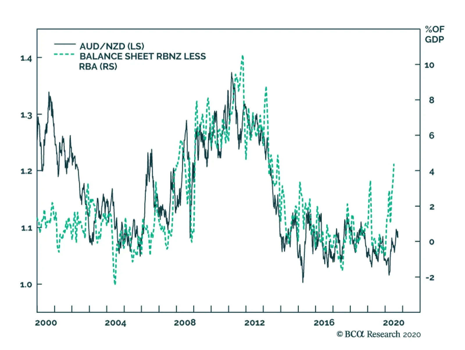
Opportunities At The Crosses Long AUD/NZD and long AUD/JPY remain attractive bets. While our momentum indicators are stretched in the short term, speculators are still neutral the currency. As for AUD/NZD, our bias is that terms of trade in Australia will continue to outperform that in New Zealand. AUD/NZD and relative terms of trade tend to move together (Chart I-18). Meanwhile, the exchange rate is cheap on a historical basis. Furthermore, the Reserve Bank of New Zealand is likely to continue with more dovish forward guidance, relative to the RBA, which will favor AUD/NZD (Chart I-19). As a percentage of GDP, the RBNZ is more aggressive in terms of asset purchases. Buy the cross if it touches 1.05. Chart I-18AUD/NZD And Terms Of Trade
AUD/NZD And Terms Of Trade
AUD/NZD And Terms Of Trade
Chart I-19AUD/NZD And Balance Sheet Policy
AUD/NZD And Balance Sheet Policy
AUD/NZD And Balance Sheet Policy
AUD/JPY is a bet on a continued global economic recovery, and any drop below 74 is a buying opportunity. Interestingly, speculators remain short the cross despite a nice run-up from the March lows. Chester Ntonifor Foreign Exchange Strategist chestern@bcaresearch.com Currencies U.S. Dollar Chart II-1USD Technicals 1
USD Technicals 1
USD Technicals 1
Chart II-2USD Technicals 2
USD Technicals 2
USD Technicals 2
Recent data from the US have been positive: Headline inflation increased from 1% to 1.3% year-on-year in August. Core inflation also edged up from 1.6% to 1.7% year-on-year. The NY Empire State Manufacturing Index jumped from 3.7 to 17 in September. Retail sales increased by 0.6% month-on-month in August. Initial jobless claims increased by 860K for the week ending on September 11. The DXY index increased by 0.3% this week. On Wednesday, the Fed kept interest rates unchanged and made a bold statement that they would keep rates low until inflation comes back to the 2% target. New economic projections show that most policymakers see interest rates on hold through at least 2023. Report Links: Addressing Client Questions - September 4, 2020 A Simple Framework For Currencies - July 17, 2020 DXY: False Breakdown Or Cyclical Bear Market? - June 5, 2020 The Euro Chart II-3EUR Technicals 1
EUR Technicals 1
EUR Technicals 1
Chart II-4EUR Technicals 2
EUR Technicals 2
EUR Technicals 2
Recent data from the euro area have been positive: The ZEW Economic Sentiment Index surged from 64 to 73.9 in September. The trade surplus widened from €16 billion to €20.3 billion in July, led by a faster decline in imports. Industrial production fell by 7.7% year-on-year in July, following a 12% contraction in June. Both headline inflation and core inflation remained flat at -0.2% and 0.4% year-on-year, respectively. The euro fell by 0.4% against the US dollar this week. While downside risk still looms for the euro area growth, we believe that the euro will continue to appreciate, as the structural growth rate of the euro area should improve relative to the US amid global economy recovery. Report Links: Addressing Client Questions - September 4, 2020 On The DXY Breakout, Euro, And Swiss Franc - February 21, 2020 Updating Our Balance Of Payments Monitor - November 29, 2019 Japanese Yen Chart II-5JPY Technicals 1
JPY Technicals 1
JPY Technicals 1
Chart II-6JPY Technicals 2
JPY Technicals 2
JPY Technicals 2
Recent data from Japan have been negative: Industrial production plunged by 15.5% year-on-year in July. The total trade balance increased from ¥10.9 billion to ¥248.3 billion in August due to a steeper decline in imports. Exports fell by 14.8% year-on-year, while imports slumped by 20.8%. The Japanese yen appreciated by 1.5% against the US dollar this week. The BoJ kept interest rates steady this Thursday and upgraded its view on the economy outlook. Moreover, the governor Haruhiko Kuroda said that the Bank will not only monitor inflation trends but also the overall economy, including job growth, for future guidance. Report Links: The Near-Term Bull Case For The Dollar - February 28, 2020 Building A Protector Currency Portfolio - February 7, 2020 Currency Market Signals From Gold, Equities And Flows - January 31, 2020 British Pound Chart II-7GBP Technicals 1
GBP Technicals 1
GBP Technicals 1
Chart II-8GBP Technicals 2
GBP Technicals 2
GBP Technicals 2
Recent data from the UK have been mixed: The total trade surplus narrowed from £3.9 billion to £1.1 billion in July. The unemployment rate rose to 4.1% from 3.9% in July. Average earnings improved by 0.2% quarter-on-quarter for the three months to July. Headline inflation declined from 1% to 0.2% year-on-year in August. Core inflation slipped from 1.8% to 0.9% in August. The British pound appreciated by 0.8% against the US dollar this week. On Thursday, the BoE kept interest rates on hold at 0.1%. While recent data have been stronger than expected, multiple threats still loom, including a second wave of COVID-19, a no-deal Brexit, and the possibility of persistent high unemployment. The Bank is now considering all options, including negative interest rates, to support the economy. Report Links: Revisiting Our High-Conviction Trades - September 11, 2020 Updating Our Balance Of Payments Monitor - November 29, 2019 A Few Trade Ideas - Sept. 27, 2019 Australian Dollar Chart II-9AUD Technicals 1
AUD Technicals 1
AUD Technicals 1
Chart II-10AUD Technicals 2
AUD Technicals 2
AUD Technicals 2
Recent data from Australia have been positive: House prices fell by 1.8% quarter-on-quarter in Q2. However, this is a 6.2% increase compared with the same quarter last year. The Westpac Leading Index increased from 0.05% to 0.48% in August. On the labor market front, the unemployment rate fell from 7.5% to 6.8% in August. 111K jobs were added in August, including 74.8K part-time positions and 36.2K full-time positions. The Australian dollar has been flat this week. The RBA minutes released this week stated that the Bank will maintain its “highly accommodative settings” as long as required to further support the economy. Please refer to our front section this week for a more detailed analysis of the Aussie dollar. Report Links: On AUD And CNY - January 17, 2020 Updating Our Balance Of Payments Monitor - November 29, 2019 A Contrarian View On The Australian Dollar - May 24, 2019 New Zealand Dollar Chart II-11NZD Technicals 1
NZD Technicals 1
NZD Technicals 1
Chart II-12NZD Technicals 2
NZD Technicals 2
NZD Technicals 2
Recent data from New Zealand have been negative: GDP slumped by 12.2% quarter-on-quarter in Q2, or 12.4% year-on-year, the largest decline on record. The current account balance shifted to a surplus of NZ$1.8 billion in Q2 from a deficit of NZ$1.47 billion the same quarter last year, led by the sharp decline in domestic demand. The New Zealand dollar appreciated by 0.5% against the US dollar this week. The latest GDP release, while negative, was better than expectations. Goods industries, which make up 20% of the total economy, declined by 16.3% quarter-on-quarter in Q2. Services industries, which make up more than 50% of the economy, also fell by 10.9%. The path of the recovery will be highly contingent on COVID-19 developments. Report Links: Currencies And The Value-Versus-Growth Debate - July 10, 2020 Updating Our Balance Of Payments Monitor - November 29, 2019 Place A Limit Sell On DXY At 100 - November 15, 2019 Canadian Dollar Chart II-13CAD Technicals 1
CAD Technicals 1
CAD Technicals 1
Chart II-14CAD Technicals 2
CAD Technicals 2
CAD Technicals 2
Recent data from Canada have been mixed: Manufacturing sales increased by 7% month-on-month in July, following a 20.7% surge the previous month. Headline inflation was flat at 0.1% year-on-year in August, below market expectations of 0.4%. Core inflation edged up from 0.7% to 0.8% year-on-year in August. ADP employment recorded a loss of 205.4K jobs in the month of August. The Canadian dollar fell by 0.4% against the US dollar this week. The latest inflation report shows that gasoline prices were down 11.1% year-on-year in August, which has been a drag on inflation. On the other hand, prices of personal care services, including haircuts, have been increasing, as the cost to implement COVID-19 safety measures are being passed on to customers. With extremely low inflation, the BoC would most likely maintain interest rates low to support the economy recovery. Report Links: Currencies And The Value-Versus-Growth Debate - July 10, 2020 More On Competitive Devaluations, The CAD And The SEK - May 1, 2020 A New Paradigm For Petrocurrencies - April 10, 2020 Swiss Franc Chart II-15CHF Technicals 1
CHF Technicals 1
CHF Technicals 1
Chart II-16CHF Technicals 2
CHF Technicals 2
CHF Technicals 2
Recent data from Switzerland have been positive: Total sight deposits increased from CHF 702.9 billion to CHF 704.1 billion for the week ending on September 11. Real exports increased by 2.9% month-on-month in August, while real imports fell by 1.3%. The trade surplus widened from CHF 3.3 billion to CHF 3.6 billion in August. PPI fell by 3.5% year-on-year in August. The Swiss franc depreciated by 0.3% against the US dollar this week, as the SNB continues to intervene in the currency market. Our bias is that the franc will fall against the euro but not so much against the US dollar. Moreover, holding the Swiss franc remains a good hedge, as Switzerland still sports the highest real rate in the G10 universe. Report Links: On The DXY Breakout, Euro, And Swiss Franc - February 21, 2020 Currency Market Signals From Gold, Equities And Flows - January 31, 2020 Portfolio Tweaks Before The Chinese New Year - January 24, 2020 Norwegian Krone Chart II-17NOK Technicals 1
NOK Technicals 1
NOK Technicals 1
Chart II-18NOK Technicals 2
NOK Technicals 2
NOK Technicals 2
Recent data from Norway have been mixed: The trade deficit widened from NOK 1.8 billion to NOK 2.9 billion in August. Exports continued to fall by 13% year-on-year to NOK 57 billion in August due to lower sales of mineral fuels and related materials (-20.1%), chemical and related products (-9.3%), and food and live animals (-13.1%). Imports, on the other hand, remained unchanged at NOK 59.9 billion in August from a year earlier. The Norwegian krone fell by 0.5% against the US dollar this week. While the widening of the trade deficit seems to be bad news for the economy, the resilience of imports reflects a strong domestic demand, which bodes well for the Norwegian economy and the krone. Report Links: Revisiting Our High-Conviction Trades - September 11, 2020 A New Paradigm For Petrocurrencies - April 10, 2020 Building A Protector Currency Portfolio - February 7, 2020 Swedish Krona Chart II-19SEK Technicals 1
SEK Technicals 1
SEK Technicals 1
Chart II-20SEK Technicals 2
SEK Technicals 2
SEK Technicals 2
Recent data from Sweden have been positive: The seasonally-adjusted unemployment rate dropped from 9.2% to 9.1% in August. The Swedish krona depreciated by 0.3% against the US dollar this week. The better-than-expected data from the labor market suggests that the economic recovery is underway, which is bullish for the Swedish krona. Report Links: Revisiting Our High-Conviction Trades - September 11, 2020 Updating Our Balance Of Payments Monitor - November 29, 2019 Where To Next For The US Dollar? - June 7, 2019 Kelly Zhong Research Analyst Trades & Forecasts Forecast Summary Core Portfolio Tactical Trades Limit Orders Closed Trades
Highlights The great political surprises of 2016 are approaching key deadlines on November 3 and December 31. Investors should not let Brexit take their eye off the US election. Globalization will retreat faster under Trump regardless of what happens in the United Kingdom. The market is starting to price several clear risks: a failure to extend fiscal relief in the US (25% chance); a surprise Trump tariff move (40%); a contested election (20%); or a failure of the UK and EU to seal a deal (35%). Trump is unlikely to pull off a landslide like Boris Johnson in December 2019. The backdrop has darkened and Biden is an acceptable alternative for voters, unlike Jeremy Corbyn. Go long GBP-USD at the 1.25 mark; go long GBP-EUR volatility. Feature The end game is approaching for the two great political shocks of 2016 – Brexit and Trump. November 3 is the US election and December 31 is the deadline for an UK-EU trade deal. Investor sentiment is starting to show some cracks for various reasons, some technical (Chart 1). But we do not believe near-term volatility and risk-off sentiment have fully run their course yet. Either the US election cycle or the UK’s brinkmanship with the EU, or both, will agitate markets as the deadlines approach. The former is a much weightier factor. Chart 1Market Starts To Price Bevy Of Near-Term Risks ... But Cyclical View Still Constructive
Market Starts To Price Bevy Of Near-Term Risks ... But Cyclical View Still Constructive
Market Starts To Price Bevy Of Near-Term Risks ... But Cyclical View Still Constructive
The risks in play are a failure to extend fiscal relief in the US (25% chance); a conflict between Trump and one of America’s foreign rivals such as China, whether due to Trump’s reelection or lame duck status (40%); a contested election (20%); or a failure of the UK and EU to seal a deal, setting back their economic recovery (35%). Maybe all of these risks will dissipate by mid-November, but maybe not. The market has not discounted any of them fully. So investors should buy insurance now. Vox Populi Is The Biggest Constraint For global investors Brexit is far less consequential than President Trump’s “America First” policy but the UK does punch above its economic weight in financial markets (Chart 2). Chart 2Brexit: Why Should We Care? UK Punches Above Its Economic Weight In Financial Markets
Brexit: Why Should We Care? UK Punches Above Its Economic Weight In Financial Markets
Brexit: Why Should We Care? UK Punches Above Its Economic Weight In Financial Markets
Geopolitical analysis teaches that limitations on policymakers should be the starting point of analysis. For democracies, the biggest constraint of all is the vox populi – the voice of the people, or popular will. The Brexit movement faced a vociferous “Resistance” that won over the media and financial market consensus until reality struck in the general election of December 12, in which the Conservative Party won a historic victory. Chart 3Joe Biden Is Not Jeremy Corbyn
The End-Game For Trump And Brexit
The End-Game For Trump And Brexit
The election vindicated Prime Minister Boris Johnson’s brinkmanship and “hard Brexit” terms, while once again chastening the elites and experts – including an innovative Supreme Court. Johnson’s single-party majority, combined with COVID-19 and the surge in domestic economic stimulus, have increased the odds that the UK will choose sovereignty over the economy and walk away from trade talks. Trump’s supporters show the same enthusiasm as Brexiteers and the same scorn for conventional wisdom and opinion polls. Will they be similarly vindicated? Beyond any knee-jerk equity rally, that would entail a “Phase Two” trade war with China – and possibly a new trade war with Europe or a global trade war. However, Trump faces much worse odds than Boris Johnson did. First, Johnson’s snap election took place at the top of the business cycle, back when a novel coronavirus was just starting to be discovered in Wuhan, China. This is how Harry Truman won his surprise victory in 1948, in defiance of all the opinion polls. Had Truman run in 1949, after a deep recession, the story would have gone differently – which is a problem for both Trump and the near-term equity market. Second, the political alternative was not acceptable in the United Kingdom but it is in the United States. Johnson led Jeremy Corbyn, a far-left rival for the premiership, by around 15%-20% in the polls. The Conservative Party itself led the Labour Party by 10%. By contrast, former Vice President Joe Biden is a center-left Democrat who has many flaws but is not out of the mainstream. He leads President Trump in the polling, as do Democrats over Republicans, though only by single digits. There is no contest between Biden and Corbyn (Chart 3). Trump might still win, but an American version of the UK landslide in 2019 is unlikely. Trump will lose the popular vote even if he wins the Electoral College, and Republicans have a very slim chance of winning the House of Representatives. The implication for financial markets is doubly negative, at least in the near term: there is about a 35% chance that the UK will leave without a deal and about a 35% chance that Trump will win. He could also kick China in the interim period if he loses. Won’t stocks cheer a Trump comeback and victory? Perhaps, but a data-dependent approach suggests that a “blue sweep” is still the base case, and that would be a good trigger for a full equity correction. Nor would a Trump win be positive for long-term equity returns in the final analysis. Trump is reflationary, but a larger trade war would hamper the global economic recovery and thus keep earnings suppressed. There is a 35% chance that Trump will win re-election. Trump is unlikely to win the national vox populi, like Brexit did, but he obviously can win the popular vote in the critical regions – the Sun Belt and the Rust Belt. If he does, the revolution in the global system will be confirmed: the retreat of globalization will accelerate. If he does not, then Brexit alone cannot confirm de-globalization; rather the UK will face even more pressure to make concessions and get a trade deal. Trump’s Path To Victory Chart 4Sitting Presidents Win Half The Time If Recession Ends In H1
Sitting Presidents Win Half The Time If Recession Ends In H1
Sitting Presidents Win Half The Time If Recession Ends In H1
We may well be forced to upgrade Trump’s odds of winning if his comeback gains momentum. Our subjective odds of a Trump win come from the historical record – incumbent parties only retain the White House amid recessions five out of 13 times in American history – but there are some important exceptions. First, the longest-serving American president, Franklin Delano Roosevelt, served during the Great Depression. So obviously a bad economy does not always disqualify a president. Nevertheless FDR got lucky with the timing of the fluctuations and he was personally popular, unlike President Trump. Second, an incumbent president wins 50% of the time if the recession ends before the election – namely in 1900, 1904, and 1924 (contrasted with defeats in 1888, 1912, and 1980). Today’s market performance looks similar to these cases, though premature fiscal tightening is now jeopardizing Trump’s bid (Chart 4). Assuming new stimulus passes, it is extremely beneficial for President Trump that COVID-19 cases are subsiding (Chart 5). Chart 5COVID-19 Subsides In Nick Of Time For Trump?
The End-Game For Trump And Brexit
The End-Game For Trump And Brexit
Chart 6Even Approval Of Trump’s Pandemic Response Improving
The End-Game For Trump And Brexit
The End-Game For Trump And Brexit
His approval rating on handling COVID-19 is somewhat recovering at the moment (Chart 6). Trump’s “law and order” message is also benefiting him amid the rise in vandalism, rioting, and homicide, judging by his improvement in national approval rating across almost all demographic groups, including many that are otherwise averse to Trump. Finally, Trump’s Abraham Accords – a potentially major peace deal between Israel and an expanding list of Arab states – could give his image another boost (Table 1). Foreign policy will not decide the election but these peace deals should not be underrated because they underscore a more important argument for voters: that the US should withdraw from its endless foreign wars and pursue peace and prosperity instead. If Trump’s typically weak approval rating on foreign policy starts to rise then his comeback gains breadth. Table 1The Abraham Accords Give Boost To Trump Image As Peacemaker
The End-Game For Trump And Brexit
The End-Game For Trump And Brexit
We will upgrade our 35% odds of Trump’s re-election if Congress passes a new fiscal relief package, assuming Trump’s polling continues to improve. Our quantitative model is now giving Trump a 45% chance, which is in line with the consensus view but well above our subjective odds (Chart 7). We will upgrade our view if Congress passes a new fiscal relief package, assuming Trump’s polling continues to improve. Chart 7Quantitative US Election Model Puts Trump Win At 45% Odds
The End-Game For Trump And Brexit
The End-Game For Trump And Brexit
Chart 8Stimulus Hiccups Cause Market To Sell
Stimulus Hiccups Cause Market To Sell
Stimulus Hiccups Cause Market To Sell
The stock market does not perform well during periods in which fiscal cliff negotiations are prolonged – the failure of the Emergency Economic Stabilization Act in 2008 is one thing, but today’s impasse is more reminiscent of the debt ceiling crises of 2011 and 2013. Trump is now directly pressuring Senate Republicans to capitulate to House Democratic spending demands. If Republican senators abandon him, market turmoil will undercut his argument that he is the best man to revive the economy and he will lose the election (Chart 8). We do not think they will – and House Speaker Nancy Pelosi’s pledge to keep the House in session until a deal is passed is very positive news – but until the deal is sealed the market is vulnerable. As mentioned above we give a 25% chance of a failure to pass any stimulus bill in September or October. The next chance for stimulus will be in late January or February. Trump stands for growth at all costs, which will be received well by equity markets, other things being equal. But a Trump victory implies more trade war and that the GOP will retain the Senate, creating a steeper fiscal cliff next year – so any relief rally will be short-lived. Meanwhile a Trump defeat raises the risk he will take aggressive actions on the way out to cement his legacy as the Man Who Confronted China, and bind the Biden administration to decoupling policy. This is not a favorable outlook for investor sentiment or the economic recovery over the next few months. Brexit: The Three Kingdoms Will Force A Trade Deal Chart 9Sterling Will Fall Before It Bounces Back On A Deal
Sterling Will Fall Before It Bounces Back On A Deal
Sterling Will Fall Before It Bounces Back On A Deal
In December 2016 we pointed to the three kingdoms – England, Ireland, and Scotland – as the origin of the geopolitical and constitutional crisis that would arise from the Brexit referendum and act as a powerful bar against a no-deal Brexit. That framework remains salient today as the risk of no-deal escalates due to quarrels over Northern Ireland Protocol, which was agreed in October 2019 as part of the formal Withdrawal Agreement that made Brexit happen on January 31, 2020. The implication is that the pound has not bottomed yet, though we see a buying opportunity around the corner (Chart 9). No one should doubt that the UK could walk away from the EU without a deal this December: The Tories’ single-party majority gives them the raw capability to push through plans they decide on – and raises the risk that they will overreach. The tariff shock of a no-deal exit is frequently exaggerated. The UK would suffer a tariff shock of about 1.38% of GDP, larger than what the US suffered in its tariff-war with China but hardly a death knell (Table 2). (The costs of losing single-market access would grow over time, however.) Table 2A No-Trade-Deal Brexit Would Create A Minimum Tariff Shock Of 1.4% Of GDP
The End-Game For Trump And Brexit
The End-Game For Trump And Brexit
COVID-19 has supplanted the worst-case outcome of a no-deal exit by producing a much worse recession than anyone feared. The US is using the disruption to decouple from China and the UK could do the same with the EU. The result of COVID-19 is massive domestic stimulus that raises the UK’s and Europe’s threshold for pain. Any failure of trade talks would spur more stimulus. The Bank of England still has some bond-buying ammunition left and parliament, again, is undivided. Given that Boris Johnson has until 2024 before the next election, there is theoretically time for his personal and party approval ratings to improve as the economy recovers from the pandemic and any messy Brexit (Chart 10). Chart 10Bojo Has Until 2024 To Recover From Crises
The End-Game For Trump And Brexit
The End-Game For Trump And Brexit
Chart 11UK Would Face WTO-Level Tariffs If No Deal
The End-Game For Trump And Brexit
The End-Game For Trump And Brexit
The UK’s position in the quarrel over Ireland is rational – but so is the EU’s. If the trade talks collapse, the UK will need to remove any regulatory or customs divisions with Northern Ireland. Yet in preparing to do so it vitiates trust with the EU and makes a trade deal less likely. However, weighing all these points up, an UK-EU trade deal is still the most likely outcome (65% chance), as the economic and political costs are crystal clear while the benefits of a hard break are not so clear. Allow us to explain. Northern Ireland is the latest cause of tensions, although it was inevitable that tensions would arise ahead of the end-of-year deadline for a trade deal. Westminster has proposed an Internal Market Bill, which has passed with solid majorities in two readings in parliament, to reclaim aspects of sovereignty over Northern Ireland that were traded away to clinch the Withdrawal Agreement last year. The Johnson government’s position should be seen as a negotiating tactic to build leverage in the talks but also as a real fallback position if the talks fail. The House of Lords could delay the bill by a year, meaning that it may not take effect until end of 2021 – but a trade deal would make it moot. The Northern Ireland Protocol solved the riddle of how to preserve the integrity of the EU’s single market after Brexit yet avoid a return to a hard customs border with the Republic of Ireland. Customs checks were removed with the Good Friday (or Belfast) Agreement in 1998, which ended the Troubles between the two Irelands. The Protocol introduces a pseudo-customs border on the Irish Sea, requiring declarations on exports to Great Britain and EU oversight of UK state aid for Northern Irish firms, so that Northern Ireland can stay in the EU customs area while the UK can leave and still preserve a semblance of its own customs area in Northern Ireland. If the UK and EU get a trade deal, then all trade is tariff-free and the Protocol becomes redundant. Also, the Protocol enables a Joint Committee to review disputes over exports to Northern Ireland that are “at risk” of making their way into the EU without duties. The Protocol is supposed to operate even if the UK and EU fail to get a trade deal. Yet it is politically untenable for the UK to subject trade within its own country to EU rules or duties, or allow the EU to supervise state corporate subsidies across the UK, if no deal is agreed. The UK is more likely to violate the treaty to preserve its internal integrity. As Northern Ireland Secretary Brandon Lewis admitted, “Yes, this [Internal Market Bill] does break international law in a very specific and limited way.” While the EU’s threat to slap tariffs on British food exports to Northern Ireland is the proximate trigger of the Internal Market Bill, another key reason for the UK’s aggressive shift is the issue of state aid. All governments are extending emergency aid to major corporations to keep them from insolvency amid the recession. This will be the case for some time and it is even more true of the EU than of the United Kingdom. However, under the Protocol, the EU would be able to penalize companies in Great Britain that receive subsidies if goods or firms in Northern Ireland can be shown to benefit. Northern Ireland is supposed to operate within the EU’s standards on state aid. London obviously bristles at this backdoor for letting in EU regulation, not least because, in the event that a trade deal is not reached, it will need to pump the country full of state aid to compensate for the shock of seeing exports to the EU rise by 3% across the board according to Most Favored Nation status under the World Trade Organization (Chart 11). An UK-EU trade deal is the most likely outcome. As Dhaval Joshi of BCA’s European Investment Strategy points out, Boris needs to keep his own Tories under his heel (Chart 12). The Internal Market Bill provoked a backlash among 30 moderates. If that number rises to 40 Johnson loses his majority. This is a problem that he is seeking to address by giving parliament a veto over any future uses of the bill that would violate international law (this is an acceptable compromise because he has a majority). But a failure to drive a hard bargain with the EU would cause a much bigger rebellion among hard Brexit Conservative MPs and threaten his job. Chart 12Bojo Must Balance Hard Brexit Tories
The End-Game For Trump And Brexit
The End-Game For Trump And Brexit
Geopolitics is about might, not right – the UK can assert its sovereignty and violate these international agreements, while the EU can then apply punitive tariffs, non-tariff barriers, and sanctions under the Withdrawal Agreement. Brexit is a power-political struggle that could devolve into a trade war. Obviously that would be a very bad outcome for the market, particularly for the UK, which is overmatched (Chart 13). But this risk is also a key limitation on the UK that will prevent this worst-case outcome. Indeed, despite all of the above, our base case is still that the UK and EU will get a deal. First, the economy will clearly suffer without a deal. After all, the US-China tariffs produced a negative effect for these two economies in 2019 and the impact on the UK would be bigger than that on the US (Chart 14). Chart 13The Brick Wall The UK Cannot Avoid
The Brick Wall The UK Cannot Avoid
The Brick Wall The UK Cannot Avoid
Chart 14UK Faces Trade Shock If No Deal
UK Faces Trade Shock If No Deal
UK Faces Trade Shock If No Deal
Second, the public doesn’t support a no-deal exit (Chart 15). Northern Ireland itself voted against Brexit in the referendum and as such would rather see an agreement that groups the UK and the EU under a single zero-tariff free trade agreement. Third, Boris faces a rebellion in Scotland if he pursues a hard break. The Scottish National Party would revive ahead of Scottish elections in May 2021 and demand a second independence referendum (Chart 16). The Irish Sea is a natural division that makes a more intrusive customs presence more supportable than otherwise. A little more paperwork is an acceptable cost to keep the United Kingdom from falling apart. Scotland is much more likely to go independent than Ireland is to unite. Chart 15Only 25% Think 'No Deal' A Good Outcome
The End-Game For Trump And Brexit
The End-Game For Trump And Brexit
Boris is now prime minister, not just party leader, and he will ultimately have to decide whether he wants to be the last prime minister of a United Kingdom. Assuming Boris is at least focused on the next election, he will have to decide if he wants the rest of his premiership to be consumed with a self-inflicted double-dip recession and democratic revolt in Scotland, or a recovery on the back of a functional if uninspiring trade deal enabling him to head off the Scottish threat and save the union. Chart 16No Deal' Would Boost Scottish Independence Movement
No Deal' Would Boost Scottish Independence Movement
No Deal' Would Boost Scottish Independence Movement
Obviously the final deal may not be clinched until the eleventh hour. The October 15 deadline can be delayed but talks must conclude in November or December in time to be ratified by the EU member states by December 31. US Election Drives Geopolitics, But Not The Brexit Outcome One factor that will not play much of a role in the UK’s decision-making is the US election. It is true that the Johnson government would benefit from President Trump’s reelection. But the EU is a much bigger market for the UK and the UK’s best strategy is to focus on its national interest regardless of what the US does. The US election may not be decided in mid-December in time for the UK to agree to a deal that can be ratified by year’s end anyway. Moreover the UK’s best strategy is to conclude a deal with the EU first, and then pursue a deal with the United States. This is because President Trump will be inclined to sign at least an executive deal, while a congressional deal requires support from the Democrats, which is only possible if Northern Ireland is resolved without hard border checks. Because the EU makes up such a larger share of British trade, an American deal does not give the UK much leverage in negotiating with the EU, but an EU deal does give the UK greater leverage in negotiating with the US. As Diagrams 1 and 2 show, this strategic logic holds even if the UK knows the outcome of the US election ahead of time: the scenarios with the least benefit and the greatest cost would still be scenarios involving no deal with the European Union. Diagrams 1 & 2United Kingdom Wants An EU Trade Deal (Regardless Of Trump/Biden)
The End-Game For Trump And Brexit
The End-Game For Trump And Brexit
Diagram 3 boils all of this down to a single decision tree. First, the diagram shows that the economic costs are not prohibitive and therefore the risk of a no-deal exit is substantial – we would say 35%. Second, it shows that the risks of the negotiation are skewed to the downside. Third, it highlights that the UK will settle its affairs directly with the EU and not hinge its actions on the US election cycle. Diagram 3No-Deal Brexit Cost Not Prohibitive, But Best Strategy Is To Get A Deal
The End-Game For Trump And Brexit
The End-Game For Trump And Brexit
Clearly the best strategy and best outcome involve seeking a trade deal with the EU, and hence it is our base case. This means an opportunity to buy the pound and domestic-oriented British equities, and turn neutral on gilts, is just around the corner. Investment Takeaways The GBP-EUR is the best measure of the market’s sensitivity to Brexit risks, so it should fall in the near term and rally sharply after resolution. However, the US election complicates things. The euro’s response is fairly binary: it is one of the biggest winners if Biden wins and one of the biggest losers if Trump wins. Hence GBP-EUR volatility will rise in the coming months (Chart 17). We recommend going long 1-month implied volatility contracts for October and November. The pound sterling, by contrast, will ultimately rise regardless of US election result, since the UK will pursue a trade deal out of its own national interest. Trump is less negative for the US dollar than Biden and a comeback and victory will drive a counter-trend dollar bounce. However, in the medium term we expect the dollar to fall regardless due to debt monetization and global growth recovery. Thus we recommend going long GBP-USD on a strategic basis when political risks peak over the next two-to-three months and GBP-USD falls to around 1.25, as recommended by our Foreign Exchange Strategist Chester Ntonifor (Chart 18). Chart 17EUR-GBP Volatility Will Rise
EUR-GBP Volatility Will Rise
EUR-GBP Volatility Will Rise
Sterling bears are forgetting that the sound defeat of Corbyn ruled out a sharp left-wing turn in domestic economic policy (higher taxes), while the Tories have made a clear turn against fiscal austerity. Therefore the worst-case scenario is a failure to agree to a trade deal by the end of this year. But that is not the base case and the risk will be priced within a month or two. Chart 18Pound Will Rally After Deal Concluded In November Or December
Pound Will Rally After Deal Concluded In November Or December
Pound Will Rally After Deal Concluded In November Or December
Chart 19Yes, China Is Opening The Taps
Yes, China Is Opening The Taps
Yes, China Is Opening The Taps
We remain tactically cautious and defensive even though the US fiscal negotiations are improving. The market is underrating too many clear and concrete risks to sentiment and the corporate earnings outlook, so the current bout of volatility can continue until there is greater clarity on US fiscal spending, the US election cycle, associated geopolitical risks, and the Brexit showdown. Book gains on long Brent trade for a return of 69.7%. We initiated this trade on March 27 in our “No Depression” report, which marked our shift to a strategic risk-on positioning. We remain bullish on oil prices and commodities on the back of global stimulus and our assessment that the OPEC 3.0 cartel will maintain discipline overall, but the next three-to-six months are crowded with downside risk. Cyclically, we see a global economic recovery deepening and broadening. China’s stimulus is surprising to the upside, as we have long written and the latest credit numbers bear this view out (Chart 19), which is critical for global reflation. Matt Gertken Vice President Geopolitical Strategy mattg@bcaresearch.com

BCA Research's Foreign Exchange Strategy service estimates that Scandinavian currencies (NOK and SEK) are the best way to express its bearish dollar view over the coming 12 months. Both Norway and Sweden are well poised to benefit from a global economic…
The UK is once again playing hardball with the EU. The proposed Internal Market Bill would violate the terms of the post-Brexit deal already agreed with the EU. If implemented, the UK seriously risks being treated as a trading partner of the EU without a…
The US dollar’s weakness has been one of the most important consequences of the economic recovery taking shape around the world and it reflects the USD’s pronounced counter-cyclicality. In this context, the lack of strength of EM currencies, which are…
Highlights We remain bearish on the US dollar over the next 12 months. The best vehicle to express this view continues to be the Scandinavian currencies (NOK and SEK). Precious metals remain a buy so long as the dollar faces downside. However, we remain more bullish on silver than gold. Go short the gold/silver ratio (GSR) again at 75. At the crosses, our favorite trade is short NZD against other cyclical currency pairs. These include the CAD, AUD, and SEK. Sterling is selling off as we anticipated, but our timing was offside. That said, the pound is cheap. We will go long cable if it falls below 1.25. Short EUR/GBP at current levels. The Swiss franc will continue to appreciate versus the USD, but will lag behind the euro. EUR/CHF will touch 1.15. We prefer the JPY to the CHF as a currency portfolio hedge. We argued last week that Prime Minster Shinzo Abe’s resignation does not change the yen’s outlook. Feature Our trade basket this year has been centered on a dollar-bearish theme. Since the top in the DXY index on March 19th, we have been expressing this view via various vehicles, most of which have been very profitable. Our favorites have been the Scandinavian currencies, silver, and the AUD, either at the crosses or against the US dollar. So far, these are among the best-performing trades in the G10 currency world (Chart I-1). Chart I-1A Currency Report Card
Revisiting Our High-Conviction Trades
Revisiting Our High-Conviction Trades
Going into the final leg of 2020, the key question is which currency pairs will provide the most upside. In this report, we revisit the rationale behind our high-conviction trades. The Case For Scandinavian Currencies A review of Q2 GDP across the G10 reveals which countries have been doing relatively better during the pandemic. Norway emerges as the economy that had the best quarter-on-quarter annualized growth (Chart I-2). Swedish growth held up very well in Q1 and even the drop in Q2 still puts it well ahead of the US, the euro area, and the UK. As small, open economies which are very sensitive to global growth conditions, this is a very impressive feat for Sweden and Norway. Part of the reason for this is that over the years, the drop in their currencies, both against the US dollar and euro, has made them very competitive. Chart I-2A Currency Report Card
A Currency Report Card
A Currency Report Card
Norway benefited from a few things during the pandemic. First, as a major oil exporter, the sharp fall in the NOK helped cushion the domestic economy against the crash in crude prices. Second, the handling of the pandemic was swift and rigorous, and this has almost completely purged the number of new infections in Norway. Third, aggressive monetary and fiscal stimulus (zero rates, quantitative easing, and the first budget deficit in 40 years) has set the economy on a recovery path. As a result, consumption is rebounding smartly and the Norges Bank expects mainland GDP to touch pre-crisis levels by 2023. Already, real retail sales have exploded higher (Chart I-3). Should global growth continue to rebound, a reversal in pessimism towards energy stocks (and value stocks in general) could see investors reprice the Norwegian stock market (and krone) sharply higher (Chart I-4). Chart I-3Norwegian Consumption Has##br##Recovered
Norwegian Consumption Has Recovered
Norwegian Consumption Has Recovered
Chart I-4A Bounce In Oil & Gas Stocks Will Help The Krone
A Bounce In Oil & Gas Stocks Will Help The Krone
A Bounce In Oil & Gas Stocks Will Help The Krone
In the case of Sweden, the sharp rebound in the manufacturing PMI also suggests the industrial base is recovering. This will also coincide with a solid bounce in exports, cementing Sweden’s rise in relative competitiveness and its exit from the pandemic-induced recession (Chart I-5). The Riksbank’s resource utilization indicator has stabilized, suggesting deflationary pressures are abating. Meanwhile, home prices are on the cusp of a recovery, which should help boost consumer confidence and support consumption. With our models showing the Swedish krona as undervalued by 19% versus the USD, there is much room for currency appreciation before financial conditions tighten significantly. Should global growth continue to rebound, a reversal in pessimism towards energy stocks could see investors reprice the Norwegian stock market (and krone) sharply higher. The bottom line is that both Norway and Sweden are well poised to benefit from a global economic recovery, with much undervalued currencies that will bolster their basic balances. We expect both the SEK and NOK to be the best performers versus the USD in the coming year (Chart I-6). Chart I-5The Swedish Economy Is On The Mend
The Swedish Economy Is On The Mend
The Swedish Economy Is On The Mend
Chart I-6The Scandinavian Currencies Remain Cheap
The Scandinavian Currencies Remain Cheap
The Scandinavian Currencies Remain Cheap
Stay Long Precious Metals, Especially Silver In a world of ample liquidity and a falling US dollar, gold and precious metals are bound to benefit. This is especially the case on the back of a central bank that is trying to asymmetrically generate inflation. Gold has a long-standing relationship with negative interest rates, though the correlation has shifted over time. The intuition behind falling real rates and rising gold prices is that low rates reduce the opportunity cost of holding non-income-generating assets such as gold. But more importantly, the correlation is between the rise in gold prices and the level of real interest rates, meaning as long as the latter stays negative, it is sufficient to sustain the gold bull market (Chart I-7). Gold tends to be a “Giffen good,” meaning demand increases as prices rise. This can be seen in the tight correlation between our financial demand indicator (proxied by open futures interest on the Comex and ETF holdings, Chart I-8) and gold prices. The conclusion is that, just like the US dollar, gold tends to be a momentum asset, where higher prices beget more demand – at least until the catalyst of easy money and negative rates vanishes Chart I-7Gold Prices And Real Yields
Gold Prices And Real Yields
Gold Prices And Real Yields
Chart I-8Gold Is A Giffen Good
Gold Is A Giffen Good
Gold Is A Giffen Good
There is reason to believe that the bull market in gold might be sustained for longer this time around. The reason is that central banks have become important (and price-insensitive) buyers. Foreign central banks have been amassing almost all of the gold annual output in recent years. It is remarkable that for most of the dollar bull market this past decade, the world’s major central banks (and biggest holders of US Treasurys) have seen rather stable exchange rates relative to the gold price (Chart I-9). This suggests that gold price risks could be asymmetric to the upside. A fall in prices encourages accumulation by EM central banks as a way to diversify out of their dollar reserves, while a rise in prices encourages financial demand and boosts the value of gold foreign exchange reserves. While we like gold, more value can be found in silver (and even platinum) prices, which have lagged the run up in gold. While we like gold, more value can be found in silver (and even platinum) prices, which have lagged the run up in gold. During precious metals bull markets, prices tend to move in sequence, starting with gold, then silver. Meanwhile, the gold/silver ratio (GSR) tends to track the US dollar (Chart I-10), since silver tends to rise and fall more explosively than gold. Part of the reason is that the silver market is thinner and more volatile. Silver’s rising industrial use has also led to competition with investment demand in recent years. Chart I-9Central Banks Will Put A Floor Under Gold Prices
Central Banks Will Put A Floor Under Gold Prices
Central Banks Will Put A Floor Under Gold Prices
Chart I-10Silver Should Outperform Gold As The Dollar Falls
Silver Should Outperform Gold As The Dollar Falls
Silver Should Outperform Gold As The Dollar Falls
The next important technical level for silver will be the 2012 highs near $35/oz. After this, silver could take out its 2011 highs that were close to $50/oz, just as gold did. Globally, the world produces much more gold than silver, with a supply ratio that is 7:1. Meanwhile, the price ratio between gold and silver is near 70:1. Back in the 1800s, Isaac Newton concluded that the appropriate ratio was 15.5:1. We initially shorted the GSR at 100 and eventually took 25% profits when our rolling stop was triggered. We recommend putting a limit sell at 75. More speculative investors can buy silver outright. Stay Short NZD At The Crosses, Especially Versus The CAD Chart I-11Stay Long CAD/NZD
Stay Long CAD/NZD
Stay Long CAD/NZD
In our currency portfolio, trades at the crosses are equally important as versus the USD in terms of adding alpha. Over the past year, we have successfully been playing the short side of the kiwi trade. We closed our long SEK/NZD trade for a profit of 7.8% on March 20, and our long AUD/NZD trade for a profit of 5.2% on June 26. Today, we remain bullish on the CAD/NZD as an exploitable trading opportunity. First, the New Zealand stock market is the most defensive in the G10, while Canadian bourses are heavy in cyclical stocks. Should value start to outperform growth, this will favor the CAD/NZD cross. Second, immigration was an important source of labor for New Zealand, and COVID-19 has eaten into this dividend for the economy. As such, the neutral rate of interest is bound to head lower. And finally, in the commodity space, our bias is that energy will fare better than agriculture, boosting Canada’s relative terms of trade. At the Bank of Canada’s meeting this past Wednesday, the tone was slightly optimistic as it kept rates on hold. Recent data has been rather strong in Canada, especially in housing and goods consumption. This allows for the possibility of the BoC tapering asset purchases faster than the market expects, as argued by my colleague Mathieu Savary. This arbitrage is already being reflected in real interest rates, where they offer a premium of 180 basis points in Canada relative to New Zealand (Chart I-11). What To Do About Sterling? Trade negotiations between the UK and EU are once again hitting a brick wall. The key issue is around Northern Ireland. Ireland wants to remain bound to the EU’s customs and trade regime. The UK is seeking an amendment to be able to intervene, if there is “inconsistency or incompatibility with international or domestic law.” In short, it allows for UK discretion in the movement of goods to and from Northern Ireland, as well as state aid to Northern Ireland. The EU argues this is a clear breach of the treaty agreed to last year. We remain bullish on the CAD/NZD as an exploitable trading opportunity. As negotiations go on, our base case is that a deal will eventually be reached. This is because neither side wants the worst-case scenario, namely, a no-deal Brexit. Should no deal be reached, the sharp rise in the trade-weighted euro will be exacerbated by a drop in the pound. This is deflationary for the euro area. And while the drop in the pound could be beneficial to the UK in the longer term, it will be very destabilizing since the UK is highly dependent on capital flows. Our roadmap for sterling is as follows: Historically, odds of a “hard” Brexit have usually been associated with cable near 1.20. This occurred after the UK referendum in 2016 and after Prime Minister Boris Johnson was elected with a mandate to take the UK out of the EU (Chart I-12). Intuitively, this suggests that maximum pessimism on the pound, driven by Brexit fears, pins cable at around 1.20. A “weak” deal cobbled together at the eleventh hour will still benefit cable. Depending on the details, 1.35-1.40 for cable will be within striking distance. In the case where both the UK and EU come to a “perfect” agreement, the pound could be 20%-25% higher. The real effective exchange rate for the pound is now lower than where it was after the UK exited the ERM in 1992, with a drawdown that has been similar in size. A good deal should cause the pound to overshoot the mid-point of its historical real effective exchange rate range (Chart I-13). Chart I-12GBP Has Historically Bottomed At 1.20
GBP Has Historically Bottomed At 1.20
GBP Has Historically Bottomed At 1.20
Chart I-13The Pound Is Cheap
The Pound Is Cheap
The Pound Is Cheap
The pound is also cheap versus the euro, and we expect the EUR/GBP to start facing significant headwinds near 0.92. It is remarkable that UK data continues to outperform both the US and euro area (Chart I-14). As such, cable should be bought on weakness. Tactically, we would be buyers of the pound in the 1.24-1.25 zone, and our limit sell on EUR/GBP was triggered yesterday at 0.92. Chart I-14The UK Economy Is Improving
The UK Economy Is Improving
The UK Economy Is Improving
Thoughts On The ECB The main takeaways from the European Central Bank (ECB) conference were threefold. First, data in the euro area was better than the ECB expected. Second, the ECB did not give any hints on its policy review or extend forward guidance. Keeping policy easy until inflation is up to, but still below, 2% appears more hawkish than the Federal Reserve, which is now trying to asymmetrically generate inflation. And finally, the ECB said they are monitoring the exchange rate, but fell short of providing any hints that they will actively lean against the currency. The euro took off, both against the dollar and other European currencies. We outlined in last week’s report why we do not believe the euro can fall much from current levels. These include the common currency being cheap and having a large share of exports in the eurozone. A Few Words On The CHF Finally, a few clients have asked what happens to the Swiss franc in an environment where the euro is rising (and the dollar is falling). Our bias is that the Swiss National Bank lets a rising EUR/CHF ease financial conditions in Switzerland, and even leans into it. The Swiss National Bank has been stepping up its pace of intervention since EUR/CHF touched 1.05 this year and will continue to do so (Chart I-15). Unfortunately, there is not much it can do about a falling USD/CHF. This suggests the franc will fall against the euro, but not so much against the dollar. In a world where global yields eventually converge to zero, holding the Swiss franc is an attractive hedge. Chart I-15USD Weakness Will Be A Headache For The SNB
USD Weakness Will Be A Headache For The SNB
USD Weakness Will Be A Headache For The SNB
Chester Ntonifor Foreign Exchange Strategist chestern@bcaresearch.com Currencies U.S. Dollar Chart II-1USD Technicals 1
USD Technicals 1
USD Technicals 1
Chart II-2USD Technicals 2
USD Technicals 2
USD Technicals 2
Recent data from the US have been positive: On the labor market front, nonfarm payrolls fell to 1371K from 1734K in August. The average hourly earnings increased by 4.7% year-on-year. The unemployment rate declined from 10.2% to 8.4%. Initial jobless claims increased by 884K for the week ending on September 4th. Finally, the NFIB business optimism index increased from 98.8 to 100.2 in August. The DXY index initially rose to a 4-week high of 93.6 earlier this week with positive data releases, then fell back to 93. Our bias is that while the dollar has been rebounding since the beginning of the month, the rally could prove to be a healthy counter-trend move in the long-term dollar bear market. Report Links: Addressing Client Questions - September 4, 2020 A Simple Framework For Currencies - July 17, 2020 DXY: False Breakdown Or Cyclical Bear Market? - June 5, 2020 The Euro Chart II-3EUR Technicals 1
EUR Technicals 1
EUR Technicals 1
Chart II-4EUR Technicals 2
EUR Technicals 2
EUR Technicals 2
Recent data from the euro area have been mixed: The Sentix investor confidence increased from -13.4 to -8 in September. GDP plunged by 11.8% quarter-on-quarter in Q1, or 14.7% year-on-year. The euro declined by 0.5% against the US dollar this week. The ECB decided to keep its interest rate and PEPP program unchanged on this Thursday. President Christine Lagarde sounded quite hawkish in the press conference, saying that incoming data since the last monetary policy meeting suggest “a strong rebound in activity broadly in line with previous expectations.” We continue to favor the euro against the US dollar. Report Links: Addressing Client Questions - September 4, 2020 On The DXY Breakout, Euro, And Swiss Franc - February 21, 2020 Updating Our Balance Of Payments Monitor - November 29, 2019 Japanese Yen Chart II-5JPY Technicals 1
JPY Technicals 1
JPY Technicals 1
Chart II-6JPY Technicals 2
JPY Technicals 2
JPY Technicals 2
Recent data from Japan have been mixed: The coincident index increased from 74.4 to 76.2 in July. The leading economic index also climbed up from 83.8 to 86.9 in July. The current account balance widened from ¥167 billion to ¥1,468 billion in July. GDP plunged by 7.9% quarter-on-quarter in Q2, or 28.1% on an annualized basis. Preliminary machine tool orders continued to fall by 23.3% year-on-year in August. Overall household spending contracted by 7.6% year-on-year in July. The Japanese yen appreciated by 0.2% against the US dollar this week. The expansion in Japan’s current account balance is mainly driven by the decline in domestic demand. Exports fell by 19.2% year-on-year in July while imports slumped at a faster pace by 22.3%. This suggests that deflationary forces are returning to Japan, which will boost real rates and buffet the yen. Report Links: The Near-Term Bull Case For The Dollar - February 28, 2020 Building A Protector Currency Portfolio - February 7, 2020 Currency Market Signals From Gold, Equities And Flows - January 31, 2020 British Pound Chart II-7GBP Technicals 1
GBP Technicals 1
GBP Technicals 1
Chart II-8GBP Technicals 2
GBP Technicals 2
GBP Technicals 2
Recent data from the UK have been mostly positive: Retail sales continued to increase, rising by 4.7% year-on-year in August, following a 4.3% increase the previous month. Halifax house prices increased by 5.2% year-on-year for the 3 months to August. The Markit construction PMI declined from 58.1 to 54.6 in August. The British pound extended its sell-off this week, depreciating by 2.5% against the US dollar, making it the worst-performing G10 currency. Under ongoing trade negotiations, the possibility of a no-deal Brexit is now putting more downward pressure on the pound after the summer rally. Report Links: Updating Our Balance Of Payments Monitor - November 29, 2019 A Few Trade Ideas - Sept. 27, 2019 United Kingdom: Cyclical Slowdown Or Structural Malaise? - Sept. 20, 2019 Australian Dollar Chart II-9AUD Technicals 1
AUD Technicals 1
AUD Technicals 1
Chart II-10AUD Technicals 2
AUD Technicals 2
AUD Technicals 2
Recent data from Australia have been mixed: The AiG services performance index fell from 44 to 42.5 in August. The NAB business confidence increased from -14 to -8 in August while the business conditions index fell from 0 to -6. The Australian dollar appreciated by 0.4% against the US dollar this week. Spending fell sharply during the pandemic, pushing Australia’s savings rate to 19.8% from 6%. Until consumer spending returns in earnest, the RBA is unlikely to raise rates, which puts a cap on how far the AUD can rise. The good news is that household balance sheets are being mended, which reduces macroeconomic risk. Report Links: On AUD And CNY - January 17, 2020 Updating Our Balance Of Payments Monitor - November 29, 2019 A Contrarian View On The Australian Dollar - May 24, 2019 New Zealand Dollar Chart II-11NZD Technicals 1
NZD Technicals 1
NZD Technicals 1
Chart II-12NZD Technicals 2
NZD Technicals 2
NZD Technicals 2
Recent data from New Zealand have been mixed: Manufacturing sales plunged by 12.2% quarter-on-quarter in Q2. The preliminary ANZ business confidence index increased from -41.8% to -26% in September. The ANZ activity outlook index also ticked up from -17.5% to -9.9%. The New Zealand dollar fell initially against the US dollar, then recovered, returning flat this week. The ANZ New Zealand Business Outlook shows that most activity indicators have increased to the highest levels since the beginning of the pandemic but are still well below pre-COVID-19 levels. We like the New Zealand dollar against the US dollar but believe that it will underperform against other pro-cyclical currencies including the Australian dollar and the Canadian dollar. Report Links: Currencies And The Value-Versus-Growth Debate - July 10, 2020 Updating Our Balance Of Payments Monitor - November 29, 2019 Place A Limit Sell On DXY At 100 - November 15, 2019 Canadian Dollar Chart II-13CAD Technicals 1
CAD Technicals 1
CAD Technicals 1
Chart II-14CAD Technicals 2
CAD Technicals 2
CAD Technicals 2
Recent data from Canada have been positive: On the labor market front, the unemployment rate declined from 10.9% to 10.2% in August. The participation rate increased from 64.3% to 64.6%. Average hourly wages surged by 6% year-on-year in August. Housing starts increased by 6.9% month-on-month to 262.4K in August, the highest reading since 2007. The Canadian dollar depreciated by 0.3% against the US dollar this week. The Bank of Canada maintained its target rate at 0.25% on Wednesday. It is also continuing large-scale asset purchases of at least C$5 billion per week of government bonds. Moreover, the Bank suggested that the bounce-back in activity in Q3 was better than expected, which bodes well for the loonie. Report Links: Currencies And The Value-Versus-Growth Debate - July 10, 2020 More On Competitive Devaluations, The CAD And The SEK - May 1, 2020 A New Paradigm For Petrocurrencies - April 10, 2020 Swiss Franc Chart II-15CHF Technicals 1
CHF Technicals 1
CHF Technicals 1
Chart II-16CHF Technicals 2
CHF Technicals 2
CHF Technicals 2
Recent data from Switzerland have been mixed: FX reserves continued to increase from CHF 847 billion to CHF 848 billion in August. The unemployment rate remained unchanged at 3.4% in August. The Swiss franc appreciated by 1% against the US dollar this week. The SNB Chairman Thomas Jordan said that “stronger currency market interventions relieve over-valuation pressure on the Swiss franc and protect the Swiss economy”. Recent dollar weakness could be another headache for the SNB, accelerating SNB’s currency intervention. While we like the franc as a safe-haven hedge with high real rates, the upside potential is likely to be more gradual as the SNB leans against it. Report Links: On The DXY Breakout, Euro, And Swiss Franc - February 21, 2020 Currency Market Signals From Gold, Equities And Flows - January 31, 2020 Portfolio Tweaks Before The Chinese New Year - January 24, 2020 Norwegian Krone Chart II-17NOK Technicals 1
NOK Technicals 1
NOK Technicals 1
Chart II-18NOK Technicals 2
NOK Technicals 2
NOK Technicals 2
Recent data from Norway have been positive: Manufacturing output increased by 1.8% month-on-month in July. Headline consumer price inflation ticked up from 1.3% to 1.7% year-on-year in August. Core inflation continued rising to 3.7% year-on-year from 3.5% the previous month. The Norwegian krone depreciated by 0.5% against the US dollar this week. The increase in headline inflation was mainly driven by furnishings and household equipment (10%), communications (4.9%) and food (3.7%). However, the Norwegian krone is still tremendously undervalued against the US dollar according to our models. Report Links: A New Paradigm For Petrocurrencies - April 10, 2020 Building A Protector Currency Portfolio - February 7, 2020 On Oil, Growth And The Dollar - January 10, 2020 Swedish Krona Chart II-19SEK Technicals 1
SEK Technicals 1
SEK Technicals 1
Chart II-20SEK Technicals 2
SEK Technicals 2
SEK Technicals 2
Recent data from Sweden have been mostly positive: The current account surplus fell to SEK 63.2 billion in Q2 from SEK 75.5 billion in Q1. However, this compares favorably to a surplus of SEK 34.7 billion the same quarter last year. Manufacturing new orders continued to fall by 6.4% year-on-year in July. This is an improvement compared to the 13.1% contraction the previous month. Headline consumer prices inflation increased from 0.5% to 0.8% year-on-year in August. Core inflation also climbed up from 0.5% to 0.7% year-on-year. The Swedish krona appreciated by 0.5% against the US dollar this week. We continue to favor the Swedish krona amid global economy recovery. Moreover, our PPP model shows that the krona is still undervalued by 19% against the US dollar. Report Links: Updating Our Balance Of Payments Monitor - November 29, 2019 Where To Next For The US Dollar? - June 7, 2019 Balance Of Payments Across The G10 - February 15, 2019 Trades & Forecasts Forecast Summary Core Portfolio Tactical Trades Limit Orders Closed Trades