Currencies

Highlights When it comes to policy easing, the euro area 5-year yield at -0.15 percent is running out of road, while the U.S. 5-year yield is still at the dizzying heights of 1.8 percent. Hence, the ECB is likely to come out the loser in any ‘battle of the doves’ with the Federal Reserve. German bunds will continue to underperform U.S. T-bonds Take profits in the overweighting to Spanish Bonos and Portuguese bonds. Equity investors should go underweight European industrials and switch to the less economically-sensitive and price-sensitive healthcare sector. Feature The German 5-year bund yield recently plunged to -0.7 percent – significantly below even the -0.25 percent yield on the Japanese 5-year government bond (JGB) (Chart of the Week). This has left many people scratching their heads and wondering: is the bond market signalling that Europe is on the cusp of a vicious deflationary vortex? Chart I-1Bund Yield, How Low Can You Go?
Bund Yield, How Low Can You Go?
Bund Yield, How Low Can You Go?
The answer is, not necessarily. The head-to-head comparison of the yields on German bunds and JGBs is misleading, because the German bund yield includes a significant discount for the possibility of currency redenomination to a new ‘super deutschmark’ (Chart I-2) while the JGB yield does not, and cannot, have such a redenomination discount given that the yen cannot break up. Chart I-2The German 5-Year Bund Yield Carries A Redenomination Discount
The German 5-Year Bund Yield Carries A Redenomination Discount
The German 5-Year Bund Yield Carries A Redenomination Discount
Why The German Bund Yield Can Go Deeply Negative The German bund yield can drop to deeply negative levels, even when the policy interest rate is, and expected to remain, close to zero. This is because a negative yield on the German bund is rational if investors anticipate an equal and opposite currency gain in the event that the euro broke up. A negative yield on the German bund is rational if investors anticipate an equal and opposite currency gain. For example, if you were certain that the bund was going to deliver you deutschmarks worth 20 percent more than euros, you would accept a symmetrically negative yield near -20 percent; if you were sure of a 10 percent redenomination gain, you would accept a yield near -10 percent; and even if you expected a relatively low one-in-twenty likelihood of the 10 percent redenomination gain, this would equate to an expected gain of 0.5 percent, so you would accept a negative yield near -0.5 percent.1 Hence, an individual euro area bond yield is made up of three components: The interest rate term-structure. The likely size and direction of a currency redenomination. The likelihood of such a currency redenomination event. Chart I-3The Euro Area Term-Structure Is Much Lower Than In The U.S., But Not Quite As Low As In Japan
The Euro Area Term-Structure Is Much Lower Than In The U.S., But Not Quite As Low As In Japan
The Euro Area Term-Structure Is Much Lower Than In The U.S., But Not Quite As Low As In Japan
By contrast, the yield on the JGB, U.S. T-bond and U.K. gilt is made up of just the first component, the interest rate term-structure. So, unlike the JGB, T-bond, or gilt, we cannot get information about the euro area’s interest rate term-structure from the German bund yield – or any other euro area bond yield – by itself. Fortunately, we can derive the euro area interest rate term-structure from the average euro area bond yield because, at the aggregate level, the expected currency redenomination must sum to zero.2 Understanding the components of the German 5-year bund yield enables us to decompose its current -0.7 percent yield into two parts: -0.15 percent is from the interest rate term-structure – which is low but not quite as low as Japan (Chart I-3) – while the lion’s share, -0.55 percent, is from the redenomination discount. A Strategy For Bonds Turning to the decline in the yield through the past nine months, the lion’s share has not come from a widening redenomination discount. It has come from a collapse in the global interest rate term-structure, during which the redenomination discount has actually narrowed by 0.2 percent. One important consequence is that German bunds have underperformed their peers as their yield shortfall versus both U.S. T-bonds and Italian BTPs has narrowed (Chart I-4 and Chart I-5). Can the trend continue? Chart I-4The German 5-Year Bund's Yield Shortfall Has Narrowed Versus Both U.S. T-Bonds And Italian BTPs
The German 5-Year Bund's Yield Shortfall Has Narrowed Versus Both U.S. T-Bonds And Italian BTPs
The German 5-Year Bund's Yield Shortfall Has Narrowed Versus Both U.S. T-Bonds And Italian BTPs
Chart I-5The German 10-Year Bund's Yield Shortfall Has Narrowed Versus Both U.S. T-Bonds And Italian BTPs
The German 10-Year Bund's Yield Shortfall Has Narrowed Versus Both U.S. T-Bonds And Italian BTPs
The German 10-Year Bund's Yield Shortfall Has Narrowed Versus Both U.S. T-Bonds And Italian BTPs
The answer is yes. When it comes to policy easing, the euro area 5-year yield at -0.15 percent is running out of road, compared with the U.S. 5-year yield at the dizzying heights of 1.8 percent. Put bluntly, from these levels of yields the ECB is likely to come out the loser in any ‘battle of the doves’ with the Federal Reserve and bunds will underperform T-bonds – exactly as we witnessed last week. Meanwhile, as absolute yields have declined euro redenomination (break-up) risk has actually diminished (Chart I-6). This makes perfect sense because solvency is an absolute concept, and the solvency of fragile Italian banks has improved in line with the higher capital values of their Italian BTP holdings. Many euro area ‘periphery’ yield spreads have already compressed to wafer-thin levels. That said, many euro area ‘periphery’ yield spreads have already compressed to wafer-thin levels. Hence, we are pleased to report that our overweighting to Spanish Bonos (versus French OATS) is now up 10 percent while our long-standing overweighting to Portuguese bonds is up 50 percent. Given that most of the yield spread compression for Spain and Portugal is now over, we are closing these positions and taking the healthy profits (Chart I-7). Chart I-6Euro Break-Up Risk Has Diminished Recently
Euro Break-Up Risk Has Diminished Recently
Euro Break-Up Risk Has Diminished Recently
Chart I-7For Spain, Most Of The Yield Spread Compression Has Already Happened
For Spain, Most Of The Yield Spread Compression Has Already Happened
For Spain, Most Of The Yield Spread Compression Has Already Happened
Where President Trump Is Right About Europe President Trump and the ECB might be like chalk and cheese, but they do agree on one thing. The ECB’s own analysis – available at https://www.ecb.europa.eu/stats – shows that the trade-weighted euro needs to appreciate by at least 10 percent to cancel the euro area’s competitive advantage versus its major trading partners including the United States (Chart I-8). Chart I-8The Euro Needs To Appreciate By 10 Percent To Cancel The Euro Area’s ##br##Over-Competitiveness
The Euro Needs To Appreciate By 10 Percent To Cancel The Euro Area's Over-Competitiveness
The Euro Needs To Appreciate By 10 Percent To Cancel The Euro Area's Over-Competitiveness
Even more controversially, the central bank’s own analysis shows that the ECB itself is to blame for the euro area’s significant competitive advantage. Prior to the ECB’s extreme and unprecedented policy easing, the euro area’s competitiveness was exactly in line with its trading partners. The ECB does not explicitly target the exchange rate, but it is fully aware that extremely accommodative monetary policy, and especially relative monetary policy, will boost the euro area’s competitiveness and thereby create trade imbalances. On this point, President Trump is spot on (Chart I-9). Chart I-9Relative Monetary Policy Has Created The Huge Trade Imbalance Between The Euro Area And The U.S.
Relative Monetary Policy Has Created The Huge Trade Imbalance Between The Euro Area And The U.S.
Relative Monetary Policy Has Created The Huge Trade Imbalance Between The Euro Area And The U.S.
Even if the ECB feels justified in its policy, it is now running out of road. To reiterate, in the coming months the ECB is likely to come out second best in any ‘battle of the doves’ with the Federal Reserve. Any resulting yield spread compression between the euro area and U.S. will lift the euro and start to correct the euro area’s massive trade surplus with the U.S. The euro needs to appreciate by 10 percent to cancel the euro area’s competitive advantage. Another development is that the up-oscillation in growth that has benefited the euro area, and world, economy over the past two or three quarters is about to end and flip into a down-oscillation. We will expand on this crucial issue in next week’s report, so don’t miss it! Putting this all together, euro area firms exporting price-elastic discretionary goods and services are likely to get hurt. For the second half of the year, equity investors should go underweight European industrials and switch to the less economically-sensitive and price-sensitive healthcare sector. Finally, following the dovish surprises from central banks in recent weeks, our short 30:60:10 portfolio of equities, bonds and oil reached its 3 percent technical stop-loss. However, we are maintaining the short portfolio for the time being, in the belief that a continued synchronized rally across all asset-classes is now harder to deliver. Fractal Trading System* Supporting the fundamental argument in the main body of the report, the fractal trading system highlights that the 6-month outperformance of euro area industrials is now technically extended and vulnerable to a trend-reversal. Accordingly, this week’s recommended trade is to short euro area industrials versus the market. The tickers are EXH4 versus EXSA, and the profit target is 2 percent with a symmetrical stop-loss. In other trades, short bitcoin reached its stop-loss and is now closed. The other trades are all in profit. For any investment, excessive trend following and groupthink can reach a natural point of instability, at which point the established trend is highly likely to break down with or without an external catalyst. An early warning sign is the investment’s fractal dimension approaching its natural lower bound. Encouragingly, this trigger has consistently identified countertrend moves of various magnitudes across all asset classes. Chart I-10Euro Area Industrials Vs. Market
Euro Area Industrials Vs. Market
Euro Area Industrials Vs. Market
The post-June 9, 2016 fractal trading model rules are: When the fractal dimension approaches the lower limit after an investment has been in an established trend it is a potential trigger for a liquidity-triggered trend reversal. Therefore, open a countertrend position. The profit target is a one-third reversal of the preceding 13-week move. Apply a symmetrical stop-loss. Close the position at the profit target or stop-loss. Otherwise close the position after 13 weeks. Use the position size multiple to control risk. The position size will be smaller for more risky positions. * For more details please see the European Investment Strategy Special Report “Fractals, Liquidity & A Trading Model,” dated December 11, 2014, available at eis.bcaresearch.com. Dhaval Joshi, Chief European Investment Strategist dhaval@bcaresearch.com Footnotes 1 The numbers quoted are for a simplified example. Consider a zero-coupon German bund redeeming at 100 a year from now. If the interest rate was zero, then you would pay 100 for it today, meaning the bund yield would be zero. But if you were certain that the bund would redeem not in euros, but in deutschmarks which would appreciate 20 percent versus the euro, you would pay 120 for the bund, meaning it would yield -17 percent. If the certain redenomination was a 10 percent appreciation, you would pay 110, and the yield would be -9 percent. But if this 10 percent redenomination was uncertain with a probability of 5 percent, your expected gain would be 0.5, you would pay 100.5, and the yield would be -0.5 percent. 2 Effectively, we can think of the euro as the sum of its strong and weak ‘component’ currencies. Fractal Trading System Recommendations Asset Allocation Equity Regional and Country Allocation Equity Sector Allocation Bond and Interest Rate Allocation Currency and Other Allocation Closed Fractal Trades Trades Closed Trades Asset Performance Currency & Bond Equity Sector Country Equity Indicators Bond Yields Chart II-1Indicators To Watch - Bond Yields
Indicators To Watch - Bond Yields
Indicators To Watch - Bond Yields
Chart II-2Indicators To Watch - Bond Yields
Indicators To Watch - Bond Yields
Indicators To Watch - Bond Yields
Chart II-3Indicators To Watch - Bond Yields
Indicators To Watch - Bond Yields
Indicators To Watch - Bond Yields
Chart II-4Indicators To Watch - Bond Yields
Indicators To Watch - Bond Yields
Indicators To Watch - Bond Yields
Interest Rate Chart II-5Indicators To Watch - Interest Rate Expectations
Indicators To Watch - Interest Rate Expectations
Indicators To Watch - Interest Rate Expectations
Chart II-6Indicators To Watch - Interest Rate Expectations
Indicators To Watch - Interest Rate Expectations
Indicators To Watch - Interest Rate Expectations
Chart II-7Indicators To Watch - Interest Rate Expectations
Indicators To Watch - Interest Rate Expectations
Indicators To Watch - Interest Rate Expectations
Chart II-8Indicators To Watch - Interest Rate Expectations
Indicators To Watch - Interest Rate Expectations
Indicators To Watch - Interest Rate Expectations
Highlights A rare market trifecta – propelled by investors seeking safe-haven assets, inflation hedges in the wake of the Fed’s dovish turn this past week, and portfolio diversification – will continue to keep gold well bid. It would only be natural for gold to have an episode of profit taking in the short term, following its 6.4% jump from ~ $1,340/oz beginning in mid-June. That said, we would use any profit-taking episode to get long gold, following its decisive break through resistance at $1,365/oz to a six-year high of $1,423.44/oz in New York spot trading on Tuesday, according to Bloomberg. The next significant resistance we see is at $1,790/oz. Energy: Overweight. Iran’s oil exports have fallen to ~ 300k b/d so far in June, according to Refinitiv Eikon, a data provider owned by Blackrock and Thomson Reuters. In mid-2018, exports exceeded 2.5mm b/d. The Kingdom of Saudi Arabia (KSA) re-assured markets its spare capacity allows it to meet customer demand. Separately, the U.S. EIA reported commercial crude oil inventories in the fell 12.8mm bbl, during the week ended June 21, 2019. This likely reflects the end of the longer-than-usual refinery turn-around season in the U.S. Base Metals: Neutral. Reduced copper concentrate supplies on the back of strike action at Codelco’s Chuquicamata mine in Chile have clobbered the Fastmarkets MB Asia – Pacific treatment and refining index, which stood at $53.50/MT June 21, its lowest level since 2013. A low index level indicates tight physical supplies. We are taking profits on our long September $3.00/lb COMEX copper calls vs. short September $3.30/lb COMEX copper calls at tonight's close. The position was up 192% at Tuesday's close. Precious Metals: Neutral. Markets await a possible re-start of Sino – U.S. trade talks at this weekend’s meeting in Osaka between presidents Xi and Trump at the G20. Ags/Softs: Underweight. The USDA Crop Progress again showed corn planting behind schedule, clocking in at 96% vs. 100% on average this time of year. Corn emergence also is behind schedule, at 89% vs. an average 99% at this time of year. Only 56% of the crop was reported to be in good or excellent condition, vs. 77% last year at this time. We expect corn to remain well bid. Feature The three main drivers of gold demand – safe-haven buying, inflation hedging and portfolio diversification – will continue to sustain the metal’s powerful rally. Safe-haven demand propelled gold toward long-term resistance at $1,365/oz in mid-June, as the U.S. – Iran showdown in the Persian Gulf intensified. As U.S. messaging becomes more internally inconsistent – particularly the resolve of America to continue to safeguard freedom of navigation through the Strait of Hormuz – uncertainty as to how the showdown will resolve increases. In response to recent attacks on commercial oil-product tankers near the Strait of Hormuz – where close to 20% of the world’s oil supply transits daily – the U.S. has deployed close to 30,000 military personnel to the Persian Gulf region, the highest level of sailors deployed anywhere in the world. However, President Trump has said he is willing to leave the U.S.’s resolve to defend freedom of navigation through the Strait “a question mark.”1 This will continue to keep a safe-haven bid under gold, until markets receive clarity on the U.S.’s commitment to its historical role, and resolution in one form or another on the showdown in the Gulf. Fed’s Dovish Turn Bullish For Gold As unnerving to markets as the showdown in the Gulf is, it was the Fed’s unexpectedly dovish turn this past week that really turbo-charged gold prices, pushing them through $1,400/oz. Although inflation does not appear to be a huge risk to the U.S. economy, we do expect the U.S. CPI to move higher in 2H19. With the U.S. economy remaining at or close to full employment, investors realized the “insurance cut” telegraphed by the U.S. central bank for next month’s Board of Governors meeting stands a very good chance of finally goosing inflation higher, and re-anchoring inflation expectations later this year, which have been moving lower since 2H18 (Chart of the Week). Indeed, as Peter Berezin notes, “The fact that market-based inflation expectations have dropped sharply since last autumn has clearly influenced the Fed’s thinking.”2 The New York Fed’s Underlying Inflation Gauge (UIG) already is registering a build-up in U.S. inflationary pressures (Chart 2). Although inflation does not appear to be a huge risk to the U.S. economy, we do expect the U.S. CPI to move higher in 2H19, something we believe investors already are embedding in gold prices. Chart of the WeekThe Fed Wants Inflation Expectations Higher
The Fed Wants Inflation Expectations Higher
The Fed Wants Inflation Expectations Higher
Chart 2Underlying Inflation Trends Indicate Higher U.S. Inflation
Underlying Inflation Trends Indicate Higher U.S. Inflation
Underlying Inflation Trends Indicate Higher U.S. Inflation
USD Weakness Will Support Gold Chart 3Weaker USD Will Boost Gold Prices
Weaker USD Will Boost Gold Prices
Weaker USD Will Boost Gold Prices
The Fed’s more accommodative policy also will push the broad USD trade-weighted index (TWI) lower, which will be bullish for gold as well (Chart 3). U.S. CPI and the broad USD TWI are two of the strongest explanatory variables for gold prices we have found in our modeling, along with real U.S. interest rates.3 Expect Profit-Taking Technically, the sharp rally in gold prices over the short term is pushing gold prices toward “overbought” territory, which is why we are expecting a round of profit-taking in the near term (Chart 4). Our Gold Composite Indicator moved up half a standard deviation since the start of the year, thanks to the above-mentioned trifecta. This move took the metal from a neutral position at the beginning of the year into a relatively mild overbought level. With the sharp rally over the past two weeks, gold now appears to be mildly overbought.4 Gold’s price performance is outstripping our equity risk-premium indicator, which measures the difference between the S&P 500 earnings yield (i.e., the inverse of the forward price/earnings ratio) and real 10-year U.S. Treasury yields (Chart 5). This is not unexpected, and may be something of a catch-up following the strong gains put up by the equity index relative to gold last year. Chart 4Short-Term Profit-Taking Likely In Gold Market
Short-Term Profit-Taking Likely In Gold Market
Short-Term Profit-Taking Likely In Gold Market
Chart 5Gold Price Gain Outstrips Equity Risk Premium
Gold Price Gain Outstrips Equity Risk Premium
Gold Price Gain Outstrips Equity Risk Premium
Gold’s price performance is outstripping our equity risk-premium indicator. Bottom Line: Gold prices to remain well supported by a rare market trifecta – investors seeking safe-haven assets, inflation hedges following the Fed’s dovish turn this past week, and portfolio diversification. We are expecting a round of profit taking in gold over the short term. We would use these brief selloffs to get long gold. The next significant resistance we see is at $1,790/oz. Robert P. Ryan, Chief Commodity & Energy Strategist rryan@bcaresearch.com Footnotes 1 Please see the June 20, 2019 Commodity & Energy Strategy Weekly Report, "Supply – Demand Balances Consistent With Higher Oil Prices" – particularly the section entitled “Will The U.S. Defend Gulf Sea Lanes?” beginning on p. 3. It is available at ces.bcaresearch.com. See also More U.S. Navy Personnel Deployed to Middle East Than Anywhere Else published by usni.org June 24, 2019. 2 Please see BCA Research's Global Investment Strategy Weekly Report, "Gentle Jay," for BCA Research’s appraisal of last week Fed board of governors meeting. Published June 21, 2019. It is available at gis.bcaresearch.com. In it, our Chief Global Investment strategist Peter Berezin notes, “Right now, rising inflation is not much of a risk. However, the Fed’s dovish turn almost guarantees that the U.S. economy will overheat.” See also “The Fed’s Got Your Back,” published by BCA Research’s U.S. Bond Strategy and Global Fixed Income Strategy June 25, 2019. It is available at usbs.bcaresearch.com and gfis.bcaresearch.com. 3 We have found inflation and U.S. financial variables – particularly the USD broad trade-weighted index, and real U.S. interest rates – are the chief variables explaining gold prices. Please see BCA Research’s Commodity & Energy Strategy Weekly Report “Balance Of Risks Favors Holding Gold,” published by October 12, 2017. It is available at ces.bcaresearch.com. 4 Our Gold Composite Indicator combines sentiment, speculative-position levels, relative strength, and momentum gauges to characterize overbought and oversold conditions. Investment Views and Themes Recommendations Strategic Recommendations Tactical Trades Trade Recommendation Performance In 2019 Q1
The Gold Trifecta
The Gold Trifecta
Commodity Prices and Plays Reference Table Trades Closed in 2019 Summary of Closed Trades
The Gold Trifecta
The Gold Trifecta
Highlights We update our long-range forecasts of returns from a range of asset classes – equities, bonds, alternatives, and currencies – and make some refinements to the methodologies we used in our last report in November 2017. We add coverage of U.K., Australian, and Canadian assets, and include Emerging Markets debt, gold, and global Real Estate in our analysis for the first time. Generally, our forecasts are slightly higher than 18 months ago: we expect an annual return in nominal terms over the next 10-year years of 1.7% from global bonds, and 5.9% from global equities – up from 1.5% and 4.6% respectively in the last edition. Cheaper valuations in a number of equity markets, especially Japan, the euro zone, and Emerging Markets explain the higher return assumptions. Nonetheless, a balanced global portfolio is likely to return only 4.7% a year in the long run, compared to 6.3% over the past 20 years. That is lower than many investors are banking on. Feature Since we published our first attempt at projecting long-term returns for a range of asset classes in November 2017, clients have shown enormous interest in this work. They have also made numerous suggestions on how we could improve our methodologies and asked us to include additional asset classes. This Special Report updates the data, refines some of our assumptions, and adds coverage of U.K., Australian, and Canadian assets, as well as gold, global Real Estate, and global REITs. Our basic philosophy has not changed. Many of the methodologies are carried over from the November 2017 edition, and clients interested in more detailed explanations should also refer to that report.1 Our forecast time horizon is 10-15 years. We deliberately keep this vague, and avoid trying to forecast over a 3-7 year time horizon, as is common in many capital market assumptions reports. The reason is that we want to avoid predicting the timing and gravity of the next recession, but rather aim to forecast long-term trend growth irrespective of cycles. This type of analysis is, by nature, as much art as science. We start from the basis that historical returns, at least those from the past 10 or 20 years, are not very useful. Asset allocators should not use historical returns data in mean variance optimizers and other portfolio-construction models. For example, over the past 20 years global bonds have returned 5.3% a year. With many long-term government bonds currently yielding zero or less, it is mathematically almost impossible that returns will be this high over the coming decade or so. Our analysis points to a likely annual return from global bonds of only 1.7%. Our approach is based on building-blocks. There are some factors we know with a high degree of certainly: such as the return on U.S. 10-year Treasury yields over the next 10 years (to all intents and purposes, it is the current yield). Many fundamental drivers of return (credit spreads, the small-cap premium, the shape of the yield curve, profit margins, stock price multiples etc.) are either steady on average over the cycle, or mean revert. For less certain factors, such as economic growth, inflation, or equilibrium short-term interest rates, we can make sensible assumptions. Most of the analysis in this report is based on the 20-year history of these factors. We used 20 years because data is available for almost all the asset classes we cover for this length of time (there are some exceptions, for example corporate bond data for Australia and Emerging Markets go back only to 2004-5, and global REITs start only in 2008). The period from May 1999 to April 2019 is also reasonable since it covers two recessions and two expansions, and started at a point in the cycle that is arguably similar to where we are today. Some will argue that it includes the Technology bubble of 1999-2000, when stock valuations were high, and that we should use a longer period. But the lack of data for many assets classes before the 1990s (though admittedly not for equities) makes this problematic. Also, note that the historical returns data for the 20 years starting in May 1999 are quite low – 5.8% for U.S. equities, for example. This is because the starting-point was quite late in the cycle, as we probably also are now. We make the following additions and refinements to our analysis: Add coverage of the U.K., Australia, and Canada for both fixed income and equities. Add coverage of Emerging Markets debt: U.S. dollar and local-currency sovereign bonds, and dollar-denominated corporate credit. Among alternative assets, add coverage of gold, global Direct Real Estate, and global REITs. Improve the methodology for many alt asset classes, shifting from reliance on historical returns to an approach based on building blocks – for example, current yield plus an estimation of future capital appreciation – similar to our analysis of other asset classes. In our discussion of currencies, add for easy reference of readers a table of assumed returns for all the main asset classes expressed in USD, EUR, JPY, GBP, AUD, and CAD (using our forecasts of long-run movements in these currencies). Added Sharpe ratios to our main table of assumptions. The summary of our results is shown in Table 1. The results are all average annual nominal total returns, in local currency terms (except for global indexes, which are in U.S. dollars). Table 1BCA Assumed Returns
Return Assumptions – Refreshed And Refined
Return Assumptions – Refreshed And Refined
Unsurprisingly, given the long-term nature of this exercise, our return projections have in general not moved much compared to those in November 2017. Indeed, markets look rather similar today to 18 months ago: the U.S. 10-year Treasury yield was 2.4% at end-April (our data cut-off point), compared to 2.3%, and the trailing PE for U.S. stocks 21.0, compared to 21.6. If anything, the overall assumption for a balanced portfolio (of 50% equities, 30% bonds, and 20% equal-weighted alts) has risen slightly compared to the 2017 edition: to 4.7% from 4.1% for a global portfolio, and to 4.9% from 4.6% for a purely U.S. one. That is partly because we include specific forecasts for the U.K., Australia, and Canada, where returns are expected to be slightly higher than for the markets we limited our forecasts to previously, the U.S, euro zone, Japan, and Emerging Markets (EM). Equity returns are also forecast to be higher than 18 months ago, mainly because several markets now are cheaper: trailing PE for Japan has fallen to 13.1x from 17.6x, for the euro zone to 15.5x from 18.0x, and for Emerging Markets to 13.6x from 15.4x (and more sophisticated valuation measures show the same trend). The long-term picture for global growth remains poor, based on our analysis, but valuation at the starting-point, as we have often argued, is a powerful indicator of future returns. We include Sharpe ratios in Table 1 for the first time. We calculate them as expected return/expected volatility to allow for comparison between different asset classes, rather than as excess return over cash/volatility as is strictly correct, and as should be used in mean variance optimizers. Chart 1Volatility Is Easier To Forecast Than Returns
Volatility Is Easier To Forecast Than Returns
Volatility Is Easier To Forecast Than Returns
For volatility assumptions, we mostly use the 20-year average volatility of each asset class. As discussed above, historical returns should not be used to forecast future returns. But volatility does not trend much over the long-term (Chart 1). We looked carefully at volatility trends for all the asset classes we cover, but did not find a strong example of a trend decline or rise in any. We do, however, adjust the historic volatility of the illiquid, appraisal-based alternative assets, such as Private Equity, Real Estate, and Farmland. The reported volatility is too low, for example 2.6% in the case of U.S. Direct Real Estate. Even using statistical techniques to desmooth the return produces a volatility of only around 7%. We choose, therefore, to be conservative, and use the historic volatility on REITs (21%) and apply this to Direct Real Estate too. For Private Equity (historic volatility 5.9%), we use the volatility on U.S. listed small-cap stocks (18.6%). Looking at the forecast Sharpe ratios, the risk-adjusted return on global bonds (0.55) is somewhat higher than that of global equities (0.33). Credit continues to look better than equities: Sharpe ratio of 0.70 for U.S. investment grade debt and 0.62 for high-yield bonds. Nonetheless, our overall conclusion is that future returns are still likely to be below those of the past decade or two, and below many investors’ expectations. Over the past 20 years a global balanced portfolio (defined as above) returned 6.3% and a similar U.S. portfolio 7.0%. We expect 4.7% and 4.9% respectively in future. Investors working on the assumption of a 7-8% nominal return – as is typical among U.S. pension funds, for example – need to become realistic. Below follow detailed descriptions of how we came up with our assumptions for each asset class (fixed income, equities, and alternatives), followed by our forecasts of long-term currency movements, and a brief discussion of correlations. 1. Fixed Income We carry over from the previous edition our building-block approach to estimating returns from fixed income. One element we know with a relatively high degree of certainty is the return over the next 10 years from 10-year government bonds in developed economies: one can safely assume that it will be the same as the current 10-year yield. It is not mathematical identical, of course, since this calculation does not take into account reinvestment of coupons, or default risk, but it is a fair assumption. We can make some reasonable assumptions for returns from cash, based on likely inflation and the real equilibrium cash rate in different countries. After this, our methodology is to assume that other historic relationships (corporate bond spreads, default and recovery rates, the shape of the yield curve etc.) hold over the long run and that, therefore, the current level reverts to its historic mean. The results of our analysis, and the assumptions we use, are shown in Table 2. Full details of the methodology follow below. Table 2Fixed Income Return Calculations
Return Assumptions – Refreshed And Refined
Return Assumptions – Refreshed And Refined
Projected returns have not changed significantly from the 2017 edition of this report. In the U.S., for the current 10-year Treasury bond yield we used 2.4% (the three-month average to end-April), very similar to the 2.3% on which we based our analysis in 2017. In the euro zone and Japan, yields have fallen a little since then, with the 10-year German Bund now yielding roughly 0%, compared to 0.5% in 2017, and the Japanese Government Bond -0.1% compared to zero. Overall, we expect the Bloomberg Barclays Global Index to give an annual nominal return of 1.7% over the coming 10-15 years, slightly up from the assumption of 1.5% in the previous edition. This small rise is due to the slight increase in the U.S. long-term risk-free rate, and to the inclusion for the first time of specific estimates for returns in the U.K., Australia, and Canada. Fixed Income Methodologies Cash. We forecast the long-run rate on 3-month government bills by generating assumptions for inflation and the real equilibrium cash rate. For inflation, in most countries we use the 20-year average of CPI inflation, for example 2.2% in the U.S. and 1.7% in the euro zone. This suggests that both the Fed and the ECB will slightly miss their inflation targets on the downside over the coming decade (the Fed targets 2% PCE inflation, but the PCE measure is on average about 0.5% below CPI inflation). Of course, this assumes that the current inflation environment will continue. BCA’s view is that inflation risks are significantly higher than this, driven by structural factors such as demographics, populism, and the advent of ultra-unorthodox monetary policy.2 But we see this as an alternative scenario rather than one that we should use in our return assumptions for now. Japan’s inflation has averaged 0.1% over the past 20 years, but we used 1% on the grounds that the Bank of Japan (BoJ) should eventually see some success from its quantitative easing. For the equilibrium real rate we use the New York Fed’s calculation based on the Laubach-Williams model for the U.S., euro zone, U.K., and Canada. For Japan, we use the BoJ’s estimate, and for Australia (in the absence of an official forecast of the equilibrium rate) we take the average real cash rate over the past 20 years. Finally, we assume that the cash yield will move from its current level to the equilibrium over 10 years. Government Bonds. Using the 10-year bond yield as an anchor, we calculate the return for the government bond index by assuming that the spread between 7- and 10-year bonds, and between 3-month bills and 10-year bonds will average the same over the next 10 years as over the past 20. While the shape of the yield curve swings around significantly over the cycle, there is no sign that is has trended in either direction (Chart 2). The average maturity of government bonds included in the index varies between countries: we use the five-year historic average for each, for example, 5.8 years for the U.S., and 10.2 years for Japan. Spread Product. Like government bonds, spreads and default rates are highly cyclical, but fairly stable in the long run (Chart 3). We use the 20-year average of these to derive the returns for investment-grade bonds, high-yield (HY) bonds, government-related securities (e.g. bonds issued by state-owned entities, or provincial governments), and securitized bonds (e.g. asset-backed or mortgage-backed securities). For example, for U.S. high-yield we use the average spread of 550 basis points over Treasuries, default rate of 3.8%, and recovery rate of 45%. For many countries, default and recovery rates are not available and so we, for example, use the data from the U.S. (but local spreads) to calculate the return for high-yield bonds in the euro zone and the U.K. Inflation-Linked Bonds. We use the average yield over the past 10 years (not 20, since for many countries data does not go back that far and, moreover, TIPs and their equivalents have been widely used for only a relatively short period.) We calculate the return as the average real yield plus forecast inflation. Chart 2Yield Curves
Yield Curves
Yield Curves
Chart 3Credit Spreads & Default Rates
Credit Spreads & Defaykt Rates
Credit Spreads & Defaykt Rates
Bloomberg Barclays Aggregate Bond Indexes. We use the weights of each category and country (from among those we forecast) to derive the likely return from the index. The composition of each country’s index varies widely: for example, in the euro zone (27% of the global bond index), government bonds comprise 66% of the index, but in the U.S. only 37%. Only the U.S. and Canada have significant weightings in corporate bonds: 29% and 50% respectively. This can influence the overall return for each country’s index. Table 3Emerging Market Debt
Return Assumptions – Refreshed And Refined
Return Assumptions – Refreshed And Refined
Emerging Market Debt. We add coverage of EMD: sovereign bonds in both local currency and U.S. dollars, and USD-denominated EM corporate debt. Again, we take the 20-year average spread over 10-year U.S. Treasuries for each category. A detailed history of default and recovery is not available, so for EM corporate debt we assume similar rates to those for U.S. HY bonds. For sovereign bonds, we make a simple assumption of 0.5% of losses per year – although in practice this is likely to be very lumpy, with few defaults for years, followed by a rush during an EM crisis. For EM local currency debt, we assume that EM currencies will depreciate on average each year in line with the difference between U.S. inflation and EM inflation (using the IMF forecast for both – please see the Currency section below for further discussion on this). After these calculations, we conclude that EM USD sovereign bonds will produce an annual return of 4.7%, and EM USD corporate bonds 4.5% – in both cases a little below the 5.6% return assumption we have for U.S. high-yield debt (Table 3). 2. Equities Our equity methodologies are largely unchanged from the previous edition. We continue to use the return forecast from six different methodologies to produce an average assumed return. Table 4 shows the results and a summary of the calculation for each methodology. The explanation for the six methodologies follows below. Table 4Equity Return Calculations
Return Assumptions – Refreshed And Refined
Return Assumptions – Refreshed And Refined
The results suggest slightly higher returns than our projections in 2017. We forecast global equities to produce a nominal annual total return in USD of 5.9%, compared to 4.6% previously. The difference is partly due to the inclusion for the first time of specific forecasts for the U.K., Australia and Canada, which are projected to see 8.0%, 7.4% and 6.0% returns respectively. The projection for the U.S. is fairly similar to 2017, rising slightly to 5.6% from 5.0% (mainly due to a slightly higher assumption for productivity growth in future, which boosts the nominal GDP growth assumption). Japan, however, does come out looking significantly more attractive than previously, with an assumed return of 6.2%, compared to 3.5% previously. This is mostly due to cheaper valuations, since the growth outlook has not improved meaningfully. Japan now trades on a trailing PE of 13.1x, compared to 17.6x in 2017. This helps improve the return indicated by a number of the methodologies, including earnings yield and Shiller PE. The forecast for euro zone equities remains stable at 4.7%. EM assumptions range more widely, depending on the methodology used, than do those for DM. On valuation-based measures (Shiller PE, earnings yield etc.), EM generally shows strong return assumptions. However, on a growth-based model it looks less attractive. We continue to use two different assumptions for GDP growth in EM. Growth Model (1) is based on structural reform taking place in Emerging Markets, which would allow productivity growth to rebound from its current level of 3.2% to the 20-year average of 4.1%; Growth Model (2) assumes no reform and that productivity growth will continue to decline, converging with the DM average, 1.1%, over the next 10 years. In both cases, the return assumption is dragged down by net issuance, which we assume will continue at the 10-year average of 4.9% a year. Our composite projection for EM equity returns (in local currencies) comes out at 6.6%, a touch higher than 6.0% in 2017. Equity Methodologies Equity Risk Premium (ERP). This is the simplest methodology, based on the concept that equities in the long run outperform the long-term risk-free rate (we use the 10-year U.S. Treasury yield) by a margin that is fairly stable over time. We continue to use 3.5% as the ERP for the U.S., based on analysis by Dimson, Marsh and Staunton of the average ERP for developed markets since 1900. We have, however, tweaked the methodology this time to take into account the differing volatility of equity markets, which should translate into higher returns over time. Thus we use a beta of 1.2 for the euro zone, 0.8 for Japan, 0.9 for the U.K., 1.1 for both Australia and Canada, and 1.3 for Emerging Markets. The long-term picture for global growth remains poor, but valuation at the starting-point, as we have often argued, is a powerful indicator of future returns. Growth Model. This is based on a Gordon growth model framework that postulates that equity returns are a function of dividend yield at the starting point, plus the growth of earnings in future (we assume that the dividend payout ratio stays constant). We base earnings growth off assumptions of nominal GDP growth (see Box 1 for how we calculate these). But historically there is strong evidence that large listed company earnings underperform nominal GDP growth by around 1 percentage point a year (largely because small, unlisted companies tend to show stronger growth than the mature companies that dominate the index) and so we deduct this 1% to reach the earnings growth forecast. We also need to adjust dividend yield for share buybacks which in the U.S., for tax reasons, have added 0.5% to shareholder returns over the past 10 years (net of new share issuance). In other countries, however, equity issuance is significantly larger than buybacks; this directly impacts shareholders’ returns via dilution. For developed markets, the impact of net equity issuance deducts 0.7%-2.7% from shareholder returns annually. But the impact is much bigger in Emerging Markets, where dilution has reduced returns by an average of 4.9% over the past 10 years. Table 5 shows that China is by far the biggest culprit, especially Chinese banks. Table 5Dilution In Emerging Markets
Return Assumptions – Refreshed And Refined
Return Assumptions – Refreshed And Refined
BOX 1 Estimating GDP Growth We estimate nominal GDP growth for the countries and regions in our analysis as the sum of: annual growth in the working-age population, productivity growth, and inflation (we assume that capital deepening remains stable over the period). Results are shown in Table 6. Table 6Calculations Of Trend GDP Growth
Return Assumptions – Refreshed And Refined
Return Assumptions – Refreshed And Refined
For population growth, we use the United Nations’ median scenario for annual growth in the population aged 25-64 between 2015 and 2030. This shows that the euro zone and Japan will see significant declines in the working population. The U.S. and U.K. look slightly better, with the working population projected to grow by 0.3% and 0.1% respectively. There are some uncertainties in these estimates. Stricter immigration policies would reduce the growth. Conversely, greater female participation, a later retirement age, longer working hours, or a rise in the participation rate would increase it. For emerging markets we used the UN estimate for “less developed regions, excluding least developed countries”. These countries have, on average, better demographics. However, the average number hides the decline in the working-age population in a number of important EM countries, for example China (where the working-age population is set to shrink by 0.2% a year), Korea (-0.4%), and Russia (-1.1%). By contrast, working population will grow by 1.7% a year in Mexico and 1.6% in India. For productivity growth, we assume – perhaps somewhat optimistically – that the decline in productivity since the Global Financial Crisis will reverse and that each country will return to the average annual productivity growth of the past 20 years (Chart 4). Our argument is that the cyclical factors that depressed productivity since the GFC (for example, companies’ reluctance to spend on capex, and shareholders’ preference for companies to pay out profits rather than to invest) should eventually fade, and that structural and technical factors (tight labor markets, increasing automation, technological breakthroughs in fields such as artificial intelligence, big data, and robotics) should boost productivity. Based on this assumption, U.S. productivity growth would average 2.0% over the next 10-15 years, compared to 0.5% since 1999. Note that this is a little higher than the Congressional Budgetary Office’s assumption for labor productivity growth of 1.8% a year. Chart 4AProductivity Growth (I)
Productivity Growth (I)
Productivity Growth (I)
Chart 4BProductivity Growth (II)
Productivity Growth (II)
Productivity Growth (II)
Our assumptions for inflation are as described above in the section on Fixed Income. The overall results suggest that Japan will see the lowest nominal GDP growth, at 0.9% a year, with the U.S. growing at 4.4%. The U.K. and Australia come out only a little lower than the U.S. For emerging markets, as described in the main text, we use two scenarios: one where productivity grow continues to slow in the absence of reforms, especially in China, from the current 3.2% to converge with the average in DM (1.1%) over the next 10-15 years; and an alternative scenario where reforms boost productivity back to the 20-year average of 4.1%. Growth Plus Reversion To Mean For Margins And Profits. There is logic in arguing that profit margins and multiples tend to revert to the mean over the long term. If margins are particularly high currently, profit growth will be significantly lower than the above methodology would suggest; multiple contraction would also lower returns. Here we add to the Growth Model above an assumption that net profit margin and trailing PE will steadily revert to the 20-year average for each country over the 10-15 years. For most countries, margins are quite high currently compared to history: 9.2% in the U.S., for example, compared to a 20-year average of 7.7%. Multiples, however, are not especially high. Even in the U.S. the trailing PE of 21.0x, compares to a 20-year average of 20.8x (although that admittedly is skewed by the ultra-high valuations in 1999-2000, and coming out of the 2007-9 recession – we would get a rather lower number if we used the 40-year average). Indeed, in all the other countries and regions, the PE is currently lower than the 20-year average. Note that for Japan, we assumed that the PE would revert to the 20-year average of the U.S. and the euro zone (19.2), rather than that of Japan itself (distorted by long periods of negative earnings, and periods of PE above 50x in the 1990s and 2000s). Earnings Yield. This is intuitively a neat way of thinking about future returns. Investors are rewarded for owning equity, either by the company paying a dividend, or by reinvesting its earnings and paying a dividend in future. If one assumes that future return on capital will be similar to ROC today (admittedly a rash assumption in the case of fast-growing companies which might be tempted to invest too aggressively in the belief that they can continue to generate rapid growth) it should be immaterial to the investor which the company chooses. Historically, there has been a strong correlation between the earnings yield (the inverse of the trailing PE) and subsequent equity returns, although in the past two decades the return has been somewhat higher that the EY suggested, and so in future might be somewhat lower. This methodology produces an assumed return for U.S. equities of 4.8% a year. Shiller PE. BCA’s longstanding view is that valuation is not a good timing tool for equity investment, but that it is crucial to forecasting long-term returns. Chart 5 shows that there is a good correlation in most markets between the Shiller PE (current share price divided by 10-year average inflation-adjusted earnings) and subsequent 10-year equity returns. We use a regression of these two series to derive the assumptions. This points to returns ranging from 5.4% in the case of the U.S. to 12.5% for the U.K. Composite Valuation Indicator. There are some issues that make the Shiller PE problematical. It uses a fixed 10-year period, whereas cycles vary in length. It tends to make countries look cheap when they have experienced a trend decline in earnings (which may continue, and not mean revert) and vice versa. So we also use a proprietary valuation indicator comprising a range of standard parameters (including price/book, price/cash, market cap/GDP, Tobin’s Q etc.), and regress this against 10-year returns. The results are generally similar to those using the Shiller PE, except that Japan shows significantly higher assumed returns, and the U.K. and EM significantly lower ones (Chart 6). Chart 5Shiller PE Vs. 10-Year Return
Shiller PE Vs. 10-Year Return
Shiller PE Vs. 10-Year Return
Chart 6Composite Valuation Vs. 10-Year Return
Composite Valuation Vs. 10-Year Return
Composite Valuation Vs. 10-Year Return
3. Alternative Investments We continue to forecast each illiquid alternative investment separately, but we have made a number of changes to our methodologies. Mostly these involve moving away from using historical returns as a basis for our forecasts, and shifting to an approach based on current yield plus projected future capital appreciation. In direct real estate, for example, in 2017 we relied on a regression of historical returns against U.S. nominal GDP growth. We move in this edition to an approach based on the current cap rate, plus capital appreciation (based on forecasts of nominal GDP growth), and taking into account maintenance costs (details below). We also add coverage of some additional asset classes: global ex-U.S. direct real estate, global ex-U.S. REITs, and gold. Table 7 summarizes our assumptions, and provides details of historic returns and volatility. Table 7Alternatives Return Calculations
Return Assumptions – Refreshed And Refined
Return Assumptions – Refreshed And Refined
It is worth emphasizing here that manager selection is far more important for many alternative investment classes than it is for public securities (Chart 7). There is likely to be, therefore, much greater dispersion of returns around our assumptions than would be the case for, say, large-cap U.S. equities. Chart 7For Alts, Manager Selection Is Key
For Alts, Manager Selection Is Key
For Alts, Manager Selection Is Key
Hedge Funds Chart 8Hedge Fund Return Over Cash
Hedge Fund Return Over Cash
Hedge Fund Return Over Cash
Hedge fund returns have trended down over time (Chart 8). Long gone is the period when hedge funds returned over 20% per year (as they did in the early 1990s). Over the past 10 years, the Composite Hedge Fund Index has returned annually 3.3% more than 3-month U.S. Treasury bills. But that was entirely during an economic expansion and so we think it is prudent to cut last edition’s assumption of future returns of cash-plus-3.5%, to cash-plus-3% going forward. Direct Real Estate Our new methodology for real estate breaks down the return, in a similar way to equities, into the current cash yield (cap rate) plus an assumption of future capital growth. For the cap rate, we use the average, weighted by transaction volumes, of the cap rates for apartments, office buildings, retail, industrial real estate, and hotels in major cities (for example, Chicago, Los Angeles, Manhattan, and San Francisco for the U.S., or Osaka and Tokyo for Japan). We assume that capital values grow in line with each’s country’s nominal GDP growth (using the IMF’s five-year forecasts for this). We deduct a 0.5% annual charge for maintenance, in line with industry practice. Results are shown in Table 8. Our assumptions point to better returns from real estate in the U.S. than in the rest of the world. Not only is the cap rate in the U.S. higher, but nominal GDP growth is projected to be higher too. Table 8Direct Real Estate Return Calculations
Return Assumptions – Refreshed And Refined
Return Assumptions – Refreshed And Refined
REITs We switch to a similar approach for REITs. Previously we used a regression of REITs against U.S. equity returns (since REITs tend to be more closely correlated with equities than with direct real estate). This produced a rather high assumption for U.S. REITs of 10.1%. We now use the current dividend yield on REITs plus an assumption that capital values will grow in line with nominal GDP growth forecasts. REITs’ dividend yields range fairly narrowly from 2.9% in Japan to 4.7% in Canada. We do not exclude maintenance costs since these should already be subtracted from dividends. The result of using this methodology is that the assumed return for U.S. REITs falls to a more plausible 8.5%, and for global REITs is 6.2%. Private Equity & Venture Capital Chart 9Private Equity Premium Has Shrunk Around
Private Equity Premium Has Shrunk Around
Private Equity Premium Has Shrunk Around
It makes sense that Private Equity returns are correlated with returns from listed equities. Most academic studies have shown a premium over time for PE of 5-6 percentage points (due to leverage, a tilt towards small-cap stocks, management intervention, and other factors). However, this premium has swung around dramatically over time (Chart 9). Over the past 10 years, for example, annual returns from Private Equity and listed U.S. equities have been identical: 12%. However, there appears to be no constant downtrend and so we think it advisable to use the 30-year average premium: 3.4%. This produces a return assumption for U.S. Private Equity of 8.9% per year. Over the same period, Venture Capital has returned around 0.5% more than PE (albeit with much higher volatility) and we assume the same will happen going forward. Structured Products In the context of alternative asset classes, Structured Products refers to mortgage-backed and other asset-backed securities. We use the projected return on U.S. Treasuries plus the average 20-year spread of 60 basis points. Assumed return is 2.7%. Farmland & Timberland Chart 10Farm Prices Grow More Slowly Than GDP
Farm Prices Grow More Slowly Than GDP
Farm Prices Grow More Slowly Than GDP
As with Real Estate and REITs, we move to a methodology using current cash yield (after costs) plus an assumption for capital appreciation linked to nominal GDP forecasts. The yield on U.S. Farmland is currently 4.4% and on Timberland 3.2%. Both have seen long-run prices grow significantly more slowly than nominal GDP growth. Since 1980, for example, farm prices have risen at a compound rate of 3.9% per acre, compared to U.S. nominal GDP growth of 5.2% and global GDP growth of 5.5% (Chart 10). We assume that this trend will continue, and so project farm prices to grow 1.5 percentage points a year more slowly than global GDP (using global, not U.S., economic growth makes sense since demand for food is driven by global factors). This produces a total return assumption of 6%. For timberland, we did not find a consistent relationship with nominal GDP growth and so assumed that prices would continue to grow at their historic rate over the past 20 years (the longest period for which data is available). We project timberland to produce an annual return of 4.8%. Commodities & Gold For commodities we use a very different methodology (which we also used in the previous edition): the concept that commodities prices consistently over time have gone through supercycles, lasting around 10 years, followed by bear markets that have lasted an average of 17 years (Chart 11). The most recent super-cycle was 2002-2012. In the period since the supercycle ended, the CRB Index has fallen by 42%. Comparing that to the average drop in the past three bear markets, we conclude that there is about 8% left to fall over the next nine years, implying an annual decline of about 1%. Our overall conclusion is that future returns are still likely to be below those of the past decade or two, and below many investors’ expectations. We add gold to our assumptions, since it is an asset often held by investors. However, it is not easy to project long-term returns for the metal. Since the U.S. dollar was depegged from gold in 1968, gold too has gone through supercycles, in the 1970s and 2002-11 (Chart 12). We find that change in real long-term interest rates negatively affects gold (logically since higher rates increase the opportunity cost of owning a non-income-generating asset). We use, therefore, a regression incorporating global nominal GDP growth and a projection of the annual change in real 10-year U.S. Treasury yields (based on the equilibrium cash rate plus the average spread between 10-year yields and cash). This produces an assumption of an annual return from gold of 4.7% a year. We continue to see this asset class more as a hedge in a portfolio (it has historically had a correlation of only 0.1 with global equities and 0.24 with global bonds) rather than a source of return per se. Chart 11Commodities Still In A Bear Market
Commodities Still In A Bear Market
Commodities Still In A Bear Market
Chart 12Gold Also Has Supercycles
Gold Also Has Supercycles
Gold Also Has Supercycles
4. Currencies Chart 13Currencies Tend To Revert To PPP
Currencies Tend To Revert To PPP
Currencies Tend To Revert To PPP
All the return projections in this report are in local currency terms. That is a problem for investors who need an assumption for returns in their home currency. It is also close to impossible to hedge FX exposure over as long a period as 10-15 years. Even for investors capable of putting in place rolling currency hedges, GAA has shown previously that the optimal hedge ratio varies enormously depending on the home currency, and that dynamic hedges (i.e. using a simple currency forecasting model) produce better risk-adjust returns than a static hedge.3 Fortunately, there is an answer: it turns out that long-term currency forecasting is relatively easy due to the consistent tendency of currencies, in developed economies at least, to revert to Purchasing Power Parity (PPP) over the long-run, even though they can diverge from it for periods as long as five years or more (Chart 13). We calculate likely currency movements relative to the U.S. dollar based on: 1) the current divergence of the currency from PPP, using IMF estimates of the latter; 2) the likely change in PPP over the next 10 years, based on inflation differentials between the country and the U.S. going forward (using IMF estimates of average CPI inflation for 2019-2024 and assuming the same for the rest of the period). The results are shown in Table 9. All DM currencies, except the Australian dollar, look cheap relative to the U.S. dollar, and all of them, again excluding Australia, are forecast to run lower inflation that the U.S. implying that their PPPs will rise further. This means that both the euro and Japanese yen would be expected to appreciate by a little more than 1% a year against the U.S. dollar over the next 10 years or so. Table 9Currency Return Calculations
Return Assumptions – Refreshed And Refined
Return Assumptions – Refreshed And Refined
PPP does not work, however, for EM currencies. They are all very cheap relative to PPP, but show no clear trend of moving towards it. The example of Japan in the 1970s and 1980s suggests that reversion to PPP happens only when an economy becomes fully developed (and is pressured by trading partners to allow its currency to appreciate). One could imagine that happening to China over the next 10-20 years, but the RMB is currently 48% undervalued relative to PPP, not so different from its undervaluation 15 years ago. For EM currencies, therefore, we use a different methodology: a regression of inflation relative to the U.S. against historic currency movements. This implies that EM currencies are driven by the relative inflation, but that they do not trend towards PPP. Based on IMF inflation forecasts, many Emerging Markets are expected to experience higher inflation than the U.S. (Table 10). On this basis, the Turkish lira would be expected to decline by 7% a year against the U.S. dollar and the Brazilian real by 2% a year. However, the average for EM, which we calculated based on weights in the MSCI EM equity index, is pulled down by China (29% of that index), Korea (15%) and Taiwan (12%). China’s inflation is forecast to be barely above that in the U.S, and Korean and Taiwanese inflation significantly below it. MSCI-weighted EM currencies, consequently, are forecast to move roughly in line with the USD over the forecast horizon. One warning, though: the IMF’s inflation forecasts in some Emerging Markets look rather optimistic compared to history: will Mexico, for example, see only 3.2% inflation in future, compared to an average of 5.7% over the past 20 years? Higher inflation than the IMF forecasts would translate into weaker currency performance. Table 10EM Currencies
Return Assumptions – Refreshed And Refined
Return Assumptions – Refreshed And Refined
In Table 11, we have restated the main return assumptions from this report in USD, EUR, JPY, GBP, AUD, and CAD terms for the convenience of clients with different home currencies. As one would expect from covered interest-rate parity theory, the returns cluster more closely together when expressed in the individual currencies. For example, U.S. government bonds are expected to return only 0.8% a year in EUR terms (versus 2.1% in USD terms) bringing their return closer to that expected from euro zone government bonds, -0.4%. Convergence to PPP does not, however, explain all the difference between the yields in different countries. Table 11Returns In Different Base Currencies
Return Assumptions – Refreshed And Refined
Return Assumptions – Refreshed And Refined
5. Correlations Chart 14Correlations Are Hard To Forecast
Correlations Are Hard To Forecast
Correlations Are Hard To Forecast
We have not tried to forecast correlations in this Special Report. As discussed, historical returns from different asset classes are not a reliable guide to future returns, but it is possible to come up with sensible assumptions about the likely long-run returns going forward. Volatility does not trend much over the long term, so we think it is not unreasonable to use historic volatility data in an optimizer. But correlation is a different matter. As is well known, the correlation of equities and bonds has moved from positive to negative over the past 40 years (mainly driven by a shift in the inflation environment). But the correlation between major equity markets has also swung around (Chart 14). Asset allocators should preferably use rough, conservative assumptions for correlations – for example, 0.1 or 0.2 for the equity/bond correlation, rather than the average -0.1 of the past 20 years. We plan to do further work to forecast correlations in a future edition of this report. But for readers who would like to see – and perhaps use – historic correlation data, we publish below a simplified correlation matrix of the main asset classes that we cover in this report (Table 12). We would be happy to provide any client with the full spreadsheet of all asset classes . Table 12Correlation Matrix
Return Assumptions – Refreshed And Refined
Return Assumptions – Refreshed And Refined
Garry Evans Chief Global Asset Allocation Strategist garry@bcaresearch.com Footnotes 1 Please see Global Asset Allocation Special Report, “What Returns Can You Expect?”, dated 15 November 2017, available at gaa.bcaresearch.com 2 Please see Global Asset Allocation Special Report, “Investors’ Guide To Inflation Hedging: How To Invest When Inflation Rises,” dated 22 May 2019, available at gaa.bcaresearch.com 3 Please see GAA Special Report, “Currency Hedging: Dynamic Or Static? A Practical Guide For Global Equity Investors,” dated 29 September 2017, available at gaa.bcaresearch.com
Interest rate differentials are moving against the dollar, but our important takeaway – that gold continues to outperform Treasurys – is an ominous sign. Gold has stood as a viable threat to dollar liabilities, any sign that the balance of forces are moving…
Highlights The unifying chorus among global central banks is currently for more monetary stimulus. In the race towards lower interest rates, the ultimate winners will be pro-cyclical currencies. Italian 10-year real government bond yields are rapidly joining those in Spain and Portugal in being below the neutral rate of interest for the entire euro zone. This is hugely reflationary. That said, growth barometers remain in freefall, suggesting some patience is still warranted. We are watching like hawks a few key crosses that are sitting at critical technical levels. A break below will signal we are entering a deflationary bust. A bounce could be a prologue to a reflationary rally. Watch the bond-to-gold ratio to gauge where the balance of forces are shifting for the U.S. dollar. Tepid action by the BoJ this week reinforces our view that the path towards additional stimulus will be lined by a stronger yen. Stay short USD/JPY. We were a few pips away from our stop loss on long GBP/USD this week. Stand aside if triggered. The Norges Bank has emerged as the most hawkish G10 central bank. Hold long NOK/SEK and short CAD/NOK positions. Feature As early as 1625, Hugo De Groot, then a Dutch philosopher, saw the act of pre-emptively striking an enemy as a move of self-defense. With a mandate of self-preservation, it made sense for a country to wage war for injury not yet done, if sufficient evidence pointed to colossal damage from no action. So faced with some important central bank meetings this week, and European manufacturing data well into freefall, the European Central Bank pulled a trick out of an old playbook. At an ECB forum in Sintra, Portugal, President Mario Draghi highlighted that if the inflation outlook failed to improve, the central bank had considerable headroom to launch a fresh expansion of its balance sheet. With its next policy meeting not until July 25th, it sure did feel like the ECB was cornered. What followed was as expected, a more dovish Federal Reserve, Bank Of Japan and Bank of England. Paradoxically, those two words might have opened a reflationary window and triggered one of the necessary catalysts for a sharp selloff in the U.S. dollar (Chart I-1). Time Lags The key question today is whether central banks have sufficiently eased policy to stem the decline in manufacturing data. Obviously, the trade war remains a key risk to whatever direction indicators might be pointing to today, but a few key observations are in order. Chart I-1A Countertrend Rally Underway
A Countertrend Rally Underway
A Countertrend Rally Underway
Chart I-2Dovish Central Banks Should Help Growth
Dovish Central Banks Should Help Growth
Dovish Central Banks Should Help Growth
Our global monetary policy barometer tends to lead the PMI by about six months. It tracks 29 central banks, gauging which have tightened policy over the last three months and which have not. Since the global financial crisis, whenever the measure has hit the critical threshold of 15-20%, it has correctly signaled that the pace of manufacturing activity is likely to slow. It is entirely another debate whether or not the world we live in today can tolerate higher interest rates, but our barometer has clearly plunged into reflationary territory – below the 20% threshold. This has usually been followed by a pick-up in manufacturing activity (Chart I-2). Data out of Singapore has been a timely tracker of global trade and warrants monitoring. Most real-time measures of economic activity remain weak, especially in the export sector, but it appears shipping activity may have been picking up pace over the past few months. Both the Harpex Shipping Index and the Baltic Dry Index have been perking up. Similarly, vessel arrivals into Singapore that tend to lead exports have stopped their pace of deceleration. It is still too early to read much into this data, since it could be a reflection of re-stocking ahead of possible tariffs. That said, data out of Singapore has been a timely tracker of global trade and warrants monitoring (Chart I-3). Chart I-3ASigns Of Life Along Shipping Lanes
Signs Of Life Along Shipping Lanes
Signs Of Life Along Shipping Lanes
Chart I-3BWatch Activity At Singaporean Ports
Watch Activity At Singaporean Ports
Watch Activity At Singaporean Ports
Chinese money growth, especially forward-looking liquidity indicators such as M2 relative to GDP, has bottomed. Historically, this has lit a fire under cyclical stocks, and by extension pro-cyclical currencies. This is also consistent with the fall in Chinese bond yields that has historically tended to be supportive for money growth in the ensuing months (Chart I-4). Overall industrial production remains weak, but the production of electricity and steel, inputs into the overall manufacturing value chain, are inflecting higher. Intuitively, these tend to lead overall industrial production. In recent weeks, both steel and iron ore prices have been soaring. Many commentators have attributed these increases to supply bottlenecks and/or seasonal demand. However, it is evident from both the manufacturing data and the trend in prices that demand is also playing a role. Overall residential property sales remain soft, but the evidence from tier-1 and even tier-2 cities is that this may be behind us. A revival in the property market will support construction activity, investment and imports (Chart I-5). Chart I-4A Bullish Signal For Chinese Liquidity
A Bullish Signal For Chinese Liquidity
A Bullish Signal For Chinese Liquidity
Chart I-5
Finally, high-beta currencies such as the RUB/USD, ZAR/USD and BRL/USD have stopped falling and are off their lows of the year. These currencies are usually good at sniffing out a change in the investment landscape, specifically one becoming more favorable to carry trades. The message so far is that the drop in U.S. bond yields may have been sufficient to make these currencies attractive again (Chart I-6). On a similar note, if currencies in emerging Asia that sit closer to the epicenter of Chinese stimulus can rally from here, it would indicate that policy stimulus is sufficient, and that the transmission mechanism is working. Chart I-6High-Beta Currencies Have Stopped Falling
High-Beta Currencies Have Stopped Falling
High-Beta Currencies Have Stopped Falling
Chart I-7AUD/JPY Near A Critical Level
AUD/JPY Near A Critical Level
AUD/JPY Near A Critical Level
Importantly, the AUD/JPY cross is sitting at an important technical level. Ever since the financial crisis, 72.5 has proven to be formidable intra-day resistance, with the cross failing to break below both during the euro area debt crisis in 2011-2012 and the China slowdown of 2015-2016. Speculators are neutral on the cross, suggesting any move in either direction could be powerful and significant. A break below will signal we are entering a deflationary bust. A bounce could be a prologue to a reflationary rally (Chart I-7). Bottom Line: We are watching a few key reflationary indicators to gauge whether it pays to be contrarian. The message is tipping in favor of pro-cyclical currencies, and further improvement will give us the green light to adopt a more pro-cyclical stance. The Message From The U.S. Dollar The market interpreted the Fed’s latest monetary policy announcement as dovish, even though the central bank kept rates on hold. What transpired during the conference was the market increasing its bets for more aggressive rate cuts. The swaps market is currently pricing in 94 basis points of rate cuts over the next 12 months, versus 76 basis points a fortnight ago. This shift has pushed down the dollar, lifting other currencies and gold in the process. U.S. bond yields have also punched below 2%. Interest rate differentials are moving against the dollar, but our important takeaway – that gold continues to outperform Treasurys – is an ominous sign. Even before the financial crisis, a long-standing benchmark for gauging ultimate downside in the dollar was the bond-to-gold ratio. This is because gold has stood as a viable threat to dollar liabilities, capturing the ebbs and flows of investor confidence in the greenback tick for tick. Any sign that the balance of forces are moving away from the U.S. dollar will favor a breakout in the bond-to-gold ratio. Chart I-8Major Peak In The Bond-To-Gold Ratio?
Major Peak In The Bond-To-Gold Ratio?
Major Peak In The Bond-To-Gold Ratio?
The rationale is pretty simple. Investors who are worried about U.S. twin deficits and the crowded trade of being long Treasurys will shift into gold, since pretty much every other major bond market (Germany, Switzerland, Japan) have negative yields. That favors gold at the expense of the dollar. The reverse is true if investors consider Treasurys more of a safe haven. The bond-to-gold ratio and dollar tend to move tick for tick, so a breakout in one can be a signal for what will happen to the other. This is why we are watching this ratio like hawks, and the breakdown this week is a bad omen for the U.S. dollar (Chart I-8). The euro might be the biggest beneficiary from the fall in the dollar. The standard dilemma for the euro zone is that interest rates have always been too low for the most productive nation, Germany, but too expensive for others such as Spain and Italy.1 As such, the euro has typically been caught in a tug-of-war between a rising equilibrium rate of interest for Germany, but a very low neutral rate for the peripheral countries. The silver lining is that the ECB may now have finally lowered domestic interest rates and eased policy to the point where they are accommodative for almost all euro zone countries: 10-year government bond yields in France, Spain, Portugal and even Italy now sit close to or below the neutral rate (Chart I-9). The ECB may now have finally lowered domestic interest rates and eased policy to the point where they are accommodative for almost all euro zone countries. Chart I-9The ECB May Have Won The Euro Battle
The ECB May Have Won The Euro Battle
The ECB May Have Won The Euro Battle
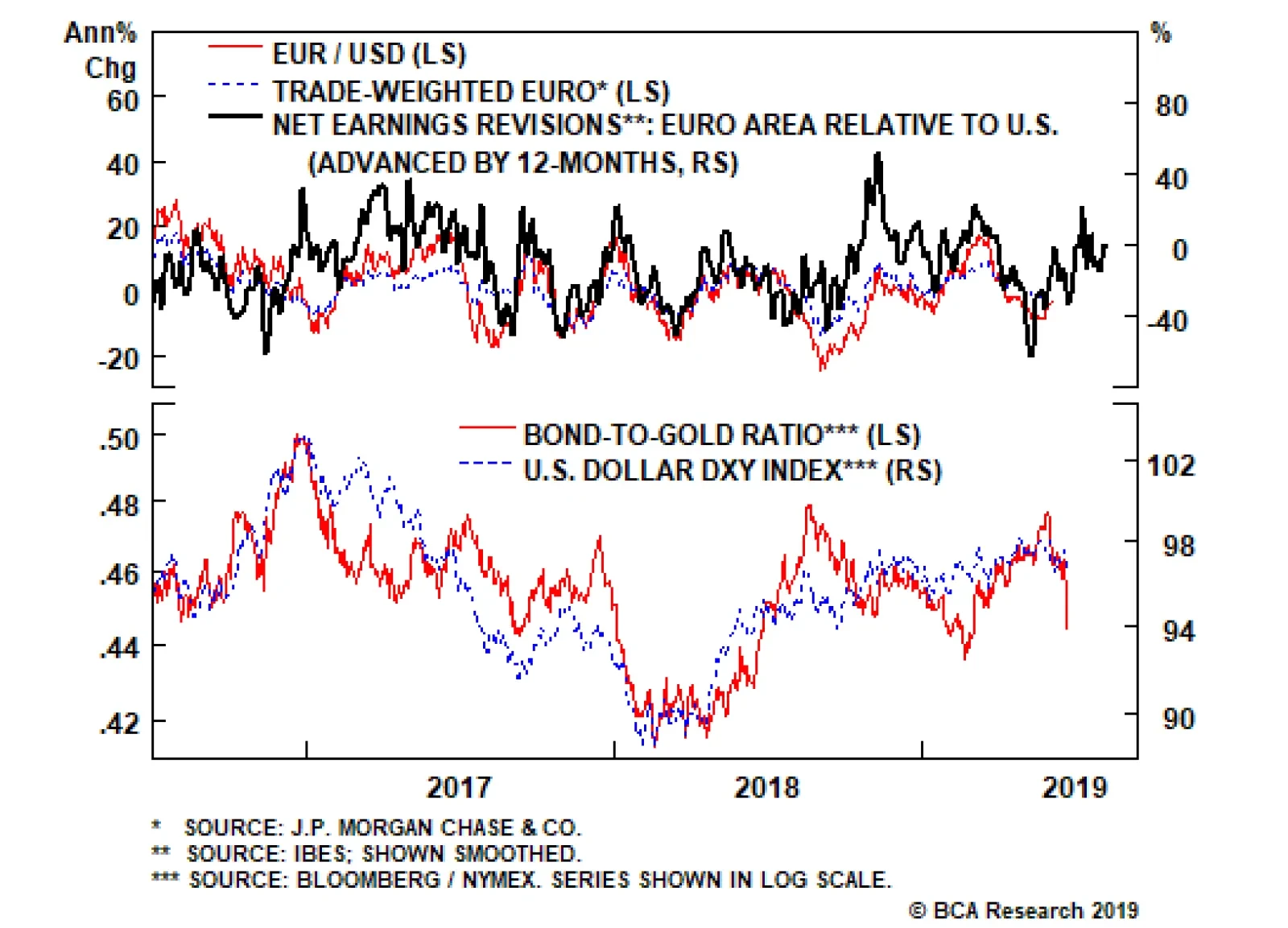
The drop in the euro since 2018 has also eased financial conditions and made euro zone companies more competitive. This is a tailwind for European stocks. Fortunately for investors, European equities, especially those in the periphery, remain unloved, given they are trading at some of the cheapest cyclically adjusted price-to-earnings multiples in the developed world. Analysts began aggressively revising up their earnings estimates for euro zone equities earlier this year, relative to the U.S. If they are right, this could lead into powerful inflows into the euro over the next nine to 12 months (Chart I-10). Chart I-10The Euro May Be On The Verge Of A Major Pop
The Euro May Be On The Verge Of A Major Pop
The Euro May Be On The Verge Of A Major Pop
Bottom Line: Falling rate expectations relative to policy action have historically been bearish for the dollar with a lag of about nine to 12 months. The dollar has been relatively resilient, despite interest rate differentials are moving against it, but has started to converge towards lower rates. One winner will be EUR/USD. Stay Short USD/JPY The BoJ kept monetary policy on hold this week, but the message was cautious, even encouraging fiscal support. It looks like the end of the Heisei era2 has brought forward a well-known quandary for the central bank, which is that additional monetary policy options are hard to come by, since there have been diminishing economic returns to additional stimulus. This puts short USD/JPY bets in an enviable “heads I win, tails I do not lose too much” position. Chart I-11Stealth Tapering By The BoJ
Stealth Tapering By The BoJ
Stealth Tapering By The BoJ
The BoJ maintained Yield Curve Control (YCC), stating it will continue to “conduct purchases of JGBs in a flexible manner so that their amount outstanding will increase at an annual pace of about 80 trillion yen.”3 But with the BoJ owning 46% of outstanding JGBs, about 75% of ETFs and almost 5% of JREITs, this will be a tall order (Chart I-11). The supply side obviously puts a serious limitation on how much more stimulus the central bank can provide. Total annual asset purchases by the BoJ are currently running at about ¥27 trillion, while JGBs purchases are running at ¥20 trillion. This is a far cry from the central bank’s soft target of ¥80 trillion, and unlikely to change anytime soon, given bond yields closing in on the -20 basis-point floor. This means interest rate differentials are likely to move in favor of a stronger yen short term (Chart I-12). The BoJ targets an inflation rate of 2%, but it is an open question as to whether it can actually achieve this. The overarching theme for prices in Japan is a rapidly falling (and ageing) population leading to deficient demand. More importantly, almost 40% of the Japanese consumption basket is in tradeable goods, meaning domestic inflation is as much driven by the influence of the BoJ as it is by globalization. Even for prices within the BoJ’s control, an ageing demographic that has a strong preference for falling prices is a powerful conflicting force. For example, transportation and telecommunications make up 17% of the core consumption basket in Japan, a non-negligible weight. This is and will remain a powerful drag on CPI, making it very difficult for the BoJ to re-anchor inflation expectations upward. The risk to short USD/JPY positions is that the BoJ will eventually act, but it may first require a riot point. On the other side of the coin, YCC and negative interest rates have been an anathema for Japanese net interest margins and share prices. This, together with QE, has pushed banks to search for yield down the credit spectrum. Any policy shift that is increasingly negative for banks could easily tip them over. Chart I-12Can Japan Drop Rates Further?
Can Japan Drop Rates Further?
Can Japan Drop Rates Further?
Chart I-13MMT Might Be What The Doctor Ordered
MMT Might Be What The Doctor Ordered
MMT Might Be What The Doctor Ordered
Bottom Line: Inflation expectations remain at rock-bottom levels in Japan, at a time when the BoJ may be running out of policy bullets. Meanwhile, the margin of error for the BoJ is non-trivial, since a small external shock could tip the economy back into deflation. The risk to short USD/JPY positions is that the BoJ will eventually act, but it may first require a riot point (Chart I-13). A Final Note On The Pound A new conservative leadership is at the margin more negative for the pound (the assessment of our geopolitical strategists is that the odds of a hard Brexit have risen from 14% to 21%). However, our simple observation is that the pound is below where it was after the 2016 referendum results, yet more people are now in favor of staying in the union (Chart I-14). Chart I-14Support For Brexit Is Low, But Has Risen
Support For Brexit Is Low, But Has Risen
Support For Brexit Is Low, But Has Risen
Chart I-15Low Rates Could Help British Capex
Low Rates Could Help British Capex
Low Rates Could Help British Capex
The BoE kept rates on hold following its latest policy meeting and will continue to err on the side of caution until the Brexit imbroglio is resolved. The reality is that the pound and U.K. gilt yields should be much higher solely on the basis of hard incoming data. Yes, the data has softened, but employment growth has been holding up very well, wages are inflecting higher and the average U.K. consumer appears in decent shape. Investment and construction have been the weak spot in the U.K. economy but may marginally improve on low rates (Chart I-15). We remain long the pound, given lower overall odds of a no-deal Brexit. That said, our long GBP/USD position was a few pips from being stopped out this week. Stand aside if triggered. Housekeeping Our stop-loss on long EUR/CHF was triggered at 1.11 yesterday. Stand aside for now, but we will be looking for opportunities to put this trade back on. Chester Ntonifor, Foreign Exchange Strategist chestern@bcaresearch.com Footnotes 1 Please see Foreign Exchange Strategy Weekly Report, titled “EUR/USD And The Neutral Rate Of Interest,” dated June 14, 2019, available at fes.bcaresearch.com. 2 The Heisei era refers to the period of Japanese history corresponding to the reign of Emperor Akihito from 8 January 1989 until his abdication on 30 April 2019. 3 Please refer to the Bank of Japan “Minutes of The Monetary Policy Meeting,” dated June 20, 2019, page 1. Currencies U.S. Dollar Chart II-1USD Technicals 1
USD Technicals 1
USD Technicals 1
Chart II-2USD Technicals 2
USD Technicals 2
USD Technicals 2
Recent data in the U.S. have been mostly negative: Retail sales grew by 0.5% month-on-month in May. University of Michigan consumer sentiment and expectation indices both fell to 97.9 and 88.6 in June. However, current conditions index increased to 112.5. NY empire state manufacturing index came in at -8.6 in June, falling below 0 for the first time since October 2016. NAHB housing market index fell to 64 in June. Housing starts contracted by 0.9% month-on-month in May, while building permits increased by 0.3% month-on-month. Current account deficit decreased to $130.4 billion in Q1. Philadelphia Fed Business Outlook survey index fell to 0.3 in June. DXY index fell by 1% this week. This Wednesday, the Fed has kept interest rates steady at 2.5%, but left the door open for rate cuts in the future as Powell stated that “Many participants now see the case for somewhat more accommodative policy has strengthened.” The dollar has weakened in response to the dovish pivot. Report Links: EUR/USD And The Neutral Rate Of Interest - June 14, 2019 Where To Next For The U.S. Dollar? - June 7, 2019 President Trump And The Dollar - May 9, 2019 The Euro Chart II-3EUR Technicals 1
EUR Technicals 1
EUR Technicals 1
Chart II-4EUR Technicals 2
EUR Technicals 2
EUR Technicals 2
Recent data in the euro area have been negative with muted inflation: Trade surplus narrowed to €15.3 billion in April. Headline and core inflation fell to 1.2% and 0.8% year-on-year respectively in May. ZEW survey expectations index fell to -20.2 in June. Current account surplus decreased to €20.9 billion in April. Construction output growth fell to 3.9% year-on-year in April. Consumer confidence fell further to -7.2 in June. EUR/USD increased by 0.7% this week. The cross fell initially on Draghi’s dovish message that ECB would ease policy again should inflation fail to accelerate, then rebounded on broad dollar weakness this Wednesday following the Fed’s dovish pivot. However, the euro has weakened further against other currency pairs. Our EUR/CHF trade was stopped out at 1.11 on Thursday morning. Report Links: EUR/USD And The Neutral Rate Of Interest - June 14, 2019 Take Out Some Insurance - May 3, 2019 Reading The Tea Leaves From China - April 12, 2019 The Yen Chart II-5JPY Technicals 1
JPY Technicals 1
JPY Technicals 1
Chart II-6JPY Technicals 2
JPY Technicals 2
JPY Technicals 2
Recent data in Japan have been mostly negative: Industrial production was unchanged at -1.1% year-on-year in April. Total adjusted trade balance decreased to -¥609.1 billion in May. Imports fell by 1.5% year-on-year, while exports contracted by 7.8% year-on-year. All industry activity index increased by 0.9% month-on-month in April. Machine tool orders continued to contract by 27.3% year-on-year in May. USD/JPY fell by 1.1% this week. BoJ kept the interest rate unchanged at -0.1% this week. In the monetary statement, the BoJ stated that the Japanese economy would likely continue expanding at a moderate rate, despite exogenous shocks. The current policy rates will be maintained at least through the spring of 2020. Report Links: Short USD/JPY: Heads I Win, Tails I Don’t Lose Too Much - May 31, 2019 Beware Of Diminishing Marginal Returns - April 19, 2019 Tug OF War, With Gold As Umpire - March 29, 2019 British Pound Chart II-7GBP Technicals 1
GBP Technicals 1
GBP Technicals 1
Chart II-8GBP Technicals 2
GBP Technicals 2
GBP Technicals 2
Recent data in the U.K. have been mixed: Retail price index increased by 3% year-on-year in May. Headline and core inflation fell to 2% and 1.7% year-on-year respectively in May. Total retail sales growth fell to 2.3% year-on-year in May. GBP/USD increased by 0.9% this week. The MPC voted unanimously to keep the interest rate unchanged at 0.75% this week. However, some policymakers have suggested that borrowing costs should be higher. The BoE however cut its growth forecast in the second quarter of 2019 amid rising global trade tensions and a fear of “no-deal” Brexit. Report Links: A Contrarian View On The Australian Dollar - May 24, 2019 Take Out Some Insurance - May 3, 2019 Not Out Of The Woods Yet - April 5, 2019 Australian Dollar Chart II-9AUD Technicals 1
AUD Technicals 1
AUD Technicals 1
Chart II-10AUD Technicals 2
AUD Technicals 2
AUD Technicals 2
There is little data from Australia this week: House price index contracted by 7.4% year-on-year in Q1. Westpac leading index fell by 0.08% month-on-month in May. AUD/USD rose by 0.7% this week. Our long AUD/USD came close to the stop-loss at 0.68 this Tuesday, then rebounded on dollar weakness and is now trading around 0.69. RBA governor Philip Lowe said that it was unrealistic to think that the single quarter-point cut to 1.25% would work to achieve its growth target, signaling more rate cuts and fiscal stimulus in the future. We are holding on to the long AUD/USD position from a contrarian perspective, and believe that the Aussie dollar will benefit as a pro-cyclical currency if the global growth outlook turns positive. Report Links: A Contrarian View On The Australian Dollar - May 24, 2019 Beware Of Diminishing Marginal Returns - April 19, 2019 Not Out Of The Woods Yet - April 5, 2019 New Zealand Dollar Chart II-11NZD Technicals 1
NZD Technicals 1
NZD Technicals 1
Chart II-12NZD Technicals 2
NZD Technicals 2
NZD Technicals 2
Recent data in New Zealand have been mixed: REINZ house sales keep contracting by 7.8% year-on-year in May. Business Manufacturing PMI fell to 50.2 in May. Westpac consumer confidence fell to 103.5 in Q2. Current account surplus widened to N$0.675 billion in Q1. GDP growth was unchanged at 0.6% in Q1 on a quarter-on-quarter basis. However, it increased to 2.5% on a year-on-year basis. NZD/USD increased by 1.1% this week. Our bias remains that the New Zealand dollar has less room to rise compared to other pro-cyclical currencies if global growth picks up. Our SEK/NZD position is 1.3% in the money since initiated. Report Links: Where To Next For The U.S. Dollar? - June 7, 2019 Not Out Of The Woods Yet - April 5, 2019 Balance Of Payments Across The G10 - February 15, 2019 Canadian Dollar Chart II-13CAD Technicals 1
CAD Technicals 1
CAD Technicals 1
Chart II-14CAD Technicals 2
CAD Technicals 2
CAD Technicals 2
Recent data in Canada have been mixed: Foreign portfolio investment in Canadian securities fell by C$12.8 billion in April. Bloomberg Nanos confidence increased to 56.9 in June. Manufacturing sales fell by 0.6% month-on-month in April. Headline and core inflation both increased to 2.4% and 2.1% year-on-year respectively in May, surprising to the upside. USD/CAD fell by 1.6% this week. The surprising Canadian inflation print, and oil price recovery are all underpinning the Canadian dollar in the short term. This Thursday, Iran shot down a the U.S. drone in Gulf, and fears have been rising of a military confrontation between the U.S. and Iran, which is bullish for oil prices and the Canadian dollar. Report Links: Currency Complacency Amid A Global Dovish Shift - April 26, 2019 A Shifting Landscape For Petrocurrencies - March 22, 2019 Into A Transition Phase - March 8, 2019 Swiss Franc Chart II-15CHF Technicals 1
CHF Technicals 1
CHF Technicals 1
Chart II-16CHF Technicals 2
CHF Technicals 2
CHF Technicals 2
Recent data in Switzerland have been positive: Exports and imports increased to CHF 21.5 billion and CHF 18.1 billion respectively in May, resulting in a higher trade surplus of CHF 3.4 billion. USD/CHF fell by 1.7% this week. The Swiss franc has strengthened significantly against the U.S. dollar and the euro following the more-than-expected dovish shifts by the ECB and the Fed this week. Our bias remains that the SNB will use the currency as a weapon to defend the economy. Report Links: What To Do About The Swiss Franc? - May 17, 2019 Beware Of Diminishing Marginal Returns - April 19, 2019 Balance Of Payments Across The G10 - February 15, 2019 Norwegian Krone Chart II-17NOK Technicals 1
NOK Technicals 1
NOK Technicals 1
Chart II-18NOK Technicals 2
NOK Technicals 2
NOK Technicals 2
Recent data in Norway have been negative: The trade surplus narrowed to 11.3 billion NOK in May. USD/NOK fell by 1.6% this week. The Norges bank raised interest rates from 1% to 1.25%, the third rate hike during the past 12 months, and the Bank is also signaling more to come in the future. The Norges Bank remains the only hawkish central bank among all the G10 countries at this moment. The widening interest rate differentials and bullish oil outlook have been pushing the Norwegian krone higher. Our long NOK/SEK position is now 4.5% in the money. Report Links: Currency Complacency Amid A Global Dovish Shift - April 26, 2019 A Shifting Landscape For Petrocurrencies - March 22, 2019 Balance Of Payments Across The G10 - February 15, 2019 Swedish Krona Chart II-19SEK Technicals 1
SEK Technicals 1
SEK Technicals 1
Chart II-20SEK Technicals 2
SEK Technicals 2
SEK Technicals 2
Recent data in Sweden have been neutral: Headline and core inflation increased to 2.2% and 2.1 year-on-year respectively in May. Consumer confidence increased to 93.8 in June, while manufacturing confidence fell to 100.2. Unemployment rate increased to 6.8% in May. USD/SEK fell by 0.7% this week. Easing financial conditions worldwide remain a tailwind for global growth. Risk assets are rebounding with higher hopes of a trade deal as Trump will meet Xi at the G20 summit. We believe that the Swedish krona will benefit if global growth picks up in the second half of this year. Report Links: Where To Next For The U.S. Dollar? - June 7, 2019 Balance Of Payments Across The G10 - February 15, 2019 A Simple Attractiveness Ranking For Currencies - February 8, 2019 Trades & Forecasts Forecast Summary Core Portfolio Tactical Trades Closed Trades
This morning’s CPI report showed that Canadian core inflation continues to accelerate. The average of the three measures followed by the Bank of Canada moved up to 2.1% in May from 1.9% in April. Underlying inflation is therefore fully consistent with…
The same script has been replayed over the last decade with the European periphery. Labor market reforms in Mediterranean Europe have seen unit labor costs in Greece, Ireland, Portugal and Spain collectively contract by almost 10%. This has effectively…
The difficulty arises because most indicators of either full employment or inflation tend to be a lagging variable. As such, steering interest rates toward the neutral level becomes a very difficult task for any one country and/or central bank to achieve in…
Highlights A resurfacing of trade tensions could weigh on risk sentiment in the near term. A somewhat less dovish tone from the FOMC this month could further rattle risk assets. While we would not exclude the possibility of an “insurance cut,” the Fed is probably uncomfortable with the amount of easing that markets now expect. That being said, a trade truce is still more likely than not, and while the Fed will resist cutting rates this year, it will not raise them either. The neutral rate of interest in the U.S. is higher than widely believed, which means that monetary policy will remain accommodative. That’s good news for global equities. Investors should maintain a somewhat cautious stance over the next month or so. However, they should overweight stocks, while underweighting bonds, over a 12-month horizon. The equity bull market will only end when U.S. inflation rises to a level that forces the Fed to pick up the pace of rate hikes. That is unlikely to occur until late-2020 at the earliest. Feature Stocks Bounce Back We turned positive on global equities in late December after a six-month period on the sidelines. While we have remained structurally bullish over the course of this year, we initiated a tactical hedge to short the S&P 500 on May 10th following what we regarded as an overly complacent reaction by investors to President Trump’s decision to increase tariffs on Chinese imports. Our reasoning at the time was that a period of market pressure would likely be necessary to forge an agreement between the two sides. Our thesis was looking prescient for a while. However, the rebound in stocks since last week has brought the S&P 500 close to the level where we initiated the trade. Is it time to drop the hedge? Not yet. First, market internals do not inspire much confidence. Even though the S&P 500 is just below its year-to-date (and all-time) high, the Russell 2000 is 5.1% below its May highs, and 11.8% below where it was last August (Chart 1). The S&P mid cap and small cap indexes are 6.8% and 16.2%, respectively, below their highs reached last August. Such weak breadth is disconcerting. Chart 1U.S. Stocks: Not As Strong As They Appear
U.S. Stocks: Not As Strong As They Appear
U.S. Stocks: Not As Strong As They Appear
Second, President Trump’s decision to suspend raising the tariffs on Mexican imports may have had less to do with his desire to seek a more conciliatory tone, and more to do with pressure from Congressional Republicans. Various news reports suggested that Mitch McConnell and other Republican leaders opposed the action, and threatened to revoke the President’s authority to unilaterally impose tariffs.1 In the end, the deal with Mexico contained many of the same measures that the Mexicans had already agreed to implement months earlier. Our geopolitical team remains skeptical of a grand bargain in trade talks with China.2 In the United States, protectionist sentiment is politically more popular towards China than it is towards other countries (Chart 2). A breakthrough is still probable, but again, it may take a stock market selloff to produce a trade truce.
Chart 2
Chart 2
Third, we have become increasingly concerned that the market has gotten ahead of itself in pricing in Fed easing. While we would not rule out the possibility that the Fed takes out an “insurance cut” to guard against downside risks to the economy, the 80 basis points of easing that the market has priced in over the next 12 months seems excessive to us. Chart 3Financial Conditions Have Not Tightened Much
Financial Conditions Have Not Tightened Much
Financial Conditions Have Not Tightened Much
Unlike late last year, U.S. financial conditions have tightened only modestly over the past nine weeks (Chart 3). The economy is also performing reasonably well. According to the Atlanta Fed GDPNow model, real final sales to domestic purchasers3 are set to grow by 2.5% in the second quarter, up from 1.5% in Q1 (Chart 4). Real personal consumption expenditures are on track to rise by 3.2%. Gasoline futures have tumbled, which will support discretionary spending over the next few quarters (Chart 5).
Chart 4
Chart 5Lower Gasoline Prices Should Bode Well For Discretionary Spending
Lower Gasoline Prices Should Bode Well For Discretionary Spending
Lower Gasoline Prices Should Bode Well For Discretionary Spending
Granted, the labor market has cooled down. Payrolls increased by only 75K in May. However, the Council of Economic Advisers estimated that flooding in the Midwest shaved 40K from payrolls. And even with this adverse impact, the three-month average for payroll growth still stands at 151K, well above the 90K-to-100K or so that is needed to keep up with labor force growth. Meanwhile, initial unemployment claims remain muted and the employment component of the nonmanufacturing ISM hit a seven-month high in May. Chart 6Trimmed Mean PCE Inflation Back To 2%
Trimmed Mean PCE Inflation Back To 2%
Trimmed Mean PCE Inflation Back To 2%
Inflation expectations are on the low side, but actual inflation is proving to be reasonably sturdy. The core PCE index rose by 0.25% month-over-month in April. Trimmed mean PCE inflation increased above 2% on a year-over-year basis for the first time in seven years (Chart 6). According to a recent Fed study, the trimmed mean calculation is superior to the core PCE index as a summary measure of underlying inflationary trends.4 Ultimately, the fact that the U.S. economy is holding up well is a positive sign for equity returns over the next 12 months. In the short term, however, it does create the risk that the Fed will sound less dovish than investors are anticipating, leading to a temporary selloff in stocks. Hence our view: near-term cautious, longer-term bullish. Who Determines Interest Rates? Central banks decide where rates will go in the short run, but it is the economy that determines where interest rates will go in the long run. The neutral rate of interest is the rate that corresponds to full employment and stable inflation. One can also think of it as the rate that aligns the level of aggregate demand with the maximum potential output the economy is capable of achieving without overheating. Both the Fed dots and the widely-used Laubach Williams model suggest that rates are close to neutral. But are they really? If a central bank keeps rates below their neutral level for too long, inflation will eventually break out, forcing the central bank to raise rates. Conversely, if a central bank raises rates above their neutral level, growth will slow, inflation will decline, and the central bank will be forced to cut rates. The problem is that changes in monetary policy typically affect the economy with a lag of 12-to-18 months. Inflation is also a highly lagging indicator. It usually peaks well after a recession has begun and troughs long after the recovery is under way (Chart 7). Thus, central banks have to make an educated guess as to where the neutral rate lies and try to steer the economy towards that rate in a way that achieves a soft landing. Needless to say, this is easier said than done.
Chart 7
Today, both the Fed dots and the widely-used Laubach Williams model suggest that rates are close to neutral (Chart 8). Chart 8The Fed Thinks Rates Are Close To Neutral
The Fed Thinks Rates Are Close To Neutral
The Fed Thinks Rates Are Close To Neutral
But are they really? That’s the million dollar question. Not only will the answer determine the medium-term path of interest rates, it will also determine how long the current U.S. economic expansion will last. Recessions rarely occur when monetary policy is accommodative, and equity bear markets almost never happen outside of recessionary periods (Chart 9). Thus, if rates are currently well below neutral, investors should maintain a bullish equity tilt. Chart 9Recessions And Bear Markets Usually Overlap
Recessions And Bear Markets Usually Overlap
Recessions And Bear Markets Usually Overlap
Chart 10U.S.: Federal Fiscal Policy Has Been Expansionary
U.S.: Federal Fiscal Policy Has Been Expansionary
U.S.: Federal Fiscal Policy Has Been Expansionary
Where Is Neutral? The neutral rate of interest is a function of many variables, most of which are not in the Laubach Williams model. Let us consider a few: Fiscal Policy A larger budget deficit boosts aggregate demand, while higher interest rates lower demand. Thus, once an economy has achieved full employment, an easing of fiscal policy must be counterbalanced by an increase in interest rates, which is another way of saying that looser fiscal policy raises the neutral rate of interest. The U.S. cyclically-adjusted budget deficit has risen by about 3% of GDP since 2015. Both tax cuts and increased federal discretionary spending have contributed to the deterioration in the fiscal balance (Chart 10). Standard “Taylor Rule” equations suggest that a 1% of GDP increase in aggregate demand will raise the appropriate level of the fed funds rate by 0.5-to-1 percentage points.5 This implies that easier fiscal policy has lifted the neutral rate of interest by 1.5-to-3 percentage points over the past five years. Labor Market Developments A tight labor market tends to increase the share of national income accruing to workers (Chart 11). Workers generally spend more of every dollar of income than businesses. Thus, a shift of income from businesses to workers raises the neutral rate of interest. The fact that a tight labor market usually generates the biggest gains for workers at the bottom of the income distribution – who have the highest marginal propensity to spend – further amplifies the positive effect on aggregate spending. Chart 11Workers Garner A Larger Piece Of The Income Pie When The Labor Market Is Tight
Workers Garner A Larger Piece Of The Income Pie When The Labor Market Is Tight
Workers Garner A Larger Piece Of The Income Pie When The Labor Market Is Tight
Chart 12
The labor share of income has rebounded since reaching a record low in 2014. The lowest-paid workers have also seen the largest wage increases during the past 12 months (Chart 12). Neither of these nascent developments have come close to unwinding the beating that labor has suffered in relation to capital over the past four decades, but if the unemployment rate keeps falling, workers are going to start gaining the upper hand. Thus, one would expect the neutral rate of interest to rise further as the labor market continues to tighten. Credit Growth The Great Recession ushered in a painful deleveraging cycle. Household debt fell from 86% of GDP in 2009 to 70% of GDP in 2012. The household debt-to-GDP ratio has edged slightly lower since then due to continued declines in mortgage debt and home equity lines of credit. A return to the rapid pace of credit growth seen before the financial crisis is unlikely. Nevertheless, a modest releveraging of household balance sheets would not be surprising. Some categories such as student and auto loans have seen fairly robust debt growth (Chart 13). Housing-related debt could also stage a modest comeback due to rising home prices and buoyant consumer confidence. Conceptually, the rate of credit growth determines the level of aggregate demand.6 Thus, if household credit growth picks up at the margin, this would push up the neutral rate of interest. Corporate debt levels also have scope to rise further. Net corporate debt is only modestly higher than it was in the late 1980s, a period when the fed funds rate averaged nearly 10% (Chart 14). Chart 13U.S. Housing Deleveraging Has Slowed
U.S. Housing Deleveraging Has Slowed
U.S. Housing Deleveraging Has Slowed
Chart 14U.S. Corporate Debt (I): No Cause For Alarm
U.S. Corporate Debt (I): No Cause For Alarm
U.S. Corporate Debt (I): No Cause For Alarm
Thanks to low interest rates and rapid asset accumulation, the economy-wide interest coverage ratio is above, while the ratio of debt-to-assets is below, their respective long-term averages (Chart 15). The corporate sector financial balance – the difference between what businesses earn and spend – is still in surplus. Almost every recession in the post-war era has begun when the corporate sector financial balance was in deficit (Chart 16). Chart 15U.S. Corporate Debt (II): No Cause For Alarm
U.S. Corporate Debt (II): No Cause For Alarm
U.S. Corporate Debt (II): No Cause For Alarm
Chart 16U.S. Corporate Debt (III): No Cause For Alarm
U.S. Corporate Debt (III): No Cause For Alarm
U.S. Corporate Debt (III): No Cause For Alarm
The Value Of The U.S. Dollar A stronger dollar reduces net exports. This drains demand from the economy, which lowers the neutral rate of interest. The real broad trade-weighted dollar index has risen 10% since 2014. According to the New York Fed’s econometric model, this would be expected to reduce the level of real GDP by 0.5% in the first year and by a further 0.2% in the second year, for a cumulative decline of 0.7%, equivalent to a decrease in the neutral rate of 0.35%-to-0.7%. The New York Fed model assumes an “all things equal” environment. All things have not been quite equal, however. The U.S. has benefited from a modest improvement in its terms of trade7 over the past five years (Chart 17). The shale boom has also significantly cut into oil imports. As a result, the trade deficit has fallen from 5.9% of GDP in 2005 to 2.9% of GDP at present. Chart 17The Dollar Has Appreciated Since 2014
The Dollar Has Appreciated Since 2014
The Dollar Has Appreciated Since 2014
Chart 18The Savings Rate Has (A Lot Of) Room To Drop, Judging From The Historical Relationship With Wealth
The Savings Rate Has (A Lot Of) Room To Drop, Judging From The Historical Relationship With Wealth
The Savings Rate Has (A Lot Of) Room To Drop, Judging From The Historical Relationship With Wealth
Asset Prices An increase in asset values – whether they be equities, bonds, or homes – makes people and businesses feel wealthier, which leads to more consumption and investment spending. As such, higher asset prices raise the neutral rate of interest. Today, U.S. household net worth stands near a record high as a percent of disposable income (Chart 18). The personal savings rate, in contrast, still stands at an elevated 6.4%. If the savings rate falls over the coming months, this would further boost aggregate demand. Demographics Slower labor force growth has led to a decline in trend GDP growth in the U.S. and most other economies. Slower economic growth tends to reduce the neutral rate of interest. The Bureau of Labor Statistics expects labor force growth to be broadly stable over the next 5-to-10 years, with immigration compensating for the withdrawal of baby boomers from employment (Chart 19).
Chart 19
Chart 20Savings Over The Life Cycle
Savings Over The Life Cycle
Savings Over The Life Cycle
In the current political climate, there is quite a bit of uncertainty over how many immigrants will settle in the United States. On the one hand, less immigration would reduce labor force growth, thus lowering the neutral rate. On the other hand, a decline in immigration would lead to an even tighter labor market, thus potentially raising the neutral rate. An additional question is how population aging, which will continue even if immigration remains elevated, will affect the neutral rate. Older people work less, but consume more than younger people, once health care spending is accounted for (Chart 20). If overall national output falls in relation to consumption, national savings will go down. This will raise the neutral rate of interest. The Shift To A Capital-Lite Economy Firms increasingly need less physical capital to carry out their activities. Larry Summers has labeled this the “demassification” of the economy. Lower investment spending would translate into a lower neutral rate. While plausible, it is not clear how important this phenomenon is. Companies may need less physical capital, but they need more human capital. Instead of more lending to businesses to finance purchases of machinery, we get additional lending to students. If our thesis that the neutral rate of interest is higher than widely believed turns out to be correct, this means that the Fed will eventually need to start hiking rates again. The question is when. The share of R&D and other intangibles in business investment has risen from around 14% in the 1960s to 33% today (Chart 21). Importantly, the depreciation rate for intangible investment is much higher than for other forms of capital spending. As intangible investment has increased, the overall depreciation rate for the economy has risen (Chart 22). Conceptually, an increase in the depreciation rate should lead to a higher neutral rate of interest.8 Chart 21A Larger Share Of Business Investment Is Intangible...
A Larger Share Of Business Investment Is Intangible...
A Larger Share Of Business Investment Is Intangible...
Chart 22...And That Puts Upward Pressure On The Depreciation Rate
...And That Puts Upward Pressure On The Depreciation Rate
...And That Puts Upward Pressure On The Depreciation Rate
Watch Housing And Business Capex The discussion above suggests that the neutral rate of interest is probably higher than widely believed. That said, there is significant uncertainty around any estimate of the neutral rate. As such, we recommend that investors track the more interest-rate sensitive sectors of the economy to gauge whether monetary policy is becoming restrictive. Housing, and to a lesser extent, business capital expenditures are the key indicators to watch. As a long-lived asset, housing is very sensitive to mortgage rates. Chart 23 shows that changes in mortgage rates tend to lead residential investment and home sales by about six months. Chart 23Housing Is Interest-Rate Sensitive
Housing Is Interest-Rate Sensitive
Housing Is Interest-Rate Sensitive
If the decline in mortgage rates since last fall fails to spur housing, this would support the claim that monetary policy turned restrictive last year. Fortunately, the jump in homebuilder confidence, the outperformance of homebuilder stocks, and the surge in mortgage applications for purchases all suggest that the housing sector remains on firm ground (Chart 24). Despite the broad-based weakness in the global manufacturing sector, U.S. capex intentions remain reasonably buoyant (Chart 25). This week’s release of the May NFIB small business survey, which showed that the share of firms citing “now is a good time to expand” jumped five points to a seven-month high, provides further evidence in support of this view. Chart 24Some Positives For U.S. Housing
Some Positives For U.S. Housing
Some Positives For U.S. Housing
Chart 25U.S. Capex Intentions Remain Solid
U.S. Capex Intentions Remain Solid
U.S. Capex Intentions Remain Solid
A Two-Stage Fed Cycle Chart 26Inflation Expectations Are Not Where The Fed Wants Them To Be
Inflation Expectations Are Not Where The Fed Wants Them To Be
Inflation Expectations Are Not Where The Fed Wants Them To Be
If our thesis that the neutral rate of interest is higher than widely believed turns out to be correct, this means that the Fed will eventually need to start hiking rates again. The question is when. Right now, the Fed has the luxury of time on its side. Even though some measures of core inflation such as the trimmed mean calculation discussed above have reached the Fed’s 2% target, this follows a prolonged period of below-target inflation. A few years of above-trend inflation would hardly be the worst thing in the world. The Fed’s failure to reach its inflation target has pushed long-term inflation expectations below the central bank’s comfort zone (Chart 26). Given the asymmetric risks created by the zero lower bound on interest rates - if inflation rises too fast, the Fed can always hike rates; but if inflation falls too much, it may be impossible to ease monetary policy by enough to avert a recession - the Fed can afford to remain patient. Thus, while the Fed is unlikely to cut rates as much as investors currently expect, it is also unlikely to raise them this year. Thanks to a cyclical revival in productivity growth, unit labor cost inflation has actually declined over the past 12 months (Chart 27). However, as we get into late next year and 2021, circumstances may change. If an increasingly tight jobs market continues to push up wage growth, unit labor costs will start to reaccelerate. Cost-push inflation will kick in. At that point, the Fed may have no choice but to pick up the pace of monetary tightening. All this suggests that Fed policy will evolve in two stages: an initial stage lasting for the next 12-to-18 months where the Fed is doing little-to-no tightening (and could even cut rates if the trade war heats up), followed by a second stage where the central bank is scrambling to raise rates to cool an overheated economy. U.S. Treasury yields are likely to rise modestly during the first stage in response to stronger-than-expected economic growth. We see the 10-year yield clawing its way back to the high-2% range by early next year. Yields could rise more precipitously, to around 4%, in the second stage once inflation begins to move decisively higher. The dollar is unlikely to strengthen during the first stage. Indeed, our baseline forecast calls for a period of modest dollar weakness stretching into late next year driven by a reacceleration in European and Chinese/EM growth. The sharp rebound in Chinese real estate equipment purchases from -18% on a six-month basis late last year to +30% in April suggests that the government’s stimulus efforts are working (Chart 28). Chart 27No Imminent Threat Of A Wage-Price Inflationary Spiral
No Imminent Threat Of A Wage-Price Inflationary Spiral
No Imminent Threat Of A Wage-Price Inflationary Spiral
Chart 28China: A Sign That Stimulus Is Finding Its Way Into The Economy
China: A Sign That Stimulus Is Finding Its Way Into The Economy
China: A Sign That Stimulus Is Finding Its Way Into The Economy
The greenback will likely appreciate, perhaps significantly so, once the Fed picks up the pace of rate hikes in late 2020. The accompanying tightening in global financial conditions is likely to sow the seeds for a worldwide downturn in 2021. The combination of faster global growth and a weaker dollar will support global equities over the next 12 months. European and EM bourses will benefit the most. Investors should begin derisking in the second half of next year. Peter Berezin, Chief Global Strategist Global Investment Strategy peterb@bcaresearch.com Footnotes 1 Patricia Zengerle, “U.S. Lawmakers Seek To Block Trump On Tariffs,” Reuters, June 5, 2019. 2 Please see Geopolitical Strategy Weekly Report, “Is Trump Ready For The New Long March?” dated May 24, 2019. 3 Final sales to domestic purchasers is equal to gross domestic product (GDP) excluding net exports of goods and services, less the change in private inventories. 4 Jim Dolmas and Evan F. Koenig, “Two Measures Of Core Inflation: A Comparison,” Federal Reserve Bank Of Dallas, Working Paper 1903, February 25, 2019. 5 Depending on which specification of the Taylor Rule one uses, a one percent of GDP increase in aggregate demand will increase the neutral rate of interest by half a point (John Taylor’s original specification) or by a full point (Janet Yellen’s preferred specification). John B. Taylor's 1993 specification is based on the following equation: rt = 2 + pt + 0.5(pt - 2) + 0.5yt. Janet Yellen's preferred specification is based on the following equation: rt = 2 + pt+ 0.5(pt - 2) + 1.0yt. Please note: For both specifications above, rt is the federal funds rate; pt is core PCE expressed as a year-over-year percent change; and yt is the output gap (as approximated using the unemployment gap and Okun's law). For further discussion, please see Janet L. Yellen, "The Economic Outlook And Monetary Policy," April 11, 2012. 6 Recall that GDP is a flow variable (how much production takes place every period), whereas credit is a stock variable (how much debt there is outstanding). By definition, a flow is a change in a stock. Thus, credit growth affects GDP and the change in credit growth affects GDP growth. 7 Ratio (multiplied by 100) of the price index for exports of goods and services to the price index for imports of goods and services. 8 The higher the depreciation rate, the more investment is necessary to maintain the existing capital stock. More investment demand for any given level of savings implies a higher interest rate. One can see this in the Solow growth model, which posits that the neutral rate of interest (r*) should be equal to:
Image
Where a is the output elasticity of capital, s is the savings rate, n is labor force growth, g is the growth in total factor productivity, and d is the depreciation rate. The equation implies that the neutral rate of interest will increase if capital intensity increases, the savings rate declines, the rate of labor force growth picks up, technological progress accelerates, or the depreciation rate increases. Strategy & Market Trends MacroQuant Model And Current Subjective Scores
Chart 29
Tactical Trades Strategic Recommendations Closed Trades
Highlights 10-year real Spanish and Portuguese bond yields have already fallen below the neutral rate of interest for the entire euro zone. This suggests monetary conditions could now be favorable for all euro zone countries. Should external demand pick up, this will also help lift the equilibrium rate for the monetary union, which will be a tailwind for the EUR/USD. Falling U.S. rate expectations relative to policy action have historically been bearish for the dollar, with a lag of about six to 12 months. A risk to this view is further deterioration in the U.S.-China trade war, or a rollover in Chinese stimulus. Remain long EUR/CHF, with a tight stop at 1.11. Our bias is that the Swiss National Bank will continue to use the currency as a weapon to defend the economy. Feature The standard dilemma for the euro zone is that interest rates have always been too low for the most productive nation, Germany, but too expensive for others such as Spain and Italy. As such, the euro has typically been caught in a tug-of-war between a rising equilibrium rate of interest for Germany, but a very low neutral rate for the peripheral countries. Over the years, the impasse has been resolved from time to time through a combination of internal devaluation, currency depreciation and a successively accommodative European Central Bank. This has helped prevent a collapse of the monetary union, but in the process generated tremendous volatility in the currency. Since the onset of the Great Recession, the EUR/USD has seen five boom/bust cycles of about 20% to 25%. For both domestic policymakers and global investors alike, this has been an untenable headache. The silver lining is that the ECB may now have finally lowered domestic interest rates and eased policy to the point where they are accommodative for almost all euro zone countries: 10-year government bond yields in France, Spain and even Portugal now sit at 11bps, 54bps and 65bps respectively, much below the neutral rate. This is severely easing financial conditions in the entire euro zone, with huge implications for European assets in general and the euro in particular. In short, the EUR/USD may be very close to a floor (Chart I-1). Chart I-1How Much Lower For Relative R-Star*?
How Much Lower For Relative R-Star*?
How Much Lower For Relative R-Star*?
Structural Reforms Have Progressed The neutral rate of interest is simply the market price at which both the supply of savings and the demand for them clear. In academic parlance, this means the interest rate at which the economy is at full employment, but inflationary pressures are relatively contained. At this critical interest rate level, the economy tends to be in balance. The difficulty arises because most indicators of either full employment or inflation tend to be lagging. As such, steering interest rates toward the neutral level becomes a very difficult task for any one country and/or central bank to achieve in real time. For the euro zone as a whole, where member countries can have vastly diverging economic outcomes at any point in time, the task becomes even more arduous. This is why since the introduction of the euro, most of the economic imbalances from the region have stemmed from the standard contradiction of a common currency regime. For most of the early 2000s, Spanish and Irish long-term rates were too low relative to the potential of their respective economies, and the reverse was true for Germany. As a result, Spanish real estate took off in what culminated to be one of the biggest booms in recent history, while it stagnated in Germany. And after the Great Recession, the reverse was true: rates became too low for the most productive nation, Germany, and too high for Ireland and Spain (Chart I-2). In a normal adjustment process, the exchange rate always tends to play a key role. In a common-currency regime, there is not such a possibility. In a normal adjustment process, the exchange rate always tends to play a key role, since countries with lower productivity growth require a lower neutral rate, and as such see currency depreciation. This tends to ease financial conditions, alleviating the need for an internal adjustment process. However, in a common-currency regime, there is not such a possibility. The result is a painful process of internal devaluation, as was very vivid in the European peripheral countries from 2009-2012 (Chart I-3). Chart I-2The Common-Currency Dilemma
The Common-Currency Dilemma
The Common-Currency Dilemma
Chart I-3Internal Devaluation In The South...
Internal Devaluation In The South...
Internal Devaluation In The South...
The good news is that for the euro zone, it forced businesses to restructure and jumpstarted the process of structural reform. In the early 2000s, the German economy had to restructure in order to improve its competitiveness. As a result, unit labor costs began to lag in 2001. Over the same period, the German government began to reform the labor market. The Hartz IV labor market reforms implemented minimized safety nets for the unemployed, encouraging them to accept market-determined wages. This dramatically increased the flexibility of the labor market. The same script has been replayed over the last decade with the European periphery. Labor market reforms in Mediterranean Europe have seen unit labor costs in Greece, Ireland, Portugal and Spain collectively contract by almost 10%. This has effectively eliminated the competitiveness gap that had accumulated over the past two decades (Chart I-4). Italy remains saddled with a rigid and less productive workforce, but overall adjustments have still come a long way to closing a key fissure plaguing the common currency area. At the same time, other factors also suggest the neutral rate for individual countries should also have converged higher to that of Germany. Peripheral sovereign borrowing costs have plummeted from their prohibitive 2012 levels. As a result, interest payments as a share of GDP have become more manageable. Most southern European countries now run primary surpluses, reducing the need for external funding. Fortunately, the improvement in structural budget balances has diminished the need for any additional austerity measures, meaning government spending should no longer be a net drag on GDP growth. Increased integration continues to sustain a steady stream of cheap migrant workers to Germany. On the labor market front, the unemployment rate in Germany remains well below that in other regions, but increased integration continues to sustain a steady stream of cheap migrant workers to Germany. Over the last decade, there has been a surge of migrant workers into Germany from countries such as Portugal or Spain (Chart I-5). This will help redistribute aggregate demand within the system. Chart I-4...Has Realigned Competitiveness
...Has Realigned Competitiveness
...Has Realigned Competitiveness
Chart I-5The Unemployment Gap Is Closing
The Unemployment Gap Is Closing
The Unemployment Gap Is Closing
The bottom line is that the various forces that may have been keeping the neutral rate of interest artificially low in the euro area are ebbing. The proverbial saying is that a chain is only as strong as its weakest link. This means that if these forces pressuring equilibrium rates in the periphery are slowly dissipating, that should lift the neutral rate of interest in the entire euro zone. Over a cyclical horizon, this should be bullish for the euro (previously referenced Chart I-1). Manufacturing Recession May Soon End With the rising specter of a full-blown trade war and a global manufacturing recession, it is possible that euro zone policy settings have become even more appropriate for Germany than the rest of Europe. For example, the latest PMI releases suggest that Germany is the weakest link in the euro zone on the manufacturing front (Chart I-6). The implication is that if the ECB’s monetary settings are now being calibrated for Germany, they may also now be appropriate for all euro zone countries. For example, since 2015, peripheral country exports have increased to 28% of GDP, from a low of 16%, despite strength in the trade-weighted euro. This contrasts favorably with Germany, where the export share of German GDP has essentially been flat over this period (Chart I-7). In fact, it is entirely possible that the German economy may have already 'maxed out' its export market share gains, given its externally driven growth model over the last decade. If so, further currency weakness can only lead to inflation and wage pressures in Germany, redistributing demand from exports to the domestic sector, while benefitting the periphery. Chart I-6Germany Is Once Again The Sickman
Germany Is Once Again The Sickman
Germany Is Once Again The Sickman
Chart I-7GIPS Are Gaining Export Share
GIPS Are Gaining Export Share
GIPS Are Gaining Export Share
Over the past few years, corporate profits as a share of GDP in both Portugal and Spain have overtaken German levels. And with the output gap is still open in these countries, it will take a while before the unemployment rate moves below NAIRU and begins to generate wage pressures. This will allow companies to continue reaping a labor dividend while gaining export market share. It is not easy to tell if and when the trade war will end sans escalation, but there remain a number of green shoots in the European economy: While the German PMI is currently one of the weakest in the euro zone, forward-looking indicators suggest we are on the cusp of a V-shaped bottom over the next few months or so (Chart I-8). A rising Chinese credit impulse is usually bullish for European exports, and this time should be no different (Chart I-9). This also follows improvement in the European credit impulse. Most European growth indicators relative to the U.S. hit a nadir at the beginning of this year, and have been steadily improving since.1 Chart I-8German Manufacturing Could Soon Bottom
German Manufacturing Could Soon Bottom
German Manufacturing Could Soon Bottom
Chart I-9A Pick Up In Global Demand Will Help
A Pick Up In Global Demand Will Help
A Pick Up In Global Demand Will Help
The bottom line is that investors are currently too pessimistic on Europe’s growth prospects at a time when policy settings have become appropriate for the weakest link. If, in fact, European growth and inflation improve relative to the U.S., this will give investors an opportunity to reassess interest rate expectations for the euro area versus the U.S. Implications For The Euro The euro tends to be largely driven by pro-cyclical flows. Fortunately for investors, European equities, especially those in the periphery, remain unloved, given they are trading at some of the cheapest cyclically adjusted price-to-earnings multiples in the developed world. Analysts began aggressively revising up their earnings estimates for euro zone equities verus the U.S. earlier this year. If they are right, this tends to firmly lead the euro by about nine to 12 months, suggesting we are due for a pop in the coming quarters (Chart I-10). Chart I-10Rising Earnings Revisions Are Bullish For The Euro
Rising Earnings Revisions Are Bullish For The Euro
Rising Earnings Revisions Are Bullish For The Euro
The euro’s bounce after the ECB’s latest meeting suggests its dovish shift is paradoxically bullish for the common currency. If a central bank eases financing conditions at a time when growth is hitting a nadir, it is tough to argue that it is bearish for the currency. This in combination with easier fiscal policy should boost aggregate demand and lift the neutral rate of interest in the euro zone. Dollar weakness could be the catalyst that triggers a EUR/USD rally. Markets are usually wrong about Federal Reserve interest rate expectations, and this time is likely to be no different. However, the current divergence between market expectations and policy action is the widest since the Great Recession. Falling rate expectations relative to policy action have historically been bearish for the dollar with a lag of about nine to 12 months (Chart I-11). The basic balance in the euro area is on the verge of hitting fresh highs. Finally, positioning, valuation and balance-of-payments dynamics remain favorable for the euro (Chart I-12). The basic balance in the euro area is on the verge of hitting fresh highs on the back of improvement in FDI flows. With a large number of short positions on the euro, this could trigger a significant short-covering rally. Chart I-11The Dollar Might ##br##Soon Peak
The Dollar Might Soon Peak
The Dollar Might Soon Peak
Chart I-12A Favorable Balance Of Payments ##br##Backdrop For The Euro
A Favorable Balance Of Payments Backdrop For The Euro
A Favorable Balance Of Payments Backdrop For The Euro
Chester Ntonifor, Foreign Exchange Strategist chestern@bcaresearch.com Footnotes 1 Please see Foreign Exchange Strategy Special Report, titled “A Contrarian Bet On The Euro,” dated March 1, 2019, available at fes.bcaresearch.com. Currencies U.S. Dollar Chart II-1USD Technicals 1
USD Technicals 1
USD Technicals 1
Chart II-2USD Technicals 2
USD Technicals 2
USD Technicals 2
Recent data in the U.S. have been mostly negative, but a few one-time factors were at play: On the labor market front, nonfarm payrolls fell to 75 thousand in May, but this was dragged down by flooding in the Midwest. Average hourly earnings grew by 3.1% year-on-year and the unemployment rate was stable at 3.6%. Headline and core consumer price inflation came in slightly lower at 1.8% and 2% year-on-year, but remain on target. Export prices fell by 0.7% year-on-year in May, and import prices contracted by 1.5% year-on-year, giving the greenback a terms-of-trade boost. On a positive note, the NFIB Small Business Optimism survey rose to a 5-month high of 105 in May. On another positive note, mortgage applications jumped by 26.8% this week. DXY index rose by 0.3% this week. Our bias is that the dollar is in the final innings of its rally, amid narrowing interest rate differentials, portfolio outflows, and easing liquidity strains. Should global growth benefit from the dovish pivot by central banks, this could be the catalyst for dollar downside. Report Links: Where To Next For The U.S. Dollar? - June 7, 2019 President Trump And The Dollar - May 9, 2019 Take Out Some Insurance - May 3, 2019 The Euro Chart II-3EUR Technicals 1
EUR Technicals 1
EUR Technicals 1
Chart II-4EUR Technicals 2
EUR Technicals 2
EUR Technicals 2
There has been tepid data out of the euro zone this week: Sentix investor confidence fell to -3.3 in June. Industrial production contracted by 0.4% year-on-year in April. This is an improvement compared with the last reading of -0.7% and the consensus of -0.5%. EUR/USD fell by 0.3% this week. The front section this week is dedicated to the euro, since it has begun to tick many of the boxes for a counter-trend rally. The euro is trading below its fair value, easy financial conditions within the euro area will help, and Chinese stimulus could boost European exports, lifting the growth potential for the entire union. Report Links: Take Out Some Insurance - May 3, 2019 Reading The Tea Leaves From China - April 12, 2019 Into A Transition Phase - March 8, 2019 The Yen Chart II-5JPY Technicals 1
JPY Technicals 1
JPY Technicals 1
Chart II-6JPY Technicals 2
JPY Technicals 2
JPY Technicals 2
Recent data in Japan have been mixed: The leading economic index fell to 95.5 in April, while the coincident index increased to 101.9. Annualized GDP growth was 2.2% year-on-year in Q1. Quarter-on-quarter growth also improved to 0.6%. The current account balance came in at 1.7 trillion yen in April. This was lower than the previous 2.9 trillion figure, but an improvement over consensus. Machine tool orders contracted by 27.3% year-on-year in May, while machinery orders increased by 2.5% year-on-year in April. It is worth noting that the pace of deceleration in machine tool orders is ebbing. USD/JPY has been flat this week. We continue to recommend the yen as an insurance against market turbulence. Even though the yen might weaken on the crosses in a scenario where global growth picks up later this year, it still has upside potential against the U.S. dollar. Report Links: Short USD/JPY: Heads I Win, Tails I Don’t Lose Too Much - May 31, 2019 Beware Of Diminishing Marginal Returns - April 19, 2019 Tug OF War, With Gold As Umpire - March 29, 2019 British Pound Chart II-7GBP Technicals 1
GBP Technicals 1
GBP Technicals 1
Chart II-8GBP Technicals 2
GBP Technicals 2
GBP Technicals 2
Recent data in the U.K. have been mixed: Halifax house prices increased by 5.2% year-on-year in May. Industrial production contracted by 1% year-on-year in April. Manufacturing production also contracted by 0.8% year-on-year. The trade deficit narrowed to 2.74 billion pounds in April. The ILO unemployment rate was unchanged at 3.8% in April, while average earnings growth keeps holding firm, though it fell slightly to 3.1%. GBP/USD fell by 0.4% this week, now oscillating around 1.268. We will respect the stop loss for our long GBP/USD position if triggered at 1.25. While cheap valuation and favorable fundamentals support the pound on a cyclical basis, the implied volatility remains elevated amidst political uncertainties. The official kickoff for a new Conservative party leader is poised to ratchet up “hard Brexit” rhetoric, which will be negative for the pound. Report Links: A Contrarian View On The Australian Dollar - May 24, 2019 Take Out Some Insurance - May 3, 2019 Not Out Of The Woods Yet - April 5, 2019 Australian Dollar Chart II-9AUD Technicals 1
AUD Technicals 1
AUD Technicals 1
Chart II-10AUD Technicals 2
AUD Technicals 2
AUD Technicals 2
Recent data in Australia have shown a steady labor market: Consumer inflation expectations were unchanged at 3.3% in June. On the labor market front, the participation rate increased to 66% in May; unemployment rate was stable at 5.2%; 42.3 thousand new jobs were created in May but the mix was unfavorable, with a combination of 2.4 thousand full-time jobs and 39.8 thousand part-time jobs. AUD/USD fell by 1.3% this week. Clearly, the Australian jobs report was interpreted negatively by the market, given the boost from temporary election hiring. As such, markets are continually pricing in further rate cuts from the RBA, a negative for interest rate differentials between Australia and the U.S. Over the longer term, easier financial conditions could help to lift the economy, and stabilize the housing sector by reducing the interest payment burdens. Report Links: A Contrarian View On The Australian Dollar - May 24, 2019 Beware Of Diminishing Marginal Returns - April 19, 2019 Not Out Of The Woods Yet - April 5, 2019 New Zealand Dollar Chart II-11NZD Technicals 1
NZD Technicals 1
NZD Technicals 1
Chart II-12NZD Technicals 2
NZD Technicals 2
NZD Technicals 2
There was scant data out of New Zealand this week: Manufacturing sales were unchanged at 2% in Q1. Electronic card retail sales growth grew by 3.2% year-on-year in May, higher than the consensus of 1.6%. Immigration remains a tailwind for domestic demand, but is slowly fading. NZD/USD fell by 1.4% this week. We introduced a long SEK/NZD trade last Friday, which is now 0.3% in the money. We believe that the Swedish krona will benefit more than the New Zealand dollar once global growth picks up. Report Links: Where To Next For The U.S. Dollar? - June 7, 2019 Not Out Of The Woods Yet - April 5, 2019 Balance Of Payments Across The G10 - February 15, 2019 Canadian Dollar Chart II-13CAD Technicals 1
CAD Technicals 1
CAD Technicals 1
Chart II-14CAD Technicals 2
CAD Technicals 2
CAD Technicals 2
Recent data in Canada have been positive: The labor market remains robust with 27.7 thousand new jobs created in May. This pushed the unemployment rate to a low of 5.4%. The participation rate fell slightly to 65.7% but average hourly wages increased by 2.6% year-on-year. The mix was also positive, with all of the jobs generated as full-time employment. Housing starts came in at 202.3 thousand in May, while building permits increased by 14.7% month-on-month in April. USD/CAD initially fell by 1% on the labor market data last Friday, then recovered gradually, returning flat this week. While the labor market remains strong and the housing sector is showing signs of a recovery, the recent weakness in energy prices has been a headwind for the loonie. Moreover, a rate cut by BoC has become increasingly likely following the dovish shift by the Fed. Report Links: Currency Complacency Amid A Global Dovish Shift - April 26, 2019 A Shifting Landscape For Petrocurrencies - March 22, 2019 Into A Transition Phase - March 8, 2019 Swiss Franc Chart II-15CHF Technicals 1
CHF Technicals 1
CHF Technicals 1
Chart II-16CHF Technicals 2
CHF Technicals 2
CHF Technicals 2
There has been little data out of Switzerland this week: The unemployment rate was unchanged at 2.4% in May. Foreign currency reserves fell slightly to 760 billion CHF in May. Producer and import prices contracted by 0.8% year-on-year in May. USD/CHF appreciated by 0.4% this week. The Swiss National Bank maintained interest rates at -0.75% this week. The policy remains expansionary, in order to stabilize price developments and support economic activity. As a technicality, the SNB will also stop targeting Libor rates in favor of SARON (Swiss Average Rate Overnight). More importantly for the franc, the SNB stated that they will “remain active in the foreign exchange market as necessary, while taking the overall currency situation into consideration.” This suggest the SNB will weaponize the franc against deflationary pressures. Remain long EUR/CHF. Report Links: What To Do About The Swiss Franc? - May 17, 2019 Beware Of Diminishing Marginal Returns - April 19, 2019 Balance Of Payments Across The G10 - February 15, 2019 Norwegian Krone Chart II-17NOK Technicals 1
NOK Technicals 1
NOK Technicals 1
Chart II-18NOK Technicals 2
NOK Technicals 2
NOK Technicals 2
Recent data in Norway have softened: Manufacturing output increased by 2.2% month-on-month in April. Headline and core inflation both fell to 2.5% and 2.3% year-on-year in May. This has nudged the core measure below the central bank’s target. Producer price inflation fell to 0.4% year-on-year in May. USD/NOK rose by 0.6% this week. The recent plunge in oil prices caused by the U.S. inventory buildup has been a headwind for the Norwegian krone. However, we expect U.S. shale-oil production to eventually slow as E&P companies exercise greater capital discipline as marginal profit decreases. Moreover, irrespective of the oil price direction, we expect the Norwegian krone to outperform other petro-currencies, such as the Canadian dollar. Report Links: Currency Complacency Amid A Global Dovish Shift - April 26, 2019 A Shifting Landscape For Petrocurrencies - March 22, 2019 Balance Of Payments Across The G10 - February 15, 2019 Swedish Krona Chart II-19SEK Technicals 1
SEK Technicals 1
SEK Technicals 1
Chart II-20SEK Technicals 2
SEK Technicals 2
SEK Technicals 2
Recent data in Sweden have been positive: PES unemployment rate fell further to 3.4% in May. Household consumption increased by 0.2% month-on-month in April, but was unchanged on a year-on-year basis. USD/SEK appreciated by 0.9% this week. We favor the krona due to its cheap valuation, and its higher β to global growth (the potential to benefit more from a global economy recovery). We initiated the long SEK/NZD position last week, based on improving relative fundamentals between Sweden and New Zealand. Report Links: Where To Next For The U.S. Dollar? - June 7, 2019 Balance Of Payments Across The G10 - February 15, 2019 A Simple Attractiveness Ranking For Currencies - February 8, 2019 Trades & Forecasts Forecast Summary Core Portfolio Tactical Trades Closed Trades