Euro Area

Highlights The USD remains supported by fundamentals, especially now that its late-2016 excesses have been purged. Solid U.S. growth contrasts with weaker growth in the rest of the world, which will incentivize further inflows into the U.S. dollar. Despite this positive cyclical view, the tactical outlook remains risky for dollar bulls. In the immediate term, the euro will benefit from easing Italian tensions and as well as from the dollar's correction, but its six-month outlook remains poor. The AUD could also rebound right now, but any such rally should be used to build further short positions. Feature After a furious rally from February to August, the dollar has been weakening since the middle of last month. Since July, we have been worried that the dollar could stage a bit of a correction,1 but we remained committed to the view that ultimately the greenback would rise further in 2018. It is now time to review whether this thesis still holds. BCA believes that the USD's correction could run through the fall, but that the final quarter of 2018 should still prove a rewarding period for dollar bulls. Ultimately, policy divergences will remain a crucial support for the dollar, especially as EM weakness continues to affect the distribution of growth across the globe. USD: Not Yet Extended The dollar ultimately follows the path implied by its fundamental drivers - whether they are interest rate spreads, growth and inflation differentials, relative equity prices, or even relative money-supply growth. However, the path taken by the USD around its drivers is rather wide, and the dollar regularly overshoots and undershoots the equilibrium implied by the aggregation of all these fundamentals (Chart I-1). Academics call this the "band of agnosticism." Chart I-1The Dollar To Follow Fundamentals Higher
The Dollar To Follow Fundamentals Higher
The Dollar To Follow Fundamentals Higher
This cycle was no exception. BCA's Fundamentals Index for the dollar hooked up in 2011, a move associated with a turning point in the greenback itself. However, the dollar remained in undershoot territory for many years. Then suddenly, in 2014, the coiled spring was released and the dollar surged higher, moving above its "band of agnosticism" in 2015 - a moved exacerbated by the sudden rally that followed the election of Donald Trump in November 2016. Once the dollar had become over-loved, over-owned and expensive, it also became vulnerable. The pick-up in global growth that was so evident in 2017 caused a serious correction in this vulnerable currency. However, the selloff had a positive impact: U.S. growth, interest rates, equities and so on continued to move favorably, and the dollar is now positioned to rebound anew, having purged its most egregious excesses. The global economic backdrop is also positive for the dollar. For one, the theme of monetary divergences is still at play. Boosted by a healthy banking sector, healthy household balance sheets and an untimely fiscal stimulus of 1.7% of GDP, U.S. growth has hit 2.8%, well above potential. Moreover, growth has been above potential for eight years, and now U.S. capacity utilization is at its tightest level since the late 1980s. Historically, so large an absence of slack has been linked to higher U.S. interest rates (Chart I-2). Yet interest rate markets are pricing in roughly four increases over the next 24 months, even as Lael Brainard warned that the Federal Reserve could move beyond the hikes implied by its own forecast, the "dot plots." Chart I-2Tight Capacity Utilization Implies Higher U.S. Rates...
Tight Capacity Utilization Implies Higher U.S. Rates...
Tight Capacity Utilization Implies Higher U.S. Rates...
The U.S. economy continues to fare well, as U.S. real interest rates remain 60 basis points below neutral rates and the yield curve has yet to invert. However, U.S. rates matter for the rest of the world as well. There, the picture is less pretty. EM dollar debt stands near record levels (Chart I-3). Hence, EM financial conditions have been hit by the combined assault of higher U.S. rates and an appreciating dollar. Nowhere is this clearer than when looking at the interplay between U.S. bond yields and the South African rand or AUD/JPY, a cross highly correlated to EM currencies. This cycle, rising U.S. bond yields have most often been associated with a rising ZAR or a rising AUD/JPY (Chart I-4). However, this time around, as was the case during the May 2013 Taper Tantrum, rising bond yields are linked to these pro-cyclical currency pairs falling. This suggests that rising yields are not reflecting global growth anymore, and are in fact restrictive for the rest of the world, even if they are not a problem for the U.S. Chart I-3... Which Will Hurt EM Economies
... Which Will Hurt EM Economies
... Which Will Hurt EM Economies
Chart I-4Higher U.S. Rates Now Hurt Global Growth
Higher U.S. Rates Now Hurt Global Growth
Higher U.S. Rates Now Hurt Global Growth
This inference is underpinned by the decline in BCA's U.S. Financial Liquidity Index, which heralds additional weakness in global growth and commodity prices (Chart I-5). Already we are seeing symptoms of the malaise. Japanese foreign machine tool orders are contracting, and BCA's Asian Leading Economic Indicator is in deep contraction (Chart I-6). Chart I-5Dollar Liquidity Is A Problem For Growth
Dollar Liquidity Is A Problem For Growth
Dollar Liquidity Is A Problem For Growth
Chart I-6Signs That Global Growth Is Already Suffering
Signs That Global Growth Is Already Suffering
Signs That Global Growth Is Already Suffering
A rising fed funds rate and falling ex-U.S. growth is likely to continue to support the dollar. The dollar loves nothing more than falling global growth. The U.S. economy has low exposure to global trade and to the global industrial sector, and therefore when global growth slows, the U.S. economy is relatively insulated from foreign shocks. This means that U.S. rates of return do not suffer as much as foreign ones. This is even truer in the rare instances when global growth slows while U.S. economic activity continues to power ahead, especially when artificially inflated by untimely fiscal stimulus. This is a characterization of the current environment. Hence, money will continue to flow into the U.S. economy on a two- to three-quarter horizon. In fact, portfolio flows into the U.S. remain well below the levels that prevailed during the previous decade (Chart I-7). The current account deficit is also smaller, hence, if net foreign portfolio flows can increase due to the attraction of higher U.S. rates of return, the U.S. balance of payments will move into a greater surplus, creating a strong underpinning for the dollar. This positive cyclical backdrop for the greenback is not without impediments. Most crucially are the short-term dynamics. Since July, we have been warning clients that a tactical correction in the dollar was likely. While EUR/USD has indeed rebounded, most other currencies have displayed rather tepid performances. This does not mean that the tactical risks to the dollar have abated. Quite the opposite, they are rising. As Chart I-8 illustrates, a large buildup in dollar longs has materialized, yet the G10 economic surprise index is making a trough. Moreover, the diffusion index of the BCA Global Leading Economic indicator is also stabilizing. Additionally, USD /CNY has failed to make new highs and the Turkish central bank just raised rates to 24% - which if Argentina is any guide is likely to provide only temporary relief for the TRY. This means that a period of risk-on sentiment in EM could emerge. Stretched dollar positioning, a temporary stabilization in global growth and EM inflows could precipitate a serious correction in the dollar. Chart I-7Dollar Favorable Flows
Dollar Favorable Flows
Dollar Favorable Flows
Chart I-8Tactical Risks To The Dollar
Tactical Risks To The Dollar
Tactical Risks To The Dollar
Bottom Line: The dollar is still supported by potent cyclical tailwinds. The U.S. economy is roaring and at full employment, yet global growth is suffering because global liquidity conditions are deteriorating. Higher rates of return in the U.S. will therefore attract additional capital, supporting the greenback in the process. Despite this positive cyclical backdrop, the short-term outlook is murkier. Speculators have aggressively bought the dollar, leaving them vulnerable to any positive surprises in global growth, even temporary ones. Fade The Euro Rebound The euro has benefited from the cool-off in Italian politics. The populist Five Star Movement / Lega Nord coalition is backing away from a budget confrontation with Brussels, as Giovanni Tria, Italy's minister of finance, wants a 2% budget deficit, while Deputy Prime Minister Matteo Salvini is arguing for a 2.9% budget hole - well south of the 6% levels touted during the campaign. As a result, the spread between Italian BTPs and German bunds has fallen from 193 basis points at the beginning of the month to 150 basis points this week (Chart I-9). Since gyrations in Italian spreads reflect the evolution of the perceived probability that the euro area will fall apart, the fall in the spreads has implied a fall in the euro area-breakup risk premium. This has created a boon for the euro. Another support for the euro emerged yesterday. At his press conference, European Central Bank President Mario Draghi divulged that the ECB has curtailed its growth forecast for 2018 and 2019, but not its inflation forecast. In fact, Draghi went as far as mentioning that his confidence that euro area inflation would move back to target in the medium term has increased. There is no denying that the inflationary backdrop has improved as European wages and labor costs have indeed starting to recover (Chart I-10). However, the picture is not that straightforward. The lagged impact of the previous fall in euro area inflation relative to the U.S. is likely to continue to be felt in EUR/USD moving forward, as has been the case over the past 10 years (Chart I-11). Chart I-9The Euro Area Break Up Risk Premium Is Declining
The Euro Area Break Up Risk Premium Is Declining
The Euro Area Break Up Risk Premium Is Declining
Chart I-10Rising Euro Area Labor Costs
Rising Euro Area Labor Costs
Rising Euro Area Labor Costs
Chart I-11Relative Inflation Backdrop Is Still Euro Bearish
Relative Inflation Backdrop Is Still Euro Bearish
Relative Inflation Backdrop Is Still Euro Bearish
This risk is compounded by developments in China. As we have often argued, the growth differential between the euro area and China can largely be explained by growth dynamics in China. As Chart I-12 illustrates, when Chinese monetary conditions tighten, or when China's marginal propensity to consume - as approximated by the gap between M1 and M2 - declines, this often leads to underperformance of European economic activity relative to the U.S. Chart I-12AChinese Economy Still Hurting Euro Area Vs U.S. (I)
Chinese Economy Still Hurting Euro Area Vs U.S. (I)
Chinese Economy Still Hurting Euro Area Vs U.S. (I)
Chart I-12BChinese Economy Still Hurting Euro Area Vs U.S. (II)
Chinese Economy Still Hurting Euro Area Vs U.S. (II)
Chinese Economy Still Hurting Euro Area Vs U.S. (II)
Today, Chinese monetary conditions have improved somewhat as the Chinese authorities try to combat the shock to the Chinese economy created by the growing trade war between the U.S. and China. However, Matt Gertken, BCA's Geopolitical Strategy service's expert on Chinese policy, believes that Chinese policymakers do not intent to actually cause economic growth to pick up. Indeed, they are committed to reform and deleveraging, and only want to limit downside to the Chinese economy.2 Thus, the large growth gap between the U.S. and the euro area is here to stay. As markets absorb news of Chinese stimulus, EUR/USD could rebound toward 1.19, but we are inclined to fade such a rebound. For one, the growth and inflation gap between the U.S. and the euro area remains euro bearish. Additionaly BCA's Central Bank Monitor for the Fed clearly points toward the need to tighten U.S. monetary policy, while our indicator for the ECB points to the need to maintain an extremely loose policy setting in Europe (Chart I-13). With the euro still trading above its intermediate-term fair value estimate (Chart I-14), beyond any short-term rally the euro still possesses ample downside in the fourth quarter. As such, we would use the current rebound in the euro as an opportunity to buy the dollar once again. Chart I-13The U.S. Needs More Tightening, Europe Does Not
The U.S. Needs More Tightening, Europe Does Not
The U.S. Needs More Tightening, Europe Does Not
Chart I-14The Euro Possesses Downside
The Euro Possesses Downside
The Euro Possesses Downside
Bottom Line: Falling risk premia in Italy, a pick-up in European wages and signs of stimulus in China are creating some support under the euro. However, European growth and inflation are set to continue to lag well behind the U.S. as China's stimulus is not designed to reverse its deleveraging campaign and boost growth, but instead to limit downside to growth created by the U.S.-China trade war. Hence, we will use the current rebound in the euro and correction in the USD to buy the greenback again in the coming weeks. What's Going On Down Under? In recent months, the Australian economy has managed to generate some impressive numbers on the employment front. However, until recently this was not enough to prompt investors to push the AUD higher. In fact, as recently as Monday, AUD/USD was trading at 0.71. Investors are skeptical about the Australian economy's underlying strength. The NAB Business Confidence for the Next Period has weakened sharply, while mortgage approvals and house prices have also sagged. This suggests that new orders, employment and consumption could follow lower (Chart I-15). This represents a big problem for the Aussie, as our central bank monitor for the Reserve Bank of Australia is already in "easing required" territory (Chart I-16). The RBA will therefore not be able to hike rates any time soon, despite the fact that U.S. interest rates are currently in an uptrend. As such, interest rate differentials between Australia and the U.S. will continue to deteriorate. Chart I-15Australia Is Set To Slowdown
Australia Is Set To Slowdown
Australia Is Set To Slowdown
Chart I-16China And Australia Are Joined At The Hip
China And Australia Are Joined At The Hip
China And Australia Are Joined At The Hip
Moreover, Australia has been hit directly by the decline in Chinese industrial activity. As Chart I-17 illustrates, Australian exports are a direct function of China's Li-Keqiang index. This has two implications. First, the current rebound in the Li-Keqiang index suggests that investors could bid up the AUD with great alacrity if the USD were to correct further, a thesis we espouse. However, since we do not anticipate the rebound in the Li-Keqiang indicator to have much longevity, nor do we anticipate the greenback's correction to morph into a bear market, this also means that we would use any rebound in the AUD to sell more of it. Beyond China, EM at large still constitutes a risk for AUD/USD. Arthur Budaghyan, our Chief EM strategist, argues that the period of weakness in EM assets has further to run. Our views on the U.S. dollar, on declining global liquidity and on Chinese policy corroborate this assessment. If EM economies slow further, the still-elevated expected long-term growth rate in EM earnings could decline further as well. Since growth expectations on EM EPS are indicative of expected interest rates and terms-of-trade for Australia, this also suggests that the AUD could suffer significant downside in the coming quarters (Chart I-18). Finally, the AUD remains a pricey currency. AUD/USD continues to trade significantly above its purchasing-power-parity fair value, and the real trade-weighted AUD remains above its long-term average (Chart I-19). As such, the AUD does not possess the required valuation cushion to make it a buy in this challenging context. Chart I-17RBA ##br##Cannot Hike
RBA Cannot Hike
RBA Cannot Hike
Chart I-18EM Has Yet To Be Fully Re-Rated, ##br##And So Does The AUD
EM Has Yet To Be Fully Re-Rated, And So Does The AUD
EM Has Yet To Be Fully Re-Rated, And So Does The AUD
Chart I-19No Valuation Cushion##br## In The AUD
No Valuation Cushion In The AUD
No Valuation Cushion In The AUD
Bottom Line: The Australian economy has posted some solid employment numbers, but the trends in business confidence and the housing market augur poorly. Australian monetary policy will have to remain very loose. Moreover, since China's stimulus is likely to be limited, any rebound in the AUD on the back of a dollar correction should be faded, especially as the Aussie does not offer any valuation cushion. Mathieu Savary, Vice President Foreign Exchange Strategy mathieu@bcaresearch.com 1 Please see Foreign Exchange Strategy Weekly Report, titled "Time To Pause And Breathe", dated July 6, 2018, available at fes.bcaresearch.com 2 Please see Foreign Exchange Strategy Special Report, titled "China: How Stimulating is The Stimulus?", dated August 24, 2018, available at fes.bcaresearch.com Currencies U.S. Dollar Recent data in the U.S. has been mixed: Average hourly earnings growth outperformed expectations significantly, coming in at 2.9%. Moreover, nonfarm payrolls also surprised to the upside, coming in at 201 thousand, but this was mitigated by large downward revisions to the previous two months. Additionally initial jobless claims surprised positively, coming in at 203 thousand. However, core inflation underperformed expectations, coming in at 2.2%. Finally, DXY has been flat for the past couple of weeks. We continue to be bullish on the dollar on a cyclical basis, as inflationary pressures will continue to accumulate in the U.S., causing the fed to hike more than expected, particularly in 2019. Moreover, high U.S. borrowing cost will likely weigh on global growth, giving an additional boost to the dollar, as the U.S. has a lower beta than other DM economies to the global economic cycle. Report Links: The Dollar And Risk Assets Are Beholden To China’s Stimulus - August 3, 2018 Rhetoric Is Not Always Policy - July 27, 2018 Time To Pause And Breathe - July 6, 2018 Chart II-1USD Technicals 1
USD Technicals 1
USD Technicals 1
Chart II-2USD Technicals 2
USD Technicals 2
USD Technicals 2
The Euro Recent data in the euro area has been negative: Both headline and core inflation surprised to the downside, coming in at 2% and 1% respectively. Moreover, industrial production yearly growth also surprised to the downside, coming in at -0.1%. Finally, retail sales yearly growth also underperformed expectations, coming in at 1.1%. EUR/USD has been flat the past two weeks. Yesterday, however the market rallied as the ECB confirmed that it expects to wind down its bond-buying program. Nevertheless, it also lowered growth forecast for this year and next. We continue to believe that the euro will have downside until the end of the year, as a policy and regulatory tightening in China will weigh on the global industrial cycle, to which Europe is highly levered. Report Links: Time To Pause And Breathe - July 6, 2018 What Is Good For China Doesn’t Always Help The World - June 29, 2018 Updating Our Long-Term FX Fair Value Models - June 22, 2018 Chart II-3EUR Technicals 1
EUR Technicals 1
EUR Technicals 1
Chart II-4EUR Technicals 2
EUR Technicals 2
EUR Technicals 2
The Yen Recent data in Japan has been mixed: Tokyo ex fresh food inflation outperformed expectations, coming in at 0.9%. Moreover, overall household spending yearly growth also surprised positively, coming in at 0.1%. However, labor cash earnings yearly growth underperformed expectations substantially, coming in at 1.5%. Finally, Markit Services PMI surprised to the downside, coming in at 51.5. USD/JPY has been flat the past couple of weeks. Overall, we are bullish on the yen against the euro and the commodity currencies, as the tightening in monetary policy in the U.S. as well as in China should create a risk off environment where safe heavens like the yen benefits and cyclical currencies suffer. Report Links: Rhetoric Is Not Always Policy - July 27, 2018 Updating Our Long-Term FX Fair Value Models - June 22, 2018 Rome Is Burning: Is It The End? - June 1, 2018 Chart II-5JPY Technicals 1
JPY Technicals 1
JPY Technicals 1
Chart II-6JPY Technicals 2
JPY Technicals 2
JPY Technicals 2
British Pound Recent data in the U.K. has been mixed: Average hourly earnings yearly growth excluding and including bonuses both came in above expectations, at 2.9% and 2.6% respectively. Moreover, Markit Services PMI also outperformed expectations, coming in at 54.3. However, industrial production surprised to the downside, coming in at 0.9%. Finally, nationwide housing prices yearly growth also surprised negatively, coming in at 2%. GBP/USD has rallied by roughly 0.5% the past couple of weeks. We believe that the pound could have some short term upside, as positioning continues to be significantly bearish. That being said, we are bearish on the pound on a cyclical basis, particularly against the yen. At this moment, the pound does not appear to have much of a geopolitical risk premium embedded in its price. Thus, any turbulence in the Brexit negotiations could result in significant downside for the GBP. Report Links: Updating Our Long-Term FX Fair Value Models - June 22, 2018 Inflation Is In The Price - June 15, 2018 Updating Our Intermediate Timing Models - May 18, 2018 Chart II-7GBP Technicals 1
GBP Technicals 1
GBP Technicals 1
Chart II-8GBP Technicals 2
GBP Technicals 2
GBP Technicals 2
Australian Dollar Recent data in Australia has been mixed: Gross domestic product yearly growth came in above expectations, at 3.4%. However, building permits month-on-month growth surprised to the downside, coming in at -5.2%. Finally, the RBA Commodity Index SDR yearly growth surprised positive, coming in at 6.7%. After a bout of pronounced weakness, AUD/USD has been flat for the past couple of weeks. We believe that the Australian dollar has further downside particularly against the yen and the dollar. Australia's economy is very sensitive to the Chinese industrial cycle, as iron ore is Australia's main commodity export. However, the overleveraged industrial complex is precisely the economic sector where Chinese policymakers want to rein in credit excesses. This will curb industrial activity in China, and hurt the economies of commodity supplies like Australia. Report Links: What Is Good For China Doesn’t Always Help The World - June 29, 2018 Updating Our Long-Term FX Fair Value Models - June 22, 2018 Updating Our Intermediate Timing Models - May 18, 2018 Chart II-9AUD Technicals 1
AUD Technicals 1
AUD Technicals 1
Chart II-10AUD Technicals 2
AUD Technicals 2
AUD Technicals 2
New Zealand Dollar Recent data in New Zealand has been mixed: Retail sales and retail sales ex autos yearly growth both outperformed expectations, coming in at 1.1% and 1.4% respectively. Moreover, the trade balance also surprised to the upside, coming in at -4.4 billion dollars/ However, the terms of trade Index underperformed expectations, coming in at 0.6%. NZD/USD has fallen by roughly 0.8% against the dollar for the past couple of weeks. We continue to be bearish on kiwi on a cyclical basis. The combination of high U.S. rates and deleveraging in China will weigh on carry currencies like the NZD. Furthermore, we also hold a bearish view on a structural basis, given that the new government has vowed to curb immigration and add an unemployment mandate to the RBNZ, both developments which are negative for the currency. Report Links: Updating Our Long-Term FX Fair Value Models - June 22, 2018 Updating Our Intermediate Timing Models - May 18, 2018 Value Strategies In FX Markets: Putting PPP To The Test - May 11, 2018 Chart II-11NZD Technicals 1
NZD Technicals 1
NZD Technicals 1
Chart II-12NZD Technicals 2
NZD Technicals 2
NZD Technicals 2
Canadian Dollar Recent data in Canada has been mixed: Both core and headline inflation outperformed expectations, coming in at 1.6% and 3% respectively. Moreover, manufacturing shipments month-on-month growth also outperformed expectations, coming in at 1.1%. However, retail sales month-on-month growth surprised to the downside, coming in at -0.2%. USD/CAD has been flat for the past couple of weeks. We are short this cross as a hedge to our dollar bullish view, as inflationary pressures in Canada remain strong. Moreover, the CAD will continue to outperform the AUD, as the divergence between Canada's and Australia's main export markets- China and the U.S. - will persist. Report Links: Updating Our Long-Term FX Fair Value Models - June 22, 2018 Inflation Is In The Price - June 15, 2018 Rome Is Burning: Is It The End? - June 1, 2018 Chart II-13CAD Technicals 1
CAD Technicals 1
CAD Technicals 1
Chart II-14CAD Technicals 2
CAD Technicals 2
CAD Technicals 2
Swiss Franc Recent data in Switzerland has been mixed: Gross domestic product yearly growth outperformed expectations, coming in at 3.4%. The SVME PMI also surprised to the upside, coming in at 64.8. However, the KOF leading indicator surprised negatively, coming in at 100.3. Finally, real retail sales growth also underperformed expectations, coming in at -0.3%. EUR/CHF has risen by roughly 0.5% this past two weeks. We continue to be bearish on the franc on a long-term basis, as inflationary pressures in Switzerland are still too weak for the SNB to remove its accommodative monetary policy, or stop its currency intervention. That being said, the CHF could experience some short term upside if the sell-off in emerging markets continues. Report Links: Updating Our Long-Term FX Fair Value Models - June 22, 2018 Updating Our Intermediate Timing Models - May 18, 2018 Value Strategies In FX Markets: Putting PPP To The Test - May 11, 2018 Chart II-15CHF Technicals 1
CHF Technicals 1
CHF Technicals 1
Chart II-16CHF Technicals 2
CHF Technicals 2
CHF Technicals 2
Norwegian Krone Recent data in Norway has been mixed: Both headline and core inflation outperform expectations, coming in at 3.4% and 1.9%. Moreover, the Labour Force survey also surprised to the upside, coming in at 3.9%. However, retail sales growth underperformed expectations, coming in at 0.7%. USD/NOK has fallen by nearly 2% over the last two weeks. We are bullish on the NOK against other commodity currencies like the AUD and the NZD. This is because oil will likely outperform within the commodity space. After all, Our commodity strategist have explained at length why political risk in Iraq and Venezuela could cause a shortage of supply in the oil markets, while Chinese deleveraging in the industrial sector will weigh on base metal demand. Report Links: Updating Our Long-Term FX Fair Value Models - June 22, 2018 Updating Our Intermediate Timing Models - May 18, 2018 Value Strategies In FX Markets: Putting PPP To The Test - May 11, 2018 Chart II-17NOK Technicals 1
NOK Technicals 1
NOK Technicals 1
Chart II-18NOK Technicals 2
NOK Technicals 2
NOK Technicals 2
Swedish Krona Recent data in Sweden has been mixed: Retail sales yearly growth surprised to the downside, coming in at -1.2%. However, consumer confidence outperformed expectations, coming in at 102.6. The krona has been the best performing currency during the past two weeks, with USD/SEK falling by roughly 2% over this period. At the moment we continue to be bullish USD/SEK, as the krona is the most sensitive currency to the dollar's strength. However, on a longer term basis, we believe that inflationary pressures in Sweden will ultimately force the Riskbank to hike more than the market expects, providing support for the SEK. Report Links: Updating Our Long-Term FX Fair Value Models - June 22, 2018 Updating Our Intermediate Timing Models - May 18, 2018 Value Strategies In FX Markets: Putting PPP To The Test - May 11, 2018 Chart II-19SEK Technicals 1
SEK Technicals 1
SEK Technicals 1
Chart II-20SEK Technicals 2
SEK Technicals 2
SEK Technicals 2
Trades & Forecasts Forecast Summary Core Portfolio Tactical Trades Closed Trades
Highlights An inflation scare would initially take bond yields higher. But the higher bond yields would undermine the valuation support of global risk-assets worth several times the size of the global economy. Thereby, an inflation scare could unleash a potentially much larger disinflationary scare. And the subsequent decline in yields would exceed the original rise. Using the 10-year T-bond yield for our roadmap (because it is least impacted by the lower bound to yields) a short trip to the uplands of 3.5% would precede a longer journey down to 2%. Feature The global long bond yield has been trapped within a tight sideways channel for almost two years (Chart of the Week); the global equity market has also lacked any clear direction in recent quarters (Chart I-2). The result is that this year's defining feature for asset-class returns is that there is no defining feature! Global equities, bonds and cash have delivered near-identical returns.1 Chart Of The WeekThe Global Long Bond Yield ##br##Has Been Trapped
The Global Long Bond Yield Has Been Trapped
The Global Long Bond Yield Has Been Trapped
Chart I-2World Equities Have Drifted ##br##Sideways This Year
At Higher Bond Yields, The Correlation With Equity Prices Has Flipped From Positive To Negative
At Higher Bond Yields, The Correlation With Equity Prices Has Flipped From Positive To Negative
This is not to say that 2018 has been a dull year for investors. Far from it. But all the action has been underneath the main asset allocation decision, across sectors, regions and countries. For example, European healthcare has outperformed European banks by 35 percent; and developed market equities have outperformed emerging market equities by 15 percent (Chart I-3 and Chart I-4). Chart I-3The Main Action Has Been Across Sectors...
The Main Action Has Been Across Sectors...
The Main Action Has Been Across Sectors...
Chart I-4...And Across Regions
...And Across Regions
...And Across Regions
Unshackling Bond Yields Might Be Difficult In the major developed economies, unemployment rates keep hitting new generational lows, implying that the main labour markets are tight. Yet policy interest rates range from a crisis-level negative 0.4 percent in the euro area to just 0.75 percent in the U.K. to a modest 2 percent in the U.S. This raises the potential for an inflation scare. At any moment, the bond market might panic that central banks are well behind the (Phillips) curve.2 The spike in bond yields would of course unleash a countervailing disinflationary feedback, by cooling credit growth and credit-sensitive sectors in the economy. But this feedback would take weeks or months to take effect and to show up in the economic data. Until then, it would liberate bond yields to reach higher ground. However, there would be a more powerful and immediate feedback which would keep the shackles on bond yields. That feedback would come not from the economy, but from the financial markets themselves. In Finance 101, all investment students learn that the valuations of risk-assets depend (inversely) on bond yields. But what is less well understood is that at very low bond yields this relationship becomes exponential. Approaching the lower bound of bond yields, bonds become doubly ugly. Not only do they offer feeble returns, but the bond returns take on an unattractive asymmetry. Specifically, you can no longer make a sudden large gain, but you can still suffer a sudden deep loss. In effect, bonds become much riskier investments.3 Confronted with this increased riskiness of bonds, 'risk-assets' becomes a misnomer because risk-assets are no longer riskier than bonds! This requires risk-asset returns to collapse to the feeble return offered by bonds with no additional 'risk-premium', giving their valuations an exponential uplift (Chart I-5). The big problem is that if bond yields normalise, the process goes into sharp reverse - the lofty valuations of risk-assets must decline as exponentially as they rose. Chart I-5At Low Bond Yields ##br##The Valuation Of Equities Changes Exponentially
Trapped: Have Equities Trapped Bonds?
Trapped: Have Equities Trapped Bonds?
The global bond yield appears close to this crossover point at which risk-asset valuations become vulnerable to an exponential derating. In the past year, whenever the global bond yield has reached the upper limits of its recent range - defined by the sum of 10-year yields on the U.S. T-bond, German bund, and JGB reaching 3.5 percent - the correlation between bond yields and equities has turned sharply negative (Chart I-6). And the subsequent sell-off in equities has eventually pegged back the rise in bond yields, effectively trapping them. Chart I-6At Higher Bond Yields The Correlation With Equity Prices Has Flipped From Positive To Negative
At Higher Bond Yields The Correlation With Equity Prices Has Flipped From Positive To Negative
At Higher Bond Yields The Correlation With Equity Prices Has Flipped From Positive To Negative
But what would happen if there were an inflation scare? The answer depends on the relative sizes of the inflationary impulse compared with the disinflationary impulse that resulted from sharply lower risk-asset prices. If central banks were more concerned about the inflationary impulse, they would have to keep tightening - in which case, bond yields would be liberated to reach elevated territory. Conversely, if the bigger worry was the disinflationary impulse, central banks would quickly reverse course, and bond yields would return to the lowlands. We now explain why the disinflationary impulse from lower risk-asset prices would end up as the bigger worry. An Inflation Scare Would Be Disinflationary The current episode of elevated risk-asset valuations is not unprecedented, but there is a crucial difference. Previous episodes of elevated risk-asset valuations tended to be localised, either by geography or sector: 1990 was focussed in Japan; 2000 was focussed in the dot com related sectors; 2008 was focussed in the U.S. mortgage and credit markets and preceded the emerging market credit boom (Chart I-7). Chart I-7The Emerging Market Boom Happened After 2008
The Emerging Market Boom Happened After 2008
The Emerging Market Boom Happened After 2008
By comparison, the post-2008 global experiment with quantitative easing, and zero and negative interest rate policy has boosted the valuations of all risk-assets across all geographies and all asset-classes - global equities (Chart I-8), global credit (Chart I-9), and global real estate. This makes it considerably more dangerous, because we estimate that the total value of global risk-assets is $400 trillion, equal to about five times the size of the global economy. Chart I-8Elevated Valuations On Global Equities
Elevated Valuations On Global Equities
Elevated Valuations On Global Equities
Chart I-9Elevated Valuations On Global Credit
Elevated Valuations On Global Credit
Elevated Valuations On Global Credit
Let's say you had an investment that was priced to generate 5 percent a year over the next decade. Now imagine that the valuation boost from ultra-accommodative monetary policy capitalises all of those future returns to today. For those future returns to drop to zero, today's price must surge by 63 percent.4 If you were prudent, you might amortise today's windfall to generate the original 5 percent a year over the next decade. But if you were imprudent, you might spend a large amount of the windfall today. Now let's imagine a valuation derating moves the investment's returns back to the future. For those that had prudently amortised the original windfall, nothing has really changed and future spending patterns would not be impacted. But not everybody is prudent. For those that had imprudently spent the original windfall, future spending would inevitably suffer a nasty recession. The key takeaway is that any inflationary impulse would - through higher bond yields - undermine the valuation support of global risk-assets worth several times the size of the global economy. Thereby, it could unleash a potentially much larger disinflationary impulse. A Roadmap For An Inflation Scare The high sensitivity of risk-asset valuations to bond yields is the genesis of our 'rule of 4' strategy for equity allocation, which is based on the sum of the 10-year yields on the U.S. T-bond, German bund and JGB: Above 3.5 is the level to go to a neutral exposure to equities; above 4 is the level to go underweight. Today, our metric stands at exactly 3.5 (Chart I-10). Chart I-10The 'Rule Of 4' Is At 3.5
10. The 'Rule Of 4' Is At 3.5
10. The 'Rule Of 4' Is At 3.5
For bonds, this means that 4 on this metric is also a good level to buy a mixed portfolio of high-quality 10-year government bonds. The equivalent level for high-quality 30-year government bonds is 5.5 (using the sum of the three 30-year yields). To sum up, an inflation scare would initially take bond yields higher. But this would threaten to unleash a much larger disinflation scare, causing the subsequent decline in yields to exceed the original rise. Using the 10-year T-bond yield as an illustration - as it is least impacted by the lower bound to yields - this would suggest the following roadmap: a short trip to the uplands of 3.5% would precede a longer journey down to 2%. Dhaval Joshi, Senior Vice President Chief European Investment Strategist dhaval@bcaresearch.com 1 The global long bond yield is captured by the simple average of the 30-year yields on the U.S. T-bond, German bund and Japanese government bond (JGB). The global equity market is captured by the MSCI All Country World Index in local currency terms. 2 The -0.4 percent refers to the ECB deposit rate. 3 Please see the European Investment Strategy Weekly Report "The Rule Of 4 For Equities And Bonds," August 2, 2018, available at eis.bcaresearch.com. 4 5 percent compounded over ten years. Fractal Trading Model* This week’s recommended trade is an intra-commodity pair trade: short palladium/long copper. The profit target is 6% with a symmetrical stop-loss. In other trades, short euro area energy versus financials was closed at the end of its 65 trading day holding period, albeit in loss. This leaves five open trades. For any investment, excessive trend following and groupthink can reach a natural point of instability, at which point the established trend is highly likely to break down with or without an external catalyst. An early warning sign is the investment’s fractal dimension approaching its natural lower bound. Encouragingly, this trigger has consistently identified countertrend moves of various magnitudes across all asset classes. Chart I-11
Long Global Basic Resources, Short Global Chemicals
Long Global Basic Resources, Short Global Chemicals
Fractal Trading Model Recommendations Equities Bond & Interest Rates Currency & Other Positions Closed Fractal Trades Trades Closed Trades Asset Performance Currency & Bond Equity Sector Country Equity Indicators Bond Yields Chart II-1Indicators To Watch - Bond Yields
Indicators To Watch - Bond Yields
Indicators To Watch - Bond Yields
Chart II-2Indicators To Watch - Bond Yields
Indicators To Watch - Bond Yields
Indicators To Watch - Bond Yields
Chart II-3Indicators To Watch - Bond Yields
Indicators To Watch - Bond Yields
Indicators To Watch - Bond Yields
Chart II-4Indicators To Watch - Bond Yields
Indicators To Watch - Bond Yields
Indicators To Watch - Bond Yields
Interest Rate Chart II-5Indicators To Watch - Interest Rate Expectations
Indicators To Watch - Interest Rate Expectations
Indicators To Watch - Interest Rate Expectations
Chart II-6Indicators To Watch - Interest Rate Expectations
Indicators To Watch - Interest Rate Expectations
Indicators To Watch - Interest Rate Expectations
Chart II-7Indicators To Watch - Interest Rate Expectations
Indicators To Watch - Interest Rate Expectations
Indicators To Watch - Interest Rate Expectations
Chart II-8Indicators To Watch - Interest Rate Expectations
Indicators To Watch - Interest Rate Expectations
Indicators To Watch - Interest Rate Expectations
Highlights German real estate and real estate equities remain a worthwhile multi-year position, especially in relative terms. The dominant stocks are Vonovia, Deutsche Wohnen, LEG, and GSW. Swedish real estate and real estate equities are likely to face harder times. The dominant stocks are Lundbergforetagen, Castellum, Fastighets, and Fabege. The structural pair-trade is long German real estate equities, short Swedish real estate equities. Italian real estate offers distressed opportunities. The long-term equity play is Covivio. We remain reluctant to own U.K. residential real estate or real estate equities. Chart of the WeekExtremes In European Real Estate
Extremes In European Real Estate
Extremes In European Real Estate
Feature Nowadays, the best way to play the relative performance of an individual economy is through real estate. Indeed, European real estate offers compelling structural opportunities for investors who want to go long, and for investors who want to go short. By contrast, the opportunities to play intra-European economic divergences through other asset-classes have become limited. Nineteen European countries share one currency and one policy interest rate; and the mega-cap companies that drive the major equity indexes are multinationals exposed to the global economy. Meaning that a stock market's relative performance is no longer defined by its home economy; it is now defined instead by its dominant sectors and stocks.1 This leaves real estate as the purest play on the domestic economy. The evidence comes from the huge divergences in real estate market performances across Europe through the past two decades (Chart I-2-Chart I-4). While house prices in Sweden and Norway have more than trebled in real terms, house prices in Germany and Italy are at the same real level today as in 1995 (Chart of the Week). Chart I-2Winners And Losers In##br## European Real Estate
Winners And Losers In European Real Estate
Winners And Losers In European Real Estate
Chart I-3Winners And Losers In##br## European Real Estate
Winners And Losers In European Real Estate
Winners And Losers In European Real Estate
Chart I-4Winners And Losers In##br## European Real Estate
Winners And Losers In European Real Estate
Winners And Losers In European Real Estate
How can German real estate be such a massive structural underperformer when the German economy has been one of Europe's star performers? The answer is that house prices take their cue from wages. German wages were suppressed for more than a decade, from which they are now playing a long catch up. A Tale Of Two Real Estate Markets: Germany And Sweden The two long-term drivers of house prices, assuming no supply bottlenecks, are: Real wages. The availability and price of bank credit. Real rents should trend higher to reflect the increasing quality of accommodation. For example, kitchens and bathrooms, heating and cooling systems and home security should all get better. In essence, the quality of accommodation benefits from productivity improvements. Of course, such improvements require investment expenditure. But a real estate investor requires a return on this investment. Therefore, rents - even after expenses - should increase in real terms. Given that house prices must maintain some long-term connection with rents, house prices should also trend higher in real terms, reflecting the improvements in home quality. But if real wages are not rising, it is impossible for tenants to absorb higher real rents, and so real rents and house prices stagnate. This describes the situation in Germany through 1995-2010 when labour market reforms resulted in real wages going nowhere, despite major gains in workers' real productivity (Chart I-5). Furthermore, as nominal adjustments to rents occur infrequently, German real rents and house prices actually fell through this extended period (Chart I-6). Chart I-5Through 1995-2010 German##br## Real Wages Stagnated...
Through 1995-2010 German Real Wages Stagnated...
Through 1995-2010 German Real Wages Stagnated...
Chart I-6...So German Real Rents And ##br##House Prices Declined
...So German Real Rents And House Prices Declined
...So German Real Rents And House Prices Declined
Since 2010, the dynamic has reversed. Needing to catch up with the economic fundamentals, German real wages, real rents and house prices have all rebounded very strongly. Nevertheless, based on the long-term connection with real productivity gains, German real rents and house prices have considerable further catch up potential. Just fifty miles across the Baltic Sea, the opposite is true. In Sweden - and Norway - house prices appear to have run well ahead of the economic fundamentals. For this, blame the central banks. In recent years, Sweden's Riksbank and the Norges Bank have had to shadow the ECB's ultra-loose policy to prevent a sharp appreciation of their currencies. The trouble is that the flood of bank credit has been absurdly inappropriate for the booming Scandinavian economies. So the ECB's policy may indeed have generated bank credit fuelled bubbles... albeit in Sweden and Norway. Real estate equities are just a leveraged play on rents - and thereby real estate capital values - because the companies take on debt to finance their property portfolios. This means that in the short term, they are (inversely) sensitive to bond yields, but in the long term the main driver is rental growth. Hence, in the German real estate market's post-2011 rebound, German real estate equities - now dominated by Vonovia, Deutsche Wohnen, LEG, and GSW - have trebled (Chart I-7), and the market relative trade is up a very pleasing 75 percent since we initiated it. Any rise in bond yields would be a short term drag, but given that real rents and house prices have further catch-up potential, the sector remains a worthwhile multi-year position, especially in relative terms. Chart I-7German Real Estate Equities ##br##Have Trebled Since 2012
German Real Estate Equities Have Trebled Since 2012
German Real Estate Equities Have Trebled Since 2012
Interestingly, Swedish real estate equities have also trebled in the post-2011 period (Chart I-8). But in Sweden's case, house prices are extended relative to the economic fundamentals. Swedish real estate equities - now dominated by Lundbergforetagen, Castellum, Fastighets, and Fabege - are likely to face harder times. Chart I-8Swedish Real Estate Equities ##br##Have Also Trebled Since 2012
Swedish Real Estate Equities Have Also Trebled Since 2012
Swedish Real Estate Equities Have Also Trebled Since 2012
Hence, the structural pair-trade is long German real estate equities, short Swedish real estate equities. Italian Real Estate Offers Distressed Opportunities Turning to Italian real estate, it has exhibited the mirror-image pattern of Germany. From the late nineties to 2008, Italian house prices almost doubled in real terms - only then to enter a ten year bear market. In recent years, Italian real wages have been growing again, raising the question: what is holding back Italian house prices? The answer is a banking system that will not lend, making it difficult for anybody to finance a house purchase (Chart I-9). Chart I-9Italian Banks Haven't Been Lending...
Italian Banks Haven't Been Lending...
Italian Banks Haven't Been Lending...
This lack of bank financing means that the natural flow of real estate that has to find a new owner is not receiving any bids. The upshot is that a long-term investor who can access financing can pick up property at highly distressed valuations, often at a fraction of the market price a few years ago. Some investors cannot remove a nagging fear about an 'Italexit' from the monetary union and the deep crisis that would follow. It is precisely because of the deep crisis that would ensue from a euro breakup that its likelihood remains low - though admittedly not zero. But even in that extreme eventuality, as long as Italy did not become an outlaw state in which property rights were dismantled, a long-term investor might still fare well. Because he would own a real asset bought at a very distressed price. Within the stock market, the real estate equity sector in Italy - just as in Germany and Sweden - has been a leveraged play on the house price cycle (Chart I-10). But there are two caveats: the sector is tiny with one dominant company, Beni Stabili; and Beni Stabili has just been taken over by the French property company Covivio. Still, now that Covivio owns a large portfolio of Italian real estate assets, it would be the appropriate equity to play this multi-year theme. And the bonus is that it offers a dividend yield of 5 percent. Chart I-10...Creating Distressed Opportunities In Italian Real Estate
...Creating Distressed Opportunities In Italian Real Estate
...Creating Distressed Opportunities In Italian Real Estate
U.K. Real Estate Faces Headwinds Finally, the recent pressure on U.K. house prices is likely to persist (Chart I-11) - with the housing market facing at least one of three potential headwinds: Chart I-11U.K. Real Estate Faces Headwinds
U.K. Real Estate Faces Headwinds
U.K. Real Estate Faces Headwinds
A disorderly Brexit, though not our central case, would pose a huge risk for the U.K. economy. On the other hand, an orderly and smooth transition to Brexit would liberate the Bank of England to hike interest rates further in 2019. Bear in mind that in the U.K., wage pressures and CPI inflation are not dissimilar to those in the U.S., where the Federal Reserve has already hiked the policy rate seven times. So it is largely the uncertainties surrounding Brexit that are staying the BoE's hands. The precarious path to leaving the EU on March 29 2019 is littered with landmines for Theresa May. Any of these landmines could trigger a snap General Election, a Jeremy Corbyn led Labour government, and the spectre of a high-end 'land value' tax. Hence, we remain reluctant to own U.K. residential real estate or real estate equities. Dhaval Joshi, Senior Vice President Chief European Investment Strategist dhaval@bcaresearch.com 1 For the compelling evidence, please see Charts 1-6 in the European Investment Strategy Weekly Report 'The Eight Components Of Equity Market Allocation' July 26 2018 available at eis.bcaresearch.com. Fractal Trading Model* The 30% outperformance of India versus China during the recent EM shock is technically stretched, hitting a fractal dimension that signals a potential reversal, assuming no further deterioration in news flow. On this technical basis, the countertrend trade would be long China/short India with a profit target of 9% and symmetrical stop-loss. In other trades, long platinum/short nickel reached the end of its 65 day holding period very comfortably in profit. However, short consumer services versus consumer goods hit its stop-loss. This leaves five open trades. For any investment, excessive trend following and groupthink can reach a natural point of instability, at which point the established trend is highly likely to break down with or without an external catalyst. An early warning sign is the investment's fractal dimension approaching its natural lower bound. Encouragingly, this trigger has consistently identified countertrend moves of various magnitudes across all asset classes. Chart I-12
India vs. China
India vs. China
The post-June 9, 2016 fractal trading model rules are: When the fractal dimension approaches the lower limit after an investment has been in an established trend it is a potential trigger for a liquidity-triggered trend reversal. Therefore, open a countertrend position. The profit target is a one-third reversal of the preceding 13-week move. Apply a symmetrical stop-loss. Close the position at the profit target or stop-loss. Otherwise close the position after 13 weeks. Use the position size multiple to control risk. The position size will be smaller for more risky positions. * For more details please see the European Investment Strategy Special Report "Fractals, Liquidity & A Trading Model," dated December 11, 2014, available at eis.bcaresearch.com Fractal Trading Model Recommendations Equities Bond & Interest Rates Currency & Other Positions Closed Fractal Trades Trades Closed Trades Asset Performance Currency & Bond Equity Sector Country Equity Indicators Bond Yields Chart II-1Indicators To Watch - Bond Yields
Indicators To Watch - Bond Yields
Indicators To Watch - Bond Yields
Chart II-2Indicators To Watch - Bond Yields
Indicators To Watch - Bond Yields
Indicators To Watch - Bond Yields
Chart II-3Indicators To Watch - Bond Yields
Indicators To Watch - Bond Yields
Indicators To Watch - Bond Yields
Chart II-4Indicators To Watch - Bond Yields
Indicators To Watch - Bond Yields
Indicators To Watch - Bond Yields
Interest Rate Chart II-5Indicators To Watch - Interest Rate Expectations
Indicators To Watch - Interest Rate Expectations
Indicators To Watch - Interest Rate Expectations
Chart II-6Indicators To Watch - Interest Rate Expectations
Indicators To Watch - Interest Rate Expectations
Indicators To Watch - Interest Rate Expectations
Chart II-7Indicators To Watch - Interest Rate Expectations
Indicators To Watch - Interest Rate Expectations
Indicators To Watch - Interest Rate Expectations
Chart II-8Indicators To Watch - Interest Rate Expectations
Indicators To Watch - Interest Rate Expectations
Indicators To Watch - Interest Rate Expectations
Highlights 2018 YTD Summary: Investment grade corporate debt in the developed economies has performed poorly so far in 2018, led by lagging returns in Financials and some steepening of credit curves. U.S. credit has outperformed European equivalents. These trends are likely to continue over at least the next six months. Our Sector Portfolios: Our investment grade sector model portfolios have underperformed modestly so far in 2018 (-3bps each in the U.S., euro area & U.K.) - primarily due to our overweight stance on Financials which have performed poorly. Looking Ahead: We are maintaining a neutral level of target spread risk (i.e. duration-times-spread equal that of the benchmark index) in our sector model portfolios for the U.S., euro area and U.K. We will look to reduce that spread risk on signs of a deeper global growth slowdown, which we expect will unfold in 2019. Feature Chart of the WeekReversal Of Fortune
Reversal Of Fortune
Reversal Of Fortune
The performance of investment grade (IG) corporate bonds in the developed markets, as an asset class, has been underwhelming so far in 2018. Using the total return indices from Bloomberg Barclays, IG corporates in the U.S., euro area and U.K. - the regions with the three largest corporate bond markets among the developed economies - have lost -2.0%, -0.3% and -1.1%, respectively. The numbers do not look much better when shown on an excess return basis versus duration-matched government bonds: U.S. IG -0.8%, euro area -1.2% and the U.K. -1.3%. The sluggish performance for IG corporates is a mirror image of the strong showing in 2017 when looking at credit spreads, which reached very tight levels at the end of last year (Chart of the Week). The 2017 rally left global corporates exposed to any negative shocks, of which there have been many so far in 2018 (the February VIX spike, the Q1 global growth slowdown, intensifying U.S.-China trade tensions, ongoing Fed tightening, a strengthening U.S. dollar, less dovish non-U.S. central banks, Italian politics, emerging market turmoil). Given the more challenging environment for overall corporate bond performance, the role of sector selection as a way to generate alpha, by mitigating losses from beta, is critical. In this Weekly Report, we take a brief look at IG sector performance so far this year and update our sector allocations based on our relative value models for IG corporates in the U.S., euro area and U.K. 2018 YTD Global Corporates Performance: A Down Year The major IG sector groupings for the U.S., euro area and U.K. are presented in Table 1, ranked by the 2018 year-to-date excess returns (all are shown in local currency terms). The overall index return for each region is also shown (highlighted in gray) in the table, to highlight how individual sectors have performed relative to the overall IG index. Table 12018 Year-To-Date Investment Grade Sector Returns For The U.S., Euro Area & U.K.
A Performance Update On Global Corporate Bond Sectors
A Performance Update On Global Corporate Bond Sectors
As is always the case with IG corporates, the performance of the broad Financials grouping (which includes banks, insurance companies, REITs, etc.) heavily influences the returns of the overall IG index given the large weighting of Financials within the Corporates index across all three regions. In both the euro area and U.K., the sharp underperformance of Financials seen year-to-date (-1.3% and -1.4%, respectively) has created a somewhat odd situation where the majority of sectors have outperformed the overall index. That could only happen given the large weight of Financials in the euro area index (40%) and U.K. index (43%). Financials are also a big part of the U.S. index (32%), but there is more balance in the U.S. IG index which has helped boost the "beta" return from U.S. corporates. Specifically, the weightings of the top three largest U.S. broad sector groupings - Energy (9%), Technology (8%) and Communications (9%) - are a combined 26% of the overall U.S. IG index. Those three sectors are also among upper tier of the 2018 performance table in the euro area and U.K., but only represent a combined 15% and 8%, respectively, of each region's IG index. The conclusion is that index composition has flattered the performance of U.S. IG corporates versus European equivalents, given the latter's heavier weighting in Financials. The poor performance of Financials can be attributed to flattening global government bond yield curves (which is a negative for banks) and poor returns from global credit, especially in emerging markets (which is a negative for insurers that invest in spread product). We do not anticipate either of those trends reversing anytime soon - particularly the ongoing selloff in emerging market assets - thus Financials are likely to remain a drag on corporate bond performance for at least the next 3-6 months. One other factor that has weighed on overall IG corporate performance has been the steepening of credit spread curves. The gaps between credit spreads for Baa- and A-rated corporates have widened since the end of January, most notably in the euro area and the U.K. where growth has been slower than in the fiscal-policy fueled U.S. economy (Chart 2). With Baa-rated debt now representing one-half of the IG index for the U.S., euro area and U.K. (Chart 3) - a function of rising corporate leverage - continued underperformance of lower quality sectors will negatively impact the future overall returns from IG corporates. Chart 2Spread Curves Are##BR##Steepening In Europe
Spread Curves Are Steepening In Europe
Spread Curves Are Steepening In Europe
Chart 31/2 Of Investment Grade Corporate Indices##BR##Are Now Baa-Rated
1/2 Of Investment Grade Corporate Indices Are Now Baa-Rated
1/2 Of Investment Grade Corporate Indices Are Now Baa-Rated
Looking ahead, credit investors should be wary of the potential for downgrade risk in their portfolios given the high proportion of Baa-rated debt in the IG benchmark indices. This risk will become more acute when the global business cycle runs out of steam (a 2019 story, at the earliest, in our view). Bottom Line: Investment grade corporate debt in the developed economies has performed poorly so far in 2018, led by lagging returns in Financials and some steepening of credit curves. U.S. credit has outperformed European equivalents. These trends are likely to continue over at least the next six months. Our Corporate Sector Valuation Models: Winners & Losers Our recommended IG sector allocations come from our relative value model, which measures the valuation of each individual sector compared to the overall Bloomberg Barclays corporate bond index for each region. The methodology takes each sector's individual option-adjusted spread (OAS) and regresses it in a panel regression with all other sectors in each region. The dependent variables in the model are each sector's duration, convexity (duration squared) and credit rating - the primary risk factors for any corporate bond. Using the common coefficients from that panel regression, a risk-adjusted "fair value" spread is calculated. The difference between the actual OAS and fair value OAS is our valuation metric used to inform our sector allocation ranking. The latest output from the models can be found in the tables and charts in the Appendix starting on Page 13. We also show the duration-times-spread (DTS) for each sector in those tables, which we use as the primary way to measure the riskiness (volatility) of each sector. The scatterplot charts in the Appendix show the tradeoff between the valuation residual from our model and each sector's DTS. We then apply individual sector weights based on the model output and our desired level of overall spread risk in our recommended credit portfolio. The weights are determined at our discretion and are not the output from any quantitative portfolio optimization process. The only constraints are that all sector weights must add to 100% (i.e. the portfolio is fully invested with no use of leverage) and the overall level of spread risk (DTS) must equal our desired target. That target portfolio DTS is the first decision in our discretionary allocation process, which is informed by our strategic views on corporate credit in each region. For example, if we were recommending an overweight allocation to U.S. IG corporates, then we would target a portfolio DTS that was greater than the index DTS. If we then became a bit more cautious on U.S. corporates, we could reduce the target DTS (spread risk) of our model sector portfolio while maintaining an overall overweight allocation to U.S. corporates versus U.S. Treasuries. That is exactly what we did one year ago, when we began to target a weighted DTS of all our individual sector tilts that was roughly equal to the overall IG corporate index DTS for each region (U.S. euro area, U.K.) while maintaining an overall overweight stance on global corporate credit versus government debt. More recently, we have downgraded our stance on global spread product to neutral, while continuing to favor the U.S. over Europe, in response to growing tensions from emerging markets and the brewing U.S.-China trade war.1 Chart 4Performance Of Our IG Sector Allocations
A Performance Update On Global Corporate Bond Sectors
A Performance Update On Global Corporate Bond Sectors
We last presented a performance update for our global IG corporate sector allocations back on April 12th of this year. Since then, our recommended tilts have modestly underperformed the benchmark index in excess return terms by a combined -3bps (Chart 4). This came entirely from the euro area, with both the U.S. and U.K. sector allocations simply matching the benchmark index. Year-to-date, our IG sector allocations have underperformed the benchmark by a combined -9bps in excess return terms, split equally among the U.S., euro area and U.K. This is a result entirely consistent with our long-standing stance to overweight Financials in all three regions, which continue to appear cheap in our valuation framework. Also, an increasing number of sectors had become expensive within that framework, in all three regions, so some portion of that overweight to global Financials was "by default" given that our model portfolios must be fully invested (finding value has been a persistent problem for credit investors over the past year). The return numbers for our U.S. sector allocations can be found in Table 2. Since our last update in April, the best performing sectors (in excess return terms) within our recommended tilts have all been underweights: Pharmaceuticals (+1.2bps), Electric Utilities (+1.1bps), Retailers (+0.6bps), Health Care (+0.6bps), Diversified Manufacturing (+0.5bps) and Chemicals (+0.4bps). These were fully offset, however, by underperformance from our large overweights to Energy (-4.1bps) and Financials (-2.7bps). Table 2U.S. Investment Grade Performance
A Performance Update On Global Corporate Bond Sectors
A Performance Update On Global Corporate Bond Sectors
The return numbers for our euro area sector allocations - shown here hedged into U.S. dollars as is the case when we present all our model portfolio returns - can be found in Table 3. Since our last update in April, the best performing sectors (in excess return terms) within our recommended tilts have been underweights to Transportation (+2.0bps) and Electric Utilities (+0.6bps), with underperformance coming from our underweight to Food/Beverage (-2.4bps) and overweight to Life Insurers (-3.1bps). Table 3Euro Area Investment Grade Performance
A Performance Update On Global Corporate Bond Sectors
A Performance Update On Global Corporate Bond Sectors
The return numbers for our U.K. sector allocations (again, hedged into U.S. dollars) can be found in Table 4. Since our last update in April, the best performing sectors (in excess return terms) within our recommended tilts have been our underweight to Utilities (+2.0bps) and Consumer Non-Cyclicals (+0.9bps), but this was nearly fully offset by our large overweight to Financials (-2.6bps). Table 4U.K. Investment Grade Performance
A Performance Update On Global Corporate Bond Sectors
A Performance Update On Global Corporate Bond Sectors
Despite the underperformance of our sector portfolios year-to-date, the cumulative alpha from the portfolios since we began tracking the performance of the recommendations remains positive (+2bps in the U.S., +9bps in the euro area, +42bps in the U.K.). Bottom Line: Our investment grade sector model portfolios have underperformed modestly so far in 2018 (-3bps each in the U.S., euro area & U.K.) - primarily due to our overweight stance on Financials which have performed poorly. Changes To Our Sector Model Portfolios As mentioned earlier, the first choice we make when determining the recommended sector allocations within our model portfolios is how much spread risk (DTS) to take. For the U.S., euro area and U.K., we have already been maintaining a portfolio DTS that is close to the index DTS since August 2017. After our recent decision to downgrade global spread product allocations to neutral versus government bonds, we do not feel a need to further reduce our spread risk by targeting a below-index DTS. That would likely be our next decision when we wish to get more defensive on credit, which would await evidence that global leading economic indicators are sharply slowing and/or global monetary policy is becoming restrictive. Within that neutral level of spread risk, we are making the following portfolio changes based on the updated output from our valuation models presented in the Appendix Tables on pages 13-18. The goal is to favor sectors that have a DTS close the index DTS but have positive valuation residuals from our model: U.S.: We downgrade Tobacco and Wireless to Neutral; we downgrade Paper to Underweight. Euro Area: We upgrade Transportation, Other Industrials, Natural Gas, Brokerages/Asset Managers and Finance Companies to Overweight; we upgrade Automotive, Retailers and Tobacco to Neutral; we downgrade Wireless to Neutral; we downgrade Diversified Manufacturing & Media Entertainment to Underweight. U.K.: We upgrade Health Care, Transportation and Other Industrials to Overweight; we upgrade Integrated Energy to Neutral; we downgrade Technology & Wireless to Neutral; we downgrade Metals & Mining and Supermarkets to underweight. Robert Robis, Senior Vice President Global Fixed Income Strategy rrobis@bcaresearch.com 1 Please see BCA Global Fixed Income Strategy Weekly Report, "Time To Take Some Chips Off The Table: Downgrade Global Corporate Bond Exposure To Neutral", dated June 26th 2018, available at gfis.bcaresearch.com. Appendix Appendix Table 1U.S. Corporate Sector Valuation And Recommended Allocation*
A Performance Update On Global Corporate Bond Sectors
A Performance Update On Global Corporate Bond Sectors
Appendix Chart 1U.S. Corporate Sector Risk Vs. Reward*
A Performance Update On Global Corporate Bond Sectors
A Performance Update On Global Corporate Bond Sectors
Appendix Table 2Euro Area Corporate Sector Valuation And Recommended Allocation*
A Performance Update On Global Corporate Bond Sectors
A Performance Update On Global Corporate Bond Sectors
Appendix Chart 2Euro Area Corporate Sector Risk Vs. Reward*
A Performance Update On Global Corporate Bond Sectors
A Performance Update On Global Corporate Bond Sectors
Appendix Table 3U.K. Corporate Sector Valuation And Recommended Allocation*
A Performance Update On Global Corporate Bond Sectors
A Performance Update On Global Corporate Bond Sectors
Appendix Chart 3U.K. Corporate Sector Risk Vs. Reward*
A Performance Update On Global Corporate Bond Sectors
A Performance Update On Global Corporate Bond Sectors
Recommendations The GFIS Recommended Portfolio Vs. The Custom Benchmark Index
A Performance Update On Global Corporate Bond Sectors
A Performance Update On Global Corporate Bond Sectors
Duration Regional Allocation Spread Product Tactical Trades Yields & Returns Global Bond Yields Historical Returns
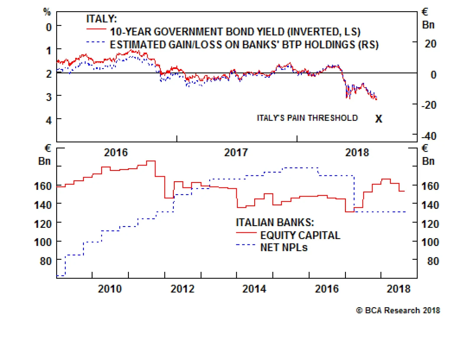
When Italian bond prices decline, it erodes the value of the €350 billion of BTPs held by Italian banks and also weakness their balance sheets. Investors start to get nervous about a bank's solvency when equity capital no longer covers net non-performing…
Highlights We remain bullish on the dollar, but no longer think that being long the greenback is the "slam-dunk" trade that it was earlier this year. A reacceleration in growth outside the U.S. and an overly dovish Fed represent the biggest risks to our constructive dollar view. China is likely to stimulate its economy, but concerns about high debt levels and malinvestment will limit the scale of any fiscal/credit stimulus. Letting the RMB slide may prove to be the preferable option. Worries about debt sustainability in Italy and EM contagion to European banks will constrain credit growth in the euro area, thus keeping the ECB in a highly dovish mode. For the time being, we favor developed market stocks over their EM peers. At the sector level, we would overweight defensives relative to deep cyclicals. U.S. stocks will outperform European stocks in dollar terms, although the performance is likely to be much more balanced in local-currency terms. The longer-term path for Treasury yields is to the upside. Nevertheless, a stronger dollar, coupled with safe-haven flows into the Treasury market, could temporarily push the 10-year yield down to 2.5% over the next few months. Feature The Dollar At A Crossroads After surging by 10% between February 1st and August 15th, the broad trade-weighted dollar has fallen by 0.9% over the past two weeks. Despite the latest setback, the greenback is still 23.2% above its 2014 lows and only 2.8% below its December 28, 2016 high (Chart 1). BCA continues to maintain a bullish view on the dollar. However, given recent market action, it is useful to stress-test our thesis in order to explore what could go wrong with it. As we discuss below, a key risk to the dollar is that global growth reaccelerates, with the U.S. once again going from leader to laggard in the global growth horserace. Global Growth And The Dollar The dollar tends to strengthen when global growth is deteriorating. Since the U.S. is a "low-beta" economy dominated by services rather than manufacturing and primary industries, an environment in which the global economy is slowing is usually one where the U.S. is outperforming the rest of the world. Chart 2 shows that there is a strong correlation between the value of the trade-weighted dollar and the difference between The Conference Board's U.S. Leading Economic Indicator (LEI) and the non-U.S. LEI. The gap between the U.S. and the non-U.S. LEI is still quite large. However, it has started to shrink recently, reflecting both a dip in the U.S. LEI as well as a small improvement in the non-U.S. LEI. The implication is that the U.S. economy is outshining the rest of the world, but the magnitude of outperformance has begun to narrow. Looking forward, the fate of the dollar will hinge on whether growth in the rest of the world can catch up with the United States. By definition, this can happen either if U.S. growth falls or non-U.S. growth rises. We examine each possibility in turn. Chart 1Despite Recent Pullback, ##br##The Dollar Is Still Close To Its 2016 High
Despite Recent Pullback, The Dollar Is Still Close To Its 2016 High
Despite Recent Pullback, The Dollar Is Still Close To Its 2016 High
Chart 2The U.S. Economy Is Still Outperforming The Rest Of The World, But The Gap Is Starting To Narrow
The U.S. Economy Is Still Outperforming The Rest Of The World, But The Gap Is Starting To Narrow
The U.S. Economy Is Still Outperforming The Rest Of The World, But The Gap Is Starting To Narrow
U.S. Growth: As Good As It Gets? The second quarter was probably the high watermark for U.S. growth for the rest of this cycle. Real GDP expanded by 4.2%, more than double most estimates of trend growth. The deceleration in payroll growth in July, a string of weak housing data releases, and the drop in the national ISM surveys alongside declines in a number of regional surveys such as the Philly Fed PMI, all point to a somewhat softer third quarter GDP growth reading. How worried should dollar bulls be? We see three reasons to downplay the negative impact on the dollar from the recent string of softer economic data. While the U.S. economy has slowed, it is still quite strong. The Bloomberg consensus forecast suggests that real GDP will increase by 3% in Q3. The Atlanta Fed's GDPNow model predicts 4.1% growth, while the New York Fed's Nowcast anticipates a more modest growth rate of 2%. The underlying drivers of aggregate demand remain supportive. U.S. financial conditions have loosened recently, thanks mainly to narrower credit spreads and higher equity prices (Chart 3). The effects of fiscal stimulus have also yet to make their way fully through the economy, especially with respect to government spending. The consumer is in great shape. The unemployment rate is near a 20-year low and the savings rate stands at a comfortable 6.7%, well above the level that the current ratio of household net worth-to-disposable income would predict (Chart 4). The housing vacancy rate is close to all-time lows, which limits the downside risk both to home prices and construction activity (Chart 5). Chart 3U.S. Financial Conditions Have Eased Recently
U.S. Financial Conditions Have Eased Recently
U.S. Financial Conditions Have Eased Recently
Chart 4The Savings Rate Has Room To Fall
The Savings Rate Has Room To Fall
The Savings Rate Has Room To Fall
Some of the apparent slowdown in U.S. growth appears to be due to intensifying supply-side constraints rather than faltering demand (Chart 6). This is important because slower growth resulting from weaker demand should, in principle, cause the Fed to moderate the pace of rate hikes, whereas slower growth resulting from an overheated economy should prompt the Fed to accelerate the pace of rate hikes. The latter is much better for the dollar than the former. Chart 5Low Housing Inventories Will ##br##Support Home Prices And Construction
Low Housing Inventories Will Support Home Prices And Construction
Low Housing Inventories Will Support Home Prices And Construction
Chart 6U.S. Economy Is Hitting Supply-Side ##br##Constraints
U.S. Economy Is Hitting Supply-Side Constraints
U.S. Economy Is Hitting Supply-Side Constraints
The Fed's Fate Is In The Stars What is true in principle, however, does not always match what happens in practice. In his Jackson Hole address, Jay Powell invoked a Draghi-esque phrase when saying that the FOMC would "do whatever it takes" to keep inflation expectations from becoming unmoored.1 Nevertheless, he also said that "there does not seem to be an elevated risk of overheating" at the moment. This is a curious statement considering the abundant evidence that U.S. firms are struggling to find qualified workers. To his credit, Powell stressed the inherent difficulty of "navigating by the stars," that is, of setting monetary policy based on highly imprecise estimates of the natural rate of unemployment, u*, and the neutral real rate of interest, r*. What he did not say is that the Fed's current estimates of these "stars" stand at record lows, which introduces a dovish bias into monetary policy should these estimates prove to be too low. Our baseline view is that the Federal Reserve will raise rates more than the market is currently discounting. We also doubt the Fed will succumb to President Trump's pressure to keep rates low or to accommodate any effort by the Treasury to intervene in the foreign exchange market with the aim of driving down the value of the dollar. That said, the risk to this view is that the Fed reacts too slowly to rising inflation. This could cause real rates to drift lower, with adverse consequences for the dollar. The China Policy Wildcard The discussion above suggests that the dollar would suffer either if U.S. growth slows significantly or if the Fed falls too far behind the curve in normalizing monetary policy. An additional risk to the dollar is that growth outside the U.S. picks up. This would suck capital away from the U.S. and into the rest of the world, with adverse consequences for the greenback. At present, the biggest question mark around the global growth outlook concerns China. The Chinese economy has struggled of late, with trade tensions adding to the misery (Chart 7). The stock market is down in the dumps. On-shore corporate yields for low-quality borrowers continue to rise. Industrial production, retail sales, and fixed asset investment all disappointed in July, following a further drop in the PMIs. The economic surprise index remains in negative territory. Only the housing market is showing renewed vigour, with both starts and sales rebounding (Chart 8). Chart 7China: Some Signs Of A Struggling Economy...
China: Some Signs Of A Struggling Economy…
China: Some Signs Of A Struggling Economy…
Chart 8...With Housing Being The Main Exception
...With Housing Being The Main Exception
...With Housing Being The Main Exception
The central bank has responded by easing liquidity. Interbank rates fell from a peak of 5.9% in late 2017 to 2.9% today. The authorities have also instructed local governments to expedite their spending plans, while ordering state-owned banks to expand lending to the export sector and for infrastructure-related projects. Fiscal/credit stimulus of the sort the authorities engaged in both 2009 and 2015 carries significant risks, however. Debt levels have reached stratospheric levels and concerns about excess capacity and malinvestment abound. We suspect these facts will cause policymakers to be more guarded than they would otherwise be. What's Next For The RMB? Letting the RMB weaken offers an alternative way to stimulate the economy - and one, crucially, that does not require piling on evermore debt. In contrast to more roads and bridges, a cheaper Chinese currency would not be welcome news for the rest of the world. A weaker RMB makes it more difficult for other economies to compete against China. A weaker currency also increases the costs to Chinese firms of importing raw materials, thus putting downward pressure on commodity prices. Despite efforts by emerging markets to diversify their economies, EM earnings remain highly correlated with industrial metals prices (Chart 9). Despite the presence of capital controls, the USD/CNY exchange rate has broadly tracked the one-year swap differential between the U.S. and China over the past few years (Chart 10). The differential has dropped from close to 300 basis points at the beginning of this year to less than 100 basis points today. Given that prospect of further Fed rate hikes, the only way the Chinese authorities will be able to keep the interest rate differential from falling even more is by tightening monetary policy themselves. This could slow credit growth and thus weaken the economy. The failure to raise rates, however, would probably cause the RMB to fall further. Both outcomes would be problematic for the rest of the world. Chart 9EM Earnings Are Correlated ##br##With Industrial Metal Prices
EM Earnings Are Correlated With Industrial Metal Prices
EM Earnings Are Correlated With Industrial Metal Prices
Chart 10USD/CNY Tracks China-U.S. ##br##Interest Rate Differentials
USD/CNY Tracks China-U.S. Interest Rate Differentials
USD/CNY Tracks China-U.S. Interest Rate Differentials
Our bet is that the authorities will ultimately choose to keep domestic monetary conditions fairly easy - leading to a weaker RMB - but will use administrative controls to prevent credit growth from accelerating too rapidly. That said, we would not rule out the possibility that the authorities succeed in stimulating the economy in a way that precludes further currency weakness. If this stimulus coincides with a thawing in trade tensions, it could lead to a burst in optimism about China specifically, and global growth in general. Such an outcome would hurt the dollar. The Euro Area: Keeping The Recovery On Track After putting in a strong performance in 2017, the economy in the euro area has struggled to maintain momentum this year. Growth is still above trend, but the overall tone of the data has been lackluster at best, with the risks to growth increasingly tilted to the downside. Weaker growth in China and other emerging markets certainly has not helped. However, much of the problem lies closer to home. The election of a populist government in Italy renewed concerns about debt sustainability in the euro area's third largest economy. The 10-year yield reached a four-year high of 3.2% this week. It is now 150 basis points above its April 2018 lows (Chart 11). The resulting tightening in Italian financial conditions will continue to weigh on growth in the months ahead. Bank credit remains the lifeblood of the euro area economy. Chart 12 shows that the 12-month credit impulse - defined as the change in credit growth from one 12-month period to the next - tends to move closely with GDP growth. Euro area credit began to moderate this year even before the Italian imbroglio and worries about the exposure of European banks to vulnerable emerging markets came on the scene. It will be difficult for euro area GDP growth to accelerate unless credit growth revives. In the absence of faster credit growth, the ECB will have little choice but to remain firmly in dovish mode. Chart 11Italian Populism Meets The Bond Market
Italian Populism Meets The Bond Market
Italian Populism Meets The Bond Market
Chart 12Euro Area Credit Growth Has Flatlined
Euro Area Credit Growth Has Flatlined
Euro Area Credit Growth Has Flatlined
The best-case scenario for the common currency is that EM stresses subside, and the Italian government reaches a friendly agreement with the European Commission over next year's budget. The thawing in Brexit negotiations would also help. We are skeptical that any of these three things will happen, but if one or a number of them did occur, this would benefit the euro at the expense of the dollar. Investment Conclusions We are not as bullish on the dollar as we were earlier this year. Sentiment towards the greenback has clearly improved (Chart 13). The narrative about a "synchronized global growth recovery" that was all the rage last year has also given way to a more sober appreciation of the problems facing emerging markets. In short, markets have moved a long way towards our view of the world. Still, we are not ready to abandon our strong dollar view. Chinese stimulus or not, the structural challenges facing emerging markets - high debt levels, poor productivity growth - will not go away. The same goes for Europe and its litany of political and economic travails. Even if the dollar did manage to weaken again, this would constitute an unwelcome easing in U.S. financial conditions at a time when the Fed wants to tighten financial conditions in order to keep the economy from overheating. From this perspective, a weaker dollar just means that the Fed would need to hike rates even more than it otherwise would. Since more rate hikes will buttress the dollar, the extent to which the dollar can weaken is self-limiting. In short, interest rate differentials between the U.S. and its trading partners should continue to favor the greenback. Assuming the dollar does strengthen from here, emerging markets will be the main casualties. While EM assets have cheapened considerably, Chart 14 shows that neither EM equities, credit, nor currencies are at levels that have marked past bottoms. Global investors should continue to favor developed market stocks over their EM peers. At the equity sector level, investors should overweight defensives over deep cyclicals. Regionally, this posture implies that U.S. stocks will outperform European stocks in dollar terms, although the performance is likely to be much more balanced in local-currency terms. Chart 13Investors Have Turned More Bullish On The Dollar
Investors Have Turned More Bullish On The Dollar
Investors Have Turned More Bullish On The Dollar
Chart 14EM Assets Are Not Very Cheap
EM Assets Are Not Very Cheap
EM Assets Are Not Very Cheap
As we recently discussed in a two-part Special Report,2 the longer-term path for Treasury yields is to the upside. Nevertheless, a broad-based appreciation in the value of the dollar, coupled with safe-haven flows into the Treasury market, could temporarily push the 10-year yield down to 2.5% over the next few months. Peter Berezin, Chief Global Strategist Global Investment Strategy peterb@bcaresearch.com 1 Jerome H. Powell, "Monetary Policy in a Changing Economy," Speech at "Changing Market Structure and Implications for Monetary Policy," a symposium sponsored by the Federal Reserve Bank of Kansas City, Jackson Hole, Wyoming, August 24, 2018. 2 Please see Global Investment Strategy Special Reports, "1970s-Style Inflation: Could It Happen Again? (Part 1)," dated August 10, 2018; "1970s-Style Inflation: Could It Happen Again? (Part 2)," dated August 24, 2018. Strategy & Market Trends Tactical Trades Strategic Recommendations Closed Trades
Highlights The global 6-month credit impulse is likely to turn up in the fourth quarter. This warrants profit-taking in some pro-defensive equity sector, regional, and country allocation... ...for example, in the 35 percent outperformance of European healthcare versus banks in just seven months. But do not become aggressively pro-cyclical until the 10-year yield on the Italian BTP (now at 3.2) moves closer to 3... ...and the sum of the 10-year yields on the U.S. T-bond, German bund and JGB (now at 3.4) also moves closer to 3. Chart Of The WeekThe Cycle Is About To Turn
The Cycle Is About To Turn
The Cycle Is About To Turn
Feature One of the most common questions we get is, when will the cycle turn? And our response is always, which cycle? The cycle that most people focus on is the so-called business cycle, which describes multi-year economic expansions punctuated by recessions. However, the business cycle - to the extent that it is a cycle - is very irregular. Its upswings and downswings vary greatly in length (Chart I-2). This irregularity is one reason why economists are useless at calling the turns. Nevertheless, investors still obsess with calling the business cycle because they think this is the only cycle that drives the financial markets. Chart I-2The Business Cycle Is Very Irregular
The Business Cycle Is Very Irregular
The Business Cycle Is Very Irregular
We disagree. Nature bestows us with a multitude of cycles with different periodicities: the daily tides, the monthly phases of the moon, the annual seasons, and the multi-year climate cycles. So it would be unnatural, and somewhat arrogant, to assume the economy and financial markets possess only one cycle. In fact, just as in nature, the economy and financial markets experience a multitude of cycles with different periodicities. There Is Not One Cycle In The Economy, There Are Many If you plotted yearly changes in temperature, you would get a flat line and you would think there were no seasons! The point being that you cannot see a yearly cycle if you look at yearly changes. To see the cyclicality of the seasons, you must plot 6-month changes in temperature. Likewise, you cannot see the shorter-term cycles in the economy and financial markets using analysis, such as yearly changes, designed to see longer-term cycles. Once you grasp this basic maths, the mini-cycles in the economy and financial markets will stare you in the face (Chart I-3), and a whole new world of investment opportunities will open up. Chart I-3The Mini-Cycle Is Very Regular
The Mini-Cycle Is Very Regular
The Mini-Cycle Is Very Regular
As we advised on January 4: "Global growth experiences remarkably consistent - and therefore predictable - 'mini-cycles', with half-cycle lengths averaging eight months. As the current mini-upswing started in May 2017 we can infer that it is likely to end at some point in early 2018. So one surprise could be that global growth will lose steam in the first half of 2018 rather than in the second half, contrary to what the consensus is expecting... Pare back exposure to cyclicals and redeploy to defensives" The advice proved to be very prescient. The global economy did enter a mini-downswing sourced in the emerging markets (Charts I-4 - I-6). Chart I-4The U.S. Mini-Downswing Was Muted...
The U.S. Mini-Downswing Was Muted
The U.S. Mini-Downswing Was Muted
Chart I-5...The Euro Area Mini-Downswing Was Also Muted...
...The Euro Area Mini-Downswing Was Also Muted...
...The Euro Area Mini-Downswing Was Also Muted...
Chart I-6...But The China Mini-Downswing Was Severe
...But The China Mini-Downswing Was Severe
...But The China Mini-Downswing Was Severe
Nevertheless, the global nature of financial markets meant that the German 10-year bund yield declined by 40 bps, while European healthcare equities outperformed banks by a mouth-watering 35 percent, and materials by 15 percent (Chart I-7 and Chart I-8). Some of these performances are as large as can be gained in a full business cycle begging the question: Why obsess with the impossible-to-predict business cycle when there are equally rich pickings in the easier-to-predict mini-cycle? Chart I-7Banks Vs. Healthcare Tracks The Mini-Cycle
Banks Vs. Healthcare Tracks The Mini-Cycle
Banks Vs. Healthcare Tracks The Mini-Cycle
Chart I-8Materials Vs. Healthcare Tracks The Mini-Cycle
Materials Vs. Healthcare Tracks The Mini-Cycle
Materials Vs. Healthcare Tracks The Mini-Cycle
Furthermore, if you get the equity sector calls right, you will get the equity regional and country calls right too. As cyclicals have underperformed, the less cyclically-exposed S&P500 has been the star performer of the major regional indexes. And cyclical-heavy stock markets like Italy's MIB have strongly underperformed defensive-heavy stock markets like Denmark's OMX (Chart I-9). Chart I-9Italy Vs. Denmark = Banks Vs. Healthcare
Italy Vs. Denmark = Banks Vs. Healthcare
Italy Vs. Denmark = Banks Vs. Healthcare
It follows that the evolution of the global economic mini-cycle is pivotal in every investment decision (Box 1). BOX 1 The Theory Of Economic And Market Mini-Cycles The academic foundation of the global economic mini-cycles is a model called the Cobweb Theorem.1 When bond yields rise, interest rate sensitive sectors in the economy feel a headwind, but with a lag. Similarly, when bond yields decline, interest rate sensitive sectors feel a tailwind, but again with a lag. The lag occurs because credit demand leads credit supply by several months. As credit demand leads credit supply, the turning point in the price of credit (the bond yield) always leads the quantity of credit supplied (the credit impulse). The result is a perpetual mini-cycle oscillation in both economic variables. And because the quantity of credit supplied is a marginal driver of economic activity, this also creates mini-cycles in economic activity. These mini-cycles are remarkably regular with half-cycle lengths averaging around eight months and the regularity creates predictability. Moreover, as most investors are unaware of this predictability, the next turning point is not discounted in financial market prices - providing a compelling investment opportunity for those who do recognise the existence and predictability of these cycles. The Mini-Cycle Will Soon Turn Up The global 6-month credit impulse entered its current mini-downswing in January. Given that mini-downswings tend to last around eight months, we should expect the global economy to exit its mini-downswing in September, the escape valve being the recent decline in bond yields (Chart Of The Week). The caveat is that bond yields were slow to react to the mini-downswing and the decline in 10-year yields, averaging around 40 bps from the peak, has been pretty shallow. It follows that the next mini-upswing could be delayed to October/November, and be somewhat muted. Nevertheless, the surprise could be that global growth will stabilise in the fourth quarter of 2018, contrary to what the consensus is expecting. And this would suggest taking some of the most mouth-watering profits in pro-defensive equity sector, regional, and country allocation - for example, in the 35 percent outperformance of European healthcare versus banks (Chart I-10). Chart I-10Banks Have Severely Underperformed Healthcare
Banks Have Severely Underperformed Healthcare
Banks Have Severely Underperformed Healthcare
Would we go a step further and become pro-cyclical? Not yet. One reason is that there is a limit to how far bond yields can rise before destabilising the very rich valuations of all risk-assets. This is captured in our 'rule of 4' which says that when the sum of the 10-year yields on the U.S. T-bond, German bund, and Japanese government bond (JGB) exceeds 4 - which broadly equates to the global 10-year yield exceeding 2 percent - it is time to go underweight equities. With the sum now equal to 3.4, yields can rise by only 25-30 bps before hurting risk-assets. Another reason for circumspection is that the investment landscape is still scattered with a large number of landmines, one of which has its own rule of 4. The Other 'Rule Of 4': The Italian 10-Year Bond Yield When Italian bond prices decline, it erodes the value of Italian banks' €350 billion portfolio of BTPs and weakens the banks' balance sheets. Investors start to get nervous about a bank's solvency when equity capital no longer covers net non-performing loans (NPLs). On this basis, the largest Italian banks now have €160 billion of equity capital against €130 billion of net NPLs, implying excess capital of €30 billion (Chart I-11). It follows that the markets would start to worry about Italian banks' mark-to-market solvency if their bond valuations sustained a drop of around a tenth from the recent peak. We estimate this equates to the 10-year BTP yield breaching and remaining above 4 percent (Chart I-12).2 Chart I-11Italian Banks' Equity Capital Exceeds Net NPLs By 30 Bn Euro
Italian Banks' Equity Capital Exceeds Net NPLs By €30 Bn
Italian Banks' Equity Capital Exceeds Net NPLs By €30 Bn
Chart I-12Italian Banks' Solvency Would Be In Question If The 10-Year Yield Breached 4%
Italian Banks' Solvency Would Be In Question If The 10-Year Yield Breached 4%
Italian Banks' Solvency Would Be In Question If The 10-Year Yield Breached 4%
Today the 10-year BTP yield stands just shy of 3.2 percent, but it is about to enter a testing period. The Italian government must agree its 2019 budget by September and present a draft to the European Commission by mid-October. The budget must tread a fine line. Cutting the structural deficit to appease the Commission would diminish the credibility of the populist government. It would also be terrible economics, making it harder for Italy to escape its decade-long stagnation.3 On the other hand, locking horns with Brussels and aggressively increasing the structural deficit might panic the bond market. The optimal outcome would be to leave the structural deficit broadly where it is now. To sum up, the global 6-month credit impulse is likely to turn up in the fourth quarter, warranting some profit-taking in pro-defensive positions. But we do not advise aggressive pro-cyclical sector, regional, and country allocation until the 10-year yield on the Italian BTP (now at 3.2) - and the sum of the 10-year yields on the U.S. T-bond, German bund and JGB (now at 3.4) - both move closer to 3. Dhaval Joshi, Senior Vice President Chief European Investment Strategist dhaval@bcaresearch.com 1 Please see the European Investment Strategy Special Report 'The Cobweb Theory And Market Cycles' published on January 11 2018 and available at eis.bcaresearch.com. 2 Assuming that the average maturity of Italian banks' BTPs is around 5 years. 3 Please see the European Investment Strategy Special Report 'Monetarists Vs Keynesians: The 21st Century Battle' July 12 2018 available at eis.bcaresearch.com. Fractal trading Model* In support of the preceding fundamental analysis, the outperformance of healthcare versus banks is technically extended. Its 130-day fractal dimension is at the lower bound which has reliably signalled previous trend exhaustions. On this basis we would position for a 10% reversal with a symmetrical stop-loss. In other trades, long PLN/USD reached the end of its 65-day holding period comfortably in profit, and is now closed. This leaves six open positions. For any investment, excessive trend following and groupthink can reach a natural point of instability, at which point the established trend is highly likely to break down with or without an external catalyst. An early warning sign is the investment's fractal dimension approaching its natural lower bound. Encouragingly, this trigger has consistently identified countertrend moves of various magnitudes across all asset classes. Chart I-13
Long Global Basic Resources, Short Global Chemicals
Long Global Basic Resources, Short Global Chemicals
* For more details please see the European Investment Strategy Special Report "Fractals, Liquidity & A Trading Model," dated December 11, 2014, available at eis.bcaresearch.com Fractal Trading Model The post-June 9, 2016 fractal trading model rules are: When the fractal dimension approaches the lower limit after an investment has been in an established trend it is a potential trigger for a liquidity-triggered trend reversal. Therefore, open a countertrend position. The profit target is a one-third reversal of the preceding 13-week move. Apply a symmetrical stop-loss. Close the position at the profit target or stop-loss. Otherwise close the position after 13 weeks. Use the position size multiple to control risk. The position size will be smaller for more risky positions. Recommendations Equities Bond & Interest Rates Currency & Other Positions Closed Fractal Trades Trades Closed Trades Asset Performance Currency & Bond Equity Sector Country Equity Indicators Bond Yields Chart II-1Indicators To Watch - Bond Yields
Indicators To Watch - Bond Yields
Indicators To Watch - Bond Yields
Chart II-2Indicators To Watch - Bond Yields
Indicators To Watch - Bond Yields
Indicators To Watch - Bond Yields
Chart II-3Indicators To Watch - Bond Yields
Indicators To Watch - Bond Yields
Indicators To Watch - Bond Yields
Chart II-4Indicators To Watch - Bond Yields
Indicators To Watch - Bond Yields
Indicators To Watch - Bond Yields
Interest Rate Chart II-5Indicators To Watch - Interest Rate Expectations
Indicators To Watch - Interest Rate Expectations
Indicators To Watch - Interest Rate Expectations
Chart II-6Indicators To Watch - Interest Rate Expectations
Indicators To Watch - Interest Rate Expectations
Indicators To Watch - Interest Rate Expectations
Chart II-7Indicators To Watch - Interest Rate Expectations
Indicators To Watch - Interest Rate Expectations
Indicators To Watch - Interest Rate Expectations
Chart II-8Indicators To Watch - Interest Rate Expectations
Indicators To Watch - Interest Rate Expectations
Indicators To Watch - Interest Rate Expectations
Highlights Two key issues will remain important drivers of global financial markets in the coming quarters: the direction of the dollar and Chinese policy stimulus. Policy and growth divergences will remain tailwinds for the dollar and there is little the Trump Administration can do to reverse the upward trend. Dollar strength is exposing poor macro fundamentals in many emerging market economies. The problems facing EM economies run deep, and will not disappear anytime soon. Expect more EM fireworks. EM market turmoil could pause the Fed's tightening campaign, but this would require evidence that the U.S. economy and/or financial markets are being negatively affected. Chinese stimulus is a risk to our base-case outlook. A growth impulse might keep the RMB from weakening further, boost commodity prices and support EM exports. However, we believe that Chinese stimulus will not be a 'game changer', and might even cause more problems if the authorities push the RMB lower. The U.S. economy and financial system are less exposed to emerging markets than in the Eurozone. An excellent profit backdrop also provides U.S. risk assets with a strong tailwind. Nonetheless, the U.S. is not immune to EM woes. Poor valuation implies a meaningful correction in U.S. risk assets on any flight-to-quality event. Stay cautious on asset allocation. Fed Chair Powell is willing to wait for the "whites of the eyes" of inflation before becoming alarmed, almost ensuring that the FOMC will fall behind the inflation curve. Evidence of labor market overheating is accumulating. Bond yields will rise as the FOMC tries to catch up and long-term inflation expectations bounce. We believe that investors are underestimating the upside in U.S. inflation risks over the medium term. We recommend below-benchmark duration, although government bonds would temporarily rally if EM turbulence sparks a flight-to-quality. We still expect the supply/demand balance in the world oil market to tighten later this year. Stay positioned for higher oil prices. Japanese corporate profits have been stellar, but that will soon change. EPS growth is likely to soften in the Eurozone too. Favor the U.S. market in unhedged terms. Feature There are numerous key issues on the investment landscape, but two stand out at the moment because they both have wide-ranging global implications: (1) Will the U.S. dollar continue to appreciate; and (2) Will Chinese policymakers place structural reform on the back burner and 'go for growth' in the near term? The latest U.S. economic and profit data provide a strong tailwind for American risk assets. Nonetheless, the mighty U.S. dollar is casting a dark shadow over the heavily-indebted emerging market economies, sparking comparisons with the late 1990s. Could Turkey be the start of a 'domino' effect, similar to Thailand's plunge into financial crisis in 1997 that eventually spread to Brazil and Russia, and finally contributed to the demise of Long-Term Capital Management in the fall of 1998? On the global growth front, the story has not changed much from our assessment last month. Growth is solid, but slowing, in part due to a deceleration in developed-economy capital spending. The global expansion has become less synchronized and relative growth dynamics are pointing to more upside for the greenback (Chart I-1). Chart I-1Cyclical Divergence Is Still Dollar Bullish
Cyclical Divergence Is Still Dollar Bullish
Cyclical Divergence Is Still Dollar Bullish
As in the late 1990s, the Fed is likely to ignore turbulence in EM financial markets and will continue on its tightening path until it begins to affect the U.S. economy or asset prices. The path of least resistance for the dollar is up until something breaks. A major policy impulse from China could alter the feedback loop between the strengthening dollar and EM asset prices. A growth pickup would lift China's imports and commodity prices, both of which would support emerging market economies and asset prices. There is plenty of uncertainty regarding the size of the recently-announced Chinese stimulus measures, but our take is that they are likely to underwhelm because a major growth push would undermine the authorities' structural initiatives. The implication is that the global backdrop will remain unfriendly to emerging market assets at a time when they are more vulnerable than the consensus believes. The risk of a financial accident is escalating. The good news is that the U.S. earnings picture remains excellent, which precludes us from being underweight on risk assets. Nonetheless, investors should have no more than a benchmark allocation to equities and corporate bonds in the major advanced economies. We are upgrading government bonds to neutral at the expense of cash on a tactical basis, to reflect the rising possibility of a global flight-to-quality. The First Domino Turkey has had all the hallmarks of a crisis for a long while. Erdogan's slim hold on power has motivated several populist policy decisions that have stretched Turkey's macro fundamentals. The central bank has been forced to provide large injections of liquidity into the banking system, despite double-digit inflation readings. The country suffers from a classic "twin deficit" problem. Turkish private sector external debt stands at 40% of GDP, of which 13% of GDP is short-term, the highest among EM countries. Erdogan wants economic growth at all costs, but has done little in terms of the structural reforms necessary to lift the country's growth potential. The Lira has lost almost 26% of its value versus the dollar since August 1 and Turkish spreads have blown out. It appears that a lot of bad news has been discounted, but our EM strategists do not see this as a buying opportunity. One risk is that Erdogan imposes capital controls next. Our emerging market team's long held caution on EM is rooted in concern for failing fundamentals.1 They emphasize that Turkey was the catalyst, not the main cause, for the broader financial stress observed across EM assets in August. BCA has highlighted for some time that EM debt is a ticking time bomb. Chart I-2 shows that EM dollar-denominated debt is now as high as it was in the late 1990s as a share of both GDP and exports. Chart I-3 highlights the most vulnerable EM economies in terms of the foreign currency funding requirement, and the foreign debt-servicing obligation relative to total exports. Turkey stands out as the most vulnerable, along with Argentina, Brazil, Indonesia, Chile, and Colombia. Chart I-2Debt Makes EM Vulnerable
Debt Makes EM Vulnerable
Debt Makes EM Vulnerable
Chart I-3EM Debt Exposure
September 2018
September 2018
In all previous major EM selloffs, any decoupling between different EM regions proved to be unsustainable. And it certainly does not help that the Fed remains on its tightening path; EM equities usually fall when U.S. financial conditions tighten (Chart I-4). The combination of a strong dollar and weak RMB is a deadly combination for highly-indebted emerging market economies. Chart I-4EM Highly Sensitive To U.S. Financial Conditions...
EM Highly Sensitive To U.S. Financial Conditions...
EM Highly Sensitive To U.S. Financial Conditions...
Investors should expect contagion to intensify. China To The Rescue? Some investors are hoping that China will 'save the day' by providing a major dose of policy stimulus, as it did in 2015, the last time that EM was close to a tipping point. We doubt China will be able to play the same stabilizing role. The Chinese authorities are committed to their long-term structural goals. They have been trying to reorient the economy toward consumption and away from investment and exports, as well as undertake other reforms to reduce financial risk, pollution, poverty and corruption. China kept policy on the tight side until recently, which resulted in a gradual growth slowdown. The Li Keqiang index (LKI) is a good coincident indicator for economic growth (Chart I-5). This index has ticked up in recent months, along with imports, but this likely reflects industrial activity designed to fill foreign orders before the new U.S. tariffs take effect. Our LKI model, based on money and credit, points to further economic weakness ahead. Chart I-5China: Watch Credit And Fiscal Impulse
China: Watch Credit And Fiscal Impulse
China: Watch Credit And Fiscal Impulse
The escalation of the trade war with the U.S. is forcing the Chinese authorities to provide some short-term policy stimulus in order to pre-empt any resulting economic damage. A flurry of policy announcements over the past month has given investors the impression that Beijing has cranked up the policy dial, including cuts to short-term interest rates, a decrease in reserve requirements, liquidity provision to the banking system, and promises of various forms of fiscal stimulus. Chinese stimulus has historically been positive for commodity prices and EM assets. However, we are less sanguine this time. First, the authorities are not abandoning structural reforms, which means that the associated growth headwinds will not disappear. Second, our China experts believe that Chinese policy is only turning moderately reflationary; this is not the 'big bang' that followed the Great Recession in the late 2000s, or the same level of stimulus provided following the 2015-16 global manufacturing downturn. There will no doubt be some fiscal stimulus, but we do not expect a major expansion in bank credit to the private sector because of the government's crackdown on shadow banking, excessive leverage and growing non-performing loans. The change in the policy stance amounts to 'taking the foot off the brake' rather than pressing firmly on the accelerator.2 Third, and perhaps most importantly, the authorities may rely even more on the currency lever to do the heavy lifting if the economy continues to slow and/or the tariff war escalates further. This would be negative for commodity demand because a weaker RMB will make commodities dearer for Chinese producers. Metals prices are particularly at risk. China's competitors will also feel the sting of a cheaper RMB. It will be critical to watch the Chinese money and credit data in the coming months to gauge whether our view on the policy stimulus is correct. We will also be watching the combined credit and fiscal impulse which, at the moment, points to continued weakening in import growth in the near term (Chart I-5, bottom panel). Slower EM growth and/or more financial market turbulence is likely to take a larger toll on the euro area than the United States. Exports to emerging markets account for only 3.6% of GDP for the U.S., compared to 9.7% of GDP for the euro area. Euro area banks also have more exposure to emerging markets than U.S. banks (Chart I-6). Notably, Spanish banks - BBVA in particular - has sizable exposure to Turkey. Meanwhile, Italian assets have come under pressure as the rift between the European Commission and the new populist government widens and Italian banks become increasingly wary of financing their government. Chart I-6DM Bank Exposure To EM
September 2018
September 2018
European growth will therefore likely continue to trail that of the U.S. Our base case does not see euro area growth falling below a trend pace in the coming quarters, but relative growth momentum and the ongoing policy divergence will favor the dollar over the euro. FOMC: No Urgency The key message from the latest FOMC Minutes and Chairman Powell's Jackson Hole speech is that policymakers are sticking with the "gradual" approach to tightening, despite the late-cycle acceleration in economic growth. The blowout second-quarter GDP report supports the view that fiscal stimulus is stoking the economy at a time when there is little slack. Evidence that the labor market is overheating is not simply anecdotal anymore. In past cycles, an acceleration in growth at a time when inflation is already at target and unemployment is below estimates of full employment would have sparked aggressive Fed action. But the Minutes and Powell's speech revealed no sense of urgency. Powell made the case that the Fed must proceed carefully in an environment where there is much uncertainty about the level of the neutral policy rate, the natural rate of unemployment and the slope of the Phillips curve. Moreover, long-term inflation expectations are still hovering below a level that is consistent with meeting the 2% target over the medium term. Some FOMC policymakers believe that this fact justifies taking chances with an inflation overshoot in the coming quarters. Another reason for the FOMC to proceed cautiously is the wage picture, which is confusing even to economic experts because the official measures paint a mixed picture (Chart I-7). The Employment Cost Index for private sector workers continues to march higher. However, growth in compensation per hour, average hourly earnings (AHE) and unit labor costs have all eased a little this year. The Atlanta Fed Wage Tracker, one of the cleanest measures of wages, reveals an even more significant pullback. The softening in wage growth has been fairly widespread across age cohorts, educational attainment and regions, according to the Atlanta Fed data (Chart I-8). Part-time workers appear to be the only segment that has bucked the trend. It is not clear why workers in the 16-24 age group, as well as those with bachelor's degrees (of any age), have seen the most pronounced softening in wage growth this year. Chart I-7Mixed U.S. Wage Data
Mixed U.S. Wage Data
Mixed U.S. Wage Data
Chart I-8U.S. Wage Slowdown Broadly-Based
U.S. Wage Slowdown Broadly-Based
U.S. Wage Slowdown Broadly-Based
Which measure is telling the correct story: the ECI or the Atlanta Wage Tracker? Both are a relatively clean measure of wages and it is difficult to tell based on the relative merits of each index alone. Nonetheless, there is little doubt that the labor market is now very tight by historical standards. Small business owners' compensation plans remained near record levels in July, while concerns about the "quality of labor" have never been higher (Chart I-9). Chart I-10 shows that the ratio of the level of job openings to unemployed workers has surpassed the pre-recession level in all but one sector according to the Jolts survey. Indeed, in most cases this ratio is well above the previous peak. Unemployment is now below the estimated level of full-employment in more than 80% of U.S. states. Chart I-9U.S. Labor Shortage Is Growing
U.S. Labor Shortage Is Growing
U.S. Labor Shortage Is Growing
Chart I-10JOLTS Signals Very Tight Jobs Market
JOLTS Signals Very Tight Jobs Market
JOLTS Signals Very Tight Jobs Market
No Evidence Of U.S. Overheating? Labor shortages first appeared for skilled workers, helping to explain why highly-skilled workers have enjoyed the fastest wage gains in recent years. But this year's Fed Beige Books have noted that many businesses are now having trouble finding low- and middle-skilled workers, as listed in Table I-1. These industries roughly line up with the ones that reveal above-average growth in average hourly earnings, and with the ones where labor market tightness is the most acute according to the Jolts survey (second and third columns in the table). The shortages appear to be broadly based, ranging from truck transportation to financial services, manufacturing and construction. This makes it all the more curious that Chairman Powell finds that there is no evidence of overheating in the labor market. The evidence seems pretty conclusive to us and it even features in the Fed's own Beige Book. Keep in mind that inflation is not always the 'cost push' type, beginning in the labor market and traveling to consumer prices. Sometimes inflation can begin in the market for goods and services, and then affect wage demands. U.S. consumer price inflation appears to be headed higher based on the New York Fed's Underlying Inflation Gauge (Chart I-11). Our CPI diffusion index shows that inflation is accelerating in a majority of categories. Other measures of underlying inflation, such as the Sticky Price Index, the Trimmed Mean, and the Median inflation rate are all in a solid uptrend. Dollar strength this year will eventually put downward pressure on core goods inflation, but that will take some time; non-energy goods inflation is more likely to rise in the near term as it catches up to the previous acceleration in imported goods prices (Chart I-11, bottom panel). Table I-1Labor 'Shortages' Identified In The Beige Book
September 2018
September 2018
Chart I-11U.S. Underlying Inflation Is Rising
U.S. Underlying Inflation Is Rising
U.S. Underlying Inflation Is Rising
U.S. Inflation To Surprise On Upside We believe that the market is underestimating the risk of a meaningful inflation overshoot over the medium term. Investors still do not believe that the Fed will be able to consistently meet the 2% target over the long-term, based on CPI swaps and TIPS breakeven rates. BCA's Chief Global Strategist, Peter Berezin, penned a two-part Special Report in August on the potential for upside inflation surprises over the coming years.3 First, increasing political pressure on the major central banks is worrying. Second, policymakers are coming around to the idea that there may be an exploitable trade-off between higher inflation and lower unemployment. This was a mistake last made in the inflationary 1970s. Finally, the pressure to keep monetary policy accommodative until the "whites of the eyes" of inflation are visible will remain strong. Bonds are in for some trouble if we are correct on the inflation outlook. We recommend that investors with a 6-12 month investor horizon remain short in duration and overweight TIPS versus conventional Treasurys. That said, we cannot rule out a flight-to-quality episode at some point, possibly reflecting trade tensions and/or EM turmoil, which would send Treasury yields temporarily lower. The Fed may be forced to place rate hikes on hold if financial conditions tighten too quickly. No Margin Peak Yet In The U.S.... The S&P 500 was unfazed by the turmoil in emerging markets and the re-widening in Italian bond spreads in August, likely because of continuing good news on the profit front. Corporate earnings remained in a sweet spot in the second quarter. Nominal GDP grew by a whopping 5.4% from a year ago, helping to boost the top line for the corporate sector. The lagged effect of previous dollar depreciation is still flattering earnings, although this only accounts for about two percentage points according to our model (Chart I-12). Meanwhile, equity buybacks have kicked into overdrive (Chart I-13). Chart I-12U.S. Dollar Impact On EPS Growth
U.S. Dollar Impact On EPS Growth
U.S. Dollar Impact On EPS Growth
Chart I-13U.S. Equity Buyback In Overdrive
U.S. Equity Buyback In Overdrive
U.S. Equity Buyback In Overdrive
Margins continued their impressive ascent in the second quarter to well above the pre-Lehman peak (Chart I-14). A lot of the increase is related to the tax cuts; EBITDA margins are still substantially below the 2007 peak according to the S&P data. It is disconcerting that all of the surge in S&P 500 margins is due to the Tech sector (Chart I-14, bottom panel). Excluding Tech, S&P after-tax margins have simply moved sideways since 2010. Looking ahead, the tailwind from previous dollar depreciation will shift to a headwind by mid-2019. Chart I-12 shows that the contribution from changes in the dollar to EPS growth will shift from a positive two percentage points to a drag of 1½ percentage points if the dollar is flat from today's level in broad trade-weighted terms. If the dollar rises by another 5% this year, then next year's drag on EPS growth will reach three percentage points. Moreover, the impact of the tax cuts on after-tax profits will fade next year. Wage pressures are building and this should eventually squeeze profit margins. That said, a margin peak does not appear to be imminent. Last month we introduced some macro indicators for profit margins (Chart I-15). Most appeared to be rolling over a month ago, but they have all since ticked up. Chart I-14Tech And Taxes Driving Profit Margins
Tech And Taxes Driving Profit Margins
Tech And Taxes Driving Profit Margins
Chart I-15U.S. Margin Indicators Have Turned Up
U.S. Margin Indicators Have Turned Up
U.S. Margin Indicators Have Turned Up
The bottom line is that we continue to expect a mean reversion in U.S. profit margins in the coming years, but this is not a risk for at least the rest of 2018. ...But Profit Outlook Darkening In Japan Second quarter earnings season was also a good one for Japanese companies. Twelve-month forward earnings estimates have been in a steep incline and margins have been rising (Chart I-16). Despite this, the Nikkei has only managed to move sideways this year in local currency terms. Concerns over trade and global growth have perhaps weighed on Japanese stock performance. Company profits have a high beta with respect to global growth. Things are looking shaky on the domestic front too. Domestic demand growth is decelerating, consistent with a weakening Economy Watcher's Survey. Some of the weakness may be related to poor weather, but the LEI suggests that this trend will continue in the coming quarters (Chart I-17, bottom panel). Chart I-16Japan: Trailing Earnings Are Solid...
Japan: Trailing Earnings Are Solid...
Japan: Trailing Earnings Are Solid...
Chart I-17...But Profit Margins Will Narrow
...But Profit Margins Will Narrow
...But Profit Margins Will Narrow
Chart I-17 presents some of the variables that have helped to explain historical trends in Japanese EPS. Industrial production growth, a good proxy for top line growth, is decelerating. Nominal GDP growth has fallen to just 1.1% year-over-year, at a time when total labor compensation has surged by more than 4%. The difference between these two, a proxy for profit margins, has therefore plunged. Previous shifts in the yen have not had a large impact on EPS growth over the past year and we do not expect that to change much in 2019. On a positive note, Japanese stocks are attractively valued now that the 12-month forward P/E ratio has fallen below 13 (Chart I-16, bottom panel). It is also constructive that the Bank of Japan is the only central bank that is not backing away from monetary stimulus. The recent widening of the trading band for the 10-year JGB yield was a technical change meant to give the central bank more flexibility, not a signal that policymakers are planning to change tack. Nonetheless, we believe that earnings growth and margins will disappoint market expectations over the next year. The story is much the same for the Eurozone. Both trailing and forward profit margins have been in a strong uptrend. Twelve-month forward EPS growth has been holding at a solid 9%. Nonetheless, the data that feed into our Eurozone profit model point to some softening ahead, including industrial production and the difference between nominal GDP and the aggregate wage bill (not shown). The Eurozone's credit impulse turned negative even before concerns about EM and Italian politics exploded onto the scene. Thus, home-grown profit generation is likely to moderate along with foreign-sourced earnings. For the moment, the BCA House View remains at benchmark on Japanese and Eurozone stocks in currency-hedged terms. In unhedged terms, we prefer the U.S. market to these other bourses because of our bullish dollar bias. Investment Conclusions: Two key issues will remain important drivers of global financial markets in the coming months and quarters: the direction of the dollar and Chinese policy stimulus. We believe that the U.S. dollar has additional upside potential due to growth and policy divergences. There is some speculation in the financial community that President Trump might resort to currency intervention. However, any intervention would be sterilized by the Fed. The only way to shift currencies on a sustained basis would be to organize a coordinated change in monetary or fiscal policies among the U.S. and its main trading partners. This is highly unlikely. Thus, the path of least resistance is up for the U.S. dollar. Dollar strength is exposing poor macro fundamentals in many emerging market economies. The problems facing EM economies run deep, and will not disappear anytime soon because high debt levels make these economies vulnerable to any weakness in global growth, commodity prices or global liquidity conditions. EM financial market turmoil could cause the Fed tightening campaign to go on hold, but this would require evidence that the former is negatively affecting the U.S. economy and/or financial markets. In other words, we need to see some pain before the Fed blinks. Chinese stimulus is a risk to our base-case EM outlook. Policy stimulus might keep the RMB from weakening further, boost commodity prices and support EM exports. This would not change the EM debt situation, but would at least give emerging economies a temporary reprieve. Careful analysis suggests that Chinese stimulus will not be a 'game changer', and might even cause problems if the authorities push the RMB lower. But it will be critical to monitor the next couple of money and credit reports. The U.S. economy and financial system are less exposed to further EM turmoil than in the Eurozone. But as the LTCM event demonstrated in 1998, the U.S. is not immune. Moreover, U.S. equity prices are more expensive than they were during previous EM selloffs that have occurred since the Great Recession. This could mean a larger equity re-rating on any flight-to-quality. This is not to say that we expect a bear market in DM risk assets to get underway in the near future. A U.S./global recession before 2020 is unlikely. Nonetheless, the risk of a meaningful correction is elevated enough that caution is warranted, especially at a time when all risk assets appear expensive. Chart I-18 updates our valuation measures for some major asset classes. All appear to be expensive, especially U.S. equities, raw materials and gold. EM sovereigns and equities are at the cheaper end of the spectrum, but are still not cheap in absolute terms even after the recent selloff. Chart I-18Major Asset Valuation Comparison
September 2018
September 2018
Treasurys rallied briefly after Chairman Powell signaled that he is not willing to accelerate the pace of rate hikes in light of the U.S. economy's growth acceleration. He is willing to wait until he sees the "whites of the eyes" of inflation before becoming alarmed, almost ensuring that the FOMC will fall behind the inflation curve. Bond yields will rise as the FOMC tries to catch up and long-term inflation expectations bounce. Over the medium term, we believe that investors are underestimating the upside in U.S. inflation risks. We recommend below-benchmark duration, although bonds may temporarily rally if EM turbulence sparks a flight-to-quality. We still expect the supply/demand balance in the world oil market to tighten later this year. Stay positioned for higher oil prices. Finally, as we go to press, the U.S. is trying to force Canada to sign on to the U.S./Mexico 'agreement in principal' by August 31. A framework deal with Canada would likely leave many tough issues unresolved. There is also a chance that Canada misses the deadline and that the existing trilateral deal will not survive. It is technically possible that Canada's refusal to join the U.S.-Mexico bilateral deal will delay its ratification well into next year. In the meantime, Trump could raise the stakes for Canada by boosting tariffs on Canadian autos and/or by suspending NAFTA altogether. As a result, we decided to go ahead and publish our Special Report on U.S. equity sector implications if NAFTA is not ratified and tariffs rise to WTO levels. The report begins on page 20. Mark McClellan Senior Vice President The Bank Credit Analyst August 30, 2018 Next Report: September 27, 2018 1 Please see BCA Emerging Market Strategy Weekly Report "What's Really Driving The EM Selloff?"dated June 28, 2018, available on ems.bcaresearch.com 2 Please see BCA China Investment Strategy Weekly Report "China is Easing Up On The Brake, Not Pressing The Accelerator," dated July 26, 2018, available on cis.bcaresearch.com 3 Please see BCA Global Investment Strategy Special Reports: "1970s-Style Inflation: Could It Happen Again? Parts I and II," dated August 10 and 24, 2018, available on gis.bcaresearch.com II. What If NAFTA Is Not A Done Deal? U.S. Equity Implications This Special Report examines the impact of a NAFTA cancelation on 21 level-three GICs industries. While the latest news on the NAFTA renegotiation with Mexico is positive as we go to press, there is still a non-negligible risk that the existing trilateral deal will not survive. The U.S.-Mexico bilateral deal is an "agreement in principle" and will take time to ratify. Meanwhile, a framework deal with Canada would leave many thorny issues to be resolved. President Trump can still revert to his tough tactics on Canada ahead of the U.S. mid-term elections. If the President does not gain major concessions that can be presented as "victories" to voters, he is likely to take an aggressive stand in order to fire up his political base. The probability of Trump triggering Article 2205 and threatening to walk away from the suspended U.S.-Canada free trade agreement is still not trivial, despite the deal with Mexico. By itself, the cancelation of NAFTA would not be devastating for any particular U.S. industry because the size of the tariff increases would be fairly small as long as all parties stick with MFN tariff levels. That said, the impact would not be trivial, especially for those industries that have extensive supply lines that run between the three countries involved (especially Autos). We approached the issue from four different perspectives; international supply chains, a model-based approach, and an analysis of foreign revenue exposure and input cost exposure. The broad conclusion is that there are no winners from a NAFTA cancelation for the U.S. manufacturing GICs industries. Pharmaceuticals, Health Care Equipment & Supplies, Personal Products and Construction Materials are lower on the risk scale, but cannot be considered beneficiaries of a NAFTA collapse. The remaining industries are all moderately-to-highly exposed. Considering the four perspectives as a group, the most vulnerable industries are Automobiles, Automobile Components, Metals & Mining, Food Products, Beverages, and Textiles & Apparel. Our U.S. equity sector specialists recommend overweight positions in Defense and Financials; while neither stands to benefit from a NAFTA abrogation, they should at least be relative outperformers. They recommend underweight positions on Auto Components, Steel and Electrical Components & Equipment as relative (and probably absolute) underperformers should NAFTA disappear. While the latest news on the renegotiation of the North American Free Trade Agreement (NAFTA) is positive as we go to press, there is still a non-negligible risk that President Trump could revert to his tough tactics ahead of the U.S. mid-term elections.1 Even if Canada signs on to a framework deal, a lot of thorny details will have to be worked out. A presidential proclamation triggering Article 2205 of the NAFTA agreement (as opposed to tweeting that the U.S. will withdraw) would initiate a six-month "exit" period. Trump could use this deadline, and the threat of canceling the underlying U.S.-Canada FTA, to put pressure on Canada (if not Mexico) to concede to U.S. demands, just as he could revoke his exit announcement anytime within the six-month period. While some market volatility would ensue upon any exit announcement, even a total withdrawal at the end of the six months would have a limited macro-economic impact as long as the U.S. continued to respect its WTO commitments and lifted tariffs only to Most Favored Nation (MFN) levels. Nonetheless, a modest tariff hike is not assured given the Administration's "America First" policy, its looming threat of Section 232 tariffs on auto imports, its warnings against the WTO itself, and the steep tariffs it has already imposed on Canada, including a 20% tariff on softwood lumber and the 300% tariff on Bombardier CSeries jets. Moreover, even a small rise in tariffs to MFN levels would have a significant negative impact on industries that are heavily integrated across borders. Our first report on the evolving U.S. trade situation analyzed the implications of the U.S.-China trade war for the 24 level two U.S. GICs equity sectors. This Special Report examines the impact of a NAFTA cancelation on 21 level three GICs industries (finer detail is required since NAFTA covers mostly goods industries). We find that there are no "winners" among the U.S. equity sectors because the negative impact would outweigh any positive effects. The hardest hit U.S. industries would be Autos, Metals & Mining, Food Products, Beverages, and Textiles and Apparel, but many others are heavily exposed to a failure of the free trade agreement. Out Of Time President Trump is seeking a new NAFTA deal ahead of the U.S. midterms in November. While this timing may yet prove too ambitious, the U.S. has made progress in recent bilateral negotiations with Mexico, raising the potential that Trump will be able to tout a new NAFTA framework deal by November 6. Yet, investors should be prepared for additional volatility. There are technical issues with the bilateral U.S.-Mexico deal that could delay ratification in Congress until mid-2019. The new Mexican Congress must ratify the deal by December 1 if outgoing President Enrique Peña Nieto is to sign off. Otherwise, the incoming Mexican President Andrés Manuel López Obrador may still want to revise any deal he signs, prolonging the process. Meanwhile, it would be surprising if the Canadians signed onto a U.S.-Mexico deal they had no part in negotiating without insisting on any adjustments.2 The important point is that President Trump's economic and legal constraints on withdrawing from NAFTA have fallen even further with the Mexican deal. If Trump does not get major concessions that can be presented as "victories" to voters, he is likely to take an aggressive stand in order to fire up his political base, as a gray area of "continuing talks" will not inspire voters. This could mean imposing the threatened auto tariffs or threatening to cancel the existing trade agreements with Canada. Thus, the risk of Trump triggering Article 2205 is still not trivial. A bilateral Mexican trade deal is not the same as NAFTA. Announcing withdrawal automatically nullifies much of the 1993 NAFTA Implementation Act. Some provisions of NAFTA under this act may continue, but the bulk would cease to have effect, and the White House could refuse to enforce the rest. The potential saving grace for trade with Canada was that the Canada-U.S. Free Trade Agreement (CUSFTA), which took effect in 1989, was incorporated into NAFTA. The U.S. and Canada agreed to suspend CUSFTA's operation when NAFTA was created, but the suspension only lasts as long as NAFTA is in effect. However, Trump may walk away from both CUSFTA and NAFTA in the same proclamation. In that event, WTO rules for preferential trade would require the U.S. and Canada to raise tariffs on trade with each other to Most Favored Nation (MFN) levels. These tariff levels are shown in Charts II-1A and II-1B. The Charts also show the maximum tariff that could potentially be applied under WTO rules. The latter are much higher than the MFN levels, underscoring that the situation could get really ugly if a full trade war scenario somehow still emerged among these three trading partners. Chart II-1AU.S.: MFN Tariff Rates By GICS Industry (2017)
September 2018
September 2018
Chart II-1BMexico & Canada: MFN Tariff Rates By GICS Industry (2017)
September 2018
September 2018
Current tariffs are set at zero for virtually all of these GICs industries, which means that the MFN levels also indicate how much tariffs will rise at a minimum if NAFTA is cancelled. Tariffs would rise the most for Automobiles, Textiles & Apparel, and Food Products (especially agricultural products), and Beverages. U.S. tariffs under the WTO are not significantly higher than NAFTA's rates; the average MFN tariff in 2016 was 3½%, which compares to 4.1% for the average Canadian MFN tariff. Would MFN Tariffs Be Painful? An increase in tariff rates of 3-4 percentage points may seem like small potatoes. Nonetheless, even this could have an outsized impact on some industries because tariffs are levied on trade flows, not on production. A substantial amount of trade today is in intermediate goods due to well-integrated supply chains. Charts II-2A and II-2B present a measure of integration. Exports and imports are quite large relative to total production in some industries. The most integrated U.S. GICs sectors include Automobiles & Components, Materials, Capital Goods and Electrical & Optical Equipment. Higher tariffs would slam those intermediate goods that cross the border multiple times at different stages of production. For example, studies of particular automobile models have found that "parts and components may cross the NAFTA countries' borders as many as eight times before being installed in a final assembly in one of the three partner countries."3 Tariffs would apply each time these parts cross the border if NAFTA fails. Chart II-2AU.S./Canada Supply Chain Integration
September 2018
September 2018
Chart II-2BU.S./Mexico Supply Chain Integration
September 2018
September 2018
Appendix Tables II-1 to II-4 show bilateral trade by product between the U.S. and Canada, and the U.S. and Mexico. In 2017, the U.S. imported almost $300b in goods from Canada, and exported $282b to that country, resulting in a small U.S. bilateral trade deficit. The bilateral deficit with Mexico is larger, with $314b in U.S. imports and $243b in exports. The largest trade categories include motor vehicles, machinery, and petroleum products. Telecom equipment and food products also rank highly. As mentioned above, the impact of rising tariffs is outsized to the extent that a substantial portion of trade in North America is in intermediate goods. Box II-1 reviews the five main channels through which rising tariffs can affect U.S. industry. Box II-1 Trade Channels There are at least five channels through which rising tariffs can affect U.S. industry: (1) The Direct Effect: This can be positive or negative. The impact is positive for those industries that do not export much but are provided relief from stiff import competition via higher import tariffs. The impact is negative for those firms facing higher tariffs on their exports, as well as for those firms facing higher costs for imported inputs to their production process. These firms would be forced to absorb some of import tariffs via lower profit margins. Some industries will fall into both positive and negative camps. U.S. washing machines are a good example. Whirlpool's stock price jumped after President Trump announced an import tariff on washing machines, but it subsequently fell back when the Administration imposed an import tariff on steel and aluminum (that are used in the production of washing machines). NAFTA also eliminated many non-tariff barriers, especially in service industries. Cancelling the agreement could thus see a return of these barriers to trade; (2) Indirect Effect: The higher costs for imported goods are passed along the supply chain within an industry and to other industries that are not directly affected by rising tariffs. This will undermine profit margins in these indirectly-affected industries to the extent that they cannot fully pass along the higher input costs. There would also be a loss of economies-of-scale and comparative advantage to the extent that firms are no longer able to use an "optimal" supply network that crosses borders, further raising the cost of doing business; (3) Foreign Direct Investment: Some U.S. imports emanate from U.S. multinationals' subsidiaries outside the U.S., or by foreign OEM suppliers for U.S. firms. NAFTA eliminated many national barriers to FDI, expanded basic protections for companies' FDI in other member nations, and established a dispute-settlement procedure. The Canadian and Mexican authorities could make life more difficult for those U.S. firms that have undertaken significant FDI in retaliation for NAFTA's cancellation; (4) Macro Effect: The end of NAFTA, especially if it were to lead to a trade war that results in tariffs in excess of the MFN levels, would take a toll on North American trade and reduce GDP growth across the three countries. Besides the negative effect of uncertainty on business confidence and, thus, capital spending, rising prices for both consumer and capital goods will reduce the volume of spending in both cases. Moreover, corporate profits have a high beta with respect to economic activity. The macro effect would probably not be large to the extent that tariffs only rise to MFN levels; (5) Currency Effect: To the extent that a trade war pushes up the dollar relative to the Canadian dollar and Mexican peso, it would undermine export-oriented industries and benefit those that import. However, while we are bullish the dollar due to diverging monetary policy, the dollar may not benefit much from trade friction given that tariffs would rise for all three countries. Chart II-3 is a scatter chart of GICs industries that compares the average MFN tariff on U.S. imports to the average MFN tariff on Canadian and Mexican imports from the U.S. A U.S. industry may benefit if it garners significant import protection but does not face a higher tariff on its exports to the other two countries. Unfortunately, there are no industries that fall into the north-west portion of the chart. The opposite corner, signifying low import protection but high tariffs on exports, includes Beverages, Household Durables, Household Products, Personal Products and Machinery. Chart II-3Import And Export Tariffs Faced By U.S. GICS Industries
September 2018
September 2018
Model-Based Approach The C.D. Howe Institute has employed a general equilibrium model to estimate the impact of a NAFTA failure at the industrial level.4 The model is able to capture the impact on trade conducted through foreign affiliates. The study captures the direct implications of higher tariffs, but also includes a negative shock to business investment that would stem from heightened uncertainty about the future of market access for cross-border trade. It also takes into consideration non-tariff barriers affecting services. Table II-1Impact Of NAFTA Cancellation By Industry
September 2018
September 2018
As with most studies of this type, the Howe report finds that the level of GDP falls by a relatively small amount relative to the baseline in all three countries - i.e. there are no winners if NAFTA goes down. Moreover, the U.S. is not even able to reduce its external deficit. While the trade barriers trim U.S. imports from NAFTA parties by $60b, exports to Canada and Mexico fall by $62b. At the industry level, the model sums the impacts of the NAFTA shock on imports, exports and domestic market share to arrive at the estimated change in total shipments (Table II-1). It is possible that an industry will enjoy a boost to total shipments if a larger domestic market share outweighs the damage to exports. However, the vast majority of U.S. industries would suffer a decline in total shipments according to this study, because the estimated gain in domestic market share is simply not large enough. Beef, Pork & Poultry and Dairy would see a 1-2% drop in total shipments relative to the baseline forecast. Next on the list are textiles & apparel, food products and automotive products. Even some service industries suffer a small decline in business, due to indirect income effects. Foreign-Sourced Revenue And Input Cost Approach Another way to approach this issue is to identify the U.S. industries that garner the largest proportion of total revenues from Mexico and Canada. Unfortunately, few companies provide much country detail on where their foreign revenues are derived. Many simply split U.S. and non-U.S. revenues, or North American and non-North American revenues. Table II-2 presents the proportion of total revenues that is generated from operations outside the U.S. for the top five companies in the industry by market cap (in some cases the proportion that is generated outside of North America was used as a proxy for foreign- sourced revenues). While this approach is not perfect, it does provide a good indication of how exposed a U.S. industry is to Canada and Mexico. This is because any company that has "gone global" will very likely be doing substantial business in these two countries. Table II-2Foreign Revenue Exposure
September 2018
September 2018
At the top of the list are the Metals & Mining, Personal Products, and Auto Component industries. Between 62% and 81% of revenues in these three industries is derived from foreign sources. Following that is Household Durables, Leisure Products, Chemicals and Tobacco. Indeed, all of the level three GICs industries we are analyzing are moderately-to-highly globally-oriented, with the sole exception of Construction Materials. Table II-3Import Tariff Exposure
September 2018
September 2018
U.S. companies are also exposed to U.S. tariffs that boost the price of imported inputs to the production process. This can occur directly when firm A imports a good from abroad, and indirectly, when firm A then sells its intermediate good to firm B at a higher price, and then on to firm C. In order to capture the entire process, we used the information contained in the Bureau of Economic Analysis' Input/Output tables. We estimated the proportion of each industry's total inputs that would be affected by a rise in tariffs to MFN levels. We then allocated the industries contained in the input/output tables to the 21 GICs level 3 industries we are considering, in order to obtain an import exposure ranking in S&P industry space (Table II-3). All 21 industries are significantly vulnerable to rising input costs, which is not surprising given that we are focusing on the manufacturing-based GICs industries and NAFTA focused on trade in goods. The vast majority of the industries could face a cost increase on 50% or more of their intermediate inputs to the production process. The Automobile industry is at the top of the list, with 72% of its intermediate inputs potentially affected by the shift up in tariffs (Automobile Components is down the list, at 56%). Containers & Packaging, Oil & Gas, Aerospace & Defense, Textiles and Food Products are also highly exposed to tariff increases. The automobile industry is a special case because of the safeguards built into NAFTA regarding rules-of-origin and the associated tracing list. The U.S. is seeking significant changes in both in order to tilt the playing field toward U.S. production, but this could severely undermine the intricate supply chain linking the three countries. Box II-2 provides more details. Box II-2 Automotive Production In NAFTA; Update Required We are focused on two key aspects to the renegotiation of the NAFTA rules that could have far reaching implications for automakers and the auto component maker supply base: the tracing list and country of origin rules. Regarding the first of these, the Trump administration has a legitimate gripe when it comes to automotive production. A tracing list was written in the early-1990's to define automotive components such that the rules of origin (ROO) could be easily met; anything not on the list is deemed originating in North America. As anyone who has driven a vehicle of early-1990's vintage and one of late-2010's vintage can attest, high tech components (largely not included on the tracing list) have grown exponentially as a percentage of the cost of the vehicle and, at least with respect to electronic and display components, are sourced mostly from overseas. Updating the tracing list would force auto makers to source a significantly greater amount of components domestically, almost certainly raising the cost of the vehicle and either hurting margins or hurting competitiveness through higher prices. The current NAFTA ROO require that 62.5% of the content of a vehicle must be sourced in North America, with no distinction between any of the member nations. The result of this legislation has been the creation of a highly integrated supply base that sees components move back and forth across borders through each stage of the manufacturing process. Early proposals from the Trump administration for a NAFTA rework included a country of origin provision for as much as 50% U.S. content. Such a provision would certainly cause a massive disruption in the automotive supply chain with components manufacturers forced to relocate or automakers electing to source overseas and pay the 2.5% MFN tariff on exports within North America. Either scenario presents a headwind to the tightly woven auto components base, underscoring BCA's U.S. Equity Strategy's underweight recommendation on the sector. The recently announced bilateral trade deal with Mexico raises the ROO content requirements to 75% from the 62.5% contemplated under NAFTA but, importantly, no country of origin provisions appear in the new deal. Still, given how quickly this is evolving, a final NAFTA deal could be significantly different. Chart II-4 presents a scatter diagram that compares import tariff exposure (horizontal axis) with foreign revenue exposure (vertical axis). The industries in the north-east corner of the diagram are the most exposed to NAFTA failure. The problem is that there are so many in this region that it is difficult to choose the top two or three, although Metals & Mining stands out from the rest. It is easier to identify the industries that face less risk in relative terms: Pharmaceuticals, Construction Materials, Health Care & Supplies, Leisure Products and, perhaps, Machinery. The rest rank highly in terms of both foreign revenue exposure and import tariff exposure. Chart II-4Foreign Revenue And Import Tariff Exposure
September 2018
September 2018
Conclusions: By itself, a total cancelation of NAFTA would not be devastating for any particular U.S. industry because the size of the tariff increases would be fairly small as long as all parties stick with MFN tariff levels. That said, the impact would not be trivial, especially for those industries that have extensive supply lines that run between the three countries involved. The negative impact on GDP growth would likely be worse for Canada (and Mexico if its bilateral somehow fell through), but U.S. exporters would see some loss of business. We approached the issue from four different perspectives; international supply chains, a model-based approach, and an analysis of foreign revenue exposure and import tariff exposure. The broad conclusion is that there are no winners from a NAFTA cancelation for the U.S. manufacturing GICs industries. Pharmaceuticals, Health Care Equipment & Supplies, Personal Products and Construction Materials are lower on the risk scale, but cannot be considered beneficiaries of a NAFTA collapse. The remaining industries are all moderately-to-highly exposed. Considering the four perspectives as a group, the most vulnerable industries are Automobiles, Automobile Components, Metals & Mining, Food Products, Beverages, and Textiles & Apparel. Our U.S. equity sector specialists recommend overweight positions in Defense and Financials; while neither stands to benefit from a NAFTA abrogation, they should at least be relative outperformers. They recommend underweight positions on Auto Components, Steel and Electrical Components & Equipment as relative (and probably absolute) underperformers should NAFTA disappear. As we go to press, rapid developments are taking place in the NAFTA negotiations. The U.S. and Mexico have completed a bilateral agreement in principle and a Canadian team is looking into whether to sign onto the agreement by a U.S.-imposed August 31 deadline. This deadline would enable the current U.S. Congress to proceed to ratification before turning over its seats in January, though it is not a hard deadline. It is possible that the negotiations will conclude this week and the crisis will be averted. But the lack of constraints on President Trump's trade authority gives reason for pause. If Canada demurs, Trump could move to raise the cost through auto tariffs or announcements that he intends to withdraw from existing U.S.-Canada agreements in advance of November 6. While Mexico has now tentatively secured bilaterals with both countries through the new U.S. deal and the Trans-Pacific Partnership (which includes Canada), it still stands to suffer if a trilateral agreement is not in place. Moreover it is technically possible that Canada's refusal to join the U.S.-Mexico bilateral could delay the latter's ratification well into next year. Therefore, we treat Mexico the same as Canada in our analysis, despite the fact that Mexican assets stand to benefit in relative terms from having a floor put under them by the Trump Administration's more constructive posture and this week's framework deal. If Trump does not pursue a hard line with Canada, then it will be an important sign that he is adjusting his trade policy to contain the degree of confrontation with the developed nations and allies and instead focus squarely on China, where we expect trade risks to increase in the coming months. Mark McClellan Senior Vice President The Bank Credit Analyst Matt Gertken Associate Vice President Geopolitical Strategy Chris Bowes Associate Editor U.S. Equity Strategy APPENDIX TABLE II-1 U.S. Imports From Canada (2017)
September 2018
September 2018
APPENDIX TABLE II-2 U.S. Exports To Canada (2017)
September 2018
September 2018
APPENDIX TABLE II-3 U.S. Imports From Mexico (2017)
September 2018
September 2018
APPENDIX TABLE II-4 U.S. Exports To Mexico (2017)
September 2018
September 2018
1 Please see BCA Geopolitical Strategy Special Report, "A Mexican Standoff - Markets Vs. AMLO," dated June 28, 2018, and Weekly Report, "Are You 'Sick Of Winning' Yet?" dated June 20, 2018, available at gps.bcaresearch.com 2 Please see BCA Geopolitical Strategy and Global Investment Strategy Special Report, "NAFTA - Populism Vs. Pluto-Populism," dated November 10, 2017, available at gps.bcaresearch.com 3 Working Together: Economic Ties Between the United States and Mexico. Christopher E. Wilson, November 2011. 4 The NAFTA Renegotiation: What if the U.S. Walks Away? The C.D. Howe Institute Working Paper. November 2017. III. Indicators And Reference Charts Our equity indicators continue to signal that caution is warranted, but U.S. profits have been so strong recently as to dominate any negative market forces. Our Monetary Indicator is hovering at a low level by historical standards, suggesting that liquidity conditions have tightened. It is constructive that our Composite Technical Indicator has hooked up, narrowly avoiding a technical break below the zero line. It is also positive that our Composite Sentiment Indicator is rising, but not yet to a level that would signal trouble for stocks from a contrary perspective. However, our U.S. Willingness-to-Pay (WTP) indicator continues to erode, and the Japanese WTP appears to be rolling over. The WTP indicators track flows, and thus provide information on what investors are actually doing, as opposed to sentiment indexes that track how investors are feeling. Flows into the U.S. stock market are waning, and those into the Japanese market are wavering. Flows into European stocks have flattened off. Moreover, our Revealed Preference Indicator (RPI) for stocks remained on a 'sell' signal in August. The RPI combines the idea of market momentum with valuation and policy measures. It provides a powerful bullish signal if positive market momentum lines up with constructive signals from the policy and valuation measures. Conversely, if constructive market momentum is not supported by valuation and policy, investors should lean against the market trend. These indicators are not aligned at the moment, further supporting the view that caution is warranted. Our indicators thus suggest that the underlying health of the U.S. equity bull market is fraying at the edges. Nonetheless, robust U.S. profits figures have sparked a euphoric late-cycle blow-off phase. The net revisions ratio is still in positive territory, and the net earnings surprises index has surged to an all-time high. Not much has changed on the U.S. Treasury front. The 10-year bond is slightly on the cheap side according to our model, and oversold conditions have not yet been worked off. This month's Overview section discusses the potential for upside inflation surprises in the U.S. that will place the FOMC "behind the curve". The term premium and long-term inflation expectations are still too low. This year's dollar rally has taken it to very expensive levels according to our purchasing power parity estimate. The long-term trend in the dollar is down, but economic and policy divergences vis-à-vis the U.S. and the other major economies suggests that the dollar is likely to continue moving higher in the near term. EQUITIES: Chart III-1U.S. Equity Indicators
U.S. Equity Indicators
U.S. Equity Indicators
Chart III-2Willingness To Pay For Risk
Willingness To Pay For Risk
Willingness To Pay For Risk
Chart III-3U.S. Equity Sentiment Indicators
U.S. Equity Sentiment Indicators
U.S. Equity Sentiment Indicators
Chart III-4Revealed Preference Indicator
Revealed Preference Indicator
Revealed Preference Indicator
Chart III-5U.S. Stock Market Valuation
U.S. Stock Market Valuation
U.S. Stock Market Valuation
Chart III-6U.S. Earnings
U.S. Earnings
U.S. Earnings
Chart III-7Global Stock Market And Earnings: ##br##Relative Performance
Global Stock Market And Earnings: Relative Performance
Global Stock Market And Earnings: Relative Performance
Chart III-8Global Stock Market And Earnings: ##br##Relative Performance
Global Stock Market And Earnings: Relative Performance
Global Stock Market And Earnings: Relative Performance
FIXED INCOME: Chart III-9U.S. Treasurys And Valuations
U.S. Treasurys And Valuations
U.S. Treasurys And Valuations
Chart III-10Yield Curve Slopes
Yield Curve Slopes
Yield Curve Slopes
Chart III-11Selected U.S. Bond Yields
Selected U.S. Bond Yields
Selected U.S. Bond Yields
Chart III-1210-Year Treasury Yield Components
10-Year Treasury Yield Components
10-Year Treasury Yield Components
Chart III-13U.S. Corporate Bonds And Health Monitor
U.S. Corporate Bonds And Health Monitor
U.S. Corporate Bonds And Health Monitor
Chart III-14Global Bonds: Developed Markets
Global Bonds: Developed Markets
Global Bonds: Developed Markets
Chart III-15Global Bonds: Emerging Markets
Global Bonds: Emerging Markets
Global Bonds: Emerging Markets
CURRENCIES: Chart III-16U.S. Dollar And PPP
U.S. Dollar And PPP
U.S. Dollar And PPP
Chart III-17U.S. Dollar And Indicator
U.S. Dollar And Indicator
U.S. Dollar And Indicator
Chart III-18U.S. Dollar Fundamentals
U.S. Dollar Fundamentals
U.S. Dollar Fundamentals
Chart III-19Japanese Yen Technicals
Japanese Yen Technicals
Japanese Yen Technicals
Chart III-20Euro Technicals
Euro Technicals
Euro Technicals
Chart III-21Euro/Yen Technicals
Euro/Yen Technicals
Euro/Yen Technicals
Chart III-22Euro/Pound Technicals
Euro/Pound Technicals
Euro/Pound Technicals
COMMODITIES: Chart III-23Broad Commodity Indicators
Broad Commodity Indicators
Broad Commodity Indicators
Chart III-24Commodity Prices
Commodity Prices
Commodity Prices
Chart III-25Commodity Prices
Commodity Prices
Commodity Prices
Chart III-26Commodity Sentiment
Commodity Sentiment
Commodity Sentiment
Chart III-27Speculative Positioning
Speculative Positioning
Speculative Positioning
ECONOMY: Chart III-28U.S. And Global Macro Backdrop
U.S. And Global Macro Backdrop
U.S. And Global Macro Backdrop
Chart III-29U.S. Macro Snapshot
U.S. Macro Snapshot
U.S. Macro Snapshot
Chart III-30U.S. Growth Outlook
U.S. Growth Outlook
U.S. Growth Outlook
Chart III-31U.S. Cyclical Spending
U.S. Cyclical Spending
U.S. Cyclical Spending
Chart III-32U.S. Labor Market
U.S. Labor Market
U.S. Labor Market
Chart III-33U.S. Consumption
U.S. Consumption
U.S. Consumption
Chart III-34U.S. Housing
U.S. Housing
U.S. Housing
Chart III-35U.S. Debt And Deleveraging
U.S. Debt And Deleveraging
U.S. Debt And Deleveraging
Chart III-36U.S. Financial Conditions
U.S. Financial Conditions
U.S. Financial Conditions
Chart III-37Global Economic Snapshot: Europe
Global Economic Snapshot: Europe
Global Economic Snapshot: Europe
Chart III-38Global Economic Snapshot: China
Global Economic Snapshot: China
Global Economic Snapshot: China
Mark McClellan Senior Vice President The Bank Credit Analyst
Highlights Lesson 1: Inflation is a non-linear phenomenon. Lesson 2: Beware government interference in monetary policy. Lesson 3: An emerging markets shock is deflationary for developed markets. Lesson 4: The 'Rule of 4' for equities and bonds. Feature We took a much needed holiday last week, hoping that financial markets would enter a midsummer slumber. Our hopes were dashed. The timing of the Turkish lira crisis reminded us of the old adage: time, tide - and financial markets - wait for no man. But on reflection, our summer holiday gave us the time for some, well... reflection: a precious quality in a world that is rapidly neglecting the value of reasoned analysis. The addiction to minute-by-minute commentary and knee-jerk reaction - epitomised by the Twitterati - means that we are 'thinking fast', when we should be 'thinking slow'. So here, after some reflection, are four long-term lessons from the Turkish lira crisis. Lesson 1: Inflation Is A Non-Linear Phenomenon. Turkey's recent experience clearly demonstrates that inflation is non-linear - meaning that inflation doesn't move in a gradual or controlled fashion. Non-linear phenomena experience sudden and explosive phase-shifts (Chart I-2). In Turkey's case, a major cause of its currency crisis was that inflation recently phase-shifted out of a well-established channel to its current 16 percent rate (Chart of the Week). Chart of the WeekTurkish Inflation Experienced A Non-Linearity
Turkish Inflation Experienced A Non-Linearity
Turkish Inflation Experienced A Non-Linearity
Chart I-2Inflation Can Experience A Phase-Shift
Inflation Can Experience A Phase-Shift
Inflation Can Experience A Phase-Shift
People struggle with the concept of non-linearity because the vast majority of our day to day experiences are linear, meaning the output is proportionate to the input. The speed of our car depends linearly on the pressure on the accelerator pedal; the temperature in our home depends linearly on the thermostat setting; the volume of music in our headphones depends linearly on the volume setting; and so on. Likewise, the vast majority of economic models - including the infamous DSGE inflation models used by central banks - assume linear relationships.1 But some phenomena are non-linear. An example you might relate to is trying to get a small amount of tomato ketchup out of crusted-over squeezy bottle. It is impossible. You squeeze and no ketchup comes out; you squeeze harder and still nothing comes out; and then suddenly you get the explosive phase-shift: the entire bottle empties on your plate! Inflation also experiences violent phase-shifts. The main reason is that people cannot perceive small changes in inflation, making inflation expectations very sticky, which is to say non-linear. The Turkish people might not perceive inflation rising from 8 percent to 10 percent, but they would certainly perceive it rising to 16 percent. Hence, as policymakers squeeze the ketchup bottle, nothing happens at first. But at a tipping point, the self-reinforcement of inflation expectations becomes explosive. Whereupon, the whole bottle comes out. The broad money supply, M, gaps up because it becomes rational for banks to lend as much as possible. And its velocity, V, also gaps up because it becomes rational to spend the money - both newly created and pre-existing balances - as quickly as possible (Chart I-3-Chart I-6). So the product MV, which equals nominal GDP, experiences an even sharper non-linearity. Chart I-3The Velocity Of Money...
Four Turkish Lessons For Long-Term Investors
Four Turkish Lessons For Long-Term Investors
Chart I-4...Is A Non-Linear Phenomenon
Four Turkish Lessons For Long-Term Investors
Four Turkish Lessons For Long-Term Investors
Chart I-5The Money Multiplier...
The Money Multiplier...
The Money Multiplier...
Chart I-6...Is A Non-Linear Phenomenon
...Is A Non-Linear Phenomenon
...Is A Non-Linear Phenomenon
This begs the question: when should we worry about a sudden phase-shift in developed market inflation rates? The answer comes from Lesson 2. Lesson 2: Beware Government Interference In Monetary Policy. An economy's broad money supply, M, is dominated by loans. So to expand the broad money supply, somebody has to borrow money. This means that the danger of an inflation phase-shift rises sharply if the government can borrow and spend money at will, with the central bank creating it.2 Over the past few centuries, the British government - by periodically leaving the gold standard - did exactly this to pay for the Napoleonic Wars, the Crimean War and the First World War (Chart I-7). Chart I-7The British Government Created Inflation To Pay For Wars
The British Government Created Inflation To Pay For Wars
The British Government Created Inflation To Pay For Wars
Which answers the question of when to worry. The government has to get into cahoots with the central bank. In other words, the central bank loses its independence and fiscal policy has the scope to become ultra-loose. This describes the situation in Turkey, where President Erdogan has forced the central bank to suppress interest rates, while putting his son-in-law in charge of the Turkish treasury. Could something similar happen in developed economies? President Trump's fiscal stimulus combined with his recent attempt to influence Federal Reserve policy (to more dovish) is a small step in this direction. Nevertheless, the major developed market central banks are on a hawkish path. They are squeezing less on the ketchup bottle. Therefore, the real risk of a phase-shift in developed market inflation will arise not before the next global downturn, but after it - when desperate policymakers might resort to desperate measures. In the near term, we expect developed market inflation to remain contained, and one supporting reason comes from Lesson 3. Lesson 3: An Emerging Markets Shock Is Deflationary For Developed Markets. The slowdown and recent shock in emerging markets has caused the dollar and yen to surge. Even the euro - on a broad trade-weighted basis - has held up very well through the Turkish lira crisis and is up 2 percent in 2018 (Chart I-8). Chart I-8An EM Shock Boosts DM Currencies...
An EM Shock Boosts DM Currencies...
An EM Shock Boosts DM Currencies...
Meanwhile, since May, industrial metal prices have plunged 20 percent (Chart I-9) and even the crude oil price is down by 10 percent. Chart I-9...And Depresses Industrial Commodity Prices
...And Depresses Industrial Commodity Prices
...And Depresses Industrial Commodity Prices
An emerging market shock also threatens the developed market banking system by impairing its foreign loans. Thereby, it risks stifling domestic credit creation. The combination of stronger currencies, lower commodity prices, and potentially weaker bank credit creation is a disinflationary headwind for developed markets in the near term. Lesson 4: The 'Rule of 4' For Equities And Bonds. If developed market inflation remains contained in the near term, it should also keep a lid on bond yields. This is significant because our non-consensus call is that the main threat to developed market risk-assets comes not from trade wars and/or a global economic slowdown; it comes from rich valuations which will become dangerously unstable if bond yields march much higher. The bond yield that matters is the global long bond yield. Effectively, this is the weighted average of its three main components: the 10-year yields on the U.S. T-bond, the German bund and the Japanese government bond (JGB). But for a useful rule of thumb, just sum the three yields. A sum above 4 - which broadly equates to the global 10-year yield rising above 2 percent - means it is time to go underweight equities. A sum between 3.5 and 4 means a neutral stance to equities. A sum well below 3.5 means an overweight stance to equities - because it would justify even richer valuations. Investment Recommendations Asset allocation: Our 'rule of 4' sum now stands at 3.3, indicating a close to neutral stance to equities. For bonds, we have since May recommended an overweight position in a portfolio of high-quality government 30-year bonds. The recommendation is performing well, and it is appropriate to stick with it for the time being. Sector allocation: Stay overweight the classical defensives versus the classical cyclicals: materials, industrials and banks. This recommendation has fared spectacularly well. Healthcare has outperformed banks by 20 percent since February, so the pressing question is: when to take profits? We anticipate at some point in the fourth quarter. Within the cyclical sectors, prefer banks over oil and gas. Regional and country equity allocation: the geographical allocation of equities follows directly from the sector allocation. Our preferred ranking of sectors necessarily means that our preferred ranking of major equity markets is: S&P500 first, Eurostoxx50 and Nikkei225 second (tied), FTSE100 third. Again, this recommendation has performed extremely well. Currency allocation: Since February, our main currency recommendations have been short EUR/JPY, long EUR/USD, and long EUR/CNY. In effect the recommendations reduce to: long JPY/USD and long EUR/CNY, and this combination has proved to be an excellent 'all-weather' position (Chart I-10). Stick with it for the time being. Chart I-10Long JPY/USD And EUR/CNY Has Been##br## A Good 'All-Weather Combination'
Long JPY/USD And EUR/CNY Has Been A Good 'All-Weather Combination'
Long JPY/USD And EUR/CNY Has Been A Good 'All-Weather Combination'
Finally, our long-standing short Turkish lira versus South African rand position has returned a mouth-watering 73 percent in four years.3 It is time to close the short Turkish lira position and bank the profits. Dhaval Joshi, Senior Vice President Chief European Investment Strategist dhaval@bcaresearch.com 1 Dynamic Stochastic General Equilibrium models. 2 For example, by giving all public sector workers a 50% pay rise! 3 After the cost of carry, based on interest rate differentials. Fractal Trading Model* Market reaction to the Turkish lira crisis caused our two most recent trades to hit their stop-losses, but it has also created new opportunities. The aggressive sell-off in industrial commodities appears technically extended. So this week's recommended trade is an intra-cyclical equity sector pair-trade: long global basic resources, short global chemicals. The profit target is 3.5% with a symmetric stop-loss. For any investment, excessive trend following and groupthink can reach a natural point of instability, at which point the established trend is highly likely to break down with or without an external catalyst. An early warning sign is the investment's fractal dimension approaching its natural lower bound. Encouragingly, this trigger has consistently identified countertrend moves of various magnitudes across all asset classes. Chart I-11
Long Global Basic Resources, Short Global Chemicals
Long Global Basic Resources, Short Global Chemicals
The post-June 9, 2016 fractal trading model rules are: When the fractal dimension approaches the lower limit after an investment has been in an established trend it is a potential trigger for a liquidity-triggered trend reversal. Therefore, open a countertrend position. The profit target is a one-third reversal of the preceding 13-week move. Apply a symmetrical stop-loss. Close the position at the profit target or stop-loss. Otherwise close the position after 13 weeks. Use the position size multiple to control risk. The position size will be smaller for more risky positions. * For more details please see the European Investment Strategy Special Report "Fractals, Liquidity & A Trading Model," dated December 11, 2014, available at eis.bcaresearch.com Fractal Trading Model Recommendations Equities Bond & Interest Rates Currency & Other Positions Closed Fractal Trades Trades Closed Trades Asset Performance Currency & Bond Equity Sector Country Equity Indicators Bond Yields Chart II-1Indicators To Watch - Bond Yields
Indicators To Watch - Bond Yields
Indicators To Watch - Bond Yields
Chart II-2Indicators To Watch - Bond Yields
Indicators To Watch - Bond Yields
Indicators To Watch - Bond Yields
Chart II-3Indicators To Watch - Bond Yields
Indicators To Watch - Bond Yields
Indicators To Watch - Bond Yields
Chart II-4Indicators To Watch - Bond Yields
Indicators To Watch - Bond Yields
Indicators To Watch - Bond Yields
Interest Rate Chart II-5Indicators To Watch - Interest Rate Expectations
Indicators To Watch - Interest Rate Expectations
Indicators To Watch - Interest Rate Expectations
Chart II-6Indicators To Watch - Interest Rate Expectations
Indicators To Watch - Interest Rate Expectations
Indicators To Watch - Interest Rate Expectations
Chart II-7Indicators To Watch - Interest Rate Expectations
Indicators To Watch - Interest Rate Expectations
Indicators To Watch - Interest Rate Expectations
Chart II-8Indicators To Watch - Interest Rate Expectations
Indicators To Watch - Interest Rate Expectations
Indicators To Watch - Interest Rate Expectations
Dear client, Our publishing schedule will be shifting over the next two weeks. Next Friday, we will publish a Special Report aggregating various pieces from our colleague Matt Gertken of BCA's Geopolitical Strategy detailing the reforms taking place in China and their past and future evolution, and the economic and investment implications for China and the rest of the world. Matt argues that Chinese reforms are in place and here to stay, which should deepen the malaise in EM and support the dollar. We will not publish any report on August 31st. We will resume our regular publishing schedule on September 7. I hope you enjoy the rest of your summer. Best regards, Mathieu Savary Highlights The 1997 Asian Crisis was a deflationary event, causing commodity prices, commodity currencies and the yen to fall against the dollar, but it had a limited impact on the euro. When Russia collapsed in 1998, the LTCM crisis hit the U.S. banking system, with fears of solvency dragging Treasury yields lower, hurting the dollar against the yen and the euro. Today is not 1997, but the tightness of the U.S. economy suggests the Federal Reserve will need a large shock before abandoning its current pace of a hike per quarter; additionally, global liquidity conditions are tightening and China is slowing. The EM crisis is therefore not over, and vulnerable Brazil, Chile, Mexico, Colombia and South Africa could still experience significant pain. Unlike in 1998, the hot potato is not hiding in the U.S. but in Europe. A contagion event is therefore more likely to hurt the euro than 20 years ago; meanwhile, the yen stands to benefit. DXY could hit 100, and commodity currencies still have ample downside, the AUD in particular. Continue to monitor our China Play Index to gauge if Chinese stimulus could delay the day of reckoning for EM; this index can also be employed as a hedge for investors long the dollar or short EM plays. Feature "Misfortune tests the sincerity of friends." - Aesop This summer is oddly reminiscent of that of 1997. The Federal Reserve is tightening policy because the U.S. economy is not only at full employment but is also growing strongly and generating increasing domestic inflationary pressures. But the most familiar echoes come from outside the U.S. Specifically, emerging market trepidations are once again front page news as the Turkish lira, which had already fallen by 24% between January 2018 and July 31st, dropped by an additional 28% at its worst in a mere two weeks. Consequently, investors are now fretting about the risks of contagion across EM markets, one that could reverberate among G10 economies as well. We too worry that the echoes of 1997 are becoming increasingly louder. EM economies have built up large stocks of debt, and have financed themselves heavily by tapping foreign investors. However, these investors can be rather fickle friends, and we are set to test their sincerity. In this piece, we review how the events of 1997-'98 unfolded, what it meant for G10 currencies, and whether the same lessons can be applied today. We find that in 2018, an EM crisis could ultimately be more supportive for the dollar versus the euro, as unlike in 1998, where the hot potatoes were held by U.S. hedge funds, this time the mess sits squarely in Europe. Tom Yum Goong Goes Viral Initiated in the second half of the 1980s, the peg of the Thai baht seemed like a very successful experiment. The stability created by this institutional setup not only contributed to keeping Thai inflation at manageable levels, but by incentivizing capital inflows in the country it also helped Thailand build up its capital stock. At the time, this yielded a large growth dividend, with real GDP growth averaging 9% from 1985 to 1996. However, the economic boost generated by this cheap financing had a dark side. The Thai current account balance ballooned to a deficit of 8% of GDP in 1995-'96. As Herb Stein famously expressed, if something cannot go on forever, it will stop. Like in Aesop's fable where one of two travelers climbed up a tree to avoid a bear, leaving his friend to fend off the bear on his own, foreign investors abandoned Thailand, which was left on its own to finance its large current account deficit. While the Bank of Thailand was able to fend off the attacks for a few weeks, on July 2nd, 1997, it abandoned its efforts. The THB was left to float freely and dropped 56% against the USD over the subsequent six months. Other EM countries including Malaysia, Brazil and Korea, to name a few, had implemented similar U.S. dollar pegs. They too enjoyed stable inflation, growing money inflows and improved growth, but also experienced growing current account deficits and foreign currency debt loads. It did not take long for investors to extrapolate Thailand's woes to other countries. The Malaysian ringgit and the Indonesian rupiah began falling soon after the THB, while the Korean won began its own steep descent four months later (Chart 1). The economic pain was felt globally. The collapse in EM Asian exchange rates and the deep recessions experienced in these countries caused their export prices to collapse, which created a global deflationary shock (Chart 2). This shock was compounded by a fall in commodity prices that materialized as market participants realized that demand for commodities from the crisis-stricken countries was set to evaporate (Chart 2, bottom panel). Chart 1How The Thai Crisis Morphed Into An Asian Crisis
How The Thai Crisis Morphed Into An Asian Crisis
How The Thai Crisis Morphed Into An Asian Crisis
Chart 2The Asian Crisis Was A Deflationary Shock
The Asian Crisis Was A Deflationary Shock
The Asian Crisis Was A Deflationary Shock
Not only did this deflationary shock lift the USD against EM currencies and commodity currencies, it also caused inflation breakevens in the U.S. to fall significantly (Chart 3). However, because the U.S. economy remained robust through the second half of 1997 and in the early days of 1998, real rates did not respond much (Chart 3, bottom panel). Markets where not very concerned that this shock would force the Fed to cut rates, as it did not seem to affect the outlook for U.S. growth and employment. However, this combination of stable real rates in the face of weaker growth in EM, as well as the collapse in commodity prices ended up having large second-round effects. Russia defaulted in August 1998, prompting a collapse in the ruble. To patch up its finances, Russia began pumping ever more oil out of the ground, causing oil prices to fall below US$10/bbl in December 1998, deepening the malaise in commodity prices. This caused the Brazilian real to collapse in 1999, and the Argentinian peso to follow in 2002 (Chart 4). Chart 31997: Falling Breakevens, Stable Real Yields
1997: Falling Breakevens, Stable Real Yields
1997: Falling Breakevens, Stable Real Yields
Chart 4Asian Crisis Goes Global
Asian Crisis Goes Global
Asian Crisis Goes Global
Among these contagions, the Russian default was the event with the greatest systemic impact. This was because it was a direct hit to the U.S. banking system. Long Term Capital Management, a large Connecticut-based hedge fund, had accumulated massive bets on Russia. The country's default plunged the fund into the abyss. However, LTCM had liabilities to banks to the tune of US$125 billion. The exposure was perceived as an existential threat to the banking sector, and the market began to anticipate a repeat of the 1907 panic.1 Junk bond spreads jumped, the S&P 500 fell by 18%, and U.S. government bond yields collapsed by 120 basis points (Chart 5). The Fed was forced to respond, coming out of hibernation and cutting rates by 75 basis points between September and November of 1998. As the Fed forcefully responded to this shock and 10-year Treasury yields fell, the dollar, which had managed to stay somewhat stable against the synthetic euro from July 1997 to August 1998, fell 11%. Within the same one-year window starting in July 1997, the yen dropped 23%, dragged lower by the competitive pressures created by weaker Asian currencies. However, as soon as U.S. bond yields collapsed, the yen began to surge, rising by 36% from August 1998 to January 1999 (Chart 6). Only once the Fed started increasing rates anew did the euro and the yen level off. Chart 5The Russian Default Was The Real Shock For The U.S.
The Russian Default Was The Real Shock For The U.S.
The Russian Default Was The Real Shock For The U.S.
Chart 6The Dollar Buckled After LTCM
The Dollar Buckled After LTCM
The Dollar Buckled After LTCM
In aggregate, the dollar's performance through the 1997-1998 period was very mixed. The trade-weighted dollar managed to rise from July 1997 to August 1998. Nevertheless, this was a complex picture. During this timeframe the dollar rose against EM currencies - against the CAD, the AUD, the NZD and the JPY - but was flat against the euro. The USD then fell against everything from August 1998 to the first half of 1999. Only once the Fed started hiking again in the summer 1999, was the greenback able to resuming its broad ascent, one that lasted all the way until late 2001. Bottom Line: In 1997, the first domino to fall was Thailand. Since many East Asian economies suffered the same ills - current account deficits, foreign currency debt loads and falling foreign exchange reserves - Asian currencies followed, dragging the yen lower in the process. This generated a deflationary shock that hurt commodity prices and commodity currencies, leading to the infamous Russian default of 1998. The associated LTCM bankruptcy threatened the survival of the U.S. banking system, forcing bond yields much lower as the Fed cut rates three times. The dollar suffered because of this policy move, especially against the yen. However, once the Fed resumed its hiking campaign, the dollar recovered across the board, making new highs all the way to late 2001 and early 2002. Is 2018: 1997, 1998, Or 2018? In one key regard, today is not the late 1990s: Dollar pegs are few and far between. However, in many respects, similarities abound. First and most obviously, EM foreign currency debt loads, as measured against exports, GDP or reserves, are at similar levels to those prevailing in the late 1990s (Chart 7). This means that EM economies suffer when the dollar rises, as it represents an increase in their cost of capital, and thus a tightening in financial conditions. Second, the Fed has been increasing interest rates. Most importantly, the Fed is growingly concerned that domestic inflationary pressures in the U.S. are intensifying, courtesy of strong growth - at least relative to potential; a high degree of capacity utilization, especially in the labor market (Chart 8); and, unique to today, the U.S. has received a large degree of unneeded fiscal stimulus. Chart 7EM Dollar Debt Is High EM Have More ##br##Foreign-Currency Debt Than In The 1990s
EM Dollar Debt Is High EM Have More Foreign-Currency Debt Than In The 1990s
EM Dollar Debt Is High EM Have More Foreign-Currency Debt Than In The 1990s
Chart 8The Foreign Pain Threshold For The Fed Is Much Higher ##br##Now Than In 2015 or 2016
The Foreign Pain Threshold For The Fed Is Much Higher Now Than In 2015 or 2016
The Foreign Pain Threshold For The Fed Is Much Higher Now Than In 2015 or 2016
This means it will take a lot of pain to derail the Fed from its desire to hike rates once a quarter. This also makes the current environment very different from 2015, the most recent episode of EM tumult. In 2015-2016, the Fed easily abandoned its hiking campaign. When it hiked rates in December 2015, the Fed anticipated increasing rates four times over the following 12 months. It delivered only one hike in December 2016. The reason was straightforward: Unlike today, the U.S. economy was still replete with slack (Chart 8) and was not on the receiving end of a large fiscal stimulus program, suggesting the Fed could not tolerate the deflationary impact of tightening financial conditions. Third, global liquidity is tightening, which is hurting the global growth outlook. Today, global excess money, as defined by the growth of broad money supply above that of loan growth in the U.S., the euro area and Japan, is contracting. Today, as in 1997, this indicator forebodes important weaknesses in global industrial production (Chart 9). U.S. liquidity is particularly important. Not only is dollar-based liquidity crucial to financing the large stock of dollar-denominated foreign debt, but the U.S. is also driving the fall in global excess money. The pick-up in U.S. economic activity is sucking liquidity from both the rest world and from the financial system to finance U.S. loan growth (Chart 10). This phenomenon was also at play in 1997. Chart 9Excess Money Is Contracting Global Excess ##br##Money Contracting, Just Like In Early 1997
Excess Money Is Contracting Global Excess Money Contracting, Just Like In Early 1997
Excess Money Is Contracting Global Excess Money Contracting, Just Like In Early 1997
Chart 10The U.S. Economy Is ##br##Sucking In Liquidity
The U.S. Economy Is Sucking In Liquidity
The U.S. Economy Is Sucking In Liquidity
Why does this matter? Simply put, U.S. financial liquidity; built as a composite of 3-month T-bills, total bank deposits minus bank loans, bank investments, and M2 money supply; is a wonderful leading indicator. The current collapse in financial liquidity suggests that the global economy is about to hit a rough patch. As Chart 11 illustrates, the weakness of this indicator points to declines in our Global Leading Economic Indicators and in global commodity prices. This suggests the indicator is foretelling that a deflationary scare could materialize, an event normally also associated with a stronger dollar and downside in EM export prices (Chart 12). In a logically consistent fashion, the liquidity indicator is also warning that the AUD, CAD and NZD have substantial downside, while EM equity prices could also suffer more (Chart 13). Finally, it also highlights that even the U.S. stock market may not be immune to upcoming troubles (Chart 14). Chart 11U.S. Financial Liquidity Points To Weaker Growth...
U.S. Financial Liquidity Points To Weaker Growth...
U.S. Financial Liquidity Points To Weaker Growth...
Chart 12...And A Stronger Dollar But Weaker EM Export Prices...
...And A Stronger Dollar But Weaker EM Export Prices...
...And A Stronger Dollar But Weaker EM Export Prices...
Chart 13...Falling EM Stocks And Commodity Currencies...
...Falling EM Stocks And Commodity Currencies...
...Falling EM Stocks And Commodity Currencies...
Chart 14...And Maybe Even A Correction In U.S. Stock Prices
...And Maybe Even A Correction In U.S. Stock Prices
...And Maybe Even A Correction In U.S. Stock Prices
Fourth, gold is sending a similar signal as in the late 1990. As we have argued in the past, gold is a very good gauge of global liquidity conditions. During the Asian Crisis and the Russia/LTCM fiasco, industrial commodity prices only experienced a serious decline after the Thai baht had dragged down Asia into a tailspin. However, gold had been falling since 1996, a move predating the fall in Asian currencies (Chart 15). The precious metal was confirming that global liquidity was tightening and being sucked back into the booming U.S. economy. Today, gold prices are sending an ominous signal. After forming a large tapering wedge from 2011 to 2018, gold prices have broken down below the major upward-sloping trend line that had defined the bull market that began in 2001 (Chart 16). This indicates that gold may be starting another leg of a major bear market. Moreover, as the bottom panel of Chart 16 illustrates, it is true that net speculative positions in the yellow metal have plunged, but they remain far above the large net short positions that prevailed in the late 1990s. If gold is indeed entering another major down leg, this would confirm that tightening liquidity will further hurt EM asset prices, commodity prices and non-U.S. economic activity. Chart 15As Early As 1996, Gold Warned Of Upcoming Problems In Asia
As Early As 1996, Gold Warned Of Upcoming Problems In Asia
As Early As 1996, Gold Warned Of Upcoming Problems In Asia
Chart 16Is A Secular Bear Market In Gold Beginning?
Is A Secular Bear Market In Gold Beginning?
Is A Secular Bear Market In Gold Beginning?
Finally, adding insult to injury is China. The current communist party leadership is hell-bent on reforming the Chinese economy, moving it away from its dependence on capex and leverage. Consequently, China is in the midst of a major deleveraging campaign concentrated in the shadow banking sector, which has already caused money growth and total social financing to plumb to new lows (Chart 17). This is deflationary for the global economy as weaker Chinese credit weighs on capex, which in turns weighs on Chinese imports, as 69% of China's intake from the rest of the world are commodities and intermediate as well as industrial goods. Chart 17Chinese Monetary And Credit Conditions Remain ##br##Tight China Deleveraging Is Biting
Chinese Monetary And Credit Conditions Remain Tight China Deleveraging Is Biting
Chinese Monetary And Credit Conditions Remain Tight China Deleveraging Is Biting
Chart 18No Capitulation ##br##Yet
No Capitulation Yet
No Capitulation Yet
Moreover, the recent wave of renminbi weakness is exacerbating these deflationary pressures. The 9% fall in the yuan versus the dollar since April 11th represents a competitive devaluation that will hurt many EM countries. It also implies downside in China's import volumes, as it increases the prices paid by Chinese economic agents for foreign-sourced industrial goods and commodities.2 All these forces suggest that the pain that started in Argentina and Turkey could continue to spread across other vulnerable EM economies. It is doubtful that economies with large debt loads, large upcoming debt rollovers and other underlying economic problems will find it easy to receive financing in an environment of declining global liquidity, a strong dollar, budding deflationary pressures and a slowing China. Making this worry even more real, EM investors have not capitulated, as bottom-fishing has prompted massive inflows into Turkey in recent days (Chart 18). 2018 may not be 1997 or 1998, but it is likely to be a year to remember. Bottom Line: EM currency pegs to the dollar may not be as prevalent as they were back in the 1990s, but enough risks are present that contagion from Argentina and Turkey to other EM economies is a very real risk. Specifically, the domestic economic situation in the U.S. warrants higher interest rates, which suggests the Fed is unlikely to be fazed by EM market routs unless they become deep enough to present a threat to U.S. growth itself. Moreover, global liquidity conditions are tightening as the U.S.'s economic strength is sucking in capital from around the world. This combination means that EM countries with large dollar debt loads are likely to find debt refinancing a very onerous exercise. Finally, China is slowing and letting the RMB fall, which is exerting a deflationary impact on the world. Investment implications An environment of slower global economic activity, tightening global liquidity conditions and a potential deflationary scare is positive for the dollar. But 1998 shows that if the hot potato hides in the U.S. and the Fed is forced to ease aggressively, the dollar could nonetheless suffer. In order to get a sense as to whether the dollar can continue to strengthen or not, it is important to get a sense of where the exposure to an EM accident may lie. To begin this exercise, we need to first assess which EM countries are most vulnerable to catching the "Turkish Flu." To do so, we collaborated with our colleague Peter Berezin and his team at BCA's Global Investment Strategy to build a heat map of vulnerable EM economies. This heat map is based on the following factors: current account balance, net international investment position, external debt, external debt service obligation, external funding requirements, private sector savings/investment balance, private sector debt, government budget balance, government debt, foreign ownership of local currency bonds, and inflation. This method shows that after Turkey and Argentina, the next six most vulnerable countries are Colombia, Brazil, Mexico, Chile, South Africa, and Indonesia in this order (Chart 19). Chart 19Vulnerability Heat Map For Key EM Markets
The Bear And The Two Travelers
The Bear And The Two Travelers
While our long-term valuation models show that the Colombian peso is already trading at a significant discount to its fair value, the BRL, the CLP, the ZAR, and the MXN are not (Chart 20). This highlights that these markets could provide serious fireworks in the coming months. Moreover, they all have their own idiosyncrasies that accentuate these risks. Brazil will soon undergo elections that will likely not result in a market-friendly outcome.3 Chile has an extremely large dollar-debt load, copper prices are tanking and the CLP is very pricey. Finally, South Africa is contemplating the kind of land expropriations reminiscent of those that plunged Zimbabwe into chaos - not a good optic for a still-expensive currency. So, who is most exposed to this potential mess? The answer is the euro area, most specifically, Spain. As Chart 21 shows, the exposure of Spanish banks to the most vulnerable EM markets totals nearly 170% of the banking system's capital and reserves. This means that 30% of the capital and reserves of the banking systems in the euro area's five largest economies is exposed to these markets. Making the risk even more acute, French banks have large exposure to Spain, and German banks to France. This combined exposure dwarfs the exposure of the U.K., Japan or the U.S. to the most vulnerable EM economies. To be fair to Spain, Spanish banks often have set up their foreign affiliates as separate legal entities. This means that the impact on the balance sheets of the Spanish banking system of defaults in vulnerable EM countries may be more limited than seems at face value. Yet, this is far from certain. Chart 20BRL, CLP, ZAR, And MXN Are Too Expensive##br## In Light Of Their Vulnerabilities
BRL, CLP, ZAR, And MXN Are Too Expensive In Light Of Their Vulnerabilities
BRL, CLP, ZAR, And MXN Are Too Expensive In Light Of Their Vulnerabilities
Chart 21Who Has More Exposure To EM?
The Bear And The Two Travelers
The Bear And The Two Travelers
As a result, we would not be surprised if the European Central Bank is forced by an EM accident to back away from its desire to abandon its extraordinary accommodative stance. The ECB would first use forward guidance to message that a hike will be delayed ever further in the future. The ECB may even be forced to resume government and corporate bonds purchases past 2018. This is a potential nightmare scenario for the euro. In fact, as Chart 22 illustrates, a euro at parity may not be a far stretch. Historically, the euro bottoms when it trades 10% below our fair value model, based on real short rate differentials, relative yield curve slopes and the ratio of copper to lumber prices. Such a discount would correspond to EUR/USD at parity. Because under such circumstances the Fed could be forced to pause its own hiking cycle for a quarter or two, a move to EUR/USD between 1.10 and 1.05 seems more likely than a collapse to parity right now. This also means that in conjunction with BCA's Geopolitical Strategy team, we recommend our clients close overweight positions in Spanish assets. Chart 22The Euro Still Has Downside If EM Go Bust
The Euro Still Has Downside If EM Go Bust
The Euro Still Has Downside If EM Go Bust
What about the yen? In the late 1990s, the yen fell against the U.S. dollar as Asian currencies were collapsing, but surged once the Fed backtracked and bond yields tanked in 1998. This time could follow a different road map. Japan does not compete against Brazil, Colombia, Mexico, Chile and South Africa in the same way as it was competing against industrial companies in countries like Taiwan, Singapore or South Korea. This means that Japan is unlikely to need to competitively devalue to remain afloat if the BRL, COP, MXN, CLP and ZAR collapse further. However, since an EM shock is likely to prove to be a deflationary event, this means that bond yields could experience downside, especially as positioning in the U.S. bond market is massively crowded to the short side (Chart 23). A countertrend bull market in bonds would greatly flatter the yen. As a result, we are maintaining our short EUR/JPY bias over the coming months. The G10 commodity currency complex is also at risk. Not only does tightening dollar liquidity imply further weakness in this group of currencies, so does slowing EM activity and a deflationary scare. Additionally, the CAD and the NZD are not trading at much of a discount to their fair value, and the AUD trades at a premium (Chart 24). This means we would anticipate these currencies to suffer more in the coming quarters, led by the AUD, which is not only the most expensive of the group, but also the most geared to EM economic activity. Being short AUD/CAD still makes sense. Chart 23A Bond Rally Would ##br##Support The Yen
A Bond Rally Would Support The Yen
A Bond Rally Would Support The Yen
Chart 24TDollar-Bloc Currencies Offer Limited Cushion##br## In The Event of An EM Selloff
TDollar-Bloc Currencies Offer Limited Cushion In The Event of An EM Selloff
TDollar-Bloc Currencies Offer Limited Cushion In The Event of An EM Selloff
Finally, the pound is its own animal. GBP/USD is now quite cheap, but the U.K.'s large current account deficit of 3.9% of GDP, which is not funded through FDIs anymore, means that Great Britain remains vulnerable to tightening global liquidity conditions. Moreover, Brexit negotiations will heat up in the fall, as the March 2019 deadline for reaching a deal with the EU looms large. This means that political tumult in the U.K. will remain a large source of risk for the pound. We will explore the outlook for the pound in an upcoming report this September. Currently, our long DXY trade is posting an 8.5% profit, with a target at 98. The above picture suggests that the dollar could move well past 98, especially as the momentum factor that is so important to the greenback still plays in favor of the USD.4 As a result, we are upgrading our target on the dollar to 100. However, we are also tightening our stop loss to 94.88. We will update our stop loss to 97 if the DXY hits 98 in the coming weeks, in order to protect gains while still being exposed to the dollar's potential upside. Bottom Line: Beyond Turkey and Argentina, the EMs most vulnerable to tightening global liquidity conditions are Brazil, Colombia, Mexico, Chile and South Africa. Spanish banks have outsized exposure to these markets, which means the euro area is at risk if the "Turkish Flu" becomes contagious. As such, the ECB could be forced to remain easier than it wants to. The euro is still at risk. The yen could strengthen if global bond yields suffer. Hence, it still makes sense to be short EUR/JPY. While the CAD, AUD and NZD are also all vulnerable to a deflationary scare, the Aussie is the worst positioned of the three. Shorting AUD/CAD still makes sense. The DXY is likely to experience significant upside from here, with a move to 100 becoming an increasingly probable scenario. Risks To Our View Chart 25A Gauge And A Hedge Against Chinese Stimulus
A Gauge And A Hedge Against Chinese Stimulus
A Gauge And A Hedge Against Chinese Stimulus
The biggest risk to our view is China. In 2016, a vicious EM selloff was staunched by a large wave of stimulus that put a floor under Chinese economic activity, and caused China to re-lever. The impact was felt around the world, lifting commodity prices and EM assets while plunging the dollar into a vicious selloff in 2017. It is conceivable that such an outcome materializes anew, especially as China is, in fact, injecting stimulus into its economy. However, as we wrote two weeks ago, the current stimulus still pales in comparison to what took place in 2015. Moreover, reforms and deleveraging have much greater primacy now than they did back then.5 BCA believes that the current wave of stimulus is not designed to cause growth to surge again, as was the case in 2015, but is instead aimed at limiting the negative impact of the ongoing trade war with the U.S. Yet, we cannot be dogmatic. Not only is it hard to gauge the actual degree of stimulus currently applied to the Chinese economy, there is a heightened risk that the flow of policy announcements causes a shift in the dominant narrative among market participants. Such a shift in attitudes could easily cause a mass buying of EM assets and commodities, delaying the day of reckoning for vulnerable EM. As a result, we continue to promulgate that investors track the behavior of our China Play Index, introduced two weeks ago (Chart 25).6 Not only does this index provide a live read on how traders are pricing in Chinese developments, but it also provides a great hedge for investors long the dollar, short EM, or short the commodity complex. Mathieu Savary, Vice President Foreign Exchange Strategy mathieu@bcaresearch.com 1 In the panic of 1907, the Knickerbocker Trust Company went bankrupt, threatening the health of the U.S. banking system. The stock market crashed, money markets went into paralysis, and a consortium of bankers led by J.P. Morgan himself ended up acting as a lender of last resort, staunching the crisis. As a consequence of this panic, the Federal Reserve System was born in 1913. 2 For a more detailed discussion of the deflationary risk created by the RMB, please see Foreign Exchange Strategy Weekly Report, "What Is Good For China Doesn't Always Help The World", dated June 29, 2018, available at fes.bcaresearch.com 3 Please see Emerging Markets Strategy Special Report, "Brazil: Faceoff Time", dated July 27, 2018, available at ems.bcaresearch.com 4 Please see Foreign Exchange Strategy Special Report, "Riding The Wave: Momentum Strategies In Foreign Exchange Markets", dated December 8, 2017, available at fes.bcaresearch.com 5 Please see Foreign Exchange Strategy Weekly Report, "The Dollar And Risk Assets Are Beholden To China's Stimulus", dated August 3, 2018, available at fes.bcaresearch.com 6 Ibid. Trades & Forecasts Forecast Summary Core Portfolio Tactical Trades Closed Trades