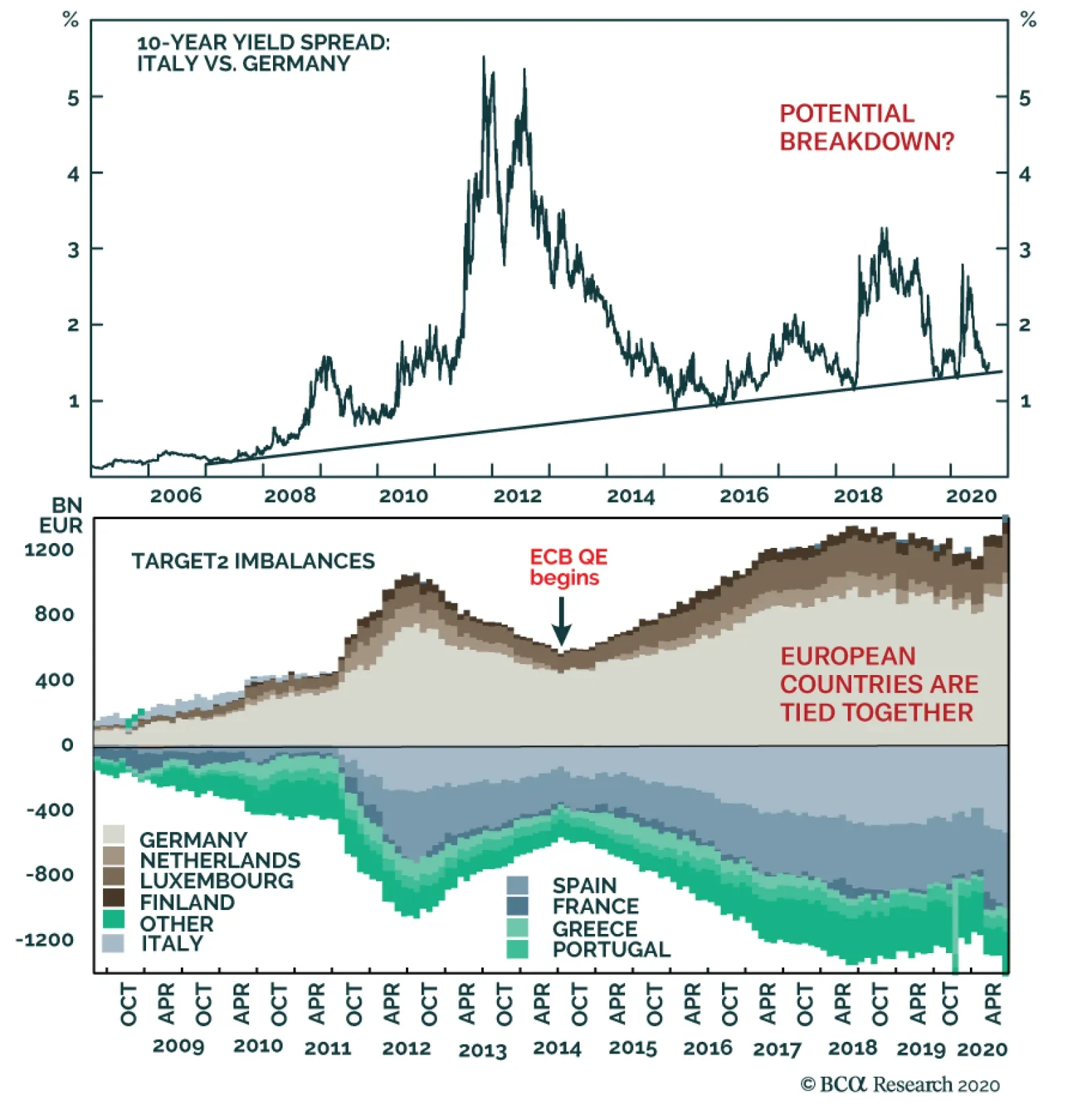
Euro Area

Highlights We remain bearish on the US dollar over the next 12 months. The best vehicle to express this view continues to be the Scandinavian currencies (NOK and SEK). Precious metals remain a buy so long as the dollar faces downside. However, we remain more bullish on silver than gold. Go short the gold/silver ratio (GSR) again at 75. At the crosses, our favorite trade is short NZD against other cyclical currency pairs. These include the CAD, AUD, and SEK. Sterling is selling off as we anticipated, but our timing was offside. That said, the pound is cheap. We will go long cable if it falls below 1.25. Short EUR/GBP at current levels. The Swiss franc will continue to appreciate versus the USD, but will lag behind the euro. EUR/CHF will touch 1.15. We prefer the JPY to the CHF as a currency portfolio hedge. We argued last week that Prime Minster Shinzo Abe’s resignation does not change the yen’s outlook. Feature Our trade basket this year has been centered on a dollar-bearish theme. Since the top in the DXY index on March 19th, we have been expressing this view via various vehicles, most of which have been very profitable. Our favorites have been the Scandinavian currencies, silver, and the AUD, either at the crosses or against the US dollar. So far, these are among the best-performing trades in the G10 currency world (Chart I-1). Chart I-1A Currency Report Card
Revisiting Our High-Conviction Trades
Revisiting Our High-Conviction Trades
Going into the final leg of 2020, the key question is which currency pairs will provide the most upside. In this report, we revisit the rationale behind our high-conviction trades. The Case For Scandinavian Currencies A review of Q2 GDP across the G10 reveals which countries have been doing relatively better during the pandemic. Norway emerges as the economy that had the best quarter-on-quarter annualized growth (Chart I-2). Swedish growth held up very well in Q1 and even the drop in Q2 still puts it well ahead of the US, the euro area, and the UK. As small, open economies which are very sensitive to global growth conditions, this is a very impressive feat for Sweden and Norway. Part of the reason for this is that over the years, the drop in their currencies, both against the US dollar and euro, has made them very competitive. Chart I-2A Currency Report Card
A Currency Report Card
A Currency Report Card
Norway benefited from a few things during the pandemic. First, as a major oil exporter, the sharp fall in the NOK helped cushion the domestic economy against the crash in crude prices. Second, the handling of the pandemic was swift and rigorous, and this has almost completely purged the number of new infections in Norway. Third, aggressive monetary and fiscal stimulus (zero rates, quantitative easing, and the first budget deficit in 40 years) has set the economy on a recovery path. As a result, consumption is rebounding smartly and the Norges Bank expects mainland GDP to touch pre-crisis levels by 2023. Already, real retail sales have exploded higher (Chart I-3). Should global growth continue to rebound, a reversal in pessimism towards energy stocks (and value stocks in general) could see investors reprice the Norwegian stock market (and krone) sharply higher (Chart I-4). Chart I-3Norwegian Consumption Has##br##Recovered
Norwegian Consumption Has Recovered
Norwegian Consumption Has Recovered
Chart I-4A Bounce In Oil & Gas Stocks Will Help The Krone
A Bounce In Oil & Gas Stocks Will Help The Krone
A Bounce In Oil & Gas Stocks Will Help The Krone
In the case of Sweden, the sharp rebound in the manufacturing PMI also suggests the industrial base is recovering. This will also coincide with a solid bounce in exports, cementing Sweden’s rise in relative competitiveness and its exit from the pandemic-induced recession (Chart I-5). The Riksbank’s resource utilization indicator has stabilized, suggesting deflationary pressures are abating. Meanwhile, home prices are on the cusp of a recovery, which should help boost consumer confidence and support consumption. With our models showing the Swedish krona as undervalued by 19% versus the USD, there is much room for currency appreciation before financial conditions tighten significantly. Should global growth continue to rebound, a reversal in pessimism towards energy stocks could see investors reprice the Norwegian stock market (and krone) sharply higher. The bottom line is that both Norway and Sweden are well poised to benefit from a global economic recovery, with much undervalued currencies that will bolster their basic balances. We expect both the SEK and NOK to be the best performers versus the USD in the coming year (Chart I-6). Chart I-5The Swedish Economy Is On The Mend
The Swedish Economy Is On The Mend
The Swedish Economy Is On The Mend
Chart I-6The Scandinavian Currencies Remain Cheap
The Scandinavian Currencies Remain Cheap
The Scandinavian Currencies Remain Cheap
Stay Long Precious Metals, Especially Silver In a world of ample liquidity and a falling US dollar, gold and precious metals are bound to benefit. This is especially the case on the back of a central bank that is trying to asymmetrically generate inflation. Gold has a long-standing relationship with negative interest rates, though the correlation has shifted over time. The intuition behind falling real rates and rising gold prices is that low rates reduce the opportunity cost of holding non-income-generating assets such as gold. But more importantly, the correlation is between the rise in gold prices and the level of real interest rates, meaning as long as the latter stays negative, it is sufficient to sustain the gold bull market (Chart I-7). Gold tends to be a “Giffen good,” meaning demand increases as prices rise. This can be seen in the tight correlation between our financial demand indicator (proxied by open futures interest on the Comex and ETF holdings, Chart I-8) and gold prices. The conclusion is that, just like the US dollar, gold tends to be a momentum asset, where higher prices beget more demand – at least until the catalyst of easy money and negative rates vanishes Chart I-7Gold Prices And Real Yields
Gold Prices And Real Yields
Gold Prices And Real Yields
Chart I-8Gold Is A Giffen Good
Gold Is A Giffen Good
Gold Is A Giffen Good
There is reason to believe that the bull market in gold might be sustained for longer this time around. The reason is that central banks have become important (and price-insensitive) buyers. Foreign central banks have been amassing almost all of the gold annual output in recent years. It is remarkable that for most of the dollar bull market this past decade, the world’s major central banks (and biggest holders of US Treasurys) have seen rather stable exchange rates relative to the gold price (Chart I-9). This suggests that gold price risks could be asymmetric to the upside. A fall in prices encourages accumulation by EM central banks as a way to diversify out of their dollar reserves, while a rise in prices encourages financial demand and boosts the value of gold foreign exchange reserves. While we like gold, more value can be found in silver (and even platinum) prices, which have lagged the run up in gold. While we like gold, more value can be found in silver (and even platinum) prices, which have lagged the run up in gold. During precious metals bull markets, prices tend to move in sequence, starting with gold, then silver. Meanwhile, the gold/silver ratio (GSR) tends to track the US dollar (Chart I-10), since silver tends to rise and fall more explosively than gold. Part of the reason is that the silver market is thinner and more volatile. Silver’s rising industrial use has also led to competition with investment demand in recent years. Chart I-9Central Banks Will Put A Floor Under Gold Prices
Central Banks Will Put A Floor Under Gold Prices
Central Banks Will Put A Floor Under Gold Prices
Chart I-10Silver Should Outperform Gold As The Dollar Falls
Silver Should Outperform Gold As The Dollar Falls
Silver Should Outperform Gold As The Dollar Falls
The next important technical level for silver will be the 2012 highs near $35/oz. After this, silver could take out its 2011 highs that were close to $50/oz, just as gold did. Globally, the world produces much more gold than silver, with a supply ratio that is 7:1. Meanwhile, the price ratio between gold and silver is near 70:1. Back in the 1800s, Isaac Newton concluded that the appropriate ratio was 15.5:1. We initially shorted the GSR at 100 and eventually took 25% profits when our rolling stop was triggered. We recommend putting a limit sell at 75. More speculative investors can buy silver outright. Stay Short NZD At The Crosses, Especially Versus The CAD Chart I-11Stay Long CAD/NZD
Stay Long CAD/NZD
Stay Long CAD/NZD
In our currency portfolio, trades at the crosses are equally important as versus the USD in terms of adding alpha. Over the past year, we have successfully been playing the short side of the kiwi trade. We closed our long SEK/NZD trade for a profit of 7.8% on March 20, and our long AUD/NZD trade for a profit of 5.2% on June 26. Today, we remain bullish on the CAD/NZD as an exploitable trading opportunity. First, the New Zealand stock market is the most defensive in the G10, while Canadian bourses are heavy in cyclical stocks. Should value start to outperform growth, this will favor the CAD/NZD cross. Second, immigration was an important source of labor for New Zealand, and COVID-19 has eaten into this dividend for the economy. As such, the neutral rate of interest is bound to head lower. And finally, in the commodity space, our bias is that energy will fare better than agriculture, boosting Canada’s relative terms of trade. At the Bank of Canada’s meeting this past Wednesday, the tone was slightly optimistic as it kept rates on hold. Recent data has been rather strong in Canada, especially in housing and goods consumption. This allows for the possibility of the BoC tapering asset purchases faster than the market expects, as argued by my colleague Mathieu Savary. This arbitrage is already being reflected in real interest rates, where they offer a premium of 180 basis points in Canada relative to New Zealand (Chart I-11). What To Do About Sterling? Trade negotiations between the UK and EU are once again hitting a brick wall. The key issue is around Northern Ireland. Ireland wants to remain bound to the EU’s customs and trade regime. The UK is seeking an amendment to be able to intervene, if there is “inconsistency or incompatibility with international or domestic law.” In short, it allows for UK discretion in the movement of goods to and from Northern Ireland, as well as state aid to Northern Ireland. The EU argues this is a clear breach of the treaty agreed to last year. We remain bullish on the CAD/NZD as an exploitable trading opportunity. As negotiations go on, our base case is that a deal will eventually be reached. This is because neither side wants the worst-case scenario, namely, a no-deal Brexit. Should no deal be reached, the sharp rise in the trade-weighted euro will be exacerbated by a drop in the pound. This is deflationary for the euro area. And while the drop in the pound could be beneficial to the UK in the longer term, it will be very destabilizing since the UK is highly dependent on capital flows. Our roadmap for sterling is as follows: Historically, odds of a “hard” Brexit have usually been associated with cable near 1.20. This occurred after the UK referendum in 2016 and after Prime Minister Boris Johnson was elected with a mandate to take the UK out of the EU (Chart I-12). Intuitively, this suggests that maximum pessimism on the pound, driven by Brexit fears, pins cable at around 1.20. A “weak” deal cobbled together at the eleventh hour will still benefit cable. Depending on the details, 1.35-1.40 for cable will be within striking distance. In the case where both the UK and EU come to a “perfect” agreement, the pound could be 20%-25% higher. The real effective exchange rate for the pound is now lower than where it was after the UK exited the ERM in 1992, with a drawdown that has been similar in size. A good deal should cause the pound to overshoot the mid-point of its historical real effective exchange rate range (Chart I-13). Chart I-12GBP Has Historically Bottomed At 1.20
GBP Has Historically Bottomed At 1.20
GBP Has Historically Bottomed At 1.20
Chart I-13The Pound Is Cheap
The Pound Is Cheap
The Pound Is Cheap
The pound is also cheap versus the euro, and we expect the EUR/GBP to start facing significant headwinds near 0.92. It is remarkable that UK data continues to outperform both the US and euro area (Chart I-14). As such, cable should be bought on weakness. Tactically, we would be buyers of the pound in the 1.24-1.25 zone, and our limit sell on EUR/GBP was triggered yesterday at 0.92. Chart I-14The UK Economy Is Improving
The UK Economy Is Improving
The UK Economy Is Improving
Thoughts On The ECB The main takeaways from the European Central Bank (ECB) conference were threefold. First, data in the euro area was better than the ECB expected. Second, the ECB did not give any hints on its policy review or extend forward guidance. Keeping policy easy until inflation is up to, but still below, 2% appears more hawkish than the Federal Reserve, which is now trying to asymmetrically generate inflation. And finally, the ECB said they are monitoring the exchange rate, but fell short of providing any hints that they will actively lean against the currency. The euro took off, both against the dollar and other European currencies. We outlined in last week’s report why we do not believe the euro can fall much from current levels. These include the common currency being cheap and having a large share of exports in the eurozone. A Few Words On The CHF Finally, a few clients have asked what happens to the Swiss franc in an environment where the euro is rising (and the dollar is falling). Our bias is that the Swiss National Bank lets a rising EUR/CHF ease financial conditions in Switzerland, and even leans into it. The Swiss National Bank has been stepping up its pace of intervention since EUR/CHF touched 1.05 this year and will continue to do so (Chart I-15). Unfortunately, there is not much it can do about a falling USD/CHF. This suggests the franc will fall against the euro, but not so much against the dollar. In a world where global yields eventually converge to zero, holding the Swiss franc is an attractive hedge. Chart I-15USD Weakness Will Be A Headache For The SNB
USD Weakness Will Be A Headache For The SNB
USD Weakness Will Be A Headache For The SNB
Chester Ntonifor Foreign Exchange Strategist chestern@bcaresearch.com Currencies U.S. Dollar Chart II-1USD Technicals 1
USD Technicals 1
USD Technicals 1
Chart II-2USD Technicals 2
USD Technicals 2
USD Technicals 2
Recent data from the US have been positive: On the labor market front, nonfarm payrolls fell to 1371K from 1734K in August. The average hourly earnings increased by 4.7% year-on-year. The unemployment rate declined from 10.2% to 8.4%. Initial jobless claims increased by 884K for the week ending on September 4th. Finally, the NFIB business optimism index increased from 98.8 to 100.2 in August. The DXY index initially rose to a 4-week high of 93.6 earlier this week with positive data releases, then fell back to 93. Our bias is that while the dollar has been rebounding since the beginning of the month, the rally could prove to be a healthy counter-trend move in the long-term dollar bear market. Report Links: Addressing Client Questions - September 4, 2020 A Simple Framework For Currencies - July 17, 2020 DXY: False Breakdown Or Cyclical Bear Market? - June 5, 2020 The Euro Chart II-3EUR Technicals 1
EUR Technicals 1
EUR Technicals 1
Chart II-4EUR Technicals 2
EUR Technicals 2
EUR Technicals 2
Recent data from the euro area have been mixed: The Sentix investor confidence increased from -13.4 to -8 in September. GDP plunged by 11.8% quarter-on-quarter in Q1, or 14.7% year-on-year. The euro declined by 0.5% against the US dollar this week. The ECB decided to keep its interest rate and PEPP program unchanged on this Thursday. President Christine Lagarde sounded quite hawkish in the press conference, saying that incoming data since the last monetary policy meeting suggest “a strong rebound in activity broadly in line with previous expectations.” We continue to favor the euro against the US dollar. Report Links: Addressing Client Questions - September 4, 2020 On The DXY Breakout, Euro, And Swiss Franc - February 21, 2020 Updating Our Balance Of Payments Monitor - November 29, 2019 Japanese Yen Chart II-5JPY Technicals 1
JPY Technicals 1
JPY Technicals 1
Chart II-6JPY Technicals 2
JPY Technicals 2
JPY Technicals 2
Recent data from Japan have been mixed: The coincident index increased from 74.4 to 76.2 in July. The leading economic index also climbed up from 83.8 to 86.9 in July. The current account balance widened from ¥167 billion to ¥1,468 billion in July. GDP plunged by 7.9% quarter-on-quarter in Q2, or 28.1% on an annualized basis. Preliminary machine tool orders continued to fall by 23.3% year-on-year in August. Overall household spending contracted by 7.6% year-on-year in July. The Japanese yen appreciated by 0.2% against the US dollar this week. The expansion in Japan’s current account balance is mainly driven by the decline in domestic demand. Exports fell by 19.2% year-on-year in July while imports slumped at a faster pace by 22.3%. This suggests that deflationary forces are returning to Japan, which will boost real rates and buffet the yen. Report Links: The Near-Term Bull Case For The Dollar - February 28, 2020 Building A Protector Currency Portfolio - February 7, 2020 Currency Market Signals From Gold, Equities And Flows - January 31, 2020 British Pound Chart II-7GBP Technicals 1
GBP Technicals 1
GBP Technicals 1
Chart II-8GBP Technicals 2
GBP Technicals 2
GBP Technicals 2
Recent data from the UK have been mostly positive: Retail sales continued to increase, rising by 4.7% year-on-year in August, following a 4.3% increase the previous month. Halifax house prices increased by 5.2% year-on-year for the 3 months to August. The Markit construction PMI declined from 58.1 to 54.6 in August. The British pound extended its sell-off this week, depreciating by 2.5% against the US dollar, making it the worst-performing G10 currency. Under ongoing trade negotiations, the possibility of a no-deal Brexit is now putting more downward pressure on the pound after the summer rally. Report Links: Updating Our Balance Of Payments Monitor - November 29, 2019 A Few Trade Ideas - Sept. 27, 2019 United Kingdom: Cyclical Slowdown Or Structural Malaise? - Sept. 20, 2019 Australian Dollar Chart II-9AUD Technicals 1
AUD Technicals 1
AUD Technicals 1
Chart II-10AUD Technicals 2
AUD Technicals 2
AUD Technicals 2
Recent data from Australia have been mixed: The AiG services performance index fell from 44 to 42.5 in August. The NAB business confidence increased from -14 to -8 in August while the business conditions index fell from 0 to -6. The Australian dollar appreciated by 0.4% against the US dollar this week. Spending fell sharply during the pandemic, pushing Australia’s savings rate to 19.8% from 6%. Until consumer spending returns in earnest, the RBA is unlikely to raise rates, which puts a cap on how far the AUD can rise. The good news is that household balance sheets are being mended, which reduces macroeconomic risk. Report Links: On AUD And CNY - January 17, 2020 Updating Our Balance Of Payments Monitor - November 29, 2019 A Contrarian View On The Australian Dollar - May 24, 2019 New Zealand Dollar Chart II-11NZD Technicals 1
NZD Technicals 1
NZD Technicals 1
Chart II-12NZD Technicals 2
NZD Technicals 2
NZD Technicals 2
Recent data from New Zealand have been mixed: Manufacturing sales plunged by 12.2% quarter-on-quarter in Q2. The preliminary ANZ business confidence index increased from -41.8% to -26% in September. The ANZ activity outlook index also ticked up from -17.5% to -9.9%. The New Zealand dollar fell initially against the US dollar, then recovered, returning flat this week. The ANZ New Zealand Business Outlook shows that most activity indicators have increased to the highest levels since the beginning of the pandemic but are still well below pre-COVID-19 levels. We like the New Zealand dollar against the US dollar but believe that it will underperform against other pro-cyclical currencies including the Australian dollar and the Canadian dollar. Report Links: Currencies And The Value-Versus-Growth Debate - July 10, 2020 Updating Our Balance Of Payments Monitor - November 29, 2019 Place A Limit Sell On DXY At 100 - November 15, 2019 Canadian Dollar Chart II-13CAD Technicals 1
CAD Technicals 1
CAD Technicals 1
Chart II-14CAD Technicals 2
CAD Technicals 2
CAD Technicals 2
Recent data from Canada have been positive: On the labor market front, the unemployment rate declined from 10.9% to 10.2% in August. The participation rate increased from 64.3% to 64.6%. Average hourly wages surged by 6% year-on-year in August. Housing starts increased by 6.9% month-on-month to 262.4K in August, the highest reading since 2007. The Canadian dollar depreciated by 0.3% against the US dollar this week. The Bank of Canada maintained its target rate at 0.25% on Wednesday. It is also continuing large-scale asset purchases of at least C$5 billion per week of government bonds. Moreover, the Bank suggested that the bounce-back in activity in Q3 was better than expected, which bodes well for the loonie. Report Links: Currencies And The Value-Versus-Growth Debate - July 10, 2020 More On Competitive Devaluations, The CAD And The SEK - May 1, 2020 A New Paradigm For Petrocurrencies - April 10, 2020 Swiss Franc Chart II-15CHF Technicals 1
CHF Technicals 1
CHF Technicals 1
Chart II-16CHF Technicals 2
CHF Technicals 2
CHF Technicals 2
Recent data from Switzerland have been mixed: FX reserves continued to increase from CHF 847 billion to CHF 848 billion in August. The unemployment rate remained unchanged at 3.4% in August. The Swiss franc appreciated by 1% against the US dollar this week. The SNB Chairman Thomas Jordan said that “stronger currency market interventions relieve over-valuation pressure on the Swiss franc and protect the Swiss economy”. Recent dollar weakness could be another headache for the SNB, accelerating SNB’s currency intervention. While we like the franc as a safe-haven hedge with high real rates, the upside potential is likely to be more gradual as the SNB leans against it. Report Links: On The DXY Breakout, Euro, And Swiss Franc - February 21, 2020 Currency Market Signals From Gold, Equities And Flows - January 31, 2020 Portfolio Tweaks Before The Chinese New Year - January 24, 2020 Norwegian Krone Chart II-17NOK Technicals 1
NOK Technicals 1
NOK Technicals 1
Chart II-18NOK Technicals 2
NOK Technicals 2
NOK Technicals 2
Recent data from Norway have been positive: Manufacturing output increased by 1.8% month-on-month in July. Headline consumer price inflation ticked up from 1.3% to 1.7% year-on-year in August. Core inflation continued rising to 3.7% year-on-year from 3.5% the previous month. The Norwegian krone depreciated by 0.5% against the US dollar this week. The increase in headline inflation was mainly driven by furnishings and household equipment (10%), communications (4.9%) and food (3.7%). However, the Norwegian krone is still tremendously undervalued against the US dollar according to our models. Report Links: A New Paradigm For Petrocurrencies - April 10, 2020 Building A Protector Currency Portfolio - February 7, 2020 On Oil, Growth And The Dollar - January 10, 2020 Swedish Krona Chart II-19SEK Technicals 1
SEK Technicals 1
SEK Technicals 1
Chart II-20SEK Technicals 2
SEK Technicals 2
SEK Technicals 2
Recent data from Sweden have been mostly positive: The current account surplus fell to SEK 63.2 billion in Q2 from SEK 75.5 billion in Q1. However, this compares favorably to a surplus of SEK 34.7 billion the same quarter last year. Manufacturing new orders continued to fall by 6.4% year-on-year in July. This is an improvement compared to the 13.1% contraction the previous month. Headline consumer prices inflation increased from 0.5% to 0.8% year-on-year in August. Core inflation also climbed up from 0.5% to 0.7% year-on-year. The Swedish krona appreciated by 0.5% against the US dollar this week. We continue to favor the Swedish krona amid global economy recovery. Moreover, our PPP model shows that the krona is still undervalued by 19% against the US dollar. Report Links: Updating Our Balance Of Payments Monitor - November 29, 2019 Where To Next For The US Dollar? - June 7, 2019 Balance Of Payments Across The G10 - February 15, 2019 Trades & Forecasts Forecast Summary Core Portfolio Tactical Trades Limit Orders Closed Trades
To all clients, Next week, in lieu of publishing a regular report, I will be hosting a webcast on September 15th at 10 am EDT, discussing our latest views on global fixed income markets. Sign up details for the Webcast will arrive in your inboxes later this week. Best regards, Robert Robis, Chief Fixed Income Strategist Feature Much of the global rebound in economic activity, and recovery in equity and credit markets, seen since the COVID-19 shock earlier this year can be attributed to historic levels of monetary and fiscal stimulus. However, the effective transmission of various monetary policy measures such as liquidity injections and refinancing operations, and by extension a sustained global recovery, is dependent on the continued smooth flow of credit from lenders to borrowers. As such, the tightening in bank lending standards seen across developed markets in the second quarter of 2020 could imperil the recovery if banks remain cautious with borrowers (Chart 1). Chart 1Credit Standards Across Developed Markets
Introducing The GFIS Global Credit Conditions Chartbook
Introducing The GFIS Global Credit Conditions Chartbook
This week, we are introducing the BCA Research Global Fixed Income Strategy (GFIS) Global Credit Conditions Chartbook—a review of central bank surveys of bank lending standards and loan demand. We will be publishing this chartbook on an occasional basis going forward to help inform our fixed income investment recommendations. Where it is relevant to our analysis, we will also make special note of the one-off questions asked in some of these surveys that are germane to the economic situation at hand. Where To Find The Bank Lending Surveys A number of central banks publish regular surveys of bank lending conditions in their domestic economies. The surveys, and the details on how they are conducted, can be found on the websites of the central banks: US Federal Reserve: https://www.federalreserve.gov/data/sloos.htm European Central Bank: https://www.ecb.europa.eu/stats/ecb_surveys/bank_lending_survey/html/index.en.html Bank of England: https://www.bankofengland.co.uk/credit-conditions-survey/ Bank of Japan: https://www.boj.or.jp/en/statistics/dl/loan/loos/index.htm/ Bank of Canada: https://www.bankofcanada.ca/publications/slos/ Reserve Bank of New Zealand: https://www.rbnz.govt.nz/statistics/c60-credit-conditions-survey US Chart 2US Credit Conditions
US Credit Conditions
US Credit Conditions
Overall credit standards for US businesses, measured as an average of standards faced by small, medium and large firms, tightened dramatically in Q2/2020 (Chart 2). Unsurprisingly, gloomier economic outlooks, reduced risk tolerance, and worsening industry-specific problems were the top reasons cited by US banks for tightening standards. US banks reported that commercial and industrial (C&I) loan demand from all firms also weakened in Q2, owing to a decrease in customers’ inventory financing and fixed investment needs. This suggests that the surge in actual C&I loan growth data during the spring was fueled by companies drawing down credit lines to survive the lack of cash flow during the COVID-19 lockdowns and should soon peak. Standards for consumer loans tightened significantly in Q2, as well. A continuation of this trend would pose a major risk to the US economic recovery, given the still fragile state of US consumer confidence. Business lending standards typically lead US high-yield corporate bond default rates by about one year, suggesting that defaults will continue to climb over the next few quarters (Chart 2, top panel). Tightening US junk bond spreads have ignored the rising trend in defaults and now provide no compensation for the likely amount of future default losses, suggesting poor value in the overall US high-yield market (Chart 3). Turning to the real estate market, lending standards have tightened significantly for both commercial and residential mortgage loans (Chart 4). In a special question asked in the Q2 survey, US banks indicated that lending standards for both those categories are at the tighter end of the range that has prevailed since 2005. Business lending standards typically lead US high-yield corporate bond default rates by about one year, suggesting that defaults will continue to climb over the next few quarters. Chart 3US Junk Spreads Do Not Compensate For Default Risk
US Junk Spreads Do Not Compensate For Default Risk
US Junk Spreads Do Not Compensate For Default Risk
Chart 4The White Picket Fence Is Looking Out Of Reach
The White Picket Fence Is Looking Out Of Reach
The White Picket Fence Is Looking Out Of Reach
Euro Area Italy is seeing the greater benefit from ECB support, however, with loan growth now at a new cyclical high. Chart 5Euro Area Credit Conditions
Euro Area Credit Conditions
Euro Area Credit Conditions
In contrast to the US, credit standards actually eased slightly in the euro area in Q2/2020 (Chart 5). Banks reported increased perceptions of overall risk from a worsening economic outlook, but that was more than offset by the massive liquidity and loan guarantee programs that were part of the policy response to the COVID-19 recession. Going forward, banks expect lending standards to tighten as the maximum impact of those policies begins to fade. Credit demand from firms rose in Q2, driven by acute liquidity needs during the COVID-19 lockdowns. At the same time, demand for longer-term financing for capital expenditure was very depressed. Banks expect credit demand to normalize in Q3, as easing lockdown restrictions dampen the immediate need for liquidity. Credit demand from euro area households plummeted in Q2. Banks reported that plunging consumer confidence was the leading cause of decline in credit demand, followed closely by reduced spending on durable goods. Consumer confidence has already rebounded and banks expect demand to follow suit, as economies re-open and spending opportunities return. Chart 6HY Spreads In The Euro Area Are Unattractive
HY Spreads In The Euro Area Are Unattractive
HY Spreads In The Euro Area Are Unattractive
As with the US, we expect that tighter credit standards to firms will drive up euro area high-yield default rates. Current euro area high-yield spreads offer little compensation for the coming increase in default losses, suggesting a similar poor valuation backdrop to US junk bonds (Chart 6). Looking at the four major euro area economies, credit standards eased across the board in Q2, with the largest moves seen in Italy and Spain (Chart 7). The ECB’s liquidity operations have helped support lending in those countries, each with a take-up from long-term refinancing operations (LTROs) equal to around 14% of total bank lending (Chart 8). Italy is seeing the greater benefit from ECB support, however, with loan growth now at a new cyclical high and Spanish banks projecting a much sharper tightening of lending standards in Q3 relative to Italian banks. Chart 7Loan Growth Accelerating Across Most Of The Euro Area
Loan Growth Accelerating Across Most Of The Euro Area
Loan Growth Accelerating Across Most Of The Euro Area
Chart 8Italy & Spain Taking Full Advantage Of LTROs
Italy & Spain Taking Full Advantage Of LTROs
Italy & Spain Taking Full Advantage Of LTROs
UK For consumers, UK banks are projecting loan demand to improve in Q3, although that will require a sharper rebound in consumer confidence than has been seen to date. Chart 9UK Credit Conditions
UK Credit Conditions
UK Credit Conditions
In the UK, corporate credit standards eased significantly in Q2 2020 thanks to the massive liquidity support programs provided by the UK government (Chart 9). Lenders reported a larger proportion of loan application approvals from all business sizes, with the greatest improvements seen in small businesses and medium-sized private non-financial corporations (PNFCs). However, lenders indicated that average credit quality on new PNFC borrowing facilities had actually declined, with default rates increasing, for all sizes of borrowers. This divergence between increased lending and declining borrower creditworthiness attests to the impact of the UK’s substantial liquidity provisions in response to the COVID-19 shock. The credit demand side mirrors the supply story with a massive spike in Q2 2020. In contrast to euro area counterparts, UK businesses reportedly borrowed primarily to facilitate balance sheet restructuring. However, as with the euro area, the story for Q3 is much more bearish. Banks are projecting credit standards to turn more restrictive as stimulus programs run out and borrowers rein in credit demand. Going forward, decreasing risk appetite of UK banks will likely contribute to a tightening in lending standards. For consumers, UK banks are projecting loan demand to improve in Q3, although that will require a sharper rebound in consumer confidence than has been seen to date. UK banks surprisingly reported that the average credit quality of new consumer loans improved in Q2, suggesting that consumer loan demand could rebound strongly in Q3 as lockdown restrictions fade. Japan Perversely, the latest improvement in Japanese business optimism could translate to lower business loan demand going forward. Chart 10Japan Credit Conditions
Japan Credit Conditions
Japan Credit Conditions
Before the pandemic hit, credit standards in Japan were in a structural tightening trend for both firms and households (Chart 10). Fiscal authorities have taken a number of measures to ease conditions for businesses, including low interest rate loan programs and guarantees for large businesses as well as small and medium-sized enterprises, which has translated into the easiest credit standards for Japanese firms since 2005. The correlation between business loan demand and business conditions is not as clear-cut in Japan compared to other countries. Japanese firms tend to borrow more when the economic outlook is poor, indicating that loans are being used to meet emergency funding or restructuring needs rather than being put towards capital expenditure or inventory financing. Perversely, the latest improvement in Japanese business optimism could translate to lower business loan demand going forward. However, the consumer picture is a bit more conventional—consumer loan demand and confidence tend to track quite closely. While consumer confidence has yet to stage a convincing rebound, it has clearly bottomed. The more positive projections for consumer loan demand from the Japan bank lending survey seem to confirm this message. Canada And New Zealand In Canada, business lending standards tightened in Q2/2020 as loan growth slowed (Chart 11). Although loan growth is far from contracting on a year-on-year basis, further tightening in conditions could pose an obstacle to Canadian recovery. On the mortgage side, the Canadian government has been active in easing pressures for lenders by relaxing loan-to-value requirements for mortgage insurance, making it easier for them to collateralize and sell their assets to the Canadian Mortgage and Housing Corporation (CMHC). Although this has yet to translate to the standards faced by borrowers, residential mortgage growth remains buoyant. In New Zealand, credit standards for firms (including both corporates and SMEs) tightened significantly in Q2 (Chart 12). Many banks expect to apply tighter lending standards to borrowers in industries most impacted by the pandemic, such as tourism, accommodation, and construction. Demand for credit from firms was driven by working capital needs while capital expenditure funding demands fell drastically. Chart 11Canada Credit Conditions
Canada Credit Conditions
Canada Credit Conditions
Chart 12New Zealand Credit Conditions
New Zealand Credit Conditions
New Zealand Credit Conditions
On the consumer side, residential mortgage standards increased somewhat, and banks expect to perform more due diligence on income and job security. The hit to credit demand was broad-based across credit card, secured, and unsecured lending and coincided with a sharp fall in loan demand. Shakti Sharma Research Associate ShaktiS@bcaresearch.com Robert Robis, CFA Chief Fixed Income Strategist rrobis@bcaresearch.com Recommendations The GFIS Recommended Portfolio Vs. The Custom Benchmark Index
Introducing The GFIS Global Credit Conditions Chartbook
Introducing The GFIS Global Credit Conditions Chartbook
Duration Regional Allocation Spread Product Tactical Trades Yields & Returns Global Bond Yields Historical Returns
Highlights Achieving 2 percent inflation, whether as a point-target or as an average over time, will continue to be a mission impossible. As central banks continue to push the monetary policy pedal to the metal, it will underpin the valuation of equities and other risk-assets. So long as bond yields do not spike, stock market sell offs will be short-lived rather than an outright bear market. Within bonds, steer towards those where the monetary policy toolbox is not fully depleted, namely US T-bonds. Within currencies, steer towards those where the monetary policy toolbox is already depleted, namely the Swiss franc and the yen. Inflationary fiscal policy, by spiking bond yields, risks collapsing the valuation underpinning of $450 trillion of global risk-assets and catalysing a deflationary bear market. Fractal trade: Euro strength is vulnerable. Feature Chart of the WeekUltra-Low Bond Yields Do Not Create Consumer Price Inflation, They Create Asset Price Inflation
Ultra-Low Bond Yields Do Not Create Consumer Price Inflation, They Create Asset Price Inflation
Ultra-Low Bond Yields Do Not Create Consumer Price Inflation, They Create Asset Price Inflation
Five years ago, we published a Special Report, Mission Impossible: 2% Inflation. We predicted that 2 percent inflation would remain elusive. Or that in the rare economies that it did appear, it would be runaway, rather than a sedate 2 percent. Either way, the 2 percent inflation point-target that had become a quasi-religious commandment for the world’s central banks would be a ‘mission impossible’.1 Our August 2015 report was heterodox and provocative. Some people pushed back, arguing that the all-powerful central banks could pick and hit whatever inflation target they desired. Yet five years on, we have been vindicated. Last week, the Federal Reserve finally threw in the towel on the 2 percent inflation point-target (Chart I-2). Chart I-2"Forecasts For 2 Percent Inflation Were Never Realised On A Sustained Basis"
"Forecasts For 2 Percent Inflation Were Never Realised On A Sustained Basis"
"Forecasts For 2 Percent Inflation Were Never Realised On A Sustained Basis"
“Over the years, forecasts from FOMC participants and private-sector analysts routinely showed a return to 2 percent inflation, but these forecasts were never realised on a sustained basis… (hence) our new statement indicates that we will seek to achieve inflation that averages 2 percent over time…”2 We suspect that, just like the Fed, European central banks will soon move their goal posts. Nevertheless, today we are doubling down on our August 2015 prediction. Achieving 2 percent inflation, whether as a point-target or as an average over time, will continue to be a mission impossible (Chart I-3). Chart I-3Mission Impossible: 2 Percent Inflation
Mission Impossible: 2 Percent Inflation
Mission Impossible: 2 Percent Inflation
Price Stability Is A State, Not A Number The current school of central bankers have misunderstood price stability. They have defined it as an over-precise inflation rate: two point zero. Yet most people feel price stability imprecisely and intuitively. A recent IFO paper points out that households’ inflation perceptions are “more in line with the imperfect information view prevailing in social psychology than with the rational actor view assumed in mainstream economics.”3 The human brain cannot distinguish between very low rates of inflation or deflation, a range we just perceive as ‘price stability’. In Real-Feel Inflation: Quantitative Estimation of Inflation Perceptions, Michael Ashton confirms that “it would be challenging for a consumer to distinguish 1 percent inflation from 2 percent inflation – that fine of a gradation in perception would be extremely unusual to find.”4 The human brain cannot distinguish between very low rates of inflation or deflation. As the entire range of ultra-low inflation just feels like one state of price stability, it is impossible for central banks to fine-tune our inflation expectations within that range. Therefore, our behaviour in terms of wage demands and willingness to borrow also stays unchanged. And if our behaviour is unchanged, what is the transmission mechanism to 2 percent inflation – or for that matter, any arbitrarily chosen inflation rate? Hence, inflation targeting can ‘phase-shift’ an economy between the states of price instability and price stability. Most notably, its inception in the 1990s ultimately phase-shifted many advanced economies into the state of price stability (Chart I-4). But once in either state, inflation targeting cannot fine-tune inflation to a desired number such as 2 percent, 4 percent, or 10 percent. Chart I-4Inflation Targeting Phase-Shifted Advanced Economies Into Price Stability
Inflation Targeting Phase-Shifted Advanced Economies Into Price Stability
Inflation Targeting Phase-Shifted Advanced Economies Into Price Stability
A recent NBER paper Inflation Expectations As A Policy Tool? points out that in advanced economies, “the inattention of households and firms to inflation is likely a reflection of policy-makers’ success in stabilizing inflation around a low level for decades. This price stability has reduced the benefit to being informed about aggregate inflation, leading many to rely on readily available price signals.”5 The ultimate proof is that even market-based inflation expectations just track realised inflation. Central Banks Have Gone Backwards In his must-read What’s Wrong With The 2 Percent Inflation Target, the late and great Paul Volcker argued that price stability is “that state in which expected changes in the general price level do not effectively alter business or household decisions. It is ill-advised to define that state with a point target, such as 2 percent, as false precision can lead to dangerous policies.”6 The irony, and tragedy, is that both the Fed and the ECB have gone backwards. Their original definitions of price stability were more correct than their more recent iterations. False precision can lead to dangerous policies. At the Federal Reserve’s July 1996 policy meeting, Chairman Alan Greenspan argued that if the aim of inflation targeting was a truly stable price level, it entailed an inflation target of 0-1 percent. But one of the persons present was not so sure. The dissenter was a Fed governor called Janet L. Yellen. She countered that if inflation ended up at 0-1 percent, the zero-bound of interest rates would prevent “real interest rates becoming negative on the rare occasions when required to counter a recession”, an argument that Jay Powell repeated last week. “Expected inflation feeds directly into the general level of interest rates… so if inflation expectations fall below our 2 percent objective, interest rates would decline in tandem. In turn, we would have less scope to cut interest rates to boost employment during an economic downturn.” Meanwhile in Europe, the ECB’s original inflation target of below 2 percent was close to Greenspan’s proposal of 0-1 percent. But in 2003 the ECB changed its inflation target to its current “below but close to 2 percent.” The reason, according to Mario Draghi: “The founding fathers of the ECB thought about the rebalancing of the different members. To rebalance these disequilibria, since the countries do not have the exchange rate, they must readjust their prices. This readjustment is much harder if you have zero inflation than if you have 2 percent.” Hence, the Fed, ECB and other central banks are targeting inflation at an arbitrary 2 percent to always allow some leeway for negative real rates. The central bank argument can be summarised as: we desperately need you to expect 2 percent inflation. Because otherwise, we won’t be able to help you by cutting real interest rates in a downturn. Yet this argument is facile, as it takes no account of the true science of inflation expectation formation (Chart I-5 and Chart I-6). And it is dangerous, as it takes no account of the financial and economic risks of pushing the monetary policy pedal to the metal. Chart I-5Inflation Expectations Just Track Realised Inflation
Inflation Expectations Just Track Realised Inflation
Inflation Expectations Just Track Realised Inflation
Chart I-6Inflation Expectations Just Track Realised Inflation
Inflation Expectations Just Track Realised Inflation
Inflation Expectations Just Track Realised Inflation
Beware The Twists In The Inflation Story Now we come to a couple of twists in the story. When bond yields become ultra-low, their impact on consumer price inflation breaks down – because the economy is already in the state of price stability – but the impact on stock market inflation increases exponentially (Chart of the Week). We refer readers to previous reports in which we have detailed this dynamic.7 The good twist is that as central banks continue to push the monetary policy pedal to the metal, it will underpin the valuation of equities and other risk-assets. So long as bond yields do not spike, stock market sell offs will be short-lived rather than an outright bear market. Remarkably, this has held true even this year in the worst economic downturn since the Depression. The current school of central bankers have misunderstood price stability. Within bonds, steer towards those where the monetary policy toolbox is not fully depleted, namely US T-bonds (Chart I-7 and Chart I-8). Conversely, within currencies, steer towards those where the monetary policy toolbox is already depleted, namely the Swiss franc and the yen. Chart I-7Steer Towards Bonds Where Monetary Policy Is Not Fully Depleted...
Steer Towards Bonds Where Monetary Policy Is Not Fully Depleted...
Steer Towards Bonds Where Monetary Policy Is Not Fully Depleted...
Chart I-8...Namely US ##br##T-Bonds
...Namely US T-Bonds
...Namely US T-Bonds
Finally, given that any economy can ultimately phase-shift to price instability, when should we worry about inflation in advanced economies? Not yet. To expand the broad money supply, somebody must borrow and spend money. If policymakers really want to create rampant inflation, that somebody is the government. It must borrow and spend money at will, with the central bank creating the money. In other words, the central bank loses its independence and government spending goes vertical. So far, we are not remotely close to this situation because government spending has barely replaced the lost incomes and livelihoods of the pandemic. Indeed, things could get worse once the current income replacement schemes end. Yet, in theory at least, government spending could ultimately go vertical. This would lead to the final bad twist. As bond yields spiked in response, the entire valuation support of global risk-assets would collapse, catalysing a devastating bear market. Given that the $450 trillion worth of global risk-assets (including real estate) is five times the size of the $90 trillion global economy, we reach an important conclusion. The road to inflation, if ever taken, goes via deflation. Fractal Trading System* This week we note that the recent strength in EUR/USD is vulnerable to a countertrend pullback. However, as we are already exposed to this via the correlated position in long USD/PLN, there is no new trade. The rolling 1-year win ratio now stands at 59 percent. Chart I-9EUR/USD
EUR/USD
EUR/USD
When the fractal dimension approaches the lower limit after an investment has been in an established trend it is a potential trigger for a liquidity-triggered trend reversal. Therefore, open a countertrend position. The profit target is a one-third reversal of the preceding 13-week move. Apply a symmetrical stop-loss. Close the position at the profit target or stop-loss. Otherwise close the position after 13 weeks. * For more details please see the European Investment Strategy Special Report “Fractals, Liquidity & A Trading Model,” dated December 11, 2014, available at eis.bcaresearch.com. Dhaval Joshi Chief European Investment Strategist dhaval@bcaresearch.com Footnotes 1 Please see the European Investment Strategy Special Report ‘Mission Impossible: 2% Inflation’, dated August 20, 2015, available at eis.bcaresearch.com. 2 Please see New Economic Challenges and the Fed's Monetary Policy Review, August 27, 2020 available at https://www.federalreserve.gov/newsevents/speech/powell20200827a.htm 3 Please see Households’ Inflation Perceptions and Expectations: Survey Evidence from New Zealand, IFO Working Paper, February 2018 available at https://www.ifo.de/DocDL/wp-2018-255-hayo-neumeier-inflation-perceptions-expectations.pdf 4 Please see Real-Feel Inflation: Quantitative Estimation of Inflation Perceptions by Michael Ashton, National Association for Business Economics available at https://link.springer.com/content/pdf/10.1057/be.2011.35.pdf 5 Please see Inflation Expectations As A Policy Tool? NBER, May 28th, 2018 available at http://conference.nber.org/conf_papers/f117592.pdf 6 Please see https://www.bloomberg.com/opinion/articles/2018-10-24/what-s-wrong-with-the-2-percent-inflation-target 7 Please see the European Investment Strategy Weekly Report ‘Risk: The Great Misunderstanding Of Finance’, dated October 25, 2018, available at eis.bcaresearch.com. Fractal Trading System Cyclical Recommendations Structural Recommendations Closed Fractal Trades Trades Closed Trades Asset Performance Currency & Bond Equity Sector Country Equity Indicators Bond Yields Chart II-1Indicators To Watch - Bond Yields
Indicators To Watch - Bond Yields
Indicators To Watch - Bond Yields
Chart II-2Indicators To Watch - Bond Yields
Indicators To Watch - Bond Yields
Indicators To Watch - Bond Yields
Chart II-3Indicators To Watch - Bond Yields
Indicators To Watch - Bond Yields
Indicators To Watch - Bond Yields
Chart II-4Indicators To Watch - Bond Yields
Indicators To Watch - Bond Yields
Indicators To Watch - Bond Yields
Interest Rate Chart II-5Indicators To Watch - Interest Rate Expectations
Indicators To Watch - Interest Rate Expectations
Indicators To Watch - Interest Rate Expectations
Chart II-6Indicators To Watch - Interest Rate Expectations
Indicators To Watch - Interest Rate Expectations
Indicators To Watch - Interest Rate Expectations
Chart II-7Indicators To Watch - Interest Rate Expectations
Indicators To Watch - Interest Rate Expectations
Indicators To Watch - Interest Rate Expectations
Chart II-8Indicators To Watch - Interest Rate Expectations
Indicators To Watch - Interest Rate Expectations
Indicators To Watch - Interest Rate Expectations
The European Central Bank has little scope to push German, French or Dutch yields much lower from current levels, especially as markets are already convinced that the ECB will not be able to raise interest rates for many years. However, this does not mean…
Highlights ‘Value’ sector profits are in terminal decline. Bank profits are in terminal decline, because private sector credit is now ‘maxed out’, and the intermediation between borrowers and savers can be done more cost-effectively by the blockchain. Oil and gas profits are in terminal decline, because we now rely less on the energy stored in ‘chemical bonds’ of portable fossil fuels, and rely more on the energy of ‘moving electrons’ generated from unportable alternative energy sources. Basic resources profits are in terminal decline, because we now rely less on the ‘physical stuff’ that requires basic resources. As such, structurally overweighting the value-heavy European market versus the growth-heavy US market is a ‘widow maker’ trade. The caveat is that a vicious snapback out of growth into value is possible when a universally accepted treatment for Covid-19 is found. Or if bond yields spike. This would create a burst of outperformance from Europe, but any such snapback would be a brief interruption to the mega downtrend. Fractal trade: Long RUB/CZK. Feature Chart of the WeekValue' Has Underperformed For 12 Years... But The Mega Downtrend Isn't Over
Value' Has Underperformed For 12 Years... But The Mega Downtrend Isn't Over
Value' Has Underperformed For 12 Years... But The Mega Downtrend Isn't Over
I have just returned from a summer holiday, on which I took a clean break from the financial markets. A clean break that is highly recommended for anybody who looks at the markets day in, day out. Nevertheless, I made two market-relevant observations. First, that having to wear a face mask on an aeroplane was an unpleasant experience. Tolerable for a short-haul flight lasting a couple of hours, but something that would be unbearable for the duration of a long-haul flight. Second, that even the most popular bars and restaurants in the most popular places were operating at half capacity. They were fully booked, yet the requirements of physical distancing at the bar, and between tables, meant that their operating capacity and revenues had collapsed. Worse, the owners feared a further hit in the winter when eating and drinking in their outdoors spaces became impossible. The use of face masks and physical distancing cripples any economic activity that requires you to have your (uncovered) mouth and nose in proximity to others. These first-hand experiences simply confirm the message in An Economy Without Mouths Or Noses Will Lose 10 Percent Of Jobs.1 The use of face masks and physical distancing cripples any economic activity that requires you to have your (uncovered) mouth and nose in proximity to others – like flying, or drinking and eating out. Hence, if governments remove the financial incentives for employers to retain workers while the pandemic is still rampant, expect structural unemployment to rise sharply. In which case, expect bond yields to remain ultra-low, and where possible, go even lower. And expect ‘growth’ sectors to continue outperforming ‘value’ sectors. Explaining Recent Market Action Returning to the financial markets after a break, several things stood out. Apple has become America’s first $2 trillion company, while HSBC’s share price is within a whisker of its 2008 crisis low. This vignette encapsulates that growth sectors – broadly defined as tech and healthcare – have been roaring ahead, while value sectors – broadly defined as banks, oil and gas, and basic resources – have been struggling. Hence, the growth-heavy S&P500 has reached a new all-time high, while the value-heavy FTSE100 and other European indexes are still deeply in the red for 2020 and have recently drifted lower (Chart I-2). The combined effect is that the strong recovery in global stocks has taken a breather. Chart I-2US Market At All-Time High, But European Markets Still Deeply In The Red
US Market At All-Time High, But European Markets Still Deeply In The Red
US Market At All-Time High, But European Markets Still Deeply In The Red
In turn, the breather in the stock market explains the recent support to the dollar. Significantly, the 2020 evolution of the dollar is a perfect mirror-image of the stock market. Nothing more, nothing less. If the stock market gives back some of its gains, expect the countertrend strengthening in the dollar to continue (Chart I-3). Chart I-3The Dollar Is A Mirror-Image Of The Stock Market
The Dollar Is A Mirror-Image Of The Stock Market
The Dollar Is A Mirror-Image Of The Stock Market
Yet the best performing major asset-class in 2020 is not growth equities, nor is it gold. Instead, it is the US 30-year T-bond, which has returned a spectacular 32 percent (Chart I-4). Chart I-4The Best Performing Major Asset-Class Is The 30-Year T-Bond
The Best Performing Major Asset-Class Is The 30-Year T-Bond
The Best Performing Major Asset-Class Is The 30-Year T-Bond
Suddenly, everything becomes crystal clear. If the ultra-long bond has surged, then other ultra-long duration investments must also surge. Within equities, this means that growth sectors, whose profits are skewed to the very distant future, must receive a huge boost to their valuations. Whereas value sectors whose profits are not growing will receive a smaller (or no) valuation boost. In fact, the value sectors have a much bigger structural problem. Not only are their profits not growing. Their profits are in terminal decline. Since 2008, Overweighting Value Has Been A ‘Widow Maker’ In the 34 years through 1975-2008, value trebled relative to growth.2 Albeit, with the occasional vicious countertrend move, such as the dot com bubble. But through 2009-2020, the tables turned. For the past 12 years, value has structurally underperformed growth and given back around half of its 1975-2008 outperformance (Chart of the Week). This means that for the past 12 years ‘proxy’ value versus growth positions have also structurally underperformed. The best example of such a proxy position is overweighting the value-heavy European market or Emerging Markets versus the growth-heavy US market. Since 2008, underweighting the US market has been a ‘widow maker’ trade. A widow maker trade is when you are on the wrong side of a megatrend. A widow maker trade is when you are on the wrong side of a megatrend. It is a widow maker because it can kill your career, or your finances, or both. The big danger is that a widow maker trade can last for decades. As the uptrend in value versus growth lasted more than three decades, there is no reason to suppose that the downtrend cannot also last a very long time. What drove value’s outperformance for 34 years, and what is driving its underperformance for the past 12 years? The simple answer is the structural trend in profits. Until 2008, the profits of banks, oil and gas, and basic resources kept up with, or even beat, the profits of technology and healthcare. This, combined with the higher yield on these value sectors, resulted in the multi-decade 200 percent outperformance of value versus growth. But since 2008, while the profits of technology and healthcare have continued their strong uptrends, the profits of banks, oil and gas, and basic resources have entered major structural downtrends. It is our high conviction view that these declines are terminal, and the reasons are nothing to do with the pandemic (Chart I-5). Chart I-5Value Sector Profits Are In A Major Structural Downtrend
Value Sector Profits Are In A Major Structural Downtrend
Value Sector Profits Are In A Major Structural Downtrend
Sector Profit Outlooks In One Sentence Each When a sector’s profits flip from a multi-decade uptrend to a multi-decade downtrend, it is almost unheard of for them to reflip into a new uptrend. Essentially, the sector has entered a terminal decline. As strong believers in brevity, we can summarise the reason for the terminal declines in one sentence per sector, as follows: When a sector’s profits flip from a multi-decade uptrend to a multi-decade downtrend, it is almost unheard of for them to reflip into a new uptrend. Bank profits are in terminal decline, because private sector credit is now ‘maxed out’, and the intermediation between borrowers and savers can be done more cost-effectively by the blockchain (Chart I-6). Chart I-6Bank Profits In Terminal Decline
Bank Profits In Terminal Decline
Bank Profits In Terminal Decline
Oil and gas profits are in terminal decline, because we now rely less on the energy stored in ‘chemical bonds’ of portable fossil fuels, and rely more on the energy of ‘moving electrons’ generated from unportable alternative energy sources (Chart I-7). Chart I-7Oil And Gas Profits In Terminal Decline
Oil And Gas Profits In Terminal Decline
Oil And Gas Profits In Terminal Decline
Basic resources profits are in terminal decline, because we now rely less on the ‘physical stuff’ that requires basic resources (Chart I-8). Chart I-8Basic Resources Profits In Terminal Decline
Basic Resources Profits In Terminal Decline
Basic Resources Profits In Terminal Decline
Conversely: Technology profits can grow, because we now rely more on information, ideas, and advice, and over half of the world’s population is still not connected to the internet (Chart I-9). Chart I-9Technology Profits Continue To Grow
Technology Profits Continue To Grow
Technology Profits Continue To Grow
Healthcare profits can grow, because as economies (and people) mature, they spend a much greater proportion of their income on healthcare to improve the quality and quantity of life (Chart I-10). Chart I-10Healthcare Profits Continue To Grow
Healthcare Profits Continue To Grow
Healthcare Profits Continue To Grow
Nevertheless, a vicious snapback out of growth into value is possible. Indeed, it is to be expected when a universally accepted treatment for Covid-19 is found. Or if bond yields spike. But any such snapback, even if vicious, will be a brief countertrend rally in a terminal decline. This is because the megatrends driving down value sector profits were already in place long before the pandemic hit. The pandemic just gave the megatrends an extra nudge. This is our high conviction view. Fractal Trading System* This week’s recommended trade is long RUB/CZK, with the profit target and symmetrical stop-loss set at 5 percent. In other trades, the explosive rallies in precious metals reached exhaustion as anticipated by their fragile fractal structures. This has taken our short gold versus lead position into profit. However, short silver was stopped out before its rally eventually ended. The rolling 1 year win ratio now stands at 60 percent. Chart I-11RUB/CZK
RUB/CZK
RUB/CZK
When the fractal dimension approaches the lower limit after an investment has been in an established trend it is a potential trigger for a liquidity-triggered trend reversal. Therefore, open a countertrend position. The profit target is a one-third reversal of the preceding 13-week move. Apply a symmetrical stop-loss. Close the position at the profit target or stop-loss. Otherwise close the position after 13 weeks. * For more details please see the European Investment Strategy Special Report “Fractals, Liquidity & A Trading Model,” dated December 11, 2014, available at eis.bcaresearch.com. Dhaval Joshi Chief European Investment Strategist dhaval@bcaresearch.com Footnotes 1 Please see the European Investment Strategy Weekly Report "An Economy Without Mouths Or Noses Will Lose 10 Percent Of Jobs", dated July 30, 2020 available at eis.bcaresearch.com. 2 In total return terms. Fractal Trading System Cyclical Recommendations Structural Recommendations Closed Fractal Trades Trades Closed Trades Asset Performance Currency & Bond Equity Sector Country Equity Indicators Bond Yields Chart II-1Indicators To Watch - Bond Yields
Indicators To Watch - Bond Yields
Indicators To Watch - Bond Yields
Chart II-2Indicators To Watch - Bond Yields
Indicators To Watch - Bond Yields
Indicators To Watch - Bond Yields
Chart II-3Indicators To Watch - Bond Yields
Indicators To Watch - Bond Yields
Indicators To Watch - Bond Yields
Chart II-4Indicators To Watch - Bond Yields
Indicators To Watch - Bond Yields
Indicators To Watch - Bond Yields
Interest Rate Chart II-5Indicators To Watch - Interest Rate Expectations
Indicators To Watch - Interest Rate Expectations
Indicators To Watch - Interest Rate Expectations
Chart II-6Indicators To Watch - Interest Rate Expectations
Indicators To Watch - Interest Rate Expectations
Indicators To Watch - Interest Rate Expectations
Chart II-7Indicators To Watch - Interest Rate Expectations
Indicators To Watch - Interest Rate Expectations
Indicators To Watch - Interest Rate Expectations
Chart II-8Indicators To Watch - Interest Rate Expectations
Indicators To Watch - Interest Rate Expectations
Indicators To Watch - Interest Rate Expectations
Yesterday’s Ifo survey of German Business Confidence was promising. The business climate index rose for the fourth consecutive month in August to 92.6, topping the 92.1 consensus forecast. The current assessment component rebounded smartly from 84.5 in July…
Feature Feature ChartThe Sales Of Makeup And Perfumes Collapsed, But The Sales Of Hair Care And Skin Care Grew
The Sales Of Makeup And Perfumes Collapsed, But The Sales Of Hair Care And Skin Care Grew
The Sales Of Makeup And Perfumes Collapsed, But The Sales Of Hair Care And Skin Care Grew
The pandemic era is diminishing our close quarters intimacy with people, which raises a fascinating question. In a world of social and physical distancing, widespread use of face coverings, and virtual meetings on Zoom or Skype, is it still important to look good? Is it important to smell good? And perhaps the most fascinating question of all: is it important to feel good? The so-called ‘lipstick effect’ is a putative counter-cyclical phenomenon during recessions in which the demand for small treats and pick-me-ups increases while other spending is shrinking. One theory is that it is based on the basic human desire to feel good, even during hard times. When budgets are squeezed, people simply cut out large extravagances and substitute them with small luxuries, epitomised by lipstick. The lipstick effect was first recorded during the Great Depression. Between 1930 and 1933, unemployment in Germany surged to six million. But thanks to the booming demand for its cosmetics, the German firm Beiersdorf could boast that it did not have to lay off a single worker. Across the Atlantic, the same was true. When US economic output shrank by a third, cosmetics were one of the few products whose sales grew. The lipstick effect was also observed during the Great Recession. Between September 2008 and January 2009 when US consumer spending shrank, the sales of cosmetics bucked the downtrend, and grew (Chart I-2). Chart I-2Cosmetics Sales Grew In The 2008 Recession...
Cosmetics Sales Grew In The 2008 Recession...
Cosmetics Sales Grew In The 2008 Recession...
The Lipstick Effect Is Working In An Evolved Form Fast forward to 2020, and the pandemic-induced economic slump is the one recession in which we would expect not to observe the lipstick effect. After all, if you are in lockdown, or must maintain physical distancing with other people, or must wear a face covering when near other people, what is the point of wearing makeup or perfume? The sales of cosmetics and fragrances collapsed in the 2020 recession… Just as we would expect, between February and April this year, the US sales of cosmetics and fragrances collapsed by 18 percent, exactly in line with the plunge in US consumer spending. On the face of it, the lipstick effect does not work under a facemask (Chart I-3). Chart I-3...But Shrank In The 2020 Recession
...But Shrank In The 2020 Recession
...But Shrank In The 2020 Recession
Yet on closer examination, the lipstick effect is working, albeit in an evolved form. While the sales of makeup and perfumes have collapsed in 2020, the sales of skincare and haircare products are growing (Chart I-1). As the pandemic took hold and forced hair and beauty salons to shutter, people replaced salon visits with at-home care routines. And interestingly, even in the Great Recession of 2008-09, the US sales of haircare and non-cosmetic personal products outperformed the sales of cosmetics (Chart I-4-Chart I-7). Chart I-4Hair Care And Skin Care Sales Grew In The 2008 Recession...
Hair Care And Skin Care Sales Grew In The 2008 Recession...
Hair Care And Skin Care Sales Grew In The 2008 Recession...
Chart I-5...And Grew In The 2020 ##br##Recession
...And Grew In The 2020 Recession
...And Grew In The 2020 Recession
Chart I-6Total Personal Products Sales Grew In The 2008 Recession...
Total Personal Products Sales Grew In The 2008 Recession...
Total Personal Products Sales Grew In The 2008 Recession...
Chart I-7...And Have Held Up Well In The 2020 Recession
...And Have Held Up Well In The 2020 Recession
...And Have Held Up Well In The 2020 Recession
In fact, 60 percent of the total beauty market comprises skincare and haircare products compared with 30 percent for makeup and perfumes (Chart I-8). It turns out that the cosmetics and personal products firms that have a diversified exposure to all segments of the beauty market are the ones that outperform in hard times as well as good. And it turns out that these companies are European. Chart I-8Skin Care And Hair Care Dominates The Beauty Market
Does The Lipstick Effect Work Under A Facemask?
Does The Lipstick Effect Work Under A Facemask?
The European Cosmetics Sector Is Outperforming In hard times, the European cosmetics sector, led by L’Oréal, has consistently outperformed the US cosmetics sector, led by Estee Lauder, and the Japanese cosmetics sector, led by Shiseido. In hard times, the European cosmetics sector, led by L’Oréal, has consistently outperformed. Specifically, the 12-month forward earnings for the European cosmetics sector barely declined in the 2008-09 recession and have barely declined in the 2020 recession. In contrast, the forward earnings for the US and Japanese cosmetics sectors collapsed both then and now (Chart I-9). Chart I-9The European Cosmetics Sector Has Been Recession-Proof
The European Cosmetics Sector Has Been Recession-Proof
The European Cosmetics Sector Has Been Recession-Proof
Furthermore, the latest quarterly reports show that while operating profits for L’Oréal are down by around 20 percent from a year ago, the operating profits for Estee Lauder and Shiseido have slumped by more than 80 percent.1 As a result, the L’Oréal share price took a much smaller hit than those of Estee Lauder and Shiseido in both the 2008 and the 2020 stock market crashes (Chart I-10 and Chart I-11). Chart I-10L’Oréal Took A Smaller Hit Than Estee Lauder And Shiseido In 2008…
L'Oreal Took A Smaller Hit Than Estee Lauder And Shiseido In 2008...
L'Oreal Took A Smaller Hit Than Estee Lauder And Shiseido In 2008...
Chart I-11…And In ##br##2020
...And In 2020
...And In 2020
An important reason for L’Oréal’s consistent outperformance is its diversified product range. L’Oréal acknowledges that for both its consumer products and luxury divisions “the health crisis triggered a sharp deceleration in the makeup market”. But the hit to makeup was counterbalanced by continued strong growth in skin care thanks, for example, to the launch of serums in its Revitalift range. Additionally, its hair care products grew thanks to Fructis Hair Food plus very strong performance in the “highly dynamic home-use hair colour market”. Estee Lauder confirms that “Covid-19 and its various impacts have influenced consumer preferences due to the closures of offices, retail stores and other businesses and the significant decline in social gatherings”. While the demand for makeup and fragrance has slumped, the demand for skin care and hair care products has been more resilient. The trouble is that hair care accounts for less than 4 percent of Estee Lauder’s total sales. Meanwhile, the collapse in makeup sales has forced goodwill asset impairments to several of its makeup brands causing the 80 percent collapse in its overall profits. Likewise, Shiseido blames the 83 percent slump in its operating profits largely on “a product mix deterioration” which outweighed prompt cost-saving measures in response to the rapid deterioration of the market environment. Another vulnerability is that Shiseido’s sales are highly concentrated in Asia. By comparison, L’Oréal benefits from geographical diversification, with sales almost equally split between Europe, the Americas, and Asia (Table I-1). Table I-1L’Oréal Benefits From Geographical Diversification
Does The Lipstick Effect Work Under A Facemask?
Does The Lipstick Effect Work Under A Facemask?
The European Personal Products Sector Is Also Outperforming Turning to the general personal products sector, the leading companies are Unilever and Beiersdorf in Europe, Procter & Gamble, Colgate-Palmolive, and Kimberly Clark in the US, and Kao in Japan. In the personal products sector too, Europe has consistently outperformed the US and Japan. In the personal products sector too, Europe has consistently outperformed the US and Japan. Indeed, while the European sector’s profits have steadily grown through the past decade, the US sector’s profits have been going nowhere since the mid-2010s (Chart 1-12). Chart I-12The European Personal Products Sector’s Profits Have Grown Through The Past Decade
The European Personal Products Sector's Profits Have Grown Through The Past Decade
The European Personal Products Sector's Profits Have Grown Through The Past Decade
One reason for the European personal products sector’s reliable growth is that both Unilever and Beiersdorf are highly exposed to the beauty sector – in fact, Unilever has an even larger market share than Estee Lauder (Chart I-13). And as we have just seen, a diversified exposure to all segments of the beauty sector – makeup, fragrances, skin care, and hair care – should produce resilient growth in all economic backdrops. Pre-pandemic, and potentially once the pandemic is over, makeup and fragrances were/will be the growth drivers. Whereas during the pandemic, skin care and hair care are the drivers. Chart I-13Unilever Is A Big Player In Beauty
Does The Lipstick Effect Work Under A Facemask?
Does The Lipstick Effect Work Under A Facemask?
A final point is that despite the superior and safer growth prospects of the European cosmetics and personal products companies, they are not generally more richly valued than their peers in the US and Japan (Table I-2 and Table I-3). Table I-2The European Cosmetics Sector Is Not More Expensive
Does The Lipstick Effect Work Under A Facemask?
Does The Lipstick Effect Work Under A Facemask?
Table I-3The European Personal Products Sector Is Not More Expensive
Does The Lipstick Effect Work Under A Facemask?
Does The Lipstick Effect Work Under A Facemask?
To sum up, for the pandemic era and beyond, the European cosmetics and personal products sector is well set for diversified growth via product mix, price points, and regional exposures. And it is relatively well valued versus its peers elsewhere in the world. As such, the sector – dominated by L’Oréal, Unilever, and Beiersdorf – should remain a core holding in an investment portfolio. Dhaval Joshi Chief European Investment Strategist dhaval@bcaresearch.com Mohamed El Shennawy Research Associate mohamede@bcaresearch.com Footnotes 1 The most recent quarterly report for Estee Lauder is due on August 20. But at the time of writing the latest quarterly report was to the end of June 2020 for L’Oréal and to the end of March 2020 for Estee Lauder and Shiseido.
German assets maintain the most appealing risk profile in the euro area. The DAX’s attraction reflects two forces. First, German equities are heavily overweight industrial stocks. The global manufacturing sector is experiencing a sharp rebound thanks to…
Highlights Global Credit Spreads: The relentless rally in global credit markets since the rout in February and March has driven corporate spreads to near pre-pandemic lows in the US, Europe and even emerging markets. Central bank liquidity is dominating uncertainties over the coronavirus and US politics. Credit Strategy: Valuations now look far less compelling in US investment grade corporates, even with the Fed backstop. EM USD-denominated corporates offer better value versus US equivalents. High-yield spreads offer mixed signals in both the US and Europe: historically attractive breakeven spreads that offer no compensation for likely default losses over the next 6-12 months. Remain neutral US junk and underweight euro area junk, favoring Ba-rated names in both. Feature Chart of the WeekA Pandemic? Credit Markets Are Not Concerned
A Pandemic? Credit Markets Are Not Concerned
A Pandemic? Credit Markets Are Not Concerned
Global credit markets have enjoyed a spectacular recovery from the carnage seen just five months ago when investors realized the magnitude of the COVID-19 shock. The option-adjusted spread (OAS) on the Bloomberg Barclays Global Investment Grade Corporate index has tightened from the 2020 high of 326bps to 130bps, while the OAS on the Global High-Yield index has narrowed from the 2020 high of 1192bps to 556bps. Unsurprisingly, those spread peaks both occurred on the same day: March 23, the day the US Federal Reserve announced their corporate bond buying programs. We have described the Fed’s actions as effectively removing the “left tail risk” of investing in credit, and not just in the US, by introducing a central bank liquidity backstop to the US corporate bond market. The backdrop for global credit markets, on the surface, seems typical for sustained spread compression (Chart of the Week). Economic optimism is buoyant, with the global ZEW expectations index now at the highest level since 2014. Monetary conditions are highly supportive, with near-0% policy rates across all developed economies and the balance sheets of the Fed, ECB, Bank of Japan and Bank of England growing at a combined year-over-year pace of 46%. Credit markets seem to be signaling boom times ahead, ignoring the pesky details of an ongoing global pandemic and election-year political uncertainty in the US. Credit markets seem to be signaling boom times ahead, ignoring the pesky details of an ongoing global pandemic and election-year political uncertainty in the US. The next moves in credit will be more challenging and less rewarding than the past five months. Investment grade corporate credit spreads no longer offer compelling value in most developed economies, while high-yield spreads are tightening in the face of rising default rates in the US and Europe. While additional spread tightening is not out of the question in these markets, investors should consider rotating into credit sectors that still offer some relative value – like emerging market (EM) hard currency corporates. A World Tour Of Our Spread Valuation Indicators The sharp fall in global bond yields over the past several months has not just been confined to government debt. Yields have fallen toward, and even below, pre-virus lows for a variety of sectors ranging from US mortgage-backed securities (MBS) to EM USD-denominated sovereign debt (Chart 2). Investors are clearly reaching for yield in the current environment of tiny risk-free government bond yields, with no greater sign of this than the recent new issue by a US sub-investment grade borrower of a 10-year bond with a coupon below 3%.1 The drop in credit yields has also occurred alongside tightening credit risk premiums, although spreads remain above the pre-virus lows for most sectors in the US, Europe and EM (Chart 3). The degree of correlation across global credit markets has been intense, with very little differentiation between countries. Investment grade corporate spreads in the US, UK and euro area are all closing in on 100bps; high-yield spreads in those same regions are all around 500bps. Chart 2Global Credit Yields Are Low
Global Credit Yields Are Low
Global Credit Yields Are Low
Chart 3Global Credit Spreads Are Getting Tight
Global Credit Spreads Are Getting Tight
Global Credit Spreads Are Getting Tight
Last week, we introduced the concept of “yield chasing” to describe how the ranking of returns in developed market government bonds was becoming increasingly correlated to the ranking of outright yield levels.2 We have seen a similar dynamic unfold in global credit markets, especially since that peak in spreads in late March. In Chart 4 and Chart 5, we present the relationship between starting benchmark index yields, and the subsequent excess returns over risk-free government bonds, for a variety of developed market and EM credit products. The first chart covers the time from start of 2020 to the March 23 peak in spreads, while the second chart shows the relationship since then. The two charts are mirror images of each other. Chart 4Starting Yields & Subsequent Global Credit Excess Returns In 2020 (January 1 To March 20)
What Next For Global Corporate Credit Spreads?
What Next For Global Corporate Credit Spreads?
Chart 5Starting Yields & Subsequent Global Credit Excess Returns In 2020 (Since March 23)
What Next For Global Corporate Credit Spreads?
What Next For Global Corporate Credit Spreads?
The worst performing markets in the first three months of the year were those with the highest yield to begin 2020: high-yield corporates in the US and Europe along with EM credit, which have been the best performing markets since late March. The opposite is true for lower yielders like investment grade credit in Japan, the euro area and Australia, which were among the top performers before March 23 and have lagged sharply since then. While there appears to be “yield chasing” going on in credit markets, much of the spread tightening over the past five months has been a reflection of reduced market volatility that justify lower risk premiums. Chart 6Lower Vol = Lower Credit Risk Premia
Lower Vol = Lower Credit Risk Premia
Lower Vol = Lower Credit Risk Premia
While there appears to be “yield chasing” going on in credit markets, much of the spread tightening over the past five months has been a reflection of reduced market volatility that justify lower risk premiums. Measures of bond volatility like the MOVE index of US Treasury options prices have declined to pre-pandemic lows, while the VIX index of US equity volatility is now down to 22 from the 2020 peak around 80 (Chart 6). The excess return volatility of US corporate bond markets has followed suit, thus allowing for lower US credit spreads. Even allowing for the lower levels of overall market volatility, corporate credit spreads do look relatively tight in the US and Europe. The ratio of the US investment grade index OAS to the VIX is now one standard deviation below the median since 2000 (Chart 7). A similar reading exists for the ratio of the US high-yield index OAS to the VIX, which is also one standard deviation below the long-run average (bottom panel). In the euro area, the ratios of investment grade and high-yield OAS to European equity volatility, the VStoxx index, are not as stretched as in the US, but remain below long-run median levels (Chart 8). Chart 7Very Tight US Corporate Credit Spreads Relative To Equity Vol
Very Tight US Corporate Credit Spreads Relative To Equity Vol
Very Tight US Corporate Credit Spreads Relative To Equity Vol
Chart 8Tight Euro Area Corporate Credit Spreads Relative To Equity Vol
Tight Euro Area Corporate Credit Spreads Relative To Equity Vol
Tight Euro Area Corporate Credit Spreads Relative To Equity Vol
While these simple comparisons of spread to market volatility suggest that corporate credit spreads are tight in most major markets, other indicators paint a more nuanced picture of cross-market valuations. Our preferred measure of the attractiveness of credit spreads is the 12-month breakeven spread. That measures the amount of spread widening that must occur over a one-year horizon for a credit product to have the same return as government bonds. In other words, how much must spreads increase to eliminate the carry advantage of a credit product over a risk-free bond, after accounting for the volatility of that product. We compare those 12-month breakeven spreads with their own history in a percentile ranking, which determines the attractiveness of spreads. While the valuations for US investment grade credit look the least compelling among those three main regions, the power of the Fed liquidity backstop will continue to put downward pressure on spreads. A look at breakeven spread percentile rankings for the major credit groupings in the US (Chart 9), euro area (Chart 10) and EM (Chart 11) shows more diverging spread valuations. Chart 9US Corporate Bond Breakeven Spread Percentile Rankings
US Corporate Bond Breakeven Spread Percentile Rankings
US Corporate Bond Breakeven Spread Percentile Rankings
Chart 10Euro Area Corporate Bond Breakeven Spread Percentile Rankings
Euro Area Corporate Bond Breakeven Spread Percentile Rankings
Euro Area Corporate Bond Breakeven Spread Percentile Rankings
Chart 11EM USD Credit Breakeven Spread Percentile Rankings
EM USD Credit Breakeven Spread Percentile Rankings
EM USD Credit Breakeven Spread Percentile Rankings
The US investment grade breakeven spread is just below the 25th percentile of their long-run history, although the high-yield breakeven spread remains in the top quartile of its history. Euro area breakeven spreads are “fairly” valued, both sitting around the 50th percentile. The EM USD-denominated sovereign breakeven spread is in the third quartile below the 50th percentile, while the EM USD-denominated corporate breakeven spread looks better, sitting just at the 75th percentile. While the valuations for US investment grade credit look the least compelling among those three main regions, the power of the Fed liquidity backstop will continue to put downward pressure on spreads. We would not be surprised to see US investment grade spreads tighten back to the previous cyclical low at some point in the next 6-12 months. There are more compelling opportunities in other global credit markets, however, especially on a risk-adjusted basis. The only investment grade sectors that have attractive breakeven spreads are in Japan, Canada and, most interestingly, EM. Bottom Line: The relentless rally in global credit markets since the out in February and March has driven credit spreads to near pre-pandemic lows in the US, Europe and even emerging markets. Central bank liquidity is dominating uncertainties over the virus and US politics. Spread valuations are looking more stretched, but “yield chasing” and “spread chasing” behavior will remain dominant with central banks encouraging risk-seeking behavior with easy money policies. Putting It All Together: Recommended Allocations One way to look at the relative attractiveness of global spread product sectors is to compare them all by 12-month breakeven spread percentile rankings. We show that in Chart 12, not just for the overall credit indices by country but also among credit tiers within each country. Sectors rated below investment grade are in red to differentiate from higher-quality markets. Chart 12Global Corporate Bond Breakeven Spreads, Ordered By Percentile Ranks
What Next For Global Corporate Credit Spreads?
What Next For Global Corporate Credit Spreads?
The main conclusion form the chart is that there is a lot of red on the left side and none on the right side. That means junk bonds in the US and Europe have relatively high breakeven spreads, while investment grade credit in most countries have relatively lower breakeven spreads. The only investment grade sectors that have attractive breakeven spreads are in Japan, Canada and, most interestingly, EM. To further refine the cross-country comparisons, we must look at those breakeven spreads relative to the riskiness of each sector. In Chart 13, we present a scatter graph plotting the 12-month breakeven spreads versus our preferred measure of credit risk, duration-times-spread (DTS), for all developed market corporate credit tiers, as well as EM USD-denominated sovereign and corporate debt. The shaded region represents all values within +/- one standard error of the fitted regression line. Thus, sectors below that shaded region have breakeven spreads that are low relative to its DTS, suggesting a poor valuation/risk tradeoff. The opposite is true for sectors above the shaded region. Chart 13Comparing Value (Breakeven Spreads) With Risk (Duration Times Spread)
What Next For Global Corporate Credit Spreads?
What Next For Global Corporate Credit Spreads?
The sectors that stand out as most attractive in this framework are B-rated and Caa-rated US high-yield, and EM USD-denominated investment grade corporates. The least attractive sectors are US investment grade corporates, for both the overall index and the Baa-rated credit tier. While those US high-yield valuations suggest overweighting allocations to the lower credit tiers, we remain reluctant to make such a recommendation. Looking beyond the spread and volatility measures presented in this report, we must consider the default risk of high-yield bonds. Our preferred measure of valuation that incorporates default risk is the default-adjusted spread, which measures the current high-yield index spread net of default losses. While those US high-yield valuations suggest overweighting allocations to the lower credit tiers, we remain reluctant to make such a recommendation. The current US high-yield default-adjusted spread is now well below its long-run average (Chart 14). We expect a peak US default rate over the next year between 10-12% (levels seen after past US recessions) and a recovery rate given default between 20-25% (slightly below previous post-recession levels). That combination would mean that expected default loses from the COVID-19 recession could exceed the current level of the US high-yield index spread by as much as 400bps (see the bottom right of the chart). Given that risk of default losses overwhelming the attractiveness of US high-yield as measured by the 12-month breakeven spread, we prefer to stay up in quality by focusing on Ba-rated names within an overall neutral allocation to US junk bonds. For euro area high-yield, where default-adjusted spreads are also projected to be negative next year but with less attractive 12-month breakeven spreads, we recommend a cautious up-in-quality allocation to Ba-rated names only but within an overall underweight allocation. After ruling out increasing allocations to US B-rated and Caa-rated high-yield, that leaves the two remaining valuation outliers from Chart 13 - US investment grade and EM USD-denominated investment grade corporates. The gap between the index OAS of the two has narrowed from the March peak of 446bps to the latest reading of 259bps (Chart 15). We believe that gap can narrow further towards 200bps, especially given the supportive EM backdrop of USD weakness and China policy stimulus – both factors that were in place during the last sustained period of EM corporate bond outperformance in 2016-17. Chart 14No Cushion Against Credit Losses For US & Euro Area HY
No Cushion Against Credit Losses For US & Euro Area HY
No Cushion Against Credit Losses For US & Euro Area HY
Chart 15EM IG Corporates Remain Attractive Vs US IG
EM IG Corporates Remain Attractive Vs US IG
EM IG Corporates Remain Attractive Vs US IG
We upgraded our recommended allocation to EM USD-denominated credit out of US investment grade back in mid-July, and we continue to view that as the most attractive relative value opportunity in global spread product on a risk/reward basis. Bottom Line: Valuations now look far less compelling in US investment grade corporates, even with the Fed backstop. EM USD-denominated corporates offer better value versus US equivalents. High-yield spreads offer mixed signals in both the US and Europe: historically attractive breakeven spreads that offer no compensation for likely default losses over the next 6-12 months. Remain neutral US junk and underweight euro area junk, favoring Ba-rated names in both. Robert Robis, CFA Chief Fixed Income Strategist rrobis@bcaresearch.com Footnotes 1https://www.bloomberg.com/news/articles/2020-08-10/u-s-junk-bond-market-sets-record-low-coupon-in-relentless-rally 2 Please see BCA Research Global Fixed Income Strategy Weekly Report, "We’re All Yield Chasers Now", dated August 11, 2020, available at gfis.bcaresearch.com. Recommendations The GFIS Recommended Portfolio Vs. The Custom Benchmark Index
What Next For Global Corporate Credit Spreads?
What Next For Global Corporate Credit Spreads?
Duration Regional Allocation Spread Product Tactical Trades Yields & Returns Global Bond Yields Historical Returns
BCA Research's Geopolitical Strategy service recommends that long-term investors overweight French equities over other developed market bourses. French equities have underperformed developed market equities by 12% this year. The post-February equity rally,…