Euro Area
The euro area 6-month bond yield impulse stands near +100 bps, posing the strongest headwind to growth in three years. To make matters worse, the impulse has flipped from a strong -100 bps tailwind last summer into the current strong headwind, equating to a…
European equities are not cheap; European currencies are. The central bank's own currency valuation indicator admits that the trade-weighted euro is 10 percent undervalued. Hence, investors seeking alpha should focus on the main currencies. That said,…

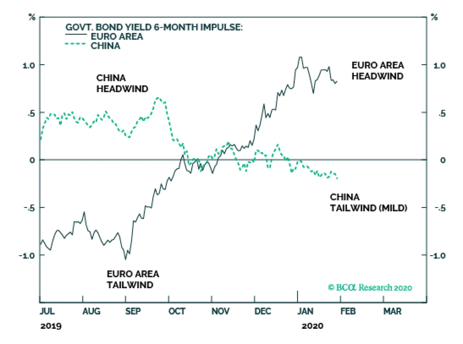
Highlights The bank credit 6-month impulse is likely to drop sharply in Europe, drop modestly in the US, but remain positive in China. Hence, the momentum of first-half economic data is likely to be worse in Europe than in China – albeit the Wuhan coronavirus scare is an unknown risk to this view. Initiate long CNY/GBP on a 6-month horizon. Underweight banks and the cyclical-heavy Eurostoxx 50 versus other markets, again on a 6-month horizon. There will be a better time to enter these positions later in the year when 6-month impulses are improving. Long-term investors seeking value in Europe should focus on the main currencies and not on the main equity indexes. Fractal trade: long EUR/GBP. Europe And China Play A Role-Reversal In recent dispatches we have highlighted that the euro area bond yield 6-month impulse stands near +100 bps, posing the strongest headwind to growth for three years. To make matters worse, the impulse has flipped from a strong -100 bps tailwind last summer into the current strong headwind, equating to a marked deterioration in the weather. But in China, it is the opposite story. Last summer, the China bond yield 6-month impulse constituted a strong +80 bps headwind; today the headwind has disappeared. Indeed, it has morphed into a tailwind, albeit a very mild tailwind at just -10 bps. In this sense, Europe and China are now playing a role-reversal. The momentum of first-half economic data is likely to be worse in Europe than in China – albeit with the caveat that the Wuhan coronavirus scare is an unknown risk to this view (Chart of the Week). Chart of the WeekBond Yields In Europe And China Play A Role-Reversal
Bond Yields In Europe And China Play A Role-Reversal
Bond Yields In Europe And China Play A Role-Reversal
For the sake of completeness, we should address the world’s other large economy, the United States. Just as in the euro area, the US bond yield 6-month impulse has flipped from a strong -100 bps tailwind last summer into a current headwind. But the headwind, at +50 bps, is not as strong as it is in the euro area (Chart I-2). Chart I-2Headwind Impulses In The Euro Area And The US, But Not In China
Headwind Impulses In The Euro Area And The US, But Not In China
Headwind Impulses In The Euro Area And The US, But Not In China
The Four Impulse Framework For Short-Term Growth The bond yield 6-month impulse is the first component of our proprietary ‘four impulse framework’ for short-term growth. The bond yield 6-month impulse is important because it usually leads the framework’s second component, the bank credit 6-month impulse, by a few months. This relationship makes perfect sense as, at the margin, it is the price of credit that drives credit demand. Indeed, to the extent that monetary policy drives growth, this is the main mechanism by which it operates, albeit with a slight delay. The bond yield impulse usually leads the credit impulse. On this compelling theoretical and empirical evidence, the bank credit impulse is now likely to drop sharply in the euro area (Chart I-3), drop modestly in the US (Chart I-4), but remain positive in China (Chart I-5). Chart I-3The Credit 6-Month Impulse Is Likely To Drop Sharply In The Euro Area...
The Credit 6-Month Impulse Is Likely To Drop Sharply In The Euro Area...
The Credit 6-Month Impulse Is Likely To Drop Sharply In The Euro Area...
Chart I-4...Drop Modestly In ##br##The US...
...Drop Modestly In The US...
...Drop Modestly In The US...
Chart I-5...But Remain Positive In China
...But Remain Positive In China
...But Remain Positive In China
But we must also consider the other two impulses in our four impulse framework. In the case of the euro area, the third important impulse is the oil price 6-month impulse. This is because the euro area relies on oil imports whose volumes tend to be price inelastic. Hence, when the oil price falls it subtracts from imports, thereby adding to net exports and growth – and vice-versa when the oil price rises. In the middle of 2019, the oil price impulse constituted a very strong headwind which helps to explain the midyear sharp slowdown in Germany. Subsequently, the headwind eased, even reversing into a modest tailwind which facilitated a recovery. But the tailwind is now fading (Chart I-6). Chart I-6A Fading Tailwind From The Oil Price 6-Month Impulse
A Fading Tailwind From The Oil Price 6-Month Impulse
A Fading Tailwind From The Oil Price 6-Month Impulse
The fourth and final component of our four impulse framework is geopolitical risk. This is not an impulse in the strict mathematical sense, but it is the same broad idea applied to the flow of geopolitical tail-events, both negative and positive. Europe’s positive events came several months ago: first in early-August when Italy ousted the firebrand Matteo Salvini from government; then in early-October when the UK parliament legislated against a no-deal Halloween Brexit. The tailwind from these positive events has now likely faded. For China, a positive geopolitical event and potential mild tailwind has come more recently, with the signing of the phase one trade deal with the US. Against this, the Wuhan coronavirus scare is a new risk – though based on the latest information it is unlikely to impact a 6-month view. The tailwind from the oil price impulse is now fading. On the four impulse framework, the momentum of first-half economic data is likely to favour China over Europe. We have found that the best way of playing this is through the exchange rate (Chart I-7), though given recent moves our preferred expression is versus the pound rather than the euro. Hence, on a 6-month horizon, initiate long CNY/GBP. Chart I-7Play Relative Impulses Through Currencies
Play Relative Impulses Through Currencies
Play Relative Impulses Through Currencies
More generally, can the mild tailwind in China counter the headwinds in the West? No. Despite the improvement in China, the aggregate global bond yield impulse still constitutes a +50 bps headwind, which is almost certain to weigh down the global credit impulse through the early months of 2020 (Chart I-8). Chart I-8The Global Credit 6-Month Impulse Will Weaken In Early 2020
The Global Credit 6-Month Impulse Will Weaken In Early 2020
The Global Credit 6-Month Impulse Will Weaken In Early 2020
Therefore, as discussed last week in Strong Headwind Warrants Caution In H1, we recommend an underweight stance to banks and to the cyclical-heavy Eurostoxx 50 versus other markets, again on a 6-month horizon. This is not to say that these positions cannot do better on a 12-month view, as per the BCA house view. But if so, any outperformance will be back-end loaded, and there will be a better time to enter these positions later in the year when 6-month impulses are improving. Where Is The Value In Europe? One of the most common questions we get is: are European equities cheaper than US equities? Usually, this question comes from our US clients who are aware that their own stock market is expensive and wish that Europe might be less so. Unfortunately, the wishful thinking won’t make it come true! Major stock market indexes comprise multinational companies with global footprints. For these multinationals, there is no such thing as a ‘European’ company or a ‘US’ company. They are simply global companies that could list their shares on any major stock market. Now ask yourself this: is it really plausible that such a multinational would be cheaper if its primary listing was in Frankfurt as opposed to New York? Of course not. The valuation depends on the industry and company specifics, but it is highly unlikely to depend on whether the company is listed in Frankfurt or New York. It is not European equities that are cheap, it is European currencies that are cheap. But then why do companies with dual listings in Europe and outside Europe trade at a valuation discount in their European listing? For example, Carnival Cruises trades around 8 percent dearer in New York than in London (Chart I-9); and BHP Billiton trades around 15 percent dearer in Sydney than in London (Chart I-10). The answer is that the London listing is quoted in pounds, the New York listing is quoted in US dollars, the Sydney listing is quoted in Australian dollars, but Carnival’s and BHP’s sales and profits are denominated in a mix of international currencies. Chart I-9Carnival Cruises Trades Dearer In New York Than In London
Carnival Cruises Trades Dearer In New York Than In London
Carnival Cruises Trades Dearer In New York Than In London
Chart I-10BHP Trades Dearer In Sydney ##br##Than In London
BHP Trades Dearer In Sydney Than In London
BHP Trades Dearer In Sydney Than In London
Hence, Carnival and BHP are trading dearer in New York and Sydney because the market is expecting their mixed currency earnings to appreciate more in US dollar and Australian dollar terms respectively than in pound terms. Put another way, the market is expecting the pound to appreciate structurally versus the major non-European currencies. Therein lies the important message. It is not European equities that are cheap, it is European currencies that are cheap. For those of you still in doubt, just visit the ECB website. The central bank’s own currency valuation indicator admits that the trade-weighted euro is 10 percent undervalued (Chart I-11). Chart I-11The ECB Admits That The Euro Is 10 Percent Undervalued
The ECB Admits That The Euro Is 10 Percent Undervalued
The ECB Admits That The Euro Is 10 Percent Undervalued
Hence, investors seeking value in Europe should not focus on the main equity indexes. Instead, they should focus on the main currencies. That said, valuation based investing only works if you have a long enough time horizon, meaning at least two years. For shorter horizons, economic momentum and technical factors dominate. In this regard, the pound’s strong rally faces resistance once post-Brexit trade deal negotiations begin in earnest after January 31. As a tactical trade, go long EUR/GBP (see next section). Fractal Trading System* The Brexit deal unleashed a strong rally in the pound, but this is vulnerable to a countertrend setback once the trade deal negotiations begin in earnest. Accordingly, this week's recommendation is long EUR/GBP. Set a profit target at 2 percent with a symmetrical stop-loss. In other trades, long tin achieved its 5 percent profit target at which it was closed. The rolling 1-year win ratio stands at 62 percent. Chart I-12EUR/GBP
EUR/GBP
EUR/GBP
When the fractal dimension approaches the lower limit after an investment has been in an established trend it is a potential trigger for a liquidity-triggered trend reversal. Therefore, open a countertrend position. The profit target is a one-third reversal of the preceding 13-week move. Apply a symmetrical stop-loss. Close the position at the profit target or stop-loss. Otherwise close the position after 13 weeks. * For more details please see the European Investment Strategy Special Report “Fractals, Liquidity & A Trading Model,” dated December 11, 2014, available at eis.bcaresearch.com. Dhaval Joshi Chief European Investment Strategist dhaval@bcaresearch.com Fractal Trading System
Europe And China Play A Role-Reversal
Europe And China Play A Role-Reversal
Europe And China Play A Role-Reversal
Europe And China Play A Role-Reversal
Cyclical Recommendations Structural Recommendations
Europe And China Play A Role-Reversal
Europe And China Play A Role-Reversal
Europe And China Play A Role-Reversal
Europe And China Play A Role-Reversal
Europe And China Play A Role-Reversal
Europe And China Play A Role-Reversal
Europe And China Play A Role-Reversal
Europe And China Play A Role-Reversal
Trades Closed Trades Asset Performance Currency & Bond Equity Sector Country Equity Indicators Bond Yields Chart II-1Indicators To Watch - Bond Yields
Indicators To Watch - Bond Yields
Indicators To Watch - Bond Yields
Chart II-2Indicators To Watch - Bond Yields
Indicators To Watch - Bond Yields
Indicators To Watch - Bond Yields
Chart II-3Indicators To Watch - Bond Yields
Indicators To Watch - Bond Yields
Indicators To Watch - Bond Yields
Chart II-4Indicators To Watch - Bond Yields
Indicators To Watch - Bond Yields
Indicators To Watch - Bond Yields
Interest Rate Chart II-5Indicators To Watch - Interest Rate Expectations
Indicators To Watch - Interest Rate Expectations
Indicators To Watch - Interest Rate Expectations
Chart II-6Indicators To Watch - Interest Rate Expectations
Indicators To Watch - Interest Rate Expectations
Indicators To Watch - Interest Rate Expectations
Chart II-7Indicators To Watch - Interest Rate Expectations
Indicators To Watch - Interest Rate Expectations
Indicators To Watch - Interest Rate Expectations
Chart II-8Indicators To Watch - Interest Rate Expectations
Indicators To Watch - Interest Rate Expectations
Indicators To Watch - Interest Rate Expectations
Highlights Global Corporates: The cyclical backdrop – accommodative monetary policies, improving global growth momentum, moderate inflation and subdued volatility – is supportive for the continued outperformance of global corporate bonds over sovereign debt in 2020. Corporate Bond Valuation: Extending a valuation framework we’ve introduced for US corporates to non-US credit – looking at volatility-adjusted spreads relative to both their own history and the “phase” of the monetary policy cycle - we calculate spread targets for non-US corporates in the euro area, UK and Canada. 2020 Opportunities: Current corporate spread levels are furthest above our targets (i.e. cheap) for US high-yield (most notably for Ba- and Caa-rated credit), UK high-yield and UK investment grade. Spreads are furthest below our targets (i.e. expensive) for euro area high-yield (mostly Ba-rated), US investment grade (all credit tiers) and Canadian investment grade. Feature Chart 1Deviations From Corporate Spread Targets
How To Find Value In Global Corporate Bonds
How To Find Value In Global Corporate Bonds
One of our main investment themes for 2020 is that accommodative monetary policies and faster economic growth will delay the peak in the aging global credit cycle, giving investors another year of corporate bond outperformance versus sovereign debt in the developed economies. Returns this year will be nowhere near as robust as in 2019, however, given rich valuation starting points for much of the global corporate universe. Against this backdrop, fixed income investors will have to be more selective in allocations by country, sector and credit quality in order to outperform. To that end, in this Special Report we extend a valuation framework for corporate bond spreads first introduced for US corporates by our sister service, US Bond Strategy, to non-US credit. This methodology looks at spreads on a volatility-adjusted basis, allowing comparison of valuations versus their own history and relative to similar stages of past monetary policy cycles. Chart 1 shows the deviations of current benchmark index option-adjusted spreads (OAS) from spread targets derived from our methodology for different countries (the US, euro area, the UK and Canada) and credit quality tiers (investment grade vs. high-yield). Positive deviations imply current spreads are above the targets derived from our framework – in other words, relatively undervalued - and vice-versa. Returns this year will be nowhere near as robust as in 2019, however, given rich valuation starting points for much of the global corporate universe. Against this backdrop, fixed income investors will have to be more selective in allocations by country, sector and credit quality in order to outperform. The conclusions are that there are still opportunities for additional spread tightening from current levels for lower-rated US high-yield and both UK investment grade and high-yield corporates. At the same time, valuations are looking most stretched for euro area high-yield, US investment grade (all credit tiers) and Canadian investment grade. A Brief Word On The Outlook For Global Corporate Credit In 2020 Chart 2Positive Backdrop For Corporate Bonds
Positive Backdrop For Corporate Bonds
Positive Backdrop For Corporate Bonds
The backdrop for global corporate bond markets will remain positive in 2020 for three main reasons: Global monetary policies will remain accommodative. Central bankers are now focusing more on boosting soft growth and low inflation expectations. Real policy interest rates in the US, euro area, UK and Canada are already below estimates of neutral like r-star (Chart 2, top panel), and will likely remain so throughout 2020. In the past, periods of credit market underperformance have occurred when monetary policy was restrictive, with real rates above neutral or government bond yield curves that were very flat or inverted (more on that later). Global growth momentum will improve. Recent data releases (global manufacturing PMIs, sentiment surveys like the global ZEW and German IFO) have shown that the 2019 global industrial downturn was in the process of bottoming out during the 4th quarter of the year. Additional improvement is likely in the coming months, based on the steady gains of the BCA Global Leading Economic Indicator (LEI). The elevated level of our global LEI diffusion index – measuring the share of individual country LEIs that are rising and which is itself a leading indicator of both the global LEI and corporate bond returns - suggests that additional outperformance of global corporates versus sovereign bonds is likely within the next 12 months (Chart 2, middle panel). Financial conditions are stimulative. Global equities and credit are off to a strong start in 2020, while market volatility is subdued across a variety of asset classes. For example, the US VIX index is now just above its 2019 low, which is consistent with narrow global corporate bond spreads (Chart 2, bottom panel). That low volatility backdrop – supported by market-friendly central bank policies - is helping keep financial conditions easy enough to lift economic growth, while also boosting investor risk appetite for corporate credit. The overall outlook for global corporate credit is still positive and investors should expect another year of corporate bond outperformance versus sovereign debt in the developed economies. Nonetheless, returns will be lower in 2020 than in 2019 due to expensive valuation starting points. As can be seen from Chart 3, global corporate bond spreads are already fairly tight relative to their long-term historical range. Also, outright index yields in many asset classes, like US high-yield, are now at new all-time lows. We interpret this as a sign that the “easy money” has already been made in being generally long corporate credit versus government bonds. Having the right tools to assess the relative values among differing credit markets will be critical to finding the best investment opportunities in this environment. Chart 3Rich Valuation Starting Points In Corporate Credit
How To Find Value In Global Corporate Bonds
How To Find Value In Global Corporate Bonds
We can use the breakeven spread as a valuation tool by looking at the percentile rank relative to its own history, effectively showing the percentage of time that the breakeven spread has been lower in the past. Bottom Line: The cyclical backdrop – accommodative monetary policies, improving global growth momentum, moderate inflation and subdued volatility – is supportive for the continued outperformance of global corporate bonds over sovereign debt in 2020. Valuations are likely to be more of a headwind for corporate bond returns, though. Using Breakeven Spreads As A Credit Valuation Tool As a reminder to existing readers (and to new clients), one of our main valuation tools for credit instruments is the 12-month breakeven spread. That is, the amount of spread widening required for corporate bond returns to break even with a duration-matched position in government bond securities over a 12-month horizon. It can be approximated by dividing the OAS of a bond (or a benchmark bond index) by its duration. More specifically, we can use the breakeven spread as a valuation tool by looking at the percentile rank relative to its own history, effectively showing the percentage of time that the breakeven spread has been lower in the past. We find this valuation tool to be superior to others for two main reasons: (i) using the breakeven spread rather than the average index OAS allows us to control for the changing average duration of the benchmark bond indices; and (ii) the percentile rank is often a better representation of credit spreads than the spread itself.1 BCA Research US Bond Strategy and Global Fixed Income Strategy have both regularly shown the percentile rankings of US investment grade and high-yield breakeven spreads as part of our discussion of US corporate bond markets. We have never produced such rankings for non-US credit, until now. InCharts 4- 7, we show those percentile ranks relative to history for credit in the US and, for the first time, the euro area, UK, Canada, Japan, Australia and Emerging Markets US dollar denominated corporates. We also provide the breakeven spread historical percentile ranks for each individual credit tier in the Appendix charts on pages 13-16. Chart 4US: Corporate Bond Breakeven Spreads
US: Corporate Bond Breakeven Spreads
US: Corporate Bond Breakeven Spreads
Chart 5Euro Area: Corporate Bond Breakeven Spreads
Euro Area: Corporate Bond Breakeven Spreads
Euro Area: Corporate Bond Breakeven Spreads
Chart 6UK: Corporate Bond Breakeven Spreads
UK: Corporate Bond Breakeven Spreads
UK: Corporate Bond Breakeven Spreads
Using these charts, we can gauge which markets offer the best (or worst) level of spread, adjusted by its own volatility and compared to its own history. The most attractive corporate credit spreads on a volatility-adjusted basis are: US high-yield (mostly Caa-rated and B-rated) Japan investment grade (mostly Baa-rated and A-rated) Canada Aaa-rated UK high-yield (excluding financials) Chart 7Other Countries: Corporate Bond Breakeven Spreads
More Corporate Bond Breakeven Spreads
More Corporate Bond Breakeven Spreads
The least attractive corporate credit spreads on a volatility-adjusted basis are: US investment grade (all credit tiers) UK Aaa-rated Canada Baa-rated Euro Area high-yield Using this metric, US Caa-rated junk bonds look most “undervalued”, with a volatility-adjusted spread in the upper 20% of all observations. Chart 8 displays the current breakeven spread historical percentile ranks across countries and credit quality, with high-yield markets shown in red. Using this metric, US Caa-rated junk bonds look most “undervalued”, with a volatility-adjusted spread in the upper 20% of all observations. While this chart provides a quick overview of which corporate bond markets are cheap/expensive with respect to their own history, it does not allow for comparisons of the relative cheapness between markets. To do this, we need to find a way to convert the percentile rankings into some measure of a “fair value” credit spread. Chart 8Global Corporate Bond 12-Month Breakeven Spreads By Percentile Rank (%)
How To Find Value In Global Corporate Bonds
How To Find Value In Global Corporate Bonds
Using Monetary Policy Cycles To Determine Corporate Spread Targets Our colleagues at BCA Research US Bond Strategy have come up with a novel approach for determining spread targets for US corporate credit, based on the breakeven spread percentile rankings.2 Essentially, the stance of US monetary policy, as measured by the slope of the US Treasury curve, is used to predict changes in the US credit cycle, helping to determine “cyclical” spread targets relative to the stance of monetary policy. The first step of this process is to group corporate bond excess returns (vs government debt) into buckets defined by the following “phases” of the US monetary policy cycle, measured by the yield differential between 10-year and 3-year Treasuries: Phase 1: from the end of the previous recession until the slope goes below 50 bps. Phase 2: from the time that the slope crosses below 50 bps until it inverts. Phase 3: from the time that the yield curve first inverts to the start of the next recession. Recessionary periods are not included in these phases, as all corporate credit exhibits the worst returns during those episodes. That is because economic growth and downgrade/default risks, and not the state of monetary policy, are the driving factor behind credit spread moves during recessions. Chart 9 shows the history of the US corporate bond markets broken down into “curve-defined” cycles.3 Dating back to 1974, the earliest date for investment grade bond index data, there have been five such cycles. Chart 9US Corporate Bond Performance And The Yield Curve
US Corporate Bond Performance And The Yield Curve
US Corporate Bond Performance And The Yield Curve
In Charts 10-12, we show the same phases for the euro area, the UK and Canada, using their own government bond yield curves to determine the phase of the monetary policy cycle in the same fashion as was done for the US.4 Once the phases of the monetary policy cycle are defined, we can then calculate corporate bond excess returns during each phase. Chart 10Euro Area: Corporate Bond Performance And The Yield Curve
Euro Area Corporate Bond Performance And The Yield Curve
Euro Area Corporate Bond Performance And The Yield Curve
Chart 11UK: Corporate Bond Performance And The Yield Curve
UK: Corporate Bond Performance And The Yield Curve
UK: Corporate Bond Performance And The Yield Curve
Chart 12Canada: Corporate Bond Performance And The Yield Curve
Canada: Corporate Bond Performance And The Yield Curve
Canada: Corporate Bond Performance And The Yield Curve
Table 1 shows the average corporate bond annualized excess returns under each phase across every cycle that can be defined with available data. Excess returns tend to be highest in Phase 1, quite low but still positive in Phase 2, and usually turn negative during Phase 3, once the yield curve has inverted. Table 1Corporate Bond Annualized Excess Returns* (%) Under Each Phase Of The Cycle
How To Find Value In Global Corporate Bonds
How To Find Value In Global Corporate Bonds
Currently, we are in Phase 2 in the US, euro area and UK, with yield curves that are relatively flat but still positively sloped. Historically, such periods have generated positive excess returns for corporate debt versus duration-matched government bonds, although of far smaller magnitudes compared to Phase 1 periods. Given our expectation that the Fed, ECB and Bank of England will maintain a dovish bias throughout 2020, we expect the no shift from Phase 2 for the US, euro area and the UK that would hurt corporate bond excess returns in those countries. With the Canadian yield curve now slightly inverted, however, Canada is now in Phase 3. This raises the risk that the recent strong outperformance of Canadian investment grade corporate bonds could end if the Bank of Canada does not deliver the monetary easing currently discounted in the Canadian yield curve. How We Determine Corporate Spread Targets Having defined the three phases of the monetary policy cycle, we then re-calculate our corporate bond breakeven spread percentile ranks within each phase. We then back-out a spread target for each credit tier by taking the median 12-month breakeven spread seen in similar monetary policy environments, as determined by the slope of the yield curve.5 Finally, we convert those “median” breakeven spreads into OAS targets using the current benchmark index duration and credit rating distribution. We are assuming that a reasonable spread target for any corporate bond market is determined by adjusting for both spread volatility AND the monetary policy cycle. So, essentially, we are assuming that a reasonable spread target for any corporate bond market is determined by adjusting for both spread volatility AND the monetary policy cycle. Charts 13-16 show the index OAS and their respective targets for the US (both investment grade and high-yield), euro area (both investment grade and high-yield), the UK (both investment grade and high-yield excluding financials), and Canada (only investment grade). Further, the spread targets for each individual credit tier are provided in the Appendix on pages 17-19. Chart 13US: Corporate Bond Spread Targets
US Corporate Bond Spread Targets
US Corporate Bond Spread Targets
Chart 14Euro Area: Corporate Bond Spread Targets
Euro Area: Corporate Bond Spread Targets
Euro Area: Corporate Bond Spread Targets
Chart 15UK: Corporate Bond Spread Targets
UK: Corporate Bond Spread Targets
UK: Corporate Bond Spread Targets
Chart 16Canada: Corporate Bond Spread Targets
Canada: Corporate Bond Spread Target
Canada: Corporate Bond Spread Target
For example, our spread target for US B-rated high-yield is 227bps, which is 80bps below the current index OAS. From the charts, we can make the following conclusions about the relative attractiveness of current spread levels: The largest deviations from our spread target (i.e. potentially most undervalued) are: US high-yield (mostly Caa-rated and B-rated) UK high-yield (excluding financials) The lowest deviations from our spread target (i.e. potentially most overvalued) are: Euro Area high-yield (mostly Ba-rated) Canada investment grade US investment grade (all credit tiers) This framework is an interesting way to derive corporate bond value, by adjusting for both the volatility and monetary policy backdrop. Of course, there are other factors that are more difficult to quantify that can keep spreads too tight or too wide versus these fair value levels, like investor risk tolerance or risk premia for political uncertainty. In terms of factors that are quantifiable, however, this spread target methodology is a useful way to get a sense of the richness or cheapness of global corporate debt. In terms of factors that are quantifiable, however, this spread target methodology is a useful way to get a sense of the richness or cheapness of global corporate debt. We will regularly update these targets in future BCA Research Global Fixed Income Strategy reports. Bottom Line: Current corporate spread levels are furthest above our targets (i.e. cheap) for US high-yield (most notably for Ba- and Caa-rated credit), UK high-yield and UK investment grade. Spreads are furthest below our targets (i.e. expensive) for euro area high-yield (mostly Ba-rated), US investment grade (all credit tiers) and Canadian investment grade. Jeremie Peloso Research Analyst jeremiep@bcaresearch.com Robert Robis, CFA Chief Fixed Income Strategist rrobis@bcaresearch.com Footnotes 1 This is because credit spreads often tighten to very low levels and then remain tight for an extended period. Thus, by showing the percentage of time that a given spread has been tighter than its current level, the percentile rank gives a better sense of this pattern than the actual spread. 2 Please see US Bond Strategy Special Report, “2019 Key Views: Implications For US Fixed Income”, dated December 11, 2018, available at usbs.bcaresearch.com. 3 Note that the Treasury curve used for this analysis is the spread between the 10-year Treasury and the 3-year Treasury yield. The more widely-followed 2-year Treasury was not used as there was more historical data available for the 3-year maturity. 4 Note that there are fewer cycles to analyze for these countries due to the shorter available history of corporate bond market data outside the US. 5 For more details on the spread targets please see US Bond Strategy Weekly Report, “Paid To Wait”, dated February 26, 2019, available at usbs.bcaresearch.com. Appendix Chart 1AUS: Investment Grade Breakeven Spreads
US: Investment Grade Breakeven Spreads
US: Investment Grade Breakeven Spreads
Chart 1BUS: High-Yield Breakeven Spreads
US: High-Yield Breakeven Spreads
US: High-Yield Breakeven Spreads
Chart 1CEuro Area: Investment Grade Breakeven Spreads By Credit Tiers
Euro Area: Investment Grade Breakeven Spreads
Euro Area: Investment Grade Breakeven Spreads
Chart 1DEuro Area: High-Yield Breakeven Spreads By Credit Tiers
Euro Area: High-Yield Breakeven Spreads
Euro Area: High-Yield Breakeven Spreads
Chart 1EUK: Investment Grade Breakeven Spreads
UK: Investment Grade Breakeven Spreads
UK: Investment Grade Breakeven Spreads
Chart 1FCanada: Investment Grade Breakeven Spreads
Canada: Investment Grade Breakeven Spreads
Canada: Investment Grade Breakeven Spreads
Chart 1GJapan: Investment Grade Breakeven Spreads
Japan: Investment Grade Breakeven Spreads
Japan: Investment Grade Breakeven Spreads
Chart 2AUS: Investment Grade Spread Targets
US: Investment Grade Spread Targets
US: Investment Grade Spread Targets
Chart 2BUS: High-Yield Spread Targets
US: High-Yield Spread Targets
US: High-Yield Spread Targets
Chart 2CEuro Area: Investment Grade Spread Targets By Credit Tiers
Euro Area: Investment Grade Spread Targets
Euro Area: Investment Grade Spread Targets
Chart 2DEuro Area: High-Yield Spread Targets By Credit Tiers
How To Find Value In Global Corporate Bonds
How To Find Value In Global Corporate Bonds
Chart 2EUK: Investment Grade Spread Targets By Credit Tiers
UK: Investment Grade Spread Targets
UK: Investment Grade Spread Targets
Chart 2FCanada: Investment Grade Spread Targets By Credit Tiers
Canada: Investment Grade Spread Targets
Canada: Investment Grade Spread Targets
Highlights The euro area bond yield 6-month impulse recently hit 100 bps, constituting the strongest headwind to growth for three years. Nine times out of ten, the strong headwind to nominal growth pushes the bond yield to a lower level six months later. Downgrade banks and materials to underweight. Downgrade the Eurostoxx 50 to underweight versus the S&P 500 and the Nikkei 225. Upgrade Switzerland to overweight, and upgrade Denmark to neutral. Downgrade Sweden to neutral, and downgrade Spain and Austria to underweight. Fractal trade: short NZD/JPY. Feature Chart of the WeekIf You Get The Bond Yield Right, You'll Get Banks Right Too
If You Get The Bond Yield Right, You'll Get Banks Right Too
If You Get The Bond Yield Right, You'll Get Banks Right Too
The analysis in this report differs from the BCA house view which is overweight European versus US equities and expects modestly higher bond yields in the next six months. The euro area 10-year bond yield stands at a miserly 50 bps, though admittedly this does mark a 60 bps increase from its record low of -10 bps last August (Chart I-2).1 However, if you look only at the level or the change in the bond yield you will miss the bigger story. As we explained in Four Impulses, Three Mistakes, the bond yield’s impact on growth accelerations and decelerations comes neither from its level nor from its change – instead, the impact comes from the change in its change, the bond yield impulse.2 Chart I-2The Recent Rise In Bond Yields Followed A Sharp Decline In The Preceding Six Months
The Recent Rise In Bond Yields Followed A Sharp Decline In The Preceding Six Months
The Recent Rise In Bond Yields Followed A Sharp Decline In The Preceding Six Months
The Strongest Headwind Impulse For Three Years The euro area bond yield 6-month impulse recently hit 100 bps, its highest mark, and therefore its strongest headwind to growth, for three years. The impulse hit such a high mark because the recent rise in yields followed a sharp decline in yields in the preceding six months. The euro area bond yield 6-month impulse recently hit 100 bps, its highest mark, and therefore its strongest headwind to growth, for three years. Since the turn of the century, the euro area bond yield 6-month impulse has reached the 100 bps strong headwind mark ten times. Nine times out of the ten, the strong headwind to nominal growth pushed the yield to a lower level six months later. That’s the bigger story. The one exception was in 2006 at the frothy end of the credit bubble which bears no resemblance to today. In any case, nine times out of ten are odds that we wouldn’t want to bet against right now (Chart I-3). Chart I-3Nine Times Out Of Ten, A Strong Headwind Bond Yield Impulse Pushes Yields To A Lower Level Six Months Later
Nine Times Out Of Ten, A Strong Headwind Bond Yield Impulse Pushes Yields To A Lower Level Six Months Later
Nine Times Out Of Ten, A Strong Headwind Bond Yield Impulse Pushes Yields To A Lower Level Six Months Later
Suffice to say, in the vast majority of these cases the lower bond yield also hurt bond yield proxies in the equity market such as banks and materials. The Bond Yield Drives Sector Strategy Investment is complex but it is not complicated. The words complex and complicated are often used interchangeably but they mean different things. Complex means something that is not fully predictable or analysable, whereas complicated means something that is made up of many parts. A car’s movement in traffic is complex, but it is not complicated. A car engine is complicated, but it is not complex. Unlike a car engine, investment is not complicated. This is because investment has just a few key parts that drive everything, albeit these parts are themselves highly complex. The objective of investment is to identify the few key parts that drive everything and to conquer their complexity. One key part is the bond yield. The Chart of the Week and Chart I-4 should leave you in no doubt that if you get the bond yield right, you will also get the relative performance of banks right, whether you are in Europe, Japan, or, for that matter, anywhere. Chart I-4If You Get The Bond Yield Right, You'll Get Banks Right Too
If You Get The Bond Yield Right, You'll Get Banks Right Too
If You Get The Bond Yield Right, You'll Get Banks Right Too
The connection between the bond yield and bank performance is twofold. First, to the extent that a higher bond yield reflects higher nominal economic growth, it also likely reflects higher growth in bank credit, which effectively constitutes bank ‘sales’. Second, a higher bond yield also typically signifies a steeper yield curve, which lifts bank net interest (profit) margins. And vice versa for a lower bond yield. Investment is complex but it is not complicated. Likewise, Chart I-5 should also leave you in no doubt that if you get the bond yield right you will also get commodity prices right. Again, this is not surprising. The higher nominal economic growth reflected in a higher bond yield could come from stronger real demand or from higher inflation, either of which would be bullish for commodity prices. And vice versa for a lower bond yield. Albeit the causality can sometimes go the other way, from a commodity price shock via inflation to the bond yield. Chart I-5If You Get The Bond Yield Right, You'll Get Commodity Prices Right Too
If You Get The Bond Yield Right, You'll Get Commodity Prices Right Too
If You Get The Bond Yield Right, You'll Get Commodity Prices Right Too
However, the bond yield’s movement itself is highly complex because it is subject to numerous feedback loops. One feedback loop is that the valuation of equities and other risk-assets depends inversely and exponentially on the bond yield level. A higher yield will ultimately undermine equity and other risk-asset prices and thereby unleash a deflationary impulse, and vice versa. A separate feedback loop comes via the direct impact on economic accelerations and decelerations which, as we have just seen, depends on the bond yield impulse – which is to say, its second derivative. Mathematicians will immediately recognise this setup as a second order differential equation with delayed negative feedback. They will tell you that it describes a complex adaptive system (CAS) which you cannot predict or analyse with any certainty. The best you can do is understand the probabilities that the system goes in one direction or the other. Based on the euro area bond yield impulse at a strong headwind mark, and the previous ten outcomes from this setup, there is a high probability that the post-August burst of outperformance from banks and materials is now over. Accordingly, we are now downgrading both banks and materials to underweight. Sector Strategy Drives Regional And Country Strategy To repeat, investment is highly complex but it is not highly complicated. If you get the bond yield right you will get your equity sector strategy right. And if you get your equity sector strategy right you will automatically get your regional and country allocation right too. This is because each major stock market has a distinguishing ‘long’ sector in which it contains up to a quarter of its total market capitalisation, as well as a distinguishing ‘short’ sector in which it has a significant under-representation. The combination of this long sector and short sector gives each equity index its distinguishing fingerprint which drives relative performance (Table I-1): Table 1The Sector Fingerprints Of Major Regional Stock Markets
Strong Headwind Warrants Caution In H1
Strong Headwind Warrants Caution In H1
FTSE 100 = long energy, short technology. Eurostoxx 50 = long banks, short technology. Nikkei 225 = long industrials, short banks and energy. S&P 500 = long technology, short materials. MSCI Emerging Markets = long technology, short healthcare. Specifically, the Eurostoxx 50 has an 11 percent overrepresentation to banks and materials versus both the S&P 500 and the Nikkei 225. Against the S&P 500 it is at the expense of technology and against the Nikkei 225 it is at the expense of industrials. It follows that if banks and materials underperform technology and industrials, the Eurostoxx 50 must underperform the S&P 500 and the Nikkei 225. Chart I-6 and Chart I-7 should convince you that there are no ifs, buts, or maybes. Chart I-6Euro Stoxx 50 Vs. S&P 500 = Global Banks In Euros Vs. Global Technology In Dollars
Euro Stoxx 50 Vs. S&P 500 = Global Banks In Euros Vs. Global Technology In Dollars
Euro Stoxx 50 Vs. S&P 500 = Global Banks In Euros Vs. Global Technology In Dollars
Chart I-7Euro Stoxx 50 Vs. Nikkei 225 = Global Banks In Euros Vs. Global Industrials In Dollars
Euro Stoxx 50 Vs. Nikkei 225 = Global Banks In Euros Vs. Global Industrials In Dollars
Euro Stoxx 50 Vs. Nikkei 225 = Global Banks In Euros Vs. Global Industrials In Dollars
Accordingly we are now downgrading the Eurostoxx 50 to underweight versus the S&P 500 and the Nikkei 225. Exactly the same principle applies to the stock markets within Europe. Relative performance comes from nothing more than the stock market’s long and short sector fingerprint combined with sector performance (Table I-2 and Table I-3). Table I-2The Sector Fingerprints Of Euro Area Stock Markets
Strong Headwind Warrants Caution In H1
Strong Headwind Warrants Caution In H1
Table I-3The Sector Fingerprints Of Non Euro Area European Stock Markets
Strong Headwind Warrants Caution In H1
Strong Headwind Warrants Caution In H1
Based on the expected underperformance of banks and materials, we are now upgrading Switzerland to overweight, and upgrading Denmark to neutral. Also, we are downgrading Sweden to neutral, and downgrading Spain and Austria to underweight (Chart I-8). Chart I-8Spain = Long Banks
Spain = Long Banks
Spain = Long Banks
Fractal Trading System* This week's recommended trade is short NZD/JPY. Set the profit target at 2.3 percent with a symmetrical stop-loss. The rolling 1-year win ratio now stands at 61 percent. Chart I-9NZD/JPY
NZD/JPY
NZD/JPY
When the fractal dimension approaches the lower limit after an investment has been in an established trend it is a potential trigger for a liquidity-triggered trend reversal. Therefore, open a countertrend position. The profit target is a one-third reversal of the preceding 13-week move. Apply a symmetrical stop-loss. Close the position at the profit target or stop-loss. Otherwise close the position after 13 weeks. * For more details please see the European Investment Strategy Special Report “Fractals, Liquidity & A Trading Model,” dated December 11, 2014, available at eis.bcaresearch.com. Dhaval Joshi Chief European Investment Strategist dhaval@bcaresearch.com Footnotes 1 This is the weighted average of 10-year government bond yields in the euro area, weighted by the stock of government issued debt. 2 Please see the European Investment Strategy Weekly Report “Four Impulses, Three Mistakes” October 31, 2019 available at eis.bcaresearch.com. Fractal Trading System
Strong Headwind Warrants Caution In H1
Strong Headwind Warrants Caution In H1
Strong Headwind Warrants Caution In H1
Strong Headwind Warrants Caution In H1
Cyclical Recommendations Structural Recommendations
Strong Headwind Warrants Caution In H1
Strong Headwind Warrants Caution In H1
Strong Headwind Warrants Caution In H1
Strong Headwind Warrants Caution In H1
Strong Headwind Warrants Caution In H1
Strong Headwind Warrants Caution In H1
Strong Headwind Warrants Caution In H1
Strong Headwind Warrants Caution In H1
Trades Closed Trades Asset Performance Currency & Bond Equity Sector Country Equity Indicators Bond Yields Chart II-1Indicators To Watch - Bond Yields
Indicators To Watch - Bond Yields
Indicators To Watch - Bond Yields
Chart II-2Indicators To Watch - Bond Yields
Indicators To Watch - Bond Yields
Indicators To Watch - Bond Yields
Chart II-3Indicators To Watch - Bond Yields
Indicators To Watch - Bond Yields
Indicators To Watch - Bond Yields
Chart II-4Indicators To Watch - Bond Yields
Indicators To Watch - Bond Yields
Indicators To Watch - Bond Yields
Interest Rate Chart II-5Indicators To Watch - Interest Rate Expectations
Indicators To Watch - Interest Rate Expectations
Indicators To Watch - Interest Rate Expectations
Chart II-6Indicators To Watch - Interest Rate Expectations
Indicators To Watch - Interest Rate Expectations
Indicators To Watch - Interest Rate Expectations
Chart II-7Indicators To Watch - Interest Rate Expectations
Indicators To Watch - Interest Rate Expectations
Indicators To Watch - Interest Rate Expectations
Chart II-8Indicators To Watch - Interest Rate Expectations
Indicators To Watch - Interest Rate Expectations
Indicators To Watch - Interest Rate Expectations
Highlights Global Investment Strategy View Matrix
Time For A Breather
Time For A Breather
Receding trade tensions; diminished risks of a hard Brexit; reduced odds of a victory for Elizabeth Warren in the US presidential elections; liquidity injections by most major central banks; and improved sentiment about the state of the global economy all helped push stocks higher late last year. Some clouds have formed over the outlook since the start of the year, however. The December US ISM manufacturing index fell to the lowest level since 2009, while the PMIs in the euro area, UK, and Japan gave up some of their November gains. The conflict between the US and Iran also flared up. Although tensions have abated in recent days, BCA’s geopolitical strategists worry that the détente may not last. The US is seeking to shift its military focus towards East Asia in order to counter China’s ascendency. They argue that this could create a dangerous power vacuum in the Middle East. Stock market sentiment is quite bullish at the moment, which makes equities more vulnerable to any disappointing news. While we are maintaining our positive 12-month view on global equities and high-yield credit in anticipation that global growth will rebound convincingly later this year, we are downgrading our tactical 3-month view to neutral. Ho Ho Ho After handing investors a sack of coal last Christmas, Santa was back to his true self this past holiday season. Global equities rose 3.4% in December, finishing the year off with a stellar fourth quarter which saw the MSCI All-Country World index surge by 8.6%. Five forces helped push stocks higher: 1) Receding trade tensions; 2) Diminished risks of a hard Brexit; 3) Reduced odds of a victory for Elizabeth Warren in the US presidential elections; 4) Liquidity injections by the Fed, ECB, and the People’s Bank of China; and arguably most importantly 5) Improved sentiment about the state of the global economy. Tarrified No More Trade tensions subsided sharply after China and the US reached a “Phase One” agreement. The deal prevented tariffs from rising on December 15th on $160 billion of Chinese imports. It also rolls back the tariff rate from 15% to 7.5% on about $120 billion in imports that have been subject to levies since September (Chart 1). Chart 1The Evolution Of The US-China Trade War
The Evolution Of The US-China Trade War
The Evolution Of The US-China Trade War
In addition, the Trump Administration allowed the November 13th deadline on European auto tariffs to lapse. This suggests that the US is unlikely to impose tariffs under the Section 232 investigation of auto imports. The auto sector has been at the forefront of the global manufacturing slowdown, so any good news for that industry is welcome. To top it all off, the US House of Representatives ratified the USMCA, the successor to NAFTA, on December 19th. We expect it to be signed into law in the first quarter of this year. Brexit Risks Fading... Chart 2The Majority Of British Voters Aren't Keen On Brexit
The Majority Of British Voters Aren't Keen On Brexit
The Majority Of British Voters Aren't Keen On Brexit
Boris Johnson’s commanding victory in the UK elections has given him the votes necessary to push a withdrawal bill through parliament by the end of the month. The British government will then seek to negotiate a free trade agreement by the end of the year. A “no-deal” Brexit is unacceptable to the majority of British voters (Chart 2). As such, the Johnson government will have no choice but to strike a deal with the EU. ... While Trump Gains On the other side of the Atlantic, President Trump’s re-election prospects improved late last year despite (and perhaps because of) the ongoing impeachment process. There is an uncanny correlation between the probability that betting markets assign to a Trump victory and the value of the S&P 500 (Chart 3). Chart 3An Uncanny Correlation
An Uncanny Correlation
An Uncanny Correlation
Chart 4Who Will Win The 2020 Democratic Nomination?
Time For A Breather
Time For A Breather
It certainly has not hurt market sentiment that Elizabeth Warren’s poll numbers have been dropping recently (Chart 4). Warren’s best hope was to squeeze out Bernie Sanders as soon as possible, thereby leaving the far-left populist lane all to herself. That dream appears to have been dashed, which suggests that even if Trump loses, a centrist like Joe Biden could emerge as president. An Uneasy Truce It remains to be seen how President Trump’s decision to assassinate General Qassem Soleimani, a top Iranian commander, will affect the election outcome. A YouGov/HuffPost poll taken over the weekend revealed that 43% of Americans approved of the airstrike against Soleimani compared to 38% that disapproved.1 History suggests that the public’s patience for war will quickly wear thin if it results in American casualties or significantly higher gasoline prices. Neither side has an incentive to allow the conflict to spiral out of control. Foreign minister Mohammad Javad Zarif tweeted on Tuesday shortly after Iran lobbed missiles at two US military bases that Iran had “concluded” its retaliatory strike, adding that “We do not seek escalation or war.” Despite claims on Iranian public television that 80 “American terrorists” were killed in the attacks, no US troops were harmed. This suggests that the Iranians may be putting on a show for domestic consumption. The US economy is less vulnerable to spikes in oil prices than in the past. Nevertheless, plenty of things could still go wrong. BCA’s geopolitical team, led by Matt Gertken, has argued that the US is seeking to shift its military focus towards East Asia in order to counter China’s ascendency. This could create a dangerous power vacuum in the Middle East. There is also a risk that President Trump overplays his hand. Contrary to the President’s claims, Soleimani was quite popular in Iran (Chart 5). If Trump begins to mock the Iranian leadership’s feeble response, Iran will have no choice but to take more aggressive action. Chart 5Soleimani Was More Popular In Iran Than Trump Claims
Time For A Breather
Time For A Breather
Chart 6US Economy Is Less Vulnerable To Spikes In Oil Prices Than In The Past
US Economy Is Less Vulnerable To Spikes In Oil Prices Than In The Past
US Economy Is Less Vulnerable To Spikes In Oil Prices Than In The Past
One thing that could embolden Trump is that the US economy is less vulnerable to spikes in oil prices than in the past. US oil output reached as high as 12.9 mm b/d in 2019, allowing the country to become a net exporter of oil for the first time in history (Chart 6). Any increase in oil prices would incentivize further domestic production, which would help bring prices back down. The US economy has also become less energy intensive – it takes less than half as much oil to produce a unit of GDP today than it did in the early 1980s. Finally, unlike in the past, the Fed will not need to raise rates in response to higher oil prices due to the fact that inflation expectations are currently well anchored. In fact, as we discuss below, we expect the Fed and other central banks to continue to provide a tailwind for growth over the course of 2020. The Fed’s “It’s Not QE” QE Program The jump in overnight lending rates in mid-September torpedoed the Federal Reserve’s efforts to shrink its balance sheet. Thanks to a steady stream of Treasury bill purchases since then, the Fed’s asset holdings have swelled by over $400 billion, reversing more than half of the decline observed since early 2018 (Chart 7). Chart 7Fed's Asset Holdings Are Growing Anew
Fed's Asset Holdings Are Growing Anew
Fed's Asset Holdings Are Growing Anew
Chart 8The Fed's Balance-Sheet Expansion Helped Fuel The Dot-Com Bubble
The Fed's Balance-Sheet Expansion Helped Fuel The Dot-Com Bubble
The Fed's Balance-Sheet Expansion Helped Fuel The Dot-Com Bubble
The Fed has insisted that its latest intervention does not amount to a new QE program, stressing that it is buying short-term securities rather than long-dated bonds. In so doing, it is simply creating bank reserves, rather than seeking to suppress the term premium by altering the maturity structure of the private sector’s holdings of government debt. Nevertheless, even such straightforward interventions have proven to be powerful signaling tools. By growing its balance sheet, a central bank is implicitly promising to keep monetary policy very accommodative. It is worth remembering that the run-up in the NASDAQ in 1999 coincided with a significant balance-sheet expansion by the Fed in response to Y2K fears, which came on the heels of three “insurance cuts” in 1998 (Chart 8). Gentle Jay Paves The Way Chart 9Inflation Expectations Remain Muted
Inflation Expectations Remain Muted
Inflation Expectations Remain Muted
In 2000, the Fed moved quickly to reverse the liquidity injection it had orchestrated the prior year. We do not expect such a reversal anytime soon. Moreover, unlike in 2000, when the Federal Reserve kept raising rates – ultimately bringing the Fed funds rate up to 6.5% in May 2000 – the Fed is likely to stay on hold this year. The Fed’s ongoing strategic policy review is poised to move the central bank even closer towards explicitly adopting an average inflation target of 2% over the course of a business cycle. Since inflation tends to fall during recessions, this implies that the Fed will seek to target an inflation rate somewhat higher than 2% during expansions. Realized core PCE inflation has averaged only 1.6% since the recession ended. Both market-based and survey-based measures of long-term inflation expectations remain downbeat (Chart 9). This suggests that the bar for raising rates this year is quite high. More Monetary Easing In The Euro Area And China Chart 10Chinese Monetary Easing Should Help Global Growth Bottom Out
Chinese Monetary Easing Should Help Global Growth Bottom Out
Chinese Monetary Easing Should Help Global Growth Bottom Out
The ECB resumed its QE program in November after a 10-month hiatus. While the current pace of €20 billion in monthly asset purchases is well below the prior pace of €80 billion, the central bank did say it would continue buying assets for “as long as necessary” to bring inflation up to its target. The language harkens back to Mario Draghi’s 2012 “whatever it takes” pledge, this time applied to the ECB’s inflation mandate. Not to be outdone, the People’s Bank of China cut the reserve requirement ratio by 50 basis points last week, a move that will release RMB 800 billion ($US 115 billion) of fresh liquidity into the banking system. Historically, cuts in reserve requirements have led to faster credit growth and ultimately, to stronger economic growth both in China and abroad (Chart 10). The PBOC has also instructed lenders to adopt the Loan Prime Rate (LPR) as the new benchmark lending rate. The LPR currently sits 20bps below the old benchmark rate (Chart 11). Hence, the PBOC’s order amounts to a stealth rate cut. Our China strategists expect further reductions in the LPR over the next six months. In addition, the crackdown on shadow bank lending seems to be subsiding, which bodes well for overall credit growth later this year (Chart 12). Chart 11China: Stealth Monetary Easing
China: Stealth Monetary Easing
China: Stealth Monetary Easing
Chart 12Crackdown On Shadow Banking In China Is Easing
Crackdown On Shadow Banking In China Is Easing
Crackdown On Shadow Banking In China Is Easing
Rising Economic Confidence Chart 13Recession Fears Amongst Economists Began To Gather Steam At The Start Of Last Year
Recession Fears Amongst Economists Began To Gather Steam At The Start Of Last Year
Recession Fears Amongst Economists Began To Gather Steam At The Start Of Last Year
Chart 14The Wider Public Was Also Worried About A Downturn
The Wider Public Was Also Worried About A Downturn
The Wider Public Was Also Worried About A Downturn
At the start of 2019, nearly half of US CFOs thought the economy would be in a recession by the end of the year. Similarly, two-thirds of European CFOs and four-fifths of Canadian CFOs expected their respective economies to succumb to recession. Professional economists were equally dire (Chart 13). Households also became increasingly worried about a downturn. Google searches for “recession” spiked to near 2009-highs last summer (Chart 14). The mood has certainly improved since then. According to the latest Duke CFO survey, optimism about the economic outlook has increased. More importantly, CFO optimism about the prospects for their own firms has risen to the highest level in the 18-year history of the survey (Chart 15). Chart 15CFOs Have Become More Optimistic Of Late
CFOs Have Become More Optimistic Of Late
CFOs Have Become More Optimistic Of Late
Show Me The Money Going forward, global growth needs to accelerate in order to validate the improved confidence of CFOs and investors alike. We think that it will, thanks to the lagged effects from the easing in financial conditions in 2019, a turn in the global inventory cycle, a de-escalation in the trade war, easier fiscal policy in the UK and euro area, and re-upped fiscal/credit stimulus in China. For now, however, the economic data remains mixed. On the positive side, household spending is still robust across most of the world, a fact that has been reflected in the resilience of service-sector PMIs (Chart 16). Chart 16AThe Service Sector Has Remained Resilient (I)
The Service Sector Has Remained Resilient (I)
The Service Sector Has Remained Resilient (I)
Chart 16BThe Service Sector Has Remained Resilient (II)
The Service Sector Has Remained Resilient (II)
The Service Sector Has Remained Resilient (II)
Chart 17US Wage Growth Has Picked Up, Especially At The Bottom Of The Income Distribution
Time For A Breather
Time For A Breather
Chart 18US Housing Backdrop Is Solid
US Housing Backdrop Is Solid
US Housing Backdrop Is Solid
The US consumer, in particular, is showing little signs of fatigue. The Atlanta Fed GDPNow estimates that real personal consumption grew by 2.4% in the fourth quarter, having increased at an average annualized pace of 3% in the first three quarters of 2019. Both a strong labor market and housing market have buoyed US consumption. Payrolls have risen by an average of 200K per month for the past six months, double what is necessary to keep up with labor force growth. This week’s strong ADP release – which featured a 29K jump in jobs in goods-producing industries in December, the best since April – suggests that today’s jobs report will remain healthy. In addition, wage growth has picked up, particularly at the bottom of the income distribution (Chart 17). Residential construction has also been strong. Homebuilder sentiment reached the best level since June 1999 (Chart 18). Global Manufacturing: Too Early To Call The All-Clear The outlook for manufacturing remains the biggest question mark in the global economy. The US ISM manufacturing index dropped to 47.2 in December, its lowest level since June 2009. The composition of the report was poor, with the new orders-to-inventory ratio dropping close to recent lows. Chart 19Other US Manufacturing Gauges Are Not As Weak As The ISM
Other US Manufacturing Gauges Are Not As Weak As The ISM
Other US Manufacturing Gauges Are Not As Weak As The ISM
We would discount the ISM report to some extent. The regional Fed manufacturing indices have not been nearly as disappointing as the ISM (Chart 19). The Markit PMI, which tracks US manufacturing activity better than the ISM, clocked in at a respectable 52.4 in December, down only slightly from November’s reading of 52.6. Nevertheless, it is hard to be excited about the near-term outlook for US manufacturing, especially in light of Boeing’s decision to suspend production of the 737 Max temporarily. Most estimates suggest that the production halt will reduce real US GDP growth by 0.3%-to-0.5% in the first quarter. The euro area manufacturing PMI gave up some of its November gains, falling to 46.3 in December. While the index is still above its September low of 45.7, it has been under 50 for 11 straight months now. The UK and Japanese PMI also retreated. Chinese manufacturing has shown clearer signs of bottoming out. Despite dipping in December, the private sector Caixin manufacturing PMI remains near its 2017 highs. The official PMI published by the National Bureau of Statistics is less upbeat, but still managed to come in slightly above 50 in December. The production subcomponent reached the highest level since August 2018. Reflecting the positive trend in the Chinese economy, Korean exports to China rose by 3.3% in December, the first positive growth rate in 14 months (Chart 20). Taiwan’s exports have also rebounded. The manufacturing PMI rose above 50 in both economies in December. In Taiwan’s case, this was the first time the PMI moved into expansionary territory since September 2018. On balance, we continue to expect global manufacturing to recover in 2020. This is in line with our observation that global manufacturing cycles typically last three years, with 18 months of weaker growth followed by 18 months of stronger growth (Chart 21). That said, the weakness in European and US manufacturing (at least judged by the ISM) is likely to give investors pause. Chart 20Some Positive Signs Emerging From Korea And Taiwan
Time For A Breather
Time For A Breather
Chart 21A Fairly Regular Three-Year Manufacturing Cycle
A Fairly Regular Three-Year Manufacturing Cycle
A Fairly Regular Three-Year Manufacturing Cycle
Investment Conclusions We turned bullish on stocks in late 2018, having temporarily moved to the sidelines during the summer of that year. Global equities have gained 25% since our upgrade. We see another 10% of upside for 2020, led by European and EM bourses. Despite its recent gains, the real value of the MSCI All-Country World Index is only 3% above its prior peak in January 2018. The 12-month forward PE ratio of 16.3 is still somewhat lower than it was back then. The valuation picture is even more enticing if we compare equity earnings yields with bond yields, which is tantamount to computing a rough equity risk premium (ERP). The global ERP remains quite high by historic standards, especially outside the US where earnings yields are higher and bond yields are generally lower (Chart 22). Chart 22The Equity Risk Premium Is Fairly High, Especially Outside The US
The Equity Risk Premium Is Fairly High, Especially Outside The US
The Equity Risk Premium Is Fairly High, Especially Outside The US
Chart 23Stock Market Sentiment Is Quite Bullish
Stock Market Sentiment Is Quite Bullish
Stock Market Sentiment Is Quite Bullish
Nevertheless, sentiment is quite positive towards stocks at the moment (Chart 23). Elevated bullish sentiment, against the backdrop of ongoing uncertainty about the outlook for global manufacturing and an uneasy truce between the US and Iran, poses a near-term headwind to risk assets. As such, while we are maintaining our positive 12-month view on global equities and high-yield credit, we are downgrading our tactical 3-month view to neutral for the time being. We do not regard this as a major realignment of our views; we will turn tactically bullish again if stocks dip about 5% from current levels. Peter Berezin Chief Global Strategist peterb@bcaresearch.com Footnotes 1 Ariel Edwards-Levy, “Here's What Americans Think About Trump's Iran Policy,” TheHuffingtonPost.com (January 6, 2020). MacroQuant Model And Current Subjective Scores
Time For A Breather
Time For A Breather
Strategic Recommendations Closed Trades
Highlights Stock markets begin 2020 with fragile short-term fractal structures, which means there is a two in three chance of a tactical reversal. The bond yield impulse is now a strong headwind, which reliably predicts that bond yields are not far from a near-term peak. The oil price tailwind impulse is fading. German and European growth will lose some momentum in the first and/or second quarters of 2020. Tactically underweight equities versus bonds. But on a longer-term horizon, the low level of bond yields justifies and underpins exponentially elevated equity market valuations. Markets Are Fractally Fragile Stock markets begin 2020 with fragile short-term fractal structures. In plain English, this means that usually cautious value investors have become momentum traders, and their buy orders have fuelled a strong short-term trend. But the danger is that when everybody becomes a momentum trader, liquidity evaporates and the market loses its stability. After all, when everybody agrees, who will take the other side of the trade without destabilising the price? When everybody becomes a momentum trader, liquidity evaporates and the market loses its stability. When a fractal structure is fragile the tiniest of straws can break the camel’s back. But the straw is simply the catalyst for a potential market reversal. The straw could be, say, US/Iran geopolitical tensions escalating, or it could be something else, or there might be no straw needed at all. The underlying cause of the potential reversal is the market’s fragile fractal structure and its associated illiquidity and instability (Chart of the Week). Chart of the WeekStock Markets Are Fractally Fragile
Stock Markets Are Fractally Fragile
Stock Markets Are Fractally Fragile
Investment presents no certainties, only probabilities. Successful investing is about identifying and playing those probabilities right. When the market’s fractal structure is at its limit of fragility, the probability that the short-term trend reverses by a third rises to two in three, while the probability that the short-term trend continues uninterrupted drops to one in three. Hence, a fractal warning of a reversal will be right two times out of three, but it will be wrong one time out of three. Still, we can accept being wrong one time out of three if it means we are right the other two times! For further details please revisit our recent Special Report ‘Fractals: The Competitive Advantage In Investing’.1 Translating all of this into current index levels, there is a two in three probability that over the next three months the Euro Stoxx 600 sees 405 before it sees 435. Across the Atlantic, there is a two in three probability that the S&P500 sees 3150 before it sees 3400 (Chart I-2). Nevertheless, a better tactical trade might be to play a short-term reversal in stocks in relative terms versus bonds. Chart I-2Stock Markets Are Fractally Fragile
Stock Markets Are Fractally Fragile
Stock Markets Are Fractally Fragile
The Bond Yield Impulse Is Now A Strong Headwind A commonly held belief is that a decline in bond yields causes economic growth to accelerate. For example, we frequently hear bold claims such as: financial conditions have eased, so economic growth is likely to pick up. Unfortunately, the commonly held belief is wrong. What causes growth to accelerate or decelerate is not the change in financial conditions but rather the change in the change – the impulse. If the decline in the bond yield is the same in two successive periods, growth will not accelerate. For example, a 0.5 percent decline in the bond yield will trigger new borrowing through an increase in credit demand. The new borrowing will add to spending, meaning it will generate growth. But in the following period, all else being equal, a further 0.5 percent decline in the bond yield will generate the same additional new borrowing and thereby exactly the same growth rate. Therefore, what matters for a growth acceleration or deceleration is whether the bond yield change in the second period is greater or less than that in the first period. In other words, what matters is the bond yield impulse. A bond yield impulse at +1 percent constitutes a strong headwind to short-term growth. Now look at the actual numbers. The euro area 10-year bond yield stands at a lowly 0.45 percent and the 6-month change is a seemingly benign +0.2 percent. Nothing to worry about, right? Wrong. The crucial 6-month impulse equals a severe +1 percent, because the +0.2 percent rise in yields followed a sharp -0.8 percent drop in the preceding period (Chart I-3). A similar story holds in the US, where the bond yield 6-month impulse now equals +0.5 percent, the highest level in two years (Chart I-4). Chart I-3The Euro Area Bond Yield Impulse Is Now A Strong Headwind
The Euro Area Bond Yield Impulse Is Now A Strong Headwind
The Euro Area Bond Yield Impulse Is Now A Strong Headwind
Chart I-4The US Bond Yield Impulse Is A Headwind Too
The US Bond Yield Impulse Is A Headwind Too
The US Bond Yield Impulse Is A Headwind Too
A bond yield impulse at +1 percent constitutes a strong headwind to short-term growth. Hence, through the past decade, this impulse level has reliably predicted that bond yields are not far from a near-term peak (Chart I-5). Combined with fractally fragile stock markets, there is a two in three chance that equities underperform bonds by about 4 percent on a three month tactical horizon. Chart I-5When The Bond Yield Impulse Is A Strong Headwind, Bond Yields Are Near A Local Peak
When The Bond Yield Impulse Is A Strong Headwind, Bond Yields Are Near A Local Peak
When The Bond Yield Impulse Is A Strong Headwind, Bond Yields Are Near A Local Peak
Yet on a longer horizon, the low level of bond yields also provides comfort to equity investors by underpinning elevated valuations. At ultra-low yields, bonds become a risky ‘lose-lose’ proposition: prices can no longer rise much, but they can fall a lot. As bonds become riskier, the much higher return required on formerly riskier assets – such as equities – collapses to the feeble return offered on equally-risky bonds (Chart I-6). Meaning that the valuation of equities resets at an exponentially higher level. Chart I-6Ultra-Low Bond Yields Justify Ultra-Low Returns From Equities
When The Bond Yield Impulse Is A Strong Headwind, Bond Yields Are Near A Local Peak
When The Bond Yield Impulse Is A Strong Headwind, Bond Yields Are Near A Local Peak
As long as bond yields stay near current levels, long-term investors should prefer equities over bonds. The Oil Price Tailwind Impulse Is Fading The preceding discussion on the bond yield impulse applies equally to how the oil price can catalyse growth accelerations and decelerations. For the impact on inflation, what matters is the oil price change. But for the impact on growth accelerations and decelerations what matters is the oil price impulse. The German economy is especially sensitive to the oil price impulse. The German economy is especially sensitive to the oil price impulse. This is because its decentralized ‘hub and spoke’ structure requires a lot of criss-crossing of road traffic that relies on imported oil. Hence, when the oil price falls it subtracts from imports and thereby adds to Germany’s net exports, and vice versa (Chart I-7). But just as for the bond yield, what matters for a growth acceleration or deceleration is whether the oil price change in a given 6-month period is greater or less than that in the preceding 6-month period. In other words, the evolution of the oil price 6-month impulse. Chart I-7The Oil Price Explains Swings In Germany's Net Exports
The Oil Price Explains Swings In Germany's Net Exports
The Oil Price Explains Swings In Germany's Net Exports
Oscillations in the oil price 6-month impulse have explained the oscillations in Germany’s 6-month economic growth with an uncanny precision. The first half of 2019 constituted a severe headwind impulse, because a 30 percent increase in the oil price followed a 40 percent decline in the previous period, equating to a severe headwind impulse of 70 percent.2 But as the oil price stabilized in the second half of 2019, this flipped into a tailwind impulse of 30 percent (Chart I-8). Chart I-8The Oil Price Tailwind Impulse Is Fading
The Oil Price Tailwind Impulse Is Fading
The Oil Price Tailwind Impulse Is Fading
Allowing for typical lags of a few months, this severe headwind impulse followed by a tailwind impulse explains why Germany experienced a sharp slowdown in the middle of 2019 followed by a healthy rebound which continued through the fourth quarter (Chart I-9). Chart I-9The Oil Price Impulse Explains Oscillations In German Growth
The Oil Price Impulse Explains Oscillations In German Growth
The Oil Price Impulse Explains Oscillations In German Growth
However, even without any escalation of US/Iran tensions, the oil price 6-month impulse is now fading. Combined with the headwind from the bond yield 6-month impulse it is highly likely that German and European growth will lose some momentum in the first and/or second quarters of 2020. Next week, we will explain what all of this means for sector, country, and regional equity allocation in the first half of 2020. Stay tuned. Fractal Trading System* To repeat the main theme of the week, all of the major stock markets are fractally fragile. Play this by going tactically short stocks versus bonds. Our preferred expression of this is short the S&P500 versus the 10-year T-bond. Set the profit target at 5 percent with a symmetrical stop-loss. Chart I-10EUROSTOXX 600
EUROSTOXX 600
EUROSTOXX 600
In other trades, short GBP/NOK achieved its 2.5 percent profit target at which it was closed. The rolling 1-year win ratio now stands at 62 percent comprising 19.7 wins and 12.0 losses. When the fractal dimension approaches the lower limit after an investment has been in an established trend it is a potential trigger for a liquidity-triggered trend reversal. Therefore, open a countertrend position. The profit target is a one-third reversal of the preceding 13-week move. Apply a symmetrical stop-loss. Close the position at the profit target or stop-loss. Otherwise close the position after 13 weeks. * For more details please see the European Investment Strategy Special Report “Fractals, Liquidity & A Trading Model,” dated December 11, 2014, available at eis.bcaresearch.com. Dhaval Joshi Chief European Investment Strategist dhaval@bcaresearch.com Footnotes 1 Please see the European Investment Strategy Special Report ‘Fractals: The Competitive Advantage In Investing’, October 10, 2019 available at eis.bcaresearch.com. 2 The 6-month steps in the WTI crude oil price were $74.15, $45.21, and $58.24. The first change equated to a 40 percent decrease and the second change equated to a 30 percent increase. So the 6-month impulse was 70 percent. Fractal Trading System
Markets Are Fractally Fragile
Markets Are Fractally Fragile
Markets Are Fractally Fragile
Markets Are Fractally Fragile
Cyclical Recommendations Structural Recommendations
Markets Are Fractally Fragile
Markets Are Fractally Fragile
Markets Are Fractally Fragile
Markets Are Fractally Fragile
Markets Are Fractally Fragile
Markets Are Fractally Fragile
Markets Are Fractally Fragile
Markets Are Fractally Fragile
Trades Closed Trades Asset Performance Currency & Bond Equity Sector Country Equity Indicators Bond Yields Chart II-1Indicators To Watch - Bond Yields
Indicators To Watch - Bond Yields
Indicators To Watch - Bond Yields
Chart II-2Indicators To Watch - Bond Yields
Indicators To Watch - Bond Yields
Indicators To Watch - Bond Yields
Chart II-3Indicators To Watch - Bond Yields
Indicators To Watch - Bond Yields
Indicators To Watch - Bond Yields
Chart II-4Indicators To Watch - Bond Yields
Indicators To Watch - Bond Yields
Indicators To Watch - Bond Yields
Interest Rate Chart II-5Indicators To Watch - Interest Rate Expectations
Indicators To Watch - Interest Rate Expectations
Indicators To Watch - Interest Rate Expectations
Chart II-6Indicators To Watch - Interest Rate Expectations
Indicators To Watch - Interest Rate Expectations
Indicators To Watch - Interest Rate Expectations
Chart II-7Indicators To Watch - Interest Rate Expectations
Indicators To Watch - Interest Rate Expectations
Indicators To Watch - Interest Rate Expectations
Chart II-8Indicators To Watch - Interest Rate Expectations
Indicators To Watch - Interest Rate Expectations
Indicators To Watch - Interest Rate Expectations
Highlights 2020 Model Bond Portfolio Positioning: Translating our 2020 global fixed income Key Views into recommended positioning within our model bond portfolio comes up with the following conclusions: target a moderately aggressive level of overall portfolio risk, with below-benchmark duration exposure alongside meaningful overweight allocations to global corporate credit. Country Allocations: The cyclical improvement in global growth heralded by leading indicators should put upward pressure on overall global bond yields in 2020. With central banks likely to maintain accommodative policy settings to try and boost depressed inflation expectations, government bond allocations should reflect each country’s “beta” to global yield changes. That means favoring lower-beta countries (Japan, Germany, Spain, Australia, the UK) over higher-beta countries (the US, Canada, Italy). Spread Product: Better global growth, combined with stimulative monetary conditions, will provide an ideal backdrop for growth-sensitive spread product like corporate bonds to outperform government debt this year. We are maintaining an overweight stance on US high-yield credit, while increasing overweights to euro area corporates (both investment grade and high-yield). With the US dollar likely to soften as 2020 evolves, emerging market hard currency debt, both sovereign and corporate, is poised to outperform – we are upgrading both to overweight. Feature Welcome to our first report of the New Year. Just before our holiday break last month, we published our 2020 “Key Views” report, outlining the thematic implications of the BCA 2020 Outlook for global bond markets.1 In this follow-up report, we turn those themes into specific investment recommendations for the next twelve months. We will also make any necessary changes to the allocations in the Global Fixed Income Strategy (GFIS) model bond portfolio to reflect our themes. The main takeaway is that 2020 will be a much different year than 2019, when virtually all global fixed income classes delivered solid absolute returns. The unusual combination of rapidly falling government bond yields and stable-to-narrowing spreads on the majority of credit products – especially in developed market corporate debt – will not be repeated in 2020. Absolute returns from fixed income will be far lower than in 2019, forcing bond investors to focus on relative returns across maturities, countries and credit sectors to generate outperformance. With global monetary policy to remain stimulative, alongside improved global growth, market volatility should remain subdued over the next 6-12 months. Being more aggressive on overall levels of portfolio risk, particularly through higher allocations to markets like high-yield corporates and emerging market (EM) credit, is a solid strategy in a world of low risk-free interest rates and tame volatility. Top-Down Bond Market Implications Of Our Key Views As a reminder, the main fixed income investment themes from our 2020 Key Views report were the following: Global growth will rebound in 2020, led by the US and China, putting upward pressure on global bond yields. Central banks will stay dovish until policy reflation has clearly turned into inflation, limiting how high bond yields can climb in 2020 but sowing the seeds for a far more bond-bearish backdrop in 2021. Accommodative monetary policy and faster growth will delay the peak in the aging global credit cycle. Returns on global fixed income will be far lower in 2020 than in 2019, given rich valuation starting points. Country and sector selection will be more important in driving fixed income outperformance. We now present the specific fixed income investment recommendations that derive from those themes, described along the following lines: overall portfolio risk, overall duration exposure, country allocations within government bonds, yield curve allocations within countries, and corporate credit allocations by country and credit rating. Overall Portfolio Risk: MODERATELY AGGRESSIVE Global growth is in the process of bottoming out after the sharp manufacturing-driven slowdown in 2019. The cumulative lagged impact of monetary easing by central banks last year, led by the US Federal Reserve cutting rates and the European Central Bank (ECB) restarting its Asset Purchase Program, is a main reason why growth is set to rebound. Reduced trade uncertainty between the US and China should augment the impact of easier monetary policy through improved business confidence. Our global leading economic indicator (LEI), which has increased for nine consecutive months, is already heralding this improvement in the global economy. Our global LEI diffusion index – which measures the number of countries with a rising LEI and is itself a leading indicator of the LEI – suggests more gains ahead as 2020 progresses. The LEI diffusion index is also a reliable leading indicator of bond market volatility, with the former signaling that the latter will remain quiescent in 2020 (Chart 1). At the same time, cross-asset correlations across fixed income sectors should drift a bit higher alongside a more broad-based upturn in global economic growth and expanding monetary liquidity via central bank asset purchases (Chart 2). This pickup in correlations suggests that there is scope for markets that lagged the 2019 global credit rally, like EM USD-denominated sovereign debt, to make up for that underperformance in 2020. Chart 1Improving Global Growth Will Keep Volatility Subdued
Improving Global Growth Will Keep Volatility Subdued
Improving Global Growth Will Keep Volatility Subdued
Chart 2Cross-Asset Correlations Should Increase In 2020
Cross-Asset Correlations Should Increase In 2020
Cross-Asset Correlations Should Increase In 2020
The combination of better growth, stable volatility – but with only a mild rise in correlations – is a good backdrop to take a somewhat more aggressive investment stance in fixed income portfolios in 2020. The combination of better growth, stable volatility – but with only a mild rise in correlations – is a good backdrop to take a somewhat more aggressive investment stance in fixed income portfolios in 2020. We prefer to take that additional risk by adding to our recommended overweight to global credit, rather than further reducing our below-benchmark overall duration exposure. Overall Portfolio Duration Exposure: BELOW BENCHMARK Chart 3Global Bond Yields Poised To Move Higher
Global Bond Yields Poised To Move Higher
Global Bond Yields Poised To Move Higher
The improvement in global growth that we are anticipating in 2020 would normally be expected to put upward pressure on the real component of global government bond yields (Chart 3, top panel). This would initially manifest itself through asset allocation shifts out of bonds into equities and, later, through expectations of rate hikes and tighter monetary policy. However, with all major developed market central banks now expressing a desire to keep policy as easy as possible to try and boost inflation expectations, the cyclical move higher in real yields is likely to be more muted in 2020. However, given our expectation that the US dollar is likely to see a moderate decline, as global capital flows move into more growth-sensitive markets in EM and Europe, there is scope for global bond yields to rise via higher inflation expectations – especially with global oil prices likely to move a bit higher, as our commodity strategists expect (bottom two panels). We recommend only a moderate below-benchmark overall duration exposure in global fixed income portfolios in 2020, given that real yields will likely stay relatively muted. Investors should maintain core allocations to inflation-linked bonds, however, to benefit from the pickup in inflation expectations that is likely to occur this year. We recommend only a moderate below-benchmark overall duration exposure in global fixed income portfolios in 2020, given that real yields will likely stay relatively muted. Investors should maintain core allocations to inflation-linked bonds, however, to benefit from the pickup in inflation expectations that is likely to occur this year. Government Bond Country Allocation: UNDERWEIGHT HIGHER-BETA MARKETS, OVERWEIGHT LOWER-BETA MARKETS At the country level, we would typically let our expectations of monetary policy changes guide our recommended allocations. Yet in 2020, we see very little potential for any change in monetary policy outside of Australia (where rate cuts can happen early in the year) and Canada (where a rate hike may be possible later in the year). Thus, we think that a more useful framework for making fixed income country allocation decisions in 2020 is to rely on the “yield betas” of each country to changes in the overall level of global bond yields. Chart 4 shows the three-year trailing yield betas for 10-year government bonds of the major developed markets. Changes in the 10-year yields are compared to the yield of the 7-10 year maturity bucket of the Bloomberg Barclays Global Treasury Index (as a proxy for the unobservable “global bond yield”). On that basis, the higher-beta markets are the US, Canada and Italy, while the lower-beta markets are Japan, Germany, France, Spain, Australia and the UK. Thus, we want to maintain underweight positions in the former group and overweight positions in the latter group. At the moment, we already have most of those tilts within our model bond portfolio, with two exceptions: we are currently neutral (benchmark index weight) in the UK and Canada. For the UK, Brexit uncertainty has made it difficult to take a strong view on the direction of Gilt yields - a problem now compounded further with Andrew Bailey set to take over from Mark Carney as the new Governor of the Bank of England. Staying neutral, for now, still seems like the best strategy until all the policy uncertainties are fully resolved. Canadian bond yields are more likely to maintain their “higher-beta” status as global yields rise, as we discussed in a recent report.2 Thus, this week, we move our recommended allocation for Canadian government bonds to underweight from neutral. For Canada, the growth and inflation data continue to print strong enough to keep the Bank of Canada on a relatively more hawkish path than the other developed market central banks. This suggests that Canadian bond yields are more likely to maintain their “higher-beta” status as global yields rise, as we discussed in a recent report.2 Thus, this week, we move our recommended allocation for Canadian government bonds to underweight from neutral. Applying Our Global Golden Rule To Government Bond Allocations In September 2018, we published a Special Report introducing a government bond return forecasting methodology called the “Global Golden Rule.”3 This is an extension of a framework introduced by our sister service, US Bond Strategy, that links US Treasury returns (versus cash) to changes in the fed funds rate not already discounted in the US Overnight Index Swap (OIS) curve. That relationship also holds in other developed market countries, where there is a clear correlation between the level of bond yields and our 12-month discounters, which measure the change in policy rates over the next year priced into OIS curves (Chart 5). Chart 4Favor Lower-Beta Government Bond Markets In 2020
Favor Lower-Beta Government Bond Markets In 2020
Favor Lower-Beta Government Bond Markets In 2020
In Table 1, we show the expected returns generated by the Global Golden Rule (shown hedged into US dollars) for the countries in our model bond portfolio universe, based on monetary policy scenarios that we deem to be most plausible for 2020. Chart 5Monetary Policy Expectations Will Remain Critical For Bond Yields
Monetary Policy Expectations Will Remain Critical For Bond Yields
Monetary Policy Expectations Will Remain Critical For Bond Yields
In Table 2, we show the returns on a duration-adjusted basis (expected total return divided by duration). We then rank the return scenarios for overall country indices, aggregating the returns of the individual yield curve maturity buckets shown in those two tables, in Table 3. Table 1Global Golden Rule Forecasts For 2020
Our Model Bond Portfolio Strategy For 2020: Selectively Aggressive
Our Model Bond Portfolio Strategy For 2020: Selectively Aggressive
The results in Table 1 show that expected returns are still expected to be positive across most countries, although this is largely due to the gains from hedging into higher-yielding US dollars. The duration-adjusted returns shown in Table 2 look most attractive at the front-end of yield curves across all the countries. This is somewhat consistent with our view, discussed in the 2020 Key Views report, that investors should expect some “bear-steepening” of global yield curves over the course of this year as inflation expectations drift higher (Chart 6). Table 2Global Golden Rule Duration-Adjusted Forecasts For 2020
Our Model Bond Portfolio Strategy For 2020: Selectively Aggressive
Our Model Bond Portfolio Strategy For 2020: Selectively Aggressive
Chart 6Expect A Mild Reflationary Bear Steepening Of Global Yield Curves
Expect A Mild Reflationary Bear Steepening Of Global Yield Curves
Expect A Mild Reflationary Bear Steepening Of Global Yield Curves
Table 3Ranking The 2020 Return Scenarios
Our Model Bond Portfolio Strategy For 2020: Selectively Aggressive
Our Model Bond Portfolio Strategy For 2020: Selectively Aggressive
The results in Table 3 show that the best expected returns would come in rate cutting scenarios – an unsurprising outcome given that there is very little change in policy rates currently discounted in OIS curves in all countries in our model bond portfolio universe. We see rates more likely to remain stable across all countries, however, making the “rates flat” scenarios in the middle of Table 3 more likely in 2020. After our downgrade of Canada this week, our recommended country allocations now reflect both yield betas and the results of our Global Golden Rule. Spread Product Allocation: OVERWEIGHT GLOBAL CORPORATES VERSUS GOVERNMENT BONDS, IN THE US, EURO AREA AND EM Chart 7Stay Overweight US High-Yield
Stay Overweight US High-Yield
Stay Overweight US High-Yield
Turning to credit markets, the shift of global central banks to a more accommodative stance – with global growth improving – has opened a window for another year of outperformance versus sovereign bonds in 2020. With market volatility likely to remain low, as discussed earlier, there is a strong case to increase credit allocations relative to government debt as 2020 begins. Turning to credit markets, the shift of global central banks to a more accommodative stance – with global growth improving – has opened a window for another year of outperformance versus sovereign bonds in 2020. We already have a recommended overweight allocation to US high-yield corporate debt within our model bond portfolio. As we discussed in a recent report, the conditions that would lead us to become more cautious on US junk bonds – deteriorating corporate health, restrictive Fed policy and tightening bank lending standards – are currently not in place (Chart 7).4 If US economic growth starts to rebound in the first half of 2020, as we expect, then the case for US junk bond outperformance is even stronger. We are maintaining only a neutral allocation to US investment grade corporates, however, but this is part of a relative value view versus US Agency mortgage backed securities, which look more attractive on a volatility-adjusted basis.5 We are comfortable with our US credit views, but we are making the following changes this week to raise the credit allocation in our model bond portfolio: Upgrade EM USD-denominated sovereign and corporate debt to overweight. The two conditions that typically must be in place before EM hard currency debt can outperform – a softer US dollar and improving global growth – are now both in place. The two conditions that typically must be in place before EM hard currency debt can outperform – a softer US dollar and improving global growth – are now both in place (Chart 8). The momentum in the US dollar has clearly rolled over and even in level terms, the trade-weighted dollar is peaking. Add in the improvement in both our global LEI and the global manufacturing PMI (and the China PMI, most importantly) and the case for upgrading EM hard currency debt for 2020 is a strong one. Increase the size of overweights to euro area investment grade and high-yield corporate debt. We already have a modest overweight stance on euro area corporate bonds in our model bond portfolio, based on our expectations that the ECB will maintain a highly-accommodative stance – which could include buying more corporate debt in its Asset Purchase Program. Yet with an increasing body of evidence highlighting that the sharp downturn in European growth seen in 2019 is bottoming out, the argument for raising euro area corporate bond allocations for this year is compelling. This is especially true for euro area high-yield, where the backdrop looks even more constructive (Chart 9) compared to US junk bonds using the same metrics described above – corporate health (not deteriorating), monetary policy (not restrictive) and lending standards (not tightening). Chart 8Upgrade EM Credit To Overweight
Upgrade EM Credit To Overweight
Upgrade EM Credit To Overweight
Chart 9Increase Overweights To European Credit
Increase Overweights To European Credit
Increase Overweights To European Credit
Summing It All Up: Our Model Bond Portfolio Adjustments To Begin 2019 The outlook described in our 2020 Key Views report, and in this week’s report, lead us to make several adjustments to our model bond portfolio weightings seen in the table on Pages 15 and 16. The results of those changes are the following: Duration: We are maintaining an overall portfolio duration of 6.5 years, which is 0.5 years below that of our custom benchmark portfolio index (Chart 10). Credit Allocation: We are increasing the allocation to EM USD-denominated debt, funded by reducing exposure to US Treasuries. We are also increasing the size of the overweight positions in euro area investment grade and high-yield corporate debt, funded by cutting allocations to German and French government bonds. The net effect of these changes is to increase our total spread product weighting to 57% of the portfolio (Chart 11), which represents an overweight tilt versus the benchmark of +15% (versus a +8% overweight prior to this week’s changes). Chart 10Stay Below-Benchmark On Duration Exposure
Stay Below-Benchmark On Duration Exposure
Stay Below-Benchmark On Duration Exposure
Chart 11A Larger Recommended Allocation To Spread Product For 2020
Our Model Bond Portfolio Strategy For 2020: Selectively Aggressive
Our Model Bond Portfolio Strategy For 2020: Selectively Aggressive
Country Allocation: We are cutting the Canadian government bond allocation to underweight, while making additional modest adjustments to yield curve positioning in the US, Japan, and the UK to reflect the output from our Global Golden Rule. The net result of these changes, combined with the increased allocation to corporate bonds, is to boost the overall portfolio yield to 3%, which represents a positive carry of +43bps versus our benchmark index (Chart 12). Chart 12Greater Portfolio Yield To Begin 2020
Greater Portfolio Yield To Begin 2020
Greater Portfolio Yield To Begin 2020
Chart 13Move To A Moderately Aggressive Level Of Portfolio Risk
Move To A Moderately Aggressive Level Of Portfolio Risk
Move To A Moderately Aggressive Level Of Portfolio Risk
Overall Portfolio Risk: All of the above changes represent an increase in the usage of the “risk budget” of our model bond portfolio, which is now running a tracking error (or excess volatility versus that of the benchmark) of 73bps (Chart 13). This is higher than the 58bps prior to this week’s changes, but is still below the maximum allowable tracking error of 100bps that we have imposed on the model portfolio since its inception. This is consistent with our view that investors should maintain a “moderately aggressive” level of risk in fixed income portfolios in 2020. Robert Robis, CFA Chief Fixed Income Strategist rrobis@bcaresearch.com Footnotes 1 Please see BCA Global Fixed Income Strategy Weekly Report, “2020 Key Views: Delay Of Reckoning”, dated December 12th 2019, available at gfis.bcarsearch.com. 2 Please see BCA Research Global Fixed Income Strategy Weekly Report, “How Sweet It Is”, dated November 6, 2019, available at gfis.bcaresearch.com. 3 Please see BCA Research Global Fixed Income Strategy Special Report, “The Global Golden Rule Of Bond Investing”, dated September 25th 2018, available at gfis.bcaresearch.com. 4 Please see BCA Research Global Fixed Income Strategy Weekly Report, “The Lowdown On Low-Rated High-Yield”, dated November 27, 2019, available at gfis.bcaresearch.com. 5 Please see BCA Research Global Fixed Income Strategy Weekly Report, “Big Mo(mentum) Is Turning Positive”, dated October 29, 2019, available at gfis.bcaresearch.com. Recommendations The GFIS Recommended Portfolio Vs. The Custom Benchmark Index
Our Model Bond Portfolio Strategy For 2020: Selectively Aggressive
Our Model Bond Portfolio Strategy For 2020: Selectively Aggressive
Duration Regional Allocation Spread Product Tactical Trades Yields & Returns Global Bond Yields Historical Returns
Highlights Mega-theme 1: A hypersensitivity to higher interest rates. Overweight equities versus bonds until 10-year bond yields rise 75 bps. At which point, switch into bonds. Mega-theme 2: Europe conquers its disintegration forces. Overweight European currencies, and underweight core European bonds within a fixed income portfolio. Mega-theme 3: Non-China exposed investments outperform structurally. Overweight non-China plays, underweight materials and resources, and underweight commodity currencies. Mega-theme 4: The rise of blockchain and alternative energy. Overweight alternative energy, underweight oil and gas, and underweight financials. Feature Feature ChartUnderweight Materials And Resources In The 2020s
Underweight Materials And Resources In The 2020s
Underweight Materials And Resources In The 2020s
“Study the past if you would divine the future” – Confucius To paraphrase Confucius, we must study the mega-themes of the 2010s if we are to identify the mega-themes of the 2020s. From an economic, financial, and political perspective, the mega-themes of the past decade were: ‘universal QE’; Europe’s threatened disintegration; China becoming the world’s ‘stimulator of last resort’; and the decentralization of information, which threatened the established hierarchies in politics and society. These mega-themes of the 2010s point the way to four mega-themes for the 2020s: A hypersensitivity to higher interest rates. Europe conquers its disintegration forces. Non-China exposed investments outperform structurally. The rise of blockchain and alternative energy. Mega-Theme 1: A Hypersensitivity To Higher Interest Rates The 2010s was the decade of ‘universal QE’. One after another, the world’s major central banks bought trillions of dollars of government bonds (Chart I-2). Yet for all its apparent mystique, QE is nothing more than a signalling mechanism – signalling that central banks intend to keep policy interest rates depressed for a long time. Thereby, QE depresses long-term bond yields – which themselves are nothing more than the expected path of policy interest rates. Chart I-2The 2010s Was The Decade Of 'Universal QE'
The 2010s Was The Decade Of 'Universal QE'
The 2010s Was The Decade Of 'Universal QE'
Something else happens. Close to the lower bound of interest rates, bonds become riskier investments. As holders of Swiss bonds discovered in 2019, low-yielding bonds become a ‘lose-lose’ proposition: prices can no longer rise much, but they can fall a lot. The upshot is that all long-duration assets become risky, and the much higher return required on formerly riskier assets – such as equities – collapses to the feeble return offered on equally-risky bonds. 'Universal QE' has boosted the valuation of all risky assets. Ten years ago, when the global 10-year bond yielded 3.5 percent, equities offered a prospective 10-year return of 9 percent (per annum). Today, when the bond is yielding around 1.5 percent, equities are offering a paltry 3 percent (Chart I-3 and Chart I-4). Meaning that while the present value of the 10-year bond is up around 20 percent, the present value of equities has surged by 60 percent.1 Chart I-3Equities Are Offering A Paltry 3 Percent Return
Equities Are Offering A Paltry 3 Percent Return
Equities Are Offering A Paltry 3 Percent Return
Chart I-4The Return Offered By Equities Has Collapsed To The Feeble Return Offered By Bonds
The Return Offered By Equities Has Collapsed To The Feeble Return Offered By Bonds
The Return Offered By Equities Has Collapsed To The Feeble Return Offered By Bonds
This exponential dynamic has applied to all risky assets in the 2010s. Most notably, real estate prices have sky-rocketed: Shenzhen 325 percent; Beijing 285 percent; Berlin 125 percent; Bangkok 120 percent; San Francisco 90 percent; Los Angeles 85 percent; Sydney 75 percent; and so on. From 2010 to 2020, the value of global real estate surged from an estimated $160 trillion to $300 trillion.2 The market value of equities also doubled from $35 trillion to $70 trillion.3 But global GDP grew by less than a third from $66 trillion to $85 trillion.3 The upshot is that in 2010 the value of real estate plus equities stood at 2.9 times GDP, whereas in 2020 it stands at 4.5 times GDP. Now add in the aforementioned exponentiality of risk-asset valuations at low bond yields. In 2010, a 1 percent rise in yields required a 10 percent decline in present values, whereas in 2020 it might require a 30 percent decline. In 2010, this meant a decline equivalent to 29 percent of global GDP, but in 2020 it means a decline equivalent to a staggering 135 percent of global GDP.4 So mega-theme 1 for the early 2020s is that any monetary policy tightening – in response to, say, wage inflation fears – will unleash a massive deflationary impulse into the economy from falling stock and real estate prices. This deflationary sledgehammer will annihilate the inflationary peanut, and almost certainly trigger the next major recession. But the good news is that it is unlikely to be a 2020 story, as all the major central banks are in ‘wait-and-see’ mode. Structural recommendation: Overweight equities versus bonds until 10-year bond yields rise 75 bps. At which point, switch into bonds. Mega-Theme 2: Europe Conquers Its Disintegration Forces In sub-atomic physics, a nucleus disintegrates when the electrostatic forces pulling it apart becomes stronger than the nuclear forces holding it together. Using the nucleus as a metaphor for Europe, two of the forces pulling it apart have weakened, while one of the forces holding it together has strengthened. We now know that Europe’s biggest rebel – the UK – is leaving the European Union in 2020. In the sub-atomic metaphor, the UK has become a free radical which will try and attach itself to the largest attractive body it can find. But in losing its most wayward member the European nucleus has, by definition, become more cohesive. A second destructive force has been the economic divergences between the ‘core’ and ‘periphery’ European member states. But over the past decade, these divergences have narrowed substantially. Relative to Germany, unit labour costs have declined by 25 percent in Spain, and 15 percent in Italy. More convergence is needed, but the economic forces pulling the European nucleus apart are much weaker in 2020 than they were in 2010 (Chart I-5). Chart I-5The Economic Divergence Between Europe's Core And Periphery Has Narrowed
The Economic Divergence Between Europe's Core And Periphery Has Narrowed
The Economic Divergence Between Europe's Core And Periphery Has Narrowed
Meanwhile, a force holding the European nucleus together has strengthened. In 2010, the Target2 banking imbalance stood at €0.3 trillion; in 2020, it stands close to €1.5 trillion. In simple terms, this means Germany’s exposure to ‘Italian euro’ assets has surged via the ECB’s massive purchases of Italian BTPs. At the same time, Italian investors have parked their cash in German banks, meaning they are owed ‘German euros’ (Chart I-6). Chart I-6Europe’s Target2 Banking Imbalance Stands Close To €1.5 Trillion
2020s Key Views: Four Mega-Themes For The 2020s
2020s Key Views: Four Mega-Themes For The 2020s
With such a massive Target2 imbalance, the biggest casualty of the euro’s disintegration would be Germany, whose 2008 recession would look like a stroll in the park. Giving Germany a huge incentive to become more conciliatory to its partners, for example on the use of fiscal stimulus. The best way to play mega-theme 2 is through the currency and bond markets. European equity markets are plays on their dominant sectors, and as we are about to see, many of the sectors over-weighted in Europe face structural headwinds. Structural recommendation: Overweight European currencies, and underweight core European bonds within a fixed income portfolio. Mega-Theme 3: Non-China Exposed Investments Outperform Structurally The 2010s was the decade when China became the global ‘stimulator of last resort’. Prior to the 2010s, the credit impulse in China was inconsequential compared to the credit impulses in the US and Europe. But in the 2010s the tables turned. The credit impulses in the US and Europe became inconsequential, as the amplitude of China’s waves of stimulus swamped all others (Chart I-7). Chart I-7In The 2010s, China Became The Global 'Stimulator Of Last Resort'
In The 2010s, China Became The Global 'Stimulator Of Last Resort'
In The 2010s, China Became The Global 'Stimulator Of Last Resort'
China became the global stimulator of last resort because in 2010 its indebtedness was significantly less than in other major economies. But today, China’s indebtedness has overtaken the others, and is levelling off at a point that has proved to be a reliable upper bound (Chart I-8). Chart I-8China's Indebtedness Is Reaching Its Upper Bound
China's Indebtedness Is Reaching Its Upper Bound
China's Indebtedness Is Reaching Its Upper Bound
An upper bound to indebtedness exists because further debt creates mal-investments whose returns are lower than the cost of the debt. And as indebtedness approaches the upper bound, each wave of stimulus loses potency compared to the preceding wave. For example, in 2011 China’s nominal GDP growth accelerated to 20 percent, but in 2017 it accelerated to 10 percent. In the financial markets, China’s waves of stimulus enabled short bursts of countertrend outperformance within the structural bear market in materials and resources – sectors which feature large in European markets. However, as Chinese stimulus loses its potency in the 2020, the structural bear markets in China-exposed investments will re-establish (Chart I-1). Structural recommendation: Overweight non-China plays, underweight materials and resources, and underweight commodity currencies. Mega Theme 4: The Rise Of Blockchain And Alternative Energy Historian Niall Ferguson describes history as a perpetual oscillation between periods dominated by centralized hierarchies and periods dominated by decentralized networks. And quite often, he says, the switch is enabled by a revolutionary new technology. For example, the advent of the printing press in the mid-15th century catalysed the Protestant Reformation and turbocharged the Renaissance by unleashing a decentralization of knowledge, information, and news. Sound familiar? In the early-21st century the internet has similarly decentralized the production and consumption of knowledge, information, and news. And the new networked age has threatened the established hierarchies in politics and society, fuelled populism, and disrupted many sectors in the economy. Yet Ferguson points out that it is futile (as well as Luddite) to resist such shifts from hierarchical structures towards decentralized networks. In the 2020s the decentralization baton will pass from the internet to the blockchain. Just as the internet decentralizes information, the blockchain decentralizes intermediation and trust functions. Hence, the blockchain will be maximally disruptive to any economic sector whose raison d’être is intermediation and trust – most notably finance and law. The blockchain will be maximally disruptive to any economic sector whose raison d’être is intermediation and trust – most notably finance and law. By the end of the decade, you will no longer need a bank to intermediate your excess savings to a borrower. And you will no longer need a lawyer to oversee a change of ownership. The blockchain will do these for you just as securely and much more cost effectively. One consequence is that the nature of the world’s energy requirements will change. The blockchain is very energy intensive, but unlike the internal combustion engine, the energy does not have to be portable. Hence, there will be a structural shift towards energy in the form of ‘moving electrons’ and away from energy in the form of the ‘chemical bonds’ in fossil fuels. This will be a boon for the alternative energy sector at the expense of oil and gas (Chart I-9). Chart I-9Underweight Oil And Gas In The 2020s
Underweight Oil And Gas In The 2020s
Underweight Oil And Gas In The 2020s
We will cover this mega-theme in more detail in a Special Report next year. Structural recommendation: Overweight alternative energy, underweight oil and gas, underweight financials. And with that, it’s time to sign off for this year and for this decade. I do hope that you have found the past decade’s reports insightful, sometimes provocative, but always enjoyable. We promise to continue in the same vein in the 2020s. It just remains for me and the team to wish you a happy new year and a happy new decade! Fractal Trading System* The Conservatives won a surprise landslide victory in the UK election last week, but fractal structures suggest that some of the market euphoria is now overdone. Specifically, the 30 percent rally in UK homebuilders through the last 65 days is vulnerable to a short-term countertrend move. Accordingly, this week’s recommended trade is short UK homebuilders / long UK oil and gas. Set the profit target at 9 percent with a symmetrical stop-loss. Chart I-10UK: Homebuilders Vs. Oil and Gas
UK: Homebuilders Vs. Oil and Gas
UK: Homebuilders Vs. Oil and Gas
In other trades, short MSCI AC World versus the global 10-year bond was closed at its 2.5 percent stop-loss, leaving three trades in comfortable profit, one neutral, and one in loss. When the fractal dimension approaches the lower limit after an investment has been in an established trend it is a potential trigger for a liquidity-triggered trend reversal. Therefore, open a countertrend position. The profit target is a one-third reversal of the preceding 13-week move. Apply a symmetrical stop-loss. Close the position at the profit target or stop-loss. Otherwise close the position after 13 weeks. Use the position size multiple to control risk. The position size will be smaller for more risky positions. * For more details please see the European Investment Strategy Special Report “Fractals, Liquidity & A Trading Model,” dated December 11, 2014, available at eis.bcaresearch.com. Dhaval Joshi Chief European Investment Strategist dhaval@bcaresearch.com Footnotes 1 In simple terms, if the 10-year yield declines by 2 percent, a 2 percent a year lower return for 10 years requires the present value to rise by 2 percent times 10, which equals 20 percent. In the case of equities, the equivalent calculation is 6 percent times 10, which equals 60 percent. 2 Source: Savills 3 Source: Thomson Reuters 4 2.9 times 10 percent equals 29 percent, 4.5 times 30 percent equals 135 percent. Fractal Trading System
2020s Key Views: Four Mega-Themes For The 2020s
2020s Key Views: Four Mega-Themes For The 2020s
2020s Key Views: Four Mega-Themes For The 2020s
2020s Key Views: Four Mega-Themes For The 2020s
Cyclical Recommendations Structural Recommendations
2020s Key Views: Four Mega-Themes For The 2020s
2020s Key Views: Four Mega-Themes For The 2020s
2020s Key Views: Four Mega-Themes For The 2020s
2020s Key Views: Four Mega-Themes For The 2020s
2020s Key Views: Four Mega-Themes For The 2020s
2020s Key Views: Four Mega-Themes For The 2020s
2020s Key Views: Four Mega-Themes For The 2020s
2020s Key Views: Four Mega-Themes For The 2020s
Trades Closed Trades Asset Performance Currency & Bond Equity Sector Country Equity
The December German Ifo not only rebounded, but also beat expectations. Business climate increased from 95.1 to 96.3 and the expectations component climbed to 93.8 from 92.3. The German Ifo tends to provide a lead on the PMI numbers as well as industrial…