Euro Area
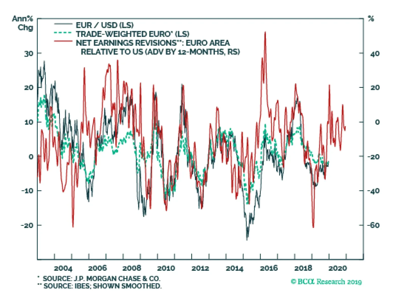
Our near-term target for EUR/USD is 1.18. This level will retest the downward sloping trendline in place since the Great Financial Crisis. The collapse in the euro since the financial crisis has been driven by falling growth differentials between the…

Highlights 2019 was a good year for our constraint-based method of political analysis. Trump was impeached, the trade war escalated, and China (modestly) stimulated – all as predicted. Nevertheless Trump caught us by surprise in Q2, with sanctions on Iran and tariffs on China. Our best trades were long defense stocks, gold, and Swiss bonds. Our worst trade was long rare earth miners. Feature Jean Buridan’s donkey starved to death because, faced with equal bundles of grain on both sides, it could not decide which to eat. So the legend goes. Investors face indecision all the time. This is especially the case when a geopolitical sea change is disrupting the global economy. Two or more political outcomes may seem equally plausible, heightening uncertainty. What is needed is a method for eliminating the options that require the farthest stretch. That’s what we offer in these pages, but we obviously make mistakes. The purpose of our annual report card is to identify our biggest hits and misses so we can hone our ability to combine fundamental macro and market analysis with the “art of the possible,” delivering better research and greater returns for clients. This is our last report for 2019. Next week we will publish a joint report with Anastasios Avgeriou of BCA Research’s US Equity Strategy. We will resume publication in early January. We wish all our clients a merry Christmas, happy holidays, and a happy new year! American Politics: Unsurprising Surprises Chart 1Our 2019 Forecast Held Up
Our 2019 Forecast Held Up
Our 2019 Forecast Held Up
On the whole our 2019 forecast held up very well. We argued that the global growth divergence that began in 2018 would extend into 2019 with the Fed hiking rates, a lack of massive stimulus from China, and an escalation in the US-China trade war. The biggest miss was that the Fed actually cut rates three times – addressed at length in our BCA Research annual outlook. But the bulk of the geopolitical story panned out: the US dollar, US equities, and developed market equities all outperformed as we expected (Chart 1). Geopolitical risk in the Trump era is centered on Trump himself. Beginning in 2017, we argued that the Democrats would take the House of Representatives in the midterm elections and impeach the president. Congress would not be totally gridlocked: while we argued for a government shutdown in late 2018, we expected a large bipartisan budget agreement in late 2019 and always favored the passage of the USMCA trade deal. Still, Congress would encourage Trump to go abroad in pursuit of policy victories, increasing geopolitical risks. We also argued that, barring “smoking gun” evidence of high crimes, the Republican-held Senate would acquit Trump – assuming his popularity held up among Republican voters themselves (Chart 2). These views either transpired or remain on track. The implication is that Trump-related risk continues and yet that Trump’s policies are ultimately constrained by the guardrails of the election. The latter factor helped propel the equity rally in the second half of the year. We largely sat out that rally, however. We overestimated the chances that Senator Bernie Sanders would falter and Senator Elizabeth Warren would swallow his votes, challenging former Vice President Joe Biden for the leading position in the early Democratic Party primary. We expected a significant bout of equity volatility via fears of a sharp progressive-populist turn in US policy (Chart 3). Instead, Sanders staged a recovery, Warren fell back, Biden maintained his lead, and markets rallied on other news. Chart 2Trump Will Be Acquitted
How Are We Doing? ... Geopolitical Strategy 2019 Report Card
How Are We Doing? ... Geopolitical Strategy 2019 Report Card
Chart 3Fears Of A Progressive Turn Did Not Derail The H2 Rally
How Are We Doing? ... Geopolitical Strategy 2019 Report Card
How Are We Doing? ... Geopolitical Strategy 2019 Report Card
Warren could still recover and win the nomination next year. But the Democratic Primary was not a reason to remain neutral toward equities, as we did in September and October. China’s Tepid Stimulus In recent years China first over-tightened and then under-stimulated the economy – as we predicted. But we misread the credit surge in the first quarter as a sign that policymakers had given up on containing leverage. In total this year’s credit surge amounts to 3.4% of GDP, about 1.2% short of what we expected (based on half of the 9.2% surge in 2015-16) (Chart 4). China’s credit surge was about 1.2% short of what we expected, but the direction was correct. While the government maintained easy monetary policy as expected, its actions combined with negative sentiment to snuff out the resurgence in shadow banking by mid-year (Chart 5). Chart 4China's Credit Surge Was Underwhelming
China's Credit Surge Was Underwhelming
China's Credit Surge Was Underwhelming
Still, China’s policy direction is clear – and fiscal policy is indeed carrying a greater load. The authorities are extremely unlikely to reverse course next year, so global activity should turn upward (Chart 6). Our “China Play Index” – iron ore prices, Swedish industrials, Brazilian stocks, and EM junk bonds, all in USD terms – has appreciated steadily (Chart 7). Chart 5China's Shadow Banking Remained Under Pressure
China's Shadow Banking Remained Under Pressure
China's Shadow Banking Remained Under Pressure
Chart 6Global Activity Should Turn Upward In 2020
Global Activity Should Turn Upward In 2020
Global Activity Should Turn Upward In 2020
Chart 7Our 'China Play Index' Performed Well
Our 'China Play Index' Performed Well
Our 'China Play Index' Performed Well
US-China: Underestimating Trump’s Risk Appetite We have held a pessimistic assessment of US-China relations since 2012. We rejected the trade truces agreed at the G20 summits in December 2018 and June 2019 as unsustainable. Our subjective probabilities of Trump achieving a bilateral trade agreement with China have never risen above 50%. Since September we have expected a ceasefire but not a full-fledged deal. Nevertheless we struggled with the timing of the trade war ups and downs (Chart 8). In particular we accepted China's new investment law as a sufficient concession and were surprised on May 5 when talks collapsed and Trump increased the tariffs. The lack of constraints on tariffs prevailed in 2019 but in 2020 the electoral constraint will prevail as long as Trump still has a chance of winning. Our worst trade recommendation of the year emerged from our correct view that the June G20 summit would lead to trade war escalation. We went long rare earth miners based outside of China. We expected China to follow through on threats to impose a rare earth embargo on the US in retaliation for sanctions against Chinese telecom giant Huawei. Not only did the US grant Huawei a reprieve, but China’s rare earth companies outperformed their overseas rivals. The trade went deeply into the red as global sentiment and growth fell (Chart 9). Only with global growth turning a corner have these high-beta stocks begun to turn around. Chart 8Expect A Ceasefire, Not A Full-Fledged Trade Agreement
Expect A Ceasefire, Not A Full-Fledged Trade Agreement
Expect A Ceasefire, Not A Full-Fledged Trade Agreement
Chart 9Our Worst Call: Long Rare Earth Miners
Our Worst Call: Long Rare Earth Miners
Our Worst Call: Long Rare Earth Miners
Chart 10North Korean Diplomacy Has Not Collapsed (Yet)
North Korean Diplomacy Has Not Collapsed (Yet)
North Korean Diplomacy Has Not Collapsed (Yet)
Our sanguine view on North Korea was largely offside this year. Setbacks in US negotiations with North Korea have often preceded setbacks in US-China talks. This was the case with the failed Hanoi summit in February and the inconsequential summit at the demilitarized zone in June. This could also be the case in 2020, as Washington and Pyongyang are now on the verge of breaking off talks with the latter threatening a “Christmas surprise” such as a nuclear or missile test. It is not too late to return to talks. Beijing is the critical player and is still enforcing crippling sanctions on North Korea (Chart 10). Beijing would benefit if North Korea submitted to nuclear and missile controls while the US reduced its military presence on the peninsula. We view this year as a hiccup in North Korean diplomacy but if talks utterly collapse and military tensions break out then it would undermine our view on US-China talks, Trump’s reelection odds, and US Treasuries in 2020. Hong Kong, rather than Taiwan, became the site of the geopolitical “Black Swan” that we expected surrounding Xi Jinping’s aggressive approach to domestic dissent. We have never downplayed Hong Kong. The loss of faith in the governing arrangement with the mainland began with the Great Recession and shows no sign of abating (Chart 11). We shorted the Hang Seng after the protests began, but closed at the appropriate time (Chart 12). The problem is not resolved. Also, Taiwan can test its autonomy much farther than Hong Kong and we still expect Taiwan to become ground zero of Greater China political risk and the US-China conflict. Chart 11Hong Kong Discontent Is Structural
How Are We Doing? ... Geopolitical Strategy 2019 Report Card
How Are We Doing? ... Geopolitical Strategy 2019 Report Card
Chart 12Our Hang Seng Short Is Done
Our Hang Seng Short Is Done
Our Hang Seng Short Is Done
Chart 13Trump Needs A Trade Ceasefire
Trump Needs A Trade Ceasefire
Trump Needs A Trade Ceasefire
Trump is unlikely to seek another trade war escalation given the negative impact it would have on sentiment and the economy (Chart 13). He could engage in another round of “fire and fury” saber-rattling against North Korea, as the economic impact is small, but he will prefer a diplomatic track. Taiwan, however, cannot be contained so easily if tempers flare. As we go to press it is not clear if Trump will hike the tariff on China on December 15. Some investors would point to his tendency to take aggressive action when the market gives him ammunition (Chart 14). We doubt he will, as this would be a policy mistake – possibly quickly reversed or possibly fatal for Trump. Trump’s electoral constraint is more powerful in 2020 than it was in 2019. Chart 14Trump Ceasefire Will Last As Long As Economy Is At Risk
Trump Ceasefire Will Last As Long As Economy Is At Risk
Trump Ceasefire Will Last As Long As Economy Is At Risk
Chart 15Our 'Doomsday Basket' Captured Trump's First Three Years
Our 'Doomsday Basket' Captured Trump's First Three Years
Our 'Doomsday Basket' Captured Trump's First Three Years
Our best tactical trade of the year stemmed from the geopolitical risk in Asia (and the Fed’s pause): we recommended a long gold position this summer that gained 16%. We also closed out our “Doomsday Basket” of gold and Swiss bonds, initiated in Trump’s first year, for a gain of 14% (Chart 15). Now that the market has digested Trump’s tactical retreat, we have reinitiated the gold trade as a long-term strategic hedge against both short-term geopolitical crises and the long-term theme of populism. Iran: Fool Me Once, Shame On You … This is the second year in a row that we are forced to explain our analysis of Iran – we were only half-right. Our long-held view is that grand strategy will push the US to pivot to Asia to counter China while scaling back its military activity in the Middle East. Two American administrations have confirmed this trend. That said, there is still a risk that President Trump will get entangled in Iran and that risk is growing. Global oil volatility – which spiked during the market share wars of 2014 – declined through the beginning of 2018, until the Trump administration took clearer steps toward a policy of “maximum pressure” on Iran. The constraints on Trump are obvious: the US economy is still affected by oil prices, which are set globally, and Iran can damage supply and push up prices. Therefore Trump should back down prior to the 2020 election. Yet Trump imposed sanctions, waivered on them, and then re-imposed them in May 2019 – catching us by surprise each time (Chart 16). Chart 16Trump Flip-Flopped On Iran Policy
Trump Flip-Flopped On Iran Policy
Trump Flip-Flopped On Iran Policy
Chart 17Iran Tensions Backwardated Oil Markets
Iran Tensions Backwardated Oil Markets
Iran Tensions Backwardated Oil Markets
This saga is not resolved – we are witnessing what could become a secular bull market in Iran tensions. True, a Democratic victory in 2020 could lead to an eventual restoration of the 2015 nuclear deal. True, the Trump administration could strike a deal with the Iranians (especially after reelection). But no, it cannot be assumed that the US will restore the historic 2015 détente with Iran. Within Iran the regime hardliners are likely to regain control in advance of the extremely uncertain succession from Supreme Leader Ali Khamenei and this will militate against reform and opening up. We went long Brent crude Q1 2020 futures relative to Q1 2021 to show that tensions were not resolved (Chart 17) – the attack on Saudi Arabia in September confirmed this view. And yet the oil price shock was fleeting as global supply was adequate and demand was weak. Our current long Brent spot trade is not only about Iran. Global growth is holding up and likely to rebound thanks to monetary stimulus and trade ceasefire, OPEC 2.0 has strong incentives to maintain production discipline (driven by both Saudi Arabian and Russian interests), and the Iranian conflict has led to instability in Iraq, as we expected. The UK: Not Dead In A Ditch British Prime Minister Boris Johnson proclaimed this year that he would "rather be dead in a ditch” than extend the deadline for the UK to leave the EU. The relevant constraint was that a disorderly “no deal” exit would have meant a recession, which we used as our visual illustration of why Johnson would not actually die in a ditch (Chart 18). The test was whether parliament could overcome its coordination problems when it reconvened in September, which it immediately did, prompting us to go long GBP-USD on September 6 (Chart 19). This trade was successful and we remain long GBP-JPY. Chart 18The Reason We Rejected
How Are We Doing? ... Geopolitical Strategy 2019 Report Card
How Are We Doing? ... Geopolitical Strategy 2019 Report Card
Chart 19UK Parliament Voted Down No-Deal Brexit
UK Parliament Voted Down No-Deal Brexit
UK Parliament Voted Down No-Deal Brexit
Populism faltered in Europe, as expected. As we go to press, the UK Christmas election is reported to have produced a whopping Conservative majority. This year Johnson mounted the most credible threat of a no-deal Brexit that we are ever likely to see and yet ultimately delayed Brexit. The Conservative victory will produce an orderly Brexit. The trade deal that needs to be negotiated next year will bring volatility but it does not have a firm deadline and is not harder to negotiate than Brexit itself. The UK has passed through the murkiest parts of Brexit uncertainty. Moreover, our high-conviction view that more dovish fiscal policy would be the end-result of the Brexit saga is now becoming consensus. Europe: Not The Crisis You Were Looking For The European Union was a geopolitical “red herring” in 2019 as we expected. Anti-establishment feeling remained contained. Italy remains the weakest link in the Euro Area, but the political “turmoil” of 2018-19 is the populist exception that mostly proves the rule: Europeans are not as a whole rebelling against the EU or the euro. On France, Italy, and Spain our views were fundamentally correct. Even in the European parliament, where anti-establishment players have a better chance of taking seats than in their home governments, the true Euroskeptics who want to exit the union only make up about 16% of the seats (Chart 20). This is up from 11% prior to the elections in May this year. Chart 20Euroskepticism Was Overstated
How Are We Doing? ... Geopolitical Strategy 2019 Report Card
How Are We Doing? ... Geopolitical Strategy 2019 Report Card
Yet the European political establishment is losing precious time to prepare for the next wave of serious agitation, likely when a full-fledged recession comes. Chart 21Trump Did Not Pile Tariffs Onto Auto Sector
Trump Did Not Pile Tariffs Onto Auto Sector
Trump Did Not Pile Tariffs Onto Auto Sector
Germany is experiencing a slow transition from the long reign of Angela Merkel, whose successor has plummeted in opinion polls. The shock of the global slowdown – particularly heavy in the auto sector (Chart 21) – hastened Germany’s succession crisis. Chart 22Overstated EU Political Risk, Understated Chinese Risk
Overstated EU Political Risk, Understated Chinese Risk
Overstated EU Political Risk, Understated Chinese Risk
There is a silver lining: this shock is forcing the Germans to reckon with de-globalization. Attitudes across the country are shifting on the critical question of fiscal policy. Even the conservative Christian Democrats are loosening their belts in the face of the success of the Green Party and a simultaneous change in leadership among the Social Democrats to embrace bigger spending. The Trump administration refrained from piling car tariffs onto Europe amidst this slowdown in the automobile sector and overall economy. We expected this delay, as there is little support in the US for a trade war with Europe, contra China, and it is bad strategy to fight a two-front war. But if the US economy recovers robustly and Trump is emboldened by a China deal then this risk could reignite in future. With European political risk overstated, and Chinese mainland risk understated, we initiated a long European equities relative to Chinese equities trade (Chart 22), as recommended by our colleagues at BCA Research European Investment Strategy. And now we are initiating the strategic long EUR/USD recommendation that we flagged in September with a stop at 1.18. Japan: Shinzo Abe Has Peaked Japanese Prime Minister Shinzo Abe is still in power and still very popular, whether judged by the average prime minister in modern memory or his popular predecessor Junichiro Koizumi. But he is at his peak and 2019 did indeed mark the turning point – it is all downhill from here. First, he lost his historic double super-majority in the Diet by falling to a mere majority in the upper house (Chart 23). He is still capable of revising the constitution, but now it is now harder – and the high water mark of his legislative power has been registered. Chart 23Abe Lost His Double Super Majority
How Are We Doing? ... Geopolitical Strategy 2019 Report Card
How Are We Doing? ... Geopolitical Strategy 2019 Report Card
Chart 24Consumption Tax Hike Shows Limits Of Abenomics
Consumption Tax Hike Shows Limits Of Abenomics
Consumption Tax Hike Shows Limits Of Abenomics
Second, he proceeded with a consumption tax from 8% to 10% that predictably sent the economy into a tailspin given the global slowdown (Chart 24). We thought the tax hike would be delayed, but Abe opted to hike the tax and then pass a stimulus package to compensate. This decision further supports the view that Abe’s power will decline going forward. It is now incontrovertible that the Liberal Democrats are eschewing a radical plan of debt monetization in which they coordinate ultra-dovish fiscal policy with ultra-dovish monetary policy. “Abenomics” has not necessarily failed but it is a fully known quantity. Abe will next preside over the 2020 summer Olympics and prepare to step down as Liberal Democratic party leader in September 2021. It is conceivable he will stay longer, but the likeliest successors have been put into cabinet positions, including Shinjiro Koizumi, son of the aforementioned, whom we would not rule out as a future prime minister. Constitutional revision or a Russian peace deal could mark the high point of his premiership, but the peak macro consequences have been felt. Japan suffered a literal and figurative earthquake in 2011. Over the long run Tokyo will resort to more unorthodox economic policies and redouble its efforts at reflation. But not until the external environment demands it. This suggests that the JPY-USD is a good hedge against risks to the cyclically bullish House View in 2020 and supports an overweight stance on Japanese government bonds. Emerging Markets: Notable Mentions India: We were correct that Narendra Modi would be reelected as prime minister, but we did not expect that he would win a single-party majority for a second time (Chart 25). The risk is that this result leads to hubris – particularly in foreign policy and domestic social policy – rather than accelerating structural reform. But for now we remain optimistic about reform. Chart 25
How Are We Doing? ... Geopolitical Strategy 2019 Report Card
How Are We Doing? ... Geopolitical Strategy 2019 Report Card
East Asia: We are optimistic on Southeast Asia in the context of US-China competition. But we proved overly optimistic on Malaysia and Indonesia this year, while we missed a chance to close our long Thai equity trade when it would have been very profitable to do so. Turkey: Domestic political challenges to President Recep Tayyip Erdoğan have led to a doubling down on unorthodox monetary policy and profligate fiscal policy, as expected. Early in the year we advised clients that Erdoğan would delay deployment of the Russian S-400 air defense system in deference to the US but it quickly became clear that this was not the case. Thus we correctly anticipated the sharp drop in the lira over the autumn (Chart 26). The US-Turkey relationship continues to fray and additional American sanctions are likely. Russia: President Vladimir Putin focused on maintaining domestic stability amid tight fiscal and monetary policy in 2019. This solidified our positive relative view of Russian currency and equities (Chart 27). But it also highlighted longer-term political risks. We expect this trend to continue, but by the same token Russia is a potential “Black Swan” risk in 2020. Chart 26The Lira's Autumn Relapse
The Lira's Autumn Relapse
The Lira's Autumn Relapse
Chart 27Russia's Eerie Quiet In 2019
Russia's Eerie Quiet In 2019
Russia's Eerie Quiet In 2019
Venezuela: Venezuela’s President Nicolas Maduro eked out another year of regime survival in 2019 despite our high-conviction view since 2017 that he would be finished. However, the economy is still collapsing and Russian and Chinese assistance is still limited (Chart 28). Before long the military will need to renovate the regime, even if our global growth and oil outlook for next year is positive for the regime on the margin. Chart 28Maduro Clung To Power
Maduro Clung To Power
Maduro Clung To Power
Chart 29Our 2019 Winner: Global Defense Stocks
Our 2019 Winner: Global Defense Stocks
Our 2019 Winner: Global Defense Stocks
Brazil: We were late to the Brazilian equity rally. While we have given the Jair Bolsonaro administration the benefit of the doubt, a halt to structural reforms in 2020 would prove us wrong. Our worst trade of the year was long rare earth miners, mentioned above. Our best trade was long global defense stocks (Chart 29), a structural theme stemming from the struggle of multiple powerful nations in the twenty-first century. Matt Gertken Vice President Geopolitical Strategist mattg@bcaresearch.com Roukaya Ibrahim Editor/Strategist Geopolitical Strategy RoukayaI@bcaresearch.com Ekaterina Shtrevensky Research Analyst ekaterinas@bcaresearch.com Jingnan Liu Research Associate jingnan@bcaresearch.com Marko Papic Consulting Editor marko@bcaresearch.com
Dear Client, In lieu of our regular report next week, I will be hosting a webcast on Wednesday, December 18th at 10:00 AM EST, where I will discuss the major investment themes and views I see playing out for 2020. This will be the last Global Investment Strategy report of 2019, with publication resuming early next year. On behalf of the entire Global Investment Strategy team, I would like to wish you a Merry Christmas, Happy Holidays, and a Healthy New Year! Best regards, Peter Berezin, Chief Global Strategist Overall Investment Strategy: Global growth should accelerate in 2020. Favor stocks over bonds. A more defensive stance will be appropriate starting in late 2021. Equities: Upgrade non-US equities to overweight at the expense of their US peers. Cyclical stocks, including financials, will outperform defensives. Fixed Income: Central banks will stay dovish, but bond yields will nevertheless rise modestly thanks to stronger global growth. Favor high-yield corporate credit over investment grade and sovereigns. Currencies: The US dollar will weaken in 2020 against EUR, GBP, CAD, AUD, and most EM currencies. The dollar will be flat against the yen and the Swiss franc. Commodities: Oil and industrial metals prices will move higher. Gold prices will be range-bound next year, but should rally in 2021 once inflation finally breaks out. GIS View Matrix
Strategy Outlook – 2020 Key Views: Full Speed Ahead
Strategy Outlook – 2020 Key Views: Full Speed Ahead
I. Global Macro Outlook Stronger Global Growth Ahead We turned bullish on global equities last December after temporarily moving to the sidelines in the summer of 2018. Last month, we increased our procyclical bias by upgrading non-US stocks within our recommended equity allocation at the expense of their US peers. The decision to upgrade non-US equities stems from our expectation that global growth will strengthen in 2020. Global financial conditions have eased sharply this year, largely due to the dovish pivot by many central banks. Monetary policy affects the economy with a lag. This is one reason why the net number of central banks cutting rates has historically led global growth by about 6-to-9 months (Chart 1). Chart 1The Effects Of Easing Monetary Policy Should Soon Trickle Down To The Economy
The Effects Of Easing Monetary Policy Should Soon Trickle Down To The Economy
The Effects Of Easing Monetary Policy Should Soon Trickle Down To The Economy
In addition, there is mounting evidence that the global manufacturing cycle is bottoming out (Chart 2). The “official” Chinese PMI produced by the National Bureau of Statistics rose above 50 in November for the first time since May. The private sector Caixin manufacturing PMI has been improving for five consecutive months. The euro area manufacturing PMI increased over the prior month, led by gains in Germany and France. Chart 2A Fairly Regular Three-Year Manufacturing Cycle
A Fairly Regular Three-Year Manufacturing Cycle
A Fairly Regular Three-Year Manufacturing Cycle
Chart 3The Auto Sector Is Showing Signs Of Life (I)
The Auto Sector Is Showing Signs Of Life (I)
The Auto Sector Is Showing Signs Of Life (I)
The PMI data for the US has been mixed. The ISM manufacturing index weakened in November. In contrast, the Markit PMI rose to a seven-month high. Despite its shorter history, we tend to give the Markit PMI more credence. It is based on a larger sample of companies and has sector weights that closely match the actual composition of US output. As such, the Markit PMI is better correlated with hard data on manufacturing production, employment, and factory orders. The auto sector has been particularly hard hit during this manufacturing downturn. Fortunately, the industry is showing signs of life. The Markit euro area auto sector PMI has rebounded, with the new orders-to-inventory ratio moving back into positive territory for the first time since the autumn of 2018. US banks stopped tightening lending standards for auto loans in the third quarter. They are also reporting stronger demand for vehicle financing (Chart 3). In China, vehicle production and sales are improving on a rate-of-change basis (Chart 4). Both automobile ownership and vehicle sales in China are still a fraction of what they are in most other economies, suggesting further upside for sales (Chart 5). Chart 4The Auto Sector Is Showing Signs Of Life (II)
The Auto Sector Is Showing Signs Of Life (II)
The Auto Sector Is Showing Signs Of Life (II)
Chart 5China: Structural Outlook For Autos Is Bright
China: Structural Outlook For Autos Is Bright
China: Structural Outlook For Autos Is Bright
Trade War Uncertainty The trade war remains the biggest risk to our sanguine view on global growth. As we go to press, rumors are swirling that the US and China have reached a “Phase One” trade deal that would cancel the scheduled December 15th tariff hike and roll back as much as half of the existing tariffs. If this were to occur, it would be consistent with our expectation of a trade truce. Nevertheless, it is impossible to be certain about how things will unfold from here. The best we can do is think through the incentives that both sides face and assume they will act in their own self-interest. For President Trump, the key priority is to get re-elected next year. Trump generally gets poor grades from voters on most issues. The one exception is the economy. Rightly or wrongly, the majority of voters approve of his handling of the economy (Chart 6). An escalation of the trade war would hurt the US economy, especially in a number of Midwestern states that Trump needs to win to remain president (Chart 7). Chart 6Trump Gets Reasonably High Marks On His Handling Of The Economy, But Not Much Else
Strategy Outlook – 2020 Key Views: Full Speed Ahead
Strategy Outlook – 2020 Key Views: Full Speed Ahead
Chart 7Economic Health Of The US Midwest Matters For Trump
Economic Health Of The US Midwest Matters For Trump
Economic Health Of The US Midwest Matters For Trump
A resurgence in the trade war would also hurt Trump’s credibility. The point of the tariffs was not simply to raise revenue; it was to get China to the negotiating table. As a self-described master negotiator, President Trump now has to produce a “great” deal for the American people. If he had finalized an agreement with China a year or two ago, he would currently be on the hook for showing that it resulted in a smaller trade deficit. But with the presidential election only a year away, he can semi-credibly claim that the trade balance will only improve after he is re-elected. For their part, the Chinese would rather grapple with Trump now than face him after the election when he will no longer be constrained by re-election pressures. China would also like to avoid facing someone like Elizabeth Warren or Bernie Sanders, who may insist on including stringent environmental and human rights provisions in any trade deal. At least with Trump, the Chinese know that they are getting someone who is focused on commercial issues. Contrary to most media reports, there is a fair amount of overlap between what Trump wants and what the Chinese themselves would like to achieve. For example, as China has moved up the technological ladder, many Chinese companies have begun to complain about intellectual theft by their domestic rivals. Thus, strengthening intellectual property protection has become a priority for Chinese officials. Along the same vein, China aspires to transform the RMB into a reserve currency. A country cannot have a reserve currency unless it also has an open capital account. Hence, financial market liberalization must be part of China’s long-term reform strategy. These mutual interests between the US and China could provide the basis for a trade truce. The Changing Nature Of Chinese Stimulus Chart 8China: Credit Growth Is Only A Few Percentage Points Above Nominal GDP Growth
China: Credit Growth Is Only A Few Percentage Points Above Nominal GDP Growth
China: Credit Growth Is Only A Few Percentage Points Above Nominal GDP Growth
If a détente in the trade war is reached, will this prompt China to go back to its deleveraging campaign? We do not think so. For one thing, there can be no assurance that a trade truce will last. Thus, China will want to maintain enough stimulus as an insurance policy. In addition, credit growth is currently running only a few percentage points above nominal GDP growth (Chart 8). With the ratio of credit-to-GDP barely rising, there is little need to bring credit growth down much from current levels. This does not mean that the Chinese authorities will allow credit growth to increase significantly further. Instead, the authorities will continue shifting the composition of credit growth from the riskier shadow banking sector to the safer formal banking sector, while increasingly leaning on fiscal policy to buttress growth. One of the developments that has gone largely unnoticed by investors this year is that China’s general government deficit has climbed from around 3% of GDP in mid-2018 to 6.5% of GDP at present (Chart 9). Some of this stimulus has been used to finance tax cuts for households. Some of it has also been used to finance infrastructure spending, which requires imports of raw materials and capital goods. As a result of this fiscal easing, the combined Chinese credit/fiscal impulse has risen to a two-year high. It leads global growth by about nine months (Chart 10). Chart 9China Has Been Stimulating, Fiscally
China Has Been Stimulating, Fiscally
China Has Been Stimulating, Fiscally
Chart 10Chinese Stimulus Should Boost Global Growth
Chinese Stimulus Should Boost Global Growth
Chinese Stimulus Should Boost Global Growth
Europe On The Upswing Chart 11Euro Area Growth: The Good, The Bad, And The Ugly
Euro Area Growth: The Good, The Bad, And The Ugly
Euro Area Growth: The Good, The Bad, And The Ugly
Chart 12German Economy: Some Green Shoots
German Economy: Some Green Shoots
German Economy: Some Green Shoots
The weakness in euro area growth this year has been concentrated in Germany and Italy. France and Spain have actually grown at a trend-like pace (Chart 11). Germany should benefit from stronger global growth and a recovery in automobile production next year. The recent rebound in the German PMI, as well as improvements in the expectations components of the IFO, ZEW, and Sentix surveys are all encouraging in this regard (Chart 12). Italy should also gain from an easing in financial conditions and receding political risks (Chart 13). The Italian 10-year government bond yield has fallen from a high of 3.69% in October 2018 to 1.23% at present. Chart 13Easing Financial Conditions And Less Political Uncertainty Will Help Italy
Easing Financial Conditions And Less Political Uncertainty Will Help Italy
Easing Financial Conditions And Less Political Uncertainty Will Help Italy
Chart 14Euro Area Fiscal Thrust
Euro Area Fiscal Thrust
Euro Area Fiscal Thrust
Fiscal policy across the euro area is also turning more stimulative. The fiscal thrust in the euro area rose to 0.4% of GDP this year mainly due to a somewhat larger budget deficit in France (Chart 14). The thrust should remain positive in 2020. Even in Germany, fiscal policy should loosen. Faster wage growth in Germany is eroding competitiveness relative to the rest of the euro area (Chart 15). That could force German policymakers to ratchet up fiscal stimulus in order to support demand. Already, the Social Democrats are responding to poor electoral performance by adopting a more proactive fiscal policy, hoping to stop the loss of votes to the big spending Greens. Chart 15Germany: Faster Wage Growth Eroding Competitiveness Relative To The Rest Of The Euro Area
Germany: Faster Wage Growth Eroding Competitiveness Relative To The Rest Of The Euro Area
Germany: Faster Wage Growth Eroding Competitiveness Relative To The Rest Of The Euro Area
Chart 16Boris Johnson Won't Pursue A No-Deal Brexit
Boris Johnson Won't Pursue A No-Deal Brexit
Boris Johnson Won't Pursue A No-Deal Brexit
The UK economy should start to recover next year as Brexit uncertainty fades and fiscal policy turns more stimulative. Exit polls suggest that the Conservatives will command a majority government following today's election. There is not enough appetite within the Conservative party for a no-deal Brexit (Chart 16). As such, today's victory will allow Prime Minister Boris Johnson to push his proposed deal through Parliament. It will also allow him to fulfill his pledge to pass a budget that boosts spending. Japan: Own Goal Japan has been hard hit by the global growth slowdown, given its close ties to its Asian neighbors, namely China. Add on a completely unnecessary consumption tax hike, and it is no wonder the economy has been faltering. Despite widespread weakness, there have been some very preliminary signs of improvement of late: The manufacturing PMI ticked up in November, while the services PMI rose back above 50. Consumer confidence also moved up to the highest level since June. Furthermore, Prime Minister Abe announced a multi-year fiscal package worth approximately 26 trillion yen. The headline number grossly overstates the size of the stimulus because it includes previously announced measures as well as items such as land acquisition costs that will not directly benefit GDP. Nevertheless, the package should still boost growth by about 0.5% next year, offsetting part of the drag from higher consumption taxes. US: Chugging Along Despite the slowdown in global growth, a stronger dollar, and the trade war, US real final demand is on track to grow by 2.5% this year (Chart 17). This is above the pace of potential GDP growth of 1.7%-to-2%. Chart 17Underlying US Growth Remains Above Trend
Strategy Outlook – 2020 Key Views: Full Speed Ahead
Strategy Outlook – 2020 Key Views: Full Speed Ahead
The Fed’s 75 basis points of rate cuts has moved monetary policy even further into accommodative territory. Not surprisingly, residential housing – the most interest rate-sensitive part of the economy – has responded favorably (Chart 18). While the tailwind from lower mortgage rates will dissipate by next summer, we do not anticipate much weakness in the housing market. This is because the inventory levels and vacancy rates remain near record-low levels (Chart 19). The shortage of homes should buttress both construction and prices. Chart 18US Housing: On Solid Ground (I)
US Housing: On Solid Ground (I)
US Housing: On Solid Ground (I)
Chart 19US Housing: On Solid Ground (II)
US Housing: On Solid Ground (II)
US Housing: On Solid Ground (II)
Strong labor and housing markets will support consumer spending, which represents nearly 70% of the economy. Business capital spending should also benefit from lower rates, receding trade tensions, and rising wages which are making firms increasingly eager to automate. II. Financial Markets Global Asset Allocation We argued in the section above that global growth should rebound next year thanks to easier financial conditions, an upturn in the global manufacturing cycle, a detente in the trade war, and modest Chinese stimulus. Chart 20 shows that stocks usually outperform bonds when global growth is accelerating. This occurs partly because corporate earnings tend to rise when growth picks up. BCA’s US equity strategy team expects S&P 500 EPS to increase by 5% next year if global growth merely stabilizes. An acceleration in global growth would surely lead to even stronger earnings growth. On the flipside, investors also tend to price out rate cuts (or price in rate hikes) when growth is on the upswing, resulting in lower bond prices (Chart 21). Chart 20Stocks Usually Outperform Bonds When Global Growth Is Accelerating
Stocks Usually Outperform Bonds When Global Growth Is Accelerating
Stocks Usually Outperform Bonds When Global Growth Is Accelerating
Chart 21Improving Global Growth Boosts Earnings Growth...And Expectations Of Rate Hikes
Improving Global Growth Boosts Earnings Growth...And Expectations Of Rate Hikes
Improving Global Growth Boosts Earnings Growth...And Expectations Of Rate Hikes
Relative valuations also favor stocks over bonds. Despite the stock market rally this year, the MSCI All-Country World Index currently trades at a reasonable 15.8-times forward earnings. This is below the forward PE ratio of 16.7 reached in January 2018 and even below the forward PE ratio of 16.4 hit in May 2015. Analysts expect global EPS to increase by 10% next year, below the historic 12-month expectation of 15% (Chart 22). In contrast to most years when analyst forecasts prove to be wildly overoptimistic, the current EPS forecast is likely to be met. Chart 22Analyst Expectations Are Not Wildly Optimistic
Analyst Expectations Are Not Wildly Optimistic
Analyst Expectations Are Not Wildly Optimistic
Chart 23Equity Risk Premium Remains Quite Elevated
Equity Risk Premium Remains Quite Elevated
Equity Risk Premium Remains Quite Elevated
If one inverts the PE ratio, one can calculate an earnings yield for global equities of 6.3%. One can then calculate the implied equity risk premium (ERP) by subtracting the real long-term bond yield from the earnings yield. As Chart 23 illustrates, the ERP remains quite elevated by historic standards. Some observers might protest that the ERP is elevated mainly because bond yields are so low. If low bond yields are discounting very poor economic growth prospects, perhaps today’s PE ratio should be lower than it actually is? The problem with this argument is that growth prospects are not so bad. The IMF estimates that global growth will be slightly above its post-1980 average over the next five years (Chart 24). While trend growth is falling in both developed and emerging economies, the rising share of faster-growing emerging markets in global GDP is helping to prop up overall growth. Chart 24The Trend In Global Growth Has Remained Steady Thanks To Faster-Growing EM
The Trend In Global Growth Has Remained Steady Thanks To Faster-Growing EM
The Trend In Global Growth Has Remained Steady Thanks To Faster-Growing EM
Sector And Regional Equity Allocation US stocks have outperformed their overseas peers by 10% year-to-date and by 137% since 2008. About half of the outperformance of US equities since the Great Recession was due to faster sales-per-share growth, a third was due to stronger margin growth, and the rest was due to relative PE expansion (Chart 25). Chart 25Faster Sales Growth, Rising Margins, And Relative PE Expansion Helped Drive US Outperformance Over The Past Decade
Strategy Outlook – 2020 Key Views: Full Speed Ahead
Strategy Outlook – 2020 Key Views: Full Speed Ahead
It is worth noting that the outperformance of US stocks is a fairly recent phenomenon. Between 1970 and 2008, European equity prices and EPS actually rose slightly faster than in the US (Chart 26). EM stocks also outperformed the US in the decade leading up to the Global Financial Crisis. Chart 26US Earnings Have Not Always Outpaced Their Peers
US Earnings Have Not Always Outpaced Their Peers
US Earnings Have Not Always Outpaced Their Peers
We expect US stocks to rise in 2020 by about 5%-to-10%, but to lag their foreign peers in common-currency terms. There are four reasons for this: Sector skews favor non-US equities. Cyclical stocks tend to outperform defensives when global growth is strengthening and the US dollar is weakening (Chart 27). Cyclical sectors are overrepresented outside the US. We would include financials in our definition of cyclicals. Faster global growth next year will lift long-term bond yields. Since central banks are unlikely to raise rates, yield curves will steepen. Steeper yield curves will boost net interest margins, thus helping bank shares (Chart 28). European banks are more dependent on the spread between lending and borrowing rates than US banks, since the latter derive more of their profits from fees. Non-US stocks are quite a bit cheaper than their US peers. The forward PE for US equities currently stands at 18.1, well above the forward PE of 13.6 for non-US equities. Other valuation measures reveal an even bigger premium on US stocks (Chart 29). Differences in sector weights account for about a quarter of the valuation gap between the US and the rest of the world. The rest of the gap is due to cheaper valuations within sectors. Financials, for example, are notably less expensive in the rest of the world, particularly in Europe (Chart 30). The valuation gap between the US and the rest of the world is even starker if we compare earnings yields with bond yields. Since bond yields are lower outside the US, the implied equity risk premium is significantly higher for non-US stocks. Profit margins have less scope to rise in the US than in the rest of the world. According to MSCI data, net operating margins currently stand at 10.3% in the US compared to 7.9% abroad. Unlike in the US, margins in Europe and EM are still well below their pre-recession peaks (Chart 31). While US margins are unlikely to fall next year thanks to stronger global growth, rising wage growth will negatively impact profits in some labor-intensive industries. Labor slack is generally greater abroad, which should limit cost pressures. Uncertainty over the US election is likely to limit the gains to US equities. All of the Democratic frontrunners have pledged to roll back the 2017 Tax Cuts and Jobs Act to one degree or another. A full repeal of the Act would reduce S&P 500 EPS by about 10%. While such a dramatic move is far from guaranteed – for starters, it would require that the Democrats gain control of both the White House and the Senate – it does pose a risk to investors. The same goes for increased regulatory actions, which Senators Sanders and Warren have both vocally championed. Chart 27Cyclicals Do Well Versus Defensives When Global Growth Is Strengthening And The US Dollar Is Weakening
Cyclicals Do Well Versus Defensives When Global Growth Is Strengthening And The US Dollar Is Weakening
Cyclicals Do Well Versus Defensives When Global Growth Is Strengthening And The US Dollar Is Weakening
Chart 28Steeper Yield Curves Help Financials
Steeper Yield Curves Help Financials
Steeper Yield Curves Help Financials
Chart 29US Equities Are More Expensive Than Stocks Abroad
US Equities Are More Expensive Than Stocks Abroad
US Equities Are More Expensive Than Stocks Abroad
Chart 30European Financials Trade At A Substantial Discount To Their US Peers
European Financials Trade At A Substantial Discount To Their US Peers
European Financials Trade At A Substantial Discount To Their US Peers
Chart 31Profit Margins Have Less Scope To Rise In The US Than In The Rest Of The World
Profit Margins Have Less Scope To Rise In The US Than In The Rest Of The World
Profit Margins Have Less Scope To Rise In The US Than In The Rest Of The World
Within the non-US universe, euro area stocks have the most upside potential. In contrast, we see less scope for Japanese stocks to outperform the global benchmark because of uncertainties over the impact of the consumption tax hike on domestic demand. In addition, a weaker trade-weighted yen next year will annul the currency translation gains that unhedged equity investors can expect to receive from other non-US stock markets. Lastly, the passage of a new investment law that requires investors wishing to “influence management” to receive prior government approval could cast a pall over recent efforts to improve corporate governance in Japan. Fixed Income Chart 32Inflation Excluding Shelter Has Been Muted
Inflation Excluding Shelter Has Been Muted
Inflation Excluding Shelter Has Been Muted
Chart 33Long-Term Bond Yields Will Move Higher As Faster Growth Pushes Up Estimates Of The Neutral Rate
Long-Term Bond Yields Will Move Higher As Faster Growth Pushes Up Estimates Of The Neutral Rate
Long-Term Bond Yields Will Move Higher As Faster Growth Pushes Up Estimates Of The Neutral Rate
Central banks will remain on the sidelines next year. Inflation is still running well below target in most economies. Even in the US, where slack has largely been absorbed and wage growth has risen, core inflation excluding housing has averaged only 1.2% over the past five years (Chart 32). Nevertheless, long-term bond yields will still move higher next year as investors revise up their estimate of the neutral rate in response to faster growth (Chart 33). On a regional basis, BCA’s fixed-income experts favor low-beta bond markets (Chart 34). Japanese bonds have a very low beta to the overall Barclays Global Treasury index because inflation expectations are quite depressed and the Bank of Japan will actively intervene to prevent yields from rising. On a USD currency-hedged basis, the Japanese 10-year yield stands at a relatively decent 2.38%, above the yield of 1.79% on comparable maturity US Treasurys (Table 1). Chart 34Favor Lower-Beta Government Bond Markets In 2020
Favor Lower-Beta Government Bond Markets In 2020
Favor Lower-Beta Government Bond Markets In 2020
Table 1Bond Markets Across The Developed World
Strategy Outlook – 2020 Key Views: Full Speed Ahead
Strategy Outlook – 2020 Key Views: Full Speed Ahead
In contrast to Japan, the beta of US Treasurys to the overall global bond index is relatively high, implying that Treasurys will underperform other sovereign bond markets in a rising yield environment. The beta for Germany, UK, Australia, and Canada lie somewhere between Japan and the US. Consistent with our bullish view on global equities, we expect corporate bonds to outperform sovereign debt in 2020 (Chart 35). Despite the weakness in manufacturing, US banks further eased terms on commercial and industrial loans in Q3, according to the Fed’s Senior Loan Officer Survey. Chart 35Stronger Growth Causes Corporate Spreads To Tighten
Stronger Growth Causes Corporate Spreads To Tighten
Stronger Growth Causes Corporate Spreads To Tighten
At the US economy-wide level, neither interest coverage nor debt-to-asset ratios are particularly stretched (Chart 36). Admittedly, the picture looks less flattering if we focus solely on high-yield issuers (Chart 37). That said, a wave of defaults is very unlikely to occur in 2020, so long as the Fed is on hold and economic growth is on the upswing. Chart 36Corporate Debt: A Benign Top-Down View
Corporate Debt: A Benign Top-Down View
Corporate Debt: A Benign Top-Down View
Chart 37Corporate Debt: More Concerning Picture Among High-Yield Issuers
Corporate Debt: More Concerning Picture Among High-Yield Issuers
Corporate Debt: More Concerning Picture Among High-Yield Issuers
Chart 38US Corporates: Focus On High-Yield Credit
HY Spread Targets US Corporates: Focus On High-Yield Credit
HY Spread Targets US Corporates: Focus On High-Yield Credit
Moreover, despite narrowing this year, high-yield spreads still remain above our fixed-income team’s estimate of fair value (Chart 38). They recommend moving down the credit curve and increasing the weight in Caa-rated bonds. These have underperformed this year largely because of technical factors such as their large exposure to the energy sector and relatively short duration. As oil prices rise next year, energy sector issuers will feel some relief. Moreover, unlike this year, rising long-term government bond yields in 2020 should also make shorter-duration credit more attractive. In contrast to high-yield spreads, investment-grade spreads have gotten quite tight. Investors seeking high-quality bond exposure should shift towards Agency MBS, which still carry an attractive spread relative to Aa- and A-rated corporate bonds. European IG bonds should also outperform their US peers thanks to faster growth in Europe next year and ongoing support from the ECB’s asset purchase program. Looking beyond the next 12-to-18 months, there is a strong chance that inflation will increase materially from current levels. The unemployment rate across the G7 has fallen to a multi-decade low, while the share of developed economies reaching full employment has hit a new cycle high (Chart 39). Chart 39ADeveloped Markets: Unemployment Rates Keep Trending Lower... And Full Employment Reaching New Cycle Highs
Developed Markets: Unemployment Rates Keep Trending Lower... And Full Employment Reaching New Cycle Highs
Developed Markets: Unemployment Rates Keep Trending Lower... And Full Employment Reaching New Cycle Highs
Chart 39BDeveloped Markets: Unemployment Rates Keep Trending Lower... And Full Employment Reaching New Cycle Highs
Developed Markets: Unemployment Rates Keep Trending Lower... And Full Employment Reaching New Cycle Highs
Developed Markets: Unemployment Rates Keep Trending Lower... And Full Employment Reaching New Cycle Highs
Chart 40The Phillips Curve Is Alive And Well
The Phillips Curve Is Alive And Well
The Phillips Curve Is Alive And Well
For all the talk about how the Phillips curve is dead, wage growth remains well correlated with labor market slack (Chart 40). Rising wages will boost real disposable incomes, leading to more spending. If economies cannot increase supply to meet higher demand, prices will rise. It simply does not make sense to argue that the price of apples will increase if the demand for apples exceeds the supply of apples, but that overall prices will not increase if the demand for all goods and services exceeds the supply of all goods and services. It will take at least until mid-2021 for inflation to rise above the Fed’s comfort zone. It will take even longer for rates to reach restrictive territory, and longer still for tighter monetary policy to make its way through the economy. However, at some point in 2022, the interest-rate sensitive sectors of the US economy will buckle, setting off a global economic downturn and a deep bear market in equities and credit. Enjoy it while it lasts. Currencies And Commodities The US dollar is a countercyclical currency, meaning that it usually moves in the opposite direction of the global business cycle (Chart 41). This countercyclicality stems from the fact that the US, with its large service sector and relatively small manufacturing base, is a “low beta economy.” Strong global growth does help the US, but it benefits the rest of the world even more. Thus, capital tends to flow out of the US when global growth strengthens, which puts downward pressure on the dollar. As global growth picks up in 2020, the dollar will weaken. EUR/USD should increase to around 1.15 by end-2020. GBP/USD will rise to 1.40. USD/CNY will move to 6.8. The Australian and Canadian dollars, along with most EM currencies, will strengthen as well. However, the Japanese yen and Swiss franc are likely to be flat-to-down against the dollar, reflecting the defensive nature of both currencies. Today's rally in the pound has raised the return on our short EUR/GBP trade to 10.5%. For now, we would stick with this position. Chart 42 shows that the pound should be trading near 1.30 against the euro based on real interest rate differentials, which is still well above the current level of 1.20. Chart 41The Dollar Is A Countercyclical Currency
The Dollar Is A Countercyclical Currency
The Dollar Is A Countercyclical Currency
Chart 42Interest Rate Differentials Suggest More Upside For The Pound
Interest Rate Differentials Suggest More Upside For The Pound
Interest Rate Differentials Suggest More Upside For The Pound
The trade-weighted dollar will continue to depreciate until late-2021, and then begin to strengthen again as the Fed turns more hawkish and global growth starts to falter. Commodity prices tend to closely track the global growth/dollar cycle (Chart 43). Industrial metal prices will fare well next year. Oil prices will also move up. Globally, the last of the big projects sanctioned prior to the oil-price collapse in late 2014 are coming online in Norway, Brazil, Guyana, and the US Gulf. Our commodity strategists expect incremental oil supply growth to slow in 2020, just as demand reaccelerates. Gold is likely to be range-bound for most of next year reflecting the crosswinds from a weaker dollar on the one hand (bullish for bullion), and receding trade war risks and rising bond yields on the other hand. Gold will have its day in the sun starting in 2021 when inflation finally breaks out. Our key market charts are shown on the following page. Peter Berezin Chief Global Strategist peterb@bcaresearch.com Chart 43Dollar Weakness Is A Boon For Commodities
Dollar Weakness Is A Boon For Commodities
Dollar Weakness Is A Boon For Commodities
Key Financial Market Forecasts
Strategy Outlook – 2020 Key Views: Full Speed Ahead
Strategy Outlook – 2020 Key Views: Full Speed Ahead
MacroQuant Model And Current Subjective Scores
Strategy Outlook – 2020 Key Views: Full Speed Ahead
Strategy Outlook – 2020 Key Views: Full Speed Ahead
Strategic Recommendations Closed Trades
Highlights Structurally overweight US T-bonds versus core European bonds. Our preferred expression is long T-bonds versus Swiss bonds. US yields can fall a lot more than European yields, and European yields can rise a lot more than US yields. Structurally underweight the overvalued dollar versus undervalued European currencies. Our preferred expression is long SEK/USD. Structurally underweight price-sensitive European export sectors. Undervalued European currencies cannot fall much further, and those European exporters that depend on price competitiveness will struggle to outperform. But structurally overweight soft luxuries. Despite President Trump’s threat to tariff French products, soft luxuries retain very strong pricing power and sustainable long term demand growth from rising female labour participation rates globally. Fractal trade: The 65-day fractal structure of global equities suggests that they are vulnerable to a near-term countertrend move. Feature Chart of the WeekLike-For-Like, Structural Inflation Is Lower In the US Than In Europe
Like-For-Like, Structural Inflation Is Lower In the US Than In Europe
Like-For-Like, Structural Inflation Is Lower In the US Than In Europe
A seemingly trivial disagreement between Europeans and Americans on how to measure inflation turns out to be the culprit for three major distortions in the world right now: Deeply divergent monetary policies across the developed economies. Huge valuation anomalies in the foreign exchange markets. President Trump’s threat of a trade war to counter the huge trade surpluses that Europe and China are running against the US. The inflation measurement disagreement wouldn’t really matter if inflation were running in the mid-single digits. But when inflation is near zero, the seemingly trivial difference in inflation measurement methodologies has ended up generating massive distortions. European And American Inflation Are Not The Same European inflation excludes the maintenance and upkeep costs associated with owning your home, whereas US inflation includes these costs at a hefty 25 percent weighting, making owner occupied housing by far the largest single item in the US inflation basket. By omitting the largest item in the US inflation basket, European inflation is subtly yet crucially different to American inflation. The European statisticians argue that unlike all the other items in the inflation basket, there is no independent market price for the ongoing cost of home ownership, and therefore this cost should be excluded. The American statisticians argue that the ongoing cost of home ownership is the single largest expense for most people and, as such, it should be ‘imputed’ from a concept known as ‘owner equivalent rent’ – essentially, asking homeowners how much it would cost to rent their own home. Different definitions of inflation will trigger very different policy responses from central banks. Both the European and American approaches have their merits and drawbacks, and it is not our intention to endorse one approach over the other. Our intention is simply to point out that the two approaches can give very different results for inflation – and therefore trigger very different policy responses from inflation-targeting central banks, with their consequent economic and political repercussions. If Americans used the European definition of inflation, then headline inflation in the US today would be running at the same sub-par rate as in the euro area, 1 percent, and well below the Fed’s 2 percent target (Chart I-2 and Chart I-3). More important, the five year annualised rate of inflation – let’s call it US structural inflation – would have been stuck below 1 percent since 2016 (Chart I-1 and Chart I-4). Under these circumstances, it would have been impossible for the Fed to hike the funds rate eight times, as it did through 2017-18. Chart I-2Like-For-Like, Headline Inflation Is Identical In The US And The Euro Area...
Like-For-Like, Headline Inflation Is Identical In The US And The Euro Area...
Like-For-Like, Headline Inflation Is Identical In The US And The Euro Area...
Chart I-3...And Core Inflation Is ##br##Very Similar
...And Core Inflation Is Very Similar
...And Core Inflation Is Very Similar
Chart I-4Using The European Definition Of Inflation, The Fed Couldn't Have Hiked Rates
Using The European Definition Of Inflation, The Fed Couldn't Have Hiked Rates
Using The European Definition Of Inflation, The Fed Couldn't Have Hiked Rates
Instead, what if Europeans used the American definition of inflation? European inflation does not include owner equivalent rent, but it does include housing rent for those that do rent their homes. In the US, these two items tend to move in lockstep (Chart I-5). If we assume the same for Europe, we can deduce that a US type weighting for owner equivalent rent would have boosted the headline inflation rate in the euro area by 0.3-0.4 percent through 2014-16, and by a possible 0.5 percent in Sweden through 2013-15 (Chart I-6 and Chart I-7). Under these circumstances, it would have been very difficult for the ECB and Riksbank to take and maintain policy rates deeply in negative territory, as they did through 2015-19. Chart I-5Owner Equivalent Rent Tracks ##br##Housing Rent
Owner Equivalent Rent Tracks Housing Rent
Owner Equivalent Rent Tracks Housing Rent
Chart I-6Using The American Definition Of inflation, Euro Area Inflation Would Have Been Higher...
Using The American Definition Of inflation, Euro Area Inflation Would Have Been Higher...
Using The American Definition Of inflation, Euro Area Inflation Would Have Been Higher...
Chart I-7...And Swedish Inflation Would Have Been Much Higher
...And Swedish Inflation Would Have Been Much Higher
...And Swedish Inflation Would Have Been Much Higher
The Different Definitions Of Inflation Have Created Dangerous Distortions If Europeans and Americans were using the same definition of inflation then, one way or the other, their monetary policies would not be as deeply divergent as they are now. One important implication is that European currencies would not be as undervalued as they are now. If Europeans and Americans were using the same definition of inflation then their monetary policies would not be as deeply divergent as they are now. Based on the ECB’s own analysis, the euro area is over-competitive versus its top 19 trading partners – meaning the euro is undervalued – by at least 10 percent. Moreover, the ECB admits that this sizable undervaluation only appeared after the ECB and Fed started taking their monetary policies in opposite directions in 2015 (Chart I-8). Chart I-8The Euro Is Undervalued By More Than 10 Percent
The Euro Is Undervalued By More Than 10 Percent
The Euro Is Undervalued By More Than 10 Percent
Put the other way, the dollar would not be as overvalued as it is now. In turn, the stronger dollar has created its own dangerous spill-overs. As we explained last week in The Hidden Sales Recession Of 2015… And Why It Matters Now, the surging dollar in 2015 could not have come at a worse time for China. Given that the Chinese economy was already slowing sharply, and the yuan was pegged to the dollar, the resulting loss of Chinese competitiveness just exacerbated the slump. Forcing China to loosen the dollar peg in August 2015. All of which brings us neatly to the hot topic of 2019, and likely 2020 too – President Trump’s threat of a trade war to counter the huge trade imbalances that Europe and China are running against the US. As it happens, President Trump has a good point. Trade wars almost always stem from trade imbalances; and trade imbalances almost always stem from exchange rate manipulations or, at least, exchange rate distortions that advantage one economy to the detriment of another. The euro's undervaluation only happened after monetary policies diverged in 2015. Most of the euro area’s €150 billion trade surplus with the US appeared after 2015, so it cannot be a structural issue. In fact, the evolution of the trade imbalance has tracked relative monetary policy between the Fed and ECB almost tick for tick (Chart I-9), via the exchange rate channel and the over-competitiveness of the euro which the ECB fully admits. Chart I-9Excessively Divergent Monetary Policies Caused The Euro Area's Huge Trade Surplus With The US
Excessively Divergent Monetary Policies Caused The Euro Area's Huge Trade Surplus With The US
Excessively Divergent Monetary Policies Caused The Euro Area's Huge Trade Surplus With The US
Of course, neither the ECB nor the Fed are deliberately targeting trade or the exchange rate; they are targeting inflation. But to repeat, they are targeting different definitions of inflation. Crucially, with a backdrop of near zero inflation, small definitional differences in inflation can generate huge economic and financial distortions, with dangerous political consequences. The Compelling Structural Opportunities The definitional difference between European and American inflation explain many of the economic and financial distortions we are witnessing now, as well as the dangerous political consequences. The main counterargument is that the inflation definitions are what they are; neither the ECB nor the Fed are likely to change them anytime soon. Nevertheless, there are compelling structural opportunities. Since 2015, American inflation has outperformed European inflation for one reason and one reason only: owner equivalent rents have surged by almost 20 percent relative to other prices (Chart I-10 and Chart I-11). The historic evidence suggests that such a pace of outperformance is unsustainable structurally and, absent this tailwind, US and European headline inflation rates have to converge, one way or the other. Chart I-10An Unsustainable Surge In US Owner Equivalent Rent...
An Unsustainable Surge In US Owner Equivalent Rent...
An Unsustainable Surge In US Owner Equivalent Rent...
Chart I-11...Has Lifted US Headline ##br##Inflation
...Has Lifted US Headline Inflation
...Has Lifted US Headline Inflation
In this inevitable convergence, the asymmetric starting point of bond yields favours a long US T-bonds, short core European bonds structural position. Because, if the inflation convergence is downwards, T-bond yields will fall much further than European yields; whereas if the inflation convergence is upwards, European yields will likely rise more than T-bond yields. Our preferred structural expression is: long US T-bonds, short Swiss bonds. For currencies it is the opposite message. The overvalued dollar is likely to underperform, at least versus other developed market currencies. Given that Swedish inflation has been the most understated by the exclusion of owner equivalent rents, combined with the Riksbank’s intention to exit negative interest rate policy imminently, our preferred structural expression is: long SEK/USD. American inflation has outperformed European inflation for one reason and one reason only: owner equivalent rents have surged by almost 20 percent relative to other prices. Lastly, European export growth – even in Germany – has been heavily reliant on a cheapening euro (Chart I-12). Undervalued European currencies cannot fall much further, and those European exporters that depend on price competitiveness will struggle to outperform. Even those multinationals that sell their products in dollars will lose out in the accounting translation back into a strengthening domestic currency. Hence, structurally underweight price-sensitive European export sectors. Chart I-12Without A Weaker Euro, Most European Exporters Will Struggle To Outperform
Without A Weaker Euro, Most European Exporters Will Struggle To Outperform
Without A Weaker Euro, Most European Exporters Will Struggle To Outperform
The one exception to this is the soft luxuries sector. Despite President Trump’s threat to tariff French products, soft luxuries retain very strong pricing power and sustainable long term demand growth from rising female labour participation rates globally. Stay structurally overweight soft luxuries. Fractal Trading System* The 65-day fractal structure of global equities suggests that they are vulnerable to a near-term countertrend move. Accordingly, this week’s recommended trade is to short the MSCI All Country World versus the global 10-year bond (simple average of US, euro area, and China), setting a profit target and symmetrical stop-loss at 2.5 percent. In other trades, long NZD/JPY and long SEK/JPY both achieved their profit targets of 3 percent and 1.5 percent respectively. Against this, long Poland versus World reached its 4 percent stop-loss. The rolling 1-year win ratio now stands at 65 percent. Chart I-13MSCI All-Country World Vs. Global 10-Year Bond
MSCI All-Country World Vs. Global 10-Year Bond
MSCI All-Country World Vs. Global 10-Year Bond
When the fractal dimension approaches the lower limit after an investment has been in an established trend it is a potential trigger for a liquidity-triggered trend reversal. Therefore, open a countertrend position. The profit target is a one-third reversal of the preceding 13-week move. Apply a symmetrical stop-loss. Close the position at the profit target or stop-loss. Otherwise close the position after 13 weeks. Use the position size multiple to control risk. The position size will be smaller for more risky positions. * For more details please see the European Investment Strategy Special Report “Fractals, Liquidity & A Trading Model,” dated December 11, 2014, available at eis.bcaresearch.com. Dhaval Joshi Chief European Investment Strategist dhaval@bcaresearch.com Fractal Trading System
How Low Inflation Has Distorted The World
How Low Inflation Has Distorted The World
How Low Inflation Has Distorted The World
How Low Inflation Has Distorted The World
Cyclical Recommendations Structural Recommendations
How Low Inflation Has Distorted The World
How Low Inflation Has Distorted The World
How Low Inflation Has Distorted The World
How Low Inflation Has Distorted The World
How Low Inflation Has Distorted The World
How Low Inflation Has Distorted The World
How Low Inflation Has Distorted The World
How Low Inflation Has Distorted The World
Trades Closed Trades Asset Performance Currency & Bond Equity Sector Country Equity Indicators Bond Yields Chart II-1Indicators To Watch - Bond Yields
Indicators To Watch - Bond Yields
Indicators To Watch - Bond Yields
Chart II-2Indicators To Watch - Bond Yields
Indicators To Watch - Bond Yields
Indicators To Watch - Bond Yields
Chart II-3Indicators To Watch - Bond Yields
Indicators To Watch - Bond Yields
Indicators To Watch - Bond Yields
Chart II-4Indicators To Watch - Bond Yields
Indicators To Watch - Bond Yields
Indicators To Watch - Bond Yields
Interest Rate Chart II-5Indicators To Watch - Interest Rate Expectations
Indicators To Watch - Interest Rate Expectations
Indicators To Watch - Interest Rate Expectations
Chart II-6Indicators To Watch - Interest Rate Expectations
Indicators To Watch - Interest Rate Expectations
Indicators To Watch - Interest Rate Expectations
Chart II-7Indicators To Watch - Interest Rate Expectations
Indicators To Watch - Interest Rate Expectations
Indicators To Watch - Interest Rate Expectations
Chart II-8Indicators To Watch - Interest Rate Expectations
Indicators To Watch - Interest Rate Expectations
Indicators To Watch - Interest Rate Expectations
Feature Recommended Allocation
Monthly Portfolio Update: How To Position For The End Game
Monthly Portfolio Update: How To Position For The End Game
In late November, BCA Research published its 2020 Outlook titled Heading Into The End Game, an annual discussion between BCA’s managing editors and the firm’s longstanding clients Mr. and Ms X.1 We recommend GAA clients read that document for a full analysis of the macro and investment environment we expect in 2020. In this Monthly Portfolio Outlook, we focus on portfolio construction: how we would recommend positioning a global multi-asset portfolio for the 12-month investment horizon in light of that analysis. First, a brief summary of the BCA macro outlook. We believe the global manufacturing cycle is starting to bottom out, partly because of its usual periodicity of 18 months from peak to trough, and also because of easier financial conditions, and some moderate fiscal and credit stimulus from China (Chart 1). Central banks will remain dovish next year despite accelerating growth. The Fed, in particular, worries that inflation expectations have become unanchored (Chart 2) and, moreover, will be reluctant to raise rates ahead of the US presidential election. This environment implies a moderate rise in long-term interest rates, with the US 10-year Treasury yield rising to 2.2-2.5%. Chart 1Reasons To Expect A Rebound
Reasons To Expect A Rebound
Reasons To Expect A Rebound
Chart 2Unanchored Inflation Expectations Worry The Fed
Unanchored Inflation Expectations Worry The Fed
Unanchored Inflation Expectations Worry The Fed
For an asset allocator, this combination of an improving manufacturing cycle and easy monetary policy looks like a very positive environment for risk assets (Chart 3). We, therefore, remain overweight equities and underweight fixed income. We have discussed over the past few months the timing to turn more risk-on and pro-cyclical in our recommendations.2 Since we are increasingly confident about the probability of the manufacturing cycle turning up, this is the time to make that change. Consequently, the shifts we are recommending in our global portfolio, shown in the Recommended Allocation table and discussed in detail below, add to its beta (Chart 4). Chart 3A Positive Environment For Risk Assets
A Positive Environment For Risk Assets
A Positive Environment For Risk Assets
Chart 4Raising The Beta Of Our Portfolio
Raising The Beta Of Our Portfolio
Raising The Beta Of Our Portfolio
Chart 5Some Signs Of Risk-On Still Missing
Some Signs Of Risk-On Still Missing
Some Signs Of Risk-On Still Missing
Nonetheless, we still have some concerns. China’s stimulus (particularly credit growth) remains half-hearted compared to previous cyclical rebounds in 2012 and 2016. We expect a “phase one” ceasefire in the trade war. But even that is not certain, and it would not anyway solve the long-term structural disputes. To turn fully risk-on, we would want to see signs of a clear rebound in commodity prices and a depreciation of the US dollar, which have not yet happened (Chart 5). The 2020 Outlook proposed some milestones to monitor whether our scenario is playing out and whether we should turn more or less risk-on. We summarize these milestones in Table 1. Given these uncertainties, to hedge our pro-cyclical positioning we continue to recommend an overweight in cash, and we are instituting an overweight position in gold. Table 1Milestones For 2020
Monthly Portfolio Update: How To Position For The End Game
Monthly Portfolio Update: How To Position For The End Game
Chart 6Recessions Are Caused By Inflation Or Debt
Recessions Are Caused By Inflation Or Debt
Recessions Are Caused By Inflation Or Debt
How will this cycle end? All recessions in modern history have been caused either by a sharp rise in inflation, or by a debt-fueled asset bubble (Chart 6). The Fed will likely fall behind the curve at some point as, after further tightening in the labor market, inflation starts to pick up. How the Fed reacts to that will determine what triggers the recession. If – as is most likely – it lets inflation run, that could blow up an asset bubble (and it was the bursting of such bubbles which caused the 2000 and 2007 recessions); if it decides to tighten monetary policy to kill inflation, the recession would look more like those of the 1970s and 1980s. But it is hard to see either happening over the next 12-18 months. Equities: As part of our shift to a more pro-risk, pro-cyclical stance, we are cutting US equities to underweight, and raising the euro zone to overweight, and Emerging Markets and the UK to neutral. US equities have outperformed fairly consistently since the Global Financial Crisis (Chart 7) – except during the two periods of accelerating global growth, in 2012-13 (when Europe did better) and 2016-17 (when EM particularly outperformed). The US today is expensive, particularly in terms of price/sales, which looks more expensive than the P/E ratio because the profit margin is at a record high level (Chart 8). The upside for US stocks in 2020 is likely to be limited. In 2019 so far, US equities have risen by 29% despite earnings growth close to zero. Multiples expanded because the Fed turned dovish, but investors should not assume further multiple expansion in 2020. Our rough model for US EPS growth points to around 8% next year (sales in line with nominal GDP growth of 4%, margins expanding by a couple of points, plus 2% in share buybacks). Add a dividend yield of 2%, and US stocks might give a total return of 10% or so. Chart 7US Doesn't Always Outperform
US Doesn't Always Outperform
US Doesn't Always Outperform
Chart 8US Equities Are Expensive
US Equities Are Expensive
US Equities Are Expensive
To play the cyclical rebound, we prefer euro zone stocks over those in EM or Japan. Euro zone stocks have a higher weighting in sectors we like such as Financials and Industrials (Table 2). European banks, in particular, look attractively valued (Chart 9) and offer a dividend yield of 6%, something investors should find appealing in this low-yield world. EM is more closely linked to China and commodities prices, which are not yet sending strong positive signals. We worry about the excess of debt in EM (Chart 10), which remains a structural headwind: the IMF and World Bank put total external EM debt at $6.8 trillion (Chart 11). Table 2Equity Sector Composition
Monthly Portfolio Update: How To Position For The End Game
Monthly Portfolio Update: How To Position For The End Game
Chart 9Euro Zone Banks Are Especially Cheap
Euro Zone Banks Are Especially Cheap
Euro Zone Banks Are Especially Cheap
Chart 10EM Debt Remains A Headwind
EM Debt Remains A Headwind
EM Debt Remains A Headwind
Japan is another likely beneficiary of a cyclical recovery. But, before we turn positive, we want to see (1) signs of a stabilization of consumption after the recent tax rise (retail sales fell by 7% year-on-year in October), and (2) clarification of a worrying new investment law (which will require any investor which intends to “influence management” to get prior government approval before buying as little as a 1% stake in many sectors). For an asset allocator this combination of an improving manufacturing cycle and easy monetary policy looks very positive for risk assets. We raise the UK to neutral. The market has been a serial underperformer over the past few years, but this has been due to the weak pound and derating, rather than poor earnings growth (Chart 12). It now looks very cheap and, with the risk of a no-deal Brexit off the table, sterling should rebound further. The UK is notably overweight the sectors we like (Table 2). However, political risk makes us limit our recommendation to neutral. Although the Conservatives look likely to win a majority in this month’s general election, which will allow them to push through the negotiated Brexit deal, subsequent arguments over the future trade relationship with the EU will be divisive. Chart 116.8 Trillion In EM External Debt
$6.8 Trillion In EM External Debt
$6.8 Trillion In EM External Debt
Chart 12The UK Has Been Derated Since 2016
The UK Has Been Derated Since 2016
The UK Has Been Derated Since 2016
Fixed Income: We remain underweight government bonds. Stronger economic growth is likely to push up long-term rates (Chart 13). Nonetheless, the rise in yields should be limited. The Fed looks to be on hold for the next 12 months, but the futures market is not far away from that view: it has priced in only a 60% probability of one rate cut over that time. The gap between market expectations and what the Fed actually does is what our bond strategists call the “golden rule of bond investing”. US inflation is also likely to soften over the next few months due to the lagged effect of this year’s weaker growth and appreciating dollar. We do not expect the 10-year US Treasury to rise above 2.5% – the current FOMC estimate of the long-run equilibrium level of short-term rates (Chart 14). Chart 13Growth Will Push Up Rates...
Growth Will Push Up Rates...
Growth Will Push Up Rates...
Chart 14...But Only As Far As 2.5%
...But Only As Far As 2.5%
...But Only As Far As 2.5%
Within the fixed-income universe, we remain positive on corporate credit. But US investment-grade bond spreads are no longer attractive and so we downgrade them to neutral (Chart 15). Investors looking for high-quality bond exposure should prefer Agency MBS, which trade on an attractive spread relative to Aa- and A-rated corporate bonds. European IG should do better since spreads are not so close to historical lows, risk-free rates should rise less than in the US, and because the ECB is increasing its purchases of corporate bonds. Chart 15US IG Spreads Are Close To Historical Lows
Monthly Portfolio Update: How To Position For The End Game
Monthly Portfolio Update: How To Position For The End Game
Chart 16US Caa Bonds Have Some Catching Up To Do
The Puzzling Case Of Caa-Rated Junk Bonds US Caa Bonds Have Some Catching Up To Do
The Puzzling Case Of Caa-Rated Junk Bonds US Caa Bonds Have Some Catching Up To Do
We continue to like high-yield bonds, both in the US and Europe. But we would suggest moving down the credit curve and increasing the weight in Caa-rated bonds. These have underperformed this year (Chart 16), mainly because of technical factors such as their overweight in the energy sector and relatively smaller decline in duration.3 With a stronger economy and rising oil prices, they should catch up to their higher-rated HY peers in 2020. To play the cyclical rebound, we prefer euro zone stocks over those in EM or Japan. Currencies: Since the US dollar is a counter-cyclical currency (Chart 17), we would expect it to weaken against more cyclical currencies such as the euro, and commodity currencies such as the Australian dollar and Canadian dollar. But it should appreciate relative to the yen and Swiss franc, which are the most defensive major currencies. We expect EM currencies to continue to depreciate. Most emerging markets are experiencing disinflation (Chart 18), which will push central banks to cut rates and inject liquidity into the banking system. This will tend to weaken their currencies. Overall, we are neutral on the US dollar. Chart 17The Dollar Is A Counter-Cyclical Currency
The Dollar Is A Counter-Cyclical Currency
The Dollar Is A Counter-Cyclical Currency
Chart 18Disinflation Will Push EM Currencies Down Further
Disinflation Will Push EM Currencies Down Further
Disinflation Will Push EM Currencies Down Further
Commodities: Industrials metals prices are closely linked to Chinese stimulus (Chart 19). A moderate recovery in Chinese growth should be a positive, and so we raise our recommendation to neutral. But with question-marks still lingering over the strength of the rebound in the Chinese economy, we would not be more positive than that. Oil prices should see moderate upside over the next 12 months, with supply tight and demand growth recovering in line with the global economy. Our energy strategists forecast Brent crude to average $67 a barrel in 2020 (compared to a little over $60 today). Chart 19Metals Prices Depend On China
Metals Prices Depend On China
Metals Prices Depend On China
Chart 20Gold: Short-Term Negatives, But Remains A Good Hedge
Gold: Short-Term Negatives, But Remains A Good Hedge
Gold: Short-Term Negatives, But Remains A Good Hedge
Gold looks a little overbought in the short term, and less monetary stimulus and a rise in rates next year would be negative factors (Chart 20). Nonetheless, we see it as a good hedge against our positive economic view going awry, and against geopolitical risks. If central banks do decide to let economies run hot next year and ignore rising inflation, gold could do particularly well. We, therefore, raise our recommendation to overweight on a 12-month horizon. Garry Evans, Senior Vice President Chief Global Asset Allocation Strategist garry@bcaresearch.com Footnotes 1 Please see "Outlook 2020," dated November 22 2019, available at bcaresearch.com 2 Please see, for example, last month’s GAA Monthly Portfolio Update, “Looking For The Turning-Point,” dated November 1, 2019, available at gaa.bcaresearch.com 3 For a more detailed explanation, please see US Bond Strategy Weekly Report, “Caa-Rated Bonds: Warning Signs Or Buying Opportunity,” dated 26 November 2019, available at usbs.bcaresearch.com GAA Asset Allocation
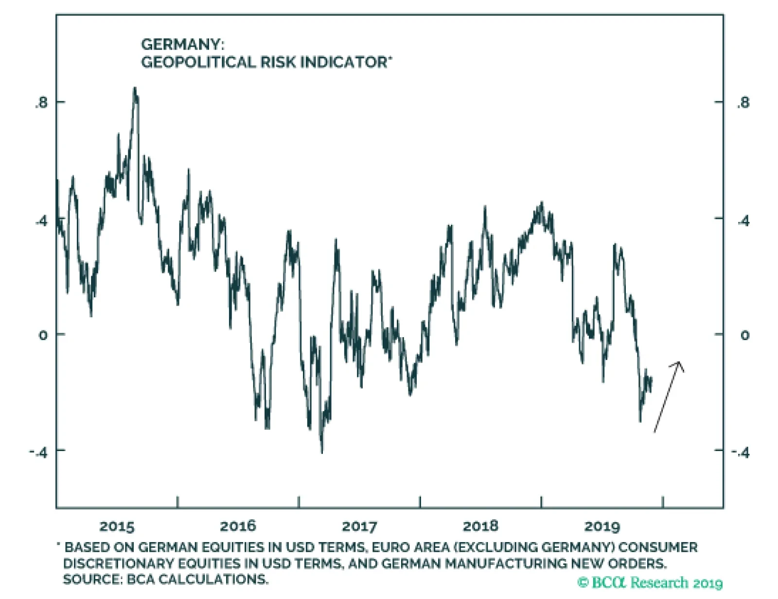
Germany is wading deeper into a period of political risk surrounding Chancellor Angela Merkel’s “lame duck” phase. The federal election of 2021 already looms large. Our indicator is only beginning to price this trend which can last for the next two years. …
Highlights The US-China trade talks will continue despite Hong Kong. The UK election will not reintroduce no-deal Brexit risk – either in the short run or the long run. European political risk is set to rise from low levels, but Euro Area break-up risk will not. There is no single thread uniting emerging market social unrest. We remain constructive on Brazil. Feature Chart 1Taiwan Indicator To Rise Despite Ceasefire
Taiwan Indicator To Rise Despite Ceasefire
Taiwan Indicator To Rise Despite Ceasefire
President Trump signed the Hong Kong Human Rights and Democracy Act into law on November 27. The signing was by now expected – Trump was not going to veto the bill and invite the Senate to override him with a 67-vote at a time when he is being impeached. He does not want to familiarize the Senate with voting against him in supermajorities. The Hong Kong bill will not wreck the US-China trade talks, but it is a clear example of our argument that strategic tensions will persist and cast doubt on the durability of the “phase one trade deal” being negotiated. It is better to think of it as a ceasefire, as Trump’s electoral constraint is the clear motivation. Trump is embattled at home and will contend an election in 11 months. He will not impose the tariff rate hike scheduled for December 15. A relapse into trade war would kill the green shoots in US and global growth, which partly stem from the perception of easing trade risk. Only if Trump’s approval rating collapses, or China stops cooperating, will he become insensitive to his electoral constraint. Will China abandon the talks and leave Trump in the lurch? This is not our base case but it is a major global risk. So far China is reciprocating. Xi Jinping’s political and financial crackdown at home, combined with the trade war abroad, has led to an economic slowdown and an explosion in China’s policy uncertainty relative to America’s. A trade ceasefire – on top of fiscal easing – is a way to improve the economy without engaging in another credit splurge. The US and China will continue moving toward a trade ceasefire, despite the Hong Kong bill. The move toward a trade ceasefire will probably keep our China GeoRisk Indicator from rising sharply over the next few months. However, our Taiwan indicator, which we have used as a trade war proxy at times, may diverge as it starts pricing in the heightened political risk surrounding Taiwan’s presidential election on January 11, 2020 (Chart 1). Sanctions, tech controls, Hong Kong, Taiwan, North Korea, Iran, the South China Sea, and Xinjiang are all strategic tensions that can flare up. Yes, uncertainty will fall and sentiment will improve on a ceasefire, but only up to a point. China’s domestic policy decisions are ultimately more important than its handling of the trade war. At the upcoming Central Economic Work Conference authorities are expected to stay focused on “deepening supply-side structural reform” and avoiding the use of “irrigation-style” stimulus (blowout credit growth). But this does not mean they will not add more stimulus. Since the third quarter, a more broad-based easing of financial controls and industry regulations is apparent, leading our China Investment Strategy to expect a turning point in the Chinese economy in early 2020. This “China view” – on stimulus and trade – is critical to the outlook for the two regions on which we focus for the rest of this report: Europe and emerging markets. Assuming that China stabilizes, these are the regions where risk assets stand to benefit the most. Europe is a political opportunity; the picture in emerging markets is, as always, mixed. United Kingdom: Will Santa Bring A Lump Of Coal? The Brits will hold their first winter election since 1974 on December 12. Prime Minister Boris Johnson’s Conservative Party has seen a tremendous rally in opinion polls, although it has stalled at a level comparable to its peak ahead of the last election in June 2017 (Chart 2). Another hung parliament or weak Tory coalition is possible. Yet the Tories are better positioned this time given that the opposition Labour Party is less popular than two years ago, while the Liberal Democrats are more capable of stealing Labour votes. The Tories stand to lose in Scotland, but the Brexit Party of Nigel Farage is not contesting seats with them and is thus undercutting Labour in certain Brexit-leaning constituencies. Markets would enjoy a brief relief rally on a single-party Tory majority. This would enable Johnson to get his withdrawal deal over the line and take the UK out of the EU in an orderly manner by January 31. The question would then shift to whether Johnson feels overconfident in negotiating the post-Brexit trade agreement with the EU, which is supposed to be done by December 31, 2020. This date will become the new deadline for tariff increases, but it can be extended. Johnson is as unlikely to fly off the cliff edge next year as he was this year, and this year he demurred. Negotiating a trade agreement is easier when the two economies are already integrated, have a clear (yet flexible) deadline, and face exogenous economic risks. Our political risk indicator will rise but it will not revisit the highs of 2018-19 (Chart 3). The pound’s floor is higher than it was prior to September 2019. Chart 2Tories Look To Be Better Positioned For A Single Party Majority
Tories Look To Be Better Positioned For A Single Party Majority
Tories Look To Be Better Positioned For A Single Party Majority
Chart 3UK Risk Will Rise, But Not To Previous Highs
UK Risk Will Rise, But Not To Previous Highs
UK Risk Will Rise, But Not To Previous Highs
Bottom Line: A hung parliament is the only situation where a no-deal Brexit risk reemerges in advance of the new Brexit day of January 31. The market is underestimating this outcome based on our risk indicator. But Johnson himself prefers the deal he negotiated and wishes to avoid the recession that would likely ensue from crashing out of the EU. And a headless parliament can prevent Johnson from forcing a no-deal exit, as investors witnessed this fall. We remain long GBP-JPY. Germany: The Risk Of An Early Election Germany is wading deeper into a period of political risk surrounding Chancellor Angela Merkel’s “lame duck” phase, doubts over her chosen successor, and uncertainty about Germany’s future in the world. The federal election of 2021 already looms large. Our indicator is only beginning to price this trend which can last for the next two years (Chart 4). On October 27 Germany’s main centrist parties suffered a crushing defeat in the state election of Thuringia. For the first time, the Christian Democratic Union (CDU) not only lost its leadership position, but also secured less vote share than both the Left Party and the right-wing Alternative für Deutschland (AfD) (Chart 5, top panel). Chart 4Germany Is Heading Toward A Period Of Greater Political Risk
Germany Is Heading Toward A Period Of Greater Political Risk
Germany Is Heading Toward A Period Of Greater Political Risk
The AfD successfully positioned itself with the right wing of the electorate and managed to capture more undecided voters than any other party (Chart 5, bottom panel). Chart 5The Right-Wing AfD Outperformed In Thuringia …
Global Unrest And A Christmas Election – GeoRisk Update: November 29, 2019
Global Unrest And A Christmas Election – GeoRisk Update: November 29, 2019
While the rise of the AfD (and its outperformance over its national polling) may seem alarming, Germany is not being taken over by Euroskeptics. Both support for the euro and German feeling of being “European” is near all-time highs (Chart 6). The question is how the centrist parties respond. Merkel’s approval rating is at its lower range. Support for Annegret Kramp-Karrenbauer (AKK), Merkel’s chosen successor, is plummeting (Chart 7). Since AKK was confirmed as party chief, the CDU suffered big losses in the European Parliament election and in state elections. Several of her foreign policy initiatives were not well received in the party.1 In October 2019, the CDU youth wing openly rejected her nomination as Merkel’s successor. At the annual CDU party conference on November 22-23, she only narrowly managed to avoid rebellion. She is walking on thin ice and will need to recover her approval ratings if she wants to secure the chancellorship. Meanwhile the CDU will lose its united front, increasing Germany’s policy uncertainty. Chart 6... But Euroskeptics Will Not Take Over Germany
... But Euroskeptics Will Not Take Over Germany
... But Euroskeptics Will Not Take Over Germany
Germany’s other major party – the Social Democratic Party (SPD) – is also going through a leadership struggle. Chart 7The CDU Party Leader Is Walking On Thin Ice
The CDU Party Leader Is Walking On Thin Ice
The CDU Party Leader Is Walking On Thin Ice
Chart 8A Return To The Polls Would Result In A CDU-Green Coalition
Global Unrest And A Christmas Election – GeoRisk Update: November 29, 2019
Global Unrest And A Christmas Election – GeoRisk Update: November 29, 2019
In the first round of the leadership vote, Finance Minister Olaf Scholz and Klara Geywitz (member of the Brandenburg Landtag) secured a small plurality of votes with 22.7%, just 1.6% more than Bundestag member Saskia Esken and Norbert Walter-Borjans (finance minister of North Rhine-Westphalia from 2010-17). The latest polling, and Scholz’s backing by the establishment, implies that he will win but this is uncertain. The results of the second round will be published on November 30, after we go to press. What does the SPD’s leadership contest mean for the CDU-SPD coalition? More likely than not, the status quo will continue. Scholz is an establishment candidate and supports remaining in the ruling coalition until 2021. Esken is calling for the SPD to leave the coalition, but Walter-Borjans has not explicitly supported this. An SPD exit from the Grand Coalition would likely lead to a snap election, not a favorable outcome for stability-loving Germans. A return to the polls would benefit the Greens and AfD at the expense of the mainstream parties, and would likely see a CDU-Green coalition emerge (Chart 8). Given that a majority of voters want the SPD to remain in government (Chart 9), and that new elections would damage the SPD’s prospects, we believe that the SPD is likely to stay in government until 2021, even if the less established Esken and Walter-Borjans win. The risk is the uncertainty around Merkel’s exit. October 2021 is a long time for Merkel to drag the coalition along, so the odds of an early election are probably higher than expected. Chart 9Germans Prefer The SPD Remains In Government
Global Unrest And A Christmas Election – GeoRisk Update: November 29, 2019
Global Unrest And A Christmas Election – GeoRisk Update: November 29, 2019
Chart 10Climate Spending Closest Germany Gets To Fiscal Stimulus (For Now)
Global Unrest And A Christmas Election – GeoRisk Update: November 29, 2019
Global Unrest And A Christmas Election – GeoRisk Update: November 29, 2019
Chart 11There Is Room For More Fiscal Stimulus In Germany, If Needed
There Is Room For More Fiscal Stimulus In Germany, If Needed
There Is Room For More Fiscal Stimulus In Germany, If Needed
What would a Scholz win mean for the great debate over whether Germany will step up its fiscal policy? If the establishment duo wins the SPD leadership, the Grand Coalition remains in place, and the economy does not relapse, we are unlikely to see additional fiscal stimulus in the near future. Scholz argues that additional stimulus would not be productive, as the slowdown is due to external factors (i.e. trade war).2 The recently released Climate Action Program 2030 is the closest to fiscal stimulus that we will see. This package will deliver additional spending worth 9bn euro in 2020 and 54bn euro until 2023 (Chart 10). We are unlikely to see additional fiscal stimulus from Germany in the near future. Bottom Line: Germany is wading into a period of rising political uncertainty. In the event of a downward surprise in growth, there is room to add more fiscal stimulus (Chart 11). But there is no change in fiscal policy in the meantime, e.g. no positive surprise. France: Macron Takes Center Stage While Merkel exits, President Emmanuel Macron continues to position himself as Europe’s leader – with a vision for European integration, reform, and political centrism. But in the near term he will remain tied down with his ambitious domestic agenda. France is trudging down the path of fiscal consolidation. After exiting the Excessive Deficit Procedure in 2018, and decreasing real government expenditures by 0.3% of GDP, France’s budget deficit is forecasted to decline further (Chart 12). Macron’s government is moving towards balancing its budget primarily by reducing government expenditures to finance tax cuts and decrease the deficit. Macron’s reform efforts following the Great National Debate – tax cuts for the middle class, bonus exemptions from income tax and social security contributions, and adjustment of pensions for inflation – have paid off.3 His approval rating is beginning to recover from the lows hit during the Yellow Vest protests (Chart 13). These reforms will be financed by lower government expenditures and reduced debt burden as a result of accommodative monetary policy. Chart 12Fiscal Consolidation In France
Global Unrest And A Christmas Election – GeoRisk Update: November 29, 2019
Global Unrest And A Christmas Election – GeoRisk Update: November 29, 2019
Chart 13Macron's Reform Efforts Have Paid Off
Macron's Reform Efforts Have Paid Off
Macron's Reform Efforts Have Paid Off
Overall, France has proven to a very resilient country in light of a general economic slowdown (Chart 14, top panel). Business investment and foreign direct investment, propped up by gradual cuts in the corporate income tax rate, have remained steady, and confidence remains strong (Chart 14, bottom panels). France is consumer driven and hence somewhat protected from storms in global trade. Chart 14French Economy Resilient Despite Global Slowdown
French Economy Resilient Despite Global Slowdown
French Economy Resilient Despite Global Slowdown
Chart 15Ongoing Strikes Will Register In French Risk Indicator
Ongoing Strikes Will Register In French Risk Indicator
Ongoing Strikes Will Register In French Risk Indicator
Bottom Line: France stands out for remaining generally stable despite pursuing structural reforms. Strikes and opposition to reforms will continue, and will register in our risk indicator (Chart 15), but it is Germany where global trends threaten the growth model and political trends threaten greater uncertainty. On the fiscal front France is consolidating rather than stimulating. Italy: Muddling Through This fall’s budget talks caused very little political trouble, as expected. The new Finance Minister Roberto Gualtieri is an establishment Democratic Party figure and will not seek excessive conflict with Brussels over fiscal policy. Italy’s budget deficit is projected to stay flat over 2019 and 2020. The key development since the mid-year budget revision was the repeal of the Value Added Tax hike scheduled for 2020, a repeal financed primarily by lower interest spending.4 Equity markets have celebrated Italy’s avoidance of political crisis this year with a 5.6% increase. Our own measure of geopolitical risk has dropped off sharply (Chart 16). But of course we expect it to rise next year given that Italy remains the weakest link in the Euro Area over the long run. The left-leaning alliance between the established Democratic Party and the anti-establishment Five Star Movement hurt both parties’ approval ratings. In fact, the only parties that have seen an increase in approval in the last month are the League, the far-right Brothers of Italy, and the new centrist party of former Prime Minister Matteo Renzi, Italia Viva (Chart 17). We expect to see cracks form next year, particularly over immigration, but mutual fear of a new election can motivate cooperation for a time. Chart 16Decline In Italian Risk Will Be Short Lived
Decline In Italian Risk Will Be Short Lived
Decline In Italian Risk Will Be Short Lived
Chart 17The M5S-PD Alliance Damaged Their Approval
The M5S-PD Alliance Damaged Their Approval
The M5S-PD Alliance Damaged Their Approval
Bottom Line: Italy’s new government is running orthodox fiscal policy, which means no boost to growth, but no clashing with Brussels either. Spain: Election Post Mortem Chart 18A Gridlocked Parliament In Spain
Global Unrest And A Christmas Election – GeoRisk Update: November 29, 2019
Global Unrest And A Christmas Election – GeoRisk Update: November 29, 2019
The Spanish election produced another gridlocked parliament, as expected, with no party gaining a majority and no clear coalition options. The Spanish Socialist Workers’ Party (PSOE) emerged as the clear leader but still lost three seats. The People’s Party recovered somewhat from its April 2019 defeat, gaining 23 seats. The biggest loser of the election was Ciudadanos, which lost 47 seats after its highly criticized shift to the right, forcing its leader Alberto Rivera to resign. The party’s seats were largely captured by the far-right Vox party, which won 15.1% of the popular vote and more than doubled its seats (Chart 18). Socialist leader Pedro Sanchez has arranged a preliminary governing agreement with Podemos leader Pablo Iglesias, but it is unstable. Even with Podemos, Sanchez falls far short of the 176 seats he needs to govern. In fact, there are only three possible scenarios in which the Socialists can reach the required 176 seats and none of these scenarios are easy to negotiate (Chart 19). The first – a coalition with the People’s Party – can already be ruled out. The other two require the support of the smaller pro-independence party, which will be difficult for Sanchez to secure, given that he hardened his stance on Catalonia in the days leading up to the election. Chart 19No Simple Way To A Majority Government
Global Unrest And A Christmas Election – GeoRisk Update: November 29, 2019
Global Unrest And A Christmas Election – GeoRisk Update: November 29, 2019
The next step for Sanchez is to be confirmed as prime minister in an “investiture” vote, likely on December 16.5 He would need 176 votes in the first round (or a simple majority in the second round) to gain the confidence of Congress. He looks to fall short (Chart 20).6 If he fails to be confirmed, Sanchez will have another two months to form a government or face the possibility of yet another election. Chart 20Sanchez Set To Fall Short In Investiture Vote
Global Unrest And A Christmas Election – GeoRisk Update: November 29, 2019
Global Unrest And A Christmas Election – GeoRisk Update: November 29, 2019
Spain’s indecision is leading to small conflicts with Brussels. Last week, the European Commission placed Spain under the preventative arm of the Stability and Growth Pact, stating that the country had not done enough to reach its medium-term budget objective.7 The European Commission’s outlook on Spain is slightly more pessimistic than that of the Spanish government (Chart 21). Deficit projections could worsen if a left-wing government takes power that includes the anti-austerity Podemos – which means that Spain is the only candidate for a substantial fiscal policy surprise. Chart 21A Fiscal Policy Surprise In Spain?
Global Unrest And A Christmas Election – GeoRisk Update: November 29, 2019
Global Unrest And A Christmas Election – GeoRisk Update: November 29, 2019
Chart 22Spanish Risk Will Keep Rising
Spanish Risk Will Keep Rising
Spanish Risk Will Keep Rising
We expect our Spanish risk indicator to keep rising (Chart 22). The silver lining is that Spain’s turmoil – like Germany’s – poses no systemic risk to the Euro Area. Spain could also see an increase in fiscal thrust. Stay long Italian government bonds and short Spanish bonos. Bottom Line: We remain tactically long Italian government bonds and short Spanish bonos. Italian bonds will sell off less in a risk-on phase and rally more in a risk-off phase, and relative political trends reinforce this trade. Emerging Markets: Global Unrest Civil unrest is unfolding across the world, grabbing the attention of the global news media (Chart 23). The proximate causes vary – ranging from corruption, inequality, governance, and austerity – but the fear of contagion is gaining ground. Chart 23Pickup In Civil Unrest Raising Fear Of Contagion
Global Unrest And A Christmas Election – GeoRisk Update: November 29, 2019
Global Unrest And A Christmas Election – GeoRisk Update: November 29, 2019
A country’s vulnerability to unrest can be gauged by two main factors: political voice and underlying economic conditions. • Political Voice: The Worldwide Governance Indicators, specifically voice and accountability, corruption, and rule of law, provide proxies for political participation (Chart 24). The aim is to assess whether there is a legitimate channel for discontent to lead to change. Countries with low rankings are especially at risk of experiencing unrest when the economy is unable to deliver. Chart 24Greater Risk Of Unrest Where Political Voice Is Absent
Global Unrest And A Christmas Election – GeoRisk Update: November 29, 2019
Global Unrest And A Christmas Election – GeoRisk Update: November 29, 2019
• Economic Conditions: Last year’s tightening monetary conditions, the manufacturing and trade slowdown, the US-China trade war, and a strong US dollar have weighed on global growth this year. This is challenging, especially for economies struggling to pick up the pace of growth (Chart 25). It translates to increased job insecurity, in some cases where insecurity is already rife (Chart 26). The likelihood that economic deterioration spurs widespread unrest depends on both the level and change in these variables. The former political factor is a structural condition that becomes more relevant when economic conditions deteriorate. Chart 25The Global Slowdown Weighed On Growth In Regions Already Struggling …
Global Unrest And A Christmas Election – GeoRisk Update: November 29, 2019
Global Unrest And A Christmas Election – GeoRisk Update: November 29, 2019
Chart 26… And Raise Job Insecurity
Global Unrest And A Christmas Election – GeoRisk Update: November 29, 2019
Global Unrest And A Christmas Election – GeoRisk Update: November 29, 2019
Chart 27Brazilian Risk Unlikely To Reach Previous Highs
Brazilian Risk Unlikely To Reach Previous Highs
Brazilian Risk Unlikely To Reach Previous Highs
BCA Research is optimistic on global growth as we enter the end game of this business cycle. Nevertheless risks to this view are elevated and emerging market economies are still reeling from the past year’s slowdown. This makes them especially sensitive to failures on the part of policymakers. As a result, policymakers will be more inclined to ease monetary and fiscal policy and less inclined to execute structural reforms. Brazil is a case in point. Our indicator is flagging a sharp rise in political risk (Chart 27). This reflects the recent breakdown in the real – which can go further as the finance ministry has signaled it is willing to depreciate to revive growth. Meanwhile the administration has postponed its proposals to overhaul the country’s public sector, including measures to freeze wages and reduce public sectors jobs. On the political front, President Jair Bolsonaro’s recent break from the Social Liberal Party and launch of a new party, the Alliance for Brazil, threatens to reduce his ability to get things done. This move comes at a time when Brazil’s political landscape is being shaken up by former president Luiz Inacio Lula da Silva’s release from jail, pending an appeal against his corruption conviction. The former leader of the Worker’s Party lost no time in vowing to revive Brazil’s left. Our risk indicator might overshoot due to currency policy, but we doubt that underlying domestic political instability will reach late-2015 and mid-2018 levels. Brazil has emerged from a deep recession, an epic corruption scandal, and an impeachment that led to the removal of former president Dilma Rousseff. It is not likely to see a crisis of similar stature so soon. Bolsonaro’s approval rating is the lowest of Brazil’s recent leaders, save Michel Temer, but it has not yet collapsed (Chart 28). An opinion poll held in October – prior to Lula’s release – indicates that Bolsonaro is favored to win in a scenario in which he goes head to head against Lula (Chart 29). Justice Minister Sergio Moro, who oversaw the corruption investigation, is the only candidate that would gain more votes when pitted against Bolsonaro. He is working with Bolsonaro at present and is an important pillar of the administration. So it is premature to pronounce Bolsonaro’s presidency finished. Chart 28Bolsonaro’s Approval, While Relatively Low, Has Not Collapsed
Global Unrest And A Christmas Election – GeoRisk Update: November 29, 2019
Global Unrest And A Christmas Election – GeoRisk Update: November 29, 2019
Chart 29Bolsonaro Not Yet Finished
Global Unrest And A Christmas Election – GeoRisk Update: November 29, 2019
Global Unrest And A Christmas Election – GeoRisk Update: November 29, 2019
The problem, as illustrated in Charts 25 and 26, is that Brazil still suffers from slow growth and an uninspiring job market – longstanding economic grievances. This will induce the administration to take a precautionary stance and slow the reform process. The result should be reflationary in the short run but negative for Brazil’s sustainability over the long run. There is still a positive path forward. Unlike the recently passed pension cuts and the public sector cuts that were just postponed – both of which zap entitlements from Brazilians – the other items on the reform agenda are less controversial. Privatization and tax reform are less politically onerous and will keep the government and economy on a positive trajectory. Meanwhile the pension cuts are unlikely to be a source of discontent as they will be phased in over 12-14 years. Thus, while the recent political events justify a higher level of risk, speculation regarding the likelihood of mass unrest in Brazil – apart from the mobilization of Worker’s Party supporters ahead of the municipal elections next fall – is overdone. Bottom Line: The growth environment in emerging markets is set to improve in 2020. US-China trade risk is falling and China will do at least enough stimulus to be stable. Moreover emerging markets will use monetary and fiscal tools to mitigate social unrest. This will not prevent unrest from continuing to flare. But not every country that has unrest is globally significant. Brazil is a major market that has recently emerged from extreme political turmoil, so a relapse is not our base case. Otherwise one should monitor Hong Kong’s impact on the trade deal, Russia’s internal stability, and the danger that Iranian and Iraqi unrest could cause oil supply disruptions. In the event that the global growth rebound does not materialize we expect Mexico and Thailand – which have better fundamentals – to outperform. Our long Thai equity relative trade is a strategic defensive trade. Matt Gertken Vice President Geopolitical Strategist mattg@bcaresearch.com Ekaterina Shtrevensky Research Analyst ekaterinas@bcaresearch.com Roukaya Ibrahim Editor/Strategist Geopolitical Strategy RoukayaI@bcaresearch.com Footnotes 1 Please see “Merkel’s Successor Splits German Coalition With Rogue Syria Plan,” dated October 22, 2019 and “Merkel's Own Party Wants Outright Huawei Ban From 5G Networks,” dated November 15, 2019, available at bloomberg.com. 2 Please see “Scholz Says No Need for German Stimulus After Dodging Recession,” dated November 14, 2019, available at bloomberg.com. 3 Please see “France: Draft Budgetary Plan For 2020,” dated October 15, 2019, available at ec.europa.eu. 4 Please see “Analysis of the Draft Budgetary Plan of Italy,” dated November 20, 2019, available at ec.europa.eu. 5 Please see “Investiture calendar | Can a government be formed before Christmas?” dated November 14, 2019, available at elpais.com. 6 If Sanchez convinces PNV, BNG, and Teruel Exists to vote in his favor for both rounds of the vote, he would need ERC and Eh Bildu to abstain in order to win. However, given that the PSOE has stated that it will not even negotiate with Eh Bildu, it is likely that this party will vote against Sanchez, giving the opposition 168 votes. In this case, Sanchez would not only need PNV, BNG, and Teruel in his favor, but also the support of either CC or ERC, both unlikely scenarios. 7 Please see “Commission Opinion on the Draft Budgetary Plan of Spain,” dated November 20, 2019, available at ec.europa.eu. Appendix Germany: GeoRisk Indicator
Germany: GeoRisk Indicator
Germany: GeoRisk Indicator
France: GeoRisk Indicator
France: GeoRisk Indicator
France: GeoRisk Indicator
Italy: GeoRisk Indicator
Italy: GeoRisk Indicator
Italy: GeoRisk Indicator
Spain: GeoRisk Indicator
Spain: GeoRisk Indicator
Spain: GeoRisk Indicator
UK: GeoRisk Indicator
UK: GeoRisk Indicator
UK: GeoRisk Indicator
Canada: GeoRisk Indicator
Canada: GeoRisk Indicator
Canada: GeoRisk Indicator
China: GeoRisk Indicator
China: GeoRisk Indicator
China: GeoRisk Indicator
Taiwan: GeoRisk Indicator
Taiwan: GeoRisk Indicator
Taiwan: GeoRisk Indicator
Korea: GeoRisk Indicator
Korea: GeoRisk Indicator
Korea: GeoRisk Indicator
Russia: GeoRisk Indicator
Russia: GeoRisk Indicator
Russia: GeoRisk Indicator
Brazil: GeoRisk Indicator
Brazil: GeoRisk Indicator
Brazil: GeoRisk Indicator
Turkey: GeoRisk Indicator
Turkey: GeoRisk Indicator
Turkey: GeoRisk Indicator
What's On The Geopolitical Radar?
Global Unrest And A Christmas Election – GeoRisk Update: November 29, 2019
Global Unrest And A Christmas Election – GeoRisk Update: November 29, 2019
Section III: Geopolitical Calendar
Highlights Net inflows into US assets have been rolling over since the beginning of 2019, given that the repatriation associated with the 2017 tax cuts was a one-off effect. Besides, fading interest rate differentials are making US Treasuries less attractive, which is a headwind for the greenback. A trade war ceasefire between the US and China should improve the balance of payments dynamics for export-oriented nations. We maintain a pro-cyclical stance. A revival in oil demand and curbs on supply should underpin oil prices through 2020, which could lift the trade balances of Norway and Canada. However, we expect the Canadian dollar to underperform, weighed by pipeline constraints and the divergence between WCS and WTI prices. Stay short CAD/NOK. Feature The balance of payments is one of the key indicators we watch on a regular basis to gauge the direction of exchange rates. While the power of BoP on currency moves differs from one country to another, it provides a big picture view of a country's transactions with other nations. Generally speaking, persistent surpluses are usually associated with appreciation in currencies, and vice versa. Ongoing trade disputes since early 2018 have caused some fluctuation in current account balances globally. Political uncertainties and rising protectionism have also limited foreign investments in some countries. Going forward, should global growth stabilize amid a possible trade détente, export-oriented regions will have more scope to improve their balance of payments dynamics. In what follows we present balance of payments across G10 through five categories: the trade balance, the current account balance, foreign direct investment, the basic balance, and lastly, portfolio investment. United States Chart 1US Balance Of Payments
US Balance Of Payments
US Balance Of Payments
The US trade deficit has been more or less flat, lingering around 3% of GDP. The trade deficit mostly comes from manufactured goods. On the positive side, the US has been producing and exporting more petroleum and related products, which has decreased oil demand from abroad. Meanwhile, exports of pharmaceutical products are on the rise. The current account is at a smaller deficit of 2.5% of GDP, thanks to a positive net international investment position. Foreign direct investment had been increasing due to repatriation by US companies since the 2017 Trump tax cuts. If this one-off tax break was a source of US dollar strength in 2018, that support is now gone. Meanwhile, dollar strength since the beginning of 2018 may have made US assets less attractive to foreign investors. Since the beginning of 2019, net inflows into US assets have been rolling over, and have fallen to 0.9% of GDP. This has brought the US basic balance down to -1.6% of GDP. In terms of portfolio investment, US bond markets are still appealing to foreign investors, but interest rate differentials are moving against the greenback. Total foreign purchases of US Treasury bonds have been negative this year, of which official purchases stand at US$350 billion of net outflows. In short, the path of least resistance for the US dollar is down, due to a widening current account deficit, waning foreign direct investment, fading interest rate differentials and increasing dollar liquidity. Euro Area Chart 2Euro Area Balance Of Payments
Euro Area Balance Of Payments
Euro Area Balance Of Payments
The slowdown in global trade has hit European exports, but the trade balance is still sporting a “healthy” surplus of 1.7% of GDP, albeit far below its peak. As a result, the current account as of September 2019 was still at a healthy level of 2.7% of GDP. Should a US-China "phase one" deal be finalized, the trade balance in the euro area is likely to rebound going into 2020. Foreign direct investment has been increasing to the point of being at its highest level over the past 20 years, or 1% of GDP. This has been aided in part by the peripheral countries, further evidence that we are getting a convergence in competitiveness across Eurozone countries. The cheap euro and lower cost of capital have helped. As a result, the basic balance for the euro area reached a new high of 3.8% of GDP in September 2019. Portfolio investment into the euro area has stopped deteriorating since the beginning of 2017 and is now sporting net inflows of 0.8% of GDP. European purchases of both foreign equities and foreign bonds are falling, probably a sign that domestic assets are becoming more attractive. For example, ETF inflows are accelerating. The restart of the European Central Bank’s asset purchase program will continue to act as an anchor for spread convergence in the euro area. Meanwhile, a rally in European equities will be another signal of recovery in the euro area. A healthy current account balance and improving foreign investments both signal a higher euro going forward. Japan Chart 3Japanese Balance Of Payments
Japanese Balance Of Payments
Japanese Balance Of Payments
The trade slowdown has dealt a small blow to Japan’s current account balance. The trade deficit widened further in 2019, reaching -0.5% of GDP in Q3. Exports have been falling for a 10th consecutive month, weighed down in part by lower sales of auto parts and semiconductor equipment. But these will pick up should a trade truce be reached. Among its major trading partners, sales to the US, China and other Asian countries have fallen, but have risen in the Middle East and Western Europe. That said, Japan’s large net international investment position has helped keep the current account surplus at an elevated level of 3.4% of GDP. Foreign direct investment in Japan has been dismal for many years due to an offshoring of industrial production. Net FDI is currently standing at -4% of GDP, which has brought the basic balance below zero for the first time since 2016. The recent deceleration is further evidence that corporate Japan needs structural reforms. Portfolio investment remains in negative territory mostly due to Japanese residents' large purchases of foreign long-term bonds. Going forward, fund inflows to Japan could face more headwinds with the proposed change to the Foreign Exchange and Foreign Trade Act. The change aims to lower the minimum stake for foreign investors without government approval from 10% to 1%. Other changes include requiring foreign directors to seek permission before becoming a board member. That said, Japan’s large net international investment position, which produces a high current account surplus, will continue to make the yen a safe haven amid global uncertainties. United Kingdom Chart 4UK Balance Of Payments
UK Balance Of Payments
UK Balance Of Payments
So far, a cheap pound has not yet staunched the deterioration in UK balance of payments. The UK trade deficit remained wide at 7% of GDP in the third quarter. Among its major trading partners, the trade deficit comes mainly from Germany and China, offset by a smaller surplus from the US, the Netherlands and Ireland. Net receipts are positive, but the current account balance is still in negative territory at -5% of GDP. The Brexit imbroglio has led to an exodus of foreign direct investment. Many international companies are fleeing the UK, but to the extent that we get a quick resolution after the December elections, the uncertainty is likely to subside. Portfolio investment in the UK has been volatile over the past few years and has not really helped dictate any discernable trend in the UK basic balance. More recently, inflows into UK gilts have been £19 billion in the second quarter, while flows into equities are also improving. Relative interest rate differentials are also likely to move in favor of the UK, especially if reduced uncertainty provides scope for the Bank of England to hike interest rates. At a minimum, compared with other European nations, gilts remain appealing to international investors. We remain positive on the pound and are long GBP/JPY in our portfolio. Canada Chart 5Canadian Balance Of Payments
Canadian Balance Of Payments
Canadian Balance Of Payments
The Canadian trade deficit has been hovering near -1% of GDP over the past few years. The goods trade deficit narrowed this year, led mostly by an increase in energy exports and lower imports of transportation equipment. Further improvement in energy product sales will require an improvement in pipeline capacity and a smaller gap between WCS and Brent crude oil prices. The current account deficit has been narrowing, now standing at -2% of GDP, the smallest since 2008. This is helped by net receipts, especially driven by a rise in direct investment income. FDI has been the bright spot in Canadian BoP dynamics. FDI inflows have been in part helped by increased cross- border M&A activities. Net FDI into Canada now accounts for 2.7% of GDP. This has brought the basic balance back above zero for the first time since 2015. Portfolio investment is positive on a net basis, but the trend looks quite worrisome. Foreign entities are fleeing Canada. In the meantime, Canadian investment in foreign securities is on the rise, reaching C$6 billion in Q3. Profitability, liquidity concerns and a global push towards sustainable investing are making Canadian energy and mining companies unappealing for foreign capital. Moreover, with elevated house prices and depressed interest rates, the outlook for banking profitability is also concerning. A drop in the US dollar will help the loonie in the short term. Over the longer term, however, we prefer to be underweight the Canadian dollar, especially via the Australian dollar and the Norwegian krone, which have a better macro outlook. Australia Chart 6Australian Balance Of Payments
Australian Balance Of Payments
Australian Balance Of Payments
Australia has seen the best balance of payments improvement among the G10. The Australian trade balance soared this year and now stands at 2.5% of GDP, the highest in several years. Terms of trade, which have increased by 45% since their 2016 bottom, have been one of the main drivers. Exports of iron ore and concentrates increased by 64% year-on-year in September 2019, adding to the positive trade balance. Ergo, Australia is benefitting from both a price and volume boost. Trade has lifted the current account to be on track to post its first surplus since the ‘70s. Going forward, we expect Australian trade to continue improving amid the US-China trade détente. Foreign direct investment dipped slightly in 2019, but from very elevated levels. At present, it still stands at 3.5% of GDP. This has allowed for a very healthy basic balance surplus of 2.9% of GDP. The largest sources of Australian foreign direct investment are the US and the UK. The FDI inflows tend to be concentrated in the mining and manufacturing sectors and generate a negative income balance for Australia. This has been part of the reason behind the country’s chronic current account deficit, but it is impressively becoming less and less important. Portfolio investment in Australia plunged in 2019, and now stands at -4.2% of GDP. This has been driven by an exodus from the bond market. The repatriation of capital back to the US probably helped exacerbate this trend. The Australian dollar is likely to rebound from a contrarian perspective. We are playing Aussie dollar strength via the New Zealand and Canadian dollars. New Zealand Chart 7New Zealand Balance Of Payments
New Zealand Balance Of Payments
New Zealand Balance Of Payments
New Zealand is also benefitting from a terms-of-trade boost. The trade deficit marginally narrowed to -1.7% of GDP in the third quarter. Exports rose by 4% year-on-year in the third quarter, while imports rose by 3.6% year-on-year. Terms of trade increased in 2019, mainly driven by a rise in dairy and meat prices. It appears the pork crisis in China is benefitting New Zealand exports. As a result, the current account deficit narrowed slightly to 3.4% of GDP. Foreign direct investment in New Zealand rose sharply to 3.1% of GDP, partly driven by reinvestment in the banking sector. This almost brought the basic balance back into positive territory. If this trend continues, it will be the first time the basic balance is in positive territory in two decades. Portfolio investment in New Zealand has been deteriorating, with net outflows of $6.2 billion in the second quarter. This is almost 4% of GDP on an annualized basis. The withdrawal of equity and investment fund shares by foreign entities, as well as divestment of debt securities by the general government, are some of the reasons behind falling portfolio investment. In a nutshell, increased portfolio investment in New Zealand will be predicated on a terms-of-trade shock that boosts margin growth for agricultural exporters, or a policy shift that boosts domestic return on capital. We like the kiwi versus the dollar, but are underweight against its pro-cyclical peers, namely the Australian dollar and the Swedish krona. Switzerland Chart 8Swiss Balance Of Payments
Swiss Balance Of Payments
Swiss Balance Of Payments
The Swiss trade balance has been in a structural surplus, and hugely underpins the nation’s large current account surplus. The improvement this year, a rebound to 5.4% of GDP in the third quarter, is notable. The increase in exports has been partly driven by higher sales of chemical and pharmaceutical products, jewelry, and metals. Combined with income inflows from its large net international investment position, this has produced a current account balance of 10.7% of GDP. The slowdown in foreign direct investment has eased sharply from a record-low of -16% to -8% of GDP. Tax breaks from the US Jobs Act in 2017 allowed for favorable divestment of FDI in Switzerland and repatriation back to the US. This was a one-off that is now behind us, which explains why the basic balance is shifting back into surplus territory, to the tune of 2.5% of GDP. Portfolio investment has been gradually improving and now stands at 0.3% of GDP. Swiss paper and equities (which are defensive) have benefitted from increased safe-haven demand this year. The Swiss franc is likely to continue its slow structural appreciation in the years to come, interspersed with bouts of volatility. In the short-term, however, the Swiss National Bank is likely to use the currency to fight deflationary pressures. This suggests the EUR/CHF has upside tactically. Sweden Chart 9Swedish Balance Of Payments
Swedish Balance Of Payments
Swedish Balance Of Payments
The Swedish trade balance has been in structural decline since 2004 and turned negative in 2016. A large component of Swedish exports are machinery and automobiles which have suffered stiff competition from other global giants. The good news is that the weak krona is starting to help. The third-quarter trade balance shifted to a surplus for the first time since 2016 and is currently standing at 0.2% of GDP. Combined with inflows from Sweden’s external investments, this has nudged the current account balance to 3.3% of GDP. Despite net FDI inflows falling to -2.1% of GDP, the basic balance still managed to remain stable at 1.2% of GDP due to the improvement in the current account balance. The recent decline in Swedish FDI has mirrored those in other countries. However, Swedish exports will benefit from a trade détente as well as from a broader improvement in global growth. This should stem FDI outflows. Net portfolio investment in Sweden has been volatile in recent years, but our expectation is for improvement. A weak krona has typically helped the manufacturing sector with a lag of 12 months. Moreover, with the krona trading at a large discount to its long-term fair value, foreign investors will likely benefit from both equity and currency returns, should cyclical stocks continue to outperform defensives. In summary, Sweden’s basic balance should recover to levels that have prevailed over the past few years. Norway Chart 10Norwegian Balance Of Payments
Norwegian Balance Of Payments
Norwegian Balance Of Payments
The bottom in oil prices since 2016 has gone a long way towards improving Norway’s trade balance. Net trade has fallen marginally this year due to lower exports of oil and natural gas, but still stands at 7.2% of GDP. The trade balance is the primary driver of the current account balance, and the latter now stands at 6.4% of GDP. Norway has seen an exodus of foreign capital from both direct and portfolio investment. Net FDI and portfolio investment stand at -3% and -4% of GDP, respectively. Declining oil production in the North Sea has been partly responsible for falling FDI. On the portfolio side of the equation, it has been mainly due to increased purchases of foreign equities and bonds, especially via the Oil Fund. Concerns around sustainable investing have also likely diverted investors away from Norwegian assets. Despite this, Norway still sports a basic balance surplus of 3.4% of GDP. Eventually, this basic balance will move from being supported by trade to income inflows from Norway’s large net international investment position. The Norwegian krone is cheap on many metrics, and is one of our favorite petrocurrencies at the moment. Should global growth stabilize, which will revive oil demand, inflows into Norway should improve. Kelly Zhong Research Analyst kellyz@bcaresearch.com Chester Ntonifor Foreign Exchange Strategist chestern@bcaresearch.com Footnotes Trades & Forecasts Forecast Summary Core Portfolio Tactical Trades Limit Orders Closed Trades
Highlights Global High-Yield: The widening of US Caa-rated high-yield spreads is narrowly focused in Energy-related companies. The conditions for a spillover into the broader junk bond market (tight monetary policy, tightening lending standards & deteriorating corporate health) are not currently in place. Stay overweight high-yield in both the US and euro area, where Caa-rated spreads have also widened. Australia: A sluggish economy and soggy inflation, with little evidence of an imminent turnaround, imply that the Reserve Bank of Australia may not be done with its rate cutting cycle. Maintain an overweight stance on Australian sovereign debt relative to global benchmarks. Feature There’s Nothing To “Caa” Here The clouds of pessimism on global growth, and financial markets, continue to slowly dissipate. The global manufacturing PMI has clearly bottomed, our rising global leading economic indicator is signaling more upside for the first half of 2020, equity markets worldwide are grinding higher, volatility is subdued, while corporate credit spreads in the US and Europe remain generally tight. Yet within the corporate bond market, a peculiar dynamic has emerged. We do not see a reason to extrapolate the weakness in lower-rated US junk bonds into a broader macro issue for the corporate bond market, and the US economy. The option-adjusted spread (OAS) for the overall Bloomberg Barclays US high-yield (HY) index now sits at 376bps. While this spread is relatively narrow from a longer-term perspective, investors may have become more discerning about credit risk. Lower-rated HY has dramatically underperformed higher-rated HY debt of late, with the US Caa-rated OAS now sitting at 985bps compared to Ba-rated spreads of 196bps (Chart of the Week). The divergence across credit tiers is unprecedented, in that Caa spreads are widening while Ba spreads are narrowing – typically, spreads move in tandem directionally, both in bull and bear markets for US junk bonds. The widening of US Caa-rated junk bond spreads has started to raise concerns that this is a “canary in the coal mine” signaling future financial stress among US corporate borrowers. Yet the same dynamic is occurring in euro area HY, with Caa-rated and Ba-rated spreads tracking the US on an almost tick-for-tick basis. In a report published yesterday, our colleagues at BCA Research US Bond Strategy investigated the history of Caa spread widenings dating back to 1996.1 They noted that Caa spread widening has typically been a good predictor of one-year-ahead negative excess returns for the overall US junk bond index. However, there has never been a period like today where Caa spreads have widened while overall HY spreads have remained stable. Chart of the WeekSome Odd Divergences In Global Credit
Some Odd Divergences In Global Credit
Some Odd Divergences In Global Credit
We do not see a reason to extrapolate the weakness in lower-rated US junk bonds into a broader macro issue for the corporate bond market, and the US economy, for two main reasons: Chart 2Lower Energy Prices Hurt Lower Rated US HY
Lower Energy Prices Hurt Lower Rated US HY
Lower Energy Prices Hurt Lower Rated US HY
1) The widening is focused on Energy related debt The widening of US Caa-rated spreads in 2019 has occurred alongside a parallel increase in the spreads of Energy-related companies in the US junk bond universe (Chart 2). A similar trend played out during the 2014/15 HY bear phase, which was triggered by the collapse of world oil prices that ravaged the US shale oil industry which dominated the lower-rated tiers of the junk bond market. In 2019, oil prices have declined, although not as dramatically, and HY Energy spreads have widened but to nowhere near the levels seen five years ago. More importantly, non-Energy junk spreads remain very subdued and stable, unlike the case in 2014/15 (bottom panel). When looking at the 2019 year-to-date excess returns for the Bloomberg Barclays US HY index, it is clear that the overall negative returns for the Caa-rated bucket have been driven by the lagging performance of Energy names (Chart 3). The rest of the market has generally been delivering solid excess returns. Chart 3Contribution To 2019 YTD US HY Excess Returns*
The Lowdown On Low-Rated High-Yield
The Lowdown On Low-Rated High-Yield
2) The widening has not been confirmed by signals from other reliable credit cycle indicators We believe that, from a top-down macro perspective, corporate credit performance in the US is influenced by three main factors: the state of US corporate health, the stance of the Fed’s monetary policy and the trend in lending standards for US banks. We have dubbed this our “Credit Checklist”, and we present a version of that checklist for US high-yield in Chart 4. Chart 4Conditions Not In Place For A Broad US HY Selloff
Conditions Not In Place For A Broad US HY Selloff
Conditions Not In Place For A Broad US HY Selloff
Our “bottom-up” US HY Corporate Health Monitor (CHM) aggregates, for a sample set of US HY issuers, published financial ratios that are typically used to determine the creditworthiness of borrowers – measures like interest coverage, operating margins and leverage. The US HY CHM is currently at a “neutral” reading (2nd panel), unlike past periods where Caa-rated spreads widened sharply: during the early 2000s telecom bust, the 2008 Financial Crisis and the 2014/15 collapse in oil prices. The readings for the three components of our US HY Credit Checklist are all at neutral levels, suggesting that there is no fundamental underpinning at the moment for a sustained increase in US HY spreads. Yet another reason why the latest widening of Caa-rated spreads looks unusual. Turning to measures of the stance of US monetary policy, we look at both the slope of the US Treasury curve (2-year vs 10-year) and the gap between the real fed funds rate and the New York Fed’s estimate of the neutral “r-star” rate. Prior to the early 2000s and 2008 blowout in Caa spreads, the Fed had pushed the real funds rate into restrictive territory above r-star, and the Treasury curve subsequently inverted. That was not the case during the 2014/15 Caa widening, as the Fed was only beginning to transition away from its QE/zero-rate era at that time. Currently, the real funds rate is right at r-star, and the Treasury curve is very flat but not inverted, indicating a broadly neutral monetary policy stance. Finally, we look at data from the Fed’s Senior Loan Officer Survey to evaluate lending standards for US banks. On that front, the latest reading on standards for commercial and industrial loans showed a very modest tightening in the third quarter of 2019, but the overall level remains broadly neutral – unlike the sharp tightening of conditions seen in the early 2000s and 2008 (and the modest tightening in 2014/15). The readings for the three components of our US HY Credit Checklist are all at neutral levels, suggesting that there is no fundamental underpinning at the moment for a sustained increase in US HY spreads. Yet another reason why the latest widening of Caa-rated spreads looks unusual, rather than a sign of future stress in US credit markets. We even see a similar dynamic at work in the euro area. In Chart 5, we present a Credit Checklist for euro area HY, using the same indicators that go into our US HY Credit Checklist. The readings here are even more positive for corporate credit performance than in the US. Our euro area bottom-up HY CHM is showing no deterioration of euro area corporate health, the real ECB policy rate is well below the estimate of r-star, the German yield curve is not inverted and the ECB’s survey of euro area bank lending standards showed a modest easing in the third quarter. Just like in the US, the fundamental backdrop does not argue for a sustained period of euro area HY spread widening, making the latest move higher in euro area Caa spreads as unusual as the move in US Caa. We cannot even blame lower oil prices for the spread widening, as Energy represents only a tiny fraction of the euro area HY market, compared to the large weighting of Energy borrowers in the US junk bond universe. Chart 5Conditions Not In Place For A Broad European HY Selloff
Conditions Not In Place For A Broad European HY Selloff
Conditions Not In Place For A Broad European HY Selloff
We suspect that the correlation between US and euro area HY spreads, by credit tier, has more to do with the increased correlation of trading within global credit markets. Or perhaps it is a sign of investors staying cautious and staying up in quality, even within the riskier HY market. Whatever the reason, we see little fundamental reason to expect the widening of Caa-rated spreads to leak into the broader high-yield market. In fact, if oil prices begin to move higher again, as our commodity strategists are expecting for 2020, that might create a tactical buying opportunity in Caa-rated junk bonds in both the US and euro area. In the meantime, we see no reason to change our recommended overweight stance on US and euro area HY corporate bonds, even with the widening of lower-rated spreads. Bottom Line: The recent widening of US Caa-rated high-yield spreads is narrowly focused in Energy-related companies. The conditions for a spillover into the broader junk bond market (tight monetary policy, tightening lending standards & deteriorating corporate health) are not currently in place. Stay overweight high-yield in both the US and euro area, where Caa-rated spreads have also widened. Australia: The RBA May Not Be Done Yet The rally in Australian government bonds has been driven by the dovish policy response from the Reserve Bank of Australia (RBA) to weak economic growth and tepid inflation – a backdrop that is showing little sign of reversing quickly. We have maintained a recommended overweight investment stance on Australian government bonds since December 19, 2017. Since then, the yield on Bloomberg Barclays Australian Treasury index has declined by -140bps, sharply outperforming bonds in the other developed markets and ending Australia’s long-time status as a “high-yielding” developed economy bond market (Chart 6). The rally in Australian government bonds has been driven by the dovish policy response from the Reserve Bank of Australia (RBA) to weak economic growth and tepid inflation – a backdrop that is showing little sign of reversing quickly. The central bank has already cut interest rates by 75bps this year, taking the Cash Rate down to a record low of 0.75%. At the November 5th monetary policy meeting, the RBA held off on additional easing but still delivered what was perceived by the market to be a dovish surprise, emphasizing persistently below-target inflation and potential downside risks stemming from the housing market. The door was kept wide open for further rate cuts, if necessary. RBA Governor Philip Lowe has even discussed the possibility that the RBA may have to cut rates to the zero bound and start buying assets via quantitative easing to try and restore inflation back to the midpoint of the RBA’s 2-3% target band. Chart 6Australian Bonds Have Outperformed Sharply
Australian Bonds Have Outperformed Sharply
Australian Bonds Have Outperformed Sharply
The RBA’s dovishness is justified, given sluggish economic growth and tepid inflation. Real GDP growth slowed sharply in the first half of 2019 to a meager 1.4% on a year-over-year basis (Chart 7). Consumer sentiment and business confidence remain depressed, having both declined since the start of the year. The former is being hit by weak house prices and sub-par income growth, while the latter is suffering under the weight of weaker demand from Australia’s most important trade partner, China. In addition, persistent drought conditions in much of the country have pushed up food prices and brought down incomes related to the farming sector. Chart 7Sluggish Australian Domestic Demand
Sluggish Australian Domestic Demand
Sluggish Australian Domestic Demand
Chart 8From Boom To Bust In Australian Housing
From Boom To Bust In Australian Housing
From Boom To Bust In Australian Housing
A bellwether for the Australian economy, the housing market, has not fared much better (Chart 8). Building approvals for new dwelling units have fallen almost 20% since September of last year, while house prices in the major cities have been contracting since the fourth quarter of 2017. Responding to easy financial conditions in Australia and the rest of the world, the standard variable mortgage rate has now fallen to a 60-year low. It remains to be seen how quickly the housing market will turn around and when that, in turn, will lift dwelling investment, but the RBA cuts in 2019 should give a bit of a lift to Australian housing in 2020. As in other developed markets, trade uncertainty and fears of a recession have made Australian firms more hesitant to invest. Real private business investment is now falling in year-over-year terms, even with the boost to the terms of trade (and corporate profits) from the increase in prices for Australia’s most important commodities seen in 2019 (Chart 9). That impact may be starting to fade, however. The price for iron ore – a major Australian commodity export – has already fallen 28% from the 2019 peak. In addition, Chinese iron ore imports from Australia are contracting in year-over-terms, even with Chinese growth starting to show signs of stabilization in response to stimulus measures implemented earlier this year. Those is an ominous signal for Australian growth, given the massive swing in net exports seen this year. Chart 9Terms Of Trade Turning Negative For Australian Capex
Terms Of Trade Turning Negative For Australian Capex
Terms Of Trade Turning Negative For Australian Capex
Chart 10An Unsustainable Lift From Net Exports
An Unsustainable Lift From Net Exports
An Unsustainable Lift From Net Exports
Driven by the persistent depreciation of the Australian dollar, and supportive terms of trade, the Australian trade balance has reached its highest value as a percent of nominal GDP (3.7%) since 1959, when quarterly data began (Chart 10). The surge has come almost entirely from the export side, occurring alongside the boost to commodity prices that was concentrated in iron ore, and looks both unsustainable and unrepeatable on a rate-of-change basis. Slowing Australian economic momentum has also impacted the labor market. Employment growth is slowing and the unemployment rate has ticked up to 5.3% from a cyclical low of 5% in February 2019 (Chart 11). The so-called “underemployment rate”, is a much higher 8.5%, indicating that there is still ample slack in the Australian labor market as workers are working fewer hours than they wish (and are hence, “underemployed”). The underemployment rate is negatively correlated to wage growth, suggesting that the modest upturn in the latter seen since the end of 2016 is likely to cool off (bottom panel). Chart 11Some Softening In The Australian Labor Market
Some Softening In The Australian Labor Market
Some Softening In The Australian Labor Market
Chart 12Australian Inflation Remains Subdued
Australian Inflation Remains Subdued
Australian Inflation Remains Subdued
The RBA has already warned that wage growth expectations may have become anchored at a lower level given the anemic growth over the past several years. That mirrors the trend seen in overall price inflation. Headline CPI inflation was only 1.6% in the third quarter of 2019, as was the “trimmed mean” CPI inflation rate that is favored by the RBA. Both are below the bottom end of the RBA’s target range of 2-3%, as are survey-based expectations of short-term inflation (Chart 12). The previously mentioned drought conditions have put some upward pressure on overall inflation via grocery food prices, but that is expected to be transitory. With depressed house prices and ongoing issues with spare capacity in the labor market, longer-term market-based inflation expectations, captured by the 5-year/5-year forward CPI swap rate, have dipped below the 2% level. The combination of weakening growth and soggy inflation poses a problem for the RBA, as it tries to use monetary policy tools to reverse those trends at a time when Australian banks have seen an unprecedented level of scrutiny of their lending practices. Australian banks have been under the harsh political spotlight after the government’s Royal Commission on misconduct in the financial industry released its findings back in February of this year. Many banks were exposed for serious violations, including money laundering and “improperly” selling financial products to households. Several top bank executives lost their jobs as a result, with the overall industry duly chastised and humbled. Australian banks remain well capitalized, following the path of most developed market banks in response to the Basel III reforms, while non-performing loans remain modest. Yet the risk moving forward is that Australian banks become more prudent in their lending practices after the public “flogging” they received this year, which may impair the transmission mechanism from low RBA policy rates to increased loan growth - and, eventually, faster economic activity. Already, private credit growth has slowed sharply, with the sharpest declines coming for housing and business lending (Chart 13). Investment implications for Australian bonds In the case of Australia, however, the underlying economy and inflation trends still point to a possibility that the RBA will have to ease again sometime in the next few months – a move that is unlikely to be matched in the other major developed markets. This likely means that Australian government bonds can continue to outperform in 2020. Despite signs that the global economy is starting to bottom out after the 2019 downturn, the momentum in Australian economic growth and inflation remains tepid. This suggests that Australian sovereign debt is likely to continue outperforming global peers on a relative basis over the next 6-12 months. Our RBA Monitor continues to signal that more interest rate cuts from the RBA are needed. Yet the Australian Overnight Index Swap (OIS) curve now discounts only 19bps of rate cuts over the next year (Chart 14). This mirrors the trend seen in other developed interest rate markets, as investors have shifted to pricing out the dovish policy expectations as global growth starts to improve. Chart 13Weakening Loan Demand, But No Credit Crunch
Weakening Loan Demand, But No Credit Crunch
Weakening Loan Demand, But No Credit Crunch
Chart 14Stay Overweight Australian Government Bonds
Stay Overweight Australian Government Bonds
Stay Overweight Australian Government Bonds
In the case of Australia, however, the underlying economy and inflation trends still point to a possibility that the RBA will have to ease again sometime in the next few months – a move that is unlikely to be matched in the other major developed markets. This likely means that Australian government bonds can continue to outperform in 2020. We advise staying strategically overweight Australian government bonds in global fixed income portfolios. Bottom Line: A sluggish economy and soggy inflation, with little evidence of an imminent turnaround, imply that the Reserve Bank of Australia may not be done with its rate cutting cycle. Maintain an overweight stance on Australian sovereign debt relative to global benchmarks. Robert Robis, CFA Chief Fixed Income Strategist rrobis@bcaresearch.com Shakti Sharma Research Associate ShaktiS@bcaresearch.com Footnotes 1 Please see BCA Research US Bond Strategy Weekly Report, “Caa-Rated Bonds: Warning Sign Or Buying Opportunity?”, dated November 26, 2019, available at usbs.bcaresearch.com. Recommendations The GFIS Recommended Portfolio Vs. The Custom Benchmark Index
The Lowdown On Low-Rated High-Yield
The Lowdown On Low-Rated High-Yield
Duration Regional Allocation Spread Product Tactical Trades Yields & Returns Global Bond Yields Historical Returns
Dear Client, In addition to this short weekly report, you will also receive our 2020 outlook, published by the Bank Credit Analyst. Next week, I will be on the road visiting clients in South Africa. I hope to report my discussions and findings the following week. Best regards, Chester Ntonifor Highlights According to a simple attractiveness framework, the most desirable currencies are the Norwegian krone, the Swedish krona, and the Japanese yen. The least attractive are the New Zealand dollar and the British pound. Take profits soon on our long GBP/JPY position. Feature In this report, we use a simple framework for ranking G10 currencies. First, we consider the macroeconomic environment using as proxies a country’s basic balance and external vulnerability. Next, we look at valuation metrics, surveying a variety of both short-term and longer-term models. Finally, we consider positioning, to gauge if our view is mainstream or out of consensus. Below are our results. Basic Balance Chart I-1Basic Balance
A Simple Attractiveness Ranking For Currencies
A Simple Attractiveness Ranking For Currencies
We consider the basic balance to be one of the most important concepts in determining the attractiveness of a currency. In a nutshell, it captures the ebb and flow of demand for a country’s domestic assets. Persistent basic balance surpluses are usually associated with an appreciating currency and vice versa. The euro area sports the best basic balance surplus in the G10 universe, followed by Norway and then Australia (Chart I-1). In simple terms, this means there is constant strong underlying demand for these currencies - either for domestic goods and services, or for investment into portfolio assets. The UK and the US rank the worst in terms of basic balances, driven by Brexit uncertainty and the ebbing of tax reform benefits in the US. We will explore balance of payments dynamics within all of the G10 countries in detail next week. External Debt A currency is sometimes only as vulnerable as its external liabilities. In an absolute sense, external debt as a share of GDP is highest in the UK, euro area, and Switzerland (Chart I-2). However, what matters most times for vulnerability are net external assets rather than gross liabilities. On this measure, Japan, Switzerland, and Norway are the most attractive countries, while the US and Australia rank the worst (Chart I-3). Chart I-2External Vulnerability
A Simple Attractiveness Ranking For Currencies
A Simple Attractiveness Ranking For Currencies
Chart I-3US Is Least Attractive
A Simple Attractiveness Ranking For Currencies
A Simple Attractiveness Ranking For Currencies
Purchasing Power Parity (PPP) Chart I-4PPP Model
A Simple Attractiveness Ranking For Currencies
A Simple Attractiveness Ranking For Currencies
Various models have shown PPP to be a very poor tool for managing currencies, but an excellent one at extremes. However, there is a roadblock that comes from measurement issues, since consumer price baskets tend to differ in composition from one country to the next. In order to get closer to an apples-to-apples comparison across countries, two adjustments are necessary. First, categorizing the consumer price index (CPI) into five major groups. In most cases, this breakdown captures 90% of the national CPI basket. This includes food, restaurants and hotels (1), shelter (2), health care (3), culture and recreation (4), and energy and transportation (5). The second adjustment is to run two regressions with the exchange rate as the dependent variable. The first regression (call it REG1) uses the relative price ratios of the five groups as independent variables. This allows us to observe the most influential price ratios that help explain variations in the exchange rate. The second regression (call it REG2) uses a weighted average combination of the five groups to form a synthetic relative price ratio. If, for example, shelter is 33% in the US CPI basket, but 19% in the Swedish CPI basket, relative shelter prices will represent 26% of the combined price ratio. This allows for a uniform cross-sectional comparison, as opposed to using the national CPI weights. The US dollar is overvalued, especially versus the Swedish krona, Japanese yen, and Norwegian krone. The results show the US dollar as overvalued, especially versus the Swedish krona, Japanese yen, and Norwegian krone. Commodity currencies are closer to fair value, and within the safe-haven complex, the Japanese yen is more attractive than the Swiss franc. The euro is less undervalued than implied by the overvaluation in the DXY index (Chart I-4). Intermediate-Term Timing Model (ITTM) Back in 2016, we developed a set of currency indicators to help global portfolio managers increase their Sharpe ratio in managing currency exposure. The idea was quite simple: For every developed world country, there were three key variables that influenced the near-term path of its exchange rate versus the US dollar. Our intermediate-term timing models are not sending any strong signals at the moment. Interest Rate Differentials: Under the lens of interest rate parity, if one country is expected to have lower interest rates versus another, the incumbent’s currency will fall today so as to gradually appreciate in the future and nullify the interest rate advantage. Chart I-5Intermediate-Term Model
A Simple Attractiveness Ranking For Currencies
A Simple Attractiveness Ranking For Currencies
Inflation Differentials: Assuming no transactional costs, the price of sandals cannot be relatively high and rising in Mumbai versus Auckland. Either the Indian rupee needs to fall, the kiwi rise, or a combination of the two has to occur to equalize prices across borders. Risk Factor: Exchange rates are not government bonds in that few treasury departments and central banks can guarantee a par value on them. Ergo, the ebb and flow of risk aversion will have an impact on the Norwegian krone as well as the yen. For the most part, our models have worked like a charm. On a risk-adjusted return basis, a dynamic hedging strategy based on our ITTMs has outperformed all static hedging strategies for all investors with six different home currencies since 2001. These results give us confidence to continue running these models as a sanity check for our ever-shifting currency biases. That said, our intermediate-term timing models are not sending any strong signals at the moment. The Swedish krona, Norwegian krone, and New Zealand dollar are the most attractive currencies, while the British pound and Swiss franc are the least attractive (Chart I-5). Long-Term Fair Value Model Chart I-6Long-Term Model
A Simple Attractiveness Ranking For Currencies
A Simple Attractiveness Ranking For Currencies
Our long-term FX models are also part of a set of technical tools we use to help us navigate FX markets. Included in these models are variables such as productivity differentials, terms-of-trade shocks, net international investment positions, real rate differentials, and proxies for global risk aversion. These models cover 22 currencies, incorporating both G10 and emerging market FX markets. The models are not designed to generate short- or intermediate-term forecasts. Instead, they reflect the economic drivers of a currency's equilibrium. Their main purpose is to provide information on the longevity of a currency cycle, depending on where we are in the economic cycle. Our long-term FX models are not sending any strong signals right now, with the US dollar at fair value. The cheapest currencies are the yen, the Norwegian krone, and Swedish krona (Chart I-6). The priciest currencies are the South African rand and the Saudi riyal. Real Interest Rates One defining feature of the currency landscape is that pretty much across the G10 countries, we have negative real rates (Chart I-7). Within the G10 universe, the US and New Zealand dollars are the highest-yielding currencies, while the British pound and Swedish krona are the least attractive. Chart I-7Real Rates
A Simple Attractiveness Ranking For Currencies
A Simple Attractiveness Ranking For Currencies
Speculative Positioning Being long Treasurys and the dollar has been a consensus trade for many years now (Chart I-8). According to CFTC data, this has been expressed mostly through the aussie and kiwi, although our bias is that the Swedish krona and Norwegian krone have been the real victims. Chart I-8Positioning
A Simple Attractiveness Ranking For Currencies
A Simple Attractiveness Ranking For Currencies
That said, flow data highlights just how precarious being long US dollars is right now. Net foreign purchases by private investors are still positive, but the momentum of these flows is clearly rolling over. This is being more than offset by official net outflows. As interest rate differentials have started moving against the US, so has foreign investor appetite for Treasury bonds. Concluding Thoughts Should the nascent pickup in global growth morph into a synchronized recovery, it will go a long way in further eroding the US’ yield advantage. More specifically, the currencies that have borne the brunt of the manufacturing slowdown should also experience the quickest reversals. For example, yields in Norway, Sweden, Switzerland, and Japan have risen by much more than those in the US since the bottom. The most attractive currencies are the Swedish krona, the Norwegian krone, and the Japanese yen. The least attractive are the British pound and New Zealand dollar. This is the message being sent by an aggregate of our ranking model. The most attractive currencies are the Swedish krona, the Norwegian krone, and the Japanese yen. The least attractive are the British pound and New Zealand dollar (Chart I-9). Take profits soon on our long GBP/JPY position. Chart I-9Favor Norway, Japan and Sweden
A Simple Attractiveness Ranking For Currencies
A Simple Attractiveness Ranking For Currencies
Chester Ntonifor Foreign Exchange Strategist chestern@bcaresearch.com Currencies U.S. Dollar Chart II-1USD Technicals 1
USD Technicals 1
USD Technicals 1
Chart II-2USD Technicals 2
USD Technicals 2
USD Technicals 2
Recent data in the US have been mixed: Retail sales grew by 0.3% year-on-year in October. Industrial production contracted by 0.8% month-on-month in October. On the housing market front, building permits and housing starts both increased by 5% and 3.8% month-on-month in October. However, MBA mortgage applications contracted by 2.2% for the week ended November 15th. The NY Empire State Manufacturing index fell to 2.9 from 4 in November. The Philly Fed manufacturing index, on the other hand, soared to 10.4 from 5.6 in November. The DXY index depreciated by 0.3% this week. The FOMC minutes released this Wednesday showed that the Fed now sees little need to further reduce rates. Last week, we did a reassessment of global growth and the USD, and entered a limit sell for the DXY index at 100. Report Links: Place A Limit Sell On DXY At 100 - November 15, 2019 Signposts For A Reversal In The Dollar Bull Market - November 1, 2019 On Money Velocity, EUR/USD And Silver - October 11, 2019 The Euro Chart II-3EUR Technicals 1
EUR Technicals 1
EUR Technicals 1
Chart II-4UR Technicals 2
EUR Technicals 2
EUR Technicals 2
Recent data in the euro area have been mostly positive: The seasonally-adjusted trade balance fell to €18.3 billion in September. The current account surplus slightly narrowed by €0.3 billion to €28.2 billion. Headline and core inflation were both unchanged at 1.1% and 0.7% year-on-year respectively in October. Consumer confidence improved from -7.6 in October to -7.2 in November. EUR/USD increased by 0.5% this week. The improvement in soft data confirms that the economy is in a bottoming process in the euro area. The fact that the largest economy, Germany, skirted a recession last week also boosted investor confidence. We continue to remain overweight the euro. Report Links: On Money Velocity, EUR/USD And Silver - October 11, 2019 A Few Trade Ideas - Sept. 27, 2019 Battle Of The Central Banks - June 21, 2019 Japanese Yen Chart II-5JPY Technicals 1
JPY Technicals 1
JPY Technicals 1
Chart II-6JPY Technicals 2
JPY Technicals 2
JPY Technicals 2
Recent data in Japan have been positive: Exports decreased by 9.2% year-on-year in October. Imports slumped by 14.8% year-on-year. The total trade balance shifted to a surplus of ¥17.3 billion. The industry activity index increased by 1.5% month-on-month in September. USD/JPY fell by 0.2% this week. While global growth is set to improve given a possible trade détente and easy monetary policy worldwide, uncertainties continue to loom. The US Senate unanimously passed legislation on the "Hong Kong Human Rights and Democracy Act," adding more difficulties to finalize the Phase I trade deal. Global trade uncertainty is positive for safe-haven demand. Report Links: Signposts For A Reversal In The Dollar Bull Market - November 1, 2019 A Few Trade Ideas - Sept. 27, 2019 Has The Currency Landscape Shifted? - August 16, 2019 British Pound Chart II-7GBP Technicals 1
GBP Technicals 1
GBP Technicals 1
Chart II-8GBP Technicals 2
GBP Technicals 2
GBP Technicals 2
Recent data in the UK have been positive: The Rightmove house price index increased by 0.3% year-on-year in November. Public sector net borrowing increased by £3 billion to £10.5 billion in October. The British pound continues to appreciate by 0.7% against the US dollar this week. With Brexit being less of a threat, the pound is poised to rise through next year. We are long GBP/JPY in our portfolio and it is in the money at 6.1%. Report Links: A Few Trade Ideas - Sept. 27, 2019 United Kingdon: Cyclical Slowdown Or Structural Malaise? - Sept. 20, 2019 Battle Of The Central Banks - June 21, 2019 Australian Dollar Chart II-9AUD Technicals 1
AUD Technicals 1
AUD Technicals 1
Chart II-10AUD Technicals 2
AUD Technicals 2
AUD Technicals 2
Recent data in Australia have been soft: The Westpac leading index fell by 0.1% month-on-month in October, following a slight decline the previous month. AUD/USD has been more or less flat this week. In the monetary policy minutes released this week, the RBA expressed their expectations for stronger growth at 2.75% in 2020 and around 3% in 2021, supported by accommodative monetary policy, infrastructure spending, stabilizing house prices, and strong steel-intensive activities in China. The minutes also presented an argument against lower interest rates: while lower interest rates can support the economy through the usual transmission channels, they could be negative for savers and confidence. That said, the RBA is "prepared to ease monetary policy further if needed." Report Links: A Contrarian View On The Australian Dollar - May 24, 2019 Beware Of Diminishing Marginal Returns - April 19, 2019 Not Out Of The Woods Yet - April 5, 2019 New Zealand Dollar Chart II-11NZD Technicals 1
NZD Technicals 1
NZD Technicals 1
Chart II-12NZD Technicals 2
NZD Technicals 2
NZD Technicals 2
Recent data in New Zealand have been positive: Both output and input components of the producer price index have increased in Q3: the output component grew by 1% quarter-on-quarter and input component by 0.9% quarter-on-quarter. NZD/USD increased by 0.7% this week. Both growth and inflation in New Zealand are showing signs that the economy is in a bottoming process. We are positive on the kiwi against the US dollar while we remain short against the Australian dollar and Swedish Krona. Report Links: Place A Limit Sell On DXY At 100 - November 15, 2019 USD/CNY And Market Turbulence - August 9, 2019 Where To Next For The US Dollar? - June 7, 2019 Canadian Dollar Chart II-13CAD Technicals 1
CAD Technicals 1
CAD Technicals 1
Chart II-14CAD Technicals 2
CAD Technicals 2
CAD Technicals 2
Recent data in Canada have been negative: Manufacturing shipments fell by 0.2% month-on-month in September. Both headline and core inflation were unchanged at 1.9% year-on-year in October. ADP employment showed a loss of 22.6K jobs in October. The Canadian dollar fell by 0.6% against the US dollar this week. While a possible trade détente between US and China and rising oil prices could put a floor under the loonie, the pipeline constraints in Canada have dampened the correlation between the oil prices and the loonie. This will limit the upside potential for the Canadian dollar. Report Links: Making Money With Petrocurrencies - November 8, 2019 Signposts For A Reversal In The Dollar Bull Market - November 1, 2019 Preserving Capital During Riot Points - September 6, 2019 Swiss Franc Chart II-15CHF Technicals 1
CHF Technicals 1
CHF Technicals 1
Chart II-16CHF Technicals 2
CHF Technicals 2
CHF Technicals 2
Recent data in Switzerland have been positive: The trade surplus narrowed to CHF 3.5 billion in October from CHF 4.1 billion the previous month, due primarily to growth in imports, which grew by 1.9 billion month-on-month. Exports also increased by 1.3 billion month-on-month. Import demand remains firm for chemical products. Industrial production grew by 8% year-on-year in Q3. USD/CHF increased by 0.2% this week. The trade balance still remains at a high level in Switzerland, which is bullish for the franc. Moreover, global uncertainties could underpin the safe-haven franc. Report Links: Notes On The SNB - October 4, 2019 What To Do About The Swiss Franc? - May 17, 2019 Beware Of Diminishing Marginal Returns - April 19, 2019 Norwegian Krone Chart II-17NOK Technicals 1
NOK Technicals 1
NOK Technicals 1
Chart II-18NOK Technicals 2
NOK Technicals 2
NOK Technicals 2
Recent data in Norway have been positive: The trade balance shifted to a surplus of NOK 5.9 billion in October, after a deficit of NOK 1.4 billion in September. However, this is compared to a surplus of NOK 32.6 billion in the same month last year. On a year-on-year basis, exports slumped by 27%, caused by a decrease in exports of mineral fuels and chemical products. The Norwegian krone appreciated by 0.3% against the US dollar this week, supported by the oil price recovery. On Wednesday, the EIA posted an increase of crude oil inventories by 1.4 million barrels from the previous week, lower than expectations. WTI crude oil prices thus surged by 4% on the news. Going forward, we remain overweight energy prices and the Norwegian krone. Report Links: Making Money With Petrocurrencies - November 8, 2019 A Few Trade Ideas - Sept. 27, 2019 Portfolio Tweaks Into Thin Summer Trading - July 5, 2019 Swedish Krona Chart II-19SEK Technicals 1
SEK Technicals 1
SEK Technicals 1
Chart II-20SEK Technicals 2
SEK Technicals 2
SEK Technicals 2
Recent data in Sweden have been positive: Capacity utilization increased to 0.5% in Q3, up from 0.1% in the previous quarter. The Swedish krona increased by 0.7% against the US dollar this week. The Swedish krona has depreciated by 23% against the USD since its 2018 peak. A global growth revival is likely to give a boost to the krona from a valuation perspective. Report Links: Where To Next For The US Dollar? - June 7, 2019 Balance Of Payments Across The G10 - February 15, 2019 A Simple Attractiveness Ranking For Currencies - February 8, 2019 Trades & Forecasts Forecast Summary Core Portfolio Tactical Trades Limit Orders Closed Trades