Euro Area
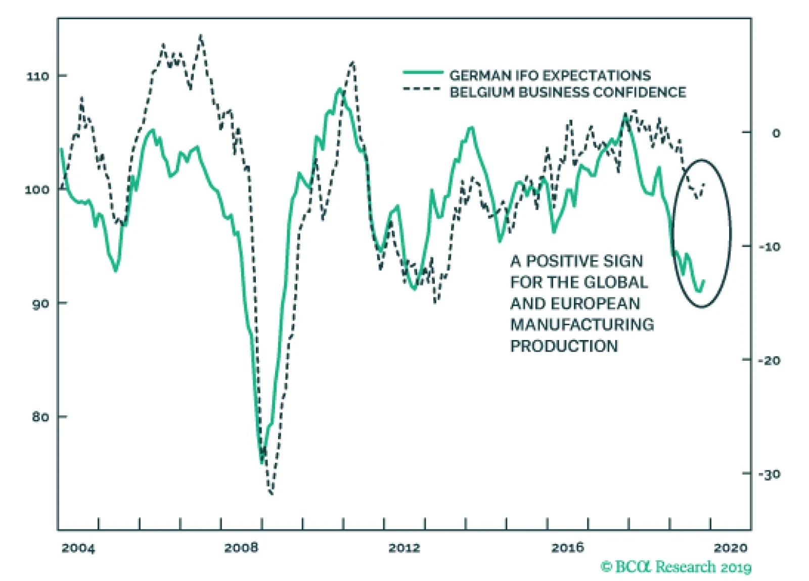
On the heels of yesterday’s disappointing German PMIs, the October Belgian Business Confidence and German IFO surveys will help alleviate fears towards the European economy. While the current assessment component of the IFO softened from 98.5 to 97.8, the…

Highlights The U.S. and China are moving toward formalizing a trade ceasefire that reduces geopolitical risk in the near term. The risk of a no-deal Brexit is finished – removing a major downside to European assets. Spanish elections reinforce our narrative of general European political stability. Go long 10-year Italian BTPs / short 10-year Spanish bonos for a trade. Geopolitical risks will remain elevated in Turkey, rise in Russia, but remain subdued in Brazil. A post-mortem of Canada’s election suggests upside to fiscal spending but further downside to energy sector investment over the short to medium term. Feature After a brief spike in trade war-related geopolitical risk just prior to the resumption of U.S.-China negotiations, President Trump staged a tactical retreat in the trade war. Chart 1Proxy For Trade War Shows Falling Risk
Proxy For Trade War Shows Falling Risk
Proxy For Trade War Shows Falling Risk
Negotiating in Washington, President Trump personally visited the top Chinese negotiator Liu He and the two sides announced an informal “phase one deal” to reverse the summer’s escalation in tensions: China will buy $40-$50 billion in U.S. agricultural goods while the U.S. will delay the October 15 tariff hike. More difficult issues – forced tech transfer, intellectual property theft, industrial subsidies – were punted to later. The RMB is up 0.7% and our own measures of trade war-related risk have dropped off sharply (Chart 1). We think these indicators will be confirmed and Trump’s retreat will continue – as long as he has a chance to save the 2020 economic outlook and his reelection campaign. Odds are low that Trump will be removed from office by a Republican-controlled senate – the looming election provides the republic with an obvious recourse for Trump’s alleged misdeeds. However, Trump’s approval rating is headed south. While it is around the same level as President Obama’s at this point in his first term, Obama’s started a steep and steady rise around now and ended above 50% for the election, a level that is difficult to foresee for Trump (Chart 2). So Trump desperately needs an economic boost and a policy victory to push up his numbers. Short of passing the USMCA, which is in the hands of the House Democrats, a deal with China is the only way to get a major economic and political win at the same time. Hence the odds of Presidents Trump and Xi actually signing some kind of agreement are the highest they have been since April (when we had them pegged at 50/50). Trump will have to delay the December 15 tariff hike and probably roll back some of the tariffs over next year as continuing talks “make progress,” though we doubt he will remove restrictions on tech companies like Huawei. Still, we strongly believe that what is coming is a détente rather than the conclusion of the Sino-American rivalry crowned with a Bilateral Trade Agreement. Strategic tensions are rising on a secular basis between the two countries. These tensions could still nix Trump’s flagrantly short-term deal-making, and they virtually ensure that some form of trade war will resume in 2021 or 2022, if indeed a ceasefire is maintained in 2020. Both sides are willing to reduce immediate economic pain but neither side wants to lose face politically. Trump will not forge a “grand compromise.” Our highest conviction view all along has been – and remains – that Trump will not forge a “grand compromise” ushering in a new period of U.S.-China economic reengagement in the medium or long term. China’s compliance, its implementation of structural changes, will be slow or lacking and difficult to verify at least until the 2020 verdict is in. This means policy uncertainty will linger and business confidence and capex intentions will only improve on the margin, not skyrocket upward (Chart 3). Chart 2Trump Needs A Policy Win And Economic Boost
How Much To Buy An American President? – GeoRisk Update: October 25, 2019
How Much To Buy An American President? – GeoRisk Update: October 25, 2019
Chart 3Sentiment Will Improve ... Somewhat
Sentiment Will Improve ... Somewhat
Sentiment Will Improve ... Somewhat
The problem for bullish investors is that even if global trade uncertainty falls, and the dollar’s strength eases, fear will shift from geopolitics to politics, and from international equities to American equities (Chart 4). Trump, hit by impeachment and an explosive reaction to his Syria policy, is entering into dangerous territory for the 2020 race. Trump’s domestic weakness threatens imminent equity volatility for two reasons. Chart 4American Outperformance Falls With Trade Tensions
bca.gps_wr_2019_10_25_c4
bca.gps_wr_2019_10_25_c4
Chart 5Democratic Win In 2020 Is Market-Negative
Democratic Win In 2020 Is Market-Negative
Democratic Win In 2020 Is Market-Negative
First, if Trump’s approval rating falls below today’s 42%, investors will begin pricing a Democratic victory in 2020, i.e. higher domestic policy uncertainty, higher taxes, and the re-regulation of the American economy (Chart 5). This re-rating may be temporarily delayed or mitigated by the fact that former Vice President Joe Biden is still leading the Democratic Party’s primary election race. Biden is a known quantity whose policies would simply restore the Obama-era status quo, which is only marginally market-negative. Contrary to our expectations Biden's polling has not broken down due to accusations of foul play in Ukraine and China. Nevertheless, Senator Elizabeth Warren will gradually suck votes away from fellow progressive Senator Bernie Sanders and in doing so remain neck-and-neck with Biden (Chart 6). When and if she pulls ahead of Biden, markets face a much greater negative catalyst. (Yes, she is also capable of beating Trump, especially if his polling remains as weak as it is.) Chart 6Warren Will Rise To Front-Runner Status With Biden
How Much To Buy An American President? – GeoRisk Update: October 25, 2019
How Much To Buy An American President? – GeoRisk Update: October 25, 2019
Second, if Trump becomes a “lame duck” he will eventually reverse the trade retreat above and turn into a loose cannon in his final months in office. Right now we see a decline in geopolitical risk, but if the economy fails to rebound or the China ceasefire offers little support, then Trump will at some point conclude that his only chance at reelection is to double down on his confrontation with America’s enemies and run as a “war president.” A cold war crisis with China, or a military confrontation with Iran (or North Korea, Venezuela, or some unexpected target) could occur. But since September we have been confirmed in believing that Trump is trying to be the dealmaker one last time before any shift to the war president. Bottom Line: The “phase one” trade deal is really just a short-term ceasefire. Assuming it is signed by Trump and Xi, it suggests no increase in tariffs and some tariff rollback next year. However, as recessionary fears fade, and if Trump’s reelection chances stabilize, U.S.-China tensions on a range of issues will revive – and there is no getting around the longer-term conflict between the two powers. For this and other reasons, we remain strategically short RMB-USD, as the flimsy ceasefire will only briefly see RMB appreciation. BoJo's Brexit Bluff Is Finished Our U.K. indicator captured a sharp decline in political risk in the past two weeks and our continental European indicators mirrored this move (Chart 7). The risk that the U.K. would fall out of the EU without a withdrawal agreement has collapsed even further than in September, when parliament rejected Prime Minister Boris Johnson’s no-deal gambit and we went long GBP-USD. We have since added a long GBP-JPY trade. Chart 7Collapse In No-Deal Risk Will Echo Across Europe
Collapse In No-Deal Risk Will Echo Across Europe
Collapse In No-Deal Risk Will Echo Across Europe
Chart 8Unlikely To See Another Tory/Brexit Rally Like This
Unlikely To See Another Tory/Brexit Rally Like This
Unlikely To See Another Tory/Brexit Rally Like This
The risk of “no deal” is the only reason to care about Brexit from a macro point of view, as the difference between “soft Brexit” and “no Brexit” is not globally relevant. What matters is the threat of a supply-side shock to Europe when it is already on the verge of recession. With this risk removed, sentiment can begin to recover (and Trump’s trade retreat also confirms our base case that he will not impose tariffs on European cars on November 14). Since Brexit was the only major remaining European political risk, European policy uncertainty will continue to fall. The Halloween deadline was averted because the EU, on the brink of recession, offered a surprising concession to Johnson, enabling him to agree to a deal and put it up for a vote in parliament. The deal consists of keeping Northern Ireland in the European Customs Union but not the whole of the U.K., effectively drawing a new soft border at the Irish Sea. The bill passed the second reading but parliament paused before finalizing it, rejecting Johnson’s rapid three-day time table. The takeaway is that even if an impending election returns Johnson to power, he will seek to pass his deal rather than pull the U.K. out without a deal. This further lowers the odds of a no-deal Brexit as it illuminates Johnson's preferences, which are normally hidden from objective analysis. True, there is a chance that the no-deal option will reemerge if Johnson’s deal totally collapses due to parliamentary amendments, or if the U.K. and EU have failed to agree to a future relationship by the end of the transition period on December 31, 2020 (which can be extended until the end of 2022). However, the chance is well below the 30% which we deemed as the peak risk of no-deal back in August. Johnson created the most credible threat of a no-deal exit that we are likely to see in our lifetimes – a government with authority over foreign policy determined to execute the outcome of a popular referendum – and yet parliament stopped it dead in its tracks. Johnson does not want a no-deal recession and his successors will not want one either. After all, the support for Brexit and for the Tories has generally declined since the referendum, and the Tories are making a comeback on the prospect of an orderly Brexit (Chart 8). All eyes will now turn toward the impending election. Opinion polls still show that Johnson is likely to be returned to power (Chart 9). The Tories have a prospect of engrossing the pro-Brexit vote while the anti-Brexit opposition stands divided. No-deal risk only reemerges if the Conservatives are returned to power with another weak coalition that paralyzes parliament. Chart 9Tory Comeback As BoJo Gets A Deal
Tory Comeback As BoJo Gets A Deal
Tory Comeback As BoJo Gets A Deal
Chart 10Brexit Means Greater Fiscal Policy
Brexit Means Greater Fiscal Policy
Brexit Means Greater Fiscal Policy
Whatever the election result, we maintain our long-held position that Brexit portends greater fiscal largesse (Chart 10). The agitated swath of England that drove the referendum result will not be assuaged by leaving the European Union – the rewards of Brexit are not material but philosophical, so material grievances will return. Voter frustration will rotate from the EU to domestic political elites. Voters will demand more government support for social concerns. Johnson’s own government confirms this point through its budget proposals. A Labour-led government would oversee an even more dramatic fiscal shift. Our GeoRisk indicator will fall on Brexit improvements but the question of the election and next government will ensure it does not fall too far. Our long GBP trades are tactical and we expect volatility to remain elevated. But the greatest risk, of no deal, is finished, so it does make sense for investors with a long time horizon to go strategically long the pound. The greatest risk, of a no deal Brexit, is finished. Bottom Line: Brexit posed a risk to the global economy only insofar as it proved disorderly. A withdrawal agreement by definition smooths the process. Continental Europe will not suffer a further shock to net exports. The Brexit contribution to global policy uncertainty will abate. The pound will rise against the euro and yen and even against the dollar as long as Trump’s trade retreat continues. Spain: Further Evidence Of European Stability We have long argued that the majority of Catalans do not want independence, but rather a renegotiation of the region's relationship with Spain (Chart 11). This month’s protests in Barcelona following the Catalan independence leaders’ sentencing are at the lower historical range in terms of size – protest participation peaked in 2015 along with support for independence (Table 1). Table 1October Catalan Protests Unimpressive
How Much To Buy An American President? – GeoRisk Update: October 25, 2019
How Much To Buy An American President? – GeoRisk Update: October 25, 2019
Our Spanish risk indicator is showing a decline in political risk (Chart 12). However, we believe that this fall is slightly overstated. While the Catalan independence movement is losing its momentum, the ongoing protests are having an impact on seat projections for the upcoming election. Chart 11Catalonians Not Demanding Independence
Catalonians Not Demanding Independence
Catalonians Not Demanding Independence
Chart 12Right-Wing Win Could Surprise Market, But No Worries
Right-Wing Win Could Surprise Market, But No Worries
Right-Wing Win Could Surprise Market, But No Worries
Since the April election, the right-wing bloc of the People’s Party, Ciudadanos, and Vox has been gaining in the seat projections at the expense of the Socialist Party and Podemos. Over the course of the protests, the left-wing parties’ lead over the right-wing parties has narrowed from seven seats to one (Chart 13). If this momentum continues, a change of government from left-wing to right-wing becomes likely. However, a right-wing government is not a market-negative outcome, and any increase in risk on this sort of election surprise would be short-lived. The People’s Party has moderated its message and focused on the economy. Besides pledging to limit the personal tax rate to 40% and corporate tax rate to 20%, the People’s Party platform supports innovation, R&D spending, and startups. The party is promising tax breaks and easier immigration rules to firms and employees pursuing these objectives. Chart 13Spanish Right-Wing Parties Narrow Gap With Left
How Much To Buy An American President? – GeoRisk Update: October 25, 2019
How Much To Buy An American President? – GeoRisk Update: October 25, 2019
Another outcome of the election would be a governing deal between PSOE and Podemos, along with case-by-case support from Ciudadanos. After a shift to the right lost Ciudadanos 5% in support since the April election, leader Albert Rivera announced in early October that he would be lifting the “veto” on working with the Socialist Party. If the right-wing parties fall short of a majority, then Rivera would be open to talks with Socialist leader Pedro Sanchez. A governing deal between PSOE, Podemos, and Ciudadanos would have 175 seats, as of the latest projections, which is just one seat short of a majority. As we go to press, this is the only outcome that would end Spain’s current political gridlock, and would therefore be the most market-positive outcome. Bottom Line: Despite having a fourth election in as many years, Spanish political risk is contained. This is reinforced by a relatively politically stable backdrop in continental Europe, and marginally positive developments in the U.K. and on the trade front. We remain long European versus U.S. technology, and long EU versus Chinese equities. We will also be looking to go long EUR/USD when and if the global hard data turn. Following our European Investment Strategy, we recommend going long 10-year Italian BTPs / short 10-year Spanish bonos for a trade. Turkey, Brazil, And Russia Chart 14Turkish Risk Will Rise Despite 'Ceasefire'
Turkish Risk Will Rise Despite 'Ceasefire'
Turkish Risk Will Rise Despite 'Ceasefire'
Turkey’s political risk skyrocketed upward after we issued our warning in September (Chart 14). We maintain that the Trump-Erdogan personal relationship is not a basis for optimism regarding Turkey’s evading U.S. sanctions. Both chambers of the U.S. Congress are preparing a more stringent set of sanctions, focusing on the Turkish military, in the wake of Trump’s decision to withdraw U.S. forces from northeast Syria. At a time when Trump needs allies in the senate to defend him against eventual impeachment articles, he is not likely to veto and risk an override. Moreover, Turkey’s military incursion into Syria, which may wax and wane, stems from economic and political weakness at home and will eventually exacerbate that weakness by fueling the growing opposition to Erdogan’s administration and requiring more unorthodox monetary and fiscal accommodation. It reinforces our bearish outlook on Turkish lira and assets. Chart 15Brazilian Risk Will Not Re-Test 2018 Highs
Brazilian Risk Will Not Re-Test 2018 Highs
Brazilian Risk Will Not Re-Test 2018 Highs
Brazil’s political risk has rebounded (Chart 15). The Senate has virtually passed the pension reform bill, as expected, which raises the official retirement age for men and women to 65 and 63 respectively. This will generate upwards of 800 billion Brazilian real in savings to improve the public debt profile. Of course, the country will still run primary deficits and thus the public debt-to-GDP ratio will still rise. Now the question shifts to President Jair Bolsonaro and his governing coalition. Bolsonaro’s approval rating has ticked up as we expected (Chart 16). If this continues then it is bullish for Brazil because it suggests that he will be able to keep his coalition together. But investors should not get ahead of themselves. Bolsonaro is not an inherently pro-market leader, there is no guarantee that he will remain disciplined in pursuing pro-productivity reforms, and there is a substantial risk that his coalition will fray without pension reform as a shared goal (at least until markets riot and push the coalition back together). Therefore we expect political risk to abate only temporarily, if at all, before new trouble emerges. Furthermore, if reform momentum wanes next year, then Brazil’s reform story as a whole will falter, since electoral considerations emerge in 2021-22. Hence it will be important to verify that policymakers make progress on reforms to tax and trade policy early next year. Our Russian geopolitical risk indicator is also lifting off of its bottom (see Appendix). This makes sense given Russia’s expanding strategic role (particularly in the Middle East), its domestic political troubles, and the risks of the U.S. election. The latter is especially significant given the risk (not our base case, however) that a Democratic administration could take a significantly more aggressive posture toward Russia. Political risk in Turkey and Russia will continue to rise. Bottom Line: Political risk in Turkey and Russia will continue to rise. Russia is a candidate for a “black swan” event, given the eerie quiet that has prevailed as Putin devotes his fourth term to reducing domestic political instability. Brazil, on the other hand, has a 12-month window in which reform momentum can be reinforced, reducing whatever spike in risk occurs in the aftermath of the ruling coalition’s completion of pension reform. Canada: Election Post-Mortem Prime Minister Justin Trudeau returned to power at the head of a minority government in Canada’s federal election (Chart 17). The New Democratic Party (NDP) lost 15 seats from the last election, but will have a greater role in parliament as the Liberals will need its support to pass key agenda items (and a formal governing coalition is possible). The NDP’s result would have been even worse if not for its last-minute surge in the polls after the election debates and Trudeau’s “blackface” scandal. Chart 17Liberals Need The New Democrats Now
How Much To Buy An American President? – GeoRisk Update: October 25, 2019
How Much To Buy An American President? – GeoRisk Update: October 25, 2019
The Conservative Party won the popular vote but only 121 seats in parliament, leaving the western provinces of Alberta and Saskatchewan aggrieved. The Bloc Québécois, the Quebec nationalist party, gained 22 seats to become the third-largest party in the House. Energy investment faces headwinds in the near-term. The Liberal Party will face resistance from the Left over the Trans Mountain pipeline. Trudeau will not necessarily have to sacrifice the pipeline to appease the NDP. He may be able to work with Conservatives to advance the pipeline while working with the NDP on the rest of his agenda. But on the whole the election result is the worst-case scenario for the oil sector and political questions will have to be resolved before Canada can take advantage of its position as a heavy crude producer near the U.S. Gulf refineries in an era in which Venezuela is collapsing and Saudi Arabia is exposed to geopolitical risk and attacks. More broadly, the Liberals will continue to endorse a more expansive fiscal policy than expected, given Canada’s low budget deficits and the need to prevent minor parties from eating away at the Liberal Party’s seat count in future. Bottom Line: The Liberal Party failed to maintain its single-party majority. Trudeau’s reliance on left-wing parties in parliament may prove market-negative for the Canadian energy sector, though that is not a forgone conclusion. Over the longer term the sector has a brighter future. Matt Gertken Geopolitical Strategist mattg@bcaresearch.com Ekaterina Shtrevensky Research Analyst ekaterinas@bcaresearch.com Appendix GeoRisk Indicator
TRADE WAR GEOPOLITICAL RISK INDICATOR
TRADE WAR GEOPOLITICAL RISK INDICATOR
U.K.: GeoRisk Indicator
U.K.: GEOPOLITICAL RISK INDICATOR
U.K.: GEOPOLITICAL RISK INDICATOR
France: GeoRisk Indicator
FRANCE: GEOPOLITICAL RISK INDICATOR
FRANCE: GEOPOLITICAL RISK INDICATOR
Germany: GeoRisk Indicator
GERMANY: GEOPOLITICAL RISK INDICATOR
GERMANY: GEOPOLITICAL RISK INDICATOR
Spain: GeoRisk Indicator
SPAIN: GEOPOLITICAL RISK INDICATOR
SPAIN: GEOPOLITICAL RISK INDICATOR
Italy: GeoRisk Indicator
ITALY: GEOPOLITICAL RISK INDICATOR
ITALY: GEOPOLITICAL RISK INDICATOR
Canada: GeoRisk Indicator
CANADA: GEOPOLITICAL RISK INDICATOR
CANADA: GEOPOLITICAL RISK INDICATOR
Russia: GeoRisk Indicator
RUSSIA: GEOPOLITICAL RISK INDICATOR
RUSSIA: GEOPOLITICAL RISK INDICATOR
Turkey: GeoRisk Indicator
TURKEY: GEOPOLITICAL RISK INDICATOR
TURKEY: GEOPOLITICAL RISK INDICATOR
Brazil: GeoRisk Indicator
BRAZIL: GEOPOLITICAL RISK INDICATOR
BRAZIL: GEOPOLITICAL RISK INDICATOR
Taiwan: GeoRisk Indicator
TAIWAN: GEOPOLITICAL RISK INDICATOR
TAIWAN: GEOPOLITICAL RISK INDICATOR
Korea: GeoRisk Indicator
KOREA: GEOPOLITICAL RISK INDICATOR
KOREA: GEOPOLITICAL RISK INDICATOR
What's On The Geopolitical Radar?
How Much To Buy An American President? – GeoRisk Update: October 25, 2019
How Much To Buy An American President? – GeoRisk Update: October 25, 2019
Section III: Geopolitical Calendar
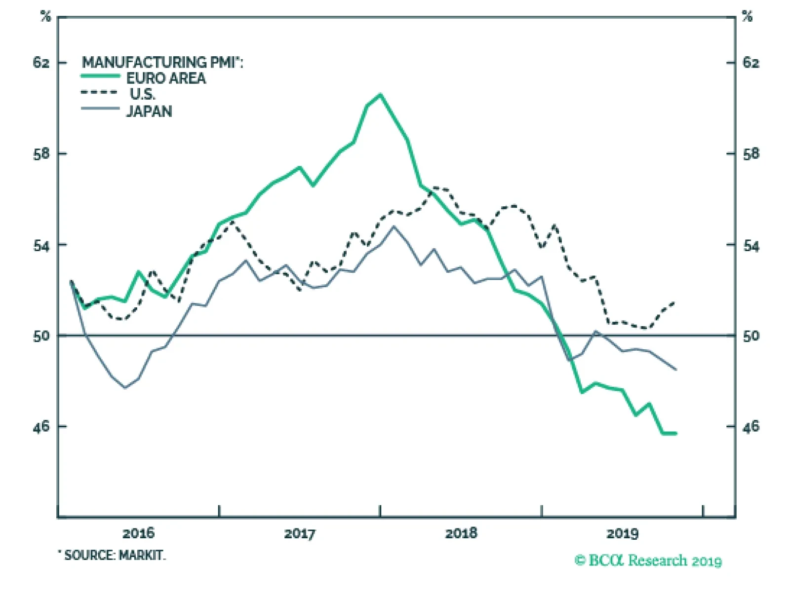
The October flash PMIs released this morning show a very modest stabilization. The Eurozone manufacturing gauge was stable at 45.7, as was Germany’s which increased slightly from 41.7 to 41.9. France’s manufacturing index rebounded from 50.5 to 50.1. Japanese…
Highlights On a tactical horizon, underweight bonds versus cash, especially those bonds with deeply negative yields… …and underweight bonds versus equities. On a strategic horizon, remain overweight a 50:50 combination of U.S. T-bonds and Italian BTPs versus a 50:50 combination of German Bunds and Spanish Bonos, at either 10-year or 30-year bond maturities. Investors could also play the component pairs: overweight U.S. T-bonds versus German bunds; and overweight Italian BTPs versus Spanish Bonos. New recommendation: switch Japanese yen long exposure into Swedish krona long exposure. Fractal trade: long SEK/JPY. Feature Chart of the WeekSwiss Bond Yields Have Found It Difficult To Go Down, But Easy To Go Up!
Swiss Bond Yields Have Found It Difficult To Go Down, But Easy To Go Up!
Swiss Bond Yields Have Found It Difficult To Go Down, But Easy To Go Up!
Anybody who has dared to bet that JGB yields would rise has ended up being carried out of their job, feet first. Shorting Japanese government bonds (JGBs) is known as the widow maker trade. Over the past 20 years, any investment manager who has dared to bet that JGB yields would rise – whether starting from 2 percent, 1 percent, or even 0.5 percent – has ended up being carried out of their job in a box, feet first. Today, the Bank of Japan’s policy of ‘yield curve control’ means that JGB yields are constrained within a tight range around zero, limiting their immediate scope to break higher. The European equivalent of the widow maker trade has been to short Swiss government bonds. Just as with JGB’s during the past two decades, anybody who has dared to bet that Swiss government bond yields would rise – whether starting from 2 percent, 1 percent, or 0.5 percent – has been proved fatally wrong (Chart I-2). Chart I-2Widow Makers: Shorting Japanese And Swiss Bonds
Widow Makers: Shorting Japanese And Swiss Bonds
Widow Makers: Shorting Japanese And Swiss Bonds
That is, until this year, when Swiss government bond yields reached -1 percent. The Lower Bound To Bond Yields Is Around -1 Percent According to several senior central bankers who have spoken to us, the practical lower bound to the policy interest rate is -1 percent, because “-1 percent counterbalances the storage cost of holding physical cash and/or other stores of value”. They argue that if bank deposit rates were to fall much below -1 percent, it would be logical for bank depositors to flee wholesale into physical cash, and such a deposit flight would destroy the banking system.1 Still, couldn’t central banks just abolish physical cash, forcing us all into ‘digital cash’ with unlimited negative interest rates? No, because that would just push us into other stores of value: for example, gold, or the rapidly growing ‘decentralised’ cryptocurrency asset-class. The common counterargument is that cryptocurrencies’ volatility makes them a poor store of value. But that is also true for gold: during a few months in 2013, gold lost one third of its value (Chart I-3). Yet who has ever argued that gold cannot be a store of value just because its price is volatile! Chart I-3Gold Is A Store Of Value ##br## Despite Its Volatility
Gold Is A Store Of Value Despite Its Volatility
Gold Is A Store Of Value Despite Its Volatility
The practical lower bound to the policy interest rate is around -1 percent because the central bank policy rate establishes the banking system’s funding rate – for example, the Eonia rate in the euro area (Chart I-4). If the funding rate fell well below the rate that the banks were paying on deposits, the banking system would come under severe strain and ultimately go bust. The lower bound of the policy rate also sets the lower bound of the bond yield, because a bond yield is just the expected average policy rate over the bond’s lifetime. Chart I-4The Policy Interest Rate Establishes The Banking System's Funding Rate
The Policy Interest Rate Establishes The Banking System's Funding Rate
The Policy Interest Rate Establishes The Banking System's Funding Rate
There is one important exception. If bond investors price in the possibility of being repaid in a different and more valuable currency, the bond yield will carry a further redenomination discount as an offset for the potential currency gain. This is relevant to euro area bonds because there remains the remote possibility of euro disintegration. Bonds which would expect to see a currency redenomination gain – notably, German bunds – therefore carry an additional discount on their yields. But for bonds where no currency redenomination is possible, the practical lower bound to bond yields is around -1 percent. Overweight High Yielding Bonds Versus Low Yielding Bonds To state the obvious, the closer that a bond yield gets to the -1 percent lower bound, the more limited becomes the possibility for a further yield decline (capital gain), while the possibility for a yield increase (capital loss) stays unlimited. This unattractive lack of upside combined with plenty of potential downside is called negative skew or negative asymmetry. It follows that, close to the lower bound of yields, the cyclicality or ‘beta’ of bond prices also becomes asymmetric. In risk-off phases, the bond prices cannot rally; while in risk-on phases, bond prices can plummet. Making such bonds a ‘lose-lose’ proposition. Case in point: Swiss bond yields have found it difficult to go down this year, but very easy to go up (Chart of the Week). Because their yields were already so close to -1 percent, Swiss bond yields could not decline much during the bond market’s recent strong rally – meaning, Swiss bond prices were very low beta on the way up. But in the recent reversal, Swiss bond yields have risen much more than others – meaning, Swiss bond prices are high beta on the way down (Chart I-5). Chart I-5Swiss Bond Prices Are Low Beta Going Up, But High Beta Going Down
Swiss Bond Prices Are Low Beta Going Up, But High Beta Going Down
Swiss Bond Prices Are Low Beta Going Up, But High Beta Going Down
Does this mean the widow maker trade can finally work? Yes, but only on a tactical horizon. For the full rationale, which we will not repeat here, please see Growth To Rebound In The Fourth Quarter, But Fade In 2020. However in summary, expect bond yields to edge modestly higher, and especially those yields that are deeply in negative territory. Also on a tactical horizon, prefer equities over bonds. On a longer term horizon, a much safer way to play the asymmetric beta is to short low yielding bonds in relative terms. In other words, overweight high yielding bonds versus low yielding bonds.2 Close to the lower bound of yields, the cyclicality or ‘beta’ of bond prices becomes asymmetric. Our strategic recommendation is to overweight a 50:50 combination of U.S. T-bonds and Italian BTPs versus a 50:50 combination of German Bunds and Spanish Bonos, at either 10-year or 30-year bond maturities. Since initiation five months ago, the recommendation at the 30-year maturity is already up by almost 7 percent. Nevertheless, it has a lot further to go (Chart I-6). Investors could also play the component pairs: overweight U.S. T-bonds versus German bunds; and overweight Italian BTPs versus Spanish Bonos (Chart I-7 and Chart I-8), but the combined two bonds versus two bonds recommendation has better return to risk characteristics. Chart I-6Expect High Yielding Bonds To Outperform Low Yielding Bonds
Expect High Yielding Bonds To Outperform Low Yielding Bonds
Expect High Yielding Bonds To Outperform Low Yielding Bonds
Chart I-7Expect Yield Spread Convergence At 10-Year Maturities...
Expect Yield Spread COnvergence At 10-Year Maturities...
Expect Yield Spread COnvergence At 10-Year Maturities...
Chart I-8...And At 30-Year ##br##Maturities
...And At 30-Year Maturities
...And At 30-Year Maturities
Switch Into The Swedish Krona Bond yield spreads are also an important driver of currency moves. The currency corollary of overweighting high yielding versus low yielding bonds is to tilt towards low yielding currencies, because these are the currencies that have the most scope for substantial upside. Our favourite low yielding currency has been the Japanese yen, and this has worked very well. Since early 2018, the yen has been the strongest major currency, and is up 16 percent versus the euro. But our favourite currency is now changing to the Swedish krona, for three reasons: The SEK is depressed from a valuation perspective. For example, it is the only major currencies that is weaker than the GBP compared to before the Brexit vote in 2016 (Chart I-9). Chart I-9The Swedish Krona Has Underperformed The Pound Despite Brexit
The Swedish Krona Has Underperformed The Pound Despite Brexit
The Swedish Krona Has Underperformed The Pound Despite Brexit
Unlike other major central banks, the Riksbank is seeking to normalise the policy rate upwards. The SEK is technically oversold on its 130-day fractal dimension, signalling over-pessimism in the price (Chart I-10), while the JPY is showing the opposite tendency. Chart I-10The Swedish Krona Is Due A Countertrend Move
The Swedish Krona Is Due A Countertrend Move
The Swedish Krona Is Due A Countertrend Move
Bottom Line: switch Japanese yen long exposure into Swedish krona long exposure. Fractal Trading System* (Chart 1-11) As just discussed, this week's recommended trade is long SEK/JPY. Set the profit target at 1.5 percent with a symmetrical stop-loss. In other trades, long NZD/JPY has started off very well and long Spain versus Belgium achieved its 3.5 percent profit target, at which it was closed, leaving five open positions. For any investment, excessive trend following and groupthink can reach a natural point of instability, at which point the established trend is highly likely to break down with or without an external catalyst. An early warning sign is the investment’s fractal dimension approaching its natural lower bound. Encouragingly, this trigger has consistently identified countertrend moves of various magnitudes across all asset classes. Chart I-11
NZD VS. JPY
NZD VS. JPY
The post-June 9, 2016 fractal trading model rules are: When the fractal dimension approaches the lower limit after an investment has been in an established trend it is a potential trigger for a liquidity-triggered trend reversal. Therefore, open a countertrend position. The profit target is a one-third reversal of the preceding 13-week move. Apply a symmetrical stop-loss. Close the position at the profit target or stop-loss. Otherwise close the position after 13 weeks. Use the position size multiple to control risk. The position size will be smaller for more risky positions. For more details please see the European Investment Strategy Special Report “Fractals, Liquidity & A Trading Model,” dated December 11, 2014, available at eis.bcaresearch.com. Dhaval Joshi Chief European Investment Strategist dhaval@bcaresearch.com Footnotes 1 The cost of holding physical cash is the cost of its safe storage. 2 Please see the European Investment Strategy Weekly Report ‘Growth To Rebound In The Fourth Quarter, But Fade In 2020’, October 3, 2019 available at eis.bcaresearch.com. Fractal Trading Model Cyclical Recommendations Structural Recommendations Fractal Trades
The ‘Widow Maker’ Trade: Can It Finally Work?
The ‘Widow Maker’ Trade: Can It Finally Work?
The ‘Widow Maker’ Trade: Can It Finally Work?
The ‘Widow Maker’ Trade: Can It Finally Work?
The ‘Widow Maker’ Trade: Can It Finally Work?
The ‘Widow Maker’ Trade: Can It Finally Work?
The ‘Widow Maker’ Trade: Can It Finally Work?
The ‘Widow Maker’ Trade: Can It Finally Work?
Trades Closed Trades Asset Performance Currency & Bond Equity Sector Country Equity Indicators Bond Yields Chart II-1Indicators To Watch - Bond Yields
Indicators To Watch - Bond Yields
Indicators To Watch - Bond Yields
Chart II-2Indicators To Watch - Bond Yields
Indicators To Watch - Bond Yields
Indicators To Watch - Bond Yields
Chart II-3Indicators To Watch - Bond Yields
Indicators To Watch - Bond Yields
Indicators To Watch - Bond Yields
Chart II-4Indicators To Watch - Bond Yields
Indicators To Watch - Bond Yields
Indicators To Watch - Bond Yields
Interest Rate Chart II-5Indicators To Watch - Interest Rate Expectations
Indicators To Watch - Interest Rate Expectations
Indicators To Watch - Interest Rate Expectations
Chart II-6Indicators To Watch - Interest Rate Expectations
Indicators To Watch - Interest Rate Expectations
Indicators To Watch - Interest Rate Expectations
Chart II-7Indicators To Watch - Interest Rate Expectations
Indicators To Watch - Interest Rate Expectations
Indicators To Watch - Interest Rate Expectations
Chart II-8Indicators To Watch - Interest Rate Expectations
Indicators To Watch - Interest Rate Expectations
Indicators To Watch - Interest Rate Expectations
Highlights Shifting Trends: The factors that have driven bond yields lower throughout 2019 – slowing growth, rising uncertainty, demand for safe assets and dovish monetary policy expectations – have all started to turn in a more bond-bearish direction. Duration & Country Allocation Strategy: Maintain a moderate below-benchmark stance on aggregate bond portfolio duration. Favor lower-beta countries with central banks that are more likely to stay relatively dovish as global yields drift higher, like core Europe, Australia and Japan. Credit Allocation Strategy: Stay overweight corporate bonds versus government debt in the U.S. and Europe, both for investment grade and high-yield. Maintain just a neutral stance on EM USD-denominated spread product, but look to upgrade if global growth improves further and the USD begins to weaken. Feature Chart of the WeekBond Yields Sniffing A Turn In Global Growth?
Bond Yields Sniffing A Turn In Global Growth?
Bond Yields Sniffing A Turn In Global Growth?
It has been fifty days (and counting) since the 2019 low for the benchmark 10-year U.S. Treasury yield was reached on September 3. The year-to-date low for the benchmark 10-year German bund yield was seen six days before that on August 28. Yields have risen by a healthy amount since those dates, up +34bps and +37bps for the 10yr Treasury and Bund, respectively. This has occurred despite the significant degree of bond-bullish pessimism on global growth and inflation that can be found in financial media reporting and investor surveys. The fact that yields are now steadily moving away from the lows suggests that the 2019 narrative for financial markets – slowing global growth, triggered by political uncertainty and the lagged impact of previous Fed monetary tightening and China credit tightening, forcing central banks to turn increasingly more dovish – is no longer correct. If that is true, yields have more near-term upside as overbought government bond markets begin to “sniff out” a bottoming out of global growth momentum (Chart of the Week). In this Weekly Report, we take a look at the changing state of the factors that fueled the sharp decline in bond yields in 2019. We follow that up with a review of all our current recommended investment positions on duration, country allocation and spread product allocations in light of recent developments. We conclude that maintaining a below-benchmark duration exposure, while favoring lower-beta countries in sovereign debt and overweighting corporate debt in the U.S. and Europe, is the most appropriate fixed income strategy for the next 6-12 months. The timing of the bottoming of yields in the major developed markets (DM) should not be surprising, given the more bond-bearish turn of reliable leading directional yield indicators. Yields Are Rising At The Right Time, For The Right Reasons Chart 2Bond-Bullish Growth & Inflation Factors Are Turning
Bond-Bullish Growth & Inflation Factors Are Turning
Bond-Bullish Growth & Inflation Factors Are Turning
The timing of the bottoming of yields in the major developed markets (DM) should not be surprising, given the more bond-bearish turn of reliable leading directional yield indicators. The diffusion index of our global leading economic indicator (LEI), which leads the real (ex-inflation expectations) component of DM bond yields by twelve months, is at an elevated level (Chart 2). At the same time, the slowing of the annual rate of growth in the trade-weighted U.S. dollar, which leads 10-year DM CPI swap rates by around six months, is signaling that bond yields have room to increase from the inflation expectations side. Finally, the rising trend of positive data surprises for the major DM countries is also pointing to higher yields. Breaking it down at the country level, the pickup in DM 10-year bond yields since the 2019 lows has been widespread (Charts 3 & 4). The range of yield increases is as low as +16bps in Japan, where the Bank of Japan (BoJ) is pursuing a yield target, to +46bps in Canada where the economy and inflation are both accelerating. Chart 3Pricing Out Some Expected Rate Cuts …
Pricing Out Some Expected Rate Cuts ...
Pricing Out Some Expected Rate Cuts ...
Chart 4… Across All Developed Markets
... Across All Developed Markets
... Across All Developed Markets
The increase in yields has also occurred alongside reduced expectations for easier monetary policy. Our 12-month discounters, which measure the expected change in short-term interest rates priced into Overnight Index Swap (OIS) curves, show that markets have partially priced out some (but not all) expected rate cuts in all major DM countries. The Three Things That Have Changed For Global Bond Markets So what has changed to trigger a reduction in rate cut expectations and an increase in global yields? The bond-bullish narrative that we refer to in the title of this report can be broken down into the following three elements, which have all turned recently: Slowing global growth (now potentially bottoming) Chart 5Global Growth Bottoming Out
Global Growth Bottoming Out
Global Growth Bottoming Out
Current global growth is still trending lower, when looking at measures like manufacturing PMIs or sentiment surveys like the global ZEW index. Forward-looking measures like our global LEI, however, have been moving higher in recent months, suggesting that a bottom in the PMIs may soon unfold (Chart 5). We investigated that improvement in our global LEI in a recent report and concluded that the move higher was focused almost exclusively within the emerging market (EM) sub-components that are most sensitive to improving global growth.1 This fits with the improvement shown in the OECD LEI for China, a bottoming of the annual growth rate of world exports, and the general acceleration of global equity markets – the classic leading economic indicator. Rising political uncertainty (now potentially fading) The U.S.-China trade war (including the implications for the upcoming 2020 U.S. presidential election) and the U.K. Brexit saga have been the main sources of bond-bullish political uncertainty over the past several months. Yet recent developments have helped reduce the odds of the most negative tail risk outcomes, providing a bit of a boost to global bond yields. The U.S. and China have agreed (in principle) to a “phase one” trade deal that, at a minimum, lowers the chances of a further escalation of the trade dispute through higher tariffs. Meanwhile, the momentum has shifted towards a potential final Brexit agreement between the U.K. and European Union that can avoid an ugly no-deal outcome. Our colleagues at BCA Research Geopolitical Strategy believe that developments are likely to continue moving away from the worst-case scenarios, given the constraints faced by policymakers.2 U.S. President Donald Trump is now in full campaign mode for the 2020 elections and needs a deal (of any kind) to deflect criticism that his trade battle with China is dragging the U.S. economy into recession. Already, there has been a sharp decline in income growth for workers in swing states that could vote for either party’s candidate in next year’s election (Chart 6). Trump cannot afford to lose voters in those states, many of which are in the U.S. industrial heartland (i.e. Ohio, Michigan) that helped put him in the White House. In other words, he is highly incentivized to turn down the heat on the trade war or else face a potential loss next November. While these political uncertainties have not been fully resolved by these latest developments, the shift in momentum away from worst-case scenarios has likely been enough to reduce the safe-haven bid for DM government bonds, helping push yields higher. Meanwhile, China is facing a slowing economy and rising unemployment, but with reduced means to fight the downtrend given high private sector debt that has impaired the typical response between easier monetary conditions and economic activity (Chart 7). While the Chinese government does not want to be seen as caving in to U.S. pressure on trade policy, its desire to maintain social stability by preventing a further rise in unemployment from the trade war provides a powerful incentive to try and ratchet down tensions with the U.S. Chart 6Political Reasons For Trump To Retreat On Trade
Political Reasons For Trump To Retreat On Trade
Political Reasons For Trump To Retreat On Trade
In the U.K., a no-deal Brexit is an economically painful and politically unpopular outcome that would severely damage the re-election chances of Prime Minister Boris Johnson and his Conservative party. Thus, even a hard-line Brexiteer like Johnson must respond to the political constraints forcing him to try and get a Brexit deal done (Chart 8). Chart 7Economic Reasons For China To Retreat On Trade
Economic Reasons For China To Retreat On Trade
Economic Reasons For China To Retreat On Trade
Chart 8Political Reasons To Retreat On A No-Deal Brexit
Political Reasons To Retreat On A No-Deal Brexit
Political Reasons To Retreat On A No-Deal Brexit
While these political uncertainties have not been fully resolved by these latest developments, the shift in momentum away from worst-case scenarios has likely been enough to reduce the safe-haven bid for DM government bonds, helping push yields higher. Bull-flattening pressure on yield curves (now turning into moderate bear-steepening) The final leg down in bond yields in August had a technical aspect to it, fueled by the demand for duration and convexity from asset-liability managers like European pension funds and insurance companies. Falling yields act to raise the value of liabilities for that group of investors, forcing them to rapidly increase the duration of their assets to match the duration of their liabilities (the technique used to limit the gap between the value of assets and liabilities). That duration increase is carried out by buying government bonds with longer maturities (and higher convexity), but also through the use of interest rate derivatives like long maturity swaps and swaptions. The end result is a bull flattening of yield curves (both for government bonds and swaps) and a rise in swaption volatility (i.e. the price of swaptions). Those dynamics were clearly in play in August after the shocking imposition of fresh U.S. tariffs on Chinese imports early in the month. Bond and swaption volatilities spiked, and bond/swap yield curves bull-flattened, in both Europe and the U.S. (Chart 9). That effect only lasted a few weeks, however, and volatilities have since declined and curves have steepened. This suggests that the “convexity-buying” effect has run its course and is now starting to work in the opposite direction, with asset-liability managers looking to reduce the duration of their assets as higher yields lower the value of their liabilities. This is putting some upward pressure on longer-maturity global bond yields. Chart 9Signs Of Reduced Convexity-Related Bond Buying
Signs Of Reduced Convexity-Related Bond Buying
Signs Of Reduced Convexity-Related Bond Buying
Chart 10Bull-Flattening Yield Curve Pressures Easing Up A Bit
Bull-Flattening Yield Curve Pressures Easing Up A Bit
Bull-Flattening Yield Curve Pressures Easing Up A Bit
Chart 11Fed & ECB Actions Should Help Steepen Up Curves
Fed & ECB Actions Should Help Steepen Up Curves
Fed & ECB Actions Should Help Steepen Up Curves
The steepening seen so far must be put in context, however, as yield curves remain very flat across the DM world (Chart 10). Term premia on longer-term bonds remain very depressed, although those should start to increase as global growth stabilizes and the massive safe-haven demand for global government debt begins to dissipate. Some pickup in inflation expectations would also help impart additional bear-steepening momentum to yield curves – a more likely result now that the Fed and ECB have both cut interest rates and, more importantly, will start provide additional monetary easing by expanding their balance sheets (Chart 11). Bottom Line: The factors that have driven bond yields lower throughout 2019 – slowing growth, rising uncertainty, demand for safe assets and dovish monetary policy expectations – have all started to turn in a more bond-bearish direction. Reviewing Our Recommended Bond Allocations In light of these shifting global trends described above, the fixed income investment implications are fairly straightforward: Yields are rising around the world, suggesting that the current move is a shift higher driven by non-country-specific factors like more stable future global growth prospects. Duration: A moderate below-benchmark overall duration stance is warranted for global fixed income portfolios, with yields likely to continue drifting higher over at least the next six months. A big surge in yields is unlikely, as central banks will need to see decisive evidence that global growth is not only bottoming, but accelerating, before shifting away from the current dovish bias. Given the reporting lags in the economic data, such evidence is unlikely to appear until the first quarter of 2020 at the earliest. Yet given how flat yield curves are across the DM government bond markets, the trajectory of forward rates is quite stable relative to spot yield levels, making it much easier to beat the forwards by positioning for even a modest yield increase. Country Allocation: Yields are rising around the world, suggesting that the current move is a shift higher driven by non-country-specific factors like more stable future global growth prospects. In that case, using yield betas to the “global” bond yield is a good way to consider country allocation decisions within a fixed income portfolio. We looked at those yield betas in an August report, using Bloomberg Barclays government bond index data for the 7-10 year maturity buckets of individual countries and the Global Treasury aggregate (Chart 12).3 The rolling 3-year betas were highest in the U.S. and Canada, making them good countries to underweight within a global government bond portfolio in a rising yield environment. The yield betas were lowest in Japan, Germany and Australia, making them good overweight candidates. The U.K. was a unique case of having a relatively high historical yield beta prior to the 2016 Brexit referendum and a lower yield beta since then - making the U.K. allocation highly conditional on the resolution of the Brexit uncertainty. Spread Product Allocation: The backdrop described in this report, where global growth is bottoming out but where central banks maintain a dovish bias, is a perfect sweet spot for global spread product like corporate bonds and Peripheral European government debt. Thus, an overweight stance on overall global spread product versus governments is warranted. The backdrop described in this report, where global growth is bottoming out but where central banks maintain a dovish bias, is a perfect sweet spot for global spread product like corporate bonds and Peripheral European government debt. With regards to our current strategic fixed income recommendations and model bond portfolio allocations, we already have much of the positioning described above in place. We are below-benchmark on overall duration, underweight higher-beta U.S. Treasuries; overweight government bonds in lower-beta Germany, France, Japan and Australia (Chart 13); overweight investment grade corporate bonds in the U.S., euro area and U.K.; and overweight high-yield corporate bonds in the U.S. and euro area. Chart 12Favor Lower-Beta Government Bond Markets
Favor Lower-Beta Government Bond Markets
Favor Lower-Beta Government Bond Markets
There are areas where our positioning could change, however. Chart 13Lower-Beta Laggards Should Start To Outperform
Lower-Beta Laggards Should Start To Outperform
Lower-Beta Laggards Should Start To Outperform
In terms of government bonds, we are currently overweight the U.K. and neutral Canada. A final Brexit deal would justify a downgrade of Gilts to at least neutral, if not underweight, as the Bank of England has signaled that rate hikes would be justified if the Brexit uncertainty was resolved. A downgrade of higher-beta Canadian government debt to underweight could also be justified, although the Bank of Canada is not signaling that a change in monetary policy (in either direction) is warranted. For now, we will hold off on any change to our U.K. stance, as it is now likely that there will be another extension of the Brexit deadline beyond October 31. As for Canada, we remain neutral for now but will revisit that stance in an upcoming Weekly Report. With regards to spread product, we are only neutral EM USD-denominated sovereign and corporate debt, as well as Spanish sovereign bonds; and underweight Italian government debt. An EM upgrade to overweight would require two things that are not yet in place: a weaker U.S. dollar and accelerating Chinese economic growth. Chart 14Stay Overweight Corporates In The U.S. & Europe
Stay Overweight Corporates In The U.S. & Europe
Stay Overweight Corporates In The U.S. & Europe
As for Peripheral governments, we have preferred to be overweight European corporate debt relative to sovereign bonds in Italy and Spain. The recent powerful rally in the Periphery, however, has driven the spreads over German bunds in those countries down to levels in line with corporate credit spreads (Chart 14). We will maintain these allocations for now, but will investigate the relative value proposition between euro area Peripheral sovereigns and corporates in an upcoming report. Bottom Line: Maintain a moderate below-benchmark stance on aggregate bond portfolio duration. Favor lower-beta countries with central banks that are more likely to stay relatively dovish as global yields drift higher, like core Europe, Australia and Japan. Stay overweight corporate bonds versus government debt in the U.S. and Europe, both for investment grade and high-yield. Maintain just a neutral stance on EM USD-denominated spread product, but look to upgrade if global growth improves further and the USD begins to weaken. Robert Robis, CFA Chief Fixed Income Strategist rrobis@bcaresearch.com Footnotes 1 Please see BCA Research Global Fixed Income Strategy Weekly Report, “What Is Driving The Improvement In The BCA Global Leading Economic Indicator?”, dated October 2, 2019, available at gfis.bcaresearch.com. 2 Please see BCA Research Geopolitical Strategy Weekly Report, “Five Constraints For The Fourth Quarter”, dated October 11, 2019, available at gps.bcaresearch.com. 3 Please see BCA Research U.S. Bond Strategy/Global Fixed Income Strategy Weekly Report, “Where’s The Positive Carry In Bond Markets?", dated August 20, 2019, available at usbs.bcaresearch.com and gfis.bcaresearch.com. Recommendations The GFIS Recommended Portfolio Vs. The Custom Benchmark Index
Cracks Are Forming In The Bond-Bullish Narrative
Cracks Are Forming In The Bond-Bullish Narrative
Duration Regional Allocation Spread Product Tactical Trades Yields & Returns Global Bond Yields Historical Returns
Highlights New structural recommendation: long GBP/USD. The substantial Brexit discount in the pound makes it a long-term buy for investors who can tolerate near-term volatility. The most powerful equity play on a fading Brexit discount would be the U.K. homebuilders. Specifically, Persimmon still has a further 25 percent of upside. Take profits in long Euro Stoxx 50 versus Shanghai Composite. Within Europe, close the overweight to Switzerland and the underweight to the Netherlands. Stay overweight banks versus industrials. Stay overweight the Euro Stoxx 50 versus the Nikkei 225. Fractal trade: long NZD/JPY. Feature Chart of the WeekThe Pound Has Substantial Upside If The Brexit Discount Fades
The Pound Has Substantial Upside If The Brexit Discount Fades
The Pound Has Substantial Upside If The Brexit Discount Fades
Carnival Says The Pound Is Cheap Carnival, the world’s largest cruise liner company, lists its shares on both the London and New York stock exchanges. But there is an apparent riddle: in London the shares trade on a forward PE of 8.8, while in New York they trade on 9.4. How can Carnival trade at different valuations on the two sides of the Atlantic when the market should instantly arbitrage the difference away? The answer to the riddle is that the London listing is quoted in pounds, the New York listing is quoted in dollars, while Carnival’s sales and profits are denominated in a mix of international currencies. Neither Brexit developments nor a potential Jeremy Corbyn led government will prevent the pound from rallying in the longer term. Carnival is trading on a higher valuation in New York versus London because the market is expecting its mixed currency earnings to appreciate more in dollar terms than in pound terms. Put another way, the valuation differential is expecting the pound to appreciate versus the dollar to a ‘fair value’ of around $1.40 (Chart I-2). Likewise, BHP Billiton shares are trading on a higher valuation in their Sydney listing compared to their London listing. This valuation differential is expecting the pound to appreciate versus the Australian dollar to around A$2.00 (Chart I-3). Chart I-2Carnival Says The Pound Is Cheap
Carnival Says The Pound Is Cheap
Carnival Says The Pound Is Cheap
Chart I-3BHP Billiton Says The Pound Is Cheap
BHP Billiton Says The Pound Is Cheap
BHP Billiton Says The Pound Is Cheap
In other words, the market believes that neither Brexit developments nor a potential Jeremy Corbyn led government will prevent the pound from rallying in the longer term. We tend to agree. The Wrong Way To Pick Stock Markets… And The Right Way Before continuing with the pound’s prospects, let’s wander into the wider investment landscape. One important lesson from dual-listed companies like Carnival and BHP Billiton is that a multinational’s valuation will appear attractive in a market where the currency is structurally cheap.1 This lesson has deep ramifications. Today, multinationals dominate all the major stock markets, meaning that the entire stock market will appear cheap if its currency is cheap. The stock market will also appear cheap if it is skewed towards lower-valued sectors. But sectors trade on a low valuation for a reason – poor long-term growth prospects. Through the past decade, Japanese banks seemed a relative bargain, trading on a forward PE of less than half of that on personal products companies (Chart I-4). Yet Japanese banks were not a relative bargain. Quite the contrary. Through the past decade Japanese personal products have outperformed the banks by 500 percent! (Chart I-5) Chart I-4Japanese Banks Seemed A Relative Bargain...
Japanese Banks Seemed A Relative Bargain...
Japanese Banks Seemed A Relative Bargain...
Chart I-5...But Japanese Banks Were Not A Relative Bargain
...But Japanese Banks Were Not A Relative Bargain
...But Japanese Banks Were Not A Relative Bargain
Hence, beware of picking stock markets on the basis of observations such as ‘European stocks are cheaper than U.S. stocks’. Given that a stock market valuation is the result of its currency valuation and its sector composition, assessing relative value across major stock markets is extremely difficult, if not impossible. To repeat, Carnival appears to be trading at a valuation discount in London versus New York, but the cheapness is illusory. Here’s the right way to pick major stock markets. Identify your preferred sectors and currencies, and then pick the regional and country stock markets that are skewed to these preferred sectors and currencies. In this regard, large underweight sector skews also matter. For example, China and EM have a near-zero exposure to healthcare equities, so their performances tend to correlate negatively with that of the global healthcare sector – albeit the causality could run in either direction. Identify your preferred sectors and currencies, and then pick the regional and country stock markets that are skewed to these preferred sectors and currencies. In early May, we noticed that the extreme outperformance of technology versus healthcare was at a critical technical point at which there was a high probability of a trend reversal. This high conviction sector view implied overweight Europe versus China, as well as overweight Switzerland and underweight Netherlands within Europe (Chart I-6 and Chart I-7). Chart I-6When Tech Underperforms Healthcare, China Underperforms Switzerland
When Tech Underperforms Healthcare, China Underperforms Switzerland
When Tech Underperforms Healthcare, China Underperforms Switzerland
Chart I-7When Tech Underperforms Healthcare, The Netherlands Underperforms Switzerland
When Tech Underperforms Healthcare, The Netherlands Underperforms Switzerland
When Tech Underperforms Healthcare, The Netherlands Underperforms Switzerland
Given that this sector trend reversal has played out exactly as anticipated, it is time to bank the profits: Close long Euro Stoxx 50 versus Shanghai Composite. And within Europe, close the overweight to Switzerland and the underweight to the Netherlands. Right now, it is appropriate to overweight banks versus industrials. It is the pace of the bond yield’s decline that has weighed on bank performance this year. But if the sharpest decline in bond yields is behind us, as seems likely, then banks should fare better versus other cyclicals (Chart I-8). Chart I-8If The Sharpest Decline In Bond Yields Is Over, Banks Will Outperform Industrials
If The Sharpest Decline In Bond Yields Is Over, Banks Will Outperform Industrials
If The Sharpest Decline In Bond Yields Is Over, Banks Will Outperform Industrials
Once again, this sector view carries an equity market implication: stay overweight the Euro Stoxx 50 versus the Nikkei 225 (Chart I-9). Chart I-9Euro Stoxx 50 Vs. Nikkei 225 = Global Banks In Euros Vs. Global Industrials In Yen
Euro Stoxx 50 Vs. Nikkei 225 = Global Banks In Euros Vs. Global Industrials In Yen
Euro Stoxx 50 Vs. Nikkei 225 = Global Banks In Euros Vs. Global Industrials In Yen
The Pound Is A Long-Term Buy Back to the pound. The message from the dual listings of Carnival and BHP Billiton is that the pound is cheap, and this is neatly corroborated by the relationship between relative interest rates and the pound versus the euro and dollar. Based on the pre-Brexit relationship between relative real interest rates and the pound’s exchange rate, we can quantify the ‘Brexit discount’. Absent this discount, the pound would now be trading close to €1.30 and well north of $1.40 (Chart of the Week and Chart I-10). Chart I-10The Pound Has Substantial Upside If The Brexit Discount Fades
The Pound Has Substantial Upside If The Brexit Discount Fades
The Pound Has Substantial Upside If The Brexit Discount Fades
In the Brexit psychodrama, we do not claim to know exactly how the next few days or weeks will play out. In the short term, Brexit is a classic non-linear system, and non-linear systems are inherently unpredictable. However, in the longer term we expect the Brexit discount to fade in any sort of transitioned resolution that allows the U.K. to adapt to a new trading relationship with the world, or alternatively to stay in a relationship broadly similar to the current one. Whatever the eventual endpoint is, the key requirement to remove the Brexit discount is to avoid a cliff-edge. We expect the Brexit discount to fade in any sort of transitioned resolution. The stumbling block to a resolution is that the three key actors – the EU, the U.K. government, and the U.K. parliament – have conflicting red lines, so the Brexit ‘Venn diagram’ has had no overlap. The EU will not countenance a customs border that divides Ireland; the current U.K. government wants a Free Trade Agreement, which implies casting away Northern Ireland into the EU customs union; and the current U.K. parliament – unless its intentions suddenly change – wants the whole of the U.K., including Northern Ireland, to remain in the EU customs union. Given that the EU will not budge its red line, the only way to a lasting resolution is for the government and parliament red lines to realign, This could happen via parliament being willing to sacrifice Northern Ireland, via a second referendum, or via a general election in which the government’s intentions and/or the composition of parliament changed. Given a long enough investment horizon – 2 years or more – it is likely that the government and parliament will realign their red lines to a Free Trade Agreement or to a customs union, one way or another. On this basis, the substantial Brexit discount in the pound makes it a long-term buy for investors who can tolerate near-term volatility. Accordingly, today we are initiating a new structural recommendation: long GBP/USD. For equity investors, the most powerful play on a fading Brexit discount would be the U.K. homebuilders (Chart I-11). Specifically, if the pound reached $1.40, Persimmon still has a further 25 percent of upside. Chart I-11U.K. Homebuilders Have Substantial Upside If The Brexit Discount Fades
U.K. Homebuilders Have Substantial Upside If The Brexit Discount Fades
U.K. Homebuilders Have Substantial Upside If The Brexit Discount Fades
Fractal Trading System* Based on its collapsed fractal structure, we anticipate a countertrend rally in NZD/JPY within the next 130 days. Accordingly, go long NZD/JPY setting a profit target of 3 percent and a symmetrical stop-loss. Chart I-12
NZD VS. JPY
NZD VS. JPY
For any investment, excessive trend following and groupthink can reach a natural point of instability, at which point the established trend is highly likely to break down with or without an external catalyst. An early warning sign is the investment’s fractal dimension approaching its natural lower bound. Encouragingly, this trigger has consistently identified countertrend moves of various magnitudes across all asset classes. The post-June 9, 2016 fractal trading model rules are: When the fractal dimension approaches the lower limit after an investment has been in an established trend it is a potential trigger for a liquidity-triggered trend reversal. Therefore, open a countertrend position. The profit target is a one-third reversal of the preceding 13-week move. Apply a symmetrical stop-loss. Close the position at the profit target or stop-loss. Otherwise close the position after 13 weeks. Use the position size multiple to control risk. The position size will be smaller for more risky positions. * For more details please see the European Investment Strategy Special Report “Fractals, Liquidity & A Trading Model,” dated December 11, 2014, available at eis.bcaresearch.com. Dhaval Joshi, Chief European Investment Strategist dhaval@bcaresearch.com Footnotes 1 There are also several companies with dual listings in the U.K. and the euro area. Unfortunately, these valuation differentials have been temporarily distorted by the risk of a no-deal Brexit, in which EU27 investors may have been forbidden from trading in the U.K. listed shares. Fractal Trading System Cyclical Recommendations Structural Recommendations Fractal Trades
The Pound Is A Long-Term Buy (And So Are Homebuilders)
The Pound Is A Long-Term Buy (And So Are Homebuilders)
The Pound Is A Long-Term Buy (And So Are Homebuilders)
The Pound Is A Long-Term Buy (And So Are Homebuilders)
The Pound Is A Long-Term Buy (And So Are Homebuilders)
The Pound Is A Long-Term Buy (And So Are Homebuilders)
The Pound Is A Long-Term Buy (And So Are Homebuilders)
The Pound Is A Long-Term Buy (And So Are Homebuilders)
The Pound Is A Long-Term Buy (And So Are Homebuilders)
The Pound Is A Long-Term Buy (And So Are Homebuilders)
The Pound Is A Long-Term Buy (And So Are Homebuilders)
The Pound Is A Long-Term Buy (And So Are Homebuilders)
Asset Performance Currency & Bond Equity Sector Country Equity Indicators Bond Yields Chart II-1Indicators To Watch - Bond Yields
Indicators To Watch - Bond Yields
Indicators To Watch - Bond Yields
Chart II-2Indicators To Watch - Bond Yields
Indicators To Watch - Bond Yields
Indicators To Watch - Bond Yields
Chart II-3Indicators To Watch - Bond Yields
Indicators To Watch - Bond Yields
Indicators To Watch - Bond Yields
Chart II-4Indicators To Watch - Bond Yields
Indicators To Watch - Bond Yields
Indicators To Watch - Bond Yields
Interest Rate Chart II-5Indicators To Watch - Interest Rate Expectations
Indicators To Watch - Interest Rate Expectations
Indicators To Watch - Interest Rate Expectations
Chart II-6Indicators To Watch - Interest Rate Expectations
Indicators To Watch - Interest Rate Expectations
Indicators To Watch - Interest Rate Expectations
Chart II-7Indicators To Watch - Interest Rate Expectations
Indicators To Watch - Interest Rate Expectations
Indicators To Watch - Interest Rate Expectations
Chart II-8Indicators To Watch - Interest Rate Expectations
Indicators To Watch - Interest Rate Expectations
Indicators To Watch - Interest Rate Expectations
Ever since the European debt crisis, the velocity of money in the euro area has collapsed relative to that in the U.S. Relative long bond yields have followed suit in tight correlation. In a nutshell, precautionary demand for money in the Eurozone has been…
Highlights In this Weekly Report, we present our semi-annual chartbook of the BCA Central Bank Monitors. All of the Monitors are now below the zero line, indicating a growing need to ease global monetary policy (Chart of the Week). Central bankers have already gone down that path in several countries over the past few months (the U.S., the euro area, Australia and New Zealand), helping sustain the powerful 2019 rally in global bond markets. Feature With the global manufacturing & trade downturn now threatening to spill over into domestic demand in the major developed markets, policymakers will need to stay dovish to stave off recession. This will keep global bond yields at depressed levels in the near term, at least until widely-followed data like manufacturing PMIs stabilize and/or there is positive news on U.S.-China trade negotiations. Chart of the WeekStrong Pressures To Ease Global Monetary Policy
Strong Pressures To Ease Global Monetary Policy
Strong Pressures To Ease Global Monetary Policy
Yields already discount a lot of bad economic news, however, and there is a ray of hope visible in the bottoming out of our global leading economic indicator. A sustainable bottom in global bond yields, though, will require some change in the current downward growth or inflation momentum highlighted in our Central Bank Monitors. Yields already discount a lot of bad economic news, however, and there is a ray of hope visible in the bottoming out of our global leading economic indicator. A sustainable bottom in global bond yields, though, will require some change in the current downward growth or inflation momentum highlighted in our Central Bank Monitors. An Overview Of The BCA Central Bank Monitors* Chart 2Low Bond Yields Are Consistent With Our CB Monitors
Low Bond Yields Are Consistent With Our CB Monitors
Low Bond Yields Are Consistent With Our CB Monitors
The BCA Central Bank Monitors are composite indicators designed to measure the cyclical growth and inflation pressures that can influence future monetary policy decisions. The economic data series used to construct the Monitors are not the same for every country, but the list of indicators generally measure the same things (i.e. manufacturing cycles, domestic demand strength, commodity prices, labor market conditions, exchange rates, etc). The data series are standardized and combined to form the Monitors. Readings above the zero line for each Monitor indicate pressures for central banks to raise interest rates, and vice versa. Through the nexus between growth, inflation, and market expectations of future interest rate changes, the Monitors do exhibit broad correlations to government bond yields in the Developed Markets (Chart 2). All of the Monitors are currently pointing in a bond-bullish direction, making them less useful as a country allocation tool within global bond portfolios. With easing pressures most intense in the euro area, given that the ECB Monitor has the lowest reading, our recommended overweight stance on core euro area government bonds (hedged into U.S. dollars) remains well supported. In each BCA Central Bank Monitor Chartbook, we include a new chart for each country that we have not shown previously. In this edition, we show the components of the Monitors, grouped into those focusing on economic growth and inflation, plotted against our central bank discounters that indicate the amount of rate cuts/hikes priced into global Overnight Index Swap (OIS) curves. Fed Monitor: Signaling A Need For More Cuts Our Fed Monitor has fallen below the zero line (Chart 3A), indicating that the Fed’s summer rate cuts were justified with more easing still required. The Monitor, however, has not yet fallen to levels seen during U.S. recessions and is more consistent with the below-trend growth periods in 2016 and the late-1990s. The views of the FOMC on U.S. monetary policy are more deeply divided now than has been seen in many years. The doves can point to slumping global growth, persistent trade uncertainty, contracting capital spending and falling inflation expectations as reasons to continue cutting rates. The hawks can look at continued labor market tightness, elevated asset prices and realized inflation rates holding near the Fed’s 2% inflation target (Chart 3B) as reasons to keep monetary policy steady. That mixed picture can be seen in the components of our Fed Monitor, with the growth components showing the biggest pressure for more rate cuts compared to more stable readings from the inflation and financial components (Chart 3C). Chart 3AU.S.: Fed Monitor
U.S.: Fed Monitor
U.S.: Fed Monitor
Chart 3BU.S. Realized Inflation Holding Firm
U.S. Realized Inflation Holding Firm
U.S. Realized Inflation Holding Firm
Chart 3CGreatest Pressure For Fed Rate Cuts From Growth Components Of Our Fed Monitor
Greatest Pressure For Fed Rate Cuts From Growth Components Of Our Fed Monitor
Greatest Pressure For Fed Rate Cuts From Growth Components Of Our Fed Monitor
The U.S. Treasury market may have gotten ahead of itself after the latest decline in yields, which looks stretched versus the Fed Monitor. The U.S. Treasury market may have gotten ahead of itself after the latest decline in yields, which looks stretched versus the Fed Monitor (Chart 3D). We still expect the Fed to deliver just one more rate cut at the FOMC meeting at the end of October, as the “hard” U.S. data is outpeforming the “soft” data like the weak ISM surveys. That leaves Treasury yields vulnerable to some rebound if global growth stabilizes, although that is conditional on no new breakdown of the U.S.-China trade negotiations – a factor that continues to weigh on U.S. business confidence. Chart 3DTreasury Yields More Than Fully Discount Fed Easing Pressures
Treasury Yields More Than Fully Discount Fed Easing Pressures
Treasury Yields More Than Fully Discount Fed Easing Pressures
BoE Monitor: Easier Policy Needed Our Bank of England (BoE) Monitor, which was in the “tighter money required” zone from 2016-18, has been below the zero line since April of this year (Chart 4A). The market agrees with the message from the Monitor and is now pricing in -12bps of rate cuts over the next twelve months. The relentless uncertainty surrounding Brexit has triggered sharp downgrades of growth expectations and weakened business confidence, which the BoE is now factoring into its own projections. In the August Inflation Report, the BoE lowered its 2020 inflation forecast to below 2% - no surprise given the sharp fall in realized inflation that has already occurred even as economic growth has still not yet fallen substantially below trend (Chart 4B). Chart 4AU.K.: BoE Monitor
U.K.: BoE Monitor
U.K.: BoE Monitor
Chart 4BFalling U.K. Inflation Opens The Door To A BoE Ease
Falling U.K. Inflation Opens The Door To A BoE Ease
Falling U.K. Inflation Opens The Door To A BoE Ease
Still, weakening growth components have been the main driver of the BoE Monitor into rate cut territory (Chart 4C). While a strong jobs market is helping support consumer spending, the Brexit turmoil is having a lasting impact on future growth. Since the 2016 Brexit referendum, business confidence and real business investment have collapsed which, in turn, has hurt productivity growth, as we discussed in a Special Report last month.1 Chart 4CBrexit Uncertainty + Slumping Growth = Pressure For BoE Rate Cuts
Brexit Uncertainty + Slumping Growth = Pressure For BoE Rate Cuts
Brexit Uncertainty + Slumping Growth = Pressure For BoE Rate Cuts
The uncertainty around Brexit dominates the economic outlook and any future BoE decisions. Our Geopolitical Strategy service anticipates that Brexit will be delayed beyond October 31st. As a result, uncertainty will continue to weigh on Gilt yields, even though yields have already fallen in line with our BoE Monitor (Chart 4D). We continue to recommend an overweight stance on U.K. Gilts. Chart 4DGilt Yields Have Fallen In Line With Our BoE Monitor
Gilt Yields Have Fallen In Line With Our BoE Monitor
Gilt Yields Have Fallen In Line With Our BoE Monitor
ECB Monitor: Intense Pressure For Easier Monetary Policy Our European Central Bank (ECB) Monitor is now well below the zero line, signaling a strong need for easier monetary policy (Chart 5A). The global manufacturing downturn has hit the export-dependent economies of the euro area hard, with Germany now likely in a technical recession. Our European Central Bank (ECB) Monitor is now well below the zero line, signaling a strong need for easier monetary policy. Despite the weaker growth momentum, there remains far less spare capacity in the euro area economy than at any time since before the 2009 global recession (Chart 5B). This is keeping realized inflation in positive territory, in contrast to what was seen during the previous downturn in 2015-16. Chart 5AEuro Area: ECB Monitor
Euro Area: ECB Monitor
Euro Area: ECB Monitor
Chart 5BEuro Area Inflation Is Subdued, Despite Tight Labor Markets
Euro Area Inflation Is Subdued, Despite Tight Labor Markets
Euro Area Inflation Is Subdued, Despite Tight Labor Markets
The ECB has already responded to the weakening growth & inflation pressures, introducing a new TLTRO program back in March and then cutting the overnight deposit rate and restarting its Asset Purchase Program in September. The latest policy moves were reported to be more contentious, with the “hard money” northern euro area countries opposed to restarting bond purchases. The new incoming ECB President, Christine Lagarde, will likely have her hands full trying to gain consensus on any further easing measures from here, even as both the growth and inflation components of our ECB Monitor indicate that more stimulus is needed (Chart 5C). Chart 5CA Consistent Message On The Need For Future ECB Easing From Growth & Inflation
A Consistent Message On The Need For Future ECB Easing From Growth & Inflation
A Consistent Message On The Need For Future ECB Easing From Growth & Inflation
The big decline in euro area bond yields, which has pushed large swaths of sovereign yields into negative territory, does not look particularly stretched relative to the plunge in the ECB Monitor (Chart 5D). Without signs that the global manufacturing downturn is ending, however, euro area yields will stay mired at current deeply depressed levels. We recommend a moderate overweight on core European government bonds, on a currency-hedged basis into U.S. dollars. Chart 5DBund Rally Looks In Line With The ECB Monitor
Bund Rally Looks In Line With The ECB Monitor
Bund Rally Looks In Line With The ECB Monitor
BoJ Monitor: A Rate Cut On The Horizon? Our Bank of Japan (BoJ) Monitor has drifted slightly below the zero line into “rate cut required” territory (Chart 6A). Over the past few years, the BoJ’s monetary policy has remained unchanged for the most part and its messaging has grown less dovish, citing an expanding economy. However, recent Japanese economic data shows widespread deterioration in growth momentum, as the nation has been hit hard by the global manufacturing and trade recession. Yet even with weaker growth, Japan’s unemployment rate keeps hitting all-time lows. This has not helped boost inflation much, though, with Japan’s CPI inflation still struggling to reach even the 1% level (Chart 6B). Still, the latest leg lower in our BoJ Monitor has been driven by the growth, rather than inflation, components (Chart 6C). Chart 6AJapan: BoJ Monitor
Japan: BoJ Monitor
Japan: BoJ Monitor
Chart 6BNo Spare Capacity In Japan, But Still No Inflation
No Spare Capacity In Japan, But Still No Inflation
No Spare Capacity In Japan, But Still No Inflation
Weakening confidence has resulted in significant declines in both consumer spending and business investment. Due to the struggling domestic economy, it was expected that the Abe government would postpone the scheduled consumption tax hike, but it was finally initiated on October 1st. The timing could not be worse given the ongoing contraction in global manufacturing and trade activity that has clearly spilled over into Japan’s export and industrially-focused economy. Chart 6CThe Slumping Japanese Economy Could Use Some More BoJ Assistance
The Slumping Japanese Economy Could Use Some More BoJ Assistance
The Slumping Japanese Economy Could Use Some More BoJ Assistance
The BoJ will likely try and deliver some sort of easing in the next few months, but its options are limited after years of already hyper-easy policy. A modest rate cut is likely all that will be delivered, on top of a continuation of the Yield Curve Control policy. That will be enough to keep JGB yields at depressed levels (Chart 6D), even if global yields were to begin climbing. Chart 6DJGB Yields Look Fairly Valued Vs The BoJ Monitor
JGB Yields Look Fairly Valued Vs The BoJ Monitor
JGB Yields Look Fairly Valued Vs The BoJ Monitor
BoC Monitor: Rate Cuts Needed, But Will The BoC Deliver? The Bank of Canada (BoC) Monitor has been below zero since April of this year, indicating a need for easier monetary policy (Chart 7A). Although the BoC has maintained its policy rate at 1.75%, dovish Fed policy and softening domestic economic growth are making it harder for the BoC to continue sitting on its hands Although the Canadian labor market remains solid, household consumption has continued to weaken alongside falling consumer confidence. However, the inflation rate for both headline and core CPI measures is still hovering near the mid-point of BoC 1-3% target range (Chart 7B). Chart 7ACanada: BoC Monitor
Canada: BoC Monitor
Canada: BoC Monitor
Chart 7BRising Inflation Making The BoC’s Job Harder
Rising Inflation Making The BoC's Job Harder
Rising Inflation Making The BoC's Job Harder
At the moment, our BoC Monitor is more influenced by weaker growth components than stabilizing inflation components (Chart 7C). Similar mixed messages are also evident in other data. According to the latest BoC Business Outlook Survey, the overall outlook has edged up to the historical average,2 but real capex growth remains in negative territory and manufacturing new orders are still falling. In contrast, the Canadian labor market remains tight and both wage and price inflation are holding firm. Chart 7CBoC Growth & Inflation Components Signaling Moderate Pressure To Ease
BoC Growth & Inflation Components Signaling Moderate Pressure To Rise
BoC Growth & Inflation Components Signaling Moderate Pressure To Rise
Canadian government bonds have rallied strongly this year, but the yield momentum has appeared to overshoot the decline in our BoC Monitor (Chart 7D). The Canadian OIS curve is discounting -27bps of rate cuts over the next twelve months, but the BoC is not signaling that they will ease. We upgraded our recommended stance on Canadian government bonds to neutral back in May, and we see no need to alter that view without further evidence of more deterioration in Canadian growth or inflation data.3 Chart 7DCanadian Bond Rally Looks A Bit Stretched
Canadian Bond Rally Looks A Bit Stretched
Canadian Bond Rally Looks A Bit Stretched
RBA Monitor: Expect Another Cut The Reserve Bank of Australia (RBA) Monitor has been below the zero line since September 2018, indicating a need for easier monetary policy (Chart 8A). The RBA has already delivered on that signal this year, cutting the Cash Rate twice to an all-time low of 0.75%. Markets are still expecting more, with the Australian OIS curve discounting another -29bps of cuts over the next year, although most of those cuts are expected to occur within the next six months. The signal from our RBA Monitor suggests that Australian bond yields should remain under downward pressure, although the yield momentum has been excessive relative to the fall in the Monitor. Both headline and core CPI inflation remain below the RBA’s 2-3% target range (Chart 8B), and the central bank continues to lower its inflation forecasts, suggesting an entrenched dovish bias. Chart 8AAustralia: RBA Monitor
Australia: RBA Monitor
Australia: RBA Monitor
Chart 8BNo Inflation For The RBA To Worry About
No Inflation For The RBA To Worry About
No Inflation For The RBA To Worry About
The latest downturn in our RBA Monitor is related to declines in both the inflation and growth components (Chart 8C). The weakness in the growth components is led by falling exports to Asia, in addition to the sharp drop in house prices in the major cities. The fall in the inflation components reflects both weak inflation expectations and spare capacity in labor markets. Chart 8CA Loud & Clear Message On The Need For RBA Easing
A Loud & Clear Message On The Need For RBA Easing
A Loud & Clear Message On The Need For RBA Easing
The signal from our RBA Monitor suggests that Australian bond yields should remain under downward pressure, although the yield momentum has been excessive relative to the fall in the Monitor (Chart 8D). Australia’s economy will not begin to outperform again, however, until China’s current growth slump starts to bottom out, which is unlikely to occur until the first quarter of 2020 at the earliest. Thus, we expect the RBA to deliver another rate cut before the end of the year, justifying a continued overweight stance on Australian government bonds. Chart 8DA Lot Of Bad News Discounted In Australian Bond Yields
A Lot Of Bad News Discounted In Australian Bond Yields
A Lot Of Bad News Discounted In Australian Bond Yields
RBNZ Monitor: More Easing To Come Our Reserve Bank of New Zealand (RBNZ) monitor remains well below zero, indicating that easier monetary policy is still required (Chart 9A). The central bank has already delivered two rate cuts this year: a -25bps cut in May and, more importantly, a shock rate cut of -50bps in August. Forward guidance remains dovish, with RBNZ Governor Adrian Orr signaling more easing is likely and even hinting at negative rates in the future. This rhetoric is reflected in the NZ OIS curve, which is pricing in a further -42bps of easing over the next twelve months. High inflation is not a constraint for the RBNZ. Both headline and core measures of inflation are currently at 1.7% (Chart 9B). As the RBNZ targets a 1-3% range over the medium term, the prospect of overshooting the 2% longer-term target will not restrict policymakers from acting as appropriate to boost growth. Chart 9ANew Zealand: RBNZ Monitor
New Zealand: RBNZ Monitor
New Zealand: RBNZ Monitor
Chart 9BNZ Inflation Creeping Higher
NZ Inflation Creeping Higher
NZ Inflation Creeping Higher
Most of the pressure to ease has come from the continued deterioration in the growth component of our RBNZ Monitor (Chart 9C), reflecting weakness in manufacturing and consumption. The manufacturing PMI is currently in contractionary territory at 48.4, having fallen almost five points since February of this year. Annual growth in retail sales has been slowing for the past two years while consumer confidence is at 7-year lows. Chart 9CWeak Growth Is The Reason RBNZ Rate Cuts Are Needed
Weak Growth Is The Reason RBNZ Rate Cuts Are Needed
Weak Growth Is The Reason RBNZ Rate Cuts Are Needed
We feel confident in reiterating our bullish recommendation on NZ government bonds versus U.S. and German sovereign debt. The RBNZ Monitor suggests that policy will stay dovish for some time, while NZ yields still offer a relatively attractive yield, unlike deeply overbought Treasuries and Bunds (Chart 9D). Chart 9DStill A Bullish Case For New Zealand Government Bonds
Still A Bullish Case For New Zealand Government Bonds
Still A Bullish Case For New Zealand Government Bonds
Riksbank Monitor: Watching And Waiting Our Riksbank Monitor remains very slightly below zero and the market is currently priced for -4bps of rate cuts over the next year (Chart 10A). The Riksbank has decided to hold the Repo Rate constant at -0.25% while forecasting a hike towards the end of this year or the beginning of 2020. Given the policy environment, rate cuts remain unlikely. At most, the Riksbank can further delay rate hikes if the data continues to disappoint. The Riksbank noted in its September Monetary Policy Report that the unexpectedly weak development of the labor market indicates that resource utilization will normalize sooner than expected. This is reflected in Chart 10B, where the unemployment gap is now negative. Meanwhile, inflation readings are giving a mixed signal for the central bank. While the headline CPI measure has declined precipitously year-to-date, owing to the dramatic fall in oil prices, core inflation has continued to climb steadily. Chart 10ASweden: Riksbank Monitor
Sweden: Riksbank Monitor
Sweden: Riksbank Monitor
Chart 10BMixed Messages From Swedish Inflation
Mixed Messages From Swedish Inflation
Mixed Messages From Swedish Inflation
As a result, the inflation components of our Riksbank monitor - driven by a spike in the Citigroup Inflation Surprise Index, wage growth hooking upward and inflation expectations holding firm around 2% - are signaling the need for tighter monetary policy (Chart 10C). However, the growth components – led by weak exports, employment, and manufacturing data - are exerting pressure in the opposite direction. This is evident in the Swedish Manufacturing PMI, which tumbled from 51.8 to 46.3 in September, deep into contractionary territory. Chart 10CThere Is A Reason Why The Riksbank Has Been On Hold
There Is A Reason Why The Riksbank Has Been On Hold
There Is A Reason Why The Riksbank Has Been On Hold
Keeping in mind the inflation constraint, it remains unlikely that the Riksbank will cut rates unless the economic data disappoints more significantly to the downside. This should help put a floor under Swedish bond yields in the near term (Chart 10D). Chart 10DSwedish Yields Have Fallen Too Far, Too Fast
Swedish Yields Have Fallen Too Far, Too Fast
Swedish Yields Have Fallen Too Far, Too Fast
Robert Robis, CFA Chief Fixed Income Strategist rrobis@bcaresearch.com Ray Park, CFA Research Analyst ray@bcaresearch.com Shakti Sharma Research Associate shaktis@bcaresearch.com Footnotes * NOTE: All information in this report reflects our knowledge of global events as of Thursday, October 10. 1 Please see BCA Global Fixed Income Strategy Special Report “United Kingdom: Cyclical Slowdown Or Structural Malaise?” dated September 20, 2019, available at gfis.bcaresearch.com. 2https://www.bankofcanada.ca/2019/06/business-outlook-survey-summer-2019/ 3 Please see BCA Global Fixed Income Weekly Report, “Reconcilable Differences” dated May 8, 2019, available at gfis.bcaresearch.com. Recommendations The GFIS Recommended Portfolio Vs. The Custom Benchmark Index
BCA Central Bank Monitor Chartbook: Intensifying Pressure To Ease
BCA Central Bank Monitor Chartbook: Intensifying Pressure To Ease
Duration Regional Allocation Spread Product Tactical Trades Yields & Returns Global Bond Yields Historical Returns
Highlights The world remains mired in a manufacturing recession. This has historically not been bullish for pro-cyclical currencies. The velocity of money in the euro area will need to rise vis-à-vis the U.S. to confirm a bottom in EUR/USD. Watch the gold/silver ratio in timing this shift. Feature The view on the dollar has hardly ever been more polarized. In the bullish camp are those who believe expected returns are currently highest in the U.S., whether in the bond, equity, or real estate markets. As such, deployment of fresh capital will naturally gravitate towards the U.S. Meanwhile, the bearish side has to contend with the fact that the dollar is expensive, the Federal Reserve is about to expand dollar liquidity, and central banks keep diversifying out of their dollar holdings at a rampant pace. Both camps make quite strong arguments. However, there is little discussion about how these trends will affect relative prices between the U.S. and its trading partners. Exchange rates constantly oscillate to equate prices between any two nations. And the most important of those prices is that of money or interest rates. Forecasting relative interest rates can be an arduous task, but at a minimum, one can observe whether they are in equilibrium or not. In this report, we do it via one lens: the velocity of money, with specific application to the EUR/USD exchange rate. EUR/USD And The Velocity Of Money The velocity of money (V) is a difficult concept to define, but can be summarized by Irving Fisher’s classical equation MV=PQ, where P is the price level in the economy, Q is output, and M is the money supply. In other words, V=PQ/M. Classical monetarists believe that the velocity of money should exhibit a high degree of stability, allowing central banks to control prices by simply altering the money supply. However, over the past few decades, there has been no correlation between prices and money supply, at least in the U.S., which seems to suggest V has a life of its own. Chart I-1Money Velocity And Interest Rates
Money Velocity And Interest Rates
Money Velocity And Interest Rates
There are many debates on how to interpret the velocity of money, but it is generally accepted that it is related to interest rates. If money supply is expanding faster than output, then it must be that interest rates are falling, assuming the latter are the price of money. Ergo, one way to regard V is as the interest rate required by the underlying economy (the neutral rate), since it is measured using economic variables, while long rates are priced in the financial arena. Put another way, once economic agents start to increase the turnover of money in the system, it is an endogenous sign that the economy requires higher rates, similar to the signal from rising inflation. Ever since the European debt crisis, the velocity of money in the euro area has collapsed relative to that in the U.S. In the financial world, relative long bond yields have followed suit in tight correlation (Chart I-1). In a nutshell, the relative demand for holding money, perhaps precautionary demand, has been extremely high in the euro area, such that all the increase in relative money supply has been absorbed by falling relative velocity. Put another way, the neutral rate of interest in the euro area has been falling relative to that in the U.S. The velocity of money is observed ex-post, meaning it is not very useful as a forecasting tool. However, if we accept the premise that it measures the underlying neutral rate of interest in an economy, then observing it offers powerful insight into the underlying fundamental trends for any economy. One conclusion from this could be that outgoing European Central Bank President Mario Draghi might be justified in his delivery of powerful monetary stimulus last month, despite the rising chorus of dissent from the governing council. Chart I-2Structural Slowdown In European Growth
Structural Slowdown In European Growth
Structural Slowdown In European Growth
Chart I-2 plots the relative growth performance of the euro area versus the U.S. superimposed with the exchange rate. The result is very evident: The collapse in the euro since the financial crisis has been driven by falling growth differentials between the Eurozone and the U.S. There is little the central bank can do about deteriorating demographic trends, but it can do something about falling productivity. One of those things is to lower the cost of capital in the entire Eurozone, such that it makes sense even for the less productive peripheral countries to borrow and invest. Of course, dynamics in the euro area are much more complex than this simple analogy, since rates do little to boost total factor productivity, and the capital stock in the euro area is quite high. But the fact that the biggest increase in investment since the end of the European debt crisis has been in the periphery is non-negligible evidence. A weaker exchange rate also helps. Global trade growth peaked in 2011, which means that since then, one of the few ways for countries to expand their trade pie has been via a “beggar thy neighbor” policy. Both the Germans and the Japanese are automobile geniuses. So, at the margin, the decision for an indifferent buyer comes down to cost. Chart I-3 shows that ever since the European debt crisis, the relative exchange rate between Japan and the euro area has followed the relative balance sheet expansion and contraction of both central banks. Until now, the Bank of Japan’s balance sheet was slated to expand much faster than that of the ECB. This would have been a powerful and unnecessary upward force on the EUR/JPY exchange rate, in the face of a trade war. Ever since the European debt crisis, the relative exchange rate between Japan and the euro area has followed the relative balance sheet expansion and contraction of both central banks. EUR/USD could face some near-term downside, judging from the spread between German bunds and Treasury yields (Chart I-4). Admittedly, hedged yields still favor the Eurozone over the U.S., especially in the periphery, but that advantage is fading rapidly. More importantly, yields across the periphery are converging rapidly towards those in Germany, solving a critical dilemma that has always plagued the Eurozone in general, and the euro in particular. In simple terms, ECB policy has historically always been too easy for some member countries while too stimulative for others. This has traditionally led to internal friction for the currency. However, with 10-year government bond yields in France, Spain, and even Portugal now at -26 basis points, 15 basis points and 14 basis points, respectively, this dilemma is slowly fading. Chart I-3ECB Action May Have Stalled A Euro Overshoot
ECB Action May Have Stalled A Euro Overshoot
ECB Action May Have Stalled A Euro Overshoot
Chart I-4EUR/USD And ##br##Interest Rates
EUR/USD And Interest Rates
EUR/USD And Interest Rates
The drop in the neutral rate of interest for the Eurozone versus the U.S. might have to do with internal dynamics in the euro area, but part of the reason may also lie in the performance of the manufacturing sector versus the services industry over the past few years. The end of the commodity bull market earlier this decade, the peak in global trade – partly driven by China’s deliberate efforts to shift its economy more towards services, and the proliferation of “capital-lite” firms has decimated the manufacturing sector around the world. This maybe explains the underperformance of the Eurozone versus the U.S. It is clear that part of this shift is structural, but there has also been a cyclical component. Together with a lot of our leading indicators, one way to time the reversal will be to watch relative money velocity trends – between the U.S., the euro area, and China, for example. This brings us to the ratio of gold prices versus silver. Bottom Line: The world remains mired in a manufacturing recession. This has historically not been bullish for pro-cyclical currencies. The velocity of money in the euro area will need to rise vis-à-vis the U.S. to confirm a bottom in EUR/USD. Gold Versus Silver Chart I-5GSR At A Speculative Extreme
GSR At A Speculative Extreme
GSR At A Speculative Extreme
The gold/silver ratio (GSR) was in a race towards major overhead resistance at 100 this summer, but finally hit a three-decade high of 93.3 and is now showing tentative signs of a reversal. The history of these reversals is that they tend to be powerful, quick, and extremely volatile (Chart I-5). This not only paves the way for an excellent entry point to short gold versus silver, but provides important information on the battleground between easing financial conditions and a pick-up in economic (or manufacturing) activity. In short, it provides insight on when to buy pro-cyclical currencies. Just like gold, silver benefits from low interest rates, plentiful liquidity, and the incentive for currency wars and fiat money debasement. However, the gold/silver ratio tends to rally ahead of an economic slowdown, but then peaks when growth is still weak but liquidity conditions are plentiful enough to affect the outlook for future global growth. Of course, a key assumption is that the global economy fends off a recession, which could otherwise sustain a high and rising GSR. The ratio of the velocity of money between the U.S. and China has tended to track the gold/silver ratio in a tight embrace. The ratio of the velocity of money between the U.S. and China has tended to track the gold/silver ratio in a tight embrace (Chart I-6). A falling ratio signifies that the number of times money is changing hands in China outpaces the number in the U.S. This also tends to coincide with a pickup in manufacturing activity, for the simple reason that silver has more industrial uses (Chart I-7). Chart I-6Falling GSR = Rising Manufacturing Activity
Falling GSR = Rising Manufacturing Activity
Falling GSR = Rising Manufacturing Activity
Chart I-7No Recession = Buy Silver
No Recession = Buy Silver
No Recession = Buy Silver
A falling dollar also tends to benefit silver more than gold, because silver generally rises faster than gold during precious metal bull markets. Part of the reason is that the silver market is thinner and more volatile, with futures open interest that is about one-third that of gold. Put another way, volatility in silver has always been historically higher than gold (Chart I-8), just as manufacturing and exports tend to be the most volatile part of any economy. Chart I-8Silver Is More Volatile Than Gold
Silver Is More Volatile Than Gold
Silver Is More Volatile Than Gold
This brings us to the sweet spot for silver (and procyclical currencies). Even if global growth remains tepid over the next few months, a lot of the bad news is already reflected in a high GSR, meaning the potential for upside will have to be nothing short of a deep recession. Relative speculative positioning hit a high of 36% of open interest and has been rolling over since. Relative sentiment hit a high of 33% and is also rolling over. More often than not, confirmation from both these indicators has led to a selloff in the GSR (Chart I-9). Chart I-9Tentative Signs Of A Top
Tentative Signs Of A Top
Tentative Signs Of A Top
If global growth bottoms, then the rise in silver prices could be explosive. Silver fabrication demand benefits from new industries such as solar and a flourishing “cloud” industry that are capturing the new manufacturing landscape (Chart I-10). Meanwhile, we are entering a window where any pickup in demand could lead to a sizeable increase in the silver physical deficit. The sharp fall in silver scrap supply is an indication that the supply bottleneck is becoming acute (Chart I-11). Chart I-10Silver Fabrication Demand Uptrend
Silver Fabrication Demand Uptrend
Silver Fabrication Demand Uptrend
Chart I-11Physical Silver Is In Deficit
Physical Silver Is In Deficit
Physical Silver Is In Deficit
As for speculators, ETF demand for silver has just started to pick up, meaning the prospect for a speculative buying frenzy is significant. Similarly, in Shanghai, turnover in both gold and silver has been muted – fitting evidence that there has been a dearth of Asian physical demand, from Hong Kong to India (Chart I-12). We are following this turnover closely as it could be a good indication of a turnaround. Chart I-12Silver Turnover Is Low In Asia
Silver Turnover Is Low In Asia
Silver Turnover Is Low In Asia
Bottom Line: A falling GSR provides important information about the battleground between easing financial conditions and a pickup in economic activity. We remain bullish on both gold and silver, but a trading opportunity has opened up for a short GSR position. Place a limit sell at 90. Chester Ntonifor, Foreign Exchange Strategist chestern@bcaresearch.com Currencies U.S. Dollar Chart II-1USD Technicals 1
USD Technicals 1
USD Technicals 1
Chart II-2USD Technicals 2
USD Technicals 2
USD Technicals 2
Recent data in the U.S. have been mostly negative: Average hourly earnings growth fell from 3.2% year-on-year to 2.9% in September. Nonfarm payrolls decreased to 136,000, while the unemployment rate fell to a 50-year low of 3.5%. The trade deficit marginally widened to $54.9 billion in August. The NFIB’s business optimism index fell to 101.8 in September, down from 103.1 in August. Producer prices for final demand fell by 0.3% month-on-month in September. Services decreased by 0.2% while goods fell by 0.4%. Initial jobless claims fell to 210,000 for the week ended October 4th. Both headline and core inflation were unchanged at 1.7% and 2.4% year-on-year in September. The DXY index increased by 0.1% this week. Fed chair Jerome Powell said in a speech on Tuesday that the Fed will begin increasing its securities holdings to maintain an appropriate level of reserves in order to avoid another cash supply shock. Balance sheet expansion may eventually help weaken the greenback. Report Links: Preserving Capital During Riot Points - September 6, 2019 Has The Currency Landscape Shifted? - August 16, 2019 USD/CNY And Market Turbulence - August 9, 2019 The Euro Chart II-3EUR Technicals 1
EUR Technicals 1
EUR Technicals 1
Chart II-4EUR Technicals 2
EUR Technicals 2
EUR Technicals 2
Recent data in the euro area have continued to disappoint: The Sentix confidence index in the euro area fell further to -16.8 in October. German factory orders contracted by 6.7% year-on-year in August, while industrial production fell by 4% year-on-year. The trade surplus narrowed by roughly €2 billion to €18 billion in August. In France, the trade deficit widened by €0.5 billion to €5 billion in August. Industrial output fell by 0.9% month-on-month in August. The EUR/USD increased by 0.4% this week. The incoming data are sending the same old message: that while services and domestic demand are holding up, manufacturing and exports continue to underperform. In an interview this week, European Central Bank Vice President Luis de Guindos stated that the ECB still has further headroom to ease policy. Report Links: A Few Trade Ideas - Sept. 27, 2019 Battle Of The Central Banks - June 21, 2019 EUR/USD And The Neutral Rate Of Interest - June 14, 2019 Japanese Yen Chart II-5JPY Technicals 1
JPY Technicals 1
JPY Technicals 1
Chart II-6JPY Technicals 2
JPY Technicals 2
JPY Technicals 2
Recent data in Japan have been mixed: Both the coincident index and leading index fell to 99.3 and 91.7 in August. Labor cash earnings contracted by 0.2% year-on-year in August. The current account balance also widened to a surplus of ¥2.2 trillion in August. The ECO Watchers Survey shows an improvement of the current situation to 46.7 in September. However, the outlook index fell further to 36.9. Preliminary machine tool orders contracted by 35.5% year-on-year in September. The USD/JPY increased by 0.6% this week. The Bank of Japan is likely to introduce additional stimulus via stronger forward guidance. But the path of least resistance for the yen before then is down. Report Links: A Few Trade Ideas - Sept. 27, 2019 Has The Currency Landscape Shifted? - August 16, 2019 Portfolio Tweaks Into Thin Summer Trading - July 5, 2019 British Pound Chart II-7GBP Technicals 1
GBP Technicals 1
GBP Technicals 1
Chart II-8GBP Technicals 2
GBP Technicals 2
GBP Technicals 2
Recent data in the U.K. have been dismal: Halifax house prices contracted by 0.4% month-on-month in September. Retail sales decreased by 1.7% year-on-year in September. Industrial production continued to fall by 1.8% year-on-year in August. Manufacturing production also decreased by 1.7% year-on-year. GDP fell by 0.1% month-on-month in August. The GBP/USD fell by 0.8% this week, weighed by Brexit uncertainties and weaker incoming data. Moreover, the FPC meeting minutes released this Wednesday highlighted the downside risks associated with a disorderly Brexit, including material debt vulnerabilities, structural illiquidity, and reduced space for monetary policy. The pound is extremely cheap, but volatility will persist in the near term. Report Links: A Few Trade Ideas - Sept. 27, 2019 United Kingdon: Cyclical Slowdown Or Structural Malaise? - Sept. 20, 2019 Battle Of The Central Banks - June 21, 2019 Australian Dollar Chart II-9AUD Technicals 1
AUD Technicals 1
AUD Technicals 1
Chart II-10AUD Technicals 2
AUD Technicals 2
AUD Technicals 2
Recent data in Australia have been negative: The NAB’s business conditions index increased to 2 from 1 in September. However, the NAB confidence index fell to zero. The Westpac consumer confidence reading also plunged by 5.5% to 92.8 in October, its lowest since mid-2016. Home loans grew by 1.8% month-on-month in August, following a monthly increase of 5% in July. The AUD/USD has been flat this week. Our bias remains pro-cyclical and we are constructive on the Aussie dollar from a contrarian perspective, especially against the kiwi. As an export-oriented economy, the Australian dollar is likely to respond well to positive U.S.-China trade talks. Report Links: A Contrarian View On The Australian Dollar - May 24, 2019 Beware Of Diminishing Marginal Returns - April 19, 2019 Not Out Of The Woods Yet - April 5, 2019 New Zealand Dollar Chart II-11NZD Technicals 1
NZD Technicals 1
NZD Technicals 1
Chart II-12NZD Technicals 2
NZD Technicals 2
NZD Technicals 2
There is scant data from New Zealand this week: The Inflation gauge was unchanged at 0.3% month-on-month in September. The NZD/USD has been flat this week. As a small, open economy, New Zealand is highly tied to global growth, and heavily weighed down by the U.S.-China trade war. We continue to be long AUD/NZD however as a play on relative valuation. Report Links: USD/CNY And Market Turbulence - August 9, 2019 Where To Next For The U.S. Dollar? - June 7, 2019 Not Out Of The Woods Yet - April 5, 2019 Canadian Dollar Chart II-13CAD Technicals 1
CAD Technicals 1
CAD Technicals 1
Chart II-14CAD Technicals 2
CAD Technicals 2
CAD Technicals 2
Recent data in Canada have been relatively strong: Exports and imports both increased in August. However, the trade deficit narrowed to C$0.96 billion in August from C$1.38 billion in July. The Ivey PMI fell to 48.7 in September, down from 60.6 in August. Building permits grew by 6.1% month-on-month in August. New housing prices contracted by 0.3% year-on-year in August. The USD/CAD fell by 0.1% this week, as Canada is gearing up for a federal election on October 21st. The latest opinion polls show the Liberal Party still ahead with 34.2% of votes, followed by the Conservative Party, closely behind. Our colleagues in Commodity & Energy Strategy point out that the most positive outcome for the Canadian energy sector is a Conservative majority. Our baseline scenario remains a second Trudeau term, producing a status quo result that does not materially change our energy sector outlook. Report Links: Preserving Capital During Riot Points - September 6, 2019 Portfolio Tweaks Into Thin Summer Trading - July 5, 2019 On Gold, Oil And Cryptocurrencies - June 28, 2019 Swiss Franc Chart II-15CHF Technicals 1
CHF Technicals 1
CHF Technicals 1
Chart II-16CHF Technicals 2
CHF Technicals 2
CHF Technicals 2
Recent data in Switzerland have been positive: The unemployment rate came in at 2.3% in September, the lowest over the past 18 years. USD/CHF has been more or less flat this week. As we argued in last week’s report, the Swiss domestic economy is holding up well. However, due to the highly export-driven nature of the Swiss economy, the Swiss National Bank is likely to weaponize its currency to keep tradeable goods prices in a favorable range. We will go long EUR/CHF at 1.06. Stay tuned. Report Links: Notes On The SNB - October 4, 2019 What To Do About The Swiss Franc? - May 17, 2019 Beware Of Diminishing Marginal Returns - April 19, 2019 Norwegian Krone Chart II-17NOK Technicals 1
NOK Technicals 1
NOK Technicals 1
Chart II-18NOK Technicals 2
NOK Technicals 2
NOK Technicals 2
Recent data in Norway have been mostly negative: Manufacturing output contracted by 1.1% month-on-month in August. Headline inflation slowed to 1.5% year-on-year in September. Core inflation, however, increased to 2.2% year-on-year. The producer price index increased by 3.6% month-on-month in September. The Norwegian krone continues to trade offside against the U.S. dollar, due to broad dollar resilience and weak oil prices. The USD/NOK increased by 0.2% this week. The EIA posted an increase of 2.9 million barrels in crude oil stocks this week, following an increase of 3.1 million barrels last week, much higher than expected. The increase in oil supply, together with a quick recovery of Saudi oil facilities are viewed as near-term bearish for oil prices. But if demand is able to recover, this will be positive. Remain long petrocurrencies for now. Report Links: A Few Trade Ideas - Sept. 27, 2019 Portfolio Tweaks Into Thin Summer Trading - July 5, 2019 On Gold, Oil And Cryptocurrencies - June 28, 2019 Swedish Krona Chart II-19SEK Technicals 1
SEK Technicals 1
SEK Technicals 1
Chart II-20SEK Technicals 2
SEK Technicals 2
SEK Technicals 2
Recent data in Sweden continue to disappoint: Industrial production grew by 2.5% year-on-year in August, following yearly growth of 3.1% the previous month. Total manufacturing new orders contracted by 1.1% year-on-year on a seasonally-adjusted basis in August. Headline inflation increased to 1.5% year-on-year in September. The Swedish krona has been the worst-performing G-10 currency this week, losing 1.1% against the U.S. dollar. Year-to-date, the USD/SEK has appreciated by a total of 12.3%. Swedish manufacturing new orders, a key indicator we watch in gauging the direction of the global economy, continued to deteriorate this week. Among sub-sectors, the largest decrease was recorded in the mines and quarries sector. We are watching Swedish data closely. Report Links: Where To Next For The U.S. Dollar? - June 7, 2019 Balance Of Payments Across The G10 - February 15, 2019 A Simple Attractiveness Ranking For Currencies - February 8, 2019 Trades & Forecasts Forecast Summary Core Portfolio Tactical Trades Limit Orders Closed Trades
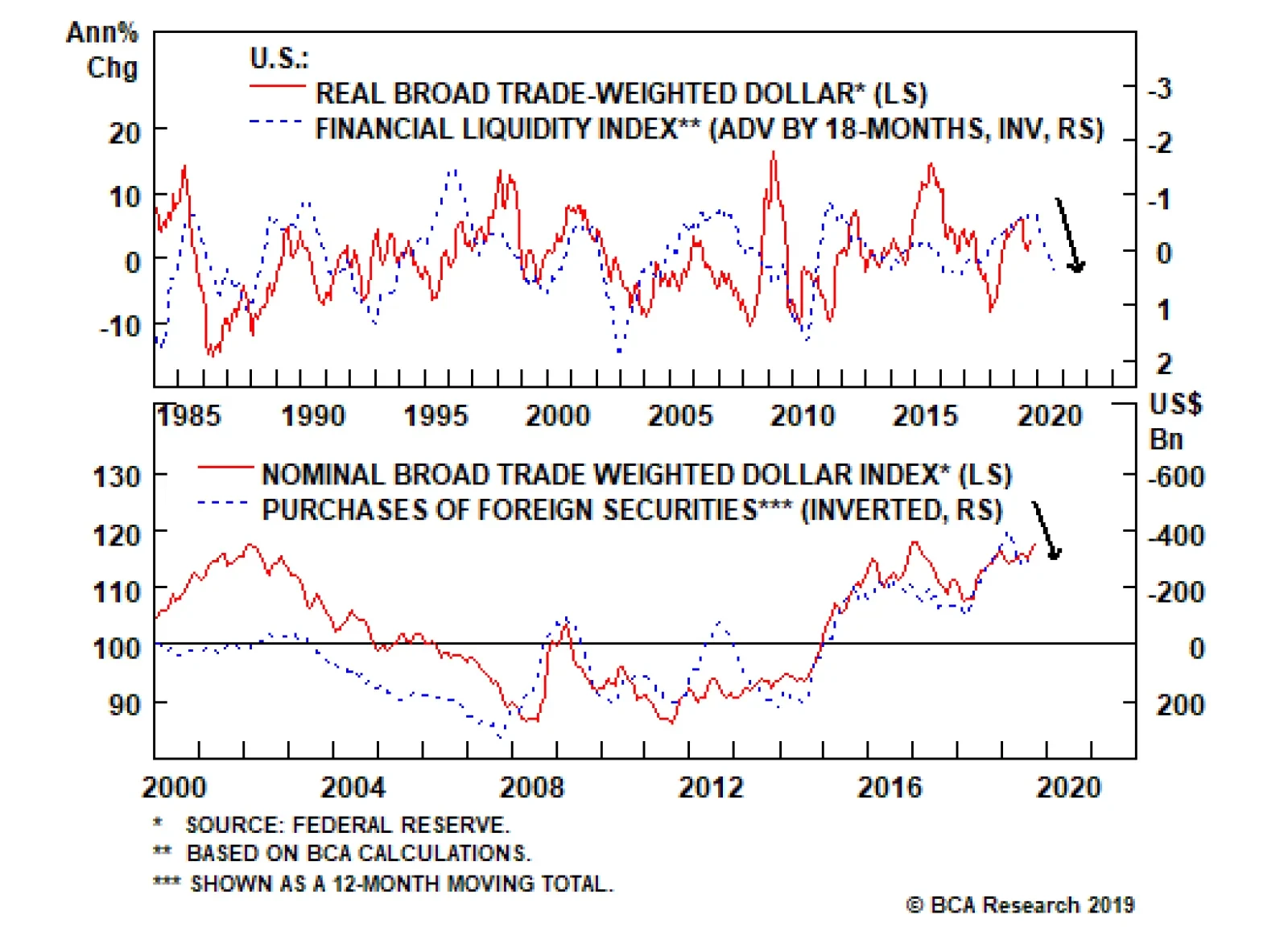
has significant downside. The greenback is very expensive and will decline as global liquidity conditions improve. These dynamics reflect the countercyclical nature of the dollar and also lead to strong greenback momentum, both on the way up and down. The…