Euro Area
The euro area trade surplus with the U.S. – standing near an all-time high of $150 billion – is extreme; and it is extreme because the undervaluation of the euro has made the euro area grossly over-competitive vis-à-vis the U.S., as claimed by the ECB’s own…

Feature Markets have turned jittery in the past month. Global growth data have deteriorated further (Chart 1), with Korean exports, the German manufacturing PMI, and even U.S. industrial production weak. Moreover, trade negotiations between the U.S. and China appear to have broken down, with China threatening to retaliate against U.S. sanctions on Huawei by blocking sales of rare earths, and refusing to negotiate further unless the U.S. eases tariffs. BCA’s Geopolitical Strategists now give only a 40% probability of a trade deal by the time of the G20 summit at the end of June (Table 1). As a result, BCA alerted clients on 10 May to the risk of a further short-term 5% correction in global equities.1 Recommended Allocation
Monthly Portfolio Update: China To The Rescue?
Monthly Portfolio Update: China To The Rescue?
Chart 1Worrying Signs?
Worrying Signs?
Worrying Signs?
Table 1Chances Of A Trade Deal Fading Fast
Monthly Portfolio Update: China To The Rescue?
Monthly Portfolio Update: China To The Rescue?
What is essentially behind the global slowdown, especially outside the U.S., is that both China and the U.S. last year were tightening monetary policy – China by slowing credit growth, the U.S. via Fed hikes. The U.S. economy was robust enough to withstand this, but economies in Europe, Asia, and Emerging Markets were not (Chart 2). The question now is whether the Chinese authorities and the Fed will come to the rescue and add stimulus that will cause a recovery in global growth. China has already triggered a rebound in credit growth since January (Chart 3). Chart 2U.S. Holding Up Better Than Elsewhere
U.S. Holding Up Better Than Elsewhere
U.S. Holding Up Better Than Elsewhere
Chart 3China Stimulus Has Only Just Begun
China Stimulus Has Only Just Begun
China Stimulus Has Only Just Begun
This has not come through clearly in Chinese – and other countries’ – activity data yet, partly because there is usually a lag of 3-12 months before this happens, and partly because Chinese authorities seemingly eased back somewhat on the gas pedal in April given rising expectations of a trade deal. But, judging by previous episodes such as 2009 and 2016, the Chinese will stimulate now based on the worst-case scenario. The risk is more that they overdo the stimulus than that they fail to do enough. Yes, China is worried about its excess debt situation. But this year they will prioritize growth – not least because of some sensitive anniversaries in the months ahead (for example, the 70th anniversary of the People’s Republic on October 1), and because the government is falling behind on its promise to double per capita real income between 2010 and 2020 (Chart 4). Chart 4Chinese Communist Party Needs To Prioritize Growth
Chinese Communist Party Needs To Prioritize Growth
Chinese Communist Party Needs To Prioritize Growth
Chart 5U.S. Consumers Look In Fine State
U.S. Consumers Look In Fine State
U.S. Consumers Look In Fine State
In the U.S., consumption is likely to continue to buoy the economy. Wages are growing 3.2% a year and set to accelerate further, and consumer confidence is close to a 50-year high (Chart 5). It is easy to exaggerate the impact of even an all-out trade war. For China, exports to the U.S. are only 3.4% of GDP. A hit to this could easily be offset by stimulus leading to greater capital expenditure. For the U.S, most academic studies show that the impact of tariffs will largely be passed on to the consumer via higher prices.2 But even if the U.S. imposes 25% tariffs on all Chinese exports and all is passed on to the consumer with no substitutions for goods from other countries the impact, about $130 billion, would represent only 1% of total U.S. consumption. The question now is whether the Chinese authorities and the Fed will come to the rescue and add stimulus that will cause a recovery in global growth. But if China will bail out the global economy, we are not so convinced that the Fed will cut rates any time soon. The market has priced in two Fed rate cuts over the next 12 months (Chart 6). But we agree with comments from Fed officials that recent softness in inflation is transitory. For example, financial services inflation (mostly comprising financial advisor fees, linked to assets under management, and therefore very sensitive to the stock market) alone has deducted 0.4 percentage points from core PCE inflation over the past six months (Chart 7). The trimmed mean PCE (which cuts out other volatile items besides energy and food, which are excluded from the commonly used core PCE measure) is close to 2% and continues to drift up. Chart 6Will The Fed Really Cut Twice In 12 Months?
Will The Fed Really Cut Twice In 12 Months?
Will The Fed Really Cut Twice In 12 Months?
Chart 7Soft Inflation Probably Is Transitory
Soft Inflation Probably Is Transitory
Soft Inflation Probably Is Transitory
Fed policy remains mildly accommodative: the current Fed Funds Rate is still two hikes below the neutral rate, as defined by the median terminal-rate dot in the FOMC’s Summary of Economic Projections (Chart 8). The market may be trying to push the Fed into cutting rates and could be disappointed if it does not. For now, we tend to agree with the Fed’s view that policy is about correct (Chart 9) but, if global growth does recover before the end of the year, one hike would be justified in early 2020 – before the upcoming Presidential election in November 2020 makes it less comfortable for the Fed to move. Chart 8Fed Policy Is Still Accommodative
Fed Policy Is Still Accommodative
Fed Policy Is Still Accommodative
Chart 9Fed Doesn't Need To Move For Now
Fed Doesn't Need To Move For Now
Fed Doesn't Need To Move For Now
In this macro environment, we see global bond yields bottoming not far below their current (very depressed) levels, and equities eking out reasonable gains over the next 12 months. The risk of a global recession over the next year or so is not high, in our opinion. We, therefore, continue to recommend an overweight on global equities and underweight on bonds over the cyclical horizon. We see global bond yields bottoming not far below their current (very depressed) levels, and equities eking out reasonable gains over the next 12 months. Fixed Income: Government bond yields have fallen sharply over the past eight months (by 110 basis points for the U.S. 10-year, for example) because of 1) falling inflation expectations, caused mostly by a weak oil price, 2) expectations of Fed rate cuts, 3) especially weak growth in Europe, which pulled German yields down to -20 basis points in May, and 4) global risk aversion which pushed asset allocators into government bonds, and lowered the term premium to near record low levels (Chart 10). If Brent crude rises to $80 a barrel this year as we forecast, the Fed does not cut rates, and European growth rebounds because of Chinese stimulus, we find it highly improbable that yields will fall much further. Ultimately, the global risk-free rate is driven by global growth (Chart 11). Investors are already positioned very aggressively for a further fall in yields (Chart 12). We would expect the U.S. 10-year yield to move back towards 3% over the next 12 months. We remain moderately positive on credit, which should also benefit from a growth rebound: U.S. high-yield spreads are still around 70 basis points for Ba-rated bonds, and 110 basis points for B-rated ones, above the levels at which they typically bottom in expansions; investment-grade bonds, though, have less room for spread contraction (Chart 13). Chart 10Term Premium Near Record Low
Term Premium Near Record Low
Term Premium Near Record Low
Chart 11Global Rebound Would Push Up Yields
Global Rebound Would Push Up Yields
Global Rebound Would Push Up Yields
Chart 12Investors Very Long Duration
Investors Very Long Duration
Investors Very Long Duration
Chart 13Credit Spreads Can Tighten Further
Credit Spreads Can Tighten Further
Credit Spreads Can Tighten Further
Equities: We remain overweight U.S. equities, partly as a hedge against our overweight on the equity asset class, since the U.S. remains a relatively low beta market. Our call for the second half will be 1) when will Chinese stimulus start to boost growth disproportionately for commodity and capital-goods exporters, and 2) does that justify a shift out of the U.S. (which may be somewhat hurt short term by the Trade War) and into euro zone and Emerging Markets equities. Given the structural headwinds in both (the chronically weak banking system and political issues in Europe; high debt and lack of structural reforms in EM), we want clear evidence that the Chinese stimulus is working before making this call. We are likely to remain more cautious on Japan, even though it is a clear beneficiary of Chinese growth, because of the risk presented by the rise in the consumption tax in October: after previous such hikes, consumption not only slumped immediately afterwards but remained depressed (Chart 14). Chart 14Japan's Sales Tax Hike Is A Worry
Japan's Sales Tax Hike Is A Worry
Japan's Sales Tax Hike Is A Worry
Chart 15Dollar Is A Counter-Cyclical Currency
Dollar Is A Counter-Cyclical Currency
Dollar Is A Counter-Cyclical Currency
Currencies: Again, China is the key. The dollar is a counter-cyclical currency, and a pickup in global growth would weaken it (Chart 15). Any further easing by the ECB – for example, significantly easier terms on the next Targeted Longer-Term Refinancing Operations (TLTRO) – might actually be positive for the euro since it would augur stronger growth in the euro area. Moreover, long dollar is a clear consensus view, with very skewed market positioning (Chart 16). Also, on a fundamental basis, compared to Purchasing Power Parity, the dollar is around 15% overvalued versus the euro and 11% versus the yen.
Chart 16
Chart 17Industrial Metals Driven By China Too
Industrial Metals Driven By China Too
Industrial Metals Driven By China Too
Commodities: Industrial metals prices have generally been weak in recent months with copper, for example, falling by 10% since mid-April. It will require a sustained rebound in Chinese infrastructure spending to push prices back up (Chart 17). Oil continues to be driven by supply-side factors, not demand. With OPEC discipline holding, Iran sanctions about to be reimposed, political turmoil in Libya and Venezuela, BCA’s energy strategists continue to see inventories drawing down this year, and therefore forecast Brent crude to reach $80 during 2019 (Chart 18). Chart 18Oil Supply Remains Tight
Oil Supply Remains Tight
Oil Supply Remains Tight
Garry Evans Chief Global Asset Allocation Strategist garry@bcaresearch.com Footnotes 1 Please see Global Investment Strategy, Special Report, “Stay Cyclically Overweight Global Equities, But Hedge Near-Term Downside Risks From An Escalation Of A Trade War,” dated May 10, 2019, available at gis.bcaresearch.com 2 Please see, for example, Mary Amiti, Sebastian Heise, and Noah Kwicklis, “The Impact of Import Tariffs on U.S. Domestic Prices,” Federal Reserve Bank of New York Liberty Street Economics, dated 4 January 2019. Recommended Asset Allocation
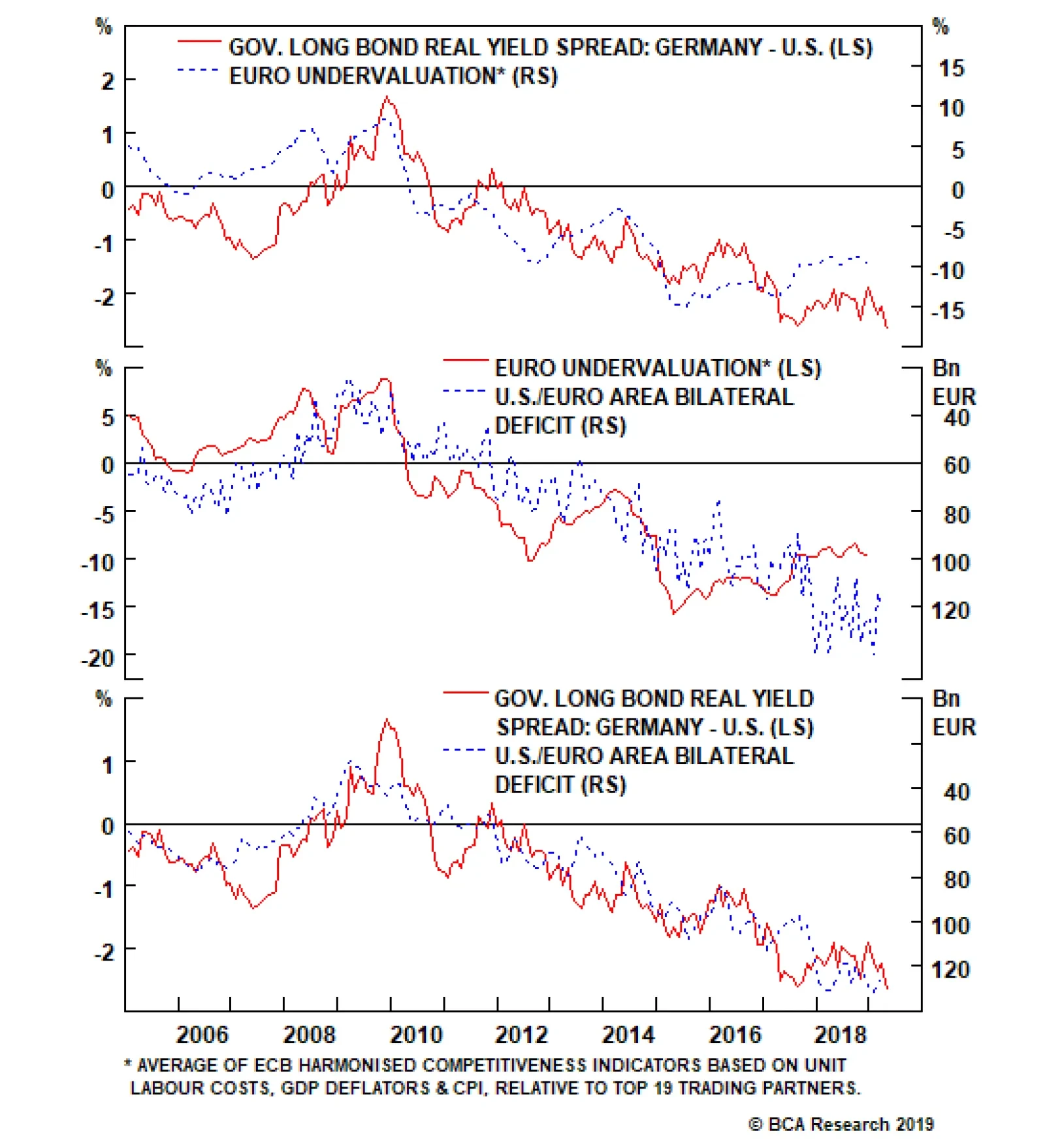
Highlights Huge imbalance #1 is the euro area’s $150 billion trade surplus with the United States. Huge imbalance #1 has resulted from the ECB holding interest rates at the lower bound while the Fed tightened policy. The upshot is that the Fed now has the scope to cut rates while the ECB does not. Huge imbalance #2 is the euro area’s €1.5 trillion TARGET2 banking imbalance. Huge imbalance #2 means that Germany effectively has hundreds of billions of ‘Italian’ euro assets, making a euro break-up unthinkable for the euro area’s dominant economy. New structural recommendation for bond investors: overweight a 50:50 portfolio of U.S. T-bonds and Italian BTPs versus a 50:50 portfolio of German bunds and Spanish Bonos. Feature Huge Imbalance #1: The Euro Area’s $150 Billion Trade Surplus With The United States While the recent focus has been on the brewing trade war between the United States and China, trade tensions between the U.S. and Europe have also been escalating. The euro area trade surplus with the U.S. – standing near an all-time high of $150 billion – is extreme; and it is extreme because the undervaluation of the euro has made the euro area grossly over-competitive vis-à-vis the U.S., as claimed by the ECB’s own analysis (Chart I-2 and Chart I-3)! Chart of the WeekThe U.S./Euro Area Trade Imbalance Is A Near-Perfect Function Of Relative Monetary Policy
The U.S./Euro Area Trade Imbalance Is A Near-Perfect Function Of Relative Monetary Policy
The U.S./Euro Area Trade Imbalance Is A Near-Perfect Function Of Relative Monetary Policy
Chart I-2Relative Monetary Policy Has Driven The Euro's Undervaluation...
Relative Monetary Policy Has Driven The Euro's Undervaluation...
Relative Monetary Policy Has Driven The Euro's Undervaluation...
Chart I-3...And The Euro's Undervaluation Has Driven The U.S./Euro Area Trade Imbalance
...And The Euro's Undervaluation Has Driven The U.S./Euro Area Trade Imbalance
...And The Euro's Undervaluation Has Driven The U.S./Euro Area Trade Imbalance
A common counterargument is that the euro area trade surplus is simply a structural issue. If a country, such as Germany, consistently consumes less than it produces, it must show up as a structural surplus. This argument is flawed. At least half of the surplus, including for Germany, has appeared since 2014, meaning it cannot be a structural issue (Chart I-4). In any case, if an economy consumes less than it produces, a higher exchange rate should help to facilitate the adjustment, encouraging under-consuming households to buy more imports, and discouraging over-producing firms from selling into foreign markets. Chart I-4Half Of Germany's Export Surplus Appeared After 2014
Half Of Germany's Export Surplus Appeared After 2014
Half Of Germany's Export Surplus Appeared After 2014
The Chart of the Week shows the true and damning reason for the trade imbalance. The euro area’s surplus with the U.S. is a near-perfect function of relative monetary policy. To be clear, the ECB is not explicitly depressing the exchange rate to make the euro area over-competitive, the ECB is just targeting its definition of price stability. However, the ECB’s definition of price stability omits owner-occupied housing (OOH) costs, and thereby understates true euro area inflation by 0.5 percent. To the extent that the ECB thinks in terms of real interest rates based on seemingly low (excluding OOH) inflation, this means that the ECB is setting real interest rates that are far too low for the euro area economy including OOH. This has resulted in the grossly over-competitive euro and the associated $150 billion surplus with the United States. The euro area trade surplus with the U.S. is a near-perfect function of relative monetary policy. Still, for 85 percent of the euro area, even inflation excluding OOH is reliably running within a 1.5-2 percent range, very close to the ECB’s definition of price stability. And bank lending is growing at a very healthy clip. For this vast majority of the bloc, the ECB’s zero and negative interest rate policy is wholly inappropriate. However, for the 15 percent of the euro area that is called Italy, ultra-loose monetary policy does seem more appropriate. Inflation is struggling to stay above 1 percent, and bank lending is still failing to gain traction (Chart I-5 and Chart I-6). Chart I-5Italian Inflation Is Struggling To Stay Above 1 Percent
Italian Inflation Is Struggling To Stay Above 1 Percent
Italian Inflation Is Struggling To Stay Above 1 Percent
Chart I-6Italian Banks Have Not ##br##Been Lending
Italian Banks Have Not Been Lending
Italian Banks Have Not Been Lending
Therefore, an important way of thinking of the ECB’s stance is one of self-preservation – protecting the euro area’s obvious source of fissure. Effectively, the ECB is setting policy for the weakest link in the euro area, even if that policy means exacerbating strains outside the euro area – specifically, by generating a huge trade surplus with the United States. But in the interests of self-preservation, the external strain is a price worth paying. This leads us to believe that the inevitable convergence of euro area and U.S. monetary policies is now much more likely to happen via the Federal Reserve ultimately cutting rates, than by the ECB raising rates. Huge Imbalance #2: The Euro Area’s €1.5 Trillion TARGET2 Imbalance The euro area Target2 banking imbalance now stands close to €1.5 trillion (Chart I-7). What is this huge imbalance (Box 1), and why does it matter?
Chart I-7
Box 1: What Is Target2? Target2 stands for Trans-European Automated Real-time Gross settlement Express Transfer system. It is the settlement system for euro payment flows between banks in the euro area. These payment flows result from trade or financial transactions such as deposit transfers, sales of financial assets or debt repayments. If the banking system in one member country has more payment inflows than outflows, its national central bank (NCB) accrues a Target2 asset vis-à-vis the ECB. Conversely, if the banking system has more outflows than inflows, the respective NCB accrues a Target2 liability vis-à-vis the ECB. Target2 balances therefore show the cumulative net payment flows within the euro area. The ECB delegated its QE sovereign bond purchases to the respective national central banks. In the case of Italian BTPs, Italian investors sold their bonds to the Bank of Italy and deposited the cash in banks healthier than those in Italy – for example, in Germany. Strictly speaking, this outflow of Italian cash to German banks is not the same as the deposit flight during the depths of the euro debt crisis in 2012. Rather, we might call it precautionary cash management. Nevertheless, in Eurosystem accounting terms it still means that the Bank of Italy has a new asset – the BTP – denominated in ‘Italian’ euros, while the Bundesbank has a new liability to German banks denominated in ‘German’ euros. The Target2 imbalance is the aggregate of such mismatches between Eurosystem assets denominated in ‘Italian and other periphery’ euros and liabilities denominated in ‘German and other core’ euros. If Italy owes Germany half a trillion euros then it is Germany that has the problem. Does the €1.5 trillion imbalance really matter? No, as long as an ‘Italian’ euro equals a ‘German’ euro, the imbalance is just an accounting identity within the Eurosystem. But if Italy and Germany started using different currencies, then suddenly it would matter with a vengeance. The Bank of Italy asset would be redenominated into lira, while the Bundesbank liability to German banks would be redenominated into deutschemarks. Thereby the ECB would end up with fewer assets than liabilities, and a solvency shortfall potentially equivalent to hundreds of billions of euros would end up on the shoulders of the ECB’s shareholders – largely, German taxpayers. To paraphrase John Maynard Keynes, if Italy owes Germany half a billion euros, then Italy has a problem; but if Italy owes Germany half a trillion euros, then it is Germany that has the problem (Chart I-8 and Chart I-9). In effect, the Target2 huge imbalance is a huge force for euro area self-preservation – because break-up means mutually assured destruction. Chart I-8The Target2 Imbalance Reflects The Cross-Border Flow Of Italian Investor Cash...
The Target2 Imbalance Reflects The Cross-Border Flow Of Italian Investor Cash...
The Target2 Imbalance Reflects The Cross-Border Flow Of Italian Investor Cash...
Chart I-9...To German##br## Banks
...To German Banks
...To German Banks
A New Structural Recommendation For Bond Investors To sum up, the euro area has two huge imbalances: one external, the other internal. The external imbalance is the $150 billion trade surplus with the United States. This huge imbalance has resulted from the ECB holding interest rates at the lower bound while the Fed tightened policy. The upshot is that the Fed now has the scope to cut rates while the ECB does not. And this makes the U.S. T-bond a much better haven asset than the German bund. The Target2 imbalance is a huge force for euro area self-preservation. The internal imbalance is the €1.5 trillion euro area Target2 imbalance. This huge imbalance means that Germany effectively has hundreds of billions of Italian ‘euro’ assets, making a euro break-up unthinkable for the euro area’s dominant economy. On this premise, the Italian BTP – which is offering a generous yield premium for such a break-up risk – is a good structural investment. Therefore, our new structural recommendation for bond investors is to overweight: A 50:50 portfolio of U.S. T-bonds and Italian BTPs Versus A 50:50 portfolio of German bunds and Spanish Bonos. Since 2018, the T-bond/BTP combination has underperformed by 20 percent and has considerable scope for ultimate catch-up one way or another (Chart I-10). Chart I-10A U.S. T-Bond/Italian BTP Combo Can Catch Up With A German Bund/Spanish Bono Combo
A U.S. T-Bond/Italian BTP Combo Can Catch Up With A German Bund/Spanish Bono Combo
A U.S. T-Bond/Italian BTP Combo Can Catch Up With A German Bund/Spanish Bono Combo
Fractal Trading System * There are no new trades this week. For any investment, excessive trend following and groupthink can reach a natural point of instability, at which point the established trend is highly likely to break down with or without an external catalyst. An early warning sign is the investment’s fractal dimension approaching its natural lower bound. Encouragingly, this trigger has consistently identified countertrend moves of various magnitudes across all asset classes. Chart I-11
Bitcoin
Bitcoin
The post-June 9, 2016 fractal trading model rules are: When the fractal dimension approaches the lower limit after an investment has been in an established trend it is a potential trigger for a liquidity-triggered trend reversal. Therefore, open a countertrend position. The profit target is a one-third reversal of the preceding 13-week move. Apply a symmetrical stop-loss. Close the position at the profit target or stop-loss. Otherwise close the position after 13 weeks. Use the position size multiple to control risk. The position size will be smaller for more risky positions. * For more details please see the European Investment Strategy Special Report “Fractals, Liquidity & A Trading Model,” dated December 11, 2014, available at eis.bcaresearch.com. Dhaval Joshi, Chief European Investment Strategist dhaval@bcaresearch.com Fractal Trading System Recommendations Asset Allocation Equity Regional and Country Allocation Equity Sector Allocation Bond and Interest Rate Allocation Currency and Other Allocation Closed Fractal Trades Trades Closed Trades Asset Performance Currency & Bond Equity Sector Country Equity Indicators Bond Yields Chart II-1Indicators To Watch - Bond Yields
Indicators To Watch - Bond Yields
Indicators To Watch - Bond Yields
Chart II-2Indicators To Watch - Bond Yields
Indicators To Watch - Bond Yields
Indicators To Watch - Bond Yields
Chart II-3Indicators To Watch - Bond Yields
Indicators To Watch - Bond Yields
Indicators To Watch - Bond Yields
Chart II-4Indicators To Watch - Bond Yields
Indicators To Watch - Bond Yields
Indicators To Watch - Bond Yields
Interest Rate Chart II-5Indicators To Watch - Interest Rate Expectations
Indicators To Watch - Interest Rate Expectations
Indicators To Watch - Interest Rate Expectations
Chart II-6Indicators To Watch - Interest Rate Expectations
Indicators To Watch - Interest Rate Expectations
Indicators To Watch - Interest Rate Expectations
Chart II-7Indicators To Watch - Interest Rate Expectations
Indicators To Watch - Interest Rate Expectations
Indicators To Watch - Interest Rate Expectations
Chart II-8Indicators To Watch - Interest Rate Expectations
Indicators To Watch - Interest Rate Expectations
Indicators To Watch - Interest Rate Expectations
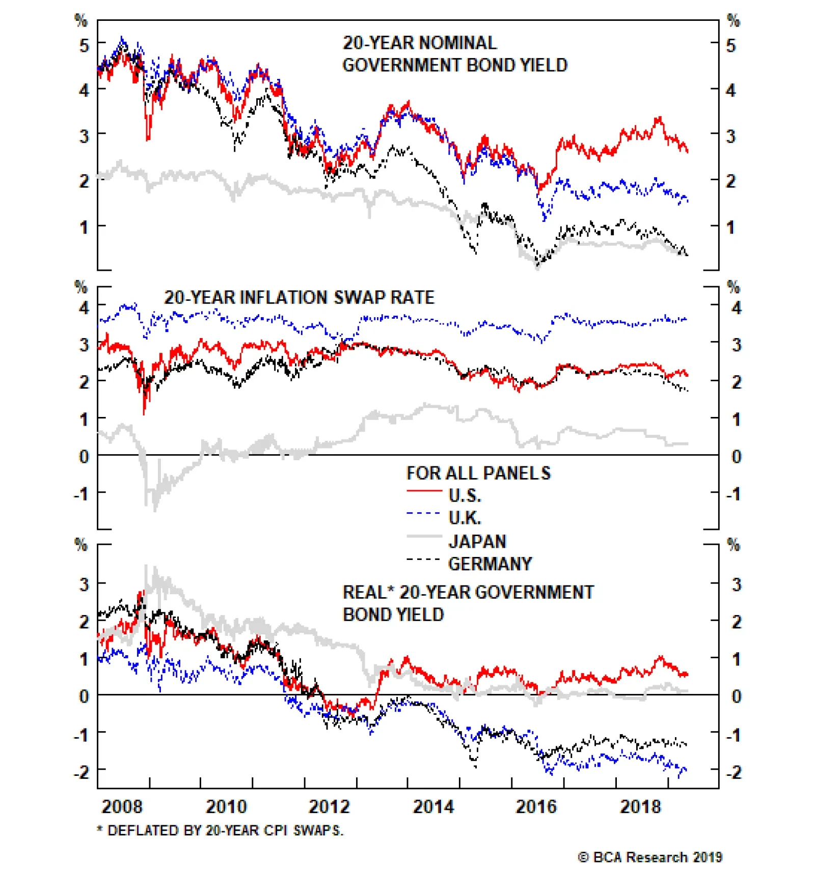
There is, however, at least one key macro difference between the two regions: While long-term inflation expectations in the euro area have declined, they are still well above Japanese levels. As a result, real yields are quite a bit lower in core Europe,…
Highlights The view that the world will sink into a deflationary “ice age” hinges on the assumption that policymakers will make a colossal mistake by failing to do what is in their own best interest. Contrary to popular belief, governments always have a tool to increase inflation, even when an economy has fallen into a liquidity trap: It’s called sustained fiscal stimulus. Japan could have avoided its deflationary epoch if the authorities had eased fiscal policy more aggressively. Ironically, bigger budget deficits probably would have caused the government debt-to-GDP ratio to rise less than it did. The U.S. and China are unlikely to repeat Japan’s mistake. Actually, looking ahead, Japan may not repeat Japan’s mistake. The euro area is a tougher call given the region’s political and institutional constraints; but even there, a reflationary outcome is more likely than not. An intensification of the trade war will cause government bond yields to fall a bit further in the near term. However, yields are likely to be higher one year from now. Global equities will follow the same path as bond yields: Down in the near term, but up over a 12-month horizon. Feature I feel more confident than ever that the next phase of the Ice Age will soon be upon us. Much of the thesis has come from learning the hard deflationary lessons from Japan. Most commenters now accept the Japanification of mainland Europe has occurred, but they just cannot conceive that the same thing might happen with the US. My biggest conviction call is that US 10y bond yields will converge with Japanese and German yields in the next recession at around minus 1% (and US 30y yields will fall to zero or below) and that markets will panic as outright deflation takes an icy grip. - Albert Edwards, Société Générale (May 2019) Fire Or Ice? If you were to ask most central bankers today whether it is better to err on the side of too much or too little inflation, chances are they would say the former. Their rationale would surely be as follows: If inflation rises to uncomfortably high levels, they can simply raise interest rates in order to cool the economy. In contrast, if inflation gets too low, and interest rates are already close to zero, monetary policy loses potency. It is better to have more control over the economy than less. This reasoning is correct on its own terms, but if one stands back and thinks about it, it is rather perverse to argue that deflation, which generally stems from a lack of aggregate demand, should be more difficult to overcome than inflation, which is usually the result of too much demand. After all, people like to spend money. Getting someone to work and produce should, in principle, be more difficult than getting them to consume. Inflation should be a bigger problem than deflation. So why do so many economists think otherwise? The Paradox Of Thrift There actually is a very good reason for this bias, one which John Maynard Keynes articulated more than 80 years ago. Keynes observed that when unemployment is rising, people are likely to try to save more due to fear of losing their jobs. Since one person’s spending is another’s income, this could create a vicious cycle where falling spending leads to lower aggregate income, and so on. Unfortunately, it is hard to save if you do not have a job. Thus, the decision by all individuals to save more could result, ironically, in a decline in aggregate savings.1 Keynes called this the paradox of thrift. At the heart of the paradox of thrift lies a deep-seated coordination problem. During an economic downturn, everyone would be better off if everyone else spent more money. However, since the spending of any one person only has a negligible effect on aggregate demand, no one has an incentive to spend more than is absolutely necessary. Keynes’ seminal insight was that a government could overcome this coordination problem by acting as a spender of last resort. Keynes argued that if the private sector decides to save more, the public sector should save less by running a bigger budget deficit. The result would be the preservation of full employment. Debt And Deliverance A common objection to the idea that governments should run bigger budget deficits to compensate for inadequate private-sector demand is that this will cause public-sector debt levels to swell to the point that a fiscal crisis becomes inevitable. The solution to Japan’s problem is obvious: The government should just keep easing fiscal policy until long-term inflation expectations reach the BoJ’s target. For countries such as Italy, this is a legitimate concern. If a country does not have a central bank that can serve as a buyer of last resort of government debt, it can end up facing a pernicious feedback loop where rising bond yields increase the likelihood of default, leading to even higher bond yields. These countries can, and often do, face speculative attacks on their bond markets (Chart 1).
Chart 1
For countries that issue debt in their own currencies, this concern does not exist. This is because their governments can print money to pay for goods and services. Since the cost to the government of printing a $100 bill is negligible, the government can always conjure up demand out of thin air. Of course, there is a risk that the government will manufacture too much demand and inflation will rise. But if the goal is to prevent deflation, this is a feature not a bug. Once demand increases enough, the government can just pull the plug on further fiscal stimulus, and everyone can live happily ever after. Japan’s Experience Chart 2The 1990s Japanese Example
The 1990s Japanese Example
The 1990s Japanese Example
Didn’t Japan try this approach and fail? No. Japan suffered the mother of all financial shocks in the early 1990s when the real estate and stock market bubbles simultaneously burst. This happened just as the working-age population was peaking, which made businesses even less eager to expand domestic capacity. The result of all this was a massive increase in excess private-sector savings. The government did loosen fiscal policy, but not by enough. Consequently, deflation eventually set in. As inflation expectations fell, real rates rose (Chart 2). Rising real rates put upward pressure on the yen and increased the government’s real debt financing costs. To make matters worse, falling prices made it more difficult for private-sector borrowers to pay back their loans. This further depressed spending. Ironically, had the Japanese government eased fiscal policy more aggressively to begin with, it probably would have been able to trim deficits later on. Nominal GDP would have also increased more briskly. As a consequence, the government debt-to-GDP ratio would have ended up rising less than it did. Today, Japan remains mired in a deflationary mindset. Twenty-year CPI swaps, a proxy for long-term inflation expectations, are trading at 0.3%, nowhere close to the Bank of Japan’s 2% target. Interest rates are stuck near zero, reflecting the fact that the economy continues to suffer from excess savings. Japan Needs Fiscal Stimulus, Not Austerity The solution to Japan’s problem is obvious: The government should just keep easing fiscal policy until long-term inflation expectations reach the BoJ’s target. Given Japan’s pathetically low fertility rate, a sensible strategy would be to offer subsidized housing and baby bonuses to any couple that has three or more children. It is impossible to know how big a budget deficit will be required to reset inflation expectations to a higher level. If people believe that the government is serious about easing fiscal policy by enough to get inflation up to target, real rates will collapse, the yen will fall, and private demand will rise. In the end, the government may not need to raise the budget deficit that much. Even if the Japanese government did have to increase the budget deficit substantially, this would not endanger the economy. As long as the interest rate at which the government borrows is below the growth rate of the economy, any budget deficit, no matter how large, will produce a stable debt-to-GDP ratio in the long run (Chart 3).2 Since there would be no need to ease fiscal policy by so much that the Bank of Japan is forced to lift interest rates above the economy’s growth rate, there is little risk that the debt-to-GDP ratio will end up on an unsustainable trajectory.
Chart 3
Chart 4Japanese Excess Savings Are Starting To Recede
Japanese Excess Savings Are Starting To Recede
Japanese Excess Savings Are Starting To Recede
Will the Japanese government heed this advice? While Q1 GDP growth surprised on the upside, this was mainly because of a strong contribution from net exports and inventories. Final domestic demand remains underwhelming. Stronger global growth will help Japan later this year, but we think there is still a 50/50 chance the planned VAT hike will be postponed. Looking ahead, the exodus of Japanese workers from the labor market into retirement will reduce private-sector savings. The household savings rate has already fallen from nearly 20% in the early 1980s to around 4% in recent years. The ratio of job openings-to-applicants has risen to a 45-year high (Chart 4). Falling private-sector savings will raise the neutral rate of interest, thus giving the BoJ more traction over monetary policy. Japan’s deflationary ice age may be coming to an end. Stimulus With Chinese Characteristics Like Japan, China has struggled to consume enough of what it produces. In the days when China had a massive current account surplus, it could export that excess savings abroad. It cannot do that anymore, so the government has consciously chosen to spur fixed-investment spending in order to prop up employment. Since a lot of investment is financed through credit, debt levels have risen (Chart 5). Much of China’s debt-financed investment spending has been undertaken by local governments and state-owned enterprises. This has made credit and fiscal policy virtually indistinguishable. While the general government fiscal deficit stands at a moderate 4.1% of GDP, the augmented deficit, which includes a variety of off-balance sheet expenditures, has swollen to 10.7% of GDP, up more than six percentage points since 2010 (Chart 6). Chart 5China: From Exporting Savings To Investing Domestically And Building Up Debt
China: From Exporting Savings To Investing Domestically And Building Up Debt
China: From Exporting Savings To Investing Domestically And Building Up Debt
Chart 6
As we discussed a few weeks ago in a report entitled “Chinese Debt: A Contrarian View”, there is little preventing the Chinese government from further ramping up credit/fiscal stimulus.3 The fact that the trade negotiations are on the ropes only strengthens the case for additional easing. The government knows full well that it will gain negotiating leverage over the U.S. if the Chinese economy is humming along despite higher tariffs on Chinese imports. Regardless of whether it is right-wing populism or left-wing populism that triumphs in the end, the outcome is likely to be the same: higher inflation. Europe: Turning Japanese? Judging from the fact that German bund yields have fallen to Japanese levels, one might conclude that the Japanification of Europe is complete. There is, however, at least one key macro difference between the two regions: While long-term inflation expectations in the euro area have declined, they are still well above Japanese levels (Chart 7). As a result, real yields are quite a bit lower in core Europe, which gives countries such as Germany and France some cushion of support. Chart 7Despite Similar Nominal Bond Yields, Real Rates Are Still Much Lower In Germany Than Japan
Despite Similar Nominal Bond Yields, Real Rates Are Still Much Lower in Germany Than Japan
Despite Similar Nominal Bond Yields, Real Rates Are Still Much Lower in Germany Than Japan
Chart 8Italian Bond Yields Are Still Worryingly High
Italian Bond Yields Are Still Worryingly High
Italian Bond Yields Are Still Worryingly High
Bond yields remain elevated in Italy, though still below the levels seen last October, and far below their peak during the euro crisis in 2011 (Chart 8). Short of the creation of a pan-euro area fiscal union, Italy’s best hope is that Germany takes steps to reflate its own economy. The conventional wisdom is that the German psyche, ever focused on fiscal discipline, would never permit that to happen. This view, however, forgets that Germany had no trouble violating the Maastricht Treaty’s deficit cap of 3% of GDP in the early 2000s. Germany today sees little need to significantly loosen fiscal policy because years of wage repression, and more recently, a weak euro, have caused its current account surplus to swell to 9% of GDP. However, the country’s ability to push out its excess production to the rest of the world may become more limited in the future. The gap in unit labor costs between Germany and other euro area members has narrowed steadily in recent years. This development has coincided with a decline in Germany’s trade surplus with the rest of the euro area (Chart 9). If the common currency starts to appreciate and wage growth in Germany continues to outpace the rest of the region, the German government may have no choice but to loosen the fiscal screws. Chart 9Germany's Competitive Advantage Against The Rest Of The Euro Area Is Declining
Germany's Competitive Advantage Against The Rest Of The Euro Area Is Declining
Germany's Competitive Advantage Against The Rest Of The Euro Area Is Declining
Chart 10U.S.: Federal Discretionary Spending Has Been Gaining Steam
U.S.: Federal Discretionary Spending Has Been Gaining Steam
U.S.: Federal Discretionary Spending Has Been Gaining Steam
U.S.: Ice Age Vs. Green New Deal While Trump’s tax cuts have gotten a lot of attention, an equally important development in recent years has been the rapid acceleration in federal government spending. From a contraction of 7% in 2013, real discretionary outlays are set to grow by 3% in 2019 (Chart 10). There is little reason to think that the U.S. budget deficit will shrink anytime soon. Taxes may go back up if the Democrats take control of the White House and sweep Congress next year. However, even in that scenario, any increase in tax rates is likely to be neutralized by higher social welfare spending – yes, including partial implementation of the green new deal. Meanwhile, government outlays on Social Security and health care programs such as Medicaid are on track to rise by 5.4% of GDP over the next thirty years (Chart 11).
Chart 11
So far, an overstimulated U.S. economy has not produced much in the way of inflation. But with the unemployment rate down to a 49-year low, that could change over the next few years. Recent communications from FOMC members suggest a growing tolerance for a modest inflation overshoot of the 2% target. An outright increase in the Fed’s inflation target is unlikely in the near term, but could become a viable option if realized inflation moves above the Fed’s current comfort zone of 2%-to-2.5% for long enough. If that were to happen, raising the inflation target could turn out to be politically more expedient than engineering a deep recession in an effort to bring inflation back down. It will also help alleviate the rising real debt burden that will ensue from high deficits. We expect global bond yields to reach a series of “higher highs and higher lows” over the coming years. The Fed is already facing political pressure from the Trump administration to keep rates low. Politics in the U.S. and in many other countries is moving in a more populist direction. Regardless of whether it is right-wing populism or left-wing populism that triumphs in the end, the outcome is likely to be the same: higher inflation. Historically, there is a clear inverse correlation between central bank independence and inflation (Chart 12).
Chart 12
Investment Conclusions On the question of whether we are heading for a deflationary ice age or a period of inflationary global warming, we would put higher odds on the latter. Many of the structural factors that have produced lower inflation over the last few decades are in retreat. Globalization has stalled, and may even reverse course if the trade war intensifies (Chart 13). The ratio of workers-to-consumers globally is starting to shrink as the post-war generation leaves the labor force (Chart 14). Central bank autonomy is under attack, while fiscal policy is turning more expansionary. Chart 13The Age Of Globalization Is Over
The Age of Globalization Is Over
The Age of Globalization Is Over
Chart 14The Worker-To-Consumer Ratio Has Peaked Globally
The Worker-To-Consumer Ratio Has Peaked Globally
The Worker-To-Consumer Ratio Has Peaked Globally
To believe that politicians will not dial up fiscal stimulus in the face of a chronic shortfall of aggregate demand is to believe that they will act incompetently. Not incompetent in the low-IQ sort of way. Incompetent in the sense that they will act against their own self-interest. Voters want more employment. In the age of populism, it seems unlikely that politicians with ready access to the printing press will fail to deliver what the people want. We declared “The End Of The 35-Year Bond Bull Market” on July 5, 2016. As luck would have it, this was the very same day that the U.S. 10-year Treasury yield hit an all-time low of 1.37%. We expect global bond yields to reach a series of “higher highs and higher lows” over the coming years. Right now, we are witnessing a countertrend rally in bond prices. Yields could fall a bit further in the coming weeks if the trade war heats up. However, yields will be higher in 12 months’ time, provided that China and the U.S. begrudgingly reach a trade truce and global growth reaccelerates, as we expect. Global equities are likely to follow the same pattern as bond yields. Trade tensions could push stocks down about 5% from current levels (we are presently positioned for this by being tactically short the S&P 500 against an underlying structural overweight position). However, equities will move to fresh highs over a 12-month horizon as global growth picks up. The recent stock market correction caused our long European bank trade to be stopped out for a loss of 7%. We will re-enter the trade once we conclude that global equities have found a bottom. The dollar will probably strengthen a bit more in the near term, but as a countercyclical currency, the greenback will weaken in the second half of this year. This will provide a good opportunity to go overweight EM and European stocks in common-currency terms. Peter Berezin, Chief Global Strategist Global Investment Strategy peterb@bcaresearch.com Footnotes 1 Another way to see this point is to recall that business spending normally declines when the economy weakens. Investment spending tends to move in lockstep with national savings (indeed, at the global level, the two must be exactly equal to each other). Thus, if consumer spending falls in response to the decision by households to try to save more, and this leads to lower investment, it will also lead to lower aggregate savings. 2 Please see Global Investment Strategy Weekly Report, “Is There Really Too Much Government Debt In The World?” dated February 22, 2019. 3 Please see Global Investment Strategy Weekly Report, “Chinese Debt: A Contrarian View,” dated April 19, 2019. Strategy & Market Trends MacroQuant Model And Current Subjective Scores
Chart 15
Tactical Trades Strategic Recommendations Closed Trades
The barrage of bad news in the past 24 hours is impressive. As the U.S. is extending its blacklist of Chinese companies, fears are growing that a resolution to the trade tensions is more elusive than ever. Moreover, Japanese flash manufacturing PMIs have…
Highlights In the second half of 2019, economic growth will stop accelerating… …but an underpinning of equity valuations will limit sell-off magnitudes to around 10 percent or so, rather than deeper sustained plunges. The equity market will end up in a sideways channel… …but defensives, such as healthcare, will outperform economically-sensitive sectors. Overweight Euro Stoxx 50 versus Shanghai Composite. Overweight the JPY. Bitcoin is due another technical correction. Feature The 2019 playbook for economies and markets is playing out exactly as we predicted. In our first report of this year we wrote that 2019 would be the economic and investment opposite of 2018. Opposite to 2018 because the first half of 2019 would see inflation fade, and growth accelerate. And opposite to 2018 because the second half of 2019 would see inflation stop fading, and growth stop accelerating (Chart of the Week). Chart of the WeekIn The First Half Of 2019, Inflation Faded, Growth Accelerated
In The First Half Of 2019, Inflation Faded, Growth Accelerated
In The First Half Of 2019, Inflation Faded, Growth Accelerated
Inflation Faded, Growth Accelerated Back in early January, we wrote: “Inflation is set to disappoint as the recent near-halving of the crude oil price feeds into both headline and core consumer price indexes. With central banks now promising even greater ‘dependence on the incoming data’, this unfolding dynamic will force them to temper any hawkish intentions and rhetoric, limiting the extent of upside in bond yields.” This was a controversial view at the time. Yet within a month of writing, the Federal Reserve had stopped hiking interest rates, while the ECB and other major central banks had also pivoted to more dovish. We also wrote: “Germany should benefit from another support to growth. Last year, the auto sector – a major engine of the German economy – spluttered as it absorbed the new WLTP emissions testing standard. Through the middle of 2018 German motor vehicle exports suffered a €20 billion hit which shaved 0.6 percent from Germany’s €3.4 trillion economy (Chart I-2). Now, if auto exports stabilize, this drag will disappear. And if auto exports recover to the pre-WLTP level after this one-off and temporary shock, Germany will receive a 0.6% mirror-image boost to growth.” 1 2019 is the economic and investment opposite of 2018. We now know that the German economy accelerated to a close-to-trend 1.7% clip in the second quarter, up from a -0.8 percent rate of contraction in the third quarter of 2018 (Chart I-3). This is not just due to relief in the auto sector. Growth in other European economies has also rebounded, so the acceleration in growth has a broader foundation, and is now beyond doubt. Given the openness of the European economy, it is also inconceivable that this growth pick-up does not reflect a more generalized acceleration in global activity.2 Chart I-2The WTLP Drag On German Auto Exports Is Over
The WTLP Drag On German Auto Exports Is Over
The WTLP Drag On German Auto Exports Is Over
Chart I-3German GDP Growth Accelerated To A 1.7 Percent Clip
German GDP Growth Accelerated To A 1.7 Percent Clip
German GDP Growth Accelerated To A 1.7 Percent Clip
To repeat, the 2019 playbook for economies and financial markets is playing out exactly as expected; in the first half of the year, inflation faded while growth accelerated. The question is: what happens next? Growth Will Struggle To Accelerate Further Clients ask us an important theoretical question: what is the most important driver for the economy and financial markets; is it the change in the bond yield (or interest rate) or is it the level of the bond yield? The answer is that both the change and the level of the bond yield are important in their different ways. The German economy accelerated to a close-to-trend 1.7% clip in the second quarter. When it comes to accelerations and decelerations in credit creation, it is the change in the bond yield that is the most important. Remember, GDP is a flow statistic, which means that GDP growth is a change of flow statistic receiving contributions from the change of flow of credit. As changes in the flow of credit result from the change in the bond yield – all else being equal – it is the change in the bond yield that drives GDP growth. If all of this sounds somewhat confusing, then Chart I-4 should make the point crystal clear. Chart I-4The Change In The Bond Yield Drives GDP Growth
The Change In The Bond Yield Drives GDP Growth
The Change In The Bond Yield Drives GDP Growth
Since last November, high-quality 10-year bond yields have plunged 70 bps, and this collapse in yields helped to provide a strong impulse to growth in the first half of 2019. To receive the same impulse again in the second half, bond yields would have to plunge another 70 bps. But with the German 10-year bund yield already at -0.1 percent, the same rate of decline seems highly unlikely, if not mathematically impossible. The upshot is that the growth impulse from declining bond yields can only fade in the second half of this year. However, when it comes to valuations and solvencies in the financial markets, it is the level of the bond yield that is the most important. Essentially, at a tipping point, higher bond yields can suddenly and viciously undermine the valuation support of equities, triggering a plunge in the stock market and other risk-assets which threatens a disinflationary impulse on the economy. The growth impulse from declining bond yields can only fade in the second half of this year. How can we sense this tipping point? It broadly equates to when the sum of the 10-year yields on the T-bond, German bund, and JGB is at 4 percent, the ‘rule of 4’ (Chart I-5). Conversely, when the sum is below 3 percent, the ‘rule of 3’, – as it is now – the seemingly rich valuation of equities versus bonds is broadly justified (Chart I-6).3 Chart I-5When The Sum Of 10-Year Yields On The T-Bond, Bund, And JGB Equals 4 Percent, The Global 10-Year Yield Equals 2 Percent
When The Sum Of 10-Year Yields On The T-Bond, Bund, And JGB Equals 4 Percent, The Global 10-Year Yield Equals 2 Percent
When The Sum Of 10-Year Yields On The T-Bond, Bund, And JGB Equals 4 Percent, The Global 10-Year Yield Equals 2 Percent
Chart I-6The Rule Of 4, And The Rule Of 3
The Rule Of 4, And The Rule Of 3
The Rule Of 4, And The Rule Of 3
The upshot is that in the second half of 2019, economic growth will stop accelerating, but the support to equity valuations will limit sell-off magnitudes to around 10 percent or so, rather than deeper sustained plunges (Chart I-7). In aggregate, the equity market will end up in a sideways channel, but defensives, such as healthcare, will outperform economically-sensitive sectors. Chart I-7The Low Expected Return On Equities Is Justified When Bond Yields Are Ultra-Low
The Low Expected Return On Equities Is Justified When Bond Yields Are Ultra-Low
The Low Expected Return On Equities Is Justified When Bond Yields Are Ultra-Low
How Did We Do? In our first report of the year, we also made (or reiterated) five investment recommendations. Today, we will review whether they worked or not, and what to do with them now. 1. Own a 25:75 combination of European banks relative to market, plus U.S. T-bonds. Chart I-8Banks Didn’t Outperform, But Bonds Did!
Banks Didn't Outperform, But Bonds Did!
Banks Didn't Outperform, But Bonds Did!
Did it work? Yes. Although European banks underperformed the market, this was more than offset by the huge rally in T-bonds that resulted from the Fed going on hold (Chart I-8). Hence, the position is up 1 percent this year and 3.5 percent since its inception last November with the added advantage of negligible volatility. What to do now. Take profits. 2. Overweight EM versus DM. Did it work? No. EM has underperformed DM this year, though the position is broadly flat since its inception in November. What to do now. Close this position and switch into overweight Euro Stoxx 50 versus Shanghai Composite. 3. Overweight European versus U.S. equities. Did it work? The position is flat this year, though modestly up since its inception in November. What to do now. Maintain the position for a little while longer, as an expected short-term underperformance of the tech sector should benefit the tech-lite European equity market. 4. Overweight Italian assets versus European assets. Did it work? The position is broadly flat this year for both Italian equities and bonds relative to their European benchmarks. What to do now. Close any cyclical exposure to Italy, but maintain a structural exposure to Italian BTPs either in absolute or relative terms. 5. Overweight the JPY. Chart I-9In Japan And Europe, The Expected Interest Rate Cannot Go Much Lower
In Japan And Europe, The Expected Interest Rate Cannot Go Much Lower
In Japan And Europe, The Expected Interest Rate Cannot Go Much Lower
Did it work? Yes. The broad trade-weighted JPY has outperformed this year, and especially so the JPY/EUR cross. What to do now. Maintain the position. When the expected interest rate is at its lower bound, then it is difficult for the central bank to hurt its currency. In technical terms, the currency possesses a highly attractive payoff profile called positive skew (Chart I-9). Of course, there are plenty of currencies whose interest rates are near the technical lower bound, but we like the JPY because it has less political risk than the others. So for the moment, remain overweight the JPY. Fractal Trading System* This week we note that after a 100 percent rally in a near straight line, bitcoin’s 65-day fractal dimension is at the lower bound that has reliably signaled previous technical corrections. On that basis, this week’s recommended trade is short bitcoin, setting the profit target and symmetrical stop-loss at 27 percent. Also, we are very pleased to report that short tech versus healthcare quickly achieved its 6.5 percent profit target and is now closed. This leaves four open positions. For any investment, excessive trend following and groupthink can reach a natural point of instability, at which point the established trend is highly likely to break down with or without an external catalyst. An early warning sign is the investment’s fractal dimension approaching its natural lower bound. Encouragingly, this trigger has consistently identified countertrend moves of various magnitudes across all asset classes. Chart I-10
Bitcoin
Bitcoin
The post-June 9, 2016 fractal trading model rules are: When the fractal dimension approaches the lower limit after an investment has been in an established trend it is a potential trigger for a liquidity-triggered trend reversal. Therefore, open a countertrend position. The profit target is a one-third reversal of the preceding 13-week move. Apply a symmetrical stop-loss. Close the position at the profit target or stop-loss. Otherwise close the position after 13 weeks. Use the position size multiple to control risk. The position size will be smaller for more risky positions. * For more details please see the European Investment Strategy Special Report “Fractals, Liquidity & A Trading Model,” dated December 11, 2014, available at eis.bcaresearch.com. Dhaval Joshi, Chief European Investment Strategist dhaval@bcaresearch.com Footnotes 1 German auto net exports and GDP are quoted at annualized rates. The Worldwide Harmonized Light Vehicle test Procedure (WLTP) is a new standard for auto emissions that took effect on September 1 2018. 2 Quarter-on-quarter real GDP growth at annualized rates. 3 Please see the European Investment Strategy Weekly Report “The Rule of 4 Becomes the Rule of 3” dated March 21, 2019 available at eis.bcaresearch.com. Fractal Trading System Recommendations Asset Allocation Equity Regional and Country Allocation Equity Sector Allocation Bond and Interest Rate Allocation Currency and Other Allocation Closed Fractal Trades Trades Closed Trades Asset Performance Currency & Bond Equity Sector Country Equity Indicators Bond Yields Chart II-1Indicators To Watch - Bond Yields
Indicators To Watch - Bond Yields
Indicators To Watch - Bond Yields
Chart II-2Indicators To Watch - Bond Yields
Indicators To Watch - Bond Yields
Indicators To Watch - Bond Yields
Chart II-3Indicators To Watch - Bond Yields
Indicators To Watch - Bond Yields
Indicators To Watch - Bond Yields
Chart II-4Indicators To Watch - Bond Yields
Indicators To Watch - Bond Yields
Indicators To Watch - Bond Yields
Interest Rate Chart II-5Indicators To Watch - Interest Rate Expectations
Indicators To Watch - Interest Rate Expectations
Indicators To Watch - Interest Rate Expectations
Chart II-6Indicators To Watch - Interest Rate Expectations
Indicators To Watch - Interest Rate Expectations
Indicators To Watch - Interest Rate Expectations
Chart II-7Indicators To Watch - Interest Rate Expectations
Indicators To Watch - Interest Rate Expectations
Indicators To Watch - Interest Rate Expectations
Chart II-8Indicators To Watch - Interest Rate Expectations
Indicators To Watch - Interest Rate Expectations
Indicators To Watch - Interest Rate Expectations
Highlights Global financial markets are currently dealing with a fresh round of uncertainty related to U.S.-China trade tensions. Yet while equities and government bond yields have fallen in response to the U.S. imposition of tariffs and escalation of the trade war with China, corporate bond markets in the developed economies have been relatively well-behaved (so far). Credit spreads have only widened modestly, which perhaps should not be surprising given central bankers’ increasingly dovish bias combined with early signs of a cyclical global growth rebound (Chart 1). Feature Chart 1Global Corporates: Shifting To A Friendlier Growth Backdrop?
Global Corporates: Shifting To A Friendlier Growth Backdrop?
Global Corporates: Shifting To A Friendlier Growth Backdrop?
With that in mind, this week we are presenting the latest update of our Corporate Health Monitor (CHM) Chartbook. The CHMs are composite indicators of balance sheet and income statement ratios (using both top-down and bottom-up data) that are designed to assess the financial well-being of the overall non-financial corporate sectors in the major developed economies. A brief overview of the methodology is presented in Appendix 1 on page 15. The main conclusion from the latest readings on our CHMs is that slower economic growth over the past year has resulted in some erosion of overall global credit quality. The deterioration was most pronounced in the more economically fragile regions that have suffered the deepest pullbacks in growth: Europe and Japan. The CHMs are currently giving an overall “neutral” signal in the U.S., although there are some worrying trends developing within the sub-components like interest coverage and short-term liquidity. Meanwhile, the CHMs in the U.K. and Canada are showing modest cyclical deterioration from very strong levels. Broadly speaking, the CHMs support our main global corporate bond market investment recommendations: a tactical aggregate overweight versus global government bonds, with a regional bias favoring the U.S. over Europe, and a quality bias tilted towards U.S. high-yield (HY) over investment grade (IG). Renewed U.S.-China trade hostilities represent a threat to that pro-cyclical fixed income asset allocation, although we expect more aggressive responses from policymakers on both sides (more fiscal and monetary stimulus in China, a more dovish bias from the Fed) to offset any tariff-induced weakness in growth. U.S. Corporate Health Monitors: Cyclically OK, But Longer-Term Problems Are Brewing Our top-down U.S. CHM is sending a neutral message on credit quality, sitting right on the threshold separating “deteriorating health” from “improving health” (Chart 2). The indicator, however, has been trending in a direction showing improving credit metrics over the past year. From a fundamental perspective, the top-down U.S. CHM suggests that the U.S. credit cycle is being extended by the stubborn endurance of the U.S. business cycle. The resilience of the U.S. economy, combined with the positive impact on U.S. profitability from the Trump corporate tax cuts, has put U.S. companies in a cyclically healthier position, even with relatively high leverage. The ratios directly related to corporate profits that go into the top-down CHM – return on capital, profit margins and interest coverage – have all gone up over the past year, generating the bulk of the directional improvement in the top-down CHM. From a fundamental perspective, the top-down U.S. CHM suggests that the U.S. credit cycle is being extended by the stubborn endurance of the U.S. business cycle. In other words, there are no immediate domestic pressures on U.S. corporate finances that should require significantly wider credit spreads to compensate for rising downgrade/default risk. That does not mean that all the news is good, however. The short-term liquidity ratio has fallen sharply and is now at levels last seen in the years leading up to the 2008 Financial Crisis. Similar deteriorations can be seen in the short-term liquidity ratios within the bottom-up versions of our U.S. CHMs for IG corporates (Chart 3) and HY companies (Chart 4). Coming at a time when interest coverage ratios have been steadily declining for IG, and are already at low levels for HY, declining short-term liquidity would leave U.S. corporates highly vulnerable during the next economic downturn. Chart 2Top-Down U.S. CHM: A Neutral Reading
Top-Down U.S. CHM: A Neutral Reading
Top-Down U.S. CHM: A Neutral Reading
Chart 3Bottom-Up U.S. IG CHM: Modest Deterioration With Worrying Trends
Bottom-Up U.S. IG CHM: Modest Deterioration With Worrying Trends
Bottom-Up U.S. IG CHM: Modest Deterioration With Worrying Trends
We see no reason yet to exit our tactical overweight stance on U.S. IG and HY corporates versus both U.S. Treasuries and non-U.S. corporates. For now, however, the message from our bottom-up U.S. CHMs is the same as that from our top-down U.S. CHM, with all hovering near the zero line suggesting no major deterioration in overall credit quality. We see no reason yet to exit our tactical overweight stance on U.S. IG and HY corporates versus both U.S. Treasuries and non-U.S. corporates (Chart 5). Our favored indicators continue to point to a rebound in global growth in the latter half of 2019, and the Fed currently has no desire to push the funds rate into restrictive territory, so the risk/reward over the next six months still favors staying overweight U.S. corporates. The medium-term outlook, however, is far more challenging given the growing body of evidence pointing to the advanced age of the U.S. credit cycle, such as falling interest coverage and liquidity. Chart 4Bottom-Up U.S. HY CHM: A Cyclical Improvement, Nothing More
Bottom-Up U.S. HY CHM: A Cyclical Improvement, Nothing More
Bottom-Up U.S. HY CHM: A Cyclical Improvement, Nothing More
Chart 5U.S. Corporates: Stay Tactically Overweight IG & HY
U.S. Corporates: Stay Tactically Overweight IG & HY
U.S. Corporates: Stay Tactically Overweight IG & HY
One final point – in Appendix 2 starting on page 17, we present bottom-up CHMs for the main industry sector groupings of companies that go into our overall U.S. IG CHM. Most of the sector CHMs are hovering near the zero line, but two industry groupings stand out as having a rising CHM that is now well within “deteriorating health” territory – Consumer Staples and Utilities. Euro Corporate Health Monitors: Worsened By Weaker Growth The message from our bottom-up CHMs for the euro area shows that there was some damage done to credit quality from last year’s growth slump, evidenced by lower profit margins and interest coverage ratios. Although overall credit quality remains fairly neutral (i.e. the CHMs remain near the zero line). For euro area IG, the gap between domestic and foreign issuers in the euro area corporate bond market continues to widen, with the former now slightly in the “deteriorating health” zone (Chart 6). Profit margins have fallen far more sharply for domestic issuers, reflecting the very rapid slowing of euro area growth over the latter half of 2019. Interest coverage for domestic issuers is also lower than for foreign issuers, while short-term liquidity ratios have weakened for both over the past year. For euro area HY, the signal from the bottom-up CHM is more consistently positive between domestic and foreign issuers (Chart 7). Leverage has declined, but profit-based metrics have worsened for both sets of issuers. Interest/debt coverage and liquidity, however, are far worse for domestic issuers. Chart 6Bottom-Up Euro Area IG CHMs: Weaker Growth Hitting Domestic Issuers
Bottom-Up Euro Area IG CHMs: Weaker Growth Hitting Domestic Issuers
Bottom-Up Euro Area IG CHMs: Weaker Growth Hitting Domestic Issuers
Chart 7Bottom-Up Euro Area HY CHMs: Healthier Through Lower Leverage
Bottom-Up Euro Area HY CHMs: Healthier Through Lower Leverage
Bottom-Up Euro Area HY CHMs: Healthier Through Lower Leverage
Within the euro area, our bottom-up IG CHMs for Core and Periphery countries have worsened over the past year, from healthy levels, and are now hovering just above the zero line (Chart 8). Interest coverage is considerably stronger for Core issuers, although profitability metrics are remarkably similar. Short-term liquidity ratios have also fallen for both regional groups over the past year. The spread tightening already seen in euro area credit is too extreme relative to the still sluggish pace of economic growth in the region. Despite the lack of a major overall negative signal from the euro area CHMs, we are only maintaining a neutral allocation to euro area corporates, even within our current overweight stance on overall global corporates (Chart 9). The spread tightening already seen in euro area credit is too extreme relative to the still sluggish pace of economic growth in the region. This will inhibit the ability for spreads to tighten further in the event of a pickup in growth, while also leaving spreads vulnerable to widening pressures if euro area growth continues to languish. Chart 8Bottom-Up Euro Area Regional IG CHMs: Trending In The Wrong Direction
Bottom-Up Euro Area Regional IG CHMs: Trending In The Wrong Direction
Bottom-Up Euro Area Regional IG CHMs: Trending In The Wrong Direction
Chart 9Euro Area Corporates: Stay Tactically Neutral IG & HY
Euro Area Corporates: Stay Tactically Neutral IG & HY
Euro Area Corporates: Stay Tactically Neutral IG & HY
Chart 10Relative Bottom-Up CHMs: Continue To Favor U.S. Over Europe
Relative Bottom-Up CHMs: Continue To Favor U.S. Over Europe
Relative Bottom-Up CHMs: Continue To Favor U.S. Over Europe
In addition, we are sticking with our preference to favor U.S. corporates – both IG and HY – over euro area equivalents for two important reasons: stronger U.S. growth and better U.S. corporate health. The gap between the combined IG/HY bottom-up CHMs for the U.S. and euro area has been strongly correlated to the difference in credit spreads between euro area and U.S. issuers (Chart 10).1 The latest trends show a narrowing of the gap between the U.S. and euro area CHMs, suggesting relative corporate health favors U.S. names (middle panel). At the same time, the relatively stronger performance of the U.S. economy continues to support U.S. corporate performance versus euro area equivalents (bottom panel). U.K. Corporate Health Monitor: Brexit Uncertainty Is Not Helping Our top-down U.K. CHM remains in the “improving health” zone, although the indicator has been drifting towards “deteriorating health” over the past two years. Almost all of the components of the U.K. CHM have contributed to this worsening trend (Chart 11), with only short-term liquidity remaining in a powerful multi-year uptrend. Most worryingly, the interest and debt coverage ratios remain historically depressed, even as the Bank of England has keep interest rates at extraordinarily low levels for the past several years. The cyclical deterioration in the U.K. CHM components can be traced to the sluggish performance of the U.K. economy and corporate profits. The cyclical deterioration in the U.K. CHM components can be traced to the sluggish performance of the U.K. economy and corporate profits. The persistent uncertainty from Brexit has weighed on business confidence and investment spending by U.K. firms, keeping growth at a below-trend pace. While the immediate deadline of “Brexit Day” came and went back in March, there is still a high degree of uncertainty over the U.K.’s future economic relationship with the European Union. With Prime Minister Theresa May now set to step down, an election will extend the period of politically-driven uncertainty in the U.K. We have maintained a moderate underweight recommendation on U.K. corporates in our model bond portfolio over the past year, despite the lack of an obvious negative signal from our U.K. CHM. Spread widening in 2018 has been followed by spread tightening in 2019 (Chart 12), but the latter has been driven by the global rally in risk assets rather than diminished perceptions of U.K. political risk. Chart 11U.K. Top-Down CHM: Modest Pullback From Healthy Levels
U.K. Top-Down CHM: Modest Pullback From Healthy Levels
U.K. Top-Down CHM: Modest Pullback From Healthy Levels
Chart 12U.K. Corporates: Stay Modestly Underweight
U.K. Corporates: Stay Modestly Underweight
U.K. Corporates: Stay Modestly Underweight
Although there has been some improvement in U.K. economic data of late, leading economic indicators continue to trend lower. In addition, the Bank of England continues to hint that any positive resolution to the Brexit uncertainty could result in a tightening of monetary policy (although that is less of a threat given the synchronized dovish turn by global central bankers over the past few months). Given all the uncertainties, the risk/reward balance continues to favor a modest underweight in U.K. corporates, particularly at current tight spread levels to Gilts. Japan Corporate Health Monitor: A Modest Cyclical Deterioration Our bottom-up Japan CHM has shown a worsening trend over the past year and now sits in the “deteriorating health” zone (Chart 13).2 Interestingly, all of the individual components have contributed to that move in the CHM, and not just the cyclical components (profit margins, return on capital, interest coverage) that reflect the recent slowing of economic growth in Japan. Leverage has increased (albeit from very low levels), while short-term liquidity has also weakened (albeit from very high levels). Strictly looking at the overall level of all the Japan CHM components, the message does not signal a major deterioration in Japanese corporate credit quality. Leverage, defined here as the ratio of total debt to the book value of equity, is still below 100%, well below the 100-140% range seen between 2006 and 2015. The same story applies to the return on capital, which at 5% is still high versus Japan’s history (although very low by global standards). Interest coverage and short-term liquidity both remain high relative to the past decade. The absolute level of Japanese corporate health remains solid, but there has been marginal deterioration from weaker economic growth. On that front, the cyclical momentum in Japan’s economy is not improving. According to the latest Tankan survey, Japanese firms reported that their business outlook was worse than previously expected. Declining confidence has damaged capital spending, as shown by the falling growth of domestic machinery and machine tool orders. Japan’s economy remains highly levered to global growth and export demand and their economy has taken a hit from the slower pace of global trade over the past year. Wage growth has also weakened after finally seeing some positive momentum in 2018, which is weighing on consumer confidence and spending. Japan’s corporate spread has widened slightly (+5bps) since the beginning of this year (Chart 14), in contrast to the spread tightening seen in other major developed economy corporate bond markets (the Bloomberg Barclays Global Corporates index spread has tightened by -33bps year-to-date). This is a sign that the markets have responded to the slowing growth momentum in Japan with a bit of a wider risk premium. Yet despite that widening, Japanese corporates with small positive yields continue to generate positive excess returns versus Japanese Government Bonds (JGBs) with yields held near zero by the Bank of Japan’s Yield Curve Control policy. Thus, we continue to recommend an overweight stance on Japanese corporates vs JGBs as a buy-and-hold carry trade, even with the softening in our Japan CHM. Chart 13Japan Bottom-Up CHM: Cyclical Deterioration
Japan Bottom-Up CHM: Cyclical Deterioration
Japan Bottom-Up CHM: Cyclical Deterioration
Chart 14Japan Corporates: Stay Overweight Vs JGBs For Carry
Japan Corporates: Stay Overweight Vs JGBs For Carry
Japan Corporates: Stay Overweight Vs JGBs For Carry
Canada Corporate Health Monitor: Still In Decent Shape Our top-down and bottom-up Canadian CHMs indicate an improving trend in Canadian corporate health, with both remaining in the “improving health” area over the past few years (Chart 15). The marginal moves have shown some modest deterioration in the cyclically-sensitive components (most notably, return on capital and profit margins for the top-down Canadian CHM). This should not be surprising given how rapidly Canadian economic growth slowed in the final quarter of 2018. There has also been some deterioration in the non-cyclical components. Leverage is high and rising, while the absolute levels of return on capital and debt/interest coverage are historically low. This may be building up risks for the next major Canadian economic downturn, but for now, Canadian companies look in decent shape. With so much of Canada’s economy (and its financial markets) geared to the performance of the energy sector, the recent recovery in global oil prices is a significant boost for the overall Canadian corporate market. Our commodity strategists see additional upside in oil prices over the next six months, which will further underpin the health of Canadian oil companies – and should also help support Canadian corporate bond performance. The Bank of Canada is now taking an extended pause from its rate-hiking cycle, with policy rates well below the central bank’s own estimate of neutral (2.25-3.25%). Accommodative monetary conditions and relatively low Canadian interest rates will continue to make Canadian corporates attractive, in an environment of decent growth and firm corporate health. Chart 15Canada CHMs: Still Healthy, Despite Slower Growth
Canada CHMs: Still Healthy, Despite Slower Growth
Canada CHMs: Still Healthy, Despite Slower Growth
Chart 16Canadian Corporates: Stay Overweight Vs Canadian Govt. Debt
Canadian Corporates: Stay Overweight Vs Canadian Govt. Debt
Canadian Corporates: Stay Overweight Vs Canadian Govt. Debt
We continue recommending an overweight position in Canadian corporate debt relative to Canadian government bonds as a carry trade. Spreads have been in a very stable range since the 2009 recession (Chart 16), ranging between 100-200bps even during periods when our CHMs were indicating worsening corporate health. To break out of that range to the upside, we would need to see a prolonged deterioration of Canadian economic growth or sharp monetary tightening from the Bank of Canada – neither outcome is likely over the next 6-12 months. Robert Robis, CFA, Chief Fixed Income Strategist rrobis@bcaresearch.com Ray Park, CFA, Research Analyst ray@bcaresearch.com Appendix 1: An Overview Of The BCA Corporate Health Monitors The BCA Corporate Health Monitor (CHM) is a composite indicator designed to assess the underlying financial strength of the corporate sector for a country. The Monitor is an average of six financial ratios inspired by those used by credit rating agencies to evaluate individual companies. However, we calculate our ratios using top-down (national accounts) data for profits, interest expense, debt levels, etc. The idea is to treat the entire corporate sector as if it were one big company, and then look at the credit metrics that would be used to assign a credit rating to it. Importantly, only data for the non-financial corporate sector is used in the CHM, as the measures that would be used to measure the underlying health of banks and other financial firms are different than those for the typical company. The six ratios used in the CHM are shown in Table 1 below. To construct the CHM, the individual ratios are standardized, added together, and then shown as a deviation from the medium-term trend. That last part is important, as it introduces more cyclicality into the CHM and allows it to better capture major turning points in corporate well-being. Largely because of this construction, the CHM has a very good track record at heralding trend changes in corporate credit spreads (both for Investment Grade and High-Yield) over many cycles. Table 1Definitions Of Ratios That Go Into The CHMs
BCA Corporate Health Monitor Chartbook: Growth Powdering Over Some Warts
BCA Corporate Health Monitor Chartbook: Growth Powdering Over Some Warts
Top-down CHMs are now available for the U.S., euro area, the U.K. and Canada. The CHM methodology was extended in 2016 to look at corporate health by industry and by credit quality.3 The financial data of a broad set of individual U.S. and euro area companies was used to construct individual “bottom-up” CHMs using the same procedure as the more familiar top-down CHM. Some of the ratios differ from those used in the top-down CHM (see Table 1), largely due to definitional differences in data presented in national income accounts versus those from actual individual company financial statements. The bottom-up CHMs analyze the health of individual sectors, and can be aggregated up into broad CHMs for Investment Grade and High-Yield groupings to compare with credit spreads. In 2018, we introduced bottom-up CHMs for Japan and Canada. With the country expansion of our CHM universe, we now have coverage for 92% of the Bloomberg Barclays Global Aggregate Corporate Bond Index (Appendix Chart 1).
Image
Appendix 2: U.S. Bottom-Up CHMs For Selected Sectors
APPENDIX 2: ENERGY SECTOR
APPENDIX 2: ENERGY SECTOR
APPENDIX 2: MATERIALS SECTOR
APPENDIX 2: MATERIALS SECTOR
APPENDIX 2: COMMUNICATIONS SECTOR
APPENDIX 2: COMMUNICATIONS SECTOR
APPENDIX 2: CONSUMER DISCRETIONARY SECTOR
APPENDIX 2: CONSUMER DISCRETIONARY SECTOR
APPENDIX 2: CONSUMER STAPLES SECTOR
APPENDIX 2: CONSUMER STAPLES SECTOR
APPENDIX 2: HEALTH CARE SECTOR
APPENDIX 2: HEALTH CARE SECTOR
APPENDIX 2: INDUSTRIALS SECTOR
APPENDIX 2: INDUSTRIALS SECTOR
APPENDIX 2: TECHNOLOGY SECTOR
APPENDIX 2: TECHNOLOGY SECTOR
APPENDIX 2: UTILITIES SECTOR
APPENDIX 2: UTILITIES SECTOR
Footnotes 1 We only use the CHMs for euro area domestic issuers in this aggregate bottom-up CHM, as this is most reflective of uniquely European corporate credits. This also eliminates double-counting from U.S. companies that issue in the euro area market that are part of our U.S. CHMs. 2 We do not currently have a top-down CHM for Japan given the lack of consistent government data sources for all the necessary components. 3 Please see Section II of The Bank Credit Analyst, “U.S. Corporate Health Gets A Failing Grade”, dated February 2016, available at bca.bcaresearch.com. Recommendations The GFIS Recommended Portfolio Vs. The Custom Benchmark Index
BCA Corporate Health Monitor Chartbook: Growth Powdering Over Some Warts
BCA Corporate Health Monitor Chartbook: Growth Powdering Over Some Warts
Duration Regional Allocation Spread Product Tactical Trades Yields & Returns Global Bond Yields Historical Returns
The simple reason is that profits growth is highly leveraged to economic growth. For many years, the big moves in the Euro Stoxx 50 have reflected changes in euro area GDP growth. It follows that what investors really need is not a current activity…
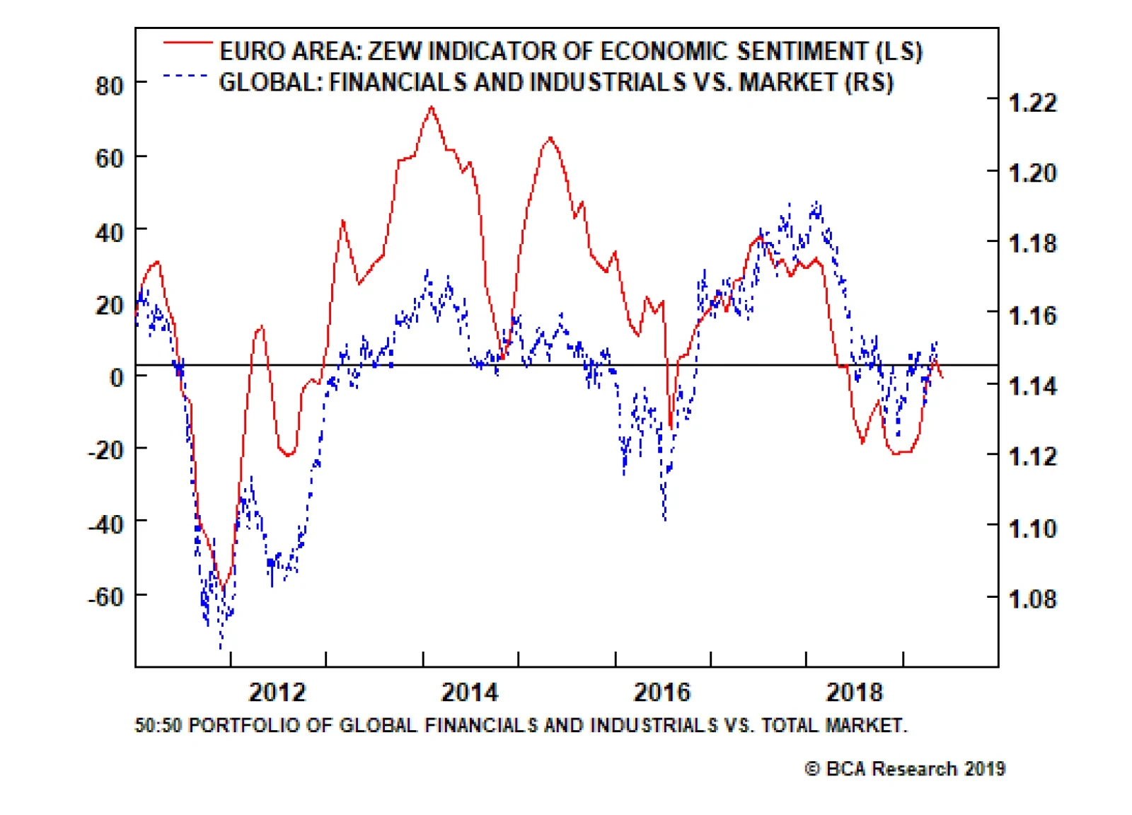
This acceleration is beyond doubt: euro area GDP growth picked up to 1.6 percent in the first quarter of 2019 from a low of 0.6 percent in the third quarter of 2018. Given the openness of the euro area economy, it is inconceivable that this growth pick-up…