Euro Area
Unsurprisingly, incoming data has been weak of late, which the ECB (like other central banks) blamed on the external environment. It did fall short of speculation that it will introduce a tiered system for its marginal deposit facility, which would have…
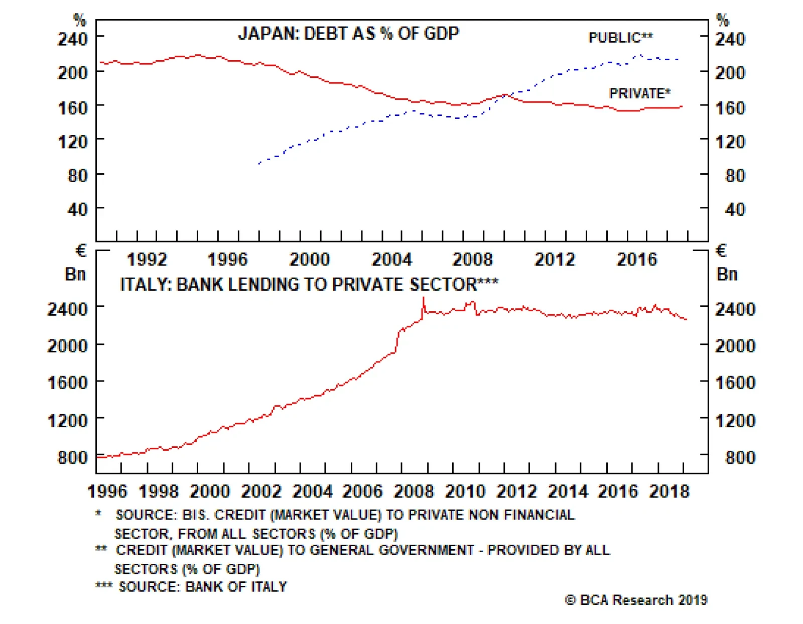
Welcome to Italy! After the 2008 global financial crisis, Italian banks’ balance sheets were left unrepaired and undercapitalized. For an individual bank whose solvency is impaired, the right thing to do is shrink its loan book relative to its equity…

Highlights Evidence continues to mount that the Chinese economy is in a bottoming process. This suggests the path of least resistance for the RMB is up. Meanwhile, as the U.S. and China move closer to a trade deal, any geopolitical risk premium in the RMB will slowly erode. The ultimate catalyst for CNY longs will be depreciation in the U.S. dollar, which we believe is slowly underway. The ECB is turning more dovish at a time when euro area growth is hitting a nadir. This will be bullish for the euro beyond the near term. Our limit buy on the pound was triggered at 1.30. Target 1.45 with stops at 1.25. With the Aussie dollar close to the epicenter of Chinese stimulus, data down under is increasingly stabilizing. We are closing our short AUD/NOK position for a small profit. Feature Chart I-1The Chinese Yuan Is Pro-cyclical
The Chinese Yuan Is Pro-cyclical
The Chinese Yuan Is Pro-cyclical
In addition to the dovish shift by global central banks, most investors are rightly fixated on China at this juncture in the economic cycle. For one, it has been mostly responsible for the mini cycles in the global economy since 2014. And with improvements in both Chinese credit and manufacturing data in recent months, the consensus is drawing closer to the fact that we may be entering a reflationary window. Looking at risk assets, MSCI China is up 25% from its lows, while the S&P 500 is up 20%. Commodity prices are also rising, with crude oil hitting a new calendar-year high this week. The corollary is that if the improvement in Chinese data proves sustainable, it will propel these asset markets to fresh highs. The evolution of the cycle has important implications for the yuan exchange rate, because the RMB has been trading like a pro-cyclical currency in recent years. The USD/CNY has been moving tick for tick with emerging market equities, Asian currencies, and even some commodity prices (Chart I-1). Ever since its liberalization over a decade ago, the RMB may finally be behaving like a free-floating exchange rate. Therefore, a simple evaluation of how relative prices between China and the rest of the world evolve will be valuable input for the fair value of the RMB exchange rate. Reading the tea leaves from Chinese credit data can be daunting, but we agree with the assessment of our China Investment Strategy team that while the credit impulse has clearly bottomed,1 the magnitude of the rise is unlikely to be what we saw in 2015-2016. That said, a higher credit-to-GDP ratio also requires a smaller increase in credit growth to have an outsized effect on GDP. As such, monitoring what is happening with hard data in the economy concurrently – in particular, green shoots – could add valuable evidence to the reflation theme. A Repeat Of 2016? Cycle bottoms can be protracted and volatile, but also V-shaped. So it is useful when economic data is at a nadir to pay attention to any green shoots emerging, because by the time the last piece of pertinent economic data has turned around, it may well be too late to call the cycle. Admittedly, most measures of Chinese (and global) growth remain weak. But there have been notable improvements in recent months that suggest economic velocity may be picking up: Production of electricity and steel, all inputs into the overall manufacturing value chain, are inflecting higher. Intuitively, these tend to lead overall industrial production. Overall industrial production remains weak, but the production of electricity and steel, all inputs into the overall manufacturing value chain, are inflecting higher. Intuitively, these tend to lead overall industrial production (Chart I-2). Electricity production for the month of February grew 5% after grinding to a halt in 2015-2016. Production of steel also rose by 7%. If these advance any further, they will begin to exceed Q4 GDP growth, indicating a renewed mini-cycle. Chart I-2A Revival In Industrial Activity
A Revival In Industrial Activity
A Revival In Industrial Activity
Chart I-3Metal Prices Are Sniffing A Rebound
Metal Prices Are Sniffing A Rebound
Metal Prices Are Sniffing A Rebound
In recent weeks, both steel and iron ore prices have been soaring. Many commentators have attributed these increases to supply bottlenecks and/or seasonal demand. However, it is evident from both the manufacturing data and the trend in prices that demand is also playing a role (Chart I-3). Overall residential property sales remain soft, but evidence from tier-1 and even tier-2 cities is signalling that this may be behind us, given robust sales. Over the longer term, the ebb and flow of property sales has tended to be in sync across city tiers. A revival in the property market will support construction activity and investment. House prices have been rising to the tune of 10% year-on-year, and real estate stocks in China may be sniffing an eventual pick-up in property volumes (Chart I-4). Over the last 20 years or so, Chinese credit growth has been a reliable indicator for car sales with a lead of about six months. Government expenditures were already inflecting higher ahead of last month’s China National People’s Congress (NPC). Again, this suggests stimulus this time around may be more fiscal than monetary (Chart I-5). In addition to the recent VAT cut for manufacturing firms from 16% to 13%, a string of policy easing measures will begin to accrue, including a cut to social security contributions effective May 1st, and perhaps a pickup in infrastructure spending. Already, real estate infrastructure spending growth is perking up, with that in the mining sector soaring to multi-year highs. Chart I-4Real Estate Volumes Could Pick Up
Real Estate Volumes Could Pick Up
Real Estate Volumes Could Pick Up
Chart I-5The Fiscal Spigots Are Opening
The Fiscal Spigots Are Opening
The Fiscal Spigots Are Opening
Finally, Chinese retail sales including those of durable goods remain very weak. Car sales are deflating at the fastest pace in over two decades. But the latest VAT cut by the government is being passed through to consumers, with an increasing number of car manufactures cutting retail prices. Chart I-6Car Sales Typically Have V-Shaped Recoveries
Car Sales Typically Have V-Shaped Recoveries
Car Sales Typically Have V-Shaped Recoveries
Over the last 20 years or so, Chinese credit growth has been a reliable indicator for car sales with a lead of about six months (Chart I-6). The indicator right now suggests we could witness a coiled-spring rebound in Chinese car sales over the next few months. Bottom Line: Both Chinese stocks and commodity prices have been suggesting a bottoming process in the domestic economy for a while now. Incoming data is beginning to corroborate this view. This has important implications for both the Chinese yuan and other global assets. Capital Flows Improving domestic and external conditions will likely offset any renewed pressure on the Chinese yuan from capital outflows. Our China Investment Strategy team reckons that even after adjusting for cross-border RMB settlements and illicit capital outflows, there is less evidence of capital flight today than there was in 2015-2016.2 Chart I-7Offshore Markets Don't See RMB Weakness
Offshore Markets Don't See RMB Weakness
Offshore Markets Don't See RMB Weakness
Typically, offshore markets have had a good track record of anticipating depreciation in the yuan. Back in 2014, offshore markets started pricing in a rising USD/CNY rate, and maintained that view all the way through to 2018, when the yuan eventually bottomed. Right now, no such depreciation is being priced in (Chart I-7). The reason offshore markets in Hong Kong and elsewhere can be prescient is because more often than not, they are the destination for illicit flows out of China. For example, one of the often-rumored ways Chinese money has left the country is through junkets, key operators in Macau casinos.3 These junkets bankroll their Chinese clients in Macau while collecting any debts in China allowing for illicit capital outflows. This was particularly rampant ahead of the Chinese 2015-2016 corruption clampdown, when Macau casino equities were surging while equity prices in China remained subdued. Historically, both equity markets tend to move together, since over 70% of visitors to Macau come from China (Chart I-8). Right now, both the Chinese MSCI index and Macau casino stocks are rising in tandem, suggesting gains are more related to fundamentals than hot money outflows. Chart I-8Macau Casinos: A Good Proxy For Chinese Spending
Macau Casinos: A Good Proxy For Chinese Spending
Macau Casinos: A Good Proxy For Chinese Spending
A surge in illicit capital outflows could also be part of the reason for an explosion in sight deposits in Hong Kong ahead of the 2015-2016 clampdown (Chart I-9). Admittedly, most of these deposits were and still are due to cross-border RMB settlements, but it is also possible that part of these constituted hot money outflows. With these sight deposits rising at a more reasonable pace, it suggests little evidence of capital flight. Chart I-9The Chinese Government Has Clamped Down On Illicit Flows
The Chinese Government Has Clamped Down On Illicit Flows
The Chinese Government Has Clamped Down On Illicit Flows
Trade Truce A trade truce between the U.S. and China will be the final catalyst for a stronger yuan. The news flow so far has been positive, with both U.S. President Donald Trump and Chinese President Xi Jinping publicly acknowledging they are closer to a deal. Even well-known China hawk Peter Navarro, head of the U.S. National Trade Council, has admitted that the two sides are in the final stages of talks. But with a still-ballooning U.S. trade deficit with China, Trump will want to take home a win (Chart I-10). Chart I-10Trump Needs To Take A Win Back To America
Trump Needs To Take A Win Back To America
Trump Needs To Take A Win Back To America
Concessions on the Chinese side so far seem reasonable, allowing us to speculate that there is a rising probability of a deal. They have agreed to increase agriculture and energy imports from the U.S. by about $1 trillion over the next six years, announced a cut on import tariffs, revised their Patent Law to improve protection of intellectual property, and provided a clear timeline for when foreign caps will be removed in sectors such as autos and financial services. These seem like very reasonable concessions that will allow Trump to go home and declare victory. Trade wars are usually synonymous with recessions. As such, there are acute political constraints inching both sides towards an agreement. For President Trump, a deteriorating U.S. manufacturing sector in the midwestern battleground states is a thorn in his side. For President Xi, rising unemployment is a key constraint. On the currency front, the details of any agreement are still unknown, but should Chinese economic fundamentals start to genuinely improve, it will put upward pressure under rates – and ergo the yuan (Chart I-11). A gradually rising yuan exchange rate will further assuage any doubts or concerns that Trump may have. Bottom Line: Our fundamental models show the yuan as undervalued by about 3%. This means China could allow its currency to gradually appreciate towards fair value, with little impact on the domestic economy or even exports. Given some green shoots in incoming economic data, little risk of capital flight, and the rising likelihood of a trade deal between the U.S. and China, our bias is that the path of least resistance for the Chinese RMB is up (Chart I-12). Chart I-11Rising Chinese Rates Will Favor The Yuan
Rising Chinese Rates Will Favor The Yuan
Rising Chinese Rates Will Favor The Yuan
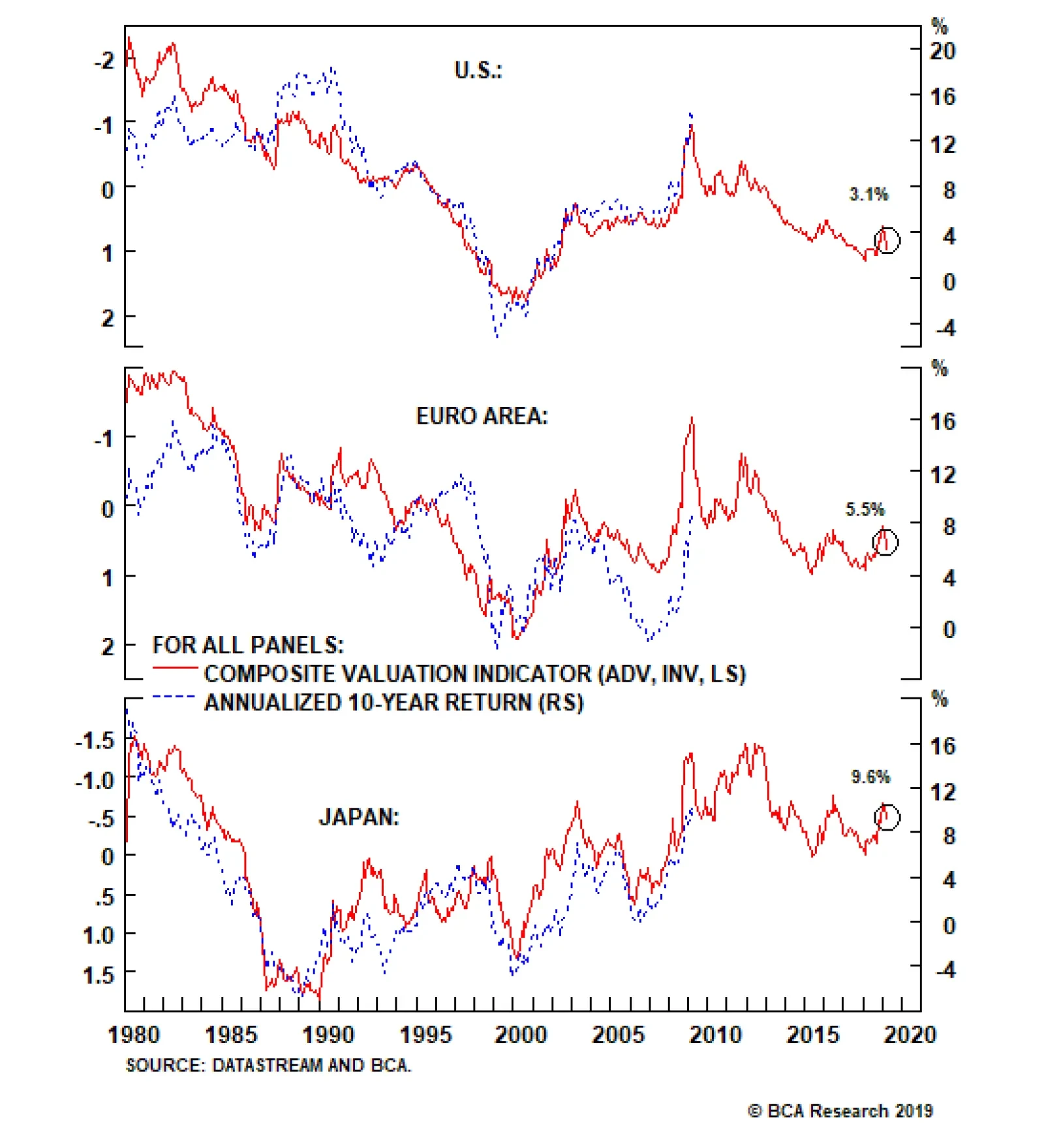
Chart I-12The RMB Is Not Expensive
The RMB Is Not Expensive
The RMB Is Not Expensive
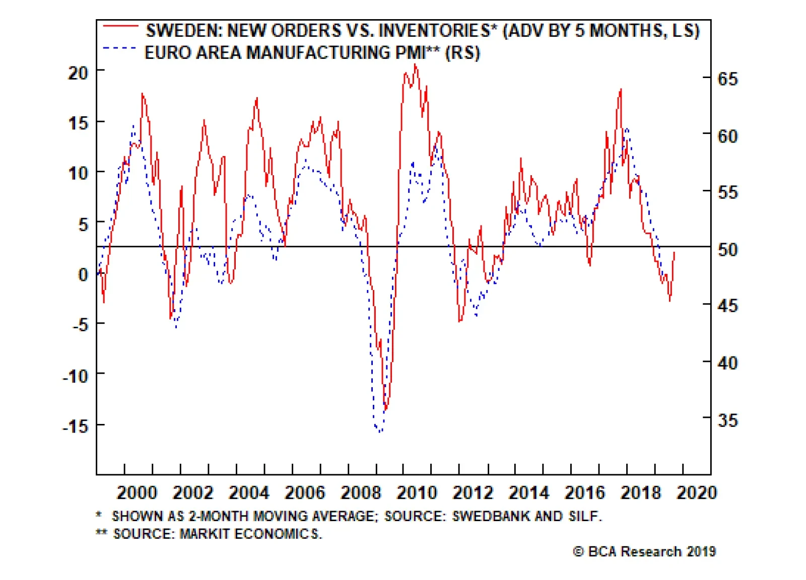
Another Dovish Shift By The ECB In another dovish twist, the European Central Bank kept monetary policy unchanged following this week’s meeting, while highlighting that it might be on hold for longer. Unsurprisingly, incoming data has been weak of late, which the ECB (like other central banks) blamed on the external environment. It did fall short of speculation that it will introduce a tiered system for its marginal deposit facility, which would have alleviated some cash flow pressures for euro area banks. Our bias is for the new Targeted Long Term Refinancing Operation (TLTRO III – in other words, cheap loans), to remain a better policy tool than a tiered central bank deposit system. In the case of a TLTRO, the ECB can effortlessly decentralize monetary policy, since liquidity gravitates towards the countries that need it the most. While a tiered system can allow a bank to offer higher rates and attract deposits, there is no guarantee that these deposits will find their way into new loans. It is also likely to benefit countries with the most excess liquidity. In the case of a TLTRO, the ECB can effortlessly decentralize monetary policy. Beyond any short-term volatility in the euro, we think the ECB’s dovish shift could be paradoxically bullish. If a central bank eases financing conditions at a time when growth is hitting a nadir, it is tough to argue that it is bearish for the currency. Meanwhile, fiscal policy is also set to be loosened. Swedish new orders-to-inventories lead euro area growth by about five months, and the recent bounce could be a harbinger of positive euro area data surprises ahead (Chart I-13). Chart I-13Euro Area Growth Will Recover
Euro Area Growth Will Recover
Euro Area Growth Will Recover
Bottom Line: European rates are further below equilibrium compared to the U.S., and the ECB’s dovish shift will help lift the euro area’s growth potential. Meanwhile, investors are currently too pessimistic on euro area growth prospects. Our bias is that the euro is close to a floor. House Keeping Our buy-stop on the British pound was triggered at 1.30. We recommend placing stops at 1.25, with an initial target of 1.45. As we argued last week,4 the odds of a hard Brexit continue to fall, with U.K. Prime Minister Theresa May explicitly saying this week that the path for the U.K. going forward is either a deal with the EU or with no Brexit at all. As we go to press, EU leaders have granted the U.K. an extension until the end of October, with a review in June. Chart I-14What Next For The Pound?
What Next For The Pound?
What Next For The Pound?
Back when the referendum was held in June 2016, even the pro-Brexit Tories, a minority in the party, promised continued access to the Common Market. Fast forward to today and there are simply not enough committed Brexiters in Westminster to deliver a hard exit. Given that the can has been kicked down the road, markets are likely to turn their focus on incoming economic data. On that front, economic surprises in the U.K. relative to both the U.S. and euro area are soaring (Chart I-14). Elsewhere, we are also taking profits on our short AUD/NOK position. Since 2015, the market has been significantly dovish on Australia, in part due to a more accelerated downturn in house prices and a marked slowdown in China. The reality is that the downturn in Australia has allowed some cleansing of sorts and has brought it far along the adjustment path relative to its potential. Any potential growth pickup in China will light a fire under the Aussie dollar, which is a risk to this position. Chester Ntonifor, Foreign Exchange Strategist chestern@bcaresearch.com Footnotes 1 Please see China Investment Strategy Special Report, titled “China: Stimulating Amid The Trade Talks,” dated February 20, 2019, available at fes.bcaresearch.com 2 Please see China Investment Strategy Special Report, titled “Monitoring Chinese Capital Outflows,” dated March 20, 2019, available at fes.bcaresearch.com 3 Farah Master, “Factbox: How Macau's casino junket system works,” Reuters, October 21, 2011. 4 Please see Foreign Exchange Strategy Weekly Report, titled “Not Out Of The Woods Yet,” dated April 5, 2019, available at bca.bcaresearch.com Currencies U.S. Dollar Chart II-1USD Technicals 1
USD Technicals 1
USD Technicals 1
Chart II-2USD Technicals 2
USD Technicals 2
USD Technicals 2
Recent data in the U.S. have been mostly positive: In March, 196K nonfarm jobs were created, surprising to the upside; unemployment rate stayed low at 3.8%, though average hourly earnings growth fell to 3.2% year-on-year. The factory orders in February contracted by 0.5% month-on-month. More importantly, headline consumer price inflation in March rose to 1.9% year-on-year, however this was mostly lifted by rising energy prices. Core inflation excluding food and energy dropped by 10 basis points to 2%. JOLTs job openings unexpectedly fell to 7.1 million in February, from 7.6 million. However, initial jobless claims fell to 196K. After a 3-month lull, producer prices are inflecting higher at a pace of 2.2% year-on-year for the month of March. DXY index fell by 0.44% this week. Global risk assets are on the rise this week. Meanwhile, the Fed minutes highlighted that members are in no rush to raise rates. Stalling interest rate differentials will be a headwind for the dollar. Report Links: Not Out Of The Woods Yet - April 5, 2019 Tug OF War, With Gold As Umpire - March 29, 2019 Into A Transition Phase - March 8, 2019 The Euro Chart II-3EUR Technicals 1
EUR Technicals 1
EUR Technicals 1
Chart II-4EUR Technicals 2
EUR Technicals 2
EUR Technicals 2
Recent data in the euro area have been positive: The Sentix Investor Confidence index continues to inflect higher, coming in at -0.3 from -2.2. German industrial production grew by 0.7% month-on-month in February. Trade balances improved across the euro area. In France, the trade deficit fell to €-4.0B in February. In Germany, the trade surplus increased to €18.7B. Italian retail sales increased by 0.9% year-on-year in February. On the inflation front, consumer price inflation in Germany and France both stayed at 1.3% year-on-year in March. EUR/USD rose by 0.57% this week. On Wednesday, the ECB has decided to leave policy unchanged as expected. Mario Draghi also highlighted more uncertainties and downside risks to the euro area amid the ongoing trade disputes. While the global trade war might add volatility to the pro-cyclical euro, easier financial conditions should eventually backstop growth. Report Links: Into A Transition Phase - March 8, 2019 A Contrarian Bet On The Euro - March 1, 2019 Balance Of Payments Across The G10 - February 15, 2019 The Yen Chart II-5JPY Technicals 1
JPY Technicals 1
JPY Technicals 1
Chart II-6JPY Technicals 2
JPY Technicals 2
JPY Technicals 2
Recent data in Japan have been negative: Preliminary cash earnings fell by 0.8% year-on-year in February, the only decline since mid-2017. Household confidence continues to tick lower, coming in at 40.5 in March. The trade balance in February came in at a surplus of ¥489.2B. Capex is rolling over. Machinery orders fell by 5.5% year-on-year in February. Machine tool orders remain extremely weak, at -28.5% year-on-year for the month of March. Lastly, the foreign investment in Japanese stocks increased to ¥1,463.7B. USD/JPY fell by 0.46% this week. In its April regional outlook, the BoJ downgraded most of the prefectures in Japan, with only Hokkaido that had an upgrade in the aftermath of the earthquake. As domestic deflationary pressures intensify, this will favor the yen. This also raises the probability the government defers the consumption tax hike. Report Links: Tug OF War, With Gold As Umpire - March 29, 2019 A Trader’s Guide To The Yen - March 15, 2019 Balance Of Payments Across The G10 - February 15, 2019 British Pound Chart II-7GBP Technicals 1
GBP Technicals 1
GBP Technicals 1
Chart II-8GBP Technicals 2
GBP Technicals 2
GBP Technicals 2
Recent data in the U.K. have been strong: In February, manufacturing production increased by 0.6% year-on-year; industrial production also increased by 0.1% year-on-year, both surprising to the upside. Both were deflating in January. The goods trade balance in February fell to £-14.1B, however the total trade balance came in at a smaller deficit of £4.86B. Monthly GDP also came in higher at 2% year-on-year in February. House prices gains have pared the increase of previous years, but the Halifax house price index still increased by 2.6% year-on-year for the month of March. GBP/USD rose by 0.41% this week. Theresa May got an extension for Brexit to October 31. Meanwhile, U.K. data have been stronger than consensus recently. We are long GBP/USD from 1.30, with a 0.6% profit. Report Links: Not Out Of The Woods Yet - April 5, 2019 A Trader’s Guide To The Yen - March 15, 2019 Balance Of Payments Across The G10 - February 15, 2019 Australian Dollar Chart II-9AUD Technicals 1
AUD Technicals 1
AUD Technicals 1
Chart II-10AUD Technicals 2
AUD Technicals 2
AUD Technicals 2
Recent data in Australia have continued to improve: Investment lending for homes in February grew by 2.6%. Home loans in February increased by 2% month-on-month, surprising to the upside. Westpac consumer confidence came in at 100.7 in April, increasing by 1.9%. AUD/USD surged by 0.64% this week. The RBA Deputy Governor Guy Debelle hinted that a wait-and-see approach for interest rates seemed like the appropriate path, signaling that policy will continue to be accommodative. Meanwhile, the Australian dollar is probably anticipating better upcoming data from China, as it is Australia’s largest trading partner. If the world’s second largest economy can turn around, the Aussie dollar is likely to grind higher. Report Links: Not Out Of The Woods Yet - April 5, 2019 Into A Transition Phase - March 8, 2019 Balance Of Payments Across The G10 - February 15, 2019 New Zealand Dollar Chart II-11NZD Technicals 1
NZD Technicals 1
NZD Technicals 1
Chart II-12NZD Technicals 2
NZD Technicals 2
NZD Technicals 2
There was little data out of New Zealand this week: The food price index came in at 0.5% month-on-month in March, shy of the estimate of 1.3%. NZD/USD plunged after rising by 0.5% initially this week, returning flat. Incoming data in New Zealand is likely to lag its commodity currency counterparts pushing the kiwi relatively lower. Our long AUD/NZD position is now 0.7% in the money since entry last Friday. Report Links: Not Out Of The Woods Yet - April 5, 2019 Balance Of Payments Across The G10 - February 15, 2019 A Simple Attractiveness Ranking For Currencies - February 8, 2019 Canadian Dollar Chart II-13CAD Technicals 1
CAD Technicals 1
CAD Technicals 1
Chart II-14CAD Technicals 2
CAD Technicals 2
CAD Technicals 2
Recent data in Canada have been negative: On the labor market front, the participation rate in March fell slightly to 65.7%; 7,200 jobs were lost, underperforming the estimated creation of 1,000 jobs; unemployment rate was unchanged at 5.8%. On the housing market front, starts in March increased by 192.5K year-on-year, underperforming the expected 196.5K; building permits dropped by 5.7% month-on-month in February. USD/CAD rebounded quickly after falling by 0.7% earlier this week, offsetting the loss. While the dovish shift by the BoC and looser fiscal policy, together with rising oil prices are likely to be growth tailwinds, the data disappointment coming from the housing market and overall economy limit upside in the CAD. Report Links: A Shifting Landscape For Petrocurrencies - March 22, 2019 Into A Transition Phase - March 8, 2019 Balance Of Payments Across The G10 - February 15, 2019 Swiss Franc Chart II-15CHF Technicals 1
CHF Technicals 1
CHF Technicals 1
Chart II-16CHF Technicals 2
CHF Technicals 2
CHF Technicals 2
There was scant data in Switzerland this week: The foreign currency reserves came in at 756B CHF in March. Unemployment rate in March was unchanged at 2.4%, in line with expectations. USD/CHF appreciated by 0.44% this week. With the euro area economy slowly recovering, the franc is likely to underperform as risk appetite rises. We are long EUR/CHF for a 0.1% profit. Report Links: Balance Of Payments Across The G10 - February 15, 2019 A Simple Attractiveness Ranking For Currencies - February 8, 2019 Waiting For A Real Deal - December 7, 2018 Norwegian Krone Chart II-17NOK Technicals 1
NOK Technicals 1
NOK Technicals 1
Chart II-18NOK Technicals 2
NOK Technicals 2
NOK Technicals 2
Recent data in Norway have been strong, with inflation grinding higher: Headline consumer price inflation increased to 2.9% year-on-year in March; core inflation also rose to 2.7% year-on-year, both surprising to the upside. Producer price index grew by 5.2% year-on-year in March, outperforming expectations. USD/NOK depreciated by 1.16% this week. The improving domestic economy, rising oil prices, and the tick up in inflation are all the reasons why we favor the Norwegian krone. We are playing the NOK via a few pairs, notably long NOK/SEK and short AUD/NOK, which are currently 3.11% and 0.75% in the money, respectively. Report Links: A Shifting Landscape For Petrocurrencies - March 22, 2019 Balance Of Payments Across The G10 - February 15, 2019 A Simple Attractiveness Ranking For Currencies - February 8, 2019 Swedish Krona Chart II-19SEK Technicals 1
SEK Technicals 1
SEK Technicals 1
Chart II-20SEK Technicals 2
SEK Technicals 2
SEK Technicals 2
Recent data in Sweden have been mixed: Industrial production fell to 0.7% year-on-year in February, lower than the previous reading of 3%. New manufacturing orders contracted by 2.8% year-on-year in February. However, the leading manufacturing new orders to inventory ratio is rising suggesting we might be near a bottom. Consumer price inflation came in higher at 1.9% year-on-year in March. USD/SEK fell by 0.21% this week. We remain bullish on the Swedish krona due to its cheap valuation and the imminent pickup in the euro area economy. Report Links: Balance Of Payments Across The G10 - February 15, 2019 A Simple Attractiveness Ranking For Currencies - February 8, 2019 Global Liquidity Trends Support The Dollar, But... - January 25, 2019 Trades & Forecasts Forecast Summary Core Portfolio Tactical Trades Closed Trades
Feature For a decade, mainstream economics has prescribed remedies for sluggish growth in the euro area on the basis of three articles of blind faith. First, that the ailment arises from structural impediments to growth; second, that in response to an ailing economy, ultra-loose monetary policy is always and everywhere effective; and third, that ‘Keynesian’ government stimuluses are at best a necessary evil and at worst a recipe for disaster. As a result, European policymakers have expended much time and energy attempting structural reforms, experimenting with ultra-loose monetary policy, while shirking government borrowing and spending. But have policymakers misdiagnosed the ailment? Chart of the WeekItaly’s Private Sector Is Paying Back Debt
Italy's Private Sector Is Paying Back Debt
Italy's Private Sector Is Paying Back Debt
Why The Focus On Public Deficits And Debt Might Be Misplaced We frown upon government deficits. They are associated with crowding out and misallocation of resources. But when the private sector is running a financial surplus, the exact opposite is true. Government borrowing and spending causes no crowding out because the government is simply utilising the private sector’s surplus savings and debt repayments. And importantly, this deficit spending prevents a deflationary shrinkage of the broad money supply. Most people are aware of the size of government deficits. Few people are aware of the size of private sector surpluses; and the leakage from the national income stream that they create. By not making this connection, people might believe that government deficits are profligate. But if the private sector as a whole has a financial surplus, it makes sense for the government to borrow to support economic growth. In a similar vein, an economy’s debt sustainability depends on its total indebtedness, not on its public indebtedness or its private indebtedness in isolation. Debt becomes unsustainable when the marginal extra euro of debt results in misallocation of resources and mal-investment. At this point, the extra debt adds nothing to growth or, worse, it subtracts from growth. This is also the point at which lenders tend to be unwilling to provide the marginal loan. Therefore, debt reaches its sustainable limit when the economy has exhausted all productive uses for it. Deficit spending can prevent a deflationary shrinkage of the broad money supply. It does not matter whether these productive uses are funded with private debt or with public debt. For example, successful economies require investment in high-quality healthcare and education. Some economies fund this with private debt, while others fund it with public debt. This means that if productive private indebtedness is low, there is more scope for productive public indebtedness. Many people believe that Italy has one of the world’s most indebted economies. But this belief is wrong. Although Italy’s public indebtedness is high, Italy’s private indebtedness is one of the lowest in the world, making Italy’s total indebtedness less than that of France and the U.K., and broadly equal to that of the U.S. (Chart I-2-I-5). Crucially, Italy’s extremely low private indebtedness means that it could afford relatively high public indebtedness before reaching the limit of debt sustainability. Chart I-2Italy: Total Debt = 250% Of GDP
Italy: Total Debt = 250% Of GDP
Italy: Total Debt = 250% Of GDP
Chart I-3France: Total Debt = 315% Of GDP
France: Total Debt = 315% Of GDP
France: Total Debt = 315% Of GDP
Chart I-4U.K.: Total Debt = 280% Of GDP
U.K.: Total Debt = 280% Of GDP
U.K.: Total Debt = 280% Of GDP
Chart I-5U.S: Total Debt = 250% Of GDP
U.S: Total Debt = 250% Of GDP
U.S: Total Debt = 250% Of GDP
Italy And Japan: Compare And Contrast In a normal world, the task of ensuring that private sector savings are borrowed and spent falls on the banks, which take in the savings and debt repayments and lend them out to others in the private sector who can make the best use of the funds. But if a dysfunctional banking system fails this task, the savings generated by the private sector will find no borrowers. The unrecycled funds become a leakage from the national income stream generating a persistent deflationary headwind for the economy. Welcome to Italy! Since 2008, the stock of loans to Italian households and firms has been stagnant while in real terms it has fallen (Chart of the Week). The upshot is that the real money supply has shrunk despite low private sector indebtedness, low interest rates and massive injections of ECB liquidity into the banking system. Japan’s public sector levering has been counterbalancing its private sector de-levering. After the 2008 global financial crisis Italian banks’ balance sheets were left unrepaired and undercapitalized. For an individual bank whose solvency is impaired, the right thing to do is shrink its loan book relative to its equity capital. But when the entire banking system is doing this simultaneously, the economy falls into a massive fallacy of composition: what is right for an individual bank becomes very deflationary when all banks are doing it together. Under these circumstances, an agent outside the fallacy of composition – namely, the government – must counter this deflationary headwind by borrowing and spending the un-recycled private sector savings. Welcome to Japan! The Japanese government has been doing precisely this for the past 25 years. Many people fret about the Japanese government’s persistent deficits and its ballooning public debt. What these people do not realise is that these persistent deficits are simply counterbalancing private sector de-levering. Hence, Japan’s all-important total (public plus private) indebtedness as a share of GDP has not been rising (Chart I-6). In Italy, the banking system has been dysfunctional for over a decade, preventing the private sector from borrowing (Chart I-7). Under these circumstances, the Italian government could borrow the private sector’s excess savings and debt repayments and put them to highly productive use, just like in Japan. Chart I-6Japan’s Persistent Deficits Have Been Counterbalancing Private Sector De-levering
Japan's Persistent Deficits Have Been Counterbalancing Private Sector De-levering
Japan's Persistent Deficits Have Been Counterbalancing Private Sector De-levering
Chart I-7The Italian Banking System Has Been Dysfunctional
The Italian Banking System Has Been Dysfunctional
The Italian Banking System Has Been Dysfunctional
Japan and Italy have quite similar demographics, but there is also a big difference. Despite the Japanese government’s persistent deficit and ballooning debt, the 10-year Japanese government bond seems not the slightest bit concerned and is yielding zero. Whereas in Italy, where the government finances are close to structural balance, the merest hint of a Keynesian stimulus sent the 10-year BTP yield rocketing towards 4 percent. Why? The answer is that Italy does not have its own central bank. The Japanese government bond yield is a direct function of the BoJ’s expected monetary policy. But the Italian BTP yield has two components: the ECB’s expected monetary policy plus a risk-premium for currency redenomination in the event that Italy left the euro. Italy’s problem is that even if modest deficit spending was the right policy, it would take time to prove. Meanwhile, bond vigilantes shoot first and ask questions later. The euro debt crisis was essentially a fear of currency redenomination which resulted from bond vigilantes running amok. When bond markets refuse to lend to sovereigns at a rational interest rate, maturing debt has to be refinanced at a penalising interest rate, causing an undeserved deterioration in the government’s finances. Thereby, the fear of redenomination could become a self-fulfilling prophecy. In Italy, the banking system has been dysfunctional for over a decade. The bottom line is that every economy has its own ‘tipping-point’ interest rate, at which its debt financing can flip from stability to instability. But we believe this interest rate is low everywhere. Modern Monetary Theory Simplified Modern Monetary Theory (MMT) is a hot topic of the moment. Our view is that its breakthrough is to establish the ‘appropriate’ public sector deficits in the context of private sector surpluses, and it simplifies to this question: In highly indebted economies, what is the interest rate needed to keep total (public plus private) indebtedness as a share of GDP stable, and prevent a deflationary shrinkage of the broad money supply? The answer differs slightly from economy to economy because private sector indebtedness is modestly rising in some places, stable in a few, while declining in others (Chart I-8). But crucially, at a global level, total indebtedness is stabilising with the global bond yield within a historically depressed sideways channel (Chart I-9). Chart I-8Private Sector Indebtedness Is Not Rising As A Whole
Private Sector Indebtedness Is Not Rising As A Whole
Private Sector Indebtedness Is Not Rising As A Whole
Chart I-9The Global Long Bond Yield Has Been In A Sideways Channel
The Global Long Bond Yield Has Been In A Sideways Channel
The Global Long Bond Yield Has Been In A Sideways Channel
Admittedly, the global bond yield is now at the bottom of this channel. This means that from a tactical perspective, we can expect 10-year yields to go up about 50 bps before hitting the top of the channel. However, from a structural perspective, the interest rate needed to stabilise total indebtedness as a share of GDP now appears to be extremely low. And this means that structurally low bond yields are here to stay. Finally, I am excited to report that two of the main commentators on MMT – Richard Koo and Stephanie Kelton – are keynote speakers at our annual conference on September 26-27 in New York City. Suffice to say it will be an event not to be missed! Fractal Trading System* There are no new trades this week, leaving five open positions. For any investment, excessive trend following and groupthink can reach a natural point of instability, at which point the established trend is highly likely to break down with or without an external catalyst. An early warning sign is the investment’s fractal dimension approaching its natural lower bound. Encouragingly, this trigger has consistently identified countertrend moves of various magnitudes across all asset classes. Chart I-10
Short the 10-Year OAT
Short the 10-Year OAT
The post-June 9, 2016 fractal trading model rules are: When the fractal dimension approaches the lower limit after an investment has been in an established trend it is a potential trigger for a liquidity-triggered trend reversal. Therefore, open a countertrend position. The profit target is a one-third reversal of the preceding 13-week move. Apply a symmetrical stop-loss. Close the position at the profit target or stop-loss. Otherwise close the position after 13 weeks. Use the position size multiple to control risk. The position size will be smaller for more risky positions. * For more details please see the European Investment Strategy Special Report “Fractals, Liquidity & A Trading Model,” dated December 11, 2014, available at eis.bcaresearch.com Dhaval Joshi, Chief European Investment Strategist dhaval@bcaresearch.com Fractal Trading System Recommendations Asset Allocation Equity Regional and Country Allocation Equity Sector Allocation Bond and Interest Rate Allocation Currency and Other Allocation Closed Fractal Trades Trades Closed Trades Asset Performance Currency & Bond Equity Sector Country Equity Indicators Bond Yields Chart II-1Indicators To Watch - Bond Yields
Indicators To Watch - Bond Yields
Indicators To Watch - Bond Yields
Chart II-2Indicators To Watch - Bond Yields
Indicators To Watch - Bond Yields
Indicators To Watch - Bond Yields
Chart II-3Indicators To Watch - Bond Yields
Indicators To Watch - Bond Yields
Indicators To Watch - Bond Yields
Chart II-4Indicators To Watch - Bond Yields
Indicators To Watch - Bond Yields
Indicators To Watch - Bond Yields
Interest Rate Chart II-5Indicators To Watch - Interest Rate Expectations
Indicators To Watch - Interest Rate Expectations
Indicators To Watch - Interest Rate Expectations
Chart II-6Indicators To Watch - Interest Rate Expectations
Indicators To Watch - Interest Rate Expectations
Indicators To Watch - Interest Rate Expectations
Chart II-7Indicators To Watch - Interest Rate Expectations
Indicators To Watch - Interest Rate Expectations
Indicators To Watch - Interest Rate Expectations
Chart II-8Indicators To Watch - Interest Rate Expectations
Indicators To Watch - Interest Rate Expectations
Indicators To Watch - Interest Rate Expectations
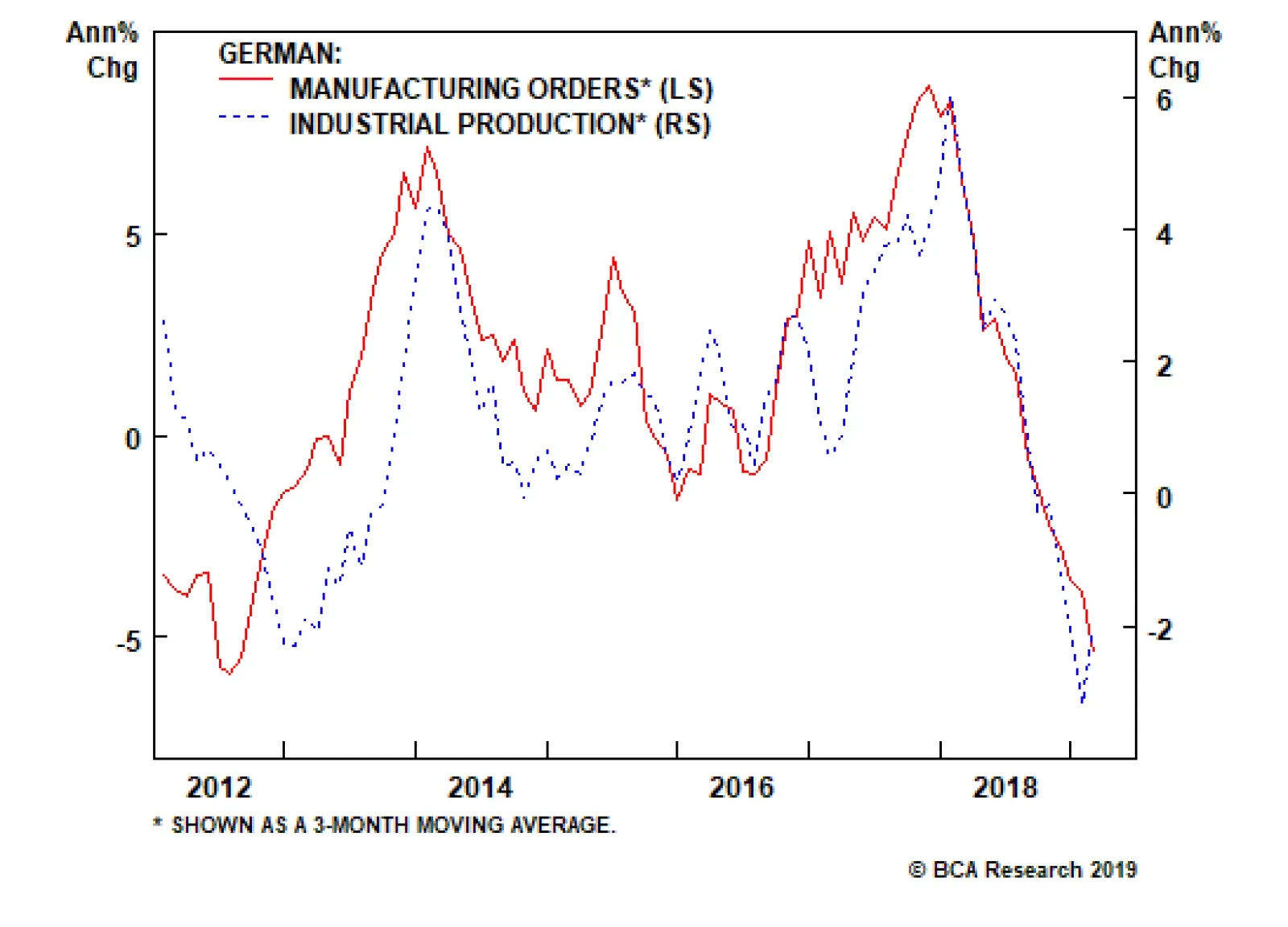
Yesterday, the German factory orders sent a chill down the spine of anyone with a positive disposition toward European growth, as they fell 8.4% on an annual basis in February. However, foreign orders drove this meltdown, contracting 12.6% on an annual basis,…
Highlights Maintain a pro-cyclical stance for the time being – overweight equities versus bonds, long commodities, overweight industrial equities, and underweight healthcare equities. But be warned, absent a continued decline in the bond yield and/or oil price, short-term positive impulses on the economy will fade and even turn negative later in the year. Hence in the summer months, look for opportunities to take profits in these pro-cyclical positions. U.K. economy plays can outperform once a cross-party parliamentary majority is found for a course of action that leads to an orderly Brexit (or no Brexit). Feature At the end of last year, we made a bold prediction: economies and financial markets would follow the opposite path in 2019 compared to 2018. Specifically we pointed out that “through most of 2018, global growth was decelerating while inflation was accelerating. Now this configuration is flipping: global growth is rebounding while inflation is set to collapse… 2019 will present investors a mirror-image pattern to 2018” (Chart of the Week). Chart of the WeekWhy 2019 Is The Opposite Of 2018
Why 2019 Is The Opposite Of 2018
Why 2019 Is The Opposite Of 2018
Four months on, we are delighted to report that the mirror-image pattern is unfolding exactly as predicted. This year, stock markets are up sharply; bond markets have rallied; metal prices have made double-digit gains, growth-sensitive industrial shares are outperforming; while defensive healthcare shares are underperforming. All of these are the precise opposite of what happened in early 2018 (Chart 1-2 - Chart I-6). Chart I-2Equities: 2019 Is The Opposite Of 2018
Equities: 2019 Is The Opposite Of 2018
Equities: 2019 Is The Opposite Of 2018
Chart I-3Bonds: 2019 Is The Opposite Of 2018
Bonds: 2019 Is The Opposite Of 2018
Bonds: 2019 Is The Opposite Of 2018
Chart I-4Commodities: 2019 Is The Opposite Of 2018
Commodities: 2019 Is The Opposite Of 2018
Commodities: 2019 Is The Opposite Of 2018
Chart I-5Cyclicals: 2019 Is The Opposite Of 2018
Cyclicals: 2019 Is The Opposite Of 2018
Cyclicals: 2019 Is The Opposite Of 2018
Chart I-6Defensives: 2019 Is The Opposite Of 2018
Defensives: 2019 Is The Opposite Of 2018
Defensives: 2019 Is The Opposite Of 2018
Why 2019 Is The Opposite Of 2018 The basis for our bold prediction was twofold. We noted that China’s 6-month credit impulse “had gone vertical” (Chart I-7). Indeed, the rebound from the trough amounted to $500 billion (and still counting), equivalent to a near 1 percent shot in the arm for global GDP. Chart I-7China's 6-Month Credit Impulse Has Gone Vertical
China's 6-Month Credit Impulse Has Gone Vertical
China's 6-Month Credit Impulse Has Gone Vertical
We also argued back then that “a racing certainty for early 2019 is that headline inflation will collapse. This is because the plunge in the crude oil price is about to feed through into headline consumer price indexes. Inevitably, it will seep through into core inflation too, via the impact on energy dependent prices such as transport costs.” “Coming at a time that central banks have professed a much greater reliance on incoming data, we can deduce that central banks will find it hard to tighten policy in the face of weaker headline and core inflation prints. Crucially though, the ECB and BoJ were not planning on tightening policy anyway, so the plunge in reported inflation will be much more impactful on the Federal Reserve.” Lo and behold. China’s PMI has rebounded sharply, and the Fed has stopped hiking rates. Still, central banks’ enhanced ‘data-dependency’ carries perils. The high-profile hard data – such as CPI inflation and GDP growth prints – on which monetary policy ‘depends’ is a record of what happened in the past, sometimes the distant past. This year’s market moves are the precise opposite of what happened in early 2018. Hence, enhanced data-dependency means that central banks are now ‘driving by looking through the rear-view mirror’ rather than looking at the current terrain. In turn, monetary policy expectations are driving bond and equity market valuations. By contrast, equity market growth expectations are based on the here and now; they move in synch with economic activity in real-time, leading even the survey-based PMIs. This also solves the puzzle as to why bonds and equities can sometimes give conflicting messages. Last year, the configuration of accelerating inflation with decelerating global growth hit equities and with a lose-lose: heavy pressure on both valuations and growth expectations. Furthermore, when interest rates rise from low levels they undermine the support for elevated risk-asset valuations in a viciously non-linear way. Chart I-8In 2018, Higher Bond Yields Pressured Equity Valuations
In 2018, Higher Bond Yields Pressured Equity Valuations
In 2018, Higher Bond Yields Pressured Equity Valuations
At low interest rates, bond prices develop the same unattractive negative asymmetry as equities. Therefore, an extended period of ultra-low interest rates removes the need for an equity risk premium, and justifies sharply higher valuations for equities and other risk-assets. But in early 2018, as hawkish central banks pushed up 10-year global bond yield towards 2 percent, this process reversed viciously: bond prices lost their negative asymmetry, re-requiring an equity risk premium and sharply lower valuations for risk-assets at a time that growth expectations were also sliding (Chart I-8).1 By contrast, the early 2019 configuration of dovish central banks and accelerating short-term credit impulses has provided equities a ‘mirror-image’ win-win: a boost to both valuations and to growth expectations. What Happens Next In 2019? Chart I-9Headline Inflation Will Soon Tick Up
Headline Inflation Will Soon Tick Up
Headline Inflation Will Soon Tick Up
Understand that the all-important impulses to an economy do not come from the level of the bond yield, oil price, net exports, inventories, and so on. The impulse always comes from the change in these metrics. And as the metrics cannot decline (or rise) incessantly, impulses always fade and then reverse. The oil price has rebounded 30 percent from its recent lows. Necessarily, this means that headline inflation prints will soon stabilise or even tick up (Chart I-9). Furthermore, central banks’ abrupt pivot to dovish has already happened. It would be hard to repeat or continue such a move. As central banks react to the inevitably backward-looking hard data prints, our expectation is that bond yields will stabilise or even tick up. Will equity markets also react positively to the better economic data prints? Not necessarily. To repeat, equity markets’ growth expectations move in synch with economic activity in real-time, leading even the survey-based PMIs. Equity markets never wait for the backward-looking data prints. China plays are tracking its short-term credit impulse which has gone vertical (Chart I-10). Hence, in 2019 to date, U.K. mining stocks are already up 25 percent; the Shenzhen Composite is already up 40 percent! Chart I-10China Plays Have Already Surged
China Plays Have Already Surged
China Plays Have Already Surged
Still, the current win-win configuration can continue for a little while longer, given that a typical upswing in short-term credit impulses lasts around eight months. But be warned, absent a continued decline in the bond yield and/or oil price, short-term impulses will fade and even turn negative later in the year. The early 2019 configuration of dovish central banks and accelerating short-term credit impulses has provided equities a win-win. Hence, maintain a pro-cyclical stance for the time being – overweight equities versus bonds, long commodities, overweight industrial equities, and underweight healthcare equities. But our strong advice is: in the summer months, look for opportunities to take profits in all of these positions. When Will Brexit’s Groundhog Day End? We really would prefer not to talk about Brexit. It is not just that every day is Groundhog Day, every day is a shambolic Groundhog Day. Still, on a positive note this means that our investment strategy for Brexit has also remained a constant (Chart I-11). Chart I-11For Investors, Brexit Simplifies To A Binary Outcome
For Investors, Brexit Simplifies To A Binary Outcome
For Investors, Brexit Simplifies To A Binary Outcome
It is not sufficient for the U.K. parliament to express what it is against (a no-deal Brexit); parliament must express what course of action it is for, leading to an orderly Brexit, or no Brexit, and that this course of action must also be acceptable to the EU27. At that point, irrespective of the exact course of action – a customs union, Common Market 2.0, or a confirmatory referendum in which ‘remain’ is an option – buy the pound, the FTSE250, and U.K. homebuilder shares. Theresa May’s overture to engage in a national unity strategy with the Labour Party is a step in the right direction. In this regard, Theresa May’s overture to engage in a national unity strategy with the Labour Party is a step in the right direction, because it finally puts national interest above party interest. To be clear, Brexit has been trapped in Groundhog Day because there is insufficient support among Conservative and DUP MPs for a relationship with the EU27 that would: Protect the cross-border supply chains which are vital to so many U.K. businesses. Avoid a hard customs border on the island of Ireland or between Ireland and Britain. Deliver on the narrow 52:48 vote to leave the EU, which was driven by a desire to control migration and the supremacy of the European Court of Justice; rather than a desire to strike independent trade deals, which is irrelevant for a majority of voters. The ray of light is that there is potentially a broader cross-party parliamentary majority for a course of action that would meet the above three conditions. Once it is found, U.K. economy plays can look forward to the “sunlit uplands”. Fractal Trading System* In line with the main body of this report, we continue to see evidence that the recent rally in bonds is technically extended. Accordingly, this week’s recommended trade is to short the 10-year OAT. The profit target is 1.3 percent with a symmetrical stop-loss. In other trades, short INR/PKR hit its 3 percent stop-loss and is now closed, leaving five open positions. For any investment, excessive trend following and groupthink can reach a natural point of instability, at which point the established trend is highly likely to break down with or without an external catalyst. An early warning sign is the investment’s fractal dimension approaching its natural lower bound. Encouragingly, this trigger has consistently identified countertrend moves of various magnitudes across all asset classes. Chart I-12
Short the 10-Year OAT Long SEK/NOK
Short the 10-Year OAT Long SEK/NOK
The post-June 9, 2016 fractal trading model rules are: When the fractal dimension approaches the lower limit after an investment has been in an established trend it is a potential trigger for a liquidity-triggered trend reversal. Therefore, open a countertrend position. The profit target is a one-third reversal of the preceding 13-week move. Apply a symmetrical stop-loss. Close the position at the profit target or stop-loss. Otherwise close the position after 13 weeks. Use the position size multiple to control risk. The position size will be smaller for more risky positions. * For more details please see the European Investment Strategy Special Report “Fractals, Liquidity & A Trading Model,” dated December 11, 2014, available at eis.bcaresearch.com Dhaval Joshi, Chief European Investment Strategist dhaval@bcaresearch.com Footnotes 1 Please see the European Investment Strategy Weekly Report “Risk: The Great Misunderstanding Of Finance”, October 25, 2018 available at eis.bcaresearch.com Fractal Trading System Recommendations Asset Allocation Equity Regional and Country Allocation Equity Sector Allocation Bond and Interest Rate Allocation Currency and Other Allocation Closed Fractal Trades Trades Closed Trades Asset Performance Currency & Bond Equity Sector Country Equity Indicators Bond Yields Chart II-1Indicators To Watch - Bond Yields
Indicators To Watch - Bond Yields
Indicators To Watch - Bond Yields
Chart II-2Indicators To Watch - Bond Yields
Indicators To Watch - Bond Yields
Indicators To Watch - Bond Yields
Chart II-3Indicators To Watch - Bond Yields
Indicators To Watch - Bond Yields
Indicators To Watch - Bond Yields
Chart II-4Indicators To Watch - Bond Yields
Indicators To Watch - Bond Yields
Indicators To Watch - Bond Yields
Interest Rate Chart II-5Indicators To Watch - Interest Rate Expectations
Indicators To Watch - Interest Rate Expectations
Indicators To Watch - Interest Rate Expectations
Chart II-6Indicators To Watch - Interest Rate Expectations
Indicators To Watch - Interest Rate Expectations
Indicators To Watch - Interest Rate Expectations
Chart II-7Indicators To Watch - Interest Rate Expectations
Indicators To Watch - Interest Rate Expectations
Indicators To Watch - Interest Rate Expectations
Chart II-8Indicators To Watch - Interest Rate Expectations
Indicators To Watch - Interest Rate Expectations
Indicators To Watch - Interest Rate Expectations
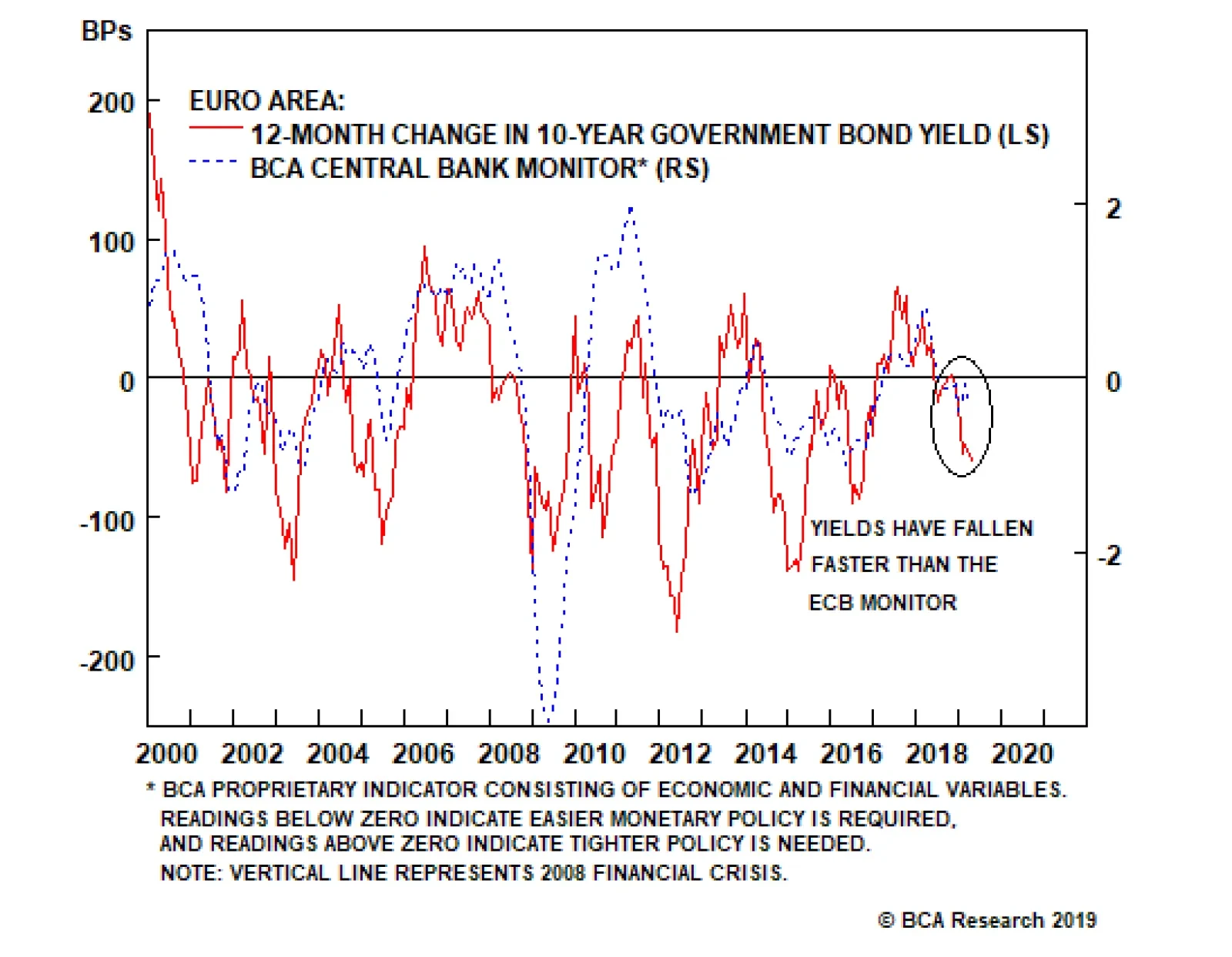
Our Global Fixed Income Strategy team’s European Central Bank (ECB) Monitor is slightly below the zero line, signaling no real need for any change to euro area monetary policy. The sharp slowing of economic growth last year, driven primarily by plunging…
Private capital will begin stampeding toward the exits when the return on invested capital (ROIC) for U.S. assets falls below their cost of capital. For investors with a long horizon, this may already be happening. During bull markets, countries that have…
Highlights In this Weekly Report, we present our semi-annual chartbook of the BCA Central Bank Monitors. All of our country Monitors are now forecasting monetary policy on hold, apart from Australia and New Zealand where looser policy is warranted (Chart of the Week). However, with early leading indicators now flagging a trough in global growth, and with labor markets mostly tight, the Monitors may not signal a need for incremental easing since inflationary pressures have not decelerated much. Given how far global bond yields have fallen in response to the weaker growth backdrop over the past year, any sign of the Monitors finding a floor would herald a turnaround in overbought global government bond markets – most notably in the U.S. and core Europe, where a below-benchmark strategic duration stance is most appropriate. Feature Chart of the WeekA Synchronized Pullback In The BCA Central Bank Monitors
A Synchronized Pullback In The BCA Central Bank Monitors
A Synchronized Pullback In The BCA Central Bank Monitors
An Overview Of The BCA Central Bank Monitors Chart 2Bond Yields Have Fully Adjusted To Our CB Monitors
Bond Yields Have Fully Adjusted To Our CB Monitors
Bond Yields Have Fully Adjusted To Our CB Monitors
The BCA Central Bank Monitors are composite indicators designed to measure the cyclical growth and inflation pressures that can influence future monetary policy decisions. The economic data series used to construct the Monitors are not the same for every country, but the list of indicators generally measure the same things (i.e. manufacturing cycles, domestic demand strength, commodity prices, labor market conditions, exchange rates, etc). The data series are standardized and combined to form the Monitors. Readings above the zero line for each Monitor indicate pressures for central banks to raise interest rates, and vice versa. Through the nexus between growth, inflation, and market expectations of future interest rate changes, the Monitors do exhibit broad correlations to government bond yields in the Developed Markets (Chart 2). Our current recommended country allocations for global government bonds reflect the trends seen in the Central Bank Monitors, even as they have all shifted lower. We are favoring countries where the Monitors are falling (Australia, the U.K., Japan, New Zealand and Canada) relative to regions where the Monitors appear to be stabilizing (the U.S., core Europe). In each BCA Central Bank Monitor Chartbook, we include a new chart for each country that we have not shown previously. In this edition, we show the components of the Monitors, grouped into those focusing on economic growth and inflation, plotted against money market yields curves (the spread between 1-year government bond yields and central bank policy rates, to measure expected changes in interest rates). Fed Monitor: No Rate Cuts Needed Our Fed Monitor has drifted lower over the past several months and now sits just above the zero line (Chart 3A). That indicates no pressure to hike interest rates, which is consistent with the Fed’s recent dovish turn. Yet the Monitor is also not yet in the “easier money required” zone that would suggest a need for the Fed to lower the funds rate - even though that is an outcome now discounted in the U.S. yield curve. Markets have gotten ahead of themselves with the expectation of Fed rate cuts. Markets have gotten ahead of themselves with the expectation of Fed rate cuts. Yes, the U.S. has finally seen some negative impact from slower global growth and the late-2018 tightening of U.S. financial conditions. However, those factors are now starting to become less negative for growth – most notably the across-the-board rally in equity and credit markets in Q1 that has eased financial conditions. There is little danger of a shift to a sustained period of below-trend growth (i.e. less than 2%) in 2019 that would free up spare capacity, and ease inflation pressures, in the U.S. economy (Chart 3B). Chart 3AU.S. Treasury Rally Looks Overdone
U.S.: Fed Monitor
U.S.: Fed Monitor
Chart 3BA Big Pullback In U.S. Inflation Is Unlikely
A Big Pullback In U.S. Inflation Is Unlikely
A Big Pullback In U.S. Inflation Is Unlikely
Among the three sub-components of the Fed Monitor (growth, inflation and financial conditions), all are close to the zero lines (Chart 3C), suggesting that the current neutral signal from the Monitor is broad-based. The rally in the U.S. Treasury market now looks stretched, however, with the 10-year yield now lower than levels of a year ago – an outcome that, in that past, has usually coincided with the Fed Monitor falling well below zero (Chart 3D). A below-benchmark duration stance in the U.S. is appropriate, as the risk/reward profile favors higher Treasury yields from current depressed levels. Chart 3CFed Monitor Components All Near Zero, Validating Current Fed Pause
Fed Monitor Components All Near Zero, Validating Current Fed Pause
Fed Monitor Components All Near Zero, Validating Current Fed Pause
Chart 3DU.S. Treasury Rally Looks Overdone
U.S. Treasury Rally Looks Overdone
U.S. Treasury Rally Looks Overdone
BoE Monitor: The Window For A Rate Hike Has Closed Our Bank of England (BoE) Monitor, which had been in the “tighter money required” zone between 2016-18, has fallen back to the zero line (Chart 4A). The obvious culprit is the ongoing Brexit uncertainty, which has damaged confidence among both businesses and consumers. Overall economic growth has held in better than expected given the Brexit noise – for example, the manufacturing PMI now sits at 55.1, comfortably above the boom/bust 50 threshold. Yet leading economic indicators continue to deteriorate and growth is likely to remain under downward pressure in the coming months. Despite estimates showing a lack of spare capacity in the U.K. economy (a closed output gap, an unemployment rate well below NAIRU), both headline and core inflation have fallen back to the BoE’s 2% target (Chart 4B). The central bank has changed its policy bias as a result, with even the more hawkish members of the Monetary Policy Committee signaling that there is no longer any pressing need for rate hikes. Chart 4AU.K.: BoE Monitor
U.K.: BoE Monitor
U.K.: BoE Monitor
Chart 4BU.K. Inflation Back To BoE Target
U.K. Inflation Back To BoE Target
U.K. Inflation Back To BoE Target
When looking at the split between the growth and inflation components of our BoE Monitor, it is clear that the former has triggered the large fall in the Monitor (Chart 4C). Yet even the inflation component has fallen below the zero line. With no pressure from any corner to alter monetary policy, the BoE can continue to sit on its hands and wait for some clarity to develop on the Brexit front. Chart 4CHit To U.K. Economy From Brexit Uncertainty Keeping BoE On Hold
Hit To U.K. Economy From Brexit Uncertainty Keeping BoE On Hold
Hit To U.K. Economy From Brexit Uncertainty Keeping BoE On Hold
We continue to recommend overweighting U.K. Gilts within global government bond portfolios, given the weakening trend in U.K. leading economic indicators and persistent Brexit uncertainty (Chart 4D). Chart 4DA Deeper U.K. Growth Slowdown Needed To Drive Down Gilt Yields
A Deeper U.K. Growth Slowdown Needed To Drive Down Gilt Yields
A Deeper U.K. Growth Slowdown Needed To Drive Down Gilt Yields
ECB Monitor: Bund Yields Have Fallen Too Far Our European Central Bank (ECB) Monitor is slightly below the zero line, signaling no real need for any change to euro area monetary policy (Chart 5A). The sharp slowing of economic growth last year, driven primarily by plunging exports, is the main reason why the Monitor has stayed subdued. Despite the weaker growth momentum, however, there remains far less spare capacity in the euro area economy than at any time since before the 2009 global recession (Chart 5B). Chart 5AEuro Area: ECB Monitor
Euro Area: ECB Monitor
Euro Area: ECB Monitor
Chart 5BEuro Area Inflation More Stable At Full Employment
Euro Area Inflation More Stable At Full Employment
Euro Area Inflation More Stable At Full Employment
Nonetheless, the ECB has already back-pedaled on policy normalization announced last December. The central bank announced a new program of cheap funding for euro area banks (TLTRO3) to begin this September, replacing the expiring loans from the previous funding program. The backdrop is turning less bullish for core European bond markets, where yields have fallen much further than justified by our ECB Monitor. There are some tentative signs that euro area growth may be stabilizing, such as increases in the expectations component of the ZEW and IFO surveys. If this is the beginning of a true cyclical turnaround, then the downward pressure on our ECB Monitor from a weak economy will soon reverse (Chart 5C). Chart 5COffsetting Growth & Inflation Components In The ECB Monitor
Offsetting Growth & Inflation Components In The ECB Monitor
Offsetting Growth & Inflation Components In The ECB Monitor
The ECB is now signaling that it will keep policy rates unchanged until the end of the year, on top of the new TLTRO. In addition, faster global growth in the latter half of 2019 will provide a boost to the euro area economy via the export channel. The backdrop is turning less bullish for core European bond markets, where yields have fallen much further than justified by our ECB Monitor (Chart 5D). We recommend only a neutral allocation to core European government bonds, but our next move is likely a downgrade. Chart 5DBund Rally Looks Stretched Versus ECB Monitor
Bund Rally Looks Stretched Versus ECB Monitor
Bund Rally Looks Stretched Versus ECB Monitor
BoJ Monitor: No Inflation, No Change In Policy Our Bank of Japan (BoJ) Monitor has drifted back to the zero line after a brief cyclical stay in the “tighter money required” zone in 2017/18 (Chart 6A). Such is life in Japan, where even an unemployment rate of 2.3% – the lowest in decades – cannot generate inflation outcomes anywhere close to the BoJ’s 2% target (Chart 6B). Chart 6AJapan: BoJ Monitor
Japan: BoJ Monitor
Japan: BoJ Monitor
Chart 6BNo Spare Capacity In Japan, But Still No Inflation
No Spare Capacity In Japan, But Still No Inflation
No Spare Capacity In Japan, But Still No Inflation
The slowing of global trade activity and weakness in Chinese economic growth has hit the export-sensitive Japanese economy hard. Industrial production is now contracting, export volumes fell –6.8% year-over-year in January, and the widely-followed Tankan survey showed the biggest quarterly drop in business confidence among manufacturers in Q1/2019 since 2011. Household confidence has also taken a hit and retail sales growth has stagnated. Against such a weak economic backdrop, the soft growth component of our BoJ Monitor is fully offsetting the relative strength of the inflation component (Chart 6C). The latter is mostly related to the tightness of Japan’s labor market, which has pushed nominal wage inflation to 3.0% - the fastest pace since 1990. Core inflation at 0.4% has not followed suit, however. Chart 6CStill Not Enough Growth To Justify Any Reduction in BoJ Accommodation
Still Not Enough Growth To Justify Any Reduction in BoJ Accommodation
Still Not Enough Growth To Justify Any Reduction in BoJ Accommodation
We continue to recommend an overweight stance on JGBs, based on our view that the BoJ will maintain hyper-easy monetary policy settings – especially compared to the rest of the developed markets – until there is much higher realized core inflation in Japan. There is no chance of the BoJ moving any part of the Japanese yield curve it effectively controls (all interest rates with maturity of 10 years of less) until both growth and inflation move durably higher (Chart 6D). Chart 6DNo Pressure On JGB Yields To Rise
No Pressure On JGB Yields To Rise
No Pressure On JGB Yields To Rise
BoC Monitor: Neutral Across The Board Our Bank of Canada (BoC) Monitor has fallen sharply since mid-2018 and now sits right at the zero line, suggesting no pressure to change monetary policy (Chart 7A). The main cause is weakness in the Canadian economy, which has responded negatively to the combination of previous BoC rate hikes, diminished business confidence and slower global growth. The central bank was surprised by how rapidly the Canadian economy lost momentum at the end of last year, when real GDP expanded an anemic 0.4% annualized pace in Q4/2018. That prompted the BoC to signal a halt to the rate hikes, even with core inflation measures hovering close to the midpoint of the BoC’s 1-3% target band (Chart 7B). Chart 7ACanada: BoC Monitor
Canada: BoC Monitor
Canada: BoC Monitor
Chart 7BIs Economic Slack Underestimated In Canada?
Is Economic Slack Underestimated In Canada?
Is Economic Slack Underestimated In Canada?
Canadian money markets now discount -20bps of rate cuts over the next year. In the past, market pricing of BoC rate expectations has tended to be more correlated to the inflation component of our BoC Monitor (Chart 7C). The latest downturn in the Monitor, however, has been driven by declines in both the growth and inflation components. The BoC’s dovish turn is validated by broad-based weakness in the Canadian data. Chart 7CBoC Monitor Components Both Consistent With No Change In Interest Rates
BoC Monitor Components Both Consistent With No Change In Interest Rates
BoC Monitor Components Both Consistent With No Change In Interest Rates
We closed our long-standing underweight recommended allocation for Canadian government bonds on March 19.1 We are now at neutral weight, although we may shift to an overweight stance if the coming rebound in global growth that we expect does not carry over into the Canadian economy and trigger some stabilization in our BoC Monitor (Chart 7D). The BoC’s dovish turn is validated by broad-based weakness in the Canadian data. Chart 7DCanadian Yields Will Not Rise Again Without A Rebound In Growth
Canadian Yields Will Not Rise Again Without A Rebound In Growth
Canadian Yields Will Not Rise Again Without A Rebound In Growth
RBA Monitor: More Pressure To Cut Rates The Reserve Bank of Australia (RBA) Monitor has been below the zero line since September 2018, indicating a need for easier monetary policy (Chart 8A). A slumping economy has been weighed down by sluggish consumption, weak exports and falling house prices in the major cities. Combined with inflation stubbornly below the 2-3% RBA target band, this has driven Australian bond yields to new lows. -41bps of RBA rate cuts over the next year are now discounted in the Australian OIS curve. Delivering on those rate cut expectations, however, will likely require some weakening of the labor market (Chart 8B). Chart 8AAustralia: RBA Monitor
Australia: RBA Monitor
Australia: RBA Monitor
Chart 8BAustralia: RBA Monitor
Australia: RBA Monitor
Australia: RBA Monitor
As depicted in Chart 8C, both the growth and inflation components of our RBA Monitor have fallen below the zero line. Over the past quarter-century, when both components of the RBA Monitor were as far below zero as they are now, shorter-dated bond yields have ended up falling below the Cash Rate as markets move to price in an easing cycle. That 1-year/Cash Rate spread has not yet gone negative, suggesting there is more room for the entire Australian government yield curve to be dragged lower by the front-end if the economy does not soon improve. Chart 8CSoft Inflation Is Why Our RBA Monitor Is Calling For Cuts
Soft Inflation Is Why Our RBA Monitor Is Calling For Cuts
Soft Inflation Is Why Our RBA Monitor Is Calling For Cuts
The positive correlation between the RBA Monitor and changes in the 10-year Australian government bond yield suggests that downward pressure on yields will persist until economic growth or inflation begins to revive. The positive correlation between the RBA Monitor and changes in the 10-year Australian government bond yield suggests that downward pressure on yields will persist until economic growth or inflation begins to revive (Chart 8D). With Australia’s leading economic indicator still decelerating, and with any boost to exports not likely until later this year, we continue to recommend an overweight stance on Australian government bonds. Chart 8DStay Long Australian Bonds
Stay Long Australian Bonds
Stay Long Australian Bonds
RBNZ Monitor: Setting Up For A Rate Cut Our Reserve Bank of New Zealand (RBNZ) monitor has been below the zero line since September 2018, indicating that easier monetary policy is required. (Chart 9A). The central bank made a significant dovish shift in its forward guidance at the March meeting, noting that the balance of risks for the New Zealand (NZ) economy was now tilted to the downside and the next move is more likely to be a rate cut. That dovish turn is consistent with the underwhelming performance of NZ inflation (Chart 9B). The RBNZ does not expect inflation to hit 2% until the end of 2020, even with the unemployment rate at a ten-year low of 4.3% and wages growing at a 2.9% annual rate. Chart 9ANew Zealand: RBNZ Monitor
New Zealand: RBNZ Monitor
New Zealand: RBNZ Monitor
Chart 9BNZ Inflation Has Struggled To Breach 2%
NZ Inflation Has Struggled To Breach 2%
NZ Inflation Has Struggled To Breach 2%
Over the past two decades, market pricing of RBNZ rate moves has been more correlated to the growth component of our RBNZ Monitor. In the years since the Global Financial Crisis, however, the growth and inflation components have been highly correlated to each other and to expectations for interest rates (Chart 9C). With markets now discounting -45bps of rate cuts over the next year, the NZ yield curve appears appropriately priced relative to our RBNZ Monitor. Chart 9CBoth Inflation & Growth Components Of The RBNZ Monitor Signaling Rate Cuts
Both Inflation & Growth Components Of The RBNZ Monitor Signaling Rate Cuts
Both Inflation & Growth Components Of The RBNZ Monitor Signaling Rate Cuts
We have maintained a bullish recommendation on NZ government bonds versus both U.S. Treasuries and German Bunds since mid-2017, and we see no reason to close this highly profitable position, even if the RBNZ fails to fully deliver on discounted rate cuts. Both Treasuries and Bunds look overvalued amid signs of U.S. and European growth stabilizing, while the deterioration in our RBNZ Monitor suggests NZ yields have far less upside (Chart 9D). Chart 9DStay Long New Zealand Government Bonds
Stay Long New Zealand Government Bonds
Stay Long New Zealand Government Bonds
Riksbank Monitor: Rate Hikes Delayed, Rate Cuts Unlikely Our Riksbank Monitor is currently slightly below zero and market is now priced for -17bps of rate cuts over next year (Chart 10A). The market has judged that the recent bout of weaker Swedish economic data has effectively derailed the Riksbank’s plans to hike rates in the second half of 2019. However, given the dearth of spare capacity in the Swedish economy (Chart 10B), and with the policy rate still negative, rate cuts are unlikely to be delivered. At best, the central bank can delay rate hikes if growth continues to disappoint, which also supports easier monetary conditions via a weaker exchange rate (the krona is down -4.7% year-to-date). Chart 10ASweden: Riksbank Monitor
Sweden: Riksbank Monitor
Sweden: Riksbank Monitor
Chart 10BSweden Inflation Cooling Off A Bit
Sweden Inflation Cooling Off A Bit
Sweden Inflation Cooling Off A Bit
The Riksbank stated in its February Monetary Policy Report that low Swedish productivity growth is leading to cost pressures through higher unit labor costs. It also forecasts that faster wage growth over the next year will help keep inflation near the 2% Riksbank target. The implication is that it will take much weaker growth, and higher unemployment, before the central bank will completely abandon its quest to normalize Swedish interest rates. The relationship between the growth/inflation components of our Riksbank Monitor and the market’s interest rate expectations has been weak since the central bank cut rates below zero and introduced quantitative easing in late 2014 (Chart 10C). Prior to that, however, it was the growth component that was more correlated to short-term interest rate expectations. On that note, the rebound in global growth that we are expecting will help support the Swedish economy, which is highly geared to global economic activity, and put a floor under Swedish bond yields (Chart 10D). Chart 10CRiksbank Can Stay On Hold
Riksbank Can Stay On Hold
Riksbank Can Stay On Hold
Chart 10DNo Pressure For Higher Sweden Bond Yields
No Pressure For Higher Sweden Bond Yields
No Pressure For Higher Sweden Bond Yields
Robert Robis, CFA, Chief Fixed Income Strategist rrobis@bcaresearch.com Ray Park, CFA, Research Analyst ray@bcaresearch.com Footnotes 1 Please see Global Fixed Income Weekly Report “March Calmness,” published March 19, 2019. Available at gfis.bcaresearch.com. Recommendations The GFIS Recommended Portfolio Vs. The Custom Benchmark Index
BCA Central Bank Monitor Chartbook: Validating The Dovish Turn
BCA Central Bank Monitor Chartbook: Validating The Dovish Turn
Duration Regional Allocation Spread Product Tactical Trades Yields & Returns Global Bond Yields Historical Returns
Highlights U.S. growth remains robust, despite some temporary softness in recent months. Ex U.S., growth continues to fall but, with China probably now ramping up monetary stimulus, should bottom in the second half. Central banks everywhere have turned more dovish, partly in an attempt to push up inflation expectations. The combination of resilient growth and easier monetary policy should be good for global equities. We remain overweight equities versus bonds. Bond yields have fallen sharply everywhere. However, with U.S. inflation still trending up, and central banks unlikely to turn any more dovish this year, yields are unlikely to fall much further in 2019. We recommend a slight underweight on duration. We remain overweight U.S. equities, but are on watch to upgrade the euro zone and Emerging Markets when we have stronger conviction about China’s stimulus. Given structural headwinds in both Europe and EM, this would probably be only a tactical upgrade. We have been tilting our equity sector recommendations in a more cyclical direction, last month raising Industrials and Energy to overweight. We also prefer credit over government bonds within the fixed-income category, though we warn that spreads will not fall much further given weak corporate fundamentals. Feature Recommended Allocation
Quarterly - April 2019
Quarterly - April 2019
Overview Don’t Fight The Doves The performance of risk assets essentially comes down to a battle between growth and monetary policy/interest rates. Last September, despite the fact that global economic growth was clearly slowing, the Fed sounded hawkish; this triggered an 18% drop in global equities in Q4. But, since late last year, all major developed central banks have turned more dovish, culminating in March’s decision of the ECB to push back its guidance for its first rate hike, and the FOMC’s wiping out its two planned hikes for 2019. But, at the same time, U.S. economic growth is showing resilience, and we see the first “green shoots” of a cyclical pickup in growth outside the U.S. This is an environment in which risk assets should continue to perform well. Why did the Fed back off? The most likely explanation is that it wants to give itself more room to act come the next recession. Inflation expectations have become unanchored, with 10-year breakevens over the past decade steadily below a level that would be consistent with the Fed achieving its 2% core PCE inflation target in the long run. In the period since the Fed formally introduced this (supposedly “symmetrical”) target in 2012, it has exceeded it in only four months (Chart 1). Around recessions over the past 50 years, the Fed has on average cut rates by 655 basis points (Table 1). It sees little risk, therefore, in letting the economy “run a little hot” and allowing inflation to rise somewhat above 2%. This would reanchor expectations, and eventually get nominal short- and long-term rates higher before the next recession. Chart 1Market Doesn’t Believe The Fed’s Target
Market Doesn't Believe The Fed's Target
Market Doesn't Believe The Fed's Target
Table 1Fed Won’t Be Able To Cut This Much Next Time
Quarterly - April 2019
Quarterly - April 2019
Chart 2Financial Conditions Now Much Easier
Financial Conditions Now Much Easier
Financial Conditions Now Much Easier
Chart 3Housing Market Bottoming Out
Housing Market Bottoming Out
Housing Market Bottoming Out
Meanwhile, U.S. growth seems to be stabilizing at a decent level after signs of weakness late last year caused by tighter financial conditions, a slowdown elsewhere in the world, and the six-week government shutdown. An easing of financial conditions since the beginning of the year should help to keep U.S. GDP growth above trend at around 2.0-2.5% this year (Chart 2). Most notably, interest-rate sensitive areas of the economy that were under pressure last year, especially housing, are showing signs of bottoming (Chart 3). Consumption also should be robust, given strong wage growth, consumer confidence close to historic record high levels, and amid no signs of a deterioration in the labor market (Chart 4). Chart 4No Signs Of Weaker Labor Market
No Signs Of Weaker Labor Market
No Signs Of Weaker Labor Market
Chart 5Some 'Green Shoots' For Global Growth
Some "Green Shoots" For Global Growth
Some "Green Shoots" For Global Growth
A key question for us over the next few months will be when to shift allocations to more cyclical, higher-beta equity markets such as the euro area and Emerging Markets. These have underperformed year-to-date despite the strong risk-on market. China’s nascent reflationary stimulus will decide the timing and level of conviction of this shift. As we explain in detail on page 6, we think the jury is still out on whether China is injecting liquidity on anything like the same scale as it did in 2016. Even if it is, historically it has taken six to 12 months before the effect showed through via a rebound in global trade, commodity prices, and other China-related indicators. The first early signs of a bottoming are emerging: Chinese fixed-asset investment and the Caixin Manufacturing PMI beat expectations last month, the German ZEW Expectations indicator has started to recover, and the diffusion index of the Global Leading Economic Indicator (which often leads the LEI itself by a few months) has picked up (Chart 5). We are on watch to shift our allocation1 but, given the long-term structural headwinds against both Europe and EM, we need to be more convinced about the strength of Chinese stimulus before doing so. The seeds of recession are sown in expansions. Eventually, we see the newly dovish Fed falling behind the curve. The Fed Funds Rate is still below the range of estimates of the neutral rate – hard though this is to estimate in real time (Chart 6). If the economy remains as strong as we expect, sometime next year inflation could begin rising to uncomfortable levels (and asset bubbles start to be of concern), which would push the Fed back into hiking mode. Given that the market is pricing in Fed rate cuts, not hikes, and that the Fed can hardly sound any more dovish than it does now without moving to an outright easing path, it seems to us that long-term rates are very unlikely to fall from here (Chart 7). Chart 6Fed Still Below Neutral
Fed Still Below Neutral
Fed Still Below Neutral
Chart 7Can The Fed Get Any More Dovish Than This?
Can The Fed Get Any More Dovish Than This?
Can The Fed Get Any More Dovish Than This?
In this environment, therefore, we continue to expect global equities to outperform bonds over the next 12 months. However, a recession is possible in 2021 triggered by the Fed late next year needing to put its foot abruptly on the brake. What Our Clients Are Asking Chart 8Ex-U.S. Equities Driven By China Stimulus
Ex US Equities Driven By China Stimilus
Ex US Equities Driven By China Stimilus
When Is The Time To Switch Allocations To Europe And EM? It is slightly surprising that the 12% rally in global equities this year has been led by the low-beta U.S., up 13%, rather than Europe (up 9%) or emerging markets (up 9% - and much less if the strong Chinese market is excluded). Is it time to switch to these underperforming, more cyclical markets? Our answer is, not yet. Global growth ex-U.S. continues to weaken. It is likely to bottom sometime in the second half, as a result of Chinese growth stabilizing. However, the jury is still out on whether the increase in Chinese credit creation in January was a one-off, or major policy reversal. Even if it is the latter, a revival in global growth (and cyclical markets) has typically lagged Chinese stimulus by 6-12 months (Chart 8, panel 1). There are also significant structural headwinds for both the euro zone and Emerging Markets which make us reluctant to overweight them unless there are clear cyclical reasons to do so. Both have lagged global equities fairly consistently since the Global Financial Crisis, with only brief outperformance during periods of economic acceleration, such as in 2016 and 2012 (panel 2). The euro zone remains challenged by its banking system. Loan growth has been stagnant for years, and banks remain undercapitalized relative to their U.S. peers, and highly fragmented (panels 3 and 4). Emerging markets are hampered by their high level of foreign-currency debt (which makes them highly sensitive to U.S. financial conditions), dependence on China, and lack of structural reform. We could see ourselves shifting our recommendation from the U.S. to the euro area and EM, and becoming outright bearish on the U.S. dollar (a counter-cyclical currency), over the coming months if we find confirmation of a bottoming of global cyclical growth and become more confident in the size of China’s stimulus. But given the structural headwinds, and the steady underperformance of these markets, we need stronger evidence first. Chart 9Oil, Positioning, And Housing
Oil, Positioning, And Housing
Oil, Positioning, And Housing
Why Is The 10-Year Bond Yield So Depressed? Despite U.S. equities rallying back to within 4% of a record high, the U.S. Treasury bond yield has fallen further this year (Chart 9, panel 1). Moreover, the 3-month/10-year yield curve has briefly inverted. Besides the Fed’s recent more dovish turn, what has depressed bond yields? We would pin the cause on the following factors: Dampened inflation expectations: Over the past few years the 10-year yield has been closely correlated with the oil price via inflation expectations. A temporary supply shock in Q4 caused oil prices to decline sharply. But tighter supply this year should allow the oil price to recover further. This should cause a rise in inflation expectation (panel 2). Trade positioning: Late last year, speculative short positions in government bonds were at their highest levels since 2015. However, the Q4 equity selloff pushed investors to cover their positions; these are now close to neutral (panel 3). Home Sales: Housing data has been weak over the past few quarters, with both existing and new home sales declining. But there are now signs of recovery: mortgage applications have started to pick up, which should in turn push home sales higher (panel 4). This should also allow for a rise in bond yields. Our key take-away from March’s FOMC meeting, when the tone turned decidedly dovish, is that the Fed is focusing on re-anchoring inflation expectations, which should push nominal yields higher. We think the market is very pessimistic by pricing in 42 and 56 bps of rate cuts over the next 12 and 24 months respectively. It would take a significant further weakening of economic data to make the Fed’s stance turn even more dovish and for nominal yields to fall even further. How Will U.S. Corporate Bonds Perform In The Next Recession? Historically high levels of U.S. corporate debt, as well as declining credit quality in the investment-grade space, have started to worry investors (Chart 10). Specifically, investors are worried that, when the next default cycle comes, a large portion of investment-grade debt will be downgraded to junk, forcing fund managers who are constrained to hold certain credit qualities to sell. These worries seem to be justified. Investment-grade bonds of lower credit quality tend to experience large increases in migration to junk status during credit recessions (Chart 11). Given the current composition of the U.S. investment-grade corporate bond universe, a credit recession would imply a downgrade to junk status of 4.6% of the index if we assume similar behavior to previous recessions. Depending on the speed of the selloff, such a downgrade could also have grave consequence for liquidity. According to the Securities Industry and Financial Markets Association (SIFMA), average daily turnover in the U.S. corporate bond market was 0.34% in 2018. Thus, it is not hard to envision a situation where forced selling could surpass normal levels of liquidity. However, it is hard to tell what would be the effect of such a fire-sale on credit spreads, given that they tend to widen in recessions regardless. While this asset class could perform poorly in the next recession, we don’t expect that its weakness will translate to the real economy. Leveraged institutions such as banks hold just 18% of corporate credit. Furthermore, despite being at all-time highs, U.S. nonfinancial corporate debt to GDP is still at a much healthier level than in other countries (Chart 12). Chart 10Declining Quality In Investment Grade
Declining Quality In Investment Grade
Declining Quality In Investment Grade
Chart 11
Chart 12U.S. Corporate Debt Levels Are Healthy Relative To The Rest Of The World
U.S. Corporate Debt Levels Are Healthy Relative To The Rest Of The World
U.S. Corporate Debt Levels Are Healthy Relative To The Rest Of The World
Chart 13A Value Rebound?
A Value Rebound
A Value Rebound
Chart 14
Is It Time To Favor Value Over Growth Again? Since it peaked in May 2007, the ratio of global value to growth has attempted to rebound several times amid a sustained downtrend (Chart 13). Due to the cyclical nature and the neutral relative valuation of the value/growth indexes, we have preferred to use sector positioning (cyclicals vs. defensives) to implement a value/growth style tilt in our global portfolio since March 20162 (Chart 13, panel 1). Lately, we have received many requests on the topic of the value-versus-growth-ratio. After reaching a historical low in August 2018, the value/growth ratio slightly rebounded in Q4 2018 before reversing some of its gains so far this year. Additionally, the value/growth valuation gap as measured by both price-to-book and forward P/E has reached a historically low level (Chart 13, panel 4). As we have often noted, the sector composition of both the value and growth indexes changes over time.2 Chart 14 shows the current sector weights of S&P Pure Value and Pure Growth Indexes.3 It’s clear that now a bet on Pure Value versus Pure Growth is essentially a bet on Financials (which account for 35% of the Pure Value index) versus Tech and Healthcare (which together account for 38% of the Pure Growth index) - see also Chart 13, panel 2. Given the cyclical nature of the value/growth ratio and also the sector concentration, it’s not surprising that the value/growth play is also a play on euro area versus U.S. equities (Chart 13, panel 3). Currently, we are neutral on Financials and Tech, while overweight Healthcare in our global sector portfolio, and we are putting the euro area on an upgrade watch (see page 14). Therefore, maintaining a neutral stance between value and growth is in line with our sector and country views. However, a close watch for a possible upgrade of value is also warranted given the extreme valuation measures. Global Economy Overview: U.S. growth has slowed recently, though it remains more robust than in the more cyclical economies in Europe and emerging markets. Central banks almost everywhere have recently turned dovish. However, China’s increased monetary stimulus should help global growth bottom out in H2. This could lead the Fed and central banks in other healthy economies to return to a rate-hiking path. U.S.: The U.S. economy has been weak in recent months. The Citigroup Economic Surprise Index (Chart 15, panel 1) has collapsed, and the Fed NowCasts point to only 1.3-1.7% QoQ annualized GDP growth in Q1 (compared to 2.2% in Q4). But the slowdown is mostly due to the six-week government shutdown (which probably took 1% off growth), some seasonal adjustment oddities (which leave Q1 as the weakest quarter almost every year), and tighter financial conditions in H2 2018 which have now largely reversed. The manufacturing and non-manufacturing ISMs in February were still healthy at 54.2 and 59.7 respectively. Consumption (propelled by strong employment growth and accelerating wages) and capex remain strong (panel 3). BCA expects GDP growth in 2019 to be around 2.0-2.5%, still above trend. Euro Area: The European economy continues to slow, driven by weak exports to emerging markets, troubles in the banking sector, and political uncertainty. Q4 GDP growth was only 0.8% QoQ annualized, and the manufacturing PMI has fallen to 47.6 (with Germany as low as 44.7). But there are some early signs of an improvement. The ZEW Expectations index for Germany has bottomed (Chart 16, panel 1), fiscal policy should boost euro area growth this year by around 0.5 percentage points, and wage growth has begun to accelerate. The key remains Chinese stimulus, whose positive effects should help European exports recover sometime in H2. Chart 15U.S. Growth Slowing But Still Robust
U.S. Growth Slowing But Still Robust
U.S. Growth Slowing But Still Robust
Chart 16Signs Of Bottoming In Global Ex-U.S.?
Signs Of Bottoming In Global Ex-U.S.?
Signs Of Bottoming In Global Ex-U.S.?
Japan: Japan also remains highly dependent on a Chinese stimulus. Machine tool orders (the best indicator of capex demand from China) fell by 29% YoY in February. Despite stronger wage growth, now 1.2% YoY, inflation shows no signs of moving up towards the Bank of Japan’s target of 2%: ex energy and food CPI inflation is still only 0.4%. The biggest risk in 2019 is October’s planned consumption tax hike from 8% to 10%. Prime Minister Abe has said that he will cancel this only in the event of a shock on the scale of Lehman Brothers’ bankruptcy. The government has put in place measures to soften the impact (most notably a 5% rebate on purchases at small retailers after October 1 paid for electronically), but consumption is still likely to fall significantly. Emerging Markets: China seems to have ramped up its monetary stimulus, with total social financing in January and February combined up 12% over the same months last year. Recent data have shown signs of a stabilization of growth: the manufacturing PMI rebounded to 49.9 in February from 48.3, and fixed-asset investment beat expectations at 6.1% YoY in January and February combined. Nonetheless, the size of liquidity injection is likely to be smaller than in previous episodes such as 2016, since Premier Li Keqiang and the PBOC have warned of the risk of excessive speculation. Elsewhere, some emerging economies (notably Brazil and Mexico) have showed signs of recovery after last year’s deterioration, whereas others (such as South Africa, Indonesia, and Poland) continue to suffer. Interest rates: Central banks worldwide have generally turned more dovish in recent months, with the Fed and ECB both moving to signal no rate hikes this year. This has pushed down long-term rates globally, with 10-year bond yields falling below 0% again in Germany and Japan. However, with global growth likely to bottom over the next few months, rates may not stay at current depressed levels. U.S. inflation, in particular, continues to trend up, and the Fed’s target PCE inflation measure is likely to exceed 2% over coming months. We see the Fed turning more hawkish by year-end, and long rates globally more likely to rise than fall from current levels. Global Equities Chart 17Watch Earnings
Watch Earnings
Watch Earnings
Remain Cautiously Optimistic: We added risk in our January Portfolio Update4 by putting cash back to work in global equities, and then in the March Portfolio Update5 we reduced the underweight in EM equities and increased the tilt to cyclicals at the expense of defensives, to hedge against a continuing acceleration in Chinese credit growth. All these came after our risk reduction in July 2018.6 GAA’s portfolio approach has always been to take risks where they are most likely to be rewarded. BCA’s macro view is that global economic growth data is likely to be on the weak side in the coming months, but will pick up in the second half. This implies that equities are likely to rally again after a period of congestion within a trading range, supporting a cautiously optimistic portfolio allocation for the next 9-12 months. At the asset-class level, our positioning of overweight equities versus bonds while neutral on cash, reflects the “optimistic” side of our allocation. However, the rebound in global equities since the December sell-off has been driven completely by a valuation re-rating, while earnings growth has been revised down sharply. (Chart 17). As such, within global equities, our preference for low-beta countries (favoring DM versus EM, and favoring the U.S over the rest of DM) reflects the “cautious” aspect of our allocation. Our macro view hinges largely on what happens to China. There are signs that China may have abandoned its focus on deleveraging, yet it is too early to tell if it has switched back to a reflationary path. Therefore, our global equity sector overlay has a slight cyclical tilt by overweighting Industrials and Energy, which are among the main beneficiaries of Chinese reflationary policies or a positive resolution to U.S.-China trade negotiations. Chart 18Warming Up To The Euro Area
Warming Up To The Euro Area
Warming Up To The Euro Area
Euro Area Equities: On Upgrade Watch We have favored U.S. equities relative to the euro area since July 2018.7 Since then, the U.S. has outperformed the euro area by 11% in USD terms and by 8% in local currency terms, with the difference being attributed to the weakness of the euro versus the U.S. dollar. Given BCA’s view on the global economy and the U.S. dollar, however, we are watching closely to switch our recommendation between the U.S. and euro area equities, for the following reasons: First, as shown in Chart 18, panel 1, the relative performance between the euro area and the U.S. is highly correlated with the EUR/USD exchange rate. BCA believes that the U.S. dollar is set for a period of weakness starting in the second half of the year,8 which bodes well for the outperformance of euro area equities. Second, relative earnings growth between the euro area and the U.S. is driven by the underlying strength of the economies, as represented by PMIs (panel 2). Both the relative earnings growth and relative PMI have stopped falling and have begun to bottom in favor of the euro area; Third, even though the euro area’s beta has been declining while that of the U.S. has increased, euro area beta is still higher than that in the U.S., making it more of a beneficiary of a global growth recovery; However, the relative valuation of euro area equities to their U.S. counterparts is now neutral not at the extreme level which historically has been a good entry-point into eurozone equities (panel 4). Chart 19Becoming Less Defensive
Becoming Less Defensive
Becoming Less Defensive
Global Sector Allocation: Gradually Becoming Less Defensive GAA’s sector portfolio took profits on its pro-cyclical positioning and went defensive in July 20189 and remained so until the March Monthly update10 when we upgraded Energy and Industrials to overweight from neutral, while downgrading Consumer Staples two notches to underweight from overweight (Chart 19). The upgrade of Industrials was mainly a hedge against further acceleration in China’s credit growth. But why did we upgrade Energy to overweight yet maintained an underweight in Materials? Long-term GAA clients know that, in terms of global sector allocation, we have structurally favored the oil-related Energy sector to the metals-related Materials sector since October 2016, because oil supply/demand is more global in nature while the supply/demand of metals, especially industrial metals, is closely linked to China (see also the Commodity section of this Quarterly on page 18). From a cyclical perspective, the relative performance of the two sectors has historically closely correlated with the relative prices of oil and metals, as shown in panel 2. This is not surprising because changes in forward earnings for the two sectors are also closely linked to change in the corresponding commodity prices (panels 3 and 4). BCA’s Commodity and Energy Strategy service has an overweight rating on oil and a neutral stance on metals, implying that the growth in the oil price will outpace that of metal prices, which suggests that the Energy sector will outperform the Materials sector (panel 2). Government Bonds Maintain Slight Underweight On Duration. Global equities have recovered 16% since reaching the low of 2018 on December 24, yet the global bond yield has decreased by 21 bps over the same period. While the directional movement of bond yields is somewhat puzzling given such strong performance in equities (see page 7 for some explanations), it’s evident that the bond markets have been driven by the recent weakness in global growth (Chart 20, panel 3), and are pricing out any expectation of rate hikes over the coming year in major developed economies. Given the surprisingly dovish tone at the March FOMC meeting and BCA’s House View that global economic growth will rebound in the second half, bond yields are now highly exposed to any hawkish shift in central bank policies and any recovery in inflation expectations. As such, it’s still appropriate to maintain a slight underweight on duration over the next 9-12 months. Favor Linkers Vs. Nominal Bonds. Depressed inflation expectations have been one reason why global bond yields have decoupled from equities. However, the crude oil price, which closely correlates with inflation expectations, has stabilized. BCA’s Commodity & Energy Strategy service expects Brent crude to end 2019 at US$75 per barrel (Chart 21). This implies a significant rise in inflation expectations in the second half of the year, supporting our preference for inflation-linked bonds over nominal bonds. However, TIPS are no longer cheap. For those who have not already moved to overweight TIPS, we suggest “buying TIPS on dips”. Inflation-linked bonds (ILBs) in Australia and Japan are also still very attractive versus their respective nominal bonds. Overweighting ILBs in those two markets also fits well with our macro themes. Chart 20Rates: Likely More Upside Risk
Rates: Likely More Upside Risk
Rates: Likely More Upside Risk
Chart 21Favor Inflation Linkers
Favor Inflation Linkers
Favor Inflation Linkers
Corporate Bonds Chart 22Tactical Upside Remains For Credit
Tactical Upside Remains For Credit
Tactical Upside Remains For Credit
In February, we raised credit to overweight within a fixed-income portfolio while underweighting government bonds. So far, this has proven to be the right decision, as corporate bonds have generated excess returns of 90 basis points over duration-matched Treasuries. We based our positioning on the mounting evidence that global growth is turning up: credit impulses are starting to rebound in several major economies, monetary conditions have eased, and our diffusion index of global leading indicators has rebounded sharply, indicating that there remains tactical upside for global credit (Chart 22– panel 1 and 2). When will we close our tactical overweight? Our U.S. Bond Strategy Service has set a target for spreads of U.S. corporate bonds with different credit ratings. According to their targets, which denote the median spread typical of late-cycle environments, there is still some room for further spread compression in non-AAA credits (Chart 22 – panel 3 and 4). However, the upside is limited and, if spreads keep tightening, we will probably close our position by the end of Q2. On a cyclical horizon, the fundamentals of corporate health are still a headwind, with both the interest-coverage and liquidity ratio for U.S. investment-grade corporates standing near 10-year lows.11 Moreover, we expect these ratios to deteriorate further, as corporate profits will likely come under pressure due to increasing wage growth. Finally, we expect that the Fed will turn more hawkish by the end of 2019, turning monetary policy from a tailwind to a headwind. Thus, we recommend investors to remain overweight, but be ready to turn bearish in the back end of the year. Commodities Chart 23Prefer Oil, Watch Metals
Prefer Oil, Watch Metals
Prefer Oil, Watch Metals
Energy (Overweight): Stable demand, declining Venezuelan production due to U.S. sanctions, instability and possible outages in Libya, Iraq, and Nigeria, alongside the GCC’s commitment to cut output through year-end, should support oil prices and allow further upside (Chart 23, panels 1 & 2). While U.S. crude production is on the rise, bottlenecks in its export capabilities should limit market oversupply. Crude supply shocks should outweigh any slowdown in demand, specifically from emerging markets. BCA’s energy strategists expect Brent to average $75 and $80 throughout 2019 and 2020 respectively, and for the gap between WTI and Brent to narrow significantly. Industrial Metals (Neutral): China, the world’s largest consumer, still plays a big role in the direction of industrial metals. Year-to-date, metals prices have been supported partly by a more stable dollar. For now, we maintain a neutral stance until we see confirmation that Chinese stimulus will trigger further upside to metal prices perhaps in the second half. However, a lack of sustained Chinese demand, alongside weaker global growth over the next few months, would weigh down on metal prices (panel 3). Precious Metals (Neutral): Gold has reversed its downslide and rallied by over 10% from its Q4 2018 low. With the market pricing out any Fed rate hikes this year, rising inflation expectations, a weaker USD by year-end, and lower real rates should help gold outperform other commodities in this late-cycle phase. We recommend an allocation to gold as an inflation hedge, as well as a hedge against geopolitical risks (panel 4). Currencies Chart 24The End Of The Dollar Bull Market
The End Of The Dollar Bull Market
The End Of The Dollar Bull Market
U.S. Dollar: Our bullish stance on the dollar has proven to be correct, as the trade-weighted dollar has appreciated by 5% in the past 12-months thanks to the slowdown in global growth. However, the two reasons for the growth slowdown – Fed tightening and Chinese deleveraging – have started to ease. On March 20 the Fed revised its forward guidance to no rate hikes in 2019 and only one rate hike in 2020. Meanwhile, Chinese total social financing relative to GDP has bottomed, indicating that Chinese authorities have opted for a pause in their deleveraging campaign (Chart 24, panel 1). These developments will likely boost global growth and hurt the countercyclical greenback. Therefore, we recommend investors to slowly shift to a cyclical underweight on the dollar. Euro: Most of the factors that dragged the euro down last year are fading: political risk in Italy has eased, fiscal policy is moving from a headwind to a tailwind, and the relative LEI between the EU and the US has started to pick up (panel 2). Moreover, we see little scope for euro area monetary policy to turn any more dovish versus the U.S., since forward rate expectations currently stand near 2014 lows (panel 3). Thus, we expect the euro to be one of the best performing currencies this year. Yen: Easy monetary policy by global central banks will boost asset prices and reduce volatility, creating a risk-on environment that is typically negative for the yen (panel 4). Moreover, the IMF still projects Japan to have a negative fiscal drag of 0.7% this year, which will force the BoJ to prolong its yield curve control regime. As a result, we expect the yen to be one of the worst performing currencies this year. Alternatives Intro: Investors’ allocation to alternatives is on the rise as we get closer to the end of the business cycle along with increasing realized volatility in traditional assets. In the alternatives assets space, we recommend thinking about allocations through three buckets: 1) return enhancers, means of outperforming traditional equity, fixed income, and mixed-asset strategies; 2) inflation hedges, means of preserving capital throughout periods of elevated inflation; and 3) volatility dampeners, means of reducing drawdowns and portfolio volatility during periods of market drawdowns. Return Enhancers: In our July and October 2018 Quarterly reports, we recommended investors trim back on PE allocations and reallocate towards hedge funds. Growing competition in the PE space has pushed up multiples. Given where the business cycle currently is, we favor macro hedge funds, as they tend to outperform in this sort of environment as well as in downturns and recessions (Chart 25, panel 1). Inflation Hedges: In our July 2018 Quarterly, we recommended investors pare back their real estate allocations, given the backdrop of a slowdown/sideways trend in the sector, and specifically within the retail segment. Given that the end of the current cycle is likely to be accompanied by elevated levels of inflation, we recommend clients to modestly allocate to commodity futures on the likelihood of a softer dollar and rising energy prices (panel 2). Volatility Dampeners: We continue to recommend both farmland and timberland since they have lower volatility than other traditional and alternative asset classes (panel 3). While timberland is more impacted by economic growth via the housing market, farmland has a near-zero correlation with economic growth. We do not favor structured products due to their unattractive valuations. Chart 25Prefer Hedge Funds Over Private Equity
Prefer Hedge Funds Over Private Equity
Prefer Hedge Funds Over Private Equity
Risks To Our View Our economic outlook is quite sanguine. What would undermine this scenario? Many investors have become nervous about the inversion of the U.S. yield curve. And we have shown in the past that an inversion of the 3-month/10-year yield curve has been a reliable indicator of recessions 12-18 months ahead.12 Its inversion in March, then, is a concern. But note that the indicator works only using a three-month moving average (Chart 26); the curve often inverted for a brief period without signaling recession. We expect long-term rates to rise from here, steepening the curve. But a prolongation of the current inversion would clearly be a worrying signal. The direction of China continues to play a key role in defining the macro picture. Our current allocation is based on the view that China is doing some monetary and fiscal stimulus but that, at the current pace, it will be much smaller than in 2016 (Chart 27). The weak response of money supply growth suggests, as Premier Li Keqiang has complained, that the liquidity is mostly going into speculation (note that A-shares have risen by 20% this year) rather than into the real economy. The March Total Social Financing data, released in mid-April, will give a better read of the degree of the reflation. If it is bigger than we expect, this would suggest a quicker shift into euro area and Emerging Market equities than we currently advocate. The U.S. dollar remains a key driver of asset allocation. The dollar is a counter-cyclical currency and, with global growth slowing, has continued to appreciate moderately this year (Chart 28). We see a weakening of the dollar later this year, when global growth picks up. But if this were to happen more quickly or dramatically than we expect – not impossible given the currency’s over-valuation and crowded long-dollar positions – EM stocks and commodity prices, given their strong inverse correlation with the dollar, could bounce sharply. Chart 26Yield Curve Inversion
Yield Curve Inversion
Yield Curve Inversion
Chart 27How Much Is China Reflating?
How Much Is China Reflating?
How Much Is China Reflating?
Chart 28Dollar Is Counter-Cyclical
Dollar Is Counter-Cyclical
Dollar Is Counter-Cyclical
Garry Evans, Chief Global Asset Allocation Strategist garry@bcaresearch.com Xiaoli Tang, Associate Vice President xiaolit@bcaresearch.com Juan Manuel Correa Ossa, Senior Analyst juanc@bcaresearch.com Amr Hanafy, Research Associate amrh@bcaresearch.com Footnotes 1 Please see the Equities Section of this Quarterly on page 14 for more details. 2 Please see Global Asset Allocation “GAA Quarterly,” dated March 31, 2016 available at gaa.bcaresearch.com 3 Please see https://us.spindices.com/documents/methodologies/methodology-sp-us-style.pdf 4 Please see Global Asset Allocation “Monthly - January 2019,” dated January 2, 2019 available at gaa.bcaresearch.com 5 Please see Global Asset Allocation “Monthly - March 2019,” dated March 1, 2019 available at gaa.bcaresearch.com 6 Please see Global Asset Allocation “Quarterly - July 2018,” dated July 2, 2018 available at gaa.bcaresearch.com 7 Please see Global Asset Allocation “Quarterly - July 2018,” dated July 2, 2018 available at gaa.bcaresearch.com 8 Please see Global Investment Strategy Weekly Report, “What’s Next For The Dollar?” dated March 15, 2019 available at gis. bcaresearch.com 9 Please see Global Asset Allocation “Quarterly - July 2018,” dated July 2, 2018 available at gaa.bcaresearch.com 10 Please see Global Asset Allocation “Monthly Portfolio Update,” dated March 1, 2019 available at gaa.bcaresearch.com 11 Based on BCA’s Global Fixed Income Strategy’s bottom-up health monitor. 12 Please see Global Asset Allocation Special Report, “Can Asset Allocators Rely On Yield Curves?” dated June 15, 2018 available at gaa.bcaresearch.com GAA Asset Allocation