Euro Area
Investors have priced out any possibility of a Fed rate hike over the next year, and now even discount a modest rate cut, according to the U.S. Overnight Index Swap (OIS) curve. Yet, while most of the attention of bond investors has been focused on the U.S.,…

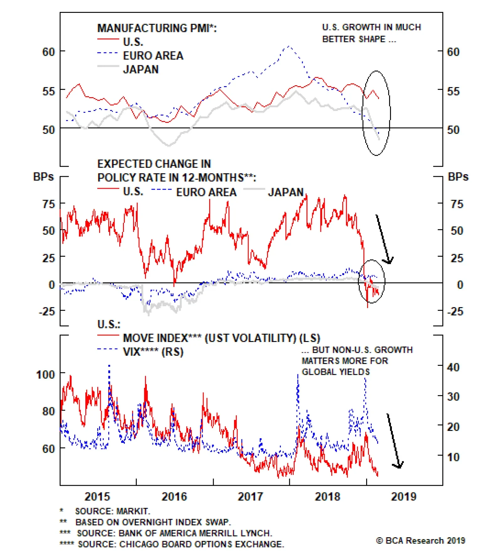
Highlights Low Bond Volatility: Weakening non-U.S. growth and a more dovish Fed have crushed global government bond volatility, especially in Europe and Japan where yields are struggling to stay above 0%. Treasury-Bund and Treasury-JGB spreads, which now largely reflect long-run real growth differentials between the U.S and Europe/Japan, are likely to stay range bound. USTs vs Bunds/JGBs: Stay overweight Bunds & JGBs versus Treasuries, on a hedged basis in U.S. dollars, given the boost to returns from hedging into higher-yielding dollars. Feature Bond Yields Are In Winter Hibernation Developed market (DM) government bonds, never the most exciting of asset classes to begin with, have become boring of late. While benchmark 10-year yields since the end of January have moved in line with our recommended country allocations - lower in Germany (-7bps), Japan (-3bps), the U.K. (-5bps) and Australia (-11bps) where we are overweight, higher in the U.S. (+5bps), Canada (+2bps) and Italy (+19bps) where we are underweight – government bonds have settled into trading ranges and lack direction. The proximate trigger for the muted yield volatility was the Federal Reserve shifting to a neutral stance on U.S. monetary policy in January. Investors have priced out any possibility of a Fed rate hike over the next year, and now even discount a modest rate cut, according to the U.S. Overnight Index Swap (OIS) curve. Yet while most of the attention for bond investors have been focused on the U.S., there are developments in other major economies that are also depressing yields – namely, weakening economic momentum and sluggish inflation. In particular, the downturn has shown no signs of stabilizing in the eurozone and Japan, with the latest readings on manufacturing PMIs now below the 50 line, signaling a contraction (Chart of the Week). The latest data in both regions still shows that core inflation is nowhere near the inflation targets of the European Central Bank (ECB) and Bank of Japan (BoJ). The story is much different in the U.S, with the manufacturing PMI still well above 50 and core inflation hovering close to the Fed’s 2% inflation target. Yet Treasury yield volatility has collapsed, with the MOVE index of Treasury options prices now back to the lows of this cycle. Chart Of The WeekAre Treasuries Leading Or Following?
Are Treasuries Leading Or Following?
Are Treasuries Leading Or Following?
For the time being, non-U.S. factors are driving the direction of global bond yields. We think that will change later this year, as steady U.S. growth and surprisingly firm U.S. inflation readings will prompt the Fed to begin hiking rates again. Yet until there are signs that non-U.S. growth is stabilizing, the low yields in Europe and Japan will act as an anchor on U.S. Treasury yields, particularly given how wide U.S./non-U.S. yield differentials already reflect faster growth and inflation in the U.S. Decomposing Treasury-Bund & Treasury-JGB Spreads When looking at the pricing of the “Big 3” DM government bond markets – the U.S., Germany and Japan – there are some major differences but also some similarities as well. Even with the benchmark 10-year U.S. Treasury sitting at 2.68% compared to a mere 0.11% and -0.03% on the 10-year German Bund and 10-year Japanese government bond (JGB), respectively. Simply looking at the breakdown of those nominal 10-year yields into the real and inflation expectations components, there is not much of a comparison (Chart 2). The real 10-year Treasury yield is in positive territory at 0.6%, compared to -1.4% and +0.2% for JGBs and German bunds, respectively. Inflation expectations, measured by 10-year CPI swap rates, are 2.1% in the U.S., 1.5% in Germany and 0.2% in Japan. Thus, the current wide 10-year Treasury-Bund spread (just under +260ps) can be broken down into a real yield spread of +200bps and an inflation expectations gap of +60bps. In the case of the 10-year Treasury-JGB spread (just under +270bps), that breaks down into a real yield differential of +80bps and an inflation gap of +190bps. Chart 2Big Differentials Here...
Big Differentials Here...
Big Differentials Here...
So while the Treasury-Bund and Treasury-JGB spreads are of similar magnitude, the valuation components driving the spread are much different. The former is more of a real yield gap, while the latter is more of an inflation expectations gap. That is no surprise given the BoJ’s Yield Curve Control policy that maintains a ceiling on the 10-year JGB yield of between 0.1% and 0.2%, limiting how much real yields can move (there are no BoJ restrictions on the level of CPI swap rates). Yet the U.S.-Japan inflation expectations gap is not too far off the spread between realized headline and core inflation measures in both countries - both are 1.4 percentage points higher in the U.S. as of January. Looking at other valuation metrics, the cross-county differentials are less pronounced (Chart 3). Chart 3...But Less So For Other Yield Measures
...But Less So For Other Yield Measures
...But Less So For Other Yield Measures
Yield curves are quite flat, with the 2-year/10-year slope a mere +16bps in the U.S., +14bps in Japan and only +66bps in Germany. Our estimates of the term premia on 10-year government debt are negative for all three markets, most notably in the countries that have seen quantitative easing in recent years (-10bps in the U.S., -90bps in Germany and -60bps in Japan). Perhaps most importantly, our preferred measure of the market pricing of the real terminal policy rate – the 5-year OIS rate, 5-years forward minus the 5-year CPI swap rate, 5-years forward – is +0.2% in the U.S., -0.5% in Germany and 0.0% in Japan. That means the market is pricing in only a +70bp differential, in real terms, between the neutral policy rates of the Fed and ECB. That gap is only +20bps between market pricing of the neutral real rates for the Fed and BoJ. That narrower gap between the market-implied pricing of the real neutral rate is consistent with the theoretical macroeconomic drivers of real rate differentials, like growth rates of potential GDP and labor productivity. According to OECD estimates, potential GDP growth is 1.8% in the U.S., 1.5% in the overall euro area and 1.2% in Japan (Chart 4). This implies a long-run real yield gap between the U.S. and Germany of +60bps and the U.S. and Japan of +30bps – very close to the market pricing for the real terminal rate differentials.1 When looking at the 5-year annualized growth rates of labor productivity data from the OECD, there is no difference between the three regions with all growing at a mere 0.5% (suggesting that either a faster growth rate of the labor input, or greater productivity of capital, accounts for the higher potential growth rate in the U.S.). Chart 4No Major Differences In Long-Run Real Growth
No Major Differences In Long-Run Real Growth
No Major Differences In Long-Run Real Growth
With the cross-country yield spreads now effectively priced for the long-run real growth differentials between the U.S. and Europe/Japan, this will limit the ability for nominal Treasury-Bund and Treasury-JGB spreads to widen much further. Right now, U.S. inflation expectations are rising faster than those of Europe and Japan, in response to the Fed’s more dovish stance. Yet if those expectations continue to rise, likely in the context of stickier realized U.S. inflation alongside solid U.S. growth, then the Fed will return to a hawkish bias. That ultimately means higher U.S. real yields and, most likely, some pullback in U.S. inflation expectations since the markets would begin to price in the implications of the Fed moving to a restrictive policy stance (including a stronger U.S. dollar that will help dampen U.S. inflation, at the margin). So that means inflation differentials between the U.S. and Germany/Japan can move wider now but will narrow later; and vice versa for real yield differentials (narrower now and wider later). The main investment implication: nominal UST-Bund and UST-JGB spreads are unlikely to move much wider, likely for the remainder of this business cycle/Fed tightening cycle. The main takeaway is that bond yields in core Europe and Japan are effectively anchoring global yields, in general, and U.S. yields, in particular. Treasury yields will not be able to break out of the current narrow trading ranges until there are signs that growth has stabilized in Europe and Japan. Reduced global trade tensions and faster Chinese growth (and import demand) are necessary conditions to reflate the export-heavy economies of Europe and Japan. Yet even if that scenario does unfold in the months ahead (which is BCA’s base case scenario), there is still a case to prefer Bunds and JGBs over U.S. Treasuries on a currency-hedged basis in U.S. dollars. Given the wide short-term interest rate differentials between the U.S. and Europe/Japan, those near-zero 10-year Bund and JGB yields, after hedging into U.S. dollars, are actually higher than 10-year Treasury yields, which benefits the relative hedged performance of the low-yielders versus the U.S. (Chart 5) Chart 5Stay Overweight Bunds & JGBs Vs. USTs (Hedged Into USD)
Stay Overweight Bunds & JGBs Vs. USTs (Hedged Into USD)
Stay Overweight Bunds & JGBs Vs. USTs (Hedged Into USD)
Thus, we continue to recommend an overweight stance on core Europe and Japan, versus an underweight tilt on the U.S., in global U.S. dollar-hedged government bond portfolios. Bottom Line: Weakening non-U.S. growth and a more dovish Fed have crushed global government bond volatility, especially in Europe and Japan where yields are struggling to stay above 0%. Treasury-Bund and Treasury-JGB spreads, which now largely reflect long-run real growth differentials between the U.S and Europe/Japan are likely to stay range bound. Stay overweight Bunds & JGBs versus Treasuries, on a hedged basis in U.S. dollars, given the boost to returns from hedging into higher-yielding dollars. Robert Robis, CFA, Senior Vice President Global Fixed Income Strategy rrobis@bcaresearch.com Footnotes 1 We are using the full euro area data for these economic comparisons, even though we are discussing U.S.-German yield differentials in this report. We think this is reasonable given the status of German government bonds as the benchmark for the euro area, and with the ECB setting its monetary policy for the overall euro area. The differences between the data for Germany and the overall euro area are modest, with German potential GDP and 5-year productivity growth both only 0.3 percentage points higher. Recommendations The GFIS Recommended Portfolio Vs. The Custom Benchmark Index
Europe & Japan: The Anchor Weighing
On Global Bond Yields
Europe & Japan: The Anchor Weighing
On Global Bond Yields
Duration Regional Allocation Spread Product Tactical Trades Yields & Returns Global Bond Yields Historical Returns
Austerity fatigue has set in. Trump’s big budget deficits and his “I love debt” mantra are the waves of the future. For their part, the Democrats are shifting to the left, with the “Green New Deal” proposal being the latest manifestation. The case for…
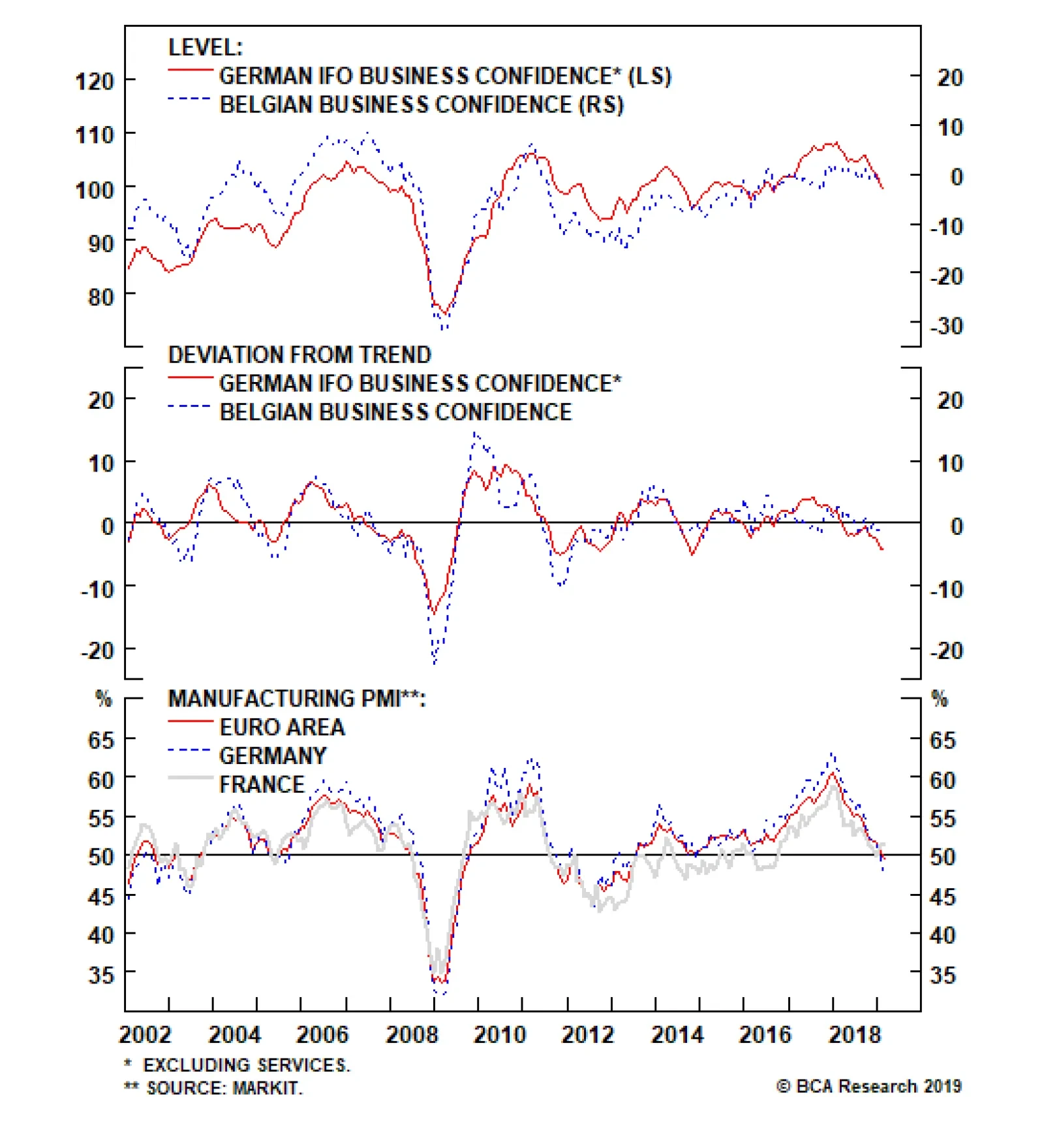
The European economic slowdown shows no sign of ending. This morning, both the German Ifo and the Belgian business confidence decelerated further, with the former falling to 98.5 from 99.3, and the latter weakening from -1.5 to -1.7. Interestingly, as the…
Highlights It may seem self-evident that most governments are overly indebted, but both theory and evidence suggest otherwise. Higher debt today does not require higher taxes tomorrow if the growth rate of the economy exceeds the interest rate on government bonds. Not only is that currently the case, but it has been the norm for most of history. Unlike private firms or households, governments can choose the interest rate at which they borrow, provided that they issue debt in their own currencies. Ultimately, inflation is the only constraint to how large fiscal deficits can get. Today, most governments would welcome higher inflation. There are increasing signs China is abandoning its deleveraging campaign. Fiscal policy will remain highly accommodative in the U.S. and will turn somewhat more stimulative in Europe. Remain overweight global equities/underweight bonds. We do not have a strong regional equity preference at the moment, but expect to turn more bullish on EM versus DM by the middle of this year. Feature A Fiscal Non-Problem? Debt levels in advanced economies are higher today than they were on the eve of the Global Financial Crisis. Rising private debt accounts for some of this increase, but the lion’s share has occurred in government debt (Chart 1). Chart 1Global Debt Levels Have Risen, Especially In The Public Sector
Global Debt Levels Have Risen, Especially In The Public Sector
Global Debt Levels Have Risen, Especially In The Public Sector
Not surprisingly, rising public debt levels have elicited plenty of consternation. While there has been a lively debate about how fast governments should tighten their belts, few have disputed the seemingly self-evident opinion that some degree of “fiscal consolidation” is warranted. Given this consensus view, one would think that the economic case for public debt levels being too high is airtight. It’s not. Far from it. Debt Sustainability, Quantified Start with the classic condition for debt sustainability, which specifies the primary fiscal balance (i.e., the overall balance excluding interest payments) necessary to maintain a constant debt-to-GDP ratio (See Box 1 for a derivation of this equation).
Image
An increase in the economy’s growth rate (g), or a decrease in real interest rates (r), would allow the government to loosen the primary fiscal balance without causing the debt-to-GDP ratio to increase (Chart 2).1 If the government were to ease fiscal policy beyond that point, debt would rise in relation to GDP. But by how much? It is tempting to assume that the debt-to-GDP ratio would then begin to increase exponentially. However, that is only true if the interest rate is higher than the growth rate of the economy. If the opposite were true, the debt-to-GDP ratio would rise initially but then flatten out at a higher level.2
Chart 2
A Fiscal Free Lunch The last point is worth emphasizing. As long as the interest rate is below the economic growth rate, then any primary fiscal balance – even a permanent deficit of 20%, or even 30% of GDP – would be consistent with a stable long-term debt-to-GDP ratio. In such a setting, the government could just indefinitely rollover the existing stock of debt, while issuing enough new debt to cover interest payments. No additional taxes would be necessary. In fact, stabilizing the debt-to-GDP ratio becomes easier the higher it rises. Chart 3 shows this point analytically.
Chart 3
Ah, one might say: If the government issues a lot of debt, then interest rates would rise, and before we know it, we are back in a world where the borrowing rate is above the economy’s growth rate, at which point the debt dynamics go haywire. Now, that sounds like a sensible statement, but it is actually quite misleading. As long as a government is able to issue its own currency, it can always create money to pay for whatever it purchases. If people want to turn around and use that money to buy bonds, they are welcome to do so, but the government is under no obligation to pay them the interest rate that they want. If they do not wish to hold cash, they can always use the cash to buy goods and services or exchange it for foreign currency. As long as a government is able to issue its own currency, it can always create money to pay for whatever it purchases. Wouldn’t that cause inflation and currency devaluation? Yes, it might, and that’s the real constraint: What limits the ability of governments with printing presses to run large deficits is not the inability to finance them. Rather, it is the risk that their citizens will treat their currencies as hot potatoes, rushing to exchange them for goods and services out of fear that rising prices will erode the purchasing power of their cash holdings. When Is Saving Desirable? The reason governments pay interest on bonds is because they want people to save more. However, more savings is not necessarily a good thing. This is obviously the case when an economy is depressed, but it may even be true when an economy is at full employment. Just like someone can work so much that they have no time left over for leisure, or buy a house so big that they spend all their time maintaining it, it is possible for an economy to save too much, leading to an excess of capital accumulation. Under such circumstances, steady-state consumption will be permanently depressed because so much of the economy’s resources are going towards replenishing the depreciation of the economy’s capital stock. Economists have a name for this condition: “dynamic inefficiency.” What determines whether an economy is dynamically inefficient? As it turns out, the answer is the same as the one that determines whether debt ratios are on an explosive path or not: The difference between the interest rate and the economy’s growth rate. Economies where interest rates are below the growth rate will tend to suffer from excess savings. In that case, government deficits, to the extent that they soak up national savings, may increase national welfare. r < g Has Been The Norm Today, the U.S. 10-year Treasury yield stands at 2.69%, compared to the OECD’s projection of nominal GDP growth of 3.8% over the next decade. The gap between projected growth and bond yields is even greater in other major economies (Chart 4).
Chart 4
Granted, equilibrium real rates are likely to rise over the next few years as spare capacity is absorbed. Structural factors might also push up real rates over time. Most notably, the retirement of baby boomers could significantly curb income growth, leading to a decline in national savings. Chart 5 shows that the ratio of workers-to-consumers globally is in the process of peaking after a three-decade long ascent. Economic growth could also fall if cognitive abilities continue to deteriorate, a worrying trend we discussed in a recent Special Report.3 Chart 5The Global Worker-To-Consumer Ratio Has Peaked
The Global Worker-To-Consumer Ratio Has Peaked
The Global Worker-To-Consumer Ratio Has Peaked
It may take a while before real rates rise above GDP growth. Still, it may take a while before real rates rise above GDP growth. As Olivier Blanchard, the former chief economist at the IMF, noted in his Presidential Address to the American Economics Association earlier this year, periods in U.S. history where GDP growth exceeds interest rates have been the rule rather than the exception (Chart 6).4 The same has been true for most other economies.5 Chart 6GDP Growth Above Interest Rates: Historically, The Rule, Not The Exception
GDP Growth Above Interest Rates: Historically, The Rule, Not The Exception
GDP Growth Above Interest Rates: Historically, The Rule, Not The Exception
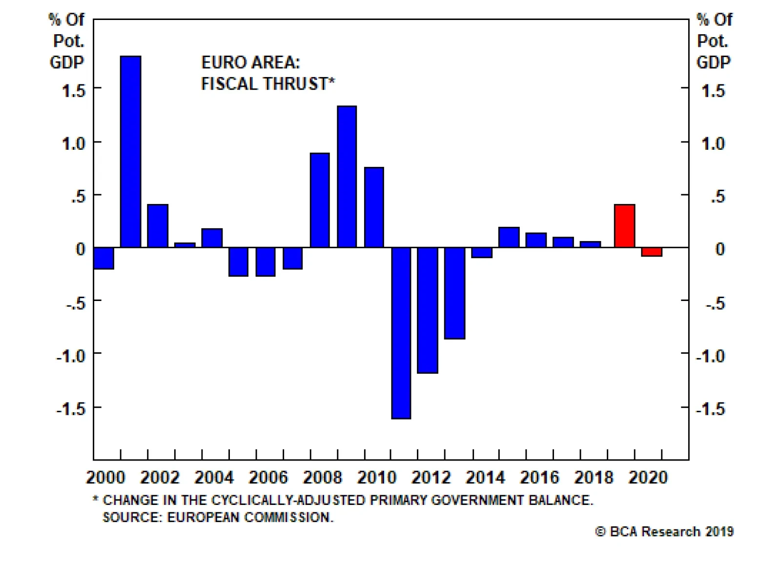
What’s Next For Fiscal Policy? Austerity fatigue has set in. In the U.S., fiscally conservative Republicans, if they ever really existed, are a dying breed. Trump’s big budget deficits and his “I love debt” mantra are the waves of the future. For their part, the Democrats are shifting to the left, with the “Green New Deal” proposal being the latest manifestation. The case for fiscal stimulus is stronger in the euro area than for the United States. The European Commission expects the euro area to see a positive fiscal thrust of 0.40% of GDP this year, up from a thrust of 0.05% of GDP last year (Chart 7). This should help support growth. Chart 7The Euro Area Will Benefit From A Modest Amount Of Fiscal Easing This Year
The Euro Area Will Benefit From A Modest Amount Of Fiscal Easing This Year
The Euro Area Will Benefit From A Modest Amount Of Fiscal Easing This Year
Additional fiscal easing would be feasible. This is clearly true in Germany, but even in Italy, the cyclically-adjusted government primary surplus is larger than what is necessary to stabilize the debt ratio.6 Unfortunately, the situation in southern Europe is greatly complicated by the ECB’s inability to act as an unconditional lender of last resort to individual sovereign borrowers. When a government cannot print its own currency, its debt markets can be subject to multiple equilibria. Under such circumstances, a vicious spiral can develop where rising bond yields lead investors to assign a higher default risk, thus leading to even higher yields (Chart 8).
Chart 8
Mario Draghi’s now-famous “whatever it takes” pledge has gone a long way towards reassuring bond investors. Nevertheless, given the political constraints the ECB faces, it is doubtful that Italy or other indebted economies in the euro area will be able to pursue large-scale stimulus. Instead, the ECB will keep interest rates at exceptionally low levels. A new round of TLTROs is also looking increasingly likely, which should protect against a rise in bank funding costs and a potential credit crunch. Our European team believes that a TLTRO extension would be particularly helpful to Italian banks. Even in Italy, the cyclically-adjusted government primary surplus is larger than what is necessary to stabilize the debt ratio. Despite having one of the highest sovereign debt ratios in the world, Japan faces no pressing need to tighten fiscal policy. Instead of raising the sales tax this October, the government should be cutting it. A loosening of fiscal policy would actually improve debt sustainability if, as is likely, a larger budget deficit leads to somewhat higher inflation (and thus, lower real borrowing rates) and, at least temporarily, faster GDP growth. We expect the Abe government to counteract at least part of the sales tax increase with new fiscal measures, and ultimately to abandon plans for further fiscal tightening over the next few years. In the EM space, Brazil, Turkey, and South Africa are among a handful of economies with vulnerable fiscal positions. They all have borrowing rates that exceed the growth rate of the economy, cyclically-adjusted primary budget deficits, and above-average levels of sovereign debt (Chart 9).
Chart 9
In contrast, China stands out as having the biggest positive gap between projected GDP growth and sovereign borrowing rates of any major economy. The problem is that the main borrowers have been state-owned companies and local governments, neither of which are backstopped by the state. Not officially, anyway. Unofficially, the government has been extremely reluctant to allow large-scale defaults anywhere in the economy. Despite all the rhetoric about market-based reforms, they are unlikely to start now. Historically, the Chinese government has allowed credit growth to reaccelerate whenever it has fallen towards nominal GDP growth. As we recently argued in a report entitled “China’s Savings Problem,” China needs more debt to sustain aggregate demand.7 Historically, the government has allowed credit growth to reaccelerate whenever it has fallen towards nominal GDP growth (Chart 10). The stronger-than-expected jump in credit origination in January suggests that we are approaching such an inflection point. Chart 10Historically, China Has Scaled Back On Deleveraging When Credit Growth Has Fallen Close To Nominal GDP Growth
Historically, China Has Scaled Back On Deleveraging When Credit Growth Has Fallen Close To Nominal GDP Growth
Historically, China Has Scaled Back On Deleveraging When Credit Growth Has Fallen Close To Nominal GDP Growth
Investment Conclusions The consensus economic view is that deflation is a much harder problem to overcome than inflation. When dealing with inflation, all you have to do is raise interest rates and eventually the economy will cool down. With deflation, however, a central bank could very quickly find itself up against the zero lower bound constraint on interest rates, unable to ease policy any further via conventional means. While this standard argument is correct, it takes a very monetary policy-centric view of macroeconomic policy. When interest rates are low, fiscal policy becomes very potent. Indeed, the whole notion that deflation is a bigger problem than inflation is rather peculiar. Just as it is easier to consume resources than to produce them, it should be easier to get people to spend than to save. People like to spend. And even if they didn’t, governments could go out and buy goods and services directly. Looking out, our bet is that policymakers will increasingly lean towards the ever-more fiscal stimulus. If structural trends end up causing the so-called neutral rate of interest to rise – the rate of interest that is necessary to avoid overheating – policymakers will have no choice but to eventually raise rates and tighten fiscal policy (Box 2). However, they will only do so begrudgingly. The result, at least temporarily, will be higher inflation. Fixed-income investors should maintain below benchmark duration exposure over both a cyclical and structural horizon. Reflationary policies that increase nominal GDP growth will help support equities, at least over the next 12 months. Chart 11 shows that corporate earnings tend to accelerate whenever nominal GDP growth rises. We upgraded global equities to overweight following the December FOMC meeting selloff. While our enthusiasm for stocks has waned with the year-to-date rally, we are sticking with our bullish bias. Chart 11Earnings And Nominal GDP Growth Tend To Move In Lock-Step
Earnings And Nominal GDP Growth Tend To Move In Lock-Step
Earnings And Nominal GDP Growth Tend To Move In Lock-Step
A reacceleration in Chinese credit growth will put a bottom under both Chinese and global growth by the middle of this year. As a countercyclical currency, the dollar will likely come under pressure in the second half of this year. Until then, we expect the greenback to be flat-to-modestly stronger. The combination of faster global growth and a weaker dollar later this year will be manna from heaven for emerging markets. We closed our put on the EEM ETF for a gain of 104% on Jan 3rd, and are now outright long EM equities. I do not have a strong view on the relative performance of EM versus DM at the moment, but expect to shift EM equities to overweight by this summer.8 Peter Berezin, Chief Global Strategist Global Investment Strategy peterb@bcaresearch.com Box 1 The Arithmetic Of Debt Sustainability
Image
Box 2 Debt Sustainability And Full Employment: The Role Of Fiscal And Monetary Policy
Image
Policymakers should strive to stabilize the ratio of debt-to-GDP over the long haul, while also ensuring that the economy stays near full employment. The accompanying chart shows the tradeoffs involved. The DD schedule depicts the combination of the primary fiscal balance and the gap between the borrowing rate and GDP growth (r minus g) that is consistent with a stable debt-to-GDP ratio. In line with the debt sustainability equation derived in Box 1, the slope of the DD schedule is simply equal to the debt/GDP ratio. Any point below the DD schedule is one where the debt-to-GDP ratio is rising, while any point above is one where the ratio is falling. The EE schedule depicts the combination of the primary fiscal balance and r - g that keeps the economy at full employment. The schedule is downward-sloping because an increase in the primary fiscal balance implies a tightening of fiscal policy, and hence requires an offsetting decline in interest rates. Any point above the EE schedule is one where the economy is operating at less than full employment. Any point below the EE schedule is one where the economy is operating beyond full employment and hence overheating. Suppose there is a structural shift in the economy that causes the neutral rate of interest – the rate of interest consistent with full employment and stable inflation – to increase. In that case, the EE schedule would shift to the right: For any level of the fiscal primary balance, the economy would need a higher interest rate to avoid overheating. The arrows show three possible “transition paths” to a new equilibrium. Scenario #1 is one where policymakers raise rates quickly but are slow to tighten fiscal policy. This results in a higher debt-to-GDP ratio. Scenario #2 is one where policymakers tighten fiscal policy quickly but are slow to raise rates. This results in a lower debt-to-GDP ratio. Scenario #3 is one where the government drags its feet in both raising rates and tightening fiscal policy. As the economy overheats, real rates actually decline, sending the arrow initially to the left. This effectively allows policymakers to inflate away the debt, leading to a lower debt-to-GDP ratio. Note: In Scenario #2, and especially in Scenario #3, the DD line will become flatter (not shown on the chart to avoid clutter). Consequently, the final equilibrium will be one where real rates are somewhat higher, but the primary fiscal balance is somewhat lower, than in Scenario #1. Footnotes 1 One can equally define the interest rate and GDP growth rate in nominal terms (see Box 1 for details). 2 Japan is a good example of this point. The primary budget deficit averaged 5% of GDP between 1993 and 2010, a period when government net debt rose from 20% of GDP to 142% of GDP. Since then, Japan’s primary deficit has averaged 5.1% of GDP, but net debt has risen to only 156% of GDP (and has been largely stable for the past two years). 3 Please see Global Investment Strategy Special Report, “The Most Important Trend In The World Has Reversed And Nobody Knows Why,” dated February 1, 2019. 4 Olivier Blanchard, “Public Debt And Low Interest Rates,” Peterson Institute for International Economics and MIT American Economic Association (AEA) Presidential Address, (January 2019). 5 Paolo Mauro, Rafael Romeu, Ariel Binder, and Asad Zaman, “A Modern History Of Fiscal Prudence And Profligacy,” IMF Working Paper, (January 2013). 6 The Italian 10-year bond yield is 2.83% while nominal GDP growth is 2.64%. Multiplying the difference by net debt of 118% of GDP results in a required primary surplus of .22% of GDP that is necessary to stabilize the debt-to-GDP ratio. This is lower than the IMF’s 2018 estimate of cyclically-adjusted government primary surplus of 2.14%. 7 Please see Global Investment Strategy Weekly Report, “China’s Savings Problem,” dated January 25, 2019. 8 Please note that my colleague, Arthur Budaghyan, BCA’s Chief EM strategist, remains bearish on both EM and DM equities and expects EM to underperform DM over the coming months. Strategy & Market Trends MacroQuant Model And Current Subjective Scores
Chart 12
Tactical Trades Strategic Recommendations Closed Trades
Highlights Equities can continue to outperform bonds for a few months longer. The pro-cyclical equity sector stance that has worked well since last October can also continue for a few months longer. Overweight pro-cyclical Sweden versus pro-defensive Denmark. The caveat is that these short-term trends are unlikely to persist and will viciously reverse later in the year. European ‘soft’ luxury goods companies are an excellent structural investment opportunity. Take profits on the 75 percent rally in Litecoin and 50 percent rally in Ethereum. Feature Why should European investors care so much about China? The Chart of the Week provides one emphatic answer. For Europe’s $500 billion basic resources sector, the three most important things in the world are: China, China, and China. Through the past decade, the share price performance of the resource behemoths BHP, Anglo American, Rio Tinto, and Glencore have been joined at the hip to China’s short-term credit impulse (Chart I-2 and Chart I-3). Chart of the WeekFor European Basic Resources, The Three Most Important Things In the World Are: China, China, And China
For European Basic Resources, The Three Most Important Things In the World Are: China, China, And China
For European Basic Resources, The Three Most Important Things In the World Are: China, China, And China
Chart I-2BHP, Anglo American, And Rio Tinto Have Been Rallying For Several Months
BHP, Anglo American, And Rio Tinto Have Been Rallying For Several Months
BHP, Anglo American, And Rio Tinto Have Been Rallying For Several Months
Chart I-3BHP Is Joined At The Hip To China's Short-Term Credit Impulse
BHP Is Joined At The Hip To China's Short-Term Credit Impulse
BHP Is Joined At The Hip To China's Short-Term Credit Impulse
But China has a much deeper importance to Europe. According to Mario Draghi, the recent cycle in Europe is ‘made in China’. On the euro area’s domestic fundamentals, Draghi is upbeat, citing “supportive financing conditions, favourable labour market dynamics and rising wage growth”. Yet the economic data have continued to be weaker than expected. Why? Draghi blames a “slowdown in external demand” and specifically, vulnerabilities in emerging markets. He claims that as soon as there is clarity on the exports and the trade sector, much of the euro area’s weakness will wash out. Federal Reserve Chairman, Jay Powell presented a remarkably similar narrative to justify the recent pause in the Fed’s sequential rate hikes: “The U.S. economy is in a good place… but growth has slowed in some major foreign economies.” If Powell claims that the U.S. domestic economy is in a good place and Draghi points out that the euro area domestic fundamentals are fine, then the explanation for what has happened – and what will happen – can only come from one place: China. Optimistically, Draghi adds: “everything we know says that China’s government is actually taking strong measures to address the slowdown.” The good news is that we can independently corroborate Draghi’s optimism, at least in the near-term (Chart I-4). Chart I-4China's Short-Term Credit Impulse Is Up Sharply, And Commodities Have Rebounded
China's Short-Term Credit Impulse Is Up Sharply, And Commodities Have Rebounded
China's Short-Term Credit Impulse Is Up Sharply, And Commodities Have Rebounded
Why China Matters To Europe Chart I-5 shows the short-term credit impulses in the euro area, U.S., and China through the past twenty years. They are all expressed in dollars to allow an apples for apples comparison between the three major economies. The comparison reveals a fascinating transformation. The dominant short-term impulse – the one with the highest amplitude – charts the shift in global economic power and influence from Europe and the U.S. to China. Chart I-5The Shift In Global Economic Power From Europe And The U.S. To China
The Shift In Global Economic Power From Europe And The U.S. To China
The Shift In Global Economic Power From Europe And The U.S. To China
Before 2008, the short-term impulses in the euro area and the U.S. dominated. But the global financial crisis was a major turning point: the credit stimulus from China dwarfed the responses from the western economies. Then through 2009-12 the impulse oscillations from the three major economies took it in turns to dominate. For example, the 2011-12 global downturn was definitely ‘made in Europe’. However, since 2013 China has taken on the undisputed mantle of dominant impulse. Most recently, last year’s peak to trough decline in China’s short-term impulse amounted to $1 trillion, equivalent to a 1.5 percent drag on global GDP. By comparison, the declines in the euro area and the U.S. amounted to a much more modest $200 billion. Likewise, the recent rebound in the China’s short-term impulse, in dollar terms, has been much larger than the respective rebounds in the euro area and the U.S. Credit Impulses And Speeding Tickets Clients complain that they are confused by the conflicting messages from differently calculated credit impulses. So let’s digress for a moment to present a powerful analogy which should clear the confusion once and for all. Imagine you floored the accelerator pedal of your car (analogous to a huge stimulus). After a hundred metres or so, the stimulus would become very apparent. Your speed over that short sprint would have surged, and possibly have become illegal! But your average speed measured over the previous kilometre would have barely changed. Now imagine a police officer rightfully presents you with a speeding ticket. To protest your innocence, you argue that you couldn’t have floored the accelerator pedal because your average speed over the previous kilometre had barely changed! Clearly, you would never offer such a ludicrous defence for pushing the pedal to the metal. Yet when assessing the impact of an economic stimulus, it is commonplace to make the same mistake. The crucial point is that a stimulus – like flooring the accelerator pedal of your car – will barely move the needle for a longer-term rate of change, but it will become very apparent in a short-term rate of change. For this reason, financial markets never wait for the long-term rates of change to pick up. They always move up or down on the evolution of short-term rates of change. It follows that the credit impulse calculation that is most relevant is the one that provides the best explanatory power for the cycles that we actually observe in the economic and financial market data. As we described in our Special Report, “The Cobweb Theory And Market Cycles”, both the theory and evidence powerfully identify the 6-month credit impulse as the one with the best explanatory power for the oscillations that we actually observe in the economy and markets.1 For the sceptics, the charts in this report should finally dispel any lingering doubts. China’s 6-month impulse gives a spookily perfect explanation for the industrial commodity inflation cycle, and thereby the share price performance of the basic resources sector, as well as the other classically cyclical sectors (Chart I-6 and Chart I-7). Chart I-6China's Short-Term Impulse Perfectly Explains Industrial Commodity Inflation
China's Short-Term Impulse Perfectly Explains Industrial Commodity Inflation
China's Short-Term Impulse Perfectly Explains Industrial Commodity Inflation
Chart I-7Semiconductors Are A Modern Day Cyclical
Semiconductors Are A Modern Day Cyclical
Semiconductors Are A Modern Day Cyclical
The good news is that China’s short-term impulse has indisputably been in a mini-upswing in recent months, and this is the reason that the classical cyclical sectors have simultaneously rebounded or, at the very least, stabilised. The bad news is that the shelf-life of such mini-upswings averages no more than eight months or so. Intuitively, this is because just as you cannot accelerate your car indefinitely, it is likewise impossible to stimulate credit growth indefinitely. The investment conclusion is that the pro-cyclical equity sector stance that has worked well since last October can continue for a few months longer. This sector stance necessarily impacts regional and country allocation. For example, it is still right to be overweight pro-cyclical Sweden versus pro-defensive Denmark (Chart I-8 and Chart I-9). Chart I-8Overweight Pro-Cyclical Sweden Versus Denmark...
Overweight Pro-Cyclical Sweden Versus Denmark...
Overweight Pro-Cyclical Sweden Versus Denmark...
Chart I-9...And Versus Norway
...And Versus Norway
...And Versus Norway
From an asset allocation perspective, it means that equities can continue to outperform bonds for the time being. But the caveat is that these short-term trends are unlikely to persist, and most likely, they will viciously reverse later in the year. Stay tuned for the signal to switch. Stay Structurally Overweight ‘Soft’ Luxuries A common question we get concerns the European luxury goods sector: is it, just like the basic resources sector, a direct play on China’s growth cycle? The answer is no. Recently, the connection between the fortunes of ‘soft’ luxury goods brands like LVMH, Hermes, and Kering and China’s growth cycle has been weak (Chart I-10). Broadly, this is also true for ‘hard’ luxury brands – for example, luxury watches – like Richemont (Chart I-11). Chart I-10European 'Soft' Luxuries Are No Longer A China Play...
European 'Soft' Luxuries Are No Longer A China Play...
European 'Soft' Luxuries Are No Longer A China Play...
Chart I-11...Neither Are European 'Hard' Luxuries
...Neither Are European 'Hard' Luxuries
...Neither Are European 'Hard' Luxuries
As we highlighted in Buying European Clothes: An Investment Megatrend, the much bigger driver for the ‘soft’ luxury brands is the structural increase in female labour participation rates, and the feminisation of consumer spending. We expect this trend to persist for the next decade.2 Hence, we are happy to buy and hold the European clothes and accessories companies with a dominant or significant exposure to women’s clothes and/or accessories; provided they have a top-end brand (or brands) giving pricing power, and mitigating the very strong deflation in clothes prices. In summary, while European basic resources are a good tactical investment opportunity, European ‘soft’ luxury goods companies are an excellent structural investment opportunity. Fractal Trading System* We are delighted to report that the fractal trading system perfectly identified the sharp recent rebound in cryptocurrencies. Our long Litecoin and Ethereum position has hit its 60 percent profit target with Litecoin up 75 percent and Ethereum up 50 percent since trade initiation on December 19. Additionally, long industrials versus utilities has also hit its profit target. With no new trades this week, the fractal trading system now has five open positions. For any investment, excessive trend following and groupthink can reach a natural point of instability, at which point the established trend is highly likely to break down with or without an external catalyst. An early warning sign is the investment’s fractal dimension approaching its natural lower bound. Encouragingly, this trigger has consistently identified countertrend moves of various magnitudes across all asset classes. Chart I-12
Litecoin Is Oversold On A 65-Day Horizon
Litecoin Is Oversold On A 65-Day Horizon
The post-June 9, 2016 fractal trading model rules are: When the fractal dimension approaches the lower limit after an investment has been in an established trend it is a potential trigger for a liquidity-triggered trend reversal. Therefore, open a countertrend position. The profit target is a one-third reversal of the preceding 13-week move. Apply a symmetrical stop-loss. Close the position at the profit target or stop-loss. Otherwise close the position after 13 weeks. Use the position size multiple to control risk. The position size will be smaller for more risky positions. * For more details please see the European Investment Strategy Special Report “Fractals, Liquidity & A Trading Model,” dated December 11, 2014, available at eis.bcaresearch.com Dhaval Joshi, Senior Vice President Chief European Investment Strategist dhaval@bcaresearch.com Footnote 1 Please see the European Investment Strategy Special Report “The Cobweb Theory And Market Cycles” January 11, 2018 available at eis.bcaresearch.com 2 Please see the European Investment Strategy Special Report “Buying European Clothes: An Investment Megatrend” December 6, 2018 available at eis.bcaresearch.com Fractal Trading System Recommendations Asset Allocation Equity Regional and Country Allocation Equity Sector Allocation Bond and Interest Rate Allocation Currency and Other Allocation Closed Fractal Trades Trades Closed Trades Asset Performance Currency & Bond Equity Sector Country Equity Indicators Bond Yields Chart II-1Indicators To Watch - Bond Yields
Indicators To Watch - Bond Yields
Indicators To Watch - Bond Yields
Chart II-2Indicators To Watch - Bond Yields
Indicators To Watch - Bond Yields
Indicators To Watch - Bond Yields
Chart II-3Indicators To Watch - Bond Yields
Indicators To Watch - Bond Yields
Indicators To Watch - Bond Yields
Chart II-4Indicators To Watch - Bond Yields
Indicators To Watch - Bond Yields
Indicators To Watch - Bond Yields
Interest Rate Chart II-5Indicators To Watch - Interest Rate Expectations
Indicators To Watch - Interest Rate Expectations
Indicators To Watch - Interest Rate Expectations
Chart II-6Indicators To Watch - Interest Rate Expectations
Indicators To Watch - Interest Rate Expectations
Indicators To Watch - Interest Rate Expectations
Chart II-7Indicators To Watch - Interest Rate Expectations
Indicators To Watch - Interest Rate Expectations
Indicators To Watch - Interest Rate Expectations
Chart II-8Indicators To Watch - Interest Rate Expectations
Indicators To Watch - Interest Rate Expectations
Indicators To Watch - Interest Rate Expectations
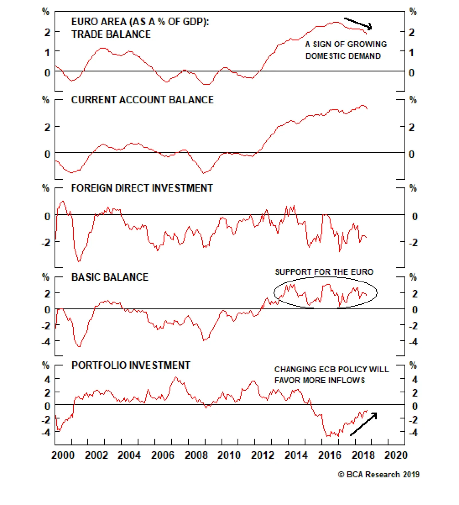
After peaking at 2.4% of GDP, the euro area trade balance has softened to 1.8% of GDP. Rebounding economic activity in the European periphery explains this small deterioration as rising domestic demand tends to lift imports growth, hurting trade balances in…
The next global economic downturn would probably be sparked by a surge in inflation which forces central banks to raise interest rates more aggressively than they would like. Given the absence of inflationary pressures today, and the still-ample spare…
Highlights We would fade fears of an “earnings recession.” EPS growth should increase during the remainder of this year. While high debt burdens around the world may exacerbate deflationary pressures by restraining spending, they may also motivate policymakers to raise inflation in order to reduce the real value of outstanding debt. Ultimately, whether high debt levels turn out to be deflationary or inflationary depends on the extent to which policymakers have both an incentive and the means to increase inflation. The spread of political populism has made governments more inclined to boost nominal incomes by allowing economies to overheat. Central bankers have also become increasingly convinced that they should wait to see “the whites of inflation’s eyes” before tightening monetary policy any further. With inflation expectations still well anchored, it may take at least another 18 months for inflation in the U.S. to break out, and longer still elsewhere. Stay bullish on global stocks for now. However, be prepared to dial back equity exposure late next year, while shifting bond duration to a maximum underweight. Feature Fade Fears Of An “Earnings Recession” We upgraded global stocks in December following the post-FOMC meeting selloff. Our recommendation to go long the MSCI All-Country World Index has gained 9.0% since we initiated it. Although our enthusiasm for stocks has waned somewhat given the recent run-up, we continue to see upside for global bourses over the next 12-to-18 months. Admittedly, earnings growth has come down sharply from a year ago. To some extent, this reflects base effects (U.S. EPS rose by 23% in Q1 of 2018, thanks in part to the tax cuts). However, slower global growth and higher tariffs have also taken their toll. The good news is that the trade war is likely to stay on hiatus over the coming months. We also expect nominal GDP growth in the U.S. and the rest of the world to pick up by the middle of this year. Chart 1 shows that earnings growth tends to move in lock-step with nominal GDP growth. Chart 1Earnings And Nominal GDP Growth Move In Lock-Step
Earnings And Nominal GDP Growth Move In Lock-Step
Earnings And Nominal GDP Growth Move In Lock-Step
Equity prices usually bottom when earnings growth bottoms (Chart 2). Analyst estimates based on IBES data foresee EPS growth troughing in Q1 and then accelerating modestly over the remainder of the year. If this happens, global equities will move higher over the coming months.
Chart 2
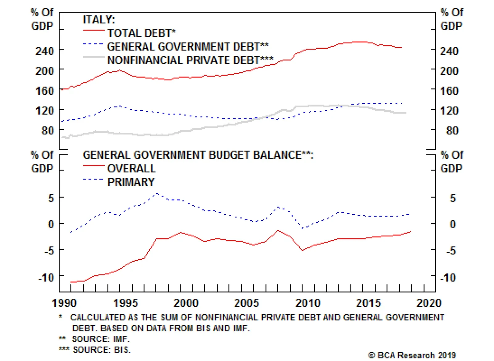
What’s The Bigger Risk? Deflation Or Inflation? Last week, we argued that the next global economic downturn would probably be sparked by a surge in inflation which forces central banks to raise interest rates more aggressively than they would like.1 Given the absence of inflationary pressures today, and the still-ample spare capacity that exists in many economies, we noted that such an outcome is far from imminent. This implies that the global expansion still has plenty of room to run, thus justifying an overweight stance towards risk assets. One common objection to this thesis posits that deflation, rather than inflation, is the main risk to the global economy. And unlike its inflationary cousin, the next deflationary shock could be lurking just around the corner. Italy serves as a good example of the dangers of high debt levels. While many things can contribute to deflationary pressures, elevated debt levels are often cited as being the most important. An excessive debt burden can lead to a prolonged period of deleveraging. Since borrowers typically spend a larger share of their cash flows than lenders, overall spending could decline, leading to lower prices and wages. High debt levels can also make an economy vulnerable to interest-rate shocks. This is particularly the case when a country is reliant on external debt or issues debt in a currency it does not control. The Italian Lesson Italy serves as a good example of the dangers of high debt levels. Italy entered the euro area with one of the highest public debt ratios in the world. Private debt also soared in anticipation of euro membership as well as during the period leading up to the Global Financial Crisis, almost doubling as a share of GDP between 1998 and 2008 (Chart 3). Chart 3Italy's Debt Inferno
Italy's Debt Inferno
Italy's Debt Inferno
Worries about high indebtedness, poor growth prospects, and contagion from Greece sent the 10-year Italian bond yield to nearly 7.5% on November 9, 2011. Yields tumbled after Mario Draghi pledged to do “whatever it takes” to preserve the common currency, but rose again last April after Italians brought an anti-austerity populist government into power. Today, the Italian government finds itself in the unenviable position of having to devote 3.4% of GDP to interest payments, more than double the euro area average (Chart 4). Domestic investors own less than half of Italian government debt, so most of those interest payments do little to stimulate domestic spending. Chart 4The Italian Government's Interest Payments Are Higher Than Elsewhere In The Euro Area
The Italian Government's Interest Payments Are Higher Than Elsewhere In The Euro Area
The Italian Government's Interest Payments Are Higher Than Elsewhere In The Euro Area
The Inflation Solution When debt reaches elevated levels, faster nominal growth via higher inflation becomes an increasingly appealing solution for reducing debt ratios. A one percentage-point increase in nominal GDP will cut debt-to-GDP by half a percentage point when it stands at 50%, but by three full percentage points when it stands at 300%. Given the attractiveness of inflating away debt burdens, why don’t more governments pursue this strategy? Part of the answer is politics. The long history of hyperinflation in Europe and many other economies has cast a long shadow over how central banks operate. Unanticipated inflation also redistributes wealth from creditors to debtors. While the latter usually outnumber the former, the former typically have more political sway. Means And Opportunities Political will is a necessary condition for generating inflation, but it is not a sufficient one. Policymakers also need to possess the ability to accomplish their goal. What determines whether they will succeed? The answer, to a large extent, is the level of the neutral rate of interest. The neutral rate of interest is the long-term interest rate that is appropriate for the economy. When interest rates are above the neutral rate, growth will tend to fall below trend, while inflation will decline. Conversely, when rates are below their neutral level, the economy will grow at an above-trend pace and inflation will accelerate. Many things can influence the neutral rate of interest. These include: Trend GDP growth: Faster growth will incentivize firms to expand capacity in anticipation of rising demand. This will push up the neutral rate of interest. National savings: Lower taxes and increased government spending will drain national savings, while stimulating aggregate demand. This will push up the neutral rate of interest. Likewise, a decrease in private-sector savings — whether it be the result of easier access to credit or greater optimism about future income growth — will raise the neutral rate. The capital intensity of the economy: Economies that require a lot of physical capital will tend to have a higher neutral rate of interest. By the same token, economies where the capital stock needs to be replenished quickly in order to offset depreciation will have a higher neutral rate of interest. The exchange rate: A weaker exchange rate will boost net exports. This resulting increase in aggregate demand will translate into a higher neutral rate of interest. With the exception of the currency effect, all of the factors listed above are captured by the canonical Solow growth model which undergraduate economics students usually encounter in their studies (See Appendix 1 for a derivation of the neutral rate of interest in this model). Inflation And The Neutral Rate Economists tend to define the neutral rate in real terms. However, when thinking about inflation, it is useful to consider the neutral rate’s nominal counterpart. Conceptually, the nominal neutral rate of interest can be either negative or positive. When the nominal neutral rate is negative, even a policy rate of zero will be insufficient to allow the economy to overheat. One might call this outcome the “strong form” version of the secular stagnation thesis. In contrast, when the neutral rate is low, but still positive, an interest rate of close to zero will be low enough to allow the economy to overheat, which will eventually generate inflation. One may refer to this as the “weak form” version of the secular stagnation thesis. Political will is a necessary condition for generating inflation, but it is not a sufficient one. The Danger Of Strong-Form Secular Stagnation In situations where the strong form version of secular stagnation prevails, deflationary pressures will feed on themselves. If an economy suffers from a chronic shortfall of aggregate demand, inflation is liable to drift lower. A lower inflation rate will push down the nominal interest rate that is consistent with any given real rate. For example, if the economy requires a real rate of -1% in order to grow at trend and inflation is 2%, a 1% nominal rate will suffice. But if inflation is 0%, then the policy rate would need to be -1%, which may be difficult to achieve. Japan serves as a case study for how this vicious circle can unfold. Following the simultaneous bursting of the property and stock market bubbles in the early 1990s, the Japanese private sector entered a prolonged deleveraging cycle. Inflation drifted steadily lower, ultimately falling into negative territory during the 1997-98 Asian Crisis (Chart 5). High debt levels in Japan were deflationary because the nominal neutral rate of interest was negative. Even if the Bank of Japan wanted to, it was greatly constrained in its ability to raise inflation. Chart 5Japan: A Case Study In Strong-Form Secular Stagnation
Japan: A Case Study In Strong-Form Secular Stagnation
Japan: A Case Study In Strong-Form Secular Stagnation
Europe Is Not Japan… Yet Next to Japan, the euro area comes the closest to meeting the criteria for strong form secular stagnation. The euro area has low trend growth, owing to its slow population growth rate, as well as a banking system that is still focused on deleveraging. There is a silver lining, however: Despite the many woes the euro area has experienced, long-term inflation expectations are still over 100 basis points higher than in Japan (Chart 6). Fiscal policy is also turning somewhat more accommodative. Our base case is that the ECB will be slow to unwind its balance sheet and will only raise rates if the economy is showing more verve. This should be enough to move inflation towards target over the next two years. Chart 6Long-Term Inflation Expectations In The Euro Area Are Still Well Above Japanese Levels
Long-Term Inflation Expectations In The Euro Area Are Still Well Above Japanese Levels
Long-Term Inflation Expectations In The Euro Area Are Still Well Above Japanese Levels
Inflation In The U.S. When inflation does break out early next decade, it will probably happen first in the United States. A large structural budget deficit and the revival of credit growth to the household sector following an intense period of deleveraging have boosted the neutral rate of interest. An overheated labor market is driving up real wages, which will lead to more consumer spending. December’s weaker-than-expected retail sales report will prove to be a fluke. Not only was it influenced by the sharp drop in the stock market and worries about a pending government shutdown (both of which have reversed), but the report itself was probably compromised by delays in the collection of data, which may have pushed some responses into January (historically, the weakest month for retail sales). This interpretation is consistent with strong holiday sales reported by online retailers and solid growth in the Johnson Redbook index of same-store sales. The latter captures over 80% of the sales surveyed by the Department of Commerce in its retail sales report, and featured a 9.3% year-over-year increase in sales in the final week of December, the fastest since the start of this series in 1997 (Chart 7). Chart 7The December Retail Sales Report Was Probably A Fluke
The December Retail Sales Report Was Probably A Fluke
The December Retail Sales Report Was Probably A Fluke
Yes, corporate debt in the U.S. is high, but it is not particularly elevated relative to most other countries (Chart 8). Despite the collapse in equity prices and the spike in credit spreads late last year, U.S. corporations are still eager to expand capacity (Chart 9). This is not an economy teetering on the brink of recession. Chart 8U.S. Corporate Debt Is Not Extreme By Global Standards
U.S. Corporate Debt Is Not Extreme By Global Standards
U.S. Corporate Debt Is Not Extreme By Global Standards
Chart 9U.S. Capex Plans Have Come Off Their Highs, But Remain Solid
U.S. Capex Plans Have Come Off Their Highs, But Remain Solid
U.S. Capex Plans Have Come Off Their Highs, But Remain Solid
Policymakers in the U.S., and in much of the world, have grown more comfortable in letting economies overheat. Whether it be Trump’s unfunded tax cuts or the “Green New Deal” championed by the more liberal members of the Democratic Party, fiscal stimulus is in, austerity is out. Policymakers in the U.S., and in much of the world, have grown more comfortable in letting economies overheat. Even mainstream voices have given their nod of approval. Just this week, former IMF Chief Economist Olivier Blanchard argued that the U.S. could safely increase public debt without endangering economic stability.2 Meanwhile, central banks have increasingly bought into the mantra, famously espoused by Larry Summers, that they should wait to see the “the whites of inflation’s eyes” before tightening monetary policy.3 What this mantra overlooks is that inflation is a highly lagging indicator. By the time you see the whites of a tiger’s eyes, you are already destined to be its dinner. Investment Conclusions The spread of populist economic policies offers a one-two punch to inflation. Not only are populist prescriptions apt to stimulate demand, but that stimulus will raise the neutral rate of interest, thereby giving central banks greater traction to further boost spending by keeping rates below their neutral level. For investors, this implies a dichotomy between the medium-term and longer-term asset market outlook. Easy money policies are a boon to risk assets when they are first introduced, as they typically combine low interest rates with fast nominal GDP growth. But the path to higher rates is lined with lower rates, meaning that the longer central banks keep rates below their neutral level, the more economies will overheat, and the larger the eventual inflation overshoot will be. As growth outside the U.S. begins to accelerate in the second half of 2019, the dollar will come under downward pressure. As such, investors should overweight global equities and high-yield credit for the next 12 months. However, be prepared to dial back equity exposure late next year, while shifting bond duration to a maximum underweight. In terms of regional equity allocation, we continue to see global growth bottoming by the middle of this year. As growth outside the U.S. begins to accelerate in the second half of 2019, the dollar will come under downward pressure. The resulting reflationary impulse will be manna from heaven for the more cyclically-sensitive sectors of the stock market, as well as Europe and EM. Peter Berezin, Chief Global Strategist Global Investment Strategy peterb@bcaresearch.com
Image
Laura Gu Research Associate Footnotes 1 Please see Global Investment Strategy Weekly Report, “Minsky’s Corollary,” dated February 8, 2019. 2 Olivier Blanchard, “Public Debt and Low Interest Rates,” Peterson Institute for International Economics and MIT American Economic Association (AEA) Presidential Address, (January 2019); Noah Smith, “The U.S. Can Take on a Lot More Debt Within Limits,” Bloomberg Opinion, (February 2019). 3 Lawrence Summers, “Only raise US rates when whites of inflation’s eyes are visible,” Financial Times, (February 2015). Strategy & Market Trends MacroQuant Model And Current Subjective Scores
Chart 10
Tactical Trades Strategic Recommendations Closed Trades
Highlights The U.S. basic balance is the strongest it’s been in decades. However, the White House’s profligacy threatens this positive. The euro area basic balance is also healthy. Now that the European Central Bank has ended its asset purchasing program, aggregate portfolio flows in Europe have much scope to improve, creating long-term support for the euro. Australia, Canada and New Zealand are likely to suffer deteriorating balance-of-payments trends, which will hamper their performance. Norway is the commodity driven economy that is likely to buck this trend. Stay positive the NOK against the SEK and the EUR as well as against other commodity currencies. Feature Balance-of-payments dynamics can often be overplayed when forecasting G10 FX. While their capacity to forecast FX moves is small on a 12-month horizon, the state of the balance of payments can occasionally take primacy over any other consideration. This is particularly true when global liquidity conditions deteriorate, as it makes financing current account deficits more expensive, often requiring sharp adjustment in currency valuations. Since we have experienced a period of rising financial market volatility and global liquidity has deteriorated, this gives us a momentous occasion to review balance-of-payments conditions across the G10. While the balance-of-payments situation for the U.S. is not as dire as is often argued, the deteriorating fiscal balance suggests that this situation is temporary. This means that balance-of-payments risks are likely to grow for the dollar over the coming years. Meanwhile, depressed portfolio flows into the euro area have a lot of scope to improve, which point to a bullish long-term outcome for the euro. Finally, other than Norway, the commodity currency complex sports tenuous balance-of-payments dynamics, which are likely to deteriorate. This suggests that the CAD, AUD and NZD have downside. As a long-term allocation, selling these currencies against the NOK makes sense as well. The U.S. Despite a strong economy that is lifting import growth, the U.S. trade and current account balances have remained stable since 2014, hovering near -3% of GDP and -2.3% of GDP, respectively. This stability is a consequence of the shale revolution, which has curtailed U.S. oil imports by 3.3 million bpd since 2006. However, thanks to robust growth due in large part to the Trump administration’s deregulatory push as well as last year’s tax cut, the U.S. has been the recipient of large FDI inflows, amounting to 1.4% of GDP, the highest level since 2006. Consequently, the U.S.’s basic balance of payments has rebounded, hitting a record high (Chart 1). Chart 1U.S. Balance Of Payments
U.S. Balance Of Payments
U.S. Balance Of Payments
A strong basic balance of payments has been an important factor behind the greenback’s strength this cycle as net portfolio flows in the U.S. have not been particularly strong, having mostly been driven by weaker official purchases. In this context, the current M&A wave bodes well for the dollar as the U.S. has historically been the recipient of such flows. The U.S. equity market’s overweight towards tech and healthcare stocks strengthens this view. From a balance-of-payments perspective, the biggest risk for the dollar is Washington’s profligacy, which is forcing the world to digest a large stock of USD-denominated liabilities. However, if history is any guide, this risk is likely to drive the dollar lower only once U.S. real rates begin to become less appealing compared to their peers. Since BCA expects U.S. real rates to increase more, widening real rate differentials in the process, the dollar should continue to remain supported this year, especially as investors continue to expect a shallower path for rates than we do. The Euro Area After peaking at 2.4% of GDP, the euro area trade balance has softened to 1.8% of GDP. Rebounding economic activity in the European periphery explains this small deterioration as rising domestic demand tends to lift imports growth, hurting trade balances in the process. Despite this worsening trade balance, the euro area current account surplus remains as wide as ever, clocking in at 3.4% of GDP. This reflects both recent improvements in the European net international investment position as well as the fact that low European rates are curtailing the costs of liabilities. Poor FDI performance mitigates the benefits of the large European current account surplus. Hampered by low rates of return, lingering worries about European cohesion and banks’ health, long-term investors have flown out of the euro area – not in. Nonetheless, despite this negative, the euro area basic balance remains in surplus, creating a small positive for the euro (Chart 2). Chart 2Euro Area Balance Of Payments
Euro Area Balance Of Payments
Euro Area Balance Of Payments
The biggest problem for the euro in recent years has been portfolio outflows, especially in the fixed income sphere. While the weakness in portfolio flows has been a crucial factor preventing the good value in the euro – EUR/USD trades at a 12% discount to its purchasing-power parity equilibrium – from realizing itself, the outlook on this front is improving. The European Central Bank’s negative interest rate policy coupled with its Asset Purchase Program have created a powerful repellent for private fixed-income investors. However, the APP is now over, and European policy rates should move back above zero by year-end 2020. As a result, euro area portfolio flows have room to improve considerably. Once this happens, since the basic balance is already in surplus, the euro will have scope to rally significantly. Japan Burdened by slowing exports to both China and emerging markets, the Japanese trade balance is vanishing quickly. However, it still remains at a wide 3.8% of GDP. This is a direct artefact of Japan’s extraordinarily large net international investment position of 60% of GDP, which generates such large net investment income that even when Japan runs a trade deficit of more than 2% of GDP, as it did in 2014, the current account remains balanced (Chart 3). Chart 3Japanese Balance Of Payments
Japan Balance Of Payments
Japan Balance Of Payments
The flipside of Japan’s structural current account surplus is an FDI balance constantly in deficit. The Japanese private sector generates more savings than the country can use, even after the profligacy of the government is satiated. Essentially, Japanese firms are reluctant to expand capacity in ageing, expensive and deflationary Japan. They prefer to do so outside of the national borders, closer to potential new customers. As a result of this dichotomy between the current account surplus and FDI deficit, Japan’s basic balance of payments is a much more modest 1.1% of GDP. Thus, the long-term and stable components of the Japanese balance of payments are mildly positive for the yen. In terms of stock and bond flows, Japan is currently experiencing significant outflows, driven by Japanese investors moving funds outside the country. Historically, these portfolio flows have been a poor indicator for the yen’s direction, often moving into deficit territory as the yen strengthens. This is because Japanese investors are often hedging their foreign asset purchases. Consequently, money market flows will likely once again determine the yen’s fate. For now, the Bank of Japan remains firmly on hold and U.S. rates are rising, suggesting USD/JPY has room to rally this year. However, the JPY’s cheapness and the favorable balance-of-payments picture of Japan argue that the yen’s weakness is in its final innings. The next big structural move in the yen is higher. The U.K. Despite the post-referendum cheapening of the pound, the U.K. continues to run a massive trade deficit of 6.7% of GDP. The current account looks a bit better but remains at a large deficit of 3.9% of GDP. A current account deficit is not a problem for a currency so long as it can be financed cheaply. Historically, the U.K. has been attractive to long-term foreign investors, with a widening current account deficit often met with a growing net FDI balance, leaving only a small basic balance to finance through other channels (Chart 4). Chart 4U.K. Balance Of Payments
U.K. Balance Of Payments
U.K. Balance Of Payments
This time around, the current account remains wide but net FDI flows have collapsed, from 8% of GDP in 2017 to 1.8% of GDP today. The uncertainty surrounding Brexit explains this deterioration. The financial services sector accounts for more than 50% of the stock of inward foreign investments in Great Britain. As financial services will suffer the brunt of Brexit, those investments have also melted. This means the U.K. will have to depend on portfolio flows to finance its current account deficit. Portfolio investments in the U.K. have grown since mid-2017, explaining the stability in the pound. However, this masks some heightened short-term volatility for the GBP against both the dollar and the euro. In the short-term, as the Brexit deadline quickly approaches, this volatility in both flows and the currency will remain high. On a long-term basis, we expect a benign resolution to Brexit. While large FDIs into the financial sector are forever something of the past, flows into British market securities are likely to improve, as the Bank of England will have room to increase rates once economic activity picks up again after the Brexit fog lifts. Canada The Canadian trade balance never recovered from its pre-Great Financial Crisis health. The rebound in oil prices since January 2016 has done little to help the Canadian trade balance, as Canadian oil trades at a large discount to global benchmarks – a consequence of a lack of pipeline capacity that has trapped Canadian oil where it is not needed. The Canadian current account balance offers little solace, and at -2.7% of GDP is in even worse shape than the trade balance (Chart 5). However, the Canadian basic balance is currently in better condition, as Canada continues to attract net FDIs equal to 2% of GDP. The problem for the country is that FDI inflows have become much more limited by the fact that Canadian oil sands generate little profits at current oil prices – a problem amplified by the lack of exporting capacity. This trend is unlikely to change anytime soon. Chart 5Canadian Balance Of Payments
Canada Balance Of Payments
Canada Balance Of Payments
Portfolio flows remain positive, but at 1.1% of GDP, they are falling sharply. The poor profitability of Canadian resources stocks is obviously a problem there, but the growing risks to the Canadian housing market are also likely to hurt banks’ profitability as well as the aggregate financial sector, which accounts for nearly 40% of the country’s stock market capitalization. As a result, with Canadian yields still lagging the U.S., portfolio flows could also deteriorate further. This combination implies that the balance-of-payments picture for Canada is becoming a growing headwind. Australia Two factors are lifting the Australian trade balance, which stands at a surplus of 0.6% of GDP. As the exploitation of Australia’s large mineral deposits mature, the need for mining capex has declined, which has been limiting the growth of Australian machinery imports. On the other hand, this same maturity means that more minerals are being exported out of Australia. Consequently, since iron ore prices have rebounded 88% since their December 2015 lows, representing a generous boost to Australian terms of trade, the country’s trade balance has significantly improved. The current account balance has mimicked this improvement; however, it remains at a deficit of 2.6% of GDP (Chart 6). Much of the investment required to develop the mineral deposits present in the country came from outside Australia’s borders. As a result, foreign investors are receiving large amounts of income from their investment, generating a negative income balance for the country. Nonetheless, the Australian basic balance is now positive as net FDI flows represent more than 3% of GDP. Chart 6Australian Balance Of Payments
Australia Balance Of Payments
Australia Balance Of Payments
Going forward, we worry that China’s slowdown has not fully played out. This means that Australia’s nominal exports could suffer under the weight of falling metals prices, generating a deterioration in the trade balance, the current account and the basic balance. Worryingly, portfolio inflows into the country would also suffer. Finally, Australian households’ high indebtedness, coupled with pronounced overvaluation evident in key cities like Sydney and Melbourne, could further impede capital inflows into the country. This suggests that from a balance-of-payments perspective, the AUD could witness further depreciation, especially as AUD/USD still trades 10% above its purchasing-power-parity fair value. New Zealand The New Zealand trade balance has fallen to -1.8% of GDP, its lowest level in 10 years. This principally reflects stronger imports growth, as exports are currently growing at a 11% annual rate. A consequence of this worsening trade balance has been a widening current account deficit, which now stands at 3.6% of GDP. New Zealand has not been able to attract enough FDI to compensate for its structural current account deficit. As a result, its perennially negative basic balance currently stands at 2.6% of GDP (Chart 7). This lack of structural funding for its current account deficit is linked to its interest rates, which always stand above the G10 average. Thanks to immigration, New Zealand has an economy with an elevated potential growth rate, and thus a higher neutral rate. This means that on average it tends to run a capital account surplus that is matched by a current account deficit. Inversely, the perennial current account deficit requires higher interest rates in order to be financed via capital inflows. Chart 7New Zealand Balance Of Payments
New Zealand Balance Of Payments
New Zealand Balance Of Payments
The problem facing the NZD is that kiwi rates, both at the long and short end of the curve, currently stand below U.S. rates. With a negative basic balance of payments, this creates a natural downward bias to the NZD. The kiwi needs to cheapen enough today that its future returns will be expected to be large enough to compensate for the lower yields offered by domestic securities. Since the real trade-weighted NZD currently trades at a 7% premium to its long-term fair value, so long as the interest rate handicap remains, the path of least resistance points south. Only a sustained rebound in global activity will be able to revert this trend in a durable manner. So far, a sustained rebound in global growth is not in the cards. Consequently, any tactical rally in the kiwi will be temporary. Switzerland The Swiss trade surplus may have declined, but it still remains at a very healthy 4.2% of GDP. This deterioration reflects a pick-up in imports, which have been boosted by a rebound in domestic activity in place since late 2015, as well as the expensive nature of the CHF. The Swiss current account surplus is even larger, standing at 10% of GDP. This large surplus is mainly the consequence of Switzerland’s extremely large net international investment position, which stands at almost 120% of GDP. Such a large pool of foreign assets yields a large income balance, which boosts the current account. After a sudden pickup in net FDI flows last year to 10% of GDP, these flows have violently morphed into a net outflow of 8.3% of GDP. Last year’s positive FDI balance was odd, as countries like Switzerland, which run persistent large positive current account balances, tend to export capital, not import it. A consequence of this sudden reversal was to push the basic balance from a surplus of 17% of GDP to a small surplus of 1.5% of GDP (Chart 8). Chart 8Switzerland Balance Of Payments
Switzerland Balance Of Payments
Switzerland Balance Of Payments
In contrast, Swiss portfolio flows have moved back into a very small surplus, reflecting investors’ desire for safety in a 2018 year full of volatility and global growth disappointments. These flows suggest that generally, investors have been parking their funds in Switzerland, explaining the strengthening of the CHF last year against the EUR. Now that global financial conditions are easing, setting the stage for stabilization in global growth, the expensive CHF is likely to depreciate. The more dovish tone of the Swiss National Bank is likely to catalyze this change. Sweden Since 2016, the Swedish trade balance has been in negative territory, currently standing at 0.6% of GDP. This is a phenomenon not experienced in this country for more than three decades. Two forces have hurt the trade balance. On one hand, boosted by negative interest rates, Swedish consumers have taken on debt and consumed aggressively. This has lifted domestic demand, propping up imports in the process. On the other hand, Sweden is very sensitive to global trade and industrial activity. The slowdown witnessed at the end of last year has dampened Swedish exports. In response to these developments, the Swedish current account balance has declined meaningfully, from 8.3% of GDP in 2007 to 2.2% today. Since Sweden’s net FDI balance is at zero, the basic balance stands at 1.8% of GDP. However, this is toward the low end of its historical distribution (Chart 9). If the deterioration in the current account continues, something we expect as the Riksbank is keeping interest rates at extraordinarily accommodative levels of -0.25%, thus ensuring that import growth will remain robust, the krona will face an increasingly onerous balance-of-payments backdrop. Chart 9Swedish Balance Of Payments
Sweden Balance Of Payments
Sweden Balance Of Payments
The saving grace for the SEK is likely to come from portfolio flows into securities. The trade-weighted krona is cheap, trading at a nearly 2-sigma discount to its long-term fair value, implicitly boosting expected returns from holding SEK-denominated assets. Moreover, the combination of a Riksbank having finally abandoned its efforts to dampen the krona, and some signs of rebound in economic domestic economic activity such as strong PMI readings, points to a high probability of funds flowing into the country. Norway Thanks to rebounding oil prices since 2016, the Norwegian trade balance has also recovered, having moved from a low of 3.8% of GDP to 6.9% of GDP today. This is still well below the levels that prevailed from 2001 to 2013, when the trade balance averaged 14% of GDP. Meanwhile, the Norwegian current account has followed the trend in the trade balance. However, since Norway sports a massive net international investment position equal to 207% of GDP, the current account stands at 7.9% of GDP, boosted by a large income stream from foreign investments. As a country sporting a structural current account surplus, Norway is also an exporter of capital, which means its FDI balance is normally negative. Even though net FDIs today are -4.6% of GDP, the basic balance is nonetheless in surplus at 3% of GDP (Chart 10). This is still a much smaller basic balance than what prevailed from 2001 to 2013. This means that the long-term component of the balance of payments is not as supportive to the NOK as it once was. Chart 10Norway Balance Of Payments
Norway Balance Of Payments
Norway Balance Of Payments
Norway also tends to suffer from portfolio outflows. This again is a consequence of the country’s large current account surplus, which is a channel outward via Norway’s massive sovereign wealth fund. Today, the portfolio balance is quite narrow, a consequence of declining oil receipts. However, Norwegian oil production is expected to increase by 50% by 2022. This means that the Norwegian current account will rebound, and portfolio outflows will once again grow. But since portfolios outflows are the mirror image of the current account dynamics, this is likely to be a neutral force for the NOK. Ultimately, we like the NOK because it is very cheap: the real trade-weighted NOK enjoys a one-sigma discount to its long-term fair value. Due to trade-weights, this means the NOK is cheap versus both the EUR and the SEK. Hence, with BCA’s positive view on oil prices and the positive outlook for Norwegian oil production, we would anticipate the NOK performing well against these two currencies on a 12- to 18-month basis. Mathieu Savary, Vice President Foreign Exchange Strategy mathieu@bcaresearch.com Trades & Forecasts Forecast Summary Core Portfolio Tactical Trades Closed Trades