Europe
It is easy to take a dim view of Europe. Demographics are poor, the region is highly dependent on foreign economic activity, especially in emerging economies, and structural rigidities abound. However, one important domestic variable continues to make…
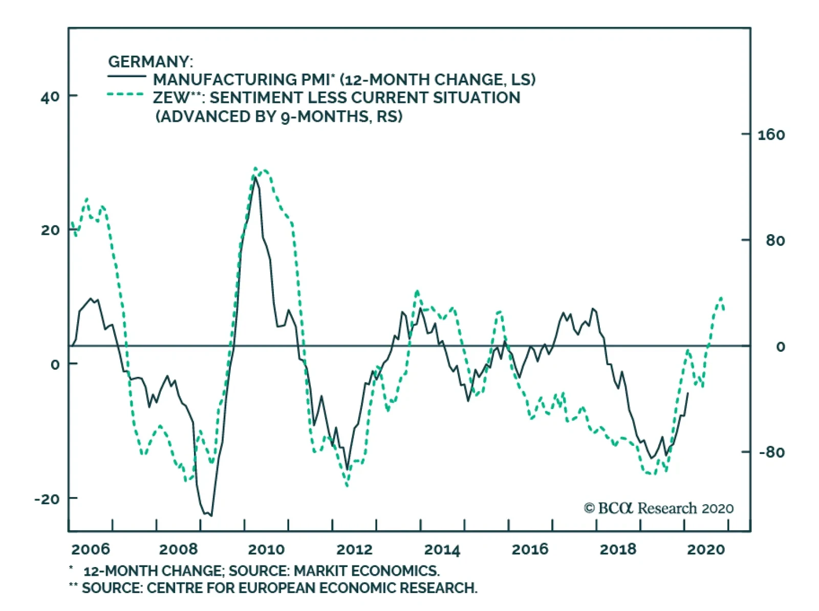
Tuesday’s release of the German ZEW survey showed that the nascent recovery in the economy is at risk from the COVID-19 shock. The current situation component of the index deteriorated from -9.5 to -15.7, while the expectations component plunged from 26.7 to…
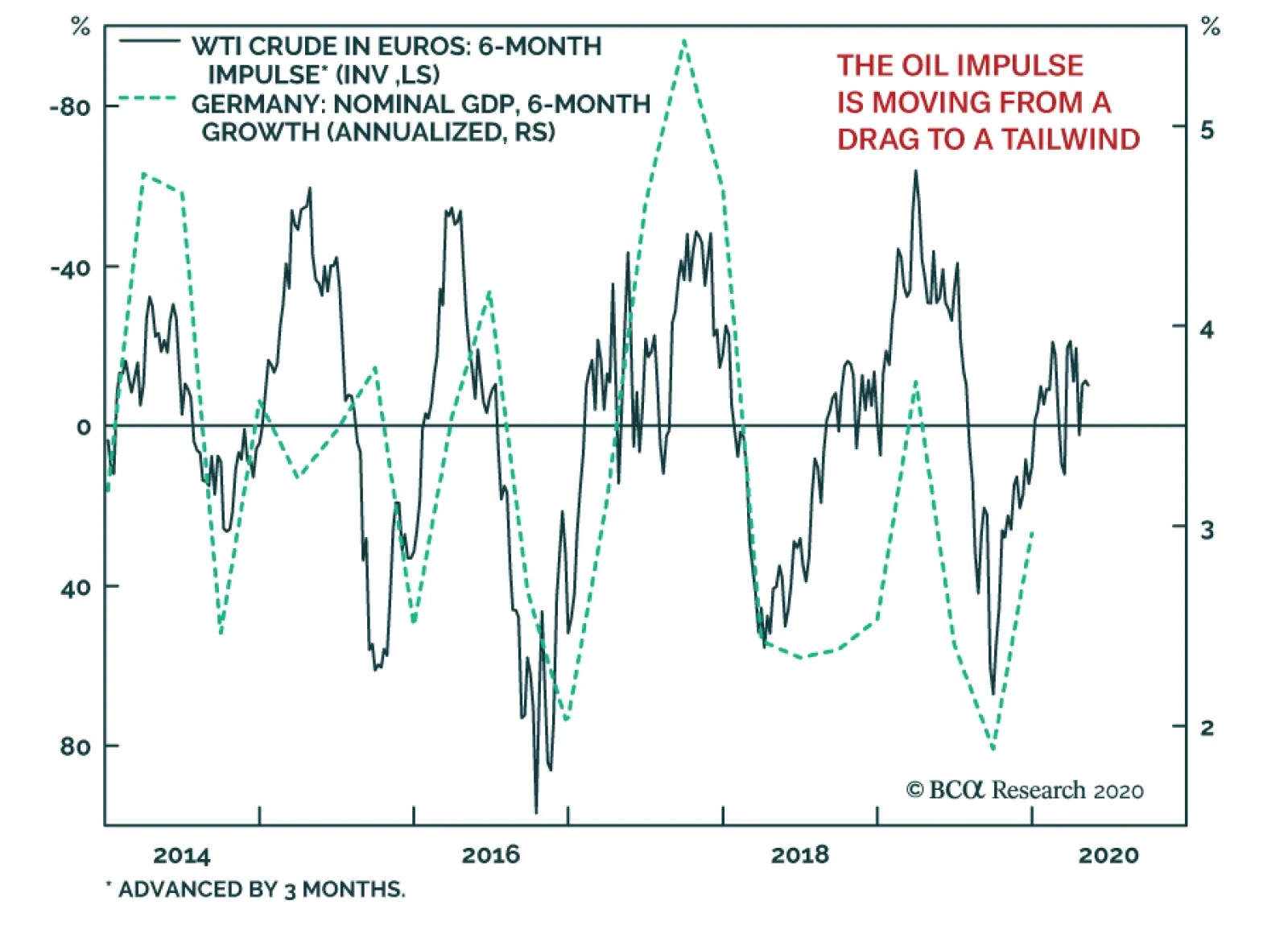
Following last week’s disastrous industrial production numbers, Germany’s Q4 GDP number was weak, coming in 0% on a quarter-over-quarter basis. As BCA Research’s European Investment Strategy service often writes, the German economy is very sensitive to oil…
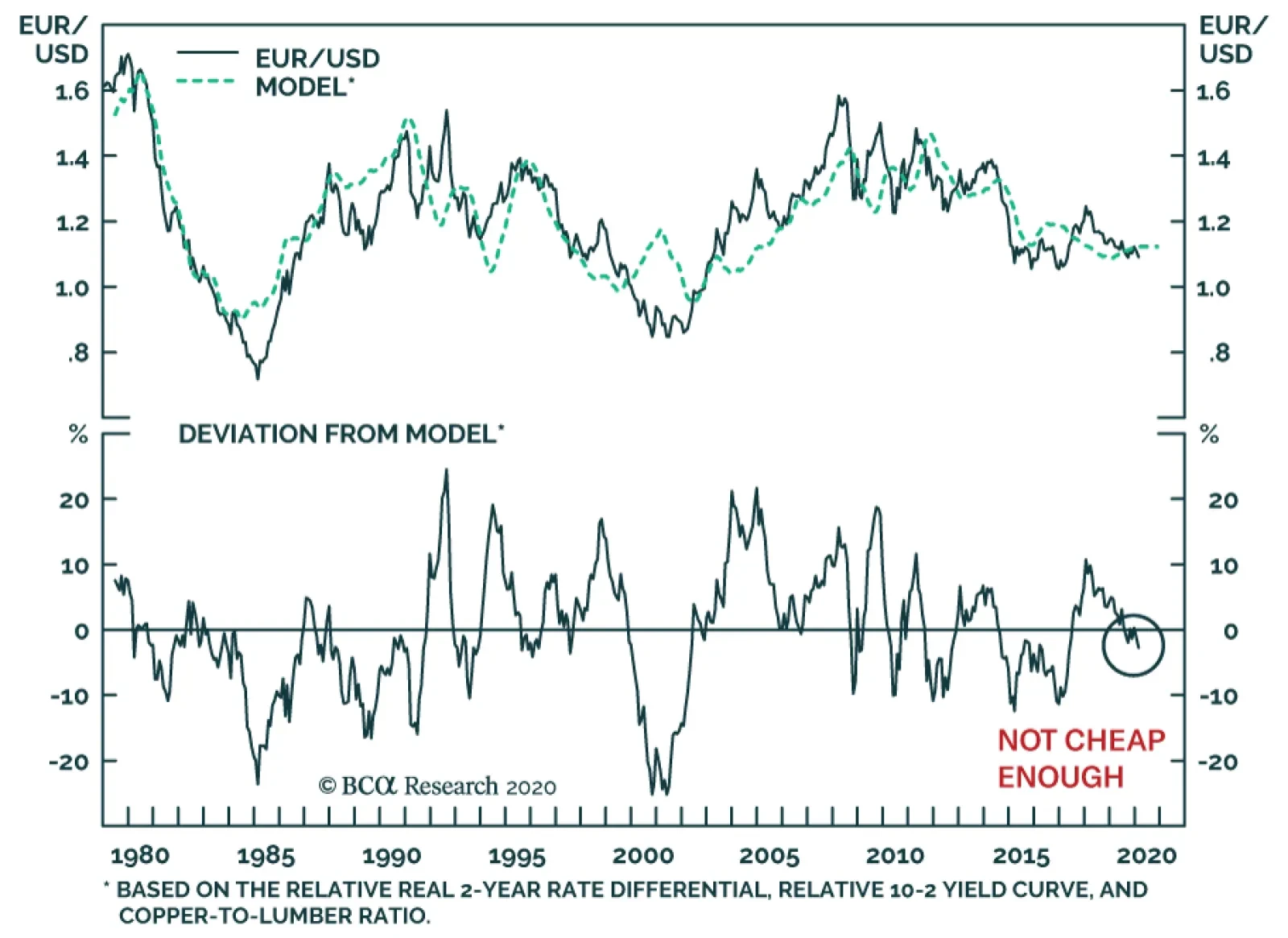
The euro is in a tricky spot. On the one hand, the euro benefits when global growth recovers. This pro-cyclical behavior reflects the heightened sensitivity of Europe to the global manufacturing cycle and to the Chinese economy in particular. On the other…
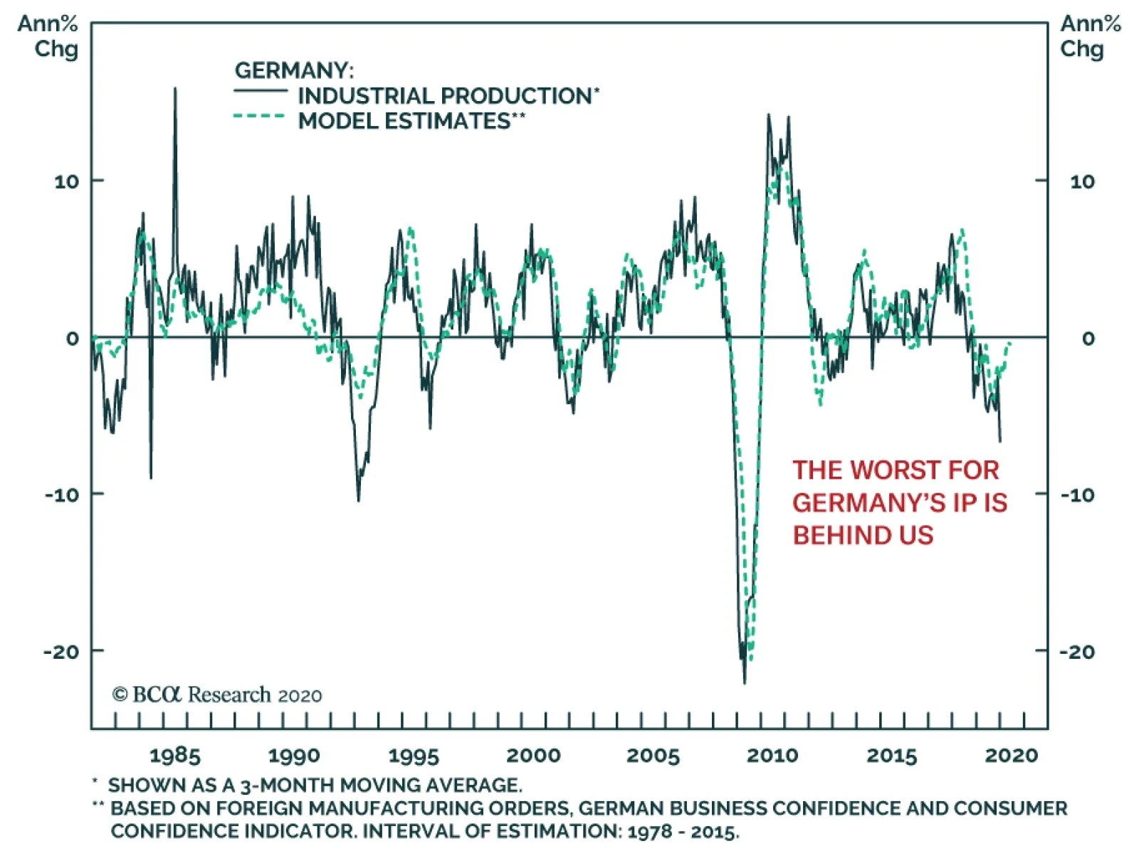
Germany’s December industrial production was a truly dismal number, contracting at a 6.8% annual pace, or the worse result since the GFC. Unsurprisingly, the potential for a German or European recession now concerns global investors. While a…

Highlights A currency portfolio comprised of the US dollar, the Japanese yen and the Norwegian krone is likely to outperform a more diversified basket over multiple macroeconomic scenarios. Our work suggests that valuation matters for currencies over the long term. The cheapest currencies in our universe are the Norwegian krone, the Swedish krona and the Japanese yen, although the pound and euro are also attractive. Tactical investors should remain short the DXY index, but also have a higher concentration of dollar-neutral trades given the uncertainty surrounding global growth. Feature A currency investor can construct a long-term portfolio based on three criteria. The first task is to figure out what macroeconomic environment she or he is residing in. During inflationary periods, “hard” currencies tend to do best, since they are usually associated with countries where the private sector is running surpluses. The lack of excess demand in these countries leads to lower inflation, which tends to boost real rates. Examples in recent history include the deutschemark during the 1970s or the Japanese yen throughout most of the ‘80s. In a disinflationary world, the high-yielders tend to be the outperformers. This is not only because the lack of an inflationary pulse leads to very positive real rates, but these are also the countries that tend to be at the forefront of the disinflationary boom, leading to rising demand for their currencies. For example, the 2000s saw emerging market and commodity currencies as the outperformers on the back of a resources boom, while the ‘90s saw the dollar rise on the back of a US productivity boom. Over the long term, a currency portfolio should include a combination of both “hard” and carry currencies. Over the long term, a currency portfolio should include a combination of both “hard” and carry currencies, with the weights adjusted based on investor preferences. For example, the risk to the world economy today remains deflation. Looking at core inflation across countries, most prints are below the magical 2% target level (Chart I-1). Inflation aside, the biggest catalyst for an investor to favor the disinflationary camp is the sequence of events we have experienced over the last two years – a trade war, Chinese deleveraging, a protracted economic expansion, bear markets in everything from sugar futures to energy stocks, and a virus outbreak. With the US 10-year versus 3-month yield curve having inverted anew, the obvious corollary is that a recession in the next few years (even of the stagflationary variety), will benefit the “hard” currencies. If we assume that the US 10-year CPI swap is a good reflection of investors’ perceptions of an inflationary versus deflationary world, then there are two crucial observations today. The first is that the British pound is the currency most attune to inflation today, while the Japanese yen thrives in deflation (Chart I-2). The second is that both the US dollar and the euro have been very indifferent to inflationary or deflationary risks over the past three years (Chart I-2, bottom panel). Using a very simple rule, an equally weighted basket of the British pound, US dollar1 and Japanese yen will make sense in this macroeconomic framework Chart I-1A Big F For Central ##br##Banks
A Big F For Central Banks
A Big F For Central Banks
Chart I-2Inflation And Deflation Protection Are Important
Inflation And Deflation Protection Are Important
Inflation And Deflation Protection Are Important
The Value Factor Our work suggests that valuation matters for currencies over the long term, a point we will discuss in an upcoming report. Therefore, the next challenge in building a protective portfolio is choosing currencies with the potential for long-term appreciation. While we look at a wide swathe of currency valuation models, we tend to adhere to the very simple and time-tested purchasing power parity (PPP) model. Our in-house PPP models have made two crucial adjustments. In order to get closer to an apples-to-apples comparison across countries, we divide the consumer price index (CPI) baskets into five major groups. In most cases, this breakdown captures 90% of the national CPI basket: food, restaurants and hotels (1), shelter (2), health care (3), culture and recreation (4), and energy and transportation (5). The second adjustment is to run two regressions with the exchange rate as the dependent variable. The first regression (call it REG1) uses the relative price ratios of the five subgroups grouped as independent variables. This allows us to observe the most influential price ratios that help explain variations in the exchange rate. The second regression (call it REG2) uses a weighted-average combination of the five groups to form a synthetic relative price ratio. If, for example, shelter is 33% in the US CPI basket, but 19% in the Swedish CPI basket, relative shelter prices will represent 26% of the combined price ratio. This allows for a uniform cross-sectional comparison, compared to using the national CPI weights. Our in-house PPP models have made two crucial adjustments. The results show that the cheapest currencies today are the Swedish krona, the Norwegian krone and the Japanese yen (Chart I-3). This is good news. The Japanese yen was already favored in our simple macroeconomic framework, and so it remains in the portfolio. However, given that the Swedish krona, the Norwegian krone, and the British pound tend to be highly correlated, it may be useful to reduce the list. Of all three, the Norwegian krone has the same macroeconomic attributes as the pound (most correlated to rising nominal rates), but comes at a cheaper price (Chart I-4). And so, it replaces the British pound in the portfolio. Chart I-3Lots Of Value In NOK, SEK And JPY
Building A Protector Currency Portfolio
Building A Protector Currency Portfolio
Chart I-4NOK And USD Remain Carry Currencies
Building A Protector Currency Portfolio
Building A Protector Currency Portfolio
The Sentiment Factor Sentiment is difficult to measure in currency markets, since it is hard to find an exhaustive list that encompasses investor biases. Speculative positioning tends to be our favorite contrarian indicator, but has limitations as a timing tool. Meanwhile, certain currencies tend to be momentum plays, while others are mean-reversion plays. In general, when both positioning and momentum are at an extreme and rolling over, this is generally a potent signal for a currency cross. Being long Treasurys and the dollar has been a consensus trade for many years now. According to CFTC data, this has been expressed mostly through the aussie and the yen, although our bias is that the Swedish krona and Norwegian krone have been the real victims (Chart I-5). That said, long positioning in the dollar has been greatly reduced over the past several weeks. Flow data supports this view. Net foreign purchases of US Treasurys by private investors are still positive, but the momentum of these flows is clearly rolling over. This is being more than offset by official net outflows. As interest rate differentials have started moving against the US, so has foreign investor appetite for Treasury bonds. Being long Treasurys and the dollar has been a consensus trade for many years now. The US dollar is a momentum currency, and the crossover between the 50-day and 200-day moving average has been good at signaling shifts in its intermediate trend (Chart I-6). Despite the recent uptick in the DXY, this still suggests downside in the coming months. Chart I-5Lots Of USD Longs
Building A Protector Currency Portfolio
Building A Protector Currency Portfolio
Chart I-6Watch The DXY Technical Pattern
Watch The DXY Technical Pattern
Watch The DXY Technical Pattern
So What? Chart I-7Who Will Be The Leaders In 2022?
Who Will Be The Leaders In 2022?
Who Will Be The Leaders In 2022?
Regular readers of our bulletin are well aware that we are dollar bears. However, in constructing a currency portfolio that will stand resilient in the face of multiple macroeconomic shocks, our recommendation is an equal-weighted basket of the US dollar, the Japanese yen and the Norwegian krone. How has this protector portfolio performed over time? Not so well. Since the financial crisis, the basket has underperformed the DXY index, but has been relatively flat over the last half decade, while generating a positive carry (Chart I-7). In the aftermath of the Great Financial Crisis, positive returns on the Norwegian krone and Japanese yen offset dollar weakness, an environment that could be replayed once global growth bottoms. Obviously, this requires further research. Portfolio Calibration Our portfolio strategy for the last half year or so has focused on dollar-neutral trades, given the uncertainty that has been grappling currency markets. Most of these trades are agnostic to the three fundamental factors outlined above. Stick with them. Long AUD/NZD: This is a play on rising terms of trade between Australia and New Zealand, as well as a much more advanced housing downturn in Australia. Over the past five years, the cross has fluctuated between 1.02 and 1.12, currently sitting at the lower bound of this range. Increased agricultural exports from the US to China will hurt New Zealand at the margin, but long-term Aussie LNG imports and coal exports to China should remain relatively resilient. Long AUD/CAD: It is becoming clearer that the People’s Bank of China has a stronger incentive to stimulate its economy relative to the Fed. This will benefit the Chinese and Australian economies at the margin, and by extension the AUD/CAD cross (Chart I-8). Short CAD/NOK: A play on diverging oil fundamentals between North Sea crude and Canadian heavy oil. A swift rebound in the European economy relative to the US will also benefit this cross. Short USD/JPY: A top recommendation for the protector portfolio. It is noteworthy that this cross has a strong positive correlation to rising gold prices (and falling real rates). Long SEK/NZD: A mean reversion trade, primarily based on valuation and relative fundamentals. The latest PMI print suggests a meaningful improvement in the Swedish economy in the months ahead (Chart I-9). Chart I-8Stay Long AUD/CAD Buy ##br##AUD/CAD
Stay Long AUD/CAD Buy AUD/CAD
Stay Long AUD/CAD Buy AUD/CAD
Chart I-9Bet On A Swedish (And European) Recovery A Tentative Bottom In Euro Area Data
Bet On A Swedish (And European) Recovery A Tentative Bottom In Euro Area Data
Bet On A Swedish (And European) Recovery A Tentative Bottom In Euro Area Data
Short USD/NOK: A top recommendation for the protector portfolio as well as a play on rising oil prices. Ditto for the petrocurrency basket. Long EUR/CAD: A swift rebound in the European economy relative to the US will benefit this cross, similar to short CAD/NOK positions. Short CHF/JPY: Low-cost portfolio insurance negatively correlated to rising yields, and a strong positive correlation to rising gold prices (Chart I-10). Chart I-10The Yen Is Better Insurance
The Yen Is Better Insurance
The Yen Is Better Insurance
Chester Ntonifor Foreign Exchange Strategist chestern@bcaresearch.com Footnotes 1 We use the USD/EUR exchange rate since the carry is positive. Returns are unhedged. Currencies U.S. Dollar Chart II-1USD Technicals 1
USD Technicals 1
USD Technicals 1
Chart II-2USD Technicals 2
USD Technicals 2
USD Technicals 2
Recent data in the US have been positive: The ISM manufacturing PMI soared to 50.9 while the Markit manufacturing PMI increased slightly to 51.9. The ISM non-manufacturing PMI increased to 55.5 and the Markit services PMI edged up to 53.4 in January. Nonfarm productivity grew by 1.4% quarter-on-quarter on an annualized basis in Q4 2019. Initial jobless claims fell to 202K from 217K for the week ended January 31st. The Johnson Redbook index of same-store sales grew by 5.7% year-on-year in January. The DXY index appreciated by 0.4% this week. In addition to coronavirus fears, a strong showing in domestic data has helped push up the USD. With the number of new coronavirus cases flattening outside of the Hubei province, it appears the rally in the DXY could end as early as mid to late-February. Report Links: Currency Market Signals From Gold, Equities And Flows - January 31, 2020 Portfolio Tweaks Before The Chinese New Year - January 24, 2020 On Oil, Growth And The Dollar - January 10, 2020 The Euro Chart II-3EUR Technicals 1
EUR Technicals 1
EUR Technicals 1
Chart II-4EUR Technicals 2
EUR Technicals 2
EUR Technicals 2
Recent data in the euro area have been mixed: GDP growth fell to 0.1% year-on-year from 0.3% in Q4 2019. The Markit manufacturing PMI moved up slightly to 47.9 while the services PMI increased to 52.5 in January. Retail sales growth slowed to 1.3% year-on-year from 2.3% in December. Core CPI inflation decreased slightly to 1.1% in January. The euro depreciated by 0.3% against the US dollar this week. While retail sales disappointed, the manufacturing and services PMI numbers beat expectations, confirming our expectations for a global growth rebound. With a European green deal on the horizon, and interest rates near the lower bound of negative territory, the euro is poised for recovery. Report Links: Updating Our Balance Of Payments Monitor - November 29, 2019 On Money Velocity, EUR/USD And Silver - October 11, 2019 A Few Trade Ideas - Sept. 27, 2019 The Yen Chart II-5JPY Technicals 1
JPY Technicals 1
JPY Technicals 1
Chart II-6JPY Technicals 2
JPY Technicals 2
JPY Technicals 2
Recent data in Japan have been mixed: The Markit manufacturing PMI declined to 48.8 from 49.3 in January while the services PMI increased to 51 from 49.4. Passenger vehicle sales continued to contract, going down 11.5% year-on-year in January. Construction orders rebounded strongly by 21.4% year-on-year in December, moving out of contractionary territory. The contraction in housing starts slowed to 7.9% year-on-year in December. The Japanese yen depreciated by 0.8% against the US dollar this week. The contraction in passenger vehicle sales can be largely attributed to extensive damage from typhoon Hagibis and typhoon Faxai. However, the Japanese economy will be buoyed by strong construction growth ahead of the summer Olympics, putting a floor under our short USD/JPY hedge. Report Links: Currency Market Signals From Gold, Equities And Flows - January 31, 2020 Portfolio Tweaks Before The Chinese New Year - January 24, 2020 Updating Our Balance Of Payments Monitor - November 29, 2019 British Pound Chart II-7GBP Technicals 1
GBP Technicals 1
GBP Technicals 1
Chart II-8GBP Technicals 2
GBP Technicals 2
GBP Technicals 2
Recent data in the UK have been positive: The Markit manufacturing PMI increased to 50 from 49.8 in January while the services PMI increased to 53.9 from 52.9. The GfK Group consumer confidence index ticked up to -9 from -11 in January. Consumer credit increased to GBP 1.22 billion in December from 0.66 billion in November. The British pound depreciated by 0.9% against the US dollar this week. In a speech delivered an hour before the UK left the European Union, PM Boris Johnson appeared defiant, rejecting EU rules on British industry and demanding a free trade agreement. Despite a decent uptick in the PMI numbers, the pound is weighed down by uncertainty about coming negotiations with the European Union. For option traders, pound volatility is set to rise. Report Links: Updating Our Balance Of Payments Monitor - November 29, 2019 A Few Trade Ideas - Sept. 27, 2019 United Kingdom: Cyclical Slowdown Or Structural Malaise? - Sept. 20, 2019 Australian Dollar Chart II-9AUD Technicals 1
AUD Technicals 1
AUD Technicals 1
Chart II-10AUD Technicals 2
AUD Technicals 2
AUD Technicals 2
Recent data in Australia have been positive: The Markit manufacturing PMI increased to 49.6 from 49.1 while the services PMI increased to 50.6 from 48.9 in January. Building permits grew by 2.7% year-on-year in December, moving out of contractionary territory. Exports grew by 1% month-on-month in December, slowing slightly from a growth rate of 1.3% the previous month. The Australian dollar appreciated by 0.5% against the US dollar this week. Despite concerns about coronavirus, and the bushfires, the Reserve Bank of Australia (RBA) decided to hold rates at 0.75%. The recovery in house prices now making its mark on building permits data, and the manufacturing PMI edging towards expansionary territory giving the RBA’s wiggle room in being patient. We are long AUD/NZD, AUD/CAD and AUD/USD. This makes a rebound in AUD one of our most potent bets. Stick with it. Report Links: On AUD And CNY - January 17, 2020 Updating Our Balance Of Payments Monitor - November 29, 2019 A Contrarian View On The Australian Dollar - May 24, 2019 New Zealand Dollar Chart II-11NZD Technicals 1
NZD Technicals 1
NZD Technicals 1
Chart II-12NZD Technicals 2
NZD Technicals 2
NZD Technicals 2
Recent data in New Zealand have been positive: Building permits soared by 9.9% month-on-month in December, from an 8.4% contraction the prior month. The labor force participation rate moved down slightly to 70.1% in Q4 2019. The labor cost index grew by 2.4% year-on-year in Q4 2019, compared to growth of 2.3% in the previous quarter. The unemployment rate fell slightly to 4% in Q4 2019. The New Zealand dollar depreciated by 0.2% against the US dollar this week. With the data remaining positive and cases of the coronavirus outside the Hubei province set to peak in the coming weeks, the downward pressure on the New Zealand Dollar should ease. Report Links: Updating Our Balance Of Payments Monitor - November 29, 2019 Place A Limit Sell On DXY At 100 - November 15, 2019 USD/CNY And Market Turbulence - August 9, 2019 Canadian Dollar Chart II-13CAD Technicals 1
CAD Technicals 1
CAD Technicals 1
Chart II-14CAD Technicals 2
CAD Technicals 2
CAD Technicals 2
Recent data in Canada have been solid: The Markit manufacturing PMI increased to 50.6 from 50.4 in January. Canadian GDP growth remained fairly flat at 0.1% month-on-month in November. Imports increased slightly to C$ 49.69 billion in December 2019 while exports moved up to C$ 48.38 billion. The raw material price index grew by 2.8% in December, picking up pace from November’s reading of 1.4%. The Canadian dollar depreciated by 0.5% against the US dollar this week. The growth in Canadian exports was led by crude oil exports, which posted a monthly gain of 18% following the resolution of a rupture in the Keystone pipeline in North Dakota. However, a widening trade deficit with countries other than the US will put downward pressure on the Canadian dollar at the crosses. Report Links: The Loonie: Upside Versus The Dollar, But Downside At The Crosses Updating Our Balance Of Payments Monitor - November 29, 2019 Making Money With Petrocurrencies - November 8, 2019 Swiss Franc Chart II-15CHF Technicals 1
CHF Technicals 1
CHF Technicals 1
Chart II-16CHF Technicals 2
CHF Technicals 2
CHF Technicals 2
Recent data in Switzerland have been mixed: The SVME manufacturing PMI decreased to 47.8 from 48.8 in January. Real retail sales grew by 0.1% year-on-year in December, slowing from 0.5% in November. The SECO consumer climate indicator for Q1 2020 printed slightly better at -9.4 from -10.3 in Q4 2019. The Swiss franc depreciated by 0.5% against the US dollar this week. Domestically, consumer sentiment was buoyed by the general outlook on economic growth. However, the outlook for households’ own budget remains gloomy. The decrease in global volatility will undermine the Swiss franc and with an uncertain domestic outlook, stealth intervention might be on the horizon. Report Links: Currency Market Signals From Gold, Equities And Flows - January 31, 2020 Portfolio Tweaks Before The Chinese New Year - January 24, 2020 Updating Our Balance Of Payments Monitor - November 29, 2019 Norwegian Krone Chart II-17NOK Technicals 1
NOK Technicals 1
NOK Technicals 1
Chart II-18NOK Technicals 2
NOK Technicals 2
NOK Technicals 2
Recent data in Norway have been mixed: The credit indicator, which measures growth in private sector debt, grew by 5.1% year-on-year in December, slowing from 5.6% the previous month. Registered unemployment (NSA) increased to 2.4% from 2.2% the previous month. The Norwegian Krone depreciated by 0.3% against the US dollar this week. However, the dramatic plunge in the NOK over the last few weeks, which has mirrored a similar drop in the WTI oil price, has taken contrarian investors by surprise. Our Commodity & Energy Strategists currently expect OPEC to respond with additional cuts of 500k barrels per day. In addition, if coronavirus cases peak sooner than expected, this will quicken the recovery in Asian economies, bolstering oil demand and driving up prices. Remain short USD/NOK. Report Links: On Oil, Growth And The Dollar - January 10, 2020 Updating Our Balance Of Payments Monitor - November 29, 2019 Making Money With Petrocurrencies - November 8, 2019 Swedish Krona Chart II-19SEK Technicals 1
SEK Technicals 1
SEK Technicals 1
Chart II-20SEK Technicals 2
SEK Technicals 2
SEK Technicals 2
Recent data in Sweden have been mostly positive: The Swedbank manufacturing PMI soared to 51.5 from 47.7 in January. Industrial production contracted by 3.2% year-on-year in December, compared to growth of 0.1% the previous month. Manufacturing new orders contracted by 4.7% year-on-year in December, deepening the contraction of 1.8% in November. The Swedish Krona remained flat against the US dollar this week. As we noted last week, the Swedbank PMI has risen in lockstep with the business confidence number. It is now in expansionary territory for the first time since August of last year. Within the Swedbank survey, the sub-indices for new orders and production posted the largest gains. While the hard data on production and new orders for the month of December was disappointing, we expect it to follow the soft data upwards in the coming months as global growth concerns fade. Report Links: Updating Our Balance Of Payments Monitor - November 29, 2019 Where To Next For The US Dollar? - June 7, 2019 Balance Of Payments Across The G10 - February 15, 2019 Trades & Forecasts Forecast Summary Core Portfolio Tactical Trades Limit Orders Closed Trades
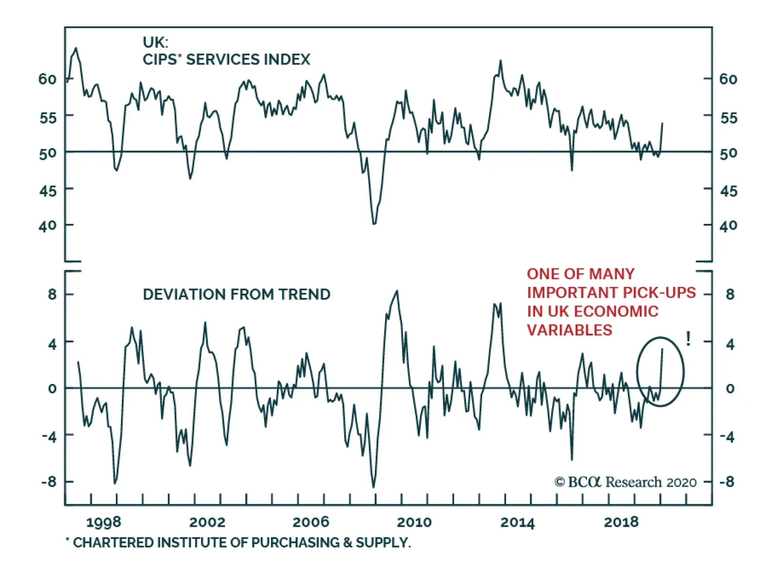
The UK’s service sector is showing signs of revival as the services PMI is rebounding significantly. This improvement is not an isolated phenomenon. Since the December election, consumer confidence, business optimism and the construction PMI have also perked…
In lieu of the next weekly report I will be presenting the quarterly webcast ‘What Are The Most Attractive Investments In Europe?’ on Monday 17 February at 10.00AM EST, 3.00PM GMT, 4.00PM CET, 11.00PM HKT. As usual, the webcast will take a TED talk format lasting 18 minutes, after which I will take live questions. Be sure to tune in. Dhaval Joshi Feature The recent coronavirus scare seems to have added a fresh deflationary impulse into the world economy, at a time that central banks are already struggling to achieve and maintain inflation at the 2 percent target. Begging the question: will central banks’ ubiquitous ultra-loose monetary policy ever generate inflation? The answer is yes, but not necessarily where the central banks desire it. Universal QE, zero interest rate policy (ZIRP), and negative interest rate policy (NIRP) have already created rampant inflation. The trouble is that it is in the wrong place. Rather than showing up in consumer price indexes it is showing up in sky-rocketing asset prices. Feature Chart Ultra-Low Bond Yields Have Created The Greatest Asset-Price Inflation Of All Time
The Greatest Asset-Price Inflation Of All Time
The Greatest Asset-Price Inflation Of All Time
Feature ChartUltra-Low Bond Yields Have Created The Greatest Asset-Price Inflation Of All Time
The Greatest Asset-Price Inflation Of All Time
The Greatest Asset-Price Inflation Of All Time
The Greatest Asset-Price Inflation Of All Time Since 2014, ultra-loose monetary policy has boosted the valuation of equities by 50 percent. But that’s the small fry. The really big story is that ultra-loose monetary policy has boosted the value of the world’s real estate from $180 trillion to $300 trillion (Chart I-2).1 Chart I-2Ultra-Low Bond Yields Have Boosted The Value Of The World’s Real Estate By $120 Trillion
Ultra-Low Bond Yields Have Boosted The Value Of The World's Real Estate By $120 Trillion
Ultra-Low Bond Yields Have Boosted The Value Of The World's Real Estate By $120 Trillion
Just pause for a moment to digest those numbers. In the space of a few years the value of the world’s real estate has surged by $120 trillion, equivalent to one and half times the world’s $80 trillion GDP. Moreover, it is a broad-based boom encompassing not just Europe, but North America and Asia too. Now add in the surge in equity prices, as well as other risk-assets such as private equity, corporate bonds and EM debt and the rise in wealth conservatively equals at least two times world GDP. To the best of our knowledge, there is no other time in economic history that asset prices have risen so broadly and by so much as a multiple of world GDP in such a short space of time. Making this the greatest asset-price inflation of all time. Yet central banks seem unmoved. To add insult to injury, Europe’s central banks do not even include surging owner-occupied housing costs in their consumer price indexes. This seems absurd given that the costs of maintaining owner-occupied housing is one of the largest costs that European households face. Europe’s central banks do not include surging owner-occupied housing costs in their consumer price indexes. Including owner-occupied housing costs would lift European inflation closer to 2 percent, eliminating the need for QE and negative interest rates. But its omission has kept measured inflation artificially low (Chart I-3), forcing European central banks to double down on their ultra-loose policies. Which in turn lifts risk-asset prices even further, and so the cycle of asset-price inflation continues. Chart I-3Using The US Definition Of Inflation, The ECB Wouldn't Need Ultra-Loose Policy
Using The US Definition Of Inflation, The ECB Wouldn't Need Ultra-Loose Policy
Using The US Definition Of Inflation, The ECB Wouldn't Need Ultra-Loose Policy
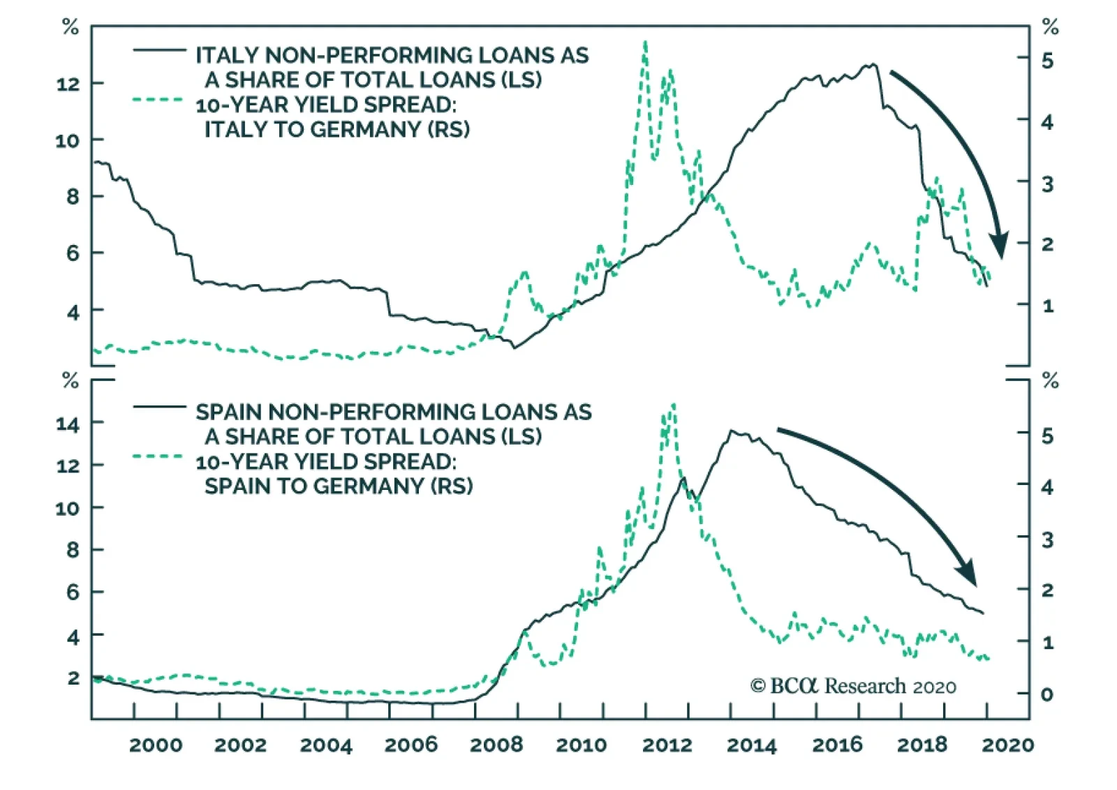
European QE has spawned other major imbalances. Germany, as the largest shareholder of the ECB, now owns hundreds of billions of ‘Italian euro’ BTPs that the ECB has bought. But given the fragility of Italian banks, the Italians who sold their BTPs to the ECB deposited the cash they received in German banks. Hence, Italy now owns hundreds of billions of ‘German euro’ bank deposits. This mismatch between Germans owning Italian euro assets and Italians owning German euro assets combined with other mismatches across the euro area constitutes the Target2 banking imbalance, which now stands at a record €1.5 trillion. It means that, were the euro to ever break up, the biggest casualty would be Germany (Chart I-4). Chart I-4ECB QE Has Taken The Target2 Banking Imbalance To An All-Time High
The Greatest Asset-Price Inflation Of All Time
The Greatest Asset-Price Inflation Of All Time
Meanwhile, the US Federal Reserve, to its credit, does include surging owner-occupied housing costs in its measure of consumer prices. As a result, US inflation has been closer to the 2 percent target enabling the Fed to tighten policy when the ECB had to loosen policy. This huge divergence between euro area and US monetary policies, stemming from different treatments of owner-occupied housing costs, has depressed the euro/dollar exchange rate and thereby spawned yet another major imbalance: the euro area/US bilateral trade surplus which now stands at an all-time high. Providing President Trump with the perfect pretext to start a trade war with Europe, should he desire (Chart I-5). Chart I-5ECB QE Has Taken The Euro Area/US Trade Surplus To An All-Time High
ECB QE Has Taken The Euro Area/US Trade Surplus To An All-Time High
ECB QE Has Taken The Euro Area/US Trade Surplus To An All-Time High
What Caused The Greatest Asset-Price Inflation Of All Time? Why did the past decade witness the greatest asset-price inflation of all time? The answer is that universal QE, ZIRP, and NIRP took bond yields to the twilight zone of the lower bound (Chart I-6). At which point, the valuation of all risky assets undergoes an exponential surge. Chart I-6The Past Decade Was The Decade Of Universal QE
The Past Decade Was The Decade Of Universal QE
The Past Decade Was The Decade Of Universal QE
Understand that when bond yields approach their lower bound, bonds become extremely risky assets because their prices take on an unattractive ‘lose-lose’ characteristic. As holders of Swiss government bonds discovered last year, prices can no longer rise much in a rally, but they can collapse in a sell-off (Chart I-7). Chart I-7At Low Bond Yields, Bonds Become Much Riskier
The Greatest Asset-Price Inflation Of All Time
The Greatest Asset-Price Inflation Of All Time
The upshot is that all (long-duration) assets become equally risky, and the much higher prospective returns offered on formerly more risky assets – such as real estate and equities – collapses to the feeble return offered on now equally-risky bonds. Given that valuation is just the inverse of the prospective return, this means that the valuation of risk assets undergoes an exponential surge. When bond yields approach their lower bound, bonds become extremely risky assets because their prices take on an unattractive ‘lose-lose’ characteristic. An obvious question is: which valuation measure best predicts this depressed prospective return offered on equities? Most people gravitate to price to earnings (profits), but earnings are highly problematic – because even if you cyclically adjust them, they take no account of structurally high profit margins. The trouble is that earnings will face a headwind when profit margins normalise, depressing prospective returns. For this reason, price to earnings missed the valuation extreme of the 2007/2008 credit bubble and should be treated with extreme caution as a predictor of prospective returns (Chart I-8). Chart I-8Price To Earnings Missed The 2007/2008 Valuation Extreme
Price To Earnings Missed The 2007/2008 Valuation Extreme
Price To Earnings Missed The 2007/2008 Valuation Extreme
A much more credible assessment comes from price to sales – or equivalently, market cap to GDP at a global level (Chart I-9). This is because sales are quantifiable, unambiguous, and undistorted by profit margins. Using these more credible prospective returns, we can now show that the theory of what should happen to risk-asset returns (and valuations) at ultra-low bond yields and the practice of what has actually happened agree almost perfectly (Feature Chart). Chart I-9Price To Sales (Or Global Market Cap To GDP) Is The Best Predictor Of Prospective Return
Price To Sales (Or Global Market Cap To GDP) Is The Best Predictor Of Prospective Return
Price To Sales (Or Global Market Cap To GDP) Is The Best Predictor Of Prospective Return
Some Investment Conclusions It is instinctive for investors to focus first and foremost on the outlook for the real economy. After all, the evolution of the $80 trillion global economy drives company sales and profits. But the value of the world’s real estate, at $300 trillion, dwarfs the economy. Public and private equity adds another $100 trillion, while other risk-assets such as corporate bonds and EM debt add at least another $50 trillion. So even on conservative assumptions, risk-assets are worth $450 trillion – an order of magnitude larger than the world economy. Now combine this with the overwhelming evidence that risk-asset valuations are exponentially sensitive to ultra-low bond yields. A relatively modest rise in yields that knocked 20 percent off risk-asset valuations would mean a $90 trillion loss in global wealth. Even a 10 percent decline would equate to a $45 trillion drawdown. Could the $80 trillion economy sail through such declines in wealth? No way. Such setbacks would constitute a severe deflationary headwind, and likely trigger the next recession. Hence, though equities are preferable to bonds at current levels, a 50-100 bps rise in yields – were it to happen – would be a great opportunity to add to bonds. Meanwhile, the record high Target2 euro area banking imbalance means that the biggest casualty of the euro’s disintegration would not be Italy. It would be Germany. As all parties have no interest in such a mutually assured destruction, investors should go long high-yielding versus low-yielding euro area sovereign bonds. Finally, the record high euro area/US trade surplus is a political constraint to a much weaker euro versus the dollar. In any case, the ECB is close to the practical limit of monetary policy easing, while the Fed is not. Long-term bond investors should prefer US T-bonds versus German bunds or Swiss bonds. Long-term currency investors should prefer the euro versus the dollar. Fractal Trading System* This week’s recommended trade is long EUR/CHF. As this currency cross has relatively low volatility, the profit target and symmetrical stop-loss is set at a modest 1 percent. In other trades, short NZD/JPY achieved its profit target, while long US oil and gas versus telecom reached the end of its 65-day holding period in partial loss having reached neither its profit target nor its stop-loss. The rolling 1-year win ratio now stands at 61 percent. Chart I-10EUR/CHF
EUR/CHF
EUR/CHF
When the fractal dimension approaches the lower limit after an investment has been in an established trend it is a potential trigger for a liquidity-triggered trend reversal. Therefore, open a countertrend position. The profit target is a one-third reversal of the preceding 13-week move. Apply a symmetrical stop-loss. Close the position at the profit target or stop-loss. Otherwise close the position after 13 weeks. * For more details please see the European Investment Strategy Special Report “Fractals, Liquidity & A Trading Model,” dated December 11, 2014, available at eis.bcaresearch.com. Dhaval Joshi Chief European Investment Strategist dhaval@bcaresearch.com Footnotes 1 Source: Savills World Research. The last data point is $281 trillion at the end of 2017, but we conservatively estimate that the value has increased to above $300 trillion in the subsequent two years. Fractal Trading System
The Greatest Asset-Price Inflation Of All Time
The Greatest Asset-Price Inflation Of All Time
The Greatest Asset-Price Inflation Of All Time
The Greatest Asset-Price Inflation Of All Time
Cyclical Recommendations Structural Recommendations
The Greatest Asset-Price Inflation Of All Time
The Greatest Asset-Price Inflation Of All Time
The Greatest Asset-Price Inflation Of All Time
The Greatest Asset-Price Inflation Of All Time
The Greatest Asset-Price Inflation Of All Time
The Greatest Asset-Price Inflation Of All Time
The Greatest Asset-Price Inflation Of All Time
The Greatest Asset-Price Inflation Of All Time
Trades Closed Trades Asset Performance Currency & Bond Equity Sector Country Equity Indicators Bond Yields Chart II-1Indicators To Watch - Bond Yields
Indicators To Watch - Bond Yields
Indicators To Watch - Bond Yields
Chart II-2Indicators To Watch - Bond Yields
Indicators To Watch - Bond Yields
Indicators To Watch - Bond Yields
Chart II-3Indicators To Watch - Bond Yields
Indicators To Watch - Bond Yields
Indicators To Watch - Bond Yields
Chart II-4Indicators To Watch - Bond Yields
Indicators To Watch - Bond Yields
Indicators To Watch - Bond Yields
Interest Rate Chart II-5Indicators To Watch - Interest Rate Expectations
Indicators To Watch - Interest Rate Expectations
Indicators To Watch - Interest Rate Expectations
Chart II-6Indicators To Watch - Interest Rate Expectations
Indicators To Watch - Interest Rate Expectations
Indicators To Watch - Interest Rate Expectations
Chart II-7Indicators To Watch - Interest Rate Expectations
Indicators To Watch - Interest Rate Expectations
Indicators To Watch - Interest Rate Expectations
Chart II-8Indicators To Watch - Interest Rate Expectations
Indicators To Watch - Interest Rate Expectations
Indicators To Watch - Interest Rate Expectations
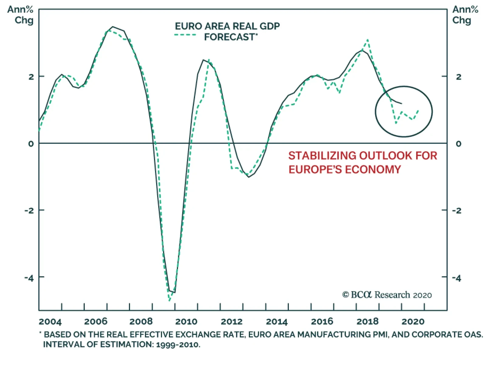
Our Euro Area GDP Model is trying to form a bottom. In effect, the variance in European GDP growth is governed by fluctuations in global economic activity. This dependence on global growth is a consequence of the lack of vigor of European domestic demand and…
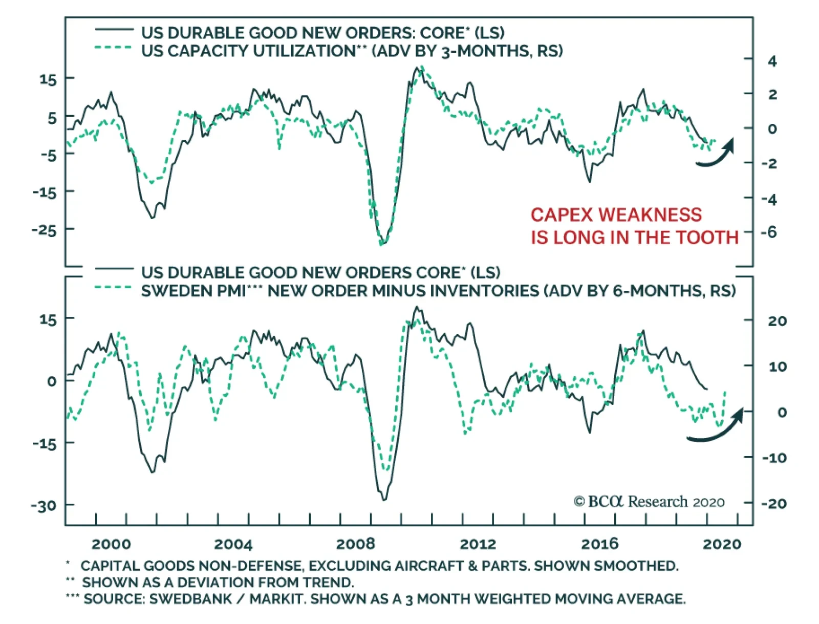
US core capital goods new orders, which excluding defense and aircraft & parts, have been weak, which suggests that the capex deterioration is intact. However, signs are accumulating that this decline is long in the tooth. First, de-trended capacity…