Europe
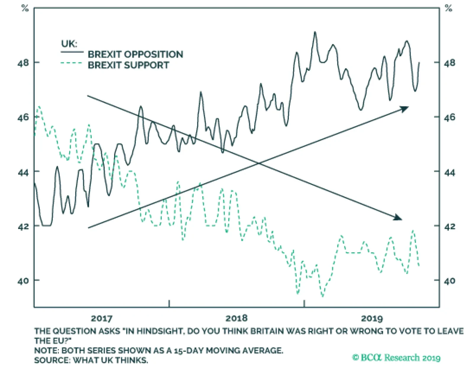
Westminster and Britain’s Supreme Court have rebuked UK Prime Minister Boris Johnson’s threat of a “No-Deal” Brexit. Moreover, parliamentary support for his latest plan, which essentially keeps Northern Ireland’s economy within the EU, indicates that the…

Highlights The attractiveness of European stocks is relative to European bonds rather than relative to non-European stocks. Despite vastly different stock market valuations in Germany, Japan, and the US, the implied prospective 10-year annualised returns are almost identical – at around 5 percent per annum. Overweight the DAX versus German long-dated bunds. Equities would lose their attractiveness if the global 10-year bond yield were to rise through 2.5 percent, because the required excess return from equities would viciously normalise. Tactically overweight EM versus DM. Fractal trade: short GBP/NOK, as the recent rally in the pound appears technically extended. Feature Chart of the WeekOverweight Europe Vs. World = Overweight Consumer Staples Vs. Technology
Overweight Europe Vs. World = Overweight Consumer Staples Vs. Technology
Overweight Europe Vs. World = Overweight Consumer Staples Vs. Technology
Stock markets recently broke to new highs, begging the perennial question: how attractive are equities at current valuations? To answer, we need to assess the prospective return that is now ‘baked in the equity valuation cake’. But which valuation metric gives the most credible assessment of prospective returns? Equity valuations based on assets are problematic – because nowadays, assets comprise intellectual capital or intangibles or ‘virtual’ assets, which are extremely difficult to value. Equity valuations based on earnings are problematic. Equity valuations based on earnings (profits) are also problematic – because they take no account of structurally high profit margins (Chart I-2). The problem is that earnings will face a headwind when profit margins normalise, depressing prospective returns. Some people suggest adjusting the earnings to derive a cyclically adjusted price to earnings multiple (CAPE), but by definition this does not correct for the structural rise in profit margins. Chart I-2Structurally High Profit Margins Flatter Earnings
Structurally High Profit Margins Flatter Equity Earnings Structurally High Profit Margins Flatter Earnings
Structurally High Profit Margins Flatter Equity Earnings Structurally High Profit Margins Flatter Earnings
Hence, the most credible assessment comes from price to sales – because sales are quantifiable, unambiguous, and undistorted by profit margins. Significantly, while price to earnings missed the high valuation of world equities in 1990 (Japanese bubble) and 2007 (credit bubble), price to sales did not (Chart I-3 and Chart I-4). Chart I-3Price To Earnings Missed The Japanese Bubble And The Credit Bubble...
Price To Earnings Missed The Japanese Bubble And The Credit Bubble...
Price To Earnings Missed The Japanese Bubble And The Credit Bubble...
Chart I-4...But Price To Sales ##br##Didn't
...But Price To Sales Didn't
...But Price To Sales Didn't
Are Stocks Attractive? Based on the credible assessment from price to sales, today’s prospective 10-year annualised return from world equities is around 5 percent (Chart I-5). This is not that different to the 4 percent prospective return at the peak of the credit bubble in 2007.1 Which raises an obvious question. Back in 2007, a secular growth boom provided the excuse for the rich absolute valuation, but today, if anything, investors fear a ‘secular stagnation’. What can excuse today’s rich absolute valuation? Chart I-5The Prospective Return From World Equities Is 5 Percent
The Prospective Return From World Equities Is 5 Percent
The Prospective Return From World Equities Is 5 Percent
The answer is ultra-low bond yields. In 2007, the global 10-year bond yield stood at 5 percent; today, it stands well below 2 percent (Chart I-6). A lower prospective return on bonds means a lower prospective return on competing long-duration assets, like equities. Chart I-6The Global 10-Year Bond Yield Has Plunged To Below 2 Percent
The Global 10-Year Bond Yield Has Plunged To Below 2 Percent
The Global 10-Year Bond Yield Has Plunged To Below 2 Percent
Moreover, as bond yields approach their lower bound, the riskiness of bonds rises because they take on an unattractive ‘lose-lose’ characteristic. As holders of Swiss government bonds discovered this year, prices do not rise much in a rally, but they do plunge in a sell-off. This higher riskiness of bonds justifies an abnormally low (or zero) ‘risk premium’ on competing long-duration assets, like equities. The 5 percent prospective return makes equities look attractive relative to bonds. The upshot is that the 5 percent prospective return from equities is low in absolute terms. But in a world of ultra-low numbers – for both bond yields and equity risk premiums – the 5 percent prospective return makes equities look attractive relative to bonds. At the peak of the credit bubble in 2007, equities were offering a lower prospective return than the 5 percent available from bonds. But today’s equity risk premium over bonds is generous. The caveat is that this would change if the global 10-year bond yield were to rise through 2.5 percent because the required risk premium on equities would viciously normalise. Are European Stocks Attractive? Turning to the relative attractiveness of major stock markets, it is tempting to think that the markets trading on the best head-to-head valuation comparisons are the most attractive. For example, Germany and Japan, both trading on a price to sales multiple of 0.9, appear compelling buys compared to the US, trading on a multiple of 2.1 (Chart I-7). But such a knee-jerk conclusion is wrong, for two reasons. Chart I-7Germany And Japan Trade On Much Lower Multiples Than The US
Germany And Japan Trade On Much Lower Multiples Than The US
Germany And Japan Trade On Much Lower Multiples Than The US
First, stock markets have very different sector compositions. Two sectors with vastly different structural growth prospects – say, technology and banks – must necessarily trade on vastly different valuations. So the sector with the lower valuation is not necessarily the better-valued sector. By extension, the stock market with the lower valuation because of its ‘sector fingerprint’ is not necessarily the better-valued stock market. Second, major stock markets are dominated by multinational companies with mixed currency sales and profits, while the stock price is quoted in the domestic currency. Hence, if the market expects the mixed currency profits to depreciate in domestic currency terms, the stock will trade at a discount. Put another way, if the domestic currency is cheap the stock market will appear cheap. The best way to see this is to look at the two valuations of dual-listed multinationals like the UK/US cruise operator Carnival. In London, the stock trades on a price to forward earnings at 9.7; in New York it trades at 10.3. But it would be absurd to suggest that Carnival is cheaper in London than in New York! The discrepancy is simply because the market expects the pound to appreciate versus the dollar. A head-to-head comparison of stock market valuations is misleading. Allowing for the distortions from sector skews and currency adjustments, the best way to assess an equity region’s attractiveness is to quantify the prospective return implied by its valuation versus its own history. The method is to regress historic starting price to sales with the (historic) prospective 10-year returns that followed. Then apply this relationship to the current price to sales to predict the (current) prospective 10-year return. The results are amazing. Despite the vastly different price to sales multiple of 0.9 in Germany and Japan, and 2.1 in the US, the implied prospective 10-year annualised returns are almost identical – at around 5 percent from each of the three stock markets (Chart I-8-Chart I-10). Chart I-8Expect Near-Identical Returns From The US...
Expect Near-Identical Returns From The US...
Expect Near-Identical Returns From The US...
Chart I-9…Germany…
...Germany...
...Germany...
Chart I-10...And Japan
...And Japan
...And Japan
Still, there is one significant difference: the 10-year bond yield is much lower in Germany and Japan than in the US, equating to a much more attractive equity risk premium of over 5 percent in Germany and Japan. So to answer this week’s title, yes, European stocks are attractive. But the attractiveness is not relative to non-European stocks, the attractiveness of European stocks is relative to European bonds. Bottom Line: maintain a structural overweight to the DAX versus German long-dated bunds. Europe’s ‘Sector Fingerprint’ Is No Longer Pro-Cyclical Over the short term, stock market relative performance is just the result of global sector relative performance combined with the unique sector fingerprint of each stock market. It follows that regional and country equity allocation must always start with a sector view combined with an awareness of the sector fingerprint of the major bourses (Table 1-1). Table I-1EM, DM, And Europe Have Unique ‘Sector Fingerprints’
Are European Stocks Attractive?
Are European Stocks Attractive?
In this regard, there is an important change. Market action plus index composition changes are making the European index less cyclical. Specifically, the European index is no longer over-weighted to Financials relative to the world index. Instead, the European sector fingerprint is now: ‘Overweight Consumer Staples, Underweight Technology’ (Chart of the Week). With the overweight skew being to defensive staples and the underweight skew to partly-cyclical tech, the cyclicality of the European index has become ambiguous. By contrast, emerging market (EM) equities remain ultra-cyclical with a sector fingerprint that is: ‘Overweight Banks, Underweight Healthcare’ (Chart I-11). Suffice to say, this is ultra-cyclical because the 10 percent overweight is to an unambiguously cyclical sector, while the symmetrical 10 percent underweight is to an unambiguously defensive sector. Chart I-11Overweight EM Vs. DM = Overweight Banks Vs. Healthcare
Overweight EM Vs. DM = Overweight Banks Vs. Healthcare
Overweight EM Vs. DM = Overweight Banks Vs. Healthcare
The upshot is that a pro-cyclical sector tilt no longer implies an overweight to European equities versus other regions, but it does strongly imply an overweight to EM equities. This is our recommended stance, albeit only on a tactical horizon until our leading indicators show that the current growth rebound can be sustained well into 2020. Stay tuned. Fractal Trading System* The broken 65-day fractal structure of GBP/NOK suggests that its recent rally is susceptible to a countertrend sell-off, albeit UK election campaign developments are likely to be the near-term sentiment drivers. Go short GBP/NOK, setting a profit target at 2.5 percent with a symmetrical stop-loss. In other trades, short Italian 10-year BTP achieved its 3 percent profit target and is now closed, while long gold / short nickel is very close to its 11 percent profit target. For any investment, excessive trend following and groupthink can reach a natural point of instability, at which point the established trend is highly likely to break down with or without an external catalyst. An early warning sign is the investment’s fractal dimension approaching its natural lower bound. Encouragingly, this trigger has consistently identified countertrend moves of various magnitudes across all asset classes.
NOK/GBP
NOK/GBP
The post-June 9, 2016 fractal trading model rules are: When the fractal dimension approaches the lower limit after an investment has been in an established trend it is a potential trigger for a liquidity-triggered trend reversal. Therefore, open a countertrend position. The profit target is a one-third reversal of the preceding 13-week move. Apply a symmetrical stop-loss. Close the position at the profit target or stop-loss. Otherwise close the position after 13 weeks. Use the position size multiple to control risk. The position size will be smaller for more risky positions. * For more details please see the European Investment Strategy Special Report “Fractals, Liquidity & A Trading Model,” dated December 11, 2014, available at eis.bcaresearch.com. Dhaval Joshi Chief European Investment Strategist dhaval@bcaresearch.com Footnotes 1 Total (capital plus income) nominal annualised returns Fractal Trading System Cyclical Recommendations Structural Recommendations Closed Fractal Trades
Are European Stocks Attractive?
Are European Stocks Attractive?
Are European Stocks Attractive?
Are European Stocks Attractive?
Are European Stocks Attractive?
Are European Stocks Attractive?
Are European Stocks Attractive?
Are European Stocks Attractive?
Trades Closed Trades Asset Performance Currency & Bond Equity Sector Country Equity Indicators Bond Yields Indicators To Watch - Bond Yields
Indicators To Watch - Bond Yields
Indicators To Watch - Bond Yields
Indicators To Watch - Bond Yields
Indicators To Watch - Bond Yields
Indicators To Watch - Bond Yields
Indicators To Watch - Bond Yields
Indicators To Watch - Bond Yields
Indicators To Watch - Bond Yields
Indicators To Watch - Bond Yields
Indicators To Watch - Bond Yields
Indicators To Watch - Bond Yields
Interest Rate Indicators To Watch - Interest Rate Expectations
Indicators To Watch - Interest Rate Expectations
Indicators To Watch - Interest Rate Expectations
Indicators To Watch - Interest Rate Expectations
Indicators To Watch - Interest Rate Expectations
Indicators To Watch - Interest Rate Expectations
Indicators To Watch - Interest Rate Expectations
Indicators To Watch - Interest Rate Expectations
Indicators To Watch - Interest Rate Expectations
Indicators To Watch - Interest Rate Expectations
Indicators To Watch - Interest Rate Expectations
Indicators To Watch - Interest Rate Expectations
Despite the persistent uncertainty over the UK-EU Brexit negotiations that has weighed on UK economic confidence, our top-down UK corporate health monitor remains in the "improving health" zone. All of the individual components are contributing to the…
Our bottom-up euro area Corporate Health Monitors are sending different messages for lower-rated and higher-quality issuers. For euro area investment grade, the gap between domestic and foreign issuers has been widening, with the former now in…
Highlights The mood among investors is shifting from the recessionary gloom of this past summer. Equities worldwide are rallying, buoyed by a combination of dovish monetary policies, tentative signs of bottoming global growth and expectations of some sort of trade détente between the US and China. The latter is fueling more bullish sentiment towards equities in regions most exposed to global trade and manufacturing like Emerging Markets (EM) and Europe. Feature Chart 1Global Corporates: 2016 Revisited?
Global Corporates: 2016 Revisited?
Global Corporates: 2016 Revisited?
Credit investors, in an unusual twist, have been far more optimistic than their equity brethren. Corporate bonds have delivered solid performance in 2019, with the Bloomberg Barclays Global Corporates total return index up +9.5% year-to-date. This is a surprising development, as global growth concerns triggered a major decline in developed market government bond yields but no widening of credit risk premia (Chart 1). With that in mind, this week we are presenting the latest update of our Corporate Health Monitor (CHM) Chartbook. The CHMs are composite indicators of balance sheet and income statement ratios (using both top-down and bottom-up data) designed to assess the financial well-being of the overall non-financial corporate sectors in the major developed economies. A brief overview of the methodology is presented in Appendix 1 on page 15. The overriding message from the latest read of our CHMs is that the manufacturing-led slowing of global growth this year has not resulted in much deterioration in overall corporate creditworthiness. There are fascinating cross-currents within the data, however. On a regional basis, the CHMs in the euro area, the UK and Canada are in better shape than in the US and Japan. The most interesting differences are across credit quality, with our “bottom-up” high-yield (HY) CHMs looking better than the investment grade (IG) equivalents in both the US and euro area, mostly due to greater relative increases in IG leverage. Our current global corporate bond investment recommendations broadly follow the trends signaled by our CHMs: an aggregate overweight stance versus global government debt, but with a “reverse quality bias” favoring HY over IG in the US and Europe. With government bond yields now on the rise across the developed markets – and with credit spreads fairly tight across the majority of countries - the period of hyper-charged absolute corporate bond returns is over. Expect more carry-like excess returns over sovereigns during the next 6-12 months. US Corporate Health Monitors: Steady Deterioration, Mostly Within Investment Grade Our top-down US CHM is sending a negative message on credit quality, staying in the “deteriorating health” zone since 2015 (Chart 2). The structural declines in the profitability ratios (return on capital and operating margin), debt coverage and, more recently, short-term liquidity are the main causes of that deterioration in US corporate health. Not all the news is negative, however. While operating margins have clearly peaked, they remain at a very high level. The top-down interest coverage ratio is also improving, thanks to low corporate borrowing rates. That is a welcome development that will help extend the US credit cycle by keeping downgrade/default risk, and the credit spreads required to compensate for it, subdued. When looking at our bottom-up US CHMs, the story becomes more nuanced. The bottom-up US high-yield CHM is signaling a surprisingly positive story, spending the past two years in “improving health” territory. The bottom-up US IG CHM remains above the zero line, as has been the case since 2012 (Chart 3). The multi-year increase in the debt-to-equity ratio, and declines in return on capital and interest coverage over the same period, are the main reasons why US IG corporate health has worsened, even as profit margins have stayed high. Chart 2Top-Down US CHM: Steadily Worsening
Top-Down US CHM: Steadily Worsening
Top-Down US CHM: Steadily Worsening
Chart 3Bottom-Up US IG CHM: Some Areas Of Concern
Bottom-Up US IG CHM: Some Areas Of Concern
Bottom-Up US IG CHM: Some Areas Of Concern
The bottom-up US HY CHM is signaling a more positive story, spending the past two years in “improving health” territory (Chart 4), led by stable balance sheet leverage and improvements in operating margins and return on capital. The absolute levels of interest and debt coverage ratios for US HY remain low – a potential future risk for US HY when the US economy goes into its next prolonged downturn. One common signal from all our US CHMs, both top-down and bottom-up, is that short-term liquidity ratios have declined. Those moves are driven by increases in the denominator of the ratios (the market value of assets for the top-down CHM, and the value of current liabilities in the bottom-up CHMs), rather than declines in working capital or cash on corporate balance sheets – trends that would typically precede periods of corporate distress. Just last week, we downgraded US IG to neutral, while maintaining an overweight tilt on US HY.1 The rationale for the move was based on value, as spreads for all US IG credit tiers had tightened to our spread targets, which is not yet the case for HY. The message from our bottom-up US CHMs supports that recommendation. The combination of improving global growth and a Fed that will stay dovish until US inflation has sustainably moved higher paints a favorable backdrop for the relative performance of all US corporate debt versus Treasuries. However, given our expectation that US bond yields will continue to move higher over the next 6-12 months, the lower interest rate duration of US HY relative to IG also supports favoring the former over the latter (Chart 5). Chart 4Bottom-Up US HY CHM: Looking Better Than IG (!)
Bottom-Up U.S. HY CHM: Looking Better Than IG (!)
Bottom-Up U.S. HY CHM: Looking Better Than IG (!)
Chart 5US Corporates: Stay Overweight HY & Neutral IG
U.S. Corporates: Stay Overweight HY & Neutral IG
U.S. Corporates: Stay Overweight HY & Neutral IG
Euro Corporate Health Monitors: Some Cyclical Weakness Our bottom-up euro area CHMs are sending different messages for lower-rated and higher-quality issuers, similar to the divergence in our bottom-up US CHMs. For euro area IG, the gap between domestic and foreign issuers has been widening, with the former now in “deteriorating health” territory (Chart 6). Leverage has gone up for all issuers, with debt/equity ratios now above 100%, but the pace of increase has been faster for domestic issuers. Return on capital and profit margins for domestic issuers have declined since the start of 2018 alongside the prolonged slowing of euro area economic growth. For domestic euro area IG issuers, interest coverage has been steadily climbing since 2015 when the ECB went to negative rates and, more importantly, started its Asset Purchase Program that included corporate debt. Our bottom-up euro area CHMs are sending different messages for lower-rated and higher-quality issuers, similar to the divergence in our bottom-up US CHMs. For euro area HY, the signal from the bottom-up CHM is more positive for both domestic and foreign issuers (Chart 7), with both CHMs sitting just in the “improving health” zone. Leverage has declined, but profit-based metrics have worsened for both sets of issuers. Interest/debt coverage and liquidity, however, are far worse for domestic issuers than foreign issuers. Chart 6Bottom-Up Euro Area IG CHMs: Weak Growth Hitting Domestic Issuers
Bottom-Up Euro Area IG CHMs: Weak Growth Hitting Domestic Issuers
Bottom-Up Euro Area IG CHMs: Weak Growth Hitting Domestic Issuers
Chart 7Bottom-Up Euro Area HY CHMs: Healthy, But Leverage Now Rising
Bottom-Up Euro Area HY CHMs: Healthy, But Leverage Now Rising
Bottom-Up Euro Area HY CHMs: Healthy, But Leverage Now Rising
Within the euro area, our bottom-up IG CHMs for Core and Periphery countries have worsened over the past year, from healthy levels, with both above the zero line (Chart 8). Interest coverage is considerably stronger for Core issuers, although profitability metrics are remarkably similar. Short-term liquidity ratios have also fallen for both regional groups over the past year. We have maintained a moderate overweight stance on euro area corporates, both for IG and HY, since the summer of this year (Chart 9). This view was based on expectations that the European Central Bank (ECB) would ease monetary policy, not on a forecast that euro area growth would revive organically. That outcome came to fruition when the ECB cut rates in September and restarted asset purchases earlier this month. The ECB’s moves create a more supportive monetary backdrop (along with an undervalued euro) that will help keep euro area credit spreads tight – a trend that is reinforced by decent corporate health. Chart 8Bottom-Up Euro Area Regional IG CHMs: Heading In The Wrong Direction
Bottom-Up Euro Area Regional IG CHMs: Heading In The Wrong Direction
Bottom-Up Euro Area Regional IG CHMs: Heading In The Wrong Direction
Chart 9Euro Area Corporates: Stay Overweight IG & HY
Euro Area Corporates: Stay Overweight IG & HY
Euro Area Corporates: Stay Overweight IG & HY
Chart 10Relative Bottom-Up CHMs: Turning In Favor Of The US?
Relative Bottom-Up CHMs: Turning In Favor Of The US?
Relative Bottom-Up CHMs: Turning In Favor Of The US?
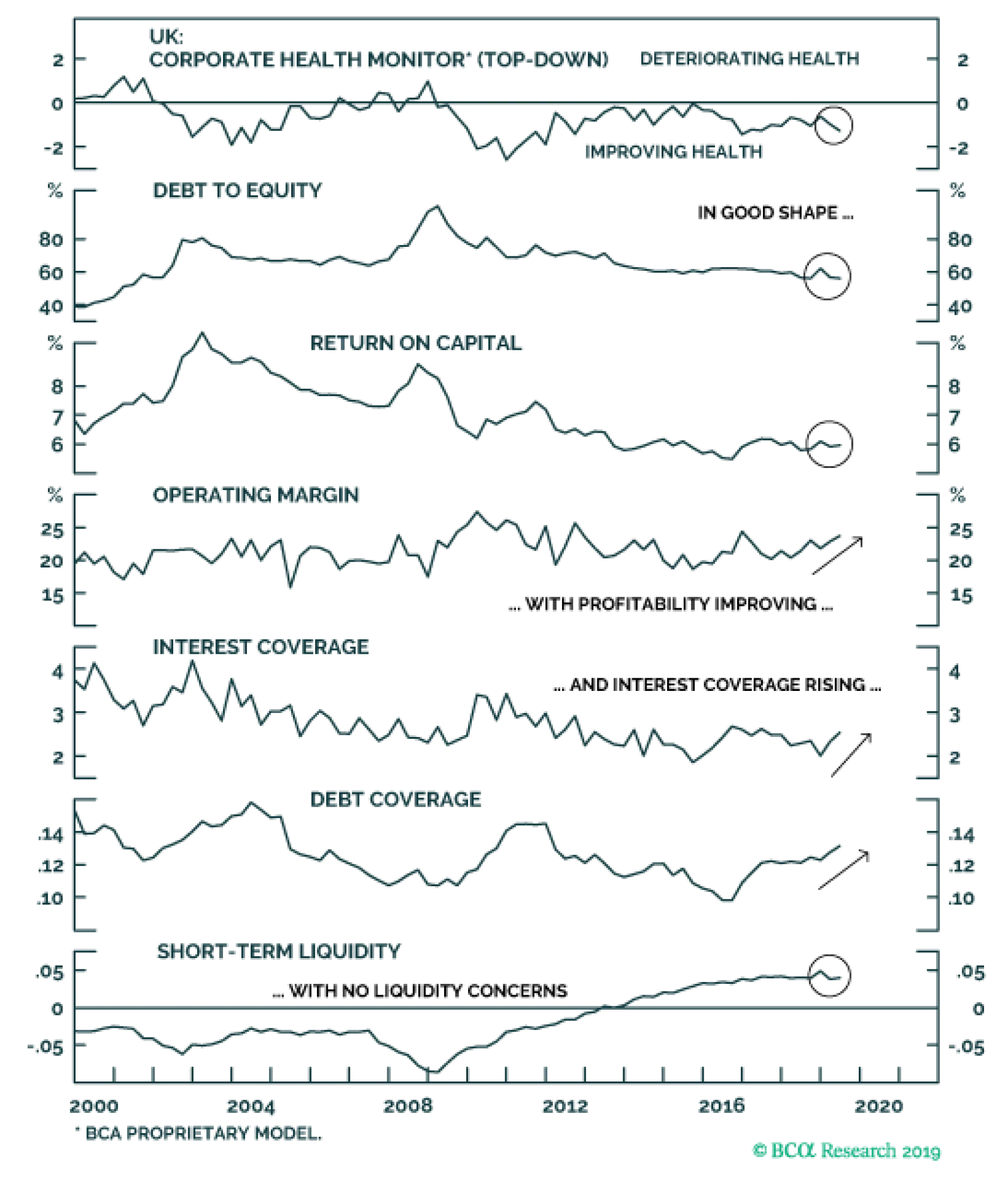
We see no reason to alter our recommendations on euro area credit, based on our forecast of better global growth, with no change to the ECB’s ultra-accommodative monetary stance, in 2020. However, a stronger growth backdrop could benefit euro area HY performance more than IG, based on the comparatively healthier signal from the bottom-up euro area HY CHM. The gap between the combined IG/HY bottom-up CHMs for the US and euro area aligns with credit spread differentials between euro area and US issuers (Chart 10).2 latest trends show a narrowing of the gap between the US and euro area CHMs, suggesting relative corporate health favors US names (middle panel). At the same time, the stronger performance of the US economy, which is much less levered to global trade and manufacturing compared to Europe, continues to support US corporate performance versus euro area equivalents (bottom panel). UK Corporate Health Monitor: Some Improvement, Even With Brexit Uncertainty Despite the persistent uncertainty over the UK-EU Brexit negotiations that has weighed on UK economic confidence, our top-down UK CHM remains in the "improving health" zone (Chart 11). All of the individual components are contributing to the strength of the CHM, which even improved from those healthy levels in Q2/2019 (the most recent data available). A sustained easing of UK financial conditions – easy monetary policy alongside a deeply undervalued currency – have helped boost interest/debt coverage ratios by keeping UK corporate borrowing costs low. Top-down operating margins for UK non-financial firms have surprisingly increased and now sit just under 25%. Short-term liquidity remains solid with leverage holding at non-problematic levels. As we discussed in a recent Special Report, the UK economy has been holding up fairly well despite the political uncertainty that has driven a prolonged slowdown in productivity growth through weak business investment.3 The UK consumer has continued to spend, however, seemingly desensitized to the political drama, and the labor market has remained tight enough to support a decent pace of household income growth. Despite the persistent uncertainty over the UK-EU Brexit negotiations, our top-down UK CHM remains in the "improving health" zone. The near term performance of the UK's economy is highly dependent on the final result of Brexit negotiations. If a negotiated Brexit occurs, UK corporates can start to ramp up the capital spending that has been delayed due to the political uncertainty, which will eventually lead to an improvement in UK productivity growth and overall corporate performance. A strengthening pound and rising government bond yields, driven by markets unwinding Brexit risk premia, will mitigate some of that growth thrust, but the net effect will still boost the relative performance of UK corporate debt versus Gilts. There are still near-term political risks stemming from the UK parliamentary election next month, with the deadline for a UK-EU Brexit deal delayed until after the election. Thus, we continue to maintain only a neutral stance on UK IG corporates in our model bond portfolio, despite our overall bias to be overweight global corporate debt versus government bonds. We will reconsider that stance after we have more clarity on the final resolution of the Brexit uncertainty. At a minimum, however, we expect UK corporates to continue to deliver solid excess returns versus UK Gilts (Chart 12). Chart 11UK Top-Down CHM: Solid Improvement, Despite Brexit
U.K. Top-Down CHM: Solid Improvement, Despite Brexit
U.K. Top-Down CHM: Solid Improvement, Despite Brexit
Chart 12UK Corporates: Stay Neutral
U.K. Corporates: Stay Neutral
U.K. Corporates: Stay Neutral
Japan Corporate Health Monitor: A Further Cyclical Deterioration Our bottom-up Japan CHM remains in the "deteriorating health" zone, as has been the case since the start of 2018 (Chart 13).4 The message from the individual CHM components, however, is that this is a cyclical, not structural, deterioration in Japanese corporate credit quality, and from a very healthy starting point. Leverage, defined here as the ratio of total debt to the book value of equity, is slightly above 100%, well below the 100-140% range seen between 2006 and 2015. A similar trend exists for return on capital, which has dipped below 5% but remains high relative to its history (although very low by global standards). Operating margins, debt coverage and short-term liquidity are down from recent peaks but all remain well above the lows of the decade since the 2008 financial crisis. Interest coverage has suffered a more meaningful deterioration relative to its history. However, this is more a cyclical issue related to falling profits (the numerator of the ratio) rather than rising interest costs (the denominator), with the latter remaining subdued thanks to the Bank of Japan’s hyper-easy monetary policy. For the former, the cyclical momentum in Japan’s economy is not improving, despite some recent evidence that global growth may be stabilizing. According to the latest Tankan survey, Japanese manufacturers – who saw profits fall -31% on a year-over-year basis in Q2/2019 - reported a worse business outlook than previously expected, both for large and small firms. This is not surprising, as Japan’s economy remains highly levered to global growth and export demand, in general, and China, in particular. Yet the less trade-sensitive services sector has also weakened – forecasts of the Tankan non-manufacturing index have already rolled over and the services PMI dropped to 49.7 in October. Japan’s corporate spread has widened slightly (+10bps) since the beginning of this year (Chart 14), in contrast to the spread tightening seen in other major developed economy corporate bond markets. This is sign that the markets have responded to the slowing growth momentum in Japan with a bit of a wider risk premium. Yet despite that widening, Japanese corporates with small positive yields continue to generate positive excess returns (on a duration-matched basis) versus Japanese Government Bonds (JGBs); yields on the latter will remain anchored near zero by the Bank of Japan’s Yield Curve Control policy. Thus, we continue to recommend an overweight stance on Japanese corporates vs JGBs as a buy-and-hold carry trade, even with the softening in our Japan CHM. Chart 13Japan Bottom-Up CHM: Cyclical Deterioration
Japan Bottom-Up CHM: Cyclical Deterioration
Japan Bottom-Up CHM: Cyclical Deterioration
Chart 14Japan Corporates: Stay Overweight Vs JGBs For Carry
Japan Corporates: Stay Overweight Vs JGBs For Carry
Japan Corporates: Stay Overweight Vs JGBs For Carry
Canada Corporate Health Monitors: Continuous Improvement Our top-down and bottom-up Canadian CHMs indicate an improving trend in Canadian corporate health, with both remaining in the “improving” zone as of the latest data available from Q2/2019 (Chart 15). The cyclical components (return on capital and operating margins) have gradually improved over the past three years, but remain relatively weak compared to history. Leverage is rising (now above 120% in our bottom-up CHM), but interest/debt coverage ratios remain steady and, in the case of the bottom-up CHM, have outright improved over the past year. We reviewed the Canadian economy last week5 and concluded that a Bank of Canada interest rate cut was unlikely because of signs of improving domestic growth momentum at a time when core inflation was at the midpoint of the BoC’s 1-3% target range. Overall, Canadian growth has been resilient in the face of the 2019 global manufacturing downturn, and should re-accelerate in the next year led by a firm consumer with rebounding housing and business investment. This should help boost the cyclical components of our Canada CHMs, especially if some improvement in global growth helps lift demand for Canadian commodity exports. We also introduced a framework to analyze Canadian corporate bonds in a Special Report published in late August.6 We concluded that Canadian companies’ financial health remains a positive for corporate bond returns on a cyclical basis, but high leverage and mediocre profitability were longer-term concerns. We also noted that the higher credit quality of Canadian corporates, where only 40% of the investment grade index is rated BBB, made them more potentially appealing on a creditworthiness basis relative to the lower quality markets in the US (50% BBB share) and euro area (52%). We continue to recommend an overweight position in Canadian corporate debt relative to Canadian government bonds as a carry trade. We continue to recommend an overweight position in Canadian corporate debt relative to Canadian government bonds as a carry trade. Spreads have held in a well-established range of 100-200bps since the 2009 recession (Chart 16), even during periods when our CHMs were indicating worsening corporate health. Accommodative monetary conditions and relatively low Canadian interest rates will continue to make Canadian corporates relatively attractive, in an environment of decent growth and firm corporate health. Chart 15Canada CHMs: Still Healthy, Despite Slower Growth
Canada CHMs: Still Healthy, Despite Slower Growth
Canada CHMs: Still Healthy, Despite Slower Growth
Chart 16Canadian Corporates: Stay Overweight Vs Canadian Govt. Debt
Canadian Corporates: Stay Overweight Vs Canadian Govt. Debt
Canadian Corporates: Stay Overweight Vs Canadian Govt. Debt
Robert Robis, CFA Chief Fixed Income Strategist rrobis@bcaresearch.com Ray Park, CFA Research Analyst ray@bcaresearch.com Appendix 1: An Overview Of The BCA Corporate Health Monitors The BCA Corporate Health Monitor (CHM) is a composite indicator designed to assess the underlying financial strength of the corporate sector for a country. The Monitor is an average of six financial ratios inspired by those used by credit rating agencies to evaluate individual companies. However, we calculate our ratios using top-down (national accounts) data for profits, interest expense, debt levels, etc. The idea is to treat the entire corporate sector as if it were one big company, and then look at the credit metrics that would be used to assign a credit rating to it. Importantly, only data for the non-financial corporate sector is used in the CHM, as the measures that would be used to measure the underlying health of banks and other financial firms are different than those for the typical company. The six ratios used in the CHM are shown in Table 1 below. To construct the CHM, the individual ratios are standardized, added together, and then shown as a deviation from the medium-term trend. That last part is important, as it introduces more cyclicality into the CHM and allows it to better capture major turning points in corporate well-being. Largely because of this construction, the CHM has a very good track record at heralding trend changes in corporate credit spreads (both for Investment Grade and High-Yield) over many cycles. Table 1Definitions Of Ratios That Go Into The CHMs
BCA Corporate Health Monitor Chartbook: Mixed Signals, But Growth Matters More
BCA Corporate Health Monitor Chartbook: Mixed Signals, But Growth Matters More
Top-down CHMs are now available for the US, euro area, the UK and Canada. The CHM methodology was extended in 2016 to look at corporate health by industry and by credit quality.7 The financial data of a broad set of individual US and euro area companies was used to construct individual “bottom-up” CHMs using the same procedure as the more familiar top-down CHM. Some of the ratios differ from those used in the top-down CHM (see Table 1), largely due to definitional differences in data presented in national income accounts versus those from actual individual company financial statements. The bottom-up CHMs analyze the health of individual sectors, and can be aggregated up into broad CHMs for Investment Grade and High-Yield groupings to compare with credit spreads. In 2018, we introduced bottom-up CHMs for Japan and Canada. With the country expansion of our CHM universe, we now have coverage for 92% of the Bloomberg Barclays Global Aggregate Corporate Bond Index (Appendix Chart 1). Appendix Chart 1We Now Have CHM Coverage For 92% Of The Developed Market Corporate Bond Universe
BCA Corporate Health Monitor Chartbook: Mixed Signals, But Growth Matters More
BCA Corporate Health Monitor Chartbook: Mixed Signals, But Growth Matters More
Footnotes 1 Please see BCA Research Global Fixed Income Strategy Weekly Report, “How Sweet It Is”, dated November 6, 2019, available at gfis.bcareseach.com. 2 We only use the CHMs for euro area domestic issuers in this aggregate bottom-up CHM, as this is most reflective of uniquely European corporate credits. This also eliminates double-counting from US companies that issue in the euro area market that are part of our US CHMs. 3 Please see BCA Research Global Fixed Income Strategy Special Report, “United Kingdom: Cyclical Slowdown Or Structural Malaise?”, dated September 20, 2019, available at gfis.bcaresearch.com. 4 We do not currently have a top-down CHM for Japan given the lack of consistent government data sources for all the necessary components. 5 Please see BCA Research Global Fixed Income Strategy Weekly Report, “How Sweet It Is”, dated November 6, 2019, available at gfis.bcaresearch.com. 6 Please see BCA Research Global Fixed Income Strategy Special Report, “The Great White North: A Framework For Analyzing Canadian Corporate Bonds”, dated August 28, 2019, available at gfis.bcaresearch.com. 7 Please see Section II of The Bank Credit Analyst, “U.S. Corporate Health Gets A Failing Grade”, dated February 2016, available at bca.bcaresearch.com. Appendix 2: US Bottom-Up CHMs For Selected Sectors
APPENDIX 2: ENERGY SECTOR
APPENDIX 2: ENERGY SECTOR
APPENDIX 2: MATERIALS SECTOR
APPENDIX 2: MATERIALS SECTOR
APPENDIX 2: COMMUNICATIONS SECTOR
APPENDIX 2: COMMUNICATIONS SECTOR
APPENDIX 2: CONSUMER DISCRETIONARY SECTOR
APPENDIX 2: CONSUMER DISCRETIONARY SECTOR
APPENDIX 2: CONSUMER STAPLES SECTOR
APPENDIX 2: CONSUMER STAPLES SECTOR
APPENDIX 2: HEALTH CARE SECTOR
APPENDIX 2: HEALTH CARE SECTOR
APPENDIX 2: INDUSTRIALS SECTOR
APPENDIX 2: INDUSTRIALS SECTOR
APPENDIX 2: TECHNOLOGY SECTOR
APPENDIX 2: TECHNOLOGY SECTOR
APPENDIX 2: UTILITIES SECTOR
APPENDIX 2: UTILITIES SECTOR
The GFIS Recommended Portfolio Vs. The Custom Benchmark Index
BCA Corporate Health Monitor Chartbook: Mixed Signals, But Growth Matters More
BCA Corporate Health Monitor Chartbook: Mixed Signals, But Growth Matters More
Recommendations Duration Regional Allocation Spread Product Tactical Trades Yields & Returns Global Bond Yields Historical Returns
The Norges Bank has been hawkish in spite of the dovish tilt by most other central banks. As such, the underperformance of the Norwegian krone, especially versus the euro, has been quite perplexing in the face of diverging monetary policies. Speculators have…
Highlights The correlation between oil and petrocurrencies has shifted in recent years. It no longer makes sense going long petrocurrencies versus the US dollar blindly. One of the reasons has been the impressive and prominent output from US shale. We are currently long a basket of petrocurrencies versus the euro, but intend to shift this trade towards a short USD position on more visible signs of a breakdown in the US dollar. Go short CAD/NOK for a trade. Feature Chart I-1Oil And Petrocurrencies Have Diverged
Oil And Petrocurrencies Have Diverged
Oil And Petrocurrencies Have Diverged
Since the middle of the last decade, one of the most perplexing disconnects has been the divergence between the price of oil and the performance of petrocurrencies. From the 2016 bottom, oil prices more than doubled, but the petrocurrency basket has underperformed by a whopping 110% versus the US dollar. This has been a very perplexing result that has surprised many investors on what was traditionally a very sound correlation (Chart I-1). In general, an increase in oil prices usually implies rising terms of trade, which should increase the fair value of a currency. Throughout our modeling exercises, terms of trade were uncovered as what mattered the most for commodity currencies in general, and petrocurrencies in particular. In theory, this makes sense, given the improvement in balance-of-payment dynamics (that tend to be observed with a lag) and the ability for increased government spending, allowing a resident central bank to tighten monetary policy. In the case of Canada and Norway, petroleum represents over 20% and 50% of total exports. For Saudi Arabia, Iran or Venezuela, this number is much higher. Therefore, it is easy to see why a big fluctuation in the price of oil can have deep repercussions for their external balances. Historically, getting the price of oil right was usually the most important step in any petrocurrency forecast, but it has now become a necessary but not sufficient condition. Oil Demand Should Recover We agree with our commodity strategists that the outlook for oil prices is to the upside. Oil demand tends to follow the ebb and flow of the business cycle, with demand having slowed sharply on the back of a manufacturing recession. Transport constitutes the largest share of global petroleum demand. Ergo the trade slowdown brought a lot of freighters, bulk ships, large crude carriers and heavy trucks to a halt (Chart I-2). Chart I-2Oil Demand Has Been Weak
Oil Demand Has Been Weak
Oil Demand Has Been Weak
Part of the slowdown in global demand is being reflected through elevated inventories. However, part of the inventory building has also been a function of refinery maintenance (Chart I-3). Chinese oil imports continue to hold up well, and should easier financial conditions put a floor on the manufacturing cycle, overall consumption will follow suit (Chart I-4). Chart I-3Oil Inventories Are Elevated
Oil Inventories Are Elevated
Oil Inventories Are Elevated
Chart I-4China Oil Imports Holding Up
China Oil Imports Holding Up
China Oil Imports Holding Up
The increase in oil demand will be on the back of two positive supply-side developments. First, OPEC spare capacity is only at 2%. This means that any rebound in oil demand in the order of 1.5%-2% (our base case), will seriously begin to bump up against supply-side constraints – especially in the face of OPEC production discipline. Second, unplanned outages wiped out about 1.5% of supply in 2018, and should this occur again as oil demand recovers, it will nudge the oil market dangerously close to a negative supply shock (Chart I-5). Chart I-5Opec Spare Capacity Is Low
Making Money With Petrocurrencies
Making Money With Petrocurrencies
Bottom Line: A recovery in the global manufacturing sector will help revive oil demand. This should be positive for oil prices in general. A Necessary But Not Sufficient Condition Rising oil prices are bullish for petrocurrencies, but being long versus the US dollar is no longer an appropriate strategy. This is because the landscape for oil production is rapidly shifting, with the US shale revolution grabbing market share from both OPEC and non-OPEC members. As the now-largest oil producer in the world, the US dollar is itself becoming a petrocurrency. In 2010, only about 6% of global crude output came from the US. Collectively, Canada, Norway and Mexico shared about 10% of the oil market. Meanwhile, OPEC’s market share sat just north of 40%. Fast forward to today and the US produces almost 15% of global crude, having grabbed market share from many other countries. In short, as the now-largest oil producer in the world, the US dollar is itself becoming a petrocurrency (Chart I-6). Chart I-6US Has Grabbed Oil Production Market Share
US Has Grabbed Oil Production Market Share
US Has Grabbed Oil Production Market Share
This explains why the positive correlation between petrocurrencies and oil has been gradually eroded as the US economy has become less and less of an oil importer. Put another way, rising oil prices benefit the US industrial base much more than in the past, while the benefits for countries like Canada and Mexico are slowly fading. Meanwhile, falling production in Iran, Venezuela, and even Angola has been a net boon for US production and the dollar. In statistical terms, petrocurrencies had a near-perfect positive correlation with oil around the time US production was about to take off (Chart I-7). Since then, that correlation has fallen from around 0.9 to around 0.2. At the same time, the DXY dollar index is on its way to becoming positively correlated with oil as the US becomes a net energy exporter. Chart I-7Falling Correlation Between Petrocurrencies And The US Dollar
Falling Correlation Between Petrocurrencies And The US Dollar
Falling Correlation Between Petrocurrencies And The US Dollar
Bottom Line: Both the CAD and NOK remain positively correlated with oil. So do the Russian ruble and the Colombian peso. That said, a loss of global market share has hurt the oil sensitivity of many petrocurrencies. Oil Consumers Versus Producers Our strategy going forward will be twofold. First, buying a petrocurrency basket versus the dollar will require perfect timing in the dollar downleg. We are long an oil currency basket versus the euro, but intend to make the switch once our momentum indicators for the dollar decisively break lower. With bond yields having already made a powerful downward adjustment, the valve for financial conditions to get any looser could easily be via the US dollar (Chart I-8). A loss of global market share has hurt the oil sensitivity of many petrocurrencies. The second strategy is to be long a basket of oil producers versus oil consumers. Chart I-9 shows that a currency basket of oil producers versus consumers has both had a strong positive correlation with the oil price and has outperformed a traditional petrocurrency basket. Rising oil prices are a terms-of-trade boost for oil exporters but lead to demand destruction for oil importers. It is also notable that the correlation has strengthened as that between petrocurrencies and the US dollar has weakened. Chart I-8The Dollar As An Arbiter Of Growth
The Dollar As An Arbiter Of Growth
The Dollar As An Arbiter Of Growth
Chart I-9Buy Oil Producers Versus Oil Consumers
Buy Oil Producers Versus Oil Consumers
Buy Oil Producers Versus Oil Consumers
Sell CAD/NOK The Norges Bank has been quite hawkish in spite of the dovish tilt by most other central banks. As such, the underperformance of the Norwegian krone, especially versus the euro, has been quite perplexing in the face of diverging monetary policies (Chart I-10). Our bias is that speculators have been using the thinly traded krone to play USD upside, but that momentum is now fading. The Norwegian economy remains closely tied to oil, with the bottom in oil prices in 2016 having jumpstarted employment growth, business confidence, and wage growth. With inflation near the central bank’s target and our expectation for oil prices to grind higher, we agree with the central bank’s assessment that the future path of interest rates is likely higher. A weak exchange rate will also anchor inflation expectations (Chart I-11). Chart I-10Diverging Monetary ##br##Policies
Diverging Monetary Policies
Diverging Monetary Policies
Chart I-11A Weak Exchange Rate Will Anchor Inflation Expectations Higher
A Weak Exchange Rate Will Anchor Inflation Expectations Higher
A Weak Exchange Rate Will Anchor Inflation Expectations Higher
The underperformance of the Norwegian krone has mirrored that of global oil and gas stocks. Perhaps sentiment towards the environment and climate change has been pushing investor flows out of these markets, but given the central role oil plays in the global economy, we may have reached the point of capitulation (Chart I-12). Our recommendation is that NOK long positions should initially be played via selling the CAD, as an indirect way to express USD shorts. Our recommendation is that NOK long positions should initially be played via selling the CAD, as an indirect way to express USD shorts (Chart I-13). The CAD/NOK briefly punched through the 7.1 level in October but is now seeing a powerful reversal. Our intermediate-term indicators also suggest the next move is likely lower. The discount between Western Canadian Select crude oil and Brent has also widened, which has historically heralded a lower CAD/NOK exchange rate (Chart I-14) Chart I-12ESG And Global Divestments
ESG And Global Divestments
ESG And Global Divestments
Chart I-13NOK Will Outperform CAD (I)
NOK Will Outperform CAD (I)
NOK Will Outperform CAD (I)
Chart I-14NOK Will Outperform CAD (II)
NOK Will Outperform CAD (II)
NOK Will Outperform CAD (II)
Bottom Line: Go short CAD/NOK for a trade, but more aggressive investors should begin accumulating long NOK positions versus the US dollar outright. Chester Ntonifor Foreign Exchange Strategist chestern@bcaresearch.com Currencies U.S. Dollar Chart II-1USD Technicals 1
USD Technicals 1
USD Technicals 1
Chart II-2USD Technicals 2
USD Technicals 2
USD Technicals 2
Recent data in the US have been strong: The labor market remains tight: nonfarm payrolls increased by 128K in October, well above expectations of 89K. Average hourly earnings continue to grow by 3% year-on-year. Unit labor costs grew by 3.6% year-on-year in Q3. The ISM manufacturing PMI increased to 48.3 from 47.8 in October. The non-manufacturing PMI soared to 54.7 from 52.6 in October, well above expectations. The trade balance narrowed by $2.5 billion to $52.5 billion in September. The DXY index appreciated by 0.8% this week. ISM PMI data points to improvements in both manufacturing and services sectors, mainly supported by production, new orders, and the employment components. It will be interesting to monitor if this signals an improvement in the global manufacturing cycle, or is a US-centric issue. Report Links: Signposts For A Reversal In The Dollar Bull Market - November 1, 2019 On Money Velocity, EUR/USD And Silver - October 11, 2019 Preserving Capital During Riot Points - September 6, 2019 The Euro Chart II-3EUR Technicals 1
EUR Technicals 1
EUR Technicals 1
Chart II-4EUR Technicals 2
EUR Technicals 2
EUR Technicals 2
Recent data in the euro area have been positive: The Markit manufacturing PMI slightly increased to 45.9 from 45.7 in October. The services PMI also improved to 52.2 from 51.8. The Sentix confidence index increased to -4.5 from -16.8 in November. Retail sales grew by 3.1% year-on-year in September, an improvement from the 2.7% yearly growth rate in the previous month. EUR/USD fell by 0.8% this week. On Monday, Christine Lagarde, the former managing director of the IMF, gave her first speech as the new ECB president where she urged Europe to overcome self-doubt, aiming to boost investor and business confidence in the euro area. However, no comments were given regarding ECB monetary policy. Report Links: On Money Velocity, EUR/USD And Silver - October 11, 2019 A Few Trade Ideas - Sept. 27, 2019 Battle Of The Central Banks - June 21, 2019 Japanese Yen Chart II-5JPY Technicals 1
JPY Technicals 1
JPY Technicals 1
Chart II-6JPY Technicals 2
JPY Technicals 2
JPY Technicals 2
Recent data in Japan have been negative: Vehicle sales shrank by 26.4% year-on-year in October. The monetary base grew by 3.1% year-on-year in October. The services PMI plunged to 49.7 from 52.8 in October. The Japanese yen depreciated by 1% against the US dollar this week. We remain short USD/JPY given global economic uncertainties and domestic deflationary tailwinds. Should the global economy pick up early next year, the yen could still remain bid against the USD, allowing investors time to rotate their short USD/JPY bets. Report Links: Signposts For A Reversal In The Dollar Bull Market - November 1, 2019 A Few Trade Ideas - Sept. 27, 2019 Has The Currency Landscape Shifted? - August 16, 2019 British Pound Chart II-7GBP Technicals 1
GBP Technicals 1
GBP Technicals 1
Chart II-8GBP Technicals 2
GBP Technicals 2
GBP Technicals 2
Recent data in the UK have been positive: The Markit manufacturing PMI increased to 49.6 from 48.3 in October. Services PMI increased to 50 from 49.5 in October. Retail sales increased by 0.1% year-on-year in October, compared to a contraction of 1.7% in the previous month. Halifax house prices grew by 0.9% year-on-year in October. GBP/USD depreciated by 1% this week. On Thursday, the BoE decided to leave its interest rate unchanged at the current level of 0.75%. However, unlike a unanimous decision as in previous policy meetings this year, two BoE officials unexpectedly voted to lower interest rates amid signs of deeper economic slowdown and entrenched Brexit chaos. Report Links: A Few Trade Ideas - Sept. 27, 2019 United Kingdon: Cyclical Slowdown Or Structural Malaise? - Sept. 20, 2019 Battle Of The Central Banks - June 21, 2019 Australian Dollar Chart II-9AUD Technicals 1
AUD Technicals 1
AUD Technicals 1
Chart II-10AUD Technicals 2
AUD Technicals 2
AUD Technicals 2
Recent data in Australia have been mostly positive: Retail sales grew modestly by 0.2% month-on-month in September. The Commonwealth composite PMI fell slightly to 50 from 50.7 in October. The services PMI also fell to 50.1 from 50.8. The trade balance increased by A$1.3 billion to A$7.2 billion in September. Both exports and imports grew by 3% month-on-month in September. The Australian dollar has been volatile against the US dollar, but returned flat this week. The RBA has left its interest rate unchanged this Monday, as widely expected. We remain positive on the Australian dollar and went long AUD/CAD last week, which is currently 0.3% in the money. Report Links: A Contrarian View On The Australian Dollar - May 24, 2019 Beware Of Diminishing Marginal Returns - April 19, 2019 Not Out Of The Woods Yet - April 5, 2019 New Zealand Dollar Chart II-11NZD Technicals 1
NZD Technicals 1
NZD Technicals 1
Chart II-12NZD Technicals 2
NZD Technicals 2
NZD Technicals 2
Recent data in New Zealand have been mostly negative: The participation rate increased marginally to 70.4% from a downward-revised 70.3% in Q3. The labor cost index increased by 2.3% year-on-year in Q3. The unemployment rate however, climbed to 4.2% from 3.9%, higher than expectations of a rise to 4.1%. The kiwi fell by 1.4% against the US dollar, making it the worst performing G-10 currency this week. Despite the rise of the unemployment rate in Q3, the under-utilization rate, a broad measure of labor market spare capacity has fallen to the lowest level in over 11 years, as suggested by the manager of Statistics New Zealand, Paul Pascoe. That said, we remain underweight the kiwi given it will likely lag other commodity currencies in a global growth upswing. We will change this view if New Zealand terms of trade start to inflect meaningfully higher. Stay with our long AUD/NZD and SEK/NZD positions. Report Links: USD/CNY And Market Turbulence - August 9, 2019 Where To Next For The US Dollar? - June 7, 2019 Not Out Of The Woods Yet - April 5, 2019 Canadian Dollar Chart II-13CAD Technicals 1
CAD Technicals 1
CAD Technicals 1
Chart II-14CAD Technicals 2
CAD Technicals 2
CAD Technicals 2
Recent data in Canada have been negative: The Markit manufacturing PMI was little changed at 51.2 in October. The trade deficit narrowed marginally from C$1.24 billion to C$0.98 billion in September. Exports and imports both fell in September. Ivey PMI fell to 48.2 from 48.7 in October. USD/CAD increased by 0.3% this week. The recent uptick in oil prices support the Canadian dollar, but the loonie will likely underperform other petrocurrencies. We remain bullish on the oil prices, however, spreads will likely continue to move against the Western Canadian Select blend. Report Links: Signposts For A Reversal In The Dollar Bull Market - November 1, 2019 Preserving Capital During Riot Points - September 6, 2019 Portfolio Tweaks Into Thin Summer Trading - July 5, 2019 Swiss Franc Chart II-15CHF Technicals 1
CHF Technicals 1
CHF Technicals 1
Chart II-16CHF Technicals 2
CHF Technicals 2
CHF Technicals 2
Recent data in Switzerland have been mostly negative: Headline CPI fell below 0 at -0.3% year-on-year for the first time over the past 3 years in October. On a month-on-month basis, it contracted by 0.2%. Real retail sales grew by 0.9% year-on-year in September. PMI improved to 49.4 from 44.6 in October. FX reserves were little changed at CHF 779 billion in October. The Swiss franc fell by 0.9% against the US dollar this week. Faced with deflationary pressures, the SNB will likely to use its currency as a weapon to stimulate the economy and exit deflation. This will favor long EUR/CHF positions. Report Links: Notes On The SNB - October 4, 2019 What To Do About The Swiss Franc? - May 17, 2019 Beware Of Diminishing Marginal Returns - April 19, 2019 Norwegian Krone Chart II-17NOK Technicals 1
NOK Technicals 1
NOK Technicals 1
Chart II-18NOK Technicals 2
NOK Technicals 2
NOK Technicals 2
Recent data in Norway have been mixed: Industrial production contracted by 8.1% year-on-year in September, mainly caused by the slowdown in extraction and related services. On the positive side, manufacturing output grew by 2.9% year-on-year. The manufacturing output of ships, boats, and oil platforms in particular, grew by 26.2% year-on-year in September. The Norwegian krone appreciated by 0.3% against the US dollar this week, despite the broad dollar strength. The WTI crude oil price increased by nearly 6% this week, which is a tailwind for petrocurrencies. We maintain a pro-cyclical stance and expect oil prices to increase further. The global growth recovery and a weaker US dollar should all boost the oil demand, and lift the Norwegian krone. Please refer to our front section this week for more detailed analysis on the NOK. Report Links: A Few Trade Ideas - Sept. 27, 2019 Portfolio Tweaks Into Thin Summer Trading - July 5, 2019 On Gold, Oil And Cryptocurrencies - June 28, 2019 Swedish Krona Chart II-19SEK Technicals 1
SEK Technicals 1
SEK Technicals 1
Chart II-20SEK Technicals 2
SEK Technicals 2
SEK Technicals 2
Recent data in Sweden have been negative: The manufacturing PMI fell marginally to 46 from 46.3 in October. Industrial production growth slowed to 0.9% from 2.1% year-on-year in September. Manufacturing new orders contracted by 1.5% year-on-year in September. The Swedish krona has been flat against the USD this week. The PMI components of new orders, industrial production, and employment all continued to fall. On the positive side, the export component increased marginally. We expect the cheap krona to help improve the trade dynamics in Sweden and put a floor under the krona. Report Links: Where To Next For The US Dollar? - June 7, 2019 Balance Of Payments Across The G10 - February 15, 2019 A Simple Attractiveness Ranking For Currencies - February 8, 2019 Trades & Forecasts Forecast Summary Core Portfolio Tactical Trades Limit Orders Closed Trades
The key question for asset allocators over coming months will be when (or, perhaps, whether) the global manufacturing cycle will turn up. This would trigger a move into more cyclically sensitive markets, for example euro zone equities and Emerging Market assets. It would push up commodity prices and government bond yields, and lead to a weakening of the U.S. dollar. Recommended Allocation
Monthly Portfolio Update: Looking For The Turning-Point
Monthly Portfolio Update: Looking For The Turning-Point
Chart 1First Inklings Of A Pick-Up?
First Inklings Of A Pick-Up?
First Inklings Of A Pick-Up?
For now, the evidence of this turning-point remains ambiguous, and so we hesitate to pull the trigger. BCA Research's calculation of the global OECD Leading Economic Indicator bottomed earlier this year and should lead to a pick-up in manufacturing activity soon (Chart 1). However, only in EM have the manufacturing PMIs bottomed (Chart 1, panel 2) and this was due mainly to a questionably strong September PMI in China which might be reversed when the latest data-point is published on October 1. In the euro zone, the best that one can say is that the PMIs have stopped falling but they remain at a low level (41.9 in Germany, for instance). Some market-based indicators also signal a pick-up – but not yet convincingly (Chart 2). Defensive currencies such as the U.S. dollar and yen have fallen a little against cyclical currencies like the Korean won and Australian dollar. Euro zone equities have shown some strength, especially in the beaten-down auto sector. The global stock-to-bond ratio looks to be about to break out of its recent range. And copper has bounced off its lows. But these moves could turn out to be just noise rather than the beginning of a trend. Chart 2Are Markets Sniffing Out A Turn?
Are Markets Sniffing Out A Turn?
Are Markets Sniffing Out A Turn?
Easier financial conditions are the most likely cause of a rebound. BCA Research's Financial Liquidity Index tends to lead both manufacturing activity and the relative performance of global stocks by around 12-18 months (Chart 3). With the dovish turn of central banks this year, the decline in long-term interest rates (the 10-year U.S. Treasury yield, even after its recent rebound, is only at 1.7% compared to 3.2% a year ago), the contraction in credit spreads, and a pick-up in money supply growth especially in the U.S. (where M2 is now growing 6.5% year-on-year), it would be surprising if these looser monetary conditions do not feed through into stronger activity over coming quarters. Chart 3Financial Liquidity Propels Growth
Financial Liquidity Propels Growth
Financial Liquidity Propels Growth
Chart 4Could Inflation Now Slow?
Could Inflation Now Slow?
Could Inflation Now Slow?
Indeed, one can easily imagine a scenario next year where growth rebounds but inflation slows (due to the lagged effect of this year’s weaker growth, Chart 4), allowing central banks to remain dovish for some time. This non-inflationary accelerating growth would be highly positive for risk assets and negative for the U.S. dollar. Chart 5 shows how various asset classes behaved in such an environment in the past. Chart 5How Assets Behaved Under Rising Growth/Falling Inflation
Monthly Portfolio Update: Looking For The Turning-Point
Monthly Portfolio Update: Looking For The Turning-Point
Easier financial conditions are the most likely cause of a rebound. There are some risks to this optimistic scenario, however. Chinese growth remains sluggish with, for example, imports – the most important factor as far as the rest of the world is concerned – falling by 8.5% year-on-year in September and showing no signs of recovery (Chart 6). The acceleration of Chinese credit growth in early 2019 has petered out since the summer and points to a much flatter recovery of activity than was the case in 2016 (Chart 7). A politburo meeting in late October could lead to monetary stimulus being ramped up but, for now, investors should not assume a big reflationary impulse from China. In the developed world, the biggest risk is that the slowdown in manufacturing spills over into employment, consumption, and services. There are some signs in the U.S. that companies are delaying hiring decisions: job openings have fallen, and the employment component of both the manufacturing and non-manufacturing ISMs points to a deterioration in the labor market (Chart 8). Growing CEO pessimism, presumably because of anemic earnings and the trade war, points to continuing weakness in capex and a further decline in activity indicators (Chart 9). Chart 6Chinese Growth Still Sluggish...
Chinese Growth Still Sluggish...
Chinese Growth Still Sluggish...
Chart 7...As Credit Growth Peters Out
...As Credit Growth Peters Out
...As Credit Growth Peters Out
Chart 8Are Firms Starting To Delay Hiring?
Are Firms Starting To Delay Hiring?
Are Firms Starting To Delay Hiring?
Chart 9CEOs Are Not Happy
CEOs Are Not Happy
CEOs Are Not Happy
Chart 10Stocks Should Outperform Cyclically
Stocks Should Outperform Cyclically
Stocks Should Outperform Cyclically
On balance, we still expect global growth to accelerate next year, and therefore global equities to outperform bonds over the next 12 months (Chart 10). But we want to have greater conviction for that view before we recommend more aggressive pro-cyclical tilts. We remain overweight equities versus bonds, but hedge the downside risk through an overweight in cash, and through tilts towards U.S. equities, and DM over EM equities. We continue to recommend hedging against the upside risk of greater Chinese stimulus and a strong rally in cyclical assets through an overweight in global Financials, Industrials, and Energy, and also through a neutral stance on Australian equities, which are a clean play on a Chinese rebound. We continue to look for the right timing to turn more positive on pure cyclical assets such as euro zone equities, and Emerging Markets. Fixed Income: A cyclical pick-up would imply that global government bond yields have further to rise (Chart 11). Our global fixed-income strategists have a short-term target for the 10-year U.S. Treasury yield of 2.1% (versus 1.7% now) and -0.2% for Bunds (-0.4% now), which would take yields back to their 200-day moving averages (Chart 12).1 We continue to recommend a moderate underweight on duration, and prefer TIPS to nominal bonds, since inflation breakevens imply that the Fed will miss its inflation target by 80 basis points a year on average over the next 10 years. In an environment of accelerating economic growth, credit (both investment grade and high-yield)should outperform in both the U.S. and Europe. The most attractive points on the credit curve are BBB-rated bonds in IG, and the riskiest bonds in HY. For more risk-averse investors, agency MBS currently offer an attractive yield pickup over quality corporate credits. Chart 11Growth Will Push Up Yields Further...
Growth Will Push Up Yields Further...
Growth Will Push Up Yields Further...
Chart 12...Initially To Their 200-Day Average
...Initially To Their 200-Day Average
...Initially To Their 200-Day Average
Equities: Any upside for U.S. equities must come from improved earnings performance. Throughout 2019, earnings have been beating overly pessimistic analysts’ forecasts and Q3 looks to be no exception, with EPS growth on track to be much stronger than the -5% year-on-year that analysts forecast going into the results season (Chart 13). Next year, nominal GDP growth of 4% and a weaker U.S. dollar should produce 7-8% EPS growth. But, with a forward PE of 17x and the Fed unlikely to boost the multiple by further rate cuts, upside is limited. In the right economic environment (as described above), euro zone and EM stocks should do much better. We are currently neutral on euro zone equities, but the recent stronger performance by European banks gives us more confidence that we may be able to move to overweight soon (Chart 14). Similarly, our EM strategists have instituted a buy stop on the MSCI EM index and say they will go overweight EM equities if the index in USD terms rises 3% from its current level.2 Chart 13Analysts Are Too Pessimistic On Earnings
Monthly Portfolio Update: Looking For The Turning-Point
Monthly Portfolio Update: Looking For The Turning-Point
Currencies: The first inklings of U.S. dollar weakness over the past month suggest that it may, too, be sniffing out the start of a cyclical rebound, since it tends to be a very counter-cyclical currency (Chart 15). Going forward, relative interest rates are also unlikely to be as bullish a force for the U.S. dollar as they have been in the past few years. For now, we are neutral on the U.S. dollar on a trade-weighted basis, but do see it depreciating against the Australian dollar and the euro over the next 12 months. The British pound has already risen to take into account the lesser probability of a no-deal Brexit, and we would not expect it to move much either way until the General Election result is clear. There are some risks to the optimistic scenario: Chinese growth remains sluggish, and there are signs that U.S. companies are delaying hiring decisions. Chart 14First Signs Of Euro Banks Recovering?
First Signs Of Euro Banks Recovering?
First Signs Of Euro Banks Recovering?
Chart 15Recovery Would Be Dollar Bearish
Recovery Would Be Dollar Bearish
Recovery Would Be Dollar Bearish
Commodities: Industrial metals prices have bottomed out in recent months, in line with Chinese leading indicators (Chart 16). But we will need to see greater Chinese stimulus before we become more positive. Crude oil has moved largely in a range for the past six months, with tightness in supply offset by some weakness in demand, especially from developed economies (Chart 17). With demand likely to pick up in line with the global economy, and supply still constrained by the Saudi/Russia production pact and geopolitical disturbances, our energy strategists see Brent crude averaging $66 a barrel in Q4 and $70 in 2020, versus $60 now. Chart 16Not Enough China Stimulus For Metals To Bounce
Not Enough China Stimulus For Metals To Bounce
Not Enough China Stimulus For Metals To Bounce
Chart 17Oil Kept Down By Weak Demand
Oil Kept Down By Weak Demand
Oil Kept Down By Weak Demand
As last year, the Global Asset Allocation service will not publish a Q1 Quarterly in mid-December. Instead, we will send clients on November 22 our annual report of the conversation between Mr and Ms X and BCA Research’s managing editors. This report will detail BCA's house views on the outlook for the macro environment and investment markets in 2020. We will publish GAA Monthly Portfolio Outlooks on the first business days of December and January. Garry Evans Senior Vice President Chief Global Asset Allocation Strategist garry@bcaresearch.com Footnotes 1Please see Global Fixed Income Strategy Weekly Report “Big Mo(mentum) Is Turning Positive,” dated 29 October 2019, available at gfis.bcaresearch.com. 2For an explanation, please see the Emerging Markets Strategy Weekly Report " EM Local Bonds: A New Normal?" dated 24 October 2019, available at ems.bcaresearch.com. Recommended Asset Allocation Model Portfolio (USD Terms)
Martin Barnes and I spent last week visiting clients in Hong Kong and Singapore in celebration of BCA’s 70th anniversary. Martin has been with BCA Research for 32 years and has been a keen observer of market trends for much longer than that. It is always fascinating to hear his thoughts on the state of world affairs. I have spent this week visiting clients in Sydney and Melbourne. I made the case that global growth will accelerate next year. Stronger growth will pull down the U.S. dollar, while pushing up bond yields, equities, and commodity prices. EM and European stocks will begin to outperform their global benchmark. Cyclical equity sectors (including financials) will outperform defensives. What follows are my answers to some of the most common questions I have been receiving. Best regards, Peter Berezin, Chief Global Strategist Feature Q: What makes you confident that global growth will rebound? A: Three things. First, global financial conditions have eased significantly thanks largely to the dovish pivot of most central banks. Reflecting this development, credit growth has picked up. This should support economic activity in the months ahead (Chart 1). Second, the manufacturing downturn seems to be running its course, as excess inventories continue to be liquidated (Box 1). As we have noted before, manufacturing cycles tend to last about three years, with 18 months of weaker growth followed by 18 months of stronger growth (Chart 2). Given that the current downturn began in the first half of 2018, we are probably approaching a bottom in growth. Chart 1Lower Rates Should Help Spur Growth
Lower Rates Should Help Spur Growth
Lower Rates Should Help Spur Growth
Chart 2A Fairly Regular Three-Year Manufacturing Cycle
A Fairly Regular Three-Year Manufacturing Cycle
A Fairly Regular Three-Year Manufacturing Cycle
Third, while there will be plenty of bumps along the road, trade tensions are likely to continue easing. As a self-described master negotiator, President Trump has to produce a “tremendous” deal for the American people. Had he negotiated an agreement with China a year or two ago, he would currently be on the hook for showing that it resulted in a smaller trade deficit. But with the presidential election only a year away, he can semi-credibly claim that the trade balance will only improve after he is re-elected. For their part, the Chinese would rather grapple with Trump now than risk either having to negotiate with him during his second term (when he will be unconstrained by re-election pressures) or having to negotiate with Elizabeth Warren (who may insist on including stringent environmental and human rights provisions in any trade deal). Better the devil you know than the devil you don’t, as they say. Q: Will a ceasefire between the U.S. and China really be enough to boost business confidence? Don’t we need to see an outright rollback of tariffs? A: We do not know if any tariffs will be rolled back as part of the “phase 1” deal that is currently being negotiated. Right now, the U.S. has only agreed to cancel the previously announced October 15th tariff hike on $250 billion of Chinese imports. A Reuters news story earlier this week indicated that China is also asking the U.S. scrap its plan to levy tariffs on $156 billion of Chinese imports on December 15th and to abolish the 15% tariffs on $125 billion in imports which were imposed on September 1st.1 Chart 3China Is No Longer As Dependent On Trade With The U.S. As It Once Was
China Is No Longer As Dependent On Trade With The U.S. As It Once Was
China Is No Longer As Dependent On Trade With The U.S. As It Once Was
While the removal of some tariffs would be a positive development, it is not a necessary condition for a global growth revival. Remember that U.S. exports to China account for only 0.5% of GDP while Chinese exports to the U.S. account for 3.4% of GDP (Chart 3). The numbers are even smaller when measured in value-added terms. That does not mean that the trade war is irrelevant. An out-of-control trade war could cause the global supply chain to break down, leading to significant economic disruptions. To the extent that a détente greatly reduces the odds of such an outcome, it justifies a meaningful upgrade to the probability-weighted economic outlook. Q: What’s your read on the Chinese economy right now? A: China’s growth data have been mixed. The Caixin manufacturing purchasing managers’ index rose to 51.7 in October, the best reading since December 2016. The new orders subcomponent reached the highest level since September 2013. Export orders rose back above 50, registering the largest month-on-month increase of any of the subcomponents. In contrast, the “official” National Bureau of Statistics (NBS) manufacturing PMI, which mainly samples larger, state-owned companies, remained below 50 and sank to the lowest level since February. The NBS nonmanufacturing PMI also weakened. It is worth noting that unlike most of the industries tracked by the NBS, the construction sector PMI moved back above 60 in October. This is consistent with industry data showing that sales of reinforced steel bars, a good proxy for property construction, have accelerated. Electricity consumption has also picked up, which often bodes well for industrial output (Chart 4). Policy has generally remained supportive: Bank reserve requirements have been cut. Benchmark interest rates should come down over the coming months. Credit growth surprised on the upside in September. While the acceleration in credit formation has been more muted this past year than in 2015-16, the credit impulse has nevertheless moved off its late-2018 lows. The Chinese credit impulse leads global growth by about nine months (Chart 5). Chart 4A Positive Sign For Chinese Growth Momentum
A Positive Sign For Chinese Growth Momentum
A Positive Sign For Chinese Growth Momentum
Chart 5The Chinese Credit Cycle Should Support Global Growth
The Chinese Credit Cycle Should Support Global Growth
The Chinese Credit Cycle Should Support Global Growth
Chart 6China Stepped Up Fiscal Stimulus In 2019
China Stepped Up Fiscal Stimulus In 2019
China Stepped Up Fiscal Stimulus In 2019
Less noticed is the fact that fiscal policy has been eased significantly. According to the IMF, the augmented budget deficit – which includes spending through local government financing vehicles and other off-balance sheet expenditures – is on track to reach nearly 13% of GDP in 2019, a bigger deficit than during the depth of the Great Recession (Chart 6). Looking out, we expect Chinese growth to rebound next year as the global manufacturing downturn ends and trade war tensions subside. Q: How much of a growth rebound can we expect in Europe? A: The slowdown in the euro area has been concentrated in Italy and Germany. In contrast, growth in Spain and France has held up relatively well (Chart 7). Looking out, Italian growth should rebound thanks to the 270 bps decline in 10-year bond yields that has taken place since October 2018 (Chart 8). German growth should also recover on an improvement in world trade and a stabilization in global auto production and demand. Chart 7Euro Area Growth: The Good, The Bad, And The Ugly
Euro Area Growth: The Good, The Bad, And The Ugly
Euro Area Growth: The Good, The Bad, And The Ugly
Chart 8Lower Yields Should Lift Italian Growth
Lower Yields Should Lift Italian Growth
Lower Yields Should Lift Italian Growth
Q: Will we see fiscal stimulus in Europe? A: Yes. Fiscal policy remains quite tight in the euro area, but it is starting to loosen at the margin. The fiscal thrust should reach 0.4% of GDP this year, the highest level since 2010 (Chart 9). We expect further modest fiscal easing in 2020, even against a backdrop of stronger domestic economic growth. Chart 9Euro Area Fiscal Stimulus Will Also Boost Growth
Euro Area Fiscal Stimulus Will Also Boost Growth
Euro Area Fiscal Stimulus Will Also Boost Growth
Chart 10Germany's Competitive Advantage Against The Rest Of The Euro Area Is Deteriorating
Germany's Competitive Advantage Against The Rest Of The Euro Area Is Deteriorating
Germany's Competitive Advantage Against The Rest Of The Euro Area Is Deteriorating
Germany has been reluctant to increase its own budget deficit in the past. However, there are at least two reasons why this attitude may slowly change. First, there are growing calls within Germany for more spending on public infrastructure, including on ”green” measures to mitigate climate change. The fact that Germany can issue debt at negative rates only incentivizes fiscal easing. If you can get paid to issue debt, why not do it? Second, relatively fast wage growth has caused Germany to become less competitive against its neighbors over the past eight years. As a result, Germany’s trade surplus with the rest of the euro area has fallen in half (Chart 10). A shrinking trade surplus will require a bigger budget deficit to compensate for the loss of aggregate demand. Q: Is A “No Deal” Brexit still a risk? A: No. Westminster and the British Supreme Court have both rebuked Prime Minister Boris Johnson’s threat of a “no deal” Brexit. This means that the only outcome that would unsettle markets – a disorderly U.K. exit from the EU – is practically off the table. Two options remain: An orderly Brexit in which an eventual trade deal minimizes tariffs, or another referendum. There is no appetite for a no-deal exit. Furthermore, if another referendum on EU membership were held today, the remain side would probably win (Chart 11). Chart 11Brexit Angst: A Case Of Bremorse
Brexit Angst: A Case Of Bremorse
Brexit Angst: A Case Of Bremorse
Q: Is the Fed done cutting rates? A: Yes. The FOMC statement removed the promise to “act as appropriate to sustain the expansion” and replaced it with a more neutral pledge to “monitor the implications of incoming information for the economic outlook”. If there were any ambiguity left about what this meant, Chair Powell squelched it by noting in his press conference that “monetary policy is in a good place” and “the current stance of policy [is] likely to remain appropriate.” This week’s “insurance cut” brings the total for this year to 75 bps. This is exactly the same amount of easing the Fed delivered in 1995/96 and 1998 — two episodes that are widely seen as successful mid-cycle course corrections. Today’s strong employment report and uptick in the ISM manufacturing index provide further evidence that the U.S. economy is on the right track. If U.S. and global growth continue to pick up as we expect, there will not be any need to cut rates further. Q: When can we expect the Fed to start hiking rates again? Chart 12Inflation Expectations Are Too Low
Inflation Expectations Are Too Low
Inflation Expectations Are Too Low
A: Probably not until December 2020 at the earliest. This is partly because the Fed will want to stay out of the political fray leading up to the presidential election (perhaps wishful thinking). Arguably more important, the Fed, along with most market participants, has convinced itself that the neutral rate of interest is very low. If that is truly the case, raising rates is a risky strategy because it could cause growth to weaken at a time when inflation expectations are still below the Fed’s comfort zone (Chart 12). In his recent press conference, Powell seemed to go out of his way to stress that he would not make the same mistake he did last October when he said rates were “a long way from neutral”. Most notably, he said this week that the FOMC “would need to see a really significant move up in inflation that is persistent before we even consider raising rates to address inflation concerns.” Q: How worried should equity investors be about the prospect of President Warren? A: While Elizabeth Warren would not be a welcome treat for shareholders, she probably would not be a disaster either. Right now she is trying to elbow Bernie Sanders out of the race in order to lock up the “progressive” vote. Thus, it is not surprising that she has dialed up the far-left rhetoric. If Warren succeeds in securing the Democratic Party nomination, she will pivot to the centre. Remember this is the same person who said last year she was “a capitalist” and “I love what markets can do… They are what make us rich, they are what create opportunity.”2 Considering that financial sector reform has been the focus of Warren’s academic and legislative career, bank shareholders are understandably worried about what a Warren presidency would entail. They probably shouldn’t be. Banks today operate more like staid utilities than the reckless casinos they were prior to the financial crisis. A lot of the rules and regulations that Warren champions have already been implemented in one guise or another. In fact, it would not be a stretch to say that had these rules been in place 15 years ago, the share prices of many financial institutions would be a lot higher today (especially the ones that went under!). Lastly, one should keep in mind that the U.S. political system has numerous checks and balances. Even if Elizabeth Warren did want to pursue a radical agenda, she would be stymied by moderate Democrats and a Senate which, more likely than not, will remain in Republican control. Q: Taking everything you said on board, how should investors position themselves over the next 12 months? A: Despite the risks facing the global economy, investors should continue to overweight stocks relative to bonds in a balanced portfolio. A rebound in global growth next year will give corporate earnings a lift. As a countercyclical currency, the U.S. dollar is likely to weaken in an environment of improving global growth (Chart 13). The combination of stronger growth and a weaker dollar will boost commodity prices (Chart 14). Chart 13The Dollar Is A Countercyclical Currency
The Dollar Is A Countercyclical Currency
The Dollar Is A Countercyclical Currency
Chart 14Dollar Weakness Is A Boon For Commodities
Dollar Weakness Is A Boon For Commodities
Dollar Weakness Is A Boon For Commodities
Cyclical equity sectors normally outperform defensive sectors when the global economy is strengthening and the dollar is weakening (Chart 15). Chart15ACyclical Stocks Will Outperform If The Dollar Weakens
Cyclical Stocks Will Outperform If The Dollar Weakens
Cyclical Stocks Will Outperform If The Dollar Weakens
Chart 15BCyclical Stocks Are More Attractive Than Defensives
Cyclical Stocks Are More Attractive Than Defensives
Cyclical Stocks Are More Attractive Than Defensives
We would include financials in our definition of cyclical sectors. As global growth improves, long-term bond yields will increase at the margin. Since central banks are in no hurry to raise rates, yield curves will steepen. This will boost bank net interest margins, flattering profits and share prices (Chart 16). Emerging market and European stocks have more exposure to cyclical sectors than U.S. stocks. Thus, it stands to reason that EM and European equities will outperform their U.S. peers over the next 12 months (Chart 17). Chart 16Steeper Yield Curves Will Benefit Financials
Steeper Yield Curves Will Benefit Financials
Steeper Yield Curves Will Benefit Financials
Chart 17EM And Euro Area Equities Usually Outperform When Global Growth Improves
EM And Euro Area Equities Usually Outperform When Global Growth Improves
EM And Euro Area Equities Usually Outperform When Global Growth Improves
Non-U.S. stocks also have the advantage of being cheaper, even if adjusted for differences in sector weights. U.S. equities currently trade at a forward PE ratio of 18, compared to 13 for non-U.S. stocks. Since interest rates are generally lower outside the U.S., the equity risk premium is especially wide for non-U.S. stocks (Chart 18). Chart 18Equity Risk Premia Remain Quite High
Equity Risk Premia Remain Quite High
Equity Risk Premia Remain Quite High
Box 1 Evidence of Inventory Liquidation In The Manufacturing Sector U.S. (October 2019): “Finally, despite a renewed rise in input buying, the stronger increase in new business meant firms increasingly dipped into stocks to ensure new orders were fulfilled in a timely manner. Therefore, pre-production inventories fell at the quickest rate for three months and stocks of finished goods decreased slightly.” Markit “The [inventory] index contracted for the fifth straight month, but at a slower rate. Improvements in new orders and stocking for the fourth quarter both contributed positively to the index compared to September” ISM (Institute for Supply Management) Germany (October 2019): “However, weighing on the index were faster decreases in employment and stocks of purchases, alongside a more marked improvement in supplier delivery times.” Markit U.K. (October 2019): “A number of firms revisited their Brexit preparations during October, leading to higher levels of input purchasing and a build-up of safety stocks. Growth in inventories of finished goods and purchases were at six-month highs, but remained below the survey-record rates reached during the first quarter.” Markit Japan (October 2019): “A reluctance to hold items in stocks was also signalled by simultaneous draw-downs to pre- and post-production inventories during the latest survey period. In fact, rates of depletion in both cases accelerated during the month, with stocks of finished goods falling at the fastest rate since survey data were first collected 18 years ago.” Markit Canada (October 2019): “Latest data signalled a marginal accumulation of preproduction inventories across the manufacturing sector. In contrast, stocks of finished goods were depleted for the first time in three months. A number of survey respondents commented on efforts to boost cash flow by streamlining their post-production inventories.” Markit China (October 2019): “Improved client demand led firms to expand their purchasing activity, with the rate of growth the quickest since February 2018. This contributed to a further rise in stocks of inputs, albeit marginal. Inventories of finished goods meanwhile declined amid reports of the greater use of stocks to fulfil orders.” Markit Taiwan (October 2019): “Stocks of both pre- and postproduction goods contracted at accelerated rates, with the latter falling solidly overall.” Markit Korea (October 2019): “Elsewhere, latest survey data highlighted a strong drive towards cost cutting, with firms clearing their existing stocks of both inputs and finished goods at accelerated rates.” Markit India (October 2019): “Both pre- and post-production inventories decreased in October. The fall in the latter was sharper and the quickest in 16 months.” Markit Russia (October 2019): “Finally, firms reduced their purchasing activity further as they supplemented production through the use of preproduction inventories. Stocks of finished goods also fell amid lower client demand and efforts to run down stores.” Markit Turkey (October 2019): “A muted easing of purchasing activity was recorded in October, while stocks of both purchases and finished goods were scaled back.” Markit Brazil (October 2019): “As a result, stocks of purchases fell at the quickest rate in 16 months. Post-production inventories likewise decreased to the greatest extent since mid-2018 during October. According to panel members, the fall was due to sales growth.” Markit Peter Berezin Chief Global Strategist peterb@bcaresearch.com Footnotes 1Please see David Lawder, and Andrea Shalal, “U.S., China say they are 'close to finalizing' part of a Phase One trade deal,” Reuters (October 25, 2019); and Alexandra Alper, and Doina Chiacu,"Trump: 'ahead of schedule' on China trade deal," Reuters (October 28, 2019). 2Please see John Harwood, “Democratic Sen. Elizabeth Warren: ‘I am a capitalist’ – but markets need to work for more than just the rich,” CNBC (July 24, 2018). Strategy & Market Trends MacroQuant Model And Current Subjective Scores
Questions From The Road: The Pacific Rim Edition
Questions From The Road: The Pacific Rim Edition
Strategic Recommendations Closed Trades
In lieu of the next weekly report I will be presenting the quarterly webcast ‘The Japanification Of Europe: Should We Fear It, Or Celebrate It?’ on Monday 4 November at 10.00AM EST, 3.00PM GMT, 4.00PM CET, 11.00PM HKT. As usual, the webcast will take a TED talk format lasting 18 minutes, after which I will take live questions. Be sure to tune in. Regards, Dhaval Joshi Highlights Global and European growth is experiencing a welcome rebound. Favour a cyclical investment stance, albeit tactical – as there is no visibility in the growth rebound beyond early 2020. Close the overweight to healthcare versus industrials at a small profit. Upgrade Sweden and Spain to overweight, and Norway to neutral. Downgrade Denmark to underweight, and Ireland to neutral. Expect heightened volatility in sterling in the build up to a highly ‘non-linear’ UK election. Fractal trades: 1. long oil and gas versus telecom; 2. long tin. Feature Global and European growth is experiencing a welcome rebound. This we can see from the best real-time indicators of activity, such as the ZEW sentiment, IFO expectations and of course the equity and bond markets (Chart of the Week). Nevertheless, investors make three very common mistakes in interpreting, predicting, and implementing such rebounds. This week’s report describes these three mistakes and the underlying realities. Chart of the WeekGrowth Is Experiencing A Welcome Rebound
Growth Is Experiencing A Welcome Rebound
Growth Is Experiencing A Welcome Rebound
Mistake #1: Real-Time Indicators Do Not Lead The Market Reality #1: In the short term, markets move in lockstep with indicators such as the ZEW sentiment, IFO expectations, and PMIs (Chart I-2). Chart I-2Economic Indicators Do Not Lead The Markets...
Economic Indicators Do Not Lead The Markets...
Economic Indicators Do Not Lead The Markets...
Having said that, the evolution of economic indicators can still provide a useful long-term investment signal. If an indicator – like IFO expectations – tends to revert to its mean, and is now near its historical lower bound, the scope for an eventual move up is greater than the scope for a further move down.1 Based on such a reversion to the mean, we are maintaining a structural overweight to the DAX versus the German long bund (Chart I-3). Chart I-3...But Depressed Performances Have Scope For Long-Term Upside
...But Depressed Performances Have Scope For Long-Term Upside
...But Depressed Performances Have Scope For Long-Term Upside
But to reiterate, in the short term, the market moves in lockstep with the real-time economic indicators. Hence, to get a useful short-term investment signal, we need to predict where these indicators will be in the coming months – in other words, to predict whether growth will continue to accelerate. In the short term, the market moves in lockstep with real-time economic indicators. Which brings us neatly to the second mistake. Mistake #2: When Financial Conditions Ease, Growth Does Not Necessarily Accelerate Reality #2: It is not the change of financial conditions but rather its impulse – the change of the change – that causes growth to accelerate or decelerate. For example, a 0.5 percent decline in the bond yield decline will trigger new borrowing through, inter alia, an increase in the number of mortgage applications. The new borrowing will add to demand, meaning it will generate growth. But in the following period, a further 0.5 percent decline in the bond yield will generate the same additional new borrowing and thereby the same growth rate. The crucial point being that if the decline in the bond yield is the same in the two periods, growth will not accelerate. Growth will accelerate only if the first 0.5 percent bond yield decline is followed by a bigger, say 0.6 percent, decline – meaning a tailwind impulse. But growth will decelerate if the first 0.5 percent decline is followed by a smaller, say 0.4 percent, decline – meaning a headwind impulse. To repeat, the counterintuitive thing is that for a growth acceleration it is not the change in the bond yield that is important but rather its impulse. There are four impulses that matter for short-term growth: The bond yield 6-month impulse. The credit 6-month impulse. The oil price 6-month impulse (for oil importing economies like Germany). The geopolitical risk impulse. To be clear the geopolitical risk impulse is not an impulse in the technical sense, but it is a similar concept: is the number of potential geopolitical tail-events going up or down? In the fourth quarter, our subjective answer is down. The Brexit deadline has been pushed back to January 31 2020; the new coalition government in Italy has removed Italian politics as an imminent tail-event; and the US/China trade war and Middle East tensions are most likely to be in stasis. Turning to the other impulses, the credit 6-month impulse should briefly rebound in the fourth quarter following the rebound in the global bond yield 6-month impulse (Chart I-4). All of this favours a cyclical investment stance – albeit tactical, because there is no visibility in this growth rebound beyond early 2020. Chart I-4The Credit 6-Month Impulse Should Briefly Rebound
The Credit 6-Month Impulse Should Briefly Rebound
The Credit 6-Month Impulse Should Briefly Rebound
Meanwhile, the recent evolution of the oil price 6-month impulse should provide an additional short-term tailwind for oil importing economies (Chart I-5). Justifying a near-term overweight stance to the cyclical heavy German stock market within a European or global equity portfolio. Chart I-5The Oil Price 6-Month Impulse Should Help Oil Importing Economies
The Oil Price 6-Month Impulse Should Help Oil Importing Economies
The Oil Price 6-Month Impulse Should Help Oil Importing Economies
Which brings us to the third mistake. Mistake #3: Major Stock Markets Are Not Plays On Their Economies Of Domicile Reality #3: Major stock markets are dominated by multinational corporations, and such companies are plays on their global sectors, rather than the country in which they have a stock market listing. Hence, a stock market’s relative performance is predominantly a play on its distinguishing overweight and underweight ‘sector fingerprint’. What confuses matters is that sometimes the sector fingerprint happens to align with the tilt of the domicile economy. Germany has an exporter heavy stock market and an exporter heavy economy while Norway has an oil heavy stock market and an oil heavy economy, so in these cases there is a connection between the stock market and the economy. But in most instances, there is no alignment: the connection between the UK stock market and the UK economy is minimal, and the same is true in Spain, Denmark, Ireland, and most other countries. When bond yields were declining most sharply, and growth was decelerating, it weighed on cyclical sectors such as industrials and banks versus the more defensive sectors such as healthcare. Banks suffered doubly because the flattening (or inverting) yield curve also ate into their margins. But if the sharpest decline in bond yields has already happened, it suggests that cyclicals could experience a burst of outperformance, at least for a few months (Chart I-6). Hence, today we are closing our four month overweight to healthcare versus industrials at a small profit. Chart I-6If The Sharpest Decline In Bond Yields Is Over, Cyclicals Could Outperform
If The Sharpest Decline In Bond Yields Is Over, Cyclicals Could Outperform
If The Sharpest Decline In Bond Yields Is Over, Cyclicals Could Outperform
Based on sector fingerprints, this also necessitates the following changes to our country allocation: Overweight banks versus healthcare means overweight Sweden versus Denmark (Chart I-7). Chart I-7Long Sweden Versus Denmark = Long Financials And Industrials Versus Biotech
Long Sweden Versus Denmark = Long Financials And Industrials Versus Biotech
Long Sweden Versus Denmark = Long Financials And Industrials Versus Biotech
Overweight banks means overweight Spain (Chart I-8). Chart I-8Long Spain = Long Banks
Long Spain = Long Banks
Long Spain = Long Banks
Meanwhile, removing our underweight to the cyclical oil sector means removing the successful underweight to Norway (Chart I-9). And indirectly, it means removing the equally successful overweight to Ireland, given its high weighting to Airlines (Chart I-10). Chart I-9Long Norway = Long Oil And Gas
Long Norway = Long Oil And Gas
Long Norway = Long Oil And Gas
Chart I-10Long Ireland = Long Airlines
Long Ireland = Long Airlines
Long Ireland = Long Airlines
Bonus Mistake: You Can Not Hit A Point Target In A Non-Linear System Boris Johnson said that he “would rather be dead in a ditch” than miss the October 31 deadline for delivering Brexit. Well Johnson had to ditch his ditch. Why? Because the UK’s parliamentary arithmetic has made Brexit an inherently non-linear system, and you cannot hit a point target in a non-linear system. Boris Johnson had to ditch his ditch. In a non-linear system a tiny change in an input might have no impact on the output, or it might have a huge impact on the output. The Brexit process is inherently non-linear because a tiny shift in parliamentary votes one way or another, or a tiny shift in the tabled amendments to laws one way or another has had a huge impact on the outcome. That’s why it proved impossible for Johnson to hit his point target of delivering Brexit by October 31. Attention now shifts to another non-linear system – the upcoming UK general election. The UK’s first past the post electoral system is designed for a head-to-head between two dominant parties. But right now, there are five parties in play – Labour, Liberal Democrat, Conservative, Brexit, plus the SNP in Scotland. Mathematically, this creates the possibility of ten types of swings, compared with the usual single swing between Labour and Conservative. Making the outcome of the election highly sensitive to a tiny shift in votes either way in ten different directions. The UK general election is a non-linear system. In The Pound Is A Long Term Buy (And So Are Homebuilders) we initiated a structural long position in the undervalued pound.2 Given that our overweight to the international focused FTSE100 versus the domestic focussed FTSE250 is effectively an inverse play on the pound, it is inconsistent with our long-term view on the currency (Chart I-11). Nevertheless, over the course of the election campaign we expect heightened volatility in sterling as the non-linearity of the election outcome becomes clear. Hence, we await an upcoming better opportunity to remove our overweight FTSE100 versus FTSE250 position. Chart I-11Long FTSE250 Versus FTSE100 = Long Pound
Long FTSE250 Versus FTSE100 = Long Pound
Long FTSE250 Versus FTSE100 = Long Pound
Fractal Trading System* There are two recommended trades this week. The underperformance of US oil and gas versus telecom is ripe for a technical rebound based on its broken 130-day fractal structure. Go long US oil and gas versus telecom, setting a profit target and symmetrical stop-loss at 8 percent. The recent sell-off in tin is undergoing a similar technical bottoming process. Go long tin, setting a profit target and symmetrical stop-loss at 5 percent. For any investment, excessive trend following and groupthink can reach a natural point of instability, at which point the established trend is highly likely to break down with or without an external catalyst. An early warning sign is the investment’s fractal dimension approaching its natural lower bound. Encouragingly, this trigger has consistently identified countertrend moves of various magnitudes across all asset classes. Chart I-12US: Oil & Gas Vs. Telecom
US: Oil & Gas Vs. Telecom
US: Oil & Gas Vs. Telecom
Chart I-13Tin
Tin
Tin
The post-June 9, 2016 fractal trading model rules are: When the fractal dimension approaches the lower limit after an investment has been in an established trend it is a potential trigger for a liquidity-triggered trend reversal. Therefore, open a countertrend position. The profit target is a one-third reversal of the preceding 13-week move. Apply a symmetrical stop-loss. Close the position at the profit target or stop-loss. Otherwise close the position after 13 weeks. Use the position size multiple to control risk. The position size will be smaller for more risky positions. * For more details please see the European Investment Strategy Special Report “Fractals, Liquidity & A Trading Model,” dated December 11, 2014, available at eis.bcaresearch.com. Dhaval Joshi Chief European Investment Strategist dhaval@bcaresearch.com Footnotes 1 In technical terms, if the time-series is ‘stationary’, it must eventually rebound from its lower bound. 2 Please see the European Investment Strategy Weekly Report, "The Pound Is A Long-Term Buy (And So Are Homebuilders)," dated October 17, 2019 available at eis.bcaresearch.com Fractal Trading System Cyclical Recommendations Structural Recommendations Fractal Trades
Four Impulses, Three Mistakes
Four Impulses, Three Mistakes
Four Impulses, Three Mistakes
Four Impulses, Three Mistakes
Four Impulses, Three Mistakes
Four Impulses, Three Mistakes
Four Impulses, Three Mistakes
Four Impulses, Three Mistakes
Trades Closed Trades Asset Performance Currency & Bond Equity Sector Country Equity Indicators Bond Yields Chart II-1Indicators To Watch - Bond Yields
Indicators To Watch - Bond Yields
Indicators To Watch - Bond Yields
Chart II-2Indicators To Watch - Bond Yields
Indicators To Watch - Bond Yields
Indicators To Watch - Bond Yields
Chart II-3Indicators To Watch - Bond Yields
Indicators To Watch - Bond Yields
Indicators To Watch - Bond Yields
Chart II-4Indicators To Watch - Bond Yields
Indicators To Watch - Bond Yields
Indicators To Watch - Bond Yields
Interest Rate Chart II-5Indicators To Watch - Interest Rate Expectations
Indicators To Watch - Interest Rate Expectations
Indicators To Watch - Interest Rate Expectations
Chart II-6Indicators To Watch - Interest Rate Expectations
Indicators To Watch - Interest Rate Expectations
Indicators To Watch - Interest Rate Expectations
Chart II-7Indicators To Watch - Interest Rate Expectations
Indicators To Watch - Interest Rate Expectations
Indicators To Watch - Interest Rate Expectations
Chart II_8Indicators To Watch - Interest Rate Expectations
Indicators To Watch - Interest Rate Expectations
Indicators To Watch - Interest Rate Expectations