Inflation/Deflation

In lieu of next week’s report, I will be presenting the quarterly Counterpoint webcast titled ‘Where Is The Groupthink Wrong? And How To Profit From It.’ I do hope you can join. We will then take a summer break, so our next report will come out on August 5. Highlights The quantum theory of finance describes the strange quantum effects of ultra-low inflation, of ultra-low interest rates, and of ultra-low probabilities. The key finding of the quantum theory of finance is that when inflation and interest rates get ultra-low, inflation becomes completely insensitive to monetary policy, while risk-asset valuations become hyper-sensitive to monetary policy. The hyper-sensitivity of $500 trillion of global risk-assets to bond yields means that the ultimate low in the US T-bond yield is still to come. Given the hyper-sensitivity of equity valuations to bond yields and the demand for US assets during bond market rallies, it also means that the structural bull market in equities and the structural bull market in the US dollar are both still intact. Feature Feature ChartNear The Lower Bound In Bond Yields, Potential Losses Are Greater Than Potential Gains
Near The Lower Bound In Bond Yields, Potential Losses Are Greater Than Potential Gains
Near The Lower Bound In Bond Yields, Potential Losses Are Greater Than Potential Gains
When things get ultra-small, the laws of physics undergo a radical shift. Classical physics breaks down, and we must to turn to an alternative theory to explain and predict the physical world. That theory is the quantum theory of physics. In this updated Special Report we propose that, just as there is the quantum theory of physics, there is The Quantum Theory Of Finance. When inflation and interest rates get ultra-low, the laws of economics and finance undergo a radical shift. And we must turn to the alternative theory to explain and predict the economic and financial world. In the physical world, the allowable values of a physical system appear to be continuous, with all values permitted. In fact, the permitted values occur in discrete ‘quanta’. At ultra-small scales, these quantum effects become the dominant driver of physical systems and form the foundation of the quantum theory of physics. Likewise, in the economic and financial world of ultra-low inflation and interest rates, quantum effects become the dominant drivers of the system. These quantum effects take three forms: The quantum effects of ultra-low inflation. The quantum effects of ultra-low interest rates. The quantum effects of ultra-low probabilities. The Quantum Effects Of Ultra-Low Inflation Even though inflation is continuous mathematically, we do not perceive it as such psychologically. Instead we perceive inflation as ‘quantum states’ of either price stability or price instability. A recent IFO paper points out that households’ inflation perceptions are “more in line with the imperfect information view prevailing in social psychology than with the rational actor view assumed in mainstream economics.”1 And in Real-Feel Inflation: Quantitative Estimation of Inflation Perceptions, Michael Ashton confirms that “it would be challenging for a consumer to distinguish 1 percent inflation from 2 percent inflation – that fine of a gradation in perception would be extremely unusual to find.”2 There are several reasons why we perceive inflation imprecisely: We do not recognise quality change and substitution adjustments. We tend to feel inflation asymmetrically, noticing goods whose prices are rising, but noticing less goods whose prices are falling. This is the classic attribution bias: higher prices are inflation, lower prices are “good shopping.” Items whose prices are volatile tend to draw more attention, and give more opportunities for these asymmetries to compound. We notice the price changes of small, frequently purchased items more than the price changes of large infrequently purchased items. We perceive the cost of homeownership as the monthly mortgage payment, and not the imputed cost of owners’ equivalent rent (OER). Yet OER is the largest single item in the US core CPI basket, weighted at 30 percent. The result of these biases is that we perceive inflation intuitively, as a quantum state rather than as a precise number within a continuum. The quantum effects of ultra-low inflation mean that policymakers can take an economy from the state of price instability to the state of price stability, and vice-versa, but they cannot sustainably hit an arbitrary inflation target within the quantum state, such as 2 percent (Chart I-2). Chart I-2Mission Impossible: 2 Percent Inflation
Mission Impossible: 2 Percent Inflation
Mission Impossible: 2 Percent Inflation
The Quantum Effects Of Ultra-Low Interest Rates Policymakers accept that there exists an interest rate, at around -1 percent, below which there would be an exodus of bank deposits. Hence, this marks the lower bound of policy interest rates. When policy interest rates are at, or near, this lower bound, central banks can turn to a second strategy: they can promise to keep the policy rate ultra-low for an extended period. Thereby they can pull down the long bond yield towards the lower bound too. To do this, they must convince the market that their promise is genuine. Enter quantitative easing (QE) which, in the words of the ECB’s former Chief Economist Peter Praet, is nothing more than “a signalling channel which reinforces the credibility of forward guidance on (ultra-low) policy rates.” Once forward guidance plus QE has taken bond yields close to their lower bound, we start to see the quantum effects of ultra-low interest rates. Specifically, the bond investor is left with a highly asymmetric payoff – the bond price can fall much more than it can rise. Witness the performance of Swiss bonds through the past three years. The worst drawdowns have far exceeded the best gains (Feature Chart, Chart I-3 and Chart I-4). Chart I-3Swiss Bonds Offer Small Potential Gains...
Swiss Bonds Offer Small Potential Gains...
Swiss Bonds Offer Small Potential Gains...
Chart I-4...But Big Potential Losses
...But Big Potential Losses
...But Big Potential Losses
This asymmetric payoff is technically known as negative skew and it starts to take effect when bond yields decline to around 2 percent above their lower bound. So, if the lower bound for the 10-year T-bond yield is -0.5 percent, the negative skew in its payoffs would start to take effect at around 1.5 percent. One important implication of the quantum effect of ultra-low interest rates is that the asymmetry of bond payoffs becomes very similar to the asymmetry of equity and other risk-asset payoffs (Chart I-5). This is important because, as we describe in the next section, it is the skew of an asset’s payoff that establishes its absolute and relative riskiness. Chart I-5Equities Can Suffer Bigger Short-Term Losses Than Short-Term Gains (Negative Skew)
Equities Can Suffer Bigger Short-Term Losses Than Short-Term Gains (Negative Skew)
Equities Can Suffer Bigger Short-Term Losses Than Short-Term Gains (Negative Skew)
The Quantum Effects Of Ultra-Low Probabilities We are very bad at comprehending low probabilities. For example, we cannot distinguish a 1 in a 1000 risk from a 1 in a 100 risk, even though the second risk is ten times greater than the first. This is what Daniel Kahneman’s and Amos Tversky’s Nobel prize winning Prospect Theory called the ‘quantal effect’ of ultra-low probabilities. Kahneman and Tversky discovered that our fears and hopes come in quanta rather than in a continuum, with the result that we overweight the tail-events in a payoff distribution. “Because people are limited in their ability to comprehend and evaluate extreme probabilities, highly unlikely events are either ignored or over-weighted.” If the payoff distribution is symmetric, then our overweighting of the positive and negative tails cancels out, meaning there is no impact on the value of the payoff (Figure I-1). However, if the payoff distribution is skewed, then the longer tail dominates our perceived value of the payoff. Figure I-1In A Symmetric Payoff, We Overestimate The Big Gain And the Big Loss Equally, So It Cancels Out
The Quantum Theory Of Finance (Part 2)
The Quantum Theory Of Finance (Part 2)
A lottery payoff has an extreme positive skew. There exists a miniscule chance of winning a fortune. As we overweight this highly unlikely event, we overvalue the lottery ticket relative to its expected payoff (Figure I-2). And this explains the existence of the multi-billion dollar lottery industry. Figure I-2In A Positively-Skewed Payoff (Lottery), We Overestimate The Big Gain, So We Overpay
The Quantum Theory Of Finance (Part 2)
The Quantum Theory Of Finance (Part 2)
Conversely, the payoff from equities has a negative skew. As we overweight the tail-event of losing a lot of money, we undervalue this negatively skewed payoff (Figure I-3). In other words, we demand a higher return from a negatively skewed payoff relative to a symmetrical payoff, such as the payoff from bonds when yields are not ultra-low. And this explains the existence of the so-called ‘equity risk premium.’ Figure I-3In A Negatively-Skewed Payoff (Risk-Assets), We Overestimate The Big Loss, So We Demand A ‘Risk Premium’
The Quantum Theory Of Finance (Part 2)
The Quantum Theory Of Finance (Part 2)
Crucially though, at ultra-low bond yields – when both equity and bond payoffs carry the same negative skew – we no longer demand a higher return from equities versus bonds. As the equity risk premium compresses, the return demanded from equities and other risk-assets collapses to the ultra-low bond yield. Put another way, the valuation of risk-assets soars. The Quantum Theory Of Finance, The Past And The Future The key finding of the quantum theory of finance is this. When inflation and interest rates get ultra-low, inflation becomes completely insensitive to monetary policy, while risk-asset valuations become hyper-sensitive to monetary policy. This is the story of the past decade, and most likely the story of the coming years. For over a decade now, central banks have fixated on hitting their 2 percent inflation targets when the quantum effects of ultra-low inflation make such a target unachievable. In their misguided fixation, the unleashing of trillions of dollars of QE has taken bond yields to unprecedented lows which has driven risk-asset valuations to unprecedented highs, and made them hyper-sensitive to the slightest move in bond yields (Chart I-6 and Chart I-7). Chart I-6Real Estate Prices Have Massively Outperformed Rents
Real Estate Prices Have Massively Outperformed Rents
Real Estate Prices Have Massively Outperformed Rents
Chart I-7Equity Prices Have Massively Outperformed Profits
Equity Prices Have Massively Outperformed Profits
Equity Prices Have Massively Outperformed Profits
Yet to be clear, though policymakers cannot consistently hit the 2 percent inflation target, they could certainly take the economy back to price instability – if they pursued ultra-loose monetary policy combined with ultra-loose fiscal policy aggressively enough for long enough. But if a major economy were to take this road – intentionally or accidentally – the $500 trillion valuation of global risk-assets that is premised on ultra-low inflation and ultra-low interest rates would collapse. As we have previously written, this means that The Road To Inflation Ends At Deflation and the ultimate low in the T-bond yield is still to come. Alternatively, another deflationary shock could take us to this ultimate low in the T-bond yield more directly. Given the hyper-sensitivity of equity valuations to bond yields and the massive portfolio inflows into US assets during shocks, this also means that the structural bull markets in equities and the structural bull market in the US dollar are both still intact. Dhaval Joshi Chief Strategist dhaval@bcaresearch.com Footnotes 1 Please see Households’ Inflation Perceptions and Expectations: Survey Evidence from New Zealand, IFO Working Paper, February 2018 available at https://www.ifo.de/DocDL/wp-2018-255-hayo-neumeier-inflation-perceptions-expectations.pdf 2 Please see Real-Feel Inflation: Quantitative Estimation of Inflation Perceptions by Michael Ashton, National Association for Business Economics available at https://link.springer.com/content/pdf/10.1057/be.2011.35.pdf Fractal Trade Update We are pleased to report that long USD/CAD achieved its 3.7 percent profit target, and short building materials (PKB) versus healthcare (XLV) achieved its 15 percent profit target. Combined with other successes, this lifts the 6-month win ratio to an all-time high of 76 percent, comprising 12.3 winners versus just 3.9 losers. This week, we present two new candidates for countertrend reversal. First, the strong recent rally in Australian 30-year bonds has reached fragility on its 65-day fractal structure. The recommended trade is to short Australian versus Canadian 30-year bonds, setting the profit-target and symmetrical stop-loss at 3.9 percent. Second, the strong recent rally in lead versus platinum has also reached fragility on its 65-day fractal structure. The recommended trade is to short lead versus platinum, setting the profit-target and symmetrical stop-loss at 6.4 percent. Chart I-8Short Australian Vs, Canadian 30-Year Bonds
Short Australian Vs, Canadian 30-Year Bonds
Short Australian Vs, Canadian 30-Year Bonds
Chart I-9Short Lead Vs. Platinum
Short Lead Vs. Platinum
Short Lead Vs. Platinum
Fractal Trading System Fractal Trades 6-Month Recommendations Structural Recommendations Closed Fractal Trades Closed Trades Asset Performance Equity Market Performance Indicators To Watch - Bond Yields Chart II-1Indicators To Watch - Bond Yields - Euro Area
Indicators To Watch - Bond Yields - Euro Area
Indicators To Watch - Bond Yields - Euro Area
Chart II-2Indicators To Watch - Bond Yields - Europe Ex Euro Area
Indicators To Watch - Bond Yields - Europe Ex Euro Area
Indicators To Watch - Bond Yields - Europe Ex Euro Area
Chart II-3Indicators To Watch - Bond Yields - Asia
Indicators To Watch - Bond Yields - Asia
Indicators To Watch - Bond Yields - Asia
Chart II-4Indicators To Watch - Bond Yields - Other Developed
Indicators To Watch - Bond Yields - Other Developed
Indicators To Watch - Bond Yields - Other Developed
Indicators To Watch - Interest Rate Expectations Chart II-5Indicators To Watch - Interest Rate Expectations
Indicators To Watch - Interest Rate Expectations
Indicators To Watch - Interest Rate Expectations
Chart II-6Indicators To Watch - Interest Rate Expectations
Indicators To Watch - Interest Rate Expectations
Indicators To Watch - Interest Rate Expectations
Chart II-7Indicators To Watch - Interest Rate Expectations
Indicators To Watch - Interest Rate Expectations
Indicators To Watch - Interest Rate Expectations
Chart II-8Indicators To Watch - Interest Rate Expectations
Indicators To Watch - Interest Rate Expectations
Indicators To Watch - Interest Rate Expectations
Highlights Home prices have risen at a rapid rate over the last year, stirring some fears that a new bust could be in store: The housing market is strong, but price appreciation has not been that significant relative to history and popular concerns appear to be misplaced. Banks and households are on much sounder financial footing than they were before the housing bust: Banks’ exposure to residential mortgages has shrunk and stiffer regulatory requirements have made them more resilient to shocks. Households have been de-levering since the crisis and have accumulated massive excess savings since the pandemic began. The housing market is not oversupplied in the aggregate and does not appear as if it will become oversupplied soon: High prices are a reliable cure for high prices, but the housing supply response has been muted and looks as if it will remain so for the immediate future. The Global Financial Crisis had its roots in debauched underwriting standards that bear no resemblance to today’s mortgage lending environment: Before it spread around the world, the GFC was known as the subprime crisis, but subprime borrowers are almost entirely shut out of today’s residential mortgage market. Feature The state of the housing market was a central concern for investors in the wake of the global financial crisis. That incident was initially known as the subprime crisis, as a new class of loans – subprime mortgages – set a self-reinforcing debt-deflation dynamic into motion. When the music stopped, dedicated mortgage originators and securitizers were out of business, a sizable share of borrowers faced foreclosure and a lot of homes, from freshly built subdivisions to tattered urban blocks, stood empty. Many of the people who were a part of the pipeline – making loans, appraising properties, wholesaling loans, packaging loans into securities, trading securities, and building and selling houses – were thrown out of work. As if the consequences in the real economy weren’t bad enough, the convulsions in the financial markets imperiled the banking system. Record mortgage default rates and plunging collateral values left commercial banks gasping, and highly leveraged investment banks holding unsold securities, as-yet-unpackaged whole loans or other property investments found their capital levels whittled nearly to zero. A high-profile insurer was undone by guaranteeing against the securities’ defaults, but several life insurers were squeezed by the losses they sustained on highly rated securities that turned out to harbor a lot of poorly underwritten loans. The net result of the financial distress was a paucity of investment capital to help the real economy get back on its feet. Elected officials, central bankers, regulators and investors are all understandably wary of a repeat of the crisis and its wide-ranging effects. In his press conference after the FOMC’s April meeting, Chair Powell acknowledged the risks before going on to say that they don’t appear particularly strong right now. “So many of the financial crack-ups … that have happened in the last 30 years have been around housing. We … really don’t see that [financial stability concerns] here. We don’t see bad loans and unsustainable prices and that kind of thing.” This Special Report examines why we concur with the Fed’s view. Investors May Be Jittery, But The Banks Are Steady Chart 1Once Bitten, Twice Shy
Once Bitten, Twice Shy
Once Bitten, Twice Shy
This evening in the States we will get on the phone with an Asia-Pacific client who wants to discuss the following topic: “One of the issues that we are currently exploring is the US housing market. It is exceptionally strong and may create an important medium-term risk for the US and global markets.” Internet users closer to home have also taken note of the housing market’s strength and have their own concerns about it. Google searches for “housing crash” by US users are making new highs, dwarfing the interest the phrase drew ahead of the GFC (Chart 1). While potential homebuyers are understandably wary of getting in at the top, and households who already have mortgages are averse to price declines that would erode the value of their equity, it is the overall financial system’s exposure to US home prices that draws global investors’ attention. Such an overwhelming majority of households borrow to buy their home that single-family homes have traditionally comprised the largest component of banking system collateral (Chart 2). Although US banks have less exposure to residential mortgages than their peers in other major developed economies (Table 1), the housing market poses an outsize risk to financial stability by virtue of the amount of debt financing it. Chart 2Moving Beyond Mortgages
Moving Beyond Mortgages
Moving Beyond Mortgages
Table 1Don't Look At Us
The US Housing Market: Déjà Vu All Over Again?
The US Housing Market: Déjà Vu All Over Again?
Since the GFC, however, the largest banks have sharply reduced their exposure to lending (Chart 3, top panel). They have a disproportionate influence on the state of the overall banking system and their offloading of qualifying loans to Fannie Mae and Freddie Mac have helped the system pare residential real estate loans’ share of total assets to 10%, or half of their pre-GFC weight (Chart 3, bottom panel). The wave of post-GFC regulation has forced systemically important banks to hold more capital against their assets, making them more resilient to shocks and the ordinary vagaries of asset markets and the business cycle. Loans account for less than half of all bank assets, with nearly all the rest going to Treasury and agency securities, cash, property and goodwill and fully collateralized short-term loans (Chart 4). Chart 3Big Banks Have Become Much More Judicious Lenders
Big Banks Have Become Much More Judicious Lenders
Big Banks Have Become Much More Judicious Lenders
Chart 4Risk Off
Risk Off
Risk Off
Bottom Line: The banking system is better capitalized than it was in 2007 and has considerably less exposure to residential real estate loans. The financial system is much less vulnerable to a rupture in the housing market than it was 15 years ago. Better Borrowers, Better Loans Household balance sheets are not a source of vulnerability, either, as they are in far better shape than they were before the GFC. Employment gains, increased savings, lender write-offs and lower debt-service costs helped shore up household finances after the crisis, and the pandemic yielded explosive wealth gains via whopping fiscal transfers, reduced spending options and surging stock and home prices. No previous four-quarter stretch has been better for household net worth gains, nominal (Chart 5, top panel) or real (Chart 5, bottom panel), than the one ended March 31st, and even the five-quarter stretch including last year’s disastrous first quarter was quite strong relative to history, especially in real terms. Households have paid down their outstanding credit card balances, and with interest rates at rock-bottom levels, servicing the debt they have has never been easier (Chart 6). Chart 5The Pandemic Has Been Great For Household Net Worth
The Pandemic Has Been Great For Household Net Worth
The Pandemic Has Been Great For Household Net Worth
Chart 6A Light Yoke
A Light Yoke
A Light Yoke
Chart 7Only Qualified Borrowers Need Apply
The US Housing Market: Déjà Vu All Over Again?
The US Housing Market: Déjà Vu All Over Again?
The improvement in aggregate household financial positions would be of little import if lenders repeated their pre-GFC practices of lending to the weakest candidates in the pool of potential borrowers. Fortunately for financial stability and the health of the housing market, the highest-quality borrowers have been capturing an increasing share of new mortgage loans. In a reversal of the underwriting follies of a decade-and-a-half ago, lenders are shunning subprime and near-prime borrowers in favor of the best credits (Chart 7). The current housing boom has been built on a solid credit foundation. Supplies Are Tight As measured by the Case-Shiller 20-City Index, home prices are appreciating at a double-digit clip on a year-over-year basis. The rapid appreciation has helped fuel fears of a housing bubble, but it pales beside the 46-month stretch of double-digit percentage gains from August 2002 through May 2006 (Chart 8). Our Bank Credit Analyst and Global Fixed Income Strategy colleagues have made the case that the current burst of home price appreciation across the developed world has largely derived from generous fiscal transfers and extremely accommodative monetary policy.1 That implies that home prices will not be able to maintain their current pace once the policy support fades, but it does not necessarily foreshadow a looming crash. In our view, policy has contributed to a sugar rush that has briefly quickened price gains, a much less destabilizing condition than the multi-year course of steroid injections provided by the willful abandonment of prudent lending standards that triggered the GFC. Chart 8Nothing Like The Last Boom Yet
Nothing Like The Last Boom Yet
Nothing Like The Last Boom Yet
Despite the run-up in prices, homes remain much more affordable today than they were at the peak of the pre-GFC boom (Chart 9, top panel), thanks to mortgage rates that are about half their 2004-7 level (Chart 9, middle panel). Homebuilders have maintained their discipline this time around, holding new home construction at or below the rate of household formation (Chart 10, top panel) and there is none of the overtrading associated with bubbles, like the flipping at the top of the last cycle. As a share of the total housing stock, inventories of new and existing homes for sale are more than two standard deviations below their four-decade mean (Chart 10, middle panel) and the share of vacant homes, at 0.9%, is sitting at its 65-year series low (Chart 10, bottom panel). Unusually high prices will eventually inspire new sources of supply and push price gains down to levels consistent with their long-run mean; in the meantime, low mortgage rates will likely summon enough demand to prevent the disruption that Google searchers and cranky Austrians fear. Chart 9Affordability Is Still Quite High ...
Affordability Is Still Quite High ...
Affordability Is Still Quite High ...
Chart 10... Even Though Supply Is Tight
... Even Though Supply Is Tight
... Even Though Supply Is Tight
Haven’t We Left Something Out? Now wait a minute; you’re trying to have it both ways. You’ve been citing rising wealth for a while, suggesting that it will help foster a virtuous growth cycle that will last through next year, six or seven quarters after the final stimulus checks were cut. Home prices have been a part of that wealth surge but you’re ignoring what will happen once they stop defying gravity. We have been tracking aggregate household income, spending and savings for over a year and the growing pile of savings has been a key pillar of our argument that the economy will grow way above trend. Our running estimate of excess pandemic savings is now up to $2.4 trillion through May. That’s quite a lot even in a $21 trillion economy, and if it were all spent over a two-year period, GDP would grow by 10% more than it otherwise would. There is no close precedent for the income windfall that up to three-fourths of households have received since the pandemic began, so we cannot turn to regression models for an estimate of the savings’ near-term impact. However, it's important to recognize the money was directed at households below the top rungs of the income scale with a higher marginal propensity to consume, especially the federal unemployment insurance benefit supplements, which wound up going largely to the lowest-paid workers who bore the brunt of pandemic layoffs. Our working assumption is that around half of the savings will be spent across 2021 and 2022, which would push output over the period higher by more than 5%. We don’t care about GDP growth per se, but it does impact the outlook for corporate earnings, household income and credit performance. We have viewed the savings developments as making an important contribution to the positive macro backdrop for investments in equities and credit and expect they will continue to do so well into next year. Although we expect the returns on risk assets to slow, we anticipate that they will continue to exceed returns from Treasuries and cash and therefore maintain our overweight recommendations on equities and spread product. The household net worth gains from financial asset and home price appreciation haven’t factored much into our view. Though their advances have far outpaced the increase in savings, mainstream economic models consider their effects on consumption to be modest. Most of the gains are captured by wealthier households, who are more apt to save wealth increases than spend them, and our rule of thumb is that five cents and three cents of every dollar of stock and home price gains are spent, respectively. By that measure, the $7.4 and $3.2 trillion advances in the value of directly held stocks and home equity are less impactful than the savings gains and do not figure meaningfully into our view. We disagree with the widespread assumption that the increase in home prices is particularly notable. Per the Fed’s quarterly report on US financial accounts, the first quarter’s year-over-year increase in the value of real estate owned by households was 10.3%, a little more than half a standard deviation above the 275-quarter mean (Chart 11). It’s a nice gain, especially against a backdrop of low inflation, but it’s hardly a game changer. We agree that what goes up must come down, but in this case, reverting to the mean would only involve a three-percentage-point decline. Chart 11Housing Wealth Is Rising, But Not At An Outsized Rate
Housing Wealth Is Rising, But Not At An Outsized Rate
Housing Wealth Is Rising, But Not At An Outsized Rate
It should also be noted that outright national declines in nominal home values are rare – the only incidence in the postwar era occurred amidst the subprime crisis/GFC. It appears that the trauma of that event has global investors and Google-searching US citizens overestimating the probability that it might occur again. We have exhumed the term “subprime crisis” because that housing bust was caused by a near-total abandonment of established lending standards by virtually everyone involved in mortgage origination and securitization, including the agencies that rated the securities, the middlemen who warehoused them, the end-investors who bought them and the insurer who blithely wrote credit protection on them. Nothing even remotely similar from a credit perspective is going on today. Chart 12 shows the aggregate loan-to-value (LTV) on residential mortgages since 1971, when the first baby boomers began to turn 25, derived from the Fed’s financial accounts data. Aggregate household LTV is back to the 33% level it hugged throughout the seventies and eighties. It exploded higher from 2006 to 2009 as new mortgage debt galloped ahead of stagnating home values during the lending crescendo of 2006 and 2007 and then continued on in 2008 and 2009 as mortgage balances fell more slowly than home values (Chart 13). Chart 12High LTVs Amplify Shocks, Low LTVs Absorb Them
High LTVs Amplify Shocks, Low LTVs Absorb Them
High LTVs Amplify Shocks, Low LTVs Absorb Them
Chart 13Six Years That Crippled The Housing Market
The US Housing Market: Déjà Vu All Over Again?
The US Housing Market: Déjà Vu All Over Again?
Appalling underwriting provided the kindling for the crisis and the unprecedented plunge in US home prices that was a feature of it. A similar plunge will not recur this cycle when there are almost no borrowers with little to no skin in the game who would walk away from their nonrecourse loans at the first sign of trouble. Psychology also matters; given our deep-seated aversion to recognizing losses, homeowners who do not have to sell often hold on until prices climb back above their basis. Home values will surely encounter some headwinds once mortgage rates rise from rock-bottom levels, but an outright decline remains unlikely when increases in longer-dated Treasury yields will almost certainly be accompanied by an increase in inflation and/or real growth expectations, both of which would be associated with higher home prices. We hold our conclusion with high conviction: the US housing market does not look vulnerable and it is not likely to be a source of distress for the financial system here or abroad. Doug Peta, CFA Chief US Investment Strategist dougp@bcaresearch.com Footnotes 1 Please see the May 28, 2021 Global Fixed Income Strategy/Bank Credit Analyst Special Report, “Global House Prices: A New Threat For Policymakers.”
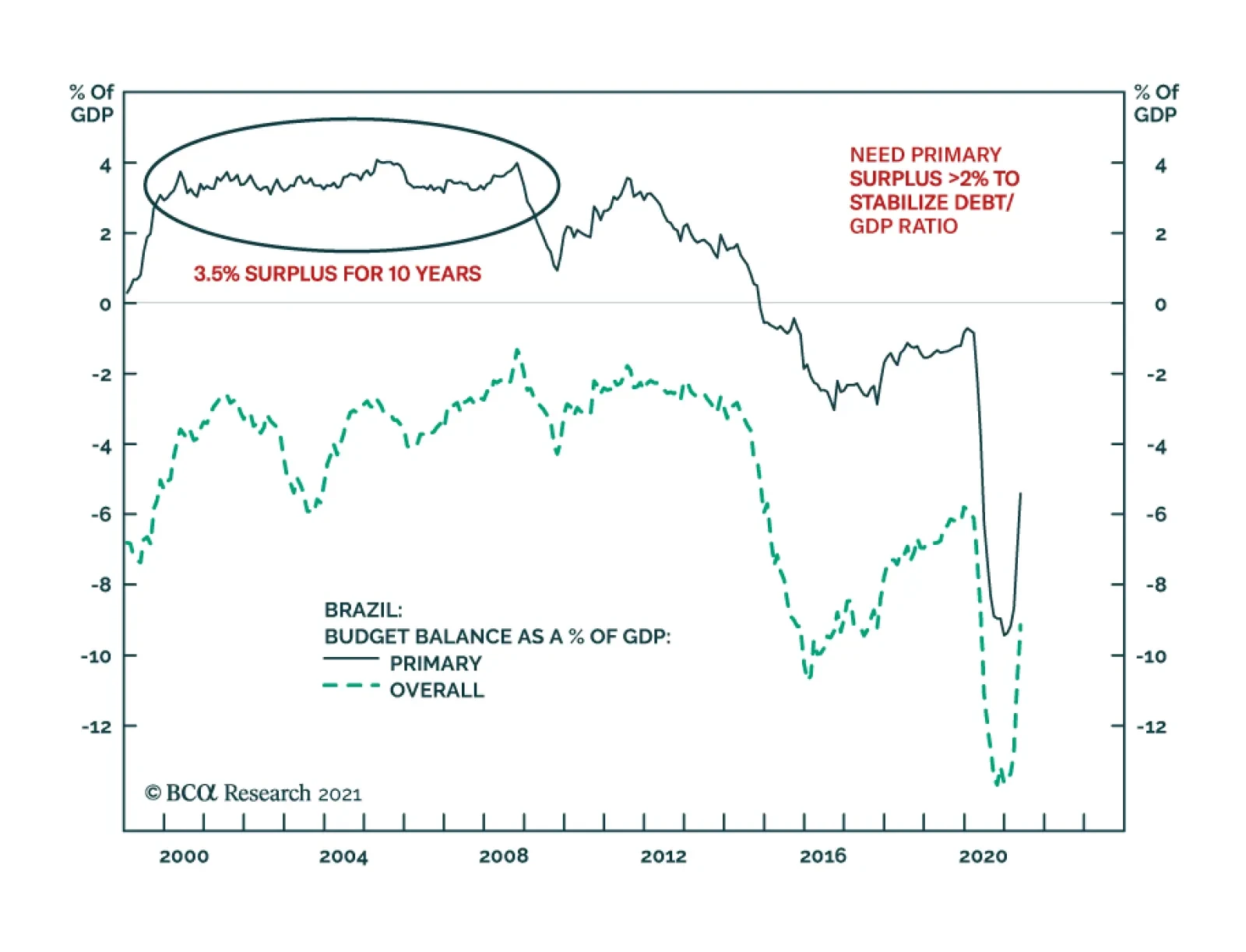
One of the structural challenges Brazil faces is its public debt overhang. The authorities have responded by periodically embarking on fiscal and monetary austerity. Yet, such austerity depresses nominal growth and has in fact worsened public debt dynamics. …
Highlights Our sense remains that the dollar is undergoing a countertrend bounce, rather than entering a new bull market. The litmus test for this view is if the DXY fails to break above the 93-94 level that marked the March highs. Stay short USD/JPY. The drop in global bond yields should give this trade a welcome fillip. Short GBP/JPY positions also make sense. We are long CHF/NZD as a play on a potential increase in currency volatility. Look to rebuy a basket of Scandinavian currencies versus the USD and EUR at a trigger point of -2% from today’s levels. Remain long silver both in absolute terms and relative to gold. Our limit buy on EUR/USD was triggered at 1.18. Place tight stops given the potential for the dollar rally to continue for the next few weeks. We also believe the change in the ECB’s framework portends another bullish tailwind for the euro beyond the near term. Feature In our webcast last week, we made the case that the recent FOMC meeting (perceived as hawkish by market participants) has not altered the longer-term downtrend in the US dollar. This week, we are revisiting some of the sentiment and technical indicators that could help gauge how high the dollar can rise in the interim. Our view remains that three fundamental forces will continue to dictate currency market trends into the year end and beyond. First, the Federal Reserve will lag other central banks in raising rates amidst a shift in economic momentum from the US towards the rest of the world. This will boost short-term interest rates outside the US and provide a floor for procyclical currencies. Second, US inflation will prove stickier compared to other countries such as the eurozone or Japan. This will depress real interest rates in the US relative to the rest of the world, and curb bond inflows. And finally, an equity market rotation towards non-US stocks will improve flows into cyclical currencies. The transition could prove volatile in the coming month or so. Equity markets remain overbought, bond yields are falling, PMIs have stopped rising, and cyclical stocks are lagging growth stocks. More widespread infection from the Delta variant of Covid-19 will continue to reprice risk to the downside. As a countercyclical currency, the dollar will be a critical variable to watch. Sentiment and technical indicators make up an important component of our currency framework and are usually good at gauging significant shifts in financial markets. Our sense remains that the dollar is undergoing a countertrend bounce, rather than entering a new bull market. The litmus test for this view is if the DXY fails to break above the 93-94 level that marked the March highs. Momentum Indicators Our momentum indicators suggest that while the dollar is very oversold, the bear market remains very much intact. The dollar advance/decline line is sitting below its 200-day moving average (Chart I-1). Historically, bull markets in the dollar have been characterized by our advance/decline line breaking both above its 200-day and 400-day moving averages. This suggests a rally towards these critical resistance levels is in play but will constitute more of a countertrend bounce. Speculators are only neutral the dollar while, admittedly, leveraged funds are very short (Chart I-2). Historically, whenever the percentage of leveraged funds that are short the dollar has dipped near 40%, a meaningful rally has ensued. There are two important offsets to this. First, as Chart I-1 suggests, the dollar is a momentum currency. As such, during the bull market of the last decade, speculators were either neutral or long the dollar. If indeed the paradigm has shifted to a decade-long bear market, we expect speculators to be either short or neutral. Meanwhile, leveraged funds are a small subset of overall open interest, suggesting they are not the elephant in the room when it comes to dictating dollar movements. Leveraged funds were short the dollar during most of the bull market run last decade. Chart I-1The US Dollar Downtrend Is Intact
The US Dollar Downtrend Is Intact
The US Dollar Downtrend Is Intact
Chart I-2Leveraged Funds Are Short The Dollar
Leveraged Funds Are Short The Dollar
Leveraged Funds Are Short The Dollar
Carry trades are relapsing anew, suggesting the environment may be becoming unfavorable for high-yielding developed and emerging market currencies. The dollar has been negatively correlated with the Deutsche Bank carry ETF, DBV, since investors ultimately dump carry trades and fly to the safety of Treasurys on any market turbulence (Chart I-3). High-beta carry currencies such as the RUB, ZAR, MXN, and BRL have been consolidating recent gains. These currencies are usually good at sniffing out a change in the investment landscape, specifically one becoming precarious for carry trades. Our carry index tends to do well when the yield spread between US Treasuries and the indexes’ constituents’ is low. As such, there is some more adjustment underway, but one of limited amplitude (Chart I-4). Chart I-3The Carry Trade Rally Is Relapsing
The Carry Trade Rally Is Relapsing
The Carry Trade Rally Is Relapsing
Chart I-4Carry Trades Have Hit An Air Pocket
Carry Trades Have Hit An Air Pocket
Carry Trades Have Hit An Air Pocket
Chart I-5Currency Volatility Is Very Low
Currency Volatility Is Very Low
Currency Volatility Is Very Low
Both expected and actual currency volatility are extremely depressed. Whenever currency volatility has been this low, the dollar has staged a meaningful rally. For example, the most significant episodes were the lows of 1996-1997, 2007-2008, and 2014-2015, and early 2020 (Chart I-5). Usually, low currency volatility is a sign of complacency, while higher volatility allows for a more balanced and healthy market rotation. The nature in which currency volatility adjusts higher this time around might be the same playbook as in previous episodes. The Asian crisis of the late 90s set the stage for the dollar bear market of the 2000s. The adjustment higher in the dollar during the Global Financial crisis jumpstarted the bull market the following decade. This time around, the Covid-19 crisis might have commenced a renewed dollar bear market. If this analogy is correct, then we should be selling the dollar on strength rather than buying on weakness. It is important to remember that the policy environment remains bearish for the dollar. These include deeply negative real rates, quantitative easing (which, admittedly, will soon end), generous liquidity swap lines to assuage any dollar funding pressures abroad (Chart I-6), and a global economy on the cusp of a renewed cycle. In our portfolio, we are long CHF/NZD since this cross has historically been a good hedge against rising currency volatility (Chart I-7). So is being short AUD/JPY. Being short the GBP/JPY cross might prove even more profitable, given that the UK has been a pandemic winner this year. Chart I-6The Fed Extended Its Swap Lines
The Fed Extended Its Swap Lines
The Fed Extended Its Swap Lines
Chart I-7Buy CHF/NZD As Insurance
Buy CHF/NZD As Insurance
Buy CHF/NZD As Insurance
Bottom Line: The message from our momentum indicators is that the bounce in the dollar was to be expected. We remain in the camp that believes the rally will be short-lived but are opportunistically playing what could be a more volatile environment. Equity Markets Signals A potential catalyst that could trigger further upside in the dollar is an equity market correction. Both the dollar and equities tend to be inversely correlated (Chart I-8). On this front, a few equity market indicators continue to flag that the rally in the dollar has a bit further to go. Chart I-8The Dollar And Equities Move Opposite Ways
The Dollar And Equities Move Opposite Ways
The Dollar And Equities Move Opposite Ways
Chart I-9Global Industrials Are Relapsing Anew
Global Industrials Are Relapsing Anew
Global Industrials Are Relapsing Anew
The underperformance of cyclical stocks, especially global industrials, suggests equity markets could be entering a more volatile phase (Chart I-9). The dollar tends to strengthen when cyclical stocks are underperforming defensive ones. This is because non-US equity markets have a much higher concentration of cyclical stocks in their bourses. In more general terms, non-US markets are underperforming the US, a clear sign that the marginal dollar is rotating back towards the US (Chart I-10A and I-10B). Technology stocks have also been well bid in recent weeks, on the back of lower bond yields. These are all temporary headwinds for dollar weakness. Chart I-10ANon-US Stock Markets Are Underperforming
Non-US Stock Markets Are Underperforming
Non-US Stock Markets Are Underperforming
Chart I-10BNon-US Stock Markets Are Underperforming
Non-US Stock Markets Are Underperforming
Non-US Stock Markets Are Underperforming
Chart I-11US Relative Earnings Revisions Are High, But Rolling Over
US Relative Earnings Revisions Are High, But Rolling Over
US Relative Earnings Revisions Are High, But Rolling Over
Earnings revisions continue to head higher across most markets, but US profit expectations are still higher compared to other countries (Chart I-11). Non-US bourses will need much higher earnings revisions to stimulate portfolio inflows, and for the dollar bear market to resume. On this front, both the euro area and emerging markets are showing only tentative improvement. The character of any selloff in equity markets will be worth monitoring. Cyclicals and value stocks are at historically bombed-out levels and could start to outperform high-flying stocks on any market reset. Bottom Line: Whether a correction ensues, or the bull market continues, requires a change in equity market leadership from defensives to cyclicals. This is a necessary condition for the dollar bear market to resume. Commodities, Bonds, And The Dollar Commodity and bond prices give important cues about the health of the global economy. For example, rising copper prices and rising yields are a sign that industrial activity is humming, which in turn points to accelerating global growth. As a counter-cyclical currency, the dollar usually weakens in this scenario. Rising gold prices are generally a sign that policy settings remain ultra-accommodative, which also points to a weaker dollar. At the FX strategy service, we tend to focus more on the internal dynamics of commodity and bond markets, which can provide early warning signs. Chart I-12The Copper-To-Gold Ratio Is Consolidating Gains
The Copper-To-Gold Ratio Is Consolidating Gains
The Copper-To-Gold Ratio Is Consolidating Gains
The copper-to-gold ratio is important since it indicates whether the liquidity-to-growth transmission mechanism is working. A rising ratio suggests policy settings are stimulating growth, while a falling ratio is a warning shot that the environment might be becoming deflationary. Correspondingly, this ratio has tended to track the dollar closely (Chart I-12). The copper-to-gold ratio is consolidating at very high levels. This is consistent with a healthy reset, rather than a reversal in the dollar bear market. The gold/silver ratio (GSR) tends to track the US dollar, and its recent price action also appears to be a welcome reset (Chart I-13). Like copper, silver benefits from rising industrial demand, especially in the electronics and renewable energy space. A falling GSR will be a sign that the manufacturing cycle is still humming. We are short the GSR with a target of 50, and a stop-loss at 71. The bond-to-gold ratio has bounced from very oversold levels. Both US Treasurys and gold are safe-haven assets and thus are competing assets. Remarkably, the ratio of the total return in US government bonds-to-gold prices has tracked the dollar pretty well since the end of the Bretton Woods system in the early ‘70s (Chart I-14). Gold has always been considered the perfect anti-fiat asset vis-à-vis the dollar, making the bond-to-gold ratio both a good short-term and long-term sentiment indicator. For now, the bounce in the ratio is not yet worrisome. We have noticed that inflows into US government bonds have risen sharply, while those into gold are falling. This should soon reverse with the fall in US rates, and the correction in gold prices. Chart I-13The Gold-To-Silver Ratio Is Consolidating Losses
The Gold-To-Silver Ratio Is Consolidating Losses
The Gold-To-Silver Ratio Is Consolidating Losses
Chart I-14Competing Assets And The Dollar
Competing Assets And The Dollar
Competing Assets And The Dollar
Bottom Line: The US is ultimately generating the most inflation in the G10, which is dampening real rates, and should curtail investor enthusiasm for gold relative to US Treasurys. The underperformance of Treasurys relative to gold will be a bearish development for the dollar. A Final Word On The Euro The strategic review from the European Central Bank had three key changes. The ECB now has a symmetric 2% inflation target. This is not a game changer, since it brings it in line with other global central banks, including the Bank of Japan. House prices will meaningfully begin to impact monetary policy, as the committee eventually includes owner’s equivalent rent (OER) in the HICP index (the ECB’s preferred inflation measure) for the euro area. This could be a game changer for the ECB’s price objective. Climate change was reiterated as important for price stability. Financial stability was also repeated as an important objective. As FX strategists, the second change was the most important. Shelter constitutes 17.7% of the euro area CPI basket, but it is 32.9% of the US CPI basket (Table I-1). Meanwhile, the shelter component of both the CPI basket in the US and euro area have tracked each other (Chart I-15). Table I-1Euro Area CPI Weights
An Update On Dollar Sentiment And Technical Indicators
An Update On Dollar Sentiment And Technical Indicators
Chart I-15What Will Happen To Eurozone Inflation?
What Will Happen To Eurozone Inflation?
What Will Happen To Eurozone Inflation?
An adjustment in the weight of the shelter component in the euro area will boost the European CPI relative to the US and could trigger a major policy shift from the ECB in the coming years. This will especially be the in case if the current environment generates an inflationary shock. Bottom Line: The ECB will stay very accommodative in the next 1-2 years, but the change in its mandate could portend a bullish tailwind for the euro beyond the near term. Investment Implications We expect the current dollar rebound to be short-lived. As such, our strategy is as follows: Stay long other safe-haven currencies. Our preferred vehicle is the Japanese yen, which sports an attractive real rate relative to the US. Investors can also short GBP/JPY from current levels. Chart I-16The Euro, Yen And Real Rates
The Euro, Yen And Real Rates
The Euro, Yen And Real Rates
Our limit-buy on EUR/USD was triggered at 1.18. Given our expectation that the dollar could rally in the near term, we are setting the stop-loss at the same level. However, the improvement in real rates in the euro area relative to the US could cushion any downside (Chart I-16). We are also long CHF/NZD, as a bet on rising currency volatility. Correspondingly, we are setting a limit buy on Scandinavian currencies relative to the euro and USD at a trigger level of -2%. Both gold and silver benefit from the current environment, but we prefer silver to gold, due to the former’s call option on continued improvement in global growth. We are short the gold/silver ratio from the 68 level. Overall, we expect the dollar to weaken towards the end of the year, as has been the case since the 1970s (Chart I-17). Chart I-17The Yen And Swiss Franc Are Usually Winners In H2
An Update On Dollar Sentiment And Technical Indicators
An Update On Dollar Sentiment And Technical Indicators
Chester Ntonifor Foreign Exchange Strategist chestern@bcaresearch.com Currencies US Dollar USD Technicals 1
USD Technicals 1
USD Technicals 1
USD Technicals 2
USD Technicals 2
USD Technicals 2
The recent data out of the US have been robust: June non-farm payrolls showed an increase of 850K jobs, versus expectations of a 700K increase. The unemployment rate was relatively flat at 5.9% in June. Factory orders came in at 1.7% year-on-year in May, in line with expectations. The US dollar DXY index is relatively flat this week, but with tremendous volatility. It was a relatively quiet week in the US, due to Independence Day, but the key theme remained a drop in US yields, with the 10-year yield moving from a high of near 1.8% this year to 1.3% currently. This move has catalyzed rallies in lower beta currencies, such as the yen and Swiss franc. The FOMC minutes released this week continue to suggest a Fed that will remain very patient in both tapering asset purchases and lifting interest rates. Report Links: Arbitrating Between Dollar Bulls And Bears - March 19, 2021 The Dollar Bull Case Will Soon Fade - March 5, 2021 Are Rising Bond Yields Bullish For The Dollar? - February 19, 2021 The Euro EUR Technicals 1
EUR Technicals 1
EUR Technicals 1
EUR Technicals 2
EUR Technicals 2
EUR Technicals 2
Recent data from the euro area were mixed: The PPI print for May came in at 9.6%, in line with expectations. Both the services and composite PMI were revised higher by 0.3 in June. At 59.2, the composite PMI is the highest in over a decade. ZEW expectations for the euro area fell sharply from 81.3 to 61.2. In Germany, there was a big decline in automotive surveys. The euro was flat this week against the dollar, despite gains overnight. The big news was the change in the ECB’s monetary policy objectives, which we discussed briefly in the front section of this report. The euro rallied on the news of three fundamental drivers in our view – real rate differentials are improving in favor of Europe, the ECB’s consideration for house price inflation could allow its price stability objective to be achieved sooner, and consideration for financial stability will be less favorable for negative interest rates. Report Links: Relative Growth, The Euro, And The Loonie - April 16, 2021 The Euro Dance: One Step Back, Two Steps Forward - April 2, 2021 On Japanese Inflation And The Yen - January 29, 2021 The Yen JPY Technicals 1
JPY Technicals 1
JPY Technicals 1
JPY Technicals 2
JPY Technicals 2
JPY Technicals 2
Recent data from Japan remains subpar, but is improving: Labor cash earnings rose 1.9% in May, in line with expectations. Household spending rose 11.6% in May, in line with expectations. The Eco Watchers Survey for June came in at 47.6 from a May reading of 38.1. The outlook component rose from 47.6 to 52.4. The yen was up by 1.6% against the USD this week, the best performer. We argued a month ago that the yen is the most underappreciated G10 currency today. The catalyst that triggered yen gains were a drop in US real rates, that favored other safe-haven currencies. Going forward, further yen gains should materialize on the back of Japan successfully overcoming the pandemic like its Western counterparts. Report Links: The Case For Japan - June 11, 2021 The Dollar Bull Case Will Soon Fade - March 5, 2021 On Japanese Inflation And The Yen - January 29, 2021 British Pound GBP Technicals 1
GBP Technicals 1
GBP Technicals 1
GBP Technicals 2
GBP Technicals 2
GBP Technicals 2
There was scant data out of the UK this week: The construction PMI rose from 64.2 to 66.3 in June. House prices remain robust, with the RICS house price balance printing an elevated 83% in June. The pound was flat this week against the USD. The new delta variant of the COVID-19 virus is gaining momentum in the UK and will likely erode some of the dividends GBP had priced in from a fast vaccine rollout. As such, short GBP positions may pay off in the near term. Shorting GBP/CHF could be an attractive near-term hedge. Report Links: Why Are UK Interest Rates Still So Low? - March 10, 2021 Portfolio And Model Review - February 5, 2021 Thoughts On The British Pound - December 18, 2020 Australian Dollar AUD Technicals 1
AUD Technicals 1
AUD Technicals 1
AUD Technicals 2
AUD Technicals 2
AUD Technicals 2
There was scant data out of Australia this week: The Melbourne Institute of Inflation survey came it at 3% year on year in June, from 3.3%. The RBA kept interest rates unchanged at 0.1%, reiterating its commitment to stay accommodative until inflation and wages pick up meaningfully. The AUD was down by 0.4% this week against the USD. The RBA is decisively lagging other central banks in communicating less monetary accommodation in the coming years. This will create a coiled spring response for the AUD, because the RBA will have to eventually play catchup as the global economic cycle gains momentum. Report Links: The Dollar Bull Case Will Soon Fade - March 5, 2021 Portfolio And Model Review - February 5, 2021 Australia: Regime Change For Bond Yields & The Currency? - January 20, 2021 New Zealand Dollar NZD Technicals 1
NZD Technicals 1
NZD Technicals 1
NZD Technicals 2
NZD Technicals 2
NZD Technicals 2
The was scant data out of New Zealand this week: ANZ commodity price index rose by 0.8% in June. The NZD was down 0.3% against the dollar this week. Our long CHF/NZD position paid off handsomely in this environment. We recommend holding onto this trade, as a reset in global rates hurts the hawkish pricing in the NZD forward curve. Report Links: How High Can The Kiwi Rise? - April 30, 2021 Portfolio And Model Review - February 5, 2021 Currencies And The Value-Versus-Growth Debate - July 10, 2020 Canadian Dollar CAD Technicals 1
CAD Technicals 1
CAD Technicals 1
CAD Technicals 2
CAD Technicals 2
CAD Technicals 2
Canadian data softened but remained robust: Building permits fell by 14.8% month on month in May. The Markit manufacturing PMI fell from 57 to 56.5 in June. The Canadian trade balance deteriorated from C$0.6bn to a deficit of -C$1.4bn in May. Business Outlook Survey indicator hit the highest level on record. As the Bank of Canada put it, improving business sentiment is broadening. The CAD fell by 0.8% against USD this week. The results of the BoC survey highlight that a reopening phase is categorically bullish for economic activity in general and financial prices. Until recently, the CAD was one of the best performing currencies in the G10. This is a sea change from a country that was previously a laggard in vaccination efforts. CAD should hold up well once the dollar rally fades, but other currency laggards such as SEK and JPY could do even better. Report Links: Relative Growth, The Euro, And The Loonie - April 16, 2021 Will The Canadian Recovery Lead Or Lag The Global Cycle? - February 12, 2021 The Outlook For The Canadian Dollar - October 9, 2020 Swiss Franc CHF Technicals 1
CHF Technicals 1
CHF Technicals 1
CHF Technicals 2
CHF Technicals 2
CHF Technicals 2
The was scant data out of Switzerland this week: The unemployment rate was near unchanged at 3.1% in June, from 3.0%. Total sight deposits were unchanged at CHF 712 bn on the week of July 2. The Swiss franc was up by 1.1% this week against the USD. Falling yields improved the relative appeal of the franc that has bombed out interest rates. The franc is also benefiting from the rising bout of volatility as a safe-haven currency. On this basis, we are long CHF/NZD cross, which performed well this week. Report Links: An Update On The Swiss Franc - April 9, 2021 Portfolio And Model Review - February 5, 2021 The Dollar Conundrum And Protection - November 6, 2020 Norwegian Krone NOK Technicals 1
NOK Technicals 1
NOK Technicals 1
NOK Technicals 2
NOK Technicals 2
NOK Technicals 2
Data out of Norway is improving: The unemployment rate fell from 3.3% to 2.9% in July. Industrial production growth came in at 2.1% year-on-year in May. Mainland GDP rose by 1.8% month on month in May. The NOK was down by 1.8% this week against the dollar, the worst performing G10 currency. The NOK is bearing the brunt of a reset in the US dollar, but our bias is that we are nearing a buy zone. NOK is cheap, would benefit from high oil prices and the economy is on the mend. We are looking to sell EUR/NOK and USD/NOK on further strength. Report Links: The Norwegian Method - June 4, 2021 Portfolio And Model Review - February 5, 2021 Revisiting Our High-Conviction Trades - September 11, 2020 Swedish Krona SEK Technicals 1
SEK Technicals 1
SEK Technicals 1
SEK Technicals 2
SEK Technicals 2
SEK Technicals 2
Recent data from Sweden have been mildly positive: The Swedbank/Silf composite PMI fell from 70.2 to 66.9 in June. Industrial production came in at 24.4% year on year in May, after a rise of 26.4% in April. Household consumption jumped 8.8% year on year in April. The SEK was also up this week against the USD. Bombed-out interest rates in Sweden have also improved the appeal of the franc, given falling global bond yields. Meanwhile, the SEK remains one of the cheapest currencies in our models. Report Links: Revisiting Our High-Conviction Trades - September 11, 2020 More On Competitive Devaluations, The CAD And The SEK - May 1, 2020 Sweden Beyond The Pandemic: Poised To Re-leverage - March 19, 2020 Trades & Forecasts Forecast Summary Core Portfolio Tactical Trades Limit Orders Closed Trades
The ECB unveiled the results of its strategic review yesterday, with some noteworthy tweaks to the policy framework. The central bank shifted to a symmetric inflation target of 2%, a change from the prior goal of aiming for inflation “just below” 2%.…
In their Q2/2021 model bond portfolio performance review, BCA Research’s Global Fixed Income Strategy team updated their recommended positioning for the next six months. Firstly, the team changed its US Treasury curve exposure to have more of a flattening…
Highlights Economy – The endpoint of easier-for-longer monetary policy may be coming into view: Elevated inflation readings and discomfort among more hawkish FOMC members may signal that a monetary policy inflection is on the way. Markets – Volatility should pick up as investors reprice financial assets to reflect the end of emergency accommodation: The rumblings in bond, currency and precious metals markets that followed the June FOMC meeting are likely to spread as investors pull their liftoff date expectations forward. Strategy – Maintain below-benchmark duration positioning and ensure that portfolios can withstand increased volatility: Don’t be lulled to sleep by the 10-year Treasury yield’s backing and filling or by the VIX’s foray into the low teens. It is a more auspicious time to be buying insurance than selling it. Feature After fourteen years, investors may be weary of focusing so much attention on the Fed, but there’s been no avoiding its impact since the global financial crisis (GFC) emerged. Zero interest rate policy (ZIRP), large-scale asset purchases and other emergency measures have exerted a strong pull on financial markets as they have been switched on and off. The extended turn of rushing to the rescue appears to be weighing on the Fed as well. Last August’s revisions to its Statement on Longer-Run Goals and Monetary Policy Strategy explicitly acknowledged the challenges of operating in a ZIRP world in which its ability to deploy its primary tool for countering economic weakness – cutting the fed funds rate – is constrained by the zero lower bound. The Fed responded by adjusting its approach to each element of its dual mandate. It adopted an average-inflation-targeting framework that seeks to remediate past inflation shortfalls and indicated that it would only intervene to mitigate shortfalls from its maximum employment estimate. The latter move marked a break with the previous four decades, when the Fed, unwilling to give inflation pressures a chance to take root, proactively tightened policy when it judged that the labor market might be getting too strong. Taken together, the changes amounted to a significant break from doing whatever it took to keep inflation from gaining a foothold to making sure it didn’t completely vanish from households’, businesses’ and investors’ consciousness. If the changes were implemented as outlined, the effects could be wide-ranging. Inflation would be able to gain more traction, all else equal, leading to higher bond yields as markets anticipated that a higher terminal fed funds rate would be required to bring it to heel. A higher terminal fed funds rate might lead to a deeper economic slowdown, ushering in lower bond yields than otherwise would have prevailed. By inducing higher highs and lower lows in Treasury yields, the revisions to the Fed’s framework could promote increased financial market volatility, depending on FOMC members’ ongoing commitment to them and the way that commitment interacted with investors’ expectations. Although the revised framework is eleven months old, it is freshly relevant as the interaction between its implementation and investors’ expectations may be approaching an inflection point. When the FOMC announced the framework revisions last August, it didn’t have any immediate monetary policy implications and investors and committee members could reasonably have figured they would cross the new-framework bridge when they came to it. Elevated inflation readings and some differences in views within the FOMC suggest the bridge might now have to be crossed soon enough to fit within most institutional investors’ time horizons. Volatility may well rise as markets attempt to reprice assets against the backdrop of a novel monetary policy approach. End Of An Era The aforementioned changes that the FOMC made to its monetary policy strategy represented a watershed moment for US monetary policy. Beginning with Paul Volcker’s tenure as Fed chair near the end of the high-inflation ‘70s, the Fed has kept a sharp lookout for inflation pressures (Chart 1). Though it only introduced an annual inflation target in the aftermath of the GFC, its one-way view of inflation was well established. Signs that it might be emerging could be grounds for tighter monetary conditions while dormant readings were nothing to worry about. Chart 1Upholding Volcker's Mantle
Upholding Volcker's Mantle
Upholding Volcker's Mantle
The average inflation target indicates that inflation shortfalls will henceforth be as much of a concern as inflation overshoots and the Fed will attempt to remediate them with an eye towards keeping inflation expectations from slipping below 2%. On the other hand, the new framework shifts from a two-way to a one-way perspective on employment. Where the committee had previously attempted to conduct policy in a way that mitigated any deviations from its maximum-employment assessment, the new framework seeks only to mitigate shortfalls. Citing the post-crisis experience, when inflation remained in check despite a half-century low in the unemployment rate, and a desire to see expansion gains spread more widely across households, Chair Powell has repeatedly emphasized that too much employment is not a concern. Easier Said Than Done When the Fed announced the changes to its approach, we noted that they would be significant for investors provided it were to follow through on them. It is one thing to promise wide-reaching changes in the indefinite future but quite another to execute them in real time under duress. Financial markets seemed to be aware that turning on a dime would be easier said than done and did not bother to adjust their fed funds rate expectations (Chart 2) or reprice assets that might be most affected by the new policy framework. Among investors with a time frame of a year or less, the talk was all theoretical, anyway – of course policy was going to remain extremely easy when the US and the rest of the world were still knee-deep in a once-in-a-century pandemic and the development of an effective vaccine was a ways off. Chart 2Until Recently, Markets Saw Little Chance Of Rate Hikes On A Two-Year Horizon
Until Recently, Markets Saw Little Chance Of Rate Hikes On A Two-Year Horizon
Until Recently, Markets Saw Little Chance Of Rate Hikes On A Two-Year Horizon
In other words, talk was cheap when the FOMC unveiled its new framework. Its plans would only matter once the pandemic’s grip eased and central banks regained some discretion. The committee’s resolve to adhere to the new framework would only be tested in the face of uncomfortably high inflation prints and/or inflation expectations that threatened to anchor at levels above its target range. Investors wouldn’t bother to reprice financial assets in line with the new framework until they were certain it would apply. Inoculating Against Deflation As it turned out, effective vaccines appeared on the horizon sooner than anticipated. Pfizer and BioNTech announced the enormously encouraging results from their vaccine’s Phase III trials before the New York open on November 9th, and the Moderna vaccine’s similar clinical successes followed shortly thereafter. Vaccine distribution would begin in January, and the long end of the Treasury curve would begin to reprice, nudged along by rising inflation expectations. Agita sparked by March CPI data caused expectations to peak ahead of the April release, and 10-year breakevens briefly edged above the levels consistent with the Fed’s goals (Chart 3, top panel). Chart 3Coloring Within The Lines
Coloring Within The Lines
Coloring Within The Lines
Chart 4Unsustainable Outliers
Unsustainable Outliers
Unsustainable Outliers
We share the view of most mainstream economists that the upside surprises in the March and April inflation prints resulted from transitory reopening factors and do not mark an inflection point. Increases in used car prices will slow once rental car companies rebuild their fleets to match burgeoning demand and new car production can resume at its intended pace, lumber prices will continue to ease as sawmills ramp up operations to capture outsized profits, and the pace of increases in airfares will settle down once staffing bottlenecks can be resolved and more flights can be added to meet resurgent demand (Chart 4). Easier For How Much Longer? Markets’ collective shrug upon the release of the revisions to the Fed’s monetary policy framework reflected the view that they did not amount to a meaningful change over most investors’ time horizons. The second wave of COVID-19 infections had peaked a month before, but at least one other was likely in store as students returned to college campuses, and a vaccine was not yet on the horizon. According to Good Judgment’s professional superforecasters, there was roughly an equal 40% probability that 25 million vaccine doses would be available for distribution in the US between October 1st, 2020 and March 31st, 2021 or between April 1st and September 30th, 2021 (Chart 5). The more optimistic estimate turned out to be right, albeit not quite optimistic enough: nearly 25 million doses were administered by the end of February and nearly 50 million by the March 31/April 1 midpoint of the two periods (Chart 6). Chart 5Vaccine Development And Distribution Wound Up Beating August's Expectations ...
Transitioning Away From Auto-Pilot
Transitioning Away From Auto-Pilot
Chart 6... By A Considerable Margin
... By A Considerable Margin
... By A Considerable Margin
The vaccine outlook was relevant because it was hard to envision any incremental tightening of monetary policy while the country was still in the throes of the pandemic. Treasury yields at the longer end of the curve weren’t likely to go anywhere in the absence of increases in the fed funds rate (Chart 7) or increases in inflation or real growth expectations. Just as a still-raging virus was likely to keep the FOMC from hiking rates, it would also put a lid on inflation pressures and economic growth. With economic activity sharply limited by social distancing mandates and individuals’ innate reluctance to risk exposure, it was certain that capacity would continue to surpass aggregate demand. Chart 7Treasury Yields Move With Fed Funds Expectations
Treasury Yields Move With Fed Funds Expectations
Treasury Yields Move With Fed Funds Expectations
To the extent investors thought about the FOMC’s new framework when it was unveiled, they seem to have taken it as confirmation that monetary policy would remain easier for longer, consistent with the theme that has prevailed since the Bernanke Fed led the charge to counter the GFC. Treasury yields were subdued even after the vaccine news broke in November (Chart 8, top panel), and with the interest rate structure remaining quiet, there was no major repricing in other rate-sensitive markets. Gold, which might have been expected to benefit from more accommodative policy, slipped nearly 15%, from the mid-$1,900s to the high $1,600s, between the release of the new framework and its March trough. After retracing half of its post-August decline, it shed a fresh 5% following the FOMC’s June meeting (Chart 8, second panel). Chart 8Growth Prospects, Not Fed Prospects
Growth Prospects, Not Fed Prospects
Growth Prospects, Not Fed Prospects
Commodity currencies had added 10% versus the US dollar before ceding half of those gains in the wake of the June FOMC meeting, but their rally appears to have been driven by the increased global growth expectations that followed the positive vaccine news as they went nowhere in September and October (Chart 8, third panel). Similarly, the DXY Index had taken its post-revision cue from global growth prospects, moving inversely with pandemic news (rising when bad, falling when good), before rallying after the June meeting (Chart 8, bottom panel). The rise in measured inflation has encouraged some committee members to bring forward their anticipated liftoff dates and accelerate their individual dot plots, as disclosed last month. Now that the Fed no longer seems to be of one mind on the easier-for-longer path, investors have begun to reassess the scene. Prices are moving as capital reportedly exits pro-inflation positions and the money markets now call for two-and-a-half rate hikes by mid-2023 (Chart 2). More volatility could be in store amidst a shift in the Fed consensus as markets pull forward or push back their expected liftoff date and the expected pace of hikes speeds up or slows down. Investment Implications With the moves in measured inflation and inflation expectations seeming to have met the FOMC’s first two criteria for hiking rates (Table 1), a return to full employment looms as the final hurdle to liftoff. We reiterate our view that hiring progress is the swing factor that investors should be watching to anticipate the coming shift in monetary policy settings. Net payrolls expanded by 850,000 in June, topping estimates and putting the three-month moving average, 567,000, ahead of the 375-485,000 pace required to return the economy to full employment by the second half of 2022.1 That may sound like an overly ambitious target on its face, but we contend that annualized monthly payroll expansion of 4% for fourteen months or 3.1% for eighteen months is attainable given the magnitude of the pandemic job losses (Chart 9). Table 1A Checklist For Liftoff
Transitioning Away From Auto-Pilot
Transitioning Away From Auto-Pilot
Chart 9A 2H22 Return To Full Employment Is Entirely Possible
A 2H22 Return To Full Employment Is Entirely Possible
A 2H22 Return To Full Employment Is Entirely Possible
Our outlook for sustained net payroll expansion remains near the optimistic end of the expectations continuum, though the money market consensus has lately caught up with our sometime-before-the-end-of-2022 liftoff date view (Chart 10). Given that we expect that the yield curve will steepen as the hiring strength shows itself, we advise maintaining below-benchmark duration in Treasury portfolios. The optimism embedded in our hiring view implies robust growth over the next twelve months and we therefore recommend overweighting spread product within fixed income portfolios via a high-yield overweight, and overweighting equities within multi-asset portfolios. Hot growth will eventually induce the Fed to start pumping the monetary brakes, slowing the economy and investment returns, but the twelve-month outlook remains favorable for risk assets. Chart 10Looking For At Least One Hike By The End Of 2022
Looking For At Least One Hike By The End Of 2022
Looking For At Least One Hike By The End Of 2022
Doug Peta, CFA Chief US Investment Strategist dougp@bcaresearch.com Footnotes 1 Making the simplifying (and overly conservative) assumption that returning to full employment will require recovering February 2020’s level of nonfarm payrolls, the US is currently short 6.8 million jobs. Regaining those jobs by August 2022 (14 months from now) will require a monthly average of 485,000 net job gains; regaining them by December 2022 (18 months hence) will require a 375,000 monthly average.
Dear Client, We are sending you our Strategy Outlook today, where we outline our thoughts on the macro landscape and the direction of financial markets for the rest of 2021 and beyond. Next week, please join me for a webcast on Thursday, July 8 at 10:00 AM EDT (3:00 PM BST, 4:00 PM CEST, 10:00 PM HKT) where I will discuss the outlook. Best regards, Peter Berezin, Chief Global Strategist Highlights Macroeconomic Outlook: Global growth is peaking but will remain solidly above trend. While the proliferation of the Delta strain is likely to trigger another wave of Covid cases this summer, the economic impact will be far smaller than during past waves. Global Asset Allocation: The risk-reward profile for stocks has deteriorated since the start of the year. Nevertheless, with few signs that the global economy is heading towards another major downturn, investors should maintain a modest equity overweight on a 12-month horizon. Equities: Favor cyclicals, value-oriented, and non-US equities. Emerging markets should spring back to life in the autumn once vaccine supplies increase and Chinese fiscal policy turns more stimulative. Fixed Income: Maintain below average interest-rate duration exposure. The 10-year US Treasury yield will finish the year at 1.9%. Spread product will continue to outperform high quality government bonds. Currencies: The US dollar will resume its weakening trend as growth momentum rotates from the US to the rest of the world. EUR/USD will finish the year at 1.25. Commodities: Brent will rise to $79/bbl by end-2021, 9% above current market expectations. While the lagged effects from the slowdown in Chinese credit growth earlier this year will weigh on base metals during the summer months, the long-term outlook for metals is positive. Favor gold over cryptos as an inflation hedge. I. Macroeconomic Outlook Global Vaccination Campaign Kicks Into High Gear Nearly 18 months after the pandemic began, the global economy is on the mend. In its latest round of forecasts released on May 31st, the OECD projects that the global economy will expand by 5.8% this year, up from its March projection of 5.6%. The OECD also bumped up its growth forecast for 2022 from 4% to 4.4%. After a rough start, the vaccination campaign is progressing well in most advanced economies (Chart 1). The US and the UK were the first major developed economies to roll out the vaccines, followed by Canada and the EU. While Japan has lagged behind, the pace of vaccinations has picked up lately. Twenty percent of the Japanese population has now received at least one dose. Developing economies are still struggling to secure enough vaccines. Fortunately, this problem should abate over the next six months. The Global Health Innovation Center at Duke University estimates that pharmaceutical companies are on track to produce more than 10 billion vaccine doses this year (Chart 2). While perhaps not enough to inoculate everyone who wants a jab, it will suffice in providing protection to the most vulnerable members of society – the elderly and those with pre-existing medical conditions. Chart 1The Vaccination Campaign Is Progressing Well In Most Developed Economies
The Vaccination Campaign Is Progressing Well In Most Developed Economies
The Vaccination Campaign Is Progressing Well In Most Developed Economies
Chart 2Vaccine Makers Are On Track To Produce Over 10 Billion Doses In 2021
2021 Third Quarter Strategy Outlook: The Path To Normal
2021 Third Quarter Strategy Outlook: The Path To Normal
New Variants And Vaccine Hesitancy Are Risks Novel strains of the virus remain a concern. First identified in India, the so-called “Delta variant” is spreading around the world. The number of new cases in the UK, where the Delta variant accounts for over 90% of all new infections, is rising again (Chart 3). The latest outbreak has forced the government to postpone “Freedom Day” from June 21st to July 19th (Chart 4). Chart 3The Number Of New Cases In The UK Is Rising Anew
2021 Third Quarter Strategy Outlook: The Path To Normal
2021 Third Quarter Strategy Outlook: The Path To Normal
Chart 4Dismantling Of Lockdown Measures Occurring At Varying Pace
2021 Third Quarter Strategy Outlook: The Path To Normal
2021 Third Quarter Strategy Outlook: The Path To Normal
It is highly likely that the Delta variant will produce another wave of cases in the US this summer. Despite ample availability, one-third of Americans over the age of 18 have yet to receive a single dose of a vaccine. As is the case with most everything in the United States, the question of whether to be inoculated has become politicized. In many Republican-leaning states, more than half the population remains unvaccinated (Chart 5). Chart 5The US Politicization Of Vaccines Raises The Risk From COVID-19 Variants
2021 Third Quarter Strategy Outlook: The Path To Normal
2021 Third Quarter Strategy Outlook: The Path To Normal
Vaccine hesitancy will likely diminish as the evidence of their effectiveness continues to mount. According to analysis by the Associated Press using CDC data, fully vaccinated people accounted for less than 1% of the 18,000 COVID-19 deaths in the US in May. A study out of the UK showed that two doses of the Pfizer-BioNTech vaccine was 96% effective against hospitalization from the Delta variant, while the Oxford-AstraZeneca vaccine was 92% effective. While another wave of the pandemic will curb growth this summer, the economic impact will be far smaller than in the past. At this point, the initial terror of the pandemic has faded. Politically, it will be more difficult to justify lockdowns in countries such as the US where almost everyone who wants a vaccine has already been able to get one. Macro Policy Outlook: Tighter But Not Tight After cranking the fire hose to full blast during the pandemic, policymakers are looking to scale back support. On the fiscal side, governments are slowly starting to rein in budget deficits. The IMF expects the fiscal impulse in advanced economies to average -4% of GDP in 2022, implying an incrementally tighter fiscal stance (Chart 6). Chart 6Budget Deficits Set To Decline, But Remain High By Historic Standards
2021 Third Quarter Strategy Outlook: The Path To Normal
2021 Third Quarter Strategy Outlook: The Path To Normal
Tighter does not necessarily mean tight, however. The IMF sees advanced economies running an average cyclically-adjusted primary budget deficit of 2.6% of GDP between 2022 and 2026, compared to an average deficit of 1.1% of GDP between 2014 and 2019. In the US, Congress is debating an infrastructure bill, a key element of President Biden’s “Build Back Better” agenda. If the bill fails to move out of the Senate, our geopolitical strategists expect Congress to use the reconciliation process to pass most of Biden’s legislative program. This should result in an additional 1.3% of GDP in federal spending per year over the next 8 years, offset only partly by higher taxes. Chart 7EU Fiscal Policy: Allocations To Southern European Countries Are Relatively Large
EU Fiscal Policy: Allocations To Southern European Countries Are Relatively Large
EU Fiscal Policy: Allocations To Southern European Countries Are Relatively Large
Chart 8Japanese PMIs Stuck In The Mud
Japanese PMIs Stuck In The Mud
Japanese PMIs Stuck In The Mud
In the euro area, the IMF expects fiscal policy to remain structurally looser by nearly 2% of GDP in the post-pandemic period. After six months of parliamentary debates, all 27 EU countries ratified the €750 billion Next Generation fund on May 28th. The allocations from the fund for southern European countries are relatively large (Chart 7). Most of the money will be spent on public investment projects with high fiscal multipliers. Japan has a habit of tightening fiscal policy at exactly the wrong moment, with the October 2019 hike in the sales tax from 8% to 10% being no exception. Unlike in other developed economies, both the Japanese manufacturing and services PMI remain stuck in the mud (Chart 8). The odds are rising that Prime Minister Yoshihide Suga will announce a major stimulus package after the Olympic Games and ahead of the general election due by October 22nd. China: Normalization Not Deleveraging Chart 9China: Weak Infrastructure Spending Should Pick Up
China: Weak Infrastructure Spending Should Pick Up
China: Weak Infrastructure Spending Should Pick Up
In China, strong export growth, propelled by the shift in global spending towards manufactured goods during the pandemic, allowed the government to tighten fiscal policy modestly in the first half of the year. Looking out, fiscal policy should turn more stimulative. Local governments used only 16% of their bond issuance allocation between January and May, compared with 59% over the same period last year and 40% in 2019. Proceeds should benefit infrastructure spending, which has been on the weak side in recent years (Chart 9). After a sharp decline, Chinese credit growth should stabilize in the second half of the year. The current pace of credit growth of 11% is near its 2018 lows and is broadly in line with nominal GDP growth (Chart 10). Given that the authorities have stated their desire to stabilize the ratio of credit-to-GDP, they are unlikely to proactively suppress credit growth further. The recent decline in the 3-month SHIBOR, which usually moves in the opposite direction of credit growth, is evidence to this effect (Chart 11). Chart 10Chinese Credit Growth Should Stabilize In The Second Half Of The Year
Chinese Credit Growth Should Stabilize In The Second Half Of The Year
Chinese Credit Growth Should Stabilize In The Second Half Of The Year
Chart 11China: Easing Off The Brakes?
China: Easing Off The Brakes?
China: Easing Off The Brakes?
Nevertheless, changes in fiscal and credit policy tend to affect the Chinese economy with a lag (Chart 12). Thus, the tightening in fiscal policy and the deceleration in credit growth that occurred early this year could still weigh on economic activity during the summer months. Chart 12China: Changes In Fiscal And Credit Policy Affect The Economy With A Lag
China: Changes In Fiscal And Credit Policy Affect The Economy With A Lag
China: Changes In Fiscal And Credit Policy Affect The Economy With A Lag
Don’t Sweat The Dot Plot Markets interpreted the June FOMC meeting in a hawkish light. Both the 2-year and 5-year yield jumped 10 basis points following the meeting (Table 1). The US dollar, which is quite sensitive to changes in short-term rate expectations, strengthened by nearly 2%. In contrast, long-term bond yields declined following the meeting, with the 10-year and 30-year bond yield falling by 6 and 19 basis points, respectively. Table 1Change In Yields Following June FOMC Meeting
2021 Third Quarter Strategy Outlook: The Path To Normal
2021 Third Quarter Strategy Outlook: The Path To Normal
As long duration assets, stocks take their cues more from long-term yields than short-term rates. Hence, it was not surprising that equities held their ground, and that growth stocks reversed some of their underperformance against value stocks this year. Chart 13Markets Interpreted The June FOMC Meeting In A Hawkish Light
Markets Interpreted The June FOMC Meeting In A Hawkish Light
Markets Interpreted The June FOMC Meeting In A Hawkish Light
This publication agrees with BCA’s bond strategists that the market overreacted to the changes in the Fed’s projections (aka “the dots”). As Chair Powell himself noted during the press conference, the dot plot is “not a great forecaster of future rate moves,” before adding that “Lift-off is well into the future.” The market is currently pricing in 105 basis points of tightening by the end of 2023. Prior to the meeting, investors were expecting 85 basis points in rate hikes (Chart 13). The regional Fed presidents tend to be more hawkish than the Board of Governors. Our guess is that Jay Powell himself only penciled in one hike for 2023. Lael Brainard, who may be replacing Powell next year, likely projects no hikes for 2023. The Path To Full Employment Chart 14The Divergence Of Goods And Services Spending
The Divergence Of Goods And Services Spending
The Divergence Of Goods And Services Spending
Rather than obsessing over the dots, investors should focus on the questions that will actually drive Fed policy, namely how long it takes the US economy to return to full employment and what happens to inflation in the interim and beyond. There is a lot of uncertainty over these questions – both on the demand side (how fast will spending recover?) and the supply side (how much labor market slack is there and how quickly can firms ramp up hiring?). On the demand side, the pandemic led to unprecedented changes in household spending and saving behavior. As Chart 14 shows, goods spending surged while services spending collapsed. Overall spending declined, and together with increased transfer payments, savings ballooned. As of May, US households were sitting on $2.5 trillion in excess savings. Looking at disaggregated bank deposit data as a proxy for the distribution of household savings, the wealthiest 10% of households accounted for about 70% of the increase in savings between Q1 of 2020 and Q1 of 2021 (Chart 15). Given that richer households have relatively low marginal propensities to spend, this suggests that a large fraction of these excess savings will remain unspent. Nevertheless, $2.5 trillion is a lot of money – it’s equal to almost 17% of annual consumption. Hence, even if a third of this cash hoard were to make its way into the economy, it could buoy aggregate demand significantly. Chart 15Excess Savings Have Mostly Flowed To The Rich
2021 Third Quarter Strategy Outlook: The Path To Normal
2021 Third Quarter Strategy Outlook: The Path To Normal
A Labor Market Puzzle Turning to the supply side, there were over 4% fewer people employed in the US in May than in January 2020 (Chart 16). On the face of it, this would suggest the presence of a significant amount of labor market slack. Chart 16US Employment Still More Than 4% Below Pre-Pandemic Levels
2021 Third Quarter Strategy Outlook: The Path To Normal
2021 Third Quarter Strategy Outlook: The Path To Normal
Yet, the NFIB small business survey tells a different story. It revealed that 48% of firms reported difficulty in filling vacant positions in May, the highest percentage of respondents in the 46-year history of the survey (Chart 17). Chart 17US Labor Market Shortages (I)
US Labor Market Shortages (I)
US Labor Market Shortages (I)
Chart 18US Labor Market Shortages (II)
US Labor Market Shortages (II)
US Labor Market Shortages (II)
Along the same lines, the nationwide job openings rate reached a record high of 6% in April, up from 4.5% in January 2020. The quits rate, a good proxy for worker confidence, is also at a record high (Chart 18). How does one reconcile the low level of employment with other data pointing to a tight labor market? As we discussed in a report two weeks ago, four explanations stand out: Generous unemployment benefits, which have depressed labor force participation among low-wage workers (Chart 19). Chart 19Labor Scarcity Prevalent In Low-Wage Sectors
2021 Third Quarter Strategy Outlook: The Path To Normal
2021 Third Quarter Strategy Outlook: The Path To Normal
Chart 20School Closures Have Curbed Labor Supply
2021 Third Quarter Strategy Outlook: The Path To Normal
2021 Third Quarter Strategy Outlook: The Path To Normal
Pandemic-related school closures. As Chart 20 shows, they have had a noticeable impact on labor force participation among women with young children. Reduced immigration. At one point during the pandemic, visa issuance was down 99% from pre-pandemic levels (Chart 21). An increase in early retirements. We estimate that about 1.5 million more workers retired during the pandemic than would have been expected based solely on demographic trends (Chart 22). Chart 21US Migrant Worker Supply Is Depressed
2021 Third Quarter Strategy Outlook: The Path To Normal
2021 Third Quarter Strategy Outlook: The Path To Normal
Chart 22The Pandemic Accelerated Early Retirement
The Pandemic Accelerated Early Retirement
The Pandemic Accelerated Early Retirement
All but the last effect is likely to be fleeting. Enhanced unemployment benefits expire in September; President Biden has reversed President Trump’s ban on most worker visas; and schools should fully reopen by the fall. And even for the retirement effect, most recent retirees were approaching retirement age anyway. Thus, there will likely be fewer incremental retirements over the next few years. A Speed Limit To Hiring? Assuming that a large fraction of sidelined workers return to the labor market in the fall, how fast will firms be able to hire them? In general, we are skeptical of arguments claiming that there is much of a speed limit to the pace of hiring. Chart 23There Is A Lot Of Churn In The Labor Market
There Is A Lot Of Churn In The Labor Market
There Is A Lot Of Churn In The Labor Market
There is a lot of churn in the labor market. Gross job flows are much larger than net flows. Between 2015 and 2019, 66.1 million people were hired on average per year compared with 59.6 million who quit or were discharged. Churn is especially strong in the retail and hospitality sectors, the two segments that account for the bulk of today’s shortfall in jobs. In April of this year, retailers hired nearly 800,000 workers. An additional 1.42 million workers found jobs in the leisure and hospitality sectors. This is equivalent to 5.3% and 10.1% of total employment in those sectors, respectively (Chart 23). And remember, we are talking about only one month’s worth of hiring. During past V-shaped recoveries, employment growth often surpassed 5% on a year-over-year basis (Chart 24). Such a growth rate would produce net 670K new jobs per month, enough to restore full employment by mid-2022. Chart 24V-Shaped Recoveries Are Generally Followed By Strong Labor Market Recoveries
V-Shaped Recoveries Are Generally Followed By Strong Labor Market Recoveries
V-Shaped Recoveries Are Generally Followed By Strong Labor Market Recoveries
The Fed’s Three Criteria For Lift-Off In August of 2020, the Fed formally adopted a “flexible average inflation targeting” framework. It seeks to offset periods of below-target inflation with periods of above-target inflation. The goal is to better anchor long-term inflation expectations, while giving households and firms more clarity over where the price level will be many years out. In the spirit of this new framework, the Fed has made it clear that it needs to see three things before it considers raising rates: The labor market must be at “maximum employment” 12-month PCE inflation must be above 2% The FOMC must expect inflation to remain above 2% for some time If the US economy achieves full employment by the middle of next year, the first criterion will be satisfied. PCE inflation clocked in at 3.9% in May, so at least for now, the second criterion is satisfied as well. The big question concerns the third criterion. How Transitory Is US Inflation Likely To Be? As Chart 25 shows, more than half of the increase in the CPI in April and May can be explained by higher vehicle prices, along with a rebound in pandemic-affected service prices (airfares, hotels, and event admissions). Outside those sectors, the level of the CPI still remains below its pre-pandemic trend, while the level of the PCE deflator is barely above it (Chart 26). Aside from a few low-wage sectors such as retail and hospitality, overall wage growth remains contained. Neither the Atlanta Fed Wage Growth Tracker nor the Employment Cost Index – the two cleanest measures of US wage inflation – is signaling a brewing wage-price spiral (Chart 27). Chart 25Rebounding Pandemic-Affected Services Prices Are Pushing Up Overall CPI
2021 Third Quarter Strategy Outlook: The Path To Normal
2021 Third Quarter Strategy Outlook: The Path To Normal
Chart 26AUnwinding Of "Base Effects" (I)
Unwinding Of "Base Effects" (I)
Unwinding Of "Base Effects" (I)
Chart 26BUnwinding Of "Base Effects" (II)
Unwinding Of "Base Effects" (II)
Unwinding Of "Base Effects" (II)
Chart 27No Sign Of A Wage-Price Spiral... For Now
No Sign Of A Wage-Price Spiral... For Now
No Sign Of A Wage-Price Spiral... For Now
Chart 28Rising Oil Prices Have Fueled The Jump In Inflation Expectations
2021 Third Quarter Strategy Outlook: The Path To Normal
2021 Third Quarter Strategy Outlook: The Path To Normal
Chart 29Inflation Expectations Back Below The Fed's Target Zone
Inflation Expectations Back Below The Fed's Target Zone
Inflation Expectations Back Below The Fed's Target Zone
Chart 30A Top In Inflation Expectations?
A Top In Inflation Expectations?
A Top In Inflation Expectations?
While inflation expectations have risen, they should fall in the second half of the year as gasoline prices descend from their seasonal highs (Chart 28). Market expectations of inflation have already dipped back below the Fed’s comfort zone (Chart 29). Inflation expectations 5-to-10 years out in the University of Michigan’s Survey of Consumers also dropped from 3% in May to 2.8% in June (Chart 30). Overall producer price inflation should decline. Chart 31 shows that lumber prices, steel prices, agriculture prices, and memory chip prices have all peaked. Taken together, all this suggests that the recent surge in inflation is indeed likely to be “transitory.” Chart 31Input Prices Have Rolled Over
Input Prices Have Rolled Over
Input Prices Have Rolled Over
Risk-Management Considerations Favor A “Go Slow” Approach Chart 32Market Participants See An Even Lower Terminal Rate Than The Fed
Market Participants See An Even Lower Terminal Rate Than The Fed
Market Participants See An Even Lower Terminal Rate Than The Fed
The financial press often characterizes the Fed’s monetary policy as ultra-accommodative. With policy rates near zero, one would be forgiven for agreeing. However, the reality is that neither the Fed nor, for that matter, most market participants think that monetary policy is all that easy. Using expectations for the terminal Fed funds rate as a proxy for the neutral rate of interest, the Fed’s estimate of the terminal rate has fallen from 4.3% in 2012 to 2.5% at present (Chart 32). Surveys of primary dealers and other market participants suggest that investors think the terminal rate is even lower than what the Fed believes it to be. It is an open question as to whether the neutral rate really is as low as widely believed. But if it is, raising rates prematurely would be a grave mistake. Given the zero lower bound constraint on nominal policy rates, the Fed would be hard-pressed to ease monetary policy by enough to respond to any future deflationary shock. In contrast, if inflation proves to be more persistent, raising rates to cool the economy would be relatively straightforward. All this suggests that the Fed is likely to maintain its “go slow” approach. This publication expects tapering of QE to begin early next year, with no rate hike until December 2022 or early 2023. Other Central Banks Constrained By The Fed Chart 33Long-Term Inflation Expectations Remain Subdued
Long-Term Inflation Expectations Remain Subdued
Long-Term Inflation Expectations Remain Subdued
The Fed’s dovish bias limits the ability of other developed economy central banks to tighten monetary policy. For some central banks, such as the ECB and BoJ, raising rates is the last thing they want to do. In both the euro area and Japan, long-term inflation expectations remain well below target (Chart 33). The Bank of England is in a better position to tighten monetary policy than the ECB. Inflation expectations are relatively high in the UK and a frothy housing market poses a long-term threat to economic stability. Nevertheless, the need to maintain a competitive currency to facilitate post-Brexit economic adjustments will limit the BoE’s ability to raise rates. Moreover, the departure of BoE Chief Economist, Andy Haldane, from the MPC will silence the sole voice sounding the alarm over rising inflation. Among the G7 economies, the Bank of Canada is the closest to raising rates. After a slow start, the vaccination campaign is now progressing well there. Property prices have gone through the roof. The Western Canada Select oil price has reached the highest level since 2014. The discount to WTI has shrunk from a peak over 50% in November 2018 to about 20% in recent weeks. The Bank of Canada has already begun tapering asset purchases. While concerns about a stronger loonie will tie the BoC’s hands to some extent, the first rate hike is still likely in mid-2022. II. Financial Markets A. Portfolio Strategy The Golden Rule embraced by this publication is “remain bullish on stocks as long as growth is likely to remain strong for the foreseeable future.” Historically, bear markets rarely occur outside of recessions (Chart 34). With both fiscal and monetary policy still supportive, and households in many countries sitting on plenty of dry powder, the odds that the global economy will experience a major downturn in the next 12 months are low. Chart 34Recessions And Bear Markets Tend To Overlap
2021 Third Quarter Strategy Outlook: The Path To Normal
2021 Third Quarter Strategy Outlook: The Path To Normal
That said, we do acknowledge that the risk-reward profile for equities has deteriorated since the start of the year. Global stocks have risen 12% year-to-date, implying that investors have priced in an increasingly optimistic economic outlook. Our equity valuation indicator points to very poor long-term future returns, particularly in the US (Chart 35). Chart 35ALong-Term Expected Returns Are Nothing To Write Home About (I)
Long-Term Expected Returns Are Nothing To Write Home About (I)
Long-Term Expected Returns Are Nothing To Write Home About (I)
Chart 35BLong-Term Expected Returns Are Nothing To Write Home About (II)
Long-Term Expected Returns Are Nothing To Write Home About (II)
Long-Term Expected Returns Are Nothing To Write Home About (II)
Democrats in Congress will likely use the reconciliation process to raise corporate taxes. While this is unlikely to cause major problems for the economy, it could weigh on stocks. As we discussed in a past report, neither analyst earnings estimates nor market expectations are baking in much impact from higher tax rates. Meanwhile, economic growth has peaked in the US and China, and will peak in the other major economies over the balance of 2021. Slower growth is usually associated with lower overall equity returns (Table 2). Stocks are also likely to face headwinds as spending shifts back from goods to services. Goods producers are overrepresented in stock market indices compared to the broader economy. Table 2The Economic Cycle And Financial Assets
2021 Third Quarter Strategy Outlook: The Path To Normal
2021 Third Quarter Strategy Outlook: The Path To Normal
The fact that global growth is peaking at exceptionally high levels will soften the blow for stocks. Likewise, the need to rebuild inventories and satisfy pent-up demand for some manufactured goods that have been in short supply will keep goods production from falling too drastically. Nevertheless, investors who have been maximally overweight stocks should consider paring exposure by raising cash. Only a modest equity overweight is appropriate going into the second half of this year. B. Equity Sectors, Regions, And Styles While we continue to favor cyclical equity sectors over defensives, non-US over the US, and value over growth, our conviction is lower than it was at the start of the year. In the near term, the lagged effects from the slowdown in Chinese credit growth could weigh on global cyclicals. Cyclicals could also stumble as the Delta variant rolls through the US and other countries. In addition, the US dollar could sustain recent gains as investors continue to fret that the Fed is turning hawkish. A stronger dollar is usually bad for cyclicals and non-US stocks (Chart 36). Chart 36Cyclical And Non-US Stocks Tend To Outperform Defensives When The Dollar Is Weakening
Cyclical And Non-US Stocks Tend To Outperform Defensives When The Dollar Is Weakening
Cyclical And Non-US Stocks Tend To Outperform Defensives When The Dollar Is Weakening
Chart 37Bank Shares Thrive in A Rising Yield Environment
Bank Shares Thrive in A Rising Yield Environment
Bank Shares Thrive in A Rising Yield Environment
Ultimately, as discussed earlier in this report, the Fed is likely to push back against the market’s hawkish interpretation of its dot plot. The resulting reflationary impulse should cause the dollar to weaken over a 12-month horizon while allowing for a re-steepening of the yield curve. Higher long-term bond yields tend to benefit banks, which are overrepresented in value indices (Chart 37). A stabilization in credit growth and more stimulative Chinese policy later this year should temper concerns about EM growth. Greater access to vaccines will also allow more EM economies to partake in reopening euphoria, thus benefiting local EM stock markets and global cyclicals. C. Fixed Income If stocks are pricey, government bonds are even more dear. Real yields are negative in most G10 economies. And while persistently higher inflation is not an imminent threat, it is a longer-term risk that bond valuations are not discounting. We expect the 10-year US Treasury yield to rise to 1.9% by the end of the year, above current market expectations of 1.61%. As of today, we are expressing this view by going short the 10-year Treasury note in our trade table. US Treasuries have a higher beta than most other government bond markets (Chart 38). Treasury yields tend to rise more when global bond yields are moving higher and vice versa. Given our expectation that global growth will remain solidly above trend over the next 12 months, fixed-income investors should underweight high-beta bond markets such as the US and Canada, while overweighting the euro area and Japan. Chart 38US Treasuries Have A Higher Beta Than Most Other Government Bond Markets
US Treasuries Have A Higher Beta Than Most Other Government Bond Markets
US Treasuries Have A Higher Beta Than Most Other Government Bond Markets
BCA’s bond strategists see more upside from high-yield bonds than for investment grade. While high-yield spreads are quite tight, they are still pricing in a default rate of 2.9%. This is more than their fair-value default estimate of 2.3%-to-2.8% (Chart 39). It is also above the year-to-date realized default rate of 1.8%. Chart 39Spread-Implied Default Rate
Spread-Implied Default Rate
Spread-Implied Default Rate
Our bond team sees USD-denominated EM corporate bonds as being attractively priced relative to domestic investment-grade corporate bonds with the same duration and credit rating. They prefer EM corporates to EM sovereigns in the A and Baa credit tiers, while preferring EM sovereigns over EM corporates in the Aa credit tier. Investors willing to take on foreign-exchange risk should consider EM local-currency bonds. As we discuss next, a weaker US dollar over the next 12 months should translate into stronger EM currencies. D. Currencies Four forces tend to drive the US dollar over cyclical horizons of about 12 months: Growth: As a countercyclical currency, the dollar typically does poorly when global growth is strong. This is especially the case when growth is rotating away from the US to other countries (Chart 40). Bloomberg consensus estimates imply that the US economy will transition from leader to laggard over the coming months, which is dollar bearish (Table 3). Chart 40The Dollar Is A Countercyclical Currency
The Dollar Is A Countercyclical Currency
The Dollar Is A Countercyclical Currency
Table 3Growth Is Peaking, But At A Very High Level
2021 Third Quarter Strategy Outlook: The Path To Normal
2021 Third Quarter Strategy Outlook: The Path To Normal
Interest Rate Differentials: The trade-weighted dollar tends to track the real 2-year spread between the US and its trading partners (Chart 41). It is unlikely that US real rates will fall much from current levels. However, the current level of spreads is already consistent with a meaningfully weaker dollar. Chart 41Rate Differentials Are A Headwind For The Dollar
Rate Differentials Are A Headwind For The Dollar
Rate Differentials Are A Headwind For The Dollar
Balance Of Payments: The US trade deficit has increased significantly over the past year (Chart 42). Equity inflows have been helping to finance the trade deficit (Chart 43). However, if stronger growth abroad causes equity flows to move out of the US, the dollar will suffer. Chart 42The US Trade Deficit Has Increased Significantly
The US Trade Deficit Has Increased Significantly
The US Trade Deficit Has Increased Significantly
Chart 43Equity Inflows Have Helped Finance The Trade Deficit
Equity Inflows Have Helped Finance The Trade Deficit
Equity Inflows Have Helped Finance The Trade Deficit
Momentum: Being a contrarian is a losing strategy when it comes to trading the dollar. This is because the US dollar is a high momentum currency (Chart 44). The dollar usually continues to weaken when it is trading below its various moving averages and sentiment is bearish (Chart 45). At present, while the dollar is near its short-term moving averages, it is still below its long-term moving averages. Sentiment is bearish, but has come off its lows. On balance, the technical picture for the dollar is slightly negative. Chart 44The Dollar Is A High Momentum Currency
2021 Third Quarter Strategy Outlook: The Path To Normal
2021 Third Quarter Strategy Outlook: The Path To Normal
Chart 45ABeing A Contrarian Doesn't Pay When It Comes To Trading The Dollar (I)
Being A Contrarian Doesn't Pay When It Comes To Trading The Dollar (I)
Being A Contrarian Doesn't Pay When It Comes To Trading The Dollar (I)
Chart 45BBeing A Contrarian Doesn't Pay When It Comes To Trading The Dollar (II)
Being A Contrarian Doesn't Pay When It Comes To Trading The Dollar (II)
Being A Contrarian Doesn't Pay When It Comes To Trading The Dollar (II)
Adding it all up, we expect the dollar to weaken over a 12-month horizon. The dollar’s downdraft will likely begin in earnest during the fall when Chinese policy turns more stimulative and fears that the Fed has turned hawkish subside. We expect EUR/USD to finish the year at 1.25. GBP/USD should hit 1.50. Both EM and commodity currencies should also do better. The lone laggard among “fiat currencies” will be the yen. As a highly defensive currency, the yen usually struggles when global growth is firm. Chart 46To This Day, Most Crypto Payments Are Made To Criminals
2021 Third Quarter Strategy Outlook: The Path To Normal
2021 Third Quarter Strategy Outlook: The Path To Normal
What about cryptocurrencies? I debated the topic with my colleague, Dhaval Joshi, in early June. To make a long story short, I think it is highly unlikely that cryptos will ever thrive. More than 13 years since Bitcoin was created, cryptos continue to be mainly used to facilitate illicit transactions. According to Chainalysis, there were fewer cryptocurrency payments processed by merchants in 2020 than in 2017 (Chart 46). Meanwhile, Bitcoin mining continues to produce significant environmental damage (Chart 47). And if there is any place where there is hyperinflation, it is in the creation of new cryptocurrencies. There are over 5000 cryptocurrencies at last count, double the number at this time last year (Chart 48). We are currently short Bitcoin in our trade table. Chart 47Bitcoin And Ethereum: How Dare You!
2021 Third Quarter Strategy Outlook: The Path To Normal
2021 Third Quarter Strategy Outlook: The Path To Normal
Chart 48Hyperinflation In New Cryptocurrency Creation
2021 Third Quarter Strategy Outlook: The Path To Normal
2021 Third Quarter Strategy Outlook: The Path To Normal
E. Commodities Structurally, oil faces a bleak future. Transport accounts for about 60% of global oil consumption. The shift to electric vehicles will undermine this key source of oil demand. Cyclically, however, crude prices could still rise as the global economic recovery unfolds. Supply remains quite tight, reflecting both OPEC vigilance and the steep drop in oil and gas capex of recent years (Chart 49). Bob Ryan, BCA’s chief commodity strategist, expects Brent to rise to $79/bbl by the end of the year, which is 9% above current market expectations (Chart 50). Chart 49Oil And Gas Companies Curtailed Capex In Recent Years
2021 Third Quarter Strategy Outlook: The Path To Normal
2021 Third Quarter Strategy Outlook: The Path To Normal
Chart 50Oil Prices Still Have Room To Run
Oil Prices Still Have Room To Run
Oil Prices Still Have Room To Run
Chart 51Chinese Metal Consumption Up 5-Fold Since The 2000s Commodity Boom
Chinese Metal Consumption Up 5-Fold Since The 2000s Commodity Boom
Chinese Metal Consumption Up 5-Fold Since The 2000s Commodity Boom
In contrast to oil, the long-term outlook for base metals is favorable. A typical electric vehicle requires four times as much copper as a typical gasoline-propelled vehicle. By 2030, the demand from EVs alone should amount to close to 4mm tonnes of copper per year, representing about 15% of current annual copper production. Strong demand for metals from China should also buoy metals prices. While trend GDP growth in China has slowed, the economy is much bigger in absolute terms than it was in the 2000s. China’s annual aggregate consumption of metals is five times as high as it was back then (Chart 51). In the near term, however, base metals have to grapple with the lagged effects of slower Chinese credit growth (Chart 52). We downgraded base metals to neutral on May 28 and are currently long global energy stocks via the IXC ETF versus global copper miners via the COPX ETF. We expect to reverse this trade by the fall. We are generally positive on gold. Since peaking last August, the price of gold has fallen more than one might have expected based on movements in real bond yields (Chart 53). Gold will also benefit from a weaker dollar later this year. Lastly, and importantly, gold should retain its standing as a good inflation hedge. Chart 52Tighter Chinese Credit Will Be A Headwind For Base Metals Over The Summer Months
Tighter Chinese Credit Will Be A Headwind For Base Metals Over The Summer Months
Tighter Chinese Credit Will Be A Headwind For Base Metals Over The Summer Months
Chart 53Gold Prices Tend To Track Real Rates
Gold Prices Tend To Track Real Rates
Gold Prices Tend To Track Real Rates
Peter Berezin Chief Global Strategist pberezin@bcaresearch.com Global Investment Strategy View Matrix
2021 Third Quarter Strategy Outlook: The Path To Normal
2021 Third Quarter Strategy Outlook: The Path To Normal
Special Trade Recommendations
2021 Third Quarter Strategy Outlook: The Path To Normal
2021 Third Quarter Strategy Outlook: The Path To Normal
Current MacroQuant Model Scores
2021 Third Quarter Strategy Outlook: The Path To Normal
2021 Third Quarter Strategy Outlook: The Path To Normal
Dear Client, China Investment Strategy will take a summer break next week. We will resume our publication on July 14th. Best regards and we wish you a happy and healthy summer. Jing Sima, China Strategist Highlights A USD rebound and higher domestic bond yields pose near-term challenges to Chinese risk assets. A sharp deceleration in credit growth in the past seven months will lead to weaker-than-expected data from China’s old-economy sectors in the second half of the year. Robust global trade has propelled Chinese exports, allowing the country to pursue financial deleverage and structural reforms. However, next year policymakers will face increased pressure to support the domestic economy as the global economic recovery peaks and demand slows. Investors should maintain an underweight stance towards Chinese stocks in 2H21, but remain alert to any improvements in China’s policy tone. An easing monetary policy may signal a potential upgrade catalyst in 1H22. Feature Most recent macro figures confirm that China’s impressive economic upcycle has peaked. We expect that the official manufacturing and non-manufacturing PMIs, which will be released as this report is published, will come in modestly down. We maintain the view that a major relapse in economic activity is unlikely, but the strong tailwinds that have propelled China's recovery since Q2 last year have since abated and will lead to softer growth. Meanwhile, the rate of economic and export expansions has given Chinese policymakers confidence to scale back leverage and continue with market reforms. In the second half of the year, investors' sentiment towards Chinese stocks will be tested based on three risks: A rebound in the US dollar index. A tighter liquidity environment and higher interest rates. A weakening in macro indicators beyond market expectations. As the global economic recovery peaks into 2022, pressures to support the domestic economy will become more urgent if policymakers want to maintain an average rate of 5% real GDP growth in 2020 - 2022. The current policy settings are not yet favorable to overweight Chinese risk assets. Major equity indexes remain richly valued and the market could easily correct if domestic rates move higher. However, signs of policy easing may emerge by yearend, which would prompt us to shift our view to overweight Chinese stocks in both absolute and relative terms. The Case For A Dollar Rebound On a tactical basis (next three months), a rebound in the US dollar index may curb investors’ enthusiasm for Chinese stocks. A stronger dollar will give the RMB’s appreciation some breathing room and will be reflationary for China’s economy. However, in the short term a stronger USD will also lead to weaker foreign inflows to China’s equity markets. Chinese stock prices have become more closely and negatively correlated with the dollar index since early 2020 (Chart 1). A weaker dollar is usually accompanied by a global economic upturn and a higher risk appetite from investors, propelling more foreign portfolio flows to emerging markets (which includes Chinese risk assets). Although foreign inflows account for a small portion of the Chinese A-share market cap, global institutional investors’ sentiment has become more influential and has led fluctuations in Chinese onshore stock prices (Chart 2). Chart 1Closer Correlations Between Chinese Stocks And The Dollar Index
Closer Correlations Between Chinese Stocks And The Dollar Index
Closer Correlations Between Chinese Stocks And The Dollar Index
Chart 2Foreign Investors Matter To Chinese Onshore Stock Prices
Foreign Investors Matter To Chinese Onshore Stock Prices
Foreign Investors Matter To Chinese Onshore Stock Prices
Chart 3Rising Market Expectations For The Fed's Rate Liftoff
Rising Market Expectations For The Fed's Rate Liftoff
Rising Market Expectations For The Fed's Rate Liftoff
The US Federal Reserve delivered a slightly more hawkish surprise at its June FOMC meeting with the message that it will move the projected timing of its first fed fund rate liftoff from 2024 to 2023. Since then, market expectations have shifted from growth and inflation to focusing on the next monetary policy tightening phase, with the short end of the US yield curve rising sharply (Chart 3). Given that currency markets trade off the short end of the yield curve, higher US interest rate expectations will at least temporarily lift the US dollar. The timing and pace of the Fed’s tapering of asset purchases and rate hikes will be determined by how rapidly the US economy approaches the US central bank’s definition of “maximum employment.” BCA’s US Bond Investment strategist anticipates that sizeable and positive non-farm payroll surprises will start in late summer/early fall, which will catalyze a move higher in bond yields. As such, we expect additional upside risks in the dollar index in the coming months, which will discourage foreign investors’ appetite for Chinese equities. Bottom Line: A rebound in the dollar index will be a near-term downside risk to Chinese stocks. Risk Of Higher Chinese Interest Rates Another near-term risk to Chinese stock prices is a tightening in domestic liquidity conditions and a rebound in interest rates, particularly in Q3. Chart 4The PBoC Has Managed To Keep Domestic Rates Low While Pulling Back Overall Stimulus
The PBoC Has Managed To Keep Domestic Rates Low While Pulling Back Overall Stimulus
The PBoC Has Managed To Keep Domestic Rates Low While Pulling Back Overall Stimulus
So far this year the PBoC has kept liquidity conditions accommodative to avoid massive debt defaults, while allowing a faster deceleration in the pace of credit expansion and a sharp contraction in shadow banking (Chart 4). In the coming months, however, the trend may reverse. Even though we do not think China’s current inflation and growth dynamics warrant meaningful and sustainable monetary policy tightening, there is still room for rates to normalize to their pre-pandemic levels in the next few months. Our view is based on the following: First, there was a major delay in local government bond issuance in the first five months of the year. The supply of government bonds will pick up meaningfully in Q3 to meet the annual quota for 2021. An increase in government bond issuance will remove some liquidity from the banking system because the majority of these local government bonds are purchased by commercial banks. Adding to the liquidity gap is a large number of one-year, medium-term lending facility (MLF) loans that will be due in 2H21. Secondly, the PBoC may shift its policy tightening from reducing the volume of total credit creation (measured by total social financing) to raising the price of money. Credit growth (on year-over-year basis) in the first five months of 2021 dropped by three percentage points from its peak in Q4 last year, much faster than the 13-month peak-to-trough deceleration during the 2017/18 policy tightening cycle. As the rate of credit creation approaches the government’s target for the year, which we expect around 11%, the pressure to further compress credit expansion has eased into 2H21. China’s policy agenda is still focused on de-risking in the financial and real estate sectors, therefore, we expect policymakers to keep overall monetary conditions restrictive by raising the price of money. Furthermore, we do not rule out the possibility of a hike in mortgage rates. Chart 5Rising Risk For A Bear Flattening In Domestic Yield Curve In Q3
Rising Risk For A Bear Flattening In Domestic Yield Curve In Q3
Rising Risk For A Bear Flattening In Domestic Yield Curve In Q3
Lastly, as the Fed prepares market expectations for its rate liftoff and China’s domestic economy is still relatively solid, the PBoC may seize the opportunity to guide market-based interest rates towards their pre-pandemic levels. Thus, the market will likely price in tighter liquidity conditions while lowering expectations for the economy and inflation. The short end of the yield curve will rise faster than the longer end, resulting in a flattening of the curve (Chart 5). There is a nontrivial risk that the market will react negatively to tighter liquidity conditions and rising bonds yields, particularly when the economy is slowing. We mentioned in previous reports that rising policy rates and bond yields do not necessarily lead to lower stock prices, if rates are rising while credit keeps expanding and corporate profit growth accelerates. However, currently credit impulse has decelerated sharply, and corporate profit growth has most likely peaked in Q2. Therefore, even a small increase in bond yields or market expectations of higher rates will likely trigger risk asset selloffs. Bottom Line: Bond yields will move higher in Q3, risking market selloffs. Chinese Economy Standing On One Leg China’s economic fundamentals also pose downside risks to Chinese stock prices. Macro indicators on a year-over-year comparison will soften further in 2H21 when low base effects wane, although they will weaken from very high levels. This year’s sharp credit growth deceleration will start to drag down domestic demand, with the risk of corporate profits disappointing the market. A positive tailwind from global trade prevented China's old economy from decelerating more in the first half of the year. It is reflected in the nominal imports and manufacturing orders components in the BCA Activity Index (Chart 6). However, while rising commodity prices boosted the value of Chinese imports, the volume of imports has been moving sideways of late (Chart 7). Chart 6Our BCA Activity Index Is Still Rising...
Our BCA Activity Index Is Still Rising...
Our BCA Activity Index Is Still Rising...
Chart 7...But The Volume Of The Import Component Has Rolled Over
...But The Volume Of The Import Component Has Rolled Over
...But The Volume Of The Import Component Has Rolled Over
Chart 8Export Growth Is Moderating From Current Level
Export Growth Is Moderating From Current Level
Export Growth Is Moderating From Current Level
Moreover, China’s export volume is peaking as the reopening in other countries shifts consumer demand from goods to services. Strong export growth would likely decelerate and converge to global industrial production growth in the coming 12 months, even though a regression-based approach suggests that export growth will stay above trend-growth if global economic activity remains robust (Chart 8). All three components of the official Li Keqiang Index, which measures China’s industrial sector activity and incorporates electricity consumption, railway transportation and bank lending, have rolled over (Chart 9). Among the three components in BCA’s Li Keqiang Leading Indicator, only the monetary conditions index improved on the back of lower real rates. Contributions from the money supply and credit expansion components to the overall indicator have been negative (Chart 10). Chart 9The Official Li Keqiang Index Is Weakening...
The Official Li Keqiang Index Is Weakening...
The Official Li Keqiang Index Is Weakening...
Chart 10...So Is Our BCA Li Keqiang Leading Indicator
...So Is Our BCA Li Keqiang Leading Indicator
...So Is Our BCA Li Keqiang Leading Indicator
Chart 11Household Consumption Recovery Remains A Laggard
Household Consumption Recovery Remains A Laggard
Household Consumption Recovery Remains A Laggard
The recovery in household consumption remains well behind the industrial sector in the current cycle (Chart 11). We expect consumption and services to continue recovering very gradually. Apart from China’s long-standing structural issues, such as sliding household income growth and a high propensity to save, the cyclical recovery in consumption is dependent on China’s domestic COVID-19 situation. The country is on track to fully vaccinate 40% of its population by the end of June and 80% by year-end (Chart 12). However, hiccups in the service sector recovery are expected through 2H21, given China’s “zero tolerance” policy on confirmed COVID cases, which could trigger sporadic local lockdowns (Chart 13). Chart 12China Is Racing To Reach “Full Inoculation Rate” By Yearend
China Outlook: A Mid-Year Recap
China Outlook: A Mid-Year Recap
Chart 13Expect Some Hiccups In Service Sector Recovery In 2H21
Expect Some Hiccups In Service Sector Recovery In 2H21
Expect Some Hiccups In Service Sector Recovery In 2H21
Bottom Line: Any moderation in exports in the rest of 2021 may add to the slowdown in China’s economic activity. Don’t Count On Fiscal Support Chart 14Fiscal Spending Has Been Disappointing In 1H21
Fiscal Spending Has Been Disappointing In 1H21
Fiscal Spending Has Been Disappointing In 1H21
During the first five months of the year, fiscal spending has downshifted (Chart 14). The amount of local government special-purpose bonds (SPBs) issued was far less than in the same period of the past two years, and below this year’s approved annual quota. Although we expect fiscal support to increase into 2H21, backloading SPBs would qualify, at best, as a remedial measure rather than a meaningful boost to economic activity. The RMB3 trillion SPBs to be issued in 2H21 represent only about 10% of this year’s total credit expansion. To substantially boost credit impulse and economic activity, the pickup in SPB issuance will need to be accompanied by looser monetary policy and an acceleration in bank loans (Chart 15). We do not expect that liquidity conditions will remain as lax as in 1H21. Additionally, given that the central government’s focus is to rein in the leverage of local governments and their affiliated financial vehicles (LGFV), provincial officers have little incentive to take on more bank loans against a restrictive policy backdrop. Historically, a stronger fiscal impulse linked to hefty increases in local government bond issuance has not necessarily led to meaningful improvements in infrastructure investment, which has been on a structural downshift since 2017 (Chart 16). Following a V-shaped recovery in 2H20, the growth in infrastructure investment will likely continue to slide in 2H21 due to sluggish government spending. Chart 15Bank Loans Still Hold The Key To Stimulus Impulse
Bank Loans Still Hold The Key To Stimulus Impulse
Bank Loans Still Hold The Key To Stimulus Impulse
Chart 16Don't Count On SPBs To Meaningfully Boost Infrastructure Investment
Don't Count On SPBs To Meaningfully Boost Infrastructure Investment
Don't Count On SPBs To Meaningfully Boost Infrastructure Investment
Bottom Line: There are no signs that the overall policy stance is easing to facilitate a higher fiscal multiplier from an upturn in local government bond issuance. As such, fiscal support for infrastructure spending and economic activity will disappoint in 2H21 despite more SPB issuance. Investment Conclusions Monetary conditions may tighten in Q3 although credit growth will decelerate at a slower pace. Pressures to support domestic demand will be more pronounced next year as tailwinds abate from the global recovery and domestic massive stimulus. Our view is that Chinese authorities will likely ease on the policy tightening brake towards the end of this year and perhaps even signal some reflationary measures in early 2022. Therefore, while we maintain an underweight stance on Chinese stocks for the time being, investors should remain alert to any improvements in China's policy direction. In particular, any monetary policy easing by end this year/early 2022 may signal a potential catalyst to upgrade Chinese stocks to overweight in absolute terms. Although both Chinese onshore and investable equities are currently traded at a discount relative to global stocks, they are richly valuated compared with their 2017/18 highs (Chart 17). China's economy is slowing and the corporate sector has substantially increased its leverage in the past decade. We believe that the current discount in Chinese equities relative to global stocks is warranted. Chart 18 presents a forecast for A-share earnings growth in US dollars, based on earnings’ relationship with the official Li Keqiang index. The chart shows that while an earnings contraction is not probable, without more stimulus the growth rate may fall sharply in the next 12 months from its current elevated level. This aspect, combined with only a minor valuation discount relative to global stocks, paints an uninspiring outlook for Chinese onshore stocks. Chart 17Chinese Onshore Stocks Are Traded At A Slight Discount To Global Equities
Chinese Onshore Stocks Are Traded At A Slight Discount To Global Equities
Chinese Onshore Stocks Are Traded At A Slight Discount To Global Equities
Chart 18An Uninspiring Domestic Equity Earnings Outlook
An Uninspiring Domestic Equity Earnings Outlook
An Uninspiring Domestic Equity Earnings Outlook
Our baseline view is that Chinese authorities will be more willing to step up policy supports into 2022. Fiscal impulse will likely turn negative for most major economies next year and global economic recovery will have peaked. In this scenario, both China’s economy and stocks will have the potential to outperform their global peers next year. Jing Sima China Strategist jings@bcaresearch.com Cyclical Investment Stance Equity Sector Recommendations
Highlights The ongoing transition to a post-pandemic state and fiscal policy are either positive or net-neutral for risky asset prices. Fiscal thrust will turn to fiscal drag over the coming year, but the negative impact this will have on goods spending will likely be offset by a significant improvement in services spending, and thus is not likely to cause a concerning slowdown in overall economic activity. A modestly hawkish shift in the outlook for monetary policy is likely over the coming year, potentially occurring over the late summer or early fall in response to outsized jobs growth. However, such a shift is not likely to become a negative driver for risky asset prices over the coming 6-12 months, barring a major rise in market expectations for the neutral rate of interest. This may very well occur once the Fed begins to raise interest rates, but not likely before. Investors should overweight risky assets within a multi-asset portfolio, and fixed-income investors should maintain a below-benchmark duration position. We continue to favor value over growth on a 6-12 month time horizon, although growth may outperform in the near term. A bias toward value over the coming year supports an overweight stance toward global ex-US equities, and an overall pro-risk stance favors bearish US dollar bets. Feature Three factors continue to drive our global macroeconomic outlook and our cyclical investment recommendations. The first factor is our assessment of the global progress that is being made on the path to a post-pandemic state, and the return to pre-COVID economic conditions; the second is the likely contribution to growth from fiscal policy over the coming year; and the third is the outlook for monetary policy and whether or not monetary conditions will remain stimulative for both economic activity and financial markets. If the world continues to progress meaningfully on the path to a post-pandemic state, and if the impact of fiscal and monetary policy remains in line with market expectations, then we see no reason to alter our recommended investment stance. Equity market returns will be modest over the coming 6 to 12 months in this scenario given how significantly stocks have rebounded from their low last year, but we would still expect stocks to outperform bonds and would generally be pro-cyclically positioned. We present below our assessment of these three factors and their potential to deviate from consensus expectations over the coming year, to determine their likely impact on economic activity and financial markets. The Ongoing Transition To A Post-Pandemic World Chart I-1Enormous Progress Has Been Made In The Fight Against COVID-19
Enormous Progress Has Been Made In The Fight Against COVID-19
Enormous Progress Has Been Made In The Fight Against COVID-19
Chart I-1 highlights that meaningful progress continues to be made in vaccinating the world's population against COVID-19. North America and Europe continue to lead the rest of the world based on the share of people who have received at least one dose, but South America continues to make significant gains, and recent data updates highlight that Asia and Oceania are also making meaningful progress. Africa is the clear laggard in the war against SARS-COV-2 and its variants, but progress there has been delayed, at least in part, by India’s export restrictions of the Oxford-AstraZeneca/COVISHIELD vaccine. This suggests that, while Africa will continue to lag, the share of Africans provided with a first dose of vaccine will begin to rise once India resumes its exports and deliveries to African countries under the COVAX program continue. If variants of the disease were not a source of concern, Chart I-1 would highlight that the full transition to a post-pandemic economy over the next several months would be near certain. However, as evidenced by the recent decision in the UK to postpone the lifting of COVID-19 restrictions by 4 weeks due to the spreading of the Delta variant, the global economy is not entirely out of the woods yet. Encouragingly, the delay in the UK genuinely appears to be temporary. Chart I-2 highlights that while the number of confirmed UK COVID-19 cases has been rising over the past month, the uptick in hospitalizations and fatalities has so far been quite muted. Importantly, the rise in hospitalizations appears to be occurring among those who have not yet been fully vaccinated, underscoring that variants of the disease are only truly concerning if they are vaccine-resistant. The evidence so far is that the Delta variant is more transmissible and may increase the risk of hospitalization, but that two doses of COVID-19 vaccine offer high protection. Of course, vaccines only offer protection if you get them, and evidence of vaccination hesitancy in the US is thus a somewhat worrying sign. Chart I-3 shows that the daily pace of vaccinations in the US has slowed significantly from mid-April levels, resulting in a slower rise in the share of the population that has received at least one dose (second panel). On this metric, the US has recently been outpaced by Canada, and the gap between the UK and the US is now widening. Germany and France are close behind the US and may surpass it soon. Chart I-2The UK Delay In Removing Restrictions Seems Genuinely Temporary
The UK Delay In Removing Restrictions Seems Genuinely Temporary
The UK Delay In Removing Restrictions Seems Genuinely Temporary
Chart I-3Recent Vaccination Progress In The US Has Been Underwhelming
Recent Vaccination Progress In The US Has Been Underwhelming
Recent Vaccination Progress In The US Has Been Underwhelming
Sadly, Chart I-4 highlights that there is a political dimension to vaccine hesitancy in the US. The chart shows that state by state vaccination rates as a share of the population are strongly predicted by the share of the popular vote for Donald Trump in the 2020 US presidential election. Admittedly, part of this relationship may also be capturing an urban/rural divide, with residents in less-dense rural areas (which typically support Republican presidential candidates) perhaps feeling a lower sense of urgency to become vaccinated against the disease. Chart I-4The US Politicization Of Vaccines Raises The Risk From COVID-19 Variants
July 2021
July 2021
But given the clear politicization that has already occurred over some pandemic control measures, such as the wearing of masks, Chart I-4 makes it difficult to avoid the conclusion that the same thing has occurred for vaccines. This is unfortunate, and seemingly raises the risk that the Delta variant may spread widely in red states over the coming several months, potentially delaying economic reopening, or risking the reintroduction of pandemic control measures. However, there are two counterarguments to this concern. First, non-vaccine immunity is probably higher in red than blue states, and CDC data suggest that this effect could be large. While this figure is still preliminary and subject to change (and likely will), the CDC estimates that only 1 out of 4.3 cases of COVID-19 were reported from February 2020 to March 2021. Taken at face value, this implies that there were approximately 115 million infections during that period, compared with under 30 million reported cases. That gap accounts for 25% of the US population, and given that red states were slower to implement pandemic control measures last year and their residents often more resistant to the measures, it stands to reason that a disproportionate share of unreported cases occurred in these states. Second, as noted above, the evidence thus far suggests that the Delta variant is not vaccine resistant, at least for those who are fully vaccinated. This is significant because if Delta were to spread widely in red states over the coming several months, the resulting increase in hospitalizations would likely convince many vaccine hesitant Americans to become vaccinated out of fear and self-interest – two powerfully motivating factors. Thus, the Delta variant may become a problem for the US in the fall, but if that occurs a solution is not far from sight. And, in other developed countries where vaccine hesitancy rates appear to be lower, it would seem that a new, vaccine-resistant variant of the disease would likely be required in order to cause a major disruption in the transition to a post-pandemic state. Such a variant could emerge, but we have seen no evidence thus far that one will before vaccination rates reach levels that would slash the odds of further widespread mutation. Fiscal Policy: Passing The Baton To Services Spending Chart I-5 highlights that US fiscal policy is set to detract from growth over the coming 6-12 months, reflecting the one-off nature of some of the fiscal response to the pandemic. This is true outside of the US as well, as Chart I-6 highlights that the IMF is forecasting a two percentage point increase in the Euro Area’s cyclically-adjusted primary budget balance, representing a significant amount of fiscal drag relative to the past two decades. Chart I-5Fiscal Thrust Will Eventually Turn To Fiscal Drag In The US…
July 2021
July 2021
Should investors be concerned about the impact of fiscal drag on advanced economies over the coming year? In our view, the answer is no. The reason is that much of the fiscal response in the US and Europe has been aimed at supporting income that has been lost due to a drastic reduction in services spending, which will continue to recover over the coming months as the effect of the pandemic continues to ebb. Chart I-7 underscores this point by highlighting the “gap” in US consumer goods and services spending relative to its pre-pandemic trend. The chart highlights that US goods spending is running well above what would be expected, whereas there is a sizeable gap in services spending (which accounts for approximately 70% of US personal consumption expenditures). Goods spending will likely slow as fiscal thrust turns to fiscal drag, but services spending will improve meaningfully – aided not just by a post-pandemic normalization in economic activity, but also by the sizeable amount of excess savings that US households have accumulated over the past year (Chart I-7, panel 2). Chart I-6... And In Europe
... And In Europe
... And In Europe
Chart I-7But Reduced Transfers Will Only Impact Spending On Goods, Not Services
But Reduced Transfers Will Only Impact Spending On Goods, Not Services
But Reduced Transfers Will Only Impact Spending On Goods, Not Services
While some of these savings have already been deployed to pay down debt and some may be permanently saved in anticipation of higher future taxes, the key point for investors is that the negative impact on goods spending from reduced fiscal thrust will be offset by a significant improvement in services spending, and thus is not likely to cause a concerning slowdown in overall economic activity. Monetary Policy: A Modestly Hawkish Shift Is Likely This leaves us with the question of whether or not monetary policy will become a negative driver for risky asset prices over the coming 6-12 months, which is especially relevant following last week’s FOMC meeting. The updated “dot plot” following the meeting shows that 7 of the 18 FOMC participants anticipate a rate hike in 2022, and the majority (13 members) expect at least one rate hike before the end of 2023, raising the median forecast for the Fed funds rate to 0.6% by the end of that year. Chart I-8 highlights that while 10-year Treasury yields remains mostly unchanged following the meeting, yields moved higher at the short-end and middle of the curve. Chart I-8The FOMC Meeting Resulted In Higher Short- And Mid-Term Yields
The FOMC Meeting Resulted In Higher Short- And Mid-Term Yields
The FOMC Meeting Resulted In Higher Short- And Mid-Term Yields
Investor fears that the Fed may shift in a significantly hawkish direction at some point over the next year have been far too focused on inflation, and far too little focused on employment. It is not a coincidence that the Fed’s guidance was updated following the May jobs report, which saw a stronger pace of jobs growth relative to April. Table I-1 updates our US Bond Strategy service’s calculations showing the average monthly nonfarm payroll growth that will be required for the unemployment rate to reach 3.5-4.5% assuming a full recovery in the participation rate, which is the range of the Fed’s NAIRU estimates. May’s payroll growth number of 560k implies that the Fed’s maximum employment criterion will be met sometime between June and September next year, if monthly payroll growth continues at that pace. Table I-1Calculating The Distance To Maximum Employment
July 2021
July 2021
Chart I-9Lighter Restrictions In Blue States Will Push Down The Unemployment Rate
Lighter Restrictions In Blue States Will Push Down The Unemployment Rate
Lighter Restrictions In Blue States Will Push Down The Unemployment Rate
It is currently difficult to assess with great confidence what average payroll growth will prevail over the coming year, but we noted in last month’s report that there were compelling arguments in favor of outsized jobs growth this fall.1 In addition to those points, we note the following: Blue states have generally been slower to reopen their economies, and Chart I-9 highlights that these states have consequently been slower to return to their pre-pandemic unemployment rate. Among blue states, California and New York are the largest by population, and it is notable that both states only lifted most COVID-19 restrictions on June 15 – including the wearing of masks in most settings. This implies that services jobs are likely to grow significantly in these states over the coming few months. Both consensus private forecasts as well as the Fed’s expectation for real GDP growth imply that the output gap will be closed by Q4 of this year (Chart I-10). These expectations appear to be reasonable, given the substantial amount of excess savings that have been accumulated by US households and the fact that monetary policy remains extremely stimulative. When the output gap turned positive during the last economic cycle, the unemployment rate was approximately 4% – well within the Fed’s NAIRU range. Chart I-10 also shows that the Fed’s 7% real GDP growth forecast for this year would put the output gap above its pre-pandemic level, when the unemployment rate stood at 3.5%. In fact, it is possible that annualized Q2 real GDP growth will disappoint current consensus expectations of 10%, due to the scarcity of labor supply (scarcity that will be eased by labor day when supplemental unemployment insurance benefit programs end). Were Q2 GDP to disappoint due to supply-side limitations, it would strengthen the view that job gains will be very strong this fall ceteris paribus, as it would highlight that real output per worker cannot rise meaningfully further in the short-term and that stronger growth later in the year will necessitate very large job gains. Chart I-11 highlights that US air travel and New York City subway ridership have already returned close to 75% and 50% of their pre-pandemic levels, respectively. Based on the trend over the past three months, the chart implies that air travel will return to its pre-pandemic levels by mid-October of this year, and New York City subway ridership by June 2022. This underscores that travel-related services employment will recover significantly in the fall, and that jobs in downtown cores will rebound as office workers progressively return to work. Chart I-10Expectations For Growth This Year Suggest A Rapid Decline In The Unemployment Rate
Expectations For Growth This Year Suggest A Rapid Decline In The Unemployment Rate
Expectations For Growth This Year Suggest A Rapid Decline In The Unemployment Rate
Chart I-11Services Employment Will Recover In The Fall
Services Employment Will Recover In The Fall
Services Employment Will Recover In The Fall
On the latter point, one major outstanding question affecting the outlook for monetary policy is the magnitude of the likely permanent impact of work from home policies on employment in central business districts. Fewer office workers commuting to downtown office locations suggests that some jobs in the leisure & hospitality, retail trade, professional & business services, and other services industries will never return or will be very slow to do so, arguing for a longer return to maximum employment (and the Fed’s liftoff date). We examine this question in depth in Section 2 of this month’s report, and find that the “stickiness” of work from home policies will likely cause permanent central business job losses on the order of 575k (or 0.35% of the February 2020 labor force). While this would be non-trivial, when compared with a pre-pandemic unemployment rate of 3.5%, WFH policies alone are not likely to cause a long-term deviation from the Fed’s maximum employment objective. Outsized jobs growth this fall, at a pace that quickly reduces the unemployment rate, argues for a first Fed rate hike that is even earlier than the market expects. Chart I-12 presents The Bank Credit Analyst service’s current assessment of the cumulative odds of the Fed’s liftoff date by quarter; we believe that it is likely that the Fed will have raised rates by Q3 of next year, and that a rate hike in the first half of 2022 is a possibility. These odds are slightly more aggressive than those presented by our fixed-income strategists in a recent Special Report,2 but are consistent with their view that the Fed will raise interest rates by the end of next year. Chart I-12The Bank Credit Analyst’s Assessment Of The Odds Of The First Rate Hike
July 2021
July 2021
The odds presented in Chart I-12 are also more hawkish than the Fed funds rate path currently implied by the OIS curve, meaning that we expect investors to be somewhat surprised by a shifting monetary policy outlook at some point over the coming year, potentially over the next 3-6 months. Payroll growth during the late summer and early fall will be a major test for the employment outlook, and is the most likely point for a hawkish shift in the market’s view of monetary policy. Is this likely to become a negative driver for risky asset prices over the coming 6-12 months? In our view, the answer is “probably not.” While investors tend to focus heavily on the timing of the first rate hike as monetary policy begins to tighten, the reality is that it is the least relevant factor driving the fair value of 10-year Treasury yields. Investor expectations for the pace of tightening and especially for the terminal Fed funds rate are far more important, and, while it is quite possible that expectations for the neutral rate of interest will eventually rise, it seems unlikely that this will occur before the Fed actually begins to raise interest rates given that most investors accept the secular stagnation narrative and the view that “R-star” is well below trend rates of growth (we disagree).3 Chart I-13 highlights the fair value path of 10-year Treasury yields until the end of next year, assuming a 2.5% terminal Fed funds rate, no term premium, and a rate hike pace of 1% per year. The chart highlights that while government bond yields are set to move higher over the coming 6-12 months, they are likely to remain between 2-2.5%. This would drop the equity risk premium to a post-2008 low (Chart I-14), which would further reduce the attractiveness of stocks relative to bonds. But we doubt that this would be enough of a decline to cause a selloff, and it would still imply a stimulative level of interest rates for households and firms. Chart I-1310-Year Yields Will Rise Over The Coming Year, But Not Sharply
10-Year Yields Will Rise Over The Coming Year, But Not Sharply
10-Year Yields Will Rise Over The Coming Year, But Not Sharply
Chart I-14Rising Yields Will Cause An Unwelcome But Contained Decline In The ERP
Rising Yields Will Cause An Unwelcome But Contained Decline In The ERP
Rising Yields Will Cause An Unwelcome But Contained Decline In The ERP
Investment Conclusions Among the three factors driving our global macroeconomic outlook and our cyclical investment recommendations, continued progress on the path toward a post-pandemic state and fiscal policy remain either positive or mostly neutral for risky assets. A potentially hawkish shift in the outlook for monetary policy this fall remains the chief risk, but we expect the rise in bond yields over the coming year to remain well-contained barring a sea change in investor expectations for the terminal Fed funds rate – which we believe is unlikely to occur before the Fed begins to raise interest rates. Consequently, we continue to recommend that investors should overweight risky assets within a multi-asset portfolio, and that fixed-income investors should maintain a below-benchmark duration position. We expect modest absolute returns from global equities, but even mid-single digit returns are likely to beat those from long-dated government bonds and cash positions. While value stocks may underperform growth stocks over the coming 3-4 months,4 rising bond yields over the coming year will ultimately favor value stocks and will likely weigh on elevated tech sector (and therefore growth stock) valuations (Chart I-15). Chart I-16 highlights that the attractiveness of US value versus growth is meaningfully less compelling for the S&P 500 Citigroup indexes, suggesting that investors should continue to favor MSCI-benchmarked value over growth positions over a 6-12 month time horizon.5 Chart I-15Value Is Extremely Cheap
Value Is Extremely Cheap
Value Is Extremely Cheap
Chart I-16Value Vs. Growth: The Benchmark Matters
Value Vs. Growth: The Benchmark Matters
Value Vs. Growth: The Benchmark Matters
The likely outperformance of value versus growth also has implications for regional allocation within a global equity portfolio. The US is significantly overweight broadly-defined technology relative to global ex-US stocks, and financials – which are overrepresented in value indexes – have already meaningfully outperformed in the US this year compared with their global peers and are now rolling over (Chart I-17). This underscores that investors should favor ex-US stocks over the coming year, skewed in favor of DM ex-US given that China’s credit impulse continues to slow (Chart I-18). Chart I-17Favor Global Ex-US Stocks Over The Coming Year
Favor Global Ex-US Stocks Over The Coming Year
Favor Global Ex-US Stocks Over The Coming Year
Chart I-18Concentrate Global Ex-US Exposure In Developed Markets
Concentrate Global Ex-US Exposure In Developed Markets
Concentrate Global Ex-US Exposure In Developed Markets
Finally, global ex-US stocks also tend to outperform when the US dollar is falling, and we would recommend that investors maintain a short dollar position on a 6-12 month time horizon despite the recent bounce in the greenback. Chart I-19 highlights that the dollar remains strongly negatively correlated with global equity returns, and that the dollar’s performance over the past year has been almost exactly in line with what one would have expected given this relationship. Thus, a bullish view toward global stocks implies both US dollar weakness and global ex-US outperformance over the coming year. Chart I-19A Bullish View Towards Global Stocks Implies A Dollar Bear Market
A Bullish View Towards Global Stocks Implies A Dollar Bear Market
A Bullish View Towards Global Stocks Implies A Dollar Bear Market
Jonathan LaBerge, CFA Vice President The Bank Credit Analyst June 24, 2021 Next Report: July 29, 2021 II. Work From Home “Stickiness” And The Outlook For Monetary Policy Work from home policies, originally designed as emergency measures in the early phase of the COVID-19 pandemic, are likely to be “sticky” in a post-pandemic world. This will negatively impact the labor market in central business districts, via reduced spending on services by office workers. The potential impact of working from home is often cited as an example of what is likely to be a lasting and negative effect on jobs growth, but we find that it is not likely to be a barrier to the labor market returning to the Fed’s assessment of “maximum employment.” The size of the impact depends importantly on whether employee preferences or employer plans for WFH prevail, but our sense is that the latter is more likely. A weaker pace of structures investment in response to elevated office vacancy rates will likely have an even smaller impact on growth than the effect of reduced central business district services employment. The contribution to growth from structures investment has been small over the past few decades, office building construction is a small portion of overall nonresidential structures, and there are compelling arguments that the net stock of office structures will stay flat, rather than decline. Our analysis suggests that job growth over the coming year could be even stronger than the Fed and investors expect, possibly resulting in a first rate hike by the middle of next year. This would be earlier than we currently anticipate, but it underscores that fixed-income investors should remain short duration on a 6-12 month time horizon, and that equity investors should favor value over growth positions beyond the coming 3-4 months. The outlook for US monetary policy over the next 12 to 18 months depends almost entirely on the outlook for employment. Many investors are focused on the potential for elevated inflation to force the Fed to raise interest rates earlier than it currently anticipates, but it is the progress in returning to “maximum employment” that will determine the timing of the first Fed rate hike – and potentially the speed at which interest rates rise once policy begins to tighten. In this report, we estimate the extent to which the “stickiness” of working from home (WFH) policies and practices could leave a lasting negative impact on the US labor market. We noted in last month's report that a large portion of the employment gap relative to pre-pandemic levels can be traced to the leisure & hospitality and professional and business services industries, both of which – along with retail employment – stand to be permanently impaired if the office worker footprint is much lower in a post-COVID world.6 Using employee surveys and a Monte Carlo approach, we present a range of estimates for the permanent impact of WFH policies on the unemployment rate, and separately examine the potential for lower construction of office properties to weigh on growth. We find that the impact of reduced office building construction is likely to be minimal, and that WFH policies may structurally raise the unemployment rate by 0.3 to 0.4%. While non-trivial, when compared with a pre-pandemic unemployment rate of 3.5%, WFH policies alone are not likely to cause a long-term deviation from the Fed’s maximum employment objective. Relative to the Fed’s expectations of a strong, lasting impact on the labor market from the pandemic, this suggests that job growth over the coming year could be even stronger than the Fed and investors expect, possibly resulting in a first rate hike by the middle of next year. This would be earlier than we currently anticipate, but it underscores that fixed-income investors should remain short duration on a 6-12 month time horizon, and that equity investors should favor value over growth positions beyond the coming 3-4 months (a period that may see outperformance of the latter). Quantifying The Labor Market Impact Of The New Normal For Work In a January paper, Barrero, Bloom, and Davis (“BBD”) presented evidence arguing why working from home will “stick.” The authors surveyed 22,500 working-age Americans across several survey “waves” between May and December 2020, and asked about both their preferences and their employer’s plans about working from home after the pandemic. Chart II-1 highlights that the desired amount of paid work from home days (among workers who can work from home) reported by the survey respondents is to approximately 55% of a work week, suggesting that a dramatic reduction in office presence would likely occur if post-pandemic WFH policies were set fully in accordance with worker preferences. Chart II-1Employee Preferences Imply A Dramatic Reduction In Post-COVID Office Presence
July 2021
July 2021
However, Table II-1 highlights that employer plans for work from home policies are meaningfully different than those of employees. The table highlights that employers plan for employees to work from home for roughly 22% of paid days post-pandemic, which essentially translates to one day per week on average.7 BBD noted that CEOs and managers have cited the need to support innovation, employee motivation, and company culture as reasons for employees’ physical presence. Managers believe physical interactions are important for these reasons, but employees need only be on premises for about three to four days a week to achieve this. Table II-1 also shows that employers plan to allow higher-income employees more flexibility in terms of working from home, and less flexibility to employees whose earnings are between $20-50k per year. Table II-1Employer Plans, However, Imply Less Working From Home Than Employees Prefer
July 2021
July 2021
Based on the survey results, BBD forecast that expenditure in major cities such as Manhattan and San Francisco will fall on the order of 5 to 10%. In order to understand the national labor market impact of work from home policies and what implications this may have on monetary policy, we scale up BBD’s calculations using a Monte Carlo approach that incorporates estimate ranges for several factors: The percent of paid days now working from home for office workers The amount of money spent per week by office workers in central business districts (“CBDs”) The number of total jobs in CBDs The percent of CBD jobs in industries likely to be negatively impacted by reduced office worker expenditure The average weekly earnings of affected CBD workers The average share of business revenue not attributable to strictly variable expenses The percent of affected jobs likely to be recovered outside of CBDs Our approach is as follows. First, we calculate the likely reduction in nationwide CBD spending from reduced office worker presence by multiplying the likely percent of paid days now permanently working from home by the number of total jobs in CBDs and the average weekly spending of office workers. This figure is then increased due to the estimated acceleration in net move outs from principal urban centers in 2020 (Chart II-2); we assume a 5% savings rate and an average annual salary of $50k for these resident workers, and assume that all of their spending occurred within CBDs. We also assume that roughly 50% of jobs connected to this spending are recovered. Chart II-2Fewer Residents Will Also Lower Spending In Central Business Districts
July 2021
July 2021
Then, we calculate the gross number of jobs lost in leisure & hospitality, retail trade, and other services by multiplying this estimate of lost spending by an estimate of non-variable costs as a share of revenue for affected industries, and dividing the result by average weekly earnings of affected employees. For affected CBD employees in the administrative and waste services industry, we simply assume that the share of jobs lost matches the percent of paid days now permanently working from home. Finally, we adjust the number of jobs lost by multiplying by 1 minus an assumed “recovery” rate, given that some of the reduction in spending in CBDs will simply be shifted to areas near remote workers’ residences. We assume a slightly lower recovery rate for lost jobs in the administrative and waste services industry. Table II-2 highlights the range of outcomes for each variable used in our simulation, and Charts II-3 and II-4 present the results. The charts highlight that the distribution of outcomes based on employer WFH intensions suggest high odds that nationwide job losses in CBDs due to reduced office worker presence will not exceed 400k. Based on average employee preferences, that number rises to roughly 800-900k. Table II-2The Factors Affecting Permanent Central Business District Job Losses
July 2021
July 2021
Chart II-3The Probability Distribution Of CBD Jobs Lost…
July 2021
July 2021
Chart II-4…Based On Our Monte Carlo Approach
July 2021
July 2021
This raises the question of whether employer plans or employee preferences for WFH arrangements will prevail. Our sense is that it will be closer to the former, given that we noted above that employer WFH plans are the least flexible for employees whose earnings are between $20-50k per year (who are presumably employees who have less ability to influence the policy of firms). Chart II-5 re-presents the projected job losses shown in Chart II-4 as a share of the February 2020 labor force, along with a probability-weighted path that assumes a 75% chance that employer WFH plans will prevail. The chart highlights that WFH arrangements would have the effect of raising the unemployment rate by approximately 0.35%. However, relative to a pre-pandemic starting point of 3.5%, this would raise the unemployment rate to a level that would still be within the Fed’s NAIRU estimates (Chart II-6). Therefore, the “stickiness” of WFH arrangements alone do not seem to be a barrier to the labor market returning to the Fed’s assessment of “maximum employment,” suggesting that the conditions for liftoff may be met earlier than currently anticipated by investors. Chart II-5CBD Job Losses Will Not Be Trivial, But They Will Not Be Enormous
July 2021
July 2021
Chart II-6Sticky WFH Policies Will Not Prevent A Return To Maximum Employment
Sticky WFH Policies Will Not Prevent A Return To Maximum Employment
Sticky WFH Policies Will Not Prevent A Return To Maximum Employment
The Impact Of Lower Office Building Construction A permanently reduced office footprint could also conceivably impact the US economy through reduced nonresidential structures investment, as builders of commercial real estate cease to construct new office towers in response to expectations of a long-lasting glut. However, several points highlight that the negative impact on growth from US office tower construction will be even smaller than the CBD employment impact of reduced office worker presence that we noted above. First, Chart II-7 highlights the overall muted impact that nonresidential building investment has had on real GDP growth by removing the contribution to growth from nonresidential structures and for overall nonresidential investment. The chart clearly highlights that the historically positive contribution to real US output from capital expenditures over the past four decades has come from investment in equipment and intellectual property products, not from structures. Chart II-8 echoes this point, by highlighting that US real investment in nonresidential structures has in fact been flat since the early-1980s, contributing positively and negatively to growth only on a cyclical basis (not on a structural basis). Chart II-7Structures Have Not Contributed Significantly To US Growth For Some Time
Structures Have Not Contributed Significantly To US Growth For Some Time
Structures Have Not Contributed Significantly To US Growth For Some Time
Chart II-8Nonresidential Structures Investment Has Been Flat For Four Decades
Nonresidential Structures Investment Has Been Flat For Four Decades
Nonresidential Structures Investment Has Been Flat For Four Decades
Second, Table II-3 highlights that office properties make up a small portion of investment in private nonresidential structures. In 2019, nominal investment in office structures amounted to $85 billion, compared with $630 billion in overall structures investment, meaning that office properties amounted to just 13% of structures investment. Table II-3Office Structures Investment Is A Small Share Of Total Structures Investment
July 2021
July 2021
Table II-4Conceivably, Vacant Office Properties Could Be Converted To Luxury Residential Units
July 2021
July 2021
Third, it is true that investment is a flow and not a stock variable, meaning that, if the net stock of office buildings were to fall as a result from WFH policies, then the US economy would see a potentially persistently negative rate of growth from nonresidential structures (which would constitute a drag on growth). But if the net stock were instead to remain flat, then gross office property investment should equal the depreciation of those structures. The second column of Table II-3 highlights that current-cost depreciation of office structures was $53 billion in 2019 (versus nominal gross investment of $85 billion). Had office property investment been ~$30 billion lower in 2019, it would have reduced nominal GDP by a mere 14 basis points (resulting in an annual growth rate of 3.84%, rather than 3.98%). Fourth, there is good reason to believe that the net stock of office properties will stay flat, as the economics of converting offices to luxury housing units (whose demand is not substantially affected by factors such as commuting) – either fully or partially into mixed-use buildings – appear to be plausible. Table II-4 highlights that the average annual asking rent for office space per square foot in Manhattan was $73.23 in Q1 2021, and that the recent median listing home price per square foot is roughly $1,400. In a frictionless world where office space could be instantly and effortlessly sold as residential property, existing prices would imply a healthy (gross) rental yield of 5.2%. Thoughts On The Future Of Office Properties Of course, reality is far from frictionless. There are several barriers that will slow office-to-residential conversion as well as construction costs, which will meaningfully lower the net value of existing office real estate in large central business districts such as Manhattan. In a recent article in the Washington Post, Roger K. Lewis, retired architect and Professor Emeritus of Architecture at the University of Maryland, College Park, detailed several of these technical barriers (which we summarize below).8 Office buildings are typically much wider than residential buildings, the latter usually being 60 to 65 feet in width in order to enable windows and natural light in living/dining rooms and bedrooms. This suggests that office-to-residential conversion might require modifying the basic structure of office buildings, including cutting open parts of roof and floor plates on upper building levels to bring natural light into habitable and interior rooms, and other costly structural modifications to address the additional plumbing and infrastructure that will be needed. Lewis noted that floor-to-floor dimensions are typically larger in office buildings, which is beneficial for office-to-residential conversion because increased room heights augments the sense of space and openness, while allowing natural light to penetrate farther into the apartment. It also allows for extra space to place needed additional building infrastructure, such as sprinkler pipes, electrical conduits, light fixtures, and air ducts. But unique apartment layouts are often needed to use available floor space effectively in an office-to-residential conversion, which will increase design costs and raise the risk that nonstandard layouts may result in unforeseen quality-of-living problems that will necessitate additional future construction to correct. Zoning regulations and building code constraints will likely add another layer of costs to office-to-housing conversions, as these rules are written for conventional buildings, meaning that special exceptions or even regulatory changes are likely to be required. So it is clear that the process of converting office space to residential property will be a costly endeavor for office tower owners, which will likely reduce the net present value of these properties relative to pre-pandemic levels. But; this process appears to be feasible and, when faced with the alternative of persistently high vacancy rates and lost revenue, our sense is that office tower owners will choose this route – thus significantly reducing the likelihood that the growth in national gross investment in office properties will fall below the rate of depreciation. In addition, the trend in suburban and CBD office property prices suggests that there are two other possible alternatives to widespread office-to-residential conversion that would also argue against a significant and long-lasting decline in office structures investment. Chart II-9 highlights that the average asking rent has already fallen significantly in most Manhattan submarkets, and Chart II-10 highlights that suburban office prices are accelerating and rising at the strongest pace relative to CBD office prices over the past two decades, possibly in response to increased demand for workspace that is closer to home for many workers who previously commuted to CBDs. Chart II-9Working From The Office Is Getting Cheaper
July 2021
July 2021
Chart II-10Suburban Offices Are Getting More Expensive
Suburban Offices Are Getting More Expensive
Suburban Offices Are Getting More Expensive
Thus, the first alternative outcome to CBD office-to-residential conversion is that an increase in suburban office construction offsets the negative impact of outright reductions in CBD office investment if residential conversions prove to be too costly or too technically challenging. The second alternative is that owners of CBD office properties “clear the market” by dramatically cutting rental rates even further, to alter the cost/benefit calculation for firms planning permissive WFH policies. We doubt that existing rents reflect the extent of vacancies in large cities such as Manhattan, so we would expect further CBD office price declines in this scenario. But if owners of centrally-located office properties face significant conversion costs and a decline in the net present value of these buildings is unavoidable and its magnitude uncertain, owners may choose to cut prices drastically as the simpler solution. Investment Conclusions Holding all else equal, the fact that owners of CBD office properties are likely to experience some permanent decline in the value of these real estate assets is not a positive development for economic activity. But these losses will be experienced by firms, investors, and ultra-high net worth individuals with strong marginal propensities to save, suggesting that the economic impact from this shock will be minimal. And as we highlighted above, a decline in the pace of gross office building investment to the depreciation rate will have a minimal impact on the overall economy. This leaves the likely impact on CBD employment as the main channel by which WFH policies are likely to affect monetary policy. As we noted above and as discussed in Section 1 of our report, the Fed is now focused entirely on the return of the labor market to maximum employment, which we interpret as an unemployment rate within the range of the Fed’s NAIRU estimates (3.5% - 4.5%) and a return to a pre-pandemic labor force participation rate. Chart II-11On A One-Year Time Horizon, Favor Value Over Growth
On A One-Year Time Horizon, Favor Value Over Growth
On A One-Year Time Horizon, Favor Value Over Growth
Our analysis indicates that WFH policies may structurally raise the unemployment rate by 0.3 to 0.4%. While non-trivial, when compared with a pre-pandemic unemployment rate of 3.5%, this suggests that WFH policies alone are not likely to cause a long-term deviation from the Fed’s maximum employment objective. The implication is that job growth over the coming year could be even stronger than the Fed and investors expect, which could mean that the Fed may begin lifting rates by the middle of next year barring a major disruption in the ongoing transition to a post-pandemic world. This is earlier than we currently expect, but the fact that it would also be earlier than what is currently priced into the OIS curve underscores that fixed-income investors should remain short duration on a 6-12 month time horizon. In addition, as noted in Section 1 of our report, while value stocks may underperform growth stocks over the coming 3-4 months,9 rising bond yields over the coming year will ultimately favor value stocks and will likely weigh on elevated tech sector valuations. Chart II-11 highlights that the relative valuation of growth stocks remains above its pre-pandemic starting point (Chart II-11), suggesting that investors should continue to favor MSCI-benchmarked value over growth positions over a 6-12 month time horizon. Finally, as also noted in Section 1 of our report, we do not expect rising bond yields to prevent stock prices from grinding higher over the coming year, unless investor expectations for the terminal fed funds rate move sharply higher – an event that seems unlikely, although not impossible, before monetary policy actually begins to tighten. Jonathan LaBerge, CFA Vice President The Bank Credit Analyst III. Indicators And Reference Charts BCA’s equity indicators highlight that the “easy” money from expectations of an eventual end to the pandemic have already been made. Our technical, valuation, and sentiment indicators are very extended, highlighting that investors should expect positive but more modest returns from stocks over the coming 6-12 months. Our monetary indicator has aggressively retreated from its high last year, reflecting a meaningful recovery in government bond yields since last August. The indicator still remains above the boom/bust line, however, highlighting that monetary policy remains supportive for risky asset prices. Forward equity earnings already price in a complete earnings recovery, but for now there is no meaningful sign of waning forward earnings momentum. Net revisions remain very strong, and positive earnings surprises have risen to their highest levels on record. Within a global equity portfolio, there has been a modest tick down in global ex-US equity performance, driven by a rally in growth stocks (which may persist for a few months). EM stocks had previously dragged down global ex-US performance, and they continue to languish. A bias towards value stocks on a 1-year time horizon means that investors should still favor ex-US stocks over the coming year, skewed in favor of DM ex-US given that China’s credit impulse continues to slow. The US 10-Year Treasury yield has trended modestly lower since mid-March, after having risen to levels that were extremely technically stretched. Despite this pause, our valuation index highlights that bonds are still expensive, and we expect that yields will move higher over the cyclical investment horizon if employment growth in Q3/Q4 implies a faster return to maximum employment than currently projected by the Fed. We expect the rise to be more modest than our valuation index would imply, but we would still recommend a short duration stance within a fixed-income portfolio. The extreme rise in some commodity prices over the past several months is beginning to ease. Lumber prices have fallen close to 50% from their recent high, whereas industrial metals and agricultural prices are down roughly 5% and 17%, respectively. We had previously argued that a breather in commodity prices was likely at some point over the coming several months, and we would expect further declines as supply chains normalize, labor supply recovers, and Chinese demand for metals slows. US and global LEIs remain in a solid uptrend, and global manufacturing PMIs are strong. Our global LEI diffusion index has declined significantly, but this likely reflects the outsized impact of a few emerging market countries (whose vaccination progress is still lagging). Strong leading and coincident indicators underscore that the global demand for goods is robust, and that output is below pre-pandemic levels in most economies because of very weak services spending. The latter will recover significantly later this year, as social distancing and other pandemic control measures disappear. EQUITIES: Chart III-1US Equity Indicators
US Equity Indicators
US Equity Indicators
Chart III-2Willingness To Pay For Risk
Willingness To Pay For Risk
Willingness To Pay For Risk
Chart III-3US Equity Sentiment Indicators
US Equity Sentiment Indicators
US Equity Sentiment Indicators
Chart III-4US Stock Market Breadth
US Stock Market Breadth
US Stock Market Breadth
Chart III-5US Stock Market Valuation
US Stock Market Valuation
US Stock Market Valuation
Chart III-6US Earnings
US Earnings
US Earnings
Chart III-7Global Stock Market And Earnings: Relative Performance
Global Stock Market And Earnings: Relative Performance
Global Stock Market And Earnings: Relative Performance
Chart III-8Global Stock Market And Earnings: Relative Performance
Global Stock Market And Earnings: Relative Performance
Global Stock Market And Earnings: Relative Performance
FIXED INCOME: Chart III-9US Treasurys And Valuations
US Treasurys And Valuations
US Treasurys And Valuations
Chart III-10Yield Curve Slopes
Yield Curve Slopes
Yield Curve Slopes
Chart III-11Selected US Bond Yields
Selected US Bond Yields
Selected US Bond Yields
Chart III-1210-Year Treasury Yield Components
10-Year Treasury Yield Components
10-Year Treasury Yield Components
Chart III-13US Corporate Bonds And Health Monitor
US Corporate Bonds And Health Monitor
US Corporate Bonds And Health Monitor
Chart III-14Global Bonds: Developed Markets
Global Bonds: Developed Markets
Global Bonds: Developed Markets
Chart III-15Global Bonds: Emerging Markets
Global Bonds: Emerging Markets
Global Bonds: Emerging Markets
CURRENCIES: Chart III-16US Dollar And PPP
US Dollar And PPP
US Dollar And PPP
Chart III-17US Dollar And Indicator
US Dollar And Indicator
US Dollar And Indicator
Chart III-18US Dollar Fundamentals
US Dollar Fundamentals
US Dollar Fundamentals
Chart III-19Japanese Yen Technicals
Japanese Yen Technicals
Japanese Yen Technicals
Chart III-20Euro Technicals
Euro Technicals
Euro Technicals
Chart III-21Euro/Yen Technicals
Euro/Yen Technicals
Euro/Yen Technicals
Chart III-22Euro/Pound Technicals
Euro/Pound Technicals
Euro/Pound Technicals
COMMODITIES: Chart III-23Broad Commodity Indicators
Broad Commodity Indicators
Broad Commodity Indicators
Chart III-24Commodity Prices
Commodity Prices
Commodity Prices
Chart III-25Commodity Prices
Commodity Prices
Commodity Prices
Chart III-26Commodity Sentiment
Commodity Sentiment
Commodity Sentiment
Chart III-27Speculative Positioning
Speculative Positioning
Speculative Positioning
ECONOMY: Chart III-28US And Global Macro Backdrop
US And Global Macro Backdrop
US And Global Macro Backdrop
Chart III-29US Macro Snapshot
US Macro Snapshot
US Macro Snapshot
Chart III-30US Growth Outlook
US Growth Outlook
US Growth Outlook
Chart III-31US Cyclical Spending
US Cyclical Spending
US Cyclical Spending
Chart III-32US Labor Market
US Labor Market
US Labor Market
Chart III-33US Consumption
US Consumption
US Consumption
Chart III-34US Housing
US Housing
US Housing
Chart III-35US Debt And Deleveraging
US Debt And Deleveraging
US Debt And Deleveraging
Chart III-36US Financial Conditions
US Financial Conditions
US Financial Conditions
Chart III-37Global Economic Snapshot: Europe
Global Economic Snapshot: Europe
Global Economic Snapshot: Europe
Chart III-38Global Economic Snapshot: China
Global Economic Snapshot: China
Global Economic Snapshot: China
Jonathan LaBerge, CFA Vice President The Bank Credit Analyst Footnotes 1 Please see The Bank Credit Analyst "June 2021," dated May 27, 2021, available at bca.bcaresearch.com 2 Please see US Bond Strategy/Global Fixed Income Strategy Special Report "A Central Bank Timeline For The Next Two Years," dated June 1, 2021, available at usbs.bcaresearch.com 3 Please see The Bank Credit Analyst Special Report "R-star, And The Structural Risk To Stocks," dated March 31, 2021, available at bca.bcaresearch.com 4 Please see US Equity Strategy "Rotate Into Growth Stocks, Be Granular In The Selection Of Cyclicals," dated June 14, 2021, available at uses.bcaresearch.com 5 For a discussion of the differences in value and growth benchmarks, please see Global Asset Allocation Special Report “Value? Growth? It Really Depends!” dated September 19, 2019, available at gaa.bcaresearch.com 6 Please see The Bank Credit Analyst "June 2021," dated May 27, 2021, available at bca.bcaresearch.com 7 Readers should note that the desired share of paid work from home days post-COVID among employees is shown to be lower in Table II-1 than what is implied by Chart II-1 on a weighted-average basis. This is due to the fact that Table II-1 excludes responses from the May 2020 survey wave, because the authors did not ask about employer intensions during that wave. This underscores that the average desired number of paid days working from home declined somewhat over time, and thus argues for the value shown in Table II-1 as the best estimate for employee preferences. 8 Roger K. Lewis, “Following pandemic, converting office buildings into housing may become new ‘normal,’ Washington Post, April 3, 2021. 9 Please see US Equity Strategy "Rotate Into Growth Stocks, Be Granular In The Selection Of Cyclicals," dated June 14, 2021, available at uses.bcaresearch.com