Labor Market
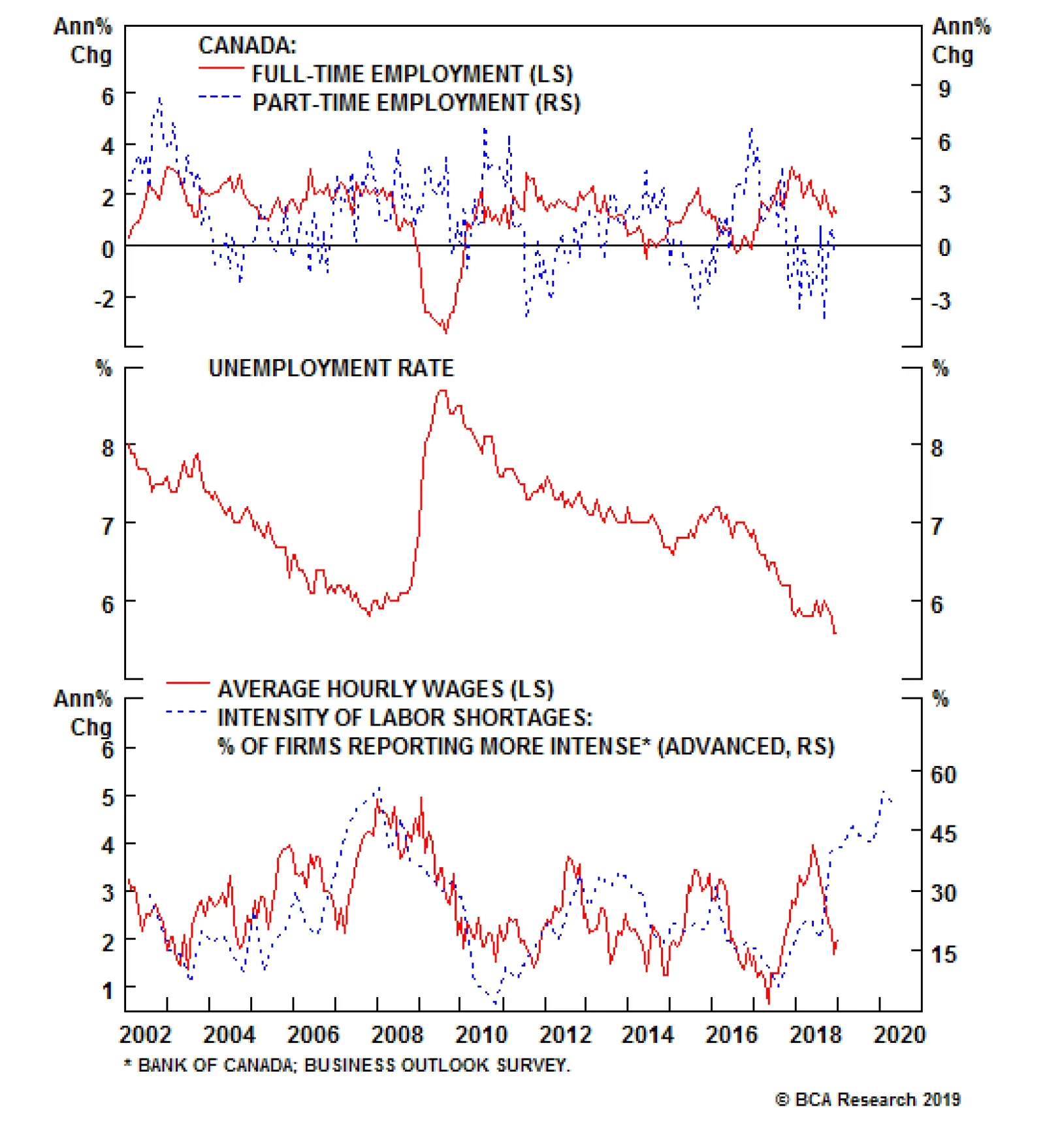
Unlike the very strong labor market conditions seen in the U.S. last December, the Canadian data came in slightly below expectations. Investors anticipated 10,000 Canadian jobs to be created in December against actual data of 9,300. But the headline…
We learned today that December marked a horrible month for risk assets, but a great month for the U.S. labor market. Caught in the crosscurrents between these opposing conditions of weakness and strength is the Fed. Elements of strength in the U.S. economy…
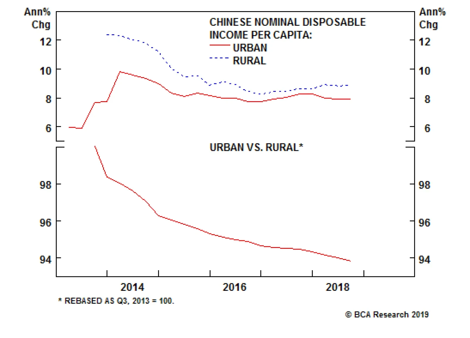
There are signs that the Chinese government is aiming to provide more support for less developed and urbanized parts of China. Beijing’s openness to rural-in-situ urbanization (i.e., urbanization without migration) suggests that the government is aiming to…
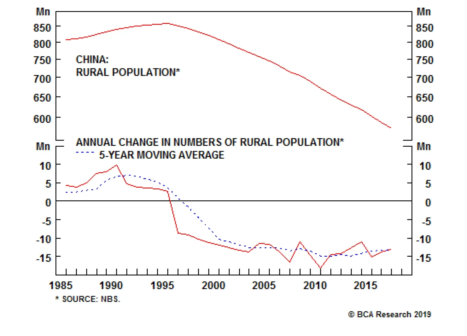
China’s rural population has declined by 33% from its peak of about 860 million in 1995 to 577 million in 2017 (see chart). All else equal, the lower rural population base alone will result in smaller rural-to-city migration compared to the previous two…
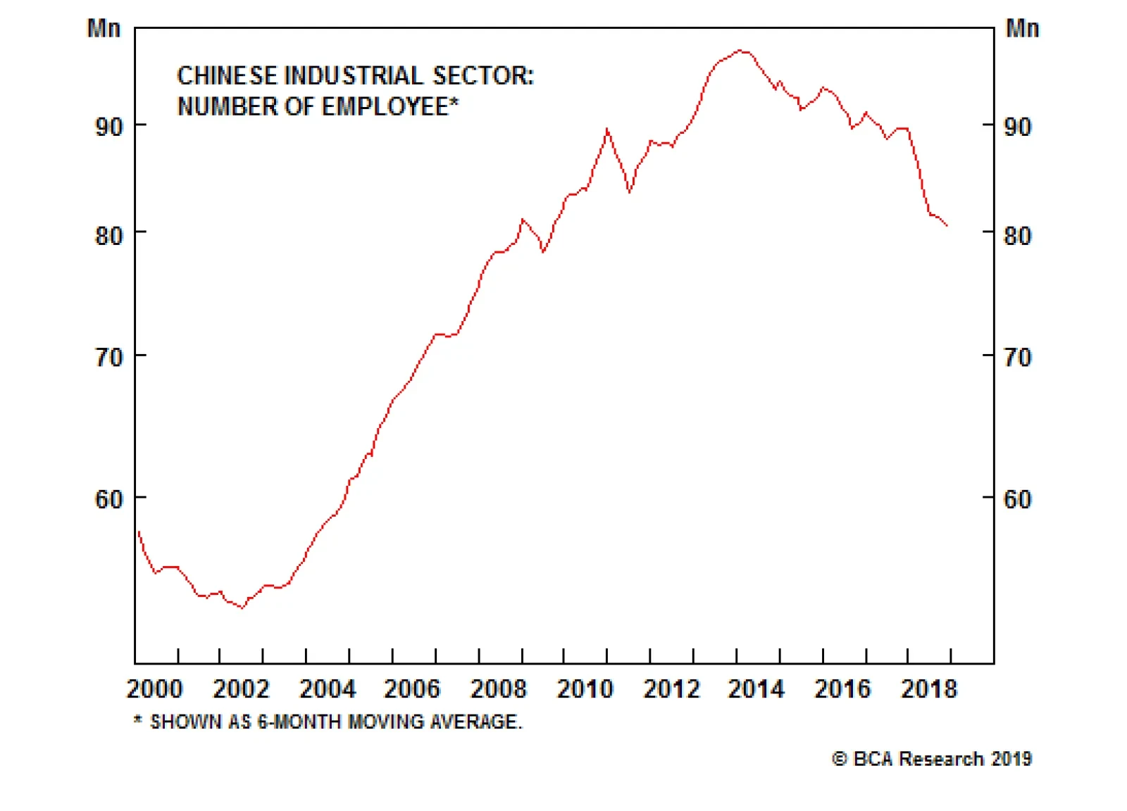
Our China strategists believe that the urbanization process will slow in China. There are several factors and trends that support their view on Chinese migration flows. First, rural-to-urban migration flows have already slowed in recent years. The number…
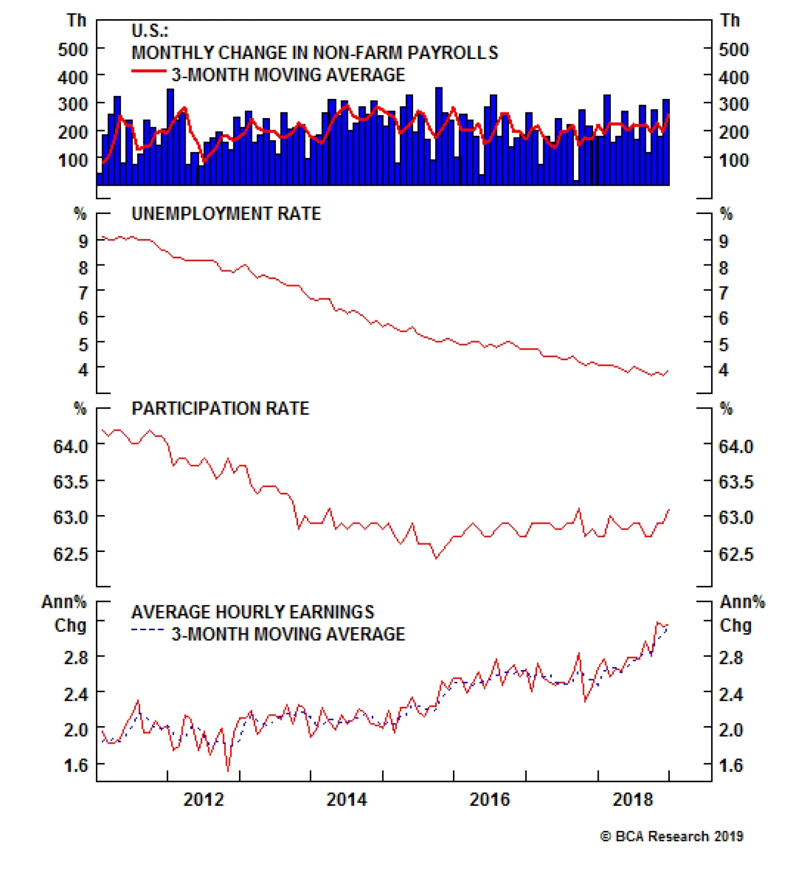
In BCA we pay close attention to nonfarm payrolls. Employment may be a coincident indicator, but it is powerfully self-reinforcing, and the sub-NAIRU unemployment rate looms large in the Fed’s policy calculus. Payroll growth is robust, and our model projects…

Highlights Differences of opinion are what make a market, and we’ve got a big one when it comes to the Fed: The money market says the fed funds rate goes no higher than 2.75%; BCA says 3.5% by the end of 2019, and possibly 4% sometime in 2020. We are confident in our assessment of the economy’s underlying strength, … : Fiscal stimulus will keep the economy growing above trend in 2019, and the unemployment rate will almost certainly continue to grind lower. ... even if many commentators are accentuating the negative: The experts quoted in Barron’s found abundant fault with the November employment situation report, and the yield curve is out-trending all of the Kardashians combined. Amidst all the uncertainty, we’re sticking with an investment strategy that is more cautious than our outlook: The monetary backdrop is still too accommodative to spell the end of the equity bull market, but we are waiting for a better entry point to put our cash overweight to work. Feature Dear Client, This is our last report of 2018. Our regular publishing schedule will resume on Monday, January 7th. We wish you a happy, healthy and prosperous new year. Best regards, Doug Peta, Senior Vice President U.S. Investment Strategy We have often remarked how we feel that we are watching a different game than the money market when it comes to the gap in our respective terminal fed funds rate expectations. Both we and the market expect a 25-basis-point (“bps”) hike to 2.5% at the conclusion of the FOMC’s two-day meeting on Wednesday, but from there our paths diverge sharply. The market grudgingly allows that one more hike, to 2.75%, is possible, though it is by no means certain. It sees about a 60% chance that the Fed will make that additional rate hike toward the end of 2019, but then proceeds to price that hike out by the end of 2020 (Chart 1). Chart 1Mind The Gap
Mind The Gap
Mind The Gap
The terminal rate’s ultimate destination, and the path it follows along the way, is not just an academic matter. Once the fed funds rate crosses above the equilibrium fed funds rate (r-star, in economics-speak), monetary policy will become restrictive for the first time since the crisis began to break. We expect the shift to a restrictive policy setting will herald the end of the expansion. Most importantly for investors, it will mark the point when asset allocation should become considerably more defensive. Getting the Fed right, then, is of the utmost importance, and we need to get to the bottom of our differences with the market. We suspect they come down to disparate assessments of the state of the economy and the state of policy. The money market seems to believe that the economy is weaker than we perceive, and that the fed funds rate is currently much closer to equilibrium than we realize. In both cases, we are vulnerable if it is later in the cycle than we think, because we are not positioned for an imminent inflection. Is The Business Cycle Closer To Ending Than We Think? Real GDP growth will slow in 2019, just as one would expect when 60 bps of fiscal thrust is taken away from an economy that was already operating at its full 2-2.25% capacity (Chart 2). Per the IMF’s fiscal estimates, 2020 shapes up as the real challenge for the economy, especially once the Fed crosses the equilibrium-rate Rubicon. In October and November, however, financial markets acted as if they feared the beginning of the recession was considerably nearer (Chart 3). Our clients’ concerns seemed to coalesce around the implications of a slowdown in housing. Chart 2Lessened Thrust, Lessened Growth
Lessened Thrust, Lessened Growth
Lessened Thrust, Lessened Growth
Chart 3Growth Scare
Growth Scare
Growth Scare
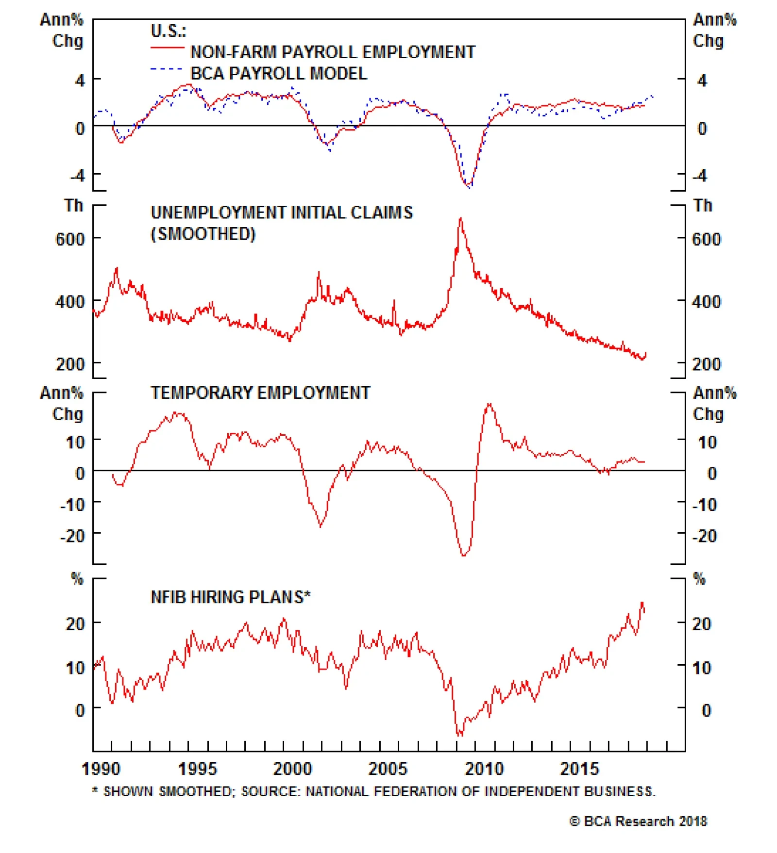
We do not worry about residential investment pulling down the economy,1 but we do pay close attention to nonfarm payrolls. Employment may be a coincident indicator, but it is powerfully self-reinforcing, and the sub-NAIRU2 unemployment rate looms large in the Fed’s policy calculus. Payrolls growth is robust, and our model projects that it will continue to be over the near term (Chart 4, top panel), as all of its components are in fine fettle, especially initial jobless claims (Chart 4, second panel), and small businesses’ hiring intentions (Chart 4, bottom panel). Chart 4Payrolls Should Keep Growing, ...
Payrolls Should Keep Growing, ...
Payrolls Should Keep Growing, ...
As we have noted before, it only takes about 110,000 net new jobs every month to keep unemployment at a steady state. Even if our model turns out to be overly optimistic, the unemployment rate appears to be several months away from bottoming, unless the participation rate rises enough to materially increase the size of the labor force. Demographics argue against that, as the baby boomers, ages 54 to 72, exit the work world in a nearly interminable conga line. The participation rate has done well to stabilize in the face of the boomer headwind (Chart 5), but there’s a limit to how much more it can close the gap when businesses are already lamenting the difficulty of finding qualified workers (Chart 6). Chart 5... But The Part Rate Probably Won't
... But The Part Rate Probably Won't
... But The Part Rate Probably Won't
Chart 6Good Help Is Hard To Find
Good Help Is Hard To Find
Good Help Is Hard To Find
A robust labor market suggests that households in the aggregate will have the means to support consumption. Now that payrolls have expanded for a record 98 straight months, the lowest-income households are finally in line to capture some of the benefits. Those households have the highest marginal propensity to consume, which may provide spending with an additional fillip. With the savings rate now back to its late-‘90s levels, better-heeled households are also in a position to do their part to keep consumption humming (Chart 7). Chart 7Plenty Of Dry Powder For Spending
Plenty Of Dry Powder For Spending
Plenty Of Dry Powder For Spending
The near-term consumption outlook is additionally supported by the expectations component of the Conference Board’s consumer confidence survey, which has been a reliable coincident indicator throughout its entire history (Chart 8). The unusual divergence between the two series suggests that consumers may have more of an appetite to spend than they’ve demonstrated so far. Employment gains and real consumption also have a well-established history of traveling together (Chart 9). Chart 8Consumers' Optimism Points To More Spending ...
Consumers' Optimism Points To More Spending ...
Consumers' Optimism Points To More Spending ...
\ Chart 9... And So Do Solid Employment Gains
... And So Do Solid Employment Gains
... And So Do Solid Employment Gains
Bottom Line: We find it hard to believe the economy is set to weaken in a worrisome way when the labor market still has plenty of momentum, and consumption is well supported on multiple fronts. Is The Fed Funds Rate Cycle Further Along Than We Realize? The Real Economy Our equilibrium fed funds rate model continues to suggest that the target fed funds rate is well below its equilibrium level and will not exceed it until late next year.3 Equilibrium is only a concept, however, so we actively seek out objective data that may confirm or disprove our assessment. Our approach is to trust our modeled estimate of a concept, but verify it with as much real-time evidence as we can muster. Based on the current level of activity, housing seems to be the only major segment that is experiencing some indigestion from higher rates. Corporate investment may not have lived up to the most optimistic post-tax-cut estimates, but there is no evidence that corporations are holding back because of higher rates. A back-of-the-envelope proxy, calculating the difference between the S&P 500’s return on capital and the after-tax interest rate on BBB-rated corporate bonds, suggests that prospective returns to borrowing are near their best level in 30 years, even with the reduction in the debt tax shield4 (Chart 10). Through December 14th, the Atlanta Fed’s GDPNow model was projecting an increase of 3.8% in fourth-quarter final domestic demand, forcefully pushing back against the notion that r-star is at hand. Chart 10Higher Rates Aren't Biting Yet
Higher Rates Aren't Biting Yet
Higher Rates Aren't Biting Yet
The ongoing application of fiscal thrust to an economy already operating at capacity argues for a higher equilibrium rate than would otherwise apply. The equilibrium rate is also higher because the unemployment rate is well below NAIRU (4.5%, per the dots), suggesting that the Fed will have to push harder against the economy than it otherwise would to keep it from overheating. Tepid post-crisis investment, mixed with unnecessary fiscal stimulus, and combined with a red-hot labor market, is a recipe for inflation pressures that can only be neutralized by a higher r-star. Financial Conditions As last week’s Google Trends chart of yield-curve searches made clear, investors have developed something of an obsession with an inverted yield curve. The yield curve’s ability to flag overly tight monetary policy in real time has made it a reliable leading indicator of recessions, and it is a key input into our simple recession indicator. The curve has flattened over the last five-plus weeks as the 10-year Treasury yield has melted, stoking recession fears. Before they get too worked up, however, investors should bear in mind that the depressed term premium has the potential to distort its signal in this cycle. The term premium is the yield differential between a Treasury note or bond, and a strip of T-bills, laddered to match the note or bond’s maturity. In line with its name, the term premium is typically positive, as investors have typically demanded compensation for bearing the increased interest-rate volatility embedded in longer-maturity instruments. That volatility may well have been restrained by the Fed’s large-scale asset purchase program, along with long yields themselves, though the entire matter of QE’s impact is subject to spirited debate. Whatever the mechanism, the term premium is considerably lower than it has been across the five decades that the yield curve has had a nearly perfect record of calling recessions (Chart 11). If the term premium were in line with its historical mean value, the yield curve would be nowhere near inverting. We continue to trust in the yield curve’s propensity to sense danger, but concede that the anomalously low term premium may render it somewhat less timely now. Given the preponderance of evidence to the contrary, we are not concerned that it is signaling that r-star is materially closer than our equilibrium fed funds rate model estimates. Chart 11The Bar For Inversion Is A Lot Lower In This Cycle
The Bar For Inversion Is A Lot Lower In This Cycle
The Bar For Inversion Is A Lot Lower In This Cycle
QE raises one more issue for our equilibrium fed funds rate model, which does not account for any tightening of monetary conditions occasioned by the unwinding of the Fed’s balance sheet. We assume that such tightening occurs only at the margin, but it could delay our recognition that policy has shifted from accommodative to restrictive. Attempting to isolate the impact of balance sheet reduction on monetary conditions would be more trouble than it’s worth, however, and we simply assume that it will cause the confidence interval around our equilibrium estimate to widen a little. Bottom Line: Our equilibrium fed funds rate model projects that policy is not nearing restrictive territory, and our interpretation of the whole of the real-time data supports that view. We think that the Fed is still several hikes away from reaching r-star. Investment Implications As we noted in last week’s 2019 outlook, the view that the economy is strong enough to overheat undergirds all of our recommendations. The potential for overheating is what will impel the Fed to hike aggressively through 2019 and possibly beyond. Investors should therefore underweight Treasuries in balanced portfolios, while maintaining below-benchmark duration. The idea that the economy will gather more momentum on its way to overheating keeps us constructive on equities. We do not believe the bull market is over, and are therefore keeping an eye out for an opportunity to overweight the S&P 500 before it makes new highs. We are confident that the unemployment rate will continue to decline, but must concede that the key outcome for Fed policy – higher wages – has been slow to materialize. Several investors have become impatient with waiting for the Phillips Curve to assert itself, and we cannot blame them. Shorn of its fancy trappings, though, the Phillips Curve is just a supply-and-demand story, and we have always found it hard to argue against supply-and-demand stories’ plain logic. The action in the 10-year Treasury nonetheless has us reviewing our call closely in search of anything that we may be missing. It appears that the decline in yields is better explained by the unwinding of lopsided positioning and sentiment (Chart 12), than by anything connected to economic growth. We are acutely conscious of how a worsening of U.S.-China trade tensions could impair global growth and subvert our constructive take on risk assets. U.S. equities may shine on a relative basis in the worst-case scenario, but absolute losses would be assured. We remain in wait-and-see mode, open to deploying our cash overweight if the opportunity presents itself, but happy to have it for ballast and insurance in the meantime. Chart 12Stretched Rubber Bands Snap Back
Stretched Rubber Bands Snap Back
Stretched Rubber Bands Snap Back
Doug Peta, Senior Vice President U.S. Investment Strategy dougp@bcaresearch.com Footnotes 1 Please see the U.S. Investment Strategy Special Reports, “Housing: Past, Present And (Near) Future,” and “Housing Seminar,” published November 19 and December 3, 2018, respectively, at usis.bcaresearch.com. 2 NAIRU, the non-accelerating-inflation rate of unemployment (also known as the natural rate of unemployment), is the unemployment rate that can be sustained over time without causing the economy to overheat. 3 Our model estimates that equilibrium fed funds is currently around 3%, will be around 3.25% by the middle of 2019, and will settle near 3⅜% at year end. 4 Before the 2017 tax reform act, corporations faced a top marginal rate of 35%, and could deduct interest expense without limit. After-tax interest expense for large corporations amounted to (1-.35), or 65% of the pre-tax expense. Now that the top marginal rate is 21%, after-tax interest expense is (1-.21), or 79% of pre-tax expense.
Feature The European stock market has a hidden gem: its clothing and accessories sector. Since the turn of the millennium, the sector’s profits are up by a thousand percent (Feature Chart). In this Special Report we propose that the megatrend has further to run, as its principle driver is still very much in place. Consumption patterns are becoming more female. Feature ChartEuropean Clothes Profits Are Up A Thousand Percent!
European Clothes Profits Are Up A Thousand Percent!
European Clothes Profits Are Up A Thousand Percent!
One of Europe’s major, and largely neglected, success stories is the dramatic rise in the percentage of the working-age population in employment. This major success story stems from another success story: the structural and broad-based increase in the female labour participation rate – which has surged from 57 percent in 1995 to 68 percent today (Chart I-2-Chart I-4). Yet the story is far from over.1 Chart I-2European Male Labour Participation Is Flat...
European Male Labour Participation Is Flat...
European Male Labour Participation Is Flat...
Chart I-3...But European Female Labour Participation Is Surging
...But European Female Labour Participation Is Surging
...But European Female Labour Participation Is Surging
Chart I-4...So The Percentage Of The European Population In Work Is Surging
...So The Percentage Of The European Population In Work Is Surging
...So The Percentage Of The European Population In Work Is Surging
Why Job Creation Favours Women Two things are driving the megatrend in female participation. One is a paradoxical feature of the current technological revolution. As we explained in The Superstar Economy: Part 2, Artificial Intelligence (AI) excels at tasks that we perceive as difficult: those requiring the application of complex algorithms and pattern recognition to a narrowly defined goal, such as making a highly-engineered product or managing a stock portfolio. This poses a big threat to jobs in manufacturing and finance, employment sectors which happen to be male-dominated.2 Conversely, AI still struggles at tasks that we perceive as easy: those requiring adaptable movements, or reading and responding to people’s emotions and intentions. If you are good at controlling a disruptive class of 7-year olds, or calming a nervous patient before giving him an injection, your human skills are still in big demand. But education, healthcare, and social care – the employment sectors that are creating the most jobs – employ three times as many women as men. With AI still in its infancy, the established pattern of job destruction and creation will continue to favour women over men (Table I-1). Table I-1AI Is A Greater Threat To Men
Buying European Clothes: An Investment Megatrend
Buying European Clothes: An Investment Megatrend
The other driver of the megatrend in female participation is a raft of European legislation designed to make work more family friendly: flexible working time, generous paid maternity and paternity leave, and subsidised childcare (Table I-2-Table I-4). Sharing the responsibility of childcare between mothers, fathers and external helpers has allowed tens of millions of European women to enter and remain in the labour force. Table I-2Generous Maternity Pay In Europe And Japan
Buying European Clothes: An Investment Megatrend
Buying European Clothes: An Investment Megatrend
Table I-3Improving Paternity Pay In Europe And Japan
Buying European Clothes: An Investment Megatrend
Buying European Clothes: An Investment Megatrend
Table I-4Affordable Childcare In Europe And Japan
Buying European Clothes: An Investment Megatrend
Buying European Clothes: An Investment Megatrend
Nevertheless, the megatrend has a lot further to run. For the ultimate end-point, look at the Scandinavian countries which started legislating such policies in the early 1970s, around twenty years before the rest of Europe. As a result, in Sweden, labour force participation rates for women and men have now converged to almost identical: 81 versus 84 percent (Chart I-5). Chart I-5In Sweden, Labour Force Participation For Women And Men Is Almost Identical
EU28: Labour Force Participation Rate In Sweden, Labour Force Participation For Women And Men Is Almost Identical
EU28: Labour Force Participation Rate In Sweden, Labour Force Participation For Women And Men Is Almost Identical
The combination of the two drivers – employment growth favouring female-dominated sectors and employment becoming more family friendly – means that net job creation in Europe will be mostly due to more women joining the workforce. An important consequence is that consumption patterns will continue to become more female. But what does that mean? How Women’s Spending Differs From Men’s Spending In the main spending categories of housing, food and healthcare, women and men tend to show near-identical spending behaviours. But there are three sub-categories where there are significant differences. Men considerably outspend women on vehicle purchases: cars account for around 8 percent of disposable income for men versus 4 percent for women. Against this, women spend more on personal care products and services: 2 percent versus 0.5 percent. This is the reason behind our long-standing successful overweight recommendation in the European personal products sector which we maintain (Chart I-6). However, the sub-category in which women outspend men by even more is clothes and accessories: estimates average around 6.5 percent for women versus 2.5 percent for men.3 Chart I-6Personal Product Profits Set To Grow Very Strongly
Personal Product Profits Set To Grow Very Strongly
Personal Product Profits Set To Grow Very Strongly
It follows that as consumption patterns become more female, we should expect to see a steady rise in spending on clothes and accessories as a share of total consumer spending. Has this been the case? In the U.K. – where the data is easily available – the answer is yes (Chart I-7). Having said that, other factors are also at play. A generalised deflation in clothes prices (Chart I-8) is also generating a strong tailwind to sales volumes (rather than values). More about this later. Chart I-7More Real Spending On Clothes...
More Real Spending On Clothes...
More Real Spending On Clothes...
Chart I-8Partly Because Clothes Prices Are Falling...
Partly Because Clothes Prices Are Falling...
Partly Because Clothes Prices Are Falling...
Of course, the more compelling evidence is the thousand percent growth in the European clothes sector’s profits since the turn of the millennium. However, with the sector dominated by top brands such as LVMH and Hermes, could a more plausible explanation come from strong economic growth, until recently, in the emerging markets such as China? The answer is yes to the extent that many of the emerging economies are experiencing the same structural uptrends in female participation, and this supports our investment thesis. Still, this cannot be the main driver, because in recent years the connection between the fortunes of the emerging economies and the European clothes sector has been weak (Chart I-9). Chart I-9The Connection Between Emerging Markets And European Clothes Is Weak
The Connection Between Emerging MarketsAnd European Clothes Is Weak
The Connection Between Emerging MarketsAnd European Clothes Is Weak
There is another obvious question: is the market already aware of, and fully priced for, the megatrend? We think not, as most investors we meet are surprised by the structural uptrend in female participation, the on-going dynamics behind it, and the implications for consumer spending patterns. Understandably, the European clothes sector does trade at a valuation premium to the market (Chart I-10). But for many companies, the recent market hiccup has pulled down their valuation premiums to close to, or below, the long-term average from which the price has previously outperformed very strongly. Chart I-10The Valuation Premium On European Clothes Is Close To Its Long-Term Average
The Valuation Premium On European Clothes Is Close To Its Long-Term Average
The Valuation Premium On European Clothes Is Close To Its Long-Term Average
What Is In The Clothes Basket? Pulling all of this together, the companies in our European clothes and accessories basket need to meet several criteria: A dominant or significant exposure to women’s clothes and/or accessories. A top-end brand (or brands) giving the company pricing power, and mitigating the very strong deflation in clothes prices. Avoid ‘fast fashion’. A reputation for sustainable development. A track-record of profit growth during the past decade. A forward price to earnings (PE) multiple of less than 25. A market capitalisation of at least €5 billion. On the basis of these criteria, our European clothes and accessories basket contains four names: LVMH, Kering, Luxottica, and Burberry (Table I-5). Hermes meets most of the criteria but, trading on a forward PE close to 35 is very richly valued. Table I-5The European Clothes Basket
Buying European Clothes: An Investment Megatrend
Buying European Clothes: An Investment Megatrend
To be clear, this is not a short-term trade. Investors who buy the clothes basket outright need to have a multi-year investment horizon. Those investors who must also protect short-term performance should instead overweight the clothes basket relative to the broad market. Dhaval Joshi, Senior Vice President Chief European Investment Strategist dhaval@bcaresearch.com Footnotes 1 Please see the European Investment Strategy Special Report “Female Participation: Another Mega-Trend” published on April 6, 2017 and available at eis.bcaresearch.com 2 Please see the European Investment Strategy Special Report, “The Superstar Economy: Part 2”, January 19, 2017 available at eis.bcaresearch.com. 3 Source: Bureau of Labor Statistics Consumer Expenditure Survey 2016 via SmartAsset, and Paymentsense.
Highlights The Reserve Bank of Australia (RBA) may consider a rate hike in 2019 if additional tightening of labor markets leads to higher wage inflation, which would help lift core inflation back to the midpoint of the RBA’s 2-3% target band. Reflation in China could also embolden the RBA to tighten monetary policy – though the odds of a more aggressive stimulus package will decline as long as China’s overall economy remains stable and the U.S. maintains its tariff ceasefire. The Labor Party is favored to win the federal election, which is most likely to occur in May. This is a low-conviction view, as polls are tight and economic improvement will help the ruling Liberal-National Coalition. Feature 2018 has been a challenging year for global financial markets, as investors have had to deal with greater economic uncertainty, less dovish central banks and more volatile asset prices. One country that has bucked the trend to some degree is Australia. The nation has famously avoided a recession since 1991 and last saw a tightening of monetary policy in 2010. While the recession streak is unlikely to be broken in 2019, there are growing risks that the era of interest rate tranquility will soon end. In this Special Report, jointly published with our colleagues at BCA Geopolitical Strategy, we update our views on Australia for 2019 – a year when the investment backdrop has the potential to become far more interesting, and volatile, due to election year uncertainty and a potential shift to a more hawkish bias for monetary policy. The Bond Outlook: What To Watch To Turn Bearish BCA Global Fixed Income Strategy has maintained an overweight stance on Australian government bonds since the end of 2017. That high-conviction view stemmed from our expectation that the Reserve Bank of Australia (RBA) would keep policy rates on hold for longer due to sluggish economic growth and underwhelming inflation. This recommendation has performed well, with Australian government bonds returning 2.4% (currency-hedged into U.S. dollars) in 2018 year-to-date, beating the Bloomberg Barclays Global Treasury index by 190bps. The benchmark 10-year Australian government is now yielding 36bps below the equivalent 10-year U.S. Treasury yield, the tightest spread since 1980 (Chart 1). Chart 1Australian Bonds Have Outperformed
Australian Bonds Have Outperformed
Australian Bonds Have Outperformed
Looking ahead, we still have a positive opinion on Australian debt relative to its global peers over the next six months. The RBA is unlikely to make any adjustments to the Cash Rate - which remains at a highly-accommodative level of 1.5% - without seeing some signs of accelerating inflation in both the Q4 2018 and Q1 2019 CPI reports. This is especially true given the political uncertainty with another federal election due by May 18,1 which could change the outlook for fiscal policy (as we discuss later in this report) and impact the RBA’s economic projections. In our view, the RBA will only be able to seriously consider an interest rate hike, warranting a downgrade of our recommended overweight stance, if all three of the following conditions occur: Australia’s underemployment rate falls below 8% China’s economy shows convincing evidence of reacceleration, especially in commodity-intensive industries like construction Core CPI inflation rises back to at least the midpoint of the RBA’s 2-3% target band We will now discuss each of these in turn. Underemployment Australia is a fairly open economy with a large export sector, but consumer spending is still the largest share of GDP (60%) so it matters most for growth. On that front, real consumption has grown in a narrow and uninspiring range between 2-3% over the past five years. Anemic wages and disposable incomes have been the problem, with the growth of both (in nominal terms) struggling to grow faster than low realized inflation, which now sits below the RBA’s inflation target range of 2-3% (Chart 2). Households have been forced to deploy a greater share of that modest income growth just to maintain spending, with the savings rate plunging from 8% at the end of 2014 to 1% this year and consumer debt piling up. Chart 2An Income-Fueled Pickup In Consumer Spending
An Income-Fueled Pickup In Consumer Spending
An Income-Fueled Pickup In Consumer Spending
The dynamics may be changing in a more positive direction, however. Growth rates of nominal wage (+2.3%) and disposable income (+3.1%) have accelerated this year to a pace faster than inflation. With real incomes perking up, the year-over-year growth rate of real consumer spending growth accelerated to 3% in Q3/2018, driving real GDP growth to similar levels. A sustained pickup in wage growth is necessary before the RBA would even contemplate a rate hike. For that to occur, there must be decisive evidence of a tightening Australian labor market and increased resource utilization. While the headline unemployment rate of 5.0% is below the OECD’s estimate of the full employment NAIRU for Australia (5.3%), broader measures of labor market slack are still at elevated levels. Specifically, the “underemployment” rate, which includes workers who are working fewer hours than they would like or at jobs below their skill levels, is still at an elevated 8.3% (Chart 3). That is down from the peak of just below 9% seen in early 2017, but well above the 2012 trough near 7% (when wage growth was close to 4%). Chart 3UNDERemployment Rate Matters More For Australian Wages
UNDERemployment Rate Matters More For Australian Wages
UNDERemployment Rate Matters More For Australian Wages
Australian wage growth tends to correlate more with the underemployment rate than the traditional unemployment rate (middle panel). This suggests that the recent blip higher in wage growth could be the beginning of a new trend, given that it has occurred alongside the recent drop in underemployment. Already, underemployment is back below the levels that prevailed when the RBA did its last interest rate cut back in 2016 (bottom panel). A further dip lower in the underemployment rate to below the 8% threshold would likely confirm that wage growth has more upside. That outcome would give the RBA greater confidence that consumer spending will gain more strength even with a low savings rate, and that CPI inflation will return back into the target range – both outcomes that would justify some removal of the RBA’s highly stimulative monetary accommodation. China Stimulus The main connection from China’s economy to Australia is through Chinese demand for Australian exports. There is also an indirect, but very important, link between Chinese demand boosting industrial commodity prices. The latter boosts Australian growth through positive terms-of-trade effects and increased capital spending in commodity-related sectors like mining. Iron ore is the most important of those commodities, representing 18% of total Australian goods exports, with 85% of those iron ore exports going to China. Australian export growth has decelerated during 2018 from the very robust 15% year-over-year pace to a still solid 10% rate. This has mirrored the trends seen in many other economies, where exports have slowed alongside diminished demand from China. If Chinese authorities change their current policy trajectory, and embrace more aggressive fiscal and credit stimulus, then they will reaccelerate the country’s flagging demand, which should benefit Australian exporters. If the increase in spending occurs in commodity-intensive parts of China’s economy, like construction, then Australia can also benefit from a terms-of-trade impact if commodity prices rise. However, BCA’s Geopolitical Strategy and China Investment Strategy remain skeptical that China will launch a major economic stimulus package along the lines of what occurred in 2015-16. That surge not only boosted Chinese GDP and import demand but also triggered a boost to global industrial commodity prices that benefitted many commodity exporters, including Australia. In recent months, there has been a pickup in overall Chinese import growth, as well as some acceleration of higher frequency growth indicators like the Li Keqiang index (Chart 4). Australian exports to China have not picked up though, and Chinese iron ore imports are contracting. Part of that is due to the elevated levels of Chinese iron ore inventories. More likely, there is little demand for additional iron ore given China’s reform agenda and the struggles of its construction sector (which accounts for roughly 35% of Chinese steel demand). Chart 4China Stimulus Not Helping Australia...Yet?
China Stimulus Not Helping Australia...Yet?
China Stimulus Not Helping Australia...Yet?
Our colleagues at BCA China Investment Strategy2 have noted that both weakening sales and tighter funding sources for real estate developers point to declining growth in property starts and construction. This will be negative for construction-related commodity markets and construction-related machinery. This is coming at a time when the Chinese government is trying specifically to address over-indebted industries like construction. As for the U.S.-China trade truce, a permanent de-escalation of tensions – which has not yet occurred – could provide a boost to Australian export demand, as with other export-focused countries. But the negative impact of bilateral U.S.-China tariffs on the global economy is much smaller than that of China’s attempt to limit indebtedness. Moreover, a trade truce will remove China’s primary incentive to adopt more aggressive stimulus. Nevertheless, from the RBA’s perspective, any boost to China’s construction-related activity would have a big impact on Australia’s economy and would strengthen the case for a rate hike in 2019. Core Inflation Australia’s headline CPI inflation has struggled to hit even the bottom end of the RBA’s 2-3% target band since 2015, reaching only 1.9% in Q3 of this year (Chart 5). The story is even worse for inflation excluding food and energy, with core CPI inflation now only at 1.2% after having drifted lower in two consecutive quarters. Both market-based and survey-based measures of inflation expectations are also hovering near 2%. Chart 5Australian Inflation Well Below RBA Target
Australian Inflation Well Below RBA Target
Australian Inflation Well Below RBA Target
When breaking down the CPI into tradeables (i.e. more globally-focused) and non-tradeables (i.e. more domestically-focused), the two types of inflation have not been accelerating at the same time since the 2009-11 period. Since then, faster tradeables inflation has occurred alongside slowing non-tradeables inflation, and vice versa. While volatility on the tradeables side should be expected given the correlation to swings in commodity prices and the Australian dollar, the weakness in non-tradeables is more directly related to the spare capacity in the domestic economy. Therefore, if wage growth continues to pick up as the labor market tightens, then non-tradeables inflation should follow suit and boost Australian CPI inflation back towards the RBA target range. The implication for the RBA is that a move in core CPI inflation back towards 2.5% (the midpoint of the RBA band), occurring after an acceleration in wage growth as described above, would give the central bank confidence that a higher Cash Rate is required. Bottom Line: The RBA has kept interest rates on hold for over two years, but may consider a rate hike in 2019 if additional tightening of labor markets leads to higher wage inflation, which would help lift core inflation back to the midpoint of the RBA’s 2-3% target band. A more aggressive fiscal and monetary stimulus package in China, while not our base case, would also embolden the RBA to tighten monetary policy. Risks From Australian Banks? Throughout 2018, the Australian financial industry has had to endure the slings and arrows of a government inquiry into its questionable business practices and misconduct. Revelations of bribery, fraud, the charging of fees for no service and from the accounts of deceased people, as well as board-level deception of regulators, have roiled Australia's financial sector since the explosive inquiry began in February. The final report of the Australian Financial Services Royal Commission will be published in February, but the impact is already being felt throughout the industry. Bank CEOs have been publically shamed, while other senior financial sector executives have been forced from their jobs. The chairman of National Australia Bank stated before the inquiry that customers’ trust in lenders had been “pretty well eroded to zero”, and that it could take as long as a decade to successfully overhaul the culture within the banks. The biggest impacts from the Commission will come through hits to banks’ earnings and funding costs, as well as the potential impact on lending standards for new loans. Australian banks will be less profitable because of fines, customer refunds, setting aside provisions for potential misconduct penalties and the government wanting increased competition. If banks also choose to be more conservative with the marking of loans, then higher loan-loss provisions could be an additional drag on bank earnings. Already, Australian bank stocks have severely underperformed the overall domestic market, and there has been some slowing of domestic credit growth (Chart 6). There are also signs of bank funding stresses from contracting bank deposit growth (second panel) and wider offshore funding costs like relatively elevated LIBOR-OIS spreads (bottom panel). Considering how heavily Australian banks rely on offshore funding, any squeeze in those markets could severely influence the availability of credit within the Australian economy. Chart 6Australian Banks Under Some Stress...
Australian Banks Under Some Stress...
Australian Banks Under Some Stress...
Looking ahead, if banks do tighten up their lending standards in response to the criticism and findings of the Commission, that will be from a starting point of very accommodative levels. In other words, getting a loan will likely still be “easy”, rather than “incredibly easy”. The reason is that Australian bank balance sheets remain in excellent condition. Credit crunches begin when banks are undercapitalized and are forced to retrench new loan activity as losses on existing loans pile up. That is not the case in Australia, where the major banks have Tier 1 capital ratios in the 10-12% range and non-performing loans are a tiny share of total lending. In our view, a true credit crunch would likely only occur after the Australian housing bubble bursts and the economy enters a severe downturn. That outcome would most likely be triggered by monetary policy tightening via multiple RBA rate hikes. Importantly, some of the steam has already been taken out of Australian house prices thanks to changes in regulations on new lending (Chart 7), potentially reducing some of the immediate risks to growth from a sharp plunge in home values. Chart 7...But No Credit Crunch Expected
...But No Credit Crunch Expected
...But No Credit Crunch Expected
Bottom Line: In 2019, the Australian government and its key financial regulators will have to work together to enforce responsible lending without triggering a catastrophic property market unwind. RBA policymakers are less likely to hike rates given their desire to maintain financial stability in the aftermath of the Commission – or at least until the inflation story forces their hand, as outlined in this report. The Federal Election: Polling Slightly Favors Labor Scandals in the financial sector are of utmost importance to the other major factor that could make 2019 a year of significant change in Australia: the federal election that looms most likely in the spring. Parliament is balanced on a knife’s edge, with the Australian Liberal Party’s loss of former Prime Minister Malcolm Turnbull’s parliamentary seat in a Sydney by-election on October 20. The ruling Liberal-National Coalition no longer has a majority and must rely on independent MPs to survive any no-confidence vote. This precarious situation suggests that the election could come even sooner than May and that the slightest twist in the campaign could deliver at least a small majority to either of the top two parties. Indeed, at this early stage, a high-conviction view on the election outcome is not warranted. After all, the 2016 election was decided in the Coalition’s favor only after a shift in opinion in the final month! Chart 8Labor Party Narrowly Leads All-Party Opinion Polls
A Year Of Change In Australia?
A Year Of Change In Australia?
Nevertheless, with all due caveats, our baseline case is for a Labor majority in 2019, however slim it may be.3 Labor is slightly ahead of the Coalition in the primary opinion polling, which includes all parties (Chart 8). In two-party preference polling, Labor has gradually widened its general lead since the July 2016 election and now holds a 10% advantage in the federal polls – albeit only a 6% lead when a moving average is taken (Chart 9). Labor is also winning or tied in every major state. Chart 9Labor Has Large Lead In Two-Party Preference Polls
A Year Of Change In Australia?
A Year Of Change In Australia?
The dramatic shift in polling since August is significant because that is when the knives came out and the Coalition ousted Turnbull in favor of the current Prime Minister Scott Morrison. The purpose of this move was to give the party a facelift ahead of the election. It is true that public opinion views Morrison as the preferred prime minister to Labor’s Bill Shorten. Shorten has a negative net approval rating and has never been viewed as an inspiring politician, while Morrison is just barely net positive. This perception works against Labor’s lead in the party polling – which is very competitive anyway – and suggests the election will be close. Critically, the Liberal-National Coalition’s polling as a whole has not benefited from the change in leadership. And in fact the data does not support the two major Australian parties’ abiding belief that a leadership coup will boost their popularity: Australia has seen four of these coups since 2010, two from Labor and two from the Coalition, and the party in question lost an average of 8% of the popular vote and 14 seats in parliament in the succeeding election (Table 1). Table 1Intra-Party Coups Don’t Win Votes
A Year Of Change In Australia?
A Year Of Change In Australia?
Turnbull’s ouster also calls attention to another detrimental factor for the Coalition: the challenge on the right flank from minor and anti-establishment parties. Pauline Hanson’s One Nation has a relatively low support rate both historically and in today’s race, currently at 8%, but anti-establishment feeling may have forced the Coalition into an error. Judging by the party’s weak polling since August, the negative response to Turnbull’s ouster has been more detrimental than the nomination of Morrison, an immigration hardliner and social conservative, has been beneficial. Meanwhile, Labor’s momentum has been corroborated by a string of surprise victories in by-elections and a sweeping win in the Victoria state elections on November 24. In the latter case, the party not only defended its hold on government, as one might expect in this progressive state, but exceeded expectations to win 56 seats out of 88 in the lower House, while the Coalition lost nearly half of its seats, falling from 37 to 21. Still, Labor’s lead is by no means decisive. In the average of the various primary polls its edge over the Coalition is within the margin of error. Moreover, the Coalition holds more “safe” (uncompetitive) seats than Labor.4 The bottom line is that a small swing in either party’s favor can produce a thin majority. The Coalition’s best case is the economy. But as concerns about unemployment and job creation recede, voters will make other demands. The top issues in recent polling are the cost of living, health care, housing affordability, and wages. Some polls also emphasize social mobility and climate change and renewable energy. Will Shorten’s Labor Party be able to capture the median voter? It is highly significant that the party has taken a rightward turn on immigration and taxes even as it holds out a more left-wing agenda on health, education, regulation, and social benefits. Immigration has played a major role in Australian politics and Labor is currently positioned near the political center – in other words, if Morrison hardens his line to guard against populists, he risks over-hardening and moving away from the median voter (Chart 10). Shorten has proposed a large bipartisan task force to determine the proper limits to immigration and how to deal with congestion and infrastructure pressures. Shorten’s platform also calls attention to abuse of temporary visas by foreign workers. Chart 10Labor Is Not Too Soft On Immigration
A Year Of Change In Australia?
A Year Of Change In Australia?
On taxes, Shorten has attempted to separate small and big companies, again in a bid for the political center. When Prime Minister Morrison sought to establish his anti-tax credentials (Chart 11), Shorten met him halfway and proposed relief for middle class families and small and medium-sized enterprises. Yet he doubled down on higher taxes for multinational corporations and high-income earners. Chart 11Liberal-National Coalition Cutting Corporate Tax Rates
A Year Of Change In Australia?
A Year Of Change In Australia?
Critically, the latter redistributive stances are more in line with the median voter than the Liberal Party’s more conservative, supply-side, tax cut agenda. All of Australia’s parties, including the increasingly popular “minority parties,” have a more favorable attitude toward redistribution than the Coalition, which is the outlier (Chart 12). Indeed, the National Party is closer in line with the others than the Liberals, highlighting the divisions within the Coalition that have been jeopardizing votes. As for tax cuts on middle income earners and small businesses, Labor’s acceptance of them speaks to voter concerns about living costs, jobs, and wages. Chart 12The Coalition Is Out Of Synch On Taxes
A Year Of Change In Australia?
A Year Of Change In Australia?
Labor is also closer to the median voter on the aforementioned financial sector scandals. The Coalition stands to suffer because it has developed a reputation for being too cozy with the banks (Chart 13). This is one of the biggest perceived differences between the two major parties – in addition to the negative perception of intra-Coalition betrayal – and it is possibly one of the most salient issues in the election. This presents a serious danger for the Coalition. Chart 13Banks: The Coalition’s Ball And Chain
A Year Of Change In Australia?
A Year Of Change In Australia?
What would a Labor government bring? The market will be jittery about Shorten’s attempts to increase tax revenue, which threatens a non-negligible tightening of fiscal policy. Shorten wants to raise taxes on high income earners; remove or lower deductions and discounts (such as on capital gains); crack down on tax evasion; and tighten control over a range of tax practices specific to Australia (limiting “negative gearing” and cutting cash refunds for “franking credits”). He is also taking a tough position on banks and the energy sector. At the same time, it is clear from Labor’s proposals in 2016 (Chart 14) that there will be a hefty amount of new spending coming down the pike if a Labor government is formed – primarily on education, health, infrastructure and job training. The tax cuts that Shorten does support will go to those with a higher propensity to consume, as well as to SMEs that are responsible for job creation. Chart 14Labor’s Spending Plans Unlikely To Change Much
A Year Of Change In Australia?
A Year Of Change In Australia?
Ultimately, Australia’s recent history, taken in consideration with the global business cycle, does not suggest that the Labor Party is all that much more fiscally profligate than the Coalition – but the current budget balance does suggest that there is substantial room to increase deficits, which is convenient for a government that is predisposed to give voters more services (Chart 15). Hence fiscal easing is the path of least resistance - one that could make the RBA even more comfortable in raising interest rates if the conditions laid out earlier in this report come to pass. Chart 15Australia's Next Government Will Have Room To Spend!
Australia's Next Government Will Have Room To Spend!
Australia's Next Government Will Have Room To Spend!
Bottom Line: The Australian Labor Party is slightly favored to win the next Australian election. This is a low-conviction call given the tight competition in public opinion polling and other mixed indicators. Broadly speaking, Labor’s shift to the political center on immigration and some tax issues makes the party more electable relative to the Coalition; meanwhile its promise of more government services fits with voter demands. We do not accept the narrative that Shorten’s Labor Party will engage in substantial fiscal tightening. The path of least resistance is for tax cuts as well as revenue collection, and for greater government spending. On the other hand, if the Coalition capitalizes on the incumbent advantage and stays in power, larger tax cuts will be in store. Hence we expect Australia to see marginally larger-than-expected budget deficits and fiscal thrust as the one reliable takeaway of next year’s election. Fixed Income Investment Implications We continue to recommend an overweight stance on Australian government bonds in currency-hedged global bond portfolios. While we have laid out the conditions that would make us change that view in this report, it is still too soon to position for such a move. Our RBA Monitor, which measures the cyclical pressures on the central bank to change monetary policy settings, is modestly below the zero line (Chart 16). This indicates a need for easier policy, although the indicator is starting to rise driven by the inflation components in the Monitor (bottom panel). In terms of market pricing, there are only 15bps of rate hikes over the next year discounted in the Australian Overnight Index Swap (OIS) curve, so markets are exposed to any shift to a more hawkish bias by the RBA as 2019 progresses. Chart 16Our RBA Monitor Starting To Turn Less Dovish
Our RBA Monitor Starting To Turn Less Dovish
Our RBA Monitor Starting To Turn Less Dovish
Looking purely at Australian government bond yields, the forward curves are priced for very little change in yields over the next year (Chart 17). This suggests that outright duration trades in Australia look uninteresting from a carry perspective of betting against the forwards. We continue to prefer Australian bonds on a relative basis to global developed market peers until there is more decisive evidence pointing to convergence of Australian growth and inflation to the other major economies (bottom panel). Chart 17Stay Overweight Australian Government Bonds
Stay Overweight Australian Government Bonds
Stay Overweight Australian Government Bonds
Over the past year, Global Fixed Income Strategy has recommended tactical trades in Australian money market futures to fade the pricing of RBA hikes that we did not expect to materialize. Specifically, we entered a long position in December 2018 Australian 90-Day Bank Bill futures on October 17, 2017, then switched to a long October 2019 90-Day Bank Bill futures position on May 29, 2017. The latter contract is now trading at implied interest rate levels just above the RBA’s 1.5% Cash Rate (Chart 18), suggesting that there is no more value in this trade. Chart 18Taking Profits On Our Long Bank Bill Futures Trade
Taking Profits On Our Long Bank Bill Futures Trade
Taking Profits On Our Long Bank Bill Futures Trade
We therefore take a profit of 21bps on the Bank Bill futures trade, while awaiting evidence from the “RBA Hike Checklist” introduced in this report before considering trades that will benefit from a more hawkish central bank. Robert Robis, CFA, Senior Vice President Global Fixed Income Strategy rrobis@bcaresearch.com Matt Gertken, Vice President Geopolitical Strategy mattg@bcaresearch.com Ray Park, CFA, Research Analyst ray@bcaresearch.com Footnotes 1 Technically the House of Representatives election could occur as late as November 2, while the half Senate election is due May 18, but the norm is to hold the election simultaneously. The 2016 election was a “double dissolution” involving the election of the entire Senate and House of Representatives. 2 Please see BCA China Investment Strategy Special Report, “China’s Property Market: Where Will It Go From Here?” dated September 13, 2018, available at cis.bcareserach.com. 3 We would slightly favor Labor leading a slim majority in the Senate as well as in the House. In the Senate, the half of the seats that are up for grabs are evenly split and the polling at this early stage favors Labor over the Coalition. The poor performance of the Greens, in recent polling and in the Victoria state election, suggests a positive development for Labor on the margin, whereas One Nation, whose polls are improving, poses a threat to the Coalition. 4 Labor is fighting for 15 “marginal” (hotly contested) seats and 28 “fairly safe” seats, while the Coalition is only fighting for 12 marginal seats and 14 fairly safe seats.
Highlights Equities had a wild ride in October, ... : The S&P 500 has bounced smartly off of its October 29th lows, but the decline that preceded the bounce was unusually severe. ... that unsettled a lot of investors, and made us reconsider our constructive take on risk assets: To judge by the November 5th Barron's, and some client conversations, several technically-minded investors are unconvinced by the bounce. Nothing has changed with our equity downgrade checklist, however, ... : The fundamental picture hasn't changed at all - neither corporate revenues nor margins appear to be in any immediate difficulty; though we still expect inflation to surprise to the upside, the latest data will not push the Fed to speed up its gradual rate-hike pace; and the combination of blockbuster third-quarter earnings and October's selloff made valuations more reasonable. ... so we see no reason to downgrade equities now, though we do have the admonition of a Wall Street legend ringing in our ears: If the fundamental backdrop remained unchanged, we would be inclined to upgrade equities if the S&P 500 got back to the 2,600-2,640 range, even though we are operating with a heightened sense of vigilance befitting the lateness of the hour. Feature It has been just four weeks since we rolled out our equity downgrade checklist. We would not ordinarily devote an entire Weekly Report to reviewing all of its components, but the last four weeks have hardly been ordinary. The swiftness of the decline, and the apparent lateness of the cycle, have unsettled investors enough to make several of them reconsider just how long they want to stay at the bull-market party. At times when market action provokes emotional gut checks, it is essential for investors to have a process to fall back on. Process provides a rational, objective haven from noise and emotion, and should help foster better decision-making. Our commitment to process underpins our fondness for checklists. They will never be comprehensive - as usual, we have our minds on other important inputs - but they help to ground our thinking, and we're happy to have them when markets make wild swings. Has The Recession Timetable Speeded Up? We are not interested in recessions for their own sake - we'll let the NBER's Business Cycle Dating Committee tell us when recessions begin and end, several months after the fact - but they're poison for risk assets. Any asset allocator who can recognize them in a timely fashion has a leg up on outperforming the competition. We therefore have been repeatedly monitoring the individual components of our recession indicator (Table 1). They do not betray any more concern than they did four weeks ago. Table 1Equity Downgrade Checklist
Checking In On Our Equity Downgrade Checklist
Checking In On Our Equity Downgrade Checklist
The yield curve is clearly flattening, just as one would expect as the Fed gets further into a rate-hiking campaign, but it is still a comfortable distance from inverting (Chart 1). We think yields at the long end have a way to go before they stop rising, so we expect the fed funds rate will have to get well into the 3's before the 3-month bill rate can overtake the 10-year Treasury yield. The Conference Board's Leading Economic Indicator is still expanding at a robust clip (Chart 2). Finally, we estimate the fed funds rate is about a year away from exceeding the equilibrium rate, thus signaling that policy has turned restrictive. Chart 1The Yield Curve Is Flattening, But It's Not About To Invert ...
The Yield Curve Is Flattening, But It's Not About To Invert ...
The Yield Curve Is Flattening, But It's Not About To Invert ...
Chart 2... And Leading Economic Indicators Are Still Surging
... And Leading Economic Indicators Are Still Surging
... And Leading Economic Indicators Are Still Surging
The unemployment rate continues to fall. Reversing the trend so that the three-month moving average could back up by the third of a percentage point that has unfailingly accompanied recessions (Chart 3) would require net monthly payroll additions to crater. Assuming annual population growth of 1%, and a constant labor force participation rate, net monthly job gains would have to fall to 100,000 for the three-month moving average to back up to 4% in 2020; if the pace of gains merely held at 120,000, the unemployment recession signal wouldn't be issued until 2021 (Chart 4). We applied the same conditions to the Atlanta Fed's online unemployment calculator to see what it would take for the unemployment rate to cross into the danger zone in 2019 (Table 2). Since the seven-year trend of 200,000 monthly net payroll additions would have to reverse on a dime for unemployment to issue a near-term warning, we do not foresee checking this box anytime soon. Chart 3Investors Should Beware An Uptick In The Unemployment Rate ...
Investors Should Beware An Uptick In The Unemployment Rate ...
Investors Should Beware An Uptick In The Unemployment Rate ...
Chart 4... But None Is Forthcoming ...
... But None Is Forthcoming ...
... But None Is Forthcoming ...
Table 2... Unless Hiring Falls Off A Cliff
Checking In On Our Equity Downgrade Checklist
Checking In On Our Equity Downgrade Checklist
Are Corporate Earnings Coming Under Pressure? As we mentioned last week, we view the labor market as tight and getting tighter. We thereby expect that wages are on their way to rising enough to crimp corporate margins, albeit slowly. The composite employment cost index has been in an uptrend since 2016, but it ticked lower last month, and remains well below its cyclical highs ahead of the last two recessions (Chart 5). Chart 5Snails, Godot, Molasses And Wages
Snails, Godot, Molasses And Wages
Snails, Godot, Molasses And Wages
October's global upheaval was good for the safe-haven dollar, which surged to a new year-to-date high (Chart 6). The DXY dollar index is now within 3% of the 100 level that would lead us to check the dollar strength box. Even though we're not checking the box yet, the dollar's 10% advance since mid-February will exert a modest drag on S&P 500 earnings for the next few quarters. Triple-B corporate yields have ticked a little higher since we rolled out the checklist, extending their six-year highs (Chart 7), though we still view them as manageable. Chart 6A Gentle Headwind (For Now)
A Gentle Headwind (For Now)
A Gentle Headwind (For Now)
Chart 7Higher Yields Aren't Biting Yet
Higher Yields Aren't Biting Yet
Higher Yields Aren't Biting Yet
A rising savings rate would cancel out some of the top-line benefits from employment gains. It fell pretty sharply in the third quarter, however, amplifying the self-reinforcing effect of new hiring. It's at the bottom of the range that's prevailed since 2014 (Chart 8), but could go still lower if consumption tracks the robust consumer confidence readings, as it consistently has in the past. Chart 8Consumers Are Well-Fortified
Consumers Are Well-Fortified
Consumers Are Well-Fortified
EM economies have become considerably more indebted since the crisis, as developed-world savings sought an outlet; corporate profits are falling; and a stronger dollar makes it harder for EM borrowers to service their USD-denominated debt. A credit crisis (or multiple credit crises) could slow global activity enough to pressure multinationals' earnings, even if the U.S. economy is mostly insulated from EM wobbles. EM equities have gotten a respite since global equities put in their year-to-date lows, and Chinese stimulus could extend EM economies a lifeline, though BCA expects that Beijing will disappoint investors hoping for a meaningful boost. We remain bearish on emerging markets as a firm, but EM distress is not anywhere near acute enough to justify ticking the box. Is Inflation Starting To Make The Fed Uneasy? There are two channels by which inflation could pose a problem for equities. The first is the Fed: if it is discomfited by what it sees in realized inflation, or perceives that inflation expectations could become unanchored, it is likely to move forcefully to quash upward pressure on prices. A forceful pace is considerably faster than a gradual pace, and would bring forward a monetary policy inflection. If policy flips from accommodative to restrictive sooner than we expect, the window for risk-asset outperformance will shrink. With all of its talk about symmetric inflation targets, the FOMC has made it clear that it will not make any attempt to defend its 2% core PCE inflation target. It is comfortable with an overshoot, and has indeed openly wished for one for much of the post-crisis era. There are limits to its indulgence, however, and we suspect that the Fed would not be comfortable if core PCE inflation were to make a new 20-year high above 2.5%. With that red line far off (Chart 9), inflation is not yet likely to encourage the Fed to quicken the pace at which it removes accommodation. Chart 9Turtles, Sloths And Inflation
Turtles, Sloths And Inflation
Turtles, Sloths And Inflation
Inflation expectations aren't yet pressing the Fed to speed things up, either. Long-maturity TIPS break-evens have retreated slightly since mid-October, and have yet to enter the range consistent with the 2% inflation target (Chart 10). The media and the broad mass of investors don't bother with symmetric targets, or implied break-evens; they take their cues from consumer prices. A multiple haircut driven by popular inflation fears is the second channel by which inflation could halt the equity advance, but CPI remains well below the mid-3% levels that would provoke concern (Chart 11). Chart 10Stubbornly Well-Anchored
Stubbornly Well-Anchored
Stubbornly Well-Anchored
Chart 11No Reason To Trim Multiples Yet
No Reason To Trim Multiples Yet
No Reason To Trim Multiples Yet
So What's To Worry About? Irrational exuberance is always a concern after an extended period of gains, but there's no sign of it in broad market measures right now. Blockbuster earnings gains have pulled the S&P 500's forward P/E multiple back down to the 15s from its January peak above 18. Secondary measures like price-to-sales, price-to-book, and price-to-cash-flow are well below extreme levels in the aggregate. If the S&P 500 is going to get silly, it will have to surge first. That said, the latter stages of bull markets and expansions can be perilous, and we are on high alert. We continue to actively seek out any evidence that challenges our broadly constructive take on risk assets and the U.S. economy. Though we have yet to find anything compelling, an admonition from legendary technical analyst and strategist Bob Farrell has lodged in our mind. Rule number nine of Farrell's ten market rules to remember states, "When all the experts and forecasts agree - something else is going to happen." It's much more fun to bring novel views and analysis to our clients, but we don't get overly concerned about agreeing with investor consensus. It's inevitable that a lot of people will agree in the middle of extended cycles; we simply strive to be among the first to recognize the major macro inflection points and determine the optimal asset-allocation framework to benefit from them. We get a little antsy, though, when everyone knows that something is either certain to happen, or cannot happen by any stretch of the imagination. The near-unanimity with which the investment community believes that a recession cannot begin in 2019 is increasingly eating at us. We have been checking and re-checking the data, and checking and re-checking our colleagues' various models, in search of trouble, but to no avail. Even though recessions begin at economic peaks, and the economy nearly always appears to be in fine fettle when the downturn asserts itself, the sizable fiscal thrust on tap for 2019 seems to obviate the possibility of a contraction. When discussing potential risks in face-to-face meetings with clients this week, we most often cited trade tensions, as any material rollback of globalization would erode corporate profit margins and would strike at global trade, on which much of the rest of world's economies rely. A dramatic worsening of the trade picture is not our base case, but we do expect upside surprises in inflation, and an attendant upside surprise in the terminal fed funds rate. We have been considering that view mainly from the perspective of fixed-income positioning: underweight Treasuries and maintain below-benchmark duration. We also have been assuming that the FOMC would lift the fed funds rate to 3.5% at the end of 2019 via four quarter-point rate hikes, and possibly take it all the way to 4% in the first half of 2020. If it were to speed up its pace, and take the fed funds rate to 3.5% by the middle of next year, and 4% by the end, we believe financial conditions would tighten enough to choke off the expansion. Monetary policy impacts the economy with a lag, so a recession may still not begin until 2020 in that scenario, but we'd bet that an equity bear market would begin in 2019. Investment Implications Balanced investors should maintain at least an equal weight position in equities. Although our checklist is a downgrade checklist, we're alert to opportunities to upgrade as well as downgrade. As we first wrote one week before the October selloff ended, we would look to overweight equities if the S&P 500 were to dip back into the 2,600-2,640 range (Chart 12). If U.S. equities wobble again in line with our Global Investment Strategy team's MacroQuant model's near-term discomfort, investors may get another opportunity before the year is out. Chart 12Only One Chance To Upgrade So Far, But There May Be More
Only One Chance To Upgrade So Far, But There May Be More
Only One Chance To Upgrade So Far, But There May Be More
Doug Peta, Senior Vice President U.S. Investment Strategy dougp@bcaresearch.com