Labor Market

Highlights So What? Donald Trump's reelection depends on the timing of the next recession. Why? The midterm elections will not determine Trump's reelection chances. Rather, the timing of the next recession will. BCA's House View expects it by 2020. Otherwise, President Trump is favored to win. Trump may be downgrading "maximum pressure" on Iran, reducing the risk of a 2019 recession. Trade war with China, gridlock, and budget deficits are the most investment-relevant outcomes of U.S. politics in 2018-20. Feature The preliminary results of the U.S. midterm elections are in, with the Democrats gaining the House and failing to gain the Senate, as expected. Our view remains that the implications for investors are minimal. The policy status quo is now locked in - a gridlocked government is unlikely to produce a major change in economic policy over the next two years. While the election is to some extent a rebuke to Trump, this report argues that he remains the favored candidate for the 2020 presidential election - unless a recession occurs. A Preliminary Look At The Midterms First, the preliminary takeaways from the midterms, as the results come in: The Democrats took the House of Representatives, with a preliminary net gain of 27 seats, resulting in a 51%-plus majority, and this is projected to rise to 34 seats as we go to press Wednesday morning. This is above the average for midterm election gains by the opposition party, especially given that Republicans have held the advantage in electoral districting. Performance in the Midwest, other swing states, and suburban areas poses a threat to Trump and Republicans in 2020. Republicans held the Senate, with a net gain of at least two seats, for a 51%-plus majority. Democrats were defending 10 seats in states that Trump won in 2016. While Democrats did well in the Midwest, these candidates had the advantage of incumbency. On the state level, the Democrats gained a net seven governorships, two of them in key Midwestern states. The gubernatorial races were partly cyclical, as the Republicans had hit a historic high-water mark in governors' seats and were bound to fall back a bit. However, the Democratic victory in Michigan and Wisconsin, key Midwestern Trump states, is a very positive sign for the Democrats, since they were not incumbents in either state and had to unseat incumbent Governor Scott Walker in Wisconsin. (Their victory in Maine could also help them in the electoral college in 2020.) The governors' races also suggest that moderate Democrats are more appealing to voters than activist Democrats. Candidate Andrew Gillum's loss in Florida is a disappointment for the progressive wing of the Democratic Party.1 With the House alone, Democrats will not be able to push major legislation through. In the current partisan environment it will be nigh-impossible to reach the 60 votes needed to end debate in the Senate ("cloture"), and even then House Democrats will face a presidential veto. They will not be able to repeal Trump's tax cuts, re-regulate the economy, abandon the trade wars, resurrect Obamacare, or revive the 2015 Iranian nuclear deal. Like the Republicans after 2010, they will be trapped in the position of controlling only one half of one of the three constitutional branches. The most they can do is hold hearings and bring forth witnesses in an attempt to tarnish Trump's 2020 reelection chances. They may eventually bring impeachment articles against him, but without two-thirds of the Senate they cannot remove him from office (unless the GOP grassroots abandons him, giving senators permission to do so). U.S. equities generally move upward after midterm elections - including midterms that produce gridlock (Chart 1A & Chart 1B). However, the October selloff could drag into November. More worryingly, as Chart 1B shows, the post-election rally tends to peter out only six months after a gridlock midterm, unlike midterms that reinforce the ruling party. Chart 1AMidterm U.S. Elections Tend To Be Bullish...
Midterm U.S. Elections Tend To Be Bullish...
Midterm U.S. Elections Tend To Be Bullish...
Chart 1B... But Markets Lose Steam Six Months Post-Gridlock
... But Markets Lose Steam Six Months Post-Gridlock
... But Markets Lose Steam Six Months Post-Gridlock
However, the 2018 midterms could be mildly positive for the markets, as they do not portend any major new policies or uncertainty. Trump's proposed additional tax cuts would have threatened higher inflation and more Fed rate hikes, whereas House Democrats will not be able to raise taxes or cut spending alone. Bipartisan entitlement reform seems unlikely in 2018-20 given the acrimony of the two parties and structural factors such as inequality and populism. An outstanding question is health care, which Republicans left unresolved after failing to repeal Obamacare, and which exit polls show was a driving factor behind Democratic victories. Separately, as an additional marginal positive for risk assets, the Trump administration has reportedly granted eight waivers to countries that import Iranian oil. We have signaled that Trump's "maximum pressure" doctrine poses a key risk for markets due to the danger of an Iran-induced oil price shock. A shift toward more lax enforcement reduces the tail-risk of a recession in 2019 (Chart 2). Of course, the waivers will expire in 180 days and may be a mere ploy to ensure smooth markets ahead of the midterm election, so the jury is still out on this issue. Chart 2Rapid Increases In Oil Prices Tend To Precede Recessions
The 2020 U.S. Election: A "Way Too Soon" Forecast
The 2020 U.S. Election: A "Way Too Soon" Forecast
This brings us to the main focus of this report: what do the midterms suggest about the 2020 election? Bottom Line: The midterm elections have produced a gridlocked Congress. Trump can continue with his foreign policy, most of his trade policy, his deregulatory decrees, and his appointment of court judges with limited interference from House Democrats. The only thing the Democrats can prevent him from doing is cutting taxes further. He tends to agree with Democrats on the need for more spending! While the U.S. market could rally on the back of this result, we do not see U.S. politics being a critical catalyst for markets going forward. On balance, a gridlocked result brings less uncertainty than would otherwise be the case, which is positive for markets in the short term. The Midterms And The 2020 Election There is a weak relationship at best between an opposition party's gains in the midterms and its performance in the presidential election two years later. Given that the president's party almost always loses the midterms - and yet that incumbent presidents tend to be reelected - the midterm has little diagnostic value for the presidential vote, as can be seen in recent elections (Chart 3A & Chart 3B). Chart 3AMidterm Has Little Predictive Power For Presidential Popular Vote ...
The 2020 U.S. Election: A "Way Too Soon" Forecast
The 2020 U.S. Election: A "Way Too Soon" Forecast
Chart 3B... Nor For Presidential Electoral College Vote
The 2020 U.S. Election: A "Way Too Soon" Forecast
The 2020 U.S. Election: A "Way Too Soon" Forecast
Nevertheless, historian Allan Lichtman has shown that since 1860, a midterm loss is marginally negative for a president's reelection chances.2 And for Republicans in recent years, losses in midterm elections are very weakly correlated with Republican losses of seats in the electoral college two years later (Chart 4). Chart 4Republican Midterm Loss Could Foreshadow Electoral College Losses
The 2020 U.S. Election: A "Way Too Soon" Forecast
The 2020 U.S. Election: A "Way Too Soon" Forecast
Still, this midterm election does not give any reason to believe that Trump's reelection chances have been damaged any more than Ronald Reagan's were after 1982, or Bill Clinton's after 1994, or Barack Obama's after 2010. All three of these presidents went on to a second term. A midterm loss simply does not stack the odds against reelection. Why are midterm elections of limited consequence for the president? They are fundamentally different from presidential elections. For instance, "the buck stops here" applies to the president alone, whereas in the midterms voters often seek to keep the president in check by voting against his party in Congress.3 Despite the consensus media narrative, the president is not that unpopular. Trump's approval rating today is about the same as that of Clinton and Obama at this stage in their first term (Chart 5). This week's midterm was not a wave of "resistance" to Trump so much as a run-of-the-mill midterm in which the president's party lost seats. Its outcome should not be overstated. Bottom Line: There is not much correlation between midterms and presidential elections. The best historians view it as a marginal negative for the incumbent. This result is not a mortal wound for Trump. Chart 5President Trump Is Hardly Losing The Popularity Contest
The 2020 U.S. Election: A "Way Too Soon" Forecast
The 2020 U.S. Election: A "Way Too Soon" Forecast
2020: The Recession Call Is The Election Call The incumbent party has lost the White House every single time that a recession occurred during the campaign proper (Chart 6).4 The incumbent party has lost 50%-60% of the time if recession occurred in the calendar year before the election or in the first half of the election year. Chart 6A 2020 Recession Is Trump's Biggest Threat
A 2020 Recession Is Trump's Biggest Threat
A 2020 Recession Is Trump's Biggest Threat
This is a problem for President Trump because the current economic expansion is long in the tooth. In July 2019, it will become the longest running economic expansion in U.S. history, following the 1991-2001 expansion. The 2020 election will occur sixteen months after the record is broken, which means that averting a recession over this entire period will be remarkable. BCA's House View holds that 2020 is the most likely year for a recession to occur. The economy is at full employment, inflation is trending upwards, and the Fed's interest rate hikes will become restrictive sometime in 2019. The yield curve could invert in the second half of 2019 - and inversion tends to precede recession by anywhere from 5-to-16 months (Table 1). No wonder Trump has called the Fed his "biggest threat."5 Table 1Inverted Yield Curve Is An Ominous Sign
The 2020 U.S. Election: A "Way Too Soon" Forecast
The 2020 U.S. Election: A "Way Too Soon" Forecast
The risks to this 2020 recession call are probably skewed toward 2021 instead of 2019. The still-positive U.S. fiscal thrust in 2019 and possibly 2020 and the Trump administration's newly flexible approach to Iran sanctions, if maintained, reduce the tail-risk of a recession in 2019. If there is not a recession by 2020, Trump is the favored candidate to win. First, incumbents win 69% of all U.S. presidential elections. Second, incumbents win 80% of the time when the economy is not in recession, and 76% of the time when real annual per capita GDP growth over the course of the term exceeds the average of the previous two terms, which will likely be the case in 2020 unless there is a recession (Chart 7). Chart 7Relative Economic Performance Could Give Trump Firepower
Relative Economic Performance Could Give Trump Firepower
Relative Economic Performance Could Give Trump Firepower
The above probabilities are drawn from the aforementioned Professor Allan Lichtman, at American University in Washington D.C., who has accurately predicted the outcome of every presidential election since 1984 (except the disputed 2000 election). Lichtman views presidential elections as a referendum on the party that controls the White House. He presents "13 Keys to the Presidency," which are true or false statements based on historically derived indicators of presidential performance. If six or more of the 13 keys are false, the incumbent will lose. On our own reading of Lichtman's keys, Trump is currently lined up to lose a maximum of four keys - two shy of the six needed to unseat him (Table 2). This is a generous reading for the Democrats: Trump's party has lost seats in the midterm election relative to 2014; his term has seen sustained social unrest; he is tainted by major scandal; and he is lacking in charisma. Yet on a stricter reading Trump only has one key against him (the midterm). Table 2Lichtman's Thirteen Keys To The White House*
The 2020 U.S. Election: A "Way Too Soon" Forecast
The 2020 U.S. Election: A "Way Too Soon" Forecast
What would it take to push Trump over the edge? Aside from a recession (which would trigger one or both of the economic keys against him), he would need to see two-to-four of the following factors take shape: a serious foreign policy or military failure, a charismatic Democratic opponent in 2020, a significant challenge to his nomination within the Republican Party, or a robust third party candidacy emerge. In our view, none of these developments are on the horizon yet, though they are probable enough. For instance, it is easy to see Trump's audacious foreign policy on China, Iran, and North Korea leading to a failure that counts against him. Thus, as things currently stand, Trump is the candidate to beat as long as the economy holds up. What about impeachment and removal from office prior to 2020? As long as Trump remains popular among Republican voters he will prevent the Senate from turning against him (Chart 8). What could cause public opinion to change? Clear, irrefutable, accessible, "smoking gun" evidence of personal wrongdoing that affected Trump's campaigns or duties in office. Nixon was not brought down until the Watergate tapes became public - and that required a Supreme Court order. Only then did Republican opinion turn against him and expose him to impeachment and removal - prompting him to resign. Chart 8Trump Cannot Be Removed From Office
The 2020 U.S. Election: A "Way Too Soon" Forecast
The 2020 U.S. Election: A "Way Too Soon" Forecast
All that being said, Trump tends to trail his likeliest 2020 adversaries in one-on-one opinion polling. Given our recession call, we would not dispute online betting markets giving Trump a less-than-50% chance of reelection at present (Chart 9). The Democratic selection process has hardly begun: e.g. Joe Biden could have health problems, and Michelle Obama, Oprah Winfrey, or other surprise candidates could decide to run. The world will be a different place in 2020. Bottom Line: The recession call is the election call. If BCA is right about a recession by 2020, then Trump will lose. If we are wrong, then Trump is favored to win. Chart 9A Strong Opponent Has Yet To Emerge
The 2020 U.S. Election: A "Way Too Soon" Forecast
The 2020 U.S. Election: A "Way Too Soon" Forecast
Is It Even Possible For Trump To Win Again? Election Scenarios Is it demographically possible for Trump to win? Yes. In 2016 BCA dubbed Trump's electoral strategy "White Hype," based on his apparent attempt to increase the support and turnout of white voters, primarily in "Rust Belt" battleground states. While Republican policy wonks might have envisioned a "big tent" Republican Party for the future, demographic trends in 2016 suggested that this strategy was premature. Indeed, drawing from a major demographic study by the Center for American Progress and other Washington think tanks,6 we found that a big increase in white turnout and support was the only 2016 election scenario in which a victory in both the popular vote and electoral college vote was possible. In other words, while "Minority Outreach" have worked as a GOP strategy in the future, Donald Trump's team was mathematically correct in realizing that only White Hype would work in the actual election at hand. This strategy did not win Trump the popular vote, but it did secure him the requisite electoral college seats, notably from the formerly blue of Wisconsin, Michigan, and Pennsylvania. Comparing the 2016 results with our pre-election projections confirms this point: Trump won the very swing states where he increased white GOP support and lost the swing states where he did not. Pennsylvania is the notable exception, but he won there by increasing white turnout instead of white GOP support.7 Can Trump do this again? Yes, but not easily. Map 1 depicts the 2016 election results with red and blue states, plus the percentage swing in white party support that would have been necessary to turn the state to the opposite party (white support for the GOP is the independent variable). In Michigan, a 0.3% shift in the white vote away from Republicans would have deprived Trump of victory; in Wisconsin and Pennsylvania, a 0.8% shift would have done the same; in Florida, a 1.5% change would have done so. Map 1The 'White Hype' Strategy Narrowly Worked In 2016
The 2020 U.S. Election: A "Way Too Soon" Forecast
The 2020 U.S. Election: A "Way Too Soon" Forecast
Critically, the country's demographics have changed significantly since 2016 - to Trump's detriment. The white eligible voting population in swing states will have fallen sharply from 81% of the population to 76% of the population by 2020 (Chart 10). Chart 10Demographic Shift Does Not Favor Trump
The 2020 U.S. Election: A "Way Too Soon" Forecast
The 2020 U.S. Election: A "Way Too Soon" Forecast
Thus, to determine whether Trump still has a pathway to victory, we looked at eight scenarios, drawing on the updated Center for American Progress study. The assumptions behind the scenarios in Table 3 are as follows: Status Quo - This replicates the 2016 result and projects it forward with 2020 demographics. 2016 Sans Third Party - Replicates the 2016 result but normalizes the third party vote, which was elevated that year. Minority Revolt - In this scenario, Hispanics, Asians, and other minorities turn out in large numbers to support Democrats, even with white non-college educated voters supporting Republicans at a decent rate. The Kanye West Strategy - Trump performs a miracle and generates a swing of minority voters in favor of Republicans. Blue Collar Democrats - White non-college-educated support returns to 2012 norms, meaning back to Democrats. Romney's Ghost - White college-educated support returns to 2012 levels. White Hype - White non-college-educated support swings to Republicans. Obama versus Trump - White college-educated voters ally with minorities in opposition to a surge in white non-college-educated voters for Republicans. Table 3Assumptions For Key Electoral Scenarios In 2020
The 2020 U.S. Election: A "Way Too Soon" Forecast
The 2020 U.S. Election: A "Way Too Soon" Forecast
The results show that Trump's best chance at remaining in the White House is still White Hype, as it is still the only scenario in which Trump can statistically win a victory in the popular vote (Chart 11). Another pathway to victory is the "2016 Sans Third Party" scenario. But this scenario still calls for White Hype, since a third party challenger is out of his hands (Chart 12).8 Chart 11'White Hype' May Be Only Way To Secure Both Popular And Electoral College Vote...
The 2020 U.S. Election: A "Way Too Soon" Forecast
The 2020 U.S. Election: A "Way Too Soon" Forecast
Chart 12... Although Moving To The Center Could Still Yield Electoral College Vote
The 2020 U.S. Election: A "Way Too Soon" Forecast
The 2020 U.S. Election: A "Way Too Soon" Forecast
However, the data show that Trump cannot win merely by replicating his white turnout and support from 2016, due to demographic changes wiping away the thin margins in key swing states. He needs some additional increases in support. These increases will ultimately have to be culled from his record in office - which reinforces the all-important question of the timing of recession, but also raises the question of whether Trump will move to the center to woo the median voter. In the "Kanye West" and "Romney's Ghost" scenarios, Trump wins the electoral college by broadening his appeal to minorities and college-educated white voters. This may sound far-fetched, but President Clinton reinvented himself after the "Republican Revolution" of 1994 by compromising with Republicans in Congress. The slim margins in the Midwest suggest that the probability of Trump shifting to the middle is not as low as one might think. Especially if there is no recession. Independents remain the largest voting block - and they have not lost much steam, if any, since 2016. Moreover, the number of independents who lean Republican is in an uptrend (Chart 13). Without a recession, or a failure on Lichtman's keys, Trump will likely broaden his base. Chart 13Trump Shows Promise Among Independents
Trump Shows Promise Among Independents
Trump Shows Promise Among Independents
Bottom Line: Trump needs to increase white turnout and GOP support beyond 2016 levels in order to win 2020. Demographics will not allow a simple repeat of his 2016 performance. However, he may be able to generate the requisite turnout and support by moving to the center, courting college-educated whites and even minorities. His success will depend on his record in office. Investment Implications What are the implications of the above findings for 2018-20 and beyond? The Rust Belt states of Michigan, Pennsylvania, and Wisconsin will become pseudo-apocalyptic battlegrounds in 2020. The Democrats must aim to take back all three to win the White House, as they cannot win with just two alone.9 They are likely to focus on these states because they are erstwhile blue states and the vote margin is so slim that the slightest factors could shift the balance - meaning that Democrats could win here without a general pro-Democratic shift in opinion that hurts Trump in other key swing states such as Florida, North Carolina, or Arizona. The "Blue Collar Democrat" scenario, for instance, merely requires that white non-college-educated voters return to their 2012 level of support for Democrats. Joe Biden is the logical candidate, health permitting, as he is from Pennsylvania and was literally on the ballot in 2012! Moreover, these states are the easiest to flip to the Democratic side via the woman vote. In Michigan, a 0.5% swing of women to the Democrats would have turned the state blue again; in Pennsylvania that number is 1.6% and in Wisconsin it is 1.7% (Table 4). These are the lowest of any state. Women from the Midwest or with a base in the Midwest - such as Michelle Obama or Oprah Winfrey - would also be logical candidates. Table 4Women Voters May Hold The Balance
The 2020 U.S. Election: A "Way Too Soon" Forecast
The 2020 U.S. Election: A "Way Too Soon" Forecast
The Democrats could also pursue a separate or complementary strategy by courting African American turnout and support, especially in Florida, Georgia, and North Carolina. But it is more difficult to flip these states than the Midwestern ones. With the Rust Belt as the fulcrum of his electoral strategy and reelection, Trump has a major incentive to maintain economic nationalism over the coming two years. Trump may be more pragmatic in the use of tariffs, and will certainly engage in talks with China and others, but he ultimately must remain "tough" on trade. He has fewer constraints in pursuing trade war with China than with Europe. For the same Rust Belt reason, the Democrats, if they get into the Oval Office, will not be overly kind to the "butchers of Beijing," as President Clinton called the Chinese leadership in the 1992 presidential campaign (after the 1989 Tiananmen Square incident). Hence we are structurally bearish U.S.-China relations and related assets. Interestingly, if Trump moves to the middle, and tones down "white nationalism" in pursuit of college-educated whites and minorities, then he would have an incentive to dampen the flames of social division ahead of 2020. The key is that in an environment without recession, Trump has the option of courting voters on the basis of his economic and policy performance alone. Whereas if he is seen fanning social divisions, it could backfire, as Democrats could benefit from a sense of national crisis and instability in a presidential election. Either way, culture wars, controversial rhetoric, identity politics, unrest, and violence will continue in the United States as the fringes of the political spectrum use identity politics and wedge issues to rile up voters.The question is how the leading parties and their candidates handle it. What about after 2020? Are there any conclusions that can be drawn regardless of which party controls the White House? The two biggest policy certainties are that fiscal spending will go up and that generational conflict will rise. On fiscal spending, Trump was a game changer by removing fiscal hawkishness from the Republican agenda. Democrats are not proposing fiscal responsibility either. The most likely areas of bipartisan legislation in 2018-20 are health care and infrastructure - returning House Speaker Nancy Pelosi mentioned infrastructure several times in her election-night speech - which would add to the deficit. The deficit is already set to widen sharply, judging by the fact that it has been widening at a time when unemployment is falling. This aberration has only occurred during the economic boom of the 1950s and the inflation and subsequent stagflation beginning in the late 1960s (Chart 14). The current outlook implies a return of the stagflationary scenario. In the late 1960s, the World War I generation was retiring, lifting the dependent-to-worker ratio and increasing consumption relative to savings. Today, as Peter Berezin of BCA's Global Investment Strategy has shown, the Baby Boomers are retiring with a similar impact. Chart 14The Deficit Is Blowing Out Even Without A Recession
The Deficit Is Blowing Out Even Without A Recession
The Deficit Is Blowing Out Even Without A Recession
Trump made an appeal to elderly voters in the midterms by warning that unfettered immigration and Democratic entitlement expansions would take away from existing senior benefits. By contrast, Democrats will argue that Republicans want to cut benefits for all to pay for tax cuts for the rich, and will try to activate Millennial voters on a range of progressive issues that antagonize older voters. The result is that policy debates will focus more on generational differences. Mammoth budget deficits - not to mention trade war - will be good for inflation, good for gold, and a headwind for U.S. government bonds and the USD as long as the environment is not recessionary. The greatest policy uncertainties are health care and immigration. These are the two major outstanding policy issues that Republicans and Democrats will vie over in 2018 and beyond. While President Trump could achieve something with the Democrats on either of these issues with some painful compromises, it is too soon to have a high conviction on the outcome. But assuming that over the coming years some immigration restrictions come into play and that some kind of public health care option becomes more widely available, there are two more reasons to expect inflation to trend upward on a secular basis. Also on a secular basis, defense stocks stand to benefit from geopolitical multipolarity, especially U.S.-China antagonism. Tech stocks stand to suffer due to the trade war and an increasingly bipartisan consensus that this sector needs to be regulated. Matt Gertken, Vice President Geopolitical Strategy mattg@bcaresearch.com Marko Papic, Senior Vice President Chief Geopolitical Strategist marko@bcaresearch.com 1 Furthermore, victories on the state level, if built upon in the 2020 election, could give the Democrats an advantage in gerrymandering, i.e. electoral redistricting, which is an important political process in the United States. 2 Please see Allan J. Lichtman, Predicting The Next President: The Keys To The White House 2016 (New York: Rowman and Littlefield, 2016). 3 Please see Joseph Bafumi, Robert S. Erikson, and Christopher Wlezien, "Balancing, Generic Polls and Midterm Congressional Elections," The Journal of Politics 72:3 (2010), pp. 705-19. 4 Please see footnote 2 above. 5 Please see Sylvan Lane, “Trump says Fed is his ‘biggest threat,’ blasting own appointees,” The Hill, October 16, 2018, available at thehill.com. 6 Please see Rob Griffin, Ruy Teixeira, and William H. Frey, "America's Electoral Future: Demographic Shifts and the Future of the Trump Coalition," Center for American Progress, dated April 14, 2018, available at www.americanprogress.org. 7 In several cases, he did not have to lift white support by as much as we projected because minority support for the Democrats dropped off after Obama left the stage. 8 Interestingly, however, this scenario would result in an electoral college tie! Since the House would then vote on a state delegation basis, it would likely hand Trump the victory (and Pence would also win the Senate). 9 However, if they win Pennsylvania plus one electoral vote in Maine, they can win the electoral college with either Michigan or Wisconsin.
Highlights The End Of APP?: Economic growth in the euro area has lost momentum, but it is not clear that an extended period of below-trend growth is unfolding. With most measures of spare capacity showing a lack of it, the ECB must still move forward with its plans to begin removing policy accommodation. Policy Choices: If the ECB downgrades its growth and inflation forecasts next month, delaying the end of the APP into 2019 is unlikely, as is altering the country weightings within the APP portfolio. More plausible options include pushing out forward guidance on future rate hikes, extending the maturity of the existing bond holdings, or introducing a new TLTRO to support lending. Impact On European Bonds & The Euro: The ECB is most likely to take a less hawkish slant in December, but will not signal any rapid move to begin hiking rates. This outcome will be bearish for the euro, but only neutral at best for overvalued European government bonds. Feature For the European Central Bank (ECB), the countdown is on to the December policy meeting, when a final decision will have to be made on the end of the Asset Purchase Program (APP). The central bank has been signaling throughout 2018 that net new APP bond purchases will stop at the end of the year, with a potential interest rate increase coming in September 2019 at the earliest. That decision on APP, however, will be conditional on the ECB remaining confident in its forecast that inflation will sustainably return to the target of "just below" 2%. Slumping European economic growth in 2018 means that the ECB's forecasts may prove to be too optimistic. This is especially true given the risks to growth and financial stability stemming from Italy's fiscal policy debate with the European Union, softening Chinese demand for European exports, and the uncertainties related to U.S. trade protectionism and the final U.K.-E.U. Brexit deal. Some pundits are even suggesting that the ECB may be forced to extend the APP program beyond December - or look for other ways to prevent a tightening of monetary conditions - even with headline inflation and wage growth having picked up across most countries. Against this increasingly muddled backdrop, what can the ECB credibly announce in December? In this Special Report, jointly published by BCA's Global Fixed Income Strategy and Foreign Exchange Strategy services, we discuss the state of the euro area economy and then consider the ECB's next potential policy moves, with ramifications for European bond yields and the euro. Our conclusion is that there are a few policy tools available to the ECB in case of a prolonged slump in growth, without having to bring on the operational difficulties from extending the APP beyond December. Such a "dovish" shift would be bearish for the euro but neutral, at best, for European government bonds which remain deeply overvalued. ECB Policy Dilemma: Slowing Growth Vs. Accelerating Inflation At last month's monetary policy meeting, ECB President Mario Draghi noted that the slowing economy was merely returning to trend (or potential) growth from an unsustainably fast pace in 2017 that was fueled by strong export demand. Looking at the broad swath of euro area economic data, Draghi's relatively optimistic assessment is not far off the mark. The euro zone has seen a clear loss of economic growth momentum since the start of the year (Chart 1). The initial read on real GDP for the third quarter, released last week, showed a deceleration to a below-potential quarterly growth pace of 1.7%. The manufacturing purchasing managers index (PMI) has fallen from a peak of 61 in December 2017 to 52 in October, mirroring a -1% decline in the OECD's leading economic indicator for the region. Chart 1A European Growth Slump, Not Yet A Downtrend
A European Growth Slump, Not Yet A Downtrend
A European Growth Slump, Not Yet A Downtrend
Yet not all the economic news has been that weak. Both consumer and business confidence remain at elevated levels according to the European Commission (EC) surveys, consistent with above-trend real GDP growth (bottom two panels). Even though exports have weakened substantially from the booming pace in 2017 - largely due to China's slowing growth - the EC survey on firms' export order books remains at robust levels and overall export growth has rebounded of late (Chart 2). The current conditions component of the euro area ZEW index has also ticked higher (top panel), as has the bank credit impulse (bottom panel). Chart 2Not All The Economic News Is Bad
Not All The Economic News Is Bad
Not All The Economic News Is Bad
The bigger issue for the ECB is that the recent cooling of growth comes at a time when, by almost all measures, there is little economic slack in the euro area. Capacity utilization is running at an 11-year high of 84%, while the output gap is effectively closed according to estimates from the IMF (Chart 3). Chart 3No Spare Capacity In Europe
No Spare Capacity In Europe
No Spare Capacity In Europe
With that gap projected to turn positive in 2019, core inflation in the euro zone should be expected to drift higher. Yet core inflation now remains stuck around 1%, well below the headline inflation figure of 2% that has been heavily influenced by past increases in energy prices (bottom panel). The labor market is sending signals that the current period of low euro area inflation may be turning around. The unemployment rate for the entire region fell to a 10-year low of 8.1% in September, well below both the ECB's latest 2018 forecast and the OECD's estimate of the full employment NAIRU (Chart 4). This tightening labor market is a broad-based phenomenon across the euro area, with nearly 80% of countries in the region having an unemployment rate below NAIRU (middle panel).1 The last two times there was such a broad-based decline in unemployment in the region, in 2001-02 and 2006-07, a significant tightening of monetary policy was required as measured by a simple Taylor Rule. Chart 4Broad-Based Labor Market Strength
Broad-Based Labor Market Strength
Broad-Based Labor Market Strength
Already, the tightening labor market is starting to put upward pressure on labor costs. The annual growth in wages & salaries accelerated to just over 2% in the second quarter of 2018. Similar to the fall in unemployment rates, the faster wage growth has also been widely seen throughout the region, with nearly three-quarters of euro area countries showing faster wage growth from one year ago (bottom panel). The mix of slowing growth momentum with some inflationary pressures can be seen in our ECB Monitor, which measures the cyclical pressures to tighten or ease monetary policy in the euro area. The Monitor had been signaling a need for tighter policy for most of the past two years, but has now fallen back to levels consistent with no change in policy (Chart 5). When breaking down the Monitor into its inflation and growth components, the latter has fallen the most. The inflation components remain in the "tight money required" zone above the zero line. Chart 5Our ECB Monitor Says 'Do Nothing'
Our ECB Monitor Says 'Do Nothing'
Our ECB Monitor Says 'Do Nothing'
Looking across the balance of the euro area data, President Draghi's assessment that the recent economic weakness is not the beginning of a sustained move to below-trend growth is justified. Given the broad evidence pointing to a lack of excess capacity across the euro area economy, it will take a much bigger growth slump before the ECB can shift to a more dovish policy bias. The critical series to monitor will be business confidence, capital spending and export orders. All are at risk of downshifting due to slowing global trade activity and sluggish Chinese demand. BCA's China experts continue to have doubts that the Chinese government will undertake any typical initiatives to stimulate demand, like interest rate cuts or fiscal spending, given worries about high domestic debt levels. Without the impetus from strong Chinese import demand boosting euro area exports, the current tightness of euro area labor markets, and uptrend in wage growth, may be at risk of a reversal, as we discussed in a recent Special Report.2 Bottom Line: Economic growth in the euro area has lost momentum, but it is not clear that an extended period of below-trend growth is unfolding. With most measures of spare capacity showing a lack of it, the ECB must still move forward with its plans to begin removing policy accommodation. What Tools Are Available For The ECB? Net-net, when looking at the broad balance of growth and inflation data at the moment, there is not yet enough evidence to suggest that the ECB needs to back away from its current plans to end net new APP purchases in December. That does not mean that the ECB would not consider changes to its total mix of monetary policy measures. The ECB has treated the APP, which began in 2015, as a "deflation fighting tool" during a period when there was excess capacity and very low inflation in the euro area. That is no longer the case, so it will be difficult for the ECB Governing Council to argue in December that new APP purchases are still necessary. It would take a substantial downward adjustment to the ECB growth and inflation forecasts, with a subsequent upward revision to the expectations for the unemployment rate, for the ECB to reconsider the plans to stop new bond purchases at year-end. Yet the ECB has also made it clear that interest rate hikes will not happen soon after the APP purchases end. Going back over the entire 20-year history of the ECB, there have only been three tightening episodes through rate hikes: 1999-2000, 2003-07 and 2011. In all three cases, what prompted the rate hikes was a period of broad-based increases in euro zone inflation that followed a period of equally broad-based euro zone economic growth. This can be seen in Chart 6, which shows "diffusion indices", or breadth across countries, for euro area real GDP and inflation. A higher number means that a greater percentage of individual nations is experiencing faster growth or inflation, and vice versa. During those three previous tightening cycles, the diffusion indices all reached elevated levels for growth and, more importantly, inflation. With more countries enjoying the upturn, the ECB could be more confident in seeing the need for interest rate increases to cool off demand to prevent an inflation overshoot. Chart 6No Need For ECB Rate Hikes Anytime Soon
No Need For ECB Rate Hikes Anytime Soon
No Need For ECB Rate Hikes Anytime Soon
At the moment, the diffusion indices are quite low, suggesting that few countries are witnessing accelerating growth or inflation. This means that there is no pressure for the ECB to move up its current dovish guidance to the markets about the timing of the first rate hike in late 2019. That also means that there is a risk that the ECB is forced to consider options for providing additional monetary accommodation if there was a large enough downgrade to its growth and inflation forecasts. If the ECB were to indeed lower its growth forecasts in December and consider additional easing options, there are only four plausible options at their disposal: 1) Extending the APP purchases beyond December, either at the current pace of €15bn/month or a slower pace between €5-10bn/month Extending the APP into 2019 is the least likely choice because the ECB is already close to some of the self-imposed constraints on its government bond holdings. The ECB has set a limit of owning no more than 33% of an individual country's allowable government bonds, with maturities of between 1-31 years. Right now, the ECB owns about 31% of all eligible German government debt (Chart 7), and would breach that 33% level sometime in the first half of 2019 if the current pace of buying was maintained without any increase in German bond issuance (i.e. smaller budget surpluses).3 A similar outcome would also occur for smaller bond markets, like the Netherlands and Finland (bottom panel). Chart 7ECB Will Hit Country Issuer Limits If Current APP Is Maintained
ECB Will Hit Country Issuer Limits If Current APP Is Maintained
ECB Will Hit Country Issuer Limits If Current APP Is Maintained
Of course, this is a self-imposed rule by the ECB that can easily be changed. That already occurred back in 2016 when the ECB allowed the purchase of bonds below the deposit rate as part of its APP operations. This meant that the ECB would buy bonds with negative yields, essentially guaranteeing a loss assuming that the bonds were held to maturity. Yet given how much emphasis the ECB has placed on abiding by the issuer limits, we think the ECB would consider other policy choices before raising them. 2) Changing the composition of the APP portfolio Changing the mix of bonds within the APP portfolio is a more likely option, but even this has its limits. The ECB could choose to buy more corporate bonds or covered bonds, but those are less liquid markets where there is arguably more evidence that ECB buying has impacted market functionality. The ECB may be reluctant to take on more credit risk in its bond portfolio, as well. At the country level, the ECB could choose to move away from using its Capital Key weightings to determine the allocation of its bond purchases by country. In the current heated political atmosphere in Europe, however, with the populist Italian government in a very public battle with the E.U. over its 2019 budget, the ECB will not want to be seen as favoring any country more than another by buying more government bonds in places like Italy or Spain over Germany and France. That can already be seen in how bond purchases have been allocated in 2018, with purchases sticking closer to the Capital Key weightings in Italy and France from the larger weightings seen in 2017 (Charts 8 & 9). Chart 8The ECB Capital Key ...
The ECB Capital Key...
The ECB Capital Key...
Chart 9... Is Not Always Adhered To
...Is Not Always Adhered Too
...Is Not Always Adhered Too
A more likely reallocation of bond holdings could occur within each country by adjusting the maturities held within the ECB's portfolio. Following the template of the Fed's 2012 "Operation Twist", the ECB could aim to sell shorter-dated bonds in exchange for longer-maturity debt, thereby exacting a flattening influence on government yield curves. There is scope for that in Germany, where the weighted-average-maturity (WAM) of the ECB's bond holdings has decline by 18 months since peaking in late 2015 (Chart 10). Large declines in WAW have also occurred for Spanish, Italian and Portuguese bonds owned by the ECB, if policymakers were willing to take on more duration risk in the Periphery. Chart 10The ECB Has Room To Extend Its APP Maturities
The ECB Has Room To Extend Its APP Maturities
The ECB Has Room To Extend Its APP Maturities
3) Extend forward guidance on the first rate hike The easiest option for the ECB in the event of a downgrade of its growth/inflation projections is to simply extend the forward guidance on the timing of the first interest rate hike. Right now, our Months-to-Hike indicators, which measure the time until a full rate hike is discounted in the European Overnight Index Swap (OIS) curve, are discounting a hike of 10bps by November 2019 and a hike of 25bps by May 2020 (Chart 11). The ECB could easily signal that any rate hike, of any size, would not occur before the latter half of 2020 if an additional easing move was required. This would mostly likely result in lower bond yields and a weaker euro, all else equal, helping easy monetary conditions in the euro area. Chart 11Extending Forward Guidance Is An Option
Extending Forward Guidance Is An Option
Extending Forward Guidance Is An Option
4) Introduce a new Targeted Long-Term Lending Operation (TLTRO) One final intriguing option for an ECB policy ease would be the introduction of another TLTRO. The last such targeted lending program occurred in 2016, but the first wave of the much larger program that began in 2014 has already started to run off the ECB's balance sheet. This is the most effective way to get European banks to extend credit to borrowers at lower interest rates, since the banks would be able to fund that borrowing via the TLTRO at a rate lower than market rates. President Draghi did note last month that some members of the Governing Council brought up the idea of a new TLTRO at the ECB's policy meeting, and some well-known investment banks have recently discussed the implications of a new operation. In our view, a new TLTRO is the most effective way for the ECB to provide stimulus via lower private borrowing rates. It would also help offset any negative ramifications of the reduction of the ECB's balance sheet from the expiration of prior TLTROs. This would likely only happen, though, if there was evidence that the credit channel was impaired in the euro area. The previous TLTROs occurred after a period when banks were tightening credit standards, corporate borrowing rates and credit spreads were widening, European bank stocks were falling and European bank lending standards were becoming more restrictive (Chart 12). Chart 12A New TLTRO? Watch Lending Standards
A New TLTRO? Watch Lending Standards
A New TLTRO? Watch Lending Standards
Today, bank stocks are falling and corporate bond yields/spreads are low but slowly rising, while European banks are actually easing lending standards according to the ECB's Q3 Bank Lending Survey. If the latter were to flip into the "tightening standards" zone, without any rebound in European bank shares or decline in corporate borrowing rates, the ECB could be tempted to go down the TLTRO route once again. Bottom Line: If the ECB downgrades its growth and inflation forecasts next month, delaying the end of the APP into 2019 is unlikely, as is altering the country weightings within the APP portfolio. More plausible options include pushing out forward guidance on future rate hikes, extending the maturity of the existing bond holdings, or introducing a new TLTRO to support lending. Likely ECB Options & Investment Implications In our view, the most realistic outcomes for the December ECB meeting can be boiled down to two decisions, conditional on how the ECB's economic forecasts are presented: 1) Unchanged growth & inflation forecasts: The ECB will signal the end of new APP bond purchases at the end of December, while maintaining the current forward guidance on rate hikes that no move will occur until at least September 2019. 2) Downgraded growth & inflation forecasts: The ECB will signal the end of new APP bond purchases at the end of December, but will also push out forward guidance on the first rate hike to at least sometime in mid-2020. In the latter scenario, the ECB could also consider two other options: extending maturities within its German bond holdings, or announcing a new TLTRO. We think that the ECB will wait to see how financial markets absorb the end of new APP buying before considering any move on maturity extension. At the same time, the ECB would signal that a TLTRO is a possibility if lending standards deteriorate and borrowing rates climb higher. While the ECB has talked a lot about how they will continue to reinvest the proceeds of maturing bonds in its portfolio, similar to what the Federal Reserve did after it ended its QE buying, the bigger impact on bond yields will come from a worsening of the supply/demand balance for European bonds. The ECB has been buying amounts greater than the entire net bond issuance of all euro area governments since the APP started in 2015, which has created a scarcity of risk-free sovereign debt for private investors. The result: extremely low bond yields, with a negative term premium (Chart 13). Reduced ECB buying will result in more bonds that have to be purchased by private investors, and a less negative term premium, going forward. Chart 13Bund Term Premium Unwind?
Bund Term Premium Unwind?
Bund Term Premium Unwind?
How high euro area bond yields eventually go will then be determined by more traditional factors, like inflation expectations and the expected path of ECB rate hikes. Going back to the ECB's previous tightening cycles over its existence, actual rate hikes did now occur before inflation expectations - as measured by 5-year CPI swaps, 5-years forward - rose above 2% (Chart 14). Those inflation expectations are now 32bps below that level, and the ECB will not begin to shift to less dovish forward guidance unless the markets begin to discount more stable inflation close to the ECB's "near 2%" target. Chart 14Not Enough Inflation (Yet) To Justify Rate Hikes
Not Enough Inflation (Yet) To Justify Rate Hikes
Not Enough Inflation (Yet) To Justify Rate Hikes
Dovish guidance on future ECB rate hikes will continue to widen the U.S.-Europe interest rate differentials that have helped weaken the euro versus the U.S. dollar in 2018 (Chart 15). This will continue to put downward pressure on EUR/USD cross, particularly with neutral momentum and positioning indicators suggesting that the euro is not yet oversold (bottom panel). Chart 15Likely ECB Actions Are Euro-Bearish
Likely ECB Actions Are Euro-Bearish
Likely ECB Actions Are Euro-Bearish
Bottom Line: The ECB is most likely to take a less hawkish slant in December, but will not signal any rapid move to begin hiking rates. This outcome will be bearish for the euro, but only neutral at best for overvalued European government bonds. Robert Robis, CFA, Senior Vice President Global Fixed Income Strategy rrobis@bcaresearch.com 1 Since not every country in the euro area is also part of the OECD, we could only use 14 of the 19 countries in the euro area in the indicator shown in the middle panel of Chart 5. 2 Please see BCA Foreign Exchange Strategy/Global Fixed Income Strategy Special Report, "Will Rising Wages Cause An Imminent Change In Policy Direction In Europe And Japan?, dated October 6th 2018, available at fes.bcaresearch.com and gfis.bcaresearch.com. 3 The ECB does allow the purchase of both federal government bonds, as well as the debt of government agencies and supranationals, as part of its APP. For our projections, we have assumed that of the €15bn in net new bonds that the ECB buys each month, 82% are debt issued by government-related entities (i.e. 18% goes to credit instruments like corporate bonds and covered bonds), with 10% of those government purchases going to supras. From that reduced number, we assume anywhere from 10-30% of purchases go to agencies, depending on the country. For the sake of simplicity, we also assume a pace of net government bond issuance in line with that seen over the past year, rather than make specific assumptions on changes in individual country budget deficits.
Highlights Did October's equity rout ... : Before bouncing back in its final two sessions, October was the S&P 500's 12th-worst month of the postwar era. ... represent a watershed for financial markets?: Shaken investors have begun asking if the equity bull market is finally over, and if Treasury yields are in the process of making their cyclical highs. Not according to the macro backdrop, which still supports risk assets, ... : There is no recession in sight. An earnings contraction sufficient to induce an equity bear market, or a meaningful pickup in defaults, isn't imminent. ... or our rates checklist, which still supports a bearish take: Inflation may be taking its time, but nothing on our rates checklist calls for increasing duration in a bond portfolio. Feature U.S. equity investors were relieved to close the books on October, which was a notably bad month for the S&P 500. Its 7% loss was good for 33rd-worst in the postwar record books, and just missed being a -2 standard-deviation event. Had the month ended before its robust bounce in the final two sessions, it would have been the 12th-worst, two-and-a-half standard deviations below the mean (Chart 1). At its lowest point, a half-hour before the October 29th close, the index was down a whopping 10.5% for the month. Chart 1Standing Out From The Crowd
Standing Out From The Crowd
Standing Out From The Crowd
The price action understandably unnerved investors. Monthly declines of this magnitude are almost always associated with bear markets; just seven of the thirty-two larger declines occurred outside of bear markets, two of them by the skin of their teeth. Decomposing the equity returns into changes in earnings estimates and changes in forward multiples shows that sharp multiple contraction is a feature of nearly every bad month (Table 1). Table 1Worst Postwar Monthly Declines
Checking In On Our Rates View
Checking In On Our Rates View
It is estimate growth - a robust 0.8% - that makes October something of an outlier among the S&P 500's worst months, and we expect growing forward earnings will keep the S&P out of a bear market for another year, especially now that its multiple is more than 15% off its peak. Earnings growth should also keep spread product out of trouble for the time being. Although we recommend no more than an equal weight in corporate bonds, modest spread widening has boosted their total return prospects. Too Legit To Quit We expect that earnings will keep growing because they rarely contract in a meaningful way outside of recessions. With monetary accommodation likely reinforcing certain fiscal stimulus over the coming year, it is hard to see how the next U.S. recession will occur before 2020. As our U.S. bond strategists pointed out last week, the ongoing market implications of last month's equity decline depend on what precipitated it.1 Was it a simple correction sparked by a valuation reset, or has the market begun to sniff out an economic slowdown? With forward four-quarter earnings growing by an annualized 9.5% in October, it appears that the selloff was nothing more than a valuation reset. As our bond strategists point out, the picture was much different when the S&P 500 corrected in the summer of 2015 and the winter of 2015-16. Those corrections unfolded against the backdrop of a global manufacturing recession (Chart 2). The U.S. economy is not bulletproof, and slowing global growth and tighter financial conditions will eventually bring it to heel, but we think the next recession is still too far down the line for markets to begin selling off in advance of it. Chart 2The Fundamentals Are Much Improved From 2015-16
The Fundamentals Are Much Improved From 2015-16
The Fundamentals Are Much Improved From 2015-16
Checking In With Our Rates Checklist If macro conditions really did change for the worse last month, our bearish rates view may no longer apply, and we would have to rethink our underweight Treasury and below-benchmark-duration calls. We introduced our rates checklist in September to identify and track the key series that could trigger a view change. We review it now to see if perceptions of the Fed, inflation measures, labor-market developments, or financial-market excesses suggest that rates may be at a turning point (Table 2). Table 2Rates View Checklist
Checking In On Our Rates View
Checking In On Our Rates View
Market Perceptions Of The Fed We continue to scratch our head over markets' refusal to take the FOMC's terminal-rate projections seriously. The overnight index swap (OIS) curves are calling for a measly two hikes over the next 12 months ... and the next 18 months ... and the next 24 as well (Chart 3). That would leave the terminal fed funds rate for this tightening cycle at a mere 2.75%. The median projection among FOMC voters is 3 1/8%, and we're looking for anywhere from 3.5 to 4%. We will have to start backing off once the gap between our expectations and the market's expectations begins to close, but it's only widened since we established the checklist. Chart 3Stubbornly Staying Behind The Curve
Stubbornly Staying Behind The Curve
Stubbornly Staying Behind The Curve
We get to our 3.5-4% estimate on the premise that measured inflation will pick up enough to force the Fed to keep hiking beyond its own expectations in a bid to keep inflation from getting out of hand. Client meetings suggest that investors find our inflation call hard to swallow. Some eye-rolling when we mention the Phillips Curve is understandable, but our view is ultimately based on capacity constraints. Tepid investment in the years following the crisis have left the economy's productive potential ill-suited to meet the surge in aggregate demand provoked by tax cuts and fiscal stimulus. An inverted curve would indicate that the bond market has begun to anticipate that rate hikes will soon stifle the economy's momentum. For all the hand-wringing in the media about flattening over the 2-year/10-year segment of the curve, our preferred 3-month/10-year measure remains nowhere near inverting (Chart 4). The yield curve tends to invert way ahead of a recession, so we would look for other indicators to corroborate its message before we changed our big-picture take. We also note that a bear flattening would support below-benchmark-duration positioning. Chart 4The Fed Hasn't Gone Too Far Yet
The Fed Hasn't Gone Too Far Yet
The Fed Hasn't Gone Too Far Yet
Bottom Line: The bond market remains well behind the Fed, and the Fed may well wind up behind the economy. A broad repricing of the Treasury curve awaits. Inflation Measures Inflation's slow creep has gotten a little slower since we initially rolled out the checklist. Headline PCE and CPI have hooked downward, though their uptrends remain intact (Chart 5). Looking forward, continued tightening of the output gap should boost inflation (Chart 6), though long-term expectations have stalled for now (Chart 7). Inflation is the only section of the checklist that has backslid since September, but not by nearly enough to justify checking any of the boxes. Chart 5Two Steps Forward, One Step Back
Two Steps Forward, One Step Back
Two Steps Forward, One Step Back
Chart 6An Economy Running Hot ...
An Economy Running Hot ...
An Economy Running Hot ...
Chart 7... Will Eventually Produce Inflation
... Will Eventually Produce Inflation
... Will Eventually Produce Inflation
Labor Market Indicators The first item on our list of labor-market indicators is the unemployment gap, the difference between the unemployment rate and NAIRU. NAIRU (the Non-Accelerating-Inflation Rate of Unemployment), is the estimate of the lowest sustainable unemployment rate. The actual rate fell below NAIRU in early 2017, and the gap has been getting steadily more negative ever since (Chart 8, top panel). A negative gap is associated with higher compensation, but the wage response has been muted so far (Chart 8, bottom panel). Chart 8Supply And Demand
Supply And Demand
Supply And Demand
Friday's October employment report pointed to further downward pressure on the unemployment gap. The three-month moving average of net payroll additions came in at 218,000, keeping job growth for the last seven years at around 200,000/month (Chart 9). If the trend were to continue for another twelve months, and population growth and the labor force participation rate (Chart 10, middle panel) were to remain constant, the Atlanta Fed Jobs Calculator2 projects that the unemployment rate will fall to 3%. Chart 9A Steady, Job-Rich Recovery
A Steady, Job-Rich Recovery
A Steady, Job-Rich Recovery
Chart 10As 'Hidden' Unemployment Shrinks ...
As "Hidden" Unemployment Shrinks …
As "Hidden" Unemployment Shrinks …
We understand investors' impatience with the Phillips Curve. We admit to being surprised that compensation growth hasn't shown more life to this point (Chart 11). Just because wage gains have been sluggish out of the gate, however, doesn't mean they won't speed up in the future. Ancillary indicators like the broader definition of unemployment that includes discouraged and involuntary part-time workers (Chart 10, top panel), and the ratio of workers voluntarily leaving their jobs (Chart 10, bottom panel), reinforce the unemployment rate's signal that the labor market is on its way to becoming as tight as a drum. Chart 11... Wages Should Rise
... Wages Should Rise
... Wages Should Rise
Broader Indications Of Instability The final three items on our checklist are meant to flag factors that could bump the Fed off its gradual rate-hiking pace. Overheating would encourage the Fed to move more quickly, but there is nothing in the main cyclical elements of the economy that stirs concern (Chart 12). The Fed might move faster if its third mandate - preserving financial stability - dictated it, but the Fed has been quiet about financial-sector imbalances since Governor Brainard expressed concern about corporate lending two months ago. Finally, the Fed is not oblivious to economic strain in the rest of the world, but conditions in even the most vulnerable emerging markets are far from triggering some sort of "EM put." Chart 12No Sign Of Overheating Yet
No Sign Of Overheating Yet
No Sign Of Overheating Yet
Investment Implications We remain constructive on the economy and markets in the absence of a near-term catalyst to cut off the expansion, the credit cycle and/or the equity bull market. Like our bond strategists, we simply think the U.S. economy is too healthy to merit revising our bearish view on rates. The implication for investors with a balanced mandate is to continue to underweight Treasuries. Within fixed-income portfolios, investors should continue to maintain below-benchmark duration. No investment stance is forever, and we are counting on our checklist to help keep us alert to an approaching inflection point in rates, but the coast is clear for now. Doug Peta, Senior Vice President U.S. Investment Strategy dougp@bcaresearch.com 1 Please see BCA Research's U.S. Bond Strategy Weekly Report, "What Kind Of Correction Is This?," published October 30, 2018. Available at usbs.bcaresearch.com. 2https://www.frbatlanta.org/chcs/calculator.aspx?panel=1
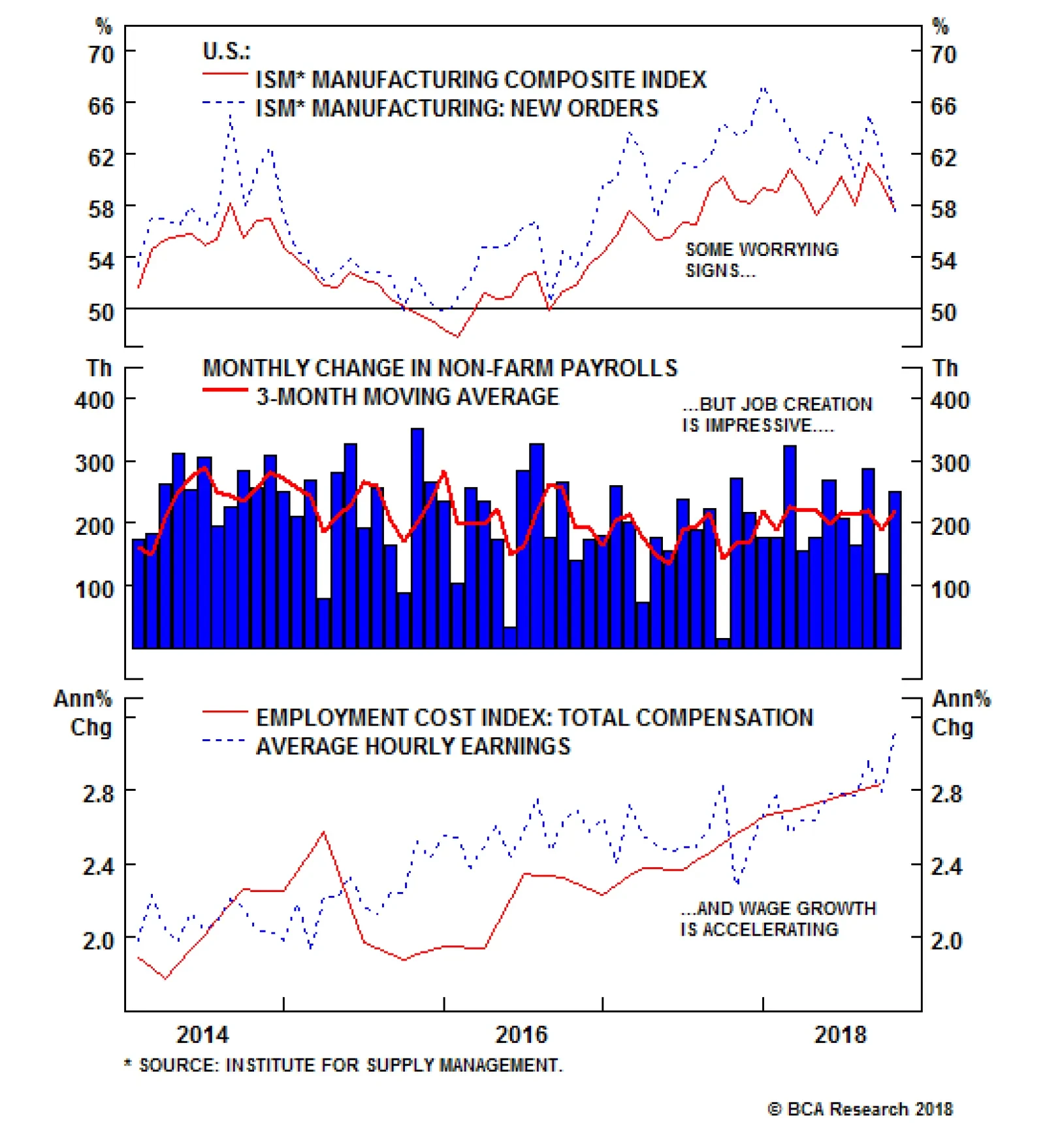
The equity market of late has been highly sensitive to any signs that the U.S. has reached peak economic and profit growth for the cycle, especially given this year’s disappointing housing data. The drop in both the ISM manufacturing composite index and the…
Highlights Duration: Foreign economic growth continues to diverge negatively from growth in the United States. The resulting upward pressure on the U.S. dollar will eventually drag U.S. growth down, and could temporarily threaten the cyclical uptrend in Treasury yields. But so far there is no evidence that dollar strength is too much for the U.S. economy to handle. Investors should maintain below-benchmark duration until signs of contagion are more apparent. Yield Curve: A reading of the macro drivers of the yield curve suggests that the slope of the curve will not steepen or flatten dramatically during the next 6-12 months. In this environment, trades that are long the belly of the curve and short a duration-matched barbell consisting of the short and long ends will profit, due to extremely attractive valuation. We currently recommend going long the 7-year bullet and short the 1/20 barbell. Feature If investors were already worried about the impact of restrictive Fed policy on credit spreads and equities, the minutes from September's FOMC meeting - released last Wednesday - did nothing to calm their nerves. The minutes revealed that "a few participants expected that policy would need to become modestly restrictive for a time" while an additional "number" of participants "judged that it would be necessary to temporarily raise the federal funds rate above their assessments of its longer-run level." There is a small distinction between the "few" participants who expect that a fed funds rate above the estimated longer-run neutral level of 3% will be necessary because restrictive monetary policy will be warranted and the "number" of participants who think that the fed funds rate will move above 3% without policy turning restrictive. However, the main takeaway for investors should be that a large portion of the committee expects that rate hikes will continue until the fed funds rate is at least above 3%. In last week's report we explored the risk that higher yields lead to an excessive tightening of financial conditions and actually sow the seeds of their own decline.1 But we do not view that as the greatest threat to our recommended below-benchmark portfolio duration stance. The biggest risk to that view comes from the ongoing divergence between strong U.S. and weak foreign economic growth. No Contagion... Yet Chart 1 shows that, since 1993, every time our Global (ex. U.S.) Leading Economic Indicator (LEI) has fallen below zero, the U.S. LEI has eventually followed. But while the Global (ex. U.S.) LEI has now been below zero for nine consecutive months, there is so far no evidence of contagion into the United States. The resilience of the U.S. economy probably explains why the September FOMC minutes only briefly mentioned the risk from weak foreign growth. Chart 1U.S. And Foreign Growth Continue To Diverge
U.S. And Foreign Growth Continue To Diverge
U.S. And Foreign Growth Continue To Diverge
From the minutes:2 The divergence between domestic and foreign economic growth prospects and monetary policies was cited as presenting a downside risk because of the potential for further strengthening of the U.S. dollar... But: Participants generally agreed that risks to the outlook appeared roughly balanced. The concern is that, much like in the 2014-16 period, the divergence in growth between the U.S. and the rest of the world puts so much upward pressure on the dollar that it eventually drags U.S. growth and bond yields lower. But despite this year's 4.6% appreciation in the trade-weighted dollar, we have yet to see any impact on our Fed Monitor and Treasury yields remain in an uptrend (Chart 2). This suggests that we have not yet reached peak divergence between U.S. and foreign growth. Further divergence and dollar strength is necessary before the U.S. economy is negatively impacted. Chart 2More $ Strength Required
More $ Strength Required
More $ Strength Required
The reason why the dollar's recent appreciation has not yet exerted a discernible impact on the U.S. economy might be because overall global GDP growth is on a more solid footing than it was in 2014-16 (Chart 3). The IMF forecasts that global GDP growth will be 3.7% in 2018 and 2019, compared to 3.5% in 2015. Meanwhile, the moderation in Eurozone growth represents a decline from lofty 2017 GDP growth of 2.4%. Even in emerging markets, where the global growth slowdown is most apparent, the IMF is still forecasting GDP growth of 4.7% for both 2018 and 2019, a far cry from the 4.3% seen in 2015 (Chart 3, bottom panel). Chart 3Global Growth Stronger Than 2014-16
Global Growth Stronger Than 2014-16
Global Growth Stronger Than 2014-16
Of course, IMF forecasts can always change, and they likely will be revised lower if current trends continue. However, the key point for bond investors is that the global economy is in much better shape than it was between 2014 and 2016. This means that non-U.S. growth needs to see further significant weakness before the uptrend in U.S. Treasury yields is threatened. Bottom Line: Foreign economic growth continues to diverge negatively from growth in the United States. The resulting upward pressure on the U.S. dollar will eventually drag U.S. growth down, and could temporarily threaten the cyclical uptrend in Treasury yields. But so far there is no evidence that dollar strength is too much for the U.S. economy to handle. Investors should maintain below-benchmark duration until signs of contagion are more apparent. Can Uncertainty Steepen The Yield Curve? The yield curve has steepened somewhat during the past few weeks, the result of much higher yields at the long-end of the curve and short-end yields that have been roughly unchanged. We think Fed communication has been an important catalyst for this curve action. Specifically, the Fed's deliberate attempt to introduce uncertainty around its estimates of the neutral fed funds rate.3 Bond investors are finally getting the message that the Fed's median forecast of a 3% longer-run fed funds rate is not written in stone. Depending on the economic outlook, the funds rate could peak for the cycle at a level that is well above or below 3%. Given the recent spate of strong U.S. economic data, the market is starting to discount a peak that is above 3%, no matter what median forecast appears in the Fed's dots. This raises the question of whether a further un-anchoring of long-dated yields could occur. Is it possible that the yield curve will continue to steepen, even with the Fed lifting short rates at a gradual pace of 25 basis points per quarter? Below, we review a few different macro drivers of the yield curve and conclude that neither a large steepening nor large flattening is likely during the next 6-12 months. Nominal GDP Growth One useful rule-of-thumb for when monetary policy turns restrictive is when the 10-year Treasury yield exceeds the rate of growth in nominal GDP. In the past, a 10-year yield above the rate of growth in nominal GDP has coincided with downward pressure on core inflation (Chart 4). With that in mind, we note that nominal GDP has grown by 5.44% during the past year, by 3.98% (annualized) during the past two years and by 3.85% (annualized) during the past three years. Chart 410-Year Yield & Nominal GDP
10-Year Yield & Nominal GDP
10-Year Yield & Nominal GDP
We discount the recent 5.44% growth rate because it was largely fueled by fiscal thrust that will fade in the coming quarters. This leaves us with a recent trend of 3.85% - 4% in nominal GDP growth. Even with no further deterioration in growth as the cycle matures, this puts an approximate cap on how high long-dated yields can rise before policy becomes restrictive and the cycle starts to turn. With the 10-year Treasury yield already at 3.19%, it can rise by between 66 bps and 81 bps before it reaches that range. If that adjustment were to occur very quickly, then the yield curve would steepen sharply and then re-flatten as the Fed lifted rates to catch up with the long end. Alternatively, if that adjustment were to occur over a period of 6-9 months, with the Fed hiking at a pace of 25 bps per quarter, the slope of the yield curve would be roughly unchanged. Wage Growth While nominal GDP growth is useful for thinking about long-maturity yields, wage growth correlates quite strongly with the slope of the yield curve itself. Specifically, rapid wage gains tend to coincide with curve flattening, and vice-versa. In fact, a typical cyclical pattern is that first the yield curve flattens and then wage growth accelerates to catch up with the curve (Chart 5). It would be highly unusual for the yield curve to steepen significantly while wage growth is rising, which it finally appears to be doing. Chart 5Higher Wage Growth = Flatter Curve
Higher Wage Growth = Flatter Curve
Higher Wage Growth = Flatter Curve
We cannot completely rule out the possibility that stronger productivity growth actually causes unit labor costs to decelerate even as "top line" wage pressures mount. Unit labor costs are essentially the ratio of wages (compensation per hour) to productivity (output-per-hour), and the bottom panel of Chart 5 shows that a deceleration in unit labor costs could cause the yield curve to steepen. However, we note that there is not much precedent for strong productivity growth overwhelming an acceleration in wages, causing unit labor costs to diverge from other wage measures. For example, even as productivity growth strengthened in the 1990s, unit labor costs continued to rise alongside other measures of wage growth. Inflation Expectations We have frequently noted that inflation expectations embedded in long-dated Treasury yields remain too low compared to levels that are consistent with inflation being well-anchored around the Fed's 2% target. It stands to reason that long-maturity TIPS breakeven inflation rates could steepen the yield curve as they adjust higher. However, the 10-year TIPS breakeven inflation rate is currently 2.11%, only slightly below the range of 2.3% to 2.5% that has historically been consistent with well-anchored inflation expectations (Chart 6). In other words, the upside in long-dated breakevens is now fairly limited. In contrast, the 2-year TIPS breakeven inflation rate stands at only 1.70%, still considerably below "well-anchored" levels (Chart 6, bottom panel). Chart 6More Upside In Short-Dated Breakevens
More Upside In Short-Dated Breakevens
More Upside In Short-Dated Breakevens
Further, since the financial crisis, breakevens at both the short- and long-ends of the curve have been driven by trends in the actual inflation data (Chart 7). If it is rising realized inflation that has driven both the 2-year and 10-year TIPS breakeven inflation rates higher this cycle, and the 2-year rate is further away from target than the 10-year rate, then it stands to reason that inflation expectations are more likely to exert flattening pressure on the nominal yield curve than steepening pressure. Chart 7Realized Inflation Is Driving Expectations
Realized Inflation Is Driving Expectations
Realized Inflation Is Driving Expectations
Rate Volatility & The Term Premium One final macro driver that could steepen the yield curve would be a spike in interest rate volatility and an increase in the term premium at the long-end of the curve. Our prior research has shown that implied interest rate volatility is linked to uncertainty about the macro environment, and Chart 8 shows that the MOVE index of implied interest rate volatility has tended to track the dispersion of individual forecasts of 3-month T-bill rates and GDP growth. In this context, it should not be surprising that implied volatility fell to very low levels when interest rates were pinned at zero and not expected to move for an extended period. Chart 8Macro Uncertainty & Rate Volatility
Macro Uncertainty & Rate Volatility
Macro Uncertainty & Rate Volatility
But, as was mentioned above, the Fed has been trying scale back its forward guidance and inject some uncertainty into the market. Indeed, we think this is one reason why the yield curve steepened and rate volatility increased during the past few weeks. Taking a broader view, we also observe that, historically, macro uncertainty and implied interest rate volatility have tended to fall when the Fed is hiking rates, only spiking once monetary policy becomes restrictive and the economic recovery is threatened. The yield curve is typically inverted by that point. This leaves us to conclude that some further increase in interest rate volatility from exceptionally low levels is possible, but a large spike is unlikely until monetary policy becomes restrictive. Investment Implications A survey of the macro drivers of the yield curve leaves us to conclude that the most likely outcome for the next 6-12 months is that the slope of the curve remains close to its current level, meaning that the curve undergoes a roughly parallel upward shift as the Fed continues to lift rates. However, if nominal GDP growth fails to decelerate from its current 5.44% clip, it is possible that the yield curve steepens first and then flattens as the Fed lifts rates more quickly to catch up. This is not the most likely outcome, but rather a risk to our base case scenario. The final piece of the puzzle is the observation that curve steepener trades continue to look attractively priced. Our current recommendation is to favor the 7-year bullet over a duration-matched barbell consisting of the 1-year and 20-year notes. This trade offers a spread of +8 bps above the reading from our fair value model (Chart 9). Or alternatively, our model shows that the 1/7/20 butterfly spread is currently priced for 29 bps of 1/20 curve flattening during the next six months (Chart 9, bottom panel). Chart 9Curve Steepeners Are Still Attractive
Curve Steepeners Are Still Attractive
Curve Steepeners Are Still Attractive
That much curve flattening is highly unlikely in the current macro environment, and we continue to recommend curve steepener trades to profit from an unchanged yield curve during the next six months. Bottom Line: A reading of the macro drivers of the yield curve suggests that the slope of the curve will not steepen or flatten dramatically during the next 6-12 months. In this environment, trades that are long the belly of the curve and short a duration-matched barbell consisting of the short and long ends will profit, due to extremely attractive valuation. We currently recommend going long the 7-year bullet and short the 1/20 barbell. Ryan Swift, Vice President U.S. Bond Strategy rswift@bcaresearch.com 1Please see U.S. Bond Strategy Weekly Report, "Rate Shock", dated October 16, 2018, available at usbs.bcaresearch.com 2https://www.federalreserve.gov/monetarypolicy/files/fomcminutes20180926.pdf 3Please see U.S. Bond Strategy Weekly Report, "Rigidly Defined Areas Of Doubt And Uncertainty", dated June 19, 2018, available at usbs.bcaresearch.com Fixed Income Sector Performance Recommended Portfolio Specification
Highlights European and Japanese wages have firmed significantly, suggesting upside to inflation in these economies. However, the gain in European wages will soon reverse, as the slowdown in global trade percolates through the European economy. The ECB will not raise rates sooner or faster than currently discounted in markets, and German Bunds remain attractive in currency hedged terms. Japanese wage growth seems more sustainable but Japanese inflation expectations remain anchored to the downside, and Japan will suffer from a fiscal shock when the consumption tax is increased next October. Japan's YCC policy will remain in place for at least another 18 months, and fixed-income investors should continue to overweight JGBs in currency-hedged fixed income portfolios. Feature The pick-up in wage growth this summer in the euro area and Japan has been an interesting development. It raises the risk that inflation in these two economies is about to hit an inflection point. Since growth has returned to these two regions, if inflation were to join the party, the European Central Bank and the Bank of Japan would finally be able to follow in the Federal Reserve's footsteps and begin increasing rates sooner rather than later. This week we explore whether or not inflationary pressures are building in Europe and Japan, and whether or not the expected policy path of the ECB and the BoJ needs to be re-assessed. While cyclical pressures are growing, clouds above the global economy - the EM space in particular - suggest that the policy path currently anticipated by money markets is just right, and no glaring mis-pricings are evident. Euro Area: A Dawn Is Not A Sunrise The Necessary Condition For Inflation Is Here... There is no denying that we have seen massive improvements in the euro area economy. In fact, we would argue that the euro area has finally hit a stage where the necessary condition for a re-emergence of inflation has been met: Economic slack has vanished. There seems to be little spare capacity in the aggregate euro area economy. Today the OECD measure for the output gap stands at +0.5% of GDP. Additionally, a basic approach comparing the level of industrial production to a simple statistical filter further confirms this assessment, showing that production stands 2% above trend (Chart 1). The capacity utilization measure published by the European Commission goes one step further, showing that utilization is at its highest level since 2008. This represents a very significant change from the days of 2011-2015, when capacity utilization stood below the average that prevailed from the time of the euro's introduction (Chart 2). Chart 1No More Slack In Europe
No More Slack In Europe
No More Slack In Europe
Chart 2Capacity Utilization Is At Previous Cycle Peaks
Capacity Utilization Is At Previous Cycle Peaks
Capacity Utilization Is At Previous Cycle Peaks
The labor market has been a particular source of concern for euro area watchers. After all, how can an economy generate any domestic inflationary pressures if wages remain depressed? On that front too, there is plenty to rejoice about. The gap between the euro area's unemployment rate and the OECD's estimate of the non-accelerating rate of unemployment (NAIRU) has nearly fully disappeared. Historically, such an occurrence has been associated with a rise in European core inflation (Chart 3). In fact, the ECB's labor underutilization survey is now at its lowest level in 10 years. Moreover, in its various business conditions surveys, the European Commission asks firms whether labor is a factor limiting production. With the exception of Italy, the number of firms reporting that labor shortages are a problem in most of the major economies stands at or near record highs (Chart 4). This confirms the simple impression provided by the gap between the unemployment rate and NAIRU that the labor market is beginning to create generalized inflationary and wage pressures. Chart 3Diminishing Labor Market Slack Leads##br## To Growing Inflationary Pressures
Diminishing Labor Market Slack Leads To Growing Inflationary Pressures
Diminishing Labor Market Slack Leads To Growing Inflationary Pressures
Chart 4Labor Shortages In ##br##The Euro Area
Labor Shortages In The Euro Area
Labor Shortages In The Euro Area
...But The Sufficient Conditions Remain Murkier While the tight labor market suggests that wages have cyclical upside, is it even true that higher wages do lead to higher inflation in the euro area? The answer is yes. Chart 5 shows that euro area wages tend to lead core CPI by approximately three quarters, with an explanatory power of nearly 87%. This makes sense. Higher wages increase the cost of production for businesses, which results in cost-push inflation. This is even more true if wages rise in real terms, which boosts household's income and supports consumption. Thus, it is likely that the recent spike in wages will lead to higher core inflation. Despite this positive backdrop, some key cyclical worries remain. First, our CPI diffusion index for the euro area, measuring the breadth of inflation increases within the subcomponents of the CPI, is in free-fall. Historically, this has been a worrying sign for core inflation, and for both nominal and real wages (Chart 6). Chart 5In Europe, Wages ##br##Lead Core CPI
In Europe, Wages Lead Core CPI
In Europe, Wages Lead Core CPI
Chart 6But CPI Diffusion Index Suggests Real Wages ##br##And Core CPI Could Hit A Speed Bump
But CPI Diffusion Index Suggests Real Wages And Core CPI Could Hit A Speed Bump
But CPI Diffusion Index Suggests Real Wages And Core CPI Could Hit A Speed Bump
The bigger risk originates from outside the euro area. We have shown in the past that EM shocks can have a disproportionate impact on European economic activity.1 This link seems to run deeper than we had originally realized. As Chart 7 shows, euro area nominal and real wages tend to follow the trend in European exports to EM and China. The logical conclusion is that export shocks end up affecting the whole economy by depressing profits, capex and the willingness of firms to provide wage increases to their employees. This also ends up reverberating into consumption as both nominal and, more importantly, real wages suffer. Today, weakening exports to EM and China suggest that European wages may soon roll over. This would take the wind out of price inflation as well, since wages lead core CPI by roughly three quarters. BCA's Foreign Exchange Strategy service as well as our Emerging Market Strategy sister publication have already highlighted that EM economies are likely to slow further in the coming quarters as China works to de-lever - a process which has already begun (Chart 8).2 Thus, the negative impact of EM on European growth and wages is likely only to grow over the coming quarters. The euro area leading economic indicator (LEI) has already picked up on these dynamics. The deterioration in the LEI suggests that real wages are likely to soon suffer, which will further dent euro area consumption and weigh on core inflation (Chart 9). Chart 7Exports To EM Are The Culprit##br## Behind This Speed Bump
Exports To EM Are The Culprit Behind This Speed Bump
Exports To EM Are The Culprit Behind This Speed Bump
Chart 8Limited Upside Ahead##br## In Chinese Growth
Limited Upside Ahead in Chinese Growth
Limited Upside Ahead in Chinese Growth
Chart 9Euro Area LEI Confirms##br## The Message From Exports
Euro Area LEI Confirms The Message From Exports
Euro Area LEI Confirms The Message From Exports
Adding up those various message we conclude that while we could soon see some upside in inflation via a pass-through of the recent pick-up in wages, the upside is likely to prove transitory as the euro area economy will soon feel the deflationary impact of the slowdown in EM economic activity. What Will The ECB Do? The ECB will end its asset purchase program at the end of this year. Money markets are currently pricing in a full 25-basis-point hike in interest rates by March 2020. However, various formulations of the Taylor Rule suggest that euro area interest rates should already be higher than they currently are (Chart 10). What are interest rates likely to really do in relation to this date? Despite these hawkish Taylor Rule estimates, we think the ECB is likely to wait and see. As we highlighted above, the slack in the euro area economy is dissipating, and therefore inflationary pressures are bound to build up. However, the slowdown in EM that is reverberating through global trade will weigh on inflation over the coming six months. Additionally, we need to monitor developments in shadow policy rates.3 After the Fed began tapering its asset purchases in 2014, the U.S. shadow rate increased by roughly 300 basis points. While the actual fed funds rate was not raised until the end of 2015, the implied tightening from the rise in the shadow rate was enough to cause both U.S. and non-U.S. growth to slow sharply in 2015. Since bottoming in November 2016, the ECB's shadow rate has increased by 450 basis points. Even if European monetary conditions remain accommodative, this is a large and sudden shock to absorb - one that goes a long way in explaining the sudden contraction in the euro area credit impulse (Chart 11). Chart 10Does Europe Really Need Higher Rates?
Does Europe Really Need Higher Rates?
Does Europe Really Need Higher Rates?
Chart 11Large Tightening In Euro Area Shadow Rate
Large Tightening In Euro Area Shadow Rate
Large Tightening In Euro Area Shadow Rate
Ultimately, while the reduction in the euro area economic slack is real, the aforementioned dynamics are worrisome. Hence, we do not think that the ECB will want to prematurely kill off the recovery. Memories of the policy mistake of 2010, when the ECB raised rates in a too-weak economy, are still very much alive on the ECB's Governing Council. This means that a small first hike of less than 25 basis points in late 2019 or early 2020 seems appropriate, as there should be more convincing evidence by then that the economy can tolerate higher interest rates. Hence, there does not seem to currently be any mis-pricing in the European interest rate curve since investors are correctly pricing in a full 25-basis points of hikes from the ECB by March 2020. Investment Implications We continue to recommend U.S. investors hold European bonds while hedging the currency exposure back into U.S. dollar. A hedged 10-year Bund currently yields 3.66%, compared to 3.2% for a 10-year Treasury note. The picture above does not suggest that Bund yields will have enough upside to generate the capital losses needed to offset this yield pick-up, especially as Treasury prices suffer greater potential downside. This also means that once hedging costs are taken into account, European fixed-income investors are better off staying at home than playing in the U.S. government bond market. The impact for EUR/USD is more complex. The U.S. Overnight Index Swap (OIS) curve is currently pricing in roughly three rate hikes by the Fed over the next 12 months. BCA think that there could be even more U.S. rate hikes as the Fed continues to follow a 25 basis-points-per-quarter pace. Thus, we do not see the spread between U.S. and euro area interest rates narrowing in a more bullish direction for the euro Moreover, currencies trade on more than just interest rate differentials. The dollar has historically responded favorably to slowing EM growth. Moreover, as we highlighted three weeks ago, since the U.S. balance of payments is currently in surplus, this means that the U.S. is sucking in liquidity from the rest of the world.4 This is another way of saying that the world is buying more dollars than the U.S. is supplying. As a result, the dollar could continue to experience upside versus the euro over this period from factors beyond simple rate differentials. Bottom Line: The euro area economic slack has greatly dissipated and the medium term outlook for inflation is improving. Moreover, the recent pick-up in euro area wages suggest that core CPI could also pick up in the coming months. However, this increase in inflation is likely to prove temporary. Before inflation can increase durably, Europe will first have to digest the deflationary impact of slowing EM economies and global trade. This means that the ECB is likely to proceed with policy normalization very cautiously. The current pricing of 25 basis points of hikes by March 2020 is sensible. Hence, investors should continue to overweight Bunds hedged back into dollars in global fixed income portfolios. Moreover, EUR/USD could experience additional weaknesses on a 12-month basis. Japan: Fragile Progress, But Not Enough This past June, Japanese wage growth hit rates not seen in 21 years. This is enough to begin wondering if Japan is finally escaping its two-decades-long deflationary trap. After all, as Chart 12 shows, Japanese wages are a slow but nonetheless leading indicator of core inflation. Giving even more comfort to forecasts of higher Japanese inflation is the fact that, after falling continuously from the bubble peak in the early 1990s until Q1 2017, Japanese land prices have been slowly but surely increasing. Inflationary pressures in Japan are building up because the economy is at full employment. According to the BoJ, the output gap stands at +1.9% and has been positive for two years. The unemployment rate is at a stunningly low level of 2.4%, and the active job opening-to-applicant ratio stands at a four-decade high. The implications of this backdrop are evident. Chart 13 shows the demand/supply condition component of the Tankan survey of Japanese businesses, both in the manufacturing and non-manufacturing sectors. It has historically been a good explanatory variable for wage developments in Japan, and currently points to additional strength. Chart 12Rising Japanese Wages Should Boost Core Inflation
Rising Japanese Wages Should Boost Core Inflation
Rising Japanese Wages Should Boost Core Inflation
Chart 13Capacity Pressures Are Lifting Japanese Wages
Capacity Pressures Are Lifting Japanese Wages
Capacity Pressures Are Lifting Japanese Wages
Despite these positive developments, there remain some nagging worries. For one, the pick-up in wages seems strange in an economy where total hours worked are not rising (Chart 14). Moreover, Japanese households are currently increasing their savings ratio, which means that while they might be earning more, they are keeping this money in their bank accounts rather than spending it (Chart 14, bottom panel). As a result, there has been a limited pass-through of the recent wage acceleration into higher consumption. Additionally, like in Europe, the Japanese economy is at risk from foreign shocks. While the domestic economy seems robust, foreign machinery orders have been weakening. Industrial production has followed this path, decelerating sharply (Chart 15). Historically, Japanese inflation is very sensitive to the level of broader economic activity, so this weakening trend in industrial activity points to limited upside for overall inflation. Chart 14Weird Dynamics In Japan
Weird Dynamics In Japan
Weird Dynamics In Japan
Chart 15Japan: The Domestic Front Is Healthy, The Foreign One Is Not
Japan: The Domestic Front Is Healthy, The Foreign One Is Not
Japan: The Domestic Front Is Healthy, The Foreign One Is Not
The biggest problem faced by the BoJ, however, remains the weakness in inflation expectations. In the eyes of the Japanese central bank, the reason why Japanese realized inflation and wage growth have remained tepid is because decades of low inflation have created embedded expectations among the Japanese to not expect rising prices. Today, Japanese inflation expectations are once again weakening, a common occurrence when global growth slows (Chart 16). Additionally, Japan could hit a fiscal cliff of sorts next year. In October 2019, the consumption tax will increase from 8% to 10%. The last such increase - a three-percentage point hike in 2014 - caused a major slowdown in economic activity that had a deep deflationary impact. While the increase this time around is smaller and the Japanese economy is stronger than in 2014-2015, it remains to be seen how the country handles the shock of a fiscal tightening via a higher sales tax, especially if exports to EM remain on their downward path. The BoJ is likely to be very cognizant of this risk. Currently, the low level of inflation means that the real BoJ policy rate is in line with that of the U.S., a much stronger economy (Chart 17, top panel). Since Japan still faces a fiscal cliff next year and inflation expectations have not yet been unmoored to the upside, the current increase in wages is not enough to push the BoJ to abandon its Yield Curve Control (YCC) policy. What about QQE? The low shadow rate means that the BoJ does not need to buy assets anymore (Chart 17, bottom panel). Yet, the problem for Japan is that QQE possesses a strong signaling component. Ending this program is likely to cause markets to price in the end of YCC, which would drive nominal rates higher and thus result in both higher real rates and a significant tightening in monetary policy. As a result, we expect QQE to remain in place so that YCC will stay credible. However, the program is likely to have a slower pace of buying than before and will be too small to fully absorb the new issuances of JGBs by the MoF (Chart 18). Chart 16The BoJ's ##br##Number 1 Problem
The BoJ's Number 1 Problem
The BoJ's Number 1 Problem
Chart 17The Signaling Effect Of QQE Is##br## Still Needed Because Of YCC...
The Signaling Effect Of QQE Is Still Needed Because Of YCC...
The Signaling Effect Of QQE Is Still Needed Because Of YCC...
Chart 18...But QQE Doesn't Need To Be ##br##Quite As Large Anymore
...But QQE Doesn't Need To Be Quite As Large Anymore
...But QQE Doesn't Need To Be Quite As Large Anymore
In terms of signposts that would signal to us to begin betting on an end to YCC, we continue to target three things that must ALL happen in unison, highlighted by BCA's Chief Global Fixed Income Strategist, Rob Robis, in February:5 USD/JPY rises at least to the 115-120 range; Japanese core CPI and nominal wage inflation both rise above 1.5%; 10-year JGB yields reaching an overvalued extreme, based on a model that includes potential GDP, BoJ purchases and the level of 10-year Treasury yields. So far, none of these conditions has been met. In fact, the slowdown in global trade and EM activity could even threaten the current improvement witnessed in wages. As a result, we expect all three of these developments to only happen in 2020, leaving Japanese yields with very limited upside. Investment Implications Japanese fixed-income investors continue to be subsidized to remain at home and avoid U.S. Treasuries. Because short rates in Japan are so low, the yield on 10-year U.S. Treasuries hedged into yen yield is 0.05%, less than the 0.16% yield on 10-year JGBs. At the same time, U.S. fixed income investors are incentivized to buy JGBs and hedge the currency exposure into dollars. Additionally, with the BoJ unlikely to abandon its YCC program for potentially two more years, JGBs with up to 10-year maturities are unlikely to suffer capital losses. Largely for this reason, BCA's Global Fixed Income Strategy's recommended model bond portfolio, maintains a large overweight position in JGBs, but only for maturities less than 10 years as the BoJ's YCC program is not focused on yields beyond the 10-year point. Regarding the yen, the outlooks is treacherous. On one hand, a strong USD implies a weaker yen. So do higher 10-year Treasury yields, especially if JGB yields possess little upside. On the other hand, weakness in the EM space tends to result in a stronger yen as carry trades get unwound. Due to these bifurcated risks, we do not recommend buying the yen against the dollar. However, we think that at current levels the yen remains an attractive play against the euro and against the Australian dollar, especially on a six- to nine-month basis. Bottom Line: Japanese wages have enjoyed significant upside, but Japanese inflation expectations remain moribund. Moreover, Japan is likely to experience a negative fiscal shock next year as the consumption tax will once again be increased. These two risks, in addition with slowing global growth, mean that the BoJ is unlikely to abandon YCC until well into 2020. As a result, investors should continue to overweight JGBs with maturities of less than 10-years hedged back into U.S. dollars in a global fixed income portfolio. USD/JPY should enjoy further upside on a 12-month basis. Mathieu Savary, Vice President Foreign Exchange Strategy mathieu@bcaresearch.com 1 Please see Foreign Exchange Strategy Weekly Report, titled "ECB: All About China", dated April 7, 2017, available at fes.bcaresearch.com 2 Please see Foreign Exchange Strategy Special Report, titled "The Bear And The Two Travelers", dated August 17, 2018, available at fes.bcaresearch.com and Emerging Markets Strategy Special Report, titled "Deciphering Global Trade Linkages", dated September 27, 2018, available at ems.bcaresearch.com 3 The shadow rate is a measure of the impact of the various unorthodox policy initiatives implemented by central banks in the wake of the great financial crisis. It tries to express the effect of those measures in terms of the implied levels of policy rates that would have needed to prevail for the economy to generate the same performance if asset purchases had not been implemented. 4 Please see Foreign Exchange Strategy Weekly Report, titled "Policy Divergences Are Still The Name Of The Game", dated September 14, 2018, available at fes.bcaresearch.com 5 Please see Global Fixed Income Strategy Special Report, titled "What Would It Take For The Bank Of Japan To Raise Its Yield Target", dated February 13, 2018, available at fes.bcaresearch.com Trades & Forecasts Forecast Summary Core Portfolio Tactical Trades Closed Trades
Highlights Macro outlook: Global growth will continue to decelerate into early next year on the back of brewing EM stresses and an underwhelming policy response from China. Equities: Stay neutral for now, while underweighting EM relative to DM stocks. Within DM, overweight the U.S. in dollar terms. Bonds: Global bond yields may dip in the near term, but the longer-term path is firmly higher. Currencies: The dollar is working off overbought conditions, but will rebound into year-end. EM currencies will suffer the most. Commodities: Favor oil over industrial metals. Precious metals will also remain under pressure until the dollar peaks next year, before beginning a major bull run as inflation accelerates. Feature I. Economic Outlook The Fed Can Hike A Lot More If 2017 was the year of a synchronized global growth recovery, 2018 is turning out to be a year where desynchronization is once again the name of the game. The U.S. economy continues to fire on all cylinders, while much of the rest of the world is struggling to stay afloat. The divergence in economic outcomes has been mirrored in central bank policy. The Fed is now hiking rates once per quarter whereas most other major central banks are still sitting on their hands. How high can U.S. rates go? The answer is a lot higher than investors anticipate. Market participants currently expect the Fed funds rate to rise to 2.37% by the end of this year and 2.84% by the end of 2019. No rate hikes are priced in for 2020 and beyond. The Fed dots are somewhat higher than market expectations (Chart 1). The median dot rises to about 3.4% in 2020-21, but then falls back to 3% over the Fed's longer-run horizon. Both investors and the Fed have apparently bought into Larry Summers' secular stagnation thesis. They seem convinced that rates will not be able to rise above 3% without triggering a recession. While we have a lot of sympathy for Summers' thesis, it must be acknowledged that it is a theory about the long-term determinants of the neutral rate of interest. Over a shorter-term cyclical horizon, many factors can influence the neutral rate. Critically, as discussed last week, most of these factors are pushing it higher: Fiscal policy is extremely stimulative. The IMF estimates that the U.S. cyclically-adjusted budget deficit will reach 6.8% of GDP in 2019. In contrast, the euro area is projected to run a deficit of only 0.8% of GDP (Chart 2). The relatively more expansionary nature of U.S. fiscal policy is one key reason why the Fed can raise rates while the ECB cannot. Chart 1Markets Expect No Fed ##br##Hikes Beyond Next Year
2018 Q4 Strategy Outlook: Desynchronization Is Back
2018 Q4 Strategy Outlook: Desynchronization Is Back
Chart 2Fiscal Policy Is More Expansionary ##br##In The U.S. Than In The Euro Area
Fiscal Policy Is More Expansionary In The U.S. Than In The Euro Area
Fiscal Policy Is More Expansionary In The U.S. Than In The Euro Area
Credit growth has picked up. After a prolonged deleveraging cycle, private-sector nonfinancial debt is increasing faster than GDP (Chart 3). The recent easing in The Conference Board's Leading Credit Index suggests that this trend will continue (Chart 4). Chart 3U.S. Private-Sector Nonfinancial Debt Is Rising At Close To Its Historic Trend
U.S. Private-Sector Nonfinancial Debt Is Rising At Close To Its Historic Trend
U.S. Private-Sector Nonfinancial Debt Is Rising At Close To Its Historic Trend
Chart 4U.S. Credit Growth Will Remain Strong
U.S. Credit Growth Will Remain Strong
U.S. Credit Growth Will Remain Strong
Wage growth is accelerating. Average hourly earnings surprised on the upside in August, with the year-over-year change rising to a cycle high of 2.9%. This followed a stronger reading in the Employment Cost Index in the second quarter. A simple correlation with the quits rate suggests that there is plenty of upside for wage growth (Chart 5). Faster wage growth will put more money into workers' pockets who will then spend it. The savings rate has scope to fall. The personal savings rate currently stands at 6.7%, more than two percentage points higher than what one would expect based on the current level of household net worth (Chart 6). If the savings rate were to fall by two points over the next two years, it would add 1.5% of GDP to aggregate demand. Chart 5The Quits Rate Is Signaling Upside For Wage Growth
The Quits Rate Is Signaling Upside For Wage Growth
The Quits Rate Is Signaling Upside For Wage Growth
Chart 6The Personal Savings Rate Has Room To Fall
2018 Q4 Strategy Outlook: Desynchronization Is Back
2018 Q4 Strategy Outlook: Desynchronization Is Back
A back-of-the-envelope calculation suggests that these cyclical factors will permit the Fed to raise rates to 5% by 2020, almost double what the market is discounting.1 An Absence Of Major Financial Imbalances Will Allow The Fed To Keep Raising Rates The past three recessions were all caused by financial market overheating rather than economic overheating. The 1991 recession was mainly the consequence of the Savings and Loan crisis, compounded by the spike in oil prices leading up to the Gulf War. The 2001 recession stemmed from the dotcom bust. The Great Recession was triggered by the housing bust. Today, it is difficult to point to any clear imbalances in the economy. True, housing activity has been weak for much of the year. However, unlike in 2006, the home vacancy rate stands near record-low levels (Chart 7). Tight supply will limit downside risks to both construction and home prices. On the demand side, low unemployment, high consumer confidence, and a rebound in the rate of new household formation should help the sector. Despite elevated home prices in some markets, the average monthly payment that homeowners must make to service their mortgage is quite low by historic standards (Chart 8). The quality of mortgage lending has also been very high over the past decade, which reduces the risk of a sudden credit crunch (Chart 9). Chart 7Low Housing Inventories Will Support Home Prices And Construction
Low Housing Inventories Will Support Home Prices And Construction
Low Housing Inventories Will Support Home Prices And Construction
Chart 8Housing Affordabiity Is Not Yet Stretched
Housing Affordabiity Is Not Yet Stretched
Housing Affordabiity Is Not Yet Stretched
Chart 9Mortgage Lenders Are Being Prudent
Mortgage Lenders Are Being Prudent
Mortgage Lenders Are Being Prudent
Unlike housing debt, there are more reasons to be concerned about corporate debt. The ratio of corporate debt-to-GDP has risen to record-high levels. So-called "covenant-lite" loans now make up the bulk of corporate leveraged loan issuance. While there is no doubt that the corporate debt market is the weakest link in the U.S. financial sector, some perspective is in order. U.S. corporate debt levels are quite low by global standards. Corporate debt in the euro area is more than 30 points higher as a percent of GDP than in the United States (Chart 10). Moreover, the interest coverage ratio - EBIT divided by interest expense - for U.S. corporates is still above its historic average (Chart 11). While this ratio will fall as interest rates rise, this will not happen very quickly. Most U.S. corporate debt is at fixed rates and average maturities have been rising. This reduces both rollover risk and the sensitivity of debt-servicing costs to higher short-term rates. An increasing share of U.S. corporate debt is held by non-leveraged investors. Bank loans account for only 18% of nonfinancial corporate sector debt, down from 40% in 1980 (Chart 12). This is important, because what makes a spike in corporate defaults so damaging is not the direct impact this has on the economy, but the second-round effects rising defaults have on financial sector stability. Chart 10U.S. Corporate Debt Not That High By Global Standards
U.S. Corporate Debt Not That High By Global Standards
U.S. Corporate Debt Not That High By Global Standards
Chart 11Interest Coverage Ratio Is Above Its Historic Average
Interest Coverage Ratio Is Above Its Historic Average
Interest Coverage Ratio Is Above Its Historic Average
Chart 12Banks Have Been Reducing Their Exposure To The Corporate Sector
Banks Have Been Reducing Their Exposure To The Corporate Sector
Banks Have Been Reducing Their Exposure To The Corporate Sector
In any case, we already had a dress rehearsal for what a corporate debt scare might look like. Credit spreads spiked in 2015. Default rates rose, but the knock-on effects to the financial system were minimal. This suggests that corporate America could handle a fair bit of monetary tightening without buckling under the pressure. The Fed And The Dollar If the Fed is able to raise rates substantially more than the market is discounting while most central banks cannot, the short-term interest rate spread between the U.S. and its trading partners is likely to widen. History suggests that this will produce a stronger dollar (Chart 13). Chart 13Historically, The Dollar Has Moved In Line With Interest Rate Differentials
Historically, The Dollar Has Moved In Line With Interest Rate Differentials
Historically, The Dollar Has Moved In Line With Interest Rate Differentials
Some have speculated that the Trump administration will intervene in the foreign-exchange market in order to drive down the value of the greenback. We doubt this will happen, but even if such interventions were to occur, they would not be successful. Presumably, currency interventions would take the form of purchases of foreign exchange, financed through the issuance of Treasurys. The purchase of foreign currency would release U.S. dollars into the financial system, but the sale of Treasury securities would suck those dollars back out of the system. The net result would be no change in the volume of U.S. dollars in circulation - what economists call a "sterilized" intervention. Both economic theory and years of history show that sterilized interventions do not have lasting effects on currency values. The Fed could, of course, provide funding for the Treasury's purchases of foreign exchange, leading to an increase in the monetary base. This would be tantamount to an unsterilized intervention. However, such a deliberate attempt to weaken the dollar by expanding the money supply would fly in the face of the Fed's efforts to cool growth by tightening financial conditions. We highly doubt the Fed's current leadership would go along with this. Emerging Markets In The Crosshairs The combination of rising U.S. rates and a stronger dollar is bad news for emerging markets. Eighty percent of EM foreign-currency debt is denominated in dollars. Outside of China, EM dollar debt is now back to late-1990s levels, both as a share of GDP and exports (Chart 14). The wave of EM local-currency debt issued in recent years only complicates matters. If EM central banks raise rates to defend their currencies, this could imperil economic growth and make it difficult for local-currency borrowers to pay back their loans. Rather than hiking rates, some EM central banks may simply choose to inflate away debt. Consider the case of Brazil. The fiscal deficit stands at nearly 8% of GDP and government debt has soared from 60% of GDP in 2013 to 84% of GDP at present (Chart 15). Ninety percent of Brazilian sovereign debt is denominated in reais. The Brazilian government won't default on its debt per se. However, if push comes to shove, Brazil's central bank can always step in to buy government bonds, effectively monetizing the fiscal deficit. This could cause the real to weaken much more than it already has. Chart 14EM Dollar Debt Is High
EM Dollar Debt Is High
EM Dollar Debt Is High
Chart 15Brazil's Perilous Fiscal Position
Brazil's Perilous Fiscal Position
Brazil's Perilous Fiscal Position
Chinese Stimulus To The Rescue? When emerging markets last succumbed to pressure in 2015, China saved the day by stepping in with massive stimulus. Fiscal spending and credit growth accelerated to over 15% year-over-year. The government's actions boosted demand for all sorts of industrial commodities. The stimulus measures in 2015 followed an even greater wave of stimulus in 2009. While these stimulus measures invigorated China's economy and helped put a floor under global growth, they came at a price: China's debt-to-GDP ratio has swollen from 140% in 2008 to over 250% at present, which has endangered financial stability (Chart 16). Excess capacity has also increased. This can be seen in the dramatic rise in the capital-to-output ratio. It can also be seen in the fact that the rate of return on assets within the Chinese state-owned enterprise sector, which has been the main source of rising corporate leverage, has fallen below borrowing costs (Chart 17). Chart 16China: Debt And Capital Accumulation Went Hand In Hand
China: Debt And Capital Accumulation Went Hand In Hand
China: Debt And Capital Accumulation Went Hand In Hand
Chart 17China: Rate Of Return On Assets Below Borrowing Costs For SOEs
China: Rate Of Return On Assets Below Borrowing Costs For SOEs
China: Rate Of Return On Assets Below Borrowing Costs For SOEs
Chinese banks are being told that they must lend more money to support the economy, while ensuring that their loans do not turn sour. Unfortunately, that is becoming an impossible feat. The Chinese economy produces too much and spends too little. The result is excess savings, epitomized most clearly in a national savings rate of 46% (Chart 18). As a matter of arithmetic, national savings must be transformed either into domestic investment or exported abroad via a current account surplus. Now that the former strategy has run into diminishing returns, the Chinese authorities will need to concentrate on the latter. This will require a larger current account surplus which, in turn, will necessitate a relatively cheap currency. Above-average productivity growth has pushed up the fair value of China's real exchange rate over time. However, the currency still looks expensive relative to its long-term trend line (Chart 19). Pushing down the value of the yuan against the dollar will not be that difficult. Chart 20 shows that USD/CNY has moved broadly in line with the one-year swap spread between the U.S. and China. The spread was about 3% earlier this year. Today, it stands at only 0.6%. As the Fed continues to raise rates, the spread will narrow further, taking the yuan down with it. Chart 18China Saves A Lot
China Saves A Lot
China Saves A Lot
Chart 19The RMB Is Still Quite Strong
The RMB Is Still Quite Strong
The RMB Is Still Quite Strong
Chart 20USD/CNY Has Tracked China-U.S. Interest Rate Differentials
USD/CNY Has Tracked China-U.S. Interest Rate Differentials
USD/CNY Has Tracked China-U.S. Interest Rate Differentials
Unlike standard Chinese fiscal/credit easing, a stimulus strategy focused on weakening the yuan would hurt other emerging markets by undermining their competitiveness in relation to China. A weaker yuan would also make it more expensive for Chinese companies to import natural resources, thus putting downward pressure on commodity prices. The Euro Area: Back In The Slow Lane After putting in a strong performance in 2017, the economy in the euro area has struggled to maintain momentum this year. Growth is still above trend, but the overall tone of the data has been lackluster at best, with the risks to growth increasingly tilted to the downside. Weaker growth in China and other emerging markets certainly has not helped. However, much of the problem lies closer to home. Bank credit remains the lifeblood of the euro area economy. The 12-month credit impulse - defined as the change in credit growth from one 12-month period to the next - tends to track GDP growth (Chart 21).2 Euro area credit growth accelerated over the course of 2017, but has been broadly stable this year. As a result, the credit impulse has fallen, taking GDP growth down with it. It will be difficult for euro area GDP growth to increase unless credit growth starts rising again. So far, there is little sign that this is about to happen. According to the latest euro area bank lending survey, while banks continue to ease standards for business loans, they are doing so at a slower pace than in the past. A net 3% of banks eased lending standards in the second quarter, compared to 8% in the first quarter. Loan demand growth has been fairly stable. This suggests that loan growth will remain positive, but is unlikely to increase much from current levels. Worries about the health of European banks will further constrain credit growth. European banks in general, and Spanish banks in particular, have significant exposure to the most vulnerable emerging markets (Chart 22). Chart 21Euro Area Credit Growth Has Flatlined
Euro Area Credit Growth Has Flatlined
Euro Area Credit Growth Has Flatlined
Chart 22Spain Most Exposed To Vulnerable EMs
2018 Q4 Strategy Outlook: Desynchronization Is Back
2018 Q4 Strategy Outlook: Desynchronization Is Back
Concerns about the ability of the Italian government to service its debt obligations will also restrain bank lending. Investors breathed a sigh of relief last month when the Italian government signaled a greater willingness to pare back next year's proposed budget deficit, in accordance with the dictates of the European Commission. Tensions remain, however, as evidenced by the fact that the ten-year spread between BTPs and German bunds is still 120 basis points higher than in April (Chart 23). The European political establishment is terrified of the rise in populism across the region and would love nothing more than to see Italy's populist parties implode. This means that any help from the ECB and the European Commission will only arrive once a full-fledged crisis is underway. Anyway, it is far from clear that a smaller budget deficit would actually translate into a lower government debt-to-GDP ratio. Like China, Italy also has a private sector that saves too much and spends too little. A shrinking population has reduced the need for firms to invest in new capacity. The prior government's pension cuts have also incentivized people to save more for their retirement. The result is a private sector savings-investment surplus that stood at 5% of GDP in 2017 compared to close to breakeven a decade ago (Chart 24). Chart 23Italian/Bund Spreads Signal Lingering Fiscal Strain
Italian/Bund Spreads Signal Lingering Fiscal Strain
Italian/Bund Spreads Signal Lingering Fiscal Strain
Chart 24Italy: Private Sector Saves Too Much And Spends Too Little
Italy: Private Sector Saves Too Much And Spends Too Little
Italy: Private Sector Saves Too Much And Spends Too Little
Unlike Germany, Italy cannot export its excess production because it does not have a hypercompetitive economy. Nor does it have the ability to devalue its currency to gain a quick competitiveness boost. This means that the Italian government has to absorb excess private-sector savings with its own dissavings - a fancy way of saying that it has to run a large budget deficit. This has effectively been Japan's strategy for over two decades. However, unlike Japan, Italy does not have a lender of last resort that can unconditionally buy government debt. This raises the risk that Italy's debt woes will resurface, either because the government abandons austerity measures, or because the lack of fiscal support causes nominal GDP to stagnate, making it all but impossible for the country to outgrow its debt burden. Receding Policy Puts The discussion above suggests that many of the "policy puts" that investors have relied on are in the process of having their strike price marked down to deeper out-of-the-money levels. Yes, the Fed will ease off on rate hikes if U.S. growth is at risk of stalling out completely. However, now that the labor market has reached full employment, the Fed will welcome modestly slower growth. Remember that there has never been a case in the post-war era where the three-month average of the unemployment rate has risen by more than a third of a percentage point without a recession taking place (Chart 25). The further the unemployment rate falls below NAIRU, the more difficult it will be for the Fed to achieve the proverbial soft landing. Chart 25Even A Small Uptick In The Unemployment Rate Is Bad News For The Business Cycle
Even A Small Uptick In The Unemployment Rate Is Bad News For The Business Cycle
Even A Small Uptick In The Unemployment Rate Is Bad News For The Business Cycle
Likewise, the "China stimulus put" - the presumption that most investors have that the Chinese authorities will launch a barrage of fiscal and credit easing at the first sign of slower growth - has become less reliable in light of the government's competing objectives namely reducing debt growth and excess capacity. The same goes for the "ECB put." Yes, the ECB will bail out Italy if the entire European project appears at risk. But spreads may need to blow out before the cavalry arrives. Meanwhile, just as the aforementioned policy puts are receding, new policy risks are rising to the fore, chief among them protectionism. We expect the trade war to heat up, with the Trump administration increasingly directing its ire at China. Trump's macroeconomic policies are completely at odds with his trade agenda. Fiscal stimulus will boost aggregate demand, which will suck in more imports. An overheated economy will prompt the Fed to raise rates more aggressively than it otherwise would, leading to a stronger dollar. All this will result in a wider trade deficit. What will Trump tell voters two years from now when he is campaigning in Michigan and Ohio about why the trade deficit has widened rather than narrowed under his watch? Will he blame himself or Beijing? No trophy for getting that answer right. II. Financial Markets Global Equities The combination of slower global growth, rising economic vulnerabilities outside the U.S., and a more challenging policy environment caused us to downgrade our view on global equities from overweight to neutral in June,3 while reiterating our preference for developed market equities relative to EM stocks. For now, we are comfortable with our bearish view towards emerging market stocks. While EM equities have cheapened, they are not yet at washed out levels (Chart 26). Bottom fishers still abound, as evidenced by the fact that the number of shares outstanding in the MSCI iShares Turkish ETF has almost tripled since early April (Chart 27). Chart 26EM Assets: Valuations Not Yet At Washed Out Levels
EM Assets: Valuations Not Yet At Washed Out Levels
EM Assets: Valuations Not Yet At Washed Out Levels
Chart 27EM Bottom Fishers Still Abound
EM Bottom Fishers Still Abound
EM Bottom Fishers Still Abound
At some point - probably in the first half of next year - investors will liquidate their remaining bullish EM bets. At that point, EM stocks will rebound. European and Japanese equities should also start to outperform the U.S., given their more cyclical nature. As far as the absolute direction of the S&P 500 is concerned, the next few months could be challenging. U.S. stocks have been able to decouple from those in the rest of the world, but this state of affairs may not last. Recall that the S&P 500 fell by 22% peak-to-trough between July 20 and October 8, 1998, in what otherwise was a massive bull market. We do not know if there is another Long-Term Capital Management lurking around the corner, but if there is, a temporary selloff in U.S. stocks may be hard to avoid. Such a selloff would present a buying opportunity over a horizon of 12-to-18 months. If we are correct that cyclical forces have lifted the neutral rate of interest, it will take a while for monetary policy to reach restrictive territory. This means that both fiscal and monetary policy will stay accommodative at least for the next 18 months. As such, the S&P 500 may not peak until 2020. Appendix A - Chart I presents a stylized diagram of where we think global equities are going. It incapsulates three phases: 1) a challenging period over the next six months, driven by EM weakness; 2) a blow-off rally in equities starting in the middle of next year; 3) and finally, a recession-induced bear market beginning in late-2020. Appendix B also presents our valuation charts, which highlight that long-term return prospects are better outside the United States. Fixed Income After advocating for a long duration strategy for much of the post-crisis recovery, BCA declared "The End Of The 35-Year Bond Bull Market" on July 5, 2016, the very same day that the 10-year U.S. Treasury yield hit a record closing low of 1.37%. Cyclically and structurally, we continue to expect U.S. bond yields to rise more than the market is discounting. As noted above, the Fed is underestimating how high rates will need to go before they reach restrictive territory. This means that the Fed will end up behind the curve in normalizing monetary policy, causing the economy to overheat and inflation to rise above the Fed's comfort zone. Chart 28Bond Sentiment Is Extremely Bearish
Bond Sentiment Is Extremely Bearish
Bond Sentiment Is Extremely Bearish
Granted, the Fed is willing to tolerate a modest inflation overshoot. However, a core PCE reading above 2.3%, which is at the top end of the range of the Fed's own forecast, would prompt the Fed to expedite the pace of rate hikes. A bear flattening of the yield curve - a situation where long-term yields rise, but short-term rates go up even more - would be highly likely in that environment. Over a shorter-term horizon spanning the next six months, the outlook for yields is more benign. The combination of a stronger dollar, slower global growth, and flight-to-quality flows into the Treasury market from vulnerable emerging markets can cap yields. Add to this the fact that sentiment towards bonds is currently extremely bearish (Chart 28), and a temporary countertrend decline in yields becomes quite probable. Developed market bond yields in general are likely to follow the direction of U.S. yields, both on the upside and the downside, but in a more muted manner. Outside the periphery, euro area yields have less scope to fall in the near term given that they are already so low. European yields also have less room to rise once global growth bottoms next year because the neutral rate of interest is much lower in the euro area than in the United States. Ironically, a more dovish ECB would help reduce Italian bond yields, as higher inflation is critical for increasing Italian nominal GDP. Since labor market slack is still elevated in Italy, continued monetary stimulus would also lift wages in core Europe more than in Italy, helping to boost Italy's competitiveness relative to the rest of the euro area. Japanese yields have plenty of scope to rise over the long haul. An aging population is pushing more people into retirement, which will cause the national savings rate to fall further. A decline in the savings pool will increase the neutral rate of interest in Japan. Instead of raising the policy rate, the Japanese authorities will let the economy overheat, generating inflation in the process. This will cause the yield curve to steepen, particularly at the very long end (e.g., beyond 10 years) which is the part of the yield curve that is the least susceptible to the BoJ's yield curve control regime. We are positioned for this outcome through our short 20-year JGB/long 5-year JGB trade recommendation. Appendix A - Chart II shows our expectations for the major government bond markets over the coming years. Turning to credit markets, high-yield credit typically underperforms in the latter innings of business-cycle expansions, a period when the Fed is raising rates. Thus, while we do not think that U.S. corporate debt levels will be a major source of systemic financial risk for the broader economy, this is hardly a reason to be overweight spread-product. A more cautious stance towards credit outside the U.S. is also warranted. Currencies And Commodities The dollar is working off overbought conditions, but will rebound into year-end, as EM tensions intensify and hopes of a massive credit/fiscal-fueled Chinese stimulus package fizzle. EM currencies will weaken the most against the dollar over the next three-to-six months, but the euro and, to a lesser extent, the yen, will also come under pressure. Granted, the dollar is no longer a cheap currency, but if long-term interest rate differentials stay anywhere close to current levels, the greenback will remain well supported. Consider the dollar's value against the euro. Thirty-year U.S. Treasurys currently yield 3.20% while 30-year German bunds yield 1.12%, a difference of 208 basis points. Even if one allows for the fact that investors expect euro area inflation to be lower than in the U.S. over the next 30 years, EUR/USD would need to trade at a measly 82 cents today in order to compensate German bund holders for the inferior yield they will receive.4 We do not expect EUR/USD to get down to that level, but a descent into the $1.10-to-$1.12 range over the next six months is probable. Sterling will remain hostage to Brexit negotiations. It is impossible to know how talks will evolve, but our bias is to take a somewhat pound-positive view. The main reason is that support for Brexit has faded (Chart 29). Opinion polls suggest that if a referendum were held again, the "bremain" side would almost certainly prevail. Lacking public support for leaving the EU, it is unlikely that British negotiators could simply walk away from the table. This reduces the odds of a "hard Brexit" outcome. Indeed, a second referendum that leads to a "no-Brexit" verdict remains a distinct possibility. The combination of slower global growth and a resurgent dollar is likely to hurt commodity prices. Industrial metals are more vulnerable than oil. China consumes around half of all the copper, nickel, aluminum, zinc, and iron ore produced around the world (Chart 30). In contrast, China represents less than 15% of global oil demand. Chart 29When Bremorse Sets In
When Bremorse Sets In
When Bremorse Sets In
Chart 30China Is A More Dominant Consumer Of Metals Than Oil
China Is A More Dominant Consumer Of Metals Than Oil
China Is A More Dominant Consumer Of Metals Than Oil
The supply backdrop for oil is also more favorable than for metals. Not only are Saudi Arabia and Russia maintaining production discipline, but U.S. sanctions against Iran threaten to weigh on global crude supply. Further reduction in Venezuela's oil output, as well as potential disruptions to Libyan or Iraqi exports, could also boost oil prices. The superior outlook for oil over metals means we prefer the Canadian dollar relative to the Aussie dollar. While AUD/CAD has weakened in recent months, the Aussie dollar is still somewhat expensive against the loonie based on our long-term valuation model (Chart 31). We also see an increasing chance that Canada will negotiate a revamped trade deal with the U.S., as Trump focuses his attention more on China. Should this happen, it will remove the NAFTA break-up risk discount embedded in the Canadian dollar. Finally, a few words on precious metals. Precious metals typically struggle during periods when the dollar is appreciating (Chart 32). Consequently, we would not be eager buyers of gold or other precious metals until the dollar peaks, most likely around the middle of next year. As inflation starts to accelerate in late-2019 and in 2020, gold will finally move decisively higher. Chart 31Canadian Dollar Still Somewhat Cheap Versus The Aussie Dollar
Canadian Dollar Still Somewhat Cheap Versus The Aussie Dollar
Canadian Dollar Still Somewhat Cheap Versus The Aussie Dollar
Chart 32Gold Won't Shine Until The Dollar Peaks
Gold Won't Shine Until The Dollar Peaks
Gold Won't Shine Until The Dollar Peaks
Appendix A - Chart III and Chart IV present an illustration of where the major currencies and commodities are heading. Peter Berezin, Chief Global Strategist Global Investment Strategy peterb@bcaresearch.com 1 Depending on which specification of the Taylor rule one uses, a one percent of GDP increase in aggregate demand will increase the neutral rate of interest by half a point (John Taylor's original specification) or by a full point (Janet Yellen's preferred specification). Fiscal policy is currently about 3% of GDP too stimulative compared to a baseline where government debt-to-GDP is stable over time. Assuming a fiscal multiplier of 0.5, fiscal policy is thus boosting aggregate demand by 1.5% of GDP. Nonfinancial private credit has increased by an average of 1.5 percentage points of GDP per year since 2016. Assuming that every additional one dollar of credit increases aggregate demand by 50 cents, the revival in credit growth is raising aggregate demand by 0.75% of GDP, compared to a baseline where credit-to-GDP is flat. The labor share of income has increased by 1.25% of GDP from its lows in 2015. Assuming that every one dollar shift in income from capital to labor boosts overall spending on net by 20 cents, this would have raised aggregate demand by 0.25% of GDP. Lastly, if the personal savings rate falls by two points over the next two years, this would raise aggregate demand by 1.5% of GDP. Taken together, these factors are boosting the neutral rate by anywhere from 2% (Taylor's specification) to 4% (Yellen's specification). This is obviously a lot, and easily overwhelms other factors such as a stronger dollar that may be weighing on the neutral rate. 2 Recall that GDP is a flow variable (how much production takes place every period), whereas credit is a stock variable (how much debt there is outstanding). By definition, a flow is a change in a stock. Thus, credit growth affects GDP and the change in credit growth affects GDP growth. Euro area private-sector credit growth accelerated from -2.6% in May 2014 to 3.1% in March 2017, but has been broadly flat ever since. Hence, the credit impulse has dropped. 3 Please see Global Investment Strategy Special Report, "Three Policy Puts Go Kaput: Downgrade Global Equities To Neutral," dated June 20, 2018. 4 For this calculation, we assume that the fair value for EUR/USD is 1.32, which is close to the IMF's Purchasing Power Parity (PPP) estimate. The annual inflation differential of 0.47% is based on 30-year CPI swaps. This implies that the fair value for EUR/USD will rise to 1.52 after 30 years. If one assumes that the euro reaches that level by then, the common currency would need to trade at 1.52/(1.0208)^30=0.82 today. Appendix A Appendix A Chart IMarket Outlook: Equities
2018 Q4 Strategy Outlook: Desynchronization Is Back
2018 Q4 Strategy Outlook: Desynchronization Is Back
Appendix A Chart IIMarket Outlook: Bonds
2018 Q4 Strategy Outlook: Desynchronization Is Back
2018 Q4 Strategy Outlook: Desynchronization Is Back
Appendix A Chart IIIMarket Outlook: Currencies
2018 Q4 Strategy Outlook: Desynchronization Is Back
2018 Q4 Strategy Outlook: Desynchronization Is Back
Appendix A Chart IVMarket Outlook: Commodities
2018 Q4 Strategy Outlook: Desynchronization Is Back
2018 Q4 Strategy Outlook: Desynchronization Is Back
Appendix B Appendix B Chart 1Long-Term Return Prospects Are Slightly Better Outside The U.S.
2018 Q4 Strategy Outlook: Desynchronization Is Back
2018 Q4 Strategy Outlook: Desynchronization Is Back
Appendix B Chart 1Long-Term Return Prospects Are Slightly Better Outside The U.S.
2018 Q4 Strategy Outlook: Desynchronization Is Back
2018 Q4 Strategy Outlook: Desynchronization Is Back
Appendix B Chart 1Long-Term Return Prospects Are Slightly Better Outside The U.S.
2018 Q4 Strategy Outlook: Desynchronization Is Back
2018 Q4 Strategy Outlook: Desynchronization Is Back
Appendix B Chart 1Long-Term Return Prospects Are Slightly Better Outside The U.S.
2018 Q4 Strategy Outlook: Desynchronization Is Back
2018 Q4 Strategy Outlook: Desynchronization Is Back
Strategy & Market Trends Tactical Trades Strategic Recommendations Closed Trades
Highlights When projecting the future course of interest rates, the Fed is the best place to start: Although the Fed only expressly controls short rates, its influence is felt across all maturities. Until it inverts the yield curve, its rate-hike campaigns push all yields higher. Its decisions are influenced by inflation, ... : Our checklist of items that might lead us to change our below-benchmark duration view includes key consumer price series as well as inflation expectations and estimates of the economy's supply-demand balance. ... the state of the labor market, ... : We are monitoring compensation trends and ancillary employment measures in addition to the headline unemployment rate to get a fix on how much slack remains in the labor market. ... and signs of major imbalances: Heading off, or ameliorating, a crisis is the third element of the Fed's mandate. Major economic or financial imbalances, or an overseas crisis, could alter the Fed's policy course, and we are on the lookout for them. Feature Over the last seven weeks, we have laid out our big-picture views on markets and the economic backdrop influencing them. We see rates going higher (July 30th Weekly Report); credit performance deteriorating, albeit slowly (August 6th Weekly Report); and the equity bull market stretching into the second half of next year (August 13th Special Report). We do not foresee a recession before 2020 (August 13th Special Report), in large part because we do not expect the monetary policy cycle to turn until the second half of next year (September 3rd Special Report). With that cyclical framework in place, we can now turn to an analysis of the relevant real-time data and its impact on our market outlooks. Checklists are useful tools to help systematize that analysis. They also help track the evolution of our views in real time. Consistent tracking helps us evaluate and improve our process, while making it easier for clients to think along with us, and anticipate our next moves. This week, we introduce our rates checklist, which details the key series we're watching that could encourage us to change our below-benchmark duration recommendation. We will roll out a companion equity checklist next month. The Fed Versus Market Expectations Table 1Rates View Checklist
What Would It Take To Change Our Bearish Rates View?
What Would It Take To Change Our Bearish Rates View?
Our aversion to Treasuries largely stems from our view that the Fed will hike more than markets currently expect. The divergence between our view and the markets' view can be resolved in one of two ways: the market can revise its rate-hike expectations higher to meet ours, or we can lower our expectations to meet theirs. Long-maturity bonds will sell off in the former scenario, validating our below-benchmark-duration call, but the call will underperform if we have to cut our expectations. The "Market Perceptions of the Fed" section of our checklist (Table 1) is designed to highlight changes in the Fed's actions or investors' interpretation of them. Opportunities to earn market-beating returns arise from divergences between outcomes and consensus expectations. If, as we expect, the fed funds rate peaks at 3.5% or above in this cycle, well ahead of the current 3% market expectation, below-benchmark-duration positions will outperform. As the consensus expectation approaches our expectation, however, the incremental return from estimating the terminal rate more accurately than the consensus shrinks. The first checklist item monitors the difference between our terminal rate projection and the market projection as implied by overnight index swaps. As the distance narrows between our estimate (marked by the "X"s in Chart 1), and the peak of the OIS series, so too will the prospective rewards from below-benchmark-duration positioning. The checklist also tracks the yield curve for its insight into whether or not rate hikes have gone too far (Chart 2).1 One explanation for inversion in the latter stages of tightening cycles holds that the curve inverts once the bond market senses that monetary conditions are sufficiently tight to induce a material slowdown. As much insight into future growth prospects as the orientation of the yield curve might offer, however, neither it nor any of the other checklist items acts as a standalone indicator. Even if the curve were to invert tomorrow, we would not change our view without corroboration from several other factors. Chart 1The Consensus Is Way Behind The Curve
The Consensus Is Way Behind The Curve
The Consensus Is Way Behind The Curve
Chart 2Still Plenty Of Margin For Error
Still Plenty Of Margin For Error
Still Plenty Of Margin For Error
Inflation And Its Drivers Price stability is one half of the Fed's statutory mandate, enshrining inflation as a critical policy driver. In our base-case scenario, adding significant fiscal stimulus to an economy already operating at its full potential will consume what remains of spare capacity, fueling upward inflation pressures. The policy upshot is that the Fed will be unable to stop hiking rates until it gains some control over inflation. Since tightening monetary conditions enough to throttle inflation is likely to induce a recession, we expect that rates will rise before they ultimately fall. To track the course of inflation, and the accuracy of our projections, we are looking at headline and core CPI, and headline and core PCE (Chart 3). We will also monitor estimates of the output gap to gauge the potential for inflation pressures to turn into accelerating inflation (Chart 4). We are keeping a close eye on inflation break-evens, the expected level of inflation implied by the difference in yields on nominal and inflation-protected Treasuries. Our bond strategists peg 2.3-2.5% as the break-even level consistent with the Fed's 2% inflation target, and expect that the Fed will turn more hawkish once break-evens threaten the top end of the range (Chart 5). Failure to make progress toward that level in a timely fashion would force us to take a hard look at our stance. Chart 3Inflation Is Slowly Creeping Higher
Inflation Is Slowly Creeping Higher
Inflation Is Slowly Creeping Higher
Chart 4If The Output Gap Really Is Closed, ...
If The Output Gap Really Is Closed, ...
If The Output Gap Really Is Closed, ...
Chart 5... Inflation Will Normalize
... Inflation Will Normalize
... Inflation Will Normalize
The State Of The Labor Market The relative tightness of the labor market is an important determinant of the level of slack in the overall economy. Phillips Curve adherents (along with anyone else who believes in the law of supply and demand) also view labor market slack, or the lack thereof, as a key variable in wage growth and a meaningful influence on the overall level of inflation. We are watching the headline unemployment rate relative to estimates of NAIRU,2 the minimum level of unemployment the economy can sustain without overheating. If unemployment remains below NAIRU, the Fed will have little choice than to remain vigilant; if it rises, or estimates of NAIRU are revised lower, the Fed may be able to ease up a little (Chart 6). Chart 6Sub-NAIRU Unemployment, ...
Sub-NAIRU Unemployment, ...
Sub-NAIRU Unemployment, ...
We are also looking at ancillary indicators of labor market health like the broader U-6 measure of unemployment3 (Chart 7, top panel); the participation rate of work-age citizens in the labor market (Chart 7, second panel); and the quit rate, which sheds light on how easily workers can switch jobs (Chart 7, bottom panel). The first two measures offer insight into the potential size of the pool of workers available to re-enter the labor market and relieve supply constraints, while the last focuses on employee bargaining power, which should impact wages. We also look at a range of compensation growth measures: the average hourly earnings series from the monthly employment situation report (Chart 8, top panel); the Atlanta Fed wage tracker, which follows the same employees from year to year, sidestepping the composition issues that broader surveys face (Chart 8, second panel); and the employment cost index (including benefits), our choice for the single best compensation measure (Chart 8, bottom panel). Chart 7... And Declining
... And Declining "Hidden" Unemployment ...
... And Declining "Hidden" Unemployment ...
Chart 8... Argue For Higher Wages
... Argue For Higher Wages
... Argue For Higher Wages
The Fed's Third Mandate In addition to maintaining price stability and full employment, the Fed also has to protect the economy from shocks or at least try to mitigate their impact. Previous Feds may not have had much taste for supervisory matters, but supervision is now an explicit point of emphasis. There do not appear to be lending excesses today, and Basel III and Dodd-Frank would seem to make them much less likely than they were before the crisis. Corporations have made the most of a parade of indulgent bond buyers, securing promiscuously easy covenants, but turmoil in the bond market does not necessarily pose a systemic threat. In our view, excesses in this cycle are more likely to emerge from typical economic overheating. We are monitoring the most cyclical economic segments' share of activity, though it remains well below previous peaks (Chart 9). But just last week, in a speech about the neutral policy rate, Governor Brainard suggested that an overheating economy may create financial problems instead of economic ones. Viewed in conjunction with recent speeches, the Fed seems to be building a case for tightening policy in response to frothy credit conditions. Chart 9Cyclical Engines Aren't Overheating Yet
Cyclical Engines Aren't Overheating Yet
Cyclical Engines Aren't Overheating Yet
"The past few times unemployment fell to levels as low as those projected over the next year, signs of overheating showed up in financial-sector imbalances rather than in accelerating inflation. The Federal Reserve's assessment suggests that financial vulnerabilities are building, which might be expected after a long period of economic expansion and very low interest rates. Rising risks are notable in the corporate sector, where low spreads and loosening credit terms are mirrored by rising indebtedness among corporations that could be vulnerable to downgrades in the event of unexpected adverse developments. Leveraged lending is again on the rise; spreads on leveraged loans and the securitized products backed by those loans are low, and the Board's Senior Loan Officer Opinion Survey on Bank Lending Practices suggests that underwriting standards for leveraged loans may be declining to levels not seen since 2005."4 Central bank orthodoxy has long held that raising interest rates specifically to prick a bubble is self-defeating because it will likely provoke undesirable collateral damage. But the Fed could presumably justify hiking more than it otherwise would on the grounds that post-crisis banks are far more insulated from loan losses than they have been for several decades. Sustained by their fortified capital positions, banks wouldn't stem the flow of credit as much as they normally would in response to a pickup in provisions and charge-offs, so it would take a higher fed funds rate to slow the economy enough to counter overheating. This is a somewhat esoteric argument, to be sure, but Fed thinking appears as if it may be evolving in that direction. Our final checklist item is major international duress. An overseas crisis, or near-crisis, could pose a dual threat to our rates view. On the one hand, it could spark a flight to quality that brings Treasury yields down. On the other, it could lead the Fed to back off of tightening in the fear that international turmoil could begin to impact the U.S. economy. In our view, the odds of the current EM rumblings deterring the Fed from its "gradual-pace" roadmap are long. The U.S. economy is not only an 800-pound gorilla, it's an especially insular 800-pound gorilla. Only the most significant EM event would cause ripples within the U.S. - even the Asian Crisis failed to register in the U.S. for a year and a half after the Thai baht's collapse, and only then via a hedge fund leveraged to the gills in a way that simply is not possible today. To the extent that there is an "EM put" that could stay the Fed's hand, it's a put with a strike price that is way out of the money. Investment Implications Maintain below-benchmark Treasury duration and underweight fixed income overall. Rates are going to rise more than the consensus expects. We remain neutral on spread product within fixed income portfolios as defaults have already bottomed for the cycle, and capital losses will chip away at stingy coupons. Even though they expect the default rate will rise slowly, our fixed-income strategists are unenthused about the prospects for risk-adjusted excess returns. Doug Peta, Senior Vice President U.S. Investment Strategy dougp@bcaresearch.com 1 We will track the 3-month/10-year segment of the yield curve, which is less susceptible to estimate error, and has historically been more sensitive, than the widely cited 2-year/10-year segment. 2 NAIRU is an acronym for the non-accelerating inflation rate of unemployment. 3 The Bureau of Labor Statistics' U-6 series includes people working part time because they're unable to find a full-time position, and discouraged workers who are not actively looking for work and are therefore not counted as unemployed, in addition to the unemployed in the headline U-3 series. 4 Brainard, Lael (2018). "What Do We Mean by Neutral And What Role Does It Play in Monetary Policy," speech delivered at the Detroit Economic Club, Detroit, Mich., September 12. Emphasis added.
Highlights Globalization, technological progress, weak trade unions, high debt levels, and population aging are often cited as reasons for why inflation will remain dormant. None of these reasons are inherently deflationary, and in some contexts, they may actually turn out to be quite inflationary. The combination of a stronger dollar and rising EM stress means that U.S. Treasury yields are more likely to fall than rise during the coming months. Over the long haul, however, bond yields are going higher - potentially much higher - as inflation surprises on the upside. Long-term bond investors should maintain below-benchmark exposure to duration risk in their portfolios. Gold offers some protection against rising inflation. That said, the yellow metal is still quite expensive in real terms, which limits its appeal. Investors would be better off simply buying inflation-protected securities such as TIPS. Historically, stocks have not performed well in inflationary environments. A neutral allocation to global equities is appropriate at this juncture. Feature Will Structural Forces Limit Inflation? In Part 1 of this report, we argued that inflation could surprise materially on the upside over the coming years due to the growing conviction among policymakers that: The neutral real rate of interest is extremely low; The natural rate of unemployment has fallen significantly over time; There is an exploitable trade-off between higher inflation and lower unemployment; The presence of the zero lower-bound on nominal short-term interest rates implies that it is better to be too late than too early in tightening monetary policy. A common refrain in response to these arguments is that the structural features of today's economy are so deflationary that policymakers simply would be not able to lift inflation even if they wanted to. Four features are often cited: 1) globalization; 2) modern technologies such as automation and e-commerce; 3) the declining influence of trade unions; and 4) population aging, high debt levels, and other contributors to "secular stagnation." In this week's report, we discuss all four features in turn. In every case, we conclude that the purported deflationary forces are not nearly as strong as most observers believe. Inflation And Globalization Imagine two closed economies, identical in every way other than the fact the one economy is larger than the other. Would one expect inflation to be structurally higher in the smaller economy? Most people would probably say no. After all, if one economy has more workers and capital than another economy, it will be able to generate more output. But all those additional workers will also want to spend more, so it is not immediately obvious why inflation should differ in the two regions. Now let us change the terminology a bit. Suppose the larger economy refers to the world as a whole. What would happen to the balance between aggregate demand and supply if we were to shift from a setting where countries do not trade with one another to a globalized world where they do? As the initial example suggests, to a first approximation, the answer is nothing. Since one country's exports are another's imports, globally, net exports will always be zero. Thus, it stands to reason that simply moving from autarky to free trade will not, in itself, boost global aggregate demand. Could a move towards free trade increase aggregate supply? Yes. Global production will rise if countries can specialize in the production of goods in which they have a comparative advantage. Productivity will also benefit from the fact that a large global market will allow companies to better exploit economies of scale by spreading their fixed costs over a greater quantity of output. But here's the catch: More production also means more income, and more income means more spending. Thus, if globalization increases aggregate supply, it will also increase aggregate demand. And if both aggregate demand and aggregate supply increase by the same amount, there is no reason to think that inflation will change. Granted, it is possible that desired demand will rise more slowly than supply in response to increasing globalization, putting downward pressure on inflation and interest rates in the process. This could be the case, for example, if globalization increases the share of income going towards rich people. As Chart 1 shows, rich people tend to save more than poor people. Chart 1Savings Heavily Skewed Towards Top Earners
Savings Heavily Skewed Towards Top Earners
Savings Heavily Skewed Towards Top Earners
If globalization has increased income inequality, it is possible that this has had a deflationary effect. However, for this effect to persist, the world has to become even more globalized. This does not seem to be happening. Global trade has been flat as a share of GDP for over a decade (Chart 2). The share of U.S. national income flowing to workers has also been rising in recent years as the labor market has tightened (Chart 3). Chart 2Global Trade Has Peaked
Global Trade Has Peaked
Global Trade Has Peaked
Chart 3Rising Labor Share Of Income Occurring ##br##Alongside Labor Market Tightening
Rising Labor Share Of Income Occurring Alongside Labor Market Tightening
Rising Labor Share Of Income Occurring Alongside Labor Market Tightening
Globalization As An Inflationary Safety Valve The discussion above suggests that the often-heard argument that globalization is deflationary because it leads to an overabundance of production is not as straightforward as it seems. What about the argument that globalization is deflationary because it limits the ability of companies to raise prices? While this is a seemingly compelling argument, it runs square into the problem that profit margins are near record-high levels in many economies. Far from making companies more price-conscious, globalization has often created oligopolistic market structures. Granted, free trade can still provide a safety valve for countries suffering from excess demand. To see this, return to our earlier example of the large country versus the small country. Suppose that because of its well-diversified economy, the large country often encounters situations where one region is booming, while another is down in the dumps. When this happens, workers and capital will tend to flow to the thriving region, alleviating any capacity pressures there. The same adjustments often occur among countries. If desired spending exceeds a country's productive capacity, it can run a trade deficit with the rest of the world. Rather than the prices of goods and services needing to rise, excess demand can be satiated with more imports. However, for that realignment in demand to occur, exchange rates must adjust. In today's context, this means that the dollar may need to strengthen further. Notice that this dynamic only works if there is slack abroad. This is presently the case, but there is no assurance that this will always be so. The implication is that inflation could rise meaningfully as global spare capacity is absorbed. Technology And Inflation If the price of electronic goods is any guide, it would seem undeniable that technological innovation is a deflationary force. However, this belief involves a fallacy of composition. Above-average productivity gains in one sector of the economy will cause prices in that sector to decline relative to other prices. But falling prices will also boost real incomes, leading to more spending. It is possible that prices elsewhere in the economy will rise by enough to offset the decline in prices in the sector experiencing above-average productivity gains, so that the overall price level remains unchanged. Ultimately, whether inflation rises or falls in response to faster productivity growth depends on what policymakers do. Over the long haul, productivity growth will lead to higher real wages. However, real wages can go up either because the price level declines or because nominal wages rise. The extent to which one or the other happens depends on the stance of monetary policy. In any case, just as in our discussion of globalization, the whole narrative about how faster productivity growth is deflationary seems rather antiquated considering that productivity growth has been quite weak in most of the world for over a decade (Chart 4). Consistent with this, the price deflator for electronic goods has been falling a lot less rapidly in recent years than it has in the past (Chart 5). Chart 4Globally, Productivity Growth Has Been ##br##Falling For Over A Decade
Globally, Productivity Growth Has Been Falling For Over A Decade
Globally, Productivity Growth Has Been Falling For Over A Decade
Chart 5Steadier Prices For Computer Hardware ##br##And Software In Recent Years
Steadier Prices For Computer Hardware And Software In Recent Years
Steadier Prices For Computer Hardware And Software In Recent Years
Admittedly, it is possible to imagine a scenario where the pace of productivity growth slows but the nature of that growth changes in a more deflationary direction. However, evidence that this has happened is fairly thin. Take the so-called Amazon effect, which purports to show sizable deflationary consequences from the spread of e-commerce. As my colleague Mark McClellan has shown, outside of department stores, profit margins in the retail sector are well above their historic average (Chart 6).1 This calls into doubt claims that online shopping has undermined corporate pricing power. Recent productivity growth in the U.S. distribution sector has actually been slower than in the 1990s, a decade which produced large productivity gains stemming from the displacement of "mom and pop" stores with "big box" retailers such as Walmart and Costco. The Waning Power Of Unions The declining influence of trade unions is also often cited as a reason for why inflation will remain subdued. There are a number of empirical and conceptual problems with this argument. Empirically, unionization rates in the U.S. peaked in the mid-1950s, more than a decade before inflation began to accelerate. While the unionization rate continued to decline in the U.S. during the 1980s and 1990s, it remained elevated in Canada. Yet, this did not prevent Canadian inflation from falling as rapidly as it did in the United States (Chart 7). The widespread use of inflation-linked wage contracts in the 1970s appears mainly to have been a consequence of rising inflation rather than the cause of it (Chart 8). Chart 6Retail Sector Profit Margins Are Strong
Retail Sector Profit Margins Are Strong
Retail Sector Profit Margins Are Strong
Chart 7Inflation Fell In Canada, Despite A ##br##High Unionization Rate
Inflation Fell In Canada, Despite A High Unionization Rate
Inflation Fell In Canada, Despite A High Unionization Rate
Chart 8Higher Inflation Led To More Inflation-Indexed ##br##Wage Contracts, Not The Other Way Around
Higher Inflation Led To More Inflation-Indexed Wage Contracts, Not The Other Way Around
Higher Inflation Led To More Inflation-Indexed Wage Contracts, Not The Other Way Around
Conceptually, the argument that strong unions tend to instigate price-wage spirals is highly suspect. Yes, firms may be forced to raise wages in response to union pressures, which could prompt them to increase prices, leading to demands for even higher wages, etc. However, the price level cannot increase on a sustained basis independent of other things such as the level of the money supply. Central banks must still play a decisive role. One can imagine a scenario where the presence of powerful trade unions creates a dual labor market, one with well-paid unionized workers and another with poorly-paid non-unionized workers. Governments may be tempted to run the economy hot to prop up the wages of non-unionized workers. On the flipside, one could also imagine a scenario where the absence of strong unions exacerbates income inequality, causing governments to pursue more demand-boosting macroeconomic policies. In either case, however, the ultimate cause of rising inflation would still be macroeconomic policy. Inflation And The Neutral Rate As the discussion so far illustrates, inflation is unlikely to rise unless policymakers let it happen. But what if the neutral rate of interest is so low that policymakers lose traction over monetary policy? In that case, central banks may not be able to bring inflation up even if they wanted to. This is not just an academic question. Japan has had near-zero interest rates for over two decades and this has not been enough to spur inflation. Chart 9Long-Term Inflation Expectations In The Euro Area ##br##Are Still Much Higher Than In Japan
Long-Term Inflation Expectations In The Euro Area Are Still Much Higher Than In Japan
Long-Term Inflation Expectations In The Euro Area Are Still Much Higher Than In Japan
We do not disagree with the notion that the neutral rate of interest is lower today than it was in the past. However, magnitudes are important here. In thinking about the secular stagnation thesis, which underpins the rationale for why the neutral rate has fallen, one should distinguish between the "weak" form and the "strong" form versions of the thesis. The weak form says that the neutral nominal rate of interest is low but positive, whereas the strong form says that the neutral nominal rate is negative.2 While this may seem like a minor distinction, it has important policy and market implications. Under the strong form version of the thesis, central banks really do lose control of their most effective policy tool: the ability to change interest rates to keep the economy on an even keel. By definition, if the neutral nominal rate is deeply negative, then even a policy rate of zero would mean that monetary policy is too tight. Under such circumstances, an economy could easily succumb to a vicious circle where insufficient demand causes inflation to fall, leading to higher real rates and even less spending. Such a vicious circle is less probable when the weak form version of the secular stagnation thesis dominates. As long as the neutral nominal rate is positive, central banks can always choose a policy rate that is low enough to allow the economy to grow at an above-trend pace. If they keep the policy rate below neutral for an extended period of time, the economy will eventually overheat, generating higher inflation. The fact that the U.S. unemployment rate has managed to fall during the past few years, even as the Fed has been raising rates, strongly suggests that the weak form of the secular stagnation thesis is applicable to the United States. The euro area is a much tougher call, given the region's poor demographics and high debt levels. Nevertheless, at least so far, the euro area has one thing on its side: Long-term inflation expectations are still much higher than they are in Japan (Chart 9). Whereas a neutral real rate of zero implies a nominal rate of 1.8% in the euro area, it implies a much lower nominal rate of 0.5% in Japan. The Neutral Rate Will Likely Move Higher As we argued a few weeks ago, cyclically, the neutral real rate of interest has risen in the U.S., and to a lesser extent, the rest of the world.3 This has happened because deleveraging headwinds have abated, fiscal policy has turned more stimulative, asset values have risen, and faster wage growth has put more money into workers' pockets. Structurally, the neutral rate may also begin to creep higher as some of the very same long-term forces that have depressed the neutral rate in the past begin to push it up in the future. Demographics is a good example. For several decades, slower population growth has reduced the incentive for firms to expand capacity. Diminished investment spending has suppressed aggregate demand, leading to lower inflation. Population aging also pushed more people into their prime saving years - ages 30 to 50. By definition, more savings mean less spending. However, now that baby boomers are starting to retire en masse, they are moving from being savers to dissavers. Chart 10 shows that the "world support ratio" - effectively, the ratio of workers-to-consumers - has begun to fall for the first time in 40 years. As more people stop working, aggregate global savings will decline. The shortage of savings will put upward pressure on the neutral rate. Japan has been on the leading edge of this demographic transformation. The unemployment rate has fallen to a mere 2.4%, while the ratio of job openings-to-applicants has reached a 45-year high (Chart 11). The shackles that have kept Japan immersed in deflation for over two decades may be starting to break. Chart 10The Ratio Of Workers-To-Consumers Is Now Falling
The Ratio Of Workers-To-Consumers Is Now Falling
The Ratio Of Workers-To-Consumers Is Now Falling
Chart 11Japan: Labor Market Tightening May Spur Inflation
Japan: Labor Market Tightening May Spur Inflation
Japan: Labor Market Tightening May Spur Inflation
Debt Deflation Or Debt Inflation? The distinction between the weak form of secular stagnation and the strong form is critical for thinking about debt issues. Rising debt tends to boost spending, but when debt reaches very high levels, spending normally suffers as borrowers concentrate on paying back loans. As such, high indebtedness generally implies a lower neutral real rate of interest. There is an important caveat, however. The presence of a lot of debt in the financial system also creates an incentive for policymakers to boost inflation in order to erode the real value of that debt. This is particularly the case when governments are the main borrowers. When the strong form version of secular stagnation prevails, generating inflation is difficult, if not impossible. In such a setting, debt deflation becomes the main concern. In contrast, when the weak form version of secular stagnation prevails, higher inflation is achievable. Debt inflation becomes an increasingly likely outcome. If we are in a period where countries such as Japan are transitioning from a strong form of secular stagnation to a weak form, inflation could begin to move rapidly higher. We are positioned for this by being short 20-year versus 5-years JGBs. Inflation As A Political Choice There is a school of thought that argues that high inflation in the 1970s and early 80s was an aberration; that the natural state of capitalism is deflation rather than inflation. We reject this view. The natural state of capitalism is ever-increasing output. Whether prices happen to rise or fall along the way depends on the choice of monetary regime. This is a political decision, not an economic one. Regimes based on the gold standard tend to have a deflationary bias, whereas regimes based on fiat money tend to have an inflationary one. The introduction of universal suffrage in the first few decades of the twentieth century made inflation politically more palatable than deflation (Chart 12). There is little mystery as to why that was the case. In every society, wealth is unevenly distributed. Creditors tend to be rich while debtors tend to be poor. Unexpected inflation hurts the former, but benefits the latter. Chart 12Universal Suffrage Made Inflation Politically ##br##More Palatable Than Deflation
Universal Suffrage Made Inflation Politically More Palatable Than Deflation
Universal Suffrage Made Inflation Politically More Palatable Than Deflation
Once universal suffrage was introduced, a poor farmer did not need to worry quite as much about losing his land to the bank, since he could now vote for someone who would ensure that crop prices increased rather than decreased. In William Jennings Bryan's colorful words, the rich and powerful "shall no longer crucify mankind on a cross of gold." Today, populism is on the rise. Trumpist Republicans have clobbered mainstream Republicans in one primary election after another. The democrats are also shifting to the left, as the ousting of ten-term incumbent Joe Crowley by the firebrand socialist candidate Alexandria Ocasio-Cortez in June illustrates. And the U.S. is not alone. Italy now has an avowedly populist government. Other European nations may not be far behind. Meanwhile, a growing chorus of prominent economists have argued in favor of raising inflation targets on the grounds that a higher level of inflation would allow central banks to push real interest rates deeper into negative territory in the event of a severe economic downturn. We doubt that any central bank would proactively raise its inflation target in the current environment. However, one could imagine a situation where inflation begins to gallop higher because central banks find themselves behind the curve in normalizing monetary policy. Confronted with the choice between engineering a painful recession and letting inflation stay elevated, it would not be too surprising in the current political context if some central banks chose the latter option. Investment Conclusions As we discussed last week, the combination of a stronger dollar and rising EM stress means that U.S. Treasury yields are more likely to fall than rise during the coming months.4 Over the long haul, however, bond yields are going higher - potentially much higher - as inflation surprises on the upside. Long-term bond investors should maintain below-benchmark exposure to duration risk in their portfolios. Gold offers some protection against inflation risk. However, the yellow metal is still quite expensive in real terms, which limits its appeal (Chart 13). Investors would be better off simply buying inflation-protected securities such as TIPS. Chart 13Gold Is Not Cheap
Gold Is Not Cheap
Gold Is Not Cheap
Historically, equities have not performed well in inflationary environments. U.S. stocks are quite expensive these days (Chart 14). Analyst expectations are also far too rosy (Chart 15). Non-U.S. stocks are more attractively priced, but face a slew of near-term headwinds. A neutral allocation to global equities is appropriate at this juncture. Chart 14U.S. Stocks Are Expensive
U.S. Stocks Are Expensive
U.S. Stocks Are Expensive
Chart 15Analysts Are Far Too Optimistic
Analysts Are Far Too Optimistic
Analysts Are Far Too Optimistic
Peter Berezin, Chief Global Strategist Global Investment Strategy peterb@bcaresearch.com 1 Please see Global Investment Strategy Special Report, "Did Amazon Kill The Phillips Curve?" dated September 1, 2017. 2 To keep things simple, we are assuming that nominal interest rates cannot be negative. In practice, as we have seen over the past few years, the zero lower-bound constraint is rather fuzzy. Nevertheless, it is doubtful that interest rates can fall too far into negative territory before people begin to shift negative-yielding bank deposits into physical currency. 3 Please see Global Investment Strategy Weekly Report, "U.S. Housing Will Drive The Global Business Cycle... Again," dated July 6, 2018. 4 Please see Global Investment Strategy Weekly Report, "Hot Dollar, Cold Turkey," dated August 17, 2018. Strategy & Market Trends Tactical Trades Strategic Recommendations Closed Trades
Highlights If the U.S. Treasury intervenes to push the greenback lower, it would only have a temporary impact. Ultimately, interventions work if they are matched with easy monetary policy. However, U.S. monetary policy will only be tightened going forward. Because inflation expectations have stabilized since the late-1980s, the dollar can influence the slope of the Phillips Curve. However, the combination of a tight labor market and untimely fiscal stimulus is likely to cause a sharp steepening of the Phillips Curve, with lower unemployment and higher inflation. Unlike in the late 1960s and early 1970s, but as in the mid-1980s, the Federal Reserve is unlikely to abide by these inflationary pressures. Thus, if the Phillips Curve steepens significantly, the Fed is likely to end up raising rates much more aggressively than what is currently priced in, in turn leading to a much stronger dollar. Feature In recent days we have heard speculation that U.S. President Donald Trump may be considering ordering the U.S. Treasury to sell dollars, in order to limit the greenback's strength. We have no preconception of whether this is indeed likely to happen or not, but the mere discussion of this risk forces us to ask questions regarding our view that the dollar can keep rallying in 2018. We think that this kind of policy, if implemented, could have a short-lived negative impact on the dollar, but that ultimately the path for the dollar will be conditional on the path taken by the Fed and global growth, not President Trump's whims. As such, we remain firmly focused on charting the most likely path for these two factors, and currently they continue to favor the USD. As a result, we recommend investors either buy into any corrective action in the dollar in the coming weeks, or, hedge them away. It is not the time to abandon our view that the dollar will end 2018 above current levels. Trump Vs The Trinity One of the bedrocks of international economics is called the Impossible Trinity. It is the simple idea that a country has to make a choice. A nation cannot target the level of its exchange rate and have an independent monetary policy while also having an open capital account. A country can pick two of these nodes at any point in time, but not all three simultaneously (Chart I-1). Chart I-1The Impossible Trinity
The Unholy Trinity: The White House, The Fed, And The Dollar
The Unholy Trinity: The White House, The Fed, And The Dollar
Essentially, if Country A has an open capital account and decides to fix its exchange rate with Country B, it needs to follow a very similar monetary policy that the nation it is pegging its currency against follows. If risk-adjusted interest rates in Country A are lower than those in Country B, money will leave country A, creating downward pressures on its FX reserves, and ultimately forcing a downward adjustment in the exchange rate. The exact opposite will happen if Country A's risk-adjusted interest rates rise above those prevailing in Country B. As a result, if Country A wants to peg its currency to Country B and maintain monetary policy that is independent of that conducted in Country B, Country A has to close its capital account. Or, as was the case when the world was under the gold standard, if Country A wants to maintain an open capital account and still have a pegged currency, then it has to relinquish control over its monetary policy. Finally, countries can also follow the strategy currently in place across most advanced economies, and have both an open capital account and an independent monetary policy, but relinquish control over their exchange rate. Since the U.S. capital account is open, the idea that President Trump could target a lower USD by forcing the Treasury to sell greenbacks in the open market ultimately flies in the face of this impossible trinity, as long as the Fed maintains its independence.1 This last clause is crucial. For example, the Japanese Ministry of Finance conducted successful interventions between 1999 and 2000, when it managed to limit upside in the yen. However, the yen only really weakened once the Bank of Japan joined the game, as it was making sure that Japanese interest rates were falling relative to the U.S. (Chart I-2). The same occurred in 1985 around the Plaza Accord. From August 1984 to August 1986, the effective fed funds rate was declining, which buttressed the U.S. Treasury's verbal efforts of seeing a lower dollar (Chart I-3). Coordination with the rest of the G7 also helped. Chart I-2MoF Interventions Worked, Once Japanese##br## Rates Fell Vs. The U.S.
MoF Interventions Worked, Once Japanese Rates Fell Vs. The U.S.
MoF Interventions Worked, Once Japanese Rates Fell Vs. The U.S.
Chart I-3The Plaza Accord Worked Because The##br## Fed Moved In The Same Direction
The Plaza Accord Worked Because The Fed Moved In The Same Direction
The Plaza Accord Worked Because The Fed Moved In The Same Direction
This means that for interventions to have any durable impact on the U.S. dollar, the Fed needs to be easing monetary policy relative to the rest of the world as well. Otherwise, any decline in the dollar caused by interventions is likely to prove transitory as the higher interest rates offered by the U.S. will likely result in inflows into the dollar. Thus, the outlook for the Fed still holds primacy. On this front, the future does not look good for President Trump's desire to see a weaker dollar. Bottom Line: Because the U.S. has an independent monetary policy and an open capital account, the U.S. Treasury cannot unilaterally target a lower exchange rate. It needs the help of either foreign nations or a compliant Fed that eases policy. Right now, foreign nations have little incentive to follow the example of the 1985 Plaza Accord, and the U.S. economic backdrop points toward higher U.S. interest rates, not lower ones. Thus, any negative impact on the dollar from open market operations by the U.S. Treasury should have a limited lifespan. A Filip From The Phillips Curve? If the Treasury selling dollars can only drag the greenback lower on a durable basis only as long as the Fed eases policy as well, the Fed remains a much more important factor in determining the dollar's outlook. At the center of the Fed's reaction function lies a concept called the Phillips Curve, which normally shows a negative relationship between the unemployment rate and the inflation rate. Logically, we would anticipate that the more strongly inflation and the unemployment rate move in opposite directions, the stronger the link with the dollar should be. If inflation surges in response to small declines in unemployment rates, this forces the Fed to respond with greater assertiveness to capacity pressures. As a result, this should lift the dollar higher. If unemployment increases and inflation plunges, the Fed eases and the dollar weakens. However, the reality is very different. As Chart I-4 illustrates, the relationship between the slope of the Phillips Curve and the dollar evolves over time. When inflation expectations were unanchored to the upside, as was the case in the 1970s, the Phillips Curve became inverted - i.e. a rising unemployment rate was associated with rising inflation. Inflation was in the driver's seat. In this environment, the higher inflation and the unemployment rate got, the weaker the dollar became. The Fed was in a bind and remained behind the curve. Consequently, real rates kept falling and the dollar suffered. Chart I-4The Strange Dance Of The Phillips Curve And The Dollar
The Strange Dance Of The Phillips Curve And The Dollar
The Strange Dance Of The Phillips Curve And The Dollar
After 1981 something interesting happened. The Phillips Curve moved back to its normal slope - i.e. negative. During that period, the dollar rallied. The slope of the Phillips Curve normalized because then-Fed Chair Paul Volcker drove up interest rates so high that inflation expectations collapsed, and ex-ante real rates rebounded as a result. This lifted the dollar. Since the second half of the 1980s, something even stranger has been happening. The dollar now moves upward when the Phillips Curve flattens or becomes inverted. The dollar also depreciates when the Phillips curve normalizes. In other words, the dollar today appreciates when the inflation rate and the unemployment rate move in unison, not in opposition. This is strange; very strange. However, this relationship can be understood if we flip the causation around. Essentially, the dollar may be driving the slope of the Phillips Curve. We have long argued that a strong dollar is not very negative for the U.S. economy, but it remains very negative for inflation.2 This can be seen in Chart I-5, which highlights that a strong dollar is associated with a falling unemployment rate, but also falling inflation. When the dollar is strengthening, it supports consumption as the price of imported goods decreases, increasing the purchasing power of households (Chart I-6). Since household consumption accounts for roughly 70% of GDP, what is good for households ends up being good for U.S. growth. However, a strong dollar dampens inflation by curtailing the price of imported goods, by weighing on the price of commodities, and by tightening EM financial conditions, which decreases EM demand and therefore further undermines global prices. This means that a strong dollar is associated with both a lower unemployment rate and lower inflationary pressures, thus a positively sloped Phillips Curve. These dynamics might explain why this cycle, the Fed has faced very limited inflationary pressures, despite facing an unemployment rate well below equilibrium: The dollar was very strong from 2014 to late 2016, and inflation fell as the unemployment rate also declined. Chart I-5A Strong Dollar Is Neutral For The##br## Unemployment Rate But Deflationary
A Strong Dollar Is Neutral For The Unemployment Rate But Deflationary
A Strong Dollar Is Neutral For The Unemployment Rate But Deflationary
Chart I-6A Strong Dollar ##br##Helps Households
A Strong Dollar Helps Households
A Strong Dollar Helps Households
How is this situation likely to evolve going forward? Will the dollar remain the likely driver of the Phillips Curve, or will the Phillips Curve drive the dollar? We opine that the Phillips Curve is likely to once again become the leading partner in this tango. This could help the dollar. Essentially, today's environment is unlike anything we have seen since the current relationship between the dollar and the Phillips Curve emerged in the second half of the 1980s. Not only is the economy at full employment, but also the U.S. government is engaging in massively expansionary fiscal policy. The obvious parallel is with the late 1960s. Back then, the unemployment rate was low, hitting 3.4% in 1969, yet in response to the Vietnam War and former President Lyndon Johnson's Great Society program, the U.S. budget deficit blew up. This generated the kind of excess demand that culminated in high inflation, and down the road, an unmooring of inflation expectations to the upside. This unmooring was crucial in causing the abnormal Phillips Curve slope discussed earlier, and the collapse in the dollar. This policy sowed the seeds of stagflation. However, forgotten in that parallel is the Fed's behavior at the time. As we highlighted two weeks ago, in the late 1960s and early 1970s, the Fed was much more focused on keeping the U.S. at full employment than it was focused on combatting inflation (Chart I-7). The Fed maintained too easy monetary policy, letting the U.S. economy become a pressure cooker.3 After 1977 and the Federal Reserve Reform act, inflation fighting became an official component of the Fed's mandate - one that took preeminence once Paul Volcker took the helm of the central bank. We are still in this regime. Chart I-7Trump's Fed Is Not Nixon's Fed
Trump's Fed Is Not Nixon's Fed
Trump's Fed Is Not Nixon's Fed
As a result, while the current environment has echoes of the late 1960s, it also resonates with the first half of the 1980s, because the Fed is now more focused on inflation than it was in the 1960s. In the first half of the 1980s, Volcker was working on keeping inflation expectations at bay (Chart I-8). However, former President Ronald Reagan wanted to increase military spending and cut taxes. He got his wish. While the U.S. budget balance normally moves in line with the employment rate, as Chart I-9 illustrates, from 1984 to 1986 employment rose but the budget balance did not improve. This could have caused inflation expectations to increase because it represented a period of unwarranted fiscal expansion and excess demand. Yet inflation expectations did not move up. Instead, the Fed let real interest rates move higher, tightening monetary conditions. The dollar surged in response to a violent normalizing of the Phillips Curve. Chart I-8Inflation Expectations ##br##Are Crucial
Inflation Expectations Are Crucial
Inflation Expectations Are Crucial
Chart I-9Investors Anticipating The Reagan / Volcker ##br##Battle Lifted The Dollar
Investors Anticipating The Reagan / Volcker Battle Lifted The Dollar
Investors Anticipating The Reagan / Volcker Battle Lifted The Dollar
Today, the Fed will continue to fight the inflationary impact of Trump's policies. Moreover, we anticipate that the Phillips Curve is likely to become much more negatively sloped as the business cycle progresses. As Chart I-10 illustrates, not only is the unemployment rate very low, the broader U-6 measure is finally consistent with full employment. In fact, the gap between the two unemployment measures also indicates there is no more hidden labor market slack in the U.S. Additionally, while the employment-to-population ratio remains low in the context of the past 30 years, the employment-to-population ratio for prime age workers has normalized (Chart I-11). Moreover, as the bottom panel of Chart I-11 illustrates, the true culprit behind the dichotomy between the employment rate of prime-age workers and that of the rest of the population is the low employment rate of young workers. Essentially, younger Americans are getting more educated, which is keeping them out of the labor force for longer. As a result, the participation age for the population at large is likely to remain below levels that prevailed before the financial crisis. This also mean that since the participation rate for prime age workers has already normalized, additional employment gains are likely to result in additional wage gains and inflationary pressures. Chart I-10The Labor Market Points To##br## A Normalizing Phillips Curve
The Labor Market Points To A Normalizing Phillips Curve
The Labor Market Points To A Normalizing Phillips Curve
Chart I-11Participation Is Low Because ##br##Millenials Stay In School Longer
Participation Is Low Because Millenials Stay In School Longer
Participation Is Low Because Millenials Stay In School Longer
Another symptom highlighting that the labor market is very tight is the fact that the unemployment rate among individuals 25 years and older but without a high school diploma has collapsed to record lows (Chart I-12). Moreover, wage growth among this cohort has skyrocketed, normally a symptom of budding inflationary pressures (Chart I-12, bottom panel). As a result, the combination of evident pressures in the labor market and untimely fiscal stimulus is likely to realize the inflationary pressures suggested by the NFIB small business survey. When companies are much more worried about finding qualified employees than they are about finding demand for their products and services, core CPI hooks up. This time will not be different (Chart I-13). Chart I-12A Clear Sign Of Tightening
A Clear Sign Of Tightening
A Clear Sign Of Tightening
Chart I-13Inflation Set To Pick Up
Inflation Set To Pick Up
Inflation Set To Pick Up
All these dynamics raise the risk that after years of dormancy, the Phillips curve could suddenly become much steeper and more negative. The Fed is likely to use rising inflation and a steeper Phillips curve as a justification to suggest that r-star is rising. As a result, it will use this logic to push both nominal and real interest rate higher. This, in our view, will push the dollar higher. Why? As we have shown in the past, when the U.S. has the highest interest rates among the G-10, the dollar performs well (Chart I-14). However, as the top panel of Chart I-15 shows, U.S. rates are the determinant of this ranking - i.e. when the fed funds rate increases, so does the ranking of U.S. rates within the G-10. This also means the ranking of U.S. rates relative to other G-10 rates follows the U.S. business cycle. Moreover, as the bottom two panels of Chart I-15 illustrate, the current level of aggregate unemployment and of unemployment among the less-educated confirms that the U.S. should have the highest interest rates among G-10 nations. Trump's stimulus will only add fuel to the fire. Chart I-14Supported By The Highest Rates In The G10, ##br##The Dollar Can Rise Further
Supported By The Highest Rates In The G10, The Dollar Can Rise Further
Supported By The Highest Rates In The G10, The Dollar Can Rise Further
Chart I-15The Ranking Of U.S. Rates Depends ##br##On The U.S. Business Cycle
The Ranking Of U.S. Rates Depends On The U.S. Business Cycle
The Ranking Of U.S. Rates Depends On The U.S. Business Cycle
In fact, the combination of a tight labor market, high U.S. rates relative to the rest of the world and a quickly steepening normal (i.e. inverse relationship) Phillips Curve could result in a supercharged rally in the U.S. dollar. Such a rally, if it were to materialize, would likely cause very serious pain on EM economies and assets. As a result, we recommend investors closely watch the slope of the Phillips Curve in coming quarters, as it will hold the key to the dollar's path. Bottom Line: The slope of the Phillips Curve moves around significantly over time, but more interestingly, its relationship with the dollar does as well. Today's environment of a tight labor market accompanied by fiscal stimulus could result in a large steepening of the Phillips Curve. Since now the Fed is much more independent and much more focused on inflation than it was in the 1960s and early 1970s, such a shift in the Phillips Curve could supercharge the dollar's strength. Increasing this likelihood, the Fed is already at the top of the interest rate distribution among the G-10, which means the dollar remains under upward pressure. Mathieu Savary, Vice President Foreign Exchange Strategy mathieu@bcaresearch.com 1 And we believe that the Fed will continue to conduct its monetary policy independently from the desires of the White House. Please see Foreign Exchange Strategy Weekly Report, "Rhetoric Is Not Always Policy", dated July 27, 2018, available at fes.bcaresearch.com 2 Please see Foreign Exchange Strategy Weekly Report, "Dollar: The Great Redistributor", dated October 7, 2016, available at fes.bcaresearch.com 3 Please see Foreign Exchange Strategy Weekly Report, "Rhetoric Is Not Always Policy", dated July 27, 2018, available at fes.bcaresearch.com Currencies U.S. Dollar Chart II-1USD Technicals 1
USD Technicals 1
USD Technicals 1
Chart II-2USD Technicals 2
USD Technicals 2
USD Technicals 2
Recent data in the U.S. has been negative: Both average hourly earnings yearly growth and the unemployment rate came in line with expectations, at 2.7% and 3.9% respectively. However, non-farm payrolls underperformed expectations, coming in at 157 thousand. Nonetheless, the high upward revisions to the June and May numbers mitigated the blow. Moreover, the participation rate also surprised negatively, coming in at 62.9%. Finally, both Markit Services and Markit Composite PMI underperformed expectations, coming in at 56 and 55.7 respectively. DXY has been flat this week. While we recognize that the dollar could have some tactical downside, it is unlikely to be very playable. Thus, investors should stay long the green back, as the combination of tightening in both China and the U.S. will create an environment of slowing global growth where the dollar benefits. However, because a countertrend correction can always be more painful than anticipated, we have bought some hedges against our long dollar call, sell USD/CAD as a form of protection. Report Links: The Dollar And Risk Assets Are Beholden To China's Stimulus - August 3, 2018 Rhetoric Is Not Always Policy - July 27, 2018 Time To Pause And Breathe - July 6, 2018 The Euro Chart II-3EUR Technicals 1
EUR Technicals 1
EUR Technicals 1
Chart II-4EUR Technicals 2
EUR Technicals 2
EUR Technicals 2
Recent data in the euro area has been negative: Markit Services PMI underperformed expectations, coming in at 54.2. Moreover, retail sales yearly growth also surprised negatively, coming in at 1.2%. This measure also decreased relative to last month. German factory orders yearly growth also surprised to the downside, showing a contraction of 0.8%. Finally, German industrial production yearly growth also underperformed, coming in at 2.5%. EUR/USD has been relatively flat this week. The euro is likely to have downside for the rest of the year, as tight labor market in the U.S. and powerful inflationary pressures will push the fed to raise rates more than what is priced into the OIS curve. Meanwhile, the ECB will have to stay put, as deaccelerating global growth will weigh on its export-oriented economy. Report Links: Time To Pause And Breathe - July 6, 2018 What Is Good For China Doesn't Always Help The World - June 29, 2018 Updating Our Long-Term FX Fair Value Models - June 22, 2018 The Yen Chart II-5JPY Technicals 1
JPY Technicals 1
JPY Technicals 1
Chart II-6JPY Technicals 2
JPY Technicals 2
JPY Technicals 2
Recent data in Japan has been mixed: Markit Services PMI underperformed expectations, coming in at 51.3. Moreover, the leading economic index also surprised to the downside, coming in at 105.2. However, overall household spending yearly growth surprised positively, coming in at -1.2%. This measure also increased relative to last month's number. Finally, labor cash earnings yearly growth also surprised to the upside, coming in at 3.6%. USD/JPY has gone down by nearly 0.7% this week. We are bullish on the yen versus commodity and European currencies on a 6 month basis, as slowing global growth coupled with trade tensions should generate rising volatility and help safe havens like the yen. Report Links: Rhetoric Is Not Always Policy - July 27, 2018 Updating Our Long-Term FX Fair Value Models - June 22, 2018 Rome Is Burning: Is It The End? - June 1, 2018 British Pound Chart II-7GBP Technicals 1
GBP Technicals 1
GBP Technicals 1
Chart II-8GBP Technicals 2
GBP Technicals 2
GBP Technicals 2
Recent data in the U.K. has been mixed: Market Services PMI underperformed expectations, coming in at 53.5. This measure also decreased from last month's number. Moreover, BRC Like-for-like retail sales yearly growth also underperformed expectations, coming in at 0.5%. This measure also decreased from 1.1% last month. However, Halifax house prices yearly growth outperformed expectations, coming in at 3.3%. This measure also increased form 1.8% the previous month. GBP/USD has fallen by 1% this week, as Brexit fears continue to put downward pressure on this cross. Cable will likely continue to fall until the end of the year, as rising U.S. rates will give a boost to the dollar. That being said, as the currency continues to depreciate it is important to keep an eye on whether inflation starts perking up a, as a buying opportunity might emerge. Report Links: Updating Our Long-Term FX Fair Value Models - June 22, 2018 Inflation Is In The Price - June 15, 2018 Updating Our Intermediate Timing Models - May 18, 2018 Australian Dollar Chart II-9AUD Technicals 1
AUD Technicals 1
AUD Technicals 1
Chart II-10AUD Technicals 2
AUD Technicals 2
AUD Technicals 2
Recent data in Australia has been mixed: Home loans growth underperformed expectations, coming in at -1.1%. This measure also decreased relatively to last month's number. However, retail sales month-on-month growth outperformed expectations, coming in at 0.4%. AUD/USD has rallied by nearly 1% this week, as investors have started to price in Chinese stimulus. Overall, we believe that any relief in tightening from the Chinese authorities will be temporary, which means that the rally in the AUD will likely be short lived. That being said, tactical investors who wish to take a position on Chinese stimulus can buy our designed "China Play Index", a risk adjusted portfolio comprised of AUD/JPY, Brazilian equities, Swedish industrials equities, iron ore and EM high yield debt. Report Links: What Is Good For China Doesn't Always Help The World - June 29, 2018 Updating Our Long-Term FX Fair Value Models - June 22, 2018 Updating Our Intermediate Timing Models - May 18, 2018 New Zealand Dollar Chart II-11NZD Technicals 1
NZD Technicals 1
NZD Technicals 1
Chart II-12NZD Technicals 2
NZD Technicals 2
NZD Technicals 2
On Thursday, the RBNZ left its policy rate unchanged at 1.75%. NZD/USD fell by 1% following the decision. The monetary policy statement stroke a dovish tone, as the RBNZ stated that they expected "to keep the OCR (Official Cash rate) at this level through 2019 and into 2020", longer than originally projected in their May statement. Moreover, the RBNZ highlighted that the probability of rate cut, while still not its central scenario, has risen. We believe, that growth in the kiwi economy could be at risk as tightening by both the Fed and the PBoC as well as trade tensions will likely prove to be a toxic cocktail for this small open economy very levered to global trade. This means that NZD/USD is likely to continue to go down as we approach2019. Report Links: Updating Our Long-Term FX Fair Value Models - June 22, 2018 Updating Our Intermediate Timing Models - May 18, 2018 Value Strategies In FX Markets: Putting PPP To The Test - May 11, 2018 Canadian Dollar Chart II-13CAD Technicals 1
CAD Technicals 1
CAD Technicals 1
Chart II-14CAD Technicals 2
CAD Technicals 2
CAD Technicals 2
Recent data in Canada has been mixed: The Ivey Purchasing Manager's Index underperformed expectations, coming in at 61.8. This measure also decreased from last month's number. Moreover, Building permit month-on-month growth also surprised negatively, coming in at -2.3%. However, International merchandise trade outperformed expectations, coming in at -0.63 billion. USD/CAD has been flat this week. We continue to hold a tactical bearish bias on this cross, as the excessive short positioning in the CAD has yet to be purged. That being said, we are bullish on this cross on a 6-12 month basis, as the Fed will likely keep raising interest rates, hurting EM economies, and consequently commodity producers like Canada. Report Links: Updating Our Long-Term FX Fair Value Models - June 22, 2018 Inflation Is In The Price - June 15, 2018 Rome Is Burning: Is It The End? - June 1, 2018 Swiss Franc Chart II-15CHF Technicals 1
CHF Technicals 1
CHF Technicals 1
Chart II-16CHF Technicals 2
CHF Technicals 2
CHF Technicals 2
Recent data In Switzerland has been neutral: Headline inflation came in line with expectations, at 1.2%. This measure also increased relatively to last month's number. The unemployment rate also came in line with expectations at 2.6%. EUR/CHF has declined by roughly 0.6% this week. We believe this cross could continue to have downside on a 6 to 12 month basis if trade tensions and Chinese tightening continue to make for a risk off environment. That being said, on a longer term basis, the franc is not likely to have much upside, given that the SNB will keep ultra-dovish monetary policy in order to help bring back inflation to Switzerland. Report Links: Updating Our Long-Term FX Fair Value Models - June 22, 2018 Updating Our Intermediate Timing Models - May 18, 2018 Value Strategies In FX Markets: Putting PPP To The Test - May 11, 2018 Norwegian Krone Chart II-17NOK Technicals 1
NOK Technicals 1
NOK Technicals 1
Chart II-18NOK Technicals 2
NOK Technicals 2
NOK Technicals 2
USD/NOK has been relatively flat this week. We are bullish on this cross on a 6 to 12 month basis, given that widening interest rate differentials between the U.S. and Norway will likely boost this cross. It is important to remember that while oil prices are an important driver of USD/NOK, our research has shown that interest rate differentials have a stronger correlation. Thus, USD/NOK could rise even amid rising oil prices. With this in mind, we are bullish on the NOK within the commodity complex, as oil should outperform base metals thanks to the supply cuts by OPEC. Strong oil prices should also help the NOK versus the EUR. Report Links: Updating Our Long-Term FX Fair Value Models - June 22, 2018 Updating Our Intermediate Timing Models - May 18, 2018 Value Strategies In FX Markets: Putting PPP To The Test - May 11, 2018 Swedish Krona Chart II-19SEK Technicals 1
SEK Technicals 1
SEK Technicals 1
Chart II-20SEK Technicals 2
SEK Technicals 2
SEK Technicals 2
USD/SEK has risen by more than 1% this week. We are bearish on this cross on a 6-12 month basis, as our research has shown that the krona is the most sensitive currency to the dollar in the G10. This is likely due to the fact that Sweden is a small very open economy which sits early in the global supply chain, exporting a large proportion of intermediate goods. When the dollar rises and curtails Emerging market demand, Sweden producers are the first to feel the pain from the slowdown. On a longer term basis we are more bullish on the krona, given that inflation continues to be very strong in Sweden, and the Riksbank will eventually have to adjust monetary policy accordingly. Report Links: Updating Our Long-Term FX Fair Value Models - June 22, 2018 Updating Our Intermediate Timing Models - May 18, 2018 Value Strategies In FX Markets: Putting PPP To The Test - May 11, 2018 Trades & Forecasts Forecast Summary Core Portfolio Tactical Trades Closed Trades