Labor Market
The September Job Openings and Labor Turnover Survey highlights that US labor market conditions are in favor of workers. The share of Americans quitting their jobs hit a fresh series high of 3%. Meanwhile, the job openings rate was broadly unchanged at 6.6%. …

Highlights Geopolitical conflicts point to energy price spikes and could add to inflation surprises in the near term. However, US fiscal drag and China’s economic slowdown are both disinflationary risks to be aware of. Specifically, energy-producers like Russia and Iran gain greater leverage amid energy shortages. Europe’s natural gas prices could spike again. Conflict in the Middle East could disrupt oil flows. President Biden’s $1.75 trillion social spending bill is a litmus test for fiscal fatigue in developed markets. It could fail, and even assuming it passes it will not prevent overall fiscal drag in 2022-23. However, it is inflationary over the long run. China’s slowdown poses the chief disinflationary risk. But we still think policy will ease to avoid an economic crash ahead of the fall 2022 national party congress. We are closing this year’s long value / short growth trade for a loss of 3.75%. Cyclical sectors ended up being a better way to play the reopening trade. Feature Equity markets rallied in recent weeks despite sharp upward moves in core inflation across the world (Chart 1). Inflation is fast becoming a popular concern and we see geopolitical risks that could drive headline inflation still higher in the short run. We also see underrated disinflationary factors, namely China’s property sector distress and economic slowdown. Several major developments have occurred in recent weeks that we will cover in this report. Our conclusions: Biden’s domestic agenda will pass but risks are high and macro impact is limited. Congress passed Biden’s infrastructure deal and will probably still pass his signature social spending bill, although inflation is creating pushback. Together these bills have little impact on the budget deficit outlook but they will add to inflationary pressures. Energy shortages embolden Russia and Iran. Winter weather is unpredictable, the energy crisis may not be over. But investors are underrating Russia’s aggressive posture toward the West. Any conflict with Iran could also cause oil disruptions in the near future. US-China relations may improve but not for long. A bilateral summit between Presidents Joe Biden and Xi Jinping will not reduce tensions for very long, if at all. Climate change cooperation is an insufficient basis to reverse the cold war-style confrontation over the long run. Chart 1Inflation Rattles Policymakers
Inflation Rattles Policymakers
Inflation Rattles Policymakers
The investment takeaway is that geopolitical tensions could push energy prices still higher in the short term. Iran and Russia need to be monitored. However, China’s economic slowdown will weigh on growth. China poses an underrated disinflationary risk to our views. US Congress: Bellwether For Fiscal Fatigue While inflation is starting to trouble households and voters, investors should bear in mind that the current set of politicians have long aimed to generate an inflation overshoot. They spent the previous decade in fear of deflation, since it generated anti-establishment or populist parties that threatened to disrupt the political system. They quietly built up an institutional consensus around more robust fiscal policy and monetary-fiscal coordination. Now they are seeing that agenda succeed but are facing the first major hurdle in the form of higher prices. They will not simply cut and run. Inflation is accompanied by rising wages, which today’s leaders want to see – almost all of them have promised households a greater share of the fruits of their labor, in keeping with the new, pro-worker, populist zeitgeist. Real wages are growing at 1.1% in the US and 0.9% across the G7 (Chart 2). Even more than central bankers, political leaders are focused on jobs and employment, i.e. voters. Yet the labor market still has considerable slack (Chart 3). Almost all of the major western governments have been politically recapitalized since the pandemic, either through elections or new coalitions. Almost all of them were elected on promises of robust public investment programs to “build back better,” i.e. create jobs, build infrastructure, revitalize industry, and decarbonize the energy economy. Thus while they are concerned about inflation, they will leave that to central banks, as they will be loathe to abandon their grand investment plans. Chart 2Higher Wages: Real Or Nominal?
Higher Wages: Real Or Nominal?
Higher Wages: Real Or Nominal?
Still, there will be a breaking point at which inflation forces governments to put their spending plans on hold. The US Congress is the immediate test of whether today’s inflation will trigger fiscal fatigue and force a course correction. Chart 3Policymakers Fear Populism, Focus On Employment
Policymakers Fear Populism, Focus On Employment
Policymakers Fear Populism, Focus On Employment
President Biden’s $550 billion infrastructure bill passed Congress last week and will be signed into law around November 15. Now he is worried that his signature $1.75 trillion social spending bill will falter due to inflation fears. He cannot spare a single vote in the Senate (and only three votes in the House of Representatives). Odds that the bill fails are about 35%. Democratic Party leaders will not abandon the cause due to recent inflation prints. They see a once-in-a-generation opportunity to expand the role of government, the social safety net, and the interests of their constituents. If they miss this chance due to inflation that ends up being transitory then they will lose the enthusiastic left wing of the party and suffer a devastating loss in next year’s midterm elections, in which they are already at a disadvantage. Biden’s social bill is also likely to pass because the budget reconciliation process necessary to pass the bill is the same process needed to raise the national debt limit by December 3. A linkage of the two by party leaders would ensure that both pass … and otherwise Democrats risk self-inflicting a national debt default. The reconciliation bill is more about long-term than short-term inflation risk. The bill does not look to have a substantial impact on the budget outlook: the new spending is partially offset by new taxes and spread out over ten years. The various legislative scenarios look virtually the same in our back-of-the-envelope budget projections (Chart 4).
Chart 4
However, given that the output gap is virtually closed, this bill combined with the infrastructure bill will add to inflationary pressures. The fiscal drag will diminish by 2024, not coincidentally the presidential election year 2024, not coincidentally the presidential election year. The deficit is not expected to increase or decrease substantially between 2023 and 2024. From then onward the budget deficit will expand. The increased government demand for goods and services and the increased disposable income for low-earning families will add to inflationary pressures. Other developed markets face a similar situation: inflation is picking up, but big spending has been promised and normalizing budgets will marginally weigh on growth in the next few years (Chart 5). True, growth should hold up since the private economy is rebounding in the wake of the pandemic. But politicians will not be inclined to renege on campaign promises of liberal spending in the face of fiscal drag. The current crop of leaders is primed to make major public investments. This is true of Germany, Japan, Canada, and Italy as well as the United States. It is partly true in France, where fiscal retrenchment has been put on hold given the presidential election in the spring. The effect will be inflationary, especially for the US where populist spending is more extravagant than elsewhere.
Chart 5
The long run will depend on structural factors and how much the new investments improve productivity. Bottom Line: A single vote in the US Senate could derail the president’s social spending bill, so the US is now the bellwether for fiscal fatigue in the developed world. Biden is likely to pass the bill, as global fiscal drag is disinflationary over the next 12 months. Yet inflation could stay elevated for other reasons. And this fiscal drag will dissipate later in the business cycle. Russia And Iran Gain Leverage Amid Energy Crunch The global energy price spike arose from a combination of structural factors – namely the pandemic and stimulus. It has abated in recent weeks but will remain a latent problem through the winter season, especially if La Niña makes temperatures unusually cold as expected. Rising energy prices feed into general producer prices, which are being passed onto consumers (Chart 6). They look to be moderating but the weather is unpredictable. There is another reason that near-term energy prices could spike or stay elevated: geopolitics. Tight global energy supply-demand balances mean that there is little margin of safety if unexpected supply disruptions occur. This gives greater leverage to energy producers, two of which are especially relevant at the moment: Russia and Iran. Russia’s long-running conflict with the West is heating up on several fronts, as expected. Russia may not have caused the European energy crisis but it is exacerbating shortages by restricting flows of natural gas for political reasons, as it is wont to do (Chart 7). Moscow always maintains plausible deniability but it is currently flexing its energy muscles in several areas: Chart 6Energy Price Depends On Winter ... And Russia/Iran!
Energy Price Depends On Winter ... And Russia/Iran!
Energy Price Depends On Winter ... And Russia/Iran!
Ukraine: Russia has avoided filling up and fully utilizing pipelines and storage facilities in Ukraine, where the US is now warning that Russia could stage a large military action in retaliation for Ukrainian drone strikes in the still-simmering Russia-Ukraine war. Belarus: Russia says it will not increase the gas flow through the major Yamal-Europe natural gas pipeline in 2022 even as Belarus threatens to halt the pipeline’s operation entirely. Belarus, backed by Russia, is locked in a conflict with Poland and the EU over Belarus’s funneling of migrants into their territory (Chart 8). The conflict could lead not only to energy supply disruptions but also to a broader closure of trade and a military standoff.1 Russia has flown two Tu-160 nuclear-armed bombers over Belarus and the border area in a sign of support. Moldova: Russia is withholding natural gas to pressure the new, pro-EU Moldovan government.
Chart 7
Chart 8
Russia’s main motive is obvious: it wants Germany and the EU to approve and certify the new Nord Stream II pipeline. Nord Stream II enables Germany and Russia to bypass Ukraine, where pipeline politics raise the risk of shortages and wars. Lame duck German Chancellor Angela Merkel worked with Russia to complete this pipeline before the end of her term, convincing the Biden administration to issue a waiver on congressional sanctions that could have halted its construction. However, two of the parties in the incoming German government, the Greens and the Free Democrats, oppose the pipeline. While these parties may not have been able to stop the pipeline from operating, Russia does not want to take any chances and is trying to force Germany’s and the EU’s hand. The energy crisis makes it more likely that the pipeline will be approved, since the European Commission will have to make its decision during a period when cold weather and shortages will make it politically acceptable to certify the pipeline.2 The decision will further drive a wedge between Germany and eastern EU members, which is what Russia wants. EU natural gas prices will likely subside sometime next year and will probably not derail the economic recovery, according to both our commodity and Europe strategists. A bigger and longer-lasting Russian energy squeeze would emerge if the Nord Stream II pipeline is not certified. This is a low risk at this point but the next six months could bring surprises. More broadly, the West’s conflict with Russia can easily escalate from here. First, President Vladimir Putin faces economic challenges and weak political support. He frequently diverts popular attention by staging aggressive moves abroad. There is no reason to believe his post-2004 strategy of restoring Russia’s sphere of influence in the former Soviet space has changed. High energy prices give him greater leverage even aside from pipeline coercion – so it is not surprising that Russia is moving troops to the Ukraine border again. Growing military support for Belarus, or an expanded conflict in Ukraine, are likely to create a crisis now or later. Second, the US-Germany agreement to allow Nord Stream II explicitly states that Russia must not weaponize natural gas supply. This statement has had zero effect so far. But when the energy shortage subsides, the EU could pursue retaliatory measures along with the United States. Of course, Russia has been able to weather sanctions. But tensions are already escalating significantly. After Russia, Iran also gains leverage during times of tight energy supplies. With global oil inventories drawing down, Iran is in the position to inflict “maximum pressure” on the US and its allies, a role reversal from the 2017-20 period in which large inventories enabled the US to impose crippling sanctions on Iran after pulling out of the 2015 nuclear deal (Chart 9). Iran is rapidly advancing on its nuclear program and a new round of diplomatic negotiations may only serve to buy time before it crosses the “breakout” threshold of uranium enrichment capability as early as this month or next. In a recent special report we argued that there is a 40% chance of a crisis over Iran in the Middle East. Such a crisis could ultimately lead to an oil shock in the Persian Gulf or Strait of Hormuz. Chart 9Now Iran Can Use 'Maximum Pressure'
Now Iran Can Use 'Maximum Pressure'
Now Iran Can Use 'Maximum Pressure'
Bottom Line: Russia’s natural gas coercion of Europe could keep European energy prices high through March or May. More broadly Russia’s renewed tensions with the West confirm our view that oil producers gain geopolitical leverage amid the current supply shortages. Iran also gains leverage and its conflict with the US could lead to global oil supply disruptions anytime over the next 12 months. Until Nord Stream II is certified and a new Iranian nuclear agreement is signed, there are two clear sources of potential energy shocks. Moreover in today’s inflationary context there is limited margin of safety for unexpected supply disruptions regardless of source. Xi’s Historical Rewrite China continues to be a major source of risk for the global economy and financial markets in the lead-up to the twentieth national party congress in fall 2022. While Chinese assets have sold off this year, global risk assets are still vulnerable to negative surprises from China. The five-year political reshuffle in 2022 is more important than usual since President Xi Jinping was originally supposed to step down but will instead stick around as leader for life, like China’s previous strongmen Mao Zedong and Deng Xiaoping.3 Xi’s rejection of term limits became clear in 2017 and is not really news. But Xi will fortify himself and his faction in 2022 against any opposition whatsoever. He is extremely vigilant about any threats that could disrupt this process, whether at home or abroad. The Communist Party’s sixth plenary session this week highlights both Xi’s success within the Communist Party and the sensitivity of the period. Xi produced a new “historical resolution,” or interpretation of the party’s history, which is only the third such resolution. A few remarks on this historical resolution are pertinent: Mao’s resolution: Chairman Mao wrote the first such resolution in 1945 to lay down his version of the party’s history and solidify his personal control. It is naturally a revolutionary leftist document. Deng’s revision of Mao: General Deng Xiaoping then produced a major revision in 1981, shortly after initiating China’s economic opening and reform. Deng’s interpretation aimed to hold Mao accountable for “gross mistakes” during the Cultural Revolution and yet to recognize the Communist Party’s positive achievements in founding the People’s Republic. His version gave credit to the party and collective leadership rather than Mao’s personal rule. Two 30-year periods: The implication was that the party’s history should be divided into two thirty-year periods: the period of foundations and conflict with Mao as the party’s core and the period of improvement and prosperity with Deng as the core. Jiang’s support of Deng: Deng’s telling came under scrutiny from new leftists in the wake of Tiananmen Square incident in 1989. But General Secretary Jiang Zemin largely held to Deng’s version of the story that the days of reform and opening were a far better example of the party’s leadership because they were so much more stable and prosperous.4 Xi’s reaction to Jiang and Deng: Since coming to power in 2012, Xi Jinping has shown an interest in revising the party’s official interpretation of its own history. The central claim of the revisionists is that China could never have achieved its economic success if not for Mao’s strongman rule. Mao’s rule and the Communist Party’s central control thus regain their centrality to modern China’s story. China’s prosperity owes its existence to these primary political conditions. The two periods cannot be separated. Xi’s synthesis of Deng and Mao: Now Xi has written himself into that history above all other figures – indeed the communique from the Sixth Plenum mentions Xi more often than Marx, Mao, or Deng (Chart 10). The implication is that Xi is the synthesis of Mao and Deng, as we argued back in 2017 at the end of the nineteenth national party congress. The synthesis consists of a strongman who nevertheless maintains a vibrant economy for strategic ends.
Chart 10
What are the practical policy implications of this history lesson? Higher Country Risk: China’s revival of personal rule, as opposed to consensus rule, marks a permanent increase in “country risk” and political risk for investors. Autocratic governments lack institutional guardrails (checks and balances) that prevent drastic policy mistakes. When Xi tries to step down there will probably be a succession crisis. Higher Macroeconomic Risk: China is more likely to get stuck in the “middle-income trap.” Liberal or pro-market economic reform is de-emphasized both in the new historical resolution and in the Xi administration’s broader program. Centralization is already suppressing animal spirits, entrepreneurship, and the private sector. Higher Geopolitical Risk: The return to autocracy and the withdrawal from economic liberalism also entail a conflict with the United States, which is still the world’s largest economy and most powerful military. The US is not what it once was but it will put pressure on China’s economy and build alliances aimed at strategic containment. Bottom Line: China is trying to escape the middle-income trap, like Taiwan, Japan, and South Korea, but it is trying to do so by means of autocracy, import substitution, and conflict with the United States. These other Asian economies improved productivity by democratizing, embracing globalization, and maintaining a special relationship with the United States. China’s odds of succeeding are low. China will focus on power consolidation through fall 2022 and this will lead to negative surprises for financial markets. China Slowdown: The Disinflationary Risk While it is very unlikely that Xi will face serious challenges to his rule, strange things can happen at critical junctures. Therefore the regime will be extremely alert for any threats, foreign or domestic, and will ultimately prioritize politics above all other things, which means investors will suffer negative surprises. The lingering pandemic still poses an inflationary risk for the rest of the world while the other main risk is disinflationary: Inflationary Risk – Zero COVID: The “Covid Zero” policy of attempting to stamp out any trace of the virus will still be relevant at least over the next 12 months (Chart 11). Clampdowns serve a dual purpose since the Xi administration wants to minimize foreign interference and domestic dissent before the party congress. Hence the global economy can suffer more negative supply shocks if ports or factories are closed. Inflationary Risk – Energy Closures: The government is rationing electricity amid energy shortages to prioritize household heating and essential services. This could hurt factory output over the winter if the weather is bad. Disinflationary Risk – Property Bust: The country is still flirting with overtightening monetary, fiscal, and regulatory policies. Throughout the year we have argued that authorities would avoid overtightening. But China is still very much in a danger zone in which policy mistakes could be made. Recent rumors suggest the government is trying to “correct the overcorrection” of regulatory policy. The government is reportedly mulling measures to relax the curbs on the property sector. We are inclined to agree but there is no sign yet that markets are responding, judging by corporate defaults and the crunch in financial conditions (Chart 12).
Chart 11
Chart 12China Has Not Contained Property Turmoil
China Has Not Contained Property Turmoil
China Has Not Contained Property Turmoil
Evergrande, the world’s most indebted property developer, is still hobbling along, but its troubles are not over. There are signs of contagion among other developers, including state-owned enterprises, that cannot meet the government’s “three red lines.” 5 Credit growth has now broken beneath the government’s target range of 12%, though money growth has bounced off the lower 8% limit set for this year (Chart 13). China is dangerously close to overtightening. China’s economic slowdown has not yet been fully felt in the global economy based on China’s import volumes, which are tightly linked to the combined credit-and-fiscal-spending impulse (Chart 14). The implication is that recent pullbacks in industrial metal prices and commodity indexes will continue. Chart 13China Tries To Avoid Over-Tightening
China Tries To Avoid Over-Tightening
China Tries To Avoid Over-Tightening
Chart 14China Slowdown Not Yet Fully Felt
China Slowdown Not Yet Fully Felt
China Slowdown Not Yet Fully Felt
Until China eases policy more substantially, it poses a disinflationary risk and a strong point in favor of the transitory view of global inflation. It is difficult for China to ease policy – let alone stimulate – when producer prices are so high (see Chart 6 above). The result is a dangerous quandary in which the government’s regulatory crackdowns are triggering a property bust yet the government is prevented from providing the usual policy support as the going gets tough. Asset prices and broader risk sentiment could go into free fall. However, the party has a powerful incentive to prevent a generalized crisis ahead of the party congress. So we are inclined to accept signs that property curbs and other policies will be eased. Bottom Line: The full disinflationary impact of China’s financial turmoil and economic slowdown has yet to be felt globally. Biden-Xi Summit Not A Game Changer As long as inflation prevents robust monetary and fiscal easing, Beijing is incentivized to improve sentiment in other ways. One way is to back away from the regulatory crackdown in other sectors, such as Big Tech. The other is to improve relations with the United States. A stabilization of US ties would be useful before the party congress since President Xi would prefer not to have the US interfering in China’s internal affairs during such a critical hour. No surprise that China is showing signs of trying to stabilize the relationship. The US is apparently reciprocating. Presidents Biden and Xi also agreed to hold a virtual bilateral summit next week, which could lead to a new series of talks. The US Trade Representative also plans to restart trade negotiations. The plan is to enforce the Phase One trade deal, issue waivers for tariffs that hurt US companies, and pursue new talks over outstanding structural disputes. The Phase One trade deal has fallen far short of its goals in general but on the energy front it is doing well. China will continue importing US commodities amid global shortages (Chart 15).
Chart 15
Chart 15
The summit alone will have a limited impact. Biden had a summit with Putin earlier this year but relations could deteriorate tomorrow over cyber-attacks, Ukraine, or Belarus. However, there is some basis for the US and China to cooperate next year: Iran. Xi is consolidating power at home in 2022 and probably wants to use negotiations to keep the Americans at bay. Biden is pivoting to foreign policy in 2022, since Congress will not get anything done, and will primarily focus on halting Iran’s nuclear program. If China assists the US with Iran, then there is a basis for a reduction in tensions. The problem is not only Iran itself but also that China will not jump to enforce sanctions on Iran amid energy shortages. And China is not about to make sweeping structural economic concessions to the US as the Xi administration doubles down on state-guided industrial policy. Meanwhile the US is pursuing a long-term policy of strategic containment and Biden will not want to be seen as appeasing China ahead of midterm elections, especially given Xi’s reversion to autocracy. What about cooperation on climate change? The US and China also delivered a surprise joint statement at the United Nations climate change conference in Scotland (COP26), confirming the widely held expectation that climate policy is an area of engagement. These powers and Europe have a strategic interest in reducing dependency on Middle Eastern oil (Chart 16). Climate talks will begin in the first half of next year. However, climate cooperation is not significant enough alone to outweigh the deeper conflicts between the US and China. Moreover climate policy itself is somewhat antagonistic, as the EU and US are looking at applying “carbon adjustment fees” to carbon-intensive imports, e.g. iron and steel exports from China and other high-polluting producers (Chart 17). While the EU and US are not on the same page yet, and these carbon tariffs are far from implementation, the emergence of green protectionism does not bode well for US-China relations even aside from their fundamental political and military disputes.
Chart 16
Bottom Line: Some short-term stabilization of US-China relations is possible but not guaranteed. Markets will cheer if it happens but the effect will be fleeting. Chinese assets are still extremely vulnerable to political and geopolitical risks.
Chart 17
Investment Takeaways Gold can still go higher. Financial markets are pricing higher inflation and weak real rates. Gold has been our chief trade to prepare both for higher inflation and geopolitical risk. We are closing our long value / growth equity trade for a loss of 3.75%. We are maintaining our long DM Europe / short EM Europe trade. This trade has performed poorly due to the rally in energy prices and hence Russian equities. But while energy prices may overshoot in the near term, investors will flee Russian equities as geopolitical risks materialize. We are maintaining our long Korea / short Taiwan trade despite its being deeply in the red. This trade is valid over a strategic or long-term time horizon, in which a major geopolitical crisis and/or war is likely. Our expectation that China will ease policy to stabilize the economy ahead of fall 2022 should support Korean equities. Matt Gertken Vice President Geopolitical Strategy mattg@bcaresearch.com Footnotes 1 Over the past year President Alexander Lukashenko’s repression of domestic unrest prompted the EU to impose sanctions. Lukashenko responded by organizing an immigration scheme in which Middle Eastern migrants are flown into Belarus and funneled into the EU via Poland. The EU is threatening to expand sanctions while Belarus is threatening to cut off the Yamal-Europe pipeline amid Europe’s energy crisis. See Pavel Felgenhauer, “Belarus as Latest Front in Acute East-West Standoff,” Jamestown Foundation, November 11, 2021, Jamestown.org. 2 Both Germany and the EU must approve of Nord Stream II for it to enter into operation. The German Federal Network Agency has until January 8, 2022 to certify the project. The Economy Ministry has already given the green light. Then the European Commission has two-to-four months to respond. The EU is supposed to consider whether the pipeline meets the EU’s requirement that gas transport be “unbundled” or separated from gas production and sales. This is a higher hurdle but Germany’s clout will be felt. Hence final approval could come by March 8 or May 8, 2022. The energy crisis will put pressure for an early certification but the EU Commission may take the full time to pretend that it is not being blackmailed. See Joseph Nasr and Christoph Steitz, “Certifying Nord Stream 2 poses no threat to gas supply to EU – Germany,” Reuters, October 26, 2021, reuters.com. 3 Xi is not serving for an “unprecedented third term,” as the mainstream media keeps reporting. China’s top office is not constant nor were term limits ever firmly established. Each leader’s reign should be measured by their effective control rather than technical terms in office. Mao reigned for 27 years (1949-76), Deng for 14 years or more (1978-92), Jiang Zemin for 10 years (1992-2002), and Hu Jintao for 10 years (2002-2012). 4 See Joseph Fewsmith, “Mao’s Shadow” Hoover Institution, China Leadership Monitor 43 (2014), and “The 19th Party Congress: Ringing In Xi Jinping’s New Age,” Hoover Institution, China Leadership Monitor 55 (2018), hoover.org. 5 Liability-to-asset ratios less than 70%, debt-to-equity less than 100%, and cash-to-short-term-debt ratios of more than 1.0x. Strategic View Open Tactical Positions (0-6 Months) Open Cyclical Recommendations (6-18 Months) Open Trades & Positions
Image
Rising inflationary pressures are seeping into Aussie inflation expectations which according to the Melbourne Institute reached 4.6% in November. Nevertheless, the RBA pushed back against market rate hike expectations at last week’s meeting. Instead, it…
Highlights Fed: Chair Powell’s remarks after the November FOMC meeting suggest that the Fed will not panic and move quickly toward tightening in the face of high inflation. Rather, the Fed will stay the course and will only lift rates once its “maximum employment” liftoff trigger is met. We continue to expect Fed liftoff in December 2022. Nominal Treasuries: We project that Treasury securities will still deliver negative total returns, even if Fed liftoff is delayed until December 2022. Investors can protect returns by favoring the 2-year note (long 2yr over cash/10yr barbell) and 20-year bond (long 20yr over 10yr/30yr barbell). TIPS: Investors should short 2-year TIPS outright in anticipation of falling short-dated inflation expectations during the next 12 months. The Taper Is Done, Now Onto Liftoff The Fed announced a tapering of its asset purchases last week and the details of the tapering plan were consistent with what had already been signaled to the public. The Fed will purchase $70 billion of Treasuries this month (compared to $80 billion in October) and $35 billion of agency MBS (down from $40 billion in October). It will then reduce monthly Treasury and MBS purchases by $10 billion and $5 billion each month, respectively, until it reaches net zero asset purchases by June of next year (Chart 2). The Fed didn’t give specific guidance on what will happen with the balance sheet after June, but it’s highly likely that it will follow the pattern of the last tightening cycle and keep the balance sheet flat for a long time, until the fed funds rate is well above the zero bound. The Fed also gave itself the option to increase or decrease the pace of purchases if such changes are warranted by the economic outlook, but it would take a major shock to knock the Fed off its pre-set course. Chart 1The Market's Liftoff Expectations
The Market's Liftoff Expectations
The Market's Liftoff Expectations
Chart 2Net Purchases Will Reach Zero By June
Net Purchases Will Reach Zero By June
Net Purchases Will Reach Zero By June
With the tapering announcement out of the way, the Fed can now turn to the more important question of when to start lifting interest rates. Jay Powell made it clear at last week’s press conference that the committee hasn’t yet formally taken up the issue, but that didn’t stop reporters from pressing the Chairman to provide more details about when the Fed will hike. None of that should be too surprising. There’s intense market interest and a great deal of uncertainty about the timing of Fed liftoff. Two months ago, markets were pricing-in no rate hikes at all in 2022. Now, markets are looking for Fed liftoff at the September 2022 FOMC meeting and are discounting a 90% chance of 2 rate hikes by the end of next year (Chart 1). The Fed’s Thinking On Liftoff So, what did we learn from last week’s FOMC Statement and press conference about how the Fed is thinking about the liftoff date? First, we know from previous comments that the Fed would prefer to reduce net asset purchases to zero before it starts lifting rates. This means that the July 2022 FOMC meeting is the first “live meeting” where a rate hike could possibly occur, and the fed funds futures market is already pricing-in a 74% chance that liftoff will occur at that meeting (Chart 1). We aren’t so sure. In fact, we don’t see the Fed lifting rates until December 2022, and Chair Powell’s comments about inflation at last week’s press conference only increased our confidence in that view. On inflation, Powell echoed comments by Fed Governor Randal Quarles that we flagged in a recent report.1 Both Powell and Quarles put less emphasis on the length of time that inflation remains above the Fed’s target and more emphasis on the causes of that inflation and whether it’s appropriate for the Fed to lean against it. Here’s Powell from last week (emphasis added): Supply constraints have been larger and longer lasting than anticipated. Nonetheless, it remains the case that the drivers of higher inflation have been predominantly connected to dislocations caused by the pandemic, specifically the effects on supply and demand from the shutdown, the uneven reopening, and the ongoing effects of the virus itself. Our tools cannot ease supply constraints. Like most forecasters, we continue to believe that our dynamic economy will adjust to the supply and demand imbalances, and that as it does, inflation will decline to levels much closer to our 2 percent longer-run goal. Of course, it is very difficult to predict the persistence of supply constraints or their effects on inflation. Global supply chains are complex; they will return to normal function, but the timing of that is highly uncertain.2 Essentially, Powell is pointing out that it would be a mistake for the Fed to tighten policy to bring down inflation only to find out that the economy’s natural supply side response was about to do so anyways. The Fed would have dragged down aggregate demand for no reason. So what would cause the Fed to lift rates? We see two potential triggers. The first liftoff trigger would be an assessment by the FOMC that the labor market has reached “maximum employment”. This is the liftoff condition that the Fed has officially set for itself. The second liftoff trigger would be an uncomfortable increase in long-dated inflation expectations. A spike in long-dated inflation expectations would be worrying enough that the Fed would abandon its “maximum employment” goal and tighten earlier. The “Maximum Employment” Trigger Chart 3How Far From "Maximum Employment"?
How Far From "Maximum Employment"?
How Far From "Maximum Employment"?
The concept of “maximum employment” brings a whole host of other issues along with it. How will the Fed know if the labor market is at “maximum employment”? We’ve discussed this topic at length ourselves and have come to a few helpful conclusions.3 First, we can infer from the most recent Summary of Economic Projections that the Fed views an unemployment rate of 3.8% as roughly consistent with “maximum employment”. It is therefore highly unlikely that the Fed will even consider declaring victory on its employment goal until the unemployment rate is in the vicinity of 3.8%, down from its current 4.6% (Chart 3). Second, there are good reasons to believe that the aging of the US population and the recent sharp increase in retirements will prevent the labor force participation rate from re-gaining its pre-pandemic level. However, FOMC participants seem to agree that the prime-age (25-54) labor force participation rate should be close to its February 2020 level for the “maximum employment” condition to be satisfied (Chart 3, bottom panel). Chair Powell even specifically referenced the prime-age participation rate at last week’s press conference.
Chart 4
We think a declaration of “maximum employment” will only occur once the unemployment rate is near 3.8% and the prime-age (25-54) labor force participation rate is near its February 2020 level of 82.9%, up from its current 81.7%. It’s unlikely that these conditions will be met in time for a July 2022 rate hike. The Appendix to this report updates our scenarios for the average monthly nonfarm payroll growth that is required to reach different combinations of the unemployment and participation rates by specific future dates. Our scenarios use the overall participation rate (not the prime-age one), but we think the scenarios derived from the New York Fed’s Surveys of Market Participants and Primary Dealers come close to capturing reasonable conditions for “maximum employment”. Based on those scenarios, we calculate that average monthly nonfarm payroll growth of 602k to 733k is required to reach “maximum employment” by June 2022. Conversely, average monthly payroll growth of only 379k to 455k is required to reach “maximum employment” by December 2022. We see the latter as easily achievable and the former as more of a stretch. On the topic of employment growth, it’s worth noting that both monthly nonfarm payroll growth and the prime-age labor force participation rate were dragged down by the spread of the Delta variant during the past few months (Chart 4). With new COVID cases falling, we should see stronger payroll growth and a higher prime-age part rate in the months ahead. Relatedly, falling COVID cases will also help alleviate some the constraints on labor supply as workers grow less fearful of the virus and more confident about re-entering the labor force. This will not only push prime-age participation higher, but it will also take some of the sting out of wage growth. Wage growth has been extremely high recently as the number of job openings has far outpaced the number of new hires (Chart 5). Fading COVID fears should increase the pace of hiring and slow wage growth. This will give the Fed even more confidence that it should stay the course. Chart 5Peak Wage Growth?
Peak Wage Growth?
Peak Wage Growth?
The Inflation Expectations Trigger Chart 6Inflation Expectations Are Well-Anchored
Inflation Expectations Are Well-Anchored
Inflation Expectations Are Well-Anchored
We noted above that the Fed would abandon its “maximum employment” liftoff condition if long-dated inflation expectations rose to uncomfortably high levels. Specifically, we like to track the 5-year/5-year forward TIPS breakeven inflation rate relative to a target range of 2.3% to 2.5% (Chart 6). As long as the 5-year/5-year breakeven rate stays within that range or below, the Fed will be guided by its “maximum employment” goal. However, if that rate were to break above 2.5% for a significant period of time, the Fed would be sufficiently worried about an expectations-driven inflationary spiral that it would abandon its “maximum employment” trigger and bring forward the liftoff date. We don’t expect to see a breakout above 2.5% in the 5-year/5-year forward TIPS breakeven inflation rate anytime soon. The rate has stayed well contained throughout the past few months even as inflation skyrocketed. It would be strange for it to suddenly spike after inflation has already peaked.4 Bottom Line: Chair Powell’s remarks after the November FOMC meeting suggest that the Fed will not panic and move quickly toward tightening in the face of high inflation. Rather, the Fed will stay the course and will only lift rates once its “maximum employment” liftoff trigger is met. We continue to expect Fed liftoff in December 2022. Treasury Market Positioning For A December 2022 Liftoff To determine how we should position within the Treasury market, we translate our above views on the timing of Fed liftoff into fair value estimates for different segments of the Treasury curve. Specifically, we assume a scenario where the Fed starts hiking in December 2022 and then lifts rates at a pace of 100 bps per year until reaching a terminal rate of 2.08%. That 2.08% terminal rate is based on an expected target range of 2%-2.25% that is inferred from responses to the New York Fed’s Surveys of Market Participants and Primary Dealers. We assume that the effective fed funds rate will trade 8 bps above the lower-bound of its target range, as it does currently. Table 1 shows expected 12-month total returns for each Treasury maturity, assuming the market moves to fully price-in our expected funds rate path during the next year. Table 1Projected 12-Month Treasury Returns: Dec 2022 Liftoff/100 Bps Per Year Pace/2.08% Terminal Rate
A Rate Hike Next Summer? Don’t Count On It.
A Rate Hike Next Summer? Don’t Count On It.
The first observation that jumps out is that, except for the 2-year and 20-year maturities, expected Treasury returns are negative across the board. This justifies sticking with our recommended below-benchmark portfolio duration stance. Second, our expectation that liftoff will be delayed relative to current market expectations gives the 2-year note slightly better expected returns, particularly relative to the 10-year note. As a result, we advise investors to hold 2/10 yield curve steepeners. Specifically, investors should go long the 2-year note versus a duration-matched barbell consisting of the 10-year note and cash. Third, the 20-year bond looks to be priced cheaply on the curve. It offers expected 12-month returns of +79 bps while the 10-year note and 30-year bond are both projected to lose money. We recommend taking advantage of this situation by going long the 20-year bond versus a duration-matched barbell consisting of the 10-year note and 30-year bond. This proposed trade offers positive carry of 20 bps (Chart 7). Further, the 10/20 slope is stuck in the middle of where it was on the 2015 and 2004 liftoff dates (Chart 7, panel 2). The 20/30 slope, meanwhile, is inverted and well below where it was on the 2015 and 2004 liftoff dates (Chart 7, bottom panel). Our 20 over 10/30 trade will profit as the 20/30 slope re-steepens, even if the 10/20 slope doesn’t move that much. Chart 7Buy 20s Versus 10s30s
Buy 20s Versus 10s30s
Buy 20s Versus 10s30s
It could be argued that our recommend trades are all predicated on a fed funds rate scenario that embeds too low of a terminal rate. In fact, the median projection of FOMC participants would place the terminal rate closer to 2.5% than to 2%. If we alter our scenario by increasing the terminal rate assumption from 2.08% to 2.58%, it only improves the outlook for our recommended positions (Table 2). Table 2Projected 12-Month Treasury Returns: Dec 2022 Liftoff/100 Bps Per Year Pace/2.58% Terminal Rate
A Rate Hike Next Summer? Don’t Count On It.
A Rate Hike Next Summer? Don’t Count On It.
In the new scenario, expected Treasury returns are more negative – especially at the long-end. However, the 2-year note is still expected to earn a small profit. Our 20 over 10/30 trade performs slightly worse in this second scenario compared to the first one (+1.79% versus +1.95%), but it is still expected to make money. TIPS Chart 8A Lot Of Upside In Short-Maturity Real Yields
A Lot Of Upside In Short-Maturity Real Yields
A Lot Of Upside In Short-Maturity Real Yields
We have one final government bond recommendation based on our expectation that Fed liftoff will be delayed until December 2022. That trade is to go short 2-year TIPS. Alternatively, investors could enter 2/10 inflation curve steepeners or 2/10 real yield curve flatteners. Our base case economic outlook is that supply side constraints (both in global supply chains and in the labor market) will loosen during the next 12 months. This will push down short-dated inflation expectations while long-dated inflation expectations stay relatively close to the Fed’s target. If we assume that both the 2-year and 10-year TIPS breakeven inflation rates trend towards the middle of the Fed’s 2.3% to 2.5% target range during the next 12 months and that the nominal 2-year and 10-year yields follow the paths predicted by the fair value scenario presented in Table 1, then we see that the 2-year real yield has a lot of upside (Chart 8). This is true both in absolute terms and relative to the 10-year real yield. We advise investors to short 2-year TIPS outright. Alternatively, 2/10 inflation curve steepeners or 2/10 real yield curve flatteners will also perform well during the next 12 months. Bottom Line: We suggest four different ways that bond investors can profit from the Fed delaying liftoff until December 2022. Investors should keep portfolio duration low, enter 2/10 nominal curve steepeners, buy the 20-year T-bond versus a 10/30 barbell and short 2-year TIPS. Appendix: How Far From “Maximum Employment” And Fed Liftoff? Chart A1Defining “Maximum Employment”
Defining "Maximum Employment"
Defining "Maximum Employment"
The Federal Reserve has promised that the funds rate will stay pinned at zero until the labor market returns to “maximum employment”. The Fed has not provided explicit guidance on the definition of “maximum employment”, but we deduce that “maximum employment” means that the Fed wants to see the U3 unemployment rate within a range consistent with its estimates of the natural rate of unemployment, currently 3.5% to 4.5%, and that it wants to see a significant increase in the labor force participation rate (Chart A1). Alternatively, we can infer definitions of “maximum employment” from the New York Fed’s Surveys of Primary Dealers and Market Participants. These surveys ask respondents what they think the unemployment and labor force participation rates will be at the time of Fed liftoff. Currently, the median respondent from the Survey of Market Participants expects an unemployment rate of 3.5% and a participation rate of 63%. The median respondent from the Survey of Primary Dealers expects an unemployment rate of 3.7% and a participation rate of 62.7%. Tables A1-A4 present the average monthly nonfarm payroll growth required to reach different combinations of unemployment rate and participation rate by specific future dates. For example, if we use the definition of “maximum employment” from the Survey of Market Participants, then we need to see average monthly nonfarm payroll growth of +455k in order to hit “maximum employment” by the end of 2022.
Image
Image
Image
Image
Chart A2 presents recent monthly nonfarm payroll growth along with target levels based on the Survey of Market Participants’ definition of “maximum employment”. This chart is to help us track progress toward specific liftoff dates. For example, if monthly nonfarm payroll growth prints +400k per month going forward, we would expect Fed liftoff between December 2022 and June 2023. Chart A2Tracking Toward Fed Liftoff
Tracking Toward Fed Liftoff
Tracking Toward Fed Liftoff
We will continue to track these charts and tables in the coming months, and will publish updates after the release of each monthly employment report. Ryan Swift US Bond Strategist rswift@bcaresearch.com Footnotes 1 Please see US Bond Strategy Weekly Report, “The Best & Worst Spots On The Yield Curve”, dated October 26, 2021. 2 https://www.federalreserve.gov/mediacenter/files/FOMCpresconf20211103.pdf 3 Please see US Bond Strategy Weekly Report, “2022 Will Be All About Inflation”, dated September 14, 2021. 4 For more details on our inflation outlook please see US Bond Strategy Weekly Report, “Right Price, Wrong Reason”, dated October 19, 2021. Recommended Portfolio Specification Other Recommendations Treasury Index Returns Spread Product Returns
We will be holding our quarterly webcasts next Monday, November 15th at 10:00 a.m. Eastern time and Tuesday, November 16th at 8:00 a.m. Hong Kong time in lieu of publishing a Weekly Report. Please join us with your questions to make it a fully interactive event. We will resume our regular publication schedule on the 22nd. Highlights Economy – Wages could be on the rise if workers are able to exploit the considerable leverage they now enjoy: The labor market currently has no slack. Workers’ ability to derive a lasting advantage from today’s shortages will determine if the extended decline in labor’s share of income will reverse. Markets – Lengthy agreements in labor’s favor could give inflation an additional impetus: Investors are not prepared for a shift in the balance of power from management to labor and a range of assets will have to reprice if workers can achieve some durable victories. Strategy – Keep an eye on labor agreements, which could hasten a shift to more defensive positioning: The current economic backdrop, along with accommodative monetary and fiscal policy, support risk-friendly portfolio positioning, but a labor revival could prompt the Fed to engage in a disruptive tightening cycle that would halt the bull markets in equities and credit and possibly also short-circuit the expansion. Feature At the end of 2019, tiring of the market debates du jour, we began haunting the New York Public Library, reading all we could about US labor relations history. Several books and rolls of microfilm later, we published a three-part Special Report on workers’ past, present and future. While we concluded that organized labor would not regain the influence it wielded in the fifties, sixties and seventies, we thought that investors were underestimating the potential for workers to reverse the grinding decline in their fortunes that began in the early eighties. Public opinion seemed to be shifting in workers’ favor, especially among the young; the coming election held promise for the Democrats; and the pendulum had swung so far, for so long, that there was little scope for management to gain any more ground. We looked forward to countering the view that organized labor was as dead as a doornail, only to have COVID-19 render the topic irrelevant. Nearly two years later, however, dislocations caused by the pandemic have pushed negotiations over wages and labor conditions to the fore. Amidst a recent flurry of strikes against S&P 500 constituents, clients have been asking what the labor future holds. We refresh the themes we identified in our initial analysis, noting how conditions have shifted since early 2020. The investment takeaway is that increasing labor muscle could stoke inflation and push long-run inflation expectations higher, forcing the Fed to tighten monetary policy more abruptly than markets expect. The 2020 Election Went Labor’s Way A review of the historical record makes it crystal clear that employees cannot gain ground if government sides with employers. The 2020 election, which delivered both the White House and the Senate to Democrats, put some unexpected wind in labor’s sails. They did not mark a revival of the New Deal, however, as Democrats’ legislative majorities are precariously thin and unlikely to survive the 2022 midterms, their control of the presidency may not extend beyond 2024, and the federal judiciary will be inclined to see things management’s way for some time thanks to past conservative appointments. At the state level, the executive and legislative branches remain firmly in Republican control. A friendly executive branch can do a lot to reset the scales nonetheless. The Biden Department of Labor, National Labor Relations Board (NLRB), Occupational Safety and Health Administration (OSHA) and Department of Justice are certain to enforce existing worker protection laws more vigorously than their recent predecessors, while more actively challenging business combinations. Joe Biden began his election campaign at a Pittsburgh union hall and returned to the Steel City to end it, promising to be “the most pro-union president you’ve ever seen.” Labor leaders have generally given him high marks since taking office for supporting legislation to make it easier for workers to organize and he publicly offered moral support to John Deere’s UAW workers when they went on strike last month, saying, “My message is they have a right to strike and they have a right to demand higher wages.” Public Opinion Has Continued To Shift Toward Labor We noted two years ago that young Democratic voters overwhelmingly favored Bernie Sanders’ and Elizabeth Warren’s candidacies, suggesting that solidarity with workers might be on the rise. It is no surprise that students would be the most avid supporters of progressive campaigns, but Millennials, born between 1981 and 1996, and Generation Z might be viewed as the Inequality Generations, having entered the workforce after China’s admittance to the WTO, which coincided with a peak in labor’s share of income (Chart 1). Their lives have spanned the September 11th attacks, the financial crisis, a once-in-a-century pandemic and three equity market crashes, and many of them started adulthood with onerous student debt burdens and dim earnings prospects. They might find the notion of a union buffer from market forces especially alluring and therefore view unions favorably. The 2019 Gallup poll found that public approval for unions had reached nearly 20-year highs; two years on, it’s up to levels last reached over 50 years ago (Chart 2). Chart 1Workers' Share Of The Pie Shrank For 15 Years
Workers' Share Of The Pie Shrank For 15 Years
Workers' Share Of The Pie Shrank For 15 Years
Chart 2Extreme Makeover
Extreme Makeover
Extreme Makeover
Public opinion is crucially important to the outcome of labor negotiations because for-profit employers will seek the most favorable terms they can get, to the extent that they are socially acceptable. In our schematic of the 1980s vicious circle that initiated unions’ 40-year decline, public opinion made it possible for the Reagan administration to take a hard line against the air traffic controllers’ union and emboldened private employers to take more aggressive measures as well (Figure 1). Beyond the private sector, elected officials reliably deliver what their constituents want, and the courts do, too, albeit with a longer lag. The median voter theory advanced by our geopolitical strategists doesn’t just predict future outcomes, it directly influences them.
Chart
Striketober Another key takeaway from our original study was that successful strikes beget strikes. Strikes are the most potent weapon in workers’ arsenal – withholding their labor threatens to reduce their employer’s output and may halt it altogether – but they are fraught with risk for individual employees. Striking workers don’t get paid beyond the partial support that may be provided by their union strike fund and may find themselves entirely out of work if the strike fails. Workers should only strike when they have a good chance of winning or when their situation has become so intolerable that they have little to lose. Strikes (and lockouts) occur when labor and management cannot reach a mutually acceptable settlement, often because at least one side overestimates its bargaining power. It is easy to agree when labor and management hold similar views about each side’s relative position, as when both perceive that one of them is considerably stronger. In that case, a settlement favoring the stronger side can be reached quickly, especially if the stronger side exercises some restraint and does not seek to impose terms that the weaker side can scarcely abide. Restraint is rational in repeated games like employer-employee bargaining, and when both parties recognize that relative bargaining positions are fluid, they are likely to exercise it. Viewing labor negotiations through a game theory lens, we posit a simple framework in which each side can hold any of five perceptions of its bargaining power, resulting in a total of 25 possible joint perceptions. Labor (L) can believe it is way stronger than Management (M), L >> M; stronger than Management, L > M; roughly equal, L ≈ M; weaker than Management, L < M; or way weaker than Management, L << M. Management also holds one of these five perceptions, and the interaction of the two sides’ perceptions establishes the path negotiations will follow. Limiting our focus to today’s prevailing conditions, Figure 2 displays only the outcomes consistent with labor’s belief that it has the upper hand. For completeness, the exhibit lists all of management’s potential perceptions, but we deem the three away from the extremes to be most likely. Record job openings and job quits rates (Chart 3) should disabuse even the most rabidly anti-union managements from thinking they hold all the cards. On the other hand, four consecutive decades of victories will make it hard for all but the most objective management negotiators to believe that the tables have completely turned and that labor is fully in control.
Chart
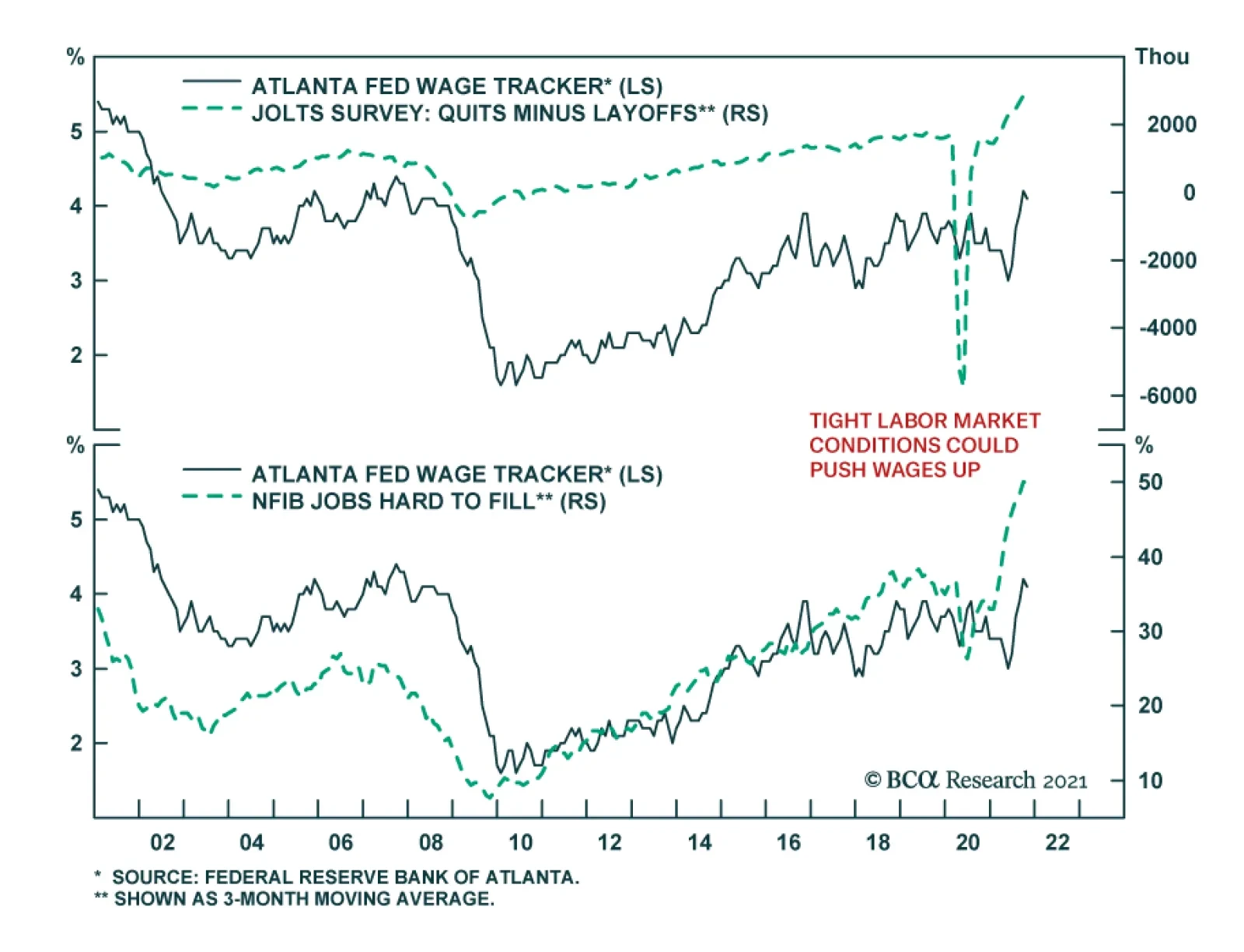
Chart 3It's A Labor Seller's Market ...
It's A Labor Seller's Market ...
It's A Labor Seller's Market ...
Strike outcomes turn on which side has overestimated its leverage. The broad factors we use to assess leverage are overall labor market slack; economic concentration; regulatory and legal trends; and the sustainability of either side’s accumulated advantage, which we describe as the labor-management rubber band. Other factors that matter on a case-by-case basis, but are beyond the scope of our analysis, include industry-level slack, a labor input’s susceptibility to automation, and the degree of labor specialization/skill involved in that input. For these micro-level factors, a given group of workers’ leverage is inversely related to the availability of substitutes for their input. Labor Market Slack Though we hold the view that labor force participation is likely to revive in coming months because inequality and a comparatively thin social safety net will compel many lower-income workers to return to the work force, no one knows for sure where the workers have gone or when they will return, if at all. It is abundantly clear from accelerating wage gains (Chart 4), the openings and quits rates, and small businesses’ historic inability to fill job openings (Chart 5) that the labor market is extremely tight right now. A difference of opinion about whether and how long the worker shortages will persist could make finding common ground in contract negotiations a challenge. Chart 4... As Rising Wages ...
... As Rising Wages ...
... As Rising Wages ...
Chart 5... And Frantic Employers Confirm
... And Frantic Employers Confirm
... And Frantic Employers Confirm
Economic Concentration We previously noted that the trend toward economic concentration has strengthened management’s hand in labor negotiations as it has made an increasing share of local labor markets tend toward monopsony. A monopsony is a market with a single buyer, the mirror image of a monopoly, which is a market with a single seller. Unfortunately for labor, monopsonies restrain prices just as monopolies inflate them. The trend toward economic concentration is well established and we think the probability that it will reverse is low – Congress may shake its fist at Big Tech and the Biden Justice Department will more vigorously contest mergers on anti-trust grounds, but there is an ocean of liquidity available to support acquisitions and robust CEO confidence suggests it will be deployed. Regulatory And Legal Trends Over the last four decades, unions have endured a near-constant drubbing from statehouses, federal agencies and the courts, as union and labor protections have been under siege from all sides. But the regulatory and legal tide has been such a huge benefit for employers since the beginning of the Reagan administration that it simply cannot continue to maintain its pace. Furthermore, as our Global Investment Strategy colleagues have observed, the Republican party’s lurch toward populism may leave Big Business without a champion in Washington, DC. The regulatory and legal winds are shifting and management teams that have spent their entire careers in an environment in which labor has perpetually been on the back foot may be the last to know, leading to an uptick in the number and contentiousness of labor disputes. A change in Fed policy, as unveiled in the August 2020 revision to the FOMC’s statement on longer-run monetary policy goals, has also tilted the playing field in workers’ favor. The Fed has sworn off preemptively tightening monetary policy when the labor market appears to be getting tight. The new direction contrasts with 40-plus years of Fed policy that were predicated on taking away the punch bowl before upward wage pressures could build momentum. The tacit pledge in the revised statement on monetary policy implies that the Fed will prioritize its full employment mandate over its price stability mandate in the near term. That’s not an unalloyed positive for workers, who will only be better off if their nominal wage gains outpace inflation, but it will help give them more of a head start than they would have gotten if the FOMC had stuck with the proposition that tight labor markets stoke inflation. The Labor-Management Rubber Band Employees and employers have a deeply symbiotic relationship, and we like to think of labor and management as being linked by an elastic tether with a finite range. Since neither side can indefinitely thrive if the other is suffering, the tether pulls the two sides closer together when the gap between them threatens to become too wide. When labor does too well for too long at management’s expense, profit margins shrink and the company’s viability as a going concern is threatened. When management does too well, deteriorating living standards drive the best employees away, undermining productivity and profitability. One does not have to be a card-carrying socialist to believe that the band is near its limit and that some sort of mean reversion is inevitable, given how badly real hourly wages have lagged gains in hourly output over the last 50 years (Chart 6). Chart 6Testing How Far The Labor-Management Rubber Band Can Stretch
Testing How Far The Labor-Management Rubber Band Can Stretch
Testing How Far The Labor-Management Rubber Band Can Stretch
What Comes Next Steady concentration across industries and a persistently hospitable legal and regulatory climate has given management the upper hand for four decades. Going forward, however, labor should see its fortunes improve as the legal and regulatory climate cannot get materially better for employers, and the labor-management rubber band becomes less stretched in management’s favor (Figure 3).
Chart
The major uncertainty pertains to the ongoing level of slack in the labor market and how employment agreements should account for it. All parties recognize there is no slack right now and employers are duly offering generous inducements to attract workers. Sign-on bonuses for new employees in unskilled services positions are ubiquitous and negotiations with unionized employees include ratification bonuses for signing new contract packages. Because wages are sticky on the downside – it’s difficult to get employees to swallow outright pay cuts – employers prefer making one-time concessions like bonuses to increasing wage rates across the board, which is tantamount to locking in higher long-term input costs. The duration of concessions appears to be a sticking point in the negotiations to settle the current strikes. Over the last two decades, several large companies with unionized workforces have instituted a two-tier employment track distinguishing legacy employees from new hires. The legacy employees remain on their existing salary path and retain their retirement and health insurance benefits, while new employees are subject to a lower salary scale and are entitled to fewer benefits, if any. The result has been to bend the human resources cost curve lower in the future as natural attrition shrinks the share of employees on the more costly legacy path. The two-tier employment classification has proven to be an effective way for employers to bend the cost curve to their liking, as it protects the interests of a considerable majority of employee voters at the expense of a largely hypothetical future employee constituency. It is presumably difficult to empathize with workers who aren’t yet coming to the plant every day and legacy employees haven’t dwelled on their plight when participating in contract ratification votes. An interesting feature of the ongoing John Deere strike is that the UAW rejected what appeared to be a strikingly generous package partially in the interest of defending current and future employees who have no path to reach legacy employees’ all-in compensation level. The recent strikes against S&P 500 constituents have been concentrated in industries that faced demand spikes during the pandemic. The bakery worker’s union (BCTGM) representing Kellogg’s workers struck against Frito-Lay (owned by Pepsi) for three weeks in July and Nabisco (a unit of Mondelez) for five weeks in August and September. A significant motivation for the BCTGM workers’ actions seemed to be frustration over intense pandemic workloads. Their plants ramped up capacity to fill kitchen cabinets while consumers were cooped up at home and they are now seeking redress for the emergency hours they were asked to work. (All of the bakery workers who struck, as well as the John Deere workers, were considered essential workers.) Management, on the other hand, might take the view that their employees’ sacrifices are in the past, and are not likely to be repeated if product demand settles back into its pre-pandemic trend. Viewing ongoing negotiations from our game theory perspective, there is ample room for divergent perceptions of relative negotiating strength, based on differing opinions about the persistence of pandemic trends. The divergence might make for increasingly contentious labor negotiations going forward, with strikes exacerbating supply bottlenecks and ramping up near-term inflation pressures. If ongoing rounds of labor negotiations result in workers achieving longer-term victories, it will pressure corporate profit margins. Labor gains will also potentially feed into inflation if capacity is not poised to meet the ensuing increase in aggregate demand. We will keep close tabs on labor negotiations as the economy works its way back to a post-pandemic steady state. Doug Peta, CFA Chief US Investment Strategist dougp@bcaresearch.com
Highlights Supply-side pressures should abate over the coming months as semiconductor availability improves, transportation bottlenecks ease, energy prices recede, and more workers enter the labor force. The respite from inflation will be temporary, however. The combination of easy fiscal and monetary policies will cause unemployment to fall below its equilibrium level in the US, and eventually, in most major economies. Unlike in the late 1990s, when rising wages were counterbalanced by robust productivity gains, most of the recent rebound in US productivity growth will prove to be illusory. US inflation will follow a “two steps up, one step down” trajectory. We are currently at the top of those two steps, but rising unit labor costs will eventually drive inflation higher. Rather than fretting that the Federal Reserve will keep rates too low for too long, investors are worried that the Fed will tighten too much. This is a key reason why the 20-year/30-year Treasury slope has inverted. Such an inversion does not make sense to us. Hence, we are initiating a trade going long the 20-year bond versus the 30-year bond. Go short the 10-year Gilt on any break below 0.85%. UK real bond yields are amongst the lowest in the world. The Bank of England will eventually have to turn more hawkish, which will support the beleaguered pound. Structurally higher bond yields will benefit value stocks. Banks stand to gain from rising bond yields while tech could suffer. The eventual re-emergence of supply-side pressures will catalyze more investment spending. This will bolster industrial stocks. The Supply Side Matters, Again Savings glut, secular stagnation; call it what you will, but for the better part of two decades, the global economy has faced a chronic shortfall of aggregate demand. Times are changing, however. The predominant problem these days is not a lack of spending; it is a lack of production. Unlike during the Global Financial Crisis – when worries about moral hazard complicated efforts to bail out homeowners and banks – the victims of the pandemic elicited sympathy. As a result, governments in developed economies rolled out a slew of measures to support workers and businesses. Thanks to bountiful fiscal transfers, households in the US have accrued $2.2 trillion in income since the start of the pandemic, about $1.2 trillion more than one would have expected based on the pre-pandemic trend (Chart 1). With many services unavailable, consumers diverted spending towards manufactured goods. At first, sellers were able to dip into their inventories to meet rising demand. By early this year, however, inventories had been depleted (Chart 2). Shortages began to pop up across much of the global supply chain. Chart 1Stimulus-Supported Income Growth Boosted Goods Consumption
Stimulus-Supported Income Growth Boosted Goods Consumption
Stimulus-Supported Income Growth Boosted Goods Consumption
Chart 2The Pandemic Depleted Inventories
The Pandemic Depleted Inventories
The Pandemic Depleted Inventories
While today’s empty warehouses can be largely attributed to surging demand for goods, supply-side disruptions have also played an important role. Four disruptions stand out: 1) semiconductor shortages; 2) transportation bottlenecks; 3) inadequate energy supplies; and 4) reduced labor force participation. Let us examine all four in turn. Semiconductor Shortages Chart 3Car Prices Have Jumped
Car Prices Have Jumped
Car Prices Have Jumped
The global supply chain was not equipped to handle the dislocations caused by the pandemic. The combination of just-in-time inventory systems and far-flung supplier networks ensured that bottlenecks in one part of the global economy quickly filtered down to other parts of the economy. Few industries are as important as semiconductors. The auto sector has felt the brunt of the chip shortage. Both new and used vehicle prices have soared as dealer lots have emptied out (Chart 3). The drop in vehicle spending alone shaved 2.4 percentage points off US real GDP growth in the third quarter. Semiconductor makers have ramped up production to meet growing demand. The US Census Bureau’s Quarterly Survey of Plant Capacity Utilization showed that semiconductor plants operated an average of 73 hours per week in the first half of this year, up from around 45-to-50 hours prior to the pandemic (Chart 4). Chip production in Northeast Asia has rebounded (Chart 5). Southeast Asian production dropped in August due to Covid lockdowns, with semiconductor exports falling by over a third in Malaysia and Vietnam. Fortunately, since then, a decline in Covid cases and rising vaccination rates have spurred a recovery throughout the region. Chart 4Chipmakers Are Working Overtime
Chipmakers Are Working Overtime
Chipmakers Are Working Overtime
Chart 5Semiconductor Production Has Accelerated In Northeast Asia
Semiconductor Production Has Accelerated In Northeast Asia
Semiconductor Production Has Accelerated In Northeast Asia
Chart 6Memory Chip Prices Are Declining
Memory Chip Prices Are Declining
Memory Chip Prices Are Declining
Commentary from semiconductor companies and automakers suggest that the chip shortage will ease over the coming months. In an auspicious sign, US auto sales jumped to 13.1 million in October from 12.3 million in September. Memory chip prices are also falling (Chart 6). Nevertheless, the overall chip market is unlikely to return to balance until 2023. Transportation Bottlenecks Unlike semiconductors and high-end electronics, which usually arrive by air, bulkier items such as furniture, sporting goods, and housing appliances typically arrive by sea. Port congestion, insufficient warehouse capacity, and a lack of truck chassis on which to place containers have all contributed to transportation bottlenecks. Chart 7Transportation Bottlenecks: Past The Worst?
Transportation Bottlenecks: Past The Worst?
Transportation Bottlenecks: Past The Worst?
As with the semiconductor shortage, we are probably past the worst point in the shipping crisis. Drewry’s composite World Container Index has edged down 11% from its highs, although it is still up more than three-fold from mid-2020 levels (Chart 7). The easing in container shipping costs follows a dramatic 47% decline in the Baltic Dry Index since early October. The number of ships waiting to unload cargo off the coast of Los Angeles and Long Beach remains near record highs (Chart 8). Port congestion should ease over the next few months. US port throughput usually falls starting in the late fall and remains weak during the winter months, bottoming shortly after the Chinese New Year. If throughput remains elevated near current levels this year, this should be enough to clear much of the backlog. Looking further out, shipping costs could face additional downward pressure. Chart 9 shows that the number of container ships on order has risen to a 10-year high; these new ships will be delivered over the next two years. Chart 8Port Congestion Should Ease Over The Coming Months
Port Congestion Should Ease Over The Coming Months
Port Congestion Should Ease Over The Coming Months
Chart 9Shipbuilders Are Busy
Shipbuilders Are Busy
Shipbuilders Are Busy
Inadequate Energy Supplies After a torrid rally since the start of the year, energy prices have come off their highs. The price of Brent oil has dipped 6% from its October peak. US natural gas prices have retreated 11%. Natural gas prices in Europe have fallen 37%.
Chart 10
The biggest move has been in coal prices, which have dropped 36% over the past two weeks alone. Futures curves are pricing in further declines in key energy prices (Chart 10). BCA’s Commodity and Energy Strategy service expects energy prices to soften over the next 12 months, but not as much as markets are discounting. Their latest forecast calls for the price of Brent crude to average $81/bbl in 2021Q4, $80/bbl in 2022 (versus market expectations of $77/bbl), and $81/bbl in 2023 (versus market expectations of $71/bbl). As we discussed a few weeks ago, years of underinvestment have led to tight supply conditions across the entire energy complex (Chart 11). Proven global oil reserves increased by only 6% between 2010 and 2020, having risen by 26% over the preceding decade. Gas reserves followed a similar trajectory, increasing by only 5% between 2010 and 2020 compared to 30% over the prior ten years (Chart 12).
Chart 11
Chart 12
With little spare capacity, energy markets have become increasingly vulnerable to shocks. A cold snap across the Northern Hemisphere this spring depleted natural gas supplies, while a lack of wind reduced energy production by European wind farms. Increased gas imports from Russia could have mitigated the problem, but the dispute over the Nord Stream 2 pipeline prevented that from happening. The pipeline is popular with German voters (Chart 13). BCA’s geopolitical team expects it to be approved, a welcome development given that La Niña is highly likely to lead to colder-than-normal temperatures across northern Europe this winter.
Chart 13
China has also restarted 170 coal mines and will probably begin re-importing Australian coal. Beijing is also allowing utilities to charge higher prices, which should help stave off bankruptcies across the sector. These measures should help mitigate China’s energy crisis. Chart 14US Rig Count Has Risen From Low Levels
US Rig Count Has Risen From Low Levels
US Rig Count Has Risen From Low Levels
A bit more oil production will also help. The US rig count, while still far below its 2014 highs, has doubled since last year (Chart 14). BCA’s commodity strategists expect output in the Lower 48 states to average 9.5mm b/d in 2022 and 10mm b/d in 2023, versus 2021 production levels of 9.0mm b/d. Nevertheless, shale producers are a lot more disciplined these days. Debt reduction and cash flow generation are now the top priorities. This implies that fairly high oil prices may be necessary to catalyze additional investment in the industry. Reduced Labor Force Participation Despite the rapid economic recovery, US employment remains 5 million below its pre-pandemic peak. One would not know this from the survey data, however. A record 51% of small businesses expressed difficulty finding qualified workers in the October NFIB survey. The share of households reporting that jobs are plentiful versus hard-to-get has returned to its 2000 highs. Both the quits rate and the job openings rate are well above their pre-pandemic levels (Chart 15). A wave of early retirement accounts for some of the apparent labor market tightness. About 1.3 million more workers have retired since the pandemic began than one would have expected based on demographic trends. Yet, there is more to the story than that. The labor force participation rate for workers aged 25-to-54 has not fully recovered; the employment-to-population ratio for that age cohort is still 2.5 percentage points below pre-pandemic levels (Chart 16).
Chart 15
Chart 16Labor Force Participation Has Room To Rise
Labor Force Participation Has Room To Rise
Labor Force Participation Has Room To Rise
There is considerable uncertainty about how many workers will re-enter the labor force over the coming months. On the one hand, the expiration of enhanced unemployment benefits could prod more workers into the job market. Diminished anxiety about the virus should help. While the number has fallen by half, there are still 2.5 million people not working due to concerns about getting or spreading Covid-19 (Chart 17). According to Boston College’s Center for Retirement Research, the retirement rate rose more for older lower-income workers than higher-income workers (Chart 18). Some of these retirees may decide to re-enter the labor force. Chart 17Less Anxiety About The Coronavirus Should Increase Labor Supply
Poorer Older Workers Were More Likely To Retire Last Year
Poorer Older Workers Were More Likely To Retire Last Year
Chart 18
On the other hand, the imposition of vaccine mandates could reduce labor supply. About 100 million US workers are currently subject to the mandates. According to the Census Household Pulse Survey, about 8 million of them are unvaccinated and attest that “they will definitely not get the vaccine.” Perhaps the biggest question mark is over whether the pandemic will lead to permanent changes in peoples’ perspectives on the optimal work/life balance. High burnout rates (especially in the health care sector), a reluctance to restart the daily commute to the office, and the desire to spend more time with family have all contributed to what some commentators have dubbed The Great Resignation. Ultimately, the deciding factor may be wages. Wage growth accelerated during the late 1990s as the labor market tightened (Chart 19). This drew a lot of people – especially less-skilled workers – into the labor force. Recently, wage growth has exploded at the bottom end of the income distribution, and our guess is that this will entice more people to seek employment (Chart 20). Chart 19Wage Growth Accelerated During The Late 1990s As The Labor Market Tightened
Wage Growth Accelerated During The Late 1990s As The Labor Market Tightened
Wage Growth Accelerated During The Late 1990s As The Labor Market Tightened
Chart 20Wages At The Bottom End Of The Income Distribution Are Rising Briskly
Wages At The Bottom End Of The Income Distribution Are Rising Briskly
Wages At The Bottom End Of The Income Distribution Are Rising Briskly
Will Higher Productivity Growth Mitigate Supply-Side Pressures? The late 1990s saw a resurgence in productivity growth. This helped restrain unit labor costs in the face of rising wages.
Chart 21
While US productivity did jump during the pandemic, we are sceptical of claims that this can be attributed to efficiency gains from digitalization and work-from-home practices. A recent study of 10,000 skilled professionals at a major IT company revealed that work-from-home policies decreased productivity by 8%-to-19%, mainly because people ended up working longer. It is telling that productivity outside of the US generally declined during the pandemic (Chart 21). This suggests that last year’s productivity gains stemmed mainly from increased operating leverage, a common feature of post-recession US recoveries (Chart 22). Supporting this view is the fact that productivity growth slowed from 4.3% in Q1 to 2.4% in Q2 on a quarter-over-quarter annualized basis. Productivity declined by 5% in Q3, leading to an 8.3% increase in unit labor costs. Chart 22US Productivity Tends To Jump After Recessions
US Productivity Tends To Jump After Recessions
US Productivity Tends To Jump After Recessions
Chart 23Capital Goods Orders Have Soared
Capital Goods Orders Have Soared
Capital Goods Orders Have Soared
The only saving grace is that core capital goods orders have soared (Chart 23). This should translate into increased business capital spending next year and higher productivity down the road. Investment Implications Supply-side pressures should abate over the coming months as semiconductor availability improves, transportation bottlenecks ease, energy prices recede, and more workers enter the labor force. The respite from inflation will be temporary, however. The combination of easy fiscal and monetary policies will cause unemployment to fall below its equilibrium level in the US, and eventually, in most major economies. This is consistent with our “two steps up, one step down” projection for US inflation. We are probably near the top of those two steps at present. This implies that the next move for inflation is to the downside, even if the longer-term trend is still to the upside. The US 10-year Treasury yield should stabilize at around 1.8% in the first half of 2022, before moving higher later in the year. As we discussed last week, markets are understating the true level of the neutral rate of interest. Rather than fretting that the Federal Reserve will keep rates too low for too long, investors are worried that the Fed will tighten too much. This is a key reason why the 20-year/30-year Treasury slope has inverted (Chart 24). Such an inversion does not make sense to us. Hence, as of this week, we are initiating a trade going long the 20-year bond versus the 30-year bond. We would also go short the 10-year Gilt on any break below 0.85%. The Bank of England’s “surprising hold” knocked the yield down 14 basis points to 0.93%. UK real bond yields are amongst the lowest in the world (Chart 25). Growth is strong and will remain buoyant as Brexit headwinds fade. The BoE will eventually have to turn more hawkish, which will support the beleaguered pound. Chart 24Go Long US 20-Year Bonds Versus 30-Year Bonds
Go Long US 20-Year Bonds Versus 30-Year Bonds
Go Long US 20-Year Bonds Versus 30-Year Bonds
Chart 25UK Real Bond Yields Are Amongst The Lowest In The World
UK Real Bond Yields Are Amongst The Lowest In The World
UK Real Bond Yields Are Amongst The Lowest In The World
Structurally higher bond yields will benefit value stocks. Chart 26 shows that there has been a close correlation between the US 30-year Treasury yield and the relative performance of global value versus growth stocks. Banks stand to gain from rising bond yields while tech could suffer (Chart 27). Chart 26Higher Bonds Yields Favor Value Stocks
Higher Bonds Yields Favor Value Stocks
Higher Bonds Yields Favor Value Stocks
Chart 27
The re-emergence of supply-side pressures could affect companies in a variety of unexpected ways. For example, Facebook and Google both rely heavily on revenue from advertising. But what is the point of trying to boost demand for your product if you already cannot produce enough of it? Companies such as Hershey and Kimberly-Clark are already cutting ad spending in response to supply-chain bottlenecks. Finally, tight supply conditions will catalyze more investment spending. This will benefit industrial stocks. Peter Berezin Chief Global Strategist pberezin@bcaresearch.com Global Investment Strategy View Matrix
Chart 28
Special Trade Recommendations
The Supply Side Strikes Back
The Supply Side Strikes Back
Current MacroQuant Model Scores
Chart 29
Highlights Japan’s long-term weaknesses – a shrinking population, low productivity growth, excess indebtedness – are very well known. However, it still punches above its weight in the realm of geopolitics. Abenomics – sorry, Kishidanomics – can still deliver some positive surprises every now and then. As the global pandemic wanes, and China faces a historic confluence of internal and external risks, investors should begin buying the yen on weakness. Japanese industrials also are an attractive play in a global portfolio. While the yen will likely fare better than the dollar over the next 6-9 months, it will lag other procyclical currencies. Feature Japan has always been an “earthquake society,” in which things seem never to change until suddenly everything changes at once. The good news for investors is that that change occurred in 2011 and the latest political events reinforce policy continuity. Why “Abenomics” Remains The Playbook Over ten years have passed since Japan suffered a triple crisis of earthquake, tsunami, and nuclear meltdown. In fact, the Fukushima nuclear crisis merely punctuated a long accumulation of national malaise: the country had suffered two “Lost Decades” and was in the thrall of the Great Recession, a rare period of domestic political change, and a rise in national security fears over a newly assertive China. The nuclear meltdown marked the nadir. The result of all these crises was a miniature policy revolution in 2012 – Prime Minister Shinzo Abe and the Liberal Democratic Party (LDP) returned to power and initiated a range of bolder policies to whip the country’s deflationary mindset and reboot its foreign and trade relations. The new economic program, “Abenomics,” consisted of easy money, soft budgets, and pro-growth reforms. It succeeded in changing Japan. Both private debt and inflation, which had fallen during the lost decades, bottomed after the 2011 crisis and began to rise under Abe (Chart 1). By the 2019 House of Councillors election, however, Abe was running out of steam. Consumption tax hikes, the US-China trade war, and COVID-19 thwarted his plans of national revival. In particular, Abe hoped to capitalize on excitement over the 2020 Tokyo Olympics to hold a popular referendum on revising the constitution. Constitutional revision is necessary to legitimize the Self-Defense Forces and thus make Japan a “normal” nation again, i.e. one that can maintain armed forces. But the global pandemic interrupted. Until the next heavyweight prime minister comes along, Japan will relapse into its old pattern of a “revolving door” of prime ministers who come and go quickly. For example, the only purpose of Abe’s immediate successor, Yoshihide Suga, was to tie off loose ends and oversee the Olympics before passing the baton (Chart 2). Chart 1Abenomics Was Making Progress
Abenomics Was Making Progress
Abenomics Was Making Progress
Chart 2
The next few Japanese prime ministers will almost inevitably lack Abe’s twin supermajority in parliament, which was exceptional in modern history (Chart 3). It will be hard for the LDP to expand its regional grip given that it holds a majority in all 11 of the regional blocks in which the political parties contend for seats based on their proportion of the popular vote (Table 1).
Chart 3
Table 1LDP+ Komeito Regional Performance
Japan: Foreign Threats, Domestic Reflation
Japan: Foreign Threats, Domestic Reflation
Short-lived, traditional prime ministers will not be able to create a superior vision for Japan and will largely follow in Abe’s footsteps. In September Prime Minister Fumio Kishida replaced Suga – a badly needed facelift for the ruling Liberal Democrats ahead of the October 31 election. The LDP retained its single-party majority in the Diet, so Kishida is off to a tolerable start (Chart 4). But he is far from charismatic and will not last long if he fumbles in the upper house elections in July 2022. This gives him a little more than half a year to make a mark.
Chart 4
Kishida will oversee a roughly 30-40 trillion yen stimulus package, or supplemental budget, by the end of this year. Japanese stimulus packages are almost always over-promised and under-delivered. However, given the electoral calendar, he will put together a large package that will not disappoint financial markets. His other goal will be to build on recent American efforts to cobble together a coalition of democracies to counter China and Russia. Japan’s Grand Strategy In Brief Chart 5Japan Exposed To China Trade
Japan Exposed To China Trade
Japan Exposed To China Trade
Japan’s grand strategy over centuries consists of maintaining its independence from foreign powers, controlling its strategic geographic approaches to prevent invasion, and stopping any single power from dominating the eastern side of the Eurasian landmass. Originally the hardest part of this grand strategy was that it required establishing unitary political control over the far-flung Japanese archipelago. However, since the Meiji Restoration, Tokyo has maintained centralized government. Since then Japan has focused on controlling its strategic approaches and maintaining a balance among the Asian powers. During the imperialist period it tried to achieve these objectives on its own. After World War II, the United States became critical to Japan’s grand strategy. Through its broad alliance with Washington, Tokyo can maintain independence, make sure critical territories are not hostile (e.g. Taiwan and South Korea), and deter neighboring threats (North Korea, China, Russia). It can at least try to maintain a balance of power in Eurasia. Yet these constant national interests underscore Japan’s growing vulnerabilities today: China’s economy is now two-times larger than Japan’s and Japan is more dependent on China’s trade than vice versa (Chart 5). Under Xi Jinping, Beijing is actively converting its wealth into military and strategic capabilities that threaten Japan’s security. Rising tensions across the Taiwan Strait are fueling nationalism and re-armament in Japan. Russia’s post-Soviet resurgence entails an ever-closer Russo-Chinese partnership. It also entails Russian conflicts with the US that periodically upset any attempts at Russo-Japanese détente. North Korea’s asymmetric war capabilities and nuclearization pose another security threat. South Korea’s attempts to engage with the North and China, and compete with Japan, are unhelpful. All of these realities drive Japan closer to the United States. Even the US is increasingly unpredictable, though not yet to the point of causing serious doubts about the alliance. If the US were fundamentally weakened, or abandoned the alliance, Japan would either have to adopt nuclear weapons or accommodate itself to Chinese hegemony to meet its grand strategy. Nuclearization would be the more likely avenue. The stability of Asia depends greatly on American arbitration. Japan’s Strategy Since 1990 Beneath this grand strategy Japan’s ruling elites must pursue a more particular strategy suited to its immediate time and place. Ever since Japan’s working population and property bubble peaked in the early 1990s, the country’s relative economic heft has declined. To maintain stability and security, the central government in Tokyo has had to take on a very active role in the economy and society. The first step was to stabilize the domestic economy despite collapsing potential growth. This has been achieved through a public debt supercycle (Chart 6). Unorthodox monetary and fiscal policy largely stabilized demand, at the cost of the world’s highest net debt-to-GDP ratio. The economic adjustment was spread out over a long period of time so as to prevent a massive social and political backlash. Unemployment peaked in 2009 at 5.5% and never rose above this level. The ruling elite and the Liberal Democrats maintained control of institutions and government. The second step was to ensure continued alliance with the United States. Japan could deal with its economic problems – and the rise of China – if it maintained access to US consumers and protection from the US military. To maintain the alliance required making investments in the American economy, in US-led global institutions, and cooperating with the US on various initiatives, including controversial foreign policies. As in the 1950s-60s, Japan would bulk up its Self-Defense Forces to share the burden of global security with the United States, despite the US-written constitution’s prohibition on keeping armed forces. The third step was to invest abroad and put Japan’s excess savings to work, developing materials and export markets abroad while employing foreign workers and factories to become Japan’s new industrial base in lieu of the shrinking Japanese workforce (Chart 7). Chart 6Japan's Public Debt Supercycle
Japan's Public Debt Supercycle
Japan's Public Debt Supercycle
Chart 7
Japan’s post-1990 strategy has staying power because of the massive pressures on Japan listed above: China’s rise, Russo-Chinese partnership, North Korean threats, and American distractions. Investors tend to underrate the impact of these trends on Japan. Unless they fundamentally change, Japan’s strategy will remain intact regardless of prime minister or even ruling party. Russia’s role is less clear and could serve as a harbinger of any future change. President Vladimir Putin and Abe had the best chance in modern memory to resolve the two countries’ territorial disputes, build on mutual interests, and maybe even sign a peace treaty. But Russia’s clash with the West proved an insurmountable obstacle. New opportunities could emerge at some later juncture, as Japan’s interest in preventing China from dominating Eurasia gives it a strong reason to normalize ties with Russia. Russia will at some point worry about overdependency on China. But this change is not on the immediate horizon. Japan’s Tactics Since 2011
Chart 8
Japan is nearly a one-party state. Brief spells of opposition rule, in 1993 and 2009-11, are exceptions that prove the rule. The Liberal Democrats did not fall from power so much as suffer a short “time out” to reflect on their mistakes before voters put them right back into power. However, these timeouts have been important in forcing the ruling party to adjust its tactics for changing times, as with Abenomics. Kishida will not have enough political capital to change direction. The emphasis will still be on defeating deflation and rekindling animal spirits and corporate borrowing (as opposed to relying exclusively on public debt). Kishida has talked about a new type of capitalism and a more active redistribution of wealth, in keeping with the current zeitgeist among the global elite. However, Japan lacks the impetus for dramatic change. Wealth inequality is not extreme and political polarization is non-existent (Chart 8). The LDP is wary of losing votes to the populist Japan Innovation Party, or other regional movements, but populism does not have as fertile ground in countries with low inequality. The desire to boost wages was a central plank of Abenomics (Chart 9) and an area of success. It will come through in Kishida’s policies as well. But the ultimate outcome will depend on how tight the labor market gets in the upcoming economic cycle. Similarly Kishida can be expected to encourage, or at least not roll back, women’s participation in the labor force, as labor markets tighten (Chart 10). As the pandemic wanes it is also likely that he will reignite Abe’s loose immigration policy, which saw the number of foreign workers triple between 2010 and 2020. This inflow is perhaps the surest sign of any that insular and xenophobic Japan is changing with the times to meet its economic needs. Chart 9Kishidanomics To Build On Abe's Wage Growth
Kishidanomics To Build On Abe's Wage Growth
Kishidanomics To Build On Abe's Wage Growth
Chart 10Women Off To Work But Fertility ##br##Relapsed
Women Off To Work But Fertility Relapsed
Women Off To Work But Fertility Relapsed
The only substantial difference between Kishidanomics and Abenomics is that Abe compromised his reflationary fiscal efforts by insisting on going forward with periodic hikes to the consumption tax. Kishida is under no such expectation. Instead he is operating in a global political and geopolitical context in which ambitious public investments are positively encouraged even at the expense of larger budget deficits (Chart 11). Yet interest rates are still low enough to make such investments cheaply. The stage is set for fiscal largesse. Chart 11Fiscal Largesse To Continue
Fiscal Largesse To Continue
Fiscal Largesse To Continue
Kishida can be expected to promote large new investments in supply-chain resilience, renewable energy, and military rearmament. The US and EU may exempt climate policies from traditional budget accounting – Japan may do the same. Even more so than China and Europe, Japan has a national interest in renewable energy since it is almost entirely dependent on foreign imports for its fossil fuels. The green transition in Japan is lagging that of Germany but the Japanese shift away from nuclear power has gone even faster, creating an import dependency that needs to be addressed for strategic reasons (Chart 12). Monetary-fiscal coordination began under Abe and can increase under Kishida. What is clear is that public investment is the top priority while fiscal consolidation is not. Military spending is finally starting to edge up as a share of GDP, as noted above. For many years Japanese leaders talked about military spending but it remained steady at 1% of GDP. Now, at the onset of the US-China cold war, the Japanese are spending more and say the ratio will rise to 2% of GDP (Chart 13). Tensions with China, especially over Taiwan, will continue to drive this shift, though North Korea’s weapons progress is not negligible.
Chart 12
Chart 13
The Biden administration is prioritizing US allies and the competition with China, which makes the Japanese alliance top of mind. Tokyo’s various attempts to talk with Beijing in recent years have amounted to nothing, with the exception of the Regional Comprehensive Economic Partnership, which is far from ratification and implementation. Japan’s relations with China are driven by interests, not passing attitudes and emotions. If Biden proves too dovish toward China – a big “if” – then it will be Japan pushing the US to take a more hawkish line rather than vice versa. Japan will take various strategic, economic, technological, and military actions to defend itself from the range of external threats it faces. These actions will intimidate and provoke China and other neighbors, which will help to entrench the “security dilemma” between the US and China and their allies. For example, Japan will eagerly participate in US efforts to upgrade its military and its regional alliances and partnerships, including via the Quadrilateral Security Dialogue with India and Australia. The Biden administration might force Japan to play nice with South Korea and patch up their trade war. But that is a price Japan can pay since American involvement also precludes any shift by South Korea fully into China’s camp. If China should invade Taiwan – which we cannot rule out over the long run – Japan’s vital supply lines and national security would fall under permanent jeopardy. Japan would have an interest in defending Taiwan but its willingness to war with China may depend on the US response. However, both Japan and the US would have to draw a stark line in defense of Japanese territory, not least Okinawa, where US troops are based. Both powers would mobilize and seek to impose a strategic containment policy around China at that point. Until The Next Earthquake … For Japan to abandon its post-1990 strategy, it would need to see a series of shocks to domestic and international politics. If China’s economy collapsed, Korea unified, or the US abandoned the Asia Pacific region, then Tokyo would have to reassess its strategy. Until then the status quo will prevail. At home Japan would need to see a split within the Liberal Democrats, or a permanent break between the LDP and their junior partner Komeito, combined with a single, consolidated, and electorally viable opposition party and a charismatic opposition leader. This kind of change would follow from major exogenous shocks. Today it is nowhere in sight – the last two shocks, in 2011 and 2020, reinforced the LDP regime. Theoretically some future Japanese government could adopt a socialist platform that relies entirely on public debt rather than trying to reboot private debt. It could openly embrace debt monetization and modern monetary theory rather than trying to raise taxes periodically to maintain the appearance of fiscal rectitude. But if it tried to distance itself from the United States and improve relations with Russia and China, such a strategy would not go very far. It would jeopardize Japan’s grand strategy. For the foreseeable future, Japan’s economic security and national security lie in maintaining the American alliance and continuing an outward investment strategy focused on emerging markets other than China. Macroeconomic Developments The key message from an economic context is that fiscal stimulus is likely to be larger in Japan than the market currently expects. The IMF is penciling in a fiscal deficit of around 2% of potential GDP next year, which will be a drag on growth (Chart 14). More likely, Kishida will cobble together a slightly larger package to implement most of the initiatives he has proposed on the campaign trail. Meanwhile, a large share of JGBs are about to mature over the next couple of years, providing room for more issuance, which the BoJ will be happy to assimilate (Chart 15). Chart 14More Fiscal Stimulus In Japan Likely
More Fiscal Stimulus In Japan Likely
More Fiscal Stimulus In Japan Likely
Chart 15Lots Of JGBs Mature In The Next Few Years
Lots Of JGBs Mature In The Next Few Years
Lots Of JGBs Mature In The Next Few Years
Real numbers on the size of the fiscal package have been scarce, but it should be around 30-40 trillion yen, spread over a few years. With Japan’s net interest expense at record lows (Chart 16), and a lot of the spending slated for worthwhile productivity-enhancing projects such as supply chains, green energy, education and some boost to the financial sector in the form of digital innovation and consolidation, we expect fiscal policy in Japan will remain moderately loose, with the BoJ staying accommodative. The timing of more fiscal stimulus is appropriate as Japan has managed to finally put the pandemic behind it. The number of new Covid-19 cases is at the lowest recorded level per capita, and Japan now has more of its population vaccinated than the US. As a result, the manufacturing and services PMIs, which have been the lowest in the developed world, could stage a coiled-spring rebound. This will be a welcome fillip for Japanese assets (Chart 17). Chart 16Little Cost To Issuing More Debt
Little Cost To Issuing More Debt
Little Cost To Issuing More Debt
Chart 17The Japanese Recovery Has Lagged
The Japanese Recovery Has Lagged
The Japanese Recovery Has Lagged
Consumption could also surprise to the upside in Japan. With the consumption tax hike of 2019 and the 2020 pandemic now behind us, pent-up demand could finally be unleashed in the coming quarters. Rising wages and high savings underscore that Japan could see a vigorous rebound in consumption, as was witnessed in other developed economies. This will be particularly the case as inflation stays low. The big risk for Japan from a macro perspective is an external slowdown, driven by China. A boom in foreign demand has been a much welcome cushion for Japanese growth, especially amidst weak domestic demand. The risk is that this tailwind becomes a headwind as Chinese growth slows, especially as a big share of Japanese exports go to China. Our view has been that policy makers in China will be able to ring-fire the property crisis, preventing a “Lehman” moment. As such, while China’s slowdown is a reality and downside risks warrant monitoring, we also expect China to avoid a hard landing. Meanwhile, Japanese exports are also diversified, with other developed and emerging markets accounting for the lion’s share of total exports. For example, exports to the US account for 19% of sales while EU exports account for 9%. Both exports and foreign machinery orders remain quite robust, suggesting that the slowdown in China will not crush all external demand (globally, export growth remains very strong). It is noteworthy that many countries now have “carte blanche” to boost infrastructure spending, especially in areas like renewable energy and supply chain resiliency. Japan continues to remain a big supplier of capital goods globally. This will ensure that an economic recovery around the world will buffer foreign machinery orders. Market Implications Japanese equities have underperformed the US over the last decade, and Kishidanomics is unlikely to change this trend. But to the extent that more fiscal stimulus helps lift aggregate demand, a few sectors could begin to see short-term outperformance. More importantly, the underperformance of certain Japanese equity sectors have not been fully justified by the improving earnings picture (Chart 18). This suggests some room for catch-up. Banks in particular could benefit from a steeper yield curve in Japan, rising global yields and proposed reform in the sector (Chart 19). We will view this as a tactical opportunity however, than a strategic call. Our colleagues in the Global Asset Allocation service have clearly outlined key reasons against overweighting Japan, and are currently neutral. More importantly, industrials also look poised to see some pickup in relative EPS growth, as global industrial demand stays robust. An improvement in domestic demand should also favor small caps over large caps. Chart 18ADismal Earnings Explain Some Underperformance Of Japanese Equities
Dismal Earnings Explain Some Underperformance Of Japanese Equities
Dismal Earnings Explain Some Underperformance Of Japanese Equities
Chart 18BDismal Earnings Explain Some Underperformance Of Japanese Equities
Dismal Earnings Explain Some Underperformance Of Japanese Equities
Dismal Earnings Explain Some Underperformance Of Japanese Equities
Chart 19Japanese Banks Will Benefit From A Steeper Yield Curve
Japanese Banks Will Benefit From A Steeper Yield Curve
Japanese Banks Will Benefit From A Steeper Yield Curve
Foreigners have huge sway over the performance of Japanese assets, especially equities. Foreign holders account for nearly 30% of the Japanese equity float. This is important not only for the equity call but for currency performance as well since portfolio flows dominate currency movements. Historically, the yen and the Japanese equity market have been negatively correlated. This was due to positive profit translation effects from a lower currency. However, it is possible that Japanese domestic profits are no longer driven only by translation effects, but rather by underlying productivity gains. This could result in less yen hedging by foreign equity investors, which would restore a positive relationship between the relative share price performance and the currency. As for the yen, the best environment for any currency is when the economy can generate non-inflationary growth. Japan may well be entering this paradigm. Historically, now has been the exact environment where the yen tends to do well, as the economy exits deflation and enters non-inflationary growth (Chart 20). Chart 20The Yen And Japanese Growth
The Yen And Japanese Growth
The Yen And Japanese Growth
Markets have been wrongly focusing on nominal rather than real yields in Japan and the implication for the yen. Therefore the risk to a long yen view is that the Bank of Japan keeps rates low as global yields are rising. However, in an environment where global inflationary pressures normalize (say in the next 6-9 months) and temper the increase in global yields, this could provide room for short covering on the yen. In our view, the yen is already the most underappreciated currency in the G10, as rising global yields have led to a massive accumulation of short positions. Finally, from a valuation standpoint, the yen is the cheapest G10 currency according to our PPP models, and is also quite cheap according to our intermediate-term timing model (Chart 21). With the yen being a risk-off currency, it also tends to rise versus the dollar not only during recessions, but also during most episodes of broad-based dollar weakness. This low-beta nature of the currency makes it a good portfolio hedge in an uncertain world. Chart 21The Yen Is Undervalued
The Yen Is Undervalued
The Yen Is Undervalued
Given the historic return of geopolitical risk to Japan’s neighborhood, as the US and Japan engage in active great power competition with China, the yen is an underrated hedge. Matt Gertken Vice President Geopolitical Strategy mattg@bcaresearch.com Chester Ntonifor Vice President Foreign Exchange Strategy chestern@bcaresearch.com
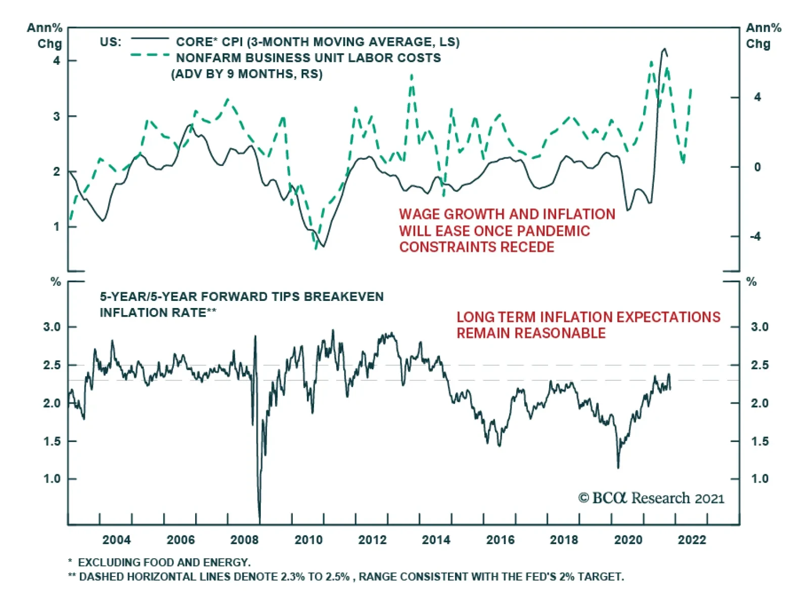
Unit labor costs in the US nonfarm business sector surged 8.3% in Q3 following Q2’s 1.1%, beating expectations of 7.0%. T increase in unit labor costs reflects both lower productivity and higher hourly compensation. Nonfarm productivity fell 5.0% – the…
In this report we examine the risk of stagflation by comparing the current environment to that of the late-1960s and 1970s. Today, investors cannot rule out the possibility of a stagflationary outcome, for four reasons: long-term household inflation expectations have risen significantly over the past year; fiscal policy has been expansionary; monetary policy will remain expansionary at the Fed’s projected terminal Fed funds rate; and component shortages and price increases linked to energy market and supply chain disruptions may persist or worsen over the coming year. However, the strong demand-pull inflationary dynamics that existed in the late-1960s were mostly absent in the lead-up to the pandemic, supply-chain issues are in part due to strong goods demand and supply disruptions that will eventually dissipate, and economic agents do not expect severe price pressures to persist beyond the pandemic. On balance, this points to a stagflationary outcome over the coming 6-24 months as a risk, but not a likely event. Investors should use the Misery Index, which is the sum of the unemployment rate and headline PCE inflation, as a real-time stagflation indicator. The Misery Index underscores that the US economy is unlikely to experience true stagflation unless the unemployment rate rises. A portfolio of the US dollar, the Swiss Franc, and industrial commodities may serve as a useful hedge for investors who are concerned about absolute return prospects in a world in which long-maturity bond yields are rising and risks of stagflationary dynamics are present. Chart II-1The Misery Index Reflects The Risk Of Stagflation
The Misery Index Reflects The Risk Of Stagflation
The Misery Index Reflects The Risk Of Stagflation
Over the past several weeks, concerns about a possible return to 1970s-style stagflation have re-emerged significantly in the minds of many investors. These investors have pointed toward similarities between the current environment and that of the 1970s, including shortages limiting output, a snarled global trade and logistical system, and rising energy prices. Chart II-1 highlights that the US “Misery Index” – the sum of the unemployment rate and headline PCE inflation – rose again over the past several months to high single-digit territory, after having fallen dramatically from April 2020 to February of this year. Panel 2 of Chart II-1 highlights that last year's rise in the Misery Index was driven almost entirely by the unemployment rate, whereas the current level is due to a combination of a modestly elevated unemployment rate and a pronounced acceleration in inflation. The headline PCE deflator has risen above 4%, a level that has not been reached since 1991 during the First Gulf War. In this report, we examine the risk of stagflation by comparing the current environment to that of the late 1960s and 1970s. We conclude that while investors cannot rule out the possibility of a stagflationary outcome, there are important differences that point toward a stagflation outcome over the coming 6-24 months as a risk, not a likely event. We conclude by highlighting assets that may produce absolute returns in a world in which long-maturity bond yields are rising and risks of stagflationary dynamics are present. Revisiting The 1960s And 70s Chart II-2The 1960s Laid The Groundwork For Elevated Inflation
The 1960s Laid The Groundwork For Elevated Inflation
The 1960s Laid The Groundwork For Elevated Inflation
The first step in judging the risk of a return to 1970s-style stagflation is to review, in a detailed way, what caused those conditions. Investors are well aware of the role that two separate energy price shocks played in raising prices and damaging output during this period, but they are less cognizant of the impact that a persistent period of above-trend output and significant labor market tightness had in setting up the conditions for sharply higher inflation. This focus of investors on energy prices partially reflects the fact that the Misery Index increased most visibly in the 1970s and that policymakers in the 1960s may not have realized how extensively economic output was running above its potential. With the benefit of hindsight, Chart II-2 illustrates the extent to which inflationary pressures built up in the 1960s, well before the first oil price shock in 1973. The chart shows that the unemployment rate was below NAIRU – the non-accelerating inflation rate of unemployment – for 70% of the time during the 1960s, and that inflation had already responded to this in the latter half of the decade. Annual headline PCE inflation was running just shy of 5% at the onset of the 1970 recession; it fell to 3% in the aftermath of the recession, but had already begun to reaccelerate in the first half of 1973. Following the 1973/1974 recession, inflation did decelerate significantly, falling from 11-12% to 5% in headline terms, and from 10% to 6% in core terms. But the pace of price appreciation did not fall below 5-6% in the second half of the 1970s, despite a significant and sustained rise in the unemployment rate above its natural rate. The 1975 to 1978 period is especially important for investors to understand, because it is arguably the clearest period of true stagflation in the 1970s. The fact that the Misery Index rose sharply during two major oil price shocks is not particularly surprising in and of itself, given the direct impact of energy prices on headline consumer prices; it is the fact that the index remained so elevated between these shocks, the result of persistently high inflation in the face of significant labor market slack, that is most relevant to investors. There are two reasons that both inflation and unemployment remained high during this period. First, labor market slack was sizeable during these years because the US economy was more energy-intensive in the 1970s than it is today. Chart II-3 highlights that goods-producing employment lagged overall employment growth from late 1973 to late 1977, underscoring that the rise in oil prices significantly impacted jobs growth in energy-intensive industries.
Chart II-3
Second, it is clear that the combination of demand-pull inflation in the late 1960s and the predominantly cost-push inflation of the 1970s led to expectations of persistent inflation among households and firms. The original Phillips Curve, as formulated by New Zealand economist William Phillips in the late 1950s, described a negative relationship between the unemployment rate and the pace of wage growth. Given the close correlation between wage and overall price growth at the time, the Phillips Curve was soon extended and generalized to describe an inverse relationship between labor market slack and overall price inflation. But the experience of the 1970s highlighted that inflation expectations are also an important determinant of inflation, a realization that gave birth to the expectations-augmented (i.e. “modern-day”) Phillips Curve (more on this below). The Stagflation Era Versus Today
Chart II-
Table II-1 presents a stagflation “threat matrix,” representing the Bank Credit Analyst service’s assessment of the various factors that could potentially contribute to a stagflationary environment today, relative to what occurred in the 1960s and 1970s. While we acknowledge that there are some similarities today to what occurred five decades ago, the most threatening factors have been present for a shorter period of time and appear to have a smaller magnitude than what occurred during the stagflationary era. In addition, key factors, such as the visibility available to policymakers and investors about household inflation expectations and the potential output of the economy, would appear to reduce significantly the risk of a stagflationary outcome today. We discuss each of the factors presented in Table II-1 below: Fiscal & Monetary Policy Chart II-4Government Spending Last Cycle Looked Nothing Like The 1960s
Government Spending Last Cycle Looked Nothing Like The 1960s
Government Spending Last Cycle Looked Nothing Like The 1960s
The persistently tight labor market that contributed to the inflationary buildup in the 1960s occurred as a result of easy fiscal and monetary policy. Chart II-4 highlights that the contribution to real GDP growth from government expenditure and investment was very elevated in the 1960s. Chart II-5 shows that a positive output gap in the late 1960s and the first half of the 1970s is well explained by the fact that 10-year US government bond yields were persistently below nominal GDP growth. The relationship between the stance of monetary policy and the output gap only meaningfully diverged in the latter half of the 1970s, during the true stagflationary era that we noted above. Chart II-5Easy Monetary Policy Juiced Aggregate Demand In The 60s And Early 70s
Easy Monetary Policy Juiced Aggregate Demand In The 60s And Early 70s
Easy Monetary Policy Juiced Aggregate Demand In The 60s And Early 70s
Chart II-6Monetary Policy Today Is Extremely Easy
Monetary Policy Today Is Extremely Easy
Monetary Policy Today Is Extremely Easy
Today, it is clear that the stance of fiscal policy has recently been extraordinarily easy, and 10-year US government bond yields have remained well below nominal GDP growth for the better part of the last decade. Relative to estimates of potential nominal GDP growth, 10-year Treasury yields are the lowest they have been since the 1970s (Chart II-6). Ostensibly, this supports concerns that policy might contribute to a stagflationary outcome. These concerns were raised by Larry Summers in March, when he described the Biden administration’s fiscal policy as the “least responsible” that the US has experienced in four decades and warned of the potential inflationary consequences of overheating the economy.1 But there are two important counterpoints to these concerns. First, easy fiscal policy this cycle has followed a period during the last economic cycle in which government spending contributed to the most sustained drag on economic activity since the 1950s. Unlike the 1960s, the unemployment rate has been below NAIRU for only a third of the time over the past decade. In addition, Chart II-7 highlights that fiscal thrust will turn to fiscal drag next year, underscoring the temporary nature of the massive burst in fiscal spending that has occurred in response to the pandemic. Under normal circumstances, the fiscal drag implied by Chart II-7 would substantially raise the risks of a recession next year, but we have noted in previous reports that a significant amount of excess savings remain to support spending and employment. The net impact of these two factors results in a reasonable expectation that the US economy will return to maximum employment next year, but this is a far cry from the 1960s when the unemployment rate was below its natural rate for 70% of the decade.
Chart II-7
Based on conventional measures, US monetary policy has been easy for a decade, but easy monetary policy did not begin to contribute positively to a rise in household sector credit growth last cycle until 2014/2015. This underscores that the natural rate of interest (“R-star”) did fall during the early phase of the last economic expansion. However, we argued in an April report that R-star was likely rising in the latter half of the last expansion,2 and we believe that the terminal Fed funds rate is likely higher than what the Fed is currently projecting, barring any additional negative policy shocks. Thus, while we do not believe that the duration of easy monetary policy over the past decade has laid the groundwork for a major rise in prices, it is now clearly positively contributing to aggregate demand and does risk a future overshoot in prices if long maturity bond yields remain well below the pace of economic growth for a sustained period of time. The Impact Of Shortages Chart II-8Gasoline Shortages Plagued The US Economy In The 1970s
Gasoline Shortages Plagued The US Economy In The 1970s
Gasoline Shortages Plagued The US Economy In The 1970s
Gasoline shortages occurred during the oil shocks of the 1970s and are a key similarity that some investors point toward when comparing the situation today with the stagflationary era. Chart II-8 highlights that the annual growth in real personal consumption expenditures on energy goods and services fell into negative territory on six occasions in the 1970s, although it was most pronounced during the two oil price shocks and their resulting recessions. Today, the impact of shortages appears to be broader than what occurred in the 1970s, but less impactful and not likely to be as long-lasting. Chart II-9 highlights that the OPEC oil embargo of 1973 raised the global oil bill by 2.4% of global GDP and permanently raised the price of oil. The global oil bill will only be fractionally above its pre-pandemic level in 2022, with oil prices at $80/bbl, and, while it is true that US gasoline prices have risen significantly, they are not higher than they were from 2011-2014 (Chart II-10). Chart II-9$80/bbl Oil Is Not Onerous
$80/bbl Oil Is Not Onerous
$80/bbl Oil Is Not Onerous
Chart II-10US Gasoline Prices Are High, But They Have Been Higher
US Gasoline Prices Are High, But They Have Been Higher
US Gasoline Prices Are High, But They Have Been Higher
It is certainly true that global shipping costs have skyrocketed and that this is contributing to the increase in US consumer prices. We estimate, however, that this increase in shipping costs as a share of GDP is no more than a quarter of the impact of the 1973 increase in oil prices, without the attendant negative effects on US goods-producing employment that occurred in the 1970s. If anything, surging shipping costs create an incentive to re-shore manufacturing production, which would contribute positively to US goods-producing employment. We also do not expect the rise in shipping costs to be meaningfully permanent, i.e., shipping costs may ultimately settle at a higher level than they were in late-2019, but at a much lower level than what prevails today. Chart II-11A Tight Labor Market Is Causing Wage Growth To Pick Up
A Tight Labor Market Is Causing Wage Growth To Pick Up
A Tight Labor Market Is Causing Wage Growth To Pick Up
Semiconductor and labor shortages would appear to represent a more salient threat of stagflation in the US, as the domestic production of motor vehicles cannot occur without key inputs and a tight labor market is already contributing to an acceleration in wage growth (Chart II-11). As we noted in Section 1 of our report, auto production significantly impacted growth in the third quarter. However, Chart II-12 highlights that, for now, the breadth of impact of these shortages appears to be limited: the production component of the ISM manufacturing index remains in expansionary territory, industrial production of durable manufacturing excluding motor vehicles and parts has not broken down, and both housing starts and building permits remain above pre-pandemic levels despite this year’s downtrend in permits. Chart II-12Shortages Do Not Yet Seem To Be Broad-Based
Shortages Do Not Yet Seem To Be Broad-Based
Shortages Do Not Yet Seem To Be Broad-Based
A physical shortage of components is a less relevant factor for the services side of the economy, which appears to have re-accelerated meaningfully in October. The services sector is more considerably impacted by shortages in the labor market, which seem to be linked to a still-low labor force participation rate. We noted in our September report that the decline in the participation rate has significantly overshot what would be implied by the ongoing pace of retirements. Chart II-13 highlights that this has occurred not just because of a significant retirement effect, but also because of the shadow labor force (people who want a job but are not currently looking for work) and family responsibilities. We expect that the recent expiry of expanded unemployment insurance benefits, a steady rise in the immunity of the US population, an abating Delta wave of COVID-19, and a likely upcoming reduction in school/classroom closures once the Pfizer/BioNTech vaccine is approved for school-age children will likely ease the labor shortage issue over the coming several months.
Chart II-13
Output Gap Uncertainty It remains a debate among economists why policymakers maintained such easy monetary policy in the 1960s and 1970s, but Chart II-14 highlights that uncertainty about the size of the output gap may have contributed to too-low interest rates. The chart shows the unemployment rate compared with today's estimate of NAIRU, alongside a simple proxy for policymakers’ real time estimate of the natural rate of employment: the cumulative average unemployment rate in the post-war environment. To the extent that policymakers used past averages of the unemployment rate as their guide for NAIRU, Chart II-14 highlights how they may have underestimated the degree to which output was running above its potential level in the 1960s, and would not have even concluded that output was above potential in the early 1970s. Chart II-14Policymakers Overestimated Labor Market Slack In The 60s And 70s
Policymakers Overestimated Labor Market Slack In The 60s And 70s
Policymakers Overestimated Labor Market Slack In The 60s And 70s
Chart II-15Policymakers Know That NAIRU Is Likely At Or Below 4%
Policymakers Know That NAIRU Is Likely At Or Below 4%
Policymakers Know That NAIRU Is Likely At Or Below 4%
Today, the environment is quite different, because the acceleration in wage growth at the tail end of the last expansion gives policymakers and investors a good estimate of where NAIRU is. Chart II-15 highlights that wage growth accelerated in 2018/2019 in response to a sub-4% unemployment rate, which is consistent with both the Fed’s NAIRU estimate of 3.5-4.5% and Fed Vice Chair Richard Clarida’s expressed view that a 3.8% unemployment rate likely constitutes maximum employment (barring any issues with the breadth and inclusivity of the labor market recovery). It is possible that the pandemic has structurally lowered potential output, which could mean that policymakers may no longer rely on the wage growth / unemployment relationship that existed in the latter phase of the last expansion. However, we do not find any credible arguments that would support the notion of a structurally lower level of potential output: the pandemic is likely to end at some point in the not-too-distant future, the negative impact of working-from-home policies on office properties and employment in central business districts is not sizeable,3 and productivity may have permanently increased in some industries because of the likely stickiness of a hybrid work culture. The Behavior Of Inflation Expectations Chart II-16Rising Long-Term Expectations Have Merely Normalized (For Now)
Rising Long-Term Expectations Have Merely Normalized (For Now)
Rising Long-Term Expectations Have Merely Normalized (For Now)
One parallel to the argument that policymakers may have underestimated the degree of labor market tightness in the 1960s and early 1970s is the fact that they did not yet understand that inflation expectations are an important determinant of actual inflation, nor were they able to monitor them even if they did. Most credible surveys of inflation expectations began in the 1980s, and policymakers in the 1960s and 1970s were guided by the original Phillips Curve that solely related inflation to unemployment. Today, policymakers have the experience of the stagflationary episode to serve as a warning not to allow inflation expectations to get out of control, and both policymakers and investors have reliable measures of inflation expectations for households and market-participants. Chart II-16 highlights that households expect significant inflation over the coming year, but also expect prices over the longer term to rise at a pace that is almost exactly in line with their average from 2000-2014. The Rudd Controversy: (Adaptive) Inflation Expectations Do Matter One potential criticism of the idea that inflation expectations are signaling a low risk of higher future inflation has emerged through arguments made by Jeremy Rudd, a Federal Reserve economist. In a recent paper, Rudd questioned the view that households’ and firms’ expectations of future inflation are a key determinant of actual inflation; he suggested instead that relatively stable inflation since the mid-1990s might reflect a situation in which inflation simply does not enter workers’ employment decisions and expectations are irrelevant. Rudd’s paper was primarily addressed to policymakers who view inflation dynamics in a highly quantitative light. A full response to the paper would be mostly academic and thus not especially relevant to investors; however, we would like to highlight three points related to the Rudd piece that we feel are important.4 First, we disagree with Rudd’s argument that the trend in inflation has not responded to changes in economic conditions since the mid-1990s. Chart II-17 highlights that while the magnitude of the relationship has shifted, the trend in inflation relative to a measure of long-term expectations based on prior actual inflation has mimicked that of the output gap. The fact that inflation was (ironically) too high during the early phase of the last economic cycle provides some support for Rudd’s inflation responsiveness view, although we would still point toward the Fed’s strong record of maintaining low and stable inflation, its active communication with the public in the years following the global financial crisis, and the fact that a recovery began and the output gap began to (slowly) close as the best explanation for the avoidance of deflation during that period. Second, we agree with Rudd’s point that regime shifts in inflation’s responsiveness to economic conditions can occur, and that adaptive measures of inflation expectations, and even surveys of inflation, may not capture such a shift in real time. Chart II-18 shows that the 2014-2016 period was a good example of this, when adaptive expectations as well as household survey measures of long-term inflation expectations both lagged the actual decline in inflation that was caused by a collapse in the price of oil. Chart II-17The Trend In Inflation Continues To Respond To Economic Conditions
The Trend In Inflation Continues To Respond To Economic Conditions
The Trend In Inflation Continues To Respond To Economic Conditions
Chart II-18Surveyed Inflation Expectations Can Lag, But This Time They Led
Surveyed Inflation Expectations Can Lag, But This Time They Led
Surveyed Inflation Expectations Can Lag, But This Time They Led
But Chart II-18 also shows that long-term household survey measures of inflation led the rise in actual inflation (and thus our adaptive expectations measure) last year, underscoring that these measures are likely more reliable indicators today of whether a major regime shift is occurring. As noted above, long-term expectations have risen significantly relative to what prevailed prior to the pandemic, but this has merely raised expectations from extraordinarily depressed levels back to the average that prevailed prior to (and immediately after) the global financial crisis. Therefore, household expectations are not yet at dangerous levels. Chart II-19Unit Labor Costs Modestly Lead Inflation, But Are Far From Extreme
Unit Labor Costs Modestly Lead Inflation, But Are Far From Extreme
Unit Labor Costs Modestly Lead Inflation, But Are Far From Extreme
Third, one of the core observations in Rudd’s paper is that unit labor cost (ULC) growth leads the trend in inflation, which he argued was evidence against the idea that expectations of future inflation are a key determinant of actual inflation. Chart II-19 highlights that Rudd is correct that ULC growth modestly leads inflation (especially core inflation), but we disagree with his conclusion that it argues against the importance of expectations. As we noted in Section 2 of our January 2021 Bank Credit Analyst,5 one crucial aspect of the expectations-augmented, or “modern-day” Phillips Curve is that, if inflation expectations are largely formed based on the experience of past inflation, then inflation is ultimately determined by three dimensions of the output gap: whether it is rising or falling, whether it is above or below zero, and how long it has been above or below zero. Our view is that ULC growth is fundamentally linked to slack in the labor market, which is directly incorporated in output gap measures. As we noted above, investors currently have a good estimate of the magnitude of the output/employment gap, meaning that it is possible to track the inflationary consequences of prevailing aggregate demand. As a final point about ULC growth, Chart II-19 highlights that while the five-year CAGR of unit labor costs is currently running at its strongest pace since the global financial crisis, investors should note that it remains well below the levels that prevailed in the late-1960s when persistently above-potential output laid the groundwork for a massive inflationary overshoot. Conclusions And Investment Strategy Our review of the 1960s and 1970s highlights that stagflation is a phenomenon in which supply-side shocks raise prices of key inputs to production, which lowers output and raises unemployment. Energy price shocks in the 1970s occurred after a long period of policy-driven above-trend growth in the 1960s, meaning that both demand-pull and cost-push inflation contributed to stagflation in the 1970s. Today, investors cannot rule out the possibility of a stagflationary outcome, for four reasons: long-term household inflation expectations have risen significantly over the past year; fiscal policy has been very expansionary; monetary policy will remain expansionary at the Fed’s projected terminal Fed funds rate; and component shortages and price increases linked to energy market and supply chain disruptions may persist or worsen over the coming year. Chart II-20It Is Not Stagflation If The Unemployment Rate Continues To Fall
It Is Not Stagflation If The Unemployment Rate Continues To Fall
It Is Not Stagflation If The Unemployment Rate Continues To Fall
However, the strong demand-pull inflationary dynamics that existed in the late-1960s were mostly absent in the lead-up to the pandemic, supply-chain issues are in part the result of strong goods demand and disruptions that are clearly linked to the pandemic (and thus will eventually dissipate), and long-term inflation expectations are behaving differently than short-term expectations, signaling that economic agents do not expect severe price pressures to persist beyond the pandemic. Policymakers also have more visibility about the magnitude of economic / labor market slack than they did during the stagflationary era and better tools to track inflation expectations. On balance, this points to a stagflationary outcome over the coming 6-24 months as a risk, but not as a likely event. Using the Misery Index as real-time stagflation indicator, investors should note that the US economy is not likely experiencing true stagflation unless the unemployment rate rises. Chart II-20 highlights that there is no evidence yet of a contraction in goods-producing or service-producing jobs. Even if goods-producing employment slows meaningfully over the coming few months as a result of component shortages, the unemployment rate is still likely to fall if services spending normalizes, as it would imply that the gap in services-producing employment, which is currently 20% of the level of pre-pandemic goods-producing employment, will continue to close. Investors have been focused on the issue of stagflation because its occurrence would imply a sharply negative correlation between stock prices and bond yields. This is not our base case view, but we have highlighted that months with negative returns from both stocks and long-maturity bonds tend to be associated with periods of monetary policy tightening (or in anticipation of such periods). As we discussed in Section 1 of our report, we do expect the Fed to raise interest rates next year. We do not see a rise in bond yields to levels implied by the Fed’s interest rates projections as being seriously threatening to economic activity, corporate earnings growth, or equity multiples. But the adjustment to higher long-maturity bond yields may unnerve equity investors for a time, implying temporary periods of a negative stock price / bond yield correlation. Table II-2 highlights that, since 1980, commodities, the US dollar, and the Swiss franc have typically earned positive returns during non-recessionary months in which stock and long-maturity bond returns are negative. While the dollar is not likely to perform well in a stagflationary scenario, Chart II-21 highlights that CHF-USD and industrial commodities performed quite well in the late-1970s. As such, a portfolio of these three assets might serve as a useful hedge for investors who are concerned about absolute return prospects in a world in which long-maturity bond yields are rising and risks of stagflationary dynamics are present.
Chart II-
Chart II-21The Swiss Franc and Raw Industrials Did Well During The Stagflationary Era
The Swiss Franc and Raw Industrials Did Well During The Stagflationary Era
The Swiss Franc and Raw Industrials Did Well During The Stagflationary Era
Jonathan LaBerge, CFA Vice President The Bank Credit Analyst Footnotes 1 “Summers Sees ‘Least Responsible’ Fiscal Policy in 40 Years,” Bloomberg News, March 20, 2021. 2 Please see The Bank Credit Analyst “R-star, And The Structural Risk To Stocks,” dated March 31, 2021, available at bca.bcaresearch.com 3 Please see The Bank Credit Analyst “Work From Home “Stickiness” And The Outlook For Monetary Policy,” dated June 24, 2021, available at bca.bcaresearch.com 4 Rudd, Jeremy B. (2021). “Why Do We Think That Inflation Expectations Matter for Inflation? (And Should We?),” Finance and Economics Discussion Series 2021-062. Washington: Board of Governors of the Federal Reserve System. 5 Please see The Bank Credit Analyst “The Modern-Day Phillips Curve, Future Inflation, And What To Do About It,” dated December 18, 2021, available at bca.bcaresearch.com
Highlights The circumstances of the pandemic improved in October, but data highlighting the economic consequences of the Delta wave grew more severe. US economic activity slowed meaningfully in the third quarter, driven by lower car sales and a slowdown in services spending. The imminent vaccination of school-aged children, and signs that services activity and spending are increasing, will likely raise labor force participation, boost education employment, and hasten the return of real services spending back to pre-pandemic levels. Investors have the right bond view, but the wrong reason. Investors believe that the Fed will be forced to raise interest rates earlier than it currently expects to prevent an out-of-control rise in prices, whereas it will likely do so because of a quicker return to maximum employment. Bond yields are likely to move higher over the coming year, but this will be driven by real yields, not inflation expectations. Once the Fed begins to raise interest rates, investors should be on the lookout for signs that market expectations for the real natural rate of interest, or “R-star,” are rising. The Fed’s terminal rate projection is well below nominal potential GDP growth, and a gap between these two measures no longer makes sense. Stocks are likely to generate mid-single digit returns next year, which will beat the returns offered by bonds and cash. But stocks will generate much lower returns compared with those enjoyed by investors over the past year. A benign rise in long-maturity bond yields argues for the outperformance of value versus growth stocks over the coming year. Cyclical stocks are now becoming stretched versus defensives on an equally-weighted basis; stay overweight for now, but a downgrade to neutral may be in the cards at some point next year. Feature Chart I-1The Waning Impact Of Delta
The Waning Impact Of Delta
The Waning Impact Of Delta
Over the past month, the focus of investors has shifted from day-to-day developments to the consequences of the Delta wave of the pandemic. Chart I-1 highlights that, while an estimate of the COVID-19 reproduction rates in advanced economies has recently inched higher, it remains below one and hospitalizations continue to trend lower in most major economies. UK hospitalizations have increased over the course of the month, but remain at a level that is a quarter of their January peak – despite an elevated pace of confirmed cases. In the US, both these cases and hospitalizations continue to fall, trends that are likely to be reinforced by the vaccination of children over the coming weeks. A 50-60% vaccination rate for school-aged children would increase the US vaccination rate by 4-5 percentage points. Vaccinating all children at this rate would increase the total vaccination rate by 7-8 percentage points. In combination with a meaningful level of natural immunity, the vaccination of children is likely to bring the US very close to, if not above, the non-accelerating hospitalization rate of immunity (or “NAHRI”).1 The Delta Hangover While the circumstances of the pandemic improved in October, the economic consequences grew more severe. US economic activity slowed meaningfully in the third quarter, as highlighted by yesterday’s advance release. Chart I-2 highlights that durable goods spending subtracted almost three percentage points from Q3 growth, and that most other components of GDP contributed less to growth in Q3 than in Q2.
Chart I-2
The significant slowdown in Q3 growth is disappointing, but several factors point toward the conclusion that it is not likely to be sustained: Chart I-3Services PMIs Are Pointing To A Stronger Q4
Services PMIs Are Pointing To A Stronger Q4
Services PMIs Are Pointing To A Stronger Q4
The Delta wave very likely impacted services spending, which we have highlighted is likely to drive overall consumption over the coming year. Given the ongoing impact of semiconductor shortages on the availability of new cars, it is not surprising that a slowdown in services spending resulted in a significant slowdown in overall growth. After having declined significantly in Q3, Chart I-3 highlights that the US, UK, French, and Japanese October flash services PMI rose anew, underscoring that recent services weakness have been closely linked to the Delta variant of COVID-19 (whose impact is now waning). Chart I-3 also highlights that the US services PMI is currently at a level that has been historically consistent with solid real PCE growth. Finally, while it is true that manufacturing PMIs are being supported by supplier deliveries components, the October output component of the US Markit manufacturing index remained in expansionary territory, as was the case in Germany, Japan, and the UK (despite month-over-month declines in these components). Chart I-4 highlights that Q3’s real GDP reading was highly anomalous relative to the pace of jobs growth in the quarter, based on the relationship between the two since the global financial crisis. In quarters in which real GDP growth was 1% or less than implied by the trendline shown in Chart I-4, real GDP accelerated in the subsequent quarter 80% of the time. In conjunction with a pickup in services activity in October, this suggests that growth will be meaningfully stronger in Q4.
Chart I-4
Chart I-5Global Growth Is Peaking, But A Major Downturn Is Unlikely
Global Growth Is Peaking, But A Major Downturn Is Unlikely
Global Growth Is Peaking, But A Major Downturn Is Unlikely
Chart I-5 shows our global Nowcast indicator, alongside our global LEI. Our Nowcast indicator is a high-frequency measure of economic activity that is designed to predict global industrial production. The chart shows that both the Nowcast and global LEI are declining, but that this decline is occurring from an extremely elevated level. The global economy is at an inflection point in terms of the pace of growth, but Chart I-5 still points to above-trend growth – and certainly not a major cyclical downturn. The expectation of a slowdown in growth in Q3 has significantly raised concerns about a possible return to 1970s-style stagflation in the minds of many investors. We address this topic in depth in this month’s Special Report, and conclude that, while investors cannot rule out the possibility of stagflation, there are important differences that point toward a stagflationary outcome over the coming 6-24 months as a risk, not a likely event. We note in our report that the risk of stagflation can be monitored in real time by tracking the Misery Index, which is the sum of headline PCE inflation and the unemployment rate. Currently, the Misery Index is elevated relative to the average of the past 30 years, but it is meaningfully lower than it was during the latter half of the 1970s. This also underscores that true stagflation is only likely to occur if the unemployment rate rises, which means that the economic and financial market outlook over the coming year is strongly tied to the pace of jobs growth (even more so than usual). Table I-1 presents an industry breakdown of the jobs gap relative to pre-pandemic levels, sorted by industries with the largest gap. The table highlights that leisure and hospitality, government, and education and health services jobs continue to account for two-thirds of the five million jobs gap, with the latter two largely reflecting the same effect: 60% of the government jobs gap is accounted for by state and local government education-related employment.
Chart I-
Chart I-6Leisure And Hospitality Employment Tracks The Hotel Occupancy Rate
Leisure And Hospitality Employment Tracks The Hotel Occupancy Rate
Leisure And Hospitality Employment Tracks The Hotel Occupancy Rate
US education employment has been impacted by school and classroom closures, which we noted above are likely to end once school-aged children are vaccinated against the disease. Chart I-6 highlights that leisure and hospitality employment is clearly predicted by the US hotel occupancy rate, which wobbled over the past few months as a result of the Delta wave of the pandemic. Correspondingly, monthly growth in leisure and hospitality employment slowed in August and September. Taken together, the imminent vaccination of school-aged children and signs that services activity and spending are increasing will likely raise labor force participation, boost education employment, and hasten the return of real services spending back to pre-pandemic levels. The Bond Market Outlook Chart I-7The Market Now Agrees With Us About The Timing Of Fed Rate Hikes...
The Market Now Agrees With Us About The Timing Of Fed Rate Hikes...
The Market Now Agrees With Us About The Timing Of Fed Rate Hikes...
A continued normalization of the labor market over the coming 6-12 months argues in favor of Fed rate hikes next year, which is a view that we have maintained for several months. Recently, investors have come to agree with us, by moving forward their expectations for the Fed funds rate (Chart I-7). However, Chart I-8 highlights that investors have the right view for the wrong reason. The chart highlights that US government bond yields have risen entirely due to inflation expectations and that real yields have fallen. This means that investors believe that the Fed will be forced to raise interest rates earlier than it currently expects to prevent an out-of-control rise in prices, whereas we believe that they will do so because of a return to maximum employment. The implication for investors is that bond yields are still likely to rise over the coming year, but that higher yields are likely to occur alongside falling inflation expectations. This trend underscores that common hedges against inflation, such as precious metals and the relative performance of TIPS, are likely to underperform over the coming year. We have noted in previous reports that the fair value for long-maturity government bond yields implied by the Fed’s interest rate projections is not likely threatening for equity multiples, and certainly not for economic activity. A September 2022 rate hike, coupled with a pace of three hikes per year and a 2.5% terminal Fed funds rate, implies that 10-year Treasury yields will rise to 2.15% over the coming year, which would be only modestly higher than the level that prevailed prior to the pandemic (Chart I-9). Chart I-8...But For The Wrong Reason
...But For The Wrong Reason
...But For The Wrong Reason
Chart I-9Higher Bond Yields Are Unlikely To Be Restrictive Next Year
Higher Bond Yields Are Unlikely To Be Restrictive Next Year
Higher Bond Yields Are Unlikely To Be Restrictive Next Year
However, once the Fed begins to raise interest rates, investors should be on the lookout for signs that market expectations for the real natural rate of interest, or “R-star,” are rising. The Fed’s terminal rate projection is well below nominal potential GDP growth, and, while a gap between these two measures made sense in the years following the global financial crisis, this no longer appears to be the case. Chart I-10 highlights that real household mortgage liabilities began to contract sharply in 2006, and did not turn positive on a year-over-year basis until the end of 2016. It is likely that R-star was falling or weak during this period, but the correlation between the two series clearly shifted in the latter phase of the last economic cycle. Chart I-11 emphasizes this point by highlighting that the household debt service ratio is now the lowest it has been since the 1970s, underscoring the capacity that US consumers have to withstand higher interest rates. Chart I-10R-star Fell Post-GFC, For A Time
R-star Fell Post-GFC, For A Time
R-star Fell Post-GFC, For A Time
Chart I-11Today, US Households Have A Lot Of Capacity To Tolerate Higher Rates
Today, US Households Have A Lot Of Capacity To Tolerate Higher Rates
Today, US Households Have A Lot Of Capacity To Tolerate Higher Rates
We doubt that investor expectations for the terminal rate will rise significantly before the Fed begins to normalize monetary policy, but it may happen. In addition, the Fed may begin raising interest rates next year as soon as late in the summer or early in the fall, which would locate the liftoff date within our 6-12 month investment time horizon. As such, our base case view is that a rise in interest rates over the coming year will not be threatening to the equity market, but this view may change at some point next year. Equities: Expect Modest Returns In 2022 A benign increase in long-maturity bond yields in 2022 suggests that equity multiples will neither contribute to, nor subtract from, equity returns. As such, return expectations for equities should be centered around expected earnings growth.
Chart I-
Table I-2 presents consensus estimates for nominal GDP growth, S&P 500 revenue growth, and earnings growth for 2022. The table highlights that expectations for revenue growth estimates appear to be reasonable, given that bottom-up analysts continue to expect an expansion in profit margins next year. Chart I-12 highlights that margins have already risen back above their pre-pandemic high, and that this is true for both tech and ex-tech sectors. Chart I-12US Profit Margins Have Already Risen To Record Levels
US Profit Margins Have Already Risen To Record Levels
US Profit Margins Have Already Risen To Record Levels
We doubt that further increases in profit margins will be sustained next year. It is possible that margins will actually decline – a view that was recently espoused by our US Equity Strategy service.2 Risks to profit margins underscore that stocks are likely to generate mid-single digit returns next year, which will beat the returns offered by bonds and cash. But stocks will generate much lower returns compared with those enjoyed by investors over the past year. Within the equity market, we remain of the view that even a benign rise in long-maturity bond yields argues for the outperformance of value versus growth stocks over the coming year. Chart I-13 highlights that the rolling one-year correlation between relative global growth versus value stock prices and the US 10-year Treasury yield has become increasingly negative over time, which bodes well for value. We also continue to recommend that investors favor small over large caps and cyclicals over defensives, although cyclical stocks are now becoming stretched versus defensives on an equally-weighted basis as they are closing in on their 2018 highs (Chart I-14). We think it is too early to position against cyclicals, but a downgrade to neutral may be in the cards at some point next year. Chart I-13Growth Will Underperform Value If Long-Maturity Bond Yields Rise
Growth Will Underperform Value If Long-Maturity Bond Yields Rise
Growth Will Underperform Value If Long-Maturity Bond Yields Rise
Chart I-14Cyclicals Are Starting To Look Stretched Versus Defensives
Cyclicals Are Starting To Look Stretched Versus Defensives
Cyclicals Are Starting To Look Stretched Versus Defensives
Investment Conclusions Next month’s report will feature BCA’s 2022 outlook, as well as a transcript of our recently held annual discussion with Mr. X and his daughter Ms. X (who joined his family office a couple of years ago). Our annual outlook will provide a detailed walkthrough of our views for the upcoming year, as well as answers to sobering questions raised by Mr. X and Ms. X about the longer-term outlook. For now, we recommend that investors stick with a pro-cyclical view, favoring the following assets: Global stocks over bonds A short-duration position within a government bond portfolio Speculative-grade corporate bonds within a credit portfolio Global ex-US stocks vs US, focused on DM ex-US Global value versus growth stocks Cyclicals versus defensives, and small versus large caps Major currencies versus the US dollar Jonathan LaBerge, CFA Vice President The Bank Credit Analyst October 29, 2021 Next Report: November 30, 2021 II. Gauging The Risk Of Stagflation In this report we examine the risk of stagflation by comparing the current environment to that of the late-1960s and 1970s. Today, investors cannot rule out the possibility of a stagflationary outcome, for four reasons: long-term household inflation expectations have risen significantly over the past year; fiscal policy has been expansionary; monetary policy will remain expansionary at the Fed’s projected terminal Fed funds rate; and component shortages and price increases linked to energy market and supply chain disruptions may persist or worsen over the coming year. However, the strong demand-pull inflationary dynamics that existed in the late-1960s were mostly absent in the lead-up to the pandemic, supply-chain issues are in part due to strong goods demand and supply disruptions that will eventually dissipate, and economic agents do not expect severe price pressures to persist beyond the pandemic. On balance, this points to a stagflationary outcome over the coming 6-24 months as a risk, but not a likely event. Investors should use the Misery Index, which is the sum of the unemployment rate and headline PCE inflation, as a real-time stagflation indicator. The Misery Index underscores that the US economy is unlikely to experience true stagflation unless the unemployment rate rises. A portfolio of the US dollar, the Swiss Franc, and industrial commodities may serve as a useful hedge for investors who are concerned about absolute return prospects in a world in which long-maturity bond yields are rising and risks of stagflationary dynamics are present. Chart II-1The Misery Index Reflects The Risk Of Stagflation
The Misery Index Reflects The Risk Of Stagflation
The Misery Index Reflects The Risk Of Stagflation
Over the past several weeks, concerns about a possible return to 1970s-style stagflation have re-emerged significantly in the minds of many investors. These investors have pointed toward similarities between the current environment and that of the 1970s, including shortages limiting output, a snarled global trade and logistical system, and rising energy prices. Chart II-1 highlights that the US “Misery Index” – the sum of the unemployment rate and headline PCE inflation – rose again over the past several months to high single-digit territory, after having fallen dramatically from April 2020 to February of this year. Panel 2 of Chart II-1 highlights that last year's rise in the Misery Index was driven almost entirely by the unemployment rate, whereas the current level is due to a combination of a modestly elevated unemployment rate and a pronounced acceleration in inflation. The headline PCE deflator has risen above 4%, a level that has not been reached since 1991 during the First Gulf War. In this report, we examine the risk of stagflation by comparing the current environment to that of the late 1960s and 1970s. We conclude that while investors cannot rule out the possibility of a stagflationary outcome, there are important differences that point toward a stagflation outcome over the coming 6-24 months as a risk, not a likely event. We conclude by highlighting assets that may produce absolute returns in a world in which long-maturity bond yields are rising and risks of stagflationary dynamics are present. Revisiting The 1960s And 70s Chart II-2The 1960s Laid The Groundwork For Elevated Inflation
The 1960s Laid The Groundwork For Elevated Inflation
The 1960s Laid The Groundwork For Elevated Inflation
The first step in judging the risk of a return to 1970s-style stagflation is to review, in a detailed way, what caused those conditions. Investors are well aware of the role that two separate energy price shocks played in raising prices and damaging output during this period, but they are less cognizant of the impact that a persistent period of above-trend output and significant labor market tightness had in setting up the conditions for sharply higher inflation. This focus of investors on energy prices partially reflects the fact that the Misery Index increased most visibly in the 1970s and that policymakers in the 1960s may not have realized how extensively economic output was running above its potential. With the benefit of hindsight, Chart II-2 illustrates the extent to which inflationary pressures built up in the 1960s, well before the first oil price shock in 1973. The chart shows that the unemployment rate was below NAIRU – the non-accelerating inflation rate of unemployment – for 70% of the time during the 1960s, and that inflation had already responded to this in the latter half of the decade. Annual headline PCE inflation was running just shy of 5% at the onset of the 1970 recession; it fell to 3% in the aftermath of the recession, but had already begun to reaccelerate in the first half of 1973. Following the 1973/1974 recession, inflation did decelerate significantly, falling from 11-12% to 5% in headline terms, and from 10% to 6% in core terms. But the pace of price appreciation did not fall below 5-6% in the second half of the 1970s, despite a significant and sustained rise in the unemployment rate above its natural rate. The 1975 to 1978 period is especially important for investors to understand, because it is arguably the clearest period of true stagflation in the 1970s. The fact that the Misery Index rose sharply during two major oil price shocks is not particularly surprising in and of itself, given the direct impact of energy prices on headline consumer prices; it is the fact that the index remained so elevated between these shocks, the result of persistently high inflation in the face of significant labor market slack, that is most relevant to investors. There are two reasons that both inflation and unemployment remained high during this period. First, labor market slack was sizeable during these years because the US economy was more energy-intensive in the 1970s than it is today. Chart II-3 highlights that goods-producing employment lagged overall employment growth from late 1973 to late 1977, underscoring that the rise in oil prices significantly impacted jobs growth in energy-intensive industries.
Chart II-3
Second, it is clear that the combination of demand-pull inflation in the late 1960s and the predominantly cost-push inflation of the 1970s led to expectations of persistent inflation among households and firms. The original Phillips Curve, as formulated by New Zealand economist William Phillips in the late 1950s, described a negative relationship between the unemployment rate and the pace of wage growth. Given the close correlation between wage and overall price growth at the time, the Phillips Curve was soon extended and generalized to describe an inverse relationship between labor market slack and overall price inflation. But the experience of the 1970s highlighted that inflation expectations are also an important determinant of inflation, a realization that gave birth to the expectations-augmented (i.e. “modern-day”) Phillips Curve (more on this below). The Stagflation Era Versus Today
Chart II-
Table II-1 presents a stagflation “threat matrix,” representing the Bank Credit Analyst service’s assessment of the various factors that could potentially contribute to a stagflationary environment today, relative to what occurred in the 1960s and 1970s. While we acknowledge that there are some similarities today to what occurred five decades ago, the most threatening factors have been present for a shorter period of time and appear to have a smaller magnitude than what occurred during the stagflationary era. In addition, key factors, such as the visibility available to policymakers and investors about household inflation expectations and the potential output of the economy, would appear to reduce significantly the risk of a stagflationary outcome today. We discuss each of the factors presented in Table II-1 below: Fiscal & Monetary Policy Chart II-4Government Spending Last Cycle Looked Nothing Like The 1960s
Government Spending Last Cycle Looked Nothing Like The 1960s
Government Spending Last Cycle Looked Nothing Like The 1960s
The persistently tight labor market that contributed to the inflationary buildup in the 1960s occurred as a result of easy fiscal and monetary policy. Chart II-4 highlights that the contribution to real GDP growth from government expenditure and investment was very elevated in the 1960s. Chart II-5 shows that a positive output gap in the late 1960s and the first half of the 1970s is well explained by the fact that 10-year US government bond yields were persistently below nominal GDP growth. The relationship between the stance of monetary policy and the output gap only meaningfully diverged in the latter half of the 1970s, during the true stagflationary era that we noted above. Chart II-5Easy Monetary Policy Juiced Aggregate Demand In The 60s And Early 70s
Easy Monetary Policy Juiced Aggregate Demand In The 60s And Early 70s
Easy Monetary Policy Juiced Aggregate Demand In The 60s And Early 70s
Chart II-6Monetary Policy Today Is Extremely Easy
Monetary Policy Today Is Extremely Easy
Monetary Policy Today Is Extremely Easy
Today, it is clear that the stance of fiscal policy has recently been extraordinarily easy, and 10-year US government bond yields have remained well below nominal GDP growth for the better part of the last decade. Relative to estimates of potential nominal GDP growth, 10-year Treasury yields are the lowest they have been since the 1970s (Chart II-6). Ostensibly, this supports concerns that policy might contribute to a stagflationary outcome. These concerns were raised by Larry Summers in March, when he described the Biden administration’s fiscal policy as the “least responsible” that the US has experienced in four decades and warned of the potential inflationary consequences of overheating the economy.3 But there are two important counterpoints to these concerns. First, easy fiscal policy this cycle has followed a period during the last economic cycle in which government spending contributed to the most sustained drag on economic activity since the 1950s. Unlike the 1960s, the unemployment rate has been below NAIRU for only a third of the time over the past decade. In addition, Chart II-7 highlights that fiscal thrust will turn to fiscal drag next year, underscoring the temporary nature of the massive burst in fiscal spending that has occurred in response to the pandemic. Under normal circumstances, the fiscal drag implied by Chart II-7 would substantially raise the risks of a recession next year, but we have noted in previous reports that a significant amount of excess savings remain to support spending and employment. The net impact of these two factors results in a reasonable expectation that the US economy will return to maximum employment next year, but this is a far cry from the 1960s when the unemployment rate was below its natural rate for 70% of the decade.
Chart II-7
Based on conventional measures, US monetary policy has been easy for a decade, but easy monetary policy did not begin to contribute positively to a rise in household sector credit growth last cycle until 2014/2015. This underscores that the natural rate of interest (“R-star”) did fall during the early phase of the last economic expansion. However, we argued in an April report that R-star was likely rising in the latter half of the last expansion,4 and we believe that the terminal Fed funds rate is likely higher than what the Fed is currently projecting, barring any additional negative policy shocks. Thus, while we do not believe that the duration of easy monetary policy over the past decade has laid the groundwork for a major rise in prices, it is now clearly positively contributing to aggregate demand and does risk a future overshoot in prices if long maturity bond yields remain well below the pace of economic growth for a sustained period of time. The Impact Of Shortages Chart II-8Gasoline Shortages Plagued The US Economy In The 1970s
Gasoline Shortages Plagued The US Economy In The 1970s
Gasoline Shortages Plagued The US Economy In The 1970s
Gasoline shortages occurred during the oil shocks of the 1970s and are a key similarity that some investors point toward when comparing the situation today with the stagflationary era. Chart II-8 highlights that the annual growth in real personal consumption expenditures on energy goods and services fell into negative territory on six occasions in the 1970s, although it was most pronounced during the two oil price shocks and their resulting recessions. Today, the impact of shortages appears to be broader than what occurred in the 1970s, but less impactful and not likely to be as long-lasting. Chart II-9 highlights that the OPEC oil embargo of 1973 raised the global oil bill by 2.4% of global GDP and permanently raised the price of oil. The global oil bill will only be fractionally above its pre-pandemic level in 2022, with oil prices at $80/bbl, and, while it is true that US gasoline prices have risen significantly, they are not higher than they were from 2011-2014 (Chart II-10). Chart II-9$80/bbl Oil Is Not Onerous
$80/bbl Oil Is Not Onerous
$80/bbl Oil Is Not Onerous
Chart II-10US Gasoline Prices Are High, But They Have Been Higher
US Gasoline Prices Are High, But They Have Been Higher
US Gasoline Prices Are High, But They Have Been Higher
It is certainly true that global shipping costs have skyrocketed and that this is contributing to the increase in US consumer prices. We estimate, however, that this increase in shipping costs as a share of GDP is no more than a quarter of the impact of the 1973 increase in oil prices, without the attendant negative effects on US goods-producing employment that occurred in the 1970s. If anything, surging shipping costs create an incentive to re-shore manufacturing production, which would contribute positively to US goods-producing employment. We also do not expect the rise in shipping costs to be meaningfully permanent, i.e., shipping costs may ultimately settle at a higher level than they were in late-2019, but at a much lower level than what prevails today. Chart II-11A Tight Labor Market Is Causing Wage Growth To Pick Up
A Tight Labor Market Is Causing Wage Growth To Pick Up
A Tight Labor Market Is Causing Wage Growth To Pick Up
Semiconductor and labor shortages would appear to represent a more salient threat of stagflation in the US, as the domestic production of motor vehicles cannot occur without key inputs and a tight labor market is already contributing to an acceleration in wage growth (Chart II-11). As we noted in Section 1 of our report, auto production significantly impacted growth in the third quarter. However, Chart II-12 highlights that, for now, the breadth of impact of these shortages appears to be limited: the production component of the ISM manufacturing index remains in expansionary territory, industrial production of durable manufacturing excluding motor vehicles and parts has not broken down, and both housing starts and building permits remain above pre-pandemic levels despite this year’s downtrend in permits. Chart II-12Shortages Do Not Yet Seem To Be Broad-Based
Shortages Do Not Yet Seem To Be Broad-Based
Shortages Do Not Yet Seem To Be Broad-Based
A physical shortage of components is a less relevant factor for the services side of the economy, which appears to have re-accelerated meaningfully in October. The services sector is more considerably impacted by shortages in the labor market, which seem to be linked to a still-low labor force participation rate. We noted in our September report that the decline in the participation rate has significantly overshot what would be implied by the ongoing pace of retirements. Chart II-13 highlights that this has occurred not just because of a significant retirement effect, but also because of the shadow labor force (people who want a job but are not currently looking for work) and family responsibilities. We expect that the recent expiry of expanded unemployment insurance benefits, a steady rise in the immunity of the US population, an abating Delta wave of COVID-19, and a likely upcoming reduction in school/classroom closures once the Pfizer/BioNTech vaccine is approved for school-age children will likely ease the labor shortage issue over the coming several months.
Chart II-13
Output Gap Uncertainty It remains a debate among economists why policymakers maintained such easy monetary policy in the 1960s and 1970s, but Chart II-14 highlights that uncertainty about the size of the output gap may have contributed to too-low interest rates. The chart shows the unemployment rate compared with today's estimate of NAIRU, alongside a simple proxy for policymakers’ real time estimate of the natural rate of employment: the cumulative average unemployment rate in the post-war environment. To the extent that policymakers used past averages of the unemployment rate as their guide for NAIRU, Chart II-14 highlights how they may have underestimated the degree to which output was running above its potential level in the 1960s, and would not have even concluded that output was above potential in the early 1970s. Chart II-14Policymakers Overestimated Labor Market Slack In The 60s And 70s
Policymakers Overestimated Labor Market Slack In The 60s And 70s
Policymakers Overestimated Labor Market Slack In The 60s And 70s
Chart II-15Policymakers Know That NAIRU Is Likely At Or Below 4%
Policymakers Know That NAIRU Is Likely At Or Below 4%
Policymakers Know That NAIRU Is Likely At Or Below 4%
Today, the environment is quite different, because the acceleration in wage growth at the tail end of the last expansion gives policymakers and investors a good estimate of where NAIRU is. Chart II-15 highlights that wage growth accelerated in 2018/2019 in response to a sub-4% unemployment rate, which is consistent with both the Fed’s NAIRU estimate of 3.5-4.5% and Fed Vice Chair Richard Clarida’s expressed view that a 3.8% unemployment rate likely constitutes maximum employment (barring any issues with the breadth and inclusivity of the labor market recovery). It is possible that the pandemic has structurally lowered potential output, which could mean that policymakers may no longer rely on the wage growth / unemployment relationship that existed in the latter phase of the last expansion. However, we do not find any credible arguments that would support the notion of a structurally lower level of potential output: the pandemic is likely to end at some point in the not-too-distant future, the negative impact of working-from-home policies on office properties and employment in central business districts is not sizeable,5 and productivity may have permanently increased in some industries because of the likely stickiness of a hybrid work culture. The Behavior Of Inflation Expectations Chart II-16Rising Long-Term Expectations Have Merely Normalized (For Now)
Rising Long-Term Expectations Have Merely Normalized (For Now)
Rising Long-Term Expectations Have Merely Normalized (For Now)
One parallel to the argument that policymakers may have underestimated the degree of labor market tightness in the 1960s and early 1970s is the fact that they did not yet understand that inflation expectations are an important determinant of actual inflation, nor were they able to monitor them even if they did. Most credible surveys of inflation expectations began in the 1980s, and policymakers in the 1960s and 1970s were guided by the original Phillips Curve that solely related inflation to unemployment. Today, policymakers have the experience of the stagflationary episode to serve as a warning not to allow inflation expectations to get out of control, and both policymakers and investors have reliable measures of inflation expectations for households and market-participants. Chart II-16 highlights that households expect significant inflation over the coming year, but also expect prices over the longer term to rise at a pace that is almost exactly in line with their average from 2000-2014. The Rudd Controversy: (Adaptive) Inflation Expectations Do Matter One potential criticism of the idea that inflation expectations are signaling a low risk of higher future inflation has emerged through arguments made by Jeremy Rudd, a Federal Reserve economist. In a recent paper, Rudd questioned the view that households’ and firms’ expectations of future inflation are a key determinant of actual inflation; he suggested instead that relatively stable inflation since the mid-1990s might reflect a situation in which inflation simply does not enter workers’ employment decisions and expectations are irrelevant. Rudd’s paper was primarily addressed to policymakers who view inflation dynamics in a highly quantitative light. A full response to the paper would be mostly academic and thus not especially relevant to investors; however, we would like to highlight three points related to the Rudd piece that we feel are important.6 First, we disagree with Rudd’s argument that the trend in inflation has not responded to changes in economic conditions since the mid-1990s. Chart II-17 highlights that while the magnitude of the relationship has shifted, the trend in inflation relative to a measure of long-term expectations based on prior actual inflation has mimicked that of the output gap. The fact that inflation was (ironically) too high during the early phase of the last economic cycle provides some support for Rudd’s inflation responsiveness view, although we would still point toward the Fed’s strong record of maintaining low and stable inflation, its active communication with the public in the years following the global financial crisis, and the fact that a recovery began and the output gap began to (slowly) close as the best explanation for the avoidance of deflation during that period. Second, we agree with Rudd’s point that regime shifts in inflation’s responsiveness to economic conditions can occur, and that adaptive measures of inflation expectations, and even surveys of inflation, may not capture such a shift in real time. Chart II-18 shows that the 2014-2016 period was a good example of this, when adaptive expectations as well as household survey measures of long-term inflation expectations both lagged the actual decline in inflation that was caused by a collapse in the price of oil. Chart II-17The Trend In Inflation Continues To Respond To Economic Conditions
The Trend In Inflation Continues To Respond To Economic Conditions
The Trend In Inflation Continues To Respond To Economic Conditions
Chart II-18Surveyed Inflation Expectations Can Lag, But This Time They Led
Surveyed Inflation Expectations Can Lag, But This Time They Led
Surveyed Inflation Expectations Can Lag, But This Time They Led
But Chart II-18 also shows that long-term household survey measures of inflation led the rise in actual inflation (and thus our adaptive expectations measure) last year, underscoring that these measures are likely more reliable indicators today of whether a major regime shift is occurring. As noted above, long-term expectations have risen significantly relative to what prevailed prior to the pandemic, but this has merely raised expectations from extraordinarily depressed levels back to the average that prevailed prior to (and immediately after) the global financial crisis. Therefore, household expectations are not yet at dangerous levels. Chart II-19Unit Labor Costs Modestly Lead Inflation, But Are Far From Extreme
Unit Labor Costs Modestly Lead Inflation, But Are Far From Extreme
Unit Labor Costs Modestly Lead Inflation, But Are Far From Extreme
Third, one of the core observations in Rudd’s paper is that unit labor cost (ULC) growth leads the trend in inflation, which he argued was evidence against the idea that expectations of future inflation are a key determinant of actual inflation. Chart II-19 highlights that Rudd is correct that ULC growth modestly leads inflation (especially core inflation), but we disagree with his conclusion that it argues against the importance of expectations. As we noted in Section 2 of our January 2021 Bank Credit Analyst,7 one crucial aspect of the expectations-augmented, or “modern-day” Phillips Curve is that, if inflation expectations are largely formed based on the experience of past inflation, then inflation is ultimately determined by three dimensions of the output gap: whether it is rising or falling, whether it is above or below zero, and how long it has been above or below zero. Our view is that ULC growth is fundamentally linked to slack in the labor market, which is directly incorporated in output gap measures. As we noted above, investors currently have a good estimate of the magnitude of the output/employment gap, meaning that it is possible to track the inflationary consequences of prevailing aggregate demand. As a final point about ULC growth, Chart II-19 highlights that while the five-year CAGR of unit labor costs is currently running at its strongest pace since the global financial crisis, investors should note that it remains well below the levels that prevailed in the late-1960s when persistently above-potential output laid the groundwork for a massive inflationary overshoot. Conclusions And Investment Strategy Our review of the 1960s and 1970s highlights that stagflation is a phenomenon in which supply-side shocks raise prices of key inputs to production, which lowers output and raises unemployment. Energy price shocks in the 1970s occurred after a long period of policy-driven above-trend growth in the 1960s, meaning that both demand-pull and cost-push inflation contributed to stagflation in the 1970s. Today, investors cannot rule out the possibility of a stagflationary outcome, for four reasons: long-term household inflation expectations have risen significantly over the past year; fiscal policy has been very expansionary; monetary policy will remain expansionary at the Fed’s projected terminal Fed funds rate; and component shortages and price increases linked to energy market and supply chain disruptions may persist or worsen over the coming year. Chart II-20It Is Not Stagflation If The Unemployment Rate Continues To Fall
It Is Not Stagflation If The Unemployment Rate Continues To Fall
It Is Not Stagflation If The Unemployment Rate Continues To Fall
However, the strong demand-pull inflationary dynamics that existed in the late-1960s were mostly absent in the lead-up to the pandemic, supply-chain issues are in part the result of strong goods demand and disruptions that are clearly linked to the pandemic (and thus will eventually dissipate), and long-term inflation expectations are behaving differently than short-term expectations, signaling that economic agents do not expect severe price pressures to persist beyond the pandemic. Policymakers also have more visibility about the magnitude of economic / labor market slack than they did during the stagflationary era and better tools to track inflation expectations. On balance, this points to a stagflationary outcome over the coming 6-24 months as a risk, but not as a likely event. Using the Misery Index as real-time stagflation indicator, investors should note that the US economy is not likely experiencing true stagflation unless the unemployment rate rises. Chart II-20 highlights that there is no evidence yet of a contraction in goods-producing or service-producing jobs. Even if goods-producing employment slows meaningfully over the coming few months as a result of component shortages, the unemployment rate is still likely to fall if services spending normalizes, as it would imply that the gap in services-producing employment, which is currently 20% of the level of pre-pandemic goods-producing employment, will continue to close. Investors have been focused on the issue of stagflation because its occurrence would imply a sharply negative correlation between stock prices and bond yields. This is not our base case view, but we have highlighted that months with negative returns from both stocks and long-maturity bonds tend to be associated with periods of monetary policy tightening (or in anticipation of such periods). As we discussed in Section 1 of our report, we do expect the Fed to raise interest rates next year. We do not see a rise in bond yields to levels implied by the Fed’s interest rates projections as being seriously threatening to economic activity, corporate earnings growth, or equity multiples. But the adjustment to higher long-maturity bond yields may unnerve equity investors for a time, implying temporary periods of a negative stock price / bond yield correlation. Table II-2 highlights that, since 1980, commodities, the US dollar, and the Swiss franc have typically earned positive returns during non-recessionary months in which stock and long-maturity bond returns are negative. While the dollar is not likely to perform well in a stagflationary scenario, Chart II-21 highlights that CHF-USD and industrial commodities performed quite well in the late-1970s. As such, a portfolio of these three assets might serve as a useful hedge for investors who are concerned about absolute return prospects in a world in which long-maturity bond yields are rising and risks of stagflationary dynamics are present.
Chart II-
Chart II-21The Swiss Franc and Raw Industrials Did Well During The Stagflationary Era
The Swiss Franc and Raw Industrials Did Well During The Stagflationary Era
The Swiss Franc and Raw Industrials Did Well During The Stagflationary Era
Jonathan LaBerge, CFA Vice President The Bank Credit Analyst III. Indicators And Reference Charts BCA’s equity indicators highlight that the “easy” money from expectations of an eventual end to the pandemic have already been made. Our technical, valuation, and sentiment indicators remain very extended, highlighting that investors should expect positive but modest returns from stocks over the coming 6-12 months. Our monetary indicator has retreated below the boom/bust line, although this mostly reflects the use of producer prices to deflate money growth. In nominal terms, the supply of money continues to grow. Still, the retreat in the indicator over the past year highlights that the monetary policy stance is likely to shift in a tighter direction over the coming year. Forward equity earnings are pricing in a substantial further rise in earnings per share. Net earnings revisions and net positive earnings surprises appear to have peaked, but there is not yet any meaningful sign of waning forward earnings. Bottom-up analyst earning expectations remain too high, but stocks are likely to be supported by robust revenue growth over the coming year. Within a global equity portfolio, we would continue to recommend that investors position for the underperformance of financial assets that are negatively correlated with long-maturity government bond yield. The US 10-Year Treasury yield remains above its 200-day moving average after failing to break meaningfully below it. 10-Year Treasury Yields remain below the fair value implied by a late-2022 rate hike scenario, underscoring that a move higher over the coming year is likely. However, most of the recent move higher in government bond yields has occurred due to rising inflation expectations, whereas the increase in yields over the coming year will likely occur in real terms. Commodity prices remain elevated, and our composite technical indicator highlights that they are still overbought. An eventual slowdown in US goods spending, coupled with eventual supply-chain normalization and the absence of a significant reflationary impulse from Chinese policy, may weigh on commodity prices at some point over the coming 6-12 months. US and global LEIs remain very elevated but have started to roll over. Our global LEI diffusion index has declined very significantly, but this likely reflects the outsized impact of a few emerging market countries (whose vaccination progress is still lagging). Still-strong leading and coincident indicators underscore that the global demand for goods is robust, and that output is below pre-pandemic levels in most economies because of very weak services spending. The latter will recover significantly at some point over the coming year, as social distancing and other pandemic control measures disappear. EQUITIES: Chart III-1US Equity Indicators
US Equity Indicators
US Equity Indicators
Chart III-2Willingness To Pay For Risk
Willingness To Pay For Risk
Willingness To Pay For Risk
Chart III-3US Equity Sentiment Indicators
US Equity Sentiment Indicators
US Equity Sentiment Indicators
Chart III-4US Stock Market Breadth
US Stock Market Breadth
US Stock Market Breadth
Chart III-5US Stock Market Valuation
US Stock Market Valuation
US Stock Market Valuation
Chart III-6US Earnings
US Earnings
US Earnings
Chart III-7Global Stock Market And Earnings: Relative Performance
Global Stock Market And Earnings: Relative Performance
Global Stock Market And Earnings: Relative Performance
Chart III-8Global Stock Market And Earnings: Relative Performance
Global Stock Market And Earnings: Relative Performance
Global Stock Market And Earnings: Relative Performance
FIXED INCOME: Chart III-9US Treasurys And Valuations
US Treasurys And Valuations
US Treasurys And Valuations
Chart III-10Yield Curve Slopes
Yield Curve Slopes
Yield Curve Slopes
Chart III-11Selected US Bond Yields
Selected US Bond Yields
Selected US Bond Yields
Chart III-1210-Year Treasury Yield Components
10-Year Treasury Yield Components
10-Year Treasury Yield Components
Chart III-13US Corporate Bonds And Health Monitor
US Corporate Bonds And Health Monitor
US Corporate Bonds And Health Monitor
Chart III-14Global Bonds: Developed Markets
Global Bonds: Developed Markets
Global Bonds: Developed Markets
Chart III-15Global Bonds: Emerging Markets
Global Bonds: Emerging Markets
Global Bonds: Emerging Markets
CURRENCIES: Chart III-16US Dollar And PPP
US Dollar And PPP
US Dollar And PPP
Chart III-17US Dollar And Indicator
US Dollar And Indicator
US Dollar And Indicator
Chart III-18US Dollar Fundamentals
US Dollar Fundamentals
US Dollar Fundamentals
Chart III-19Japanese Yen Technicals
Japanese Yen Technicals
Japanese Yen Technicals
Chart III-20Euro Technicals
Euro Technicals
Euro Technicals
Chart III-21Euro/Yen Technicals
Euro/Yen Technicals
Euro/Yen Technicals
Chart III-22Euro/Pound Technicals
Euro/Pound Technicals
Euro/Pound Technicals
COMMODITIES: Chart III-23Broad Commodity Indicators
Broad Commodity Indicators
Broad Commodity Indicators
Chart III-24Commodity Prices
Commodity Prices
Commodity Prices
Chart III-25Commodity Prices
Commodity Prices
Commodity Prices
Chart III-26Commodity Sentiment
Commodity Sentiment
Commodity Sentiment
Chart III-27Speculative Positioning
Speculative Positioning
Speculative Positioning
ECONOMY: Chart III-28US And Global Macro Backdrop
US And Global Macro Backdrop
US And Global Macro Backdrop
Chart III-29US Macro Snapshot
US Macro Snapshot
US Macro Snapshot
Chart III-30US Growth Outlook
US Growth Outlook
US Growth Outlook
Chart III-31US Cyclical Spending
US Cyclical Spending
US Cyclical Spending
Chart III-32US Labor Market
US Labor Market
US Labor Market
Chart III-33US Consumption
US Consumption
US Consumption
Chart III-34US Housing
US Housing
US Housing
Chart III-35US Debt And Deleveraging
US Debt And Deleveraging
US Debt And Deleveraging
Chart III-36US Financial Conditions
US Financial Conditions
US Financial Conditions
Chart III-37Global Economic Snapshot: Europe
Global Economic Snapshot: Europe
Global Economic Snapshot: Europe
Chart III-38Global Economic Snapshot: China
Global Economic Snapshot: China
Global Economic Snapshot: China
Jonathan LaBerge, CFA Vice President The Bank Credit Analyst Footnotes 1 Please see Section 1 of the September 2021 Bank Credit Analyst for a detailed discussion of the US immunity level. 2 Please see US Equity Strategy "Marginally Worse," dated October 11, 2021, available at uses.bcaresearch.com 3 “Summers Sees ‘Least Responsible’ Fiscal Policy in 40 Years,” Bloomberg News, March 20, 2021. 4 Please see The Bank Credit Analyst “R-star, And The Structural Risk To Stocks,” dated March 31, 2021, available at bca.bcaresearch.com 5 Please see The Bank Credit Analyst “Work From Home “Stickiness” And The Outlook For Monetary Policy,” dated June 24, 2021, available at bca.bcaresearch.com 6 Rudd, Jeremy B. (2021). “Why Do We Think That Inflation Expectations Matter for Inflation? (And Should We?),” Finance and Economics Discussion Series 2021-062. Washington: Board of Governors of the Federal Reserve System. 7 Please see The Bank Credit Analyst “The Modern-Day Phillips Curve, Future Inflation, And What To Do About It,” dated December 18, 2021, available at bca.bcaresearch.com EQUITIES:FIXED INCOME:CURRENCIES:COMMODITIES:ECONOMY: