Labor Market

Highlights Increasing consumption should be a lot easier than increasing savings. After all, most people like to spend! It is getting them to work that should be challenging. Yet, the conventional wisdom is that deflation is a much tougher problem to overcome than inflation. It is true that the zero-bound constraint on interest rates makes it more difficult for central banks to react to deflationary forces. However, monetary policy is not the only game in town; fiscal policy becomes more effective as interest rates fall because governments can stimulate the economy without incurring onerous financing costs. When the borrowing rate is below the growth rate of the economy, the more profligate a government has been in the past, the more profligate it can be in the future, while still maintaining a stable debt-to-GDP ratio. The pandemic banished the bond vigilantes. Governments ran massive budget deficits, but bond yields still dropped. While budget deficits will decline from their highs, fiscal policy will remain structurally more accommodative in the post-pandemic period. The combination of easier fiscal policy, increased household net worth, and other factors has raised the neutral rate of interest in the US and most other economies. This means that monetary policy is currently much more stimulative than widely believed. This is good news for equities and other risk assets in the near term, even if it does produce a major hangover down the road. New trade: Short US consumer discretionary stocks relative to other cyclicals. Consumer durable goods spending will slow as services spending and capex continue to recover. A Paradoxical Problem Economic pundits like to say that deflation is a tougher problem to overcome than inflation. We hear this statement so often that we do not think twice about it. In many respects, it is a rather strange perspective. Inflation results from too much spending relative to output, whereas deflation results from too little spending. Yet, people like to spend! One would think it would be much easier to get people to consume than to get them to work. The claim that deflation is a bigger problem than inflation is really just a statement about the limits of monetary policy. If the economy is overheating, central banks can theoretically raise rates as high as they want. In contrast, if the economy is in a deflationary funk, the zero-bound constraint limits how far interest rates can fall. Fortunately, there are other ways of stimulating the economy when interest rates cannot be cut any further. Most notably, governments can utilize fiscal policy by cutting taxes, spending more on goods and services, or increasing transfer payments. Getting Paid To Eat Lunch When interest rates are very low, not only is fiscal stimulus a free lunch, but you actually get paid for eating more. If the borrowing rate is below the growth rate of the economy, the more profligate a government has been in the past, the more profligate it can be in the future, while still maintaining a stable debt-to-GDP ratio. This sounds so counterintuitive that it is worth thinking through a simple example. Suppose you currently earn $100,000 per year and expect your income to rise by 8% per year. You have $100,000 in debt, which incurs an interest rate of 3%, and want to keep your debt-to-income ratio constant at 100% over time. Next year, your income will be $108,000, so you should target a debt level of $108,000. Thus, this year, you can spend $105,000 on goods and services, make $3,000 in interest payments, and take on $8,000 in additional debt. Now, suppose you have been spendthrift in the past and have accumulated $200,000 in debt. You still want to keep your debt-to-income ratio constant, but this time at 200%. How much can you spend this year? The answer is $110,000. If you spend $110,000 and pay an additional $6,000 in interest, your cash outflows will exceed your income by $16,000, taking your debt to $216,000 — exactly twice next year’s income. Notice that by maintaining a higher debt balance, you can actually spend $5,000 more while still keeping your debt-to-income ratio constant. Appendix A proves this point mathematically. One might protest that the interest rate you face would be higher if you had more debt. Fair enough, although in our example, the interest rate would need to rise above 5.5% for spending to decline. The more important point is that unlike people, governments which issue debt in their own currencies get to choose whatever interest rate they want. Granted, if central banks set interest rates too low, the economy will overheat, leading to higher inflation. But this just reinforces the point we made at the outset, which is that inflation and not deflation is the real constraint to macroeconomic policy. A Blissful Outcome For Stocks We would not have waded through this theoretical discussion if it did not serve a practical purpose. In April of last year, we wrote a controversial report asking if, paradoxically, the pandemic could turn out to be good for stocks.
Chart 1
We noted that by combining monetary easing with fiscal stimulus, policymakers could steer equity markets towards a “blissful outcome” where the economy was operating at full capacity, yet interest rates were lower than they were before (Chart 1). If such a blissful state were reached, earnings would return to their pre-pandemic level, but the discount rate would remain below its pre-pandemic level, thus allowing stock prices to rise above their pre-pandemic peak. In the months following our report, the stock market played out this narrative. From Blissful To Blissless? Chart 2Both The Fed And Investors Have Lowered Their Estimate Of The Neutral Rate
Both The Fed And Investors Have Lowered Their Estimate Of The Neutral Rate
Both The Fed And Investors Have Lowered Their Estimate Of The Neutral Rate
More recently, bond yields have risen, stoking fears that we are moving towards less auspicious conditions for equities. There is no doubt that many central banks are looking to normalize monetary policy. That said, what central banks regard as normal today is very different from what they thought was normal in the past. Back in 2012, when the Fed began publishing its “dot plot,” the FOMC thought the neutral rate of interest was around 4.25%. Today, it thinks the neutral rate is only 2.5%. And based on the New York Fed’s survey of market participants and primary dealers, investors believe the neutral rate is even lower than the Fed’s estimate (Chart 2). Even if the Fed did not face political pressure to keep interest rates low, it probably would not want to raise them all that much anyway. The same applies to most other central banks. Why The Neutral Rate Is Higher Than The Fed Believes There are at least four reasons to think that the neutral rate of interest is higher than what the Fed believes: Reason #1: The drag on growth from the household deleveraging cycle is ending As a share of disposable income, US household debt has declined by nearly 40 percentage points since 2008. Debt-servicing costs are now at record low levels (Chart 3). The Fed’s Senior Loan Officer Survey points to an increasing willingness to lend (Chart 4). The Conference Board’s Leading Credit Index also remains in easing territory (Chart 5). Chart 3The Deleveraging Cycle Has Run Its Course
The Deleveraging Cycle Has Run Its Course
The Deleveraging Cycle Has Run Its Course
Real personal consumption increased by only 1.6% in Q3. However, this was largely driven by a 54% drop in auto spending on the back of the semiconductor shortage. While vehicle purchases normally account for only 4% of consumer spending, the sector still managed to shave 2.4 percentage points off GDP growth in Q3. Chart 4Banks Are Easing Credit Standards
Banks Are Easing Credit Standards
Banks Are Easing Credit Standards
Chart 5A Positive Signal For Credit Growth
A Positive Signal For Credit Growth
A Positive Signal For Credit Growth
Spending on services rose by 7.9%, an impressive feat considering the quarter saw the peak in the Delta variant wave. Reason #2: Fiscal policy is likely to remain accommodative in the post-pandemic period The combination of lower real rates and higher debt levels has increased the budget deficit consistent with a stable debt-to-GDP ratio in the US and most developed markets (Chart 6). This point has not been lost on governments. While the flow of red ink will abate, the IMF estimates that the US cyclically-adjusted primary budget deficit will be 3% of GDP larger in 2022-26 than it was in 2014-19. The IMF also expects most other advanced economies to run larger budget deficits (Chart 7).
Chart 6
Chart 7
Chart 8A Record Rise In Household Net Worth
A Record Rise In Household Net Worth
A Record Rise In Household Net Worth
Reason #3: Higher asset prices will bolster spending According to the Federal Reserve, US household net worth rose by over 113% of GDP between 2019Q4 and 2021Q2, the largest six-quarter increase on record (Chart 8). Empirical estimates of the wealth effect suggest that households spend about 5-to-8 cents on goods and services for every additional dollar of housing wealth, and 2-to-4 cents for every additional dollar of equity wealth. Based on the latest available data, we estimate that US homeowner equity has increased by $5 trillion since the start of 2020, while household equity holdings have increased by $15.8 trillion. Together, this would translate into 2.5%-to-4% of GDP in additional annual consumption. And this does not even include any spending arising from the $2.4 trillion in incremental bank deposits that households have amassed since the start of the pandemic. Chart 9Most Of The Deceleration In US Potential Real GDP Growth Has Already Occurred
Most Of The Deceleration In US Potential Real GDP Growth Has Already Occurred
Most Of The Deceleration In US Potential Real GDP Growth Has Already Occurred
Reason #4: Population aging will drain savings Aging populations can affect the neutral rate either by dragging down investment demand or reducing savings. The former would lead to a lower neutral rate, while the latter would lead to a higher rate. As Chart 9 shows, most of the decline in US potential GDP growth has already occurred. According to the Congressional Budget Office, real potential GDP growth fell from over 3% in the early 1980s to about 1.8% today, mainly due to slower labor force growth. The CBO expects potential growth to edge down to 1.5% over the next few decades. The average age of the US capital stock is now the highest on record (Chart 10). Whereas real business fixed investment is 6% below its pre-pandemic trend, core capital goods orders – a leading indicator for capex – are 17% above trend. Capex intentions remain near multi-year highs (Chart 11). All this suggests that investment spending is unlikely to fall much in the future. Chart 10The Average Age Of The US Capital Stock Is Now The Highest On Record
The Average Age Of The US Capital Stock Is Now The Highest On Record
The Average Age Of The US Capital Stock Is Now The Highest On Record
Chart 11Capex Intentions Remain At Lofty Levels
Capex Intentions Remain At Lofty Levels
Capex Intentions Remain At Lofty Levels
Chart 12
In contrast, the depletion of national savings from an aging population is just beginning. Baby boomers are leaving the labor force en masse. They hold over half of US household wealth, considerably more than younger generations (Chart 12). As baby boomers transition from net savers to net dissavers, national savings will fall. UnTaylored Monetary Policy The Taylor Rule prescribes the Fed to hike rates by between 50-to-100 bps for each percentage point that output rises relative to its potential. Over the past decade, the Fed has favored the higher output gap coefficient, meaning that a permanent one percentage-point increase in aggregate demand should translate, all things equal, into a one percentage-point increase in the neutral rate of interest. Taken at face value, the combination of increased household wealth and looser fiscal policy may have raised the neutral rate in the US by more than five percentage points since the pandemic. This estimate, however, does not consider feedback loops: A higher term structure for interest rates would depress asset prices, thus obviating some of the wealth effect. Higher rates would also reduce the incentive for governments to run large budget deficits. Taking these feedback loops into account, a reasonable estimate is that the neutral rate in the US is about 2% in real terms, or slightly over 4% in nominal terms based on current long-term inflation expectations. This is close to the historic average for real rates, although well above current market pricing. The implication for investors is that US monetary policy is currently more stimulative than widely believed. This is the good news. The bad news is that in the absence of fiscal tightening, the Fed will eventually be forced to raise rates by more than investors are discounting. Higher Inflation Won’t Force The Fed’s Hand… Just Yet When will the Fed be forced to move away from its baby-step approach to monetary policy normalization and adopt a more aggressive stance? Our guess is not for another two years. Last week, we argued that inflation in the US and many other countries is likely to follow a “two steps up, one step down” trajectory of higher highs and higher lows over the remainder of the decade. We are currently near the top of those two steps: Most of the recent increase in inflation has been driven by surging durable goods prices (Chart 13). Considering that durable goods prices usually fall over time, this is not a sustainable source of inflation. Chart 13ADurable Goods Spending Has Further To Fall (I)
Durable Goods Spending Has Further To Fall (I)
Durable Goods Spending Has Further To Fall (I)
Chart 13BDurable Goods Spending Has Further To Fall (II)
Durable Goods Spending Has Further To Fall (II)
Durable Goods Spending Has Further To Fall (II)
In modern service-based economies, structurally high inflation requires rapid wage growth. While US wage growth has picked up recently, most of the increase in wages has occurred at the bottom end of the income distribution (Chart 14). The Fed welcomes this development, given its expanded mandate to pursue “inclusive growth.” At some point in the future, long-term inflation expectations could become unmoored. However, that has not happened yet, whether one looks at market-based or survey-based expectations (Chart 15). Thus, for now, investors should remain constructive on stocks. Chart 14Wages At The Bottom End Of The Income Distribution Are Rising Briskly
Wages At The Bottom End Of The Income Distribution Are Rising Briskly
Wages At The Bottom End Of The Income Distribution Are Rising Briskly
Chart 15
New Trade: Short Consumer Discretionary Stocks Relative To Other Cyclicals We continue to favor cyclical stocks over defensives. Within the cyclical category, however, we are cautious on consumer discretionary names. Spending on consumer durable goods still has further to fall in order to return to trend. Durable goods prices will also come down, potentially squeezing profit margins. Go short the Consumer Discretionary Select Sector SPDR Fund (XLY) versus an S&P 500 sector-weighted basket of the Industrial Select Sector SPDR Fund (XLI), the Energy Select Sector SPDR Fund (XLE), and the Materials Select Sector SPDR Fund (XLB). Appendix A
Image
Peter Berezin Chief Global Strategist pberezin@bcaresearch.com View Matrix
Image
Special Trade Recommendations This table provides trade recommendations that may not be adequately represented in the matrix on the preceding page.
Image
Current MacroQuant Model Scores
Image
Highlights Bank of Canada: Rising inflation, high capacity utilization, and monetary policy constraints will force the Bank of Canada to taper further and move up the timing of its first rate hike to H1/2022. Stay underweight Canadian government bonds in global government bond portfolios. Also, upgrade Canadian real return bonds to neutral within the underweight allocation to better reflect the mixed signals from our suite of Canadian inflation breakeven indicators. Bank of England: Markets have aggressively shifted UK interest rate expectations, with a rate hike now expected before year-end. We expect that outcome to occur, but the vote will be close. Stay underweight UK Gilts in global bond portfolios. Maintain a curve steepening bias that would win if a hike is delayed to 2022 or, counterintuitively, even if the Bank of England does indeed hike in November or December - longer-term UK yields are still too low relative to the likely peak in Bank Rate. Feature Chart of the WeekAn Inflation Shock For Bond Yields
An Inflation Shock For Bond Yields
An Inflation Shock For Bond Yields
Steadily climbing inflation expectations, fueled by rising energy prices and persistent supply-chain disruptions, remain a thorn in the side of global bond markets. 10-year US TIPS breakevens have climbed to a 15-year high of 2.7%, while breakevens on 10-year German inflation-linked bonds are at a 9-year high of 2%. Rising inflation expectations are keeping upward pressure on nominal bond yields in the major developed economies, as markets start to slowly reprice the pace and timing of future interest rate increases (Chart of the Week). Market expectations on interest rates, however, can adjust much more quickly when policymakers change their tune. We have already seen that recently in smaller countries like Norway and New Zealand. Rate hikes delivered by the Norges Bank and Reserve Bank of New Zealand over the past month - which were telegraphed well in advance by the central banks – were a negative shock that pushed up bond yields in those countries. The next central bank “liftoff” within the developed economies is expected to occur in the UK and Canada, according to pricing in overnight index swap (OIS) curves (Table 1). In this report, we consider the outlook for monetary policy and government bond yields in both countries, which represent two of our highest conviction underweight recommendations. Table 1Markets Are Pulling Forward Rate Hikes
UK & Canada: Next Up For A Rate Hike?
UK & Canada: Next Up For A Rate Hike?
Canada: Watch For A Bond Bearish Policy Shift In Canada, given the economic backdrop and policy constraints, we believe the Bank of Canada (BoC) will have to deliver on the hawkish market-implied path for interest rates, which calls for an initial rate hike to occur in Q2/2022 – much sooner than the central bank’s current messaging on liftoff. Chart 2ACanadian Inflation Not Looking So "Transitory" Anymore
Canadian Inflation Not Looking So 'Transitory' Anymore
Canadian Inflation Not Looking So 'Transitory' Anymore
First on the BoC’s mind is inflation. Canadian CPI inflation came in at 4.4% year-over-year in September, blowing through analyst expectations and hitting an 18-year high (Charts 2A and 2B). The CPI-trim, a measure of core inflation which strips out extreme price movements, hit 3.4% year-over-year, the highest reading since 1991. All eight major components of the CPI rose on a yearly basis. On an annualized monthly basis, the energy-driven Transportation aggregate declined and less volatile components like Shelter (+1.1%) and Clothing (+0.7%) led the pack in terms of their contribution to the overall figure.
Chart 2
The data show that inflationary pressures are clearly broadening out in the Great White North, no longer constrained to “transitory” sectors. The effect of this inflationary pressure is also starting to make its mark on consumer and business sentiment. Chart 3Rising Inflation Expectations Are Hurting Canadian Consumer Sentiment
Rising Inflation Expectations Are Hurting Canadian Consumer Sentiment
Rising Inflation Expectations Are Hurting Canadian Consumer Sentiment
According to the BoC Survey of Consumer Expectations, the 1-year-ahead forecast of inflation reached a series high of 3.7% in Q3/2021 (Chart 3). While longer-term inflation expectations are more subdued, that doesn’t mean that inflation is not a worry for the Canadian consumer. With inflation expected to run much higher than expected wage growth (+2%) over the next year, consumers expect a decline in their real purchasing power. Correspondingly, consumer confidence is taking a hit—the Bloomberg/Nanos consumer sentiment index has fallen 7.3 points since the July peak. Canadian businesses are much more upbeat. The overall summary indicator from the BoC’s Business Outlook Survey for Q3/2021 climbed to the highest level in the 18-year history of the series (Chart 4). Firms reported continued expectations of strong demand, but with capacity constraints starting to weigh on sales - a quarter of firms surveyed reporting that a lack of capacity and skills will have a negative impact on sales over the next twelve months. In response, more companies are planning on increasing capital expenditure and hiring over the next year (Chart 4, middle panel). More than half of firms surveyed by the BoC indicated that investment spending will be higher over the next two years compared to typical pre-pandemic levels. Chart 4Canadian Businesses Are Brushing Up Against Capacity Constraints
Canadian Businesses Are Brushing Up Against Capacity Constraints
Canadian Businesses Are Brushing Up Against Capacity Constraints
However, hiring plans will likely face difficulty, given the large share of firms (64%), reporting more intense labor shortages (Chart 4, bottom panel). A net 50% of respondents now expect wage growth to accelerate over the coming year, driven by a need to attract and retain workers amid strong labor demand. With regards to inflation, the BoC Business Outlook Survey measures the share of respondents that expect inflation over the next two years to fall within four different ranges—below 1%, between 1% and 2%, between 2% and 3%, and above 3% (Chart 5). We can “back out” a point estimate of expected inflation for Canadian firms by assigning a specific level to each of these ranges – 0.5, 1.5%, 2.5%, and 3.5%, respectively – and using the shares of respondents to calculate a weighted average expected inflation rate for the next two years.1 Based on this estimate, Canadian business inflation expectations have bounced rapidly since the 2020 trough and are now at all-time highs. The BoC has already begun to respond to the normalization of the economy and rising inflationary pressures indicated by its business survey by tapering the pace of its bond buying program. The Bank is now targeting weekly bond purchases of C$2bn, down from C$5bn at the start of the program and with another reduction expected at this week’s policy meeting (Chart 6). The size of the balance sheet has also fallen in absolute terms, driven by the Bank drawing down its holdings of treasury bills to virtually zero while also ending pandemic emergency liquidity programs. Chart 5Putting A Number To Canadian Business Inflation Expectations
Putting a Number To Canadian Business Inflation Expectations
Putting a Number To Canadian Business Inflation Expectations
Chart 6The BoC Is Moving Towards Normalizing Policy
The BoC Is Moving Towards Normalizing Policy
The BoC Is Moving Towards Normalizing Policy
The BoC now owns a massive 36.5% of Canadian government bonds outstanding – a share acquired in a very short time for this pandemic-era stimulus program. Thus, tapering now is not only necessary from a forward guidance perspective, signaling an eventual shift to less accommodative monetary policy and rate hikes, but also to ensure liquidity in the Canadian sovereign bond market. The remaining BoC tapering will be fairly quick, setting up the more important shift to the timing of the first rate increase. The Canadian OIS curve is currently pricing in BoC liftoff in April 2022, ahead of the BoC’s current guidance of a likely rate hike in the second half of the year (Chart 7). Given the developments on the inflation front, we are inclined to side with the market’s assessment of an earlier hike.
Chart 7
In the longer run, rates might even be able to rise further than discounted in swap curves. The real policy rate, calculated as the policy rate minus the BoC’s CPI-trim measure, is negative and a significant distance from the New York Fed’s Q2/2020 estimate of the natural real rate of interest (R-star) for Canada of 1.4%. Admittedly, those estimates have not been updated by the New York Fed for over a year, given the uncertainties over trend growth and output gap measurement created by the pandemic shock. The BoC’s own estimates for the neutral nominal policy interest rate - last updated in April 2021 and therefore inclusive of any structural impacts of the pandemic on potential growth - range from 1.75% to 2.75%.2 The OIS forward curve expects the BoC to only lift rates to 2% in the next hiking cycle, barely in the lower end of the BoC’s neutral range of estimates. After subtracting the mid-point of the BoC’s 1-3% inflation target, presumably a level of inflation consistent with a neutral policy rate, the BoC’s implied real policy rate range is -0.25% to +0.75%. The current level of the real policy rate is near the bottom of that range. Thus, real rates, and the real bond yields that track them over time, have room to rise if the BoC begins to hike rates at a faster pace, and to a higher level, than the market expects. We see this as a likely outcome given the extent of the Canadian inflation overshoot and the robust optimism evident in Canadian business sentiment, thus justifying our current negative view on Canadian government bonds. To think about this mix of rising inflation expectations and increased BoC hawkishness down the road, and its implication for the Canadian inflation-linked bond market, we turn to our Canadian comprehensive breakeven indicator (Chart 8). This indicator combines three measures, on an equal-weighted and standardized basis, to determine the upside potential for 10-year inflation breakevens: the distance from fair value based on our models, the spread between headline inflation and the midpoint of the BoC’s 1-3% target inflation, and the gap between market-based and survey-based measures of inflation expectations. Going forward, we will be using the Canadian Business Outlook Survey measure of inflation expectations, introduced in Chart 5, for this indicator. Chart 8Upgrade Canadian Inflation-Linked Bonds To Neutral
Upgrade Canadian Inflation-Linked Bonds To Neutral
Upgrade Canadian Inflation-Linked Bonds To Neutral
Two out of three measures point towards Canadian breakevens having further upside. Firstly, they are cheap under our fair value model, where the rise in breakevens has lagged the yearly growth in oil prices. Secondly, breakevens are a long distance away from the survey-based business inflation expectations. However, both forces are more than counteracted with Canadian headline inflation nearly two standard deviations from the BoC’s target, which indicates that the central bank must step in to address high realized inflation. Given these diverging signals on the upside potential for breakevens, we see a neutral allocation to Canadian linkers as more appropriate for the time being Bottom Line: Rising inflation, high capacity utilization, and monetary policy constraints will force the Bank of Canada to taper further and move up the timing of its first rate hike to H1/2022. Stay underweight Canadian government bonds in global government bond portfolios. Also, upgrade Canadian real return bonds to neutral within the underweight allocation to better reflect the mixed signals from our suite of Canadian inflation breakeven indicators. Will The BoE Actually Hike By December? Chart 9UK Gilts Have Been Hammered By BoE Hawkishness
UK Gilts Have Been Hammered By BoE Hawkishness
UK Gilts Have Been Hammered By BoE Hawkishness
We downgraded our recommended stance on UK government bonds to underweight on August 11 and, since then, Gilts have severely underperformed their developed market peers (Chart 9).3 We had anticipated that the Bank of England (BoE) would be forced to shift their policy guidance in a less dovish direction because of rising UK inflation expectations. Yet we have been surprised by how quickly the BoE has shifted to an open discussion about the potential for imminent interest rate hikes. The BoE’s new chief economist, Huw Pill, commented in the Financial Times last week that UK inflation will likely hit, or even exceed, 5% by early next year, and that the November 4 Monetary Policy Committee (MPC) was “live” with regards to a potential rate hike.4 This followed BoE Governor Andrew Bailey’s comment that the Bank “will have to act” to contain rising inflation expectations. Mixed signals on economic momentum are not making the BoE’s decisions any easier. The preliminary October Markit PMIs ticked higher for both manufacturing and services, but remain below the peak seen last May. At the same time, UK consumer confidence has fallen since August, thanks in part to rapidly rising inflation that has reduced the perceived real buying power of UK consumers. High Inflation Might Last Longer Chart 10Why The BoE Is More Worried About Inflation
Why The BoE Is More Worried About Inflation
Why The BoE Is More Worried About Inflation
The BoE’s last set of economic forecasts, published in August, called for headline inflation to temporarily climb to 4% by year-end, before gradually returning to the central bank’s 2% target level in 2022. Yet the BoE’s newfound nervousness over inflation is well-founded, for a number of reasons (Chart 10): The domestic economic recovery has led to a robust labor market, with job vacancies relative to unemployment fully recovering to pre-COVID levels. The 3-month moving average of wage growth remains elevated at 6.9%, although the BoE believes some of that increase could be due to compositional issues related to the pandemic. The BoE is projecting that the UK output gap is narrowing rapidly and would be fully closed in the second half of 2022. This suggests growing underlying inflation pressures were already in place before the latest boost to inflation from global supply-chain disruptions. UK energy costs are soaring, particularly for natural gas which remains the main source for UK electricity production. UK natural gas inventories are the lowest within Europe, yet the supply response from major providers has been slow to develop – most notably, Russia, which is seeking regulatory approval to begin shipping gas through the Nord Stream 2 pipeline. While natural gas prices have stopped rising, for now, inadequate supplies during an expected cold UK winter could keep the upward pressure on UK inflation from energy. UK house price inflation remains well supported, even with the recent expiration of the stamp duty reductions initiated as a form of pandemic economic stimulus. According to the Royal Institution of Chartered Surveyors (RICS), the ratio of UK home sales to inventories is still quite elevated (bottom panel). Given a still-favorable demand/supply balance, and low borrowing costs, UK house price inflation will likely not cool as much as the BoE would prefer to see. Stay Defensive On UK Rates Exposure The combination of rising UK inflation and increasingly hawkish BoE comments has resulted in a rapid upward repricing of UK interest rate expectations over the past few months (Chart 11). Markets now expect the BoE to raise Bank Rate to 1%, from the current 0.1%, by late 2022. More interesting is what is discounted after that. The OIS curve is pricing in no additional rate increases in 2023 and a rate cut in 2024. In other words, the market now believes that the BoE is about to embark on a policy mistake with rate hikes that will need to be quickly reversed. Chart 11Markets Are Pricing In A BoE Policy Error
Markets Are Pricing In A BoE Policy Error
Markets Are Pricing In A BoE Policy Error
We think there is a risk of a more aggressive-than-expected BoE tightening cycle. The surge in UK inflation expectations is not trivial nor “transitory”. Looking at survey-based measures of expectations like the YouGov/Citigroup survey, or market-based measures like CPI swaps, inflation is expected to reach at least 4% both in the short-term and over the longer-run (Chart 12). If Bank Rate were to peak at a mere 1%, as indicated in the OIS curve, that would still leave UK real interest rates in deeply negative territory even if there was a pullback in inflation expectations. We expect the votes on whether to hike rates at either the November or December MPC meetings to be close. There will be a new Monetary Policy Report published for the November 4 meeting, which will include a new set of economic and inflation forecasts that will give the BoE a platform to signal, or deliver, a rate hike. In the end, we think that the senior leadership on the MPC has already revealed too much of its hawkish hand, and a rate hike will occur by year-end. Looking beyond liftoff into 2022, we still see markets pricing in too shallow a path for Bank Rate over the next couple of years, leaving us comfortable to maintain our underweight stance on UK Gilts. With regards to positioning along the Gilt yield curve, however, we see the potential for more curve steepening even if after the BoE begins to lift rates. The implied path for UK real interest rates, taken as the gap between the UK OIS forwards and CPI swap forwards, shows that markets expect the BoE to keep policy rates well below expected inflation for well into the next decade (Chart 13). At the same time, the wide current gap between the actual real policy rate (Bank Rate minus headline inflation) and the New York Fed’s most recent estimate of the UK neutral real rate (r-star) suggests that the Gilt curve is far too flat (bottom panel). Chart 12The BoE Cannot Ignore This
The BoE Cannot Ignore This
The BoE Cannot Ignore This
Perversely, this creates a situation where the UK curve steepeners can be an attractive near-term hedge to an underweight stance on UK Gilts.
Chart 13
If the BoE does not deliver on the strongly hinted rate hike in November or December, the Gilt curve can steepen as shorter-maturity Gilt yields fall but longer-dated yields remain boosted by high inflation expectations.However, if the BoE does hike and more tightening is signaled, longer-term yields will likely rise more than shorter-term yields as the market prices in a higher future trajectory for policy rates. Bottom Line: Stay underweight UK Gilts in global bond portfolios, but maintain a curve steepening bias that would win if a hike is delayed to 2022 or, counterintuitively, even if the Bank of England does indeed hike in November or December - longer-term UK yields are still too low relative to the likely peak in Bank Rate. Robert Robis, CFA Chief Fixed Income Strategist rrobis@bcaresearch.com Shakti Sharma Senior Analyst ShaktiS@bcaresearch.com Ray Park, CFA Research Analyst ray@bcaresearch.com Footnotes 1 For this calculation, we exclude firms that did not provide a response to the BoC Business Outlook Survey. 2 The Bank of Canada’s Staff Analytical Note on neutral rate estimation can be found here: https://www.bankofcanada.ca/2021/04/staff-analytical-note-2021-6/ 3 Please see BCA Research Global Fixed Income Strategy and European Investment Strategy Report, "The UK Leads The Way", dated August 11, 2021, available at gfis.bcaresearch.com. 4https://www.ft.com/content/bce7b1c5-0272-480f-8630-85c477e7d69 Recommendations Duration Regional Allocation Spread Product Tactical Trades GFIS Model Bond Portfolio Recommended Positioning Active Duration Contribution: GFIS Recommended Portfolio Vs. Custom Performance Benchmark
Image
The GFIS Recommended Portfolio Vs. The Custom Benchmark Index
Highlights Treasuries: Bond investors should maintain below-benchmark portfolio duration and continue to short the 5-year note versus a duration-matched 2/10 barbell. For those investors who want to take an outright long position in US Treasuries, the 2-year Treasury note looks like the best security to choose. Municipal Bonds: This week we upgrade our recommended allocation to municipal bonds from overweight (4 out of 5) to maximum overweight (5 out of 5). Investors who can take advantage of the muni tax exemption should favor municipal bonds over Treasuries and over corporate bonds with the same credit rating and duration. In particular, we recommend that investors focus on long-maturity municipal bonds. Fed: Given our view that inflation will fall during the next 12 months, we still view December 2022 as the most likely liftoff date. However, we will continue to monitor our Five Factors For Fed Liftoff to see if our forecast needs to be revised. Feature
Chart 1
Our call for a bear-flattening of the US Treasury curve has worked out well during the past few weeks. Long-maturity Treasury yields have almost risen back to their March highs, and the short-end of the curve has also participated in the recent bout of selling (Chart 1). In light of these moves, it makes sense to re-evaluate our nominal Treasury curve positioning. First, we consider whether, at current yield levels, it still makes sense to run below-benchmark portfolio duration. Second, we consider whether our current recommended yield curve trade (short the 5-year note versus a duration-matched 2/10 barbell) remains the best way to extract returns from changes in the yield curve’s shape. The next section of this report answers these questions by looking at forecasted returns for different Treasury maturities across a variety of plausible economic and monetary policy scenarios. Later in the report we look at municipal bond valuation and provide a quick update on last week’s Fedspeak. Forecasting Treasury Returns
Chart 2
Three sources of Treasury bond return need to be considered when creating a forecast. Income Return: The return earned from the bond’s coupon payments. Rolldown Return: The return that a bond accrues simply by moving closer to its maturity date in an unchanged yield curve environment. Capital Gains/Losses: The return earned by a bond due to changes in the level and slope of the yield curve. We like to combine the income and rolldown return into one measure called “carry”. The carry can be thought of as the return an investor will earn in a specific bond if the yield curve remains unchanged throughout the investment horizon. Though carry is not the be all and end all of bond returns, it can be illuminating to look at the yield curve in terms of carry instead of the typical yield-to-maturity. Chart 2 shows the usual par coupon yield curve alongside the 12-month carry for each Treasury security. At present, the steepness of the 3-7 year part of the curve means that bonds of those maturities benefit a lot from rolldown. In fact, we see that a 7-year Treasury note will earn more than a 10-year Treasury note during the next 12 months if the curve remains unchanged. After calculating carry, the next step is to calculate capital gains/losses for each bond. To do this, we create some possible scenarios for future changes in the fed funds rate and assume that the yield curve moves to fully price-in that funds rate path over the course of a 12-month investment horizon.1 Next, we calculate the capital gains/losses for each bond based on the new shape of the yield curve in each scenario. Tables 1A-1D show the results from four different scenarios where the Fed starts to lift rates in December 2022. We then assume that the Fed will lift rates at a pace of 75-100 bps per year and that the funds rate will level-off at a terminal rate of either 2.08% or 2.58%. The 2.08% terminal rate corresponds to the median estimate of the long-run neutral fed funds rate from the New York Fed’s Survey of Market Participants. The 2.58% terminal rate corresponds to the median forecast from the Fed’s Summary of Economic Projections.2
Chart
Chart
Chart
Chart
The scenario shown in Table 1B is the closest to our base case. In this scenario, some short-maturity bonds deliver positive returns, but returns are negative for the 5-year maturity and beyond. Also, the 5-year note delivers the worst total return of all the maturities we examine. Unsurprisingly, expected returns for the longer maturities drop significantly if we raise our terminal rate assumption to 2.58% (Tables 1C & 1D). Therefore, any call to short the 5-year note versus the long-end relies on an assumption that the market will trade as though the terminal rate is closer to 2% than to 2.5% during the next 12 months. This is in line with our expectation. Finally, we observe that slowing our pace assumption from 100 bps per year to 75 bps raises expected returns across the board, but the 5-year still performs worse than the other maturities (Table 1A). Due to our expectation that inflation will fall during the next 12 months, a December 2022 liftoff remains our base case.3 However, the market has recently moved to price-in an earlier start to rate hikes. As of last Friday’s close, the fed funds futures curve was priced for liftoff in September 2022 and for a total of 49 bps of tightening by the end of 2022 (Chart 3). Chart 3Market Priced For September 2022 Liftoff
Market Priced For September 2022 Liftoff
Market Priced For September 2022 Liftoff
Tables 2A-2D incorporate these recent market moves into our forecast by looking at the same scenarios as in Tables 1A-1D but assuming a September 2022 liftoff instead of December. The results are not all that different. Expected returns are worse across the board, but the 5-year still looks like the worst spot on the curve unless the market starts to price-in a higher terminal rate.
Chart
Chart
Chart
Chart
Investment Conclusions Most of the scenarios we examined had negative expected returns for most maturities. We therefore still think it makes sense to keep portfolio duration low. Further, in every scenario the best expected returns can be found in the shorter maturities. In fact, the 2-year Treasury note offers positive returns in every scenario we examined. An outright long position in the 2-year Treasury note looks like a decent trade for investors forced to hold bonds. As for the yield curve, our results suggest that we should continue with our current positioning: short the 5-year note versus a duration-matched 2/10 barbell. The 5-year note performs worst in every scenario that assumes a 2.08% terminal rate. While it’s conceivable that investors will eventually push their terminal rate expectations higher, we think this is more likely to occur once the Fed has already lifted rates a few times. Bottom Line: Bond investors should maintain below-benchmark portfolio duration and continue to short the 5-year note versus a duration-matched 2/10 barbell. For those investors who want to take an outright long position in US Treasuries, the 2-year Treasury note looks like the best security to choose. The Duration Drift In Municipal Bond Valuations One under-discussed aspect of municipal bonds is that the securities tend to pay higher coupons than other bonds. That is, the bonds will often be issued with coupon rates well above prevailing yields. Investors therefore must pay a higher price to purchase the bonds, but they receive more return in the form of coupon payments. This feature of municipal bonds has important implications for how we should value them. For example, while the average maturity of the Municipal Bond index is much higher than the average maturity of the Treasury index, the muni index’s higher coupon rate makes its average duration significantly lower (Chart 4). This means that any valuation measure that compares a municipal bond’s yield with the yield of another bond with the same maturity will be unflattering for the muni. Chart 4Munis Pay High Coupons, Have Low Durations
Munis Pay High Coupons, Have Low Durations
Munis Pay High Coupons, Have Low Durations
Further, since Treasury securities and corporate bonds tend to issue at par, the coupon rates paid by those securities have fallen alongside yields during the past few decades. Meanwhile, municipal bond coupons have been relatively stable (Chart 4, panel 3). This means that, over time, municipal bond durations have fallen significantly compared to the durations of other US bond sectors. A fair valuation measure would compare municipal bond yields with equivalent-duration Treasury yields and that is exactly what we’ve done. Chart 5A shows the spread between General Obligation (GO) muni bond yields and equivalent-duration Treasury yields. Chart 5B shows the spreads expressed as percentile ranks. For example, a percentile rank of 50% means that the spread is at its historical median, a percentile rank of 10% means the spread has only been tighter 10% of the time. Chart 5AGO Muni/Treasury Spreads I
GO Muni/Treasury Spreads I
GO Muni/Treasury Spreads I
Chart 5BGO Muni/Treasury Spreads II
GO Muni/Treasury Spreads II
GO Muni/Treasury Spreads II
The first thing that jumps out from our analysis is that municipal bonds are not that expensive. Shorter-maturity spreads were tighter than current levels as recently as 2019/20 and the long-maturity (17-year+) spread is positive, despite the muni tax exemption. In terms of percentile rank, spreads for all GO maturity buckets are only just below the historical median. However, spreads traded much tighter prior to the 2008 financial crisis and it may not be reasonable to expect munis to return to those tight mid-2000 valuations. Charts 6A and 6B repeat the exercise from Charts 5A and 5B but for Revenue bonds instead of GOs. The message is similar. Muni valuations are not that stretched compared to history, and investors can earn a before-tax spread pick-up in munis versus Treasuries if they focus on the long maturities. Chart 6ARevenue Muni/Treasury Spreads I
Revenue Muni/Treasury Spreads I
Revenue Muni/Treasury Spreads I
Chart 6BRevenue Muni/Treasury Spreads II
Revenue Muni/Treasury Spreads II
Revenue Muni/Treasury Spreads II
In fact, municipal bonds offer a before-tax yield advantage versus Treasuries for Revenue bonds beyond the 12-year maturity point and for GO bonds beyond the 17-year maturity point. Further, the breakeven tax rate for 12-17 year GOs versus Treasuries is a mere 1% and the breakeven tax rate for 8-12 year Revenue bonds is only 8%. Investors facing a tax rate above the breakeven rate will earn an after-tax yield pick-up in munis versus duration-matched Treasuries (Table 3). Table 3Muni/Treasury And Muni/Credit Yield Ratios
The Best & Worst Spots On The Yield Curve
The Best & Worst Spots On The Yield Curve
Of course, municipal bonds also carry a small credit risk premium relative to duration-matched Treasuries. The GO and Revenue indexes have average credit ratings of Aa1/Aa2 and Aa3/A1, respectively, compared to a Aaa rating for US Treasuries. But we can control for credit risk as well by comparing municipal bonds to the US Credit Index and matching both the duration and credit rating. Even this comparison looks favorable for municipal bonds. Once again, long-maturity munis offer a before-tax yield advantage compared to credit rating and duration-matched US Credit. Meanwhile, breakeven tax rates for other maturities are low enough to attract most investors. Bottom Line: This week we upgrade our recommended allocation to municipal bonds from overweight (4 out of 5) to maximum overweight (5 out of 5). Investors who can take advantage of the muni tax exemption should favor municipal bonds over Treasuries and over corporate bonds with the same credit rating and duration. In particular, we recommend that investors focus on long-maturity municipal bonds, noting that the relatively low duration of these bonds makes them attractive relative to other bonds with similar risk profiles. Five Fed Factors A lot of Fedspeak hit the tape last week. Of particular interest were an interview with Chair Jay Powell on Friday and speeches by Fed Governors Randy Quarles and Chris Waller on Wednesday and Tuesday. One takeaway from their remarks is that a tapering announcement at the next FOMC meeting is very likely, with net asset purchases expected to hit zero by the middle of next year. The market, however, seems to have already taken the taper announcement on board. The more interesting aspects of the speeches were the discussions about how the Fed will decide when to lift rates and how elevated inflation readings may or may not influence that decision. We’ve noted in prior reports that five factors will determine when the Fed finally decides to lift rates, and last week’s comments gave us confidence that we’re on the right track. We run through our Five Factors For Fed Liftoff below, with some additional comments on why each factor is important (Table 4). Table 4Five Factors For Fed Liftoff
The Best & Worst Spots On The Yield Curve
The Best & Worst Spots On The Yield Curve
1. The Unemployment Rate The Fed has officially pledged through its forward guidance not to lift rates until “maximum employment” is reached. While the exact definition of “maximum employment” can be debated, there is widespread agreement that it includes an unemployment rate below its current adjusted level of 4.9%.4 More specifically, we inferred from the September Summary of Economic Projections that most FOMC participants view an unemployment rate of around 3.8% as consistent with “maximum employment” (Chart 7).5 Chart 7Defining "Maximum Employment"
Defining "Maximum Employment"
Defining "Maximum Employment"
We expect that the Fed will refrain from lifting rates until the unemployment rate reaches 3.8%. 2. Labor Force Participation We explored the debate about labor force participation in a recent report.6 In short, there are some policymakers who believe that “maximum employment” cannot be achieved until the labor force participation rate has returned to pre-COVID levels. There are others, however, who think that an aging population and the recent uptick in retirements make such a return impossible. Randy Quarles, for example: I expect that as conditions normalize, [the labor force participation rate] will pick up, but it is unlikely to return to its February 2020 level. One reason is that a disproportionate number of older workers responded to the initial shock of the COVID event by retiring, which may be an area where participation and employment struggle to retrace lost ground.7 In his speech, Governor Waller also mentioned “2 million jobs” that will be lost forever due to retirements.8 While many policymakers cite increased retirements as a reason why the overall labor force participation rate will remain permanently lower, there is much broader agreement that a reasonable definition of “maximum employment” should include the prime-age (25-54) labor force participation rate being much closer to its February 2020 level (Chart 7, bottom panel). We think the Fed will refrain from lifting rates until the prime-age (25-54) labor force participation rate is close to its February 2020 level. 3. Wage Growth Accelerating wages are a tried-and-true signal that the labor market is running hot. While wage growth is rising quickly right now (Chart 8), there is a strong sense that this is due to pandemic-related labor supply shortages and that wage growth will moderate as pandemic fears (and labor shortages) wane. Chart 8Wage Growth
Wage Growth
Wage Growth
What will be more important is what wage growth looks like when the unemployment rate is close to the Fed’s target of 3.8%. At that point, accelerating wages will give the Fed a strong signal that a 3.8% unemployment rate really does constitute “maximum employment”. 4. Non-Transitory Inflation Of our five factors, this is admittedly the most difficult to pin down. However, Governor Quarles did a good job of explaining non-transitory inflation in last week’s speech: The fundamental dilemma that we face at the Fed now is this: Demand, augmented by unprecedented fiscal stimulus, has been outstripping a temporarily disrupted supply, leading to high inflation. But the fundamental productive capacity of our economy as it existed just before COVID – and, thus, the ability to satisfy that demand without inflation – remains largely as it was, constraining demand now, to bring it into line with a transiently interrupted supply, would be premature. Essentially, Quarles is saying that the Fed does not want to respond to a pandemic-related supply shock by lifting rates and curtailing aggregate demand. The Fed only wants to tighten policy if it sees an increase in broad-based inflationary pressures that will not be contained naturally by a return to more normal aggregate supply conditions. Accelerating wages would be one signal of such broad-based inflationary pressures, as would be measures of core inflation excluding those sectors that have been most impacted by the pandemic supply disruptions (Chart 9). Lastly, we could also look at indicators of inflation’s breadth across its different components, which have recently spiked to concerning levels (Chart 10). Chart 9Non-Covid Inflation
Non-Covid Inflation
Non-Covid Inflation
Chart 10CPI Breadth Has Spiked
CPI Breadth Has Spiked
CPI Breadth Has Spiked
5. Inflation Expectations Inflation expectations are also critical to monitor. While all Fed participants seem to agree that inflation will fall during the next year, there is also widespread agreement that if high inflation causes inflation expectations to rise to uncomfortably high levels, then the Fed will be forced to act. Chris Waller: A critical aspect of our new framework is to allow inflation to run above our 2 percent target (so that it averages 2 percent), but we should do this only if inflation expectations are consistent with our 2 percent target. If inflation expectations become unanchored, the credibility of our inflation target is at risk, and we likely would need to take action to re-anchor expectations at our 2 percent target. At present, inflation expectations remain well-anchored near levels consistent with the Fed’s target (Chart 11). In particular, we like to track the 5-year/5-year forward TIPS breakeven inflation rate targeting a range of 2.3% to 2.5% as consistent with the Fed’s target. Incidentally, Governor Waller also flagged TIPS breakeven inflation rates as his “preferred” measure of inflation expectations in last week’s speech. Chart 11Inflation Expectations Remain Well-Anchored
Inflation Expectations Remain Well-Anchored
Inflation Expectations Remain Well-Anchored
The Fed will move much more quickly toward rate hikes if the 5-year/5-year forward TIPS breakeven inflation rate moves above 2.5%. Bottom Line: Given our view that inflation will fall during the next 12 months, we still view December 2022 as the most likely liftoff date. However, we will continue to monitor our Five Factors For Fed Liftoff to see if our forecast needs to be revised. Ryan Swift US Bond Strategist rswift@bcaresearch.com Footnotes 1 All of our scenarios use a 12-month investment horizon and assume a term premium of 0 bps. 2 In both cases we assume that the fed funds rate trades 8 bps above its lower-bound, as is currently the case. 3 Please see US Bond Strategy Weekly Report, “Right Price, Wrong Reason”, dated October 19, 2021. 4 We adjust the unemployment rate for distortions in the number of people employed but absent from work. Please see US Bond Strategy Weekly Report, “Overreaction”, dated July 13, 2021 for further details. 5 Please see US Bond Strategy Weekly Report, “Damage Assessment”, dated September 28, 2021. 6 Please see US Bond Strategy Weekly Report, “2022 Will Be All About Inflation”, dated September 14, 2021. 7 https://www.federalreserve.gov/newsevents/speech/quarles20211020a.htm 8 https://www.federalreserve.gov/newsevents/speech/waller20211019a.htm Recommended Portfolio Specification Other Recommendations Treasury Index Returns Spread Product Returns
Highlights Inflation in the US and many other countries is likely to follow a “two steps up, one step down” trajectory of higher highs and higher lows over the remainder of the decade. Goods inflation will ease in 2022, while energy price pressures will abate. This suggests that we are currently near the top of those two steps. Any decline in inflation will be short-lived, however. Tight labor markets will bolster wages. Rent inflation is also poised to pick up, especially in the US. The Fed and other central banks will face political pressure to keep interest rates low in order to suppress debt-servicing costs. This could lead to overheating. While we are not as bullish on stocks as we were at the start of the year, the combination of low interest rates and above-trend growth over the next 12 months will support equities. Investors should favor cyclicals, value stocks, small caps, and non-US markets. The Stairway To Higher Inflation In past reports, we argued that global inflation had reached a secular bottom and would begin to reaccelerate (see here, here, and more recently here). While it is still too early to be certain, recent developments appear to have vindicated that view. The path to structurally higher inflation is likely to be a bumpy one. We have generally contended that the shift to a more inflationary regime would follow a “two steps up, one step down” pattern, characterized by a series of higher highs and higher lows for inflation. In thinking about the inflation process, it is useful to distinguish between transitory shocks and structural forces. Unfortunately, much of the recent discussion about inflation has been politically charged, with one camp arguing that high inflation is entirely transitory (mainly due to pandemic disruptions) and another camp arguing that it is entirely structural in nature (big budget deficits, QE, and “dollar debasement” are often cited). The idea that both transitory shocks and structural forces may be driving inflation seems to generate a lot of cognitive dissonance in peoples’ minds. Our view is that transitory shocks have pushed up inflation, but that structural forces (both policy and non-policy related) are playing an important role too. In other words, we think that we are near the top of those metaphorical two steps. The next step for inflation is likely down, even though the longer-term trend is to the upside. Team Transitory Is Right About One Thing During most recessions, cyclically-sensitive durable goods spending falls, while the service sector serves as a ballast for the economy. The pandemic flipped this pattern on its head (Chart 1). While durable goods spending did dip briefly, it came roaring back due to generous stimulus payments and stay-at-home restrictions which cut many households off from the services they normally purchase. In March of this year, US real consumer durable spending was 27% above its pre-pandemic trend (Chart 2A and 2B). Chart 1Unlike During Most Recessions, Durable Goods Spending Spiked Due To Stimulus Checks And Stay-At-Home Restrictions
Unlike During Most Recessions, Durable Goods Spending Spiked Due To Stimulus Checks And Stay-At-Home Restrictions
Unlike During Most Recessions, Durable Goods Spending Spiked Due To Stimulus Checks And Stay-At-Home Restrictions
Chart 2ADurable Goods Spending Has Begun To Normalize, But Durable Goods Prices Keep Rising Due To Supply Bottlenecks (I)
Durable Goods Spending Has Begun To Normalize, But Durable Goods Prices Keep Rising Due To Supply Bottlenecks (I)
Durable Goods Spending Has Begun To Normalize, But Durable Goods Prices Keep Rising Due To Supply Bottlenecks (I)
Chart 2BDurable Goods Spending Has Begun To Normalize, But Durable Goods Prices Keep Rising Due To Supply Bottlenecks (II)
Durable Goods Spending Has Begun To Normalize, But Durable Goods Prices Keep Rising Due To Supply Bottlenecks (II)
Durable Goods Spending Has Begun To Normalize, But Durable Goods Prices Keep Rising Due To Supply Bottlenecks (II)
Durable goods spending has retreated since then, however. As of August, it was only 8% above its trendline. Supply-chain bottlenecks have curbed durable goods spending over the past eight months. A tell-tale sign of a supply shock is when spending declines and prices nonetheless rise. Between January 2020 and March 2021, durable goods spending increased at an annualized rate of 29% while prices rose at an annualized pace of 2%. Since March 2021, durable goods spending has fallen at an annualized pace of 28%, but price inflation has accelerated to 15% (Chart 3).
Chart 3
Even more than other categories of durable goods, vehicle production has been stymied by supply-chain disruptions. Motor vehicles and auto parts represent about 40% of the durable goods sold in the US and accounted for nearly two-thirds of the decline in real durable goods spending between March and August. The downward trend in vehicle sales continued in September, with unit sales declining by 7.2% on the month. In the US, vehicle sales are now back to where they were in 2011 when the unemployment rate was 9%. In the euro area, they are below their sovereign debt crisis lows (Chart 4). The chip shortage hampering vehicle production will abate in 2022. However, vehicle prices are likely to come down only slowly. Auto inventories in the US are only a third of what they were prior to the pandemic (Chart 5). Until dealers are able to rebuild inventories, they will have little incentive to cut prices. Chart 4The Chip Shortage Has Caused Auto Sales To Tumble
The Chip Shortage Has Caused Auto Sales To Tumble
The Chip Shortage Has Caused Auto Sales To Tumble
Chart 5Dealer Inventories Have Collapsed
Dealer Inventories Have Collapsed
Dealer Inventories Have Collapsed
Energy Price Pressures Should Abate, But Probably Not As Fast As Investors Expect Investors believe the recent surge in energy prices will reverse. The futures curves for oil, natural gas, and coal are all in steep backwardation (Chart 6). We agree that energy price pressures are likely to abate in 2022. However, as we discussed last week, the odds are that prices do not fall as quickly as anticipated. This concern is especially acute in Europe, where La Niña could lead to another cold winter and uncertainty abounds over the status of the Nord Stream 2 pipeline. Looking beyond the next 12 months, the risk is that years of declining investment in the oil and gas sector lead to continued energy shortages during the remainder of the decade. In 2020, 12% of global energy production came from renewable sources such as solar, wind, and hydro. The IEA estimates that this share will rise to 20% in 2030. However, the IEA also reckons that the global economy will still need about 5% more oil and natural gas than it consumes now (Table 1). Given the reluctance of many countries to invest in nuclear power generation, the phase-out of carbon-based fuels may take longer than expected.
Chart 6
Table 1Oil And Gas Consumption Will Not Peak Until The Next Decade
The Inflation Outlook: Two Steps Up, One Step Down
The Inflation Outlook: Two Steps Up, One Step Down
Near-Term Upside For Rents Despite increasing home prices in most economies, rent inflation decelerated in the first year of the pandemic (Chart 7). More recently, however, the rental market has begun to heat up. US rents rose by 0.5% in September, the fastest monthly growth since the 2006 housing boom (Chart 8). The Zillow rent index, which looks only at units turning over, has spiked (Chart 9). Chart 7Rent Inflation Is Bouncing Back After Falling During The Pandemic
Rent Inflation Is Bouncing Back After Falling During The Pandemic
Rent Inflation Is Bouncing Back After Falling During The Pandemic
Chart 8More Upside To Rent Inflation
More Upside To Rent Inflation
More Upside To Rent Inflation
Strong job growth, the end of the nationwide eviction moratorium, and the loosening of regulations freezing rents in a number of US cities and states are all contributing to higher rent inflation. A shortage of homes is also putting upward pressure on home prices and rents. After having surged during the Great Recession, the homeowner vacancy rate has fallen to record low levels (Chart 10). Chart 9Newly Listed Apartments Are Being Marked Up Sharply
Newly Listed Apartments Are Being Marked Up Sharply
Newly Listed Apartments Are Being Marked Up Sharply
Chart 10The Home Vacancy Rate Is Very Low
The Home Vacancy Rate Is Very Low
The Home Vacancy Rate Is Very Low
In addition to encouraging more construction, higher home prices could indirectly boost inflation through the wealth effect. According to the Federal Reserve, homeowner equity increased by $4.1 trillion, or 21%, between 2019Q4 and 2021Q2. Empirical estimates of the wealth effect suggest that consumption rises between 5 and 8 cents for every additional dollar in housing wealth. For the US, this would translate into 0.9%-to-1.4% of GDP in incremental annual consumption since the start of the pandemic. Higher Nominal Income Growth Would Make Housing More Affordable Chart 11Many Developed Economies Feature Overheated Housing Markets
Many Developed Economies Feature Overheated Housing Markets
Many Developed Economies Feature Overheated Housing Markets
The housing wealth effect would turn negative if home prices were to fall. While this is less of a risk in the US where housing is still reasonably affordable in many states, it is more of a risk in countries such as Canada, Australia, New Zealand, and Sweden where home prices have reached stratospheric levels in relation to incomes and rents (Chart 11). Not only would a decline in nominal home prices curb construction and consumer spending, but it would also potentially undermine the financial system by reducing the value of the collateral backing mortgage loans. To support spending and preclude an outright fall in home prices, central banks would likely keep interest rates at fairly low levels. Low rates, in turn, would incentivize governments to maintain accommodative fiscal policies. The IMF expects the cyclically-adjusted primary budget deficit to be 2% of GDP larger in advanced economies in 2022-26 compared to 2014-19 (Chart 12).
Chart 12
The combination of low interest rates and loose fiscal policies will help drive nominal income growth, thus allowing for improved home affordability without the need for a disruptive decline in home prices. As Japan’s experience demonstrates, a deflationary environment is toxic for the property market and the financial system. Labor Markets Getting Tighter There is little doubt that the US labor market is heating up. Even though there are 5 million fewer people employed now than at the start of the pandemic, the job vacancy rate is near record high levels and workers are displaying few misgivings about quitting their jobs (Chart 13). Part of the apparent tightness in the US labor market stems from pandemic-related factors. Although enhanced federal unemployment benefits have expired, households are still sitting on $2.4 trillion in excess savings (Chart 14). This cash cushion has allowed workers to be choosy in entertaining job offers. In addition, decreased immigration flows and a spate of early retirements have decreased labor supply.
Chart 13
Chart 14
More recently, the introduction of vaccine mandates has caused some disruptions to the labor market. About 100 million US workers are currently subject to the mandates. According to the Census Household Pulse Survey, about 8 million of them are unvaccinated and attest that “they will definitely not get the vaccine.” Although many of them will reconsider, the anecdotal evidence suggests that some will not. In one glaring example, 4.6% of workers resigned from a rural hospital in upstate New York, causing the maternity ward to temporarily suspend operations. Prospects For A Wage-Price Spiral Chart 15Wages At The Bottom End Of The Income Distribution Are Rising Briskly
Wages At The Bottom End Of The Income Distribution Are Rising Briskly
Wages At The Bottom End Of The Income Distribution Are Rising Briskly
So far, much of the pick-up in wage growth has been confined to the bottom end of the income distribution (Chart 15). Wage pressures are likely to become more broad-based over time as the unemployment rate continues to decline. A full-blown wage-price spiral would worry the Fed. However, such a spiral does not appear imminent. While respondents to the University of Michigan survey in October expected inflation to reach 4.8% over the next 12 months, they anticipated inflation of only 2.8% over a 5-to-10-year horizon (Chart 16). This is not much higher than their pre-pandemic expectations and is lower than the 3.0% figure reported for September. Chart 16Long-Term Inflation Expectations Have Risen But Remain At Historically Low Levels
Long-Term Inflation Expectations Have Risen But Remain At Historically Low Levels
Long-Term Inflation Expectations Have Risen But Remain At Historically Low Levels
It is easy to dismiss households’ beliefs about future inflation as being largely irrelevant. However, these beliefs do influence spending decisions. For example, a record share of households say that this is a bad time to buy a car (Chart 17). The top reason given is that prices are too high. In other words, many households are deferring the purchase of a vehicle in the hopes of getting a better deal. Automobile demand would be a lot higher now if households thought that prices would keep rising, as this would incentivize them to buy a car before prices rose even more. Chart 17Households Think That This Is The Worst Time Ever To Buy A Car
Households Think That This Is The Worst Time Ever To Buy A Car
Households Think That This Is The Worst Time Ever To Buy A Car
Chart 18Inflation Started Accelerating Quickly Only When Unemployment Reached Very Low Levels In The 1960s
Inflation Started Accelerating Quickly Only When Unemployment Reached Very Low Levels In The 1960s
Inflation Started Accelerating Quickly Only When Unemployment Reached Very Low Levels In The 1960s
What should be acknowledged is that inflation expectations tend to be governed by complex social feedback loops, which makes the relationship between slack and inflation highly non-linear. The experience of the 1960s provides a pertinent example. The US unemployment rate reached NAIRU in 1962. However, it was not until 1966, when the unemployment rate was two percentage points below NAIRU, that inflation expectations became unhinged. Within the span of ten months, both wage growth and CPI inflation doubled, with the latter reaching 6% by the end of the decade (Chart 18). The lesson is clear: While long-term inflation expectations are well anchored today, there is no guarantee they will stay that way indefinitely. Is this a lesson that the Fed will heed? Like Larry Summers, we have our doubts, suggesting that the long-term risks to inflation are to the upside. Fighting The Last War Just as military generals are prone to fighting the last war, the same is true of economic policymakers. Central bankers have been staring down the barrel of the deflationary gun for over two decades. In the 1960s, policymakers prioritized high employment over low inflation. With memories of the Great Depression still fresh in their minds, they kept policy rates too low for too long. This time around, policymakers have an additional reason to drag their heels in raising rates: government debt is very high. Higher borrowing costs would force governments to shift spending from social programs to pay off bondholders. Needless to say, that would not be very popular with most voters. Reducing debt-to-GDP ratios via higher nominal income growth will prove to be more politically palatable than fiscal austerity. Investment Conclusions The path to high interest rates is lined with low interest rates. Structurally higher inflation will eventually lead to higher nominal interest rates, but not before an extended period of negative real rates. Chart 19Neither The Fed Nor The Markets Think The Neutral Rate Of Interest Is All That High
Neither The Fed Nor The Markets Think The Neutral Rate Of Interest Is All That High
Neither The Fed Nor The Markets Think The Neutral Rate Of Interest Is All That High
Neither the Fed nor the markets think the neutral rate of interest is all that high (Chart 19). We think the neutral rate is higher than widely believed. However, this will not become apparent until the unemployment rate falls well below its full employment level. For now, the Fed’s leadership will want to avoid rocking the boat by turning more hawkish. While the US 10-year Treasury yield will trend higher over time, it will pause at around 1.8% in the first half of next year as the unwinding of pandemic-related bottlenecks leads to a “one step down” for inflation. The ECB and the Bank of Japan are even more reluctant to tighten monetary policy than the Fed. Some developed economy central banks like those of the UK, Norway, Sweden, Canada, and New Zealand are more inclined to normalize monetary conditions. That said, they too will be constrained by the fear that going it alone in raising rates will put undue upward pressure on their currencies. While we are not as bullish on stocks as we were at the start of the year, the combination of low interest rates and above-trend growth over the next 12 months will support equities. As we discussed in our recent strategy outlook, investors should favor cyclicals, value stocks, small caps, and non-US markets. Bitcoin Trade Update After being up as much as 50%, our short Bitcoin trade got stopped out for a loss. We remain bearish on Bitcoin and have decided to reinstate the trade. Peter Berezin Chief Global Strategist pberezin@bcaresearch.com View Matrix
Image
Special Trade Recommendations
Image
Current MacroQuant Model Scores
Image
Highlights Liquidity conditions in Bangladesh are easy and growth has revived. Exports are set to recover as well. Foreign reserve accumulation will continue, which will have positive implications for the economy and stock prices. Steadily rising capital expenditure has improved the economy’s productivity and competitiveness. Progress towards gender and income equality has also been impressive. Growth will stay strong and steady, which warrants higher equity multiples. Bangladeshi stocks also have low correlation with their EM and Emerging Asian counterparts, providing diversification benefits. Absolute return investors should buy this market on dips. Dedicated EM/Frontier market equity portfolios should consider overweighting Bangladeshi stocks. Feature A new business cycle appears to be unfolding in Bangladesh. Domestic demand has picked up. Exports are slated to rise as well. The country’s structural progress also continues to be impressive. Not surprisingly, stocks have gone up in tandem. Yet, high and rising oil prices may lead to a pause in the rally. Absolute-return investors with a time horizon of more than one year should therefore consider accumulating equities on dips. Dedicated equity investors should consider adding the very ‘low-correlation’ Bangladeshi equity market to an EM Asia/EM equity portfolio (Chart 1). External Tailwinds Bangladesh’s foreign reserves have surged to a new high. This has been a very positive development for both the economy and stock prices (Chart 2). Chart 1Bangladeshi Stocks Will Benefit From Liquidity Tailwinds
Bangladeshi Stocks Will Benefit From Liquidity Tailwinds
Bangladeshi Stocks Will Benefit From Liquidity Tailwinds
Chart 2Foreign Reserves, M1 And Stock Prices
Foreign Reserves, M1 And Stock Prices
Foreign Reserves, M1 And Stock Prices
Chart 3Both Current And Capital Account Balances Have Improved
Both Current And Capital Account Balances Have Improved
Both Current And Capital Account Balances Have Improved
The country’s balance of payments (BoP) has improved substantially in the last couple of years. The improvement can be attributed to both current and capital accounts: The current account deficit has narrowed significantly since 2018. The improvement will likely persist as the outlook of its two main components are both promising: Remittances have surged to an all-time high of $25 billion over the past 12-months. In the coming year too, it will likely stay buoyant thanks to a 2% incentive scheme that the government introduced on inward remittances (Chart 3, top panel). The second major component, the trade deficit, will likely stabilize. This is because exports are set to pick up, in part due to rising orders from the EU, Bangladesh’s prime export destination (Chart 4). The recent surge in trade credit inflows also implies a significant rise in export revenues in the coming months (Chart 5). That said, high oil prices, if they remain as such, will lead to higher import bills. Crude and petroproducts make up about 10% of Bangladesh’s import costs and can be a headwind to the trade balance, and by extension, stock prices. Chart 6 shows that stock prices accelerate when oil prices are low, but struggle when oil prices rise. Chart 4Strong EU Orders Means Exports Are Set To Accelerate Further
Strong EU Orders Means Exports Are Set To Accelerate Further
Strong EU Orders Means Exports Are Set To Accelerate Further
Chart 5A Surge In Trade Credit Also Implies Strong Export Numbers Ahead
A Surge In Trade Credit Also Implies Strong Export Numbers Ahead
A Surge In Trade Credit Also Implies Strong Export Numbers Ahead
Capital account inflows have risen sharply too. The rise is due mainly to surging trade financing inflows (as mentioned above), and elevated government foreign borrowing (Chart 3, bottom panel). Going forward, trade financing inflows can remain at a high level if the country continues to obtain the same volume of export orders. The government’s foreign borrowing may also persist. Notably, this long-term financing is mostly used to import capital goods – something that the country needs for its investment and infrastructure projects (Chart 7). With Bangladesh’s ever-rising capital expenditure, such long-term capital inflows – either in the form of government borrowing, or FDI, or a combination of two – will likely continue. If so, this will not only help boost the country’s BoP in the short-term, but it will also be a long-term positive for Bangladesh since capital spending will help improve productivity. Chart 6Stocks Struggle Whenever Oil Prices Rise Too Much
Stocks Struggle Whenever Oil Prices Rise Too Much
Stocks Struggle Whenever Oil Prices Rise Too Much
Chart 7Government's Foreign Borrowings Help Finance Infrastructure Projects
Government's Foreign Borrowings Help Finance Infrastructure Projects
Government's Foreign Borrowings Help Finance Infrastructure Projects
Overall, odds are that the BoP will stay in healthy surplus, thus allowing the central bank continue to accumulate foreign exchange reserves. This has major ramifications for the domestic economy. Rising foreign reserves augment domestic money supply. Stronger money supply is bullish for the economy, and in turn, stock prices (Chart 2, above). Growth Has Revived Domestic demand has revived. Manufacturing has risen to well-above pre-pandemic levels. Robust economic activity is also vouched for by strong electricity generation (Chart 8). What’s more, the recovery will likely have legs as a new credit cycle could well be unfolding. For one, banks are flush with excess reserves – usually a precursor to rising credit going forward. This is because the Bangladeshi central bank uses excess reserves to achieve its monetary policy objectives1 (Chart 9). Chart 8Bangladesh's Domestic Growth Has Revived Well Beyond Pre-Pandemic Levels
Bangladesh's Domestic Growth Has Revived Well Beyond Pre-Pandemic Levels
Bangladesh's Domestic Growth Has Revived Well Beyond Pre-Pandemic Levels
Chart 9A Deluge Of Excess Reserves Will Help Kickstart A New Credit Cycle
A Deluge Of Excess Reserves Will Help Kickstart A New Credit Cycle
A Deluge Of Excess Reserves Will Help Kickstart A New Credit Cycle
Chart 10Banks' NPL Problems Have Abated Marginally
Banks' NPL Problems Have Abated Marginally
Banks' NPL Problems Have Abated Marginally
Incidentally, the central bank is planning to engineer an acceleration in its domestic credit growth rate to 17.8% by June 2022, up from 10.3% in June 2021. It is also planning to augment the broad money growth to 15% from 13.6% in June 2021 as part of its 2021-22 policy objectives. That means the monetary policy setting will remain very accommodating in the foreseeable future, paving the way for a new credit cycle. Notably, the country’s inflation is under control, with both headline and core CPI hovering around 5 - 6% over the past few years. Wage growth has also been broadly in line with consumer inflation and shows no sign of accelerating. Contained wages and consumer price inflation will make the central bank’s plan to run easy policy more feasible. Meanwhile, the banks’ bad loan problems have abated somewhat. As per the latest data from the IMF, the banking system’s gross NPL ratio has fallen to 8.1%, and its net NPL ratio to 4.6% as of Q1 this year (Chart 10, top panel). The lingering NPLs are concentrated in a handful of state-owned banks whose role in the economy has steadily diminished and which now hold about 20% of the banking sector loans. Banks' capital adequacy ratios are also decent at 11.6% and 7.8% (for Tier I capital) respectively (Chart 10, bottom panel). Hence, banks will likely be more willing to expand their loan books going forward which should help propel economy. Chart 11Bangladesh Has Notched Up Impressive Growth Without Any Credit Gush
Bangladesh Has Notched Up Impressive Growth Without Any Credit Gush
Bangladesh Has Notched Up Impressive Growth Without Any Credit Gush
Remarkably, over the past decade, Bangladesh has been able to notch up a robust growth rate of 7%+ without any credit gush in the economy. Domestic credit, at 48% of GDP, is at the same level as it was ten years ago (Chart 11). Hence, should a new credit cycle unfold, Bangladeshi’s growth rate will likely move up a notch higher than it has been in the recent past. The country’s fiscal stance is not going to be tight either. The parliament has passed a budget for the 2021-22 fiscal year (July – June) that envisages a nominal spending growth of 6.3%. Incidentally, government debt is rather low at 23% of GDP. Including the debt held by all the public corporations (concentrated in public financial corporations), gross public debt goes up to 56% of GDP - still a manageable figure. Real government borrowing costs are low as well. The 10-year nominal bond yield is at 6%; in real terms (deflated by non-food CPI), it is 0%. Thus, fiscal authorities have the wherewithal to ramp up borrowing and spending to stimulate the economy should there be a need. Robust Structural Backdrop Structurally, the Bangladeshi economy is remarkably resilient. The growth rate has not only been very steady but has also seen acceleration over the past quarter century. This is in sharp contrast to the boom-and-bust cycles experienced in most other developing nations (Chart 12). Even during the recent pandemic, Bangladesh has been one of the rare countries where growth has remained positive. Importantly, factors behind this stable growth are likely to persist: Bangladesh has done very well to ramp up its capital expenditure to a substantial 32% of GDP, one of the highest rates globally (Chart 13, top panel). This has helped the economy gain competitiveness over time – which is evident in the continued improvement in its net exports volume (Chart 13, bottom panel). Chart 12Bangladeshi Economy Has Been Devoid Of Boom-Bust Cycles
Bangladeshi Economy Has Been Devoid Of Boom-Bust Cycles
Bangladeshi Economy Has Been Devoid Of Boom-Bust Cycles
Chart 13Strong And Rising Capex Has Led To Higher Competitiveness
Strong And Rising Capex Has Led To Higher Competitiveness
Strong And Rising Capex Has Led To Higher Competitiveness
Strong capex has also been instrumental for the economy to grow at a very robust 6-7% rate for decades at a stretch and yet keep inflation under control. This indicates that productive capacity and labor productivity have been rising. Inflation is often a binding constraint to fast growth over a prolonged period of time. Bangladesh’s productivity growth rates have indeed risen to among the highest rates globally, the pandemic-hit last year being a deviation from the long-term trend (Chart 14). What’s more, given the sustained investment in productive capacity and the still low absolute level of labor productivity – compared to other East and South-east Asian economies – Bangladesh should continue to see robust productivity gains in the foreseeable future. Bangladesh specializes in a staple consumer product: textiles. Rising productivity has helped export volumes quintuple over the past two decades; handily beating both emerging markets and global exports volume growth. Incidentally, in common currency terms, the relative wage ratio between Bangladesh and China has been flat at a low level. This has helped Bangladesh remain competitive and continue to expand its global export market share (Chart 15). Chart 14Bangladesh's Productivity Growth Rate Is Among The Best Globally
Bangladesh's Productivity Growth Rate Is Among The Best Globally
Bangladesh's Productivity Growth Rate Is Among The Best Globally
Chart 15Bangladesh Has Been Consistently Gaining Market Share In Global Trade
Bangladesh Has Been Consistently Gaining Market Share In Global Trade
Bangladesh Has Been Consistently Gaining Market Share In Global Trade
The country’s demographic outlook is also positive. The working age population as a share of the total is projected to rise for another decade.2 Together, strong productivity growth and a rising labor force will ensure an enviable potential growth rate of around 7 - 8% over the next decade. Inclusive, Sustainable Growth Economic factors aside, strong and steady growth in Bangladesh also owes much of its achievements to social progress. Over the past few decades, the country has attained significant improvements in various human development areas: Bangladesh boasts of one of the highest female participation rates in its labor force in the Muslim world. At 36%, this is almost twice as high as the Middle East & North Africa (20%), Pakistan (22%), and neighboring India (21%) – as per the World Bank. In the fledgling textile industry in Bangladesh, over 75% of workers are women. The country pioneered microcredit, which by design mostly goes to women. The social fabric of the country is changing as women are now much more likely to make family / economic decisions. Spending on children’s food, health and education has gone up. Women’s fertility rates have gone down significantly. At the same time, infant / maternal mortality rates have witnessed one of the fastest declines seen anywhere globally. Chart 16Bangladesh’s Income Inequality Has Remained Low As Growth Has Been Inclusive
Bangladeshi Equities: Buy On Dips
Bangladeshi Equities: Buy On Dips
Bangladesh’s income inequality – as measured by the Gini index – is one of the lowest in the world (Chart 16). What’s more, despite strong growth, inequality has not risen over the past 25 years. This is in stark contrast to many other advanced and developing countries. Such inclusive growth has rendered the society more equitable, making growth itself more sustainable. Bangladeshis have largely embraced their more liberal linguistic identity over their religious identity. For context, Bengali-speaking Bangladesh was born out of an extremely violent secession from the Urdu-speaking people of Pakistan in 1971 as the former realized that culturally their linguistic identity supersedes their religious identity.3 As such, the vast majority of Bangladeshis practice a moderate form of Islam. This factor has helped to encourage such social changes as the empowerment of women and the expansion of microcredit as religious / cultural opposition has been low. These major traits of this society, including those of gender and income equality, are likely to persist in the foreseeable future. Therefore, odds are that the strong growth will continue to remain inclusive and therefore sustainable. Investment Conclusions The Bangladeshi equity market exhibits a very low and often a negative correlation with both the EM and Emerging Asian markets. In particular, periods of global risk aversions, such as in 2014-15 and early 2020 saw the correlations turn negative. This increases market attractiveness to asset allocators as it will allow them to reap diversification benefits (Chart 17). That said, this bourse has risen significantly over the past year or so and has outperformed its EM counterparts (Chart 1 in page 1). Its valuations have also risen and are now on par with their EM peers (Chart 18). As such, there could well be a period of indigestion / consolidation – especially if our view of a stronger dollar and rising US bond yields transpires, and oil prices remain elevated over the next several months. Chart 17Bangladeshi Stocks' Correlation With EM Turns Negative During Bear Markets
Bangladeshi Stocks' Correlation With EM Turns Negative During Bear Markets
Bangladeshi Stocks' Correlation With EM Turns Negative During Bear Markets
Chart 18Bangladeshi Stock Valuations Have Risen, But Are Not Excessive
Bangladeshi Stock Valuations Have Risen, But Are Not Excessive
Bangladeshi Stock Valuations Have Risen, But Are Not Excessive
Putting it all together, we recommend that absolute return investors with a time horizon of over one year should adopt a strategy of ‘buying on dips’ for Bangladeshi stocks. Dedicated EM/frontier market equity portfolios should consider overweighting Bangladeshi stocks. Finally, regarding the currency, the Bangladeshi taka will likely remain more or less stable over the next year or so. The taka rarely depreciates unless the country’s BoP begins to deteriorate materially. As explained above, that is not in the cards. Rajeeb Pramanik Senior EM Strategist rajeeb.pramanik@bcaresearch.com Footnotes 1 Bangladeshi central bank tries to control the ‘quantity’ of money/credit, rather than the ‘price (i.e., interest rate)’ to conduct its monetary policy. To explain, it controls the ‘reserve money’ growth and thereby impact the ‘broad money (M2)’ growth - to achieve its objectives on economic growth, inflation, and the exchange rate. 2 As per the United Nations’ World Population Prospects 2019. The same metric for Vietnam, Bangladesh’s main exports competitor, has peaked in 2015. 3 For a detailed account of the geopolitical outlook of Bangladesh and the larger South Asia, please see South Asia: A New Geopolitical Theatre from BCA’s Geopolitical Strategy team.
Highlights As US inflation proves to be not-so-transitory, US interest rate expectations will rise. Slowing Chinese domestic demand and rising US interest rate expectations will support the US dollar. The net impact from China’s slowdown and higher US interest rate expectations on mainstream EM will be currency depreciation. Rising mainstream EM nominal and real (inflation-adjusted) interest rates do not often lead to domestic currency appreciation A strengthening dollar vis-à-vis EM currencies is bad news for EM fixed-income markets – both local currency bonds and credit markets. Feature This report discusses EM local currency (domestic) bonds and US dollar bonds (credit markets). To begin with, we reiterate our main macro themes since January this year: (1) a slowdown in China and (2) rising US inflationary pressures and higher US bond yields. These macro themes will create tailwinds for the US dollar, at least for the next several months. A strengthening dollar is bad news for EM fixed-income markets. China’s Slowdown China’s slowdown will continue to unfold. China’s credit (TSF1 excluding equity) growth has slowed further in September (Chart 1, top panel). Similarly, household mortgages are also decelerating sharply (Chart 1, bottom panel). Chart 1China's Money And Credit Are Decelerating
China's Money And Credit Are Decelerating
China's Money And Credit Are Decelerating
Chart 2Curtailed Financing For Property Developers = Less Construction Activity
Curtailed Financing For Property Developers = Less Construction Activity
Curtailed Financing For Property Developers = Less Construction Activity
China's ever-important property market and construction activity will contract in the months ahead. Property sales were down by 20% in September from a year ago. Property developers in recent years have been relying on pre-construction sales as a major source of financing. With pre-sales drying up and borrowing restrained by both government regulations and creditors’ unwillingness to lend, property developers will be unable to sustain the current pace of construction and completion (Chart 2). Chart 3Red Flags For EM ex-TMT Stocks
Red Flags For EM ex-TMT Stocks
Red Flags For EM ex-TMT Stocks
For the same reason, property developers have curtailed their purchases of land. Land sales have been a major source of local government revenues – it is estimated to account for 45% of local government revenues including managed (off-balance sheet) funds. The upshot will be that local governments will be unable to ramp up their infrastructure spending to offset shrinking property construction. Altogether, these will have negative implications for the mainland’s industrial economy and raw materials. Notably, global material stocks have rolled over decisively even though CRB Raw Materials price index has yet to peak (Chart 3, top panel). Global industrial stocks in general and machinery stocks in particular have also relapsed. Finally, Chinese non-TMT share prices have dropped by 20% from their February high and EM ex-TMT equity prices have formed a head-and-shoulder pattern, which often precedes a major gap down (Chart 3, bottom panel). These equity market signals are foreshadowing a slowdown in China’s “old economy”. Bottom Line: The shockwaves emanating from the slowdown in China will hinder growth in Asia and commodity-producing economies in the rest of EM. This is positive for the US dollar because among major economic blocks, the US economy is the least exposed to the mainland economy. US Interest Rates Will Be Repriced US bond yields will continue marching higher, supporting the US dollar. The reasons for higher bond yields are as follows: Investors and commentators can differ on their assessment of the US inflation outlook. However, one thing that we should all agree on is that uncertainty over the US inflation outlook is extraordinarily high. Heightened uncertainty requires a higher risk premium in bonds, i.e., a wider bond term premium. Surprisingly, until August, the term premium on US bonds was very subdued (Chart 4). In brief, the US bond term premium will rise to reflect uncertainty around the inflation outlook, which will push bond yields higher. US wages hold the key to the inflation outlook. We believe that wage growth will surprise to the upside as many companies have strong order books but are struggling to hire. As people gradually return to the labor force, employers have a once in a decade chance to attract qualified employees. Hence, companies will likely compete with one another by offering higher wages to attract the most qualified candidates. The job quit rate is the highest it has been since the early 2000s. This rate also points to higher wages (Chart 5). Chart 4High Inflation Uncertainty Heralds Higher Bond Term Premium And Yields
High Inflation Uncertainty Heralds Higher Bond Term Premium And Yields
High Inflation Uncertainty Heralds Higher Bond Term Premium And Yields
Chart 5US Wage Growth Will Accelerate
US Wage Growth Will Accelerate
US Wage Growth Will Accelerate
Three factors that had suppressed US bond yields will likely be reversing: US commercial banks have been major buyers of US Treasurys and agency securities; the US Treasury has depleted its account at the Fed due to the debt ceiling but will now begin issuing more bonds to fill in this account; the Fed has been purchasing $80 billion of US government bonds each month; however, the Fed is preparing to taper and therefore reduce these purchases. Chart 6US Banks Have Been Buying Bonds En Masse
US Banks Have Been Buying Bonds En Masse
US Banks Have Been Buying Bonds En Masse
US commercial banks’ holdings of US government and agency securities has risen to 19% of their total assets – on par with their early 1990s all-time high (Chart 6, top panel). In turn, the share of loans and leases has fallen to an all-time low (Chart 6, middle panel). As US banks begin to expand their lending, they will likely reduce the pace of their buying of US Treasurys. This along with the US Treasury issuing more paper to increase its depleted Treasury General Account at the Fed (Chart 6, bottom panel) and the Fed’s tapering will likely push up US bond yields. Current shortages are the result of excessive demand, rather than producers operating below capacity.2 The fact is that the supply/shipment of goods is booming, at least from Asia/China to the US. This will prove to be inflationary, and therefore lead to higher bond yields. Chinese shipments to the US continue to thrive – in September, export values were up by 30.5% from a year ago (Chart 7, top panel). Given that US import prices from China are rising at an annual rate of 3.8%, China’s export volume to the US has grown to about 26.7% from last September when it was already booming. Consistently, inbound containers unloaded at the Long Beach and LA ports have surged to all-time highs (Chart 7, bottom panel). Hence, US ports are not operating below capacity, it is excessive demand for goods that has created these bottlenecks. Finally, concerning semiconductors, shortages are due to excessive demand not a failure to produce. Global semiconductor production has been growing rapidly over the past two years. A silver lining is that a capitalistic system will eventually expand production and meet demand. Although we broadly agree with this expectation, it will take a couple of years for this to take place. In the interim, we can expect to see higher prices, at least for goods, and rising inflation expectations. Bottom Line: As US inflation proves to be not-so-transitory, US interest rate expectations will rise, which will support the US dollar. The broad-trade weighted US dollar has been correlated with US TIPS yields (Chart 8). Chart 7Shipments From Asia To The US Have Been Booming
Shipments From Asia To The US Have Been Booming
Shipments From Asia To The US Have Been Booming
Chart 8High US Rates Will Support The Dollar
High US Rates Will Support The Dollar
High US Rates Will Support The Dollar
EM Domestic Bonds Chart 9EM Inflation Has Been Spiking
EM Inflation Has Been Spiking
EM Inflation Has Been Spiking
EM domestic bond yields have been rising as inflation in EM ex-China, Korea, Taiwan (herein referred as mainstream EM) has been surging (Chart 9). Even if commodity prices roll over, EM interest rate expectations will likely continue rising for now because of higher US bond yields and EM currency weakness. Many clients have been asking whether rising mainstream EM policy rates and local bond yields will support EM currencies. We do not think so. In high-yielding interest rate markets such as Brazil, Mexico, South Africa, Russia and Turkey, neither short- nor long-term rates have been positively correlated with the value of their currencies (Chart 10 and 11). Chart 10Higher Bond Yields Do Not Lead To Currency Appreciation In Brazil And Mexico
Higher Bond Yields Do Not Lead To Currency Appreciation In Brazil And Mexico
Higher Bond Yields Do Not Lead To Currency Appreciation In Brazil And Mexico
Chart 11Higher Bond Yields Do Not Lead To Currency Appreciation In Russia And South Africa
Higher Bond Yields Do Not Lead To Currency Appreciation In Russia And South Africa
Higher Bond Yields Do Not Lead To Currency Appreciation In Russia And South Africa
Chart 12Higher EM Inflation-Adjusted Bond Yields Do Not Lead To EM Currency Appreciation
Higher EM Inflation-Adjusted Bond Yields Do Not Lead To EM Currency Appreciation
Higher EM Inflation-Adjusted Bond Yields Do Not Lead To EM Currency Appreciation
Further, in these markets real (inflation-adjusted) rates also have not been positively correlated with their currencies (Chart 12). As illustrated in Charts 11, 12 and 13, there has been no positive correlation between both EM nominal and real (inflation-adjusted) interest rates and their currencies. Rather, there has often been a negative correlation. The basis is that exchange rates drive interest rate expectations, not vice versa. Currency depreciation leads to higher inflation expectations and rising interest rates. Conversely, exchange rate appreciation dampens inflation expectations paving the way for declining interest rates. Bottom Line: The net impact China’s slowdown and higher US interest rate expectations on mainstream EM domestic bonds will be currency depreciation with little room for their central banks to cut rates. As a result, local bonds’ risk-reward factor remains an unattractive tradeoff. EM Credit Markets As we laid out in A Primer on EM USD Bonds report on April 29, EM exchange rates and their business cycle are the key drivers of EM sovereign and corporate credit spreads. If EM currencies drop, EM sovereign and corporate credit spreads will widen (Chart 13). The basis is that foreign currency debt servicing will become more expensive as EM currencies depreciate. As EM growth disappoints, EM credit spreads will widen too (Chart 14). Chart 13EM Credit Spreads And EM Currencies
EM Credit Spreads And EM Currencies
EM Credit Spreads And EM Currencies
Chart 14EM Profit Expectations And EM Corporate Spreads
EM Profit Expectations And EM Corporate Spreads
EM Profit Expectations And EM Corporate Spreads
In addition, the continuous carnage in Chinese offshore corporate bonds will heighten odds of a material selloff in this EM credit. Chinese property companies’ USD bonds make up a more than half of China’s offshore USD corporate bond index and a large part of the EM corporate bond index. Poor performance of the EM corporate bond index could trigger outflows from this asset class. Investment Recommendations Slowing Chinese domestic demand and rising US interest rate expectations will support the US dollar. As the interest rate differential between China and the US narrows, the CNY will likely experience a modest setback versus the greenback (Chart 15). Even small RMB weakness could produce a non-trivial depreciation in EM exchange rates. The latter is negative for EM local currency bonds and EM credit markets. Absolute-return investors should stay on the sidelines of EM domestic bonds. For dedicated investors in this asset class, our recommended overweights are Mexico, Russia, Korea, India, China, Korea, Malaysia and Chile. EM credit markets will continue to underperform their US counterparts (Chart 16). Credit investors should continue underweighting EM credit versus their US counterparts, a strategy we have been recommending since March 25, 2021. Chart 15CNY/USD And The Interest Rate Differential
CNY/USD And The Interest Rate Differential
CNY/USD And The Interest Rate Differential
Chart 16EM Credit Markets Are Underperforming Their US Peers
EM Credit Markets Are Underperforming Their US Peers
EM Credit Markets Are Underperforming Their US Peers
Finally, EM ex-TMT share prices correlate with inverted EM USD corporate bond yields (Chart 17). Higher EM corporate bond yields (shown inverted in Chart 17) entail lower EM ex-TMT share prices. Chart 17High EM USD Bond Yields Herald Lower Share Prices
High EM USD Bond Yields Herald Lower Share Prices
High EM USD Bond Yields Herald Lower Share Prices
In turn, China’s TMT stocks remain vulnerable as we have argued in past reports. Arthur Budaghyan Chief Emerging Markets Strategist arthurb@bcaresearch.com Footnotes 1 Total Social Financing. 2 We made a similar case for Chinese electricity shortages in last week’s report. Equities Recommendations Currencies, Credit And Fixed-Income Recommendations
Highlights Spread Product: Investors should stay overweight spread product versus Treasuries for now (with a preference for high-yield corporates over investment grade). But recent shifts in the yield/spread correlation suggest that the credit cycle is getting a bit long in the tooth. We will be quick to recommend a reduction in spread product exposure once the monetary tightening cycle is more advanced and the 3-year/10-year Treasury slope flattens to below 50 bps. We expect this could occur in the first half of 2022. Labor Market & Fed: September’s employment report likely doesn’t alter the Fed’s timeline. The Fed is still on track to announce a tapering of its asset purchases next month and we expect employment growth will be sufficiently strong for the Fed to start hiking rates in December 2022. The Treasury curve will bear-flatten as that outcome is priced in. Duration: Investors should maintain below-benchmark portfolio duration with an expectation that the 10-year Treasury yield will reach a range of 2%-2.25% by the time of Fed liftoff in December 2022. Feature Chart 1A December Debt Ceiling Debate
A December Debt Ceiling Debate
A December Debt Ceiling Debate
The creditors of the United States government can breathe a little easier, at least for a couple of months, as Congress reached an agreement last week to punt debt ceiling negotiations until December. T-bills maturing this month reacted sharply to price-out the risk of technical default, though December bill yields have already started to push higher in anticipation of more turmoil (Chart 1). Of course, the political incentives to lift the debt ceiling will be the same in December as they are today, and Congress will ultimately act to avert economic disaster.1 Financial markets seem to realize this, and Treasury note and bond yields have been unphased by the drama. Instead, Treasury yields have moved higher in recent weeks alongside other indicators of optimism surrounding economic reflation and re-opening (Chart 2). However, there is one troubling signal from financial markets that warrants further investigation. Corporate bonds (both investment grade and high-yield) have underperformed duration-matched Treasuries so far in October, even as Treasury yields have moved higher (Chart 3). Typically, Treasury yields and corporate bond spreads are negatively correlated – spreads tighten as Treasury yields rise, and vice-versa – so it is notable when the correlation flips. Chart 2The Reflation Trade Is Back
The Reflation Trade Is Back
The Reflation Trade Is Back
Chart 3Bad Times For Bonds
Bad Times For Bonds
Bad Times For Bonds
The next section of this report explores the economic drivers of the yield/spread correlation and considers whether the flip to a positive yield/spread correlation signals anything about future corporate bond performance. An Examination Of The Yield/Spread Correlation The simple economic explanation for the negative yield/spread correlation is that an improved economic outlook leads to both a better environment for credit risk (i.e. tighter corporate bond spreads) and the expectation that higher interest rates will be needed to cool the economy in the future (i.e. higher Treasury yields). With that in mind, when spreads and yields both rise at the same time it usually means that the Fed is “over-tightening”. That is, tightening monetary policy so much that the near-term credit environment is deteriorating. This could be because the Fed is making a policy mistake – tightening into an economic slowdown – or because inflation is high enough that the Fed is deliberately slowing growth in an effort to bring down prices. A Technical Examination Looking at the history of monthly changes in Treasury index yields and High-Yield index spreads since 1994, we see that it is quite unusual for yields and spreads to both rise in the same month (Chart 4). In fact, monthly yield and spread changes are negatively correlated 65% of the time and have only risen together in 15% of the months since 1994. Chart 4Monthly Junk Spread Changes Versus Monthly Treasury Yield Changes Since 1994
An Early Warning Sign For Spreads
An Early Warning Sign For Spreads
Second, we observe in Chart 4 that almost all months of large spread widening or tightening occur against the back-drop of a negative yield/spread correlation. This shouldn’t be too surprising. The worst months for corporate bond performance occur during economic recessions when the Fed is cutting interest rates. Conversely, the best months for corporate bond performance occur just after the recession-peak in spreads when the Fed has finished cutting rates and the economic recovery is starting up. Tables 1A and 1B delve deeper into the return numbers. Table 1A shows average High-Yield excess returns over different investment horizons following a signal from the yield/spread correlation. For example, the second row shows that after a month when both Treasury yields and junk spreads rise, high-yield bonds deliver average excess returns of 24 bps during the following 3 months, 116 bps during the following 6 months and 75 bps during the following 12 months. Table 1B provides even more detail by showing 90% confidence intervals for each number. Table 1AAverage High-Yield Excess Returns After A Signal From Yield/Spread Correlation
An Early Warning Sign For Spreads
An Early Warning Sign For Spreads
Table 1BHigh-Yield Excess Returns After A Signal From Yield/Spread Correlation: 90% Confidence Intervals
An Early Warning Sign For Spreads
An Early Warning Sign For Spreads
We draw two conclusions from this analysis. First, a month when spreads widen and yields fall sends the worst signal for near-term (3-month) corporate bond performance, though a month where both yields and spreads rise is a close second. Second, and most relevant for the current market, a month when yields and spreads rise together sends the worst signal for junk bond performance over the following 12 months. In fact, it is the only signal where the 90% confidence interval shows the chance of negative excess returns during the following 12 months. This second conclusion aligns with our intuition. A period of both rising Treasury yields and junk spreads likely signals that the market is pricing-in some move toward a tighter monetary policy stance, though not a severe enough move to send long-maturity Treasury yields down. This is most likely to occur in the very early stages of a monetary tightening cycle, when monetary conditions are still accommodative but recent shifts in Fed policy suggest that they will become more restrictive down the road. A Historical Examination A look back through history confirms our analysis of when yields and spreads tend to rise concurrently. The solid line in the third panel of Chart 5 shows the number of months when both junk spreads and Treasury yields rose out of the most recent trailing 12-month period. The dashed line shows the same measure over the trailing 3-month period, multiplied by 4 to put it on the same scale as the solid line. A spike in these lines indicates that Treasury yields and junk spreads were rising at the same time. Chart 5Rising Yields And Spreads Is A Warning Signal For Monetary Tightening
Rising Yields And Spreads Is A Warning Signal For Monetary Tightening
Rising Yields And Spreads Is A Warning Signal For Monetary Tightening
We identify four relevant historical periods. First, yields and spreads rose concurrently during the 1999/2000 Fed tightening cycle. Specifically, yields and spreads rose together in the early stages of the tightening cycle, then spreads continued to widen as yields fell during the 2001 recession. Second, our indicator showed a couple blips higher during the 2004/06 tightening cycle, though corporate bond returns were solid during this period, at least until after the tightening cycle ended and the recession began. Third, the 2013 taper tantrum coincided with a temporary increase in both yields and spreads as investors worried that the Fed was moving too quickly toward rate hikes. Fourth, yields and spreads both moved higher in 2015 as the Fed was heading toward a December 2015 rate hike against a back-drop of slowing economic growth. Turning to today, we view the recent jump in our indicator as similar to the jump seen during the 2013 taper tantrum. Not only is the Fed once again about to taper asset purchases, but the tapering of asset purchases suggests that the Fed’s next move will be a rate hike at some point down the road. We view this as an early warning sign for corporate bond spreads. While the monetary environment remains supportive for positive corporate bond returns for now, this may not be true by this time next year when the Fed is that much closer to liftoff. Bottom Line: Investors should stay overweight spread product versus Treasuries for now (with a preference for high-yield corporates over investment grade). But recent shifts in the yield/spread correlation suggest that the credit cycle is getting a bit long in the tooth. We will be quick to recommend a reduction in spread product exposure once the monetary tightening cycle is more advanced and the 3-year/10-year Treasury slope flattens to below 50 bps. We expect this could occur in the first half of 2022. Labor Market Update: Still On Track For November Taper And December 2022 Liftoff Chart 6Employment Growth Slowed in September
Employment Growth Slowed in September
Employment Growth Slowed in September
September’s employment report delivered a disappointing headline number, with nonfarm payrolls growing only 194 thousand on the month compared to a consensus estimate of 500k (Chart 6). The details of the report were slightly better: August’s nonfarm payroll growth number was revised higher, our measure of the unemployment rate adjusted for distortions in the number of people employed but absent from work fell from 5.5% to 4.9% (Chart A1) and average hourly earnings rose at an annualized monthly rate of 7.7% (Chart 6, bottom panel). Expect A November Taper For bond investors, the most pressing question is whether the report is bad enough to delay the Fed’s tapering announcement past November. We doubt it. The Fed’s test for when to taper asset purchases, that it gave itself last December, is “substantial further progress” back to pre-COVID levels of employment. Since December 2020, total nonfarm payroll employment is 50% of the way back to its February 2020 level (Chart 7) and there are several good reasons to believe that employment growth will be much stronger in October and November. First, the delta wave of COVID cases clearly weighed on employment growth in September, much like it did in August. The Leisure & Hospitality sector only added 74 thousand jobs in September, compared to an average monthly pace of 349 thousand jobs between February and July of this year before the delta wave struck. With a shortfall of almost 1.6 million Leisure & Hospitality jobs compared to pre-COVID levels (Table 2), job growth in this sector will bounce back sharply during the next few months now that new COVID cases are receding (Chart 8). Chart 7"Substantial Further Progress" Has Been Made
"Substantial Further Progress" Has Been Made
"Substantial Further Progress" Has Been Made
Chart 8Delta Wave Has Crested
Delta Wave Has Crested
Delta Wave Has Crested
Second, the last column of Table 2 shows that the government sector accounted for net job loss of 123 thousand in September. This negative number was driven by state & local government education jobs and is almost certainly a statistical artifact. According to the Bureau of Labor Statistics’ release notes: Recent employment changes [in state & local government education] are challenging to interpret, as pandemic-related staffing fluctuations in public and private education have distorted the normal seasonal hiring and layoff patterns. Table 2Employment By Industry
An Early Warning Sign For Spreads
An Early Warning Sign For Spreads
Expect December 2022 Liftoff As for what this labor market report means for when the Fed will start lifting rates, we believe that we are still on track for liftoff in December 2022. The Appendix to this report updates our scenarios that show the average monthly nonfarm payroll growth that is required to reach different combinations of the unemployment and labor force participation rates by specific future dates. If we use the median assumption from the New York Fed’s Survey of Market Participants that the Fed will lift rates when the unemployment rate is 3.5% and the participation rate is 63%, we calculate that average monthly nonfarm payroll growth of +453k is required to reach those targets by the end of 2022. We see that threshold as eminently achievable.2 Bottom Line: September’s employment report likely doesn’t alter the Fed’s timeline. The Fed is still on track to announce a tapering of its asset purchases next month and we expect employment growth will be sufficiently strong for the Fed to start hiking rates in December 2022. Investors should maintain below-benchmark portfolio duration and hold Treasury curve flatteners in anticipation of that outcome. Ryan Swift US Bond Strategist rswift@bcaresearch.com Appendix: How Far From “Maximum Employment” And Fed Liftoff? Chart A1Defining “Maximum Employment”
Defining "Maximum Employment"
Defining "Maximum Employment"
The Federal Reserve has promised that the funds rate will stay pinned at zero until the labor market returns to “maximum employment”. The Fed has not provided explicit guidance on the definition of “maximum employment”, but we deduce that “maximum employment” means that the Fed wants to see the U3 unemployment rate within a range consistent with its estimates of the natural rate of unemployment, currently 3.5% to 4.5%, and that it wants to see a significant increase in the labor force participation rate (Chart A1). Alternatively, we can infer definitions of “maximum employment” from the New York Fed’s Surveys of Primary Dealers and Market Participants. These surveys ask respondents what they think the unemployment and labor force participation rates will be at the time of Fed liftoff. Currently, the median respondent from the Survey of Market Participants expects an unemployment rate of 3.5% and a participation rate of 63%. The median respondent from the Survey of Primary Dealers expects an unemployment rate of 3.8% and a participation rate of 62.8%. Tables A1-A4 present the average monthly nonfarm payroll growth required to reach different combinations of unemployment rate and participation rate by specific future dates. For example, if we use the definition of “maximum employment” from the Survey of Market Participants, then we need to see average monthly nonfarm payroll growth of +453k in order to hit “maximum employment” by the end of 2022. Table A1Average Monthly Nonfarm Payroll Growth Required For The Unemployment Rate To Reach 4.5% By The Given Date
An Early Warning Sign For Spreads
An Early Warning Sign For Spreads
Table A2Average Monthly Nonfarm Payroll Growth Required For The Unemployment Rate To Reach 4% By The Given Date
An Early Warning Sign For Spreads
An Early Warning Sign For Spreads
Table A3Average Monthly Nonfarm Payroll Growth Required For The Unemployment Rate To Reach 3.5% By The Given Date
An Early Warning Sign For Spreads
An Early Warning Sign For Spreads
Table A4Average Monthly Nonfarm Payroll Growth Required To Reach “Maximum Employment” As Defined By Survey Respondents
An Early Warning Sign For Spreads
An Early Warning Sign For Spreads
Chart A2 presents recent monthly nonfarm payroll growth along with target levels based on the Survey of Market Participants’ definition of “maximum employment”. This chart is to help us track progress toward specific liftoff dates. For example, if monthly nonfarm payroll growth prints +400k per month going forward, we would expect Fed liftoff between December 2022 and June 2023. We will continue to track these charts and tables in the coming months, and will publish updates after the release of each monthly employment report. Chart A2Tracking Toward Fed Liftoff
Tracking Toward Fed Liftoff
Tracking Toward Fed Liftoff
Footnotes 1 For more details on the politics of the debt ceiling please see US Political Strategy Weekly Report, “The House Ways And Means Tax Plan”, dated September 15, 2021. 2 For a discussion about what unemployment and participation rate targets to use in this analysis please see US Bond Strategy Weekly Report, “2022 Will Be All About Inflation”, dated September 14, 2021. Recommended Portfolio Specification Other Recommendations Treasury Index Returns Spread Product Returns
Highlights In this report, we take a close look at corporate margins by analyzing their key drivers: The general level of economic activity, trends in labor costs and productivity, borrowing costs, tax rates, depreciation charges, the exchange rate, and corporate pricing power. The likely contraction of margins next year will be driven by a combination of factors: First and foremost, a slowdown in top-line growth and a decline in corporate pricing power. In the meantime, the tight labor market is putting upward pressure on wage growth despite a peak in productivity improvement. Input costs are also on the rise with PPI soaring, cutting into corporate profitability. Depreciation is already rising on the back of the recent recovery in capex. Interest expense has bottomed in the face of rising rates, and the potential healing of corporate balance sheets is leading to re-leveraging to raise capital for capex and buybacks. The US corporate tax rate is bound to increase based on news from Capitol Hill. The model above encapsulates all of these moving parts (Chart 1) and reiterates that the path of least resistance is lower for US corporate margins. S&P 500 operating margins are likely to contract in 2022. Feature Profits Have Rebounded S&P 500 earnings growth has rebounded vigorously from the pandemic low. Operating earnings-per-share stand 32% YoY above the January 2020 pre-pandemic high (Chart 2). Margins have also exceeded pre-pandemic levels of 11.7% reaching 14.4% in September (Chart 3). The basic story behind a rebound in profitability is well understood: Companies have cut costs aggressively, productivity has improved, lower interest rates have reduced debt servicing burdens, a weaker dollar has boosted overseas earnings, and corporate pricing power has strengthened. Gauging the direction of change for each of these various factors will help us assess whether profits can continue growing, and whether operating margins can continue expanding. Chart 1After An Impressive Surge, Margins Are Set To Decline
Marginally Worse
Marginally Worse
Chart 2Profits Have Rebounded Vigorously
Profits Have Rebounded Vigorously
Profits Have Rebounded Vigorously
Chart 3Margins Are Above Pre-pandemic High
Margins Are Above Pre-pandemic High
Margins Are Above Pre-pandemic High
Sneak Preview: We expect profit margins to contract in 2022 NIPA Operating Margins vs S&P 500 Operating Margins The market tends to focus on S&P 500 earnings and these can be measured on a reported or operating basis, with the latter removing the effects of one-off charges. In order to better understand the path of S&P 500 margins, we aim to relate profits to the economic cycle; to do so, we analyze the data from the national income and product accounts (NIPA) because they are fully integrated with GDP and any related series. National non-financial after-tax profits without the inventory valuation adjustment (IVA) and the capital consumption adjustment (CCAdj)1 are conceptually closest to S&P 500 profits as they measure the after-tax worldwide earnings of US corporations. Fortunately, the S&P and equivalent national income measures of operating profits broadly track each other over the long run, although the S&P data display greater volatility. The NIPA profit margin series is 70% correlated with S&P 500 operating profit margins. While this level of correlation indicates that long-term trends in NIPA profits and S&P earnings are broadly similar, short-term annual and quarterly growth rates can differ dramatically. The Key Drivers Of Profitability A number of factors can influence the path of profits: The general level of economic activity, including trends in borrowing costs, tax rates, depreciation charges, the exchange rate, productivity, and corporate pricing power. It clearly would be most bullish if productivity had been the main driver because any future benefits from the other four sources will be limited. Interest rates will normalize at some point, and effective tax rates seem more likely to rise than fall from current levels, and we should hope for faster depreciation in line with increased capital spending. In addition, the downside in the dollar is constrained by the desire of other countries to maintain competitive exchange rates. Corporate pricing power is the sole mitigating factor against these cost pressures. In this report, we will methodically go through and assess the outlook for each of these profit drivers, and their cumulative effect on profit margins for the next year or so. Revenue Growth Is A Key To Margin Expansion The EBITD measure of domestic non-financial profits excludes the impact of changes in taxes, interest rates and depreciation charges and is thus the series that is most directly affected by the underlying economic cycle and by productivity. Moreover, because it covers only domestic profits, it is not overly influenced by exchange-rate movements. GDP growth and NIPA EBITD margin expansion move in tandem. The post-pandemic rebound in economic growth has underpinned margin recovery (Chart 4). However, real GDP forecasts have recently been cut from 6.5% to just under 6% for 2021, and to 4% in 2022 (Chart 5). Slower growth suggests that the pace of margin expansion will also slow. Chart 4EBITD Margins Usually Track GDP
EBITD Margins Usually Track GDP
EBITD Margins Usually Track GDP
Chart 5GDP Growth Is Expected To Slow
GDP Growth Is Expected To Slow
GDP Growth Is Expected To Slow
Cost Drivers Of Profits Labor Expense As Percentage Of Sales Has Been Falling Looking at the expense side of the NIPA Income Statement, we note that labor costs are singlehandedly the largest expense, hovering around 50% of sales, dwarfing all the other expense items (Chart 6). The NIPA EBITD margin allows us to gauge the effect of changes in labor costs on the bottom line. Chart 6Labor Costs Are The Largest Expense
Labor Costs Are The Largest Expense
Labor Costs Are The Largest Expense
After the initial spike to 54% of sales at the beginning of the pandemic, explained by rapidly falling sales and an inability of companies to rapidly reduce employee numbers, labor costs as a percentage of sales have been reverting to historical levels. This is a curious phenomenon as wages have recently been on the rise: The number of open positions has been exceeding the number of job seekers by over a million, indicating that jobs are plentiful. As a result, the quit rate has exploded (Chart 7). To attract and retain workers, businesses have been raising compensation, leading to average weekly earnings rising by more than 5% year over year. As a result, wages-to-sales have been trending up (Chart 8). Chart 7Quit Rate Exploded Pushing Wages Up
Quit Rate Exploded Pushing Wages Up
Quit Rate Exploded Pushing Wages Up
Chart 8Wages-to-Sales Have Been Trending Up
Wages-to-Sales Have Been Trending Up
Wages-to-Sales Have Been Trending Up
If companies must pay more for labor, why has the labor expense as percentage of sales fallen? To answer this question, we will look at the selling prices over unit labor costs as a proxy for the EBITD margin (Chart 9) to examine the underlying profitability as a function of labor costs. However, since the beginning of the pandemic, this stable relationship has broken down, with selling prices falling over unit labor costs, while margins have been expanding. Digging deeper, we notice that NIPA sales prices have rebounded (Chart 10) due to a surge in inflation and a rise in a corporate pricing power (Chart 11), while unit labor costs dived. This can be attributed to a pandemic productivity surge (Chart 12), making it cheaper to produce each additional unit. Chart 9A Proxy For EBITD Margin
A Proxy For EBITD Margin
A Proxy For EBITD Margin
Chart 10Sales Prices Are Up, Unit Labor Costs Are Down
Sales Prices Are Up, Unit Labor Costs Are Down
Sales Prices Are Up, Unit Labor Costs Are Down
Chart 11US Corporate Power Is Waning
US Corporate Power Is Waning
US Corporate Power Is Waning
Chart 12Productivity Has Peaked
Productivity Has Peaked
Productivity Has Peaked
However, after rising for months, the ability of companies to raise prices further has been diminished by consumers’ income increasing slower than inflation, reducing their purchasing power. Improvements in productivity have also peaked and are unlikely to propel margins higher. Input Costs Are Soaring While cost of goods sold (COGS) is not one of the lines in the NIPA income statement, we would be remiss not to mention that input costs have been on the rise. The most recent reading in PPI was up 8.3% YoY (Chart 13). The price of oil has been surging as well. An increase in the cost of materials definitely has an adverse effect on corporate margins. We will quantify the effects of the year-on-year percentage of PPI on margins later in this report. Chart 13Input Prices Have Soared
Input Prices Have Soared
Input Prices Have Soared
Other Drivers Of Profitability: Depreciation, Interest And Taxes Switching gears to other costs, interest, taxes, and depreciation expenses are likely to increase going forward. Capex Is Rising, So Will Depreciation Expense Depreciation expense is the second largest expense in the cost structure, constituting some 15% of sales. Between mid-2009 and mid-2012, depreciation charges fell sharply, curtailed by weak investment growth during the Global Financial Crisis (GFC) economic downturn. Similarly, the same story unfolded during the 2015 manufacturing slowdown, and the pandemic-induced recession (Chart 14). Today, growth in US domestic fixed investment has rebounded at rates comparable to the 2000 and 2010 recoveries. The trend will continue: According to the Philly Fed Manufacturing Survey, capex intentions have been rising (Chart 15). As a result, depreciation expense is set to climb, cutting into margins and earnings. Chart 14Capex Surge Will Lead To Higher Depreciation
Capex Surge Will Lead To Higher Depreciation
Capex Surge Will Lead To Higher Depreciation
Chart 15More Capex Is Under Way
More Capex Is Under Way
More Capex Is Under Way
Interest Costs Set To Increase With Rising Rates Interest charges are small compared to other expenses, never rising above 5% of sales. There has been quite a lot of variability in interest charges in recent years, reflecting swings in both interest rates and the level of corporate borrowing (Chart 16). Falling interest costs provided a boost to profits between 2008 and 2010, as well as during the trade war and the pandemic. Also, corporations have been de-leveraging, but this trend is about to turn: As the corporate sector heals, it is likely to re-leverage, whether to finance capex or buybacks. With interest rates set to rise, interest costs are likely to become a drag on profits (Chart 17). Chart 16Higher Rates And Corporate Re-Leveraging Will Push Interest Costs Up
Higher Rates And Corporate Re-Leveraging Will Push Interest Costs Up
Higher Rates And Corporate Re-Leveraging Will Push Interest Costs Up
Chart 17Corporate Debt Has Bottomed
Corporate Debt Has Bottomed
Corporate Debt Has Bottomed
Effective Tax Rates Are Likely To Increase Effective tax rates have fallen from about 18% in 2014-2017 to 12% in January 2018 because of the Trump Administration’s tax reform and remain low by historical standards (Chart 18). Meanwhile, taxes paid have also been hit by the 2020 downturn thanks to temporary tax breaks, and have not yet rebounded to pre-pandemic levels, thereby aiding margin expansion. However, given the Biden Administration’s push to increase the US corporate tax rate and eliminate loopholes, chances are that tax expenses will rise. Chart 18Effective Tax Rates Are Low By Historical Standards
Effective Tax Rates Are Low By Historical Standards
Effective Tax Rates Are Low By Historical Standards
Overseas Profits So far, we have focused on the domestic drivers of changes in margins. Yet for many US corporations, especially the ones in the S&P 500, overseas profits are a key source of profits. Many industries derive a substantial share of sales from abroad, and for Technology, this number stands as high as 58%. Historically, overseas profits have been a tremendous source of growth (Chart 19) thanks to rising exposure to fast-growing emerging economies, a weaker dollar, and the transfer of operations to low-tax regimes. However, recently this trend has turned due to closing loopholes allowing companies to locate headquarters in lower tax regime jurisdictions, tax reform, foreign profits amnesty, and unified global pressure to tax US multinationals. Onshoring of manufacturing production is another emerging trend that is likely to improve the efficiency of supply chains but will add to production expenses, chipping away at corporate profitability. The US dollar has been weakening during the pandemic, giving a boost to profits thanks to both lower prices of the American goods and translation effects (Chart 20). Chart 19Overseas Profits Are Trending Down
Overseas Profits Are Trending Down
Overseas Profits Are Trending Down
Chart 20USD TRW Is Strengthening
USD TRW Is Strengthening
USD TRW Is Strengthening
Hence, we conclude that the share of overseas profits is unlikely to change and is not going to become an engine for profit growth for US corporations. Where Next For Profits? The clear implication from the above analysis is that profits have ceased to benefit from earlier benign trends in depreciation charges, interest costs, and tax rates. Looking ahead, these factors, are destined to become modest headwinds for profit growth. Sales growth is also likely to slow as GDP growth returns to trend, with overseas profits less of a source of growth. And importantly, productivity growth and pricing power have peaked and turned, depriving the economy of its key drivers of margin expansion. S&P 500 The obvious question is how all the factors affecting NIPA margins translate into the forecast for change in S&P 500 operating margins. S&P 500 margins are subject to the same profit drivers as the NIPA accounts. In order to forecast the effect of these factors on the year-on-year changes in operating margins, we have built a simple regression model that uses year-on-year changes in average hourly earnings (AHE) to capture the cost of labor; high-yield option-adjusted spreads (OAS) to capture the cost of borrowing; year-on-year PPI as a change in cost of input materials; the trade-weighted USD as an indicator capturing change in foreign profits; and, lastly, the BCA pricing power indicator to measure companies’ ability to pass on these costs to their customers (Table 1). Table 1Regression To Predict Operating Margins YoY%
Marginally Worse
Marginally Worse
The model forecast of margin growth peaked in August 2021 and is about to slow into the balance of the year (Chart 21). Margins will contract outright in December 2021-January 2022. The growth rate for margins in January 2022 is -65% year on year. In January 2021, operating margins were 7.2%. Incorporating a negative year-on-year growth rate, we arrive at margins of only 2.6%, which is certainly very low. The caveat here is that our objective is to predict the direction of change as opposed to working out a point estimate of future margins. In other words, there is a wide confidence interval around any forecast of earnings given the unpredictability of movements in the exchange rate, productivity and the general level of economic activity. However, our assumptions are conservative, and the model clearly points to a margin contraction in 2022. Chart 21After An Impressive Surge, Margins Are Set To Decline
Marginally Worse
Marginally Worse
And lastly, why will margins contract? What is the main culprit that would make things worse? The answer is an increase in input and labor costs (PPI and AHE), both of which are no longer being offset by a corporate pricing power: The ability of corporations to pass on their costs to customers has diminished, and margins are going to take a hit (Chart 22 & Table 2). Chart 22Increase In Costs Is No Longer Offset By Pricing Power
Marginally Worse
Marginally Worse
Table 2Contributions To Margins Growth
Marginally Worse
Marginally Worse
Bottom Line Earnings growth and profit margins are of paramount importance to the performance of equities – as we wrote in a report in August, the key driver of returns has shifted from multiple expansion to earnings growth. Despite the recent pullback, the S&P 500, trading at 20.5x forward multiples, is still expensive. Our analysis shows that S&P 500 operating margins are likely to contract in 2022 because of rising wages, a slowdown in productivity, increases in interest and depreciation expenses, and potential tax hikes. On the revenue side, US GDP growth is slowing, and corporate pricing power is waning, making it difficult to pass on rising costs to customers. Impending margin contraction does not bode well for the strong performance of US equities in the year ahead. Irene Tunkel Chief Strategist, US Equity Strategy irene.tunkel@bcaresearch.com Footnotes 1 Profits before tax reflect the charges used in tax accounting for inventory withdrawals and depreciation. The inventory valuation adjustment (IVA) and the capital consumption adjustment (CCAdj) are used to adjust before-tax profits to NIPA asset valuation concepts. The IVA adjusts inventories to a current-cost basis, which is similar to valuation of inventory withdrawals on a last-in/first-out basis. The CCAdj adjusts tax-reported depreciation to the NIPA concept of economic depreciation (or “consumption of fixed capital”), which values fixed assets at current cost and uses consistent depreciation profiles based on used asset prices. Recommended Allocation
Highlights Electricity shortages in China are largely due to excessive power demand rather than a matter of shrinking electricity production. Chinese electricity consumption has been supercharged by the export sector’s booming demand for electricity. Excessive overseas (mainly US) demand for goods has been the main culprit behind China’s robust electricity demand. Divergence in the mainland economy between booming exports on the one hand and weakening property construction and infrastructure spending on the other hand will reduce the likelihood that policymakers will rush to stimulate. Odds are that Chinese and EM share prices will continue selling off and underperforming DM equities. Feature Contrary to popular perceptions, China’s electricity crisis is not due to drastic supply shortages but rather caused by excessive demand. This has implications for macro policy. Given that electricity shortages stem from strong demand, policymakers will be less aggressive in providing blanket stimulus over the near term. The basis is that unleashing more stimulus to boost the industrial sector – at a time when there are already scarcities of electricity and other inputs – will intensify the shortages and aggravate the situation. Robust Electricity Demand Electricity demand has been outstripping growing electricity output. Hence, shortages are largely due to excessive electricity demand. Charts 1 and 2 demonstrate that both electricity consumption and output have been expanding but demand growth has outpacing supply. Notably, electricity demand has surged above its trend by more than electricity production. Chart 1Chinese Electricity Production Is Above Its Trend
Chinese Electricity Production Is Above Its Trend
Chinese Electricity Production Is Above Its Trend
Chart 2Chinese Electricity Consumption Is Well Above Its Trend
Chinese Electricity Consumption Is Well Above Its Trend
Chinese Electricity Consumption Is Well Above Its Trend
The mainland’s electricity demand has been strong due to surging manufacturing consumption of electricity. The top panel of Chart 3illustrates that electricity consumption in manufacturing has become overextended. On the other hand, residential demand for electricity has been expanding gradually and has not been excessive (Chart 3, bottom panel). The manufacturing sector has been supercharged by booming exports. Chart 4 reveals that China’s industrial output and exports have expanded briskly – their levels have surged well above their 10-year trend. Chart 3Electricity Demand Growth Is Driven By Manufacturing Not Residential Consumption
Electricity Demand Growth Is Driven By Manufacturing Not Residential Consumption
Electricity Demand Growth Is Driven By Manufacturing Not Residential Consumption
Chart 4Manufacturing And Exports Have Been Very Strong
Manufacturing And Exports Have Been Very Strong
Manufacturing And Exports Have Been Very Strong
Chart 5US Goods Demand: Classic Overheating
US Goods Demand: Classic Overheating
US Goods Demand: Classic Overheating
DM countries’ stimulus has been responsible for this export boom. Specifically, US demand for goods has been running well above its pre-pandemic trend (Chart 5). Bottom Line: Both electricity consumption and production have been rising but demand has outstripped supply, resulting in shortages. On Supply Constraints Not only has total electricity output been rising but electricity produced by thermal coal has also been expanding, albeit gradually (Chart 6). China still generates 71% of its electricity using thermal coal. While electricity output growth from this source has slowed down recently, it has still not contracted (Chart 7). Chart 6China: Sources Of Electricity Production
China: Sources Of Electricity Production
China: Sources Of Electricity Production
Chart 7Electricity Output Has Slowed But Not Contracted
Electricity Output Has Slowed But Not Contracted
Electricity Output Has Slowed But Not Contracted
Similarly, coal supply has been rising slowly, i.e., it has not shrunk (Chart 8). Coal supply has been capped due to the following reasons: Coal production has decelerated due to decarbonization policies adopted by Beijing. Authorities have also constrained coal mining by strictly enforcing safety protocols in mines following accidents early this year. Moreover, coal imports have been constrained by Beijing's ban on coal from Australia. Beijing’s “dual control” policy – which imposes targets on energy intensity and the level of energy consumption on provinces – has also led several local governments to reduce electricity production in recent weeks to ensure that annual targets are met. Finally, in recent years electricity prices have been flat-to-down while coal prices have surged (Chart 9). Thus, coal-based power generators have recently been incurring losses and some of them have been reluctant to produce more electricity. Chart 8China's Coal Supply Has Been Timid
China's Coal Supply Has Been Timid
China's Coal Supply Has Been Timid
Chart 9Coal Power Plants Are Operating With Losses
Coal Power Plants Are Operating With Losses
Coal Power Plants Are Operating With Losses
Authorities have begun tackling these problems. Coal supply will likely rise moderately as will electricity output from thermal coal. Reportedly, some Australian coal has in recent days been offloaded in China, and authorities have eased restriction on coal production and encouraged banks to lend to coal producers and electricity generators. Bottom Line: There has been a slowdown – not a contraction – in electricity produced by thermal coal. Authorities have started addressing these bottlenecks and odds are that electricity output will catch up with electricity demand before year-end, i.e., the power shortages will likely gradually ebb. Implications For Chinese Macro Policy Given that electricity demand has been outstripping supply, clients might wonder about the pace of China’s economic growth. This has ramifications as to whether or not authorities will stimulate aggressively. On the one hand, the manufacturing and especially export-oriented segments have been expanding briskly. As shown in Chart 4 above, manufacturing output in general and exports in particular have been overheating. Further, the labor market has been tightening, as is illustrated in Chart 10. On the other hand, as we have been writing, construction and infrastructure spending have been weakening (Chart 11). Chart 10China: Urban Labor Market Is Tight
China: Urban Labor Market Is Tight
China: Urban Labor Market Is Tight
Chart 11Construction And Infrastructure Have Slowed
Construction And Infrastructure Have Slowed
Construction And Infrastructure Have Slowed
Granted property developers, local governments and LGFVs are facing debt limits and financing constraints, it is safe to assume that they will cut back on their capital spending. China’s construction and infrastructure spending accounts for a large share of industrial metals demand. This is a basis for our argument that industrial metal prices remain at risk of declining. Unlike the current power crunch, industrial metal shortages are not caused by excessive demand but rather are due to shrinking production. Chart 12 shows that China’s steel output has contracted. Hence, the surge in steel prices has been due to production cutbacks. Local governments are probably shutting down metals production in response to decarbonization policies and to divert power to export-oriented companies. The fact that the price of steel’s key ingredient – iron ore – has collapsed is consistent with reduced demand for it (Chart 13). This is in contrast with the current strong demand for coal. Chart 12Lower Steel Production = Higher Steel Prices
Lower Steel Production = Higher Steel Prices
Lower Steel Production = Higher Steel Prices
Chart 13Weak Iron Ore Demand = Lower Prices
Weak Iron Ore Demand = Lower Prices
Weak Iron Ore Demand = Lower Prices
Overall, the bifurcation in the economy characterized by booming exports versus weakening property construction and infrastructure spending reduces the likelihood that policymakers will rush to stimulate. Rather, they will provide targeted support to negatively affected segments of the economy in the form of easier credit access, easing industry regulation and easier decarbonization targets. Bottom Line: Policymakers in Beijing will not rush to provide a blanket stimulus for now. Rather, they will use this period of booming exports to undertake deleveraging in the real estate sector as well as local governments and their affiliated companies. Investment Implications: Barring any large stimulus, construction and infrastructure spending will continue to disappoint, which is bad for industrial metals. This outlook in combination with the ongoing regulatory clampdown on internet companies heralds lower prices for Chinese investable stocks. Chart 14Stay Long A Shares / Short Chinese Investable Stocks
Stay Long A Shares / Short Chinese Investable Stocks
Stay Long A Shares / Short Chinese Investable Stocks
Given that Chinese investable stocks include few export companies, booming exports will not be sufficient to propel China’s MSCI Investable equity index higher. Among the Chinese indexes, we reiterate our long A shares / short China MSCI Investable index strategy, a recommendation made in early March (Chart 14). Reshuffling The EM Portfolio BCA’s Emerging Markets Strategy team is recommending the following changes in country allocation within EM equity and fixed-income portfolios. Equities: We are downgrading Indian stocks from overweight to neutral. The reasons for this portfolio shift are presented in the country report we are publishing today. In its place, dedicated EM equity managers should upgrade Russian and Central European equity markets like Poland, Czech Republic and Hungary from neutral to overweight. The rationale is that high oil prices favor Russian equity outperformance. Barring a major crash in oil prices, we are comfortable maintaining an overweight allocation to Russia in an EM portfolio. In turn, rising bond yields in core Europe are positive for bank stocks that have a large weight in Central European bourses. Fixed Income: We are upgrading Russian local currency bonds from neutral to overweight within an EM domestic bond portfolio. A hawkish central bank is positive for the long end of the Russian yield curve. 10-year yields also offer great value. Further, high energy prices (even if they drop from current very elevated levels but remain above $60 per a barrel) will help the ruble to outperform its EM peers. We maintain a yield curve trade of receiving 10-year/paying 1-year swap rates in Russia. Finally, we continue overweighting Russian sovereign and corporate credit within an EM credit portfolio. Arthur Budaghyan Chief Emerging Markets Strategist arthurb@bcaresearch.com Equities Recommendations Currencies, Credit And Fixed-Income Recommendations
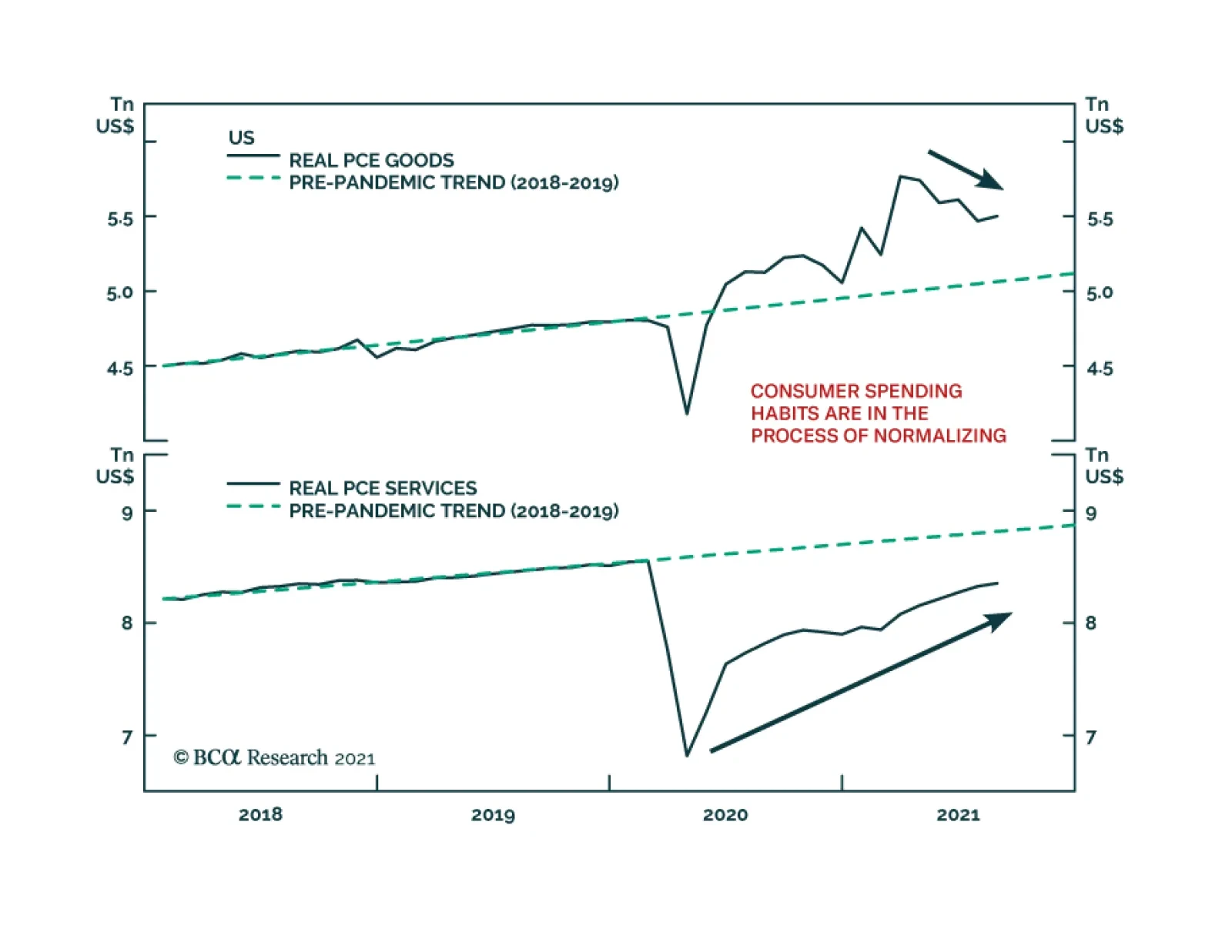
The August US Personal Income and Outlays report was broadly in line with expectations. Personal income rose 0.2% m/m following the prior month’s 1.1% m/m increase. Meanwhile, real personal spending grew 0.4% m/m after a downwardly revised percentage decline…