Labor Market

Highlights Duration: The recent decline in Treasury yields is overdone. Economic growth is no longer accelerating, but it hasn’t slowed enough to justify the strength in bonds. Stronger employment data will pressure bond yields higher this fall, once labor supply constraints ebb. Ultimately, we expect the 10-year Treasury yield to reach a range of 2% to 2.25% by the end of 2022 when the Fed is ready to lift rates. Maintain below-benchmark portfolio duration. Employment: The static unemployment rate and sub-50 readings from ISM employment indexes will prove to be short-lived phenomena driven by labor supply constraints. These constraints will vanish in the fall when schools re-open and expanded unemployment benefits lapse. Yield Curve: Remain positioned in yield curve flatteners. We specifically like shorting the 5-year bullet versus a duration-matched 2/10 barbell. We expect that the next significant move in Treasury yields will be a bear-flattening of the curve prompted by strong employment data this fall. Feature Last week was another dramatic one in the bond market. Bond yields fell sharply as doubts emerged about the pace of economic recovery and the economy’s progress back to full employment. The 10-year Treasury yield started the week at 1.44% before hitting an intra-day low of 1.25% on Thursday. It then rebounded somewhat to end the week at 1.36%. One catalyst for the move was Tuesday morning’s ISM Non-Manufacturing report that printed at 60.1, below consensus expectations of 63.5. But in truth, economic momentum had already been slowing for several months before that release. The 10-year Treasury yield peaked at 1.74% on March 31st, right around the same time that the New York Fed’s Weekly Economic Index and both the ISM Manufacturing and Non-Manufacturing indexes leveled-off (Chart 1). Last week simply saw the “slowing growth” narrative pick up steam. One noteworthy feature of last week’s market action is that the Treasury curve flattened as yields fell. While the 10-year yield is now at its lowest since February, the 2-year yield remains higher than it was just prior to the June FOMC meeting (Chart 2). This suggests that part of the drop in long-maturity bond yields is due to a fear that the Fed will over-tighten in the face of slowing growth. This fear likely stems from the Fed’s apparent hawkish pivot at the June FOMC meeting.1 Chart 1"Peak Growth" Hits The Bond Market
"Peak Growth" Hits The Bond Market
"Peak Growth" Hits The Bond Market
Chart 2A Flatter Curve Since March
A Flatter Curve Since March
A Flatter Curve Since March
It’s also worth mentioning that the bulk of last week’s drop in yields was concentrated in long-maturity real yields (Chart 2, bottom 2 panels). TIPS breakeven inflation rates have fallen somewhat since the end of March. But, at 2.3% and 2.23% respectively, the 10-year and 30-year TIPS breakeven inflation rates are not that far below the Fed’s 2.3% - 2.5% target range. Chart 3Bond Rally Not Confirmed By Commodities
Bond Rally Not Confirmed By Commodities
Bond Rally Not Confirmed By Commodities
Finally, many have suggested that “technical factors” are responsible for last week’s bond market strength. That is, factors related to the supply and demand for bonds but unrelated to economic fundamentals conspired to push yields lower. This is a difficult thesis to prove or disprove, but we will point out that the 10-year Treasury yield has diverged significantly from the CRB Raw Industrials / Gold ratio (Chart 3). The 10-year yield and the CRB/Gold ratio tend to track each other very closely but, in contrast to yields, the CRB/Gold ratio has actually increased since March 31st. This lends some credence to the argument that last week’s drop in yields is not purely a reflection of economic weakness, and it could be an overreaction to weaker-than-expected data that was exacerbated by extreme short positioning in the market (Chart 3, bottom panel). Three Reasons Why The Decline In Treasury Yields Is Overdone We do in fact think that the recent decline in Treasury yields is overdone, and we continue to see the 10-year Treasury yield reaching a range of 2% - 2.25% by the end of next year when the Fed is ready to lift rates. We present three reasons why the recent drop in Treasury yields is overdone. First, the bond market is making too much of the “slowing growth” narrative. Yes, it’s certainly true that the economic indicators shown in Chart 1 are no longer accelerating, but in level terms they remain consistent with a robust economic recovery where GDP growth is well above trend. This sort of growth environment is consistent with a falling unemployment rate that will eventually bring Fed rate hikes into play. Bond yields will move higher as this tightening cycle approaches. Second, it is not just the pace of economic growth that matters for bond yields. The output gap matters as well.2 That is, the same rate of economic growth will coincide with higher bond yields when the unemployment rate is 5% than it will when the unemployment rate is 10%. With that in mind, we observe that the output gap has closed significantly during the past year. The prime-age employment-to-population ratio is 77%, up from a 2020 low of 70%. Similarly, capacity utilization is 75%, up from a 2020 low of 64% (Chart 4). Unless we expect economic growth to slow enough for progress on these two fronts to reverse, then we should see significantly higher bond yields this year compared to last year. This makes it difficult to see how Treasury yields can fall much further from current levels. Another way to conceptualize the relationship between the output gap and long-maturity bond yields is to look at how long-dated yields move relative to short-dated yields. Since the Fed moves the funds rate in response to changes in the output gap, we can model the 10-year Treasury yield relative to the fed funds rate and expectations for near-term changes in the fed funds rate to get a sense of how well the output gap explains changes in long-maturity bond yields. Chart 5 presents a simple model of the 10-year Treasury yield relative to the fed funds rate and the 24-month fed funds discounter. It shows that last week’s decline in the 10-year yield caused it to diverge significantly from the model’s fair value. Chart 4The Output Gap Matters
The Output Gap Matters
The Output Gap Matters
Chart 5Long-Maturity Yields Are Too Low
Long-Maturity Yields Are Too Low
Long-Maturity Yields Are Too Low
Third, the Fed’s pledge to keep rates at the zero-lower-bound at least until the labor market reaches “maximum employment” means that the labor market outlook is critical for bond yields. Our view is that the labor market is on the cusp of a rapid recovery that will cause the Fed to lift rates before the end of 2022. However, recent labor market data have been mixed and there is considerable uncertainty in the market about the future pace of employment gains. The next section delves deeper into the outlook for the labor market. Making Sense Of The Employment Data Chart 6ISM Employment Below 50 ...
ISM Employment Below 50 ...
ISM Employment Below 50 ...
Overall, it seems safe to say that the labor market data have been disappointing in recent months. Yes, nonfarm payroll growth has averaged a robust +543k this year, but the minutes of the June FOMC meeting revealed that “some participants” viewed employment gains as “weaker than they had expected”. The recent dips in the employment components of both the ISM Manufacturing and Non-Manufacturing indexes to below the 50 boom/bust line only add to the sense of pessimism about the labor market. Historically, sub-50 readings from the ISM employment indices (particularly from the non-manufacturing ISM) have coincided with slowing employment growth (Chart 6). This time, however, we don’t see the ISM employment indexes staying below 50 for very long. The more demand-focused components of the ISM indexes – production, new orders and backlog of orders – remain elevated (Chart 7). This tells us that demand is strong and that hiring is only weak because of labor supply constraints, a topic we have covered repeatedly in this publication.3 Our view is that by September, once schools re-open and expanded unemployment benefits lapse, we will see a surge in hiring and a jump in the ISM employment components as people are enticed back into the workforce. A clearer picture of the labor market will then emerge, and it will catalyze a jump in bond yields. It’s not just weak ISM employment readings that are giving investors doubts about the labor market. The unemployment rate’s decline has also slowed markedly in recent months (Chart 8). Our adjusted measure of the U3 unemployment rate currently sits at 6.1%, above the headline U3 measure of 5.9% and significantly above the range of 3.5% to 4.5% that the Fed estimates is consistent with full employment. Chart 7... But Demand Indicators Are Elevated
... But Demand Indicators Are Elevated
... But Demand Indicators Are Elevated
Chart 8Slow Progress On Unemployment
Slow Progress On Unemployment
Slow Progress On Unemployment
Chart 9Labor Supply Is The Problem
Labor Supply Is The Problem
Labor Supply Is The Problem
We adjust the U3 unemployment rate to include a number of people that are currently being classified as “employed but absent from work” when they should be classified as “temporarily unemployed”. The number of people describing themselves as “employed but absent from work” jumped sharply in March 2020 and has remained elevated. This is the result of workers that were placed on temporary furlough during the pandemic and who should be counted as unemployed. We make our adjustment by taking the difference between the number of people that are “employed but absent from work for other reasons” each month and a baseline calculated as that month’s average between 2015 and 2019. We then add this excess amount to the number of temporarily unemployed. This gives us adjusted readings for both the U3 unemployment rate and the temporary unemployment rate (Chart 8, top 2 panels). The Appendix of this report updates our scenarios for the average monthly nonfarm payroll growth required to reach “maximum employment” to consider both this new adjustment and June’s employment figures. Technical adjustments aside, the main takeaway for investors is that progress toward “maximum employment” has been relatively slow during the past few months. This is particularly true if we look at the unemployment rate excluding those on temporary furlough (Chart 8, panel 3) and the labor force participation rate (Chart 8, bottom panel). This slow progress toward “maximum employment” is undoubtedly a reason why bond yields remain low. But, once again, we think it’s only a matter of time before labor supply constraints ease and the unemployment rate falls rapidly, catching up to indicators of labor demand that have already surpassed pre-COVID levels (Chart 9). Bottom Line: The recent decline in Treasury yields is overdone. Economic growth is no longer accelerating, but it hasn’t slowed enough to justify the strength in bonds. The labor market also continues to make progress toward maximum employment (and Fed rate hikes) though that progress has slowed during the past few months. We anticipate that stronger employment data will pressure bond yields higher this fall, once labor supply constraints ebb. Ultimately, the economy will reach full employment in time for the Fed to lift rates in 2022. We expect that the 10-year Treasury yield will be in a range of 2% to 2.25% by then. Maintain below-benchmark portfolio duration. A Quick Note On The Yield Curve Chart 105y5y Still Close To Fair Value
5y5y Still Close To Fair Value
5y5y Still Close To Fair Value
While we view the recent drop in the level of bond yields as an overreaction, we are less inclined to view recent curve flattening as temporary. To see why, let’s look at the 5-year/5-year forward Treasury yield relative to survey estimates of the long-run neutral fed funds rate. We like to think of the 5-year/5-year forward Treasury yield as a market proxy for the long-run neutral fed funds rate, so a range of estimates of that rate is a logical fair value target. The 5-year/5-year forward Treasury yield has fallen a lot during the past few weeks. But, at 2%, it is still within the range of neutral rate estimates from the New York Fed’s Survey of Market Participants and only just outside of the same range from the Survey of Primary Dealers (Chart 10). The fact that the 5-year/5-year yield remains relatively close to its fair value range tells us that there is very limited scope for curve steepening. Recent periods of significant curve steepening have tended to coincide with one of the following two developments: The Fed is cutting rates (coincides with a bull-steepening) The 5-year/5-year forward Treasury yield moves into its fair value range after starting out well below it (coincides with a bear-steepening) This second sort of curve steepening occurred during the 2013 taper tantrum, after the 2016 presidential election and again after the 2020 presidential election. It’s conceivable that the yield curve could re-steepen somewhat during the next few months, if the 5-year/5-year forward yield moves back to its prior highs. But we expect the next major move in the Treasury market to be a bear-flattening as the rest of the yield curve catches up to the 5-year/5-year. This is the sort of curve flattening that occurred in 2017 and 2018 when the Fed was lifting rates (Chart 10, bottom 2 panels). A bear-flattening of the yield curve is also the most likely outcome if we start to see significant positive employment surprises later this year, as we anticipate. These employment surprises would bring forward the timing and pace of rate hikes but wouldn’t necessarily cause investors to question their views about the long-run neutral fed funds rate. Bottom Line: Remain positioned in yield curve flatteners. We specifically like shorting the 5-year bullet versus a duration-matched 2/10 barbell. We expect that the next significant move in Treasury yields will be a bear-flattening of the curve prompted by strong employment data this fall. Appendix: How Far From “Maximum Employment” And Fed Liftoff? Chart A1Defining “Maximum Employment”
Defining "Maximum Employment"
Defining "Maximum Employment"
The Federal Reserve has promised that the funds rate will stay pinned at zero until the labor market returns to “maximum employment”. The Fed has not provided explicit guidance on the definition of “maximum employment”, but we deduce that “maximum employment” means that the Fed wants to see the U3 unemployment rate within a range consistent with its estimates of the natural rate of unemployment, currently 3.5% to 4.5%, and that it wants to see a more or less complete recovery of the labor force participation rate back to February 2020 levels (Chart A1). Alternatively, we can infer definitions of “maximum employment” from the New York Fed’s Surveys of Primary Dealers and Market Participants. These surveys ask respondents what they think the unemployment and labor force participation rates will be at the time of Fed liftoff. Currently, the median respondent from the Survey of Market Participants expects an unemployment rate of 3.5% and a participation rate of 63%. The median respondent from the Survey of Primary Dealers expects an unemployment rate of 3.7% and a participation rate of 63%. Tables A1-A4 present the average monthly nonfarm payroll growth required to reach different combinations of unemployment rate and participation rate by specific future dates. For example, if we use the definition of “maximum employment” from the Survey of Market Participants, then we need to see average monthly nonfarm payroll growth of +484k in order to hit “maximum employment” by the end of 2022. Table A1Average Monthly Nonfarm Payroll Growth Required For The Unemployment To Reach 4.5% By The Given Date
Overreaction
Overreaction
Table A2Average Monthly Nonfarm Payroll Growth Required For The Unemployment To Reach 4% By The Given Date
Overreaction
Overreaction
Table A3Average Monthly Nonfarm Payroll Growth Required For The Unemployment To Reach 3.5% By The Given Date
Overreaction
Overreaction
Table A4Average Monthly Nonfarm Payroll Growth Required To Reach “Maximum Employment” As Defined By Survey Respondents
Overreaction
Overreaction
Chart A2 presents recent monthly nonfarm payroll growth along with target levels based on the Survey of Market Participants’ definition of “maximum employment”. This chart helps us track progress toward specific liftoff dates. For example, if monthly nonfarm payroll growth continues to print at the same level as last month, then we could anticipate a Fed rate hike by June 2022. We will continue to track these charts and tables in the coming months, and will publish updates after the release of each monthly employment report. Chart A2Tracking Toward Fed Liftoff
Tracking Toward Fed Liftoff
Tracking Toward Fed Liftoff
Ryan Swift US Bond Strategist rswift@bcaresearch.com Footnotes 1 Please see US Bond Strategy / Global Fixed Income Strategy Weekly Report, “How To Re-Shape The Yield Curve Without Really Trying”, dated June 22, 2021. 2 For a description of the five macro factors that determine bond yields please see US Bond Strategy Weekly Report, “Bond Kitchen”, dated April 9, 2019. 3 Please see US Bond Strategy Weekly Report, “Making Money In Municipal Bonds”, dated April 27, 2021. Fixed Income Sector Performance Recommended Portfolio Specification
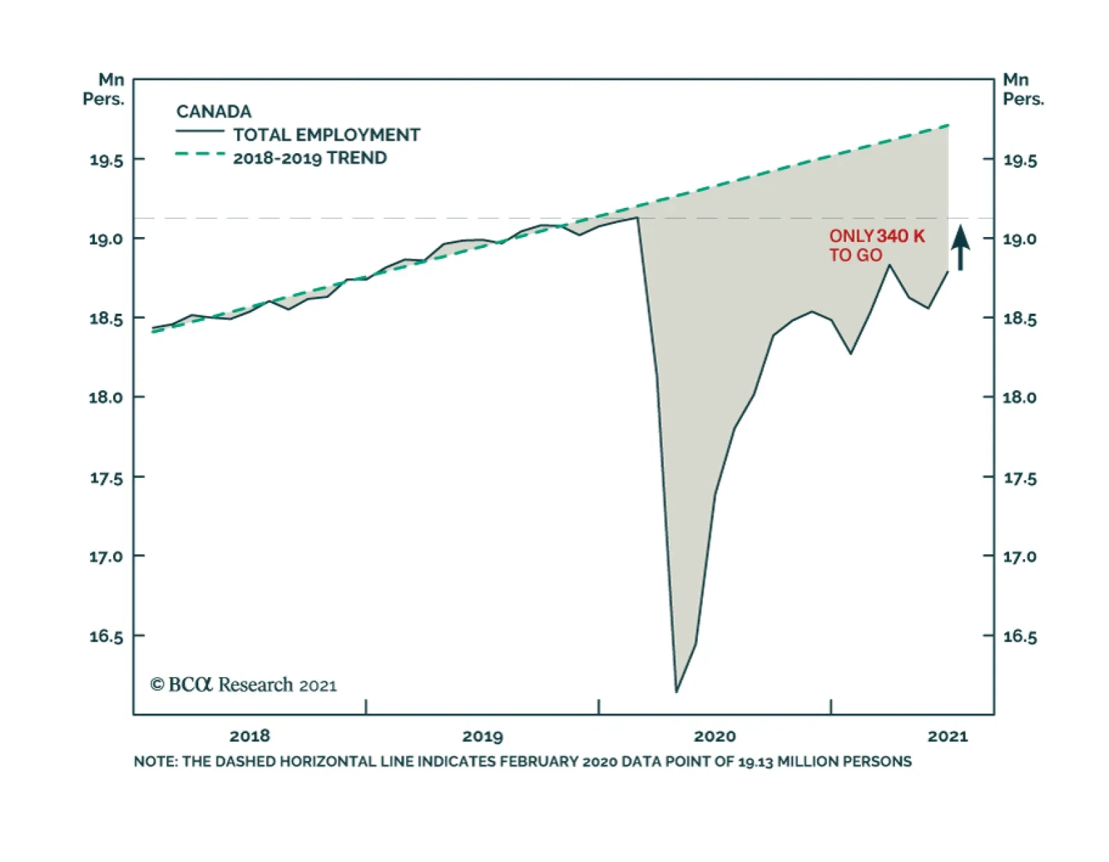
Canadian employment growth in June was robust at 231,000, a big improvement over the losses incurred over the prior two months. The latest month’s growth was driven mainly by a 264,000 increase in part-time jobs: full-time workers fell by 33,000. The recovery…
In their Q2/2021 model bond portfolio performance review, BCA Research’s Global Fixed Income Strategy team updated their recommended positioning for the next six months. Firstly, the team changed its US Treasury curve exposure to have more of a flattening…
Highlights Chart 1Employment Growth
Employment Growth
Employment Growth
June’s employment report revealed that 850 thousand jobs were added to nonfarm payrolls during the month. This is well above the 416k to 505k threshold that is required to hit the Fed’s “maximum employment” target in time for a rate hike in 2022 (Chart 1). The bond market, however, didn’t see things this way. Treasury yields fell across the entire curve following the report’s release on Friday. This is likely because, in contrast to the establishment survey’s strong +850k print, the household employment survey showed a decline of 18k jobs and an uptick in the unemployment rate from 5.8% to 5.9%. Importantly, the household survey tends to be more volatile than the establishment survey, and we expect it will catch up in the coming months. We see the bond market as overly complacent in the face of what is shaping up to be a rapid labor market recovery that will only accelerate once schools re-open and expanded unemployment benefits lapse in September. US bond investors should maintain below-benchmark portfolio duration. Feature Table 1Recommended Portfolio Specification
On Track For 2022 Liftoff
On Track For 2022 Liftoff
Table 2Fixed Income Sector Performance
On Track For 2022 Liftoff
On Track For 2022 Liftoff
Investment Grade: Neutral Chart 2Investment Grade Market Overview
Investment Grade Market Overview
Investment Grade Market Overview
Investment grade corporate bonds outperformed the duration-equivalent Treasury index by 50 basis points in June, bringing year-to-date excess returns up to +209 bps. The combination of above-trend economic growth and accommodative monetary policy supports continued positive excess returns for spread product versus Treasuries. At 99 bps, the 3/10 Treasury slope remains very steep and the 5-year/5-year forward TIPS breakeven inflation rate is below the Fed’s 2.3% to 2.5% target range. The message from these two indicators is that the Fed is not yet ready for monetary conditions to turn restrictive. Despite the positive macro back-drop, investment grade valuations are extremely tight. The investment grade corporate index’s 12-month breakeven spread is at its lowest since 1995 (Chart 2). Last week’s report looked at what different combinations of Treasury slope and corporate spreads have historically signaled about corporate bond excess returns.1 We found that tight corporate spreads only correlate with negative excess returns once the 3/10 Treasury slope is below 50 bps. Though we retain a positive view of spread product as a whole, better value can be found outside of the investment grade corporate sector. Specifically, we recommend favoring high-yield over investment grade. We also prefer municipal bonds, USD-denominated EM sovereigns and USD-denominated EM corporates over investment grade US corporates with the same credit rating and duration. Table 3ACorporate Sector Relative Valuation And Recommended Allocation*
On Track For 2022 Liftoff
On Track For 2022 Liftoff
Table 3BCorporate Sector Risk Vs. Reward*
On Track For 2022 Liftoff
On Track For 2022 Liftoff
High-Yield: Overweight Chart 3High-Yield Market Overview
High-Yield Market Overview
High-Yield Market Overview
High-Yield outperformed the duration-equivalent Treasury index by 122 basis points in June, bringing year-to-date excess returns up to +468 bps. Last week’s report looked at the default expectations that are currently priced into the junk index and considered whether they are likely to be met.2 If we demand an excess spread of 100 bps and assume a 40% recovery rate on defaulted debt, then the High-Yield index embeds an expected default rate of 2.8% (Chart 3). Using a model of the 12-month trailing speculative grade default rate that is based on gross corporate leverage (pre-tax profits over total debt) and C&I lending standards, we estimate that the 12-month default rate will fall to between 2.3% and 2.8%, slightly below what the market currently discounts. This estimate assumes 7% real GDP growth (an input we use to forecast corporate profit growth) and corporate debt growth of between 0% and 8%. Notably, the corporate default rate is tracking at an annualized rate of roughly 1.8% through the first five months of the year, below the estimate generated by our macro model. At 267 bps, the average option-adjusted spread on the High-Yield index is at its lowest since 2007. However, our above analysis suggests that these spread levels are still consistent with earning positive excess returns versus duration-matched Treasuries because default losses will also be low. High-yield spreads also look relatively attractive compared to investment grade spreads. Investors still receive an additional 97 bps of spread as compensation for moving out of the Baa credit tier and into the Ba tier (panel 2). Given the accommodative macro environment, we advise investors to grab this extra spread. MBS: Underweight Chart 4MBS Market Overview
MBS Market Overview
MBS Market Overview
Mortgage-Backed Securities underperformed the duration-equivalent Treasury index by 36 basis points in June, dragging year-to-date excess returns down to -45 bps. The nominal spread between conventional 30-year MBS and equivalent-duration Treasuries tightened 8 bps in June. The spread remains wide compared to recent history, but it is still tight compared to the pace of mortgage refinancings (Chart 4). The conventional 30-year MBS option-adjusted spread (OAS) widened 13 bps in June (panel 3), and it is now starting to look more competitive compared to other similarly risky spread sectors. The conventional 30-year MBS OAS sits at 34 bps, below the 49 bps offered by Aa-rated corporate bonds but above the 17 bps offered by Aaa-rated consumer ABS and the 30 bps offered by Agency CMBS. In a recent report we looked at MBS performance and valuation across the coupon stack.3 We noted that the higher convexity of high-coupon MBS makes them likely to outperform lower-coupon MBS in a rising yield environment. Higher coupon MBS also have greater OAS than lower coupons. This makes the high-coupon MBS more likely to outperform in a flat bond yield environment as well. Given our view that bond yields will rise during the next 6-12 months, we recommend favoring high coupons (4%, 4.5%) over low coupons (2%, 2.5%, 3%) within an overall underweight allocation to Agency MBS. Government-Related: Neutral Chart 5Government-Related Market Overview
Government-Related Market Overview
Government-Related Market Overview
The Government-Related index outperformed the duration-equivalent Treasury index by 4 basis points in June, bringing year-to-date excess returns up to +91 bps (Chart 5). Sovereign debt underperformed duration-equivalent Treasuries by 16 bps in June, dragging year-to-date excess returns down to +36 bps. Foreign Agencies outperformed the Treasury benchmark by 10 bps on the month, bringing year-to-date excess returns up to +46 bps. Local Authority bonds outperformed by 31 bps in June, bringing year-to-date excess returns up to +392 bps. Domestic Agency bonds underperformed by 1 bp, dragging year-to-date excess returns down to +26 bps. Supranationals outperformed by 3 bps, bringing year-to-date excess returns up to +26 bps. USD-denominated Emerging Market (EM) Sovereign bonds continue to offer an attractive spread pick-up versus investment grade US corporate bonds with the same credit rating and duration. Attractive countries include: Qatar, UAE, Saudi Arabia, Mexico and Russia. Last week’s report looked at valuation within the investment grade USD-denominated EM corporate space.4 We found that EM corporates are attractively priced relative to US corporate bonds across the entire investment grade credit spectrum. We also found that EM corporates are attractive relative to EM sovereigns within the A and Baa credit tiers. EM sovereigns have the edge in the Aa credit tier. Municipal Bonds: Overweight Chart 6Municipal Market Overview
Municipal Market Overview
Municipal Market Overview
Municipal bonds outperformed the duration-equivalent Treasury index by 22 basis points in June, bringing year-to-date excess returns up to +309 bps (before adjusting for the tax advantage). We took a detailed look at municipal bond performance and valuation in a recent report and come to the following conclusions.5 First, the economic and policy back-drop is favorable for municipal bond performance. The recently enacted American Rescue Plan includes $350 billion of funding for state & local governments, a bailout that came after state & local government revenues already exceeded expenditures in 2020 (Chart 6). Second, Aaa-rated municipal bonds look expensive relative to Treasuries (top panel). Muni investors should move down in quality to pick up additional yield. Third, General Obligation (GO) and Revenue munis offer better value than investment grade corporates with the same credit rating and duration, particularly at the long-end of the curve. Revenue munis in the 12-17 year maturity bucket offer a before-tax yield pick-up versus corporates. GO munis offer a breakeven tax of just 6% (panel 2). Fourth, taxable munis offer a yield advantage over credit rating and duration-matched investment grade corporates that investors should grab (panel 3). Finally, high-yield muni spreads are reasonably attractive relative to high-yield corporates, offering a breakeven tax rate of 20% (panel 4). But despite the attractive spread, we recommend only a neutral allocation to high-yield munis versus high-yield corporates as the deep negative convexity of high-yield munis makes them susceptible to extension risk if bond yields rise. Treasury Curve: Buy 2/10 Barbell Versus 5-Year Bullet Chart 7Treasury Yield Curve Overview
Treasury Yield Curve Overview
Treasury Yield Curve Overview
The Treasury curve underwent a massive re-shaping in June. Yields at the front-end of the curve rose significantly after the June FOMC meeting while longer-maturity yields declined. All told, the yield curve flattened dramatically on the month. The 2/10 slope flattened 24 bps to end the month at 120 bps. The 5/30 slope flattened 28 bps to end the month at 119 bps. As we wrote in a recent report, we believe that the June FOMC meeting marks an inflection point for the yield curve.6 Prior to the meeting, the yield curve up to the 10-year maturity point had generally been in a bear-steepening/bull-flattening regime, where the slope of the yield curve was positively correlated with the average level of yields (Chart 7). But bond investors appear to have left the June FOMC meeting with a sense that we are now marching toward a Fed rate hike cycle. In that new world, it makes more sense for the yield curve to be negatively correlated with the average level of yields: a bear-flattening/bull-steepening regime. Given that we expect the Fed to lift rates before the end of 2022, we are now sufficiently close to a tightening cycle that the yield curve should bear-flatten between now and then. We therefore recommend that investors short the 5-year bullet and go long a duration-matched barbell consisting of the 2-year and 10-year notes. This position offers a negative yield pick-up, but it looks modestly cheap on our fair value model (see Appendix A) and it will earn capital gains as the 2/10 slope flattens. TIPS: Neutral Chart 8TIPS Market Overview
TIPS Market Overview
TIPS Market Overview
TIPS underperformed the duration-equivalent nominal Treasury index by 22 basis points in June, dragging year-to-date excess returns down to +461 bps. The 10-year and 5-year/5-year forward TIPS breakeven inflation rates both fell 10 bps on the month. At 2.35%, the 10-year TIPS breakeven inflation rate is just within the 2.3% to 2.5% range that is consistent with inflation expectations being well anchored around the Fed’s target (Chart 8). Meanwhile, at 2.18%, the 5-year/5-year forward TIPS breakeven inflation rate is below where the Fed would like it to be (panel 3). We see some upside in long-maturity TIPS breakeven inflation rates during the next 6-12 months, as we expect that the 5-year/5-year forward breakeven will find its way back into the Fed’s target range before the first rate hike. However, once the Fed starts tightening it will have a strong incentive to keep long-maturity breakevens below 2.5%. This means that a long position in TIPS versus nominal Treasuries has limited upside. We also see the cost of short-maturity inflation protection falling somewhat during the next few months, as realized inflation is likely at its peak. This will lead to some modest steepening of the inflation curve (panel 4). We do expect, however, that the inflation curve will remain inverted. An inverted inflation curve is simply more consistent with the Fed’s Average Inflation Target than a positively sloped one, as the Fed will be attacking its inflation target from above rather than from below. ABS: Overweight Chart 9ABS Market Overview
ABS Market Overview
ABS Market Overview
Asset-Backed Securities outperformed the duration-equivalent Treasury index by 6 basis points in June, bringing year-to-date excess returns up to +39 bps. Aaa-rated ABS outperformed by 5 bps on the month, bringing year-to-date excess returns up to +31 bps. Non-Aaa ABS outperformed by 14 bps on the month, bringing year-to-date excess returns up to +84 bps. The stimulus from last year’s CARES act led to a significant increase in household savings when individual checks were mailed in April 2020. That excess savings has still not been spent and the most recent round of stimulus checks has only added to the stockpile by pushing the savings rate higher yet again (Chart 9). The extraordinarily large stock of household savings means that the collateral quality of consumer ABS is also extraordinarily high. Indeed, many households have been using their windfalls to pay down consumer debt (bottom panel). Investors should remain overweight consumer ABS and should also take advantage of the high quality of household balance sheets by moving down the quality spectrum. Non-Agency CMBS: Neutral Chart 10CMBS Market Overview
CMBS Market Overview
CMBS Market Overview
Non-Agency Commercial Mortgage-Backed Securities outperformed the duration-equivalent Treasury index by 20 basis points in June, bringing year-to-date excess returns up to +183 bps. Aaa Non-Agency CMBS outperformed Treasuries by 4 basis points in June, bringing year-to-date excess returns up to +82 bps. Non-Aaa Non-Agency CMBS outperformed Treasuries by 66 bps in June, bringing year-to-date excess returns up to a whopping +522 bps (Chart 10). Though returns have been strong and spreads remain attractive, particularly for lower-rated CMBS, we continue to recommend only a neutral allocation to the sector because of the structurally challenging environment for commercial real estate. Even with the economic recovery well underway, commercial real estate loan demand continues to contract and banks are not making lending standards more accommodative (panels 3 & 4). Agency CMBS: Overweight Agency CMBS underperformed the duration-equivalent Treasury index by 9 basis points in June, dragging year-to-date excess returns down to +116 bps. The average index option-adjusted spread widened 3 bps on the month and it currently sits at 30 bps (bottom panel). Though Agency CMBS spreads have recovered to well below pre-COVID levels, they still look attractive compared to other similarly risky spread products. Stay overweight. Appendix A: Butterfly Strategy Valuations The following tables present the current read-outs from our butterfly spread models. We use these models to identify opportunities to take duration-neutral positions across the Treasury curve. The following two Special Reports explain the models in more detail: US Bond Strategy Special Report, “Bullets, Barbells And Butterflies”, dated July 25, 2017, available at usbs.bcaresearch.com US Bond Strategy Special Report, “More Bullets, Barbells And Butterflies”, dated May 15, 2018, available at usbs.bcaresearch.com Table 4 shows the raw residuals from each model. A positive value indicates that the bullet is cheap relative to the duration-matched barbell. A negative value indicates that the barbell is cheap relative to the bullet. Table 4Butterfly Strategy Valuation: Raw Residuals In Basis Points (As Of June 30TH, 2021)
On Track For 2022 Liftoff
On Track For 2022 Liftoff
Table 5 scales the raw residuals in Table 4 by their historical means and standard deviations. This facilitates comparison between the different butterfly spreads. Table 5Butterfly Strategy Valuation: Standardized Residuals (As Of June 30TH, 2021)
On Track For 2022 Liftoff
On Track For 2022 Liftoff
Table 6 flips the models on their heads. It shows the change in the slope between the two barbell maturities that must be realized during the next six months to make returns between the bullet and barbell equal. For example, a reading of 9 bps in the 5 over 2/10 cell means that we would only expect the 5-year to outperform the 2/10 if the 2/10 slope steepens by more than 9 bps during the next six months. Otherwise, we would expect the 2/10 barbell to outperform the 5-year bullet. Table 6Discounted Slope Change During Next 6 Months (BPs)
On Track For 2022 Liftoff
On Track For 2022 Liftoff
Appendix B: Excess Return Bond Map The Excess Return Bond Map is used to assess the relative risk/reward trade-off between different sectors of the US bond market. It is a purely computational exercise and does not impose any macroeconomic view. The Map’s vertical axis shows 12-month expected excess returns. These are proxied by each sector’s option-adjusted spread. Sectors plotting further toward the top of the Map have higher expected returns and vice-versa. Our novel risk measure called the “Risk Of Losing 100 bps” is shown on the Map’s horizontal axis. To calculate it, we first compute the spread widening required on a 12-month horizon for each sector to lose 100 bps or more relative to a duration-matched position in Treasury securities. Then, we divide that amount of spread widening by each sector’s historical spread volatility. The end result is the number of standard deviations of 12-month spread widening required for each sector to lose 100 bps or more versus a position in Treasuries. Lower risk sectors plot further to the right of the Map, and higher risk sectors plot further to the left. Chart 11Excess Return Bond Map (As Of June 30TH, 2021)
On Track For 2022 Liftoff
On Track For 2022 Liftoff
Ryan Swift US Bond Strategist rswift@bcaresearch.com Footnotes 1 Please see US Bond Strategy Weekly Report, “The Post-FOMC Credit Environment”, dated June 29, 2021. 2 Please see US Bond Strategy Weekly Report, “The Post-FOMC Credit Environment”, dated June 29, 2021. 3 Please see US Bond Strategy Weekly Report, “A New Conundrum”, dated April 20, 2021. 4 Please see US Bond Strategy Weekly Report, “The Post-FOMC Credit Environment”, dated June 29, 2021. 5 Please see US Bond Strategy Weekly Report, “Making Money In Municipal Bonds”, dated April 27, 2021. 6 Please see US Bond Strategy / Global Fixed Income Strategy Weekly Report, “How To Re-Shape The Yield Curve Without Really Trying”, dated June 22, 2021.
Highlights Three distinct forces are likely to make South Asia’s geopolitical risks increasingly relevant to global investors. First, India’s tensions with China stem from China’s growing foreign policy assertiveness and India’s shift away from traditional neutrality toward aligning with the US and its allies. This creates a security dilemma in South Asia, just as in East Asia. Second, India’s economy is sputtering in the wake of the COVID-19 pandemic, adding fuel to nationalism and populism in advance of a series of important elections. India will stimulate the economy but it could also become more reactive on the international scene. Third, the US is withdrawing from Afghanistan and negotiating a deal with Iran in an effort to reduce the US military presence in the Middle East and South Asia. This will create a scramble for influence across both regions and a power vacuum in Afghanistan that is highly likely to yield negative surprises for India and its neighbors. Traditionally geopolitical risks in South Asia have a limited impact on markets. India’s growth slowdown and forthcoming fiscal stimulus are more relevant for investors. However, a sharp rise in geopolitical risk would undermine India’s structural advantages as the West diversifies away from China. Stay short Indian banks. Feature Geopolitical risks in South Asia are slowly but surely rising. India-Pakistan and China-India are well-known “conflict-dyads” or pairings. Historically, these two sets have been fighting each other over their fuzzy Himalayan border with limited global financial market consequences. But now fundamental changes are afoot that are altering the geopolitical setting in the region. Specifically, the coming together of three distinct forces could trigger a significant geopolitical event in South Asia. The three forces are as follow: Force #1: Sino-Indian Tensions Get Real About a year ago, Indian and Chinese troops clashed in Ladakh, a disputed territory in the Kashmir region. Following these clashes China reduced its military presence in the Pangong Tso area but its presence in some neighboring areas remains meaningful. Besides the troop build-up along India’s eastern border, China is building more air combat infrastructure in its India-facing western theatre. China’s major air bases have historically been concentrated in China’s eastern region, away from the Indian border (Map 1). Consequently, India has historically enjoyed an advantage in airpower. But China appears to be working to mitigate this disadvantage. Map 1Most Of China’s Major Aviation Units Are Located Away From India
South Asia: A Slowdown And A Showdown
South Asia: A Slowdown And A Showdown
Owing to China’s increased military focus along the Sino-India border, India’s threat perception of China has undergone a fundamental change in recent years. Notably, India has diverted some of its key army units away from its western Indo-Pak border towards its eastern border with China. India could now have nearly 200,000 troops deployed along its border with China, which would mark a 40% increase from last year.1 Turning attention to the Indo-Pak border, India’s problems with Pakistan appear under control for now. This is owing to the ceasefire agreement that was renewed by the two countries in February 2021. However, this peace cannot possibly be expected to last. This is mainly because core problems between the two countries (like Pakistan’s support of militant proxies and India’s control over Kashmir) remain unaddressed. History too suggests that bouts of peace between the two warring neighbors rarely last long. These bouts usually end abruptly when a terrorist attack takes place in India. With both political turbulence and economic distress in Pakistan rising, the fragile ceasefire between India and Pakistan could be upended over the next six months. In fact, two events over the last week point to the fragility of the ceasefire: Two drones carrying explosives entered an Indian air force station located in Jammu and Kashmir (i.e. a northern territory that India recently reorganized, to Pakistan’s chagrin). Even as no casualties were reported, this attack marks a turning point for terrorist activity in India as this was the first-time terrorists used drones to enter an Indian military base. Hours later, another drone attack struck an Indian base at the Ratnuchak-Kaluchak army station, the site of a major terrorist attack in 2002. Chart 1China, Pakistan And India Cumulatively Added 41 Nuclear Warheads Over 2020
South Asia: A Slowdown And A Showdown
South Asia: A Slowdown And A Showdown
Given that the ceasefire was agreed recently, any further increase in terrorist activity in India over the next six months would suggest that a more substantial breakdown in relations is nigh. Distinct from these recent tensions, China’s troop deployment along India’s eastern arm and Pakistan’s presence along India’s western arm creates a strategic “pincer” that increasingly threatens India. India is naturally concerned. China and Pakistan are allies who have been working closely on projects including the strategic China-Pakistan Economic Corridor (CPEC). The CPEC is a collection of infrastructure projects in Pakistan that includes the development of a port in Gwadar where a future presence of the People's Liberation Army Navy (PLAN) is envisaged. Gwadar has the potential of providing China land-based access to the Indian Ocean. Trust in the South Asian region is clearly running low. Distinct from troop build-ups and drone-attacks, China, Pakistan, and India cumulatively added more than 40 nuclear warheads over the last year (Chart 1). China is reputed to be engaged in an even larger increase in its nuclear arsenal than the data show.2 From a structural perspective, too, geopolitical risks in the South Asian peninsula are bound to keep rising. When it comes to the conflicting Indo-Pak dyad, India’s geopolitical power has been rising relative to that of Pakistan in the 2000s. However, the geopolitical muscle of the Sino-Pak alliance is much greater than that of India on a standalone basis (Chart 2). Chart 2India Has Aligned With The QUAD To Counter The Sino-Pak Alliance
South Asia: A Slowdown And A Showdown
South Asia: A Slowdown And A Showdown
China’s active involvement in South Asia is responsible for driving India’s increasing desire to abandon its historical foreign policy stance of non-alignment. India’s membership in the Quadrilateral Security Dialogue (also known as the QUAD, whose other members include the US, Japan, and Australia) bears testimony to India’s active effort to develop closer relations with the US and its allies (Chart 2). India’s alignment with the US is deepening China’s and Pakistan’s distrust of India. Conventional and nuclear military deterrence should prevent full-scale war. But the regional balance is increasingly fluid which means geopolitical risks will slowly but surely rise in South Asia over the coming year and years. Force #2: A Growth Slowdown Alongside India’s Loaded Election Calendar The pandemic has hit the economies of South Asia particularly hard. South Asia historically maintained higher real GDP growth rates relative to Emerging Markets (EMs). But in 2021, this region’s growth rate is set to be lower than that of EM peers (Chart 3). History is replete with examples of a rise in economic distress triggering geopolitical events. South Asia is characterized by unusually low per capita incomes (Chart 4) and the latest slowdown could exacerbate the risk of both social unrest and geopolitical incidents materialising. Chart 3South Asian Economies Have Been Hit Hard By The Pandemic
South Asia: A Slowdown And A Showdown
South Asia: A Slowdown And A Showdown
Chart 4South Asia Is Characterized By Very Low Per Capita Incomes
South Asia: A Slowdown And A Showdown
South Asia: A Slowdown And A Showdown
To complicate matters a busy state elections calendar is coming up in India. Elections will be due in seven Indian states in 2022. These states account for about 25% of India’s population. State elections due in 2022 will amount to a high-stakes political battle. During state elections in 2021, the ruling Bharatiya Janata Party (BJP) was the incumbent in only one of the five states. In 2022, the BJP is the incumbent party in most of the states that are due for elections, which means it has the advantage but also has a lot to lose, especially in a post-pandemic environment. Elections kick off in the crucial state of Uttar Pradesh next February. Last time this state faced elections Prime Minister Narendra Modi was willing to go to great lengths to boost his popularity ahead of time. Specifically, he upset the nation with a large-scale and unprecedented de-monetization program. Given the busy state election calendar in 2022, we expect the BJP-led central government to focus on policy actions that can improve its support among Indian voters. Two policies in particular are likely to come through: Fiscal Stimulus Measures To Provide Economic Relief: India has refrained from administering a large post-pandemic stimulus thus far. As per budget estimates, the Indian central government’s total expenditure in FY22 is set to increase only by 1% on a year-on-year basis. But the expenditure-side restraint shown by India’s central government could change. With elections and a pandemic (which has now claimed over 400,000 lives in India), the central government could consider a meaningful increase in spending closer to February 2022. Map 2Northern India Views Pakistan Even More Unfavorably Than Rest Of India
South Asia: A Slowdown And A Showdown
South Asia: A Slowdown And A Showdown
India’s Finance Minister already announced a fiscal stimulus package of $85 billion (amounting to 2.8% of GDP) earlier this week. Whilst this stimulus entails limited fresh spending (amounting to about 0.6% of India’s GDP), we would not be surprised if the government follows it up with more spending closer to February 2022. Assertive Foreign Policy To Ward-Off Unfriendly Neighbors: India’s northern states are known to harbor unfavorable views of Pakistan (Map 2). The roots of this phenomenon can be traced to geography and the bloody civil strife of 1947 that was triggered by the partition of British-ruled India into the two independent dominions of India and Pakistan. Given the north’s unfavorable views of Pakistan and given looming elections, Indian policy makers may be forced to adopt a far more aggressive foreign policy response, to any terrorist strikes from Pakistan or territorial incursions by China. This kind of response was observed most recently ahead of the Indian General Elections in April-May 2019. An Indian military convoy was attacked by a suicide-bomber in early February 2019 and a Pakistan-based terrorist group claimed responsibility. A fortnight later the Indian air force launched unexpected airstrikes across the Line of Control which were then followed by the Pakistan air force conducting air strikes in Jammu and Kashmir. While the next round of Pakistani and Indian general elections is not due until 2023 and 2024, respectively, it is worth noting that of the seven state elections due in India in 2022, four are in the north (Uttar Pradesh, Punjab, Uttarakhand, and Himachal Pradesh). Force #3: Power Vacuum In Afghanistan The final reason to be wary of the South Asian geopolitical dynamic is the change in US policy: both the Iran nuclear deal expected in August and the impending withdrawal from Afghanistan in September. The US public has now elected three presidents on the demand that foreign wars be reduced. In the wake of Trump and populism the political establishment is now responding. Therefore Biden will ultimately implement both the Iran deal and the Afghan withdrawal regardless of delays or hang-ups. But then he will have to do damage control. In the case of Iran, a last-minute flare-up of conflict in the region is likely this summer, as the US, Israel, Saudi Arabia, and Iran underscore their red lines before the US and Iran settle down to a deal. Indeed it is already happening, with recent US attacks against Iran-backed Shia militias in Syria and Iraq. A major incident would push up oil prices, which is negative for India. But the endgame, an Iranian economic opening, is positive for India, since it imports oil and has had close relations with Iran historically. In the case of Afghanistan, the US exit will activate latent terrorist forces. It will also create a scramble for influence over this landlocked country that could lead to negative surprises across the region. The first principle of the peace agreement between the US and Afghanistan states that the latter will make all efforts to ensure that Afghan soil is not used to further terrorist activity. However, the enforceability of such a guarantee is next to impossible. Notably, the US withdrawal from Afghanistan will revive the Taliban’s influence in the region. This poses major risks for India, which has a long history of being targeted by Afghani terrorist groups. The Taliban played a critical role in the release of terrorists into Pakistan following the hijacking of an Indian Airlines flight in 1999. Furthermore, the Haqqani network, which has pledged allegiance to the Taliban, has attacked Indian assets in the past. Any attack on India deriving from the power vacuum in Afghanistan would upset the precarious regional balance. Whilst there are no immediate triggers for Afghani groups to launch a terrorist attack in India, the US withdrawal will trigger a tectonic shift in the region. Negative surprises emanating from Afghanistan should be expected. Investment Conclusions Chart 5Indian Banks Appear To Have Factored In All Positives
Indian Banks Appear To Have Factored In All Positives
Indian Banks Appear To Have Factored In All Positives
We reiterate the need to pare exposure to Indian assets on a tactical basis. India’s growth engine is likely to misfire over the second half of the Indian financial year. Macroeconomic headwinds pose the chief risk for investors, but major geopolitical changes could act as a negative catalyst in the current context. So we urge clients to stay short Indian Banks (Chart 5). Financials account for the lion’s share of India’s benchmark index (26% weight). India could opt for an unexpected expansion in its fiscal deficit soon. Whilst we continue to watch fiscal dynamics closely, we expect the fiscal expansion to materialize closer to February 2022 when India’s most populous state (i.e. Uttar Pradesh) will undergo elections. Over the long run, India’s sense of insecurity will escalate in the context of a more assertive China, stronger Sino-Pakistani ties, and a power vacuum in Afghanistan. For that reason, New Delhi will continue to shed its neutrality and improve relations with the US-led coalition of democratic countries, with an aim to balance China. This process will feed China’s insecurity of being surrounded and contained by a hegemonic American system. This security dilemma is a source of South Asian geopolitical risk that will become more globally relevant over time. China’s conflict with the US and western world should create incentives for India to attract trade and investment. However, its ability to do so will be contingent upon domestic political factors and regional geopolitical factors. Ritika Mankar, CFA Editor/Strategist ritika.mankar@bcaresearch.com Matt Gertken Vice President Geopolitical Strategy mattg@bcaresearch.com Footnotes 1 Sudhi Ranjan Sen, ‘India Shifts 50,000 Troops to China Border in Historic Move’, Bloomberg, June 28, 2021, bloomberg.com. 2 Joby Warrick, “China is building more than 100 missile silos in its western desert, analysts say,” Washington Post, June 30, 2021, washingtonpost.com.
Dear Client, We are sending you our Strategy Outlook today, where we outline our thoughts on the macro landscape and the direction of financial markets for the rest of 2021 and beyond. Next week, please join me for a webcast on Thursday, July 8 at 10:00 AM EDT (3:00 PM BST, 4:00 PM CEST, 10:00 PM HKT) where I will discuss the outlook. Best regards, Peter Berezin, Chief Global Strategist Highlights Macroeconomic Outlook: Global growth is peaking but will remain solidly above trend. While the proliferation of the Delta strain is likely to trigger another wave of Covid cases this summer, the economic impact will be far smaller than during past waves. Global Asset Allocation: The risk-reward profile for stocks has deteriorated since the start of the year. Nevertheless, with few signs that the global economy is heading towards another major downturn, investors should maintain a modest equity overweight on a 12-month horizon. Equities: Favor cyclicals, value-oriented, and non-US equities. Emerging markets should spring back to life in the autumn once vaccine supplies increase and Chinese fiscal policy turns more stimulative. Fixed Income: Maintain below average interest-rate duration exposure. The 10-year US Treasury yield will finish the year at 1.9%. Spread product will continue to outperform high quality government bonds. Currencies: The US dollar will resume its weakening trend as growth momentum rotates from the US to the rest of the world. EUR/USD will finish the year at 1.25. Commodities: Brent will rise to $79/bbl by end-2021, 9% above current market expectations. While the lagged effects from the slowdown in Chinese credit growth earlier this year will weigh on base metals during the summer months, the long-term outlook for metals is positive. Favor gold over cryptos as an inflation hedge. I. Macroeconomic Outlook Global Vaccination Campaign Kicks Into High Gear Nearly 18 months after the pandemic began, the global economy is on the mend. In its latest round of forecasts released on May 31st, the OECD projects that the global economy will expand by 5.8% this year, up from its March projection of 5.6%. The OECD also bumped up its growth forecast for 2022 from 4% to 4.4%. After a rough start, the vaccination campaign is progressing well in most advanced economies (Chart 1). The US and the UK were the first major developed economies to roll out the vaccines, followed by Canada and the EU. While Japan has lagged behind, the pace of vaccinations has picked up lately. Twenty percent of the Japanese population has now received at least one dose. Developing economies are still struggling to secure enough vaccines. Fortunately, this problem should abate over the next six months. The Global Health Innovation Center at Duke University estimates that pharmaceutical companies are on track to produce more than 10 billion vaccine doses this year (Chart 2). While perhaps not enough to inoculate everyone who wants a jab, it will suffice in providing protection to the most vulnerable members of society – the elderly and those with pre-existing medical conditions. Chart 1The Vaccination Campaign Is Progressing Well In Most Developed Economies
The Vaccination Campaign Is Progressing Well In Most Developed Economies
The Vaccination Campaign Is Progressing Well In Most Developed Economies
Chart 2Vaccine Makers Are On Track To Produce Over 10 Billion Doses In 2021
2021 Third Quarter Strategy Outlook: The Path To Normal
2021 Third Quarter Strategy Outlook: The Path To Normal
New Variants And Vaccine Hesitancy Are Risks Novel strains of the virus remain a concern. First identified in India, the so-called “Delta variant” is spreading around the world. The number of new cases in the UK, where the Delta variant accounts for over 90% of all new infections, is rising again (Chart 3). The latest outbreak has forced the government to postpone “Freedom Day” from June 21st to July 19th (Chart 4). Chart 3The Number Of New Cases In The UK Is Rising Anew
2021 Third Quarter Strategy Outlook: The Path To Normal
2021 Third Quarter Strategy Outlook: The Path To Normal
Chart 4Dismantling Of Lockdown Measures Occurring At Varying Pace
2021 Third Quarter Strategy Outlook: The Path To Normal
2021 Third Quarter Strategy Outlook: The Path To Normal
It is highly likely that the Delta variant will produce another wave of cases in the US this summer. Despite ample availability, one-third of Americans over the age of 18 have yet to receive a single dose of a vaccine. As is the case with most everything in the United States, the question of whether to be inoculated has become politicized. In many Republican-leaning states, more than half the population remains unvaccinated (Chart 5). Chart 5The US Politicization Of Vaccines Raises The Risk From COVID-19 Variants
2021 Third Quarter Strategy Outlook: The Path To Normal
2021 Third Quarter Strategy Outlook: The Path To Normal
Vaccine hesitancy will likely diminish as the evidence of their effectiveness continues to mount. According to analysis by the Associated Press using CDC data, fully vaccinated people accounted for less than 1% of the 18,000 COVID-19 deaths in the US in May. A study out of the UK showed that two doses of the Pfizer-BioNTech vaccine was 96% effective against hospitalization from the Delta variant, while the Oxford-AstraZeneca vaccine was 92% effective. While another wave of the pandemic will curb growth this summer, the economic impact will be far smaller than in the past. At this point, the initial terror of the pandemic has faded. Politically, it will be more difficult to justify lockdowns in countries such as the US where almost everyone who wants a vaccine has already been able to get one. Macro Policy Outlook: Tighter But Not Tight After cranking the fire hose to full blast during the pandemic, policymakers are looking to scale back support. On the fiscal side, governments are slowly starting to rein in budget deficits. The IMF expects the fiscal impulse in advanced economies to average -4% of GDP in 2022, implying an incrementally tighter fiscal stance (Chart 6). Chart 6Budget Deficits Set To Decline, But Remain High By Historic Standards
2021 Third Quarter Strategy Outlook: The Path To Normal
2021 Third Quarter Strategy Outlook: The Path To Normal
Tighter does not necessarily mean tight, however. The IMF sees advanced economies running an average cyclically-adjusted primary budget deficit of 2.6% of GDP between 2022 and 2026, compared to an average deficit of 1.1% of GDP between 2014 and 2019. In the US, Congress is debating an infrastructure bill, a key element of President Biden’s “Build Back Better” agenda. If the bill fails to move out of the Senate, our geopolitical strategists expect Congress to use the reconciliation process to pass most of Biden’s legislative program. This should result in an additional 1.3% of GDP in federal spending per year over the next 8 years, offset only partly by higher taxes. Chart 7EU Fiscal Policy: Allocations To Southern European Countries Are Relatively Large
EU Fiscal Policy: Allocations To Southern European Countries Are Relatively Large
EU Fiscal Policy: Allocations To Southern European Countries Are Relatively Large
Chart 8Japanese PMIs Stuck In The Mud
Japanese PMIs Stuck In The Mud
Japanese PMIs Stuck In The Mud
In the euro area, the IMF expects fiscal policy to remain structurally looser by nearly 2% of GDP in the post-pandemic period. After six months of parliamentary debates, all 27 EU countries ratified the €750 billion Next Generation fund on May 28th. The allocations from the fund for southern European countries are relatively large (Chart 7). Most of the money will be spent on public investment projects with high fiscal multipliers. Japan has a habit of tightening fiscal policy at exactly the wrong moment, with the October 2019 hike in the sales tax from 8% to 10% being no exception. Unlike in other developed economies, both the Japanese manufacturing and services PMI remain stuck in the mud (Chart 8). The odds are rising that Prime Minister Yoshihide Suga will announce a major stimulus package after the Olympic Games and ahead of the general election due by October 22nd. China: Normalization Not Deleveraging Chart 9China: Weak Infrastructure Spending Should Pick Up
China: Weak Infrastructure Spending Should Pick Up
China: Weak Infrastructure Spending Should Pick Up
In China, strong export growth, propelled by the shift in global spending towards manufactured goods during the pandemic, allowed the government to tighten fiscal policy modestly in the first half of the year. Looking out, fiscal policy should turn more stimulative. Local governments used only 16% of their bond issuance allocation between January and May, compared with 59% over the same period last year and 40% in 2019. Proceeds should benefit infrastructure spending, which has been on the weak side in recent years (Chart 9). After a sharp decline, Chinese credit growth should stabilize in the second half of the year. The current pace of credit growth of 11% is near its 2018 lows and is broadly in line with nominal GDP growth (Chart 10). Given that the authorities have stated their desire to stabilize the ratio of credit-to-GDP, they are unlikely to proactively suppress credit growth further. The recent decline in the 3-month SHIBOR, which usually moves in the opposite direction of credit growth, is evidence to this effect (Chart 11). Chart 10Chinese Credit Growth Should Stabilize In The Second Half Of The Year
Chinese Credit Growth Should Stabilize In The Second Half Of The Year
Chinese Credit Growth Should Stabilize In The Second Half Of The Year
Chart 11China: Easing Off The Brakes?
China: Easing Off The Brakes?
China: Easing Off The Brakes?
Nevertheless, changes in fiscal and credit policy tend to affect the Chinese economy with a lag (Chart 12). Thus, the tightening in fiscal policy and the deceleration in credit growth that occurred early this year could still weigh on economic activity during the summer months. Chart 12China: Changes In Fiscal And Credit Policy Affect The Economy With A Lag
China: Changes In Fiscal And Credit Policy Affect The Economy With A Lag
China: Changes In Fiscal And Credit Policy Affect The Economy With A Lag
Don’t Sweat The Dot Plot Markets interpreted the June FOMC meeting in a hawkish light. Both the 2-year and 5-year yield jumped 10 basis points following the meeting (Table 1). The US dollar, which is quite sensitive to changes in short-term rate expectations, strengthened by nearly 2%. In contrast, long-term bond yields declined following the meeting, with the 10-year and 30-year bond yield falling by 6 and 19 basis points, respectively. Table 1Change In Yields Following June FOMC Meeting
2021 Third Quarter Strategy Outlook: The Path To Normal
2021 Third Quarter Strategy Outlook: The Path To Normal
As long duration assets, stocks take their cues more from long-term yields than short-term rates. Hence, it was not surprising that equities held their ground, and that growth stocks reversed some of their underperformance against value stocks this year. Chart 13Markets Interpreted The June FOMC Meeting In A Hawkish Light
Markets Interpreted The June FOMC Meeting In A Hawkish Light
Markets Interpreted The June FOMC Meeting In A Hawkish Light
This publication agrees with BCA’s bond strategists that the market overreacted to the changes in the Fed’s projections (aka “the dots”). As Chair Powell himself noted during the press conference, the dot plot is “not a great forecaster of future rate moves,” before adding that “Lift-off is well into the future.” The market is currently pricing in 105 basis points of tightening by the end of 2023. Prior to the meeting, investors were expecting 85 basis points in rate hikes (Chart 13). The regional Fed presidents tend to be more hawkish than the Board of Governors. Our guess is that Jay Powell himself only penciled in one hike for 2023. Lael Brainard, who may be replacing Powell next year, likely projects no hikes for 2023. The Path To Full Employment Chart 14The Divergence Of Goods And Services Spending
The Divergence Of Goods And Services Spending
The Divergence Of Goods And Services Spending
Rather than obsessing over the dots, investors should focus on the questions that will actually drive Fed policy, namely how long it takes the US economy to return to full employment and what happens to inflation in the interim and beyond. There is a lot of uncertainty over these questions – both on the demand side (how fast will spending recover?) and the supply side (how much labor market slack is there and how quickly can firms ramp up hiring?). On the demand side, the pandemic led to unprecedented changes in household spending and saving behavior. As Chart 14 shows, goods spending surged while services spending collapsed. Overall spending declined, and together with increased transfer payments, savings ballooned. As of May, US households were sitting on $2.5 trillion in excess savings. Looking at disaggregated bank deposit data as a proxy for the distribution of household savings, the wealthiest 10% of households accounted for about 70% of the increase in savings between Q1 of 2020 and Q1 of 2021 (Chart 15). Given that richer households have relatively low marginal propensities to spend, this suggests that a large fraction of these excess savings will remain unspent. Nevertheless, $2.5 trillion is a lot of money – it’s equal to almost 17% of annual consumption. Hence, even if a third of this cash hoard were to make its way into the economy, it could buoy aggregate demand significantly. Chart 15Excess Savings Have Mostly Flowed To The Rich
2021 Third Quarter Strategy Outlook: The Path To Normal
2021 Third Quarter Strategy Outlook: The Path To Normal
A Labor Market Puzzle Turning to the supply side, there were over 4% fewer people employed in the US in May than in January 2020 (Chart 16). On the face of it, this would suggest the presence of a significant amount of labor market slack. Chart 16US Employment Still More Than 4% Below Pre-Pandemic Levels
2021 Third Quarter Strategy Outlook: The Path To Normal
2021 Third Quarter Strategy Outlook: The Path To Normal
Yet, the NFIB small business survey tells a different story. It revealed that 48% of firms reported difficulty in filling vacant positions in May, the highest percentage of respondents in the 46-year history of the survey (Chart 17). Chart 17US Labor Market Shortages (I)
US Labor Market Shortages (I)
US Labor Market Shortages (I)
Chart 18US Labor Market Shortages (II)
US Labor Market Shortages (II)
US Labor Market Shortages (II)
Along the same lines, the nationwide job openings rate reached a record high of 6% in April, up from 4.5% in January 2020. The quits rate, a good proxy for worker confidence, is also at a record high (Chart 18). How does one reconcile the low level of employment with other data pointing to a tight labor market? As we discussed in a report two weeks ago, four explanations stand out: Generous unemployment benefits, which have depressed labor force participation among low-wage workers (Chart 19). Chart 19Labor Scarcity Prevalent In Low-Wage Sectors
2021 Third Quarter Strategy Outlook: The Path To Normal
2021 Third Quarter Strategy Outlook: The Path To Normal
Chart 20School Closures Have Curbed Labor Supply
2021 Third Quarter Strategy Outlook: The Path To Normal
2021 Third Quarter Strategy Outlook: The Path To Normal
Pandemic-related school closures. As Chart 20 shows, they have had a noticeable impact on labor force participation among women with young children. Reduced immigration. At one point during the pandemic, visa issuance was down 99% from pre-pandemic levels (Chart 21). An increase in early retirements. We estimate that about 1.5 million more workers retired during the pandemic than would have been expected based solely on demographic trends (Chart 22). Chart 21US Migrant Worker Supply Is Depressed
2021 Third Quarter Strategy Outlook: The Path To Normal
2021 Third Quarter Strategy Outlook: The Path To Normal
Chart 22The Pandemic Accelerated Early Retirement
The Pandemic Accelerated Early Retirement
The Pandemic Accelerated Early Retirement
All but the last effect is likely to be fleeting. Enhanced unemployment benefits expire in September; President Biden has reversed President Trump’s ban on most worker visas; and schools should fully reopen by the fall. And even for the retirement effect, most recent retirees were approaching retirement age anyway. Thus, there will likely be fewer incremental retirements over the next few years. A Speed Limit To Hiring? Assuming that a large fraction of sidelined workers return to the labor market in the fall, how fast will firms be able to hire them? In general, we are skeptical of arguments claiming that there is much of a speed limit to the pace of hiring. Chart 23There Is A Lot Of Churn In The Labor Market
There Is A Lot Of Churn In The Labor Market
There Is A Lot Of Churn In The Labor Market
There is a lot of churn in the labor market. Gross job flows are much larger than net flows. Between 2015 and 2019, 66.1 million people were hired on average per year compared with 59.6 million who quit or were discharged. Churn is especially strong in the retail and hospitality sectors, the two segments that account for the bulk of today’s shortfall in jobs. In April of this year, retailers hired nearly 800,000 workers. An additional 1.42 million workers found jobs in the leisure and hospitality sectors. This is equivalent to 5.3% and 10.1% of total employment in those sectors, respectively (Chart 23). And remember, we are talking about only one month’s worth of hiring. During past V-shaped recoveries, employment growth often surpassed 5% on a year-over-year basis (Chart 24). Such a growth rate would produce net 670K new jobs per month, enough to restore full employment by mid-2022. Chart 24V-Shaped Recoveries Are Generally Followed By Strong Labor Market Recoveries
V-Shaped Recoveries Are Generally Followed By Strong Labor Market Recoveries
V-Shaped Recoveries Are Generally Followed By Strong Labor Market Recoveries
The Fed’s Three Criteria For Lift-Off In August of 2020, the Fed formally adopted a “flexible average inflation targeting” framework. It seeks to offset periods of below-target inflation with periods of above-target inflation. The goal is to better anchor long-term inflation expectations, while giving households and firms more clarity over where the price level will be many years out. In the spirit of this new framework, the Fed has made it clear that it needs to see three things before it considers raising rates: The labor market must be at “maximum employment” 12-month PCE inflation must be above 2% The FOMC must expect inflation to remain above 2% for some time If the US economy achieves full employment by the middle of next year, the first criterion will be satisfied. PCE inflation clocked in at 3.9% in May, so at least for now, the second criterion is satisfied as well. The big question concerns the third criterion. How Transitory Is US Inflation Likely To Be? As Chart 25 shows, more than half of the increase in the CPI in April and May can be explained by higher vehicle prices, along with a rebound in pandemic-affected service prices (airfares, hotels, and event admissions). Outside those sectors, the level of the CPI still remains below its pre-pandemic trend, while the level of the PCE deflator is barely above it (Chart 26). Aside from a few low-wage sectors such as retail and hospitality, overall wage growth remains contained. Neither the Atlanta Fed Wage Growth Tracker nor the Employment Cost Index – the two cleanest measures of US wage inflation – is signaling a brewing wage-price spiral (Chart 27). Chart 25Rebounding Pandemic-Affected Services Prices Are Pushing Up Overall CPI
2021 Third Quarter Strategy Outlook: The Path To Normal
2021 Third Quarter Strategy Outlook: The Path To Normal
Chart 26AUnwinding Of "Base Effects" (I)
Unwinding Of "Base Effects" (I)
Unwinding Of "Base Effects" (I)
Chart 26BUnwinding Of "Base Effects" (II)
Unwinding Of "Base Effects" (II)
Unwinding Of "Base Effects" (II)
Chart 27No Sign Of A Wage-Price Spiral... For Now
No Sign Of A Wage-Price Spiral... For Now
No Sign Of A Wage-Price Spiral... For Now
Chart 28Rising Oil Prices Have Fueled The Jump In Inflation Expectations
2021 Third Quarter Strategy Outlook: The Path To Normal
2021 Third Quarter Strategy Outlook: The Path To Normal
Chart 29Inflation Expectations Back Below The Fed's Target Zone
Inflation Expectations Back Below The Fed's Target Zone
Inflation Expectations Back Below The Fed's Target Zone
Chart 30A Top In Inflation Expectations?
A Top In Inflation Expectations?
A Top In Inflation Expectations?
While inflation expectations have risen, they should fall in the second half of the year as gasoline prices descend from their seasonal highs (Chart 28). Market expectations of inflation have already dipped back below the Fed’s comfort zone (Chart 29). Inflation expectations 5-to-10 years out in the University of Michigan’s Survey of Consumers also dropped from 3% in May to 2.8% in June (Chart 30). Overall producer price inflation should decline. Chart 31 shows that lumber prices, steel prices, agriculture prices, and memory chip prices have all peaked. Taken together, all this suggests that the recent surge in inflation is indeed likely to be “transitory.” Chart 31Input Prices Have Rolled Over
Input Prices Have Rolled Over
Input Prices Have Rolled Over
Risk-Management Considerations Favor A “Go Slow” Approach Chart 32Market Participants See An Even Lower Terminal Rate Than The Fed
Market Participants See An Even Lower Terminal Rate Than The Fed
Market Participants See An Even Lower Terminal Rate Than The Fed
The financial press often characterizes the Fed’s monetary policy as ultra-accommodative. With policy rates near zero, one would be forgiven for agreeing. However, the reality is that neither the Fed nor, for that matter, most market participants think that monetary policy is all that easy. Using expectations for the terminal Fed funds rate as a proxy for the neutral rate of interest, the Fed’s estimate of the terminal rate has fallen from 4.3% in 2012 to 2.5% at present (Chart 32). Surveys of primary dealers and other market participants suggest that investors think the terminal rate is even lower than what the Fed believes it to be. It is an open question as to whether the neutral rate really is as low as widely believed. But if it is, raising rates prematurely would be a grave mistake. Given the zero lower bound constraint on nominal policy rates, the Fed would be hard-pressed to ease monetary policy by enough to respond to any future deflationary shock. In contrast, if inflation proves to be more persistent, raising rates to cool the economy would be relatively straightforward. All this suggests that the Fed is likely to maintain its “go slow” approach. This publication expects tapering of QE to begin early next year, with no rate hike until December 2022 or early 2023. Other Central Banks Constrained By The Fed Chart 33Long-Term Inflation Expectations Remain Subdued
Long-Term Inflation Expectations Remain Subdued
Long-Term Inflation Expectations Remain Subdued
The Fed’s dovish bias limits the ability of other developed economy central banks to tighten monetary policy. For some central banks, such as the ECB and BoJ, raising rates is the last thing they want to do. In both the euro area and Japan, long-term inflation expectations remain well below target (Chart 33). The Bank of England is in a better position to tighten monetary policy than the ECB. Inflation expectations are relatively high in the UK and a frothy housing market poses a long-term threat to economic stability. Nevertheless, the need to maintain a competitive currency to facilitate post-Brexit economic adjustments will limit the BoE’s ability to raise rates. Moreover, the departure of BoE Chief Economist, Andy Haldane, from the MPC will silence the sole voice sounding the alarm over rising inflation. Among the G7 economies, the Bank of Canada is the closest to raising rates. After a slow start, the vaccination campaign is now progressing well there. Property prices have gone through the roof. The Western Canada Select oil price has reached the highest level since 2014. The discount to WTI has shrunk from a peak over 50% in November 2018 to about 20% in recent weeks. The Bank of Canada has already begun tapering asset purchases. While concerns about a stronger loonie will tie the BoC’s hands to some extent, the first rate hike is still likely in mid-2022. II. Financial Markets A. Portfolio Strategy The Golden Rule embraced by this publication is “remain bullish on stocks as long as growth is likely to remain strong for the foreseeable future.” Historically, bear markets rarely occur outside of recessions (Chart 34). With both fiscal and monetary policy still supportive, and households in many countries sitting on plenty of dry powder, the odds that the global economy will experience a major downturn in the next 12 months are low. Chart 34Recessions And Bear Markets Tend To Overlap
2021 Third Quarter Strategy Outlook: The Path To Normal
2021 Third Quarter Strategy Outlook: The Path To Normal
That said, we do acknowledge that the risk-reward profile for equities has deteriorated since the start of the year. Global stocks have risen 12% year-to-date, implying that investors have priced in an increasingly optimistic economic outlook. Our equity valuation indicator points to very poor long-term future returns, particularly in the US (Chart 35). Chart 35ALong-Term Expected Returns Are Nothing To Write Home About (I)
Long-Term Expected Returns Are Nothing To Write Home About (I)
Long-Term Expected Returns Are Nothing To Write Home About (I)
Chart 35BLong-Term Expected Returns Are Nothing To Write Home About (II)
Long-Term Expected Returns Are Nothing To Write Home About (II)
Long-Term Expected Returns Are Nothing To Write Home About (II)
Democrats in Congress will likely use the reconciliation process to raise corporate taxes. While this is unlikely to cause major problems for the economy, it could weigh on stocks. As we discussed in a past report, neither analyst earnings estimates nor market expectations are baking in much impact from higher tax rates. Meanwhile, economic growth has peaked in the US and China, and will peak in the other major economies over the balance of 2021. Slower growth is usually associated with lower overall equity returns (Table 2). Stocks are also likely to face headwinds as spending shifts back from goods to services. Goods producers are overrepresented in stock market indices compared to the broader economy. Table 2The Economic Cycle And Financial Assets
2021 Third Quarter Strategy Outlook: The Path To Normal
2021 Third Quarter Strategy Outlook: The Path To Normal
The fact that global growth is peaking at exceptionally high levels will soften the blow for stocks. Likewise, the need to rebuild inventories and satisfy pent-up demand for some manufactured goods that have been in short supply will keep goods production from falling too drastically. Nevertheless, investors who have been maximally overweight stocks should consider paring exposure by raising cash. Only a modest equity overweight is appropriate going into the second half of this year. B. Equity Sectors, Regions, And Styles While we continue to favor cyclical equity sectors over defensives, non-US over the US, and value over growth, our conviction is lower than it was at the start of the year. In the near term, the lagged effects from the slowdown in Chinese credit growth could weigh on global cyclicals. Cyclicals could also stumble as the Delta variant rolls through the US and other countries. In addition, the US dollar could sustain recent gains as investors continue to fret that the Fed is turning hawkish. A stronger dollar is usually bad for cyclicals and non-US stocks (Chart 36). Chart 36Cyclical And Non-US Stocks Tend To Outperform Defensives When The Dollar Is Weakening
Cyclical And Non-US Stocks Tend To Outperform Defensives When The Dollar Is Weakening
Cyclical And Non-US Stocks Tend To Outperform Defensives When The Dollar Is Weakening
Chart 37Bank Shares Thrive in A Rising Yield Environment
Bank Shares Thrive in A Rising Yield Environment
Bank Shares Thrive in A Rising Yield Environment
Ultimately, as discussed earlier in this report, the Fed is likely to push back against the market’s hawkish interpretation of its dot plot. The resulting reflationary impulse should cause the dollar to weaken over a 12-month horizon while allowing for a re-steepening of the yield curve. Higher long-term bond yields tend to benefit banks, which are overrepresented in value indices (Chart 37). A stabilization in credit growth and more stimulative Chinese policy later this year should temper concerns about EM growth. Greater access to vaccines will also allow more EM economies to partake in reopening euphoria, thus benefiting local EM stock markets and global cyclicals. C. Fixed Income If stocks are pricey, government bonds are even more dear. Real yields are negative in most G10 economies. And while persistently higher inflation is not an imminent threat, it is a longer-term risk that bond valuations are not discounting. We expect the 10-year US Treasury yield to rise to 1.9% by the end of the year, above current market expectations of 1.61%. As of today, we are expressing this view by going short the 10-year Treasury note in our trade table. US Treasuries have a higher beta than most other government bond markets (Chart 38). Treasury yields tend to rise more when global bond yields are moving higher and vice versa. Given our expectation that global growth will remain solidly above trend over the next 12 months, fixed-income investors should underweight high-beta bond markets such as the US and Canada, while overweighting the euro area and Japan. Chart 38US Treasuries Have A Higher Beta Than Most Other Government Bond Markets
US Treasuries Have A Higher Beta Than Most Other Government Bond Markets
US Treasuries Have A Higher Beta Than Most Other Government Bond Markets
BCA’s bond strategists see more upside from high-yield bonds than for investment grade. While high-yield spreads are quite tight, they are still pricing in a default rate of 2.9%. This is more than their fair-value default estimate of 2.3%-to-2.8% (Chart 39). It is also above the year-to-date realized default rate of 1.8%. Chart 39Spread-Implied Default Rate
Spread-Implied Default Rate
Spread-Implied Default Rate
Our bond team sees USD-denominated EM corporate bonds as being attractively priced relative to domestic investment-grade corporate bonds with the same duration and credit rating. They prefer EM corporates to EM sovereigns in the A and Baa credit tiers, while preferring EM sovereigns over EM corporates in the Aa credit tier. Investors willing to take on foreign-exchange risk should consider EM local-currency bonds. As we discuss next, a weaker US dollar over the next 12 months should translate into stronger EM currencies. D. Currencies Four forces tend to drive the US dollar over cyclical horizons of about 12 months: Growth: As a countercyclical currency, the dollar typically does poorly when global growth is strong. This is especially the case when growth is rotating away from the US to other countries (Chart 40). Bloomberg consensus estimates imply that the US economy will transition from leader to laggard over the coming months, which is dollar bearish (Table 3). Chart 40The Dollar Is A Countercyclical Currency
The Dollar Is A Countercyclical Currency
The Dollar Is A Countercyclical Currency
Table 3Growth Is Peaking, But At A Very High Level
2021 Third Quarter Strategy Outlook: The Path To Normal
2021 Third Quarter Strategy Outlook: The Path To Normal
Interest Rate Differentials: The trade-weighted dollar tends to track the real 2-year spread between the US and its trading partners (Chart 41). It is unlikely that US real rates will fall much from current levels. However, the current level of spreads is already consistent with a meaningfully weaker dollar. Chart 41Rate Differentials Are A Headwind For The Dollar
Rate Differentials Are A Headwind For The Dollar
Rate Differentials Are A Headwind For The Dollar
Balance Of Payments: The US trade deficit has increased significantly over the past year (Chart 42). Equity inflows have been helping to finance the trade deficit (Chart 43). However, if stronger growth abroad causes equity flows to move out of the US, the dollar will suffer. Chart 42The US Trade Deficit Has Increased Significantly
The US Trade Deficit Has Increased Significantly
The US Trade Deficit Has Increased Significantly
Chart 43Equity Inflows Have Helped Finance The Trade Deficit
Equity Inflows Have Helped Finance The Trade Deficit
Equity Inflows Have Helped Finance The Trade Deficit
Momentum: Being a contrarian is a losing strategy when it comes to trading the dollar. This is because the US dollar is a high momentum currency (Chart 44). The dollar usually continues to weaken when it is trading below its various moving averages and sentiment is bearish (Chart 45). At present, while the dollar is near its short-term moving averages, it is still below its long-term moving averages. Sentiment is bearish, but has come off its lows. On balance, the technical picture for the dollar is slightly negative. Chart 44The Dollar Is A High Momentum Currency
2021 Third Quarter Strategy Outlook: The Path To Normal
2021 Third Quarter Strategy Outlook: The Path To Normal
Chart 45ABeing A Contrarian Doesn't Pay When It Comes To Trading The Dollar (I)
Being A Contrarian Doesn't Pay When It Comes To Trading The Dollar (I)
Being A Contrarian Doesn't Pay When It Comes To Trading The Dollar (I)
Chart 45BBeing A Contrarian Doesn't Pay When It Comes To Trading The Dollar (II)
Being A Contrarian Doesn't Pay When It Comes To Trading The Dollar (II)
Being A Contrarian Doesn't Pay When It Comes To Trading The Dollar (II)
Adding it all up, we expect the dollar to weaken over a 12-month horizon. The dollar’s downdraft will likely begin in earnest during the fall when Chinese policy turns more stimulative and fears that the Fed has turned hawkish subside. We expect EUR/USD to finish the year at 1.25. GBP/USD should hit 1.50. Both EM and commodity currencies should also do better. The lone laggard among “fiat currencies” will be the yen. As a highly defensive currency, the yen usually struggles when global growth is firm. Chart 46To This Day, Most Crypto Payments Are Made To Criminals
2021 Third Quarter Strategy Outlook: The Path To Normal
2021 Third Quarter Strategy Outlook: The Path To Normal
What about cryptocurrencies? I debated the topic with my colleague, Dhaval Joshi, in early June. To make a long story short, I think it is highly unlikely that cryptos will ever thrive. More than 13 years since Bitcoin was created, cryptos continue to be mainly used to facilitate illicit transactions. According to Chainalysis, there were fewer cryptocurrency payments processed by merchants in 2020 than in 2017 (Chart 46). Meanwhile, Bitcoin mining continues to produce significant environmental damage (Chart 47). And if there is any place where there is hyperinflation, it is in the creation of new cryptocurrencies. There are over 5000 cryptocurrencies at last count, double the number at this time last year (Chart 48). We are currently short Bitcoin in our trade table. Chart 47Bitcoin And Ethereum: How Dare You!
2021 Third Quarter Strategy Outlook: The Path To Normal
2021 Third Quarter Strategy Outlook: The Path To Normal
Chart 48Hyperinflation In New Cryptocurrency Creation
2021 Third Quarter Strategy Outlook: The Path To Normal
2021 Third Quarter Strategy Outlook: The Path To Normal
E. Commodities Structurally, oil faces a bleak future. Transport accounts for about 60% of global oil consumption. The shift to electric vehicles will undermine this key source of oil demand. Cyclically, however, crude prices could still rise as the global economic recovery unfolds. Supply remains quite tight, reflecting both OPEC vigilance and the steep drop in oil and gas capex of recent years (Chart 49). Bob Ryan, BCA’s chief commodity strategist, expects Brent to rise to $79/bbl by the end of the year, which is 9% above current market expectations (Chart 50). Chart 49Oil And Gas Companies Curtailed Capex In Recent Years
2021 Third Quarter Strategy Outlook: The Path To Normal
2021 Third Quarter Strategy Outlook: The Path To Normal
Chart 50Oil Prices Still Have Room To Run
Oil Prices Still Have Room To Run
Oil Prices Still Have Room To Run
Chart 51Chinese Metal Consumption Up 5-Fold Since The 2000s Commodity Boom
Chinese Metal Consumption Up 5-Fold Since The 2000s Commodity Boom
Chinese Metal Consumption Up 5-Fold Since The 2000s Commodity Boom
In contrast to oil, the long-term outlook for base metals is favorable. A typical electric vehicle requires four times as much copper as a typical gasoline-propelled vehicle. By 2030, the demand from EVs alone should amount to close to 4mm tonnes of copper per year, representing about 15% of current annual copper production. Strong demand for metals from China should also buoy metals prices. While trend GDP growth in China has slowed, the economy is much bigger in absolute terms than it was in the 2000s. China’s annual aggregate consumption of metals is five times as high as it was back then (Chart 51). In the near term, however, base metals have to grapple with the lagged effects of slower Chinese credit growth (Chart 52). We downgraded base metals to neutral on May 28 and are currently long global energy stocks via the IXC ETF versus global copper miners via the COPX ETF. We expect to reverse this trade by the fall. We are generally positive on gold. Since peaking last August, the price of gold has fallen more than one might have expected based on movements in real bond yields (Chart 53). Gold will also benefit from a weaker dollar later this year. Lastly, and importantly, gold should retain its standing as a good inflation hedge. Chart 52Tighter Chinese Credit Will Be A Headwind For Base Metals Over The Summer Months
Tighter Chinese Credit Will Be A Headwind For Base Metals Over The Summer Months
Tighter Chinese Credit Will Be A Headwind For Base Metals Over The Summer Months
Chart 53Gold Prices Tend To Track Real Rates
Gold Prices Tend To Track Real Rates
Gold Prices Tend To Track Real Rates
Peter Berezin Chief Global Strategist pberezin@bcaresearch.com Global Investment Strategy View Matrix
2021 Third Quarter Strategy Outlook: The Path To Normal
2021 Third Quarter Strategy Outlook: The Path To Normal
Special Trade Recommendations
2021 Third Quarter Strategy Outlook: The Path To Normal
2021 Third Quarter Strategy Outlook: The Path To Normal
Current MacroQuant Model Scores
2021 Third Quarter Strategy Outlook: The Path To Normal
2021 Third Quarter Strategy Outlook: The Path To Normal
Highlights The ongoing transition to a post-pandemic state and fiscal policy are either positive or net-neutral for risky asset prices. Fiscal thrust will turn to fiscal drag over the coming year, but the negative impact this will have on goods spending will likely be offset by a significant improvement in services spending, and thus is not likely to cause a concerning slowdown in overall economic activity. A modestly hawkish shift in the outlook for monetary policy is likely over the coming year, potentially occurring over the late summer or early fall in response to outsized jobs growth. However, such a shift is not likely to become a negative driver for risky asset prices over the coming 6-12 months, barring a major rise in market expectations for the neutral rate of interest. This may very well occur once the Fed begins to raise interest rates, but not likely before. Investors should overweight risky assets within a multi-asset portfolio, and fixed-income investors should maintain a below-benchmark duration position. We continue to favor value over growth on a 6-12 month time horizon, although growth may outperform in the near term. A bias toward value over the coming year supports an overweight stance toward global ex-US equities, and an overall pro-risk stance favors bearish US dollar bets. Feature Three factors continue to drive our global macroeconomic outlook and our cyclical investment recommendations. The first factor is our assessment of the global progress that is being made on the path to a post-pandemic state, and the return to pre-COVID economic conditions; the second is the likely contribution to growth from fiscal policy over the coming year; and the third is the outlook for monetary policy and whether or not monetary conditions will remain stimulative for both economic activity and financial markets. If the world continues to progress meaningfully on the path to a post-pandemic state, and if the impact of fiscal and monetary policy remains in line with market expectations, then we see no reason to alter our recommended investment stance. Equity market returns will be modest over the coming 6 to 12 months in this scenario given how significantly stocks have rebounded from their low last year, but we would still expect stocks to outperform bonds and would generally be pro-cyclically positioned. We present below our assessment of these three factors and their potential to deviate from consensus expectations over the coming year, to determine their likely impact on economic activity and financial markets. The Ongoing Transition To A Post-Pandemic World Chart I-1Enormous Progress Has Been Made In The Fight Against COVID-19
Enormous Progress Has Been Made In The Fight Against COVID-19
Enormous Progress Has Been Made In The Fight Against COVID-19
Chart I-1 highlights that meaningful progress continues to be made in vaccinating the world's population against COVID-19. North America and Europe continue to lead the rest of the world based on the share of people who have received at least one dose, but South America continues to make significant gains, and recent data updates highlight that Asia and Oceania are also making meaningful progress. Africa is the clear laggard in the war against SARS-COV-2 and its variants, but progress there has been delayed, at least in part, by India’s export restrictions of the Oxford-AstraZeneca/COVISHIELD vaccine. This suggests that, while Africa will continue to lag, the share of Africans provided with a first dose of vaccine will begin to rise once India resumes its exports and deliveries to African countries under the COVAX program continue. If variants of the disease were not a source of concern, Chart I-1 would highlight that the full transition to a post-pandemic economy over the next several months would be near certain. However, as evidenced by the recent decision in the UK to postpone the lifting of COVID-19 restrictions by 4 weeks due to the spreading of the Delta variant, the global economy is not entirely out of the woods yet. Encouragingly, the delay in the UK genuinely appears to be temporary. Chart I-2 highlights that while the number of confirmed UK COVID-19 cases has been rising over the past month, the uptick in hospitalizations and fatalities has so far been quite muted. Importantly, the rise in hospitalizations appears to be occurring among those who have not yet been fully vaccinated, underscoring that variants of the disease are only truly concerning if they are vaccine-resistant. The evidence so far is that the Delta variant is more transmissible and may increase the risk of hospitalization, but that two doses of COVID-19 vaccine offer high protection. Of course, vaccines only offer protection if you get them, and evidence of vaccination hesitancy in the US is thus a somewhat worrying sign. Chart I-3 shows that the daily pace of vaccinations in the US has slowed significantly from mid-April levels, resulting in a slower rise in the share of the population that has received at least one dose (second panel). On this metric, the US has recently been outpaced by Canada, and the gap between the UK and the US is now widening. Germany and France are close behind the US and may surpass it soon. Chart I-2The UK Delay In Removing Restrictions Seems Genuinely Temporary
The UK Delay In Removing Restrictions Seems Genuinely Temporary
The UK Delay In Removing Restrictions Seems Genuinely Temporary
Chart I-3Recent Vaccination Progress In The US Has Been Underwhelming
Recent Vaccination Progress In The US Has Been Underwhelming
Recent Vaccination Progress In The US Has Been Underwhelming
Sadly, Chart I-4 highlights that there is a political dimension to vaccine hesitancy in the US. The chart shows that state by state vaccination rates as a share of the population are strongly predicted by the share of the popular vote for Donald Trump in the 2020 US presidential election. Admittedly, part of this relationship may also be capturing an urban/rural divide, with residents in less-dense rural areas (which typically support Republican presidential candidates) perhaps feeling a lower sense of urgency to become vaccinated against the disease. Chart I-4The US Politicization Of Vaccines Raises The Risk From COVID-19 Variants
July 2021
July 2021
But given the clear politicization that has already occurred over some pandemic control measures, such as the wearing of masks, Chart I-4 makes it difficult to avoid the conclusion that the same thing has occurred for vaccines. This is unfortunate, and seemingly raises the risk that the Delta variant may spread widely in red states over the coming several months, potentially delaying economic reopening, or risking the reintroduction of pandemic control measures. However, there are two counterarguments to this concern. First, non-vaccine immunity is probably higher in red than blue states, and CDC data suggest that this effect could be large. While this figure is still preliminary and subject to change (and likely will), the CDC estimates that only 1 out of 4.3 cases of COVID-19 were reported from February 2020 to March 2021. Taken at face value, this implies that there were approximately 115 million infections during that period, compared with under 30 million reported cases. That gap accounts for 25% of the US population, and given that red states were slower to implement pandemic control measures last year and their residents often more resistant to the measures, it stands to reason that a disproportionate share of unreported cases occurred in these states. Second, as noted above, the evidence thus far suggests that the Delta variant is not vaccine resistant, at least for those who are fully vaccinated. This is significant because if Delta were to spread widely in red states over the coming several months, the resulting increase in hospitalizations would likely convince many vaccine hesitant Americans to become vaccinated out of fear and self-interest – two powerfully motivating factors. Thus, the Delta variant may become a problem for the US in the fall, but if that occurs a solution is not far from sight. And, in other developed countries where vaccine hesitancy rates appear to be lower, it would seem that a new, vaccine-resistant variant of the disease would likely be required in order to cause a major disruption in the transition to a post-pandemic state. Such a variant could emerge, but we have seen no evidence thus far that one will before vaccination rates reach levels that would slash the odds of further widespread mutation. Fiscal Policy: Passing The Baton To Services Spending Chart I-5 highlights that US fiscal policy is set to detract from growth over the coming 6-12 months, reflecting the one-off nature of some of the fiscal response to the pandemic. This is true outside of the US as well, as Chart I-6 highlights that the IMF is forecasting a two percentage point increase in the Euro Area’s cyclically-adjusted primary budget balance, representing a significant amount of fiscal drag relative to the past two decades. Chart I-5Fiscal Thrust Will Eventually Turn To Fiscal Drag In The US…
July 2021
July 2021
Should investors be concerned about the impact of fiscal drag on advanced economies over the coming year? In our view, the answer is no. The reason is that much of the fiscal response in the US and Europe has been aimed at supporting income that has been lost due to a drastic reduction in services spending, which will continue to recover over the coming months as the effect of the pandemic continues to ebb. Chart I-7 underscores this point by highlighting the “gap” in US consumer goods and services spending relative to its pre-pandemic trend. The chart highlights that US goods spending is running well above what would be expected, whereas there is a sizeable gap in services spending (which accounts for approximately 70% of US personal consumption expenditures). Goods spending will likely slow as fiscal thrust turns to fiscal drag, but services spending will improve meaningfully – aided not just by a post-pandemic normalization in economic activity, but also by the sizeable amount of excess savings that US households have accumulated over the past year (Chart I-7, panel 2). Chart I-6... And In Europe
... And In Europe
... And In Europe
Chart I-7But Reduced Transfers Will Only Impact Spending On Goods, Not Services
But Reduced Transfers Will Only Impact Spending On Goods, Not Services
But Reduced Transfers Will Only Impact Spending On Goods, Not Services
While some of these savings have already been deployed to pay down debt and some may be permanently saved in anticipation of higher future taxes, the key point for investors is that the negative impact on goods spending from reduced fiscal thrust will be offset by a significant improvement in services spending, and thus is not likely to cause a concerning slowdown in overall economic activity. Monetary Policy: A Modestly Hawkish Shift Is Likely This leaves us with the question of whether or not monetary policy will become a negative driver for risky asset prices over the coming 6-12 months, which is especially relevant following last week’s FOMC meeting. The updated “dot plot” following the meeting shows that 7 of the 18 FOMC participants anticipate a rate hike in 2022, and the majority (13 members) expect at least one rate hike before the end of 2023, raising the median forecast for the Fed funds rate to 0.6% by the end of that year. Chart I-8 highlights that while 10-year Treasury yields remains mostly unchanged following the meeting, yields moved higher at the short-end and middle of the curve. Chart I-8The FOMC Meeting Resulted In Higher Short- And Mid-Term Yields
The FOMC Meeting Resulted In Higher Short- And Mid-Term Yields
The FOMC Meeting Resulted In Higher Short- And Mid-Term Yields
Investor fears that the Fed may shift in a significantly hawkish direction at some point over the next year have been far too focused on inflation, and far too little focused on employment. It is not a coincidence that the Fed’s guidance was updated following the May jobs report, which saw a stronger pace of jobs growth relative to April. Table I-1 updates our US Bond Strategy service’s calculations showing the average monthly nonfarm payroll growth that will be required for the unemployment rate to reach 3.5-4.5% assuming a full recovery in the participation rate, which is the range of the Fed’s NAIRU estimates. May’s payroll growth number of 560k implies that the Fed’s maximum employment criterion will be met sometime between June and September next year, if monthly payroll growth continues at that pace. Table I-1Calculating The Distance To Maximum Employment
July 2021
July 2021
Chart I-9Lighter Restrictions In Blue States Will Push Down The Unemployment Rate
Lighter Restrictions In Blue States Will Push Down The Unemployment Rate
Lighter Restrictions In Blue States Will Push Down The Unemployment Rate
It is currently difficult to assess with great confidence what average payroll growth will prevail over the coming year, but we noted in last month’s report that there were compelling arguments in favor of outsized jobs growth this fall.1 In addition to those points, we note the following: Blue states have generally been slower to reopen their economies, and Chart I-9 highlights that these states have consequently been slower to return to their pre-pandemic unemployment rate. Among blue states, California and New York are the largest by population, and it is notable that both states only lifted most COVID-19 restrictions on June 15 – including the wearing of masks in most settings. This implies that services jobs are likely to grow significantly in these states over the coming few months. Both consensus private forecasts as well as the Fed’s expectation for real GDP growth imply that the output gap will be closed by Q4 of this year (Chart I-10). These expectations appear to be reasonable, given the substantial amount of excess savings that have been accumulated by US households and the fact that monetary policy remains extremely stimulative. When the output gap turned positive during the last economic cycle, the unemployment rate was approximately 4% – well within the Fed’s NAIRU range. Chart I-10 also shows that the Fed’s 7% real GDP growth forecast for this year would put the output gap above its pre-pandemic level, when the unemployment rate stood at 3.5%. In fact, it is possible that annualized Q2 real GDP growth will disappoint current consensus expectations of 10%, due to the scarcity of labor supply (scarcity that will be eased by labor day when supplemental unemployment insurance benefit programs end). Were Q2 GDP to disappoint due to supply-side limitations, it would strengthen the view that job gains will be very strong this fall ceteris paribus, as it would highlight that real output per worker cannot rise meaningfully further in the short-term and that stronger growth later in the year will necessitate very large job gains. Chart I-11 highlights that US air travel and New York City subway ridership have already returned close to 75% and 50% of their pre-pandemic levels, respectively. Based on the trend over the past three months, the chart implies that air travel will return to its pre-pandemic levels by mid-October of this year, and New York City subway ridership by June 2022. This underscores that travel-related services employment will recover significantly in the fall, and that jobs in downtown cores will rebound as office workers progressively return to work. Chart I-10Expectations For Growth This Year Suggest A Rapid Decline In The Unemployment Rate
Expectations For Growth This Year Suggest A Rapid Decline In The Unemployment Rate
Expectations For Growth This Year Suggest A Rapid Decline In The Unemployment Rate
Chart I-11Services Employment Will Recover In The Fall
Services Employment Will Recover In The Fall
Services Employment Will Recover In The Fall
On the latter point, one major outstanding question affecting the outlook for monetary policy is the magnitude of the likely permanent impact of work from home policies on employment in central business districts. Fewer office workers commuting to downtown office locations suggests that some jobs in the leisure & hospitality, retail trade, professional & business services, and other services industries will never return or will be very slow to do so, arguing for a longer return to maximum employment (and the Fed’s liftoff date). We examine this question in depth in Section 2 of this month’s report, and find that the “stickiness” of work from home policies will likely cause permanent central business job losses on the order of 575k (or 0.35% of the February 2020 labor force). While this would be non-trivial, when compared with a pre-pandemic unemployment rate of 3.5%, WFH policies alone are not likely to cause a long-term deviation from the Fed’s maximum employment objective. Outsized jobs growth this fall, at a pace that quickly reduces the unemployment rate, argues for a first Fed rate hike that is even earlier than the market expects. Chart I-12 presents The Bank Credit Analyst service’s current assessment of the cumulative odds of the Fed’s liftoff date by quarter; we believe that it is likely that the Fed will have raised rates by Q3 of next year, and that a rate hike in the first half of 2022 is a possibility. These odds are slightly more aggressive than those presented by our fixed-income strategists in a recent Special Report,2 but are consistent with their view that the Fed will raise interest rates by the end of next year. Chart I-12The Bank Credit Analyst’s Assessment Of The Odds Of The First Rate Hike
July 2021
July 2021
The odds presented in Chart I-12 are also more hawkish than the Fed funds rate path currently implied by the OIS curve, meaning that we expect investors to be somewhat surprised by a shifting monetary policy outlook at some point over the coming year, potentially over the next 3-6 months. Payroll growth during the late summer and early fall will be a major test for the employment outlook, and is the most likely point for a hawkish shift in the market’s view of monetary policy. Is this likely to become a negative driver for risky asset prices over the coming 6-12 months? In our view, the answer is “probably not.” While investors tend to focus heavily on the timing of the first rate hike as monetary policy begins to tighten, the reality is that it is the least relevant factor driving the fair value of 10-year Treasury yields. Investor expectations for the pace of tightening and especially for the terminal Fed funds rate are far more important, and, while it is quite possible that expectations for the neutral rate of interest will eventually rise, it seems unlikely that this will occur before the Fed actually begins to raise interest rates given that most investors accept the secular stagnation narrative and the view that “R-star” is well below trend rates of growth (we disagree).3 Chart I-13 highlights the fair value path of 10-year Treasury yields until the end of next year, assuming a 2.5% terminal Fed funds rate, no term premium, and a rate hike pace of 1% per year. The chart highlights that while government bond yields are set to move higher over the coming 6-12 months, they are likely to remain between 2-2.5%. This would drop the equity risk premium to a post-2008 low (Chart I-14), which would further reduce the attractiveness of stocks relative to bonds. But we doubt that this would be enough of a decline to cause a selloff, and it would still imply a stimulative level of interest rates for households and firms. Chart I-1310-Year Yields Will Rise Over The Coming Year, But Not Sharply
10-Year Yields Will Rise Over The Coming Year, But Not Sharply
10-Year Yields Will Rise Over The Coming Year, But Not Sharply
Chart I-14Rising Yields Will Cause An Unwelcome But Contained Decline In The ERP
Rising Yields Will Cause An Unwelcome But Contained Decline In The ERP
Rising Yields Will Cause An Unwelcome But Contained Decline In The ERP
Investment Conclusions Among the three factors driving our global macroeconomic outlook and our cyclical investment recommendations, continued progress on the path toward a post-pandemic state and fiscal policy remain either positive or mostly neutral for risky assets. A potentially hawkish shift in the outlook for monetary policy this fall remains the chief risk, but we expect the rise in bond yields over the coming year to remain well-contained barring a sea change in investor expectations for the terminal Fed funds rate – which we believe is unlikely to occur before the Fed begins to raise interest rates. Consequently, we continue to recommend that investors should overweight risky assets within a multi-asset portfolio, and that fixed-income investors should maintain a below-benchmark duration position. We expect modest absolute returns from global equities, but even mid-single digit returns are likely to beat those from long-dated government bonds and cash positions. While value stocks may underperform growth stocks over the coming 3-4 months,4 rising bond yields over the coming year will ultimately favor value stocks and will likely weigh on elevated tech sector (and therefore growth stock) valuations (Chart I-15). Chart I-16 highlights that the attractiveness of US value versus growth is meaningfully less compelling for the S&P 500 Citigroup indexes, suggesting that investors should continue to favor MSCI-benchmarked value over growth positions over a 6-12 month time horizon.5 Chart I-15Value Is Extremely Cheap
Value Is Extremely Cheap
Value Is Extremely Cheap
Chart I-16Value Vs. Growth: The Benchmark Matters
Value Vs. Growth: The Benchmark Matters
Value Vs. Growth: The Benchmark Matters
The likely outperformance of value versus growth also has implications for regional allocation within a global equity portfolio. The US is significantly overweight broadly-defined technology relative to global ex-US stocks, and financials – which are overrepresented in value indexes – have already meaningfully outperformed in the US this year compared with their global peers and are now rolling over (Chart I-17). This underscores that investors should favor ex-US stocks over the coming year, skewed in favor of DM ex-US given that China’s credit impulse continues to slow (Chart I-18). Chart I-17Favor Global Ex-US Stocks Over The Coming Year
Favor Global Ex-US Stocks Over The Coming Year
Favor Global Ex-US Stocks Over The Coming Year
Chart I-18Concentrate Global Ex-US Exposure In Developed Markets
Concentrate Global Ex-US Exposure In Developed Markets
Concentrate Global Ex-US Exposure In Developed Markets
Finally, global ex-US stocks also tend to outperform when the US dollar is falling, and we would recommend that investors maintain a short dollar position on a 6-12 month time horizon despite the recent bounce in the greenback. Chart I-19 highlights that the dollar remains strongly negatively correlated with global equity returns, and that the dollar’s performance over the past year has been almost exactly in line with what one would have expected given this relationship. Thus, a bullish view toward global stocks implies both US dollar weakness and global ex-US outperformance over the coming year. Chart I-19A Bullish View Towards Global Stocks Implies A Dollar Bear Market
A Bullish View Towards Global Stocks Implies A Dollar Bear Market
A Bullish View Towards Global Stocks Implies A Dollar Bear Market
Jonathan LaBerge, CFA Vice President The Bank Credit Analyst June 24, 2021 Next Report: July 29, 2021 II. Work From Home “Stickiness” And The Outlook For Monetary Policy Work from home policies, originally designed as emergency measures in the early phase of the COVID-19 pandemic, are likely to be “sticky” in a post-pandemic world. This will negatively impact the labor market in central business districts, via reduced spending on services by office workers. The potential impact of working from home is often cited as an example of what is likely to be a lasting and negative effect on jobs growth, but we find that it is not likely to be a barrier to the labor market returning to the Fed’s assessment of “maximum employment.” The size of the impact depends importantly on whether employee preferences or employer plans for WFH prevail, but our sense is that the latter is more likely. A weaker pace of structures investment in response to elevated office vacancy rates will likely have an even smaller impact on growth than the effect of reduced central business district services employment. The contribution to growth from structures investment has been small over the past few decades, office building construction is a small portion of overall nonresidential structures, and there are compelling arguments that the net stock of office structures will stay flat, rather than decline. Our analysis suggests that job growth over the coming year could be even stronger than the Fed and investors expect, possibly resulting in a first rate hike by the middle of next year. This would be earlier than we currently anticipate, but it underscores that fixed-income investors should remain short duration on a 6-12 month time horizon, and that equity investors should favor value over growth positions beyond the coming 3-4 months. The outlook for US monetary policy over the next 12 to 18 months depends almost entirely on the outlook for employment. Many investors are focused on the potential for elevated inflation to force the Fed to raise interest rates earlier than it currently anticipates, but it is the progress in returning to “maximum employment” that will determine the timing of the first Fed rate hike – and potentially the speed at which interest rates rise once policy begins to tighten. In this report, we estimate the extent to which the “stickiness” of working from home (WFH) policies and practices could leave a lasting negative impact on the US labor market. We noted in last month's report that a large portion of the employment gap relative to pre-pandemic levels can be traced to the leisure & hospitality and professional and business services industries, both of which – along with retail employment – stand to be permanently impaired if the office worker footprint is much lower in a post-COVID world.6 Using employee surveys and a Monte Carlo approach, we present a range of estimates for the permanent impact of WFH policies on the unemployment rate, and separately examine the potential for lower construction of office properties to weigh on growth. We find that the impact of reduced office building construction is likely to be minimal, and that WFH policies may structurally raise the unemployment rate by 0.3 to 0.4%. While non-trivial, when compared with a pre-pandemic unemployment rate of 3.5%, WFH policies alone are not likely to cause a long-term deviation from the Fed’s maximum employment objective. Relative to the Fed’s expectations of a strong, lasting impact on the labor market from the pandemic, this suggests that job growth over the coming year could be even stronger than the Fed and investors expect, possibly resulting in a first rate hike by the middle of next year. This would be earlier than we currently anticipate, but it underscores that fixed-income investors should remain short duration on a 6-12 month time horizon, and that equity investors should favor value over growth positions beyond the coming 3-4 months (a period that may see outperformance of the latter). Quantifying The Labor Market Impact Of The New Normal For Work In a January paper, Barrero, Bloom, and Davis (“BBD”) presented evidence arguing why working from home will “stick.” The authors surveyed 22,500 working-age Americans across several survey “waves” between May and December 2020, and asked about both their preferences and their employer’s plans about working from home after the pandemic. Chart II-1 highlights that the desired amount of paid work from home days (among workers who can work from home) reported by the survey respondents is to approximately 55% of a work week, suggesting that a dramatic reduction in office presence would likely occur if post-pandemic WFH policies were set fully in accordance with worker preferences. Chart II-1Employee Preferences Imply A Dramatic Reduction In Post-COVID Office Presence
July 2021
July 2021
However, Table II-1 highlights that employer plans for work from home policies are meaningfully different than those of employees. The table highlights that employers plan for employees to work from home for roughly 22% of paid days post-pandemic, which essentially translates to one day per week on average.7 BBD noted that CEOs and managers have cited the need to support innovation, employee motivation, and company culture as reasons for employees’ physical presence. Managers believe physical interactions are important for these reasons, but employees need only be on premises for about three to four days a week to achieve this. Table II-1 also shows that employers plan to allow higher-income employees more flexibility in terms of working from home, and less flexibility to employees whose earnings are between $20-50k per year. Table II-1Employer Plans, However, Imply Less Working From Home Than Employees Prefer
July 2021
July 2021
Based on the survey results, BBD forecast that expenditure in major cities such as Manhattan and San Francisco will fall on the order of 5 to 10%. In order to understand the national labor market impact of work from home policies and what implications this may have on monetary policy, we scale up BBD’s calculations using a Monte Carlo approach that incorporates estimate ranges for several factors: The percent of paid days now working from home for office workers The amount of money spent per week by office workers in central business districts (“CBDs”) The number of total jobs in CBDs The percent of CBD jobs in industries likely to be negatively impacted by reduced office worker expenditure The average weekly earnings of affected CBD workers The average share of business revenue not attributable to strictly variable expenses The percent of affected jobs likely to be recovered outside of CBDs Our approach is as follows. First, we calculate the likely reduction in nationwide CBD spending from reduced office worker presence by multiplying the likely percent of paid days now permanently working from home by the number of total jobs in CBDs and the average weekly spending of office workers. This figure is then increased due to the estimated acceleration in net move outs from principal urban centers in 2020 (Chart II-2); we assume a 5% savings rate and an average annual salary of $50k for these resident workers, and assume that all of their spending occurred within CBDs. We also assume that roughly 50% of jobs connected to this spending are recovered. Chart II-2Fewer Residents Will Also Lower Spending In Central Business Districts
July 2021
July 2021
Then, we calculate the gross number of jobs lost in leisure & hospitality, retail trade, and other services by multiplying this estimate of lost spending by an estimate of non-variable costs as a share of revenue for affected industries, and dividing the result by average weekly earnings of affected employees. For affected CBD employees in the administrative and waste services industry, we simply assume that the share of jobs lost matches the percent of paid days now permanently working from home. Finally, we adjust the number of jobs lost by multiplying by 1 minus an assumed “recovery” rate, given that some of the reduction in spending in CBDs will simply be shifted to areas near remote workers’ residences. We assume a slightly lower recovery rate for lost jobs in the administrative and waste services industry. Table II-2 highlights the range of outcomes for each variable used in our simulation, and Charts II-3 and II-4 present the results. The charts highlight that the distribution of outcomes based on employer WFH intensions suggest high odds that nationwide job losses in CBDs due to reduced office worker presence will not exceed 400k. Based on average employee preferences, that number rises to roughly 800-900k. Table II-2The Factors Affecting Permanent Central Business District Job Losses
July 2021
July 2021
Chart II-3The Probability Distribution Of CBD Jobs Lost…
July 2021
July 2021
Chart II-4…Based On Our Monte Carlo Approach
July 2021
July 2021
This raises the question of whether employer plans or employee preferences for WFH arrangements will prevail. Our sense is that it will be closer to the former, given that we noted above that employer WFH plans are the least flexible for employees whose earnings are between $20-50k per year (who are presumably employees who have less ability to influence the policy of firms). Chart II-5 re-presents the projected job losses shown in Chart II-4 as a share of the February 2020 labor force, along with a probability-weighted path that assumes a 75% chance that employer WFH plans will prevail. The chart highlights that WFH arrangements would have the effect of raising the unemployment rate by approximately 0.35%. However, relative to a pre-pandemic starting point of 3.5%, this would raise the unemployment rate to a level that would still be within the Fed’s NAIRU estimates (Chart II-6). Therefore, the “stickiness” of WFH arrangements alone do not seem to be a barrier to the labor market returning to the Fed’s assessment of “maximum employment,” suggesting that the conditions for liftoff may be met earlier than currently anticipated by investors. Chart II-5CBD Job Losses Will Not Be Trivial, But They Will Not Be Enormous
July 2021
July 2021
Chart II-6Sticky WFH Policies Will Not Prevent A Return To Maximum Employment
Sticky WFH Policies Will Not Prevent A Return To Maximum Employment
Sticky WFH Policies Will Not Prevent A Return To Maximum Employment
The Impact Of Lower Office Building Construction A permanently reduced office footprint could also conceivably impact the US economy through reduced nonresidential structures investment, as builders of commercial real estate cease to construct new office towers in response to expectations of a long-lasting glut. However, several points highlight that the negative impact on growth from US office tower construction will be even smaller than the CBD employment impact of reduced office worker presence that we noted above. First, Chart II-7 highlights the overall muted impact that nonresidential building investment has had on real GDP growth by removing the contribution to growth from nonresidential structures and for overall nonresidential investment. The chart clearly highlights that the historically positive contribution to real US output from capital expenditures over the past four decades has come from investment in equipment and intellectual property products, not from structures. Chart II-8 echoes this point, by highlighting that US real investment in nonresidential structures has in fact been flat since the early-1980s, contributing positively and negatively to growth only on a cyclical basis (not on a structural basis). Chart II-7Structures Have Not Contributed Significantly To US Growth For Some Time
Structures Have Not Contributed Significantly To US Growth For Some Time
Structures Have Not Contributed Significantly To US Growth For Some Time
Chart II-8Nonresidential Structures Investment Has Been Flat For Four Decades
Nonresidential Structures Investment Has Been Flat For Four Decades
Nonresidential Structures Investment Has Been Flat For Four Decades
Second, Table II-3 highlights that office properties make up a small portion of investment in private nonresidential structures. In 2019, nominal investment in office structures amounted to $85 billion, compared with $630 billion in overall structures investment, meaning that office properties amounted to just 13% of structures investment. Table II-3Office Structures Investment Is A Small Share Of Total Structures Investment
July 2021
July 2021
Table II-4Conceivably, Vacant Office Properties Could Be Converted To Luxury Residential Units
July 2021
July 2021
Third, it is true that investment is a flow and not a stock variable, meaning that, if the net stock of office buildings were to fall as a result from WFH policies, then the US economy would see a potentially persistently negative rate of growth from nonresidential structures (which would constitute a drag on growth). But if the net stock were instead to remain flat, then gross office property investment should equal the depreciation of those structures. The second column of Table II-3 highlights that current-cost depreciation of office structures was $53 billion in 2019 (versus nominal gross investment of $85 billion). Had office property investment been ~$30 billion lower in 2019, it would have reduced nominal GDP by a mere 14 basis points (resulting in an annual growth rate of 3.84%, rather than 3.98%). Fourth, there is good reason to believe that the net stock of office properties will stay flat, as the economics of converting offices to luxury housing units (whose demand is not substantially affected by factors such as commuting) – either fully or partially into mixed-use buildings – appear to be plausible. Table II-4 highlights that the average annual asking rent for office space per square foot in Manhattan was $73.23 in Q1 2021, and that the recent median listing home price per square foot is roughly $1,400. In a frictionless world where office space could be instantly and effortlessly sold as residential property, existing prices would imply a healthy (gross) rental yield of 5.2%. Thoughts On The Future Of Office Properties Of course, reality is far from frictionless. There are several barriers that will slow office-to-residential conversion as well as construction costs, which will meaningfully lower the net value of existing office real estate in large central business districts such as Manhattan. In a recent article in the Washington Post, Roger K. Lewis, retired architect and Professor Emeritus of Architecture at the University of Maryland, College Park, detailed several of these technical barriers (which we summarize below).8 Office buildings are typically much wider than residential buildings, the latter usually being 60 to 65 feet in width in order to enable windows and natural light in living/dining rooms and bedrooms. This suggests that office-to-residential conversion might require modifying the basic structure of office buildings, including cutting open parts of roof and floor plates on upper building levels to bring natural light into habitable and interior rooms, and other costly structural modifications to address the additional plumbing and infrastructure that will be needed. Lewis noted that floor-to-floor dimensions are typically larger in office buildings, which is beneficial for office-to-residential conversion because increased room heights augments the sense of space and openness, while allowing natural light to penetrate farther into the apartment. It also allows for extra space to place needed additional building infrastructure, such as sprinkler pipes, electrical conduits, light fixtures, and air ducts. But unique apartment layouts are often needed to use available floor space effectively in an office-to-residential conversion, which will increase design costs and raise the risk that nonstandard layouts may result in unforeseen quality-of-living problems that will necessitate additional future construction to correct. Zoning regulations and building code constraints will likely add another layer of costs to office-to-housing conversions, as these rules are written for conventional buildings, meaning that special exceptions or even regulatory changes are likely to be required. So it is clear that the process of converting office space to residential property will be a costly endeavor for office tower owners, which will likely reduce the net present value of these properties relative to pre-pandemic levels. But; this process appears to be feasible and, when faced with the alternative of persistently high vacancy rates and lost revenue, our sense is that office tower owners will choose this route – thus significantly reducing the likelihood that the growth in national gross investment in office properties will fall below the rate of depreciation. In addition, the trend in suburban and CBD office property prices suggests that there are two other possible alternatives to widespread office-to-residential conversion that would also argue against a significant and long-lasting decline in office structures investment. Chart II-9 highlights that the average asking rent has already fallen significantly in most Manhattan submarkets, and Chart II-10 highlights that suburban office prices are accelerating and rising at the strongest pace relative to CBD office prices over the past two decades, possibly in response to increased demand for workspace that is closer to home for many workers who previously commuted to CBDs. Chart II-9Working From The Office Is Getting Cheaper
July 2021
July 2021
Chart II-10Suburban Offices Are Getting More Expensive
Suburban Offices Are Getting More Expensive
Suburban Offices Are Getting More Expensive
Thus, the first alternative outcome to CBD office-to-residential conversion is that an increase in suburban office construction offsets the negative impact of outright reductions in CBD office investment if residential conversions prove to be too costly or too technically challenging. The second alternative is that owners of CBD office properties “clear the market” by dramatically cutting rental rates even further, to alter the cost/benefit calculation for firms planning permissive WFH policies. We doubt that existing rents reflect the extent of vacancies in large cities such as Manhattan, so we would expect further CBD office price declines in this scenario. But if owners of centrally-located office properties face significant conversion costs and a decline in the net present value of these buildings is unavoidable and its magnitude uncertain, owners may choose to cut prices drastically as the simpler solution. Investment Conclusions Holding all else equal, the fact that owners of CBD office properties are likely to experience some permanent decline in the value of these real estate assets is not a positive development for economic activity. But these losses will be experienced by firms, investors, and ultra-high net worth individuals with strong marginal propensities to save, suggesting that the economic impact from this shock will be minimal. And as we highlighted above, a decline in the pace of gross office building investment to the depreciation rate will have a minimal impact on the overall economy. This leaves the likely impact on CBD employment as the main channel by which WFH policies are likely to affect monetary policy. As we noted above and as discussed in Section 1 of our report, the Fed is now focused entirely on the return of the labor market to maximum employment, which we interpret as an unemployment rate within the range of the Fed’s NAIRU estimates (3.5% - 4.5%) and a return to a pre-pandemic labor force participation rate. Chart II-11On A One-Year Time Horizon, Favor Value Over Growth
On A One-Year Time Horizon, Favor Value Over Growth
On A One-Year Time Horizon, Favor Value Over Growth
Our analysis indicates that WFH policies may structurally raise the unemployment rate by 0.3 to 0.4%. While non-trivial, when compared with a pre-pandemic unemployment rate of 3.5%, this suggests that WFH policies alone are not likely to cause a long-term deviation from the Fed’s maximum employment objective. The implication is that job growth over the coming year could be even stronger than the Fed and investors expect, which could mean that the Fed may begin lifting rates by the middle of next year barring a major disruption in the ongoing transition to a post-pandemic world. This is earlier than we currently expect, but the fact that it would also be earlier than what is currently priced into the OIS curve underscores that fixed-income investors should remain short duration on a 6-12 month time horizon. In addition, as noted in Section 1 of our report, while value stocks may underperform growth stocks over the coming 3-4 months,9 rising bond yields over the coming year will ultimately favor value stocks and will likely weigh on elevated tech sector valuations. Chart II-11 highlights that the relative valuation of growth stocks remains above its pre-pandemic starting point (Chart II-11), suggesting that investors should continue to favor MSCI-benchmarked value over growth positions over a 6-12 month time horizon. Finally, as also noted in Section 1 of our report, we do not expect rising bond yields to prevent stock prices from grinding higher over the coming year, unless investor expectations for the terminal fed funds rate move sharply higher – an event that seems unlikely, although not impossible, before monetary policy actually begins to tighten. Jonathan LaBerge, CFA Vice President The Bank Credit Analyst III. Indicators And Reference Charts BCA’s equity indicators highlight that the “easy” money from expectations of an eventual end to the pandemic have already been made. Our technical, valuation, and sentiment indicators are very extended, highlighting that investors should expect positive but more modest returns from stocks over the coming 6-12 months. Our monetary indicator has aggressively retreated from its high last year, reflecting a meaningful recovery in government bond yields since last August. The indicator still remains above the boom/bust line, however, highlighting that monetary policy remains supportive for risky asset prices. Forward equity earnings already price in a complete earnings recovery, but for now there is no meaningful sign of waning forward earnings momentum. Net revisions remain very strong, and positive earnings surprises have risen to their highest levels on record. Within a global equity portfolio, there has been a modest tick down in global ex-US equity performance, driven by a rally in growth stocks (which may persist for a few months). EM stocks had previously dragged down global ex-US performance, and they continue to languish. A bias towards value stocks on a 1-year time horizon means that investors should still favor ex-US stocks over the coming year, skewed in favor of DM ex-US given that China’s credit impulse continues to slow. The US 10-Year Treasury yield has trended modestly lower since mid-March, after having risen to levels that were extremely technically stretched. Despite this pause, our valuation index highlights that bonds are still expensive, and we expect that yields will move higher over the cyclical investment horizon if employment growth in Q3/Q4 implies a faster return to maximum employment than currently projected by the Fed. We expect the rise to be more modest than our valuation index would imply, but we would still recommend a short duration stance within a fixed-income portfolio. The extreme rise in some commodity prices over the past several months is beginning to ease. Lumber prices have fallen close to 50% from their recent high, whereas industrial metals and agricultural prices are down roughly 5% and 17%, respectively. We had previously argued that a breather in commodity prices was likely at some point over the coming several months, and we would expect further declines as supply chains normalize, labor supply recovers, and Chinese demand for metals slows. US and global LEIs remain in a solid uptrend, and global manufacturing PMIs are strong. Our global LEI diffusion index has declined significantly, but this likely reflects the outsized impact of a few emerging market countries (whose vaccination progress is still lagging). Strong leading and coincident indicators underscore that the global demand for goods is robust, and that output is below pre-pandemic levels in most economies because of very weak services spending. The latter will recover significantly later this year, as social distancing and other pandemic control measures disappear. EQUITIES: Chart III-1US Equity Indicators
US Equity Indicators
US Equity Indicators
Chart III-2Willingness To Pay For Risk
Willingness To Pay For Risk
Willingness To Pay For Risk
Chart III-3US Equity Sentiment Indicators
US Equity Sentiment Indicators
US Equity Sentiment Indicators
Chart III-4US Stock Market Breadth
US Stock Market Breadth
US Stock Market Breadth
Chart III-5US Stock Market Valuation
US Stock Market Valuation
US Stock Market Valuation
Chart III-6US Earnings
US Earnings
US Earnings
Chart III-7Global Stock Market And Earnings: Relative Performance
Global Stock Market And Earnings: Relative Performance
Global Stock Market And Earnings: Relative Performance
Chart III-8Global Stock Market And Earnings: Relative Performance
Global Stock Market And Earnings: Relative Performance
Global Stock Market And Earnings: Relative Performance
FIXED INCOME: Chart III-9US Treasurys And Valuations
US Treasurys And Valuations
US Treasurys And Valuations
Chart III-10Yield Curve Slopes
Yield Curve Slopes
Yield Curve Slopes
Chart III-11Selected US Bond Yields
Selected US Bond Yields
Selected US Bond Yields
Chart III-1210-Year Treasury Yield Components
10-Year Treasury Yield Components
10-Year Treasury Yield Components
Chart III-13US Corporate Bonds And Health Monitor
US Corporate Bonds And Health Monitor
US Corporate Bonds And Health Monitor
Chart III-14Global Bonds: Developed Markets
Global Bonds: Developed Markets
Global Bonds: Developed Markets
Chart III-15Global Bonds: Emerging Markets
Global Bonds: Emerging Markets
Global Bonds: Emerging Markets
CURRENCIES: Chart III-16US Dollar And PPP
US Dollar And PPP
US Dollar And PPP
Chart III-17US Dollar And Indicator
US Dollar And Indicator
US Dollar And Indicator
Chart III-18US Dollar Fundamentals
US Dollar Fundamentals
US Dollar Fundamentals
Chart III-19Japanese Yen Technicals
Japanese Yen Technicals
Japanese Yen Technicals
Chart III-20Euro Technicals
Euro Technicals
Euro Technicals
Chart III-21Euro/Yen Technicals
Euro/Yen Technicals
Euro/Yen Technicals
Chart III-22Euro/Pound Technicals
Euro/Pound Technicals
Euro/Pound Technicals
COMMODITIES: Chart III-23Broad Commodity Indicators
Broad Commodity Indicators
Broad Commodity Indicators
Chart III-24Commodity Prices
Commodity Prices
Commodity Prices
Chart III-25Commodity Prices
Commodity Prices
Commodity Prices
Chart III-26Commodity Sentiment
Commodity Sentiment
Commodity Sentiment
Chart III-27Speculative Positioning
Speculative Positioning
Speculative Positioning
ECONOMY: Chart III-28US And Global Macro Backdrop
US And Global Macro Backdrop
US And Global Macro Backdrop
Chart III-29US Macro Snapshot
US Macro Snapshot
US Macro Snapshot
Chart III-30US Growth Outlook
US Growth Outlook
US Growth Outlook
Chart III-31US Cyclical Spending
US Cyclical Spending
US Cyclical Spending
Chart III-32US Labor Market
US Labor Market
US Labor Market
Chart III-33US Consumption
US Consumption
US Consumption
Chart III-34US Housing
US Housing
US Housing
Chart III-35US Debt And Deleveraging
US Debt And Deleveraging
US Debt And Deleveraging
Chart III-36US Financial Conditions
US Financial Conditions
US Financial Conditions
Chart III-37Global Economic Snapshot: Europe
Global Economic Snapshot: Europe
Global Economic Snapshot: Europe
Chart III-38Global Economic Snapshot: China
Global Economic Snapshot: China
Global Economic Snapshot: China
Jonathan LaBerge, CFA Vice President The Bank Credit Analyst Footnotes 1 Please see The Bank Credit Analyst "June 2021," dated May 27, 2021, available at bca.bcaresearch.com 2 Please see US Bond Strategy/Global Fixed Income Strategy Special Report "A Central Bank Timeline For The Next Two Years," dated June 1, 2021, available at usbs.bcaresearch.com 3 Please see The Bank Credit Analyst Special Report "R-star, And The Structural Risk To Stocks," dated March 31, 2021, available at bca.bcaresearch.com 4 Please see US Equity Strategy "Rotate Into Growth Stocks, Be Granular In The Selection Of Cyclicals," dated June 14, 2021, available at uses.bcaresearch.com 5 For a discussion of the differences in value and growth benchmarks, please see Global Asset Allocation Special Report “Value? Growth? It Really Depends!” dated September 19, 2019, available at gaa.bcaresearch.com 6 Please see The Bank Credit Analyst "June 2021," dated May 27, 2021, available at bca.bcaresearch.com 7 Readers should note that the desired share of paid work from home days post-COVID among employees is shown to be lower in Table II-1 than what is implied by Chart II-1 on a weighted-average basis. This is due to the fact that Table II-1 excludes responses from the May 2020 survey wave, because the authors did not ask about employer intensions during that wave. This underscores that the average desired number of paid days working from home declined somewhat over time, and thus argues for the value shown in Table II-1 as the best estimate for employee preferences. 8 Roger K. Lewis, “Following pandemic, converting office buildings into housing may become new ‘normal,’ Washington Post, April 3, 2021. 9 Please see US Equity Strategy "Rotate Into Growth Stocks, Be Granular In The Selection Of Cyclicals," dated June 14, 2021, available at uses.bcaresearch.com
Highlights Economy – We agree with the Fed’s judgment that sky-high inflation readings will not last: Used-car prices won’t go up forever and neither will airline fares or hotel accommodations. Supply bottlenecks affecting the prices of a wide range of goods will eventually ease. Markets – If growth is too strong for a recession but not so strong that it forces the Fed to induce a recession, equities and spread product will outperform Treasuries: Uncertainty surrounds the post-pandemic economy, but our base case is that the US will be able to grow well above trend in 2021 and 2022 without triggering uncomfortably high inflation. Strategy – Investors should remain at least equal weight risk assets in multi-asset portfolios: A strong-growth, easy-policy backdrop is good for equities and credit and investors should maintain exposure to them in balanced portfolios. Feature The unprecedented nature of the current economic backdrop, in which a global pandemic causes the US to idle large swaths of the economy, inject previously unimaginable amounts of aid to households and businesses to help them withstand its ravages, then attempt to restart the idled elements more than a year later, allows a lot of room for interpretation. One can see just about whatever one wants to see in the incoming flow of data as it is highly uncertain how long it will take the many individual engines to hum after their switches are flipped back to ON from OFF. Investors are charged with getting ahead of moves in forward-looking markets, however, and want to know now what awaits around the bend. Amidst the flow of often contradictory data points, we strive to maintain our focus on the broad overarching trend. We continue to find the Goldilocks-and-the-Two-Tails framework helpful in keeping our eye on the ball (Figure 1). Our base case remains that the just-right strong-growth/accommodative-monetary-policy backdrop will remain in place for the balance of our three-to-twelve-month cyclical investment time frame. COVID-19’s apparent retreat in the US1 leads us to believe that the too-cold left-tail outcome, characterized by disappointingly slow growth, is increasingly unlikely (Chart 1). Figure 1Goldilocks And The Two Tails
Checking In With The Inflation Checklist
Checking In With The Inflation Checklist
Chart 1The Pace Has Slowed, But A Lot Of Americans Are Already Vaccinated
The Pace Has Slowed, But A Lot Of Americans Are Already Vaccinated
The Pace Has Slowed, But A Lot Of Americans Are Already Vaccinated
Table 1Inflation Checklist
Checking In With The Inflation Checklist
Checking In With The Inflation Checklist
The right-tail outcome in which the economy overheats looks more probable and it is our primary concern. Overheating would bring uncomfortably high rates of consumer price inflation and we devote this week’s report to a review of our inflation checklist (Table 1). The checklist is not meant to identify the moment that inflation becomes a mortal threat to the expansion. We will not sound the alarm and adjust our asset allocation recommendations the instant that a pre-determined number of boxes are checked; it is simply meant to provide us with a systematic framework for assessing its movements and their implications for financial markets and the economy. Labor Market Indicators Chart 2Wages Are Not Yet A Hot Spot
Wages Are Not Yet A Hot Spot
Wages Are Not Yet A Hot Spot
The executive summary of last week’s examination of the labor market is that we expect the factors constraining supply will ease considerably by the fall as the services sector fully reopens, in-person learning resumes for all K through 12 students and federal supplements to unemployment insurance benefits expire. Demand for workers remains robust, with the JOLTS job openings rate and the NFIB survey’s unfilled job openings series making new highs. The combination of potent demand and constrained supply is not producing wage inflation, however. The Atlanta Fed’s wage tracker, which follows the same set of employees over time, has rolled over and is now nearly a full point below its post-GFC peak (Chart 2, middle panel); the employment cost index, which also adjusts for changes in labor force composition, is rising but remains near the bottom of its pre-GFC range (Chart 2, bottom panel); and the less-sophisticated average hourly earnings series has dipped below 2% (Chart 2, top panel). Price Indexes Checking the Marquee Indexes box was a no-brainer after the core CPI and core PCE price index made new multi-year highs in May. The question going forward is whether the surge in consumer prices is a one-off or a harbinger of a lasting change. We remain in the one-off camp with the Fed, figuring that the bottlenecks that have pushed month-over-month gains in the price indexes to multi-decade highs are a function of trying to ramp up production to more normal levels after a year-plus interruption. The trimmed-mean measures of core CPI and PCE send a much less worrisome message and suggest that once the bottlenecks driving outlier price increases are resolved, the marquee measures will settle down as well (Chart 3). Chart 3Trimmed-Mean Price Indexes Are Still Well Behaved
Trimmed-Mean Price Indexes Are Still Well Behaved
Trimmed-Mean Price Indexes Are Still Well Behaved
Pipeline Pressures BCA’s pipeline inflation pressure index did not let up in May (Chart 4, top panel), indicating that components like the CRB Raw Industrials Index are still pushing higher, reinforcing our Commodity and Energy Strategy team’s view that several years of tepid investment have left base metals and energy markets with supply deficits that will push prices higher into the intermediate term. The DXY index tested multi-year support at 90 but is holding above it for now (Chart 4, bottom panel), staving off the increase in import prices that could result from a technical breakdown in the dollar. There is also little direct inflation pressure coming from overseas, as consumer prices in the Eurozone and China, the two biggest economies outside of the US, remain contained (Chart 5). Chart 4Pipeline Pressures Have Not Eased, But The Dollar Staved Off An Inflationary Breakdown
Pipeline Pressures Have Not Eased, But The Dollar Staved Off An Inflationary Breakdown
Pipeline Pressures Have Not Eased, But The Dollar Staved Off An Inflationary Breakdown
Chart 5China And The Eurozone Aren't Exporting Inflation Pressures To The US Yet
China And The Eurozone Aren't Exporting Inflation Pressures To The US Yet
China And The Eurozone Aren't Exporting Inflation Pressures To The US Yet
Inflation Expectations Chart 6Markets Still Expect The Rate Of Inflation To Slow Over Time
Markets Still Expect The Rate Of Inflation To Slow Over Time
Markets Still Expect The Rate Of Inflation To Slow Over Time
The inflation expectations curve as derived from market-based measures remains inverted, indicating that investors agree with the Fed’s transitory inflation assessment. The message is the same as it was last month when we showed the TIPS break-even and CPI swap rates for the 2-to-5- and 5-to-10-year periods, though there have been some adjustments across the segments. The 2-to-5-year segment has become more inverted (Chart 6, top and third panels), which is to say that investors expect a larger drop-off in inflation in years three, four and five versus years one and two, while the 5-to-10-year segment has become less inverted (Chart 6, second and bottom panels). The curves still point to declining long-term inflation after a near-term spike, however, as inflation is projected to fall in years 3 to 5 and then hold steady (TIPS) or rise slightly (CPI swaps) in years 6 to 10 (Table 2). We find market-based measures to be more insightful than survey measures, but we were encouraged to see the University of Michigan consumer survey data follow the same pattern. The median 1-year inflation expectation, at 4% (down 60 basis points (“bps”) from May), was 120 bps above the median 5-year inflation expectation of 2.8% (down 20 bps from May’s reading). The New York Fed’s April Survey of Market Participants had 5-year-on-5-year CPI inflation rising, albeit at a modest level that demonstrated market professionals’ inflation expectations remain well anchored. The respondents’ median forecast for the annual rate of inflation from April 2026 through March 2031 was 2.2%, slightly above their 2.1% median forecast from April 2021 through March 2026. Table 2Investors Agree That Inflation Will Be Transitory
Checking In With The Inflation Checklist
Checking In With The Inflation Checklist
The Fed’s Reaction Function The June FOMC meeting accorded with our expectations. The post-meeting statement acknowledged the economy’s improvement as waning infections and an effective vaccination campaign have pushed the pandemic off of center stage. Meeting participants pulled their median liftoff date expectation into 2023 from 2024, aligning “the dots” more closely with financial markets and our own late-2022 view (Chart 7). They also significantly raised their 2021 inflation expectations from March, which had been trampled by the April and May CPI and PCE index releases. Chart 7Much Ado About A Modest Tweak
Much Ado About A Modest Tweak
Much Ado About A Modest Tweak
We were therefore surprised that the meeting produced so much excitement in financial markets. Treasuries gyrated, with yields soaring across all maturities Wednesday afternoon before long-dated issues unwound most of their backup (the 10-year note) or made new multi-month lows (the 30-year bond) in Thursday’s session. Yields at the short end of the curve stayed higher as the bond market moved its liftoff date expectations forward, with the net result that the Treasury curve flattened. The dollar popped, precious metals were hammered, and the NASDAQ rose while banks took a hit. We included the Fed reaction function items in our inflation checklist as a way of highlighting that the high-inflation end game will proceed once fed funds rate hikes are directed at containing it. When we introduced the checklist last month, we wrote that we would only check the Fed boxes in the event that Fed speakers begin to telegraph a change of direction or if the dots indicated that the bias toward accommodative policy was shifting. We do not think last week’s recognition that the March Summary of Economic Projections (SEP) had gone stale in the wake of subsequent data releases constitutes a change in the Fed’s accommodative stance. As a Wall Street Journal editorial lamenting that bias (and the administration’s ambitious spending plans) put it,2 Which of the following doesn’t fit with the others? A) 7% GDP growth in 2021. B) 5% and 3.8% year-over-year increases in CPI and core CPI, respectively. C) 4.5% unemployment by year-end, on its way to 3.8% at year-end 2022. D) A near-zero fed funds rate for two more years. As long as the Fed finds a way for D) to coexist with A), C) and whatever B) turns out to be over the ensuing months as transitory inflation pressures abate, there will be no need to check our reaction function boxes. Investors won’t have any need to get overweight benchmark duration to position for a cyclical rally in Treasuries, either. Why Bother? Our US Bond Strategy colleagues have noted that the inflation-related criteria for hiking rates have been met. Year-over-year PCE inflation is above 2% and with the SEP’s median headline and core projections for 2021 PCE inflation at 3.4% and 3%, respectively, it is on track to exceed 2% for some time. If the Fed abides by the specific guidance it has repeatedly outlined, the beginning of the next rate-hiking cycle will depend on the state of the labor market. An investor who wants to position for the cyclical inflection in Treasury yields will be best served by anticipating the path of nonfarm payrolls. We will continue to keep tabs on our inflation checklist, however, because inflation is an important tail risk. We are asked about it in every meeting and it is a hot topic in the general media as well. If households, businesses and investors were to become convinced that a new worrisome inflation regime had begun, financial markets and the economy would be roiled. Even though such a scenario lies outside of our base case, we will track it and think about how to navigate it on the general principle that we would rather be ready than have to get ready. Doug Peta, CFA Chief US Investment Strategist dougp@bcaresearch.com Footnotes 1 The 7-day averages of new cases and deaths have fallen all the way to their late March 2020 levels. 2https://www.wsj.com/articles/no-inflation-worries-at-the-fed-11623883322 Accessed June 17, 2021.
Dear Client, Next week, instead of our regular report, we will be sending you a Special Report from BCA Research’s MacroQuant tactical global asset allocation team. Titled “MacroQuant: A Quantitative Solution For Forecasting Macro-Driven Financial Trends,” this white paper will discuss the purpose, coverage, and methodology of the MacroQuant model. I hope you will find the report insightful. We will be back the following week with the GIS Quarterly Strategy Outlook, where we will explore the major trends that are set to drive financial markets for the rest of 2021 and beyond. We will also be holding a webcast on Thursday, July 8 at 10:00 AM EDT (3:00 PM BST, 4:00 PM CEST, 10:00 PM HKT) to discuss the outlook. Best regards, Peter Berezin Chief Global Strategist Highlights Although the Fed delivered a hawkish surprise on Wednesday, monetary policy is likely to remain highly accommodative for the foreseeable future. We continue to see high US inflation as a long-term risk rather than a short-term problem. Outside of a few industries, wage inflation remains well contained. In those industries suffering from labor shortages, the expiration of emergency unemployment benefits, increased immigration, and the opening up of schools should replenish labor supply. Bottlenecks in the global supply chain are starting to ease. Many key input prices have already rolled over, suggesting that producer price inflation has peaked and is heading down. A slowdown in Chinese credit growth could weigh on metals prices during the summer months, which would further temper inflationary pressures. We are downgrading our view on US TIPS from overweight to neutral. Owning bank shares is a cheaper inflation hedge. Look Who’s Talking The Fed jolted markets on Wednesday after the FOMC signaled it may raise rates twice in 2023. Back in March, the Fed projected no hikes until 2024 (Chart 1). Chart 1Fed Forecasts Converge Toward Market Expectations
Don’t Sweat US Inflation…Just Yet
Don’t Sweat US Inflation…Just Yet
Seven of 18 committee members expected lift-off as early as 2022, up from four in March. Only five participants expected the Fed to start raising rates in 2024 or later, down from 11 previously. The Fed acknowledged recent upward inflation surprises by lifting its forecast of core PCE inflation to 3.4% for 2021 compared with the March projection of 2.4%. These forecast revisions bring the Fed closer to market expectations, although the latter are proving to be a moving target. Going into the FOMC meeting, the OIS curve was pricing in 85 bps of rate tightening by the end of 2023. At present, the market is pricing in about 105 bps of tightening. At his press conference, Chair Powell acknowledged that FOMC members had discussed scaling back asset purchases. “You can think of this meeting as the ‘talking about talking about’ meeting,” he said. A rate hike in 2023 would imply the start of tapering early next year. The key question for investors is whether this week’s FOMC meeting marks the first of many hawkish surprises from the Fed. We do not think it does. As Chair Powell himself noted, the dot-plot is “not a great forecaster of future rate moves,” before adding that “Lift-off is well into the future.” Ultimately, a major monetary tightening cycle would require that inflation remain stubbornly high. As we discuss below, while there are good reasons to think that the US economy will eventually overheat, the current bout of inflation is indeed likely to be “transitory.” This implies that bond yields are unlikely to rise into restrictive territory anytime soon, which should provide continued support to stocks. Inflation: A Long-Term Risk Rather Than A Short-Term Problem Chart 2Globalization Plateaued More Than A Decade Ago
Globalization Plateaued More Than A Decade Ago
Globalization Plateaued More Than A Decade Ago
There are plenty of reasons to worry that US inflation will eventually move persistently higher. As we discussed in a recent report, many of the structural factors that have suppressed inflation over the past 40 years are reversing direction: Globalization is in retreat: The ratio of global trade-to-manufacturing output has been flat for over a decade (Chart 2). Looking out, the ratio could even decline as more companies shift production back home in order to gain greater control over unruly global supply chains. Baby boomers are leaving the labor force en masse. As a group, baby boomers control more than half of US wealth (Chart 3). They will continue to run down their wealth once they retire. However, since they will no longer be working, they will no longer contribute to national output. Continued spending against a backdrop of diminished production could be inflationary. Chart 3Baby Boomers Have Accumulated A Lot Of Wealth
Don’t Sweat US Inflation…Just Yet
Don’t Sweat US Inflation…Just Yet
Despite a pandemic-induced bounce, underlying productivity growth remains disappointing (Chart 4). Slow productivity growth could cause aggregate supply to fall short of aggregate demand. Social stability is in peril, as exemplified by the recent dramatic increase in the US homicide rate. In the past, social instability and higher inflation have gone hand in hand (Chart 5). Chart 4Trend Productivity Growth Has Been Disappointing
Trend Productivity Growth Has Been Disappointing
Trend Productivity Growth Has Been Disappointing
Chart 5Historically, Social Unrest And Higher Inflation Move In Lock-Step
Historically, Social Unrest And Higher Inflation Move In Lock-Step
Historically, Social Unrest And Higher Inflation Move In Lock-Step
Perhaps most importantly, policymakers are aiming to run the economy hot. A tight labor market will lift wage growth (Chart 6). Not only could higher wage growth push up inflation through the usual “cost-push” channel, but by boosting labor’s share of income, a tight labor market could spur aggregate demand. Despite these structural inflationary forces, history suggests that it will take a while – perhaps another two-to-four years – for the US economy to overheat to the point that persistently higher inflation becomes a serious risk. Consider the case of the 1960s. While the labor market reached its full employment level in 1962, it was not until 1966 – when the unemployment rate was a full two percentage points below NAIRU – that inflation finally took off (Chart 7). Chart 6A Tight Labor Market Eventually Bolsters Wages
A Tight Labor Market Eventually Bolsters Wages
A Tight Labor Market Eventually Bolsters Wages
Chart 7Inflation Started Accelerating Quickly Only When Unemployment Reached Very Low Levels In The 1960s
Inflation Started Accelerating Quickly Only When Unemployment Reached Very Low Levels In The 1960s
Inflation Started Accelerating Quickly Only When Unemployment Reached Very Low Levels In The 1960s
In May, 4.4% fewer Americans were employed than in January 2020 (Chart 8). The employment-to-population ratio for prime-aged workers stood at 77.1%, 3.4 percentage points below its pre-pandemic level (Chart 9). Chart 8US Employment Still More Than 4% Below Pre-Pandemic Levels
Don’t Sweat US Inflation…Just Yet
Don’t Sweat US Inflation…Just Yet
Chart 9Prime-Age Employment-To-Population Ratio Remains Below Pre-Pandemic Levels
Prime-Age Employment-To-Population Ratio Remains Below Pre-Pandemic Levels
Prime-Age Employment-To-Population Ratio Remains Below Pre-Pandemic Levels
A Labor Market Puzzle Admittedly, if one were to ask most companies if they were finding it easy to hire suitable workers, one would hear a resounding “no.” According to the National Federation of Independent Business (NFIB), 48% of firms reported difficulty in filling vacant positions in May, the highest share in the 46-year history of the survey (Chart 10). Chart 10US Labor Market Shortages (I)
US Labor Market Shortages (I)
US Labor Market Shortages (I)
Chart 11US Labor Market Shortages (II)
US Labor Market Shortages (II)
US Labor Market Shortages (II)
Nationwide, the job openings rate reached a record high of 6% in April, up from 4.5% in January 2020. The share of workers quitting their jobs voluntarily – a measure of worker confidence – also hit a record of 2.7% (Chart 11). How can we reconcile the apparent tightness in the labor market with the fact that employment is still well below where it was at the outset of the pandemic? Four explanations stand out. First, unemployment benefits remain extremely generous. For most low-wage workers, benefits exceed the pay they received while employed. It is not surprising that labor shortages have been most pronounced in sectors such as leisure and hospitality where average wages are relatively low (Chart 12). The good news for struggling firms is that the disincentive to working will largely evaporate by September when enhanced unemployment benefits expire. Chart 12Labor Scarcity Prevalent In Low-Wage Sectors
Don’t Sweat US Inflation…Just Yet
Don’t Sweat US Inflation…Just Yet
Chart 13School Closures Have Curbed Labor Supply
Don’t Sweat US Inflation…Just Yet
Don’t Sweat US Inflation…Just Yet
Second, lingering fears of the virus and ongoing school closures continue to depress labor force participation. Chart 13 shows that participation rates have recovered less for mothers with young children than for other demographic groups. This problem will also fade away by the fall when schools reopen. Third, the number of foreign workers coming to the US fell dramatically during the pandemic. State Department data show that visas dropped by 88% in the nine months between April and December of last year compared to the same period in 2019 (Chart 14). President Biden revoked President Trump’s visa ban in February, which should pave the way for renewed migration to the US. Chart 14US Migrant Worker Supply Is Depressed
Don’t Sweat US Inflation…Just Yet
Don’t Sweat US Inflation…Just Yet
Chart 15The Pandemic Accelerated Early Retirement
The Pandemic Accelerated Early Retirement
The Pandemic Accelerated Early Retirement
Fourth, about 1.5 million more workers retired during the pandemic than one would have expected based on the pre-pandemic trend (Chart 15). Most of these workers were near retirement age anyway. Thus, there will likely be a decline in new retirements over the next couple of years before the baby boomer exodus described earlier in this report resumes in earnest. Other Input Prices Set To Ease Just as labor shortages in a number of industries will ease later this year, some of the bottlenecks gripping the global supply chain should also diminish. The prices of various key inputs – ranging from lumber, steel, soybeans, corn, to DRAM prices – have rolled over (Chart 16). This suggests that producer price inflation for manufactured goods, which hit a multi-decade high of 13.5% in May – has peaked and is heading lower. Chart 16Input Prices Have Rolled Over
Input Prices Have Rolled Over
Input Prices Have Rolled Over
The jump in prices largely reflected one-off pandemic effects. For example, rental car companies, desperate to raise cash at the start of the pandemic, liquidated part of their fleets. Now that the US economy is reopening, they have found themselves short of vehicles. With fewer rental vehicles hitting the used car market, households flush with cash, and new vehicle production constrained by the global semiconductor shortage, both new and used car prices have soared. Vehicle prices have essentially moved sideways since the mid-1990s (Chart 17). Thus, it is doubtful that the recent surge in prices represents a structural break. More likely, prices will come down as supply increases. According to a recent report from Goldman Sachs, auto production schedules already imply an almost complete return to January output levels in June. Chart 17Vehicle Prices Have Essentially Moved Sideways Since The Mid-1990s
Vehicle Prices Have Essentially Moved Sideways Since The Mid-1990s
Vehicle Prices Have Essentially Moved Sideways Since The Mid-1990s
Chart 18Rebounding Pandemic-Affected Services Prices Are Pushing Up Overall CPI
Don’t Sweat US Inflation…Just Yet
Don’t Sweat US Inflation…Just Yet
As Chart 18 shows, more than half of the increase in consumer prices in April and May can be explained by higher vehicle prices, along with a rebound in pandemic-affected service prices (airfares, hotels, and event admissions). Outside those sectors, the level of the CPI remains below its pre-pandemic trend (Chart 19). Chart 19Unwinding Of "Base Effects"
Unwinding Of "Base Effects"
Unwinding Of "Base Effects"
Chart 20"Supercore" Inflation Measures Remain Well Contained
"Supercore" Inflation Measures Remain Well Contained
"Supercore" Inflation Measures Remain Well Contained
More refined measures of underlying inflation such as the trimmed-mean CPI, median CPI, and sticky price CPI are all running well below their official core CPI counterpart (Chart 20). While certain components of the CPI basket, such as residential rental payments, are likely to exhibit higher inflation in the months ahead, others such as vehicle and food prices will see lower inflation, and perhaps even outright deflation. Slower Chinese Credit Growth Should Temper Commodity Inflation Chart 21Chinese Credit Growth And Metal Prices Move Together
Chinese Credit Growth And Metal Prices Move Together
Chinese Credit Growth And Metal Prices Move Together
Chinese credit growth and base metals prices are strongly correlated (Chart 21). We do not expect the Chinese authorities to embark on a new deleveraging campaign. Credit growth has already fallen back to 11%, which is close to the prior bottom reached in late-2018. Nevertheless, to the extent that changes in Chinese credit growth affect commodity prices with a lag of about six months, metals prices could struggle to maintain altitude over the summer months. China’s plan to release metal reserves into the market could further dampen prices. We remain short the global copper ETF (COPX) relative to the global energy ETF (IXC) in our trade recommendations. The trade is up 18.4% since we initiated on May 27, 2021. We will close this trade if it reaches our profit target of 30%. Bank Shares Are A Better Hedge Against Inflation Than TIPS We have been overweight TIPS in our view matrix. However, with 5-year/5-year forward breakevens trading near pre-pandemic levels, any near-term upside for inflation expectations is limited (Chart 22). As such, we are downgrading TIPS from overweight to neutral in our fixed-income recommendations. Investors looking to hedge inflation risk should consider bank shares. Our baseline view is that the 10-year Treasury yield will rise to about 1.9% by the end of the year. If inflation fails to come down as fast as we anticipate, bond yields would increase even more than that. Chart 23 shows that banks almost always outperform the S&P 500 when bond yields are rising. Chart 22Limited Near-Term Upside For Inflation Expectations
Limited Near-Term Upside For Inflation Expectations
Limited Near-Term Upside For Inflation Expectations
Chart 23Bank Shares Thrive in A Rising Yield Environment
Bank Shares Thrive in A Rising Yield Environment
Bank Shares Thrive in A Rising Yield Environment
Banks are also cheap. US banks trade at 12.2-times forward earnings compared with 21.9-times for the S&P 500. Non-US banks trade at 10-times forward earnings compared to 16.4-times for the MSCI ACW ex-US index. Finally, we like gold as a long-term inflation hedge. We would go long gold in our structural trade recommendations if the price were to fall to $1700/ounce. Peter Berezin Chief Global Strategist pberezin@bcaresearch.com Global Investment Strategy View Matrix
Don’t Sweat US Inflation…Just Yet
Don’t Sweat US Inflation…Just Yet
Special Trade Recommendations
Don’t Sweat US Inflation…Just Yet
Don’t Sweat US Inflation…Just Yet
Current MacroQuant Model Scores
Don’t Sweat US Inflation…Just Yet
Don’t Sweat US Inflation…Just Yet
Highlights China’s Communist Party has overcome a range of challenges over the past 100 years, performed especially well over the past 42 years, but the macro and geopolitical outlook is darkening. The “East Asian miracle” phase of Chinese growth has ended. Potential GDP growth is slowing and it will be harder for Beijing to maintain financial and sociopolitical stability. The Communist Party has shifted the basis of its legitimacy from rapid growth to quality of life and nationalist foreign policy. The latter, however, will undermine the former by stirring up foreign protectionism. In the near term, global investors should favor developed market equities over China/EM equities. But they should favor China and Hong Kong stocks over Taiwanese stocks given significant geopolitical risk over the Taiwan Strait. Structurally, favor the US dollar and euro over the renminbi. Feature Ten years ago, in the lead up to the Communist Party’s 90th anniversary, I wrote a report called “China and the End of the Deng Dynasty,” referring to Deng Xiaoping, the Chinese Communist Party’s great pro-market reformer.1 The argument rested on three points: the end of the export-manufacturing economic model, an increasingly assertive foreign policy, and the revival of Maoist nationalism. After ten years the report holds up reasonably well but it did not venture to forecast what precisely would come next. In reality it is the rule of the Communist Party, and not the leader of any one man, that fits into China’s history of dynastic cycles. As the party celebrates a hundred years since its founding on July 23, 1921, it is necessary to pause and reflect on what the party has achieved over the past century and what the current Xi Jinping era implies for the country’s next 100 years. Single-Party Rule Can Bring Economic Success. Communism Cannot. Regime type does not preclude wealth. Countries can prosper regardless of whether they are ruled by one person, one party, or many parties. The richest countries in the world grew rich over centuries in which their governments evolved from monarchy to democracy and sometimes back again. Even today several of the world’s wealthy democracies are better described as republics or oligarchies. Chart 1China Outperformed Communism But Not Liberal Democracy
China’s Communist Party Turns 100: So What?
China’s Communist Party Turns 100: So What?
The rule of one person, or autocracy, is not necessarily bad for economic growth. For every Kim Il Sung of North Korea there is a Lee Kuan Yew of Singapore. But authority based on a single person often expires with that person and rarely survives his grandchild. In China, Chairman Mao Zedong’s death occasioned a power struggle. Deng Xiaoping’s attempts to step down led to popular unrest that threatened the Communist Party’s rule on two separate occasions in the 1980s. The rule of a single party is thought to be more sustainable. Japan and Singapore are effectively single-party states and the wealthiest countries in Asia. They are democracies with leadership rotation and a popular voice in national affairs. And yet South Korea’s boom times occurred under single-party military rule. The same goes for the renegade province of Taiwan. Only around the time these two reached about $11,000-$14,000 GDP per capita did they evolve into multi-party democracies – though their wealth grew rapidly in the wake of that transition. China and soon Vietnam will test whether non-democratic, single-party rule can persist beyond the middle-income economic status that brought about democratic transition in Taiwan (Chart 1). Vietnam and Taiwan are the closest communist and non-communist governing systems, respectively, to mainland China. Insofar as China and Vietnam succeed at catching up with Taiwan it will be for reasons other than Marxist-Leninist ideology. Most communist systems have failed. At the height of international communism in the twentieth century there were 44 states ruled by communist parties; today there are five. China and Vietnam are the rare examples of communist states that not only survived the Soviet Union’s fall but also unleashed market forces and prospered (Chart 2). North Korea survived in squalor; Cuba’s experience is mixed. States that close off their economies do not have a good record of generating wealth. Closed economies lack competition and investment, struggle with stagflation, and often succumb to corruption and political strife. Openness seems to be a more diagnostic variable than government type or ideology, given the prosperity of democratic Japan and non-democratic China. Has the CPC performed better than other communist regimes? Arguably. It performs better than Vietnam but worse than Cuba on critical measures like infant mortality rates and life expectancy. Has it performed better than comparable non-communist regimes? Not really, though it is fast approaching Taiwan in all of these measures (Chart 3). Chart 2Communist States Get Rich By Compromising Their Communism
China’s Communist Party Turns 100: So What?
China’s Communist Party Turns 100: So What?
Chart 3China Catching Up To Cuba On Basic Wellbeing
China’s Communist Party Turns 100: So What?
China’s Communist Party Turns 100: So What?
What can be said for certain is that, since China’s 1979 reform and opening up, the CPC has avoided many errors and catastrophes. It survived the 1980s, 1990s, and 2000s without succumbing to international isolation, internal divisions, or economic crisis. It has drastically increased its share of global power (Table 1). Contrast this global ascent with the litany of mistakes and crises in the US since the year 2000. The CPC also managed the past decade relatively well despite the Chinese financial turmoil of 2015-16, the US trade war of 2018-19, and the COVID-19 pandemic. However, these events hint at greater challenges to come. China’s transition to a consumer-oriented economy has hardly begun. The struggle to manage systemic financial risk is intensifying today at risk to growth and stability (Chart 4). The trade war is simmering despite the Phase One trade deal and the change of party in the White House. And it is too soon to draw conclusions about the impact of the global pandemic, though China suppressed the virus more rapidly than other countries and led the world into recovery. Table 1China’s Global Rise After ‘Reform And Opening Up’
China’s Communist Party Turns 100: So What?
China’s Communist Party Turns 100: So What?
Chart 4China To Keep Struggling With Financial Instability
China To Keep Struggling With Financial Instability
China To Keep Struggling With Financial Instability
Judging by the points above, there are two significant risks on the horizon. First, the CPC’s revival of neo-Maoist ideology, particularly the new economic mantra of self-reliance and “dual circulation” (import substitution), poses the risk of closing the economy and undermining productivity.2 Second, China’s sliding back into the rule of a single person – after the “consensus rule” that prevailed after Deng Xiaoping – increases the risk of unpredictable decision-making and a succession crisis whenever General Secretary Xi Jinping steps down. The party’s internal logic holds that China’s economic and geopolitical challenges are so enormous as to require a strongman leader at the helm of a single-party and centralized state. But because of the traditional problems with one-man rule, there is no guarantee that the country will remain as stable as it has been over the past 42 years. Slowing Growth Drives Clash With Foreign Powers Every major East Asian economy has enjoyed a “miracle” phase of growth – and every one of them has seen this phase come to an end. Now it is China’s turn. The country’s potential GDP growth is slowing as the population peaks, the labor force shrinks, wages rise, and companies outsource production to cheaper neighbors (Charts 5A & 5B). The Communist Party is attempting to reverse the collapse in the fertility rate by shifting from its historic “one Child policy,” which sharply reduced births. It shifted to a two-child policy in 2016 and a three-child policy in 2021 but the results have not been encouraging over the past five years. Chart 5AChina’s Demographic Decline Accelerating
China’s Communist Party Turns 100: So What?
China’s Communist Party Turns 100: So What?
Chart 5BChina’s Demographic Decline Accelerating
China’s Communist Party Turns 100: So What?
China’s Communist Party Turns 100: So What?
In the best case China’s growth will follow the trajectory of Taiwan and South Korea, which implies at most a 6% yearly growth rate over the next decade (Chart 6). This is not too slow but it will induce financial instability as well as hardship for overly indebted households, firms, and local governments. Chart 6China's Growth Rates Will Converge With Taiwan, South Korea
China's Growth Rates Will Converge With Taiwan, South Korea
China's Growth Rates Will Converge With Taiwan, South Korea
The Communist Party’s legitimacy was not originally based on rapid economic growth but it came to be seen that way over the roaring decades of the 1980s through the 2000s. Thus when the Great Recession struck the party had to shift the party’s base of legitimacy. The new focus became quality of life, as marked by the Xi administration’s ongoing initiatives to cut back on corruption, pollution, poverty, credit excesses, and industrial overcapacity while increasing spending on health, education, and society (Chart 7). Chart 7China’s Fiscal Burdens Will Rise On Social Welfare Needs
China’s Communist Party Turns 100: So What?
China’s Communist Party Turns 100: So What?
The party’s efforts to improve standards of living and consumer safety also coincided with an increase in propaganda, censorship, and repression to foreclose political dissent. The country falls far short in global governance indicators (Chart 8). Chart 8China Lags In Governance, Rule Of Law
China’s Communist Party Turns 100: So What?
China’s Communist Party Turns 100: So What?
A second major new source of party legitimacy is nationalist foreign policy. China adopted a “more assertive” foreign and trade policy in the mid-2000s as its import dependencies ballooned. It helped that the US was distracted with wars of choice and financial crises. After the Great Recession the CPC’s foreign policy nationalism became a tool of generating domestic popular support amid slower economic growth. This was apparent in the clashes with Japan and other countries in the East and South China Seas in the early 2010s, in territorial disputes with India throughout the past decade, in political spats with Norway and most recently Australia, and in military showdowns over the Korean peninsula (2015-16) and today the Taiwan Strait (Chart 9). Chart 9Proxy Wars A Real Risk In China’s Periphery
China’s Communist Party Turns 100: So What?
China’s Communist Party Turns 100: So What?
If China were primarily focused on foreign policy and global strategy then it would not provoke multiple neighbors on opposite sides of its territory at the same time. This is a good way to motivate the formation of a global balance-of-power coalition that can constrain China in the coming years. But China’s outward assertiveness is not driven primarily by foreign policy considerations. It is driven by the secular economic slowdown at home and the need to use nationalism to drum up domestic support. This is why China seems indifferent to offending multiple countries at once (like India and Australia) as well as more distant trade partners whom it “should be” courting rather than offending (like Europe). Such assertive foreign policy threatens to undermine quality of life, namely by provoking international protectionism and sanctions on trade and investment. The US is galvanizing a coalition of democracies to put pressure on China over its trade practices and human rights. The Asian allies are mostly in step with the US because they fear China’s growing clout. The European states do not have as much to fear from China’s military but they do fear China’s state-backed industry and technological rise. Europe’s elites also worry about anti-establishment political movements just like American elites and therefore are trying to win back the hearts and minds of the working class through a more proactive use of fiscal and industrial policy. This entails a more assertive trade policy. China has so far not adapted to the potential for a unified front among the democracies, other than through rhetoric. Thus the international horizon is darkening even as China’s growth rates shift downward. China’s Geopolitical Outlook Is Dimming China’s government has overcome a range of challenges and crises. The country takes an ever larger role in global trade despite its falling share of global population because of its productivity and competitiveness. The drop in China’s outward direct investment is tied to the global pandemic and may not mark a top, given that the country will still run substantial current account surpluses for the foreseeable future and will need to recycle these into natural resources and foreign production (Chart 10). However, the limited adoption of the renminbi as a reserve currency in the face of this formidable commercial power reveals the world’s reservations about Beijing’s ability to maintain macroeconomic stability, good governance, and peaceful foreign relations. Chart 10China's Rise Continues
China's Rise Continues
China's Rise Continues
Chart 11China's Policy Uncertainty: A Structural Uptrend
China's Policy Uncertainty: A Structural Uptrend
China's Policy Uncertainty: A Structural Uptrend
China is not in a position to alter the course of national policy dramatically prior to the Communist Party’s twentieth national congress in 2022. The Xi administration is focused on normalizing monetary and fiscal policy and heading off any sociopolitical disturbances prior to that critical event, in which General Secretary Xi Jinping, who was originally slated to step down at this time according to the old rules, may be anointed the overarching “chairman” position that Mao Zedong once held. The seventh generation of Chinese leaders will be promoted at this five-year rotation of the Central Committee and will further consolidate the Xi administration’s grip. It will also cement the party’s rotation back to leaders who have ideological educations, as opposed to the norm in the 1990s and early 2000s of promoting leaders with technocratic skills and scientific educations.3 This does not mean that President Xi will refuse to hold a summit with US President Biden in the coming months nor does it mean that US-China strategic and economic dialogue will remain defunct. But it does mean that Beijing is unlikely to make any major course correction until after the 2022 reshuffle – and even then a course correction is unlikely. China has taken its current path because the Communist Party fears the sociopolitical consequences of relinquishing economic control just as potential growth slows. The new ruling philosophy holds that the Soviet Union fell because of Mikhail Gorbachev’s glasnost and perestroika, not because openness and restructuring came too late. Moreover it is far from clear that the US, Europe, and other democratic allies will apply such significant and sustained pressure as to force China to change its overall strategy. America is still internally divided and its foreign policy incoherent; the EU remains reactive and risk-averse. China has a well-established set of strategic goals for 2035 and 2049, the 100th anniversary of the People’s Republic, and the broad outlines will not be abandoned. The implication is that tensions with the US and China’s Asian neighbors will persist. Rising policy uncertainty is a secular trend that will pick back up sooner rather than later (Chart 11), to the detriment of a stable and predictable investment environment. Chart 12Chinese Government’s Net Worth High But Hidden Liabilities Pose Risks
China’s Communist Party Turns 100: So What?
China’s Communist Party Turns 100: So What?
Monetary and fiscal dovishness and a continued debt buildup are the obvious and necessary solutions to China’s combination of falling growth potential, rising social liabilities, the need to maintain the rapid military buildup in the face of geopolitical challenges. Sovereign countries can amass vast debts if they own their own debt and keep nominal growth above average bond yields. China’s government has a very favorable balance sheet when national assets are taken into consideration as well as liabilities, according to the IMF (Chart 12). On the other hand, China’s government is having to assume a lot of hidden liabilities from inefficient state-owned companies and local governments. In the short run there are major systemic financial risks even though in the long run Beijing will be able to increase its borrowing and bail out failing entities in order to maintain stability, just like Japan, the US, and Europe have had to do. The question for China is whether the social and political system will be able to handle major crises as well as the US and Europe have done, which is not that well. Investment Takeaways The rule of a single party is not a bar to economic success – but the rule of a single person is a liability due to the problem of succession. Marxism-Leninism is terrible for productivity unless it is compromised to allow for markets to operate, as in China and Vietnam. States that close their economies to the outside world usually atrophy. There is no compelling evidence that China’s Communist Party has performed better than a non-communist alternative would have done, given the province of Taiwan’s superior performance on most economic indicators. Since 1979, the Communist Party has avoided catastrophic errors. It has capitalized on domestic economic potential and a favorable international environment. Now, in the 2020s, both of these factors are changing for the worse. China’s “miracle” phase of growth has expired, as it did for other East Asian states before it. The maturation of the economy and slowdown of potential GDP have forced the Communist Party to shift the base of its political legitimacy to something other than rapid income growth: namely, quality of life and nationalist foreign policy. An aggressive foreign policy works against quality of life by provoking protectionism from foreign powers, particularly the United States, which is capable of leading a coalition of states to pressure China. The Communist Party’s policy trajectory is unlikely to change much through the twentieth national party congress in 2022. After that, a major course correction to improve relations with the West is conceivable, though we would not bet on it. Between 2021 and China’s 2035 and 2049 milestones, the Communist Party must navigate between rising socioeconomic pressures at home and rising geopolitical pressures abroad. An economic or political breakdown at home, or a total breakdown in relations with the US, could lead to proxy wars in China’s periphery, including but not limited to the Taiwan Strait. For now, global investors should favor the euro and US dollar over the renminbi (Chart 13). Chart 13Prefer The Dollar And Euro To The Renminbi
Prefer The Dollar And Euro To The Renminbi
Prefer The Dollar And Euro To The Renminbi
Mainland investors should favor government bonds relative to stocks. Chinese stocks hit a major peak earlier this year and the government’s seizure of control over the tech sector is taking a toll. Investors should prefer developed market equities relative to Chinese equities until China’s current phase of policy tightening ends and there is at least a temporary improvement in relations with the United States. But investors should also prefer Chinese and Hong Kong stocks relative to Taiwanese due to the high risk of a diplomatic crisis and the tail risk of a war. Matt Gertken Vice President Geopolitical Strategy mattg@bcaresearch.com Footnotes 1 The report concluded, “the emerging trends suggest a likely break from Deng's position toward heavier state intervention in the economy, more contentious relationships with neighbors, and a Party that rules primarily through ideology and social control.” Co-written with Jennifer Richmond, "China and the End of the Deng Dynasty," Stratfor, April 19, 2011, worldview.stratfor.com. 2 The Xi administration’s new concept of “dual circulation” entails that state policy will encourage the domestic economy whereas the international economy will play a secondary role. This is a reversal of the outward and trade-oriented economic model under Deng Xiaoping. See “Xi: China’s economy has potential to maintain long-term stable development,” November 4, 2020, news.cgtn.com. 3 See Willy Wo-Lap Lam, "China’s Seventh-Generation Leadership Emerges onto the Stage," Jamestown Foundation, China Brief 19:7, April 9, 2019, Jamestown.org.