Labor Market

Highlights Economy – We think the current hiring logjam will prove to be temporary: Once schools fully re-open for in-person learning in August and September and enhanced unemployment benefits expire, restraints on labor supply should ease. Markets – We expect that employment will rebound quickly enough to support an initial rate hike in 2022, ahead of the bond market’s current expectations: Liftoff expectations will have to be pulled forward if nonfarm payrolls return to their pre-pandemic peak before the end of 2022. Strategy – Remain underweight duration to stay ahead of a repricing of Fed tightening: Rates may continue to consolidate or edge lower in the near term, but we still see them rising over the next twelve months. Feature The state of the labor market is the key uncertainty for US macro observers. Although the headline unemployment rate has come down nine percentage points from its 14.8% peak, retracing nearly 80% of its sudden increase, it overstates the healing that has occurred. 22 million people, or nearly 15% of employees, lost work in March and April 2020. Two-thirds of those jobs have been recovered, but 5% fewer Americans are employed now than at last February’s employment peak. Even if today’s much-reduced shortfall had marked the trough, it would represent a postwar drawdown surpassed only by the Great Recession (Chart 1). Chart 1An Especially Severe Bloodletting
Sizing Up The Labor Market
Sizing Up The Labor Market
The economic implications of a plunge in employment follow from what we like to call the fundamental theorem of macroeconomics: my spending is your income and your spending is my income. The US economy has dodged those implications, thanks to a massive infusion of fiscal stimulus that featured three waves of direct assistance to households, but it will not be able to stand on its own until nonfarm payrolls close in on their previous peak. Financial markets will take some notice of payrolls’ impact on economic fundamentals, but they are mostly concerned about their effect on monetary policy settings. With the Fed’s inflation-related criteria for hiking rates largely met, its full-employment goal is set to take center stage. It is easy to envision a scenario in which bond yields and equity multiples begin taking their cue from payrolls’ ongoing progress. We center our examination of that progress on labor force participation, which is likely to inform the pace of payroll expansion and wage gains. The Incredible Shrinking Work Force Only 61.6% of civilians 16 and over are participating in the labor force, recovering less than half of the pandemic decline from 63.4% to 60.2%. The participation rate has been subject to a structural headwind since 2001 when the baby boomers, born between 1946 and 1964, began exiting their prime working years1 (Chart 2, top panel). Except for a modest decline in the wake of the global financial crisis, however, the labor force kept expanding, even during recessions (Chart 2, bottom panel), thanks to an expanding working-age population. The pandemic decline was large enough to overcome population growth, with the participation rate now at a (pre-pandemic) level it last hit in January 1977, when female prime-age participation was 17-1/2 percentage points lower than it is today. Chart 2Participation Took A Big Hit From The Pandemic
Participation Took A Big Hit From The Pandemic
Participation Took A Big Hit From The Pandemic
Table 1Labor Force Growth Has Been Slowing For A While
Sizing Up The Labor Market
Sizing Up The Labor Market
Labor force growth has been decelerating since the ‘70s (Table 1), when it was souped up by the first half of the baby boomers’ entry into their prime working years and the explosion in female participation. It tapered in the ‘80s as the growth in female participation moderated even as the rest of the boomers turned 25. After a middling decade of labor force expansion in the ‘90s, growth slowed sharply over the last two decades as one cohort of baby boomers exited their prime working years every year from 2001 through 2019. The demographic headwind from aging boomers never produced outright contraction like today’s, though, with the labor force plunging by 5% at last April’s trough, and still languishing 2.2% below its pre-pandemic peak today. Where Did All Those Workers Go? There is no smoking gun among demographic breakouts of those who have left the labor force, but the loss of external caregiving resources appears to have been a formidable obstacle to participation. Child care burdens tend to fall more heavily on women, married or unmarried, and the recovery in the participation rate of women with young children has consistently lagged the recovery for women without young children and men with or without young children (Chart 3). It currently sits nearly a percentage point below the other three gender/children categories. Participation rate data by age group suggests that increased adult caregiving burdens may also be playing a role in suppressing participation, based on the mean and median ages of 49.4 and 51, respectively, of adult caregivers.2 Among all workers, the 45-to-54 and 55-and-above cohorts accounted for an outsized share of labor force departures while the 35-to-44 cohort, which is less likely to have adult-care burdens, has experienced labor-force losses at one-fifth of its proportion of the labor force (Table 2). Though adult caregivers skew female (61%), there is not an observable difference in the change in male and female participation at the ages of 45 and above. Chart 3Remote Learning Is Weighing On Participation
Sizing Up The Labor Market
Sizing Up The Labor Market
Table 2Pandemic Labor Force Changes By Age And Gender Cohorts
Sizing Up The Labor Market
Sizing Up The Labor Market
As part of the Household Pulse Survey it began conducting in late April 2020 to track the effects of the pandemic on American households, the Census Bureau has asked the jobless why they are not working. Childcare has steadily gained share and together with eldercare accounted for 9% of responses in May (Chart 4). The largest factor last April and May – the coronavirus’ impact on businesses, covering business drop-offs, temporary and permanent closures and furloughs and layoffs – rapidly fell away and is down to just 11%. Retirements have taken up 11 percentage points of the slack, with 42% of May survey respondents saying they are retired (Chart 5). Chart 4Childcare, Eldercare And ...
Sizing Up The Labor Market
Sizing Up The Labor Market
Chart 5"Retirement" Have Shrunk The Work Force
Sizing Up The Labor Market
Sizing Up The Labor Market
The huge pickup in retirees matches the plunge in 55-and-over participation, but it flies in the face of longer-term trends. 55-plus participation surged during the nineties’ expansion and during all of the aughts, including the dot-com and the GFC recessions, both of which dealt a blow to retirement nest eggs (Chart 6). The 55-and-over participation rate had held remarkably steady around 40% over the last ten years and we are skeptical that so many older workers are exiting at a time when their share of the population is increasing along with life spans. We expect that many of these respondents’ stated retirements may prove to be as "final" as their favorite bands’ retirement tours. Chart 6Previous Equity Selloffs Forced Older Workers To Stay On The Job
Previous Equity Selloffs Forced Older Workers To Stay On The Job
Previous Equity Selloffs Forced Older Workers To Stay On The Job
The Demand Picture Is Different This Time “Jobless recoveries” have become a fixture of the post-recession landscape of the last three decades, which have seen the time it takes to recover the previous cycle’s employment peak become increasingly protracted (Chart 7). We do not believe that we are in the throes of a jobless recovery now, however. The sluggish pace of hiring that followed the last three recessions has mainly been a function of weak demand. This time around,3 the issue appears to be a dearth of labor supply, as increasingly desperate employers report that they are unable to find capable workers to fill open positions. Chart 7It Takes A Long Time To Regain Peak Employment In A Jobless Recovery, ...
It Takes A Long Time To Regain Peak Employment In A Jobless Recovery, ...
It Takes A Long Time To Regain Peak Employment In A Jobless Recovery, ...
Chart 8... But It Doesn't Look Like We're In One Now
... But It Doesn't Look Like We're In One Now
... But It Doesn't Look Like We're In One Now
Chart 9Help Wanted
Help Wanted
Help Wanted
Per the job openings component of the Job Openings and Labor Turnover Survey (JOLTS), there is very nearly one job for every unemployed worker. Although the JOLTS has only existed since 2000, the current level of demand is remarkably robust compared to each of the last two cycles (Chart 8). May’s NFIB survey of small businesses shows the percentage of firms with at least one job opening extended its all-time high (Chart 9, top panel) and hiring intentions over the next three months matched the high set late last cycle (Chart 9, bottom panel). Surging demand for workers is also evident in the record-high rate at which they’re quitting their jobs, presumably to hop to better ones (Chart 8, bottom panel). The Bond Market’s Take The Fed is at pains to avoid market disruptions from its inevitable future moves to tighten monetary policy from the pandemic’s emergency levels. It has explicitly laid out three criteria for hiking rates: year-over-year PCE inflation above 2%, PCE inflation on track to moderately exceed 2% for some time and labor market conditions consistent with its assessment of maximum employment. With both inflation criteria seemingly accomplished, attaining maximum employment shapes up as the swing factor. Maximum employment is a squishy concept that affords the Fed ample discretion in setting its liftoff date. Fed officials keep referring to the previous employment peak in their public comments, and we view it as a simple proxy for meeting its labor market condition. At the end of May, 7.6 million fewer people were working than at the cyclical employment peak in February 2020. At a monthly rate of 500,000 net payrolls gains, it would take fifteen months to get back to the pre-pandemic peak; at a 400,000 clip, it would take nineteen months. Sustaining monthly payrolls additions at the required 4.2% and 3.3% annualized rates for fifteen and nineteen months, respectively, may seem improbable, but it has been done before (Chart 10). The economy’s trend rate of growth was much faster in those past instances, but the employment decline was much larger now, like the fiscal aid meant to counter it. We expect that nonfarm payroll employment will recover its pre-pandemic peak level before the end of 2022. Chart 10It's Not Easy, But It Has Been Done Before
It's Not Easy, But It Has Been Done Before
It's Not Easy, But It Has Been Done Before
Investment Strategy The 10-year Treasury bond yield spent much of April and May consolidating its August-to-March surge from 0.5% to 1.75% and has retraced about a quarter-point of it after its recent slide. It may well stay put or even ease a little more over the next month or so if the Fed sticks to its transitory inflation messaging and the hiring logjam stretches into the summer. We expect that it will eventually be broken, however, as school re-openings and the return of adult-care providers allow sidelined workers to come back to work and the end of enhanced employment benefits forces some lower-wage earners to clock in again. As the pace of hiring picks up in line with our expectations and increasingly points to a return to pre-pandemic employment sometime in the latter half of 2022, we expect that the fixed income markets will pull their liftoff date estimates forward. As market expectations get closer to our first-hike-in-2022 view, bond yields will rise and longer-maturity Treasuries will bear the brunt of the ensuing selloff. Over our cyclical 3-to-12-month timeframe, we therefore continue to recommend that investors underweight fixed income in multi-asset portfolios while maintaining large Treasury underweights and below-benchmark duration. There may well be a tactical opportunity to overweight duration in fixed income or equity portfolios, and our sister US Equity Strategy publication recommends overweighting growth sectors over value sectors to position for it. We do not disagree with our equity colleagues’ call but are keeping our asset allocation eyes fixed on the 12-month horizon. Doug Peta, CFA Chief US Investment Strategist dougp@bcaresearch.com Footnotes 1 An individual is deemed to be in his/her prime-age employment years between the ages of 25 and 54. The baby boomers entered their prime working years from 1971 to 1989, and exited them from 2001 to 2019. 2Caregiving in the US 2020, AARP and The National Alliance for Caregiving. 3 The NBER’s business cycle dating committee declared that the last expansion ended in February 2020, but it has not yet made a judgment as to when the new one began. We assume it likely began in last year’s fourth quarter or this year’s first quarter.
Highlights Duration: The Fed will ignore inflation for the time being and focus on its “maximum employment” target to decide when to lift rates off the zero bound. As a result, bond investors should also ignore inflation and focus on the employment data. We anticipate that significant positive nonfarm payroll surprises will start in late-summer/early-fall and that they will catalyze a move higher in bond yields. Keep portfolio duration below benchmark. Fed Operations: We see no implications for the Fed’s balance sheet or interest rate policies stemming from the recent uptick in ON RRP usage. It is possible that the Fed will decide to slightly increase the IOER or ON RRP rates at this month’s FOMC meeting in an effort to move the funds rate closer to the middle of its target range, but we don’t view this as a pressing need. Inflation: Inflation will moderate in the coming months, but 12-month core inflation will remain close to or above the Fed’s target at least through the end of 2022. Baffling Bond Market Strength We’ve received more questions than usual in recent days, mostly from readers seeking to understand why long-dated bond yields fell during a week that saw one of the strongest CPI prints of the past 40 years and the Treasury dump $38 billion of new 10-year supply on the market. We believe we can explain the conundrum. First, consensus expectations are finally starting to catch up with the pace of economic recovery. Economic surprise indexes measure the strength of economic data relative to consensus expectations and they have fallen a lot compared to the elevated levels seen last year (Chart 1). In fact, if it weren’t for incredibly strong inflation data these indexes would be much closer to “negative surprise” territory. The Industrial Sector and Labor Market components of the Bloomberg Economic Surprise Index have already dipped well below the zero line (Chart 1, bottom panel). Encouragingly, the fall in surprise indexes has more to do with investor expectations ratcheting higher than it does with a slowdown in the pace of economic growth, or at least that is the message you get from the CRB/Gold ratio, an excellent coincident indicator for bond yields (Chart 2). The CRB Raw Industrials commodity price index serves as a proxy for global economic growth and it remains in a solid uptrend. What has changed in the past few weeks is that gold is also staging a rally (Chart 2, bottom panel). This tells us that bond yields are not falling because of a slowdown in economic growth. Rather, they are falling because investors see the Federal Reserve turning increasingly dovish. Chart 1Surprise Indexes
Surprise Indexes
Surprise Indexes
Chart 2CRB/Gold Ratio
CRB/Gold Ratio
CRB/Gold Ratio
Why might investors have this impression of Fed Policy? During the past few months the Fed has successfully convinced markets that it will not lift rates until its “maximum employment” target is achieved, irrespective of what happens with inflation or inflation expectations (more on this in the section titled “A Checklist For Liftoff” below). This explains why bond investors are ignoring positive inflation surprises and focusing instead on the employment data, which have been disappointing. Nonfarm payroll growth came in significantly below consensus expectations in both May and April (Table 1). In light of those disappointing numbers, investors have pushed out expectations for the timing of Fed liftoff and bond yields have fallen as a result. Table 1Monthly Nonfarm Payroll Results Versus Consensus
Watch Employment, Not Inflation
Watch Employment, Not Inflation
In For A Jolt Chart 3Labor Demand Is Not The Problem
Labor Demand Is Not The Problem
Labor Demand Is Not The Problem
We view the recent drop in yields as a bond market over-reaction to weak employment data. Investors are focusing on the weaker-than-expected nonfarm payroll numbers but ignoring skyrocketing indicators of labor demand such as the JOLTS Job Openings Rate, the NFIB Jobs Hard To Fill survey and the Consumer Confidence Jobs Plentiful less Hard To Get survey (Chart 3). As we have noted in past reports, the demand for labor has already fully recovered from the pandemic and it is the lack of labor supply that is holding back the employment recovery.1 That is, people are not making themselves available to work. When we think about possible reasons why people are not making themselves available for job opportunities, the most obvious candidates relate to the pandemic and the fiscal response to the pandemic. Table 2 shows the net number of jobs lost since February 2020 broken down by major industry group. It shows that the Leisure & Hospitality sector (mostly restaurants and bars) accounts for about one third of the net job loss. Together, the Education & Health Services and Government sectors account for another third. A lot of these missing jobs are close-proximity service industry jobs that pay a relatively low average hourly wage. It therefore shouldn’t be too surprising that people are reluctant to take these jobs due to fears of contracting COVID and the fact that they have received large income supplements from the federal government in the form of stimulus checks and expanded unemployment benefits. Table 2Employment By Industry
Watch Employment, Not Inflation
Watch Employment, Not Inflation
It seems unlikely that these constraints to labor supply will persist beyond the next few months. Virus fears will ebb over time, as long as the case count remains low, and government income support will also go away. There will be no more stimulus checks and expanded unemployment benefits are scheduled to expire in September. Chart 4S&L Government Hiring Will Increase
S&L Government Hiring Will Increase
S&L Government Hiring Will Increase
With this in mind, we expect that labor supply constraints will ease by end-summer/early-fall and the result will be significant upside surprises to nonfarm payroll growth. Bond yields will likely stay rangebound in the near-term, but the next significant move will be an increase in yields driven by strong employment data. As a final point on the labor market, we noted above that the Government sector accounts for about 15% of the net job loss since February 2020. In fact, all those missing government jobs are from state & local governments.2 State & local governments cut expenditures drastically last year, but thanks to a faster-than-expected recovery in tax revenues and generous transfers from the federal government, they actually saw overall revenues exceed expenditures in 2020 and again in the first quarter of 2021 (Chart 4). The upshot is that state & local governments are now in a position to ramp up spending, and their pace of hiring should accelerate in the coming months. Bottom Line: The Fed will ignore inflation for the time being and focus on its “maximum employment” target to decide when to lift rates off the zero bound. As a result, bond investors should also ignore inflation and focus on the employment data. We anticipate that significant positive nonfarm payroll surprises will start in late-summer/early-fall and that they will catalyze a move higher in bond yields. Keep portfolio duration below benchmark. A Note On Reverse Repos And Fed Operations Chart 5An Over-Supply Of Reserves
An Over-Supply Of Reserves
An Over-Supply Of Reserves
Many investors have noticed that usage of the Fed’s Overnight Reverse Repo Facility (ON RRP) has surged during the past few weeks, and many are also wondering if this will force the Fed to alter its interest rate or balance sheet policies. The short answer is no. In fact, the increased take-up of the ON RRP is a sign that the Fed’s operational strategy is working as intended. Let’s explain. The Fed’s main task is to set a target range for the federal funds rate and then ensure that the funds rate stays within that range. Today, that target range is between 0% and 0.25%. The fed funds market is where banks trade reserves amongst each other. If the Fed has over-supplied the market with reserves, then they will be very cheap to acquire and the fed funds rate will fall. Conversely, if the Fed has under-supplied the market with reserves, they will be more expensive to acquire and the fed funds rate will rise. At present, the market is awash with reserves. This is the result of the Fed’s asset purchases and the Treasury department’s ongoing policy of reducing its cash holdings.3 This over-supply of reserves is forcing the fed funds rate down, toward the lower-end of the Fed’s target band (Chart 5). This is where the ON RRP comes to the rescue. Through the ON RRP, the Fed pledges to borrow reserves from any eligible counterparty at a rate of 0% using a security off its balance sheet as collateral. This effectively gives any eligible counterparty the option of depositing excess reserves at the Fed in return for a rate of 0%. The result is that the ON RRP establishes a firm floor of 0% under the fed funds rate. Chart 6An Under-Supply Of Reserves
An Under-Supply Of Reserves
An Under-Supply Of Reserves
This is why we say that the ON RRP is working as intended. The market is currently over-supplied with bank reserves and the ON RRP is absorbing that excess while keeping the funds rate anchored within the Fed’s target range. We should note that, in addition to the ON RRP rate, the Fed also pays a rate of interest on excess reserves (IOER). This IOER rate is currently 0.10%. Much like the ON RRP, the IOER should function as a floor on interest rates since it promises banks a rate of 0.10% for excess reserves deposited at the Fed. The problem is that the IOER is only available to primary dealer banks that have accounts at the Federal Reserve. There are other major players in overnight money markets, such as the GSEs and large money market funds, and these institutions do not have access to the IOER, only to the ON RRP. It is this broader counterparty access that makes the ON RRP the true floor on interest rates. It’s also interesting to look back at a time when the Fed was grappling with the opposite issue. In September 2019 the Fed was supplying the market with too few reserves and the fed funds rate was rising as a result (Chart 6). During this period, the fed funds rate actually did briefly break above the top-end of the Fed’s target range. This is because the Fed does not have a standing facility to put a ceiling above rates the way that the ON RRP provides a floor. In September 2019, the Fed had to conduct ad-hoc repo operations – lending reserves in exchange for securities – in order to bring the funds rate back down. Fortunately, the Fed has plans to rectify this problem. The minutes from the last FOMC meeting reveal that a “substantial majority of participants” supported the establishment of a standing repo facility to serve as a ceiling on interest rates in the same way that the ON RRP serves as a floor. The establishment of such a facility will make it easier for the Fed to shrink the size of its balance sheet when the time comes. All in all, we see no implications for the Fed’s balance sheet or interest rate policies stemming from the recent uptick in ON RRP usage. It is possible that the Fed will decide to slightly increase the IOER or ON RRP rates at this month’s FOMC meeting in an effort to move the funds rate closer to the middle of its target band (the fed funds rate is currently 0.06%), but we don’t view this as a pressing need. It is more likely that the Fed will stay the course, knowing that the over-supply of reserves will abate once the Treasury’s cash balance re-normalizes and that the ON RRP will keep the funds rate well-anchored in the meantime. A Checklist For Liftoff Table 3The Fed’s Liftoff Checklist
Watch Employment, Not Inflation
Watch Employment, Not Inflation
At the beginning of this report we claimed that, in determining when to lift rates off the zero bound, the Fed will ignore inflation and inflation expectations and will be guided only by the labor market. This claim stems from the three criteria that the Fed has said will determine the timing of liftoff (Table 3). Yes, above-target inflation is one of the items on the checklist. However, the checklist places no upper limit on inflation that would cause the Fed to ignore the checklist’s “maximum employment” criteria. Further, it’s highly likely that inflation will remain close to or above the Fed’s target at least through the end of 2022. In essence, this means that the inflation portion of the Fed’s liftoff checklist has been achieved and it is only employment that will determine the timing of liftoff. Inflation To see why inflation is likely to remain close to or above target levels we look at 12-month core CPI (Chart 7A) and 12-month core PCE (Chart 7B) and run some scenarios based on future monthly growth rates of 0.1%, 0.2%, 0.3% and 0.4%. For context, core CPI grew 0.9% in April and 0.7% in May. Core PCE grew 0.7% in April and May data have not yet been released. Chart 7A12-Month Core CPI Scenarios
12-Month Core CPI Scenarios
12-Month Core CPI Scenarios
Chart 7B12-Month Core PCE Scenarios
12-Month Core PCE Scenarios
12-Month Core PCE Scenarios
Charts 7A and 7B show that an average monthly growth rate of 0.2%, a significant drop from current rates, will cause 12-month core CPI and core PCE to level-off either at or above target levels and this leveling-off won’t even occur until the middle of next year. Given that we are likely to see at least a few more elevated monthly inflation prints, it is highly likely that inflation will be at or above the Fed’s target by the end of 2022. Employment As for the Fed’s “maximum employment” criteria, we have updated our scenarios for the average monthly pace of nonfarm payroll growth required to reach “maximum employment” by specific dates in the future. As a reminder, we define “maximum employment” as an unemployment rate between 3.5% and 4.5% and a labor force participation rate of 63.3%, equal to its February 2020 level. Our results are presented in Tables 4A-4C. We calculate that average monthly nonfarm payroll growth of between +378k and +462k is required to reach “maximum employment” by the end of 2022. As noted above, we expect that nonfarm payroll growth will come in far above this range starting in late-summer/early-fall. Table 4AAverage Monthly Nonfarm Payroll Growth Required For The Unemployment To Reach 4.5% By The Given Date
Watch Employment, Not Inflation
Watch Employment, Not Inflation
Table 4BAverage Monthly Nonfarm Payroll Growth Required For The Unemployment To Reach 4% By The Given Date
Watch Employment, Not Inflation
Watch Employment, Not Inflation
Table 4CAverage Monthly Nonfarm Payroll Growth Required For The Unemployment To Reach 3.5% By The Given Date
Watch Employment, Not Inflation
Watch Employment, Not Inflation
All in all, we think that the Fed’s maximum employment and inflation criteria will both be met in time for a rate hike in 2022. Ryan Swift US Bond Strategist rswift@bcaresearch.com Footnotes 1 For more details on the lack of labor supply please see US Bond Strategy Weekly Report, “Making Money In Municipal Bonds”, dated April 27, 2021. 2 The federal government has added a net 24 thousand jobs since Feb. 2020. State & local governments have lost a net 1.2 million. 3 For more details on how the Treasury department’s cash management policy is influencing the supply of bank reserves please see US Bond Strategy Weekly Report, “No Panic From Powell”, dated March 9, 2021. Fixed Income Sector Performance Recommended Portfolio Specification
Highlights Geopolitical risk is trickling back into financial markets. China’s fiscal-and-credit impulse collapsed again. The Global Economic Policy Uncertainty Index is ticking back up after the sharp drop from 2020. All of our proprietary GeoRisk Indicators are elevated or rising. Geopolitical risk often rises during bull markets – the Geopolitical Risk Index can even spike without triggering a bear market or recession. Nevertheless a rise in geopolitical risk is positive for the US dollar, which happens to stand at a critical technical point. The macroeconomic backdrop for the dollar is becoming less bearish given China’s impending slowdown. President Biden’s trip to Europe and summit with Russian President Vladimir Putin will underscore a foreign policy of forming a democratic alliance to confront Russia and China, confirming the secular trend of rising geopolitical risk. Shift to a defensive tactical position. Feature Back in March 2017 we wrote a report, “Donald Trump Is Who We Thought He Was,” in which we reaffirmed our 2016 view that President Trump would succeed in steering the US in the direction of fiscal largesse and trade protectionism. Now it is time for us to do the same with President Biden. Our forecast for Biden rested on the same points: the US would pursue fiscal profligacy and mercantilist trade policy. The recognition of a consistent national policy despite extreme partisan divisions is a testament to the usefulness of macro analysis and the geopolitical method. Trump stole the Democrats’ thunder with his anti-austerity and anti-free trade message. Biden stole it back. It was the median voter in the Rust Belt who was calling the shots all along (after all, Biden would still have won the election without Arizona and Georgia). We did make some qualifications, of course. Biden would maintain a hawkish line on China and Russia but he would reject Trump’s aggressive foreign and trade policy when it came to US allies.1 Biden would restore President Obama’s policy on Iran and immigration but not Russia, where there would be no “diplomatic reset.” And Biden’s fiscal profligacy, unlike Trump’s, would come with tax hikes on corporations and the wealthy … even though they would fall far short of offsetting the new spending. This is what brings us to this week’s report: New developments are confirming this view of the Biden administration. Geopolitical Risk And Bull Markets Chart 1Global Geopolitical Risk And The Dollar
Global Geopolitical Risk And The Dollar
Global Geopolitical Risk And The Dollar
In recent weeks Biden has adopted a hawkish policy on China, lowered tensions with Europe, and sought to restore President Obama’s policy of détente with Iran. The jury is still out on relations with Russia – Biden will meet with Putin on June 16 – but we do not expect a 2009-style “reset” that increases engagement. Still, it is too soon to declare a “Biden doctrine” of foreign policy because Biden has not yet faced a major foreign crisis. A major test is coming soon. Biden’s decision to double down on hawkish policy toward China will bring ramifications. His possible deal with Iran faces a range of enemies, including within Iran. His reduction in tensions with Russia is not settled yet. While the specific source and timing of his first major foreign policy crisis is impossible predict, structural tensions are rebuilding. An aggregate of our 13 market-based GeoRisk indicators suggests that global political risk is skyrocketing once again. A sharp spike in the indicator, which is happening now, usually correlates with a dollar rally (Chart 1). This indicator is mean-reverting since it measures the deviation of emerging market currencies, or developed market equity markets, from underlying macroeconomic fundamentals. The implication is positive for the dollar, although the correlation is not always positive. Looking at both the DXY’s level and its rate of change shows periods when the global risk indicator fell yet the dollar stayed strong – and vice versa. The big increase in the indicator over the past week stems mostly from Germany, South Korea, Brazil, and Australia, though all 13 of the indicators are now either elevated or rising, including the China/Taiwan indicators. Some of the increase is due to base effects. As global exports recover, currencies and equities that we monitor are staying weaker than one would expect. This causes the relevant BCA GeoRisk indicator to rise. Base effects from the weak economy in June 2020 will fall out in coming weeks. But the aggregate shows that all of the indicators are either high or rising and, on a country by country level, they are now in established uptrends even aside from base effects. Chart 2Global Policy Uncertainty Revives
Global Policy Uncertainty Revives
Global Policy Uncertainty Revives
Meanwhile the global Economic Policy Uncertainty Index is recovering across the world after the drop in uncertainty following the COVID-19 crisis (Chart 2). Policy uncertainty is also linked to the dollar and this indicator shows that it is rising on a secular basis. The Geopolitical Risk Index, maintained by Matteo Iacoviello and a group of academics affiliated with the Policy Uncertainty Index, is also in a secular uptrend, although cyclically it has not recovered from the post-COVID drop-off. It is sensitive to traditional, war-linked geopolitical risk as reported in newspapers. By contrast our proprietary indicators are sensitive to market perceptions of any kind of risk, not just political, both domestic and international. A comparison of the Geopolitical Risk Index with the S&P 500 over the past century shows that a geopolitical crisis may occur at the beginning of a business cycle but it may not be linked with a recession or bear market. Risk can rise, even extravagantly, during economic expansions without causing major pullbacks. But a crisis event certainly can trigger a recession or bear market, particularly if it is tied to the global oil supply, as in the early 1970s, 1980s, and 1990s (Chart 3). Chart 3Secular Rise In Geopolitical Risk Soon To Reassert Itself
Secular Rise In Geopolitical Risk Soon To Reassert Itself
Secular Rise In Geopolitical Risk Soon To Reassert Itself
While geopolitical risk is normally positive for the dollar, the macroeconomic backdrop is negative. The dollar’s attempt to recover earlier this year faltered. This underlying cyclical bearish dollar trend is due to global economic recovery – which will continue – and extravagant American monetary expansion and budget deficits. This is why we have preferred gold – it is a hedge against both geopolitical risk and inflation expectations. Tactically this year we have refrained from betting against the dollar except when building up some safe-haven positions like Japanese yen. Over the medium and long term we expect geopolitical risk to put a floor under the greenback. The bottom line is that the US dollar is at a critical technical crossroads where it could break out or break down. Macro factors suggest a breakdown but the recovery of global policy uncertainty and geopolitical risk suggests the opposite. We remain neutral. A final quantitative indicator of the recovery of geopolitical risk is the performance of global aerospace and defense stocks (Chart 4). Defense shares are rising in absolute and relative terms. Chart 4Another Sign Of Geopolitical Risk: Defense Stocks Outperform As Virus Ebbs And Military Spending Surges
Another Sign Of Geopolitical Risk: Defense Stocks Outperform As Virus Ebbs And Military Spending Surges
Another Sign Of Geopolitical Risk: Defense Stocks Outperform As Virus Ebbs And Military Spending Surges
Can The WWII Peace Be Prolonged? Qualitative assessments of geopolitical risk are necessary to explain why risk is on a secular upswing – why drops in the quantitative indicators are temporary and the troughs keep getting higher. Great nations are returning to aggressive competition after a period of relative peace and prosperity. Over the past two decades Russia and China took advantage of America’s preoccupations with the Middle East, the financial crisis, and domestic partisanship in order to build up their global influence. The result is a world in which authority is contested. The current crisis is not merely about the end of the post-Cold War international order. It is much scarier than that. It is about the decay of the post-WWII international order and the return of the centuries-long struggle for global supremacy among Great Powers. The US and European political establishments fear the collapse of the WWII settlement in the face of eroding legitimacy at home and rising challenges from abroad. The 1945 peace settlement gave rise to both a Cold War and a diplomatic system, including the United Nations Security Council, for resolving differences among the great powers. It also gave rise to European integration and various institutions of American “liberal hegemony.” It is this system of managing great power struggle, and not the post-Cold War system of American domination, that lies in danger of unraveling. This is evident from the following points: American preeminence only lasted fifteen years, or at best until the 2008 Georgia war and global financial crisis. The US has been an incoherent wild card for at least 13 years now, almost as long as it was said to be the global empire. Russian antagonism with the West never really ended. In retrospect the 1990s were a hiatus rather than a conclusion of this conflict. China’s geopolitical rise has thawed the frozen conflicts in Asia from the 1940s-50s – i.e. the Chinese civil war, the Hong Kong and Taiwan Strait predicaments, the Korean conflict, Japanese pacifism, and regional battles for political influence and territory. Europe’s inward focus and difficulty projecting power have been a constant, as has its tendency to act as a constraint on America. Only now is Europe getting closer to full independence (which helped trigger Brexit). Geopolitical pressures will remain historically elevated for the foreseeable future because the underlying problem is whether great power struggle can be contained and major wars can be prevented. Specifically the question is whether the US can accommodate China’s rise – and whether China can continue to channel its domestic ambitions into productive uses (i.e. not attempts to create a Greater Chinese and then East Asian empire). The Great Recession killed off the “East Asia miracle” phase of China’s growth. Potential GDP is declining, which undermines social stability and threatens the Communist Party’s legitimacy. The renminbi is on a downtrend that began with the Xi Jinping era. The sharp rally during the COVID crisis is over, as both domestic and international pressures are rising again (Chart 5). Chart 5Biden Administration Review Of China Policy: More China Bashing
Biden Administration Review Of China Policy: More China Bashing
Biden Administration Review Of China Policy: More China Bashing
While the data for China’s domestic labor protests is limited in extent, we can use it as a proxy for domestic instability in lieu of official statistics that were tellingly discontinued back in 2005. The slowdown in credit growth and the cyclical sectors of the economy suggest that domestic political risk is underrated in the lead up to the 2022 leadership rotation (Chart 6). Chart 6China's Domestic Political Risk Will Rise
China's Domestic Political Risk Will Rise
China's Domestic Political Risk Will Rise
Chart 7Steer Clear Of Taiwan Strait
Steer Clear Of Taiwan Strait
Steer Clear Of Taiwan Strait
The increasing focus on China’s access to key industrial and technological inputs, the tensions over the Taiwan Strait, and the formation of a Russo-Chinese bloc that is excluded from the West all suggest that the risk to global stability is grave and historic. It is reminiscent of the global power struggles of the seventeenth through early twentieth centuries. The outperformance of Taiwanese equities from 2019-20 reflects strong global demand for advanced semiconductors but the global response to this geopolitical bottleneck is to boost production at home and replace Taiwan. Therefore Taiwan’s comparative advantage will erode even as geopolitical risk rises (Chart 7). The drop in geopolitical tensions during COVID-19 is over, as highlighted above. With the US, EU, and other countries launching probes into whether the virus emerged from a laboratory leak in China – contrary to what their publics were told last year – it is likely that a period of national recriminations has begun. There is a substantial risk of nationalism, xenophobia, and jingoism emerging along with new sources of instability. An Alliance Of Democracies The Biden administration’s attempt to restore liberal hegemony across the world requires a period of alliance refurbishment with the Europeans. That is the purpose of his current trip to the UK, Belgium, and Switzerland. But diplomacy only goes so far. The structural factor that has changed is the willingness of the West to utilize government in the economic sphere, i.e. fiscal proactivity. Infrastructure spending and industrial policy, at the service of national security as well as demand-side stimulus, are the order of the day. This revolution in economic policy – a return to Big Government in the West – poses a threat to the authoritarian powers, which have benefited in recent decades by using central strategic planning to take advantage of the West’s democratic and laissez-faire governance. If the West restores a degree of central government – and central coordination via NATO and other institutions – then Beijing and Moscow will face greater pressure on their economies and fewer strategic options. About 16 American allies fall short of the 2% of GDP target for annual defense spending – ranging from Italy to Canada to Germany to Japan. However, recent trends show that defense spending did indeed increase during the Trump administration (Chart 8). Chart 8NATO Boosts Defense Spending
Joe Biden Is Who We Thought He Was
Joe Biden Is Who We Thought He Was
The European Union as a whole has added $50 billion to the annual total over the past five years. A discernible rise in defense spending is taking place even in Germany (Chart 9). The same point could be made for Japan, which is significantly boosting defense spending (as a share of output) after decades of saying it would do so without following through. A major reason for the American political establishment’s rejection of President Trump was the risk he posed to the trans-Atlantic alliance. A decline in NATO and US-EU ties would dramatically undermine European security and ultimately American security. Hence Biden is adopting the Trump administration’s hawkish approach to trade with China but winding down the trade war with Europe (Chart 10). Chart 9Europe Spending More On Guns
Joe Biden Is Who We Thought He Was
Joe Biden Is Who We Thought He Was
Chart 10US Ends Trade War With Europe?
Joe Biden Is Who We Thought He Was
Joe Biden Is Who We Thought He Was
A multilateral deal aimed at setting a floor in global corporate taxes rates is intended to prevent the US and Europe from undercutting each other – and to ensure governments have sufficient funding to maintain social spending and reduce income inequality (Chart 11). Inequality is seen as having vitiated sociopolitical stability and trust in government in the democracies. Chart 11‘Global’ Corporate Tax Deal Shows Return Of Big Government, Attempt To Reduce Inequality In The West
Joe Biden Is Who We Thought He Was
Joe Biden Is Who We Thought He Was
Risks To Biden’s Diplomacy It is possible that Biden’s attempt to restore US alliances will go nowhere over the course of his four-year term in office. The Europeans may well remain risk averse despite their initial signals of willingness to work with Biden to tackle China’s and Russia’s challenges to the western system. The Germans flatly rejected both Biden and Trump on the Nord Stream II natural gas pipeline linkage with Russia, which is virtually complete and which strengthens the foundation of Russo-German engagement (more on this below). The US’s lack of international reliability – given the potential of another partisan reversal in four years – makes it very hard for countries to make any sacrifices on behalf of US initiatives. The US’s profound domestic divisions have only slightly abated since the crises of 2020 and could easily flare up again. A major outbreak of domestic instability could distract Biden from the foreign policy game.2 However, American incapacity is a risk, not our base case, over the coming years. We expect the US economic stimulus to stabilize the country enough that the internal political crisis will be contained and the US will continue to play a global role. The “Civil War Lite” has mostly concluded, excepting one or two aftershocks, and the US is entering into a “Reconstruction Lite” era. The implication is negative for China and Russia, as they will now have to confront an America that, if not wholly unified, is at least recovering. Congress’s impending passage of the Innovation and Competition Act – notably through regular legislative order and bipartisan compromise – is case in point. The Senate has already passed this approximately $250 billion smorgasbord of industrial policy, supply chain resilience, and alliance refurbishment. It will allot around $50 billion to the domestic semiconductor industry almost immediately as well as $17 billion to DARPA, $81 billion for federal research and development through the National Science Foundation, which includes $29 billion for education in science, technology, engineering, and mathematics, and other initiatives (Table 1). Table 1Peak Polarization: US Congress Passes Bipartisan ‘Innovation And Competition Act’ To Counter China
Joe Biden Is Who We Thought He Was
Joe Biden Is Who We Thought He Was
With the combination of foreign competition, the political establishment’s need to distract from domestic divisions, and the benefit of debt monetization courtesy of the Federal Reserve, the US is likely to achieve some notable successes in pushing back against China and Russia. On the diplomatic front, the US will meet with some success because the European and Asian allies do not wish to see the US embrace nationalism and isolationism. They have their own interests in deterring Russia and China. Lack Of Engagement With Russia Russian leadership has dealt with the country’s structural weaknesses by adopting aggressive foreign policy. At some point either the weaknesses or the foreign policy will create a crisis that will undermine the current regime – after all, Russia has greatly lagged the West in economic development and quality of life (Chart 12). But President Putin has been successful at improving the country’s wealth and status from its miserably low base in the 1990s and this has preserved sociopolitical stability so far. Chart 12Russia's Domestic Political Risk
Russia's Domestic Political Risk
Russia's Domestic Political Risk
It is debatable whether US policy toward Russia ever really changed under President Trump, but there has certainly not been a change in strategy from Russia. Thus investors should expect US-Russia antagonism to continue after Biden’s summit with Putin even if there is an ostensible improvement. The fundamental purpose of Putin’s strategy has been to salvage the Russian empire after the Soviet collapse, ensure that all world powers recognize Russia’s veto power over major global policies and initiatives, and establish a strong strategic position for the coming decades as Russia’s demographic decline takes its toll. A key component of the strategy has been to increase economic self-sufficiency and reduce exposure to US sanctions. Since the invasion of Ukraine in 2014, Putin has rapidly increased Russia’s foreign exchange reserves so as to buffer against shocks (Chart 13). Chart 13Russia Fortified Against US Sanctions
Russia Fortified Against US Sanctions
Russia Fortified Against US Sanctions
Putin has also reduced Russia’s reliance on the US dollar to about 22% (Chart 14), primarily by substituting the euro and gold. Russia will not be willing or able to purge US dollars from its system entirely but it has been able to limit America’s ability to hurt Russia by constricting access to dollars and the dollar-based global financial architecture. Russian Finance Minister Anton Siluanov highlighted this process ahead of the Biden-Putin summit by declaring that the National Wealth Fund will divest of its remaining $40 billion of its US dollar holdings. Chart 14Russia Diversifies From USD
Joe Biden Is Who We Thought He Was
Joe Biden Is Who We Thought He Was
In general this year, Russia is highlighting its various advantages: its resilience against US sanctions, its ability to re-invade Ukraine, its ability to escalate its military presence in Belarus and the Black Sea, and its ability to conduct or condone cyberattacks on vital American food and fuel supplies (Chart 15). Meanwhile the US is suffering from deep political divisions at home and strategic incoherence abroad and these are only starting to be mended by domestic economic stimulus and alliance refurbishment. Chart 15Cyber Security Stocks Recover
Cyber Security Stocks Recover
Cyber Security Stocks Recover
Europe’s risk-aversion when it comes to strategic confrontation with Russia, and the lack of stability in US-Russia relations, means that investors should not chase Russian currency or financial assets amid the cyclical commodity rally. Investors should also expect risk premiums to remain high in developing European economies relative to their developed counterparts. This is true despite the fact that developed market Europe’s outperformance relative to emerging Europe recently peaked and rolled over. From a technical perspective this outperformance looks to subside but geopolitical tensions can easily escalate in the near term, particularly in advance of the Russian and German elections in September (Chart 16). Chart 16Developed Markets In Europe Will Outperform Emerging Europe Unless Russian Geopolitical Risk Abates
Developed Markets In Europe Will Outperform Emerging Europe Unless Russian Geopolitical Risk Abates
Developed Markets In Europe Will Outperform Emerging Europe Unless Russian Geopolitical Risk Abates
Developed Europe trades in line with EUR-RUB and these pair trades all correspond closely to geopolitical tensions with Russia (Chart 17). A notable exception is the UK, whose stock market looks attractive relative to eastern Europe and is much more secure from any geopolitical crisis in this region (Chart 17, bottom panel). The pound is particularly attractive against the Czech koruna, as Russo-Czech tensions have heated up in advance of October’s legislative election there (Chart 18). Chart 17Long UK Versus Eastern Europe
Long UK Versus Eastern Europe
Long UK Versus Eastern Europe
Chart 18Long GBP Versus CZK
Long GBP Versus CZK
Long GBP Versus CZK
Meanwhile Russia and China have grown closer together out of strategic necessity. Germany’s Election And Stance Toward Russia Germany’s position on Russia is now critical. The decision to complete the Nord Stream II pipeline against American wishes either means that the Biden administration can be safely ignored – since it prizes multilateralism and alliances above all things and is therefore toothless when opposed – or it means that German will aim to compensate the Americans in some other area of strategic concern. Washington is clearly attempting to rally the Germans to its side with regard to putting pressure on China over its trade practices and human rights. This could be the avenue for the US and Germany to tighten their bond despite the new milestone in German-Russia relations. The US may call on Germany to stand up for eastern Europe against Russian aggression but on that front Berlin will continue to disappoint. It has no desire to be drawn into a new Cold War given that the last one resulted in the partition of Germany. The implication is negative for China on one hand and eastern Europe on the other. Germany’s federal election on September 26 will be important because it will determine who will succeed Chancellor Angela Merkel, both in Germany and on the European and global stage. The ruling Christian Democratic Union (CDU) is hoping to ride Merkel’s coattails to another term in charge of the government. But they are likely to rule alongside the Greens, who have surged in opinion polls in recent years. The state election in Saxony-Anhalt over the weekend saw the CDU win 37% of the popular vote, better than any recent result, while Germany’s second major party, the Social Democrats, continued their decline (Table 2). The far-right Alternative for Germany won 21% of the vote, a downshift from 2016, while the Greens won 6% of the vote, a slight improvement from 2016. All parties underperformed opinion polling except the CDU (Chart 19). Table 2Saxony-Anhalt Election Results
Joe Biden Is Who We Thought He Was
Joe Biden Is Who We Thought He Was
Chart 19Germany: Conservatives Outperform In Final State Election Before Federal Vote, But Face Challenges
Joe Biden Is Who We Thought He Was
Joe Biden Is Who We Thought He Was
Chart 20Germany: Greens Will Outperform in 2021 Vote
Germany: Greens Will Outperform in 2021 Vote
Germany: Greens Will Outperform in 2021 Vote
The implication is still not excellent for the CDU. Saxony-Anhalt is a middling German state, a CDU stronghold, and a state with a popular CDU leader. So it is not representative of the national campaign ahead of September. The latest nationwide opinion polling puts the CDU at around 25% support. They are neck-and-neck with the Greens. The country’s left- and right-leaning ideological blocs are also evenly balanced in opinion polls (Chart 20). A potential concern for the CDU is that the Free Democratic Party is ticking up in national polls, which gives them the potential to steal conservative votes. Betting markets are manifestly underrating the chance that Annalena Baerbock and the Greens take over the chancellorship (Charts 21A and 21B). We still give a subjective 35% chance that the Greens will lead the next German government without the CDU, a 30% that the Greens will lead with the CDU, and a 25% chance that the CDU retains power but forms a coalition with the Greens. A coalition government would moderate the Greens’ ambitious agenda of raising taxes on carbon emissions, wealth, the financial sector, and Big Tech. The CDU has already shifted in a pro-environmental, fiscally proactive direction. Chart 21AGerman Greens Will Recover
Joe Biden Is Who We Thought He Was
Joe Biden Is Who We Thought He Was
Chart 21BGerman Greens Still Underrated
Joe Biden Is Who We Thought He Was
Joe Biden Is Who We Thought He Was
No matter what the German election will support fiscal spending and European solidarity, which is positive for the euro and regional equities over the next 12 to 24 months. However, the Greens would pursue a more confrontational stance toward Russia, a petro-state whose special relations with the German establishment have impeded the transition to carbon neutrality. Latin America’s Troubles A final aspect of Biden’s agenda deserves some attention: immigration and the Mexican border. Obviously this one of the areas where Biden starkly differs from Trump, unlike on Europe and China, as mentioned above. Vice President Kamala Harris recently came back from a trip to Guatemala and Mexico that received negative media attention. Harris has been put in charge of managing the border crisis, the surge in immigrant arrivals over 2020-21, both to give her some foreign policy experience and to manage the public outcry. Despite telling immigrants explicitly “Do not come,” Harris has no power to deter the influx at a time when the US economy is fired up on historic economic stimulus and the Democratic Party has cut back on all manner of border and immigration enforcement. From a macro perspective the real story is the collapse of political and geopolitical risk in Mexico. From 2016-20 Mexico faced a protectionist onslaught from the Trump administration and then a left-wing supermajority in Congress. But these structural risks have dissipated with the USMCA trade deal and the inability of President Andrés Manuel López Obrador to follow through with anti-market reforms, as we highlighted in reports in October and April. The midterm election deprived the ruling MORENA party of its single-party majority in the Chamber of Deputies, the lower house of the legislature (Chart 22). AMLO is now politically constrained – he will not be able to revive state control over the energy and power sectors. Chart 22Mexican Midterm Election Constrained Left-Wing Populism, Political Risk
Joe Biden Is Who We Thought He Was
Joe Biden Is Who We Thought He Was
Chart 23Buy Mexico (And Canada) On US Stimulus
Buy Mexico (And Canada) On US Stimulus
Buy Mexico (And Canada) On US Stimulus
American monetary and fiscal stimulus, and the supply-chain shift away from China, also provide tailwinds for Mexico. In short, the Mexican election adds the final piece to one of our key themes stemming from the Biden administration, US populism, and US-China tensions: favor Mexico and Canada (Chart 23). A further implication is that Mexico should outperform Brazil in the equity space. Brazil is closely linked to China’s credit cycle and metals prices, which are slated to turn down as a result of Chinese policy tightening. Mexico is linked to the US economy and oil prices (Chart 24). While our trade stopped out at -5% last week we still favor the underlying view. Brazilian political risk and unsustainable debt dynamics will continue to weigh on the currency and equities until political change is cemented in the 2022 election and the new government is then forced by financial market riots into undertaking structural reforms. Chart 24Brazil's Troubles Not Truly Over - Mexico Will Outperform
Brazil's Troubles Not Truly Over - Mexico Will Outperform
Brazil's Troubles Not Truly Over - Mexico Will Outperform
Elsewhere in Latin America, the rise of a militant left-wing populist to the presidency in a contested election in Peru, and the ongoing social unrest in Colombia and Chile, are less significant than the abrupt slowdown in China’s credit growth (Charts 25A and 25B). According to our COVID-19 Social Stability Index, investors should favor Mexico. Turkey, the Philippines, South Africa, Colombia, and Brazil are the most likely to see substantial social instability according to this ranking system (Table 3). Chart 25AMexico To Outperform Latin America
Mexico To Outperform Latin America
Mexico To Outperform Latin America
Chart 25BChina’s Slowdown Will Hit South America
China's Slowdown Will Hit South America
China's Slowdown Will Hit South America
Table 3Post-COVID Emerging Market Social Unrest Only Just Beginning
Joe Biden Is Who We Thought He Was
Joe Biden Is Who We Thought He Was
Investment Takeaways Close long emerging markets relative to developed markets for a loss of 6.8% – this is a strategic trade that we will revisit but it faces challenges in the near term due to China’s slowdown (Chart 26). Go long Mexican equities relative to emerging markets on a strategic time frame. Our long Mexico / short Brazil trade hit the stop loss at 5% but the technical profile and investment thesis are still sound over the short and medium term. Chart 26China Slowdown, Geopolitical Risk Will Weigh On Emerging Markets
China Slowdown, Geopolitical Risk Will Weigh On Emerging Markets
China Slowdown, Geopolitical Risk Will Weigh On Emerging Markets
Chart 27Relative Uncertainty And Safe Havens
Relative Uncertainty And Safe Havens
Relative Uncertainty And Safe Havens
China’s sharp fiscal-and-credit slowdown suggests that investors should reduce risk exposure, take a defensive tactical positioning, and wait for China’s policy tightening to be priced before buying risky assets. Our geopolitical method suggests the dollar will rise, while macro fundamentals are becoming less dollar-bearish due to China. We are neutral for now and will reassess for our third quarter forecast later this month. If US policy uncertainty falls relative to global uncertainty then the EUR-USD will also fall and safe-haven assets like Swiss bonds will gain a bid (Chart 27). Gold is an excellent haven amid medium-term geopolitical and inflation risks but we recommend closing our long silver trade for a gain of 4.5%. Disfavor emerging Europe relative to developed Europe, where heavy discounts can persist due to geopolitical risk premiums. We will reassess after the Russian Duma election in September. Go long GBP-CZK. Close the Euro “laggards” trade. Go long an equal-weighted basket of euros and US dollars relative to the Chinese renminbi. Short the TWD-USD on a strategic basis. Prefer South Korea to Taiwan – while the semiconductor splurge favors Taiwan, investors should diversify away from the island that lies at the epicenter of global geopolitical risk. Close long defense relative to cyber stocks for a gain of 9.8%. This was a geopolitical “back to work” trade but the cyber rebound is now significant enough to warrant closing this trade. Matt Gertken Vice President Geopolitical Strategy mattg@bcaresearch.com Footnotes 1 Trump’s policy toward Russia is an excellent example of geopolitical constraints. Despite any personal preferences in favor of closer ties with Russia, Trump and his administration ultimately reaffirmed Article 5 of NATO, authorized the sale of lethal weapons to Ukraine, and deployed US troops to Poland and the Czech Republic. 2 As just one example, given the controversial and contested US election of 2020, it is possible that a major terrorist attack could occur. Neither wing of America’s ideological fringes has a monopoly on fanaticism and violence. Meanwhile foreign powers stand to benefit from US civil strife. A truly disruptive sequence of events in the US in the coming years could lead to greater political instability in the US and a period in which global powers would be able to do what they want without having to deal with Biden’s attempt to regroup with Europe and restore some semblance of a global police force. The US would fall behind in foreign affairs, leaving power vacuums in various regions that would see new sources of political and geopolitical risk crop up. Then the US would struggle to catch up, with another set of destabilizing consequences.
Highlights Chart 1Tracking Nonfarm Payrolls
Tracking Nonfarm Payrolls
Tracking Nonfarm Payrolls
With 12-month PCE inflation already above the Fed’s 2% target, it is progress toward the Fed’s “maximum employment” goal that will determine both the timing of Fed liftoff and whether bond yields rise or fall. On that note, the bond market is currently priced for Fed liftoff in early 2023. We also calculate that average monthly nonfarm payroll growth of between 378k and 462k is required to meet the Fed’s “maximum employment” goal by the end of 2022, in time for an early-2023 rate hike. It follows from this analysis that any monthly employment print above +462k should be considered bond-bearish and any print below +378k should be considered bond-bullish (Chart 1). In that light, May’s +559k print is bond-bearish, and we anticipate further bond-bearish employment reports in the coming months as COVID fears fade and people return to a labor market that is already awash with demand. Investors should maintain below-benchmark portfolio duration in US bond portfolios and also continue to favor spread product over duration-matched Treasuries. Feature Table 1Recommended Portfolio Specification
It’s All About Employment
It’s All About Employment
Table 2Fixed Income Sector Performance
It’s All About Employment
It’s All About Employment
Investment Grade: Neutral Chart 2Investment Grade Market Overview
Investment Grade Market Overview
Investment Grade Market Overview
Investment grade corporate bonds outperformed the duration-equivalent Treasury index by 47 basis points in May, bringing year-to-date excess returns up to +159 bps. The combination of above-trend economic growth and accommodative monetary policy supports positive excess returns for spread product versus Treasuries. At 142 bps, the 2/10 Treasury slope is very steep and the 5-year/5-year forward TIPS breakeven inflation rate sits at 2.27% - almost, but not quite, within the 2.3% to 2.5% range that the Fed considers “well anchored”.1 The message from these two indicators is that the Fed is not yet ready for monetary conditions to turn restrictive. Despite the positive macro back-drop, investment grade corporate valuations are extremely tight. The investment grade corporate index’s 12-month breakeven spread is almost at its lowest since 1995 (Chart 2). Though we retain a positive view of spread product as a whole, tight valuations cause us to recommend only a neutral allocation to investment grade corporates. We prefer high-yield corporates, municipal bonds and USD-denominated Emerging Market Sovereigns. Last week, the Fed announced that it will wind down its corporate bond portfolio over the coming months. The corporate bond purchase facility has not been operational since December 2020, meaning that the corporate bond market has been functioning without an explicit Fed back-stop for all of 2021. The portfolio itself is also quite small compared to the size of the corporate bond market. As a result, we anticipate no material impact on spreads. Table 3ACorporate Sector Relative Valuation And Recommended Allocation*
It’s All About Employment
It’s All About Employment
Table 3BCorporate Sector Risk Vs. Reward*
It’s All About Employment
It’s All About Employment
High-Yield: Overweight Chart 3High-Yield Market Overview
High-Yield Market Overview
High-Yield Market Overview
High-Yield outperformed the duration-equivalent Treasury index by 8 basis points in May, bringing year-to-date excess returns up to +343 bps. In a recent report, we looked at the default expectations that are currently priced into the junk index and considered whether they are likely to be met.2 If we demand an excess spread of 100 bps and assume a 40% recovery rate on defaulted debt, then the High-Yield index embeds an expected default rate of 3.3% (Chart 3). Using a model of the speculative grade default rate that is based on gross corporate leverage (pre-tax profits over total debt) and C&I lending standards, we can estimate a likely default rate for the next 12 months using assumptions for profit and debt growth. The median FOMC forecast of 6.5% real GDP growth in 2021 is consistent with 31% corporate profit growth. We also assume that last year’s corporate debt binge will moderate in 2021. According to our model, 30% profit growth and 2% debt growth is consistent with a default rate of 3.4%, very close to what is priced into junk spreads. Given that the large amount of fiscal stimulus coming down the pike makes the Fed’s 6.5% real GDP growth forecast look conservative, and the fact that the combination of strong economic growth and accommodative monetary policy could easily cause valuations to overshoot in the near-term, we are inclined to maintain an overweight allocation to High-Yield bonds. MBS: Underweight Chart 4MBS Market Overview
MBS Market Overview
MBS Market Overview
Mortgage-Backed Securities underperformed the duration-equivalent Treasury index by 36 basis points in May, dragging year-to-date excess returns down to -9 bps. The nominal spread between conventional 30-year MBS and equivalent-duration Treasuries widened 7 bps in May. The spread remains wide compared to recent history, but it is still tight compared to the pace of mortgage refinancings (Chart 4). The conventional 30-year MBS option-adjusted spread (OAS) currently sits at 24 bps. This is considerably below the 51 bps offered by Aa-rated corporate bonds and the 27 bps offered by Agency CMBS. It is only slightly more than the 18 bps offered by Aaa-rated consumer ABS. All in all, value in MBS is not appealing compared to other similarly risky sectors. In a recent report, we looked at MBS performance and valuation across the coupon stack.3 We noted that the higher convexity of high-coupon MBS makes them likely to outperform lower-coupon MBS in a rising yield environment. Higher coupon MBS also have greater OAS than lower coupons. This makes the high-coupon MBS more likely to outperform in a flat bond yield environment as well. Given our view that bond yields will be flat-to-higher during the next 6-12 months, we recommend favoring high coupons over low coupons within an overall underweight allocation to Agency MBS. Government-Related: Neutral Chart 5Government-Related Market Overview
Government-Related Market Overview
Government-Related Market Overview
The Government-Related index outperformed the duration-equivalent Treasury index by 15 basis points in May, bringing year-to-date excess returns up to +87 bps (Chart 5). Sovereign debt outperformed duration-equivalent Treasuries by 32 bps in May, bringing year-to-date excess returns up to +53 bps. Foreign Agencies outperformed the Treasury benchmark by 2 bps on the month, bringing year-to-date excess returns up to +37 bps. Local Authority bonds outperformed by 30 bps in May, bringing year-to-date excess returns up to +360 bps. Domestic Agency bonds and Supranationals both outperformed by 8 bps, bringing year-to-date excess returns up to +27 bps and +24 bps, respectively. We recently took a detailed look at USD-denominated Emerging Market (EM) Sovereign valuation.4 We found that, on an equivalent-duration basis, EM Sovereigns offer a spread advantage over investment grade US corporates. Attractive countries include: Qatar, UAE, Saudi Arabia, Indonesia, Mexico, Russia and Colombia. We prefer US corporates over EM Sovereigns in the high-yield space where there is still some value left in US corporate spreads and where the EM space is dominated by distressed credits like Turkey and Argentina. Municipal Bonds: Overweight Chart 6Municipal Market Overview
Municipal Market Overview
Municipal Market Overview
Municipal bonds underperformed the duration-equivalent Treasury index by 21 basis points in May, dragging year-to-date excess returns down to +286 bps (before adjusting for the tax advantage). We took a detailed look at municipal bond performance and valuation in a recent report and came to the following conclusions.5 First, the economic and policy back-drop is favorable for municipal bond performance. The recently enacted American Rescue Plan includes $350 billion of funding for state & local governments, a bailout that comes after state & local government revenues already exceeded expenditures in 2020 (Chart 6). President Biden has also proposed increasing income tax rates. However, there may not be time to pass these tax hikes before the 2022 midterm elections. Second, Aaa-rated municipal bonds look expensive relative to Treasuries (top panel). Muni investors should move down in quality to pick up additional yield. Third, General Obligation (GO) and Revenue munis offer better value than investment grade corporates with the same credit rating and duration, particularly at the long-end of the curve. Revenue munis in the 12-17 year maturity bucket offer a before-tax yield pick-up versus corporates. GO munis offer a breakeven tax rate of just 7% (panel 2). Fourth, taxable munis offer a yield advantage over investment grade corporates that investors should take advantage of (panel 3). Finally, high-yield muni spreads are reasonably attractive relative to high-yield corporates, offering a breakeven tax rate of 22% (panel 4). But despite the attractive spread, we recommend only a neutral allocation to high-yield munis versus high-yield corporates as the deep negative convexity of high-yield munis makes them prone to extension risk if bond yields gap higher. Treasury Curve: Buy 5-Year Bullet Versus 2/30 Barbell Chart 7Treasury Yield Curve Overview
Treasury Yield Curve Overview
Treasury Yield Curve Overview
Treasury yields fell in May, with the 5-10 year part of the curve benefiting the most. The 7-year yield fell 8 bps in May while the 5-year and 10-year yields both fell 7 bps. Yield declines were smaller for shorter (< 5-year) and longer (> 10-year) maturities. The 2/10 Treasury slope flattened 5 bps to end the month at 144 bps. The 5/30 Treasury slope steepened 3 bps to end the month at 147 bps (Chart 7). We recently changed our recommended yield curve position from a 5 over 2/10 butterfly to a 5 over 2/30 butterfly.6 In making the switch we noted that the slope of the Treasury curve has behaved differently since bond yields peaked in early April. Prior to April, the rise in bond yields was concentrated at the very long-end (10-year +) of the curve. During the past two months, the belly of the curve (5-7 years) has seen more volatility. We conclude that we are now close enough to an expected Fed liftoff date that further significant increases in yields will be met with a flatter curve beyond the 5-year maturity point and that the 5-year and 7-year notes are likely to benefit the most if bond yields dip. We also observe an exceptional yield pick-up of +33 bps in the 5-year bullet over a duration-matched 2/30 barbell. Given our view that bond yields will be flat-to-higher during the next 6-12 months, we recommend buying the 5-year bullet over a duration-matched 2/30 barbell to take advantage of the strong positive carry in a flat yield environment, and as a hedge against our below-benchmark portfolio duration stance. TIPS: Neutral Chart 8TIPS Market Overview
TIPS Market Overview
TIPS Market Overview
TIPS outperformed the duration-equivalent nominal Treasury index by 86 basis points in May, bringing year-to-date excess returns up to +484 bps. The 10-year and 5-year/5-year forward TIPS breakeven inflation rates rose 1 bp and 2 bps on the month, respectively. At 2.42%, the 10-year TIPS breakeven inflation rate is near the top-end of the 2.3% to 2.5% range that is consistent with inflation expectations being well anchored around the Fed’s target (Chart 8). Meanwhile, at 2.27%, the 5-year/5-year forward TIPS breakeven inflation rate is just below the target band (panel 3). With long-maturity breakevens already consistent (or close to consistent) with the Fed’s target, they have limited upside going forward. The Fed has so far welcomed rising TIPS breakeven inflation rates, but it will have an increasing incentive to lean against them if they continue to move up. We also think that the market has priced-in an overly aggressive inflation outlook at the front-end of the curve. The 1-year and 2-year CPI swap rates stand at 3.76% and 3.12%, respectively. There is a good chance that these lofty inflation expectations will not be confirmed by the actual data. With all that in mind, investors should maintain a neutral allocation to TIPS versus nominal Treasuries and also a neutral posture towards the inflation curve (panel 4). The inflation curve could steepen somewhat in the near-term if short-maturity inflation expectations moderate, but we expect the curve to remain inverted for a long time yet. An inverted inflation curve is more consistent with the Fed’s Average Inflation Target than a positively sloped one, and it should be considered the natural state of affairs moving forward. ABS: Overweight Chart 9ABS Market Overview
ABS Market Overview
ABS Market Overview
Asset-Backed Securities outperformed the duration-equivalent Treasury index by 13 basis points in May, bringing year-to-date excess returns up to +33 bps. Aaa-rated ABS outperformed by 13 bps on the month, bringing year-to-date excess returns up to +26 bps. Non-Aaa ABS outperformed by 12 bps on the month, bringing year-to-date excess returns up to +70 bps. The stimulus from last year’s CARES act led to a significant increase in household savings when individual checks were mailed in April 2020. This excess savings has still not been spent and, already, the most recent round of stimulus checks is pushing the savings rate higher again (Chart 9). The extraordinarily large stock of household savings means that the collateral quality of consumer ABS is also extraordinarily high. Indeed, many households have been using their windfalls to pay down consumer debt (bottom panel). Investors should remain overweight consumer ABS and should also take advantage of the high quality of household balance sheets by moving down the quality spectrum. Non-Agency CMBS: Neutral Chart 10CMBS Market Overview
CMBS Market Overview
CMBS Market Overview
Non-Agency Commercial Mortgage-Backed Securities outperformed the duration-equivalent Treasury index by 41 basis points in May, bringing year-to-date excess returns up to +163 bps. Aaa Non-Agency CMBS outperformed Treasuries by 27 bps in May, bringing year-to-date excess returns up to +78 bps. Non-Aaa Non-Agency CMBS outperformed by 84 bps, bringing year-to-date excess returns up to +453 bps (Chart 10). Though returns have been strong and spreads remain attractive, particularly for lower-rated CMBS, we continue to recommend only a neutral allocation to the sector because of the structurally challenging environment for commercial real estate. Even with the economic recovery well underway, commercial real estate loan demand continues to weaken and banks are not making lending standards more accommodative (panels 3 & 4). Agency CMBS: Overweight Agency CMBS outperformed the duration-equivalent Treasury index by 37 basis points in May, bringing year-to-date excess returns up to +125 bps. The average index option-adjusted spread tightened 7 bps on the month and it currently sits at 27 bps (bottom panel). Though Agency CMBS spreads have completely recovered their pre-COVID levels, they still look attractive compared to other similarly risky spread products. Stay overweight. Appendix A: Butterfly Strategy Valuations The following tables present the current read-outs from our butterfly spread models. We use these models to identify opportunities to take duration-neutral positions across the Treasury curve. The following two Special Reports explain the models in more detail: US Bond Strategy Special Report, “Bullets, Barbells And Butterflies”, dated July 25, 2017, available at usbs.bcaresearch.com US Bond Strategy Special Report, “More Bullets, Barbells And Butterflies”, dated May 15, 2018, available at usbs.bcaresearch.com Table 4 shows the raw residuals from each model. A positive value indicates that the bullet is cheap relative to the duration-matched barbell. A negative value indicates that the barbell is cheap relative to the bullet. Table 4Butterfly Strategy Valuation: Raw Residuals In Basis Points (As Of May 28TH, 2021)
It’s All About Employment
It’s All About Employment
Table 5 scales the raw residuals in Table 4 by their historical means and standard deviations. This facilitates comparison between the different butterfly spreads. Table 5Butterfly Strategy Valuation: Standardized Residuals (As Of May 28TH, 2021)
It’s All About Employment
It’s All About Employment
Table 6 flips the models on their heads. It shows the change in the slope between the two barbell maturities that must be realized during the next six months to make returns between the bullet and barbell equal. For example, a reading of 57 bps in the 5 over 2/10 cell means that we would only expect the 5-year to outperform the 2/10 if the 2/10 slope steepens by more than 57 bps during the next six months. Otherwise, we would expect the 2/10 barbell to outperform the 5-year bullet. Table 6Discounted Slope Change During Next 6 Months (BPs)
It’s All About Employment
It’s All About Employment
Appendix B: Excess Return Bond Map The Excess Return Bond Map is used to assess the relative risk/reward trade-off between different sectors of the US bond market. It is a purely computational exercise and does not impose any macroeconomic view. The Map’s vertical axis shows 12-month expected excess returns. These are proxied by each sector’s option-adjusted spread. Sectors plotting further toward the top of the Map have higher expected returns and vice-versa. Our novel risk measure called the “Risk Of Losing 100 bps” is shown on the Map’s horizontal axis. To calculate it, we first compute the spread widening required on a 12-month horizon for each sector to lose 100 bps or more relative to a duration-matched position in Treasury securities. Then, we divide that amount of spread widening by each sector’s historical spread volatility. The end result is the number of standard deviations of 12-month spread widening required for each sector to lose 100 bps or more versus a position in Treasuries. Lower risk sectors plot further to the right of the Map, and higher risk sectors plot further to the left. Chart 11Excess Return Bond Map (As Of May 28TH, 2021)
It’s All About Employment
It’s All About Employment
Ryan Swift US Bond Strategist rswift@bcaresearch.com Footnotes 1 For further discussion of how we assess the state of monetary policy vis-à-vis spread product please see US Bond Strategy Weekly Report, “Lower For Longer, Then Faster Than You Think”, dated May 25, 2021. 2 Please see US Bond Strategy Weekly Report, “That Uneasy Feeling”, dated March 30, 2021. 3 Please see US Bond Strategy Weekly Report, “A New Conundrum”, dated April 20, 2021. 4 Please see US Bond Strategy Weekly Report, “Searching For Value In Spread Product”, dated January 26, 2021. 5 Please see US Bond Strategy Weekly Report, “Making Money In Municipal Bonds”, dated April 27, 2021. 6 Please see US Bond Strategy Weekly Report, “Entering A New Yield Curve Regime”, dated May 11, 2021.
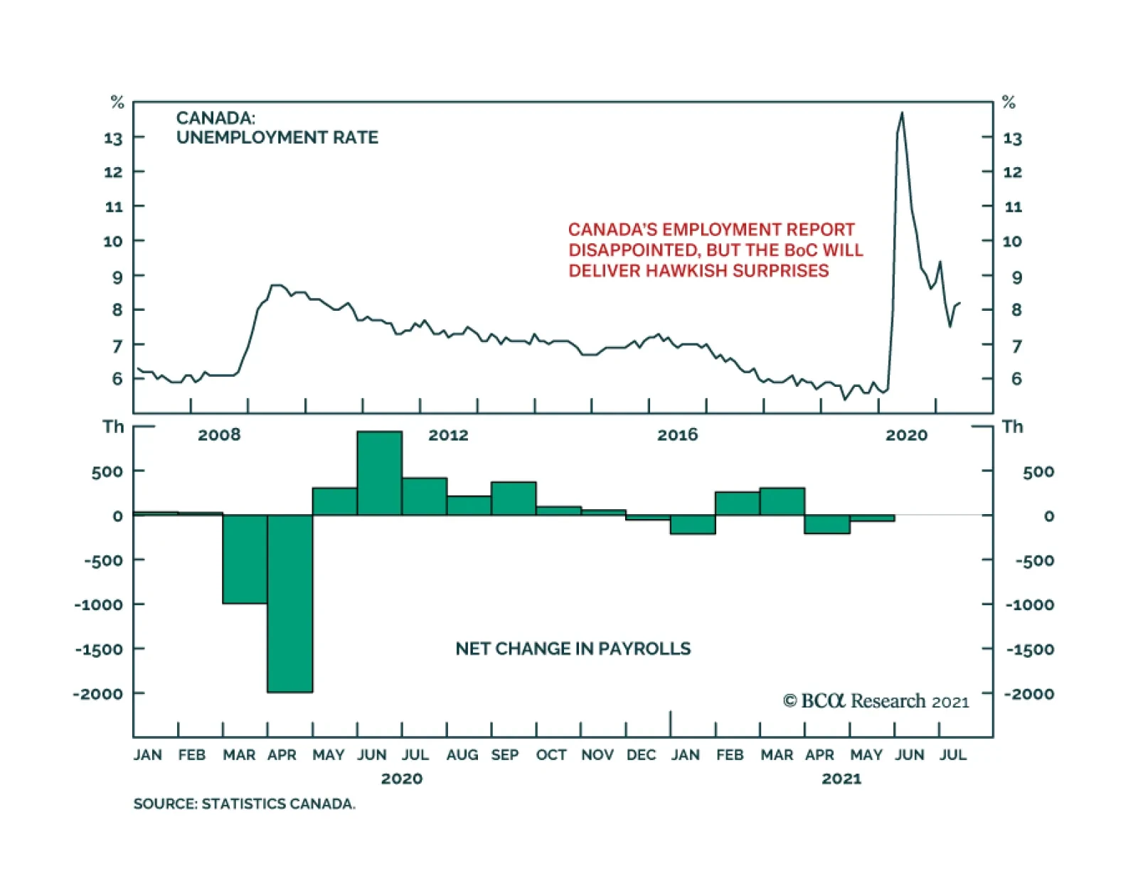
Canada’s May Employment report missed expectations on Friday, sending a downbeat message about the labor market recovery. A net 68 thousand jobs were lost in May, which is more than the 25 thousand loss expected by the consensus and marks the second…
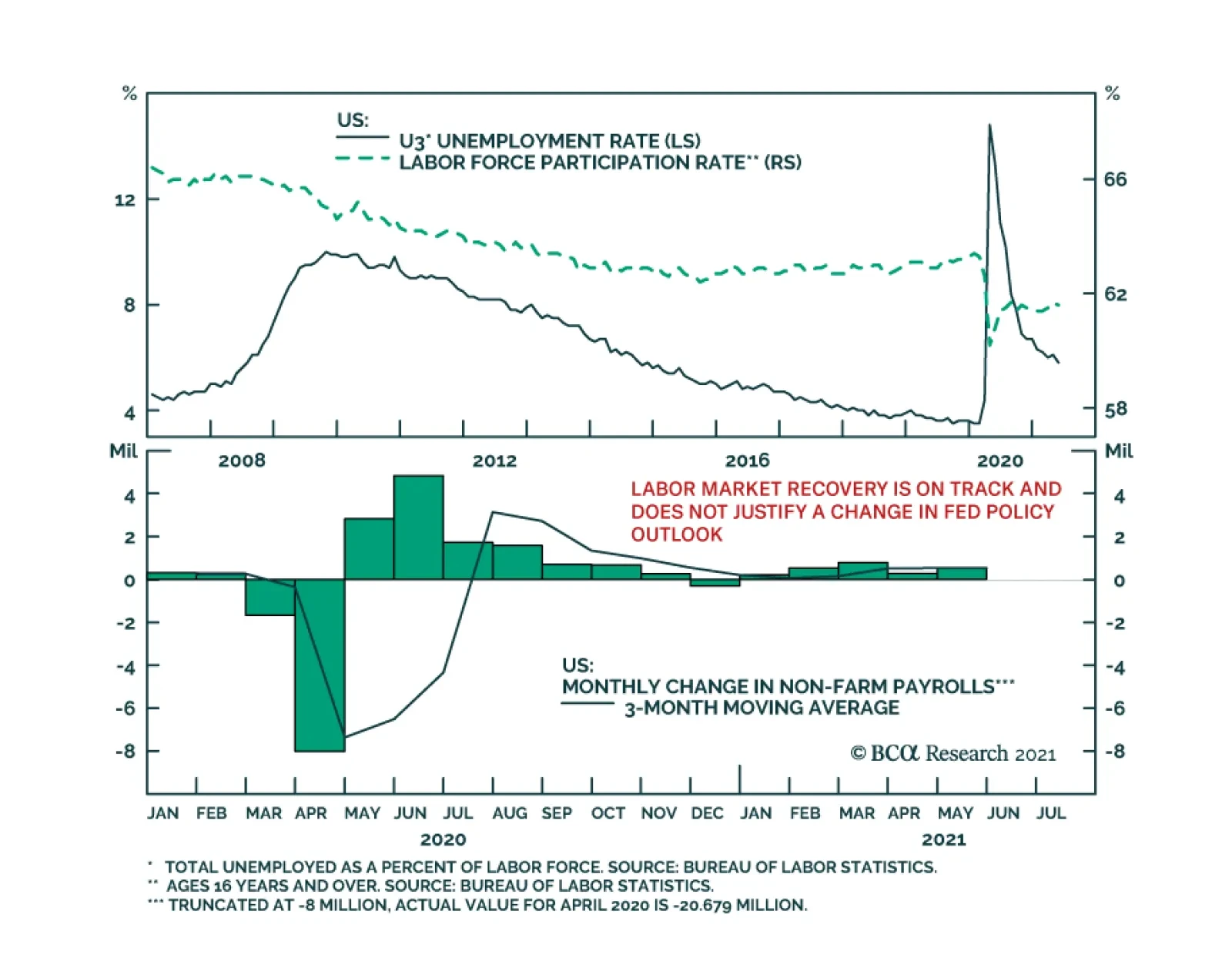
Friday’s US employment report was another miss. Nonfarm payroll employment increased by 559 thousand in May, below the anticipated 675 thousand. Moreover, the labor force participation rate ticked down to 61.6% from 61.7%. Thus, the 0.3 percentage point…
The DXY weakened following Friday’s disappointing Employment Report release, pushing the index towards 90 – near the critical technical level of 89. The dollar’s move suggests that weaker than expected job gains caused investors to adjust their Fed…
Dear Client, In this special report we are pleased to introduce Ritika Mankar, the newest Strategist to join BCA Research and Geopolitical Strategy. Ritika hails from Mumbai where she has led a distinguished career as a director at Ambit, an institutional equity brokerage, leading one of the top macro research franchises in India. She is also a director on the board of CFA Society India. Going forward Ritika will oversee Geopolitical Strategy’s India and South Asia analysis. In this report Ritika argues that owing to both under-investment and under-employment, India’s growth engine is set to misfire in FY22. Investors should pare their exposure to Indian assets for now. I trust you will find the report insightful and will look forward to Ritika’s regular contributions, which will deepen our global coverage of market-relevant geopolitical trends and themes. Sincerely, Matt Gertken Geopolitical Strategist Highlights Indian equities have outperformed emerging market equities decisively since March 2020. But a festering jobs problem in the informal sector and weak consumer confidence, will mean that both consumption and investment growth could disappoint in FY22. We recommend closing the Long Indian / Short Chinese Equities trade and the Long Indian Local Currency Bond / Short EM Bonds trade. We launch two new trades: Short India Banks and Long India Consumer Discretionary. Feature India has been the blue-eyed boy of the emerging market space since the dawn of the twenty-first century. Narratives about India have had a marked bullish tilt. To be fair, this optimism is justified most of the time for three very good reasons. Firstly, India’s geopolitical backdrop has improved. At home, the aftermath of the Great Recession saw the emergence of a new policy consensus consisting of nationalism and economic development. Indian policymakers recognize that if they undertake reforms to boost productivity then India has a chance of achieving a stronger strategic position in South Asia than military might alone can give it. Abroad, India is being courted by foreign powers and foreign investors. The United States has broken up the special relationship it maintained with China since the early 1970s. India stands to benefit from the West’s need now to counter-balance China. Secondly, India’s growth engine relies primarily on consumption as compared to more volatile components like net exports. Consumption makes up 56% of GDP. A consumption-powered economy that is young and not yet saturated with consumer goods, from washing machines to cars, deserves a premium. Growth in such an economy is likely to be far more predictable as compared to an export-driven economy that must contend with commodity price cycles, foreign business cycles, and de-globalization. Thirdly, India scores over other emerging markets as it offers political stability in a well-entrenched democratic framework. Despite having a low per capita income, India has a political system that is comparable to that of high-income developed countries. India’s head of state has been democratically elected since 1951 and the government at the centre has completed its full five-year term every time since 1999. More importantly, India’s institutions by design are “inclusive.”1 Institutions that provide checks and balances also deliver most of the time. So, unlike say in the case of China, Russia, Brazil, or even Turkey, India rarely gives an emerging market fund manager sleepless nights on account of politics or policy unpredictability. Whilst India deserves the premium it attracts most of the time, in this note we highlight that the market seems to be underpricing certain material risks that are building up in India. Distinct from the challenges created by COVID-19 (more on this later), India’s growth engine appears to be sputtering as two key faults develop: Under-investment: India has underinvested in capital creation for over a decade now. With government finances stretched, and with middling capacity utilization rates, investment growth in the short run is likely to stay compromised. Under-employment: India’s high GDP growth rate over the last few years has not been accompanied by an expansion in employment. Even before the pandemic, the Indian economy’s growth process had been asymmetric (or K-shaped) with the majority’s employment prospects worsening while a limited minority’s economic prospects were improving. This trend has become even more entrenched post-pandemic. Till India’s fast-compounding unemployment problem is solved, consumption growth in India will disappoint. And until then, only a select few upwardly mobile consumers of the service economy and business class will be supporting consumption growth in India. Both these dynamics will hurt India’s ability to grow its economy in the short term. These faults could force policymakers to take imprudent fiscal decisions to boost growth in the medium term too. Against this backdrop and with MSCI India trading at a 79% premium to EMs versus a two-year average of 57%, we reckon that the time is right for investors to scale down their exposure to segments of the Indian market where valuations look stretched. This report is divided into three segments: Segment 1: India’s GDP in FY22: Brace for disappointments Segment 2: COVID-19 in India: The road to normalcy will be long Segment 3: Investment conclusions India GDP In FY22: Brace For Disappointments Both the under-investment and the under-employment problem predate the COVID-19 crisis. Even as a degree of reflation kicks in as the second wave of COVID-19 infections abates, both these problems will act as a drag on India’s GDP growth in FY22. Investment Growth In India To Stay Constrained In FY22 The importance of investment in India is often underrated. Not only does gross fixed capital formation make up a third of India’s GDP each year, it also plays a critical role in driving consumption growth over the subsequent period (Chart 1). Occasional upcycles in investment are required to ensure that income growth remains robust, which in turn powers consumption growth. What is worrying is that India’s investment-to-GDP ratio had been trending downwards even before the onset of COVID-19 (Chart 2). This ratio in fact has been inching lower since the global financial crisis (GFC) from a peak of 36% to 29% in FY20. Unsurprisingly, investments have fallen further following the pandemic. The investment-to-GDP ratio fell to 27% in FY21 which is the lowest reading for this metric since the bursting of the dot-com bubble in 2001. Chart 1Consumption Growth Today, Is A Function Of Investments Made In The Past
India: Flying Without Wings
India: Flying Without Wings
Chart 2India’s Investment To Gdp Ratio Has Been Trending Lower Since The GFC
India: Flying Without Wings
India: Flying Without Wings
In addition, India’s investment-to-GDP ratio appears likely to stay constrained in FY22 as well. This is because the government sector and the private corporate sector (which together account for 62% of India’s investments) are unlikely to have the ability or incentive to expand capacity. Government “big push” is missing: The stock of capital in any country is created by the household sector, the private corporate sector, and the government sector. In India’s case, the government accounts for about 25% of capital formation on a cross-cycle basis. India’s government has consistently underinvested in growing its capital stock. For instance, the central government’s allocation towards capital expenditure has stayed range-bound between 1.5%-2.5% of GDP for over a decade now (see Chart 2). Hence India has not had the benefit of a big push from the government to create capital assets, such as the Four Asian Tigers undertook in the 1970-80s and China undertook in the 1990s. To be fair, the Union Budget for FY22 envisages an increase in capital expenditure to 2.5% of GDP from 2.2% of GDP last year. However, this increase is small, and we worry that the actual government spending on capital investments could well surprise to the downside. Moreover government revenues could get crimped owing to the second wave of COVID-19 in India. History suggests that government capital expenditure priorities are often set aside when India confronts a crisis. Following the GFC, the Indian central government expanded its fiscal deficit from 2.6% of GDP in FY08 to 6.1% of GDP in FY09. However, a breakdown of expenditure-side data suggests that this increase was mainly driven by higher revenue spends. Capital expenditure in fact was cut back from 2.4% of GDP in FY08 to 1.6% of GDP in FY09. Private sector faces low demand: The private sector accounts for about 37% of capital formation on a cross-cycle basis. The private corporate sector is unlikely to want to fire up investments in FY22 as the demand scenario looks weak and capacity utilization rates in the economy are middling. Whilst specific sectors and companies are growing, consumer confidence in India on an economy-wide level remains low thereby pointing to a lackluster demand environment. The post-2020 revival in consumer confidence in India, surveys suggest, has been weaker than that experienced by developed and developing country peers (Chart 3). History suggests that upturns in the investment cycle are triggered when capacity utilization rates hover at 74% or more (Chart 4). Reserve Bank of India’s latest capacity utilization survey suggests that utilization rates were recorded at only 67% in 4Q 2020. So, with consumer confidence levels low and with capacity utilization rates not being high enough, an economy-wide upsurge in investment growth in India at this stage appears unlikely. Chart 3Consumer Confidence In India Is Yet To Return To Pre-2020 Levels
India: Flying Without Wings
India: Flying Without Wings
Chart 4Capacity Utilization Rates In India Are Low And Hovering At Less Than 70% Levels
India: Flying Without Wings
India: Flying Without Wings
Finally, the household sector accounts for about 38% of capital formation and is the only source of hope. Whilst the upper-income segment of India’s household sector may have the financial firepower to support investment growth, the lower income segment is unlikely to be able to drive investments in an environment of poor jobs growth. Large-Scale Unemployment Likely In India’s Unreported Underbelly Unlike most developing and developed countries, data on India’s monthly employment situation is not collected. But piecing together jobs data from a range of sources makes it clear that India’s job market is undergoing a meaningful squeeze. These job losses in India’s mid- and low-income groups will restrain consumption growth in India in FY22. GDP growth not translating into employment growth: The last pan-India employment survey was conducted in 2019. An analysis of these historical surveys suggests that India’s high GDP growth rate has not been translating into high employment growth in India for a while. The formal employment data could be understating the extent of unemployment in India and even the official unemployment rate has not fallen despite high GDP growth (Chart 5). Chart 5Even When Gdp Growth Is High, Unemployment Rates In India Remain Elevated
India: Flying Without Wings
India: Flying Without Wings
Chart 6For Most Of India’s Population, Business Relevance Of Education And Digital Preparedness Is Poor
India: Flying Without Wings
India: Flying Without Wings
Unless India’s manufacturing sector grows rapidly, the widening rift between India’s GDP growth rate and jobs growth rate could become a structural phenomenon. Whilst labor supply in India is large, only part of this can be absorbed into India’s fast-growing service sector, as the business relevance of education as well as the digital preparedness of India’s labor force is low (Chart 6). Job losses in the informal sector: According to the Centre for Monitoring Indian Economy (CMIE), a private firm, India’s unemployment rate was recorded at 11.9% as at June 1, 2021. Even before the second COVID-19 wave and related lockdowns began, this metric was recorded at an elevated level of 7.5% over Dec 2020 to Feb 2021. Most of the job losses that have occurred are likely to be concentrated in the informal or unorganized sector, which employs 80% of India’s workforce. Rural wage inflation collapse points to excess supply: The supply of labor in the informal sector has increased at a faster pace than demand as evinced by the slowdown in rural wage inflation in India from an average of 12% over 2008-19 to 5% over 2019. This dynamic has worsened amid the pandemic as rural wage inflation fell to 2% in 2021YTD. This is after a challenging 2020 when unorganized sector wages could have contracted by 22%, according to a study conducted by the International Labor Organization (ILO). Informal sector’s market share loss suggests demand may stay weak: The Indian economy over the last five years has been undergoing a rapid pace of formalization. This was triggered by government action including the “de-monetization” move in 2016 (which outlawed high denomination notes that were in circulation) and then the introduction of the goods and services tax regime in 2017 (which discourages businesses from working with informal, non-tax paying businesses). The trend of formalization was then cemented in the pre-pandemic years by the fact that the economic health of the informal sector’s consumer was worsening. The formal sector on the other hand caters to a relatively high-income consumer whose incomes/jobs grew at a steady clip. The pandemic expedited this trend of formal sector businesses gaining market share as access to finance from unorganized sources either dried up or became prohibitively expensive, thereby leading to another wave of causalities in the informal sector. Also, it is worth noting that formal sector businesses tend to be more efficient and need fewer hands to generate each unit of profit so even as this sector grows it needs fewer workers. This trend of formalization has been particularly true for the retail, financial, building materials and real estate sectors in India, where the informal sector has shrunk and left behind a trail of job losses. Bottom Line: India’s growth prospects in FY22 could disappoint. With government finances strained and private demand weak, investment growth in FY22 is likely to decelerate. Additionally, employment growth is likely to stay low, especially for informal workers, as the economy rapidly formalizes. Given that wage growth has not slowed down for the top income strata as much as for the bottom, it is this top income group’s consumption growth which is likely to support consumption in FY22. However, the bulk of household consumption will falter. The interplay of these forces will mean that the two prime drivers of India’s growth engine, consumption and investment, will stay constrained in the short run. In view of these factors, we highlight the risk of India’s GDP growth rate in FY22 undershooting the Indian central bank’s forecast of 10.5% by 200-350bps. Now it is tempting to think that even a 7.5% real GDP growth rate appears decent compared to peers. But it is critical to note that India’s headline GDP growth data in FY22 has an unusual padding built into it. Strong low base effect: Whilst emerging markets’ GDP growth contracted by 2.2% in 2020 as per IMF, India’s GDP contracted by 7.3%. So, the contraction experienced by India in 2021 was 3x times more than that experienced by peer countries. FY22 GDP comparison with FY21 makes growth appear high, when it is not: If India’s GDP growth rate in FY22 were to be recorded at 8%, then this would in fact imply no growth over the real GDP recorded in FY20. COVID-19 Effect: The Road To Economic Normalcy Will Be Long Whilst the second wave of the pandemic has peaked in India, the time required for this peak to turn into a trough could take longer than was the case last year. Furthermore, India’s slow vaccine roll-out (particularly in India’s large states) adds to the probability of a potential third wave. The Second Wave In India Was 3.6 Times Stronger Than First Chart 7Second COVID-19 Wave Was 3.6x Stronger
India: Flying Without Wings
India: Flying Without Wings
The virus in the second wave has been far more virulent and necessitated another wave of lockdowns. In specific, the peak COVID-19 deaths during the second wave were recorded at 4,188 deaths per day (on a 7-day moving average basis), which is 3.6 times greater than the peak hit last year (Chart 7). Also, a range of sources2 suggest that actual daily deaths in India could be 1.5-2x the stated numbers. Given that this wave has been stronger, the journey to the trough too is likely to be longer and thus may need localized lockdowns to stay in place. Headline Vaccination Rates Hide Vast Regional Disparities Only 15% of India’s population has received at least one dose. Headline vaccination rates conceal the slow pace of vaccination underway in some of India’s largest states (Chart 8). For instance, less than 8% of the population has been given its first dose in India’s most populous state (i.e. Uttar Pradesh). Given that state borders are porous, persistently low vaccination rates in large states can allow the virus to spread and mutate. Chart 8India’s Largest States Are Lagging On Vaccinations
India: Flying Without Wings
India: Flying Without Wings
Even today only 3% of India’s population has received both doses of vaccines. Even as the government plans to vaccinate all of India’s adult population by December 2021, this goalpost could have to be shifted to early 2022. A Loaded State Election Calendar Cometh In 2022 Looking into 2022, the state election calendar will get busier than it was this year. This could be a problem if vaccination rates are slow because elections involve large-scale rallies and gatherings. It is worth noting that: Five state elections that account for about 20% of India’s population were held in 2021. Elections will be due in seven states that account for about 25% of India’s population in 2022. To provide context, the population involved in state elections in India in 2021 was almost equivalent to that of a national election in Brazil. The states in India undergoing elections in 2022 have a population comparable to the United States. Besides involving a larger population, state elections due in 2022 will also have higher political stakes. This is mainly because in five of the seven states, the ruling Bharatiya Janata Party (BJP) is the incumbent party and will want to defend its status. This contrasts with the 2021 elections when the BJP was the incumbent in only one of the five states. In specific, India’s most populous state, Uttar Pradesh, is scheduled to undergo elections in February 2022. This is easily the most important state election in India and will be a high stakes four-cornered contest. Vaccine rates in this state are currently lagging the national average. Bottom Line: During the first wave, it took about five months for the trough to form after the peak in September 2020. The current wave has been significantly stronger (causing 4x more deaths) with vaccine rates too being low. Therefore, this wave may take longer than 5-6 months to subside. The long road to the trough in turn implies that the road to economic normalcy too may be slower than anticipated. Investment Takeaways Chart 9India's Outperformance Since March 2020 - Driven More By P/E Expansion, Less By Earnings
India's Outperformance Since March 2020 - Driven More By P/E Expansion, Less By Earnings
India's Outperformance Since March 2020 - Driven More By P/E Expansion, Less By Earnings
The Indian stock market has outperformed relative to emerging markets (Chart 9). Given that we are increasingly worried about India’s growth capabilities, we will close our Long Indian / Short Chinese Equities trade for a gain of 11.7%. Tactically, excessive policy tightening remains a genuine risk for the Chinese economy. Incidentally, we also expect that the looming US-Iran diplomatic détente will weigh on bullish fundamentals for oil in the second half of the year, which would be good for Indian stocks. However, the pair trade is challenged from a technical perspective and so we will book gains and move to the sidelines for now. Moreover to mitigate the effects of the coming growth slowdown in India on client portfolios, we recommend initiating two sectoral trades, namely Short India Banks and Long India Consumer Discretionary. Our Emerging Markets Strategy has shown that Indian private banks have higher efficiency and better balance sheets vis-à-vis EM banks. Our concern is that markets have already priced this dynamic. Specifically, Indian banks’ return on equity has seen a sharp drop from pre-pandemic levels and yet valuations remain high (Chart 10). As GDP growth in India slows, credit growth will stay low. This along with rising domestic interest rates could mean that banks’ net interest margins disappoint. As India’s broader consumption story disappoints and a K-shaped recovery takes shape, we expect a limited set of high-income services and business sector professionals to drive demand for high end-consumer discretionary products. So these two sectoral trades tap into the differential growth rates that two different segments of the economy are set to experience. Finally, we recommend closing the Long Indian Local Currency Bond / Short EM Bonds trade which is currently in the money. This is for two sets of reasons. Firstly, history points to a tight correlation between the US 10-year bond yield and Indian local currency denominated 10-year bond yields. As the US 10-year yield moves upwards, we expect Indian yields also to inch higher. Secondly, we worry that India’s fiscal response to the pandemic has been relatively small thus far and so India could opt for an unexpected expansion in its fiscal deficit over the next 12 months (Chart 11). Chart 10Indian Banks Appear To Be Factoring In All Positives
India: Flying Without Wings
India: Flying Without Wings
Chart 11India’s Fiscal Response To The Pandemic Has Been Relatively Small So Far
India: Flying Without Wings
India: Flying Without Wings
Ritika Mankar, CFA Editor/Strategist ritika.mankar@bcaresearch.com Footnotes 1Daron Acemoglu and James Robinson, Why Nations Fail: The Origins of Power, Prosperity, and Poverty (New York: Crown, 2012) 2Please see Jeffrey Gettleman, Sameer Yasir, Hari Kumar, and Suhasini Raj, “As Covid-19 Devastates India, Deaths Go Undercounted,” New York Times, April 24, 2021, nytimes.com and Murad Banaji, “The Importance of Knowing How Many Have Died of COVID-19 in India,” The Wire, May 9, 2021, science.thewire.in.
Services PMIs for May confirmed the message from the global manufacturing sector earlier this week that the global recovery is accelerating. The Global Services PMI jumped to 59.4 from 57.0 in April. Improvement in both the services and manufacturing sectors…
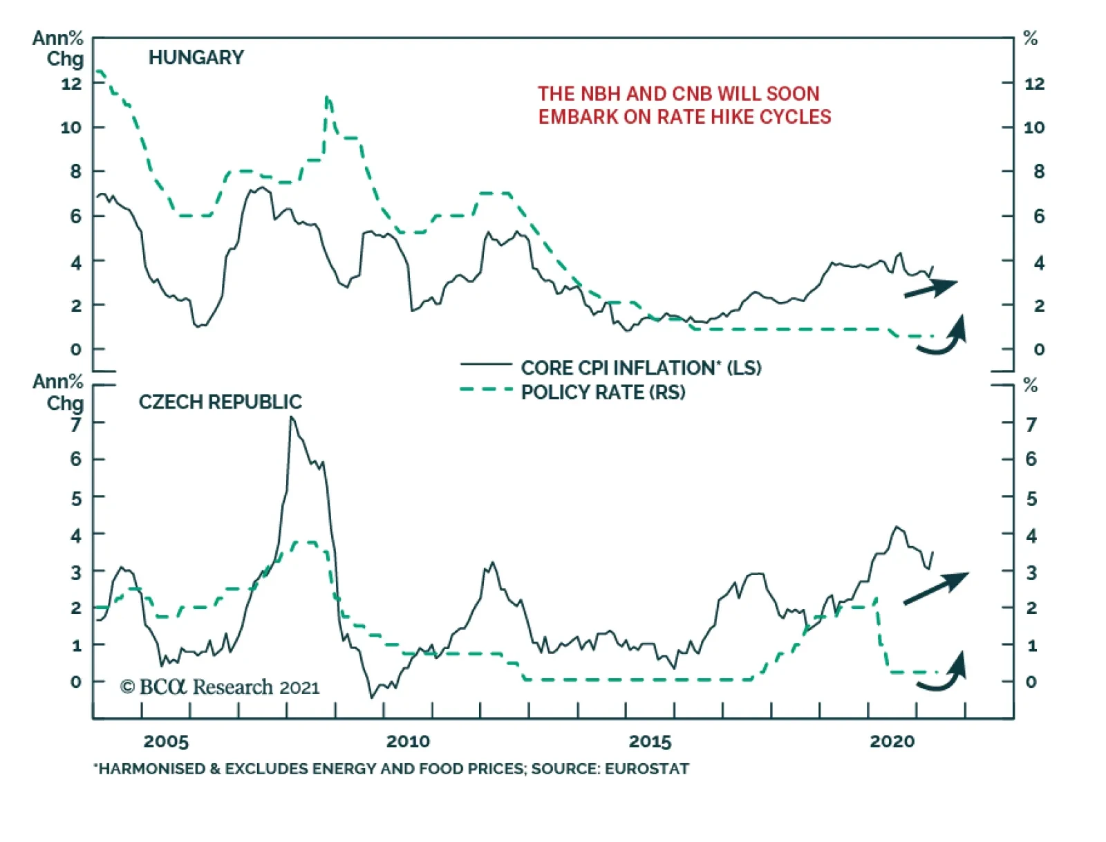
BCA Research’s Emerging Markets Strategy service concludes that the Czech koruna will outperform the Hungarian forint. Conditions for central bank rate hike cycles are in place in Hungary and the Czech Republic. Yet Czech authorities are following a more…