Recession-Hard/Soft Landing

Highlights Investors are worrying too much about the things that caused the global financial crisis, and not enough about those that could cause the next downturn. Despite the recent patch of soft data, the U.S. housing market is in good shape. Go long homebuilders relative to the S&P 500. Imbalances in the corporate debt market have increased, but are not severe enough to generate systemic economic distress. U.S. rates will need to rise quite a bit more than the market anticipates before the economy slows by enough to force the Fed to back off. The combination of a stronger dollar and inadequate Chinese stimulus will continue to pressure emerging markets. Even Brazil's pro-capitalist new president may not be able to reverse the country's bleak fiscal dynamics. Our MacroQuant model, which predicted the correction, points to further near-term downside risk for global equities. The cyclical (12-to-18 month) outlook looks much better, however. Feature The Market's Maginot Line One of the most reliable ways to make money as an investor is to figure out the market's collective biases and trade against them. Behavioral economists have long noted that people tend to assign too much weight to recent experience in taking decisions. As a result, in finance, as in military strategy, there is a constant temptation to fight the last war. The last war policymakers waged was against the scourge of deflation that followed the housing bust and financial crisis. For much of the past decade, investors have held a magnifying glass over anything that could possibly resemble the conditions that led up to the Global Financial Crisis. While such behavior is understandable, it is misplaced. History suggests that both lenders and borrowers tend to act prudently for years, if not decades, following major financial crises. Mistakes are still made, but they are different mistakes. People overcompensate. They obsess about the past rather than focusing on the future. U.S. Housing Is Okay There is no denying that the U.S. housing market has softened this year (Chart 1). Housing starts, building permits, and home sales have all fallen. Residential investment has subtracted from GDP growth over three consecutive quarters. Chart 1Housing Has Been A Drag On The U.S. Economy This Year
Housing Has Been A Drag On The U.S. Economy This Year
Housing Has Been A Drag On The U.S. Economy This Year
There is little mystery as to why the housing market has been on the back foot. The Trump tax bill capped the deduction on state and local property taxes, while reducing the amount of mortgage debt on which homeowners can deduct interest payments from $1 million to $750,000. This had a negative effect on housing activity, especially in high-tax Democrat-leaning states with elevated real estate prices. More importantly, mortgage rates have risen by over 100 basis points since last August. Chart 2 shows that home sales and construction almost always decline after mortgage rates rise. In this respect, the weakness in housing activity is reminiscent of the period following the taper tantrum, when housing activity also slowed sharply. Chart 2No Mystery Why U.S. Housing Has Been Weak...
No Mystery Why U.S. Housing Has Been Weak...
No Mystery Why U.S. Housing Has Been Weak...
We do not expect mortgage rates to fall from current levels. But they are not going to rise at the same pace as they have over the past year. Thus, while the headwinds from higher financing costs will not disappear, they will abate to some extent. Fundamentally, the housing market is on solid ground (Chart 3). Mortgage rates are still well below their historic average. Home prices have risen considerably, but do not appear excessively stretched compared to rents or incomes. Unlike in 2006, the home vacancy rate is near its historic lows. Residential investment stands at only 3.9% of GDP, compared with a peak of 6.7% of GDP in the second half of 2005. The average age of the residential capital stock has risen by nearly five years since 2006, the largest increase since the Great Depression. With household formation rebounding briskly from its post-recession lows, homebuilders are still arguably not churning out enough new homes. Chart 3A...But Fundamentals Are Still In Good Shape (I)
...But Fundamentals Are Still In Good Shape (I)
...But Fundamentals Are Still In Good Shape (I)
Chart 3B...But Fundamentals Are Still In Good Shape (II)
...But Fundamentals Are Still In Good Shape (II)
...But Fundamentals Are Still In Good Shape (II)
Mortgage lenders have learned from past mistakes (Chart 4). While lending standards have eased modestly over the past 4 years, underwriting standards have remained high. The average FICO score for new borrowers is more than 40 points above pre-recession levels. The Urban Institute Housing Credit Availability index, which measures the percentage of home purchase loans that are likely to default over the next 90 days, is at reassuringly low levels. This is particularly the case for private-label mortgages, whose default risk has hovered at just over 2% during the past few years, down from a peak of 22% in 2006. Moreover, banks today hold much more high-quality capital than in the past, which gives them additional space to absorb losses (Chart 5). Chart 4Lending Standards Have Been Tight, But Are Starting To Loosen
Lending Standards Have Been Tight, But Are Starting To Loosen
Lending Standards Have Been Tight, But Are Starting To Loosen
Chart 5U.S. Banks Are Well Capitalized
U.S. Banks Are Well Capitalized
U.S. Banks Are Well Capitalized
With all this in mind, we are initiating a new strategic trade to go long U.S. homebuilders relative to the S&P 500.1 Corporate Debt: How Big Are The Risks? Unlike household debt, U.S. corporate debt has risen over the past decade and now stands at a record high level as a share of GDP. The quality of the lending has also been less than pristine, as evidenced by the proliferation of "covenant lite" loans. The interest coverage ratio for the economy as a whole - defined as the volume of profits corporations generate for every dollar of interest paid - is still above its historic average (Chart 6). However, this number is skewed by a few mega-cap tech companies that hold a lot of cash and have little debt. Chart 6Interest Coverage Looks Relatively High
Interest Coverage Looks Relatively High
Interest Coverage Looks Relatively High
My colleague Mark McClellan, who writes our monthly Bank Credit Analyst publication, has shown that the interest coverage ratio for companies comprising the Bloomberg Barclays index would drop close to the lows of the Great Recession if interest rates were to rise by a mere 100 basis points across the corporate curve. The damage would be far worse if profits also fell by 25% in this scenario.2 While the corporate debt market has become increasingly frothy, it does not pose an imminent danger to the economy. There are several reasons for this. First, while U.S. corporate debt is high in relation to the past, it is still quite low in comparison with many other economies (Chart 7). The ratio of corporate debt-to-GDP, for example, is 30 percentage points higher in the euro area. This suggests that U.S. businesses still have the "carrying capacity" to take on additional debt. Chart 7U.S. Corporate Debt Is Not That High By Global Standards
U.S. Corporate Debt Is Not That High By Global Standards
U.S. Corporate Debt Is Not That High By Global Standards
Second, the average maturity of U.S. corporate debt has risen over the past decade, with an increasing share of companies opting for fixed over floating-rate borrowings. This implies that it will take a while for the effect of higher rates to make their way through the system. Third, and perhaps most importantly, corporate bonds are generally held by non-leveraged investors such as pension funds, insurance companies, and ETFs. Bank loans account for only 18% of nonfinancial corporate-sector debt, down from 40% in 1980 (Chart 8). The share of leveraged loans held by banks has declined from about 25% a decade ago to less than 10% today. Chart 8Banks Have Reduced Their Exposure To The Corporate Sector
Banks Have Reduced Their Exposure To The Corporate Sector
Banks Have Reduced Their Exposure To The Corporate Sector
Tellingly, we already had a dress rehearsal for what a corporate debt scare might look like. Credit spreads spiked in 2015. Default rates rose, but the knock-on effects to the financial system were minimal (Chart 9). This suggests that corporate America could withstand quite a bit of monetary tightening without buckling under the pressure. Chart 9The 2015 Debt Scare Did Not Topple The Economy
The 2015 Debt Scare Did Not Topple The Economy
The 2015 Debt Scare Did Not Topple The Economy
Government Debt: No Worries... Yet If the risks posed by both the housing market and corporate debt market are contained, what about the risks posed by soaring government debt? The long-term fiscal outlook is certainly bleak, but the near-term risks are low.3 President Trump's tweets aside, the U.S. has an independent central bank which has been able to keep inflation expectations well anchored. The U.S. private sector is also running a financial surplus at the moment, meaning that it earns more than it spends (Chart 10). Not only does this make the economy more resilient, it also provides the government with additional savings with which to finance its fiscal deficit. Chart 10The U.S. Private Sector Is A Net Saver
The U.S. Private Sector Is A Net Saver
The U.S. Private Sector Is A Net Saver
The private sector's financial balance will deteriorate over the next two years as household savings decline and corporate investment rises. This will put upward pressure on Treasury yields. However, if rising yields are reflective of stronger aggregate demand, this is unlikely to derail the economy. When Things Break Recessions are usually caused when the Fed raises rates by enough to undermine spending on interest rate-sensitive purchases such as housing, or when higher rates prick an asset bubble just waiting to burst. Given the lack of clear imbalances either in the real economy or financial markets, the Fed may have to raise rates significantly more than the market is currently anticipating. In fact, far from having to press the pause button midway through next year, our baseline expectation is that the Fed will expedite the pace of rate hikes in late 2019 as inflation finally starts to accelerate. Aggressive Fed rate hikes combined with an incrementally less expansionary fiscal policy will sow the seeds of a recession in late 2020 or 2021. Before the next U.S. downturn arrives, the dollar will have strengthened further. A resurgent greenback will cast a long shadow over emerging markets and commodity producers. As we discussed last week, China is unlikely to save the day by launching a massive stimulus program of the sort that it orchestrated in both 2009 and 2015.4 True, not all emerging markets are equal. Emerging Asia is more resilient now than it was two decades ago. Thailand, for example, was patient zero for the Asian crisis in 1997. Today, it sports a current account surplus of over 10% of GDP and low levels of external debt. This resilience will not prevent Asian economies from experiencing slower growth on the back of weaker Chinese demand, but it will prevent a full-blown balance of payments crisis from spiraling out of control. In contrast to Emerging Asia, Latin America looks more vulnerable (Table 1). BCA's chief emerging market strategist, Arthur Budaghyan, wisely upgraded Brazilian assets on a tactical basis on October 9th ahead of the presidential elections. Nevertheless, Arthur still worries that Brazil's daunting fiscal challenges - the budget deficit currently stands at 7.8% of GDP and the IMF expects government debt to rise to nearly 100% of GDP over the next five years (Chart 11) - are so grave that even South America's answer to Donald Trump may not be able to save the Brazilian economy. Table 1Vulnerability Heat Map For Key EM Markets
Fighting The Last War
Fighting The Last War
Chart 11Brazil Is Fiscally Challenged
Brazil Is Fiscally Challenged
Brazil Is Fiscally Challenged
A Correction, Not A Bear Market The current market environment bears some similarities to the late 1990s. The Fed is tightening monetary policy in order to keep the domestic economy from overheating. The U.S. economy is responding to higher rates to some extent, but the main effects are being felt overseas. The Asian Crisis did not end the bull market in U.S. stocks, but it did generate a few nasty selloffs, the most notable being the 22% peak-to-trough decline in the S&P 500 between July 20 and October 8, 1998. We witnessed such a selloff this October. The bad news is that our MacroQuant model is pointing to additional equity weakness over the coming weeks (Chart 12). The model tends to downgrade stocks whenever growth is slipping, financial conditions are tightening, and sentiment is deteriorating from bullish levels. All three of these things are currently occurring. Chart 12MacroQuant* Model Suggests Caution Is Warranted
Fighting The Last War
Fighting The Last War
The good news is that none of our recession indicators are flashing red. Since recessions and bear markets typically overlap (Chart 13), the odds are high that the current stock market correction will be just that, a correction. Chart 13Recessions And Bear Markets Usually Overlap
Recessions And Bear Markets Usually Overlap
Recessions And Bear Markets Usually Overlap
Peter Berezin, Chief Global Strategist Global Investment Strategy peterb@bcaresearch.com 1 The corresponding ETFs are long ITB/short SPY. 2 Please see The Bank Credit Analyst Special Report, "The Long Shadow Of The Financial Crisis," dated October 25, 2018. 3 It is actually not even clear that a loss of confidence in America's fiscal management would cause a recession. The Fed largely determines borrowing costs at the short-to-medium end of the yield curve, which is where the government finances most of its debt. If people lose confidence in the dollar, they will either need to run down their cash balances by purchasing more goods and services or try to move their wealth abroad. The former will directly increase aggregate demand, while the latter will indirectly increase it through a weaker currency. To be clear, we are not suggesting that such an outcome would be beneficial to the economy; it would, among other things, greatly slow potential GDP growth by discouraging investment. But the near-term effect would likely be economic overheating and rising inflation rather than a recession. 4 Please see Global Investment Strategy Weekly Report, "Chinese Stimulus: Not So Stimulating," dated October 26, 2018. Strategy & Market Trends Tactical Trades Strategic Recommendations Closed Trades
The Great Recession and financial crisis cast a long shadow that will affect economies, policymakers and investors for years to come. The roots of the crisis are already well known. The first of a two-part series looks forward by examining the areas where we believe structural change has occurred related to the economy or financial markets. First, the financial crisis transformed the corporate bond market in several ways that heighten the risk for quality spreads in the next downturn. Debt and market liquidity are two key concerns. Corporate leverage will not cause the next recession. Nonetheless, when one does occur, corporate spreads in the U.S. and (to a lesser extent) the Eurozone will widen by more for any given degree of recession. This reflects a low interest coverage ratio, poor market liquidity, the downward trend in credit quality and covenant erosion. Second, the shock of the Great Recession and its aftermath appears to have affected the relationship between economic slack and inflation. Firms have been extra reluctant to grant wage gains. However, we argue that the "shell shock" effect will wane. The fact that inflation has been depressed for so long may actually cultivate the risk that inflation will surprise on the upside in the coming years. Investors should hold inflation-protection in the inflation swaps market, or by overweighting inflation-linked bonds versus conventional issues. Third, the events of the last decade have left a lasting impression on monetary policymakers. They will err on the side of allowing the economy to overheat and inflation to modestly overshoot the target in the major economies, despite signs of financial froth. The Fed will respond only with a lag to the current fiscally-driven surge in U.S. growth, leading to a boom/bust economic scenario. Central bankers will have no trouble employing unorthodox policies again in the future, and will be willing to push the boundaries even further during the next recession. Expect aggressive manipulation of the long-end of the yield curve when the time arrives to ease policy. We may also observe more coordination between monetary and fiscal policies. Fourth, global bond yields fell to unprecedented levels, reflecting both structural and cyclical headwinds to demand growth. A dismal productivity performance is another culprit. Productivity growth is poised to recover to some extent, while some of the growth headwinds have reached an inflection point. We do not expect nominal bond yields to return to pre-Lehman norms, and yields could even fall back to previous lows in the case of a recession. Nonetheless, we expect a yield pattern of higher lows and higher highs over the coming business cycles. The 10-year anniversary of the Lehman shock this autumn sparked an avalanche of analysis on the events and underlying causes of the Great Recession and financial crisis. It is a woeful story of greed, a classic bubble, inadequate regulation, new-fangled financial instruments, and a globalized financial system that spread the shock around the world. The crisis cast a long shadow that will affect economies, policymakers and investors for many years to come. The roots of the crisis are well known, so we will not spend any time going over well-trodden ground. Rather, this Special Report looks forward by examining the areas where we believe structural change has occurred related to the economy or financial markets. In Part I, we cover the corporate bond market, the inflation outlook, central bank policymaking and equilibrium bond yields. Part II will look at the debt overhang, systemic risk in the financial sector, asset correlations, the cult of equity and the rise of populism. While not an exhaustive list, we believe these are the key areas of structural change. (1) Corporate Bond Market: Leverage And Downgrade Risk The financial crisis transformed the corporate bond market in several ways that heighten the risk for quality spreads in the next downturn. Debt and market liquidity are two key concerns. An extraordinarily long period of extremely low interest rates was too much for corporate CEOs to pass up. However, because the durability of the economic recovery was so uncertain, it seemed more attractive to hand over the borrowed cash to shareholders than to use it to aggressively expand productive capacity. The ongoing equity bull market rewarded CEOs for the financial engineering, serving to create a self-reinforcing feedback loop. And so far, corporate bondholders have not policed this activity. The result is that the U.S. corporate bond market has grown in leaps and bounds since 2009 (Chart II-1A and Chart II-1B). The average duration of the Bloomberg Barclays index has also risen as firms locked in attractive financing rates. The same is true, although to a lesser extent, in the Eurozone. Chart II-1AU.S. BBB-Rated Share Rising...
U.S. BBB-Rated Share Rising...
U.S. BBB-Rated Share Rising...
Chart II-1B...Same In The Eurozone
...Same In The Eurozone
...Same In The Eurozone
Balance sheet health is obviously not the key driver of corporate bond relative returns at the moment. Nonetheless, investors will begin to worry about the growth outlook if interest rates continue to rise. The U.S. national accounts data suggest that interest coverage remains relatively healthy, but this includes large companies such as some of the FAANGs that have little debt and a lot of cash. The national accounts data are unrepresentative of the companies that are included in the Bloomberg Barclays corporate bond index, which are heavy debt issuers. To gain a clearer picture, we calculated a bottom-up Corporate Health Monitor (CHM) for a sample of U.S. companies that provides a sector and credit-quality composition that roughly matches the Bloomberg Barclay's index. The CHM is the composite of six critical financial ratios. Chart II-2 highlights that the investment-grade (IG) CHM has improved over the past two years due to the profitability sub-components. However, the debt/equity ratio has been in a steep uptrend. Interest coverage does not appear alarming by historical standards at the moment, but one can argue that it should be much higher given the extremely low average coupon on corporate bonds, and given that profit margins are extraordinarily high in the U.S. The rapid accumulation of debt has overwhelmed these other factors. Evidence of rising leverage is broadly based across sectors and ratings. Chart II-2U.S. IG Corporate Health
U.S. IG Corporate Health
U.S. IG Corporate Health
Unfortunately, the profit tailwind won't last forever. At some point, earnings growth will stall and this cycle's debt accumulation will start to bite in the context of rising interest rates. To gauge the risk, we estimate the change in the interest coverage ratio over the next three years for a 100 basis-point rise in interest rates across the corporate curve, taking into consideration the maturity distribution of the debt.1 For our universe of Investment-grade U.S. companies, the interest coverage ratio would drop from a little over 7 to under 6, which is close to the lows of the Great Recession (denoted as "x" in Chart II-3). Of course, the decline in interest coverage will be much worse if the Fed steps too far and monetary tightening sparks a recession. The "o" in Chart II-3 denotes the combination of a 100 basis-point interest rate shock and a mild recession in which the S&P 500 suffers a 25% peak-to-trough decline in EPS. The overall interest coverage ratio plunges close to all-time lows at 4½. Chart II-3Interest Coverage To Plunge...
Interest Coverage To Plunge...
Interest Coverage To Plunge...
These simulations imply that, for any given size of recession, the next economic downturn will have a larger negative impact on corporate health than in the past. Rating agencies have undertaken some downgrading related to shareholder-friendly activity, but downgrades will proliferate when the agencies realize that the economy is turning and the profit boom is over (Chart II-4). Banks will belatedly tighten lending standards, adding to funding pressure for the corporate sector. Chart II-4...And Ratings To Be Slashed
...And Ratings To Be Slashed
...And Ratings To Be Slashed
Fallen Angels The potential for a large wave of fallen angels means that downgrade activity will be particularly painful for corporate bond investors. The surge in lower-quality issuance has led to a downward trend in the average credit rating and has significantly raised the size of the BBB-rated bonds relative to the IG index and relative to the broader universe of corporate bonds including high yield (Chart II-5, and Chart II-1A).2 The downward trend in credit quality predates Lehman, but events since the Great Recession have likely reinforced the trend. Chart II-5Lower Ratings And Longer Duration
Lower Ratings And Longer Duration
Lower Ratings And Longer Duration
Studies show that bonds that get downgraded into junk status can perform well for a period thereafter, suggesting that investors holding a fallen angel should not necessarily sell immediately. Nonetheless, the process of transitioning from investment-grade to high-yield involves return underperformance as the spread widens. Poor market liquidity and covenant erosion will intensify pressure for corporate spreads to widen when the bear market arrives. Market turnover has decreased substantially since the pre-Lehman years, especially for IG (Chart II-6). The poor liquidity backdrop appears to be structural, reflecting regulation that has curtailed banks' market-making activity and prop trading, among other factors. Chart II-6Poor Market Liquidity
Poor Market Liquidity
Poor Market Liquidity
The Eurozone corporate bond market has also seen rapid growth and a deterioration in the average credit rating. Liquidity is an issue there as well. That said, the Eurozone corporate sector is less advanced in the leverage cycle than the U.S. Interest coverage ratios will fall during the next recession, but this will be concentrated among foreign issuers - domestic issuers are much less at risk to rising interest rates and/or an economic downturn.3 Bottom Line: Corporate leverage will not cause the next recession. Nonetheless, when one does occur, corporate spreads in the U.S. and (to a lesser extent) Eurozone will widen by more for any given degree of recession. Current spreads do not compensate for this risk. (2) Inflation Undershoot Breeds Overshoot Inflation in the U.S. and other developed economies has been sticky since the financial crisis. First, inflation did not fall as much in the recession and early years of the recovery as many had predicted, despite the worst economic contraction in the post-war period. Subsequently, central banks have had trouble raising inflation back to target. In the U.S., core PCE inflation has only recently returned to 2%. Several structural factors have been blamed, but continuing tepid wage growth in the face of a very tight labor market raises the possibility that the inflation-generating process has been fundamentally altered by the Great Recession. In other words, the relationship between slack in the labor market (or market for goods and services) and inflation has changed. In theory, inflation should rise when the economy's output is above its potential level or when the unemployment rate is below its full-employment level. Inflation should fall when the reverse is true. This means that the change (not the level) in inflation should be positively correlated with the level of the output gap or the labor market gap. Chart II-7 presents the change in U.S. core inflation with the output gap. Although inflation appears to have become less responsive to shifts in the output gap after 1990, it has been particularly insensitive in the post-Lehman period. Chart II-7The U.S. Phillips Curve: RIP?
The U.S. Phillips Curve: RIP?
The U.S. Phillips Curve: RIP?
One reason may be that the business sector was shell-shocked by the Great Recession and financial crisis to such an extent that business leaders have been more reluctant to grant wage gains than in past cycles. Equally-unnerved workers felt lucky just to have a job, and have been less willing to demand raises. Dampened inflation expectations meant that low actual inflation became self-reinforcing. We have some sympathy with this view. Long-term inflation expectations have been sticky at levels that are inconsistent with the major central banks meeting their inflation targets over the long term. This suggests that people believe that central banks lack the tools necessary to overwhelm the deflationary forces. The lesson for investors and policymakers is that, while unorthodox monetary policies helped to limit the downside for inflation and inflation expectations during and just after the recession, these policies have had limited success in reversing even the modest decline that did occur. That said, readers should keep in mind a few important points: One should not expect inflation to rise much until economies break through their non-inflationary limits. The major advanced economies have only recently reached that point to varying degrees; Inflation lags the business cycle (Chart II-8). This is especially the case in long 'slow burn' economic expansions, as we have demonstrated in previous research; and The historical relationship between inflation and economic slack has been non-linear. As shown in Chart II-9, U.S. inflation has tended to accelerate quickly when unemployment drops below 4½%. Chart II-8U.S. Inflation Lags The Cycle
November 2018
November 2018
Chart II-9A Kinked Phillips Curve
November 2018
November 2018
Shell Shock Is Fading We believe that the "shell shock" effect of the Great Recession on inflation will wane over time. Indeed, my colleague Peter Berezin has made the case that the fact that inflation has been depressed for so long actually cultivates the risk that inflation will surprise on the upside in the coming years.4 Central bankers have been alarmed by the economic and financial events of the last decade. They also cast a wary eye on Japan's inability to generate inflation even in the face of massive and prolonged monetary stimulus. Policymakers at the FOMC are determined to boost inflation and inflation expectations before the next economic downturn strikes. They are also willing to not only tolerate, but actively encourage, an overshoot of the 2% inflation target in order to ensure that long-term inflation expectations return "sustainably" to a level consistent with meeting the 2% target over the long term. In other words, the Fed is going to err on the side of too much stimulus rather than too little. This is an important legacy of the last recession (see below). Meanwhile, other structural explanations for low inflation are less powerful than many believe. For example, globalization has leveled off and rising tariff and non-tariff barriers will hinder important global supply chains. Our research also suggests that the rising industrial use of robots and the e-commerce effect on retail prices have had only a small depressing effect on U.S. inflation. Bottom Line: The Phillips curve relationship has probably not changed in a permanent way since Lehman went down. It is quite flat when the labor market is not far away from full employment, but the relationship is probably non-linear. As the unemployment rate drops further, the business sector will have no choice but to lift wages as labor becomes increasingly scarce. The kinked nature of the Phillips curve augments the odds that the Fed will eventually find itself behind the curve, and inflation will rise more than the market is expecting. The same arguments apply to the Bank of England and possibly even the European Central Bank. Gold offers some protection against inflation risk, but the precious metal is still quite expensive in real terms. Investors would be better off simply buying inflation-protection in the inflation swaps market or overweighting inflation-linked bonds over conventional issues. (3) Monetary Policy: Destined To Fight The Last War There are several reasons to believe that the shocking events of the crisis and its aftermath have left a lasting impression on monetary policymakers. Several factors suggest that they will err on the side of allowing the economy to overheat and inflation to modestly overshoot the target: Inflation Persistence: As discussed above, there is a greater awareness that it is difficult to lift both actual inflation and inflation expectations once they have fallen. Some FOMC members believe that long-term inflation expectations are still too low to be consistent with the Fed meeting its 2% inflation target over the long term. A modest inflation overshoot in this cycle would be beneficial, according to this view, in the sense that it would boost inflation expectations and thereby raise the probability that the FOMC will indeed meet its goals over the long term. It might also encourage some discouraged workers to re-enter the labor market. Some policymakers also believe that the Fed is not taking much of a risk by pushing the economy hard, because the Phillips curve is so flat. Zero Bound: Low inflation expectations, among other factors, have combined to dramatically reduce the level of so-called r-star - the short-term rate of interest that is neither accommodative nor restrictive in terms of growth and inflation. R-star is thought to be rising now, at least for the U.S., but it is probably still low by historical standards across the major economies. This increases the risk that policy rates will again hit the lower bound during the next recession, making it difficult for central banks to engineer a real policy rate that is low enough to generate faster growth.5 Fighting the Last War: Memories of the crisis linger in the minds of policymakers. The global economy came dangerously close to a replay of the Great Depression, and policymakers want to ensure that it never happens again. Some monetary officials have argued that a risk-based approach means that it is better to take some inflation risks to limit the possibility of making a deflationary policy mistake down the road. Fears that the major economies are now more vulnerable to deflationary shocks seem destined to keep central banks too-easy-for-too-long. Central bankers will also be quicker and more aggressive in responding when negative shocks arrive in the future. This applies more to the U.S., the U.K. and Japan than the European Central Bank, but even for the latter there has been a clear change in the monetary committee's reaction function since Mario Draghi took over the reins. Financial Stability Concerns Policymakers are also more concerned about financial stability. Pre-crisis, the consensus among the monetary elite was that financial stability should play second fiddle to the inflation target. It was felt that central banks should focus on the latter, and pay attention to signs of financial froth only when they affect the inflation outlook. In practice, this meant paying only lip service to financial excess until it was too late. It was difficult to justify rate increases when inflation was not threatening. It was thought that macro-prudential regulation on its own was enough to contain financial excesses. Today, policymakers see financial stability as playing a key role in meeting the inflation target. It is abundantly clear that a burst bubble can be highly deflationary. Some policymakers still believe that aggressive macro-prudential policies can be effective in directly targeting financial excesses. However, others feel there is no substitute for higher interest rates; as ex-Governor Jeremy Stein stated, interest rates get "in all the cracks". Moreover, the Fed does not regulate the shadow banking sector. The Fed is thus balancing concerns over signs of financial froth against the zero-bound problem and fears of the next deflationary shock. We believe that the latter will dominate their policy choices, because it will still be difficult to justify rate hikes to the public when there is no obvious inflation problem. In the U.S., this implies that the economic risks are skewed toward a boom/bust scenario in which the FOMC is slow to respond to a fiscally-driven late cycle mini-boom. Inflation and inflation expectations react with a lag, but a subsequent acceleration in both forces the Fed to aggressively choke off growth. Policy Toolkit Central bankers will be quite willing to employ their new-found policy tools again in the next recession. The new toolbox includes asset purchases, aggressive forms of forward guidance, negative interest rates, and low-cost direct lending to banks and non-banks in some countries. Policymakers generally view these tools as being at least somewhat effective, although some have argued that the costs of using negative interest rates have outweighed the benefits in Europe and Japan. The debate on how to deal with the zero-bound problem in the U.S. has focused on lifting r-star, including raising the inflation target, adopting a price level target, policies to boost productivity, and traditional fiscal stimulus. Nonetheless, ex-Fed Chair Yellen's comments at the Jackson Hole conference in 2016 underscored that it will be more of the same in the event that the zero bound is again reached - quantitative easing and forward guidance.6 No doubt, the major central banks will rely heavily on both of these tools in order to manipulate yields far out the curve. Forward guidance may be threshold-based. For example, policymakers could promise to keep the policy rate frozen until unemployment or inflation reaches a given level. Now that central bankers have crossed the line into unorthodox monetary policy and inflation did not surge, future policymakers will be willing to stretch the boundaries even further in the event of a recession. For example, they may consider price-level targeting, which would institutionalize inflation overshoots to make up for past inflation undershoots. It is also possible that we will observe more coordination between monetary and fiscal policies in the next recession. The combination of fiscal stimulus and a cap on bond yields would be highly stimulative in theory, in part by driving the currency lower. Japan has gone half way in this direction by implementing a yield curve control (YCC) policy. However, it has failed so far to provide any meaningful fiscal stimulus since the yield cap has been in place. It also appears likely that central bank balance sheets will not return to levels as a percent of GDP that existed before the crisis. An abundance of bank deposits at the central bank will help to satisfy a structural increase in the demand for cash-like risk-free assets. Maintaining a bloated balance sheet will also allow central banks to provide substantial amounts of reverse repos (RRPs) into the market, which should improve the functioning of money markets that have been impaired to some degree by regulation. We do not expect that a structural increase in central bank balance sheets will have any material lasting impact on asset prices or inflation. We believe that inflation will surprise on the upside, but not because central banks will continue to hold significant amounts of government bonds on their balance sheets over the medium term. Bottom Line: The implication is that the monetary authorities will have a greater tolerance for an overshoot of the inflation target than in the past. The Fed will respond only with a lag to the fiscally-driven surge in U.S. growth, leading to a boom/bust economic scenario. During the next recession, policymakers will rely heavily on quantitative easing and forward guidance to manipulate the yield curve (after the policy rate reaches the lower bound). (4) Bond Prices: Structural Factors Turning Less Bullish Perhaps the most dramatic and lasting impact of the GFC has been evident in the global bond market. Government yields fell to levels never before observed across the developed countries and have remained extremely depressed, even as the expansion matured and economic slack was gradually absorbed. Real government bond yields are still negative even at the medium and long parts of the curve in the Eurozone and Japan (Chart II-10). It is tempting to conclude that there has been a permanent shift down in global bond yields. Chart II-10Real Yields Still Depressed
Real Yields Still Depressed Real Yields Still Depressed
Real Yields Still Depressed Real Yields Still Depressed
Equilibrium bond yields are tied to the supply side of the economy. Potential GDP growth is the sum of trend productivity growth and the pace of expansion of the labor force. Equilibrium bond yields may fall below the potential growth rate for extended periods to the extent that aggregate demand faces persistent headwinds. The headwinds in place over the past decade include fiscal austerity, demographics, household deleveraging, increased regulation and lingering problems in the banking sector that limited the expansion of credit, among others. These headwinds either affect the desire to save or the desire to invest, the interplay of which affects equilibrium bond yields. Some of these economic headwinds predate 2007, but the financial crisis reinforced the desire to save more and invest less. Space limitations prevent a full review of the forces that depressed bond yields, but a summary is contained in Appendix 1 and we encourage interested readers to see our 2017 Special Report for full details.7 The Great Supply-Side Shortfall Falling potential output growth in the major advanced economies also helped to drag down equilibrium bond yields. The pace of expansion in the global labor force has plunged from 1¾% in 2005, to under 1% today (Chart II-11). The labor force has peaked in absolute terms in the G7, and is already shrinking in China. Chart II-11Slower Labor Force Expansion...
Slower Labor Force Expansion...
Slower Labor Force Expansion...
Productivity growth took a dramatic turn for the worst after 2007 (Chart II-12). The dismal productivity performance is not fully understood, but likely reflected the peaking in globalization, increased regulation and the dramatic decline in capital spending relative to GDP. The latter was reflected in a collapse in the growth rate of the global capital stock (Chart II-13). In the U.S., for which we have a longer history of data, growth in the capital stocks has lead shifts in productivity growth with a 3-year lag. Firms have also been slower to adopt new technologies over the past decade. Chart II-12...And Lower Productivity
November 2018
November 2018
Chart II-13Productivity And Investment
Productivity And Investment
Productivity And Investment
The resulting impact on the level of GDP today has been nothing short of remarkable. The current IMF estimate for the level of potential GDP in 2018 is 10% lower than was projected by the IMF in 2008 (Chart II-14). There has been a similar downgrading of capacity in Europe, Japan and the U.K. Actual GDP has closed the gap with potential GDP to varying degrees in the major countries, but at a much lower level than was projected a decade ago. Paul Krugman has dubbed this the "Great Shortfall". Chart II-14A Permanent Loss Of Output
A Permanent Loss Of Output
A Permanent Loss Of Output
The Great Shortfall was even greater with respect to capital spending. For 2017, the IMF estimates that global investment was more than 20% below the level implied by the pre-crisis trend (Chart II-15). Reduced credit intermediation, from a combination of supply and demand factors, was a significant factor behind the structural loss of economic capacity according to the IMF study.8 Chart II-15Permanent Scars On Capital Spending
Permanent Scars On Capital Spending
Permanent Scars On Capital Spending
By curtailing the business investment relative to GDP for a prolonged period, major economic slumps can have a permanent effect on an economy's long-term prospects. The loss of output since the financial crisis will never be regained. That said, bond yields in theory are related to the growth rate of productivity, not its level. The IMF report noted that there may even be some long-lasting effects on the growth rate of productivity. The crisis left lingering scars on future growth due to both reduced global labor force migration and fertility rates. The latter rose in the decade before the crisis in several advanced economies, only to decline afterward. Households postponed births in the face of the economic and financial upheaval. The IMF argues that not all of the decline in fertility rates will be reversed. An Inflection Point In Global Bond Yields On a positive note, the pickup in business capital spending in the major countries in recent years implies an acceleration in the growth rate of the capital stock and, thus, productivity. In the U.S., this relationship suggests that productivity growth could rise by a percentage point over the coming few years (Chart II-13). This should correspond to a roughly equivalent rise in equilibrium bond yields. Moreover, some of the other structural factors behind ultra-low interest rates have waned, while others have reached an inflection point. For example, the age structure of world population is transitioning from a period in which aging added to the global pool of savings to one in which aging will begin to drain that pool as people retire and begin to deplete their nest eggs. Household savings rates will trend sharply lower in the coming years. Again, we encourage readers to read the 2017 Special Report for a full account of the structural factors that are shifting in a less bond-bullish direction. QE Reversal To Weigh On Bond Prices And let's not forget the unwinding of central bank balance sheets. The idea that central bank asset purchases on their own had a significant depressing effect on global bond yields is controversial. Some argue that the impact on yields occurred more via forward guidance; quantitative easing was a signal to markets that the central bank would stay on hold for an extended period, which pulled down yields far out the curve. This publication believes that QE had a meaningful impact on global bond yields on its own (Chart II-16). Nonetheless, either way, the Fed is now shrinking its balance sheet and the European Central Bank will soon end asset purchases. This means that the private sector this year is being forced to absorb a net increase in government bonds available to the private sector for the first time since 2014 (Chart II-17). Investors may demand juicier yields in order to boost their allocation to fixed-income assets. Chart II-16Reverse QE To Weigh On Bonds
Reverse QE To Weigh On Bonds
Reverse QE To Weigh On Bonds
Chart II-17Private Investors Will Have To Buy More
November 2018
November 2018
We are not making the case that real global bond yields are going to quickly revert to pre-Lehman averages. Global yields could even drop back to previous lows in the event of another recession. Nonetheless, from a long-term perspective, current market expectations suggest that investors still have an overly benign view on the outlook for yields. For example, implied real short-term rates remain negative until 2027 in the Eurozone, while they stay negative out to 2030 in the U.K. (Chart II-18). The implied path of real rates in the U.S. looks more reasonable, but there is still upside potential. Moreover, there is room for the inflation expectations component of nominal yields to shift up, as discussed above. Chart II-18Real Yields Still Too Low
Real Yields Still Too Low
Real Yields Still Too Low
Another way of making this point is shown in Chart II-19. The market expects the 10-year Treasury yield in ten years to be only slightly above today's spot yield, which itself is still very low by historical standards. Market expectations are equally depressed for the 5-year/5-year forward rate for the U.S. and the other major economies. Chart II-19Market Expectations Still Low
Market Expectations Still Low
Market Expectations Still Low
Bottom Line: Global bond yields fell to unprecedented levels due to a combination of cyclical and structural factors. The bond-bullish structural factors were reinforced by shifts in desired savings and business investment as a result of the Great Recession and financial crisis. Some of these structural factors will linger in the coming years, but others are shifting in a less bond-bullish direction. We do not expect nominal bond yields to return to pre-Lehman norms, and yields could even return close to previous lows in the case of a recession. Nonetheless, we expect a yield pattern of higher lows and higher highs over the coming business cycles. Mark McClellan Senior Vice President The Bank Credit Analyst Appendix 1: Key Factors Behind The Decline In Equilibrium Global Bond Yields The so-called Global Savings Glut has been a bullish structural force for bonds for the past couple of decades. A key factor is population aging in the advanced economies. Ex-ante desired savings rose as baby boomers entered their high-income years. China became a major source of global savings after it joined the WTO, and its large trade surplus was recycled into the global pool of savings. A slower pace of labor force growth in the developed countries resulted in a permanently lower level of capital spending relative to GDP. Slower consumer spending growth, as a result of a more moderate expansion in the working-age population, meant a reduced appetite for new factories, malls, and apartment buildings. The integration of the Chinese and Eastern European workforces into the global labor pool during the 1990s and 2000s resulted in an effective doubling of global labor supply in a short period of time. The sudden abundance of cheap labor depressed real wages from what they otherwise would have been, thus incentivizing firms to use more labor and less capital at the margin. The combination of slower working-age population growth in the advanced economies and a surge in the global labor force resulted in a decline in desired global capital spending. The increase in ex-ante savings and reduction in ex-ante capital spending resulted in a substantial drop in equilibrium global interest rates. The wave of cheap labor also aggravated the trend toward greater inequality in the advanced economies and the downward trend in labor's share of the income pie. A positive labor supply shock should benefit global living standards in the long run, but the adjustment costs related to China's integration into the global economy imposed on the advanced economies were huge and long-lasting. The lingering adjustment phase contributed to greater inequality in the major countries. Management was able to use the threat of outsourcing to gain the upper hand in wage negotiations. Moreover, technology appears to be resulting in faster, wider and deeper degrees of hollowing-out than in previous periods of massive technological change. The result has been a rise in the share of income going to high-income earners in the Advanced Economies, at the expense of low- and middle-income earners. This represents a headwind to growth that requires lower interest rates all along the curve. In other words, firms in the developed world either replaced workers with machinery in areas where technology permitted, or outsourced jobs to lower-wage countries in areas that remained labor-intensive. Both trends undermined labor's bargaining power, depressed labor's share of income, and contributed to inequality. 1 We make the simplifying assumptions that companies do not issue any more debt over the three years, and that EBIT is unchanged, in order to isolate the impact of higher interest rates. 2 The average credit rating for the U.S. is unavailable before 2000 in the Bloomberg Barclays index. However, other data sources confirm the long-term downward trend. 3 Please see The Bank Credit Analyst Special Report "Leverage And Sensitivity To Rising Rates: The Eurozone Corporate Sector," dated May 31, 2018, available at bca.bcaresearch.com 4 Please see Global Investment Strategy Special Reports "1970s-Style Inflation: Could It Happen Again? (Part 1)," dated August 10, 2018 and "1970s-Style Inflation: Could It Happen Again? (Part 2)," dated August 24, 2018, available at gis.bcaresearch.com 5 The lower bound is zero in the U.S., but is in negative territory for those central banks willing to impose negative rates on the banking sector. 6 For more background on the zero bound debate, the usefulness of a large central bank balance sheet and ways to lift r-star, please see The Bank Credit Analyst Special Report "Herding Cats At the Fed," dated October 2016, available at bca.bcaresearch.com 7 Please see The Bank Credit Analyst Special Report "Beware Inflection Points In The Secular Drivers Of Global Bonds," dated April 27, 2017, available at bca.bcaresearch.com 8 The Global Economic Recovery 10 Years After the 2008 Financial Meltdown. IMF World Economic Outlook, October 2018.
Highlights The combination of slower global growth, trade protectionism, Italy's budget crisis, and rising Treasury yields have made U.S. equities increasingly vulnerable to a phase transition from euphoric optimism to a more sober appreciation of the risks facing the global economy. The good news is that the U.S. economy is still quite healthy and none of our recession indicators are flashing red. This suggests that the correction which began last week will be just that, a correction. The bad news is that corrections usually end when investors stop believing that they are witnessing a correction and start thinking that a bear market is afoot. Stock market sentiment is still fairly ebullient, which suggests that it will take more pain to put in a bottom. Investors should anticipate renewed weakness in risk assets over the coming days, but be prepared to increase exposure to global equities if they retreat 9% from current levels. Feature Global Equities: How Low Will They Go? I have been on the road meeting clients this week. Not surprisingly, much of the discussion has focused on what caused last week's stock market sell-off and whether the rebound earlier this week marked the end of the correction. At times like these, I am reminded of Robert Shiller's study of the 1987 stock market crash. Soon after the crash, Shiller sent questionnaires to investors soliciting their views on what caused stocks to swoon. Shiller's assessment downplayed the role of program trading, instead ascribing the crash to investor panic.1 Simply put, Shiller contended that investors were selling because other investors were selling. While I broadly agree with Shiller's conclusion, I think his argument can be enhanced by drawing on a ubiquitous concept in physics: the idea of "phase transitions." Phase Transitions In Financial Markets A phase transition occurs when a substance changes from a solid, liquid, or gas into a different state. For example, water remains a liquid until its temperature either falls below zero degrees Celsius, at which point it becomes a solid (ice), or rises above 100°C, where it turns into gas (steam). The relationship between water and temperature is highly nonlinear. To someone who can only visually observe the contents of a kettle, it is difficult to say if the temperature of the water is 20°C or 80°C. The same principle applies to markets. Sometimes, as economic and financial stresses build, nothing discernible happens until a phase transition is reached, at which point everything goes haywire. Importantly for investors, these phase transitions are surprisingly common and, at least with the benefit of hindsight, are often predictable. The Twilight Zone From Boom To Bust Consider the lead-up to five market crashes in the U.S. over the past 100 years: 1929: The conventional wisdom is that the stock market crash of October 1929 was the first hint that the economy was about to go into a tailspin. But, in fact, automobile, machinery, and steel production were already falling by the summer of 1929 (Chart 1). Automobile output had declined by a third by the time stocks reached their zenith. Investors simply ignored the fact that the economic thermostat was plunging towards zero in those late summer months, setting the stage for a phase transition from boom to bust. Chart 1The Economy Had Started To Deteriorate Before The 1929 Stock Market Crash
The Economy Had Started To Deteriorate Before The 1929 Stock Market Crash
The Economy Had Started To Deteriorate Before The 1929 Stock Market Crash
1987: It was not so much one single thing that caused the stock market crash on October 19, 1987, but a culmination of things that the market either ignored or downplayed in the months leading up to Black Monday. A rising U.S. trade deficit and a falling dollar raised concerns that the Fed would be forced to expedite the pace of rate hikes. The 10-year Treasury yield increased from 7.1% at the start of 1987 to almost 10% on the eve of the crash (Chart 2). The House of Representatives filed legislation that sought to eliminate the tax benefits of financial mergers. Against a backdrop of increasingly stretched valuations, these developments were enough to bring the temperature of the stock market below zero. Chart 2Treasury Yields Spiked In The Run-Up To The 1987 Crash
Treasury Yields Spiked In The Run-Up To The 1987 Crash
Treasury Yields Spiked In The Run-Up To The 1987 Crash
1998: Popular lore attributes the 22% plunge in the S&P 500 from July 20 to October 8 to the implosion of Long-Term Capital Management (LTCM), but in fact almost all of the decline in the index occurred before the problems at LTCM surfaced. It was more the steady drip of bad news over the course of 1998 - the spread of the EM crisis from Thailand to Indonesia, Malaysia, and South Korea; the collapse of Hong Kong-based Peregrine Investments Holdings, Asia's largest private investment bank at the time; growing fears that China would devalue its currency; and finally, the Russian sovereign debt default - which caused market sentiment among U.S. investors to turn from euphoric ambivalence to bearish panic (Chart 3). Chart 3Key Events During The Asian Crisis
Phase Transitions In Financial Markets: Lessons For Today
Phase Transitions In Financial Markets: Lessons For Today
2000: After cutting interest rates three times in the autumn of 1998, the Fed resumed hiking rates, ultimately bringing the fed funds rate to a cycle high of 6.5% in May 2000. The Fed's actions pushed monetary policy into restrictive territory, weakening the foundation on which the stock market boom had been built. A massive wave of equity issuance from initial and secondary public offerings only made matters worse. Net corporate equity issuance went from -$111 billion in 1998, to $6 billion in 1999, to $153 billion in Q1 of 2000 alone (Chart 4). With the market unable to absorb the increase in the supply of shares, prices began to tumble. Chart 4A Tidal Wave Of Equity Issuance Preceded The 2000 Crash
A Tidal Wave Of Equity Issuance Preceded The 2000 Crash
A Tidal Wave Of Equity Issuance Preceded The 2000 Crash
2008: The stock market crash in the autumn of 2008 did not come out of the blue. U.S. home prices peaked in April 2006 - twenty months before the recession officially began. Delinquency rates on both conventional and nonconventional mortgages had already more than doubled by late-2007 (Chart 5). By then, residential investment had already fallen by 2.5% of GDP from its high in December 2005. Investors may be forgiven for not appreciating the full extent of the mortgage problem. However, it should have been clear, even at the time, that nothing was going to fill the void in aggregate demand that the decline in housing-related spending had opened up. This made a recession highly likely. Chart 5The U.S. Housing Sector Weakened Sharply Prior To The 2008 Crash
The U.S. Housing Sector Weakened Sharply Prior To The 2008 Crash
The U.S. Housing Sector Weakened Sharply Prior To The 2008 Crash
Corrections Vs. Bear Markets The five sell-offs discussed above share many similarities, along with a number of key differences. As far as the similarities are concerned, all five began when stocks were richly priced and macro fundamentals were starting to look increasingly shaky (Chart 6). Chart 6Bear Markets Tend To Occur When Earnings Disappoint
Bear Markets Tend To Occur When Earnings Disappoint
Bear Markets Tend To Occur When Earnings Disappoint
The differences lie mainly in what happened to stocks after the dam burst. In 1987 and 1998, equities quickly bottomed; whereas the initial drop in stocks in 1929, 2000, and 2008 was followed by further declines, morphing into major bear markets. The evolution of the economy distinguishes the two sets of episodes. The 1929, 2000, and 2008 sell-offs foreshadowed significant declines in economic activity and corporate earnings. In contrast, neither the stock market crash in 1987 nor the one in 1998 presaged any imminent economic doom. The latter two episodes were among those "false positives" that had led Paul Samuelson to quip decades earlier that "the stock market had predicted nine out of the last five recessions."2 History suggests that recessions are more likely to occur when the economy is suffering from significant macroeconomic imbalances. Both the 1929 and 2008 crashes were preceded by large increases in leverage (Chart 7). This made the financial system highly vulnerable to economic shocks. History also suggests that recessions are more likely to occur when policymakers lack either the will or the tools to stimulate the economy. The Fed did little to arrest the myriad bank failures in the early 1930s. This negligence allowed the money supply to decline by one-third, which caused deflation to set in. Chart 7Large Increases In Leverage Occurred During The Lead-Up To The 1929 & 2008 Crashes
Phase Transitions In Financial Markets: Lessons For Today
Phase Transitions In Financial Markets: Lessons For Today
Policymakers were more adept in combating the Great Recession, but were nevertheless constrained by a lack of regulatory authority to handle distressed nonbank financial institutions. The zero lower bound on short-term interest rates also limited the Fed's ability to cut rates by enough to revive growth, a pernicious constraint given Congress' unwillingness to enact a sufficiently large fiscal stimulus program. Both the 1987 and 1998 crashes had the potential to spawn recessions. Fortunately, policymakers were quick to put out the fire. The Federal Reserve eased short-term liquidity conditions by engaging in large-scale open market operations in the hours following the 1987 crash. The Fed also issued a statement affirming "its readiness to serve as a source of liquidity to support the economic and financial system."3 Likewise, the FOMC's decision to cut rates in the autumn of 1998 helped to temporarily weaken the dollar and give some breathing room to struggling emerging markets. The Fed was slower to cut rates after the stock market fell in March 2000, partly because the economy was more overheated by that point than it was in 1998. In addition, the bubble in stocks was much greater in 2000, as were the economic imbalances created by years of easy financing, chief of which was a massive overhang of capital spending in the tech sector (Chart 8). Chart 8The Dotcom Boom Created A Massive Overhang In Tech Sector Capex
The Dotcom Boom Created A Massive Overhang In Tech Sector Capex
The Dotcom Boom Created A Massive Overhang In Tech Sector Capex
Lessons For Today Buying on the dips in the early stages of a bear market is usually a recipe for disaster. Investors who jumped back into the stock market in September 2008 were in for a rude awakening as stocks continued to plummet into October and November. It was only in March 2009, when the first green shoots appeared, that the stock market finally bottomed. In contrast, buying into a correction tends to be a profitable strategy, provided one does so when technical indicators are signaling that a capitulation point has been reached. This brings us to today. The combination of slower global growth, trade protectionism, Italy's budget crisis, and rising Treasury yields have made U.S. equities increasingly vulnerable to a phase transition from euphoric optimism to a more sober appreciation of the risks presently facing the global economy. The good news is that the U.S. economy is still quite healthy and none of our recession indicators are flashing red (Chart 9). As we discussed two weeks ago, aggregate demand continues to benefit from fiscal stimulus, strong credit growth, and a strengthening labor market.4 While bond yields have risen, they are still far from levels that will choke off growth. This suggests that the correction which began last week will be just that, a correction. Chart 9A U.S. Recession Is Not Imminent
A U.S. Recession Is Not Imminent
A U.S. Recession Is Not Imminent
The bad news is that corrections usually end when investors stop believing that they are witnessing a correction and start thinking that a bear market is afoot. Stock market sentiment is still fairly ebullient, which suggests that it will take more pain to put in a bottom (Chart 10). This message is echoed by our forthcoming MacroQuant model, which is designed to gauge the "internal temperature" of the market. (Chart 11). It is currently pointing to downside risk for the S&P 500 over the next 30 days. Chart 10Stock Market Sentiment Is Still Fairly Elevated
Stock Market Sentiment Is Still Fairly Elevated
Stock Market Sentiment Is Still Fairly Elevated
Chart 11MacroQuant* Recommends Continued Caution Towards Equities
Phase Transitions In Financial Markets: Lessons For Today
Phase Transitions In Financial Markets: Lessons For Today
Even EM sentiment has yet to reach bombed-out levels. The latest BofA Merrill Lynch Global Fund Manager Survey showed that managers were slightly net overweight emerging market equities in October. This is a far cry from 2015, when a net 30% of managers were underweight EM stocks. Bottom Line: Investors should anticipate renewed weakness in risk assets over the coming days, but be prepared to increase exposure to global equities if they retreat 9% from current levels. Peter Berezin, Chief Global Strategist Global Investment Strategy peterb@bcaresearch.com 1 Robert J. Shiller, "Investor Behavior in the October 1987 Stock Market Crash: Survey Evidence," NBER Working Paper (2446), November 1987. 2 Paul Samuelson, "Science and Stocks," Newsweek, September 19, 1966 (p. 92). 3 Mark Carlson, "A Brief History of the 1987 Stock Market Crash with a Discussion of the Federal Reserve Response," Federal Reserve, 2006. 4 Please see Global Investment Strategy Weekly Report, "The Next U.S. Recession: Waiting For Godot?" dated October 5, 2018. Strategy & Market Trends Tactical Trades Strategic Recommendations Closed Trades
Highlights U.S. domestic demand will remain robust for the foreseeable future thanks to fiscal stimulus, stronger credit growth, a falling savings rate, and plentiful sources of pent-up demand. Economic and financial imbalances in the U.S. are also muted, while the financial system is fairly resilient. All this implies that the Fed can raise rates quite a bit more - certainly above the 3% level that the market regards as the threshold at which the economy will go off the rails. Since both monetary and fiscal policy will remain accommodative for the foreseeable future, a recession is unlikely before 2020, with risks tilted to an even later onset date. The combination of a stronger dollar, slowing global trade, high EM debt levels, and the Chinese government's reluctance to pursue a massive fiscal/credit stimulus program due to concerns about financial stability and debt sustainability, all spell trouble for emerging markets. Investors should favor developed market equities over their EM counterparts. Within the developed market universe, remain overweight the U.S. over both Europe and Japan in common-currency terms. As we predicted two years ago, bonds have entered a secular bear market. However, a temporary countertrend rally is a growing risk in the near term, especially in light of extremely stretched short positioning and technically oversold conditions. Feature A New Record Will Be Set Next Year The current U.S. economic expansion will become the longest on record if it makes it to July 2019, at which point it will surpass the 1990s expansion (Chart 1). Will it last that long? We think so. In fact, the risk to our 2020 recession call is tilted towards a later downturn rather than an earlier one. Chart 1The Current Economic Expansion Will Likely Be The Longest On Record
The Current Economic Expansion Will Likely Be The Longest On Record
The Current Economic Expansion Will Likely Be The Longest On Record
To understand why, it is useful to consider the forces that generate recessions. In one sense, business cycles are very simple things: Recessions occur when spending begins to decline in relation to the economy's productive capacity. This often sets in motion a vicious circle where rising unemployment reduces both income and confidence, leading to less spending and even higher unemployment. Conversely, recoveries occur when spending rises relative to the economy's productive capacity. This may happen because fiscal and/or monetary policy turn stimulative. It can also happen because the excesses that were built up in the lead-up to the recession are purged, allowing the economy to grow from a clean slate. Lessons From The Great Recession The Great Recession offers a vivid demonstration of these processes. The run-up in home prices starting in the early 2000s pushed up consumption. Rising housing demand also lifted residential investment. Once the housing bubble burst, everything went into reverse: Home prices and construction collapsed. Household debt, which had grown rapidly over the preceding 25 years, began to contract. The importance of shifts in aggregate demand in explaining business-cycle fluctuations may seem simple if not obvious, but it is remarkable how many people fail to understand them. One of the more strangely controversial reports I wrote while working in the global markets group at Goldman Sachs in September 2009 was a piece predicting that the Fed would need to keep rates low for "many years" to come.1 It is easy to forget now, but the U.S. 10-year yield rose as high as 3.92% in December 2009 on the expectation that the Fed would start "normalizing" monetary policy in the near future (Chart 2). Chart 2Rate Expectations Were Too Hawkish Shortly After The Great Recession, But Are Now Too Dovish
The Next U.S. Recession: Waiting For Godot?
The Next U.S. Recession: Waiting For Godot?
Those who understood the mechanics of recessions and recoveries should have realized that the Fed would not be able to abandon its ultra-loose monetary stance so quickly. Yes, the financial crisis had ended in the sense that credit spreads were falling, equity prices were recovering, and fears of a massive bank run were receding. But the sources of demand that propped up spending prior to the Great Recession were not coming back anytime soon. The U.S. needs about 3.5% of GDP in residential investment to keep up with population growth. After the recession ended, it probably required something closer to 2% of GDP in residential investment in order to work off the excess inventory of homes that was created during the bubble years. Residential investment averaged nearly 6% of GDP between 2002 and 2006. Where exactly was that 4% of GDP in lost demand going to come from? Certainly not from the Obama stimulus package, which was too small and too transient. Likewise, while one could have reasonably debated in 2009 the extent to which debt levels would ultimately fall, it should have been pretty obvious that they would not start rising at least for the next few years. Conceptually, the level of demand is determined by the rate of growth of debt.2 Rising debt added to aggregate demand in the years leading to the Great Recession. If debt levels had simply stabilized in the aftermath of the recession, this would have still left the economy with less spending power than it had before the downturn. It took a long time, but by 2016 investors had finally internalized the lessons discussed above. The U.S. 10-year yield hit a record closing low of 1.37% on July 5, 2016. As luck would have it, this was also the day that we published a note declaring "The End Of The 35-Year Bond Bull Market." Our decision to turn more cautious on bonds was motivated by both valuation considerations and the fact that many of the forces that had dragged down bond yields were starting to drive them back up: The output gap had shrunk; fiscal policy had become more stimulative; and credit was growing anew. In addition, eight years of frugal living created plenty of pent-up demand for fixed capital and consumer durable goods. Chart 3 shows that the average age of the residential capital stock shot up from 25.8 years in 2007 to 30.1 years in 2016. The average age of the nonresidential capital stock also continued to drift up, rising to the highest level since 1963. The average age of consumer goods also increased (Chart 4). Chart 3The U.S. Capital Stock Has Aged (Part I)
The U.S. Capital Stock Has Aged (Part I)
The U.S. Capital Stock Has Aged (Part I)
Chart 4The U.S. Capital Stock Has Aged (Part II)
The U.S. Capital Stock Has Aged (Part II)
The U.S. Capital Stock Has Aged (Part II)
Where Things Stand Today This brings us to the present. Today, the output gap is fully closed, private-sector credit growth has returned to its long-term trend, and fiscal policy is even looser than it was two years ago (Chart 5). The replacement cycle for business investment still has further to run. Both capex intention surveys and the recent easing in lending standards for commercial and industrial loans suggest that capital expenditures will remain strong for the foreseeable future (Chart 6). Meanwhile, household spending will be supported by accelerating wage growth and a savings rate that has plenty of scope to fall from current levels (Chart 7). Chart 5The Need For Ultra-Low Rates Has Passed
The Need For Ultra-Low Rates Has Passed
The Need For Ultra-Low Rates Has Passed
Chart 6Business Investment Still Going Strong
Business Investment Still Going Strong
Business Investment Still Going Strong
Chart 7Stronger Wage Growth And A Falling Savings Rate Will Lift Spending
Stronger Wage Growth And A Falling Savings Rate Will Lift Spending
Stronger Wage Growth And A Falling Savings Rate Will Lift Spending
Perhaps most importantly, the sort of financial imbalances that have triggered recessions in the past are largely absent today. Unlike a decade ago, the mortgage market is in good shape. The Urban Institute's Housing Credit Availability Index, which measures the percentage of housing loans that are likely to default over the next 90 days, remains near all-time lows (Chart 8). The corporate debt market is more problematic, and we continue to see it as the "weakest link" in the financial system. The ratio of corporate debt-to-GDP has climbed to a record high, while so-called "covenant-light loans" have proliferated. The situation is particularly bad among companies with publicly-traded bonds, who have generally been the worst offenders. Nevertheless, the situation is far from dire. The ratio of corporate net debt-to-EBITD is still reasonably low. The interest coverage ratio is fairly elevated, as is the "quick ratio," which takes the difference between current corporate assets and inventories and divides it by short-term liabilities. Corporate assets have also risen quite briskly over the past few years, which has kept the corporate debt-to-asset ratio broadly stable (Chart 9). Chart 8U.S. Mortgage Market Is In Good Shape
U.S. Mortgage Market Is In Good Shape
U.S. Mortgage Market Is In Good Shape
Chart 9Corporate Debt: Problematic, But Far From Dire
Corporate Debt: Problematic, But Far From Dire
Corporate Debt: Problematic, But Far From Dire
Looking out, rising interest rates will lift debt-servicing costs while faster wage growth will put downward pressure on profit margins. This is likely to strain corporate balance sheets, causing spreads to widen from today's ultra-low levels. However, a major wave of defaults is unlikely to occur unless earnings collapse, which rarely happens outside of recessions. The Financial System Is More Resilient Is it possible that rising defaults will force firms to lay off workers, leading to less spending throughout the economy, higher corporate defaults, and even more layoffs? Such a vicious circle cannot be dismissed, but its likelihood is mitigated by the fact that most corporate debt is held by unleveraged investors. Defaults are most economically pernicious when they lead to "leveraged losses," a term coined by my former Goldman Sachs colleague, Jan Hatzius. If a leveraged institution wishes to hold ten times as much assets as capital, a $1 loss on a bad loan will force it to reduce its assets by $10. This could result in a downward spiral in asset prices - one where fire sales lead to big haircuts to asset holders, generating even more forced sales. A credit crunch is almost inevitable in such a scenario. Unlike mortgages, which are often held by leveraged institutions, most corporate debt is held by unleveraged players such as pension funds, insurance companies, and ETFs. Bank loans account for only 18% of nonfinancial corporate-sector debt, down from 40% in 1980 (Chart 10). The share of leveraged loans held by banks has declined from about 25% a decade ago to less than 10% today. Moreover, banks today hold much more high-quality capital than in the past (Chart 11). Chart 10Banks Have Reduced Their Exposure To The Corporate Sector
Banks Have Reduced Their Exposure To The Corporate Sector
Banks Have Reduced Their Exposure To The Corporate Sector
Chart 11U.S. Banks Are Well Capitalized
U.S. Banks Are Well Capitalized
U.S. Banks Are Well Capitalized
Tellingly, we already had a dress rehearsal for what a corporate debt scare might look like. Credit spreads spiked in 2015. Default rates rose, but the knock-on effects to the financial system were minimal (Chart 12). This suggests that corporate America could withstand quite a bit of monetary tightening without buckling under the pressure. Chart 12Corporate Debt Scare: 2015 Was A Preview
Corporate Debt Scare: 2015 Was A Preview
Corporate Debt Scare: 2015 Was A Preview
No Recession On The Horizon The discussion above suggests that U.S. aggregate demand growth will remain robust for the foreseeable future thanks to fiscal stimulus, stronger credit growth, a falling savings rate, and still-abundant sources of pent-up demand. Economic and financial imbalances are also muted, while the financial system is fairly resilient. All this implies that the Fed can raise rates quite a bit more - certainly above the 3% level that the market regards as the threshold at which the economy will go off the rails (Chart 13). Comments this week from key Fed officials, including Chair Powell, suggest that the FOMC is finally starting to see things our way. Since it will take a while for the Fed to lift interest rates into restrictive territory, it follows that the next recession is nowhere on the horizon. This observation is supported by a variety of leading economic indicators, including the ISM index, initial unemployment claims, and core durable goods orders (Chart 14). Only the yield curve is sending a modestly worrying signal, although as we discussed in a prior report,3 the danger posed from a flatter yield curve is lower today than in the past. Chart 13Markets Expect No Fed Hikes Beyond Next Year
The Next U.S. Recession: Waiting For Godot?
The Next U.S. Recession: Waiting For Godot?
Chart 14No Imminent Risk Of A U.S. Recession
No Imminent Risk Of A U.S. Recession
No Imminent Risk Of A U.S. Recession
It will not be until 2020, and perhaps even later, that monetary policy turns restrictive. By that time, imbalances will have grown, which implies that debt levels and asset prices will probably be higher. The unemployment rate could be in the low 3% range and core PCE inflation will likely have moved squarely above the Fed's target. Risks To The View While our baseline scenario foresees a recession happening later rather than sooner, it would be unwise to ignore the risks to that sanguine view. Four things could hasten an economic downturn: A full-blown trade war with China: Trump's procyclical fiscal policy will drain domestic savings, causing the current account deficit to widen. Since Trump is unlikely to blame his own macro policies for a rising trade deficit, he will try to find a scapegoat. He cannot blame Canada or Mexico anymore since he just negotiated a "tremendous" new USMCA agreement with them, which allegedly redresses all the injustices of the prior trade deal. Japan and the EU will also get a break, if for no other reason than they are still needed as geopolitical allies. This just leaves China as the fall guy. The risk is that the Chinese government not only raises tariffs on U.S. exports, but also retaliates against U.S. firms with operations in China. Even more dangerously, a trade war with China could escalate into an outright military conflict. The underreported story of the near collision between a Chinese warship and a U.S. destroyer this week highlights the risk of such an outcome.4 An oil superspike: Our energy strategists have argued that extremely tight supply conditions, exacerbated by sanctions against Iranian oil exports, could cause the price of crude to shoot up to $100 dollars per barrel by early next year. Every U.S. recession over the past 40 years has been preceded by a rapid increase in oil prices (Chart 15). While there are reasons to think that an oil shock would be less damaging than in the past - the U.S. is now a net energy exporter; the volume of oil consumption as a share of real GDP has fallen by a third since 1995, and by half since 1980; inflation expectations are much better anchored - a big enough oil spike, if combined with other adverse shocks, could create the conditions for another recession. An Italian sovereign debt crisis: Italy is caught between a rock and a hard place. The Italian private sector saves too much and spends too little. A shrinking population has reduced the need for firms to invest in new capacity. The prior government's pension cuts have also incentivized people to save more for their retirement. The result is a private sector savings-investment surplus that stood at 5% of GDP in 2017 compared to close to breakeven a decade ago (Chart 16). Unlike Germany, Italy cannot export its savings to the rest of the world through a large trade surplus because it does not have a hypercompetitive economy. Nor can the Italian government risk running afoul of the bond vigilantes by emulating Japan's strategy of absorbing private-sector savings with large budget deficits. It is unlikely that these tensions will come to a head before the next global recession. Nevertheless, Italy's fiscal woes certainly make global financial markets more vulnerable to a risk-off event. Emerging market meltdown: As our EM strategists have highlighted, the combination of a stronger dollar, slowing global trade, high EM debt levels, and the Chinese government's reluctance to pursue a massive fiscal/credit stimulus program due to concerns about financial stability, all spell trouble for emerging markets. It is doubtful that an EM crisis would bring down the U.S. economy - even the 1990s crises did not do that - but it could exacerbate a preexisting slowdown, especially if the spillovers from EM lead to a tightening in U.S. financial conditions via a sharp appreciation of the dollar, wider credit spreads, and a selloff in U.S. stocks. Chart 15Rapid Increases In Oil Prices Tend To Precede Recessions
The Next U.S. Recession: Waiting For Godot?
The Next U.S. Recession: Waiting For Godot?
Chart 16Italy: Private Sector Saves Too Much And Spends Too Little
Italy: Private Sector Saves Too Much And Spends Too Little
Italy: Private Sector Saves Too Much And Spends Too Little
Investment Conclusions In many respects, the economic and financial landscape today resembles that of late-1997 and early-1998. Back then, the U.S. stock market was rallying while emerging market assets were selling off. The decoupling between U.S. and global stocks came to a thunderous end in the summer of 1998. Popular lore attributes the 22% plunge in the S&P 500 from July 20 to October 8 to the implosion of Long-Term Capital Management (LTCM), but in fact almost all of the decline in the index occurred before the problems at LTCM surfaced. It was more the steady drip of bad news over the course of 1998 - the spread of the crisis from Thailand to Indonesia, Malaysia, and South Korea; the collapse of Hong Kong-based Peregrine Investments Holdings, Asia's largest private investment bank; growing fears that China would devalue its currency; and finally, the Russian sovereign debt default - which caused market sentiment among U.S. investors to turn from euphoric ambivalence to bearish hysteria (Chart 17). Chart 17Key Events During The Asian Crisis
The Next U.S. Recession: Waiting For Godot?
The Next U.S. Recession: Waiting For Godot?
It is impossible to know if such a phase-transition will occur again, but prudent investors should consider scaling back risk if they are currently overweight risk assets. We moved to neutral from overweight on global equities in June, while maintaining our preference for developed over emerging markets. Within the developed market universe, we continue to favor the U.S. over both Europe and Japan in common-currency terms, given our expectation of further dollar strength. If global stocks do suffer a correction during the next few months, this will present a buying opportunity. U.S. equities, which account for over half of global stock market capitalization, tend not to peak until six months or so before the start of a recession (Table 1). Keep in mind that the S&P 500 rallied by 68% between its October 1998 lows and April 2000. Emerging market stocks bottomed in September 1998, before doubling over the subsequent 18 months. Following this script, we expect to flip our recommendation from being underweight to overweight EM equities at some point in 2019, probably in the first half of the year. The 1998 template is also helpful for thinking about the outlook for bond yields. The 10-year Treasury yield rose from 4.16% in October 1998 to 6.79% in January 2000, but not before falling from nearly 7% in April 1997. We do not expect a similar decline in yields this time around, but a modest dip from current levels would not be surprising, particularly because bond sentiment is highly bearish at the moment (Chart 18). As with stocks, any decline in bond yields would be temporary. Bonds are now in a secular bear market that could last a decade, if not longer. Our baseline views for global equities, bonds, currencies, and commodities are illustrated in Appendix A. Table 1Stocks And Recessions: Case-By-Case
The Next U.S. Recession: Waiting For Godot?
The Next U.S. Recession: Waiting For Godot?
Chart 18Bond Sentiment Is Very Bearish
Bond Sentiment Is Very Bearish
Bond Sentiment Is Very Bearish
Peter Berezin, Chief Global Strategist Global Investment Strategy peterb@bcaresearch.com 1 "Goldman Says Deleveraging May Keep Fed Rate Low for 'Years,' " Bloomberg, September 10, 2009. 2 Recall that GDP is a flow variable (how much production takes place every period), whereas credit is a stock variable (how much debt there is outstanding). Thus, credit growth affects GDP and, by extension, the change in credit growth (the so-called credit impulse) affects GDP growth. 3 Please see Global Investment Strategy Weekly Report, "Don't Fear A Flatter Yield Curve," dated December 22, 2017. 4 Steven Lee Myers, "American and Chinese Warships Narrowly Avoid High-Seas Collision," The New York Times, October 2, 2018. Appendix A Appendix Chart IMarket Outlook: Equities
The Next U.S. Recession: Waiting For Godot?
The Next U.S. Recession: Waiting For Godot?
Appendix Chart IIMarket Outlook: Bonds
The Next U.S. Recession: Waiting For Godot?
The Next U.S. Recession: Waiting For Godot?
Appendix Chart IIIMarket Outlook: Currencies
The Next U.S. Recession: Waiting For Godot?
The Next U.S. Recession: Waiting For Godot?
Appendix Chart IVMarket Outlook: Commodities
The Next U.S. Recession: Waiting For Godot?
The Next U.S. Recession: Waiting For Godot?
Strategy & Market Trends Tactical Trades Strategic Recommendations Closed Trades
Highlights So What? Go long Brent / short S&P 500. The risk of a recession in 2019 is underappreciated. Why? The likelihood is increasing of a geopolitically-induced supply-side shock that pushes crude prices above $100 per barrel in the coming 6-12 months. Oil supply disruptions in Iran, Iraq, and Venezuela represent the primary source of risk. Historically, the combination of Fed rates hike and an oil price spike has preceded 8 out of the last 9 recessions. Also... A recession in 2019, ahead of the 2020 election, would set the stage for a confrontation between Trump and the Fed, adding fuel to market volatility. Feature Geopolitical tensions are brewing from the Strait of Hormuz to the Strait of Malacca. As we go to press, news is breaking that a Chinese naval vessel almost collided with the USS Decatur as the latter conducted "freedom of navigation" operations within 12 nautical miles of Gaven and Johnson reefs in the Spratly Islands. Given the trade tensions between China and the U.S., this alleged maneuver by the Chinese vessel suggests that Beijing is not backing off from a confrontation. Our view remains that Sino-American trade tensions can get a lot worse before they get better. The latest incident, which builds on a series of negative gestures recently in the South China Sea, suggests that both sides are combining longstanding geopolitical tensions with the trade war. This will likely encourage brinkmanship and further degrade U.S.-China relations. Yet China-U.S. tensions are not the only concern for investors in 2019. Another crisis is brewing in the Middle East, with the potential to significantly increase oil prices over the next 12 months. U.S. households may have to deal with a double-whammy next year: higher costs of imported goods as the U.S.-China trade war rages on and a significant increase in gasoline prices. In this report, we discuss this dire outlook. The Folly Of Recession Forecasting In mid-2017, BCA Research published two reports, one titled "Beware The 2019 Trump Recession" and another titled "The Timing Of The Next Recession."1 Both argued that if the Federal Reserve kept raising rates in line with the FOMC dots, then monetary policy would move into restrictive territory by early 2019 and increase the likelihood of recession thereafter. We subsequently adjusted the timing of our recession forecast to 2020 or beyond, based on a more positive assessment of the U.S. economy. In this report, we explore a risk to the BCA House View on the timing of the next recession. As BCA's long-time Chief Economist Martin Barnes has said, predicting recessions is a mug's game. There have been eight recessions in the past 60 years (excluding the brief 1980-81 downturn) and the Fed failed to forecast all of them (Table 1). Table 1Fed Economic Forecasts Versus Outcomes
2019: The Geopolitical Recession?
2019: The Geopolitical Recession?
The Atlanta Fed produces a recession indicator index which is designed to highlight the odds of recession based on trends in recent GDP data. At the moment, the indicator is at a historically sanguine 2.4%. Unfortunately, low readings are not a reliable cause for optimism. The 1974-75, 1981-82, and 2007-09 recessions were all severe and the Atlanta Fed's recession indicator had a low reading of 10%, 1.6%, and 7.7%, respectively - just as the recession was about to begin (Chart 1). Chart 1The Market Is Not Expecting A Recession
The Market Is Not Expecting A Recession
The Market Is Not Expecting A Recession
The 1974-75 recession is instructive, given the numerous parallels with the current environment: Energy Geopolitics: The 1973 oil crisis caused a massive spike in crude prices. This point is especially pertinent since the 1973 oil embargo is widely viewed as an important contributor to the 1974-75 recession. Real short rates had risen and the yield curve had inverted long before oil prices spiked, so recession was almost inevitable even without the oil price move. But the oil spike made the recession much deeper than otherwise. Protectionism: President Nixon imposed a 10% across-the-board tariff on all imports into the U.S. in 1971 to try to force trade partners to devalue the U.S. dollar. Dislocation: Competition from newly industrialized countries - Japan and the East Asian tigers in particular - laid waste to the steel industry in the developed world. Polarization: President Nixon polarized the nation with both his policies and behavior, leading to his resignation in 1974. Given the exogenous and geopolitical nature of oil supply shocks, today's recession indicators are missing a critical potential headwind to the economy. A geopolitically induced oil-price shock could create more pain than the economy is able to handle. Why An Oil Price Shock? America's renewed foray into the politics of the Middle East will unravel the tenuous equilibrium that was just recently established between Iran and its regional rivals. The U.S.-Iran détente that produced the signing of the 2015 Joint Comprehensive Plan of Action (JCPA) created conditions for a precarious balance of power between Israel and Saudi Arabia on one side, and Iran and its allies on the other side. This equilibrium led to a meaningful change in Tehran's behavior, particularly on the following fronts: The Strait of Hormuz: Tehran ceased to rhetorically threaten the Strait as soon as negotiations began with the U.S. (Chart 2). Since then, Iran's capabilities to threaten the Strait have grown, while the West's anti-mine capabilities remain unchanged.2 Iraq: Iran directly participated in the anti-U.S. insurgency in Iraq. Tehran changed tack after 2013 and cooperated closely with the U.S. in the fight against the Islamic State. In 2014, Iran acquiesced to the removal of the deeply sectarian, and pro-Iranian, Prime Minister Nouri al-Maliki. Bahrain and the Saudi Eastern Province: Iran's material and rhetorical support was instrumental in the Shia uprisings in Bahrain and Saudi Arabia's Eastern Province in 2011 (Map 1). Saudi Arabia had to resort to military force to quell both. Since the détente with the U.S. in 2015, Iranian support for Shia uprisings in these critical areas of the Persian Gulf has stopped. Chart 2Geopolitical Crises And Global Peak Supply Losses
2019: The Geopolitical Recession?
2019: The Geopolitical Recession?
Map 1Saudi Arabia's Eastern Province Is A Crucial Piece Of Real Estate
2019: The Geopolitical Recession?
2019: The Geopolitical Recession?
Put simply, the 2015 nuclear deal traded American acquiescence toward Iranian nuclear development in exchange for Iran's cooperation on a number of strategically vital regional issues. By unraveling that détente, President Trump is upending the balance of power in the Middle East and increasing the probability that Iran retaliates. Since penning our latest net assessment of the U.S.-Iran tensions in May, Iran has already retaliated.3 Our checklist for "kinetic" conflict has now risen from zero to at least 15%, if not higher (Table 2). We expect the probability to rise once the U.S. starts implementing the oil embargo in November. This will dovetail our Iran-U.S. decision tree, which sets the subjective probability of kinetic action by the U.S. against Iran at a baseline of 20% (Diagram 1). Table 2Will The U.S. Attack Iran?
2019: The Geopolitical Recession?
2019: The Geopolitical Recession?
Diagram 1Iran-U.S. Tensions Decision Tree
2019: The Geopolitical Recession?
2019: The Geopolitical Recession?
Bottom Line: The premier geopolitical risk to investors in 2019 is that President Trump's maximum pressure tactic on Iran spills over into Iraq, causing a loss of supply from the world's fifth-largest crude producer.4 We expect the U.S. oil embargo against Iran to remove between 1 million and 1.5 million barrels per day from the market. In addition, the loss of Iraqi production due to sabotage could be anywhere between 500,000 and 3.5 million barrels per day. Added to this total is the potential loss of Venezuelan exports due to the deteriorating situation there. When our commodity team combines all of these factors, they generate a worst-case scenario where the price of crude rises to $110 per barrel in 2019 or higher (Chart 3). And this scenario assumes that EMs do not reinstitute energy subsidies (and therefore their consumption falls faster than if they do reinstitute them). Chart 3Worst-Case Scenario Propels Oil Price Toward 0/Barrel
Worst-Case Scenario Propels Oil Price Toward $110/Barrel
Worst-Case Scenario Propels Oil Price Toward $110/Barrel
The Ayatollah Recession We believe that the midterm election is a dud from an investment perspective, no matter the outcome. However, the election does matter as a hurdle that, once cleared, will allow President Trump to renew his "maximum pressure" tactic against China, Iran, and perhaps domestic tech corporations.5 Iran is a critical risk in this strategy. If President Trump applies maximum pressure on Iran, then a reduction in crude exports from Iran, Iranian retaliation in Iraq, and the simultaneous loss of Venezuelan supplies could combine to increase the likelihood of U.S. recession in 2019. Readers might recall that no sitting president has gotten re-elected during a recession. Why would Trump pursue a policy that risks his re-election chances in 2020? Surely he would deviate from his maximum pressure tactic if faced with the prospect of a recession. However, it is folly to assume that policymakers are perfectly rational, or fully informed. American presidents are some of the most unconstrained policymakers in the world, given both the hard power of the United States and the constitutional lack of constraints on the president when it comes to national security. Trump may believe, for instance, that the 660 million barrels of crude in America's Strategic Petroleum Reserve can offset the impact of sanctions against Iran.6 Or he may believe that he can force OPEC to supply enough oil to offset the Iranian losses. The problem for President Trump is that Iran is not led by idiots. Iranian policymakers understand that the best way to reduce American pressure is to induce an oil price spike in the summer of 2019 that hurts President Trump's re-election chances, forcing him to back off. As such, sabotaging Iraqi oil exports, which mainly transit through the port of Basra - a city highly vulnerable to Shia-on-Shia violence that is already a risk to the country's stability - would be an obvious target. An oil price spike would serve as a negotiating tool against the U.S., and the additional revenue would help replace what Iran loses due to the embargo. Tehran and Washington will therefore play a game of chicken throughout 2019, and there is a fair probability that neither side will swerve. President Trump may be making the same mistake as many predecessors have made, assuming that the Iranian regime is teetering at a precipice and that a mere nudge will force the leadership to negotiate. Oil price shocks and recessions have a historical connection. In a recent report, our commodity strategists highlighted that a spike in oil prices preceded 10 out of the past 11 recessions in the U.S. since 1945 (Table 3). Admittedly, not all spikes were followed by recession. The combination of an oil price spike and Fed rate hikes has produced a recession 8 out of 9 times.7 If oil prices rose to $100 per barrel in the coming 6-12 months, there will be several negative macro consequences. In particular, gasoline prices will rise back toward $4 per gallon (Chart 4). Retail gasoline prices have already increased by more than 50% since they bottomed in February 2016. So how much more upside can the U.S. private sector take? Table 3History Of Oil Supply Shocks
2019: The Geopolitical Recession?
2019: The Geopolitical Recession?
Chart 4A Source Of Pressure For Consumers
A Source Of Pressure For Consumers
A Source Of Pressure For Consumers
The Household Sector Consumer confidence is currently near all-time highs, which tends to signal that the path of least resistance is flat or down (Chart 5). Household gasoline consumption has already declined in response to higher oil prices since the middle of 2017. Given that gasoline demand is relatively inelastic, consumers may already be near their minimum consumption level. Chart 5Nearing All-Time Highs
Nearing All-Time Highs
Nearing All-Time Highs
Instead, households will experience a decline in their disposable income. This will come on the back of both higher gasoline prices and an increase in the prices of other goods and services, as the oil spike spills across sectors. U.S. households - and most likely those in other markets - are stretched to the limit already. A recent Fed survey found that 40% of U.S. households do not have the funds needed to meet an unexpected $400 cost in any given month.8 Such an unexpected expense would require them to either sell possessions, borrow, or cut back on other purchases. Chart 6Most Americans Cannot Cut Saving To Spend
Most Americans Cannot Cut Saving To Spend
Most Americans Cannot Cut Saving To Spend
Left with few other options, households would react to their lower disposable income by reducing demand for other goods and services. This dent in consumer spending would bring down aggregate demand, leading to slower employment growth and even less income and spending. Households could save less to maintain their current purchasing levels, given the recent rise in the savings rate (Chart 6). But this is unlikely. Although the household savings rate has increased in recent years, we have previously argued that a material part of the increase was driven by small business-owner profits. These owners have much higher levels of income than the median consumer. For Americans living paycheck-to-paycheck, it would be difficult to reduce a savings rate that is already close to, or below, zero. Higher oil prices will also hurt growth in Europe and Japan, economies that are already struggling to gain economic momentum after grappling with a weaker growth impulse from China. In addition, EM economies that took the opportunity to reform their oil subsidies amid lower oil prices post-2014 will have to grapple with a much larger shock to consumers than usual. The Corporate Sector In theory, what consumers lose from rising oil prices, producers of crude can gain in stronger revenue. This is especially important in the U.S. as domestic energy production has increased significantly over the past 10 years. Nonetheless, the oil and gas extraction sector accounts for just 1.1% of GDP and 0.1% of total employment. The marginal propensity to spend out of every dollar of income is lower for producers than consumers. Moreover, if consumer confidence fell and consumer spending weakened, non-energy capex would decline as businesses reassessed household demand and held off from making investment decisions. Small business confidence is at record highs, and as with consumer confidence, vulnerable to downward revisions (Chart 7). Chart 7Dizzying Heights
Dizzying Heights
Dizzying Heights
Chart 8Only One Way To Go (Down)
Only One Way To Go (Down)
Only One Way To Go (Down)
Profit margins remain at a highly elevated level and also have only one way to go (Chart 8). If high oil prices should combine with rising borrowing costs and upward pressure on wages (which could develop in this macro environment) the result would be a triple hit to margins (Chart 9). Of course, rising wages would give consumers some offset to higher oil prices, so the question will be the net effect of all variables. And if the dollar bull market continues, as our FX team believes it will, the combination of higher oil prices and a strong USD would hurt U.S. companies with international exposure. The debt load held by the U.S. corporate sector would turn this bad dream into a nightmare. Many American companies have spent the past 10 years increasing leverage to buy back equity (Chart 10). Companies with high debt would need to revise down their profit expectations, with potentially devastating consequences. Elevated debt levels also increase the likelihood of financial market stress if bond investors get worried and spreads begin to widen significantly. Chart 9Rising Pressures On Earnings?
Rising Cost Pressures On Earnings
Rising Cost Pressures On Earnings
Chart 10Large Corporate Debts
Large Corporate Debts
Large Corporate Debts
According to all measures, U.S. stocks are at or near their all-time valuation peaks. Investors have also priced in a significant amount of optimism for profit growth (Chart 11). These expectations would be subject to quick revision if our oil shock scenario plays out. In other words, investor expectations for profit margins are not sufficiently factoring the triple hit of higher oil prices, higher interest rates, and higher wages. Chart 11The Market Has High Hopes
The Market Has High Hopes
The Market Has High Hopes
An additional geopolitical risk on the horizon for 2019 is the creeping "stroke of pen" risk from potential regulation of technology enterprises. This is unrelated to an oil price spike (other than that it would be an effect of U.S. policy) but could nonetheless combine with rising energy prices to sour investors' mood.9 Bottom Line: An oil price spike above $100 would produce negative consequences for the U.S. household and corporate sectors. Given the supply-side nature of the price shock, it would not be accompanied by the usual decline in USD, and could therefore hurt the foreign profits of U.S. corporations as well. If investors must also deal with mounting regulatory pressures on FAANG stocks, they could face a perfect storm. Given the high probability of such an oil price shock, why isn't a 2019 recession BCA's House View, rather than merely a risk to it? Because it is difficult to say how high oil prices need to rise to cause a recession. For example, 1973 both marked a permanent move up in oil prices and saw oil prices triple. In 2019 terms, that would mean an oil price above $200, a far less probable scenario than $100-$110. Nevertheless, the combination of elevated oil prices and the price impact on consumer goods of the U.S.-China trade war could combine to create a nightmare scenario for consumers. But it is impossible to gauge the level of both required to push the U.S. into a recession. Second, there are many ways in which today's macro environment is different from that in 1974. In the 1970s the inventory cycle was a key factor in the business cycle, with excesses building up ahead of recessions, forcing output cutbacks as demand weakened. That is no longer the case in today's world of just-in-time inventory management. Also, inflation was a much bigger problem back then, requiring tougher Fed action. On the other hand, debt burdens were much lower. Investment Implications To be clear, none of the usual recession indicators that BCA Research uses are flashing red at this time. The point of this analysis is to illustrate a credible, exogenous scenario that cannot be revealed through the usual data-driven recession forecasting methods. What happens if a recession does occur ahead of the 2020 election? How would President Trump react to a recession induced by his foreign policy adventurism in the Middle East? By doing what every other president would do: finding someone else to blame. In this case, we would put high odds on the Federal Reserve becoming the target of President Trump's fury. Ahead of 2020, the Fed and its independence may very well become an election issue.10 This could spell serious trouble for the Fed, which is at a massive disadvantage when it comes to explaining to voters why central bank independence is so important. The Fed had great difficulty managing public opinion regarding its extraordinary measures to combat the Great Recession - its attempts at public outreach largely failed. Compare the number of Trump's Twitter followers to that of the Fed's (Chart 12). Chart 12The Fed's PR Abilities Are Limited
2019: The Geopolitical Recession?
2019: The Geopolitical Recession?
Though most of our clients and colleagues will probably disagree, we do not see central bank independence as a static quality. It was bestowed upon central banks by politicians following widespread inflation fears throughout the 1970s and 1980s, although in the U.S. the current tradition goes back to the 1951 Treasury Accord that restored the independence of the Fed. Our colleague Martin Barnes penned a report on the politicization of monetary policy in 2013.11 His conclusion is that political meddling in monetary affairs is less pernicious than economic performance. The Fed will incur Trump's ire, in other words, but it will be its failure to generate economic growth that causes a break in independence. We are not so sure. The next recession is likely to be a mild one for Main Street given the lack of real economic bubbles. But given the slow recovery in real wages over the past decade and the general angst of the populace towards governing elites, even a mild recession that merely reminds voters of 2008-2009 could produce deep anxiety and significant public reactions. Further, the idea of "independent," non-politically accountable institutions is going out of style. President Trump - and other policymakers in the developed world - have specifically targeted the "so-called experts" and "institutions." President Trump has attacked America's foreign policy architecture, NATO, the WTO, and a slew of supposedly outdated norms and practices for being "out of touch" with the electorate. This policy has served him well thus far. If our nightmare scenario of an oil price-induced recession plays out, the immediate implication for investors will be a sharp downturn in risk assets. As such, we are recommending that investors hedge their portfolios with a long Brent / short S&P 500 trade. Alternatively we would recommend going long U.S. energy / short technology stocks. A longer-term, and perhaps even more pernicious implication, would be the end of the era of central bank independence and a full politicization of the economy. Laissez-faire capitalist system would give way to dirigisme. In the process, the U.S. dollar and Treasuries would be doomed. Jim Mylonas, Global Strategist Daily Insights & BCA Academy jim@bcaresearch.com Marko Papic, Senior Vice President Chief Geopolitical Strategist marko@bcaresearch.com 1 Please see BCA Research Special Report, "Beware The 2019 Trump Recession," dated March 7, 2017, and Global Investment Strategy Weekly Report, "The Timing Of The Next Recession," dated June 16, 2017, available at gis.bcaresearch.com. 2 Please see BCA Research Geopolitical Strategy and Commodity & Energy Strategy Special Report, "U.S., OPEC Talk Oil Prices Down; Gulf Tensions Could Become Kinetic," dated July 19, 2018, available at gps.bcaresearch.com. 3 Please see BCA Research Geopolitical Strategy Special Report, "Why Conflict With Iran Is A Big Deal - And Why Iraq Is The Prize," dated May 30, 2018, available at gps.bcaresearch.com. 4 Please see BCA Geopolitical Strategy Weekly Report, "Fade The Midterms, Not Iraq Or Brexit," dated September 12, 2018 and "Iraq: The Fulcrum Of Middle East Geopolitics And Global Oil Supply," dated September 5, 2018, available at gps.bcaresearch.com. 5 Please see BCA Research Geopolitical Strategy Weekly Report, "A Story Told Through Charts: The U.S. Midterm Election," dated September 19, 2018, available at gps.bcaresearch.com. 6 The Strategic Petroleum Reserve currently covers 100 days of net crude imports, or 200 days of net petroleum imports, and can be tapped for reasons of political timing as well as international emergencies. 7 Please see BCA Commodity & Energy Strategy Weekly Report, "Oil-Supply Shock, Rising U.S. Rates Favor Gold As A Portfolio Hedge," dated September 13, 2018, available at bcaresearch.com. 8 Please see the U.S. Federal Reserve, "Report on the Economic Well-Being of U.S. Households in 2017," May 2018, available at federalreserve.gov. 9 Please see BCA Geopolitical Strategy and U.S. Equity Strategy Special Report, "Is The Stock Rally Long In The FAANG?" dated August 1, 2018, available at gps.bcaresearch.com. 10 Please see BCA Daily Insights, "Politics And Monetary Policy," dated August 22, 2018, and "The Battle Of The Press Conferences: Trump Versus Powell," dated September 27, 2018, available at dailyinsights.bcaresearch.com. 11 Please see BCA Special Report, "The Politicization Of Monetary Policy: Should We Care?" dated April 15, 2013, available at bca.bcaresearch.com. Geopolitical Calendar
Highlights Macro outlook: Global growth will continue to decelerate into early next year on the back of brewing EM stresses and an underwhelming policy response from China. Equities: Stay neutral for now, while underweighting EM relative to DM stocks. Within DM, overweight the U.S. in dollar terms. Bonds: Global bond yields may dip in the near term, but the longer-term path is firmly higher. Currencies: The dollar is working off overbought conditions, but will rebound into year-end. EM currencies will suffer the most. Commodities: Favor oil over industrial metals. Precious metals will also remain under pressure until the dollar peaks next year, before beginning a major bull run as inflation accelerates. Feature I. Economic Outlook The Fed Can Hike A Lot More If 2017 was the year of a synchronized global growth recovery, 2018 is turning out to be a year where desynchronization is once again the name of the game. The U.S. economy continues to fire on all cylinders, while much of the rest of the world is struggling to stay afloat. The divergence in economic outcomes has been mirrored in central bank policy. The Fed is now hiking rates once per quarter whereas most other major central banks are still sitting on their hands. How high can U.S. rates go? The answer is a lot higher than investors anticipate. Market participants currently expect the Fed funds rate to rise to 2.37% by the end of this year and 2.84% by the end of 2019. No rate hikes are priced in for 2020 and beyond. The Fed dots are somewhat higher than market expectations (Chart I-1). The median dot rises to about 3.4% in 2020-21, but then falls back to 3% over the Fed's longer-run horizon. Both investors and the Fed have apparently bought into Larry Summers' secular stagnation thesis. They seem convinced that rates will not be able to rise above 3% without triggering a recession. While we have a lot of sympathy for Summers' thesis, it must be acknowledged that it is a theory about the long-term determinants of the neutral rate of interest. Over a shorter-term cyclical horizon, many factors can influence the neutral rate. Critically, most of these factors are pushing it higher: Fiscal policy is extremely stimulative. The IMF estimates that the U.S. cyclically-adjusted budget deficit will reach 6.8% of GDP in 2019. In contrast, the euro area is projected to run a deficit of only 0.8% of GDP (Chart I-2). The relatively more expansionary nature of U.S. fiscal policy is one key reason why the Fed can raise rates while the ECB cannot. Chart I-1Markets Expect No Fed Hikes Beyond Next Year
October 2018
October 2018
Chart I-2Fiscal Policy Is More Expansionary In ##br##The U.S. Than In The Euro Area
Fiscal Policy Is More Expansionary In The U.S. Than In The Euro Area
Fiscal Policy Is More Expansionary In The U.S. Than In The Euro Area
Credit growth has picked up. After a prolonged deleveraging cycle, private-sector nonfinancial debt is increasing faster than GDP (Chart I-3). The recent easing in The Conference Board's Leading Credit Index suggests that this trend will continue (Chart I-4). Chart I-3U.S. Private-Sector Nonfinancial Debt Is ##br##Rising At Close To Its Historic Trend
U.S. Private-Sector Nonfinancial Debt Is Rising At Close To Its Historic Trend
U.S. Private-Sector Nonfinancial Debt Is Rising At Close To Its Historic Trend
Chart I-4U.S. Credit Growth Will Remain Strong
U.S. Credit Growth Will Remain Strong
U.S. Credit Growth Will Remain Strong
Wage growth is accelerating. Average hourly earnings surprised on the upside in August, with the year-over-year change rising to a cycle high of 2.9%. This followed a stronger reading in the Employment Cost Index in the second quarter. A simple correlation with the quits rate suggests that there is plenty of upside for wage growth (Chart I-5). Faster wage growth will put more money into workers' pockets who will then spend it. The savings rate has scope to fall. The personal savings rate currently stands at 6.7%, more than two percentage points higher than what one would expect based on the current level of household net worth (Chart I-6). If the savings rate were to fall by two points over the next two years, it would add 1.5% of GDP to aggregate demand. Chart I-5The Quits Rate Is Signaling Upside For Wage Growth
The Quits Rate Is Signaling Upside For Wage Growth
The Quits Rate Is Signaling Upside For Wage Growth
Chart I-6The Personal Savings Rate Has Room To Fall
October 2018
October 2018
A back-of-the-envelope calculation suggests that these cyclical factors will permit the Fed to raise rates to 5% by 2020, almost double what the market is discounting.1 An Absence Of Major Financial Imbalances Will Allow The Fed To Keep Raising Rates The past three recessions were all caused by financial market overheating rather than economic overheating. The 1991 recession was mainly the consequence of the Savings and Loan crisis, compounded by the spike in oil prices leading up to the Gulf War. The 2001 recession stemmed from the dotcom bust. The Great Recession was triggered by the housing bust. Today, it is difficult to point to any clear imbalances in the economy. True, housing activity has been weak for much of the year. However, unlike in 2006, the home vacancy rate stands near record-low levels (Chart I-7). Tight supply will limit downside risks to both construction and home prices. On the demand side, low unemployment, high consumer confidence, and a rebound in the rate of new household formation should help the sector. Despite elevated home prices in some markets, the average monthly payment that homeowners must make to service their mortgage is quite low by historic standards (Chart I-8). The quality of mortgage lending has also been very high over the past decade, which reduces the risk of a sudden credit crunch (Chart I-9). Chart I-7Low Housing Inventories Will Support ##br##Home Prices And Construction
Low Housing Inventories Will Support Home Prices And Construction
Low Housing Inventories Will Support Home Prices And Construction
Chart I-8Housing Affordabiity Is Not Yet Stretched
Housing Affordabiity Is Not Yet Stretched
Housing Affordabiity Is Not Yet Stretched
Chart I-9Mortgage Lenders Are Being Prudent
Mortgage Lenders Are Being Prudent
Mortgage Lenders Are Being Prudent
Unlike housing debt, there are more reasons to be concerned about corporate debt. The ratio of corporate debt-to-GDP has risen to record-high levels. So-called "covenant-lite" loans now make up the bulk of corporate leveraged loan issuance. While there is no doubt that the corporate debt market is the weakest link in the U.S. financial sector, some perspective is in order. U.S. corporate debt levels are quite low by global standards. Corporate debt in the euro area is more than 30 points higher as a percent of GDP than in the United States (Chart I-10). Moreover, the interest coverage ratio - EBIT divided by interest expense - for U.S. corporates is still above its historic average (Chart I-11). While this ratio will fall as interest rates rise, this will not happen very quickly. Most U.S. corporate debt is at fixed rates and average maturities have been rising. This reduces both rollover risk and the sensitivity of debt-servicing costs to higher short-term rates. Chart I-10U.S. Corporate Debt Not That High By Global Standards
U.S. Corporate Debt Not That High By Global Standards
U.S. Corporate Debt Not That High By Global Standards
Chart I-11Interest Coverage Ratio Is Above Its Historic Average
Interest Coverage Ratio Is Above Its Historic Average
Interest Coverage Ratio Is Above Its Historic Average
An increasing share of U.S. corporate debt is held by non-leveraged investors. Bank loans account for only 18% of nonfinancial corporate sector debt, down from 40% in 1980 (Chart I-12). This is important, because what makes a spike in corporate defaults so damaging is not the direct impact this has on the economy, but the second-round effects rising defaults have on financial sector stability. In any case, we already had a dress rehearsal for what a corporate debt scare might look like. Credit spreads spiked in 2015. Default rates rose, but the knock-on effects to the financial system were minimal. This suggests that corporate America could handle a fair bit of monetary tightening without buckling under the pressure. The Fed And The Dollar If the Fed is able to raise rates substantially more than the market is discounting while most central banks cannot, the short-term interest rate spread between the U.S. and its trading partners is likely to widen. History suggests that this will produce a stronger dollar (Chart I-13). Chart I-12Banks Have Been Reducing Their ##br##Exposure To The Corporate Sector
Banks Have Been Reducing Their Exposure To The Corporate Sector
Banks Have Been Reducing Their Exposure To The Corporate Sector
Chart I-13Historically, The Dollar Has Moved ##br##In Line With Interest Rate Differentials
Historically, The Dollar Has Moved In Line With Interest Rate Differentials
Historically, The Dollar Has Moved In Line With Interest Rate Differentials
Some have speculated that the Trump administration will intervene in the foreign-exchange market in order to drive down the value of the greenback. We doubt this will happen, but even if such interventions were to occur, they would not be successful. Presumably, currency interventions would take the form of purchases of foreign exchange, financed through the issuance of Treasurys. The purchase of foreign currency would release U.S. dollars into the financial system, but the sale of Treasury securities would suck those dollars back out of the system. The net result would be no change in the volume of U.S. dollars in circulation - what economists call a "sterilized" intervention. Both economic theory and years of history show that sterilized interventions do not have lasting effects on currency values. The Fed could, of course, provide funding for the Treasury's purchases of foreign exchange, leading to an increase in the monetary base. This would be tantamount to an unsterilized intervention. However, such a deliberate attempt to weaken the dollar by expanding the money supply would fly in the face of the Fed's efforts to cool growth by tightening financial conditions. We highly doubt the Fed's current leadership would go along with this. Emerging Markets In The Crosshairs The combination of rising U.S. rates and a stronger dollar is bad news for emerging markets. Eighty percent of EM foreign-currency debt is denominated in dollars. Outside of China, EM dollar debt is now back to late-1990s levels, both as a share of GDP and exports (Chart I-14). The wave of EM local-currency debt issued in recent years only complicates matters. If EM central banks raise rates to defend their currencies, this could imperil economic growth and make it difficult for local-currency borrowers to pay back their loans. Rather than hiking rates, some EM central banks may simply choose to inflate away debt. Consider the case of Brazil. The fiscal deficit stands at nearly 8% of GDP and government debt has soared from 60% of GDP in 2013 to 84% of GDP at present (Chart I-15). Ninety percent of Brazilian sovereign debt is denominated in reais. The Brazilian government won't default on its debt per se. However, if push comes to shove, Brazil's central bank can always step in to buy government bonds, effectively monetizing the fiscal deficit. This could cause the real to weaken much more than it already has. Chart I-14EM Dollar Debt Is High
EM Dollar Debt Is High
EM Dollar Debt Is High
Chart I-15Brazil's Perilous Fiscal Position
Brazil's Perilous Fiscal Position
Brazil's Perilous Fiscal Position
Chinese Stimulus To The Rescue? When emerging markets last succumbed to pressure in 2015, China saved the day by stepping in with massive stimulus. Fiscal spending and credit growth accelerated to over 15% year-over-year. The government's actions boosted demand for all sorts of industrial commodities. The stimulus measures in 2015 followed an even greater wave of stimulus in 2009. While these stimulus measures invigorated China's economy and helped put a floor under global growth, they came at a price: China's debt-to-GDP ratio has swollen from 140% in 2008 to over 250% at present, which has endangered financial stability (Chart I-16). Excess capacity has also increased. This can be seen in the dramatic rise in the capital-to-output ratio. It can also be seen in the fact that the rate of return on assets within the Chinese state-owned enterprise sector, which has been the main source of rising corporate leverage, has fallen below borrowing costs (Chart I-17). Chart I-16China: Debt And Capital ##br##Accumulation Went Hand In Hand
China: Debt And Capital Accumulation Went Hand In Hand
China: Debt And Capital Accumulation Went Hand In Hand
Chart I-17China: Rate Of Return On Assets ##br##Below Borrowing Costs For SOEs
China: Rate Of Return On Assets Below Borrowing Costs For SOEs
China: Rate Of Return On Assets Below Borrowing Costs For SOEs
Chinese banks are being told that they must lend more money to support the economy, while ensuring that their loans do not turn sour. Unfortunately, that is becoming an impossible feat. Chart I-18China Saves A Lot
China Saves A Lot
China Saves A Lot
The Chinese economy produces too much and spends too little. The result is excess savings, epitomized most clearly in a national savings rate of 46% (Chart I-18). As a matter of arithmetic, national savings must be transformed either into domestic investment or exported abroad via a current account surplus. Now that the former strategy has run into diminishing returns, the Chinese authorities will need to concentrate on the latter. This will require a larger current account surplus which, in turn, will necessitate a relatively cheap currency. Above-average productivity growth has pushed up the fair value of China's real exchange rate over time. However, the currency still looks expensive relative to its long-term trend line (Chart I-19). Pushing down the value of the yuan against the dollar will not be that difficult. Chart I-20 shows that USD/CNY has moved broadly in line with the one-year swap spread between the U.S. and China. The spread was about 3% earlier this year. Today, it stands at only 0.6%. As the Fed continues to raise rates, the spread will narrow further, taking the yuan down with it. Chart I-19The RMB Is Still Quite Strong
The RMB Is Still Quite Strong
The RMB Is Still Quite Strong
Chart I-20USD/CNY Has Tracked China-U.S. Interest Rate Differentials
USD/CNY Has Tracked China-U.S. Interest Rate Differentials
USD/CNY Has Tracked China-U.S. Interest Rate Differentials
Unlike standard Chinese fiscal/credit easing, a stimulus strategy focused on weakening the yuan would hurt other emerging markets by undermining their competitiveness in relation to China. A weaker yuan would also make it more expensive for Chinese companies to import natural resources, thus putting downward pressure on commodity prices. The Euro Area: Back In The Slow Lane After putting in a strong performance in 2017, the economy in the euro area has struggled to maintain momentum this year. Growth is still above trend, but the overall tone of the data has been lackluster at best, with the risks to growth increasingly tilted to the downside. Weaker growth in China and other emerging markets certainly has not helped. However, much of the problem lies closer to home. Bank credit remains the lifeblood of the euro area economy. The 12-month credit impulse - defined as the change in credit growth from one 12-month period to the next - tends to track GDP growth (Chart I-21).2 Euro area credit growth accelerated over the course of 2017, but has been broadly stable this year. As a result, the credit impulse has fallen, taking GDP growth down with it. It will be difficult for euro area GDP growth to increase unless credit growth starts rising again. So far, there is little sign that this is about to happen. According to the latest euro area bank lending survey, while banks continue to ease standards for business loans, they are doing so at a slower pace than in the past. A net 3% of banks eased lending standards in the second quarter, compared to 8% in the first quarter. Loan demand growth has been fairly stable. This suggests that loan growth will remain positive, but is unlikely to increase much from current levels. Worries about the health of European banks will further constrain credit growth. European banks in general, and Spanish banks in particular, have significant exposure to the most vulnerable emerging markets (Chart I-22). Chart I-21Euro Area Credit Growth Has Flatlined
Euro Area Credit Growth Has Flatlined
Euro Area Credit Growth Has Flatlined
Chart I-22Spain Most Exposed To Vulnerable EMs
October 2018
October 2018
Concerns about the ability of the Italian government to service its debt obligations will also restrain bank lending. Investors breathed a sigh of relief last month when the Italian government signaled a greater willingness to pare back next year's proposed budget deficit, in accordance with the dictates of the European Commission. Tensions remain, however, as evidenced by the fact that the ten-year spread between BTPs and German bunds is still 120 basis points higher than in April (Chart I-23). The European political establishment is terrified of the rise in populism across the region and would love nothing more than to see Italy's populist parties implode. This means that any help from the ECB and the European Commission will only arrive once a full-fledged crisis is underway. Anyway, it is far from clear that a smaller budget deficit would actually translate into a lower government debt-to-GDP ratio. Like China, Italy also has a private sector that saves too much and spends too little. A shrinking population has reduced the need for firms to invest in new capacity. The prior government's pension cuts have also incentivized people to save more for their retirement. The result is a private sector savings-investment surplus that stood at 5% of GDP in 2017 compared to close to breakeven a decade ago (Chart I-24). Chart I-23Italian/Bund Spreads Signal Lingering Fiscal Strain
Italian/Bund Spreads Signal Lingering Fiscal Strain
Italian/Bund Spreads Signal Lingering Fiscal Strain
Chart I-24Italy: Private Sector Saves Too Much And Spends Too Little
Italy: Private Sector Saves Too Much And Spends Too Little
Italy: Private Sector Saves Too Much And Spends Too Little
Unlike Germany, Italy cannot export its excess production because it does not have a hypercompetitive economy. Nor does it have the ability to devalue its currency to gain a quick competitiveness boost. This means that the Italian government has to absorb excess private-sector savings with its own dissavings - a fancy way of saying that it has to run a large budget deficit. This has effectively been Japan's strategy for over two decades. However, unlike Japan, Italy does not have a lender of last resort that can unconditionally buy government debt. This raises the risk that Italy's debt woes will resurface, either because the government abandons austerity measures, or because the lack of fiscal support causes nominal GDP to stagnate, making it all but impossible for the country to outgrow its debt burden. Receding Policy Puts The discussion above suggests that many of the "policy puts" that investors have relied on are in the process of having their strike price marked down to deeper out-of-the-money levels. Yes, the Fed will ease off on rate hikes if U.S. growth is at risk of stalling out completely. However, now that the labor market has reached full employment, the Fed will welcome modestly slower growth. Remember that there has never been a case in the post-war era where the three-month average of the unemployment rate has risen by more than a third of a percentage point without a recession taking place (Chart I-25). The further the unemployment rate falls below NAIRU, the more difficult it will be for the Fed to achieve the proverbial soft landing. Chart I-25Even A Small Uptick In The Unemployment Rate Is Bad News For The Business Cycle
Even A Small Uptick In The Unemployment Rate Is Bad News For The Business Cycle
Even A Small Uptick In The Unemployment Rate Is Bad News For The Business Cycle
Likewise, the "China stimulus put" - the presumption that most investors have that the Chinese authorities will launch a barrage of fiscal and credit easing at the first sign of slower growth - has become less reliable in light of the government's competing objectives namely reducing debt growth and excess capacity. The same goes for the "ECB put." Yes, the ECB will bail out Italy if the entire European project appears at risk. But spreads may need to blow out before the cavalry arrives. Meanwhile, just as the aforementioned policy puts are receding, new policy risks are rising to the fore, chief among them protectionism. We expect the trade war to heat up, with the Trump administration increasingly directing its ire at China. Trump's macroeconomic policies are completely at odds with his trade agenda. Fiscal stimulus will boost aggregate demand, which will suck in more imports. An overheated economy will prompt the Fed to raise rates more aggressively than it otherwise would, leading to a stronger dollar. All this will result in a wider trade deficit. What will Trump tell voters two years from now when he is campaigning in Michigan and Ohio about why the trade deficit has widened rather than narrowed under his watch? Will he blame himself or Beijing? No trophy for getting that answer right. II. Financial Markets Global Equities The combination of slower global growth, rising economic vulnerabilities outside the U.S., and a more challenging policy environment caused us to downgrade our view on global equities from overweight to neutral in June,3 while reiterating our preference for developed market equities relative to EM stocks. For now, we are comfortable with our bearish view towards emerging market stocks. While EM equities have cheapened, they are not yet at washed out levels (Chart I-26). Bottom fishers still abound, as evidenced by the fact that the number of shares outstanding in the MSCI iShares Turkish ETF has almost tripled since early April (Chart I-27). Chart I-26EM Assets: Valuations Not Yet At Washed Out Levels
EM Assets: Valuations Not Yet At Washed Out Levels
EM Assets: Valuations Not Yet At Washed Out Levels
Chart I-27EM Bottom Fishers Still Abound
EM Bottom Fishers Still Abound
EM Bottom Fishers Still Abound
At some point - probably in the first half of next year - investors will liquidate their remaining bullish EM bets. At that point, EM stocks will rebound. European and Japanese equities should also start to outperform the U.S., given their more cyclical nature. As far as the absolute direction of the S&P 500 is concerned, the next few months could be challenging. U.S. stocks have been able to decouple from those in the rest of the world, but this state of affairs may not last. Recall that the S&P 500 fell by 22% peak-to-trough between July 20 and October 8, 1998, in what otherwise was a massive bull market. We do not know if there is another Long-Term Capital Management lurking around the corner, but if there is, a temporary selloff in U.S. stocks may be hard to avoid. Such a selloff would present a buying opportunity over a horizon of 12-to-18 months. If we are correct that cyclical forces have lifted the neutral rate of interest, it will take a while for monetary policy to reach restrictive territory. This means that both fiscal and monetary policy will stay accommodative at least for the next 18 months. As such, the S&P 500 may not peak until 2020. Appendix A - Chart I presents a stylized diagram of where we think global equities are going. It incapsulates three phases: 1) a challenging period over the next six months, driven by EM weakness; 2) a blow-off rally in equities starting in the middle of next year; 3) and finally, a recession-induced bear market beginning in late-2020. Appendix B also presents our valuation charts, which highlight that long-term return prospects are better outside the United States. Fixed Income After advocating for a long duration strategy for much of the post-crisis recovery, BCA declared "The End Of The 35-Year Bond Bull Market" on July 5, 2016, the very same day that the 10-year U.S. Treasury yield hit a record closing low of 1.37%. Cyclically and structurally, we continue to expect U.S. bond yields to rise more than the market is discounting. As noted above, the Fed is underestimating how high rates will need to go before they reach restrictive territory. This means that the Fed will end up behind the curve in normalizing monetary policy, causing the economy to overheat and inflation to rise above the Fed's comfort zone. Granted, the Fed is willing to tolerate a modest inflation overshoot. However, a core PCE reading above 2.3%, which is at the top end of the range of the Fed's own forecast, would prompt the Fed to expedite the pace of rate hikes. A bear flattening of the yield curve - a situation where long-term yields rise, but short-term rates go up even more - would be highly likely in that environment. Over a shorter-term horizon spanning the next six months, the outlook for yields is more benign. The combination of a stronger dollar, slower global growth, and flight-to-quality flows into the Treasury market from vulnerable emerging markets can cap yields. Add to this the fact that sentiment towards bonds is currently extremely bearish (Chart I-28), and a temporary countertrend decline in yields becomes quite probable. Chart I-28Bond Sentiment Is Extremely Bearish
Bond Sentiment Is Extremely Bearish
Bond Sentiment Is Extremely Bearish
Developed market bond yields in general are likely to follow the direction of U.S. yields, both on the upside and the downside, but in a more muted manner. Outside the periphery, euro area yields have less scope to fall in the near term given that they are already so low. European yields also have less room to rise once global growth bottoms next year because the neutral rate of interest is much lower in the euro area than in the United States. Ironically, a more dovish ECB would help reduce Italian bond yields, as higher inflation is critical for increasing Italian nominal GDP. Since labor market slack is still elevated in Italy, continued monetary stimulus would also lift wages in core Europe more than in Italy, helping to boost Italy's competitiveness relative to the rest of the euro area. Japanese yields have plenty of scope to rise over the long haul. An aging population is pushing more people into retirement, which will cause the national savings rate to fall further. A decline in the savings pool will increase the neutral rate of interest in Japan. Instead of raising the policy rate, the Japanese authorities will let the economy overheat, generating inflation in the process. This will cause the yield curve to steepen, particularly at the very long end (e.g., beyond 10 years) which is the part of the yield curve that is the least susceptible to the BoJ's yield curve control regime. Appendix A - Chart II shows our expectations for the major government bond markets over the coming years. Turning to credit markets, high-yield credit typically underperforms in the latter innings of business-cycle expansions, a period when the Fed is raising rates. Thus, while we do not think that U.S. corporate debt levels will be a major source of systemic financial risk for the broader economy, this is hardly a reason to be overweight spread-product. A more cautious stance towards credit outside the U.S. is also warranted. Currencies And Commodities The dollar is working off overbought conditions, but will rebound into year-end, as EM tensions intensify and hopes of a massive credit/fiscal-fueled Chinese stimulus package fizzle. EM currencies will weaken the most against the dollar over the next three-to-six months, but the euro and, to a lesser extent, the yen, will also come under pressure. Granted, the dollar is no longer a cheap currency, but if long-term interest rate differentials stay anywhere close to current levels, the greenback will remain well supported. Consider the dollar's value against the euro. Thirty-year U.S. Treasurys currently yield 3.20% while 30-year German bunds yield 1.12%, a difference of 208 basis points. Even if one allows for the fact that investors expect euro area inflation to be lower than in the U.S. over the next 30 years, EUR/USD would need to trade at a measly 82 cents today in order to compensate German bund holders for the inferior yield they will receive.4 We do not expect EUR/USD to get down to that level, but a descent into the $1.10-to-$1.12 range over the next six months is probable. Sterling will remain hostage to Brexit negotiations. It is impossible to know how talks will evolve, but our bias is to take a somewhat pound-positive view. The main reason is that support for Brexit has faded (Chart I-29). Opinion polls suggest that if a referendum were held again, the "bremain" side would almost certainly prevail. Lacking public support for leaving the EU, it is unlikely that British negotiators could simply walk away from the table. This reduces the odds of a "hard Brexit" outcome. Indeed, a second referendum that leads to a "no-Brexit" verdict remains a distinct possibility. The combination of slower global growth and a resurgent dollar is likely to hurt commodity prices. Industrial metals are more vulnerable than oil. China consumes around half of all the copper, nickel, aluminum, zinc, and iron ore produced around the world (Chart I-30). In contrast, China represents less than 15% of global oil demand. Chart I-29When Bremorse Sets In
When Bremorse Sets In
When Bremorse Sets In
Chart I-30China Is A More Dominant Consumer Of Metals Than Oil
China Is A More Dominant Consumer Of Metals Than Oil
China Is A More Dominant Consumer Of Metals Than Oil
The supply backdrop for oil is also more favorable than for metals. Not only are Saudi Arabia and Russia maintaining production discipline, but U.S. sanctions against Iran threaten to weigh on global crude supply. Further reduction in Venezuela's oil output, as well as potential disruptions to Libyan or Iraqi exports, could also boost oil prices. The superior outlook for oil over metals means we prefer the Canadian dollar relative to the Aussie dollar. While AUD/CAD has weakened in recent months, the Aussie dollar is still somewhat expensive against the loonie based on our long-term valuation model (Chart I-31). We also see an increasing chance that Canada will negotiate a revamped trade deal with the U.S., as Trump focuses his attention more on China. Should this happen, it will remove the NAFTA break-up risk discount embedded in the Canadian dollar. Finally, a few words on precious metals. Precious metals typically struggle during periods when the dollar is appreciating (Chart I-32). Consequently, we would not be eager buyers of gold or other precious metals until the dollar peaks, most likely around the middle of next year. As inflation starts to accelerate in late-2019 and in 2020, gold will finally move decisively higher. Chart I-31Canadian Dollar Still Somewhat ##br##Cheap Versus The Aussie Dollar
Canadian Dollar Still Somewhat Cheap Versus The Aussie Dollar
Canadian Dollar Still Somewhat Cheap Versus The Aussie Dollar
Chart I-32Gold Won't Shine Until The Dollar Peaks
Gold Won't Shine Until The Dollar Peaks
Gold Won't Shine Until The Dollar Peaks
Appendix A - Chart III and Chart IV present an illustration of where the major currencies and commodities are heading. Peter Berezin Chief Global Strategist Global Investment Strategy September 28, 2018 Next Report: October 25, 2018 1 Depending on which specification of the Taylor rule one uses, a one percent of GDP increase in aggregate demand will increase the neutral rate of interest by half a point (John Taylor's original specification) or by a full point (Janet Yellen's preferred specification). Fiscal policy is currently about 3% of GDP too stimulative compared to a baseline where government debt-to-GDP is stable over time. Assuming a fiscal multiplier of 0.5, fiscal policy is thus boosting aggregate demand by 1.5% of GDP. Nonfinancial private credit has increased by an average of 1.5 percentage points of GDP per year since 2016. Assuming that every additional one dollar of credit increases aggregate demand by 50 cents, the revival in credit growth is raising aggregate demand by 0.75% of GDP, compared to a baseline where credit-to-GDP is flat. The labor share of income has increased by 1.25% of GDP from its lows in 2015. Assuming that every one dollar shift in income from capital to labor boosts overall spending on net by 20 cents, this would have raised aggregate demand by 0.25% of GDP. Lastly, if the personal savings rate falls by two points over the next two years, this would raise aggregate demand by 1.5% of GDP. Taken together, these factors are boosting the neutral rate by anywhere from 2% (Taylor's specification) to 4% (Yellen's specification). This is obviously a lot, and easily overwhelms other factors such as a stronger dollar that may be weighing on the neutral rate. 2 Recall that GDP is a flow variable (how much production takes place every period), whereas credit is a stock variable (how much debt there is outstanding). By definition, a flow is a change in a stock. Thus, credit growth affects GDP and the change in credit growth affects GDP growth. Euro area private-sector credit growth accelerated from -2.6% in May 2014 to 3.1% in March 2017, but has been broadly flat ever since. Hence, the credit impulse has dropped. 3 Please see Global Investment Strategy Special Report, "Three Policy Puts Go Kaput: Downgrade Global Equities To Neutral," dated June 20, 2018. 4 For this calculation, we assume that the fair value for EUR/USD is 1.32, which is close to the IMF's Purchasing Power Parity (PPP) estimate. The annual inflation differential of 0.47% is based on 30-year CPI swaps. This implies that the fair value for EUR/USD will rise to 1.52 after 30 years. If one assumes that the euro reaches that level by then, the common currency would need to trade at 1.52/(1.0208)^30=0.82 today. APPENDIX A APPENDIX A CHART IMarket Outlook: Equities
October 2018
October 2018
APPENDIX A CHART IIMarket Outlook: Bonds
October 2018
October 2018
APPENDIX A CHART IIIMarket Outlook: Currencies
October 2018
October 2018
APPENDIX A CHART IVMarket Outlook: Commodities
October 2018
October 2018
APPENDIX B Long-Term Return Prospects Are Slightly Better Outside The U.S.
October 2018
October 2018
Long-Term Return Prospects Are Slightly Better Outside The U.S.
October 2018
October 2018
Long-Term Return Prospects Are Slightly Better Outside The U.S.
October 2018
October 2018
Long-Term Return Prospects Are Slightly Better Outside The U.S.
October 2018
October 2018
II. Is It Time To Buy Value Stocks? Per the most commonly referenced growth and value indexes, growth has been outperforming value for over 11 years, the longest stretch in the history of the series. Growth's extended winning streak has split investors into two camps: those who believe that value is finished because of overexposure and shortened investor timeframes, and those who are trying to identify the point at which reversion to the mean will ensue. In this Special Report, we argue that the traditional off-the-shelf indexes are poor proxies for true value. Their methodology strays quite far from the principles enumerated by Benjamin Graham, the father of value investing, and Fama and French, the researchers who demonstrated that lower-priced stocks have outperformed over time. The headline S&P 500 indexes currently differentiate between growth and value stocks using simplistic metrics that introduce considerable sector bias, reducing the difference between growth and value to a binary choice between Tech and Financials. Using tools developed by BCA's Equity Trading Strategy service, we create sector-neutral U.S. value and growth indexes that correct for the off-the-shelf indexes' flaws, and broaden the range of metrics Fama and French employed to make style distinctions. The ETS-derived indexes appear to better distinguish between value and growth stocks. The ETS value-versus-growth portfolio beat its Fama and French counterpart by four percentage points annually over its 22-year life. We join our custom value and growth indexes to Fama and French's to study the impact of macro variables on relative style performance over time for the purpose of gaining insight into the most opportune points to shift between styles. Relative style performance has not corresponded consistently or robustly enough with the business cycle, inflation, interest rates, or broad market direction to support reliable style-decision rules. We find that monetary policy settings, as defined by our stylized fed funds rate cycle, are a consistently reliable predictor of relative style performance. Per the fed funds rate cycle, tight policy is most conducive to value outperformance. From this perspective, value's decade-long slump is not a surprise, given that the ultra-accommodative tide has been lifting all boats. There is no rush to increase value exposure while policy remains easy, but investors should look to load up on value once policy becomes tight, using the metrics in our ETS model to identify true value stocks. We expect that the policy inflection will occur sometime in the second half of 2019, or the first half of 2020. Growth stocks have been on a tear for the longest stretch in the history of the series, based on the most commonly referenced growth and value indexes, even if their gains haven't yet matched the magnitude of the 1990s (Chart II-1). It is no surprise, then, that growth stocks are as expensive as they have ever been, outside of the tech-bubble era in the late 1990s. Many investors are thus wondering if the next "big trade" is to bet on an extended reversion to the mean during which value regains the ground it has given up. Chart II-1A Lost Decade For Value Stocks
A Lost Decade For Value Stocks
A Lost Decade For Value Stocks
In this Special Report, we argue that the traditional off-the-shelf indexes are not very good at differentiating growth from value stocks. Trends in relative performance have much more to do with sector performance than intrinsic value, making the indexes a poor proxy for investors who are truly interested in selecting stocks based on their value and growth profiles. We create U.S. value and growth indexes that are unaffected by sector performance, using stock selection software provided by BCA's Equity Trading Strategy service. The results will surprise readers who are used to dealing with canned measures of value and growth. What Is Value Investing? Value investing principles have been around at least since the days when Benjamin Graham was a money manager himself. Style investing has been a part of the asset-management lexicon for four decades. Yet there is no universally agreed-upon definition of a value stock versus a growth stock. Based on our reading of Graham's Intelligent Investor, we submit that an essential element of value investing is the identification of stocks that are temporarily trading below their intrinsic value. The temporary drag may persist for a while - stock markets can remain oblivious to fundamentals for extended stretches - but it is ultimately expected to dissipate. Value investing is a play on negative overreaction or neglect, and dedicated value investors have to be contrarians, not to mention contrarians with strong stomachs. The temporary nature of undervaluation is a recurring theme in Graham's book. The stock market's ever-present proclivity toward overreaction ensures a steady supply of value opportunities: "The market is always making mountains out of molehills and exaggerating ordinary vicissitudes into major setbacks.1" "[W]hen an individual company ... begins to lose ground in the economy, Wall Street is quick to assume that its future is entirely hopeless and it should be avoided at any price.2" "[T]he outstanding characteristic of the stock market is its tendency to react excessively to favorable and unfavorable influences.3" Graham viewed security analysis as the comparison of an issue's market price to its intrinsic value. He advised buying stocks only when they trade at a discount to intrinsic value, offering an investor a "margin of safety" that should guard against significant declines. His favorite measure for assessing intrinsic value was a sober, objective estimate of average future earnings, grossed-up by an appropriate multiple. A low price-to-average-earnings ratio was the linchpin of his margin-of-safety mantra. Decades after Graham's heyday, University of Chicago professors Eugene Fama and Kenneth French bestowed the academy's seal of approval on value investing. Their landmark 1992 paper found that low price-to-book ("P/B") stocks consistently and convincingly outperformed high P/B stocks.4 Several "growth" and "value" indexes have been developed over the years, but they bear no more than a passing resemblance to Graham's, and Fama and French's, work. It is important to realize that the off-the-shelf indexes are far from an ideal proxy for the value factor that Fama & French tried to isolate. Traditional Growth And Value Indexes Are Wanting The off-the-shelf growth and value indexes shown in Chart II-1 all share similar cyclical profiles, with only small differences in long-term returns. Given the similarity of the indexes, we will focus on Standard & Poor's/Citigroup methodology for the purposes of this report.5 The headline S&P 500 indexes currently differentiate between growth and value stocks using the following metrics: 3-year growth rates in EPS, 3-year growth rates in sales-per-share, and 12-month price momentum; along with valuation yardsticks including price-to-book, price-to-earnings, and price-to-sales. Companies with higher growth rates in earnings and sales, and better price momentum, are classified as growth stocks, while those with lower valuation multiples are considered value stocks. Several stocks are cross-listed in both indexes, which is baffling and counterproductive for an investor seeking to implement a rigorous style tilt.6 Table II-1 contains a summary of the current sector breakdowns for the S&P 500 Growth and Value indexes. Table II-2 sheds light on each index's aggregate geographical and U.S. business cycle exposure, the former of which is based on our U.S. Equity Strategy service's judgment. Table II-1Current S&P 500 Style Index Exposures
October 2018
October 2018
Table II-2The Value Index Has Less Global ##br##And Late Cyclical Exposure
October 2018
October 2018
Growth is currently heavily weighted in Health Care, Technology and Consumer Discretionary sectors, while value has a high concentration of Financials, Energy and Consumer Staples (Table II-1). Table II-2 shows that the growth index has a clear current bias toward sectors with global economic exposure that typically outperform the broad equity market late in the business cycle. The value benchmark flips growth's global/domestic exposure, and has slightly more exposure to defensive sectors, while splitting its cyclical exposure evenly between early and late cyclicals. Sector Dominance Unfortunately, the reigning methodology creates a major problem - shifts in the relative performance of growth and value indexes are dominated by sector performance. Financials' higher debt loads, and banks' low-margin operations, depress their multiples relative to nonfinancial firms. Thus, Financials hold permanent residency in the off-the-shelf value indexes. Conversely, Tech stocks perennially account for an outsized proportion of most growth indexes' market cap. Value-versus-growth boils down to a binary choice between Financials and Tech.7 The growth/value price ratio has closely tracked the Technology/Financials price ratio since the late 1990s (Chart II-2, top panel). The correlation was much less evident before 1995, when Tech stocks accounted for a much smaller share of market capitalization. Chart II-3 demonstrates that the positive correlation between growth/value and Tech has steadily climbed over the decades to almost 1, while the correlation with Financials has become increasingly negative (currently at -0.75). Chart II-2The S&P 500 Style Indexes Merely Mimic Relative Sector Performance
The S&P 500 Style Indexes Merely Mimic Relative Sector Performance
The S&P 500 Style Indexes Merely Mimic Relative Sector Performance
Chart II-3Style Capture
Style Capture
Style Capture
In contrast, the Fama/French approach, which focuses exclusively on price-to-book while ensuring equal representation for large- and small-market-cap stocks, appears much less affected by sector skews; the growth/value index created from their data has not tracked the Tech/Financials ratio, even after 1995 (Chart II-2, second panel). Moreover, note that the extended downward trend in the Fama/French growth/value ratio is consistent with other academic research that shows that value stocks outperform growth over the long-term. The off-the-shelf indexes show the opposite, but that is because they are merely tracking the long-term outperformance of Tech relative to Financials. The bottom line is that the standard indexes incorporate flawed measures of growth and value that limit their usefulness for true style investing. Conventional Wisdom With respect to style investing and the economic cycle, the prevailing conventional wisdom holds that: Inflation - Growth stocks perform best during times of disinflation and persistently low inflation, whereas value stocks perform best during periods of accelerating inflation; Interest Rates - Periods of high and rising interest rates favor value stocks at the expense of growth; and Business Cycle - It is believed that growth stocks outperform value during recessions, because the latter tend to be more highly leveraged to the economic cycle than their growth counterparts. According to the conventional view, value stocks shine in the early and middle phases of a business cycle expansion. Growth stocks return to favor again in the late states of an expansion, when investors begin to worry about the pending end to the business cycle and are looking for reliable and consistent earnings growth. Do the traditional measures of growth and value corroborate this conventional wisdom? Chart II-4 shows that the S&P value/growth index and headline CPI inflation have both trended lower since the early 1980s, but there has been no tendency for value to outperform when inflation rises. Value has shown some tendency to outperform during rising-rate phases since the mid-1980s, but the relationship with the level of the fed funds rate is stronger than its direction, as we discuss below. The growth-over-value relationship with the business cycle is complicated by the tech bubble in the late 1990s, which heavily distorted relative sector performance. The Citigroup measure of growth began to outperform very late in the cycle and through the subsequent recession in some business cycles (1979-1981, 1989-1991, and 2007-2009; Chart II-5). The early and middle parts of the cycles, however, were a mixed bag. Chart II-4Spiting The Conventional Wisdom
Spiting The Conventional Wisdom
Spiting The Conventional Wisdom
Chart II-5No Consistent Relationship With The Business Cycle
No Consistent Relationship With The Business Cycle
No Consistent Relationship With The Business Cycle
The bottom line is that there appears to be some rough correspondence between the Citigroup index and the interest rate and growth cycles, but it is too variable to point to reliable rules for shifting between styles. Ultimately, determining the direction of the growth and value indexes is more about forecasting relative Tech and Financials performance than it is about identifying cheap stocks. A Better Value Approach We identify four broad shortcomings of off-the-shelf value indexes: They exclusively use trailing multiples, a rear-view mirror metric. They rely on simple price-to-book multiples, which flatter serial acquirers. They rely entirely on reported earnings, which are an imperfect proxy for cash flow. A share of stock ultimately represents a claim on its issuer's future cash flows. They make no attempt to place relative metrics into historical context. Without a mechanism to compare a particular segment's valuation relative to its history, structurally low-multiple stocks will be over-represented and structurally high-multiple stocks will be under-represented. BCA's Equity Trading Strategy (ETS) platform provides a way of differentiating value from growth stocks that avoids these problems. The web-based platform uses 24 quantitative factors to rank approximately 10,000 individual stocks in 23 countries. Users can rank and score individual equities to support a broad set of investment strategies and apply macro and sector views to single-name investments. The ETS approach has an impressive track record. Historically, the top decile of stocks ranked using the "BCA Score" methodology has outperformed stocks in the bottom decile by over 25% a year. The overall BCA Score includes all 24 factors when ranking stocks, but to develop our custom value index, we use only the five valuation measures in the ETS database: trailing P/E, forward P/E, price-to-tangible-book, price-to-sales and price-to-cash flow. Every quarter we rank the stocks within each of the 11 sectors based on an equally-weighted composite of the five valuation measures. Note that we are using the data to rank stocks only against other stocks in the same sector. We calculate the total return from owning the top 30% of stocks by value in each sector. We do the same with the bottom 30% and refer to this as our "growth" index.8 We then compute an equally-weighted average of the total returns for the growth indexes across the 11 sectors. We do the same for the value indexes. By comparing stock valuation only to other stocks in the same sector, this approach avoids the sector composition problem suffered by the off-the-shelf measures. Chart II-6 compares the ETS value/growth total return index to the Fama/French value/growth index. Data limitations preclude comparing the two measures before 1996, but the ETS index confirms the Fama/French result that value trumps growth over the long term. The ETS index follows a similar cyclical profile to the Fama/French index from 1997 to 2009, rising and falling in tandem. The two series subsequently diverge: per the criteria ETS uses to identify value and construct an index, lower-priced stocks have outperformed higher-priced ones for most of this expansion, while the Fama/French methodology suggests the reverse. Chart II-6The ETS Model Builds On Fama And French's Work
The ETS Model Builds On Fama And French's Work
The ETS Model Builds On Fama And French's Work
By avoiding sector composition problems and using a wider variety of value measures, the ETS approach appears to be a superior measure of value. An investor that consistently over-weighted value stocks according to the ETS approach would have outperformed someone who did the same using the Fama methodology by an annual average of four percentage points from 1996 to 2018. The history of our ETS index only covers two recessions, limiting our ability to gauge its performance vis-Ã -vis a variety of macro factors, so we extend the ETS index back to 1926 using the Fama/French index. While joining two indexes with different methodologies is less than ideal, we feel the drawbacks are outweighed by the benefit of observing growth and value relative performance across more business cycles. The top panel of Chart II-7 shows U.S. real GDP growth, shaded for recessions. The bottom panel presents our extended ETS value/growth index, shaded for declines of more than 10%. The shaded periods overlap in many, but not all, cycles (indicated by circles in the chart). That is, growth stocks have tended to outperform during economic downturns, although this is not a hard-and-fast rule. Chart II-7No Hard-And-Fast Relationship With The Business Cycle...
No Hard-And-Fast Relationship With The Business Cycle...
No Hard-And-Fast Relationship With The Business Cycle...
Value-over-growth relative returns exhibit some directionality with the overall equity market when looking at corrections (peak-to-trough declines of at least 10%, as shaded in the top panel of Chart II-8), though it should be noted that it is nearly impossible to flag a correction in advance. The relationship weakens when considering bear markets, i.e. peak-to-trough declines of at least 20%, which can be forecast with at least some reliability.9 The bottom panel is the same as in Chart II-7; the extended ETS index, shaded for periods of significant value stock underperformance. The correspondence between the shaded periods is hardly perfect, and there does not appear to be a practical style exposure message, even if an investor could call corrections in advance. Chart II-8...And Market Directionality Has Been An Imperfect Guide Over The Last 50 Years
...And Market Directionality Has Been An Imperfect Guide Over The Last 50 Years
...And Market Directionality Has Been An Imperfect Guide Over The Last 50 Years
Valuation Relative valuation also provides some useful information on positioning, though it is not always timely. Chart II-9 presents an aggregate valuation measure for the stocks in our value index relative to that of the stocks in our growth index. Value stocks are expensive relative to growth when the valuation indicator is above +1 standard deviation, and value is cheap when the indicator is less than -1 standard deviation. Historically, investors would have profited if they had over-weighted value stocks when the valuation indicator reached the threshold of undervaluation, although subsequent outperformance was delayed by as much as a year in two episodes. In contrast, the valuation indicator is not useful as a 'sell' signal for value stocks because they can remain overvalued for long periods. Value was overvalued relative to growth for much of the time between 2009 and 2016. Value stocks have cheapened since then, although they have yet to reach the undervaluation threshold. The Fed Funds Rate Cycle While relative style performance may generally lean in one direction or another in conjunction with the business cycle, inflation, interest rates, or broad equity-market performance, there are no hard-and-fast rules. It is difficult to formulate any sort of rotation view between styles, and history does not inspire confidence that any such rule would generate material outperformance. The monetary policy backdrop offers a path forward. We have found the fed funds rate cycle offers a consistent guide to equity and bond returns in other contexts, and our Global ETF Strategy service has found a robust link between the policy cycle and equity factor performance.10 We segment the fed funds rate cycle into four phases, based on whether or not the Fed is hiking or cutting rates, and whether policy is accommodative or restrictive (Chart II-10). Our judgment of the state of policy is derived from comparing the fed funds rate to our estimate of the equilibrium fed funds rate, the policy rate that neither encourages nor discourages economic activity. Chart II-9Sizeable Undervaluation Flags Turning ##br##Points, But You May Have To Wait A While
Sizeable Undervaluation Flags Turning Points, But You May Have To Wait A While
Sizeable Undervaluation Flags Turning Points, But You May Have To Wait A While
Chart II-10The Fed Funds Rate Cycle
October 2018
October 2018
As defined by Fama and French, value stocks outperform growth stocks by a considerable margin when monetary policy is restrictive (Table II-3 and Chart II-11, top panel). Considering value and growth stocks separately, both perform extremely well when policy is easy (Chart II-11, second panel), but growth stocks barely advance when policy is tight, falling far behind their value counterparts. A strategy for generalist investors may be to seek out value exposure when policy is tight, while investing without regard to styles when it is easy. Table II-3The State Of Monetary Policy Is The ##br##Best Guide To Style Performance
October 2018
October 2018
Chart II-11The State Of Monetary Policy Drives Style Performance
The State Of Monetary Policy Drives Style Performance
The State Of Monetary Policy Drives Style Performance
Investment Conclusions: U.S. equity sectors that have traditionally been considered "growth" have outperformed value sectors for an extended period. The long slump has led some investors to argue that value investing is finished, killed by a combination of overexposure and short-term performance imperatives. Other investors see value's long drought as an anomaly, and are looking for the opportune time to bet on a reversal. We are in the latter camp. The difficulty lies in finding an indicator that reliably leads value stocks' outperformance. Most macro measures are unhelpful, though broad market direction offers some insight, as stocks with low price-to-book multiples have outperformed their high-priced peers by a wide margin during bear markets. Bear markets aren't the most useful timing guide, however, because one only knows in retrospect when they begin and end. The monetary policy backdrop holds the most promise as a practical guide. Although our determination of easy or tight policy turns on the modeled estimate of a concept and should not be looked to for absolute precision, it has provided a timely, reliable guide to value outperformance. We expect the relationship will persist because of the cushion provided by less demanding multiples. Earnings and multiples surge when policy is easy, lifting all boats. It is only when policy is tight, and the tide is going out, that the margin of safety offered by lower-priced stocks yields the greatest benefit. Per our estimate of the equilibrium fed funds rate, we are still firmly ensconced within Phase I of the policy rate cycle, and expect that we will remain there until sometime in the second half of 2019. We therefore expect that value, in Fama and French terms, will continue to underperform growth for another year. The clock is ticking for growth, though, as the expansion is in its latter stages and building inflation pressures will likely force the Fed to take a fairly hard line in this rate-hiking cycle. Once monetary policy turns restrictive, investors should hunt for value candidates using a range of valuation metrics, and combine them in a sector-neutral way, as we have via our Equity Trading Strategy service's model. Mark McClellan Senior Vice President The Bank Credit Analyst Doug Peta Senior Vice President U.S. Investment Strategy 1 Graham, Benjamin, The Intelligent Investor, Harper Collins: New York, 2005, p. 97. 2 Ibid, p. 15. 3 Ibid, p. 189. 4 Fama, Eugene F. and French, Kenneth R., "The Cross-Section of Expected Stock Market Returns," The Journal of Finance, Volume 47, Issue 2 (June 1992), pp. 427-465. 5 S&P currently brands its Growth and Value Indexes as S&P 500 Dow Jones Indexes, but Citigroup has the longest history of compiling S&P 500 Growth and Value Indexes, beginning in 1975, so we join the Citigroup S&P 500 style indexes to the Standard & Poor's series to obtain the maximum style-index history. We use the terms Citigroup and S&P interchangeably. 6 The Pure Value and Pure Growth indexes include only the top quartile of value and growth stocks, respectively, with no overlap between indexes, and are therefore better gauges of true style investing. 7 The Tech-versus-Financials cast of the indexes endures because all of the other sectors, ex-regulated Telecoms and Utilities, which account for too little market cap to make a difference, regularly move between the indexes as their fundamental fortunes, and investor appetites, wax and wane. The current Early Cyclical/Late Cyclical/Defensive profiles are not etched in stone and should be expected to shift, perhaps considerably, over time. 8 We created a second growth index by taking the top 30% of stocks ranked by earnings momentum. However, it made little difference to the results, so we will use the bottom 30% of stocks by value as our measure of "growth" for the purposes of this report, consistent with Fama/French methodology. 9 Please see The Bank Credit Analyst. September 2017, available on bca.bcaresearch.com 10 Please see the May 17, 2017 Global ETF Strategy Special Report, "Equity Factors And The Fed Funds Rate Cycle," available at getf.bcaresearch.com. III. Indicators And Reference Charts Our equity indicators continue to signal that caution is warranted, but U.S. profits remain potent enough to drown out scattered negative messages. Our Monetary Indicator remains at the low end of a multi-year range, suggesting that liquidity conditions have tightened. Our Composite Technical Indicator is in no-man's land, not far above the zero line that marks a sell signal, but coming close to issuing a buy signal by crossing above its 9-month moving average. Our Composite Sentiment Indicator is in a healthy position that suggests that the current level of investor optimism is sustainable. On the other hand, not one of our Willingness-to-Pay (WTP) Indicators is moving in the right direction. The U.S. version is still weak and slowly getting weaker; the European one has flat-lined; and our Japanese WTP extended its decline, albeit from a high level. Our Revealed Preference Indicator (RPI) for stocks continues to issue a sell signal. The RPI combines the idea of market momentum with valuation and policy measures. It provides a powerful bullish signal if positive market momentum lines up with constructive signals from the policy and valuation measures. Conversely, if constructive market momentum is not supported by valuation and policy, investors should lean against the market trend. Momentum remains out of sync with valuation and policy, underlining the idea that caution is warranted. On balance, our indicators continue to suggest that the underlying supports of the U.S. equity bull market are eroding. Surging U.S. profits are papering over the cracks, and may still have some legs. Earnings surprises are at an all-time high, and the net revisions ratio remains elevated. The 10-year Treasury yield's march higher is due to run out of steam. Valuation (slightly cheap) and technicals (oversold by almost 2 standard deviations) imply that a countertrend pullback is not too far around the corner. Beyond a near-term correction, though, complacency about inflation and the Fed's ability to hike rates to at least the level of the FOMC voters' median projection points to looming capital losses. The dollar is quite expensive on a purchasing power parity basis, and its long-term outlook is not constructive, but policy and growth divergences with other major economies will likely keep the wind at its back in the near term. EQUITIES: Chart III-1U.S. Equity Indicators
U.S. Equity Indicators
U.S. Equity Indicators
Chart III-2Willingness To Pay For Risk
Willingness To Pay For Risk
Willingness To Pay For Risk
Chart III-3U.S. Equity Sentiment Indicators
U.S. Equity Sentiment Indicators
U.S. Equity Sentiment Indicators
Chart III-4Revealed Preference Indicator
Revealed Preference Indicator
Revealed Preference Indicator
Chart III-5U.S. Stock Market Valuation
U.S. Stock Market Valuation
U.S. Stock Market Valuation
Chart III-6U.S. Earnings
U.S. Earnings
U.S. Earnings
Chart III-7Global Stock Market And Earnings: ##br##Relative Performance
Global Stock Market And Earnings: Relative Performance
Global Stock Market And Earnings: Relative Performance
Chart III-8Global Stock Market And Earnings: ##br##Relative Performance
Global Stock Market And Earnings: Relative Performance
Global Stock Market And Earnings: Relative Performance
FIXED INCOME: Chart III-9U.S. Treasurys And Valuations
U.S. Treasurys And Valuations
U.S. Treasurys And Valuations
Chart III-10Yield Curve Slopes
Yield Curve Slopes
Yield Curve Slopes
Chart III-11Selected U.S. Bond Yields
Selected U.S. Bond Yields
Selected U.S. Bond Yields
Chart III-1210-Year Treasury Yield Components
10-Year Treasury Yield Components
10-Year Treasury Yield Components
Chart III-13U.S. Corporate Bonds And Health Monitor
U.S. Corporate Bonds And Health Monitor
U.S. Corporate Bonds And Health Monitor
Chart III-14Global Bonds: Developed Markets
Global Bonds: Developed Markets
Global Bonds: Developed Markets
Chart III-15Global Bonds: Emerging Markets
Global Bonds: Emerging Markets
Global Bonds: Emerging Markets
CURRENCIES: Chart III-16U.S. Dollar And PPP
U.S. Dollar And PPP
U.S. Dollar And PPP
Chart III-17U.S. Dollar And Indicator
U.S. Dollar And Indicator
U.S. Dollar And Indicator
Chart III-18U.S. Dollar Fundamentals
U.S. Dollar Fundamentals
U.S. Dollar Fundamentals
Chart III-19Japanese Yen Technicals
Japanese Yen Technicals
Japanese Yen Technicals
Chart III-20Euro Technicals
Euro Technicals
Euro Technicals
Chart III-21Euro/Yen Technicals
Euro/Yen Technicals
Euro/Yen Technicals
Chart III-22Euro/Pound Technicals
Euro/Pound Technicals
Euro/Pound Technicals
COMMODITIES: Chart III-23Broad Commodity Indicators
Broad Commodity Indicators
Broad Commodity Indicators
Chart III-24Commodity Prices
Commodity Prices
Commodity Prices
Chart III-25Commodity Prices
Commodity Prices
Commodity Prices
Chart III-26Commodity Sentiment
Commodity Sentiment
Commodity Sentiment
Chart III-27Speculative Positioning
Speculative Positioning
Speculative Positioning
ECONOMY: Chart III-28U.S. And Global Macro Backdrop
U.S. And Global Macro Backdrop
U.S. And Global Macro Backdrop
Chart III-29U.S. Macro Snapshot
U.S. Macro Snapshot
U.S. Macro Snapshot
Chart III-30U.S. Growth Outlook
U.S. Growth Outlook
U.S. Growth Outlook
Chart III-31U.S. Cyclical Spending
U.S. Cyclical Spending
U.S. Cyclical Spending
Chart III-32U.S. Labor Market
U.S. Labor Market
U.S. Labor Market
Chart III-33U.S. Consumption
U.S. Consumption
U.S. Consumption
Chart III-34U.S. Housing
U.S. Housing
U.S. Housing
Chart III-35U.S. Debt And Deleveraging
U.S. Debt And Deleveraging
U.S. Debt And Deleveraging
Chart III-36U.S. Financial Conditions
U.S. Financial Conditions
U.S. Financial Conditions
Chart III-37Global Economic Snapshot: Europe
Global Economic Snapshot: Europe
Global Economic Snapshot: Europe
Chart III-38Global Economic Snapshot: China
Global Economic Snapshot: China
Global Economic Snapshot: China
Doug Peta Senior Vice President U.S. Investment Strategy
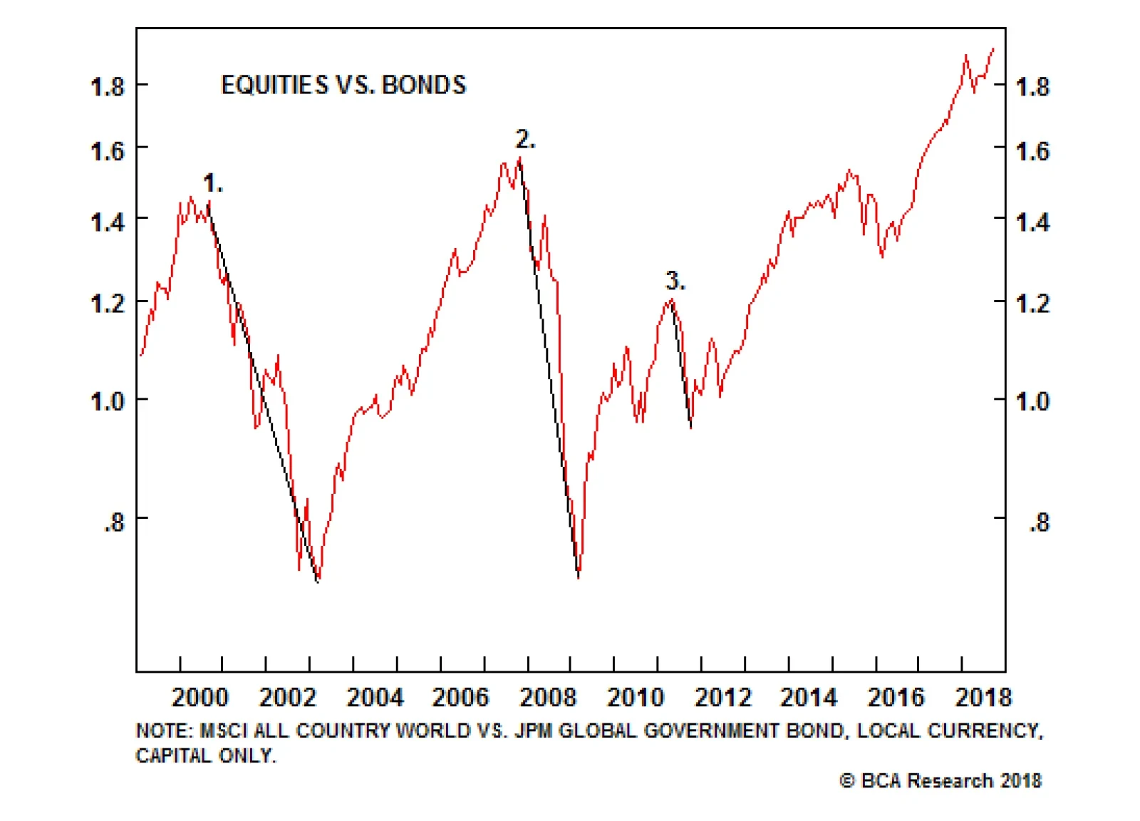
There have been three major financial market downturns, defined as a greater-than-six-month period when equities underperform bonds by more than 20 percent, in the 21th century (see chart). The twenty-first century’s major economic downturns have all…
Highlights Prediction 1: A major financial downturn will trigger the next major economic downturn, and not the other way round. Prediction 2: The straw that will break the back of a fragile financial system will be the global long bond yield rising by 60 bps within a short space of time. But for those who can fine tune, the global long bond yield must rise a further 30-50 bps before reaching the tipping point for the global risk-asset edifice. Take short-term profits in the overweight position in 30-year government bonds. Take short-term profits in the underweight position in basic materials. Take short-term profits in the underweight positions in Italy (MIB) and Spain (IBEX) and overweight position in Denmark (OMX). Feature The twenty-first century has witnessed three major downturns: the first started in 2000; the second started in 2007 culminating in the Lehman crisis a year later; and the third started in 2011 (Chart of the Week). Today, we are going to stick our necks out and make two predictions about the century's fourth major downturn. Chart of the WeekThree Episodes When Equities Underperformed Bonds By 20 Percent Or More
Three Episodes When Equities Underperformed Bonds By 20 Percent Or More
Three Episodes When Equities Underperformed Bonds By 20 Percent Or More
A major financial downturn will trigger the fourth major economic downturn. The straw that will break the back of a fragile financial system will be the global long bond yield rising by 60 bps within a short space of time. Where The Consensus Is Very Wrong As investment strategists, our primary focus should be the financial markets rather than the economy. On this basis, we define a major downturn in terms of the markets: an episode in which equities underperform bonds by more than 20 percent over a period of more than six months.1 All the same, our market based definition of a major downturn perfectly captures the three occasions that the European economy went into recession or stagnation (Chart I-2). Does this mean that the economic downturns triggered the financial market downturns? No, quite the reverse. The onset of the three major financial downturns clearly preceded the onset of the three major economic downturns. Chart I-2Three Episodes When The Euro Area Economy ##br##Contracted Or Stagnated
Three Episodes When The Euro Area Economy Contracted Or Stagnated
Three Episodes When The Euro Area Economy Contracted Or Stagnated
On reflection, this is hardly surprising. The twenty-first century's major economic downturns have all resulted from financial market distortions and fragilities: the bubble valuations of the technology, media and telecom sectors in 2000 (Chart I-3); the mispricing of U.S. mortgages and credit in 2007 (Chart I-4); and the mispricing of euro area sovereign credit risk in 2011 (Chart I-5). Therefore, it makes perfect sense that the downturns in financial markets should precede the downturns in the economy, even when both are measured in real time. Chart I-3The Major Downturns Stemmed From##br## Financial Market Distortions: The Dot Com ##br##Bubble In 1999/2000...
The Major Downturns Stemmed From Financial Market Distortions: The Dot Com Bubble In 1999/2000...
The Major Downturns Stemmed From Financial Market Distortions: The Dot Com Bubble In 1999/2000...
Chart I-4...The Mispricing Of U.S. ##br##Mortgages And Credit##br## In 2007/2008...
...The Mispricing Of U.S. Mortgages And Credit In 2007/2008...
...The Mispricing Of U.S. Mortgages And Credit In 2007/2008...
Chart I-5...And The Mispricing Of Euro Area ##br##Sovereign Credit Risk##br## In 2010/2011
...And The Mispricing Of Euro Area Sovereign Credit Risk In 2010/2011
...And The Mispricing Of Euro Area Sovereign Credit Risk In 2010/2011
Today, the consensus overwhelmingly believes that an economic downturn will cause the next major downturn in financial markets. But history has taught us time and time again that the causality is much more likely to run the other way. Why not learn the lesson? So here's our first prediction: a major financial downturn will trigger the fourth major economic downturn, and not the other way round. This prediction raises some obvious questions: what could be the major fragility in financial markets, and what could fracture it? A Sharp Rise In Bond Yields Triggered The Last Three Major Downturns Look carefully at the financial market downturns that started in 2000, 2007 and 2011, and you will see another striking similarity. In each episode, the global long bond yield rose by 60 bps or more in the months that preceded the onset of the financial market downturn: April 1999 through January 2000 (Chart I-6); March through July 2007 (Chart I-7); and October 2010 through April 2011 (Chart I-8). This strongly suggests that the spike in the bond yield was the trigger for the subsequent major downturn in financial markets. Chart I-6A Sharply Rising Bond Yield Triggered ##br##The Major Downturn Of 2000
A Sharply Rising Bond Yield Triggered The Major Downturn Of 2000
A Sharply Rising Bond Yield Triggered The Major Downturn Of 2000
Chart I-7A Sharply Rising Bond Yield Triggered##br## The Major Downturn Of 2007 And 2008
A Sharply Rising Bond Yield Triggered The Major Downturn Of 2007 And 2008
A Sharply Rising Bond Yield Triggered The Major Downturn Of 2007 And 2008
Chart I-8A Sharply Rising Bond Yield Triggered ##br##The Major Downturn Of 2011
A Sharply Rising Bond Yield Triggered The Major Downturn Of 2011
A Sharply Rising Bond Yield Triggered The Major Downturn Of 2011
A sharp rise in bond yields is usually the straw that breaks the back of financial market fragilities, in (at least) one of three ways: it flushes out those actors that are reliant on cheap liquidity; it pressures interest rate sensitive sectors in the economy; and it weighs on the valuations of other assets such as equities, especially if those valuations are already extremely elevated. Which segues us neatly to the current fragility in the global financial system. As we wrote last week, the post-2008 global experiment with quantitative easing, and zero and negative interest rate policy has boosted the valuations of all risk-assets across all geographies across all asset-classes. And the total value of those global risk-assets is $400 trillion, equal to about five times the size of the global economy.2 We have also consistently highlighted that not only do the rich valuations of $400 trillion of risk-assets depend (inversely) on bond yields, but that this relationship is an exponential function.3 So here's our second prediction: the straw that will break the back of a fragile financial system will be the global long bond yield rising by 60 bps within a short space of time - just as it did in 2000, 2007 and 2011. But Bond Yields Haven't Gone Up Far Enough... Yet Now comes some bullish news, at least for those who can play shorter-term moves in the market. The global long bond yield has been trapped within a tight channel and is only 20 bps up from its recent low in April (Chart I-9). Therefore, it has the scope to rise a further 30-50 bps before reaching the tipping point for the global risk-asset edifice and unleashing a 'risk-off' phase. Chart I-9In 2018, The Bond Yield Has Not Risen Sharply...Yet
In 2018, The Bond Yield Has Not Risen Sharply...Yet
In 2018, The Bond Yield Has Not Risen Sharply...Yet
For those who want to fine tune their investment strategy, the journey up to that turning point would define a phase when many of this year's cyclical sector underperformances would end or even switch to a phase of modest outperformances. Bear in mind that the cyclical sector underperformances this year have been substantial: European banks have underperformed healthcare by 35 percent; global basic materials have underperformed the market by 10 percent; emerging market equities have underperformed developed market equities by 15 percent. So it is prudent to take some short-term profits, especially as these trends are likely to end, at least in the near term. Hence, three weeks ago we closed our underweight banks versus healthcare position, booking a tidy profit of 23 percent. Today, we are closing our underweight position in basic materials versus the market, booking a profit of 6 percent. In a similar vein, we are taking the modest profits in our overweight position in 30-year government bonds. Sector allocation has unavoidable implications for stock market allocation - because the mainstream stock market indexes all have dominant sector skews which determine their relative performances (Chart I-10). Chart I-10Italy Vs. Denmark = Banks Vs. Healthcare
Italy Vs. Denmark = Banks Vs. Healthcare
Italy Vs. Denmark = Banks Vs. Healthcare
On this basis, closing our underweight banks versus healthcare removes the justification for being underweight bank-dominant Italy (MIB) and Spain (IBEX) and the justification for being overweight healthcare-dominant Denmark (OMX). These three positions now move to neutral. While we consider our next shift, our European stock market allocation is temporarily reduced to just five positions. Overweight: France, Ireland, Switzerland. Underweight: Sweden, Norway. Finally, just to say that there will be no report next week as I will be attending our annual Investment Conference which is in Toronto this year. I look forward to seeing some of you there. Dhaval Joshi, Senior Vice President Chief European Investment Strategist dhaval@bcaresearch.com 1 Based on the relative performance of the MSCI All Country World Index versus the JP Morgan Global Government Bond Index, both in local currency terms. 2 Please see the European Investment Strategy Weekly Report 'Trapped: Have Equities Trapped Bonds?' September 13 2018 available at eis.bcaresearch.com. 3 Please see the European Investment Strategy Weekly Report 'The Rule Of 4 For Equities And Bonds' August 2 2018 available at eis.bcaresearch.com. Fractal Trading Model* This week, we note that the very strong recent outperformance of U.S. telecoms versus U.S. autos is technically extended, reaching a fractal dimension that has previously signalled the start of a countertrend move. Hence, the recommended trade is short U.S. telecoms, long U.S. autos. Set a profit target of 9% with a symmetrical stop-loss. For any investment, excessive trend following and groupthink can reach a natural point of instability, at which point the established trend is highly likely to break down with or without an external catalyst. An early warning sign is the investment's fractal dimension approaching its natural lower bound. Encouragingly, this trigger has consistently identified countertrend moves of various magnitudes across all asset classes. Chart I-11
U.S. Telecom VS. Autos
U.S. Telecom VS. Autos
The post-June 9, 2016 fractal trading model rules are: When the fractal dimension approaches the lower limit after an investment has been in an established trend it is a potential trigger for a liquidity-triggered trend reversal. Therefore, open a countertrend position. The profit target is a one-third reversal of the preceding 13-week move. Apply a symmetrical stop-loss. Close the position at the profit target or stop-loss. Otherwise close the position after 13 weeks. Use the position size multiple to control risk. The position size will be smaller for more risky positions. * For more details please see the European Investment Strategy Special Report "Fractals, Liquidity & A Trading Model," dated December 11, 2014, available at eis.bcaresearch.com Fractal Trading Model Recommendations Equities Bond & Interest Rates Currency & Other Positions Closed Fractal Trades Trades Closed Trades Asset Performance Currency & Bond Equity Sector Country Equity Indicators Bond Yields Chart II-1Indicators To Watch - Bond Yields
Indicators To Watch - Bond Yields
Indicators To Watch - Bond Yields
Chart II-2Indicators To Watch - Bond Yields
Indicators To Watch - Bond Yields
Indicators To Watch - Bond Yields
Chart II-3Indicators To Watch - Bond Yields
Indicators To Watch - Bond Yields
Indicators To Watch - Bond Yields
Chart II-4Indicators To Watch - Bond Yields
Indicators To Watch - Bond Yields
Indicators To Watch - Bond Yields
Interest Rate Chart II-5Indicators To Watch - Interest Rate Expectations
Indicators To Watch - Interest Rate Expectations
Indicators To Watch - Interest Rate Expectations
Chart II-6Indicators To Watch - Interest Rate Expectations
Indicators To Watch - Interest Rate Expectations
Indicators To Watch - Interest Rate Expectations
Chart II-7Indicators To Watch - Interest Rate Expectations
Indicators To Watch - Interest Rate Expectations
Indicators To Watch - Interest Rate Expectations
Chart II-8Indicators To Watch - Interest Rate Expectations
Indicators To Watch - Interest Rate Expectations
Indicators To Watch - Interest Rate Expectations
Highlights Valuation measures and technical indicators are widely followed market gauges, but neither set of metrics dependably warns of impending bear markets. Recessions might, however, as they almost always overlap with bear markets. A simple indicator using just three inputs - the yield curve, the index of leading economic indicators ("LEI") and the state of monetary policy - has correctly called all seven recessions of the last fifty years. Our recession indicator is timely as well as accurate. It turns red an average of six months ahead of a recession, aligning closely with the S&P 500's average cyclical peak. Our indicator is currently giving the all-clear signal, and we do not expect it will sound the alarm for at least another year. We do not foresee downgrading equities to underweight before then unless trade tensions take a turn for the worse, the S&P 500 rises parabolically, or the Fed moves its hiking timetable forward. Feature Investors who get the biggest macro questions right will generally find themselves on the right side of their performance benchmarks. The biggest question right now is how much longer the equity bull market will last. Trying to call a market top is folly, but "close enough" counts for recognizing the beginning of bear markets, and we are confident that our recession indicator gets close enough to provide a practical asset-allocation guide. While our indicator has moved closer to sounding the alarm over the last year, it is not yet signaling any immediate trouble.1 Can We Call Bear Markets? Neither we nor any other investor can consistently call market tops or bottoms with any degree of accuracy. The core problem is that doing so requires pinpointing the moment when a firmly established trend reverses for good - after all, a bear market begins the day a bull market concludes, and vice versa. As our colleague Martin Barnes has pointed out, there are no foolproof guides to identifying these inflection points in real time.2 The most popular rules of thumb - valuation measures, technical indicators and the calendar - are of no help at all in forecasting equity bear markets. Equities are surely more vulnerable when they trade at high multiples than when they trade at low multiples, but conventional valuation measures have been all over the map ahead of the eight bear markets that have occurred over the last 50 years (Box 1). The late-'80-to-early-'82 and 1990 bear markets occurred despite P/E, Shiller P/E and P/B multiples that were all comfortably below their long-run medians (Chart 1, second, third and fourth panels). The dot-com-bubble bear market occurred when every valuation metric was at an all-time high, to be sure, but our composite valuation indicator had spent three solid years in extremely overvalued territory (Chart 1, bottom panel) before the bear finally arrived. BOX 1 50 Years Of U.S. Equity Bear Markets For the purposes of this Special Report, we adhere to the classic definition of a bear market - a peak-to-trough closing price decline of at least 20% - and we confine our analysis to the last 50 years. The result is eight bear markets, as shown in Table 1 (we round the 1990 bear up to 20% from 19.9% but leave out the 1998 and 2011 corrections of 19.3% and 19.4%, respectively). Chart 3 shows the S&P 500, in log scale, with NBER-defined recessions shaded in gray and bear markets shaded in light red. The shaded chart brings two key observations to the fore: recessions and bear markets nearly always travel together (gray and light red only failed to overlap in the opening leg of the double-dip Volcker recessions and 1987's Black Monday), and bull markets (the white space in the chart) are more or less the S&P 500's default condition. The bear markets can be nasty, however, and a process that could help a manager sidestep even a portion of their declines could lead to significant outperformance over time. Technical indicators don't provide consistently reliable advance signals, either. Nearly all of the most overheated technical environments of the last 50 years (Chart 2, bottom panel) worked themselves off without tipping into full-fledged bear-market declines. Our composite technical indicator looks much more like a coincident indicator than a leading one. The calendar is of no help at all; since 1968, bull markets have lasted anywhere from two to nine years, and the current one, within two weeks and a percentage point of becoming the longest of the postwar era, may make it to ten. Chart 1Valuation Is A Poor Guide To Bear Markets ...
Valuation Is A Poor Guide To Bear Markets ...
Valuation Is A Poor Guide To Bear Markets ...
Chart 2... And Technicals Aren't Much Better
... And Technicals Aren't Much Better
... And Technicals Aren't Much Better
Table 1U.S. Equity Bear Markets, 1968 -2018
How Much Longer Can The Bull Market Last?
How Much Longer Can The Bull Market Last?
Chart 350 Years Of Recessions And Bear Markets
50 Years Of Recessions And Bear Markets
50 Years Of Recessions And Bear Markets
Can We Call Recessions? Given the mingling of gray and red in Chart 3, a reliable recession indicator would be nearly as good as an equity bear market indicator. As noted above, only one recession (January to July 1980) passed without an accompanying bear market. Only the fall 1987 bear market occurred outside of a recession, though the two 19% corrections over our sample period also occurred ex-recessions. We submit that these three declines, accompanied by Black Monday's 20% one-day crash, the Russian crisis and the implosion of Long-Term Capital Management, and the U.S. debt-ceiling showdown and the euro crisis, were sparked by exogenous events that nearly defied prediction. Economists have a deservedly poor reputation for foretelling recessions. As the late economist John Kenneth Galbraith put it, "The only function of economic forecasting is to make astrology look respectable." Perhaps the Ph.Ds have overcomplicated matters by trying to pack too many variables into convoluted models. We have found that just three simple measures, in combination, have called all of the recessions in our 50-year sample without a single false positive. Our Recession Indicators Our first recession indicator is the orientation of the yield curve, defined as the sign of the difference between the 10-year Treasury bond yield and the 3-month T-bill rate.3 When the 3-month's rate exceeds the 10-year's yield, the curve is inverted and a recession typically follows. In our 50-year sample period, the yield curve has successfully called all seven recessions with just one false positive (Chart 4). As a standalone indicator, however, it tends to be overly eager, prematurely signaling the onset of a recession by an average of nearly twelve months (Table 2). Chart 4The Yield Curve Has Called 8 Of The Last 7 Recessions...
The Yield Curve Has Called 8 Of The Last 7 Recessions...
The Yield Curve Has Called 8 Of The Last 7 Recessions...
Table 2Inverted Yield Curves, 1968 - 2018
How Much Longer Can The Bull Market Last?
How Much Longer Can The Bull Market Last?
Our second recession indicator is the sign of the year-over-year change in the index of the leading economic indicators ("LEI"). When the LEI contracts on a year-over-year basis, a recession typically ensues. As with the inverted yield curve, year-over-year contractions in the LEI have successfully called all of the recessions in our sample with just one false positive (Chart 5). The LEI signal tends to flip to red in a more timely fashion than the perpetually early yield curve, leading recessions by an average of six-plus months (Table 3). Chart 5...And So Have Leading Economic Indicators
...And So Have Leading Economic Indicators
...And So Have Leading Economic Indicators
Table 3LEI Contractions, 1968 - 2018
How Much Longer Can The Bull Market Last?
How Much Longer Can The Bull Market Last?
The false positives go away once we combine the yield curve and the LEI into a single signal. To confirm that signal and make it more robust, we also consider the monetary policy backdrop. Over the nearly 60 years for which BCA's model calculates an estimate of the equilibrium fed funds rate, every recession has occurred when the fed funds rate has exceeded our estimate of equilibrium (Chart 6). In other words, recessions only occur when monetary policy settings are restrictive. In this case, the old market wisdom really is wise: expansions don't die of old age, they die because the Fed murders them. Chart 6Tight Policy Is A Necessary, But Not Sufficient, Recession Ingredient
Tight Policy Is A Necessary, But Not Sufficient, Recession Ingredient
Tight Policy Is A Necessary, But Not Sufficient, Recession Ingredient
From Recession Indicator To Portfolio Strategy Tool Relative asset-class performance in previous bear markets, as detailed in the initial version of this study, published last summer by our Global ETF Strategy service,4 clearly argues for portfolio de-risking ahead of a recession. Investors would have benefited handsomely from overweighting bonds and cash at the expense of equities, overweighting countercyclical stocks and underweighting cyclicals, and overweighting Treasuries while underweighting high-yield corporates. Timing those defensive shifts is hardly clear-cut, however. The lead times between yield curve inversion, LEI contraction, the onset of restrictive monetary policy and the beginning of a recession vary from cycle to cycle. Fortunately for investors, waiting until all of the indicator components are in agreement dampens much of the variability in lead times. As Table 4 shows, the LEI signal is much less hasty than either the yield curve or the policy signals. It typically is the last component to flip, guiding the composite indicator to issue its recession signal just one week ahead of the S&P 500's average pre-recession peak. Sample averages mask in-sample variability, and the composite indicator does not march in lockstep with the S&P 500, but it is timely enough to have managed to catch about three-fourths of every bear market that coincided with a recession (Table 5). Table 4Lead Times For Indicator Components And Bear Markets
How Much Longer Can The Bull Market Last?
How Much Longer Can The Bull Market Last?
Table 5Share Of Bear Markets Captured By Recession Indicator
How Much Longer Can The Bull Market Last?
How Much Longer Can The Bull Market Last?
Why Bother? Some of our colleagues, duly noting forecasting's inherent difficulties, argue that there's little to be gained from attempting to narrow down the potential range of bear-market start dates. Fearful of the consequences of flying too close to the sun, they suggest that investors de-risk when enough common-sense-defying signs of a peak accumulate, and not worry about leaving some performance on the table. Such an approach has the benefits of being flexible and intuitive, but is difficult to apply consistently. Even proponents of former Supreme Court Justice Potter Stewart's legendary I-know-it-when-I-see-it obscenity standard have to concede that its parameters are arbitrary. It is also a concern that licking one's finger and holding it aloft is likely to put one squarely in the midst of the herd. The practicality of Justice Stewart's standard hinges on broad agreement: only if the distribution of opinions within the consensus is very narrow will a good deal of the community be satisfied with decisions based on it. Comity is the enemy of alpha, however, and an investor whose common sense is too common will wind up exiting the market too early and getting back into it too late, underperforming on both sides of the inflection point. The empirical record suggests that there's much to be lost from leaving too early. Bull markets tend to end with a bang, not a whimper (Chart 7 and Table 6). It is unlikely that investors who are willing to forego some returns in the name of security on the way up have the temperament to get back in at the beginning stages of the next rally. Factor in our view that public-market returns will be thin gruel over the next five to ten years compared to what investors have enjoyed since 1982, and one can make a case for trying to capture as much of the current bull market's gains as possible. Chart 7Sprinting To The Finish Line
Sprinting To The Finish Line
Sprinting To The Finish Line
Table 6Finishing In Style
How Much Longer Can The Bull Market Last?
How Much Longer Can The Bull Market Last?
Investment Implications Our composite recession indicator has done an excellent job of flagging recessions in advance. As recessions and equity bear markets are such steadfast companions, the composite recession indicator holds considerable promise as a tool to help investors capture a greater share of bull-market gains while helping them skirt some bear-market losses. Given a flattening but still positively-sloped yield curve, booming year-on-year growth in the LEI, and a policy rate that looks to be at least a year from becoming restrictive, we see no recession on the horizon. Unless trade negotiations fall apart, the S&P 500 melts up, or the Fed's rate-hiking guidance gets much more aggressive, we do not expect that investors will have cause to put their recession/bear market game plan into place for at least another year. Doug Peta, Senior Vice President U.S. Investment Strategy dougp@bcaresearch.com 1 This Special Report is adapted from the August 16, 2017 Global ETF Strategy Special Report, "A Guide To Spotting And Weathering Bear Markets," available at etf.bcaresearch.com. 2 Please see BCA Research Special Reports, "Timing The Next Equity Bear Market," and "Timing Equity Bear Markets," published January 24, 2014 and April 6, 2011, respectively, available at www.bcaresearch.com. 3 We use the 3-month/10-year segment instead of the more common 2-year/10-year because the 3-month bill is a cleaner proxy for short rates than the 2-year note, which incorporates estimates of the Fed's future actions. 2s/10s also fail to measure up empirically, inverting even earlier than the habitually premature 3-month/10-year. 4 August 16, 2017 Global ETF Strategy Special Report, "A Guide To Spotting And Weathering Bear Markets."
According to market lore, one should never say, "It's Different This Time". But every time is always different: there is a never a previous period that perfectly matches the current environment. That is why forecasting is so difficult and why all model-based predictions should be treated with caution. Yet, some basic common sense can go a long way in helping to assess investment risks and potential rewards. As I look at the world, it looks troubled enough to warrant a very conservative investment stance, but that clearly puts me at odds with the majority of investors. In aggregate, investors and market analysts are upbeat. Major equity indexes are close to all-time highs, earnings expectations are ebullient and surveys of investor sentiment do not imply much concern about the outlook. There is a strong consensus that a U.S. recession will not occur before 2020, meaning that risk assets still have decent upside. That may indeed turn out to be true, but I can't shake off my concerns about a number of issues: The consensus may be too complacent about the timing of the next U.S. recession. The dark side of current strong growth is growing capacity pressures that warn of upside surprises for inflation and thus interest rates. Uncertainty about trade wars represents a risk to the global economic outlook beyond the direct impact of tariffs because it also gives companies a good reason to hold back on investment spending. Profit growth in the U.S. has remained much stronger than I expected, but the forces driving this performance are temporary. Rising pressures on wages suggest that labor's share of income will rise, leading to lower margins. The geopolitical environment is ugly, ranging from a shambolic Brexit process to rising populist pressures in Europe, a flaring in U.S./Iran tensions and possible disappointment with North Korea negotiations. The Debt Supercycle may be over, but global debt levels remain worryingly high in several major economies. This could become a problem in the next economic downturn. It would be easier to live with the above concerns if markets were cheap, but that is far from the case - especially in the U.S. Credit spreads in the corporate bond market are below historical averages while equities continue to trade at historically high multiples to earnings. Even if equity prices do move higher, the upside from current levels is likely to be limited. Yes, there could be a final, dramatic blow-off phase similar to that of the late 1990s, but that would be an incredibly risky period and not one that I would want to participate in. Timing The Next Recession Sad to say, economists do a very poor job of forecasting recessions. As I showed in a report published last year, the Fed has missed every recession in the past 60 years (Table 1).1 One could argue that the Fed could never publish a forecast of recession because it would be an admission of policy failure: they generally have to be seen aiming for soft landings. But private forecasters have not done any better. For example, the consensus of almost 50 private forecasters published in mid-November 2007 was that the U.S. economy would grow by 2.5% in the year to 2008 Q4.2 The reality was that the economy was then at the precipice of its worst downturn since the 1930s. Table 1Fed Economic Forecasts Versus Outcome
Personal Observations On The Current Environment
Personal Observations On The Current Environment
The U.S. economy currently is very strong, but that often is the case just a few quarters before a recession starts. Strong growth today is not a predictor of future strong growth. As has been widely acknowledged, the yield curve has been one of the few indicators to give advance warning of economic trouble ahead. Yet, in the past, its message typically was ignored or downplayed, with the result that most forecasters stayed too bullish on the economy for too long. History is repeating itself with a flurry of reports explaining why the recent flattening of the yield curve is giving a misleading signal. The principal argument is that term premiums have been artificially depressed by the Fed's bond purchases. However, the curve has flattened even as the Fed has pulled back from quantitative easing. As usual, the flattening reflects the tightening in monetary policy and, therefore, should not be discounted. To be fair, there is still a positive slope across the curve, so this indicator is not yet flashing red. But it is headed in that direction (Chart 1). Chart 1Recession Indicators: Not Flashing Red...Yet
Recession Indicators: Not Flashing Red...Yet
Recession Indicators: Not Flashing Red...Yet
The other series to watch closely is the Conference Board's Leading Economic Index. Typically, the annual rate of change in this index turns negative ahead of recessions, although once again, there is a history of forecasters ignoring or downplaying the message of this signal. Currently, the growth in the index is firmly in positive territory, so no alarm bells are ringing. Overall, there are no indications that a U.S. recession is imminent. At the same time, late cycle pressures and thus risks are building. Anecdotal evidence abounds of labor shortages and supply bottlenecks in a number of industries. Wage growth has stayed relatively muted given the low unemployment rate, but that is starting to change. My colleague Peter Berezin has shown compelling evidence of a "kinked" relationship between wage growth and unemployment whereby the former accelerates noticeably after the latter drops below its full employment level (Chart 2). We are at the point where wage growth should accelerate and it is significant that the 2.8% rise in the employment cost index in the year to the second quarter was the largest rise in a decade. It also should be noted that the Fed's preferred inflation measure (the core personal consumption deflator) has been running at around a 2% pace in the past three quarters, in line with its target (Chart 3). As capacity pressures build, an overshoot of 2% seems inevitable, forcing the Fed to react. Current market expectations that the funds rate will rise by only 25 basis points over the remainder of this year and by 100 basis points in 2019 are likely to prove too optimistic. Chart 2Faster Wage Growth Ahead
Personal Observations On The Current Environment
Personal Observations On The Current Environment
Chart 3Core Inflation At The Fed's Target
Core Inflation At The Fed's Target
Core Inflation At The Fed's Target
Admittedly, there is huge uncertainty about what interest rate level will be restrictive enough to damage growth. Historically, recessions did not occur until the fed funds rate reached at least the level of potential GDP growth. The Congressional Budget Office estimates that potential GDP growth will average around 4% over the coming year, and the funds rate probably will not reach that level in 2019. However, additional restraint is coming from the strong dollar, and lingering high debt burdens mean that rates are likely to bite at lower levels than past relationships would suggest. Chart 4U.S. Trade Performance: No Major Surprises
U.S. Trade Performance: No Major Surprises
U.S. Trade Performance: No Major Surprises
Trade Wars Etc. President Trump appears to believe that the large U.S. trade deficit is largely a reflection of unfair trade practices. The reality is obviously more complicated, even if there is truth to the claim that the playing field with China is far from level. The key drivers of trade imbalances are relative economic growth rates and relative real exchange rates. The trend in the volume of U.S. non-oil merchandise imports has been exactly in line with that of domestic demand for goods (Chart 4). In other words, there is no indication that the U.S. is being "taken advantage of". The growth in U.S. non-oil exports has been a little on the soft side relative to overseas growth in recent years, but that occurred against the background of a rising real dollar exchange rate. Overall, the trend in the ratio of U.S. real non-oil imports to exports has broadly followed the ratio of U.S. real GDP to that of other OECD economies. The periods where the trade ratio deteriorated somewhat faster than the GDP ratio were times when the real trade-weighted dollar was strong, such as in the past few years. The irony, which seems to escape the administration, is that recent policy actions - tax cuts and efforts to boost private investment spending - are bound to further boost the trade deficit. This may partly explain the clumsy attempt to encourage the Fed to slow down its rate hikes in order to dampen the dollar's ascent. Of course, that will not work - the Fed will not be deflected from its policy course by political interference. Meanwhile, the administration's imposition of tariffs will not change the underlying drivers of the U.S. trade deficit. I have no way of knowing whether current trade skirmishes will degenerate into an all-out war. There are some glimmers of hope with the EU and U.S. promising to engage in talks about reducing trade barriers. But the more important issue is what happens with China. While China has an economic incentive to make concessions, I cannot imagine that President Xi wants to be seen as giving ground in the face of U.S. bullying. My rather unhelpful conclusion is that trade wars are a serious risk that need watching but are unforecastable at this stage. Earnings Galore, But... It's confession time. The performance of U.S. corporate earnings has been far better than I have been predicting during the past few years. In several previous reports, I argued that earnings growth was bound to slow sharply as labor's share of income eventually climbed from its historically low level. I certainly had not expected that the annual growth in S&P 500 operating earnings would average 20% in the two years to 2018 Q2 (Chart 5). In defense, my original argument was not completely wrong. Labor's share of corporate income bottomed in the third quarter of 2014 and that marked the peak in margins, based on national income data of pre-tax profits (Chart 6). Margins have fallen particularly sharply for the national income measure of non-financial profits before interest, taxes and depreciation (EBITD). I believe this is a good measure of the underlying performance of the corporate sector as it is unaffected by policy changes to taxes, depreciation rates and monetary policy. This measure of margins used to be very mean reverting but currently is still far above its historical average. Given the tightness in the labor market, there is still considerable downside in margins as wage costs edge higher. Chart 5Spectacular U.S. Earnings Growth
Spectacular U.S. Earnings Growth
Spectacular U.S. Earnings Growth
Chart 6Profit Margins Have Peaked
Profit Margins Have Peaked
Profit Margins Have Peaked
An unusually large gap has opened up in recent years between S&P earnings data and the national accounts numbers. While there are several definitional differences between the two datasets, this cannot explain the large divergence shown in Chart 7. The national income data are generally believed to be less susceptible to accounting gimmicks and are thus a better reflection of underlying trends. Analysts remain extraordinarily bullish on future earnings prospects. Not only are S&P 500 earnings forecast to rise a further 14% over the next 12 months, but the current expectation of 16% per annum long-run earnings growth was only exceeded at the peak of the tech bubble (Chart 8). And we know how that episode ended! Chart 7A Strange Divergence in Profit Data
A Strange Divergence in Profit Data
A Strange Divergence in Profit Data
Chart 8Insanely Bullish Long-Term Earnings Expectations
Insanely Bullish Long-Term Earnings Expectations
Insanely Bullish Long-Term Earnings Expectations
I am inclined to stick to my view that earnings surprises will disappoint over the next year. The impact of corporate tax cuts will disappear, and both borrowing costs and wage growth are headed higher. A marked slowdown in earnings growth will remove a major prop under the bull market. Brexit As a Brit, I am totally appalled with the Brexit fiasco. It was all so unnecessary. Yes, the EU has an intrusive bureaucracy that imposes some annoying rules and regulations on member countries. However, OECD data show that the U.K. is one of the world's least regulated economies and it scores high in the World Bank's Ease of Doing Business rankings. In other words, there is no compelling evidence that EU bureaucratic meddling has undermined business activity in the U.K. The vote for Brexit probably had more to do with immigration than anything else, and that also makes little sense given that the U.K. has a tight labor market and needs a plentiful supply of immigrant workers. History likely will dictate that former Prime Minister David Cameron's decision to call for the Brexit referendum was the U.K.'s greatest political miscalculation of the post-WWII period. Not only was the decision to hold the referendum a mistake, but it also was foolhardy to base such a momentous vote on a simple majority rather than a super-majority of at least 60%. Adjusting the referendum result by voter turnout, those backing Brexit represented only around 37% of the eligible voting public.3 Clearly, the government was unprepared for the vote result and divorce proceedings have moved ahead with no viable plan to achieve an acceptable separation. Meanwhile, the inevitable confusion has created huge uncertainty for businesses and is doing significant damage to the economy. This is not the place to get into the minutiae of the Brexit morass such as the Northern Ireland border issue and the difficulty of agreeing new trade relationships. Those have been well aired in the press and by many other commentators. My lingering hope is that the enormous challenges of coming up with a mutually acceptable deal with the EU will prove intractable, resulting in a new referendum or election that will consign the whole idea to its grave. We should not have to wait too long to discover whether that is a futile wish. Investment Strategy Chart 9The U.S. Equity Market Is Expensive
The U.S. Equity Market Is Expensive
The U.S. Equity Market Is Expensive
Equities are still in a bull market and we are thus in a period where investors are biased to be optimistic. Bears have been discredited and the current strength of the economy gives greater credence to the market's cheerleaders. I have been in the forecasting business for long enough (45+ years) to be suitably humble about my ability to forecast where markets are headed. I am very sympathetic to the famous Keynes quote that "the market can stay irrational longer than you can stay solvent". Investors will have their own set of preferences and constraints about whether it makes sense to stay heavily invested during times when markets appear to have diverged from fundamentals. The U.S. equity market's price-earnings ratio (PER) currently is about 20% above historical averages, based on both trailing and 12-month forward earnings and more than 30% above based on cyclically-adjusted earnings (Chart 9). Yes, interest rates are low by historical standards, giving scope for higher PERs, but rates are going up and profit margins are at historically elevated levels with lots of downside potential. I fully accept that equity markets can continue to rise over the next year, beating the meagre returns available from cash and bonds. For those investors being measured by quarterly performance, it is difficult to stay on the sidelines while prices march higher. Nevertheless, I believe this is a time for caution. The perfect time for equity investing is when markets are cheap, earnings expectations are overly pessimistic and the monetary environment is highly accommodative. Currently, the opposite conditions exist: valuations are stretched, earnings expectations are euphoric and the Fed is in tightening mode. It does not seem a propitious time to be aggressive. The future is always shrouded in mist, but there currently is an unusually large number of important economic and political questions hanging over the market. These include the timing of the next recession, the related path of monetary policy, the outcome of the U.S. midterm elections, trade wars, U.S.-Sino relations and Brexit, just to name a few. The good news is that our Annual Investment Conference on September 24/25 will be tackling these issues head on with an incredible group of experts. I am looking forward to hearing, among others, from Janet Yellen on monetary policy, Leland Miller and Elizabeth Economy on China, Greg Valliere on U.S. politics, and Stephen King and Stephen Harper on global trade. It promises to be an exceptional event and I hope to see you there. Martin H. Barnes, Senior Vice President Economic Advisor mbarnes@bcaresearch.com 1 BCA Special Report "Beware The 2019 Trump Recession," March 7, 2017. Available at bca.bcaresearch.com. 2 Source: Federal Reserve Bank of Philadelphia, Survey of Professional Forecasters (www.philadelphiafed.org). 3 The referendum result was 51.9% in favor of Brexit, with a voter turnout of close to 72%.