Sectors

The Race To $1 Trillion
The Race To $1 Trillion
Overweight (High-Conviction) In last week’s GDP report, software was a clear standout. Investment in software as a ratio of total fixed non-residential investment has been on fire for much of the past four years and is on the cusp of surpassing the GFC highs when capex collapsed, but defensive outlays on software stood their ground (top panel). On a rate of change basis, growth in investment in software has breached the double-digit level for the first time in seven years; the last time this happened marked the beginning of software’s five year bull run. Further, the acute uptick in software investment’s contribution to GDP growth is an excellent herald for relative earnings performance. While the latter’s growth has been decelerating of late, the sharp divergence from the former suggests a resumption of outsized EPS growth in the S&P software index (bottom panel). Bottom Line: We reiterate our high-conviction overweight recommendation in the S&P software index. The ticker symbols for the stocks in this index are: BLBG: S5SOFT - MSFT, ORCL, ADBE, CRM, INTU, RHT, ADSK, SNPS, CTXS, ANSS, CDNS, FTNT and SYMC.
Highlights European Growth: Europe’s economy is slowing, while core inflation remains subdued. The ECB must now contemplate the need for a monetary policy ease so soon after ending its bond buying program. Likely ECB Options: The ECB will likely have no choice but to initiate a new round of LTROs – likely to be announced in either April or May – to prevent an unwanted tightening of credit conditions at a time of slowing economic growth. Fixed Income Implications: Stay below-benchmark on euro area duration, with inflation expectations likely to rebound alongside a more dovish ECB and rising global oil prices. Stay underweight Italian government bonds and neutral overall euro area corporate credit exposure, however, until there are more decisive signs that growth is stabilizing. Feature Back in December, the European Central Bank (ECB) - confident that the euro zone economy was healthy enough to allow the slow process of policy normalization to begin - ended its Asset Purchase Program and signaled that rate hikes could commence as soon as late 2019. Just two months later, the central bank is faced with an unexpectedly persistent and broad-based growth slump. Markets now expect no change in short-term interest rates until well into 2020. By most conventional measures, the ECB is running a very accommodative monetary stance, with a €4.7 trillion balance sheet and negative interest rates (both in nominal and inflation-adjusted terms). On a rate-of-change basis, however, policy has become incrementally less stimulative, with the balance sheet no longer expanding and real interest rates unchanged from levels of a year ago (Chart 1). An additional potential tightening of liquidity conditions is on the horizon with the ECB’s long-term funding operations for euro zone banks (LTROs and TLTROs) set to begin rolling off next year. Chart 1The ECB Needs To Ease Policy Somehow
The ECB Needs To Ease Policy Somehow
The ECB Needs To Ease Policy Somehow
Our ECB Monitor indicates that fresh monetary easing will soon be required if the current downtrend in growth persists. Given the persistent fragilities within the European banking system, not only in Italy but increasingly in core countries like Germany, a combination of slowing economic momentum and tightening monetary liquidity is a potentially toxic brew. Weaker growth raises the specter of a rise in non-performing loans held by banks that also have significant sovereign debt exposures (the so-called “Doom Loop”). In this Special Report, we consider the policy options that the ECB could realistically deliver in the coming months - given the state of the economy, inflation and banking system – with the associated investment implications for European fixed income markets. Our conclusion: the ECB will be forced to take a dovish turn as an insurance policy against tighter credit conditions and weak growth. Eurozone Economy: Broad-Based Mediocrity The ECB has categorized the current downturn, which has pushed real GDP growth in the Eurozone to a below-trend pace of 1.7% and triggered a technical recession in Italy, as simply the product of a bunch of idiosyncratic country-specific shocks (a cut in Germany auto production due to changing emissions standards, Italy-EU fiscal policy debates that raised the cost of capital in Italy, and political unrest in France damaging consumer spending). The biggest shock, however, has been exogenous. Trade policy uncertainty and a weakening Chinese economy have both been a major drag on growth for euro zone countries that rely heavily on exports, in general, and Chinese import demand, in particular. The “one-off shocks” narrative is incorrect because the slowdown has been broad-based. The majority of countries within the euro zone are suffering slowing GDP growth, falling leading economic indicators and decelerating headline inflation, according to our diffusion indices for each (Chart 2). The previous three times such a synchronized slowdown unfolded (2001, 2009 and 2012), the ECB responded with a full-blown rate cutting cycle. Inflation trends today, however, make it a bit more difficult for the ECB to consider any such possible shift in a more dovish direction. Chart 2ECB Typically Eases After A Broad-Based Economic Downturn
ECB Typically Eases After A Broad-Based Economic Downturn
ECB Typically Eases After A Broad-Based Economic Downturn
The overall unemployment rate for the region is 7.8%, well below the OECD’s estimate of the full employment NAIRU1 rate. In contrast to our diffusion indicators for the economy, the majority of euro area countries (83%) have unemployment rates lower than NAIRU (Chart 3). The previous two times labor markets were so tight in the euro area, wage inflation reached 4%, core inflation climbed beyond 2.5% and the ECB pushed policy interest rates to between 4-5%. Today, a large majority of countries are witnessing faster wage growth and core inflation, but the overall level of both is still relatively low (2.5% and 1%, respectively). Chart 3ECB Policy Is Already Very Easy
ECB Policy Is Already Very Easy
ECB Policy Is Already Very Easy
So from the point of view of the state of overall growth and inflation, the ECB is in a difficult position. Euro area growth has slowed, but not by enough to ease the nascent inflation pressures in labor markets. The story gets more complex when looking at growth and inflation at the individual country level. For the four largest economies in the region – Germany, France, Italy and Spain – the latter two remain a source of concern. Unemployment in both Spain and Italy remains in double-digits, with headline and core inflation rates at 1% or lower (Chart 4). Italy’s manufacturing PMI is now at 47.6 and Spain’s is now at 49.9, both below the 50 level indicating an expanding economy. Chart 4Italy & Spain Are Becoming An Issue (Again)
Italy & Spain Are Becoming An Issue (Again)
Italy & Spain Are Becoming An Issue (Again)
Credit growth exhibits a similar pattern. Total bank lending is contracting on a year-over-year basis in Italy (-4.3%) and Spain (-2.1%), while still growing at a positive, albeit decelerating, rate in Germany (+1.5%) and France (+5.3%). The most recent ECB Bank Lending Survey for the fourth quarter of 2018 showed that lending standards were becoming more stringent in Italy and Spain than in Germany or France (Chart 5). In Italy, where the growth downturn has been deeper and borrowing costs have gone up due to the Italian populist government’s repudiation of EU deficit limits, banks are actually tightening lending standards. Chart 5Credit Conditions Tightening At The Margin
Credit Conditions Tightening At The Margin
Credit Conditions Tightening At The Margin
The last thing the ECB wants to see now is a sustained credit contraction in the large economies where growth and banking systems are the most fragile – most notably, Italy. Bottom Line: Europe’s economy is slowing, while core inflation remains subdued. Weakness is more pronounced in the Peripheral countries compared to the Core, especially Italy. The ECB must now contemplate the need for a monetary policy ease so soon after ending its bond buying program. Italy’s Banks Are Still A Huge Headache For The ECB European banks have struggled to generate acceptable profits in recent years against a backdrop of sluggish economic growth, negative interest rates and increased regulatory capital requirements. Bank equity values remain near post-2008 crisis lows, with Italian bank stocks severely underperforming their competitors within the euro zone (Chart 6). Credit spreads for Italian banks are also far more elevated than those of their euro area peers, a reflection of the higher yields and wider spreads on Italian government bonds (which, given Italy’s BBB sovereign credit rating, means that the floor on Italian yields and credit spreads is higher than those of other euro zone countries with better credit ratings). Chart 6Italy's Fiscal Problems Impacting The Banks
Italy's Fiscal Problems Impacting The Banks
Italy's Fiscal Problems Impacting The Banks
Even given the economic fragility in Italy, Italian banks remain reasonably well-capitalized. According to the data from the European Banking Authority (EBA), Italian banks have a Common Equity Tier 1 (CET1) capital ratio of 13.8%, well above the minimum levels required by Basel III bank regulations and close to the overall euro area CET1 ratio of 14.7% (Chart 7).
Chart 7
The problem for Italian banks, however, remains the high level of non-performing loans (NPLs). EBA data shows that Italian banks have an NPL ratio of 9.4%, nearly three times the total euro area NPL ratio of 3.4%. While this is a substantial improvement from the near-20% NPL ratio seen after the 2011 European debt crisis, the absolute level of NPLs remains high. The other major risk for Italian banks is their large holdings of Italian sovereign bonds, which raises the risk of mark-to-market losses hitting the banks’ capital position as government bond yields rise (i.e. the “Doom Loop”). The ECB’s bond purchases have helped to reduce the share of Italian sovereign debt held by Italy’s banks from 25% to around 19% over the past five years (Chart 8). Yet with Italy’s sovereign credit rating now BBB – on the cusp of junk – Italian bank balance sheets remain heavily exposed to sovereign debt risk.
Chart 8
The ECB has tried to mitigate the impact of its extraordinary monetary stimulus on the profitability of Europe’s banks by offering longer-term loans (against acceptable collateral) at low interest rates. These programs, known as Long-Term Refinancing Operations (LTROs), have mostly been used by banks in Italy and Spain, which have taken up a combined 56% of all outstanding LTROs (Chart 9). Chart 956% Of ECB LTROs Have Gone To Italy & Spain
56% Of ECB LTROs Have Gone To Italy & Spain
56% Of ECB LTROs Have Gone To Italy & Spain
The most recent LTRO operation launched in 2016 was a Targeted LTRO (TLTRO) that tied the extension of ECB funding directly to the amount of new loans made by any bank that received the funding. Those TLTROs were offered at the ECB’s Marginal Deposit Rate of -0.4%, effectively providing a 40bps subsidy for new bank lending. The impact on loan growth from the TLTROs was far greater in Italy and Spain, where the share of total bank lending funded by LTROs in each country is now 10% compared to 4% for all euro area bank loans (Chart 10). Chart 10LTROs Funding 10% Of Bank Lending In Italy & Spain
LTROs Funding 10% Of Bank Lending In Italy & Spain
LTROs Funding 10% Of Bank Lending In Italy & Spain
The TLTROs extended in 2016 had a maturity of four years, which means that the loans will begin to mature next year.2 If the ECB lets these operations expire without any offering of a new program, then banks that have used that cheap liquidity will be faced with one of two choices: replace that funding with bank debt at much higher market interest rates, or reduce the size of their loan books (i.e. delever their balance sheets). For Italy’s banks, replacing all of that cheap TLTRO funding with expensive bank debt is highly unlikely. According to the Bank of Italy’s latest Financial Stability Report, bank debt represents as large a share of overall Italy bank funding as the TLTROs (around 10%), but the growth rate of that debt has been contracting at a -15% to -20% rate over the past couple of years (Table 1).3 This is how rising Italian sovereign bond yields translate into higher bank debt yields and market funding costs, restricting lending activity. Table 1Italian Banks Have Slashed Expensive Debt Market Funding
The ECB's Next Move: Taking Out Some Insurance
The ECB's Next Move: Taking Out Some Insurance
Already, Italian banks have been cutting back on lending to the most risky borrowers, according to Bank of Italy data (Chart 11). The growth rates of loans deemed “risky” and “vulnerable” contracted at a faster pace in 2018 than during 2015-17, while loans extended to “solvent” and “safe” borrowers grew more quickly in 2018 than the prior three years. These trends are likely to continue with credit standards now being tightened by Italian banks according to the ECB Bank Lending Survey.
Chart 11
An additional factor for the banks to consider is the upcoming implementation of the Basel III regulatory requirement that banks must maintain a minimum amount of funding with a maturity greater than one year (the Net Stable Funding Ratio, or NSFR). Even though the current round of TLTROs do not begin to expire until June 2020, they will turn into “short-term” funding as of June of this year when it comes to banks calculating their NSFR. That ratio is not yet binding, but banks will likely seek to plan ahead for their long-term funding and will seek guidance from the ECB. So the ECB is now faced with the prospect of letting the TLTROs begin to expire next year, placing 4% of total euro area bank lending and 10% of Italian and Spanish bank lending at risk. Given the current fragile state of growth in the euro area, especially in Italy, the central bank would be taking a huge gamble by risking an even deeper downturn through banks shrinking their loan books. The easiest way to prevent that outcome – more LTROs. Bottom Line: The ECB will likely have no choice but to initiate a new round of LTROs – likely to be announced in April or May - to prevent an unwanted tightening of credit conditions amid slowing economic growth. The ECB’s Likely Next Move? New LTROs With More Dovish Forward Guidance The ECB Governing Council meets this week. There will be a new set of economic projections prepared for this meeting, and the ECB has typically chosen to make changes to its monetary policies alongside shifts in its economic forecasts. ECB President Mario Draghi has already noted that the growth risks in the euro zone are now tilted to the downside. Even noted monetary hawks like German Bundesbank President Jans Weidmann and Dutch Central Bank President Klaas Knot – both candidates to replace Draghi when his term expires in October – have toned down their calls for monetary tightening given the weak growth in their own economies. We expect the ECB to follow a dovish script at the March ECB meeting, along these lines: Downgrade the ECB’s growth forecasts Delay the date when inflation is projected to return back to 2% target Extend forward guidance on the first rate hike out to “mid-2020 or later” (which only validates current market pricing) A pessimistic assessment of the outlook for bank lending based on elevated bank funding costs impairing the transmission of ECB’s “highly accommodative” monetary policy A discussion about the need for a new LTRO program to replace the ones that start expiring in 2020 Step 4 in that script could be delayed until the April or May ECB meetings, to allow for more time to see how the economic data unfolds. Almost all of the current downturn in real GDP growth can be attributed to the plunge in net exports – the contribution to growth from domestic demand has been stable over the past year (Chart 12). Thus, the ECB will likely want to see if the current indications of a U.S.-China trade deal, combined with more stimulus from China’s policymakers, puts a floor under the downturn in euro area trade activity. Chart 12ECB Growth Forecasts Require A Rebound In Exports
ECB Growth Forecasts Require A Rebound In Exports
ECB Growth Forecasts Require A Rebound In Exports
Step 5 in our March ECB meeting script can also be delayed to April or May, but the ECB is not likely to wait longer than that and run the risk of letting the current slowing of euro area credit growth turn into a full-blown contraction due to the end of cheap funding (Chart 13). Chart 13Tightening Lending Standards: Trigger For A New LTRO?
Tightening Lending Standards: Trigger For A New LTRO?
Tightening Lending Standards: Trigger For A New LTRO?
There has also been some speculation that the ECB could satisfy both the hawks and doves on the Governing Council by announcing a hike in the ECB Overnight Deposit rate at the same time as a new LTRO program. The Overnight Deposit rate represents the floor of the ECB’s policy interest rate corridor, with the Marginal Lending rate representing the ceiling and the Main Refinancing rate acting as the midpoint of the corridor. Yet with the ECB maintaining such a large balance sheet, with €1.2 trillion in excess reserves, the effective short-term interest rate (1-week EONIA) has traded near the Overnight Deposit Rate floor. Thus, lifting only the Overnight Deposit Rate, which is -0.4% and has been blamed for damaging the earnings of euro area banks, would effectively be the same as a traditional hike in the ECB’s main interest rate tool, the Main Refinancing Rate (Chart 14). Chart 14The ECB Cannot
The ECB Cannot "Just" Hike The Deposit Rate
The ECB Cannot "Just" Hike The Deposit Rate
Bottom Line: Offering a new LTRO, but perhaps for only a shorter time period than the expiring TLTROs (i.e. two years instead of four), seems to be the best solution for the ECB. This will prevent a potential liquidity-driven bank credit crunch in the most vulnerable parts of the European economy – Italy and Spain. Fixed Income Investment Implications Of Our ECB View 1. Duration: the benchmark 10-year German Bund yield had fallen as low as 0.09% in the most recent global bond rally, largely driven by a collapse in inflation expectations. The ECB’s likely dovish guidance on rate hikes will prevent any meaningful rise in real Bund yields. Inflation expectations, however, do have a lot more upside if BCA’s bullish oil forecast is realized – especially so if the ECB also takes a more dovish turn (Chart 15). Stay below-benchmark on euro zone duration, and stay long inflation-linked instruments like CPI swaps. Chart 15Stay Below-Benchmark On European Duration Exposure
Stay Below-Benchmark On European Duration Exposure
Stay Below-Benchmark On European Duration Exposure
2. Italian Sovereign Debt: A new LTRO program, combined with more dovish forward guidance, should help prevent the current Italian growth downturn from intensifying. However, a weak economy will sustain pressure on Italian sovereign spreads. Stay underweight for now, but look to upgrade when growth stabilizes (Chart 16). Chart 16Stay Cautious On Euro Area Spread Product Until Growth Bottoms
Stay Cautious On Euro Area Spread Product Until Growth Bottoms
Stay Cautious On Euro Area Spread Product Until Growth Bottoms
3. Euro Area Corporates: A more dovish ECB will help stabilize corporate credit spreads in the euro area, but like Italian sovereign debt, signs of more stable growth are required before spreads can meaningfully compress. Stay neutral for now. Robert Robis, CFA, Chief Fixed Income Strategist rrobis@bcaresearch.com Footnotes 1 Non-accelerating inflation rate of unemployment. 2 The loans were offered in four allotments in June 2016, September 2016, December 2016 and March 2017. Hence, the loans will mature in June 2020, September 2020, December 2020 and March 2021. 3 The November 2018 Bank of Italy Financial Stability Report can be found here: https://www.bancaditalia.it/pubblicazioni/rapporto-stabilita/2018-2/index.html Recommendations The GFIS Recommended Portfolio Vs. The Custom Benchmark Index
The ECB's Next Move: Taking Out Some Insurance
The ECB's Next Move: Taking Out Some Insurance
Duration Regional Allocation Spread Product Tactical Trades Yields & Returns Global Bond Yields Historical Returns
The worst of the drubbing in German automobile production is likely behind us, as new orders have recently gone vertical. Backlogs are also sky-high and suggest that a definitive turn looms in German motor vehicle output. The leading indicators of Japanese…
Highlights Chart 1Track The CRB/Gold Ratio
Track The CRB/Gold Ratio
Track The CRB/Gold Ratio
Earlier this year the Fed signaled a dovish policy shift in response to slowing global growth and tighter financial conditions. In large part due to the Fed’s move, financial conditions are now easing and the CRB Raw Industrials index – a timely proxy for global growth – is starting to perk up. But when will this improvement translate to higher Treasury yields? The CRB/gold ratio offers some clues. Gold moves higher when monetary policy eases. Then with a lag, that easier policy spurs stronger global growth and a rising CRB index. Eventually, that stronger growth puts rate hikes back on the table. A more hawkish Fed limits the upside in gold and sends Treasury yields higher. In fact, we find that the 10-year Treasury yield only starts to rise when the CRB index outpaces the gold price (Chart 1). The recent jump in the CRB index is a positive sign, but we shouldn’t expect Treasury yields to rise until the CRB/gold ratio heads higher. In the meantime, investors should maintain below-benchmark portfolio duration and initiate positive-carry yield curve trades (see page 10) to boost returns while we wait for the next upward adjustment in yields. Feature Investment Grade: Overweight Investment grade corporate bonds outperformed the duration-equivalent Treasury index by 59 basis points in February, bringing year-to-date excess returns up to +243 bps. The Federal Reserve’s pause opens a window for corporate spreads to tighten during the next few months. We recommend overweight positions in corporate bonds for now, but will be quick to reduce exposure once spreads reach our near-term targets (Chart 2). Chart 2Investment Grade Market Overview
Investment Grade Market Overview
Investment Grade Market Overview
In last week’s report we published option-adjusted spread targets for each corporate credit tier.1 The targets are based on the median 12-month breakeven spreads during prior periods when the slope of the yield curve is quite flat but not yet inverted, what we call a Phase 2 environment.2 Currently, the Aa-rated spread of 59 bps is 3 bps above our target (panel 2). The A-rated spread of 91 bps is 6 bps above our target (panel 3). The Baa-rated spread of 156 bps is 28 bps above our target (panel 4). The Aaa-rated spread is already below our target. We advise investors to avoid the Aaa-rated credit tier. With profit growth poised to moderate during the next few quarters, it is unlikely that gross corporate leverage will continue to decline at its current pace (bottom panel). As such, we will be quick to reduce corporate bond exposure when spreads reach our targets. Renewed Fed hawkishness will be another headwind for corporate bonds in the second half of the year.
Chart
Chart
High-Yield: Overweight High-Yield outperformed the duration-equivalent Treasury index by 175 basis points in February, bringing year-to-date excess returns up to +590 bps. In last week’s report we published near-term spread targets for each high-yield credit tier.3 The targets are based on the median 12-month breakeven spreads seen during periods when the yield curve is quite flat but not yet inverted, what we call a Phase 2 environment.4 At present, the Ba-rated option-adjusted spread is 224 bps, 37 bps above our target. The B-rated spread is 376 bps, 81 bps above our target. The Caa-rated spread is 780 bps, 208 bps above our target. Our default-adjusted spread is an alternative measure of high-yield valuation. It represents the excess spread available in the High-Yield index after accounting for expected default losses. It is currently 243 bps, very close to the historical average of 250 bps (Chart 3). In other words, if corporate defaults match the Moody’s baseline forecast during the next 12 months, high-yield bonds will return 243 bps in excess of duration-matched Treasuries, assuming no change in spreads. Chart 3High-Yield Market Overview
High-Yield Market Overview
High-Yield Market Overview
The Moody’s baseline forecast calls for a default rate of 2.4% during the next 12 months. This appears a touch too optimistic, as our own macro model is calling for a default rate closer to 3.5%.5 In either case, junk bonds currently offer adequate compensation for default risk. MBS: Neutral Mortgage-Backed Securities outperformed the duration-equivalent Treasury index by 6 basis points in February, bringing year-to-date excess returns up to +39 bps. The conventional 30-year zero-volatility spread tightened 2 bps on the month, driven by a 5 bps decline in the compensation for prepayment risk (option cost). The fall in option cost was partially offset by a 3 bps widening in the option-adjusted spread (OAS). The recent drop in the 30-year mortgage rate led to a jump in mortgage refinancings from historically low levels, putting some temporary upward pressure on MBS spreads (Chart 4). However, the relatively tepid pace of new issuance during the past few years means that the existing MBS stock is not very exposed to refinancing risk, even if mortgage rates fall further. All in all, we view agency MBS as one of the safest spread products in the current macro environment. Chart 4MBS Market Overview
MBS Market Overview
MBS Market Overview
The problem with MBS is that valuation remains unattractive. The index option-adjusted spread for conventional 30-year MBS is well below its average pre-crisis level (panel 3) and the sector offers less compensation than normal compared to corporate bonds (panel 4). We continue to recommend a neutral allocation to agency MBS. An upgrade will only be appropriate when value in the corporate sector is no longer attractive relative to expected default risk. Government-Related: Underweight The Government-Related index outperformed the duration-equivalent Treasury index by 38 basis points in February, bringing year-to-date excess returns up to +92 bps. Sovereign debt outperformed duration-equivalent Treasuries by 97 bps on the month, bringing year-to-date excess returns up to +320 bps. Local Authorities outperformed the Treasury benchmark by 54 bps in February, bringing year-to-date excess returns up to +86 bps. Foreign Agencies outperformed by 44 bps in February, bringing year-to-date excess returns up to +109 bps, while Domestic Agencies outperformed by 12 bps on the month, bringing year-to-date excess returns up to +9 bps. Supranationals outperformed by 10 bps in February, bringing year-to-date excess returns up to +13 bps. The USD-denominated sovereign debt of most countries continues to look expensive relative to equivalently-rated U.S. corporate credit. However, in a recent report we highlighted that Mexican sovereign debt is an exception (Chart 5).6 Chart 5Government-Related Market Overview
Government-Related Market Overview
Government-Related Market Overview
Not only is Mexican sovereign debt cheap relative to U.S. corporate credit, but our Emerging Markets Strategy service highlights that the Mexican peso is very cheap as measured by the real effective exchange rate based on unit labor costs.7 This is not surprising given that the peso has been relatively flat versus the dollar during the past two years, despite real interest rates being much higher in Mexico than in the U.S. Municipal Bonds: Overweight Municipal bonds outperformed the duration-equivalent Treasury index by 85 basis points in February, bringing year-to-date excess returns up to +92 bps (before adjusting for the tax advantage). The average Aaa-rated Municipal / Treasury yield ratio fell 5% in February, and currently sits at 81% (Chart 6). This is more than one standard deviation below its post-crisis mean and right at the average level that prevailed in the late stages of the previous cycle, between mid-2006 and mid-2007. Chart 6Municipal Market Overview
Municipal Market Overview
Municipal Market Overview
In other words, municipal bonds on average are no longer cheap. Rather, they appear fairly valued compared to similar prior macro environments. But a pure focus on the average yield ratio across the curve hides an important distinction. The yield ratio for short maturities (2-year and 5-year) is very low relative to history, while the yield ratio for long maturities (10-year, 20-year and 30-year) remains quite cheap (panel 2). Investors should continue to focus on long-maturity municipal debt to add yield to U.S. bond portfolios. In our research into the phases of the credit cycle, we often divide the cycle based on the slope of the yield curve. Since 1983, in the middle phase of the credit cycle when the 3/10 Treasury slope is between 0 bps and 50 bps (where it stands today), investment grade corporate bonds have delivered annualized excess returns of +3 bps. In contrast, municipal bonds have delivered annualized excess returns of +64 bps (before adjusting for the tax advantage).8 Given strong historical returns during the current phase of the cycle and the fact that our Municipal Health Monitor remains in “improving health” territory (bottom panel), we advocate an overweight allocation to municipal bonds. Treasury Curve: Favor 2/30 Barbell Over 7-Year Bullet Treasury yields rose in February, led by the long-end of the curve. The 2/10 Treasury slope steepened 3 bps on the month and currently sits at 21 bps. The 5/30 slope steepened 1 bp on the month and currently sits at 57 bps. Our 12-month fed funds discounter remains below zero, meaning that the market is priced for rate cuts during the next year (Chart 7). We continue to view rate hikes as more likely than cuts on this time horizon, and therefore recommend yield curve trades that will profit from a move higher in our discounter. In prior research we found that the 5-year and 7-year Treasury maturities are most sensitive to changes in our discounter, so any trade where you sell the 5-year or 7-year bullet and buy a duration-matched barbell consisting of the long and short ends of the curve will provide the appropriate exposure.9 Chart 7Treasury Yield Curve Overview
Treasury Yield Curve Overview
Treasury Yield Curve Overview
An added benefit of implementing a barbell over bullet strategy in the current environment is that barbells currently offer higher yields than bullets, meaning that you earn positive carry as you wait for the market to price rate hikes back into the curve (bottom 2 panels).10 Not surprisingly, barbell strategies also look attractively valued on our yield curve models, the output of which is found in Appendix B. TIPS: Overweight TIPS outperformed the duration-equivalent nominal Treasury index by 36 basis points in February, bringing year-to-date excess returns up to +120 bps. The 10-year TIPS breakeven inflation rate rose 11 bps on the month and currently sits at 1.96%. The 5-year/5-year forward TIPS breakeven inflation rate rose 7 bps on the month and currently sits at 2.07%. Both rates remain below the 2.3% - 2.5% range that has historically been consistent with inflation expectations that are well-anchored around the Fed’s target. After last month’s increase, the 10-year TIPS breakeven inflation rate is currently very close to the fair value reading from our Adaptive Expectations model (Chart 8).11 This model is based on a combination of backward-looking and forward-looking inflation measures and is premised on the idea that investors’ inflation expectations take time to adjust to changing macro environments. The current fair value reading from the model is 1.97%, but that fair value will trend steadily higher as long as core CPI inflation remains above 1.84%. The 1.84% threshold is the annualized trailing 10-year growth rate in core CPI, and it is the most important variable in the model. Chart 8Inflation Compensation
Inflation Compensation
Inflation Compensation
On that note, core CPI has increased at an annual rate of 2.58% during the past four months, well above the necessary threshold. And while some forward-looking inflation measures have moderated, notably the ISM Prices Paid index (panel 3), this is largely a reaction to the recent drop in energy prices. A drop that should reverse as global growth improves in the coming months. ABS: Neutral Cut To Underweight Asset-Backed Securities outperformed the duration-equivalent Treasury index by 22 basis points in February, bringing year-to-date excess returns up to +38 bps. The index option-adjusted spread for Aaa-rated ABS narrowed 8 bps on the month and currently sits at 31 bps, 3 bps below its pre-crisis low (Chart 9). Chart 9ABS Market Overview
ABS Market Overview
ABS Market Overview
Our excess return Bond Map, shown in Appendix C on page 18, shows that Aaa-rated ABS offer a relatively poor risk/reward trade-off compared to other U.S. bond sectors. Aaa-rated auto loan ABS in particular offer greater risk and lower potential return than the Aggregate Plus index (the Bloomberg Barclays Aggregate index plus high-yield). Tight spreads look even more unattractive when you consider that the delinquency rate for consumer credit is rising, and according to the uptrend in household interest expense, will continue to march higher in the coming quarters (panel 4). Lending standards are also tightening for both credit cards and auto loans, a dynamic that often coincides with a rising delinquency rate and wider ABS spreads (bottom panel). Given the recent spread tightening, we advise investors to reduce consumer ABS exposure in U.S. bond portfolios. Other sectors, such as Agency CMBS, offer a more attractive risk/reward trade-off within high-rated spread product. Non-Agency CMBS: Underweight Non-Agency Commercial Mortgage-Backed Securities outperformed the duration-equivalent Treasury index by 74 basis points in February, bringing year-to-date excess returns up to +142 bps. The index option-adjusted spread for non-agency Aaa-rated CMBS tightened 13 bps on the month and currently sits at 93 bps, below the average pre-crisis level but somewhat higher than the recent tights (Chart 10). Chart 10CMBS Market Overview
CMBS Market Overview
CMBS Market Overview
The Fed’s Senior Loan Officer Survey showed that banks tightened lending standards on commercial real estate (CRE) loans in Q4 and witnessed falling demand (bottom 2 panels). This, coupled with decelerating CRE prices paints a relatively negative picture for non-agency CMBS. Agency CMBS: Overweight Agency CMBS outperformed the duration-equivalent Teasury index by 49 basis points in February, bringing year-to-date excess returns up to +77 bps. The index option-adjusted spread tightened 8 bps on the month and currently sits at 48 bps. The excess return Bond Map in Appendix C shows that Agency CMBS offer high potential return compared to other low-risk spread products. An overweight allocation to this defensive sector continues to make sense. Appendix A - The Golden Rule Of Bond Investing We follow a two-step process to formulate recommendations for bond portfolio duration. First, we determine the change in the federal funds rate that is priced into the yield curve for the next 12 months. Second, we decide – based on our assessments of the economy and Fed policy – whether the change in the fed funds rate will exceed or fall short of what is priced into the curve. Most of the time, a correct answer to this question leads to the appropriate duration call. We call this framework the Golden Rule Of Bond Investing, and we demonstrated its effectiveness in the U.S. Bond Strategy Special Report, “The Golden Rule Of Bond Investing”, dated July 24, 2018, available at usbs.bcaresearch.com. Chart 11 illustrates the Golden Rule’s track record by showing that the Bloomberg Barclays Treasury Master Index tends to outperform cash when rate hikes fall short of 12-month expectations, and vice-versa. At present, the market is priced for 2 basis points of rate cuts during the next 12 months. Given that we expect the Fed to deliver rate hikes in the second half of this year, we recommend that investors maintain below-benchmark portfolio duration. Chart 11The Golden Rule's Track Record
The Golden Rule's Track Record
The Golden Rule's Track Record
We can also use our Golden Rule framework to make 12-month total return forecasts for the Bloomberg Barclays Treasury index under different scenarios for the change in the fed funds rate. To forecast total returns we first calculate the 12-month fed funds rate surprise in each scenario by comparing the assumed change in the fed funds rate to the current value of our 12-month discounter. This rate hike surprise is then mapped to an expected change in the Treasury index yield using a regression based on the historical relationship between those two variables. Finally, we apply the expected change in index yield to the current characteristics (yield, duration and convexity) of the Treasury index to estimate total returns on a 12-month horizon. The below tables present those results, along with 95% confidence intervals.
Image
Image
Appendix B - Butterfly Strategy Valuation The following tables present the current read-outs from our butterfly spread models. We use these models to identify opportunities to take duration-neutral positions across the Treasury curve. The following two Special Reports explain the models in more detail: U.S. Bond Strategy Special Report, “Bullets, Barbells And Butterflies”, dated July 25, 2017, available at usbs.bcaresearch.com U.S. Bond Strategy Special Report, “More Bullets, Barbells And Butterflies”, dated May 15, 2018, available at usbs.bcaresearch.com Table 4 shows the raw residuals from each model. A positive value indicates that the bullet is cheap relative to the duration-matched barbell. A negative value indicates that the barbell is cheap relative to the bullet. Table 5 scales the raw residuals in Table 4 by their historical means and standard deviations. This facilitates comparison between the different butterfly spreads. Table 6 flips the models on their heads. It shows the change in the slope between the two barbell maturities that must be realized during the next six months to make returns between the bullet and barbell equal. For example, a reading of +55 bps in the 5 over 2/10 cell means that we would only expect the 5-year to outperform the 2/10 if the 2/10 slope steepens by more than 55 bps during the next six months. Otherwise, we would expect the 2/10 barbell to outperform the 5-year bullet. Table 4Butterfly Strategy Valuation: Raw Residuals In Basis Points (As of February 28, 2019)
The Sequence Of Reflation
The Sequence Of Reflation
Table 5Butterfly Strategy Valuation: Standardized Residuals (As of February 28, 2019)
The Sequence Of Reflation
The Sequence Of Reflation
Table 6Discounted Slope Change During Next 6 Months (BPs)
The Sequence Of Reflation
The Sequence Of Reflation
Appendix C - Excess Return Bond Map The Excess Return Bond Map is used to assess the relative risk/reward trade-off between different sectors of the U.S. fixed income market. The Map employs volatility-adjusted breakeven spread analysis to show how likely it is that a given sector will earn/lose money during the subsequent 12 months. The Map does not incorporate any macroeconomic view. The horizontal axis of the Map shows the number of days of average spread widening required for each sector to lose 100 bps versus a position in duration-matched Treasuries. Sectors plotting further to the left require more days of average spread widening and are therefore less likely to see losses. The vertical axis shows the number of days of average spread tightening required for each sector to earn 100 bps in excess of duration-matched Treasuries. Sectors plotting further toward the top require fewer days of spread tightening and are therefore more likely to earn 100 bps of excess return.
Chart 12
Ryan Swift, U.S. Bond Strategist rswift@bcaresearch.com Jeremie Peloso, Research Analyst jeremiep@bcaresearch.com Footnotes 1 Please see U.S. Bond Strategy Weekly Report, “Paid To Wait”, dated February 26, 2019, available at usbs.bcaresearch.com 2 Please see U.S. Bond Strategy Special Report, “2019 Key Views: Implications For U.S. Fixed Income”, dated December 11, 2018, available at usbs.bcaresearch.com 3 Please see U.S. Bond Strategy Weekly Report, “Paid To Wait”, dated February 26, 2019, available at usbs.bcaresearch.com 4 Please see U.S. Bond Strategy Special Report, “2019 Key Views: Implications For U.S. Fixed Income”, dated December 11, 2019, available at usbs.bcaresearch.com 5 Please see U.S. Bond Strategy Weekly Report, “The Value In Corporate Bonds”, dated February 19, 2019, available at usbs.bcaresearch.com 6 Please see U.S. Bond Strategy Weekly Report, “The Value In Corporate Bonds”, dated February 19, 2019, available at usbs.bcaresearch.com 7 Please see Emerging Markets Strategy Weekly Report, “Dissecting China’s Stimulus”, dated January 17, 2019, available at ems.bcaresearch.com 8 Please see U.S. Bond Strategy Special Report, “2019 Key Views: Implications For U.S. Fixed Income”, dated December 11, 2018, available at usbs.bcaresearch.com 9 Please see U.S. Bond Strategy Weekly Report, “Don’t Position For Curve Inversion”, dated January 22, 2019, available at usbs.bcaresearch.com 10 Please see U.S. Bond Strategy Weekly Report, “Paid To Wait”, dated February 26, 2019, available at usbs.bcaresearch.com 11 Please see U.S. Bond Strategy Weekly Report, “Adaptive Expectations In The TIPS Market”, dated November 20, 2018 available at usbs.bcaresearch.com Fixed Income Sector Performance Recommended Portfolio Specification Corporate Sector Relative Valuation And Recommended Allocation
CHART 7
CHART 7
Neutral We have successfully ridden down the S&P 1500 components index on a structural basis over the past four years. But now, factors are falling into place for an end to this multi-year bloodbath. On Monday, we lifted exposure to neutral from underweight, locking in relative gains of 36% since inception. In the U.S., light vehicle sales have been stable over the past five years and the latest Conference Board consumer confidence release showed that consumers’ plans to purchase a car remain upbeat, and could serve as a catalyst to unlock excellent relative value (middle panel). With regard to President Trump’s hawkish tariff rhetoric and the ongoing U.S./China trade tussle, automobile components makers have taken a big hit. But, there are high odds of an end to the U.S./China trade dispute. Tack on a softening greenback courtesy of a more dovish Fed. U.S. auto components producers will likely grab a larger slice of the global auto parts revenue pie (top panel). Still a number of risks keep us from turning outright bullish on this consumer discretionary subsector, including auto loan delinquencies which are increasing rapidly, approaching last cycle’s peak (bottom panel). Bottom Line: The easy money has already been made by shying away from auto component manufacturers and we lifted the S&P 1500 auto components index to neutral; please see Monday’s Weekly Report for more details. The ticker symbols for the stocks in this index are: BLBG: S15AUTC – APTV, BWA, GNTX, GT, DAN, VC, FOXF, DORM, LCII, DJPH, AXL, ADNT, CTB, THRM, GTX, SMP, CPS, MPAA, SUP.
Highlights Portfolio Strategy While equities will likely be higher in the coming 9-12 months, we would refrain from committing fresh capital to the market at this juncture. A better entry point lies ahead. Tactically, this market needs a breather to digest the V-shaped formation since last December’s G20 meeting before it resumes its bull run. Firming leading indicators of global auto sales, upbeat auto components industry operating metrics, a softening U.S. dollar, the looming truce in the U.S./China trade spat and depressed relative technicals and valuations all suggest that it no longer pays to be bearish the S&P 1500 auto components index. Augment positions to neutral. The global economic soft patch that is exerting downward pressure on real interest rates, a soft U.S. dollar and rising global policy uncertainty, all signal that it still makes sense to hold a global gold mining equity portfolio hedge. Recent Changes Lift the S&P 1500 auto components index to neutral and cement gains of 36% today. From a portfolio management perspective, downgrade the S&P semi equipment index to neutral for a gain of 16% since the December 17, 2018 inception. Table 1
The Good, The Bad And The Ugly
The Good, The Bad And The Ugly
Feature The S&P 500 hit a trouble spot last week, despite positive news on the U.S./China trade tussle. Clearly, there is an element of “buy the rumor sell the news” in the market as equities have come a long way this year, reversing all of last December’s steep losses. But, the SPX now faces stiff resistance at the most important 2,800 level as we highlighted in recent research.1 Chart 1 shows “The Good”. From a sentiment/technical perspective, fresh all-time highs in the S&P 500 advance/decline line portend ongoing gains in this broad-based equity market advance. The junk bond market sends an equally encouraging signal: The Barclays total return high yield corporate bond index has vaulted to new highs, which bodes well for the SPX (middle panel, Chart 1). Finally, all three of the S&P risk parity total return indexes2 have slingshot into uncharted territory and suggest that the S&P 500 is headed there next. Chart 1The Good…
The Good…
The Good…
Nevertheless, there are some cracks appearing in the U.S. economy. News of an abysmal retail sales report was quickly discredited by pundits, with some blaming poor data collection due to the government shutdown. Chart 2 shows “The Bad”. Worrisomely, contracting intermodal rail carloads and a nosedive in the “First Data merchant services dollar spend” at retailers likely corroborate the Commerce Department’s weak retail sales data. Moreover, the recent plunge in the Goldman Sachs MAP (Macro-data Assessment Platform) Surprise Index, which is now probing a three year low, suggests that the U.S. economy is in a soft-patch. Chart 2…The Bad…
…The Bad…
…The Bad…
Charts 3 & 4 show “The Ugly”. Our Economic Impulse Indicator (EII) first introduced last October,3 has taken a turn for the worse. Six economic indicators encapsulating the U.S. economy comprise the EII, and there is clear deterioration in economic activity on a second derivative basis. The recent contraction in the overall business (manufacturing, wholesale and retail) sales-to-inventories (SI) ratio also warns of profit trouble in the coming quarters (Chart 4). Keep in mind that this data series only goes to November 2018 and once it gets updated to include December later this week, the SI ratio will likely fall deeper into the contraction zone. Chart 3…And The…
…And The…
…And The…
Chart 4…Ugly
…Ugly
…Ugly
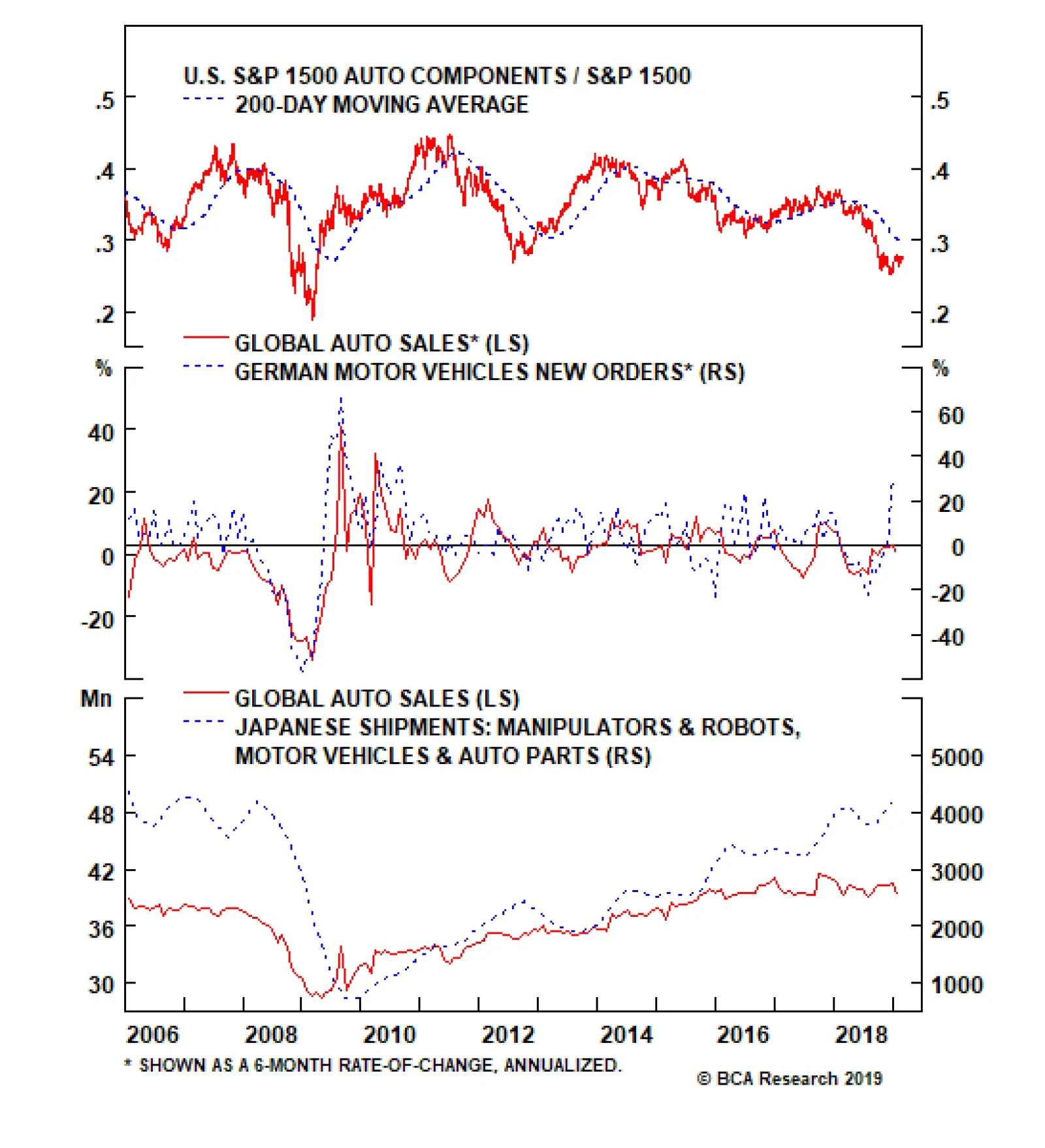
So should investors take some chips off the table given this macro backdrop? Prior to answering the question, as a reminder, BCA’s view remains that the business cycle is alive and well and there is no recession on a cyclical time horizon. Therefore, equities should be higher in the coming 9-12 months. Our end-2019 SPX target remains at 3,000 based on $181 EPS for calendar year 2020 assuming a 16.5 multiple.4 Nevertheless from a shorter-term perspective, we would refrain from committing fresh capital to this market, as we believe a better entry point lies ahead. Tactically, this market now needs a breather to digest the V-shaped formation since last December’s G20 meeting, before it resumes its bull run. In addition, we would book gains on any alpha generating tactical trades; today we crystalize 16% gains in the S&P semi equipment tactical overweight position since the December 17, 2018 inception and downgrade to neutral. This week, we book handsome profits on a long-held underweight in a consumer discretionary subindex that Trump’s hawkish tariff rhetoric and actions have badly wounded. We also update a materials subsector that benefits from the ongoing global reflationary impulse. Auto Components: Aiming For Pole Position? We have successfully ridden down the S&P 1500 components index on a structural basis over the past four years. But now, factors are falling into place for an end to this multi-year bloodbath. We are lifting exposure to neutral from underweight, locking in relative gains of 36% since inception. Global auto sales are the main driver of auto components profits, thus identifying where we stand in the global auto sales cycle is key. Bellwether German automakers have been caught in an emissions-related downdraft with “Dieselgate” weighing heavily on this sector when new emissions-test procedures were implemented last quarter. The top panel of Chart 5 shows that the worst is likely behind this drubbing in German automobile production as new orders have recently gone vertical. Backlogs are also sky-high and suggest that a definitive turn looms in German motor vehicle output. The upshot is that global auto sales may come out of their recent funk. Chart 5Global Auto Sales Are About To Turn
Global Auto Sales Are About To Turn
Global Auto Sales Are About To Turn
The Japanese car industry, the other global heavyweight, also suffered a minor setback last year, but leading indicators of Japanese auto production are also ticking higher. Japanese industrial robot shipments are at fresh cyclical highs and signal that global auto sales will hook up (bottom panel, Chart 5). In the U.S., light vehicle sales have been stable over the past five years, but auto industrial production growth has been roaring, rising 40 percentage points from the manufacturing recession trough (second panel, Chart 6). Chart 6Improving…
Improving…
Improving…
All of this paints a brightening backdrop for U.S. auto components manufacturers. Indeed, auto components new orders are at all-time highs (middle panel, Chart 7), at a time when inventories remain tame. In fact the new orders-to-inventories ratio sits squarely above one and continues to firm, with unfilled orders also at all-time highs (Chart 8). As a result, selling prices are accelerating at a healthy clip (third panel, Chart 6). The upshot is that industry profits will likely overwhelm. Chart 7…Operating…
…Operating…
…Operating…
Chart 8...Auto Component Metrics
...Auto Component Metrics
...Auto Component Metrics
On the domestic demand front, the latest Conference Board consumer confidence release showed that consumers’ plans to purchase a car remain upbeat, and could serve as a catalyst to unlock excellent relative value (bottom panel, Chart 7). With regard to President Trump’s hawkish tariff rhetoric and the ongoing U.S./China trade tussle, automobile components makers have taken a big hit. But, there are high odds of an end to the U.S./China trade dispute. Tack on a softening greenback courtesy of a more dovish Fed. U.S. auto components producers will likely grab a larger slice of the global auto parts revenue pie (top panel, Chart 7). Despite these tailwinds, investors have relentlessly avoided auto component stocks. Technicals remain washed out and industry valuations are a small fraction of the broad market and below the historical mean as per the relative price-to-sales ratio (Chart 9). Chart 9Cheap And Oversold…
Cheap And Oversold…
Cheap And Oversold…
Nevertheless, we refrain from turning outright bullish on this consumer discretionary subsector given the following risks: First, auto loan delinquencies are increasing rapidly, approaching last cycle’s peak. Second, car financing interest rates are still rising, which, at the margin, dents demand for new car sales. Third, auto credit growth is decelerating and demand for auto loans is also anemic according to the Fed’s latest Senior Loan Officer survey (Chart 10). This stands in marked contrast to the aforementioned Conference Board’s survey of consumers’ plans to buy a car. Finally, were President Trump to proceed with auto tariffs on European car manufacturers once he strikes a deal with China, U.S. auto parts producers will suffer a setback. Chart 10…But There Are Some Risks
…But There Are Some Risks
…But There Are Some Risks
Netting it all out, the easy money has already been made by shying away from auto component manufacturers. Firming leading indicators of global auto sales, upbeat auto components industry operating metrics, a softening U.S. dollar, the looming truce in the U.S./China trade spat and depressed relative technicals and valuations all suggest that it no longer pays to be bearish the S&P 1500 auto components index. Bottom Line: Lift the S&P 1500 auto components index to neutral and crystalize gains of 36% today. The ticker symbols for the stocks in this index are: BLBG: S15AUTC – APTV, BWA, GNTX, GT, DAN, VC, FOXF, DORM, LCII, DJPH, AXL, ADNT, CTB, THRM, GTX, SMP, CPS, MPAA, SUP. A Modest Gold Portfolio Hedge Still Makes Sense Within our broad-based U.S. equity sector and subsector coverage, we continue to recommend a modest gold-related hedge via being overweight the global gold mining index (given that the S&P gold index only comprises a single stock) versus the MSCI All-Country World Index, expressed through the long GDX:US/short ACWI:US exchange traded funds. There is compelling evidence that gold bullion is a reliable reflationary gauge. The shiny metal troughed in mid-August, leading even the JP Morgan EM FX index. Since then, it has been in an uninterrupted run rising over $180/oz. or 15% and sniffing out a reflationary impulse. Not only is there a tight inverse correlation with the trade-weighted U.S. dollar, but over the past three years the Chinese renminbi also moves in close lockstep with gold (Chart 11). Now that Chinese policymakers have opened the credit spigots (January credit data revealed the largest ever month-over-month loan increase in the history of the data, please refer to the second panel of Chart 2 in last week’s publication)5 reflating their economy, there are high odds that gold can break out of its past five year trading range in a bullish fashion. Chart 11Gold Is Sniffing Out A Reflationary Impulse
Gold Is Sniffing Out A Reflationary Impulse
Gold Is Sniffing Out A Reflationary Impulse
Commodity sentiment and positioning data suggest that gold’s run up will prove durable and continue to underpin the relative share price ratio (second & third panels, Chart 12). Chart 12Bullish Bullion Positioning Underpins Global Gold Miners
Bullish Bullion Positioning Underpins Global Gold Miners
Bullish Bullion Positioning Underpins Global Gold Miners
Importantly, the precious metals industry has not stood still. It has embarked on a massive consolidation phase and the recent spike in M&A activity in global gold miners signals that there is more upside for relative share prices (top panel, Chart 12). But the good news does not stop there. Globally there is a slowdown that has infected a number of economies and BCA’s calculated Global ZEW economic sentiment index has lit a fire under gold mining stocks (Global ZEW shown inverted, second panel, Chart 13). The longer the global soft-patch lasts the longer Central Banks will remain on the sidelines or even ease monetary policy in order to rekindle growth. This macro backdrop represents fertile ground for gold and gold related equities (bottom panel, Chart 14). Chart 13Rising Uncertainty, Global Growth Softpatch And…
Rising Uncertainty, Global Growth Softpatch And…
Rising Uncertainty, Global Growth Softpatch And…
Chart 14…Falling Real Rates Are Excellent Gold Mining Supports
…Falling Real Rates Are Excellent Gold Mining Supports
…Falling Real Rates Are Excellent Gold Mining Supports
Keep in mind that gold bullion yields zero and the gold mining equities’ dividend yield trails the broad market by 100bps; thus, there is an opportunity cost to holding gold and gold related equities, especially now that even U.S. cash yields 2.5%. This explains the inverse correlation with real interest rates and the recent 30bps fall in the U.S. 10-year TIPS yield reinforces gold bullion and the relative share price ratio (TIPS yield shown inverted, middle panel, Chart 14). Moreover, the global policy uncertainty index is perking up given the ongoing U.S./China trade tussle (top panel, Chart 13), recent news of a no deal between the U.S. and North Korea and looming Brexit deadline. All of this underpins global gold stocks (top panel, Chart 13). Tack on the recent fear that gripped markets, and skyrocketing equity risk premia, and the ingredients are in place for additional gains in the relative share price ratio (third panel, Chart 13). While some semblance of normality has returned to global bourses year-to-date, fixed income investors do not share the euphoria their equity peers are emitting. Such a dichotomy favors global gold mining stocks. Finally, with regard to relative valuations and technicals, global gold equities remain in undervalued territory, but have recently recovered smartly from deeply oversold conditions (Chart 15). Chart 15Valuations Ready To Shine
Valuations Ready To Shine
Valuations Ready To Shine
In sum, gold bullion is sniffing out a reflationary impulse that is bullish for global gold mining equities. The global economic soft patch that is exerting downward pressure on real interest rates, a soft U.S. dollar and rising global policy uncertainty, all signal that it still makes sense to hold a global gold mining equity portfolio hedge. Bottom Line: Stay overweight the global gold miners index (long GDX:US/short ACWI:US), and remove the downgrade alert. Anastasios Avgeriou, U.S. Equity Strategist anastasios@bcaresearch.com Footnotes 1 Please see BCA U.S. Equity Strategy Weekly Report, “Trader’s Paradise” dated January 28, 2019,available at uses.bcaresearch.com. 2 https://us.spindices.com/documents/methodologies/methodology-sp-risk-parity-indices.pdf?force_download=true 3 Please see BCA U.S. Equity Strategy Report, “Icarus Moment” dated October 22, 2018, available at uses.bcaresearch.com. 4 Please see BCA U.S. Equity Strategy Report, “Catharsis” dated January 14, 2019, available at uses.bcaresearch.com. 5 Please see BCA U.S. Equity Strategy Report, “Reflationary Or Recessionary” dated February 25, 2019, available at uses.bcaresearch.com. Current Recommendations Current Trades Size And Style Views Favor value over growth Favor large over small caps
Korea’s dependence on the semiconductor sector has risen considerably in the past several years: Semiconductor exports have risen from under 10% to slightly above 20% of total goods exports. On the demand front, memory demand from the global smartphone…
Feature The GAA DM Equity Country Allocation model is updated as of February 28, 2019. The quant model increased allocations to Spain, Italy, Sweden and Germany at the expense of the U.S., the Netherlands and Switzerland. As such, now the model underweights the U.S., Japan, the U.K, France, Canada (downgraded from overweight) and Australia, while overweighting Germany, Spain, Italy, Switzerland and Sweden (upgraded from underweight), as shown in Table 1. Table 1Model Allocation Vs. Benchmark Weights
GAA Quant Model Updates
GAA Quant Model Updates
As shown in Table 2 and Charts 1, 2 and 3, the overall model outperformed the MSCI World benchmark by 18 bps in February, with a 54 bps of outperformance from the Level 2 model offset by a 9 bps of underperformance from Level 1. Since going live, the overall model has outperformed by 148 bps, with Level 2 outperforming by 267 bps and Level 1 outperforming by 29 bps. Table 2Performance (Total Returns In USD %)
GAA Quant Model Updates
GAA Quant Model Updates
Chart 1GAA DM Model Vs. MSCI World
GAA DM Model Vs. MSCI World
GAA DM Model Vs. MSCI World
Chart 2GAA U.S. Vs. Non U.S. Model (Level 1)
GAA U.S. Vs. Non U.S. Model (Level 1)
GAA U.S. Vs. Non U.S. Model (Level 1)
Chart 3GAA Non U.S. Model (Level 2)
GAA Non U.S. Model (Level 2)
GAA Non U.S. Model (Level 2)
Please see also the website http://gaa.bcaresearch.com/trades/allocation_performance. For more details on the models, please see Special Report, “Global Equity Allocation: Introducing The Developed Markets Country Allocation Model,” dated January 29, 2016, available at https://gaa.bcaresearch.com. Please note that the overall country and sector recommendations published in our Monthly Portfolio Update and Quarterly Portfolio Outlook use the results of these quantitative models as one input, but do not stick slavishly to them. We believe that models are a useful check, but structural changes and unquantifiable factors need to be considered too in making overall recommendations. GAA Equity Sector Selection Model We are happy to reintroduce the GAA Equity Sector Selection model after we suspended it as of October 2018 following the GICS adjustments to global sector composition. As noted in our September 2018 Special Alert and October 2018 Quarterly, the most notable changes occurred in the new Communication Services sector (previously known as Telecommunication Services) and the Information Technology sector, whereas the Consumer Discretionary sector had various yet insubstantial movements in and out of the sector. Having received historical performance of the revised data, we have retested and adjusted various inputs in the model to match the cyclicality of the revised sectors. We were able to backtest the model to only June 2008 as this was the starting point of the revised data. Given the nature of firms that are now included in the global Communication Services sector, we revised our classification of this sector from a defensive to a cyclical. Hence, it will be positively impacted by the model’s growth component. Furthermore, we have introduced Real Estate as its own sector (following its removal from Financials in August 2016). Additionally, we have neutralized the impact of the liquidity component on the Real Estate sector; in other terms, we found no evidence that the Fed cycle affects this sector in any of its four phases. We also revised the valuations component by shortening the confirming signal of our technical indicator from a 12-month to a 6-month moving average. To properly assess the model’s adjusted performance, we have reset the “since going live date” to begin in March 2019. However, the historical backtested performance of the model will still be shown in Chart 4. Additionally, we show the old model’s performance vs. its benchmark (Table 3). Chart 4Overall Model Performance
Overall Model Performance
Overall Model Performance
Given the above, and following our Monthly Update that was released yesterday, the model corroborates our slightly cyclical stance by overweighting Industrials and Materials (Table 4). Additionally, the model’s biggest underweight shift from last month was on Consumer Staples as the momentum indicator significantly deteriorated. The model is overweight Utilities due to positive inputs from its momentum and liquidity components. Table 3Old Model’s Performance
GAA Quant Model Updates
GAA Quant Model Updates
Table 4Current Model Allocations
GAA Quant Model Updates
GAA Quant Model Updates
For more details on the model, please see the Special Report “Introducing The GAA Equity Sector Selection Model,” dated July 27, 2016, available at https://gaa.bcaresearch.com. Xiaoli Tang, Associate Vice President xiaoliT@bcaresearch.com Amr Hanafy, Research Associate amrh@bcaresearch.com
The Chip Cycle Is Turning
The Chip Cycle Is Turning
Neutral There are high odds that the chip cycle will soon take a turn for the better. Global chip sales have been decelerating for 17 months and are now on the cusp of contraction (middle panel). Over the past two decades, steep contractions have been associated with recession. Given that BCA’s view does not call for recession this year, it is highly unlikely for global semi sales to suffer a major setback. While we do not rule out a brief and shallow dip below zero similar to the 2011/12 and 2015/16 parallels, leading indicators of global semi sales suggest that a trough is near. Namely, BCA’s Global Leading Economic Indicator (GLEI) diffusion index is in a V-shaped recovery signaling that global growth is close to a nadir (middle panel). Similarly the U.S. dollar is decelerating which is a boon to global growth and conducive to higher global chip sales (trade-weighted U.S. dollar shown inverted, bottom panel). Bottom Line: In Monday’s Weekly Report, we lifted the S&P semiconductors index to neutral and added it to our upgrade watch list; we are looking for an opportunity to boost to overweight on a pullback, stay tuned. Finally, from a risk management perspective we increased our trailing stop to 15% in our tactical overweight in the S&P semi equipment index, in order to protect gains. The ticker symbols for the stocks in the S&P semiconductors index are: BLBG: S5SECO – INTC, AVGO, TXN, NVDA, QCOM, MU, ADI, XLNX, AMD, MCHP, MXIM, SWKS, QRVO.
The U.S. Equity Strategy team recently upgraded the S&P materials index to overweight via boosting the steel index to an above benchmark allocation and subsequently they also put on a market-neutral trade: long materials / short utilities. They are…