Sectors

Highlights Duration: The U.S. economic data show few signs of restrictive monetary policy, despite the fact that the market is now priced for an end to the Fed’s rate hike cycle. Investors should position for further rate hikes this year. Practically, this means keeping portfolio duration low and avoiding the 5-year/7-year part of the Treasury curve. Corporate Spreads: Corporate breakeven spreads are too wide for this phase of the cycle, especially for the Baa and junk credit tiers. Our default-adjusted spread shows that high-yield bonds offer adequate compensation for default losses, in line with the historical average. Corporate Defaults: A simple model using gross nonfinancial corporate leverage pegs fair value for the 12-month speculative grade default rate at 4.1%. This fair value estimate should decline slightly in the months ahead, as long as pre-tax profit growth stays above 7%, the approximate rate of debt growth. Feature Fed rate hikes have been completely priced out of the curve. As of last Friday’s close, the overnight index swap market was priced for 2 basis points of rate hikes during the next 12 months and 9 bps of cuts during the next 24 months (Chart 1). The sharp drop in rate hike expectations is an overreaction, and investors should position for a near-term rise in rate expectations. The Fed’s rate hike cycle still has room to run before interest rates peak. Chart 1Market Says "No More Hikes"
Market Says "No More Hikes"
Market Says "No More Hikes"
In this week’s report we survey the recent economic data, searching for any signal that interest rates are high enough to choke off the recovery. We conclude that monetary conditions remain accommodative, and that the Fed’s rate hike cycle will re-start in the second half of this year. Searching For Signs Of Tight Money Policymakers frequently talk about the concept of the neutral (or equilibrium) fed funds rate. In essence, the neutral rate is the interest rate that is consistent with trend economic growth and stable inflation. If the fed funds rate is set above neutral, then we should expect growth to slow and inflation to fall. Conversely, if the fed funds rate is set below neutral, we should expect growth to accelerate and inflation to rise. The slope of the yield curve can help distill this concept for bond investors. An inverted yield curve signals that the market is priced for interest rate cuts in the future. This is what we would expect to see in an environment where the fed funds rate is above neutral and monetary conditions are restrictive. Conversely, a very steep yield curve means that investors expect rate hikes in the future. This is usually consistent with accommodative monetary policy and an interest rate well below neutral. We find the neutral rate to be a useful concept, though like Fed Chairman Powell we think it is unwise to place too much stock in point estimates of its level.1 Such estimates are very difficult to make in real time, and tend to be heavily revised with hindsight.2 For investors, a wiser strategy is to look for signs in the economic data that interest rates are too high, and to use those signs to decide when interest rates have peaked for the cycle. We review a few of those potential signs below. Nominal GDP Growth One simple signal of restrictive monetary policy is when interest rates rise above the year-over-year growth rate in nominal GDP. In the last cycle, Treasury returns versus cash didn’t move materially higher until after year-over-year nominal GDP growth was below both the 10-year Treasury yield and the 3-month T-bill rate (Chart 2). At present, year-over-year nominal GDP growth is running at 5.5%. Though it is very likely to slow during the next few quarters, it still has a long way to go before it falls below 2.76%, the current 10-year Treasury yield. Chart 2GDP Growth Suggests That Monetary Policy Remains Accommodative
GDP Growth Suggests That Monetary Policy Remains Accommodative
GDP Growth Suggests That Monetary Policy Remains Accommodative
Verdict: An assessment of nominal GDP growth shows that monetary policy remains accommodative. The Housing Market Given that the mortgage market provides the most direct link between interest rates and real economic activity, it makes sense that signs of tight money might show up first in the housing data. Empirical investigation backs up this claim. As was observed by Edward Leamer in his 2007 paper, of the ten post-WWII U.S. recessions, eight were preceded by a significant slowdown in residential investment.3 Our own reading of the data is consistent with this message. Downtrends in the 12-month moving averages of both single-family housing starts and new home sales preceded inflection points higher in excess Treasury returns in each of the past two cycles (Chart 3). Chart 3No Signal From Housing
No Signal From Housing
No Signal From Housing
While these housing metrics certainly deteriorated during the past nine months, it appears that the worst is now behind us. The recent moderation in mortgage rates has already led to a significant bounce in mortgage purchase applications and a pop in homebuilder confidence (Chart 4). This will translate into increased housing starts and new home sales during the next few months. Chart 4Housing Rebound Underway
Housing Rebound Underway
Housing Rebound Underway
Verdict: The housing data are most likely consistent with still-accommodative monetary policy. However, if single-family housing starts and new home sales do not respond as expected to the recent drop in the mortgage rate, then we will be forced to re-visit this view. The Labor Market Of all the available labor market statistics, initial unemployment claims tend to be the most leading and have historically provided the best signal of tight monetary conditions. In each of the past two cycles a significant increase in jobless claims has coincided with the inflection point higher in Treasury excess returns (Chart 5). While there was some concern toward the end of last year that claims were trending up, this has now been dashed and claims actually fell below 200k last week. Notice in Chart 5 that the 13-week change in claims remains negative. In prior cycles it rose above zero around the same time that Treasury returns started to improve.. Chart 5No Signal From Labor Market
No Signal From Labor Market
No Signal From Labor Market
Verdict: The labor market data remain consistent with accommodative monetary policy. Bottom Line: It seems very likely that U.S. monetary policy remains accommodative. Nominal GDP growth and the labor market both strongly support this claim. The housing data have been weaker, but are already showing signs of rebounding. The implication for bond investors is that the Fed is not done lifting interest rates, even though the market is priced for exactly that outcome. Investors should maintain below-benchmark portfolio duration on the view that rate hikes will re-start in the second half of this year. The 5-year/7-year part of the Treasury curve is especially vulnerable to an increase in rate hike expectations. Investors should avoid this part of the curve, focusing on the very long and short maturities.4 The Weakness Is Global The analysis in the above section begs the question: If the economic data do not suggest that monetary policy is restrictive, then why is the market priced for an end to the Fed’s rate hike cycle? The answer is that everything is not rosy in the economic outlook. Specifically, we have already seen a significant slowdown in non-U.S. economic growth that weighed significantly on financial markets near the end of last year and is starting to impact the most externally-exposed segments of the U.S. economy. Chart 6 shows that a slowdown in the Global ex. U.S. Leading Economic Indicator (LEI) is now dragging the U.S. LEI down with it. Chart 6Global Weakness Infects U.S.
Global Weakness Infects U.S.
Global Weakness Infects U.S.
Not surprisingly, the components of the U.S. LEI that have weakened are those related to financial markets and the corporate sector. Given that corporate profits are determined globally, a slowdown in global growth often shows up first in downward revisions to investors’ corporate profit expectations. This weighs on equity prices and causes business owners to re-assess their future investment plans. Consistent with this narrative, we have seen significant downward moves in ISM New Orders and NFIB Capital Spending Plans, shown averaged together in the top panel of Chart 7. Capital spending plans as reported in regional Fed surveys have also moderated (Chart 7, panel 2), and CEO confidence has plunged (Chart 7, bottom panel). All of these indicators suggest that weaker global growth will weigh on the nonresidential investment component of U.S. GDP during the next few quarters. Chart 7Weaker Nonresidential Investment...
Weaker Nonresidential Investment...
Weaker Nonresidential Investment...
But while corporate investment is poised to weaken, the U.S. consumer is in rude health (Chart 8). Core retail sales are growing strongly, though the most recent data only extend through November. For more timely data we can look at the Johnson Redbook measure of same-store sales which has accelerated into the New Year (Chart 8, top panel). The University of Michigan survey of consumers shows that expectations dipped last month (Chart 8, panel 2), but also that consumers still view current conditions as extremely positive (Chart 8, bottom panel). Chart 8...And Resilient Consumer Spending
...And Resilient Consumer Spending
...And Resilient Consumer Spending
The overall picture is reminiscent of 2015/16. The U.S. consumer and labor market are in good shape, but slowing foreign growth and a strong U.S. dollar are weighing on the corporate profit outlook and U.S. corporate investment spending. As in 2016, the solution is for the Fed to temporarily pause its rate hike cycle. This will allow the dollar’s uptrend to moderate and will take some pressure off the corporate profit and investment outlooks. With a Fed pause discounted in the market, the conditions are already in place for renewed optimism on the corporate sector. It is for this reason that we upgraded our recommended allocation to corporate bonds two weeks ago.5 We expect this optimism will cause financial conditions to ease during the next few months, allowing the Fed to resume its rate hike cycle in the second half of this year. Corporate Bond Valuation Update As mentioned above, we increased our recommended exposure to corporate credit (both investment grade and junk) two weeks ago, partly due to valuations that had become too attractive to pass up. The Breakeven Spread One of our preferred valuation techniques is to look at 12-month breakeven spreads for each corporate credit tier as a percentile rank versus history.6 We like this method for three reasons: First, focusing on each individual credit tier controls for the fact that the average credit rating of bond indexes can change over time. Second, using the breakeven spread instead of the average index option-adjusted spread allows us to control for the changing average duration of the bond indexes. Finally, we find that the percentile rank is often a better representation of credit spreads than the spread itself. This is because credit spreads often tighten to very low levels and then remain tight for an extended period of time. By showing us the percentage of time that a given spread has been tighter than its current level, the percentile rank gives a better sense of this pattern than the actual spread. At present, Baa-rated debt and all junk credit tiers have 12-month breakeven spreads at or above their historical medians. Aa and A rated bonds have breakeven spreads that rank near the 40th percentile, and Aaa-rated debt remains expensive with a 12-month breakeven spread below the 10th percentile since 1989. To appreciate how cheap these spreads are, especially for Baa-rated and junk credits, consider that the current 12-month breakeven spread for a Baa-rated corporate bond is 24 bps (Chart 9). In our analysis of the different phases of the economic cycle, we determined that in an environment where the slope of the 3/10 Treasury curve is between 0 bps and 50 bps (it is 18 bps today), the 12-month Baa-rated breakeven spread averages 18 bps.7 Chart 9Attractive Baa Valuation
Attractive Baa Valuation
Attractive Baa Valuation
Given current index duration, if the 12-month Baa-rated breakeven spread returned to the 18 bps level that is typical for this stage of the cycle, it would imply a tightening in the option-adjusted spread from 169 bps to 129 bps – a 40 bps tightening! Default-Adjusted Spread Another valuation measure to consider is our high-yield default-adjusted spread. This is the excess spread available in the high-yield index after subtracting expected default losses. To determine expected default losses we use Moody’s baseline forecast for the 12-month default rate and our own forecast for the 12-month recovery rate. At present, this gives us a default-adjusted spread of 237 bps, right in line with the historical average (Chart 10). In other words, if default losses during the next 12 months match those embedded in our calculation, then investors should expect an excess return that is in line with the historical average, assuming also no capital gains/losses from spread tightening/widening. Chart 10In Line With Historical Average
In Line With Historical Average
In Line With Historical Average
But how likely is it that default losses fall in line with that expectation? In its last Monthly Default Report, Moody’s revised its baseline 12-month default rate forecast up to 3.4%, from 2.6% previously. The new 3.4% forecast seems reasonable to us. A simple model of the 12-month trailing default rate based only on our measure of gross leverage for the nonfinancial corporate sector puts fair value for the 12-month default rate at 4.1% (Chart 11). Our measure of gross leverage is simply total debt divided by pre-tax profits. This measure fell during the past year because pre-tax profits grew by 17% and total debt grew by only 7%. Chart 11Default Expectations
Default Expectations
Default Expectations
Going forward, profit growth will almost certainly moderate during the next 12 months, driven by the combination of weaker global growth and rising wage pressures. However, it needs to fall a long way, to below 7%, before our measure of leverage starts to rise. In other words, a further slight decline in our measure of gross leverage is a reasonable expectation at the current juncture, which would bring the fair value from our simple default rate model close to the current Moody’s projection. All in all, our default-adjusted spread tells us that high-yield bonds offer historically average compensation given reasonable default expectations. Bottom Line: Corporate breakeven spreads are too wide for this phase of the cycle, especially for the Baa and junk credit tiers. Our default-adjusted spread shows that high-yield valuation is in line with the historical average, given a reasonable expectation for default losses. Overall, we conclude that corporate spreads are attractive at current levels and we recommend an overweight allocation to both investment grade and high-yield corporate debt in a U.S. bond portfolio. Ryan Swift, Vice President U.S. Bond Strategy rswift@bcaresearch.com Footnotes 1 Please see U.S. Bond Strategy Weekly Report, “The Powell Doctrine Emerges”, dated September 4, 2018, available at usbs.bcaresearch.com 2 Chairman Powell cites a few examples of this in his Jackson Hole address from last fall. https://www.federalreserve.gov/newsevents/speech/powell20180824a.htm 3 http://www.nber.org/papers/w13428 4 Please see U.S. Bond Strategy Weekly Report, “Don’t Position For Curve Inversion”, dated January 22, 2019, available at usbs.bcaresearch.com 5 Please see U.S. Bond Strategy Weekly Report, “Buy Corporate Credit”, dated January 15, 2019, available at usbs.bcaresearch.com 6 The 12-month breakeven spread is the spread widening required on a 12-month investment horizon for a corporate bond to break even with a duration-matched position in Treasury securities. It can be quickly approximated by dividing the bond’s option-adjusted spread by its duration. 7 For a more complete analysis of the economic cycle based on the slope of the yield curve please see U.S. Bond Strategy Special Report, “2019 Key Views: Implications For U.S. Fixed Income”, dated December 11, 2018, available at usbs.bcaresearch.com Fixed Income Sector Performance Recommended Portfolio Specification
Highlights Portfolio Strategy We highlight our top seven reasons of why it pays to initiate a long materials/short utilities pair trade this week. Enticing long-term residential real estate prospects, a vibrant labor market, the recent improvement in house affordability, encouraging industry operating metrics and rock bottom valuations, all signal that a durable advance looms for the S&P homebuilding index. Recent Changes Initiate a long S&P Materials/short S&P Utilities pair trade today on a tactical (3-6 month) horizon. Table 1
Trader's Paradise
Trader's Paradise
Feature The S&P 500 pierced through the 50-day moving average last week and managed to hold the line above this key technical level. Stocks are still absorbing the December shock, and our sense is that it may take a while before the SPX clears 2,800 where it faced stiff resistance all last year (Chart 1). This is a ripe trading environment. Chart 12,800 Is Stiff Resistance
2,800 Is Stiff Resistance
2,800 Is Stiff Resistance
However, in order for a breakout to materialize, we reiterate the three potential positive catalysts we identified last week: A continuation of the earnings juggernaut A positive U.S./China trade resolution A definitively more dovish Fed, which would help restrain the greenback On the earnings front, Charts 2 & 3 update our GICS1 sector EPS growth models with one caveat: due to a lack of data we continue to show telecom services instead of communications services. While most sectors are projected to decelerate following 2018’s fiscal easing-related profit growth boost, the energy sector is the one that clearly stands out. Chart 2Sector EPS Growth...
Sector EPS Growth...
Sector EPS Growth...
Chart 3...Models Update
...Models Update
...Models Update
Last week we highlighted that sell-side analysts are anticipating energy profits to contract in 2019;1 this is in line with our S&P energy EPS growth model that continues to point toward EPS contraction (third panel, Chart 2). Nevertheless, we expect upward surprises in this deep cyclical sector given BCA’s Commodity & Energy Strategy service bullish oil forecast for the year. With regard to the three profit heavyweight sectors, tech, financials and health care, our EPS growth models are more or less in line with the street’s estimates (please refer to Table 2 in last week’s Weekly Report). Tech profits in particular are kissing off the zero growth line according to our regression model (top panel, Chart 3), and we continue to recommend a barbell positioning approach, overweighting the S&P software (high-conviction) and tech hardware, storage & peripherals indexes at the expense of the S&P semiconductors index. As a reminder we are neutral the broad S&P tech sector. Beyond profit growth, looking at our S&P 500 GICS1 sector Valuation Indicator (VI) and Technical Indicator (TI) provides a more complete sector positioning picture. Chart 4 is a valuation versus technical map of the 11 sectors, using our proprietary VI and TI as inputs. The map plots the VI on the y-axis and the TI on the x-axis. Both indicators depict Z-scores (please look forward to our upcoming Cyclical Indicator Update report that will highlight long-term GICS1 sector time series of our VI and TI).
Chart 4
The S&P utilities sector is the most stretched and simultaneously very expensive sector. Real estate is just behind utilities and we continue to dislike both of these niche interest rate-sensitive sectors. The S&P consumer discretionary sector also makes it in this top right quadrant and is the most expensive GICS1 sector; we remain underweight this early cyclical sector. On the flip side, energy, materials and financials populate the bottom left quadrant; as a reminder we are overweight all three sectors. The S&P energy sector is the most undervalued and unloved of all GICS1 sectors. Netting it all out, we continue to prefer deep cyclical to defensive sectors as we still see the most opportunity in this tilt on all three fronts: earnings, valuations and technicals. Importantly, most of the bad/negative China slowdown news is likely reflected in the downtrodden cyclical/defensive ratio and a slingshot recovery is looming (China slowdown story count shown inverted, bottom panel, Chart 5). Chart 5China Slowdown Baked In The Cake
China Slowdown Baked In The Cake
China Slowdown Baked In The Cake
In that light, this week we are initiating a new cyclical/defensive pair trade that is primed to generate alpha, and also update a niche early cyclical group. Buy Materials/Sell Utilities A playable market-neutral opportunity has resurfaced to buy materials at the expense of utilities stocks. Below we outline our top seven reasons why investors should put on this pair trade on a tactical (3-6 month) horizon. Chart 6The Dollar's Trough
The Dollar's Trough
The Dollar's Trough
While global growth is decelerating, this news is last year’s story, especially now that even the IMF came out and downgraded global output growth. This is contrarily positive as cyclical stocks have more than discounted a softer growth outlook. If anything, the surprise this year would be for global growth to pick up momentum on the back of a positive U.S./China trade dispute resolution. The top panel of Chart 6 shows our Global Trade Activity Indicator (GTAI) that is making an effort to trough. Historically, the GTAI has been an excellent leading indicator of the long materials/short utilities price ratio and the current message is that the latter has bottomed. As the Fed is backing off aggressively raising interest rates this year and this has dealt a modest blow to the U.S. dollar. As a reminder, a depreciating greenback is conducive to rising global growth and vice versa. Were the U.S. dollar to complete its reverse head and shoulders technical formation courtesy of a more dovish Fed, this will prove a boon for relative share prices (middle panel, Chart 6). Related to the softening currency is a pickup in commodity price inflation. In fact, already metal prices are outpacing natural gas prices. The latter is the marginal price setter for utilities. This relative pricing power gauge is signaling that the worst is behind this pair trade ratio and a relative profit-led advance is in the offing (bottom panel, Chart 6). While the China slowdown narrative is well telegraphed to the markets (Chart 5), there is increasing pressure on the Chinese to either strike a deal with the U.S. and resolve the trade tussle or put together a comprehensive fiscal package alongside the already easing monetary backdrop in order to aid their decelerating economy. Importantly, the V-shaped recovery in the Li Keqiang index is signaling that the opening of the monetary taps and up-to-now piecemeal fiscal easing are starting to pay dividends. The upshot is that materials have the upper hand versus utilities (Li Keqiang index shown advanced, Chart 7). Chart 7...Chinese Reflation...
...Chinese Reflation...
...Chinese Reflation...
Domestic conditions are also fertile ground for the relative share price ratio. While the ISM manufacturing survey took a beating last month, the latest release of the Philly Fed manufacturing business outlook ticked higher (both current activity and six-month forecast), reversing last month’s downbeat sentiment reading (Chart 8). BCA’s view remains that there will be no recession in 2019, which underpins materials at the expense of utilities. Chart 8...No U.S. Recession...
...No U.S. Recession...
...No U.S. Recession...
High-frequency financial market indicators also suggest that the path of least resistance is higher for this cyclicals vs. defensives share price ratio. Inflation expectations have rebounded following an over 50bps collapse late last year, and financial conditions have also started to ease, partially reversing December’s spike (Chart 9). At the margin, materials are an inflation beneficiary/hedge and also investors shed defensive utilities stocks when financial conditions start to ease (junk bond spread shown inverted, bottom panel, Chart 9). Finally, our EPS growth models do an excellent job in capturing all these relative macro drivers and underscore that a reversal in bombed out technicals and depressed valuations looms (Chart 10). Chart 9...Financial Market Indicators...
...Financial Market Indicators...
...Financial Market Indicators...
Chart 10...And Compelling Valuations & Technicals Say Buy Materials/Sell Utilities
...And Compelling Valuations & Technicals Say Buy Materials/Sell Utilities
...And Compelling Valuations & Technicals Say Buy Materials/Sell Utilities
In sum, a softer U.S. dollar, positive global/China growth surprises, commodity price inflation, an easing in financial conditions and no 2019 U.S. recession, all suggest that a relative earnings led advance will unlock excellent relative value and push the materials/utilities ratio higher in the coming months. Bottom Line: Initiate a new long S&P materials/short S&P utilities pair trade today on a tactical (3-6 month) horizon. Will Homebuilders Go Through The Roof? While we were admittedly a bit early in buying homebuilders in late-September, relative share prices have come full circle and are in the black since inception.2 We maintain our overweight stance in this niche consumer discretionary sub index and reiterate our long S&P homebuilding/short S&P home improvement retail pair trade that we initiated last week.3 Domestic long-term housing prospects remain compelling, especially given that the GFC wrung out all the residential real estate excesses. Currently, household formation is still running higher than housing starts and building permits (top panel, Chart 11). Similarly the homeownership ratio remains low by historical standards (it has yet to return to the long-term mean, not shown) and suggests that there is pent up housing demand. Chart 11Robust Long-term Housing Fundamentals
Robust Long-term Housing Fundamentals
Robust Long-term Housing Fundamentals
Further, housing valuations are not pricey as both the price-to-rent and price-to-income ratios are a far cry from the 2005/06 peak (bottom panel, Chart 11). BCA’s view remains that wages will continue to rise this year and the economy will avoid recession. Historically, a vibrant labor market and residential construction are joined at the hip (unemployment rate and unemployment insurance claims shown inverted, Chart 12). Chart 12Labor Market And Residential Construction Move In Lockstep
Labor Market And Residential Construction Move In Lockstep
Labor Market And Residential Construction Move In Lockstep
Tack on the recent fall in the 30-year fixed mortgage rate courtesy of a marginally more dovish Fed, and first-time home buyers will return this spring selling season (second panel, Chart 11). Already there is tentative evidence that potential home-owners have rushed to take advantage of the near 50bps drop in interest rates since the early November peak. The Mortgage Bankers Association's (MBA) mortgage applications purchase survey hit a multi-year high this month and signals that the there is a long runway ahead for the S&P homebuilding share price ratio (bottom panel, Chart 13). Chart 13Buyers Are Coming Back
Buyers Are Coming Back
Buyers Are Coming Back
On the homebuilding operating front there are also some encouraging signs. Lumber prices, are down $300/tbf since mid-summer. This wholesale lumber liquidation phase provides profit margin relief to homebuilders given that framing lumber is a key input cost to housing construction (second panel, Chart 14). Chart 14Firming Operating Metrics
Firming Operating Metrics
Firming Operating Metrics
Importantly, bankers are still willing extenders of residential real estate credit according to the latest Fed Senior Loan Officer survey. Indeed, mortgage credit is expanding at a healthy clip and there are high odds that this recent pick up in mortgage loan origination will remain upbeat owing to the decrease in the price of credit (third & bottom panels, Chart 14). Finally, sell-side analysts’ exuberance on homebuilding profits has returned to earth and now industry long-term profit growth is trailing the overall market. This significantly lowered profit hurdle coupled with depressed relative valuations suggest that investors seeking early cyclical equity exposure can still park capital in homebuilding stocks (Chart 15). Chart 15Homebuilders Are Still Cheap
Homebuilders Are Still Cheap
Homebuilders Are Still Cheap
Adding it all up, enticing long-term residential real estate prospects, a vibrant labor market, the recent improvement in house affordability, encouraging industry operating metrics and rock bottom valuations, all signal that a durable advance looms for the S&P homebuilding index. Bottom Line: Maintain the overweight stance in the S&P homebuilding index. The ticker symbols for the stocks in this index are: BLBG: S5HOME – PHM, LEN, DHI. Anastasios Avgeriou, Vice President U.S. Equity Strategy anastasios@bcaresearch.com Footnotes 1 Please see BCA U.S. Equity Strategy Weekly Report, “Dissecting 2019 Earnings” dated January 22, 2019, available at uses.bcaresearch.com. 2 Please see BCA U.S. Equity Strategy Weekly Report, “Indurated” dated September 24, 2018, available at uses.bcaresearch.com. 3 Please see BCA U.S. Equity Strategy Weekly Report, “Dissecting 2019 Earnings” dated January 22, 2019, available at uses.bcaresearch.com. Current Recommendations Current Trades Size And Style Views Favor value over growth Favor large over small caps
Overweight Procter & Gamble (PG), the heavyweight of the S&P household products sector, delivered excellent results this week and raised their guidance, despite a forecast of a nearly $1 billion after-tax currency headwind to earnings this fiscal year. The principal driver was a push to raise prices across their segments that appears to have gained traction. Our macro indicators agree with PG’s guidance; household product sales have been pushing higher (second panel), driven by a resurgence in pricing power (second panel). Meanwhile, exports have continued their two-year ascent despite the aforementioned tough currency environment and the upshot is that relative EPS growth will likely remain upbeat (bottom panel). In light of challenged EM consumer spending growth, this signal is very encouraging. Bottom Line: Recovering sales in a harsh global environment and growing profits irrespective of currency headwinds point to outsized relative EPS growth should either of these offsets soften; stay overweight. The ticker symbols for the stocks in this index are: PG, CL, CLX, KMB.
Household Products Are Booming
Household Products Are Booming
Feature Conditions are falling into place in Brazil that will facilitate a recovery in physical property prices as well as the outperformance of real estate stocks. With the overall Brazilian equity index having rallied considerably, investors are now wondering which sectors of the market presently offer the most upside with the least risk. Our bias is that the risk-reward of property stocks is currently attractive both relative to the overall equity index as well as in absolute terms (Chart I-1). Chart I-1Good Risk-Or-Reward In Property Sector
Good Risk-Or-Reward In Property Sector
Good Risk-Or-Reward In Property Sector
As such, we recommend investors begin accumulating Brazilian real estate stocks on weakness and other proxies that stand to benefit from a revival in both residential and commercial property markets. The Macro Case For Real Estate Following years of severe depression, fertile ground for strong growth in Brazilian real estate and related assets is finally developing: Interest rates are falling, employment and incomes are rising, and credit availability is improving amid substantial pent-up demand for properties. Barring an outright failure by the government to adopt pension reforms, which would cause major financial market turbulence, the economy will continue on a recovery path (Chart I-2). Please see page 7 for more details. Chart I-2Domestic Demand Bottoming...
Domestic Demand Bottoming...
Domestic Demand Bottoming...
We upgraded our recommended allocation in Brazil from underweight to overweight across equity, fixed-income, currency and credit markets right after the October elections.1 We argued that the presidential election victory by pro-business candidate Jair Bolsonaro was set to revive sentiment and “animal spirits” among businesses, unleashing pent-up demand for capital expenditures and hiring. On the whole, the Brazilian economy is recovering from the most severe economic depression of the past several decades (Chart I-3). Consequently, there is a lot of pent-up demand for discretionary spending in general and properties in particular. Chart I-3...After The Worst Recession In Decades
...After The Worst Recession In Decades
...After The Worst Recession In Decades
Our view remains negative on Chinese growth and commodities. Historically, Brazilian financial markets have never sustainably diverged from commodities prices, as illustrated in Chart I-4. Nevertheless, going forward the odds that Brazilian domestic plays could decouple from commodities prices are non-trivial. Chart I-4Can Brazilian Financial Markets Decouple From Commodities?
Can Brazilian Financial Markets Decouple From Commodities?
Can Brazilian Financial Markets Decouple From Commodities?
Importantly, aggregate exports make up only 13% of Brazilian GDP (Chart I-5). This indicates that Brazil’s exposure to global demand in general and commodities in particular is not substantial. Besides, Brazil’s commodities exports are very diversified – overseas shipments of each commodity accounts for only a small portion of Brazilian exports and GDP (Table I-1). Chart I-5Brazil Is A Closed Economy!
Brazil Is A Closed Economy!
Brazil Is A Closed Economy!
Chart I-
In Brazil, the property market is one of the few sectors that is least exposed to global growth and most leveraged to local interest rates and household income growth. Hence, this sector stands to outperform in a scenario where global cyclicals and commodities fare poorly while domestic income and spending recover. Notably, real estate is the most leveraged play on falling real interest rates. The rationale for why real estate is more sensitive to real rather than nominal rates is as follows: Property prices benefit from higher inflation – higher inflation lifts nominal household income, which improves affordability for buyers and renters. In addition, investors often buy properties as an inflation hedge. Provided property prices positively correlate with inflation but negatively correlate with nominal interest rates, it follows that they are very strongly inversely correlated with real (inflation-adjusted) interest rates. Confirming this, relative performance of property stocks to the overall market tracks real interest rate trends very closely (Chart I-6) Chart I-6Lower Real Rates Warrant Real Estate Stocks Outperformance
Lower Real Rates Warrant Real Estate Stocks Outperformance
Lower Real Rates Warrant Real Estate Stocks Outperformance
Yields on inflation-indexed bonds – real rates – have recently broken down (Chart I-7). If Congress adopts social security reforms in the coming months, real interest rates could drop further. Chart I-7Real Rates Have Fallen To All-Time Lows
Real Rates Have Fallen To All-Time Lows
Real Rates Have Fallen To All-Time Lows
In short, falling real rates will greatly benefit real estate prices and volumes. Some commentators might argue that Brazil’s low national savings rate will preclude real rates from falling. We discussed why a low national savings rate is not an impediment to a decline in real interest rates in our March 22, 2018 Special Report (please click on the link to access the report). Property Market: Post Depression… The majority of excesses have been wrung out of the physical property markets in Brazil over the past 5-6 years, and real estate prices and volumes are finally showing signs of recovery. Residential property prices have been flat in nominal terms over the past 5 years. Yet in real (inflation-adjusted) terms they have declined by 20%, and in U.S. dollar terms they are down 40% from their 2014 peak (Chart I-8). Chart I-8Apartment Prices Have Been Beaten Down Nationwide
Apartment Prices Have Been Beaten Down Nationwide
Apartment Prices Have Been Beaten Down Nationwide
Property sales and prices in São Paulo have already begun rising, but not in Rio de Janeiro (Chart I-9). Typically, bull markets begin in financial and business centers and then spread to other cities and regions. Chart I-9Brazil: Apartment Prices
Brazil: Apartment Prices
Brazil: Apartment Prices
Over the past two days, during our visit to clients in São Paulo, we witnessed very few cranes. Even in this financial and business center, property construction/supply remains extremely subdued. Vacancy rates in office spaces, residential property inventories, and the average sales time are all starting to fall (Chart I-10). These are all early signposts of revival. Chart I-10Signs Of Life
Signs Of Life
Signs Of Life
Notably, the consumer debt-servicing ratio has fallen due to lower interest rates (Chart I-11). Mortgage rates remain high relative to the (SELIC) policy rate. However, odds are that this spread will narrow as confidence and appetite for mortgage lending among banks improves. Chart I-11Diminishing Household Debt Stress
Diminishing Household Debt Stress
Diminishing Household Debt Stress
Bottom Line: Overall residential property prices across Brazil’s 11 largest metropolitan areas are slowly starting to rise in nominal but not in real terms yet (Chart I-12). The recovery is only beginning to take shape. Chart I-12Property Price Deflation Is Ending
Property Price Deflation Is Ending
Property Price Deflation Is Ending
Pension Reforms Hold The Key At the moment, we believe pension reforms – not commodities prices – are the key to sustaining the positive momentum behind Brazil’s financial markets and economy. If Bolsonaro introduces pension legislation immediately, while his political capital is still high, then it will be a market-positive development. However, it is difficult to determine the odds of the passage of the social security reform bill, and the form in which it will be adopted. On one hand, the Brazilian Congress is as fragmented as ever. Bolsonaro’s PSL party holds only 52 seats, or 10% of the total. This means that the president has to convince 256 congressmen outside his party to vote for pension reforms in order to get the 308 votes required to pass this constitutional amendment (Chart I-13). His attempt to find a new way to form a coalition may backfire, at least initially, and he will also face obstructionist voting behavior from minor parties.
Chart I-13
On the other hand, Brazilian presidents eventually tend to succeed in forming coalitions that comprise a majority of seats. On paper, right-leaning parties have slightly more seats than the three-fifths majority needed for constitutional changes in the Chamber of Deputies. Moreover, many congressmen are new faces in politics and represent small parties. They have little political experience and may not go against a popular president at the very early stages of their congressional terms. It is reasonable to assume that they could side with the president and vote for the pension reforms, for several reasons: (1) distancing themselves from Bolsonaro may not help their own popularity; and (2) voters may well be focused on issues other than unpalatable pension reforms four years from now if the economy is doing well. Hence, voting for the pension reforms early in their term may be a reasonable political strategy for them. Importantly, it seems these reforms have the initial backing of both the military and the police establishments, even though their pensions will be negatively impacted by the changes. Specifically, Vice President and retired general Hamilton Mourão has hinted at the army’s and police’s support of the upcoming social security reforms proposal. In brief, the adoption of pension reforms will create positive tailwinds for investor and business sentiment and in turn support the economic recovery. Investment Recommendation Brazilian stocks have lately exhibited a low correlation with the EM overall equity index. This gives us comfort in arguing that even if our negative view on EM risk assets plays out, Brazilian domestic equity plays will likely have only moderate downside in absolute terms, and certainly outperform the EM equity benchmark on a relative basis. Therefore, we recommend investors begin accumulating Brazilian real estate stocks on weakness. Even though their valuations are not cheap, rising revenue and cash flow will improve their valuation metrics and boost their share prices. With respect to sector composition, the Brazilian real estate sector is comprised of 27 listed firms: 15 listed homebuilders, 7 mall operators, 3 commercial properties and 2 brokers.2 Their total market cap relative to the Bovespa is now around 1.2% – down from 2.4% in 2012 (Chart I-14). We recommend buying a mix of these companies to gain exposure to various parts of the Brazilian property market. Chart I-14More Upside In Real Estate Stocks
bca.ems_sr_2019_01_24_s1_c14
bca.ems_sr_2019_01_24_s1_c14
Arthur Budaghyan, Senior Vice President Emerging Markets Strategy arthurb@bcaresearch.com Andrija Vesic, Research Analyst andrijav@bcaresearch.com Footnotes 1 Please see Emerging Markets Strategy Special Alert "Brazil: A Regime Shift?" dated October 9, 2018, available on page 12. 2 We used the BM&FBOVESPA Real Estate Index (IMOB) in Chart 14. The Real Estate Index (IMOB) is compiled as a weighted average of 13 stocks. For more detail, please refer to: http://www.b3.com.br/en_us/market-data-and-indices/indices/indices-de-segmentos-e-setoriais/real-estate-index-imob.htm Equity Recommendations Fixed-Income, Credit And Currency Recommendations
Highlights The Eurostoxx600’s short bursts of outperformance require either global technology to underperform or the euro to underperform. EM’s short bursts of outperformance usually coincide with the global healthcare sector’s short bursts of underperformance. Remain tactically overweight to Europe and EM, but expect to reverse position later in the year. The ECB is justified in setting an accommodative monetary policy, but it is not justified in setting an ultra-accommodative monetary policy. Soft inflation prints will cap the extent to which bond yields can rise in the near term. Italian BTPs are an attractive long-term proposition, especially relative to other euro area bonds. Feature Chart of the WeekEuro Area Inflation Appears To Be Underperforming...
Euro Area Inflation Appears To Be Underperforming... ...But Adjusted For Its 'Negative Space' It Is Not
Euro Area Inflation Appears To Be Underperforming... ...But Adjusted For Its 'Negative Space' It Is Not
...But Adjusted For Its 'Negative Space' It Is Not
Euro Area Inflation Appears To Be Underperforming... ...But Adjusted For Its 'Negative Space' It Is Not
Euro Area Inflation Appears To Be Underperforming... ...But Adjusted For Its 'Negative Space' It Is Not
“The music is not in the notes, but in the silence between” – Wolfgang Amadeus Mozart As Mozart pointed out, true awareness lies not in appreciating what is there, but in appreciating what is not there. This is the concept of ‘negative space’: to understand an object, you have to understand the empty space that defines it. This week’s report extends the concept of negative space into the fields of investment and economics to make more sense of Europe’s recent past and its future. The Negative Space In Stock Markets Picking stock markets is a relative game. This means that what a stock market does not contain – its negative space – is often more important than what it does contain (Table I-1). This is not an abstract proposition, it is a mathematical truth. When a major global sector is strongly outperforming, a stock market’s zero or near-zero exposure to that sector will create a strong headwind to relative performance. And when the major sector is underperforming, its absence in the stock market will necessarily create a strong tailwind to relative performance.
Chart I-
For the European stock market, the negative space is technology, a sector in which European equities have a near-zero exposure. But there is another factor to consider: the currency. The technology sector’s global profits are mostly translated into shares quoted in dollars, while European equities’ global profits are mostly translated into shares quoted in euros. It follows that the Eurostoxx600’s short bursts of outperformance require at least one of the following two conditions (Chart I-2): Chart I-2The Eurostoxx600 Usually Outperforms When Technology Underperforms
The Eurostoxx600 Outperforms When Technology Underperforms
The Eurostoxx600 Outperforms When Technology Underperforms
Technology to underperform. Or: The euro to underperform. For emerging market (EM) equities, the negative space is healthcare, a sector in which EM has a near-zero exposure. Therefore unsurprisingly, EM’s short bursts of outperformance usually coincide with the healthcare sector’s short bursts of underperformance (Chart I-3). Sceptics will raise an obvious question: what is the cause and what is the effect? The answer is that sometimes EM is the driver of healthcare relative performance, and at other times vice-versa. Chart I-3EM Usually Outperforms When Healthcare Underperforms
EM Outperforms When Healthcare Underperforms
EM Outperforms When Healthcare Underperforms
A sharp slowdown emanating from emerging economies would undoubtedly drag down global equities. In the ensuing bear market, the more defensive healthcare sector would almost certainly outperform the financials. Under these circumstances the direction of causality would clearly be from EM to healthcare’s relative performance. On the other hand, absent a major bear market, in a common or garden reassessment of sector relative valuations versus their growth prospects, the causality would run in the other direction: sector rotation would drive the relative performance of equity markets: healthcare’s underperformance would help EM to outperform; and technology’s underperformance would help European equities to outperform. As we have explained in recent reports, the major sectors – and therefore the major stock markets – are now in this latter configuration in a brief countertrend burst before reverting to their structural trends later this year (Chart I-4 and Chart I-5). So for the time being, remain tactically overweight to Europe and to EM.1 Chart I-4The Eurostoxx600 Outperformance Is A Countertrend Burst
The Eurostoxx600 Outperformance Is A Countertrend Burst
The Eurostoxx600 Outperformance Is A Countertrend Burst
Chart I-5The EM Outperformance Is A Countertrend Burst
The EM Outperformance Is A Countertrend Burst
The EM Outperformance Is A Countertrend Burst
The Negative Space In European Inflation And Unemployment On the face of it, inflation is structurally underperforming in the euro area versus the U.S. But on closer examination this is only because of what the euro area harmonised index of consumer prices (HICP) does not contain: owner occupied housing costs – which tend to rise faster than other items in the price basket. Adjusting for this negative space in the HICP, the euro area and the U.S. have both achieved the exact same modest structural inflation, which their central banks define as ‘price stability’ (Chart of the Week). In a similar vein, the unemployment rate disregards changes in the labour participation rate. When people join the labour force – as they are in their tens of millions in Europe (Chart I-6) – the joining cohort tends to have a slightly higher unemployment rate given its inexperience in the formal labour market. So the joiners tend to lift the overall unemployment rate too. The paradox is that the percentage of the working age (15-74) population in employment also rises at the same time. Looking at this alternative measure of labour market health, the euro area employment market is in a structural uptrend and much healthier than it was at the peak of the last cycle in 2008 (Chart I-7). Chart I-6Europeans Are Joining The Labour Force In Their Tens Of Millions
Europeans Are Joining The Labour Force In Their Tens Of Millions
Europeans Are Joining The Labour Force In Their Tens Of Millions
Chart I-7The European Employment To Population Ratio Is In A Structural Uptrend
The European Employment To Population Ratio Is In A Structural Uptrend
The European Employment To Population Ratio Is In A Structural Uptrend
Hence, once we adjust for what is missing in euro area inflation and the euro area unemployment rate, neither inflation nor employment market performance appear to be too cold or too hot. This means that the ECB is justified in setting an accommodative monetary policy, but it is not justified in setting an ultra-accommodative monetary policy. The Negative Space In Monetary Policy The negative space in monetary policy is literally the negative space, by which we mean that interest rates cannot go deeply into negative territory. With the deposit rate already at -0.4 percent, the ECB’s room for manoeuvre in the dovish direction is limited. On the other hand, neither can monetary policy get meaningfully hawkish in the near term. The simple reason is that the ECB, like other central banks, is now even more wedded to ‘data-dependency’. The problem with this is that the data on which the central banks depend is always backward-looking. So policy will reflect what was happening one or two months ago, rather than what is happening now. Specifically, the plunge in the price of crude oil will depress both headline and core inflation rates (Chart I-8). And the recent wobble in risk-asset prices has weighed down some sentiment surveys (Chart I-9). Having promised to be data-dependent, the central banks have effectively created ‘an algorithm’ for their policy setting, an algorithm which everyone can see and read. It follows that the data, especially soft inflation prints, will cap the extent to which bond yields can rise in the near term. Chart I-8The Plunge In The Price Of Crude Will Subdue Inflation
The Plunge In The Price Of Crude Will Subdue Inflation
The Plunge In The Price Of Crude Will Subdue Inflation
Chart I-9The Stock Market Sell-Off Hurt Sentiment
The Stock Market Sell-Off Hurt Sentiment
The Stock Market Sell-Off Hurt Sentiment
However, core euro area bonds are an unattractive long-term proposition. When yields are so close to their lower bound, there is little scope for a capital gain, even in a crisis. Whereas the scope for a capital loss is considerably greater. By contrast, Italian BTPs are an attractive long-term proposition, especially relative to other euro area bonds. Almost all of the 2.75 percent yield on 10-year BTPs is a premium for euro break-up risk. Yet the populists in Italy do not want to break up the euro. And despite their rhetoric, neither do the populists in the core countries. To understand why, we must explain the negative space of ECB QE. When the ECB bought BTPs from Italian investors, what the Italian investors did not do was deposit the cash in Italian banks. Instead, they deposited it in German banks – something that we can see very clearly in the euro area’s mirror-image Target2 imbalances (Chart I-10). Chart I-10ECB QE Has Exacerbated The Target2 Imbalances
ECB QE Has Exacerbated The Target2 Imbalances
ECB QE Has Exacerbated The Target2 Imbalances
In effect, the core countries, through their equity in the Eurosystem, are holding a huge quantity of Italy’s €2.7 trillion of BTPs. Meaning that if the euro broke up, the core countries would be the ones picking up the tab. For the euro area’s future, this is the most important negative space of all. Dhaval Joshi, Senior Vice President Chief European Investment Strategist dhaval@bcaresearch.com Fractal Trading System* There are no new trades this week. But all four of our open trades – long PKR/INR, industrials versus utilities, litecoin and ethereum, and MIB versus Eurostoxx – are in profit. For any investment, excessive trend following and groupthink can reach a natural point of instability, at which point the established trend is highly likely to break down with or without an external catalyst. An early warning sign is the investment’s fractal dimension approaching its natural lower bound. Encouragingly, this trigger has consistently identified countertrend moves of various magnitudes across all asset classes. The post-June 9, 2016 fractal trading model rules are: When the fractal dimension approaches the lower limit after an investment has been in an established trend it is a potential trigger for a liquidity-triggered trend reversal. Therefore, open a countertrend position. The profit target is a one-third reversal of the preceding 13-week move. Apply a symmetrical stop-loss. Close the position at the profit target or stop-loss. Otherwise close the position after 13 weeks. Use the position size multiple to control risk. The position size will be smaller for more risky positions. * For more details please see the European Investment Strategy Special Report “Fractals, Liquidity & A Trading Model,” dated December 11, 2014, available at eis.bcaresearch.com Footnotes 1 Please see the European Investment Strategy Weekly Report, “Why 2019 Is The Mirror-Image Of 2018”, dated January 10, 2019, available at eis.bcaresearch.com. Fractal Trading Model Recommendations Asset Allocation Equity Regional and Country Allocation Equity Sector Allocation Bond and Interest Rate Allocation Currency and Other Allocation Closed Fractal Trades Trades Closed Trades Asset Performance Currency & Bond Equity Sector Country Equity Indicators Bond Yields Chart II-1Indicators To Watch - Bond Yields
Indicators To Watch - Bond Yields
Indicators To Watch - Bond Yields
Chart II-2Indicators To Watch - Bond Yields
Indicators To Watch - Bond Yields
Indicators To Watch - Bond Yields
Chart II-3Indicators To Watch - Bond Yields
Indicators To Watch - Bond Yields
Indicators To Watch - Bond Yields
Chart II-4Indicators To Watch - Bond Yields
Indicators To Watch - Bond Yields
Indicators To Watch - Bond Yields
Interest Rate Chart II-5Indicators To Watch - Interest Rate Expectations
Indicators To Watch - Interest Rate Expectations
Indicators To Watch - Interest Rate Expectations
Chart II-6Indicators To Watch - Interest Rate Expectations
Indicators To Watch - Interest Rate Expectations
Indicators To Watch - Interest Rate Expectations
Chart II-7Indicators To Watch - Interest Rate Expectations
Indicators To Watch - Interest Rate Expectations
Indicators To Watch - Interest Rate Expectations
Chart II-8Indicators To Watch - Interest Rate Expectations
Indicators To Watch - Interest Rate Expectations
Indicators To Watch - Interest Rate Expectations
Underweight A seldom considered victim from the slowdown in both the housing and auto markets is the top lines of property & casualty insurers. Relative growth of insurers and home & auto sales have typically shown a reasonably strong correlation and the four-year long deceleration of both overlap (second panel). This is confirmed by the rapid slowdown in insurers’ pricing power which has recently fallen into outright deflation, its worst performance in more than five years (third panel). A confirming anecdote comes from industry bellwether Travelers’ Q4 results released earlier this week which saw their combined ratio (the ratio of losses and costs to premiums) rise 2% to 97.5% as premium growth failed to offset increased expenses. Meanwhile, and despite the flat line in the relative performance of insurers (top panel), the S&P insurance index has rerated since the mid-summer lows. Accordingly, a narrative of bargain shopping in insurance equities does not yet appear plausible. Bottom Line: The bear market for insurers is not over yet; stay underweight. The ticker symbols for the stocks in this index are: BLBG: S5INSU - AIG, CB, MET, MMC, PRU, TRV, AFL, AON, ALL, PGR, WLTW, HIG, PFG, L, CINF, LNC, XL, AJG, UNM, TMK, AIZ, RE, BHF.
The Deductible Is Still Too High For Insurance Stocks
The Deductible Is Still Too High For Insurance Stocks
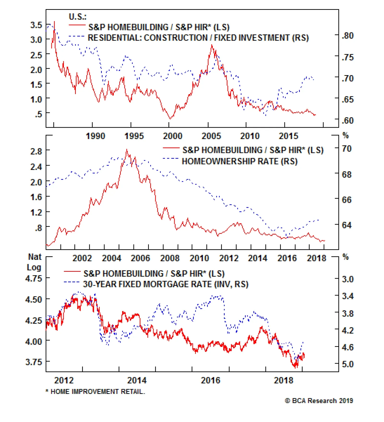
This pair trade is levered to the swings in residential construction compared to residential investment. Right now, the former is significantly outpacing the latter, suggesting that relative share prices have ample room to run. Currently, interest rates…
Buy Homebuilders Sell Home Improvement Retailers
Buy Homebuilders Sell Home Improvement Retailers
While we reiterate our recent overweight call on the S&P homebuilding index1 and the high-conviction underweight call on the S&P home improvement retail (HIR) group,2 it also makes sense to initiate a market neutral trade: long homebuilders/short HIR. Keep in mind that housing starts and building permits are extremely sensitive to interest rates, depend on first time home buyers and move in lockstep with the homeownership rate. Currently, interest rates are easing, the homeownership rate is coming out of its GFC funk and first time home buyers are slated to make a comeback this spring selling season. This is a boon for homebuilders at the expense of HIR (top & middle panels). Beyond these macro tailwinds for this intra-sector trade, the price of lumber is a key determinant of relative profitability: lumber represents an input cost to homebuilders whereas it is an important selling item in Big Box building & supply retailers that make a set margin on it. The recent drubbing in lumber prices should ease margin pressures on homebuilders but eat into HIR profits (change in lumber prices shown inverted and advanced in bottom panel). Bottom Line: We initiated a new long S&P homebuilding/short S&P home improvement retail pair trade yesterday; please see yesterday’s Weekly Report for more details. The ticker symbols for the stocks in these indexes are: BLBG: S5HOME – DHI, LEN and PHM, and BLBG: S5HOMI – HD and LOW, respectively. 1 Please see BCA U.S. Equity Strategy Report, “Indurated” dated September 24, 2018, available at uses.bcaresearch.com 2 Please see BCA U.S. Equity Strategy Report, “2019 Key Views: High-Conviction Calls” dated December 3, 2018, available at uses.bcaresearch.com
Highlights Portfolio Strategy Vibrant and broad-based bank credit growth, pristine credit quality, pent up bank buyback demand and a V-shaped recovery in bank ROE more than offset the risk of 10/2 yield curve inversion, and suggest that the path of least resistance is higher for the S&P banks index. Rising residential construction versus stalling residential investment, easing interest rates, cheapened lumber prices, and alluring valuations and technicals all signal that more gains are in store for homebuilders at the expense of home improvement retailers. Recent Changes Initiate a long S&P homebuilding/short S&P home improvement retail pair trade today. Table 1
Dissecting 2019 Earnings
Dissecting 2019 Earnings
Feature Equities have retraced 50% of the peak-to-trough losses, and are still consolidating the post December Fed meeting tremor. Chart 1 shows that the VIX has been cut in half and the high-yield corporate bond option-adjusted spread has dropped 105bps. Retrenching volatility and deflating junk spreads suggest that the equity risk premium (ERP) remains uncharacteristically high. The path of least resistance is for the ERP to narrow in the coming months as we do not foresee recession in 2019. As a reminder, the ERP and the economy are inversely correlated. Chart 1Risk Premia Renormalization
Risk Premia Renormalization
Risk Premia Renormalization
Nevertheless, in order for the reflex rebound since the late-December lows to morph into a durable rally, the macro/policy backdrop has to turn from a headwind to a tailwind. We are closely monitoring three potential positive catalysts: A definitively more dovish Fed, which would help restrain the greenback A positive U.S./China trade resolution A continuation of the earnings juggernaut With regard to the macro related catalysts, an update to our reflation gauge (RG) is in order. The trade-weighted U.S. dollar has been depreciating since early November, the 10-year U.S. Treasury yield has come undone since the early November peak and oil prices are 33% lower than the early-October peak. These three variables comprise our RG and the signal is unambiguously bullish. In other words, a reflationary impulse looms in the months ahead which should pave the way for a rebound in both plunging investor sentiment and the gloomy economic surprise index (RG shown advanced, Chart 2). Chart 2Reflating Away
Reflating Away
Reflating Away
On the earnings front, last week we trimmed our end-2020 SPX EPS forecast to $181 while we sustained the multiple at 16.5 times which resulted in a 3,000 SPX target.1 Drilling beneath the surface and analyzing the composition of SPX profits is revealing. Table 2 highlights sell side analysts’ profit levels and growth projections on a per GICS1 sector basis and also their contribution to overall earnings along with each sector’s projected earnings weight and most recent market capitalization weight. Table 2S&P 500 Earnings Analysis
Dissecting 2019 Earnings
Dissecting 2019 Earnings
Chart 3 shows that financials, health care and industrials are responsible for 61% of the SPX’s profit growth in 2019. Interestingly, technology’s contribution has fallen to a mere 7.2% and even if we add the new communication services sector’s 9.6% contribution it still falls well shy of the tech sector’s market cap and earnings weight. Another worthwhile observation is that energy profits are no longer off the charts, as base effects since the early-2016 $25/bbl oil trough have filtered out of the dataset.
Chart 3
While the risk of disappointment surrounds financials, health care and industrials, there are high odds that tech surprises to the upside as it has borne the brunt of recent negative earnings revisions (Charts 4 & 5). In addition, if our Commodity & Energy Strategy service’s bullish oil forecast pans out this year, the negative energy sector contribution to SPX profit growth will get a sizable upward revision (please look forward to our GICS1 sector EPS growth models updates and profit margin analysis in next week’s report). Chart 4Earnings Revisions...
Earnings Revisions...
Earnings Revisions...
Chart 5...Really Weigh On Tech
...Really Weigh On Tech
...Really Weigh On Tech
In sum, if the Fed pauses its hiking cycle through at least the first half of the year, we see a positive U.S./China trade resolution and SPX profits sustain their upward trajectory, then the SPX budding recovery will morph into a durable rally. This week we are updating an interest rate sensitive index that is highly levered to the surging U.S. credit impulse (Chart 6) and are initiating an early cyclical intra-sector and intra-industry pair trade. Chart 6Heed The U.S. Credit Impulse Signal
Heed The U.S. Credit Impulse Signal
Heed The U.S. Credit Impulse Signal
Stick With Banks While our overweight call in the S&P banks index suffered a setback last month, since inception it has moved laterally, and we continue to recommend an above benchmark allocation to this key financials sub group. Not only are the odds of recession low for this year, but narrowing credit spreads and a reversal in financial conditions are also waving the green flag (junk spread shown inverted & advanced, bottom panel, Chart 7). Chart 7Bank On Banks
Bank On Banks
Bank On Banks
Unlike the previous three reporting seasons when banks revealed blowout numbers and stocks subsequently fell, this season some profit and top line growth misses have been greeted with rising bank stocks prices. Such a reaction suggests that the worst is behind this sector and a sustainable recovery looms. Importantly, on the loan growth front, our credit impulse diffusion index is reaccelerating (Chart 6) and the overall credit impulse is expanding (middle panel, Chart 7). Our total loans & leases growth model and BCA’s C&I loan growth model both corroborate this encouraging credit backdrop (second & bottom panels, Chart 8). The latter is significant given that C&I loans are the single biggest credit category in bank loan books (Chart 9). Importantly, C&I loans have gone vertical recently topping the 10.5% growth mark despite softening capex intentions and CEO confidence. Chart 8Credit Models Flashing Green
Credit Models Flashing Green
Credit Models Flashing Green
Chart 9Credit Models Flashing Green
C&I Loans Leading The Pack
C&I Loans Leading The Pack
Multi-decade highs in consumer confidence are offsetting the Fed’s tightening cycle and suggest that consumer loans, another key lending category, will also gain traction (third panel, Chart 8). The outlook for the second largest credit category, residential real estate, remains upbeat in spite of last quarter’s soft housing related data releases. The recent easing in monetary conditions has breathed life back into the mortgage purchase applications index and also house prices continue to expand at a healthy pace (Chart 10). The upshot is that first-time home buyers will show up this spring selling season. Chart 10Residential Loans Also On Solid Footing
Residential Loans Also On Solid Footing
Residential Loans Also On Solid Footing
Beyond positive credit growth prospects, credit quality remains pristine. BCA’s no recession in 2019 view remains intact, thus NPLs and chargeoffs should stay muted. As a reminder, U.S. banks are the best capitalized banks in the world,2 and their reserve coverage ratio has returned to 124%, a level last seen in 2007 (Chart 11). Chart 11Pristine Credit Quality
Pristine Credit Quality
Pristine Credit Quality
Another important source of support is equity retirement. Banks have been late to the buyback game as the GFC along with the new strict bank regulatory body, the Fed, really tied their hands with regard to shareholder friendly activities. In fact, according to flow of funds data, the financial sector is still a net equity issuer, albeit at a steeply decelerating pace especially relative to the non-financial corporate sector (Chart 12). Pent up financial sector buyback demand is a boon for bank EPS growth. Chart 12Pent Up Buyback Demand Getting Unleashed
Pent Up Buyback Demand Getting Unleashed
Pent Up Buyback Demand Getting Unleashed
This is significant at a time when analysts have been swiftly downgrading EPS growth figures for the SPX. Encouragingly, our bank EPS growth model captures all these positive forces and while it is decelerating it still suggests that profit growth will be stellar in 2019 and easily outpace the overall market (Chart 13). Chart 13Banks EPS Growth Will Outpace The Market
Banks EPS Growth Will Outpace The Market
Banks EPS Growth Will Outpace The Market
Despite all this enticing news, bank valuations remain anchored near rock bottom levels and a resurgent ROE is signaling that a re-rating phase looms (Chart 14). Chart 14Rerating In Still In The Early Innings
Rerating In Still In The Early Innings
Rerating In Still In The Early Innings
Nevertheless, there is one headwind banks face as the business cycle is long in the tooth and on track to become the longest expansion on record: the price of credit. One reason for the deflating relative stock price ratio since the January 2018 peak has been the yield curve slope flattening (Chart 15), as it suppresses bank net interest margins. Banks have been fighting this off partly by keeping their source of funding ultra-low judging by still anemic CD rates, according to Bankrate’s national average (bottom panel, Chart 15). Chart 15One Minor Headwind
One Minor Headwind
One Minor Headwind
While yield curve inversions have widened all the way out to the 7/1 slope, the key 10/2 slope has yet to invert. Were the 10-year U.S. treasury to resume its selloff, even a mild yield curve steepening will go a long way, as BCA’s bond strategists expect. Clearly a flattening curve is a risk to our sanguine bank view, but the rest of the positives we outlined above more than offset the yield curve blues. Adding it all up, vibrant and broad-based bank credit growth, pristine credit quality, pent up bank buyback demand and a V-shaped recovery in bank ROE more than offset the risk of the 10/2 yield curve inversion, and suggest that the path of least resistance is higher for the S&P banks index. Bottom Line: Maintain the overweight stance in the S&P banks index. The ticker symbols for the stocks in this index are: BLBG: S5BANKX – WFC, JPM, BAC, C, USB, PNC, BBT, STI, MTB, FITB, CFG, RF, KEY, HBAN, CMA, ZION, PBCT, SIVB, FRC, . Buy Homebuilders/Sell Home Improvement Retailers While we reiterate our recent overweight call on the S&P homebuilding index3 and the high-conviction underweight call on the S&P home improvement retail (HIR) group,4 it also makes sense to initiate a market neutral trade: long homebuilders/short HIR. This pair trade is levered on the swings of residential construction compared with residential investment. Currently the former is significantly outpacing the latter and suggests that relative share prices have ample room to run (top panel, Chart 16). Chart 16A Play On Residential Construction Vs. Investment
A Play On Residential Construction Vs. Investment
A Play On Residential Construction Vs. Investment
Put differently, this share price ratio moves in tandem with homebuilders breaking new ground versus home owners renovating their existing house. Chart 17 shows the NAHB’s homebuilder sales expectations survey compared with the remodeling expectations survey. This relative sentiment gauge has ticked up recently, confirming the message from national accounts that residential construction has the upper hand over residential investment. The upshot is that the bull market in relative share prices is in the early innings. Chart 17Relative Survey Expectations...
Relative Survey Expectations...
Relative Survey Expectations...
Keep in mind that housing starts and building permits are extremely sensitive to interest rates, depend on first time home buyers and move in lockstep with the homeownership rate. Currently, interest rates are easing, the homeownership rate is coming out of its GFC funk and first time home buyers are slated to make a comeback this spring selling season. This is a boon for homebuilders at the expense of HIR (middle & bottom panels, Chart 16). More specifically on the interest rate front, while both groups move with the oscillation of lending rates, new home sales are more sensitive than HIR sales to the price of credit. Our proxy of mortgage application purchase to refinance index does an excellent job in capturing this relative interest rate sensitivity and the recent jump signals that a catch up phase looms in the relative share price ratio (top panel, Chart 18). Chart 18...Easing Interest Rates...
...Easing Interest Rates...
...Easing Interest Rates...
Relative loan growth activity also corroborates that demand for residential real estate is outpacing demand for home renovation (bottom panel, Chart 18). Beyond these macro tailwinds for this intra-sector trade, the price of lumber is a key determinant of relative profitability: lumber represents an input cost to homebuilders whereas it is an important selling item in Big Box building & supply retailers that make a set margin on it. In other words, rising lumber prices are a boon for HIR and a bane to homebuilders and vice versa. The recent drubbing in lumber prices should ease margin pressures on homebuilders but eat into HIR profits (Chart 19). Chart 19...And Cheapened Lumber Prices Favor Homebuilders Over HIR
...And Cheapened Lumber Prices Favor Homebuilders Over HIR
...And Cheapened Lumber Prices Favor Homebuilders Over HIR
Finally, oversold relative technicals, depressed valuations and extreme sell side analysts’ relative profit pessimism, offer a very compelling entry point in the pair trade for fresh capital (Chart 20). Chart 20Oversold And Unloved
Oversold And Unloved
Oversold And Unloved
Netting it all out, rising residential construction versus stalling residential investment, easing interest rates, cheapened lumber prices, and relative alluring valuations and technicals all signal that more gains are in store for homebuilders at the expense of home improvement retailers. Bottom Line: Initiate a new long S&P homebuilding/short S&P home improvement retail pair trade today. The ticker symbols for the stocks in these indexes are: BLBG: S5HOME – DHI, LEN and PHM, and BLBG: S5HOMI – HD and LOW, respectively. Anastasios Avgeriou, Vice President U.S. Equity Strategy anastasios@bcaresearch.com footnotes 1 Please see BCA U.S. Equity Strategy Report, “Catharsis” dated January 14, 2019, available at uses.bcaresearch.com. 2 Please see BCA U.S. Equity Strategy Special Report, “Top 10 Reasons We Still Like Banks” dated March 5, 2018, available at uses.bcaresearch.com. 3 Please see BCA U.S. Equity Strategy Report, “Indurated” dated September 24, 2018, available at uses.bcaresearch.com. 4 Please see BCA U.S. Equity Strategy Report, “2019 Key Views: High-Conviction Calls” dated December 3, 2018, available at uses.bcaresearch.com. Current Recommendations Current Trades Size And Style Views Favor value over growth Favor large over small caps
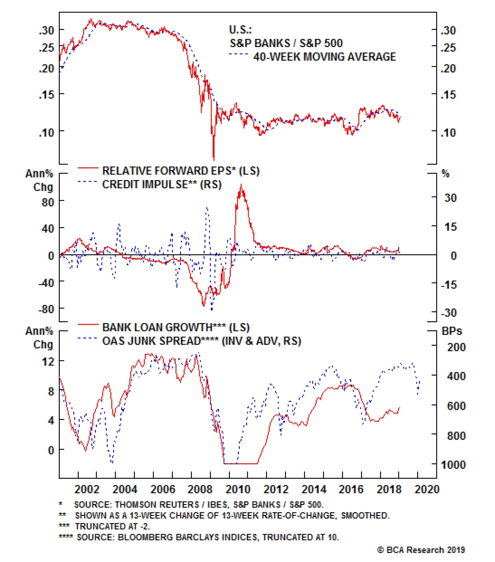
On the loan growth front, our credit impulse diffusion index is reaccelerating and the overall credit impulse is expanding. Our total loans & leases growth model and the BCA’s C&I loan growth model both corroborate this encouraging credit backdrop.…