Sectors

Highlights Downside risks to EM assets remain substantial. Stay put. EM stocks, credit and currencies will underperform their DM counterparts in the first half of 2019. The key and necessary condition for a new secular EM bull market to emerge is the end of abundant financing. The latter is imperative to compel corporate restructuring, bank recapitalization as well as structural reforms. The cyclical EM outlook hinges on China’s business cycle. The slowdown in China is broad-based and will deepen. The slowdown in China/EM will likely lead to global trade contraction. The latter is negative for global cyclicals yet bullish for the U.S. dollar. Feature As we head into 2019, the past decade is shaping up to be a lost one for emerging markets (EM) assets. In particular: EM stocks have underperformed DM markets substantially since the end of 2010 (Chart I-1). In absolute terms, EM share prices are at the same level as they were in early 2010. Chart I-1EM Equities Have Been Underperforming DM For Eight Years
EM Equities Have Been Underperforming DM For Eight Years
EM Equities Have Been Underperforming DM For Eight Years
EM currencies have depreciated substantially since 2011, and the EM local currency bond index (GBI-EM) on a total-return basis has produced zero return in U.S. dollar terms since 2010 (Chart I-2). Chart I-2A Lost Decade For Investors In EM Local Currency Bonds?
A Lost Decade For Investors In EM Local Currency Bonds?
A Lost Decade For Investors In EM Local Currency Bonds?
Finally, EM sovereign and corporate high-yield bonds have not outperformed U.S. high-yield corporate bonds on an excess-return basis. Will 2019 witness a major reversal of such dismal EM performance? And if so, will it be a structural or cyclical bottom? The roots underneath this lost decade for EM stem neither from trade wars nor from Federal Reserve tightening. Therefore, a structural bottom in EM financial markets is contingent neither on the end of Fed tightening nor the resolution of current trade tussles. We address the issues of Fed tightening and trade wars below. A Lost Decade: Causes And Remedies What led to a lost decade for EM was cheap and plentiful financing. When the price of money is low and financing is abundant, companies and households typically rush to borrow and spend unwisely. Capital is misallocated and, consequently, productivity and real income growth disappoint – and debtors’ ability to service their debts worsens. This is exactly what has happened in EM, as easy money splashed all over developing economies since early 2009. There have been three major sources of financing for EM: Source 1: Chinese Banks Chinese banks have expanded their balance sheets by RMB 198 trillion to RMB 262 trillion (or the equivalent of $28.8 trillion) over the past 10 years (Chart I-3, top panel). When commercial banks expand their balance sheets by lending to or buying an asset from non-banks, they create deposits (money). Consistently, the broad money supply has expanded by RMB 175 trillion to RMB 234 trillion (or the equivalent of $25.5 trillion). Chart I-3Enormous Boom In Chinese Banks' Assets And Money Supply
Enormous Boom In Chinese Banks' Assets And Money Supply
Enormous Boom In Chinese Banks' Assets And Money Supply
Notably, the People’s Bank of China (PBoC) has increased commercial banks’ excess reserves by RMB 1.5 trillion to RMB 2.8 trillion (or the equivalent of $0.22 trillion) (Chart I-3, bottom panel). Hence, the meaningful portion of money supply expansion has been due to the money multiplier – money created by mainland banks – not a provision of excess reserves by the PBoC (Chart I-4). Chart I-4Attribution Of Rise In Money Supply To Excess Reserves And Money Multiplier
Attribution Of Rise In Money Supply To Excess Reserves And Money Multiplier
Attribution Of Rise In Money Supply To Excess Reserves And Money Multiplier
Not only has such enormous money creation by commercial banks generated purchasing power domestically, but it has also boosted Chinese companies’ and households’ purchases of foreign goods and services. The Middle Kingdom’s imports of goods and services have grown to $2.5 trillion compared with $3.2 trillion for the U.S. (Chart I-5). China’s spending has boosted growth considerably in many Asian, Latin American, African, Middle Eastern, and even select advanced economies. Chart I-5Imports Of Goods And Services: China And The U.S.
Imports Of Goods And Services: China And The U.S.
Imports Of Goods And Services: China And The U.S.
Source 2: DM Central Banks’ QE By conducting quantitative easing, the central banks of several advanced economies have crowded out investors from fixed-income markets, incentivizing them to search for yield in EM. The Fed, the Bank of England, the European Central Bank and the Bank of Japan have in aggregate expanded their balance sheets by $10 trillion (Chart I-6). Chart I-6Quantitative Easing In DM
Quantitative Easing In DM
Quantitative Easing In DM
This has led to massive inflows of foreign portfolio capital into EM, and reflated asset prices well beyond what was warranted by their fundamentals. Specifically, since January 2009, foreign investors have poured $1.5 trillion on a net basis into the largest 15 developing countries excluding China, Taiwan and Korea (Chart I-7, top panel). For China, net foreign portfolio inflows amounted to $560 billion since January 2009 (Chart I-7, bottom panel). Chart I-7Cumulative Foreign Portfolio Inflows Into EM And China
Cumulative Foreign Portfolio Inflows Into EM And China
Cumulative Foreign Portfolio Inflows Into EM And China
Source 3: EM Ex-China Banks EM ex-China began expanding their balance sheets aggressively in early 2009, originating new money (local currency) and thereby creating purchasing power. This was especially the case between 2009 and 2011. Since that time, money creation by EM ex-China banks has decelerated substantially due to periodic capital outflows triggering currency weakness and higher borrowing costs. Out of these three sources, China’s money/credit cycles remain the primary driver of EM. The mainland’s imports from developing economies serves as the main nexus between China and the rest of EM. Essentially, Chinese money and credit drive imports, influencing growth and corporate profits in the EM universe (Chart I-8). Chart I-8China's Credit Cycle Leads Its Imports
China's Credit Cycle Leads Its Imports
China's Credit Cycle Leads Its Imports
In turn, EM business cycle upturns attract international capital. Meanwhile, credit creation by local banks in EM ex-China – primarily in economies with high inflation or current account deficits – is a residual factor. In these countries, domestic credit creation is contingent on a healthy balance of payments and a stable exchange rate. The latter two, in turn, transpire when exports to China and international portfolio capital inflows are improving. The outcome of easy financing is over-borrowing and capital misallocation. The upshot of the latter is usually lower efficiency and productivity growth. Not surprisingly, productivity growth in both China and EM ex-China has decelerated considerably since 2009 (Chart I-9). EM return on assets has dropped a lot in the past 10 years and is now on par with levels last seen during the 2008 global recession (Chart I-10). Chart I-9Falling Productivity Growth In EM And China =...
Falling Productivity Growth In EM And China =...
Falling Productivity Growth In EM And China =...
Chart I-10... = Low Profit Margins And Low Return On Capital
... = Low Profit Margins And Low Return On Capital
... = Low Profit Margins And Low Return On Capital
Accordingly, the ability to service debt by EM companies has deteriorated considerably in the past decade – the ratios of cash flows from operations to both interest expenses and net debt have dropped (Chart I-11). Chart I-11EM: Deteriorating Ability To Service Debt
EM: Deteriorating Ability To Service Debt
EM: Deteriorating Ability To Service Debt
These observations offer unambiguous confirmation that money has been spent inefficiently – i.e., misallocated. Credit booms and capital misallocations warrant a period of corporate restructuring and banking sector recapitalization. Without this, a new cycle cannot emerge. A secular bull market in equities and exchange rates arises when productivity growth and hence income-per-capita growth accelerates, and return on capital begins to climb. This is not yet the case for most developing economies. The end of cheap and abundant financing is imperative to compel corporate restructuring, bank recapitalization as well as structural reforms. These are necessary conditions to create the foundation for a new secular bull market. Ironically, the best remedy for an addiction to easy money is a period of tight money. For example, U.S. share prices would not be as high as they currently are if the U.S. did not go through the Lehman crisis. This 10-year bull market in U.S. equities was born from the ashes of the Lehman crisis. Vanished financing and the private sector’s tight budgets in 2008-‘09 compelled corporate restructuring as well as a focus on efficiency and return on equity. Has EM financing become scarce and tight? Cyclically, China’s money creation and credit flows have slowed, pointing to a cyclical downturn in EM share prices and commodities (please see below for a more detailed discussion). International portfolio flows to EM have also subsided since early this year. There has been selective corporate restructuring post the 2015 commodities downturn, including in the global/EM mining and energy sectors, China steel and coal industries as well as among Russian and Brazilian companies. However, there are many economies and industries where corporate restructuring, bank recapitalization and structural reforms have not been undertaken. Yet from a structural perspective, China’s money and credit growth remain elevated and excesses have not been purged. Besides, international portfolio flows to EM have had periodic “stop-and-gos” but have not yet retrenched meaningfully (refer to Chart I-7 on page 4). Consequently, structural overhauls and corporate restructuring in China/EM have by and large not yet occurred – in turn negating the start of a new secular bull market. Bottom Line: Conditions for a structural bull market in EM/China are not yet present. EM/China: A Cyclical Bottom Is Not In Place From a cyclical perspective, China is an important driving force for the majority of EM economies, and its deepening growth slowdown will continue to weigh on EM growth and global trade. In fact, odds are that global trade will contract in the first half of 2019: In China, tightening of both monetary policy as well as bank and non-bank regulation from late 2016 has led to a deceleration in money and credit growth. The latter has, with a time, lag depressed growth since early this year. Policymakers have undertaken some stimulus since the middle of this year, but it has so far been limited. Stimulus also works with a time lag. Besides, even though the broad money impulse has improved, the credit and fiscal spending impulse remains in a downtrend (Chart I-12). Therefore, there are presently mixed signals from money and credit. Chart I-12China's Stimulus Leads EM And Commodities
China's Stimulus Leads EM And Commodities
China's Stimulus Leads EM And Commodities
As illustrated in Chart I-12, the bottoms in the money and combined credit and fiscal spending impulses, in July 2015, preceded the bottom in EM and commodities by six months and their peak led the top in financial markets by about 15 months in January 2018. Besides, in 2012-‘13, the rise in the money and credit impulses did not do much to help EM stocks or industrial commodities prices. Hence, even if the money as well as credit and fiscal impulses bottom today, it could take several more months before the selloff in EM financial markets and commodities prices abates. Additionally, the ongoing regulatory tightening of banks and non-bank financial institutions will hinder these institutions' willingness and ability to extend credit, despite lower interest rates. We discussed in a recent report that both the effectiveness of the monetary transmission mechanism and the time lag between policy easing and a bottom in the business cycle are contingent on the money multiplier (creditors' willingness to lend, and borrowers' readiness to borrow) and the velocity of money (the marginal propensity to spend among households and companies). Growth in capital spending in general and construction in particular have ground to a halt (Chart I-13). Chart I-13China: Weak Capital Spending
China: Weak Capital Spending
China: Weak Capital Spending
Not only has capital spending decelerated but household consumption has also slowed since early this year, as demonstrated in the top panel of Chart I-14. Chart I-14China: A Broad-Based Slowdown
China: A Broad-Based Slowdown
China: A Broad-Based Slowdown
Finally, mainland imports are the main channel in terms of how China’s growth slowdown transmits to the rest of the world. Not surprisingly, EM share prices and industrial metals prices correlate extremely well with the import component of Chinese manufacturing PMI (Chart I-15). Chart I-15China's Imports And EM And Commodities
China's Imports And EM And Commodities
China's Imports And EM And Commodities
Bottom Line: The slowdown in China is broad-based, and our proxies for marginal propensity to spend by households and companies both point to further weakness (Chart I-14, middle and bottom panels). Constraints And Chinese Policymakers’ Dilemma Given the ongoing slowdown in the economy, why are Chinese policymakers not rushing to the rescue with another round of massive stimulus? First, policymakers in China realize that the stimulus measures of 2009-‘10, 2012-‘13 and 2015-‘16 led to massive misallocations of capital and fostered both inefficiencies and speculative excesses in many parts of the economy – the property markets being among the main culprits. Indeed, policymakers recognize that easy money does not foster productivity growth, which is critical to the long-term prosperity of any nation. For China to grow and prosper in the long run, the economy’s addiction to easy financing should be curtailed. Second, policymakers are currently facing a dilemma. The real economy is saddled with enormous debt and is slowing. This warrants lower interest rates – probably justifying bringing down short-term rates close to zero. Yet, despite enforcing capital controls, it seems the exchange rate has been correlated with China’s interest rate differential with the U.S. since early 2010 (Chart I-16). Given the ongoing growth slowdown and declining return on capital in China, there are rising pressures for capital to exit the country. Notably, the PBoC’s foreign exchange reserves of $3 trillion are only equivalent to 10-14% of broad money supply (i.e., all deposits in the banking system) (Chart I-17). Chart I-16Chinese Currency And Interest Rates
Chinese Currency And Interest Rates
Chinese Currency And Interest Rates
Chart I-17China: Foreign Currency Reserves Are Very Low Compared To Money Supply/Deposits
China: Foreign Currency Reserves Are Very Low Compared To Money Supply/Deposits
China: Foreign Currency Reserves Are Very Low Compared To Money Supply/Deposits
The current interest rate differential is only 33 basis points. If the PBoC guides short-term rates lower and the Fed stays on hold or hikes a few more times, the spread will drop to zero or turn negative. Based on the past nine-year correlation, the narrowing interest rate spread suggests yuan depreciation. This will weigh on EM and probably even global risk assets. In a scenario where policymakers prioritize defending the yuan’s value, they may not be able to reduce borrowing costs and assist indebted companies and households. As a result, the downtrend in the real economy would likely worsen. Consequently, EM and global growth-sensitive assets will drop further. Given the constraints Chinese policymakers are facing, reducing interest rates and allowing the yuan to depreciate further is the least-bad outcome. Yet this will rattle Asian and EM currencies and risk assets. What About The Fed And Trade Wars? The Fed and EM: Fed policy and U.S. interest rates are relevant to EM, but they are of secondary importance. The primary driver of EM economies are their own domestic fundamentals as well as global trade – not just U.S. growth. Historically, the correlation between EM risk assets and the fed funds rate has been mixed, albeit more positive than negative (Chart I-18). On this chart, we have shaded the five periods over the past 38 years when EM stocks rallied despite a rising fed funds rate. Chart I-18The Fed And EM Share Prices: A Historical Perspective
The Fed And EM Share Prices: A Historical Perspective
The Fed And EM Share Prices: A Historical Perspective
There were only two episodes when EMs crashed amid rising U.S. interest rates: the 1982 Latin American debt crisis and the 1994 Mexican Tequila crisis. Yet it is vital to emphasize that these crises occurred because of poor EM fundamentals – elevated foreign currency debt levels, negative terms-of-trade shocks, large current account deficits and pegged exchange rates. Dire EM fundamentals also prevailed before the Asian/EM crises of 1997-1998. However, these late-1990s crises occurred without much in the way of Fed tightening or rising U.S. bond yields. Trade Wars: China’s current growth slowdown has not originated from a decline in its exports. In fact, Chinese aggregate exports and those to the U.S. have been growing at a double-digit pace, largely due to the front running ahead of U.S. import tariffs. More importantly, China’s exports to the U.S. and EU account for 3.8% and 3.2% of its GDP, respectively (Chart I-19). Total exports amount to 20% of GDP, with almost two-thirds of that being shipments to developing economies. This compares with capital spending that makes up 42% of GDP and household consumption of 38% of GDP. Hence, capital expenditures and household spending are significantly larger than shipments to the U.S. Chart I-19Structure Of Chinese Economy
Structure Of Chinese Economy
Structure Of Chinese Economy
There is little doubt that the U.S.-China confrontation has affected consumer and business sentiment in China. Nevertheless, the slowdown in China has - until recently - stemmed from domestic demand, not exports. Investment Recommendations It is difficult to forecast whether the current EM down leg will end with a bang or a whimper. Whatever it is, the near-term path of least resistance for EM is to the downside. “A bang” scenario – where financial conditions tighten substantially and for an extended period – would likely compel corporate and bank restructuring as well as structural reforms. Therefore, it is more likely to mark a structural bottom in EM financial markets. “A whimper” scenario would probably entail only moderate tightening in financial conditions. Thereby, it would not foster meaningful corporate restructuring and structural reforms. Hence, such a scenario might not mark a secular bottom in EM stocks and currencies. In turn, the EM cyclical outlook hinges on China’s business cycle. If and when Chinese policymakers reflate aggressively, the mainland business cycle will revive, producing a cyclical rally in EM risk assets. At the moment, Chinese policymakers are behind the curve. With respect to investment strategy, we continue to recommend: Downside risks to EM assets remain substantial. Stay put. EM stocks, credit and currencies will underperform their DM counterparts in the first half of 2019. The slowdown in China/EM will likely lead to global trade contraction. The latter is negative for global cyclicals yet bullish for the U.S. dollar. For dedicated EM equity portfolios, our overweights are: Brazil, Mexico, Chile, Colombia, Russia, central Europe, Korea and Thailand. Our underweights are: South Africa, Peru, Indonesia, India, the Philippines and Hong Kong stocks. We are neutral on the remaining bourses. In the currency space, we continue to recommend shorting a basket of the following EM currencies versus the U.S. dollar: ZAR, CLP, IDR, MYR and KRW. The latter is a play on RMB depreciation. The full list of our recommendation across EM equity, fixed-income, currency and credit markets is available on pages 14-15. Arthur Budaghyan, Senior Vice President Emerging Markets Strategy arthurb@bcaresearch.com Equity Recommendations Fixed-Income, Credit And Currency Recommendations
Underweight (High-Conviction) In our initiation of coverage on the S&P interactive media & services index,1 we highlighted a renewed regulatory focus as a key risk that offset the revenue & profit growth vigor of this group, comprised almost entirely of Alphabet (Google) and Facebook. Tack on the inverse correlation these growth stocks have with interest rates (top panel) and that caused us to lower our recommendation on Monday. Increasing regulatory efforts on technology will be a key theme next year, one we explored this past summer. Our conclusion was that both antitrust (particularly in the case of Alphabet) and privacy regulation (particularly in the case of Facebook) added significant risk to these near monopolies; calls for legislating both have dramatically amplified. This communication services sub-index is particularly prone to such a risk when it already trades at close to a 40% valuation premium to the broad market (middle panel). Adding insult to injury is the PEG ratio that is trading at a 60% premium to the broad market (bottom panel). In the face of the Fed’s sustained tightening cycle these extreme growth stocks are vulnerable to massive gravitational pull. Net, we have downgraded our recommendation to underweight and include this index in the high-conviction underweight list for 2019; please see Monday’s Weekly Report for more details. The ticker symbols in the stocks in this index are: S5INMS – GOOGL, GOOG, FB, TWTR and TRIP. 1 Please see BCA U.S. Equity Strategy Special Report, “New Lines Of Communication,” dated October 1, 2018, available at uses.bcaresearch.com.
Logging Off Interactive Media And Services
Logging Off Interactive Media And Services
Feature The European stock market has a hidden gem: its clothing and accessories sector. Since the turn of the millennium, the sector’s profits are up by a thousand percent (Feature Chart). In this Special Report we propose that the megatrend has further to run, as its principle driver is still very much in place. Consumption patterns are becoming more female. Feature ChartEuropean Clothes Profits Are Up A Thousand Percent!
European Clothes Profits Are Up A Thousand Percent!
European Clothes Profits Are Up A Thousand Percent!
One of Europe’s major, and largely neglected, success stories is the dramatic rise in the percentage of the working-age population in employment. This major success story stems from another success story: the structural and broad-based increase in the female labour participation rate – which has surged from 57 percent in 1995 to 68 percent today (Chart I-2-Chart I-4). Yet the story is far from over.1 Chart I-2European Male Labour Participation Is Flat...
European Male Labour Participation Is Flat...
European Male Labour Participation Is Flat...
Chart I-3...But European Female Labour Participation Is Surging
...But European Female Labour Participation Is Surging
...But European Female Labour Participation Is Surging
Chart I-4...So The Percentage Of The European Population In Work Is Surging
...So The Percentage Of The European Population In Work Is Surging
...So The Percentage Of The European Population In Work Is Surging
Why Job Creation Favours Women Two things are driving the megatrend in female participation. One is a paradoxical feature of the current technological revolution. As we explained in The Superstar Economy: Part 2, Artificial Intelligence (AI) excels at tasks that we perceive as difficult: those requiring the application of complex algorithms and pattern recognition to a narrowly defined goal, such as making a highly-engineered product or managing a stock portfolio. This poses a big threat to jobs in manufacturing and finance, employment sectors which happen to be male-dominated.2 Conversely, AI still struggles at tasks that we perceive as easy: those requiring adaptable movements, or reading and responding to people’s emotions and intentions. If you are good at controlling a disruptive class of 7-year olds, or calming a nervous patient before giving him an injection, your human skills are still in big demand. But education, healthcare, and social care – the employment sectors that are creating the most jobs – employ three times as many women as men. With AI still in its infancy, the established pattern of job destruction and creation will continue to favour women over men (Table I-1). Table I-1AI Is A Greater Threat To Men
Buying European Clothes: An Investment Megatrend
Buying European Clothes: An Investment Megatrend
The other driver of the megatrend in female participation is a raft of European legislation designed to make work more family friendly: flexible working time, generous paid maternity and paternity leave, and subsidised childcare (Table I-2-Table I-4). Sharing the responsibility of childcare between mothers, fathers and external helpers has allowed tens of millions of European women to enter and remain in the labour force. Table I-2Generous Maternity Pay In Europe And Japan
Buying European Clothes: An Investment Megatrend
Buying European Clothes: An Investment Megatrend
Table I-3Improving Paternity Pay In Europe And Japan
Buying European Clothes: An Investment Megatrend
Buying European Clothes: An Investment Megatrend
Table I-4Affordable Childcare In Europe And Japan
Buying European Clothes: An Investment Megatrend
Buying European Clothes: An Investment Megatrend
Nevertheless, the megatrend has a lot further to run. For the ultimate end-point, look at the Scandinavian countries which started legislating such policies in the early 1970s, around twenty years before the rest of Europe. As a result, in Sweden, labour force participation rates for women and men have now converged to almost identical: 81 versus 84 percent (Chart I-5). Chart I-5In Sweden, Labour Force Participation For Women And Men Is Almost Identical
EU28: Labour Force Participation Rate In Sweden, Labour Force Participation For Women And Men Is Almost Identical
EU28: Labour Force Participation Rate In Sweden, Labour Force Participation For Women And Men Is Almost Identical
The combination of the two drivers – employment growth favouring female-dominated sectors and employment becoming more family friendly – means that net job creation in Europe will be mostly due to more women joining the workforce. An important consequence is that consumption patterns will continue to become more female. But what does that mean? How Women’s Spending Differs From Men’s Spending In the main spending categories of housing, food and healthcare, women and men tend to show near-identical spending behaviours. But there are three sub-categories where there are significant differences. Men considerably outspend women on vehicle purchases: cars account for around 8 percent of disposable income for men versus 4 percent for women. Against this, women spend more on personal care products and services: 2 percent versus 0.5 percent. This is the reason behind our long-standing successful overweight recommendation in the European personal products sector which we maintain (Chart I-6). However, the sub-category in which women outspend men by even more is clothes and accessories: estimates average around 6.5 percent for women versus 2.5 percent for men.3 Chart I-6Personal Product Profits Set To Grow Very Strongly
Personal Product Profits Set To Grow Very Strongly
Personal Product Profits Set To Grow Very Strongly
It follows that as consumption patterns become more female, we should expect to see a steady rise in spending on clothes and accessories as a share of total consumer spending. Has this been the case? In the U.K. – where the data is easily available – the answer is yes (Chart I-7). Having said that, other factors are also at play. A generalised deflation in clothes prices (Chart I-8) is also generating a strong tailwind to sales volumes (rather than values). More about this later. Chart I-7More Real Spending On Clothes...
More Real Spending On Clothes...
More Real Spending On Clothes...
Chart I-8Partly Because Clothes Prices Are Falling...
Partly Because Clothes Prices Are Falling...
Partly Because Clothes Prices Are Falling...
Of course, the more compelling evidence is the thousand percent growth in the European clothes sector’s profits since the turn of the millennium. However, with the sector dominated by top brands such as LVMH and Hermes, could a more plausible explanation come from strong economic growth, until recently, in the emerging markets such as China? The answer is yes to the extent that many of the emerging economies are experiencing the same structural uptrends in female participation, and this supports our investment thesis. Still, this cannot be the main driver, because in recent years the connection between the fortunes of the emerging economies and the European clothes sector has been weak (Chart I-9). Chart I-9The Connection Between Emerging Markets And European Clothes Is Weak
The Connection Between Emerging MarketsAnd European Clothes Is Weak
The Connection Between Emerging MarketsAnd European Clothes Is Weak
There is another obvious question: is the market already aware of, and fully priced for, the megatrend? We think not, as most investors we meet are surprised by the structural uptrend in female participation, the on-going dynamics behind it, and the implications for consumer spending patterns. Understandably, the European clothes sector does trade at a valuation premium to the market (Chart I-10). But for many companies, the recent market hiccup has pulled down their valuation premiums to close to, or below, the long-term average from which the price has previously outperformed very strongly. Chart I-10The Valuation Premium On European Clothes Is Close To Its Long-Term Average
The Valuation Premium On European Clothes Is Close To Its Long-Term Average
The Valuation Premium On European Clothes Is Close To Its Long-Term Average
What Is In The Clothes Basket? Pulling all of this together, the companies in our European clothes and accessories basket need to meet several criteria: A dominant or significant exposure to women’s clothes and/or accessories. A top-end brand (or brands) giving the company pricing power, and mitigating the very strong deflation in clothes prices. Avoid ‘fast fashion’. A reputation for sustainable development. A track-record of profit growth during the past decade. A forward price to earnings (PE) multiple of less than 25. A market capitalisation of at least €5 billion. On the basis of these criteria, our European clothes and accessories basket contains four names: LVMH, Kering, Luxottica, and Burberry (Table I-5). Hermes meets most of the criteria but, trading on a forward PE close to 35 is very richly valued. Table I-5The European Clothes Basket
Buying European Clothes: An Investment Megatrend
Buying European Clothes: An Investment Megatrend
To be clear, this is not a short-term trade. Investors who buy the clothes basket outright need to have a multi-year investment horizon. Those investors who must also protect short-term performance should instead overweight the clothes basket relative to the broad market. Dhaval Joshi, Senior Vice President Chief European Investment Strategist dhaval@bcaresearch.com Footnotes 1 Please see the European Investment Strategy Special Report “Female Participation: Another Mega-Trend” published on April 6, 2017 and available at eis.bcaresearch.com 2 Please see the European Investment Strategy Special Report, “The Superstar Economy: Part 2”, January 19, 2017 available at eis.bcaresearch.com. 3 Source: Bureau of Labor Statistics Consumer Expenditure Survey 2016 via SmartAsset, and Paymentsense.
Highlights The Reserve Bank of Australia (RBA) may consider a rate hike in 2019 if additional tightening of labor markets leads to higher wage inflation, which would help lift core inflation back to the midpoint of the RBA’s 2-3% target band. Reflation in China could also embolden the RBA to tighten monetary policy – though the odds of a more aggressive stimulus package will decline as long as China’s overall economy remains stable and the U.S. maintains its tariff ceasefire. The Labor Party is favored to win the federal election, which is most likely to occur in May. This is a low-conviction view, as polls are tight and economic improvement will help the ruling Liberal-National Coalition. Feature 2018 has been a challenging year for global financial markets, as investors have had to deal with greater economic uncertainty, less dovish central banks and more volatile asset prices. One country that has bucked the trend to some degree is Australia. The nation has famously avoided a recession since 1991 and last saw a tightening of monetary policy in 2010. While the recession streak is unlikely to be broken in 2019, there are growing risks that the era of interest rate tranquility will soon end. In this Special Report, jointly published with our colleagues at BCA Geopolitical Strategy, we update our views on Australia for 2019 – a year when the investment backdrop has the potential to become far more interesting, and volatile, due to election year uncertainty and a potential shift to a more hawkish bias for monetary policy. The Bond Outlook: What To Watch To Turn Bearish BCA Global Fixed Income Strategy has maintained an overweight stance on Australian government bonds since the end of 2017. That high-conviction view stemmed from our expectation that the Reserve Bank of Australia (RBA) would keep policy rates on hold for longer due to sluggish economic growth and underwhelming inflation. This recommendation has performed well, with Australian government bonds returning 2.4% (currency-hedged into U.S. dollars) in 2018 year-to-date, beating the Bloomberg Barclays Global Treasury index by 190bps. The benchmark 10-year Australian government is now yielding 36bps below the equivalent 10-year U.S. Treasury yield, the tightest spread since 1980 (Chart 1). Chart 1Australian Bonds Have Outperformed
Australian Bonds Have Outperformed
Australian Bonds Have Outperformed
Looking ahead, we still have a positive opinion on Australian debt relative to its global peers over the next six months. The RBA is unlikely to make any adjustments to the Cash Rate - which remains at a highly-accommodative level of 1.5% - without seeing some signs of accelerating inflation in both the Q4 2018 and Q1 2019 CPI reports. This is especially true given the political uncertainty with another federal election due by May 18,1 which could change the outlook for fiscal policy (as we discuss later in this report) and impact the RBA’s economic projections. In our view, the RBA will only be able to seriously consider an interest rate hike, warranting a downgrade of our recommended overweight stance, if all three of the following conditions occur: Australia’s underemployment rate falls below 8% China’s economy shows convincing evidence of reacceleration, especially in commodity-intensive industries like construction Core CPI inflation rises back to at least the midpoint of the RBA’s 2-3% target band We will now discuss each of these in turn. Underemployment Australia is a fairly open economy with a large export sector, but consumer spending is still the largest share of GDP (60%) so it matters most for growth. On that front, real consumption has grown in a narrow and uninspiring range between 2-3% over the past five years. Anemic wages and disposable incomes have been the problem, with the growth of both (in nominal terms) struggling to grow faster than low realized inflation, which now sits below the RBA’s inflation target range of 2-3% (Chart 2). Households have been forced to deploy a greater share of that modest income growth just to maintain spending, with the savings rate plunging from 8% at the end of 2014 to 1% this year and consumer debt piling up. Chart 2An Income-Fueled Pickup In Consumer Spending
An Income-Fueled Pickup In Consumer Spending
An Income-Fueled Pickup In Consumer Spending
The dynamics may be changing in a more positive direction, however. Growth rates of nominal wage (+2.3%) and disposable income (+3.1%) have accelerated this year to a pace faster than inflation. With real incomes perking up, the year-over-year growth rate of real consumer spending growth accelerated to 3% in Q3/2018, driving real GDP growth to similar levels. A sustained pickup in wage growth is necessary before the RBA would even contemplate a rate hike. For that to occur, there must be decisive evidence of a tightening Australian labor market and increased resource utilization. While the headline unemployment rate of 5.0% is below the OECD’s estimate of the full employment NAIRU for Australia (5.3%), broader measures of labor market slack are still at elevated levels. Specifically, the “underemployment” rate, which includes workers who are working fewer hours than they would like or at jobs below their skill levels, is still at an elevated 8.3% (Chart 3). That is down from the peak of just below 9% seen in early 2017, but well above the 2012 trough near 7% (when wage growth was close to 4%). Chart 3UNDERemployment Rate Matters More For Australian Wages
UNDERemployment Rate Matters More For Australian Wages
UNDERemployment Rate Matters More For Australian Wages
Australian wage growth tends to correlate more with the underemployment rate than the traditional unemployment rate (middle panel). This suggests that the recent blip higher in wage growth could be the beginning of a new trend, given that it has occurred alongside the recent drop in underemployment. Already, underemployment is back below the levels that prevailed when the RBA did its last interest rate cut back in 2016 (bottom panel). A further dip lower in the underemployment rate to below the 8% threshold would likely confirm that wage growth has more upside. That outcome would give the RBA greater confidence that consumer spending will gain more strength even with a low savings rate, and that CPI inflation will return back into the target range – both outcomes that would justify some removal of the RBA’s highly stimulative monetary accommodation. China Stimulus The main connection from China’s economy to Australia is through Chinese demand for Australian exports. There is also an indirect, but very important, link between Chinese demand boosting industrial commodity prices. The latter boosts Australian growth through positive terms-of-trade effects and increased capital spending in commodity-related sectors like mining. Iron ore is the most important of those commodities, representing 18% of total Australian goods exports, with 85% of those iron ore exports going to China. Australian export growth has decelerated during 2018 from the very robust 15% year-over-year pace to a still solid 10% rate. This has mirrored the trends seen in many other economies, where exports have slowed alongside diminished demand from China. If Chinese authorities change their current policy trajectory, and embrace more aggressive fiscal and credit stimulus, then they will reaccelerate the country’s flagging demand, which should benefit Australian exporters. If the increase in spending occurs in commodity-intensive parts of China’s economy, like construction, then Australia can also benefit from a terms-of-trade impact if commodity prices rise. However, BCA’s Geopolitical Strategy and China Investment Strategy remain skeptical that China will launch a major economic stimulus package along the lines of what occurred in 2015-16. That surge not only boosted Chinese GDP and import demand but also triggered a boost to global industrial commodity prices that benefitted many commodity exporters, including Australia. In recent months, there has been a pickup in overall Chinese import growth, as well as some acceleration of higher frequency growth indicators like the Li Keqiang index (Chart 4). Australian exports to China have not picked up though, and Chinese iron ore imports are contracting. Part of that is due to the elevated levels of Chinese iron ore inventories. More likely, there is little demand for additional iron ore given China’s reform agenda and the struggles of its construction sector (which accounts for roughly 35% of Chinese steel demand). Chart 4China Stimulus Not Helping Australia...Yet?
China Stimulus Not Helping Australia...Yet?
China Stimulus Not Helping Australia...Yet?
Our colleagues at BCA China Investment Strategy2 have noted that both weakening sales and tighter funding sources for real estate developers point to declining growth in property starts and construction. This will be negative for construction-related commodity markets and construction-related machinery. This is coming at a time when the Chinese government is trying specifically to address over-indebted industries like construction. As for the U.S.-China trade truce, a permanent de-escalation of tensions – which has not yet occurred – could provide a boost to Australian export demand, as with other export-focused countries. But the negative impact of bilateral U.S.-China tariffs on the global economy is much smaller than that of China’s attempt to limit indebtedness. Moreover, a trade truce will remove China’s primary incentive to adopt more aggressive stimulus. Nevertheless, from the RBA’s perspective, any boost to China’s construction-related activity would have a big impact on Australia’s economy and would strengthen the case for a rate hike in 2019. Core Inflation Australia’s headline CPI inflation has struggled to hit even the bottom end of the RBA’s 2-3% target band since 2015, reaching only 1.9% in Q3 of this year (Chart 5). The story is even worse for inflation excluding food and energy, with core CPI inflation now only at 1.2% after having drifted lower in two consecutive quarters. Both market-based and survey-based measures of inflation expectations are also hovering near 2%. Chart 5Australian Inflation Well Below RBA Target
Australian Inflation Well Below RBA Target
Australian Inflation Well Below RBA Target
When breaking down the CPI into tradeables (i.e. more globally-focused) and non-tradeables (i.e. more domestically-focused), the two types of inflation have not been accelerating at the same time since the 2009-11 period. Since then, faster tradeables inflation has occurred alongside slowing non-tradeables inflation, and vice versa. While volatility on the tradeables side should be expected given the correlation to swings in commodity prices and the Australian dollar, the weakness in non-tradeables is more directly related to the spare capacity in the domestic economy. Therefore, if wage growth continues to pick up as the labor market tightens, then non-tradeables inflation should follow suit and boost Australian CPI inflation back towards the RBA target range. The implication for the RBA is that a move in core CPI inflation back towards 2.5% (the midpoint of the RBA band), occurring after an acceleration in wage growth as described above, would give the central bank confidence that a higher Cash Rate is required. Bottom Line: The RBA has kept interest rates on hold for over two years, but may consider a rate hike in 2019 if additional tightening of labor markets leads to higher wage inflation, which would help lift core inflation back to the midpoint of the RBA’s 2-3% target band. A more aggressive fiscal and monetary stimulus package in China, while not our base case, would also embolden the RBA to tighten monetary policy. Risks From Australian Banks? Throughout 2018, the Australian financial industry has had to endure the slings and arrows of a government inquiry into its questionable business practices and misconduct. Revelations of bribery, fraud, the charging of fees for no service and from the accounts of deceased people, as well as board-level deception of regulators, have roiled Australia's financial sector since the explosive inquiry began in February. The final report of the Australian Financial Services Royal Commission will be published in February, but the impact is already being felt throughout the industry. Bank CEOs have been publically shamed, while other senior financial sector executives have been forced from their jobs. The chairman of National Australia Bank stated before the inquiry that customers’ trust in lenders had been “pretty well eroded to zero”, and that it could take as long as a decade to successfully overhaul the culture within the banks. The biggest impacts from the Commission will come through hits to banks’ earnings and funding costs, as well as the potential impact on lending standards for new loans. Australian banks will be less profitable because of fines, customer refunds, setting aside provisions for potential misconduct penalties and the government wanting increased competition. If banks also choose to be more conservative with the marking of loans, then higher loan-loss provisions could be an additional drag on bank earnings. Already, Australian bank stocks have severely underperformed the overall domestic market, and there has been some slowing of domestic credit growth (Chart 6). There are also signs of bank funding stresses from contracting bank deposit growth (second panel) and wider offshore funding costs like relatively elevated LIBOR-OIS spreads (bottom panel). Considering how heavily Australian banks rely on offshore funding, any squeeze in those markets could severely influence the availability of credit within the Australian economy. Chart 6Australian Banks Under Some Stress...
Australian Banks Under Some Stress...
Australian Banks Under Some Stress...
Looking ahead, if banks do tighten up their lending standards in response to the criticism and findings of the Commission, that will be from a starting point of very accommodative levels. In other words, getting a loan will likely still be “easy”, rather than “incredibly easy”. The reason is that Australian bank balance sheets remain in excellent condition. Credit crunches begin when banks are undercapitalized and are forced to retrench new loan activity as losses on existing loans pile up. That is not the case in Australia, where the major banks have Tier 1 capital ratios in the 10-12% range and non-performing loans are a tiny share of total lending. In our view, a true credit crunch would likely only occur after the Australian housing bubble bursts and the economy enters a severe downturn. That outcome would most likely be triggered by monetary policy tightening via multiple RBA rate hikes. Importantly, some of the steam has already been taken out of Australian house prices thanks to changes in regulations on new lending (Chart 7), potentially reducing some of the immediate risks to growth from a sharp plunge in home values. Chart 7...But No Credit Crunch Expected
...But No Credit Crunch Expected
...But No Credit Crunch Expected
Bottom Line: In 2019, the Australian government and its key financial regulators will have to work together to enforce responsible lending without triggering a catastrophic property market unwind. RBA policymakers are less likely to hike rates given their desire to maintain financial stability in the aftermath of the Commission – or at least until the inflation story forces their hand, as outlined in this report. The Federal Election: Polling Slightly Favors Labor Scandals in the financial sector are of utmost importance to the other major factor that could make 2019 a year of significant change in Australia: the federal election that looms most likely in the spring. Parliament is balanced on a knife’s edge, with the Australian Liberal Party’s loss of former Prime Minister Malcolm Turnbull’s parliamentary seat in a Sydney by-election on October 20. The ruling Liberal-National Coalition no longer has a majority and must rely on independent MPs to survive any no-confidence vote. This precarious situation suggests that the election could come even sooner than May and that the slightest twist in the campaign could deliver at least a small majority to either of the top two parties. Indeed, at this early stage, a high-conviction view on the election outcome is not warranted. After all, the 2016 election was decided in the Coalition’s favor only after a shift in opinion in the final month! Chart 8Labor Party Narrowly Leads All-Party Opinion Polls
A Year Of Change In Australia?
A Year Of Change In Australia?
Nevertheless, with all due caveats, our baseline case is for a Labor majority in 2019, however slim it may be.3 Labor is slightly ahead of the Coalition in the primary opinion polling, which includes all parties (Chart 8). In two-party preference polling, Labor has gradually widened its general lead since the July 2016 election and now holds a 10% advantage in the federal polls – albeit only a 6% lead when a moving average is taken (Chart 9). Labor is also winning or tied in every major state. Chart 9Labor Has Large Lead In Two-Party Preference Polls
A Year Of Change In Australia?
A Year Of Change In Australia?
The dramatic shift in polling since August is significant because that is when the knives came out and the Coalition ousted Turnbull in favor of the current Prime Minister Scott Morrison. The purpose of this move was to give the party a facelift ahead of the election. It is true that public opinion views Morrison as the preferred prime minister to Labor’s Bill Shorten. Shorten has a negative net approval rating and has never been viewed as an inspiring politician, while Morrison is just barely net positive. This perception works against Labor’s lead in the party polling – which is very competitive anyway – and suggests the election will be close. Critically, the Liberal-National Coalition’s polling as a whole has not benefited from the change in leadership. And in fact the data does not support the two major Australian parties’ abiding belief that a leadership coup will boost their popularity: Australia has seen four of these coups since 2010, two from Labor and two from the Coalition, and the party in question lost an average of 8% of the popular vote and 14 seats in parliament in the succeeding election (Table 1). Table 1Intra-Party Coups Don’t Win Votes
A Year Of Change In Australia?
A Year Of Change In Australia?
Turnbull’s ouster also calls attention to another detrimental factor for the Coalition: the challenge on the right flank from minor and anti-establishment parties. Pauline Hanson’s One Nation has a relatively low support rate both historically and in today’s race, currently at 8%, but anti-establishment feeling may have forced the Coalition into an error. Judging by the party’s weak polling since August, the negative response to Turnbull’s ouster has been more detrimental than the nomination of Morrison, an immigration hardliner and social conservative, has been beneficial. Meanwhile, Labor’s momentum has been corroborated by a string of surprise victories in by-elections and a sweeping win in the Victoria state elections on November 24. In the latter case, the party not only defended its hold on government, as one might expect in this progressive state, but exceeded expectations to win 56 seats out of 88 in the lower House, while the Coalition lost nearly half of its seats, falling from 37 to 21. Still, Labor’s lead is by no means decisive. In the average of the various primary polls its edge over the Coalition is within the margin of error. Moreover, the Coalition holds more “safe” (uncompetitive) seats than Labor.4 The bottom line is that a small swing in either party’s favor can produce a thin majority. The Coalition’s best case is the economy. But as concerns about unemployment and job creation recede, voters will make other demands. The top issues in recent polling are the cost of living, health care, housing affordability, and wages. Some polls also emphasize social mobility and climate change and renewable energy. Will Shorten’s Labor Party be able to capture the median voter? It is highly significant that the party has taken a rightward turn on immigration and taxes even as it holds out a more left-wing agenda on health, education, regulation, and social benefits. Immigration has played a major role in Australian politics and Labor is currently positioned near the political center – in other words, if Morrison hardens his line to guard against populists, he risks over-hardening and moving away from the median voter (Chart 10). Shorten has proposed a large bipartisan task force to determine the proper limits to immigration and how to deal with congestion and infrastructure pressures. Shorten’s platform also calls attention to abuse of temporary visas by foreign workers. Chart 10Labor Is Not Too Soft On Immigration
A Year Of Change In Australia?
A Year Of Change In Australia?
On taxes, Shorten has attempted to separate small and big companies, again in a bid for the political center. When Prime Minister Morrison sought to establish his anti-tax credentials (Chart 11), Shorten met him halfway and proposed relief for middle class families and small and medium-sized enterprises. Yet he doubled down on higher taxes for multinational corporations and high-income earners. Chart 11Liberal-National Coalition Cutting Corporate Tax Rates
A Year Of Change In Australia?
A Year Of Change In Australia?
Critically, the latter redistributive stances are more in line with the median voter than the Liberal Party’s more conservative, supply-side, tax cut agenda. All of Australia’s parties, including the increasingly popular “minority parties,” have a more favorable attitude toward redistribution than the Coalition, which is the outlier (Chart 12). Indeed, the National Party is closer in line with the others than the Liberals, highlighting the divisions within the Coalition that have been jeopardizing votes. As for tax cuts on middle income earners and small businesses, Labor’s acceptance of them speaks to voter concerns about living costs, jobs, and wages. Chart 12The Coalition Is Out Of Synch On Taxes
A Year Of Change In Australia?
A Year Of Change In Australia?
Labor is also closer to the median voter on the aforementioned financial sector scandals. The Coalition stands to suffer because it has developed a reputation for being too cozy with the banks (Chart 13). This is one of the biggest perceived differences between the two major parties – in addition to the negative perception of intra-Coalition betrayal – and it is possibly one of the most salient issues in the election. This presents a serious danger for the Coalition. Chart 13Banks: The Coalition’s Ball And Chain
A Year Of Change In Australia?
A Year Of Change In Australia?
What would a Labor government bring? The market will be jittery about Shorten’s attempts to increase tax revenue, which threatens a non-negligible tightening of fiscal policy. Shorten wants to raise taxes on high income earners; remove or lower deductions and discounts (such as on capital gains); crack down on tax evasion; and tighten control over a range of tax practices specific to Australia (limiting “negative gearing” and cutting cash refunds for “franking credits”). He is also taking a tough position on banks and the energy sector. At the same time, it is clear from Labor’s proposals in 2016 (Chart 14) that there will be a hefty amount of new spending coming down the pike if a Labor government is formed – primarily on education, health, infrastructure and job training. The tax cuts that Shorten does support will go to those with a higher propensity to consume, as well as to SMEs that are responsible for job creation. Chart 14Labor’s Spending Plans Unlikely To Change Much
A Year Of Change In Australia?
A Year Of Change In Australia?
Ultimately, Australia’s recent history, taken in consideration with the global business cycle, does not suggest that the Labor Party is all that much more fiscally profligate than the Coalition – but the current budget balance does suggest that there is substantial room to increase deficits, which is convenient for a government that is predisposed to give voters more services (Chart 15). Hence fiscal easing is the path of least resistance - one that could make the RBA even more comfortable in raising interest rates if the conditions laid out earlier in this report come to pass. Chart 15Australia's Next Government Will Have Room To Spend!
Australia's Next Government Will Have Room To Spend!
Australia's Next Government Will Have Room To Spend!
Bottom Line: The Australian Labor Party is slightly favored to win the next Australian election. This is a low-conviction call given the tight competition in public opinion polling and other mixed indicators. Broadly speaking, Labor’s shift to the political center on immigration and some tax issues makes the party more electable relative to the Coalition; meanwhile its promise of more government services fits with voter demands. We do not accept the narrative that Shorten’s Labor Party will engage in substantial fiscal tightening. The path of least resistance is for tax cuts as well as revenue collection, and for greater government spending. On the other hand, if the Coalition capitalizes on the incumbent advantage and stays in power, larger tax cuts will be in store. Hence we expect Australia to see marginally larger-than-expected budget deficits and fiscal thrust as the one reliable takeaway of next year’s election. Fixed Income Investment Implications We continue to recommend an overweight stance on Australian government bonds in currency-hedged global bond portfolios. While we have laid out the conditions that would make us change that view in this report, it is still too soon to position for such a move. Our RBA Monitor, which measures the cyclical pressures on the central bank to change monetary policy settings, is modestly below the zero line (Chart 16). This indicates a need for easier policy, although the indicator is starting to rise driven by the inflation components in the Monitor (bottom panel). In terms of market pricing, there are only 15bps of rate hikes over the next year discounted in the Australian Overnight Index Swap (OIS) curve, so markets are exposed to any shift to a more hawkish bias by the RBA as 2019 progresses. Chart 16Our RBA Monitor Starting To Turn Less Dovish
Our RBA Monitor Starting To Turn Less Dovish
Our RBA Monitor Starting To Turn Less Dovish
Looking purely at Australian government bond yields, the forward curves are priced for very little change in yields over the next year (Chart 17). This suggests that outright duration trades in Australia look uninteresting from a carry perspective of betting against the forwards. We continue to prefer Australian bonds on a relative basis to global developed market peers until there is more decisive evidence pointing to convergence of Australian growth and inflation to the other major economies (bottom panel). Chart 17Stay Overweight Australian Government Bonds
Stay Overweight Australian Government Bonds
Stay Overweight Australian Government Bonds
Over the past year, Global Fixed Income Strategy has recommended tactical trades in Australian money market futures to fade the pricing of RBA hikes that we did not expect to materialize. Specifically, we entered a long position in December 2018 Australian 90-Day Bank Bill futures on October 17, 2017, then switched to a long October 2019 90-Day Bank Bill futures position on May 29, 2017. The latter contract is now trading at implied interest rate levels just above the RBA’s 1.5% Cash Rate (Chart 18), suggesting that there is no more value in this trade. Chart 18Taking Profits On Our Long Bank Bill Futures Trade
Taking Profits On Our Long Bank Bill Futures Trade
Taking Profits On Our Long Bank Bill Futures Trade
We therefore take a profit of 21bps on the Bank Bill futures trade, while awaiting evidence from the “RBA Hike Checklist” introduced in this report before considering trades that will benefit from a more hawkish central bank. Robert Robis, CFA, Senior Vice President Global Fixed Income Strategy rrobis@bcaresearch.com Matt Gertken, Vice President Geopolitical Strategy mattg@bcaresearch.com Ray Park, CFA, Research Analyst ray@bcaresearch.com Footnotes 1 Technically the House of Representatives election could occur as late as November 2, while the half Senate election is due May 18, but the norm is to hold the election simultaneously. The 2016 election was a “double dissolution” involving the election of the entire Senate and House of Representatives. 2 Please see BCA China Investment Strategy Special Report, “China’s Property Market: Where Will It Go From Here?” dated September 13, 2018, available at cis.bcareserach.com. 3 We would slightly favor Labor leading a slim majority in the Senate as well as in the House. In the Senate, the half of the seats that are up for grabs are evenly split and the polling at this early stage favors Labor over the Coalition. The poor performance of the Greens, in recent polling and in the Victoria state election, suggests a positive development for Labor on the margin, whereas One Nation, whose polls are improving, poses a threat to the Coalition. 4 Labor is fighting for 15 “marginal” (hotly contested) seats and 28 “fairly safe” seats, while the Coalition is only fighting for 12 marginal seats and 14 fairly safe seats.
Overweight (High-Conviction) One of the key themes for 2019 we noted in Monday’s Weekly Report is the later stages of the U.S. capex upcycle; we highlight our high-conviction overweight recommendation on the S&P software index, a hold-over from last year, which is levered to this theme. As shown in the top panel, relative capital outlays and the share price ratio are joined at the hip. Software upgrades offer the simplest, quickest and most effective capital deployment, especially when productivity gains ground to a halt. Importantly, leading indicators of overall capex remain upbeat and should continue to underpin software profits (second panel). The recovery in the software price deflator (bottom panel), a proxy for industry pricing power, corroborates the upbeat demand backdrop. With regard to financial statements, software stocks have pristine balance sheets with more cash on hand than debt, which sustains the net debt-to-EBITDA ratio in negative territory. Interest coverage is great at 10x and free cash flow generation is expanding smartly. Bottom Line: Software stocks should remain core tech holdings in equity portfolios; we reiterate our high-conviction overweight recommendation. Please see Monday’s Weekly Report for more details. The ticker symbols for the stocks in this index are: BLBG: S5SOFT - MSFT, ORCL, ADBE, CRM, INTU, RHT, ADSK, SNPS, CTXS, ANSS, CDNS, FTNT and SYMC.
Software Still Has Room To Run
Software Still Has Room To Run
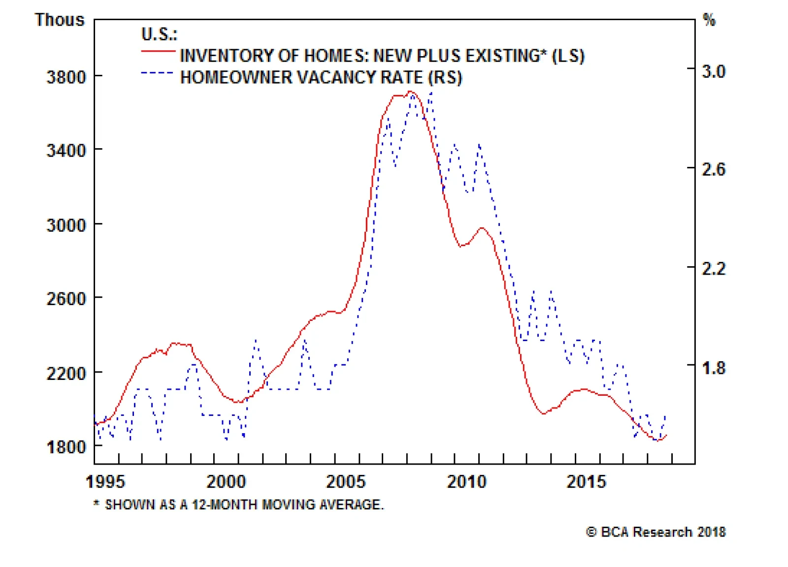
Housing is an important part of the economy, and residential investment could become a problem if it weakens further. Residential activity puts a lot of people to work, directly and indirectly, and drives the consumption of big-ticket items linked to home…
Highlights Chart 1Looking For Peak Credit Spreads
Looking For Peak Credit Spreads
Looking For Peak Credit Spreads
The sell-off in spread product continued through November, driven by that toxic combination of weakening global growth and tightening Fed policy. With spreads now looking more attractive, we have begun to search for catalysts that could throw the current sell-off into reverse. Chart 1 shows two catalysts that called the peak in credit spreads in early 2016: A move higher in the CRB Raw Industrials index – a sign of improving global demand – and a shift down in our 12-month Fed Funds Discounter – a sign of easier Fed policy. The recovery in the CRB index is so far only tentative, and despite Chairman Powell’s dovish tone last week, the Fed will need to see more credit market pain before hitting pause on the rate hike cycle. As such, we anticipate further spread widening during the next few months. On a cyclical (6-12 month) horizon, we continue to recommend a neutral allocation to spread product versus Treasuries and, given that the market is only priced for 44 bps of rate hikes during the next 12 months, a below-benchmark portfolio duration stance. Feature Investment Grade: Neutral Investment grade corporate bonds underperformed the duration-equivalent Treasury index by 120 basis points in November, dragging year-to-date excess returns down to -216 bps. The index option-adjusted spread widened 19 bps on the month and currently sits at 137 bps. Corporate bonds are no longer expensive. The 12-month breakeven spread for Baa-rated debt is almost back to its average historical level (Chart 2). However, as was noted in last week’s report and on the first page of this report, the combination of weakening global growth and Fed tightening makes further widening likely in the near term.1 Chart 2Investment Grade Market Overview
Investment Grade Market Overview
Investment Grade Market Overview
A period of outperformance will follow the current bout of spread widening once global growth re-accelerates and/or the Fed adopts a more dovish policy stance. Therefore, on a cyclical (6-12 month) horizon we maintain a neutral allocation to corporate bonds. Pre-tax corporate profits grew 22% (annualized) in Q3 and a stunning 16% during the past year, well above the rate of corporate debt accumulation (bottom panel). But going forward, the stronger dollar and accelerating wages will cause profit growth to slow in the first half of 2019, triggering a renewed increase in gross leverage (panel 4). With that in mind, we continue to recommend that investors maintain an up-in-quality bias within a neutral allocation to corporate bonds. We prefer to pick-up extra spread by favoring the long-end of the credit curve.2 High-Yield: Neutral High-Yield underperformed the duration-equivalent Treasury index by 155 basis points in November, dragging year-to-date excess returns down to +4 bps. The average index option-adjusted spread widened 47 bps on the month, and currently sits at 418 bps. Our measure of the excess spread available in the High-Yield index after accounting for default losses is currently 308 bps, nicely above its long-run average of 250 bps (Chart 3). In other words, if corporate defaults match the Moody’s baseline forecast during the next 12 months, high-yield bonds will return 308 bps in excess of duration-matched Treasuries, assuming no change in spreads. Factoring-in enough spread compression to bring the default-adjusted spread back to its historical average leads to an expected excess return of 534 bps. Chart 3High-Yield Market Overview
High-Yield Market Overview
High-Yield Market Overview
For a different perspective on valuation, we can also calculate the default rate necessary for the High-Yield index to deliver 12-month excess returns in line with the historical average. As of today, this spread-implied default rate is 3.20%, well above the 2.26% default rate anticipated by Moody’s (panel 4). While the elevated spread-implied default rate is certainly a sign of improved value, our sense is that the actual default rate will end up closer to the spread-implied level than to the level expected by Moody’s. Job cut announcements – an excellent indicator of corporate defaults – have put in a clear bottom (bottom panel) and the third quarter Senior Loan Officer Survey showed a decline in C&I loan demand, often a precursor of tighter lending standards.3 Table 3ACorporate Sector Relative Valuation And Recommended Allocation*
More Pain Required
More Pain Required
Table 3BCorporate Sector Risk Vs. Reward*
More Pain Required
More Pain Required
MBS: Neutral Mortgage-Backed Securities performed in line with the duration-equivalent Treasury index in November, keeping year-to-date excess returns steady at -43 bps. The conventional 30-year zero-volatility spread was flat on the month. A basis point widening in the option-adjusted spread (OAS) was offset by a basis point drop in the compensation for prepayment risk (option cost). Although very low mortgage refinancings have kept overall MBS spreads tight, the option-adjusted spread has widened in recent months, bringing some value back to the sector (Chart 4). Chart 4MBS Market Overview
MBS Market Overview
MBS Market Overview
In last week’s report we ran a performance attribution on excess MBS returns for 2018.4 We found that interest rate volatility had been a drag on MBS returns early in the year, but the sector’s most recent underperformance was almost entirely due to OAS widening. Mortgage refinancing risk, typically the most important risk factor, contributed positively to excess returns throughout most of the year. With Fed rate hikes likely to keep refinancings low, and with mortgage lending standards still easing from restrictive levels (bottom panel), the macro back-drop remains very supportive for MBS spreads. We maintain a neutral allocation to the sector for now, but will likely upgrade when it comes time to further pare our allocation to corporate credit. Government-Related: Underweight The Government-Related index underperformed the duration-equivalent Treasury index by 33 basis points in November, dragging year-to-date excess returns down to -50 bps. Sovereign debt underperformed the Treasury benchmark by 70 bps, dragging year-to-date excess returns down to -188 bps. Foreign Agencies underperformed by 68 bps, dragging year-to-date excess returns down to -128 bps. Local Authorities underperformed by 51 bps, dragging year-to-date excess returns down to +11 bps. Supranationals outperformed Treasuries by 5 bps, bringing year-to-date excess returns up to +19 bps. Domestic Agency bonds underperformed by 4 bps, dragging year-to-date excess returns down to +1 bp. Sovereign debt has underperformed this year, but spreads remain expensive compared to U.S. corporate credit and the dollar’s recent strength suggests that the sector will continue to struggle (Chart 5). Chart 5Government-Related Market Overview
Government-Related Market Overview
Government-Related Market Overview
In a recent report we looked at USD-denominated Emerging Market Sovereign debt by country and found that only a few nations offer excess spread compared to equivalently-rated U.S. corporates.5 Those countries are Argentina, Turkey, Lebanon and Ukraine at the low-end of the credit spectrum and Saudi Arabia, Qatar and UAE at the upper-end. We continue to view the Local Authority sector as very attractive. The sector offers similar value to Aa/A-rated corporate debt on a breakeven spread basis (bottom panel), and it is also dominated by taxable municipal securities that are insulated from weak foreign economic growth. Municipal Bonds: Overweight Municipal bonds underperformed the duration-equivalent Treasury index by 6 basis points in November, dragging year-to-date excess returns down to +99 bps (before adjusting for the tax advantage). The average Aaa-rated Municipal / Treasury (M/T) yield ratio fell 2% in November, and currently sits at 86% (Chart 6). This is about one standard deviation below its post-crisis mean and only slightly above the average of 81% that was observed in the late stages of the previous cycle, between mid-2006 and mid-2007. Chart 6Municipal Market Overview
Municipal Market Overview
Municipal Market Overview
In our research into the phases of the credit cycle, we often divide the cycle based on the slope of the yield curve. Since 1975, in the middle phase of the credit cycle when the 3/10 Treasury slope is between 0 bps and +50 bps (where it stands today) investment grade corporate bonds have delivered annualized excess returns of -11 bps. In contrast, municipal bonds have delivered annualized excess returns of +156 bps before adjusting for the tax advantage. We attribute this mid-cycle outperformance to the fact that state & local government balance sheet health tends to lag the health of the corporate sector. At present, our Municipal Health Monitor remains in “improving health” territory, consistent with an environment where ratings upgrades will outpace downgrades (bottom panel). Meanwhile, corporations are already deep into the releveraging process. Treasury Curve: Favor The 2-Year Bullet Over The 1/5 Barbell Treasury yields fell in November, led by the 5-10 year maturities. The 2/10 slope flattened 7 bps to end the month at 21 bps. The 5/30 slope steepened 5 bps to end the month at 46 bps. In a recent report we demonstrated that the best place to position on the Treasury curve has shifted from the 5-7 year maturity point to the 2-year maturity point.6 Our sense is that the 2-year note offers the best combination of risk and reward of any point on the Treasury curve, both in absolute and duration-neutral terms. The 2/5 Treasury slope was 31 bps at the beginning of 2018, but has flattened all the way down to 4 bps over the course of this year. Factoring in the greater roll-down at the short-end of the curve, we find that the 2-year note would actually outperform the 5-year note in an unchanged yield curve scenario. This sort of carry advantage in the 2-year note is relatively rare, and tends to occur only when the yield curve is inverted. Attractive compensation at the front-end of the curve provides an opportunity for investors to buy the 2-year note and short a duration-matched 1/5 barbell. Our model shows that the 2 over 1/5 butterfly spread is priced for 18 bps of 1/5 flattening during the next six months (Chart 7). In other words, if the 1/5 slope steepens or flattens by less than 18 bps, our position long the 2-year and short the 1/5 will outperform. Chart 7Treasury Yield Curve Overview
Treasury Yield Curve Overview
Treasury Yield Curve Overview
TIPS: Overweight TIPS underperformed the duration-equivalent nominal Treasury index by 54 basis points in November, dragging year-to-date excess returns down to +21 bps. The 10-year TIPS breakeven inflation rate fell 8 bps on the month and currently sits at 1.97%. The 5-year/5-year forward TIPS breakeven inflation rate fell 3 bps on the month and currently sits at 2.17%. Long-maturity TIPS breakeven inflation rates finally capitulated and have fallen sharply alongside the prices of oil and other commodities during the past two months. Breakevens continue to grapple with the competing forces of falling commodity prices on the one hand, and relatively strong U.S. inflation on the other. Eventually, the decisive factor in the TIPS market will be core U.S. inflation continuing to print close to the Fed’s 2% target. This will drive both the 10-year and 5-year/5-year forward TIPS breakeven inflation rates back into a range between 2.3% and 2.5%, although the headwind from weak commodity prices could persist for a while longer. In a recent report we showed that the 10-year TIPS breakeven rate is very close to the fair value reading from our Adaptive Expectations Model (Chart 8).7 This model is based on a combination of long-run and short-run inflation measures and is premised on the idea that investors’ expectations take time to adjust to changing macro environments. In other words, the market will need to see core inflation print close to the Fed’s target for some time before deciding that it will remain there on a sustained basis. Chart 8Inflation Compensation
Inflation Compensation
Inflation Compensation
ABS: Neutral Asset-Backed Securities underperformed the duration-equivalent Treasury index by 2 basis points in November, dragging year-to-date excess returns down to +21 bps. The index option-adjusted spread for Aaa-rated ABS widened 4 bps on the month and now stands at 42 bps, 8 bps above its pre-crisis low. The Fed’s Senior Loan Officer Survey for Q3 showed that average consumer credit lending standards eased for the first time since early 2016 (Chart 9). Consistent with a somewhat more supportive lending environment, the consumer credit delinquency rate has been roughly flat on a year-over-year basis. However, given the continued uptrend in household interest coverage, consumer credit delinquencies are biased higher (panel 4). Chart 9ABS Market Overview
ABS Market Overview
ABS Market Overview
The excess return Bond Map on page 15 shows that consumer ABS offer greater expected returns than Domestic Agencies and Supranationals, though with a commensurate increase in risk. The Map also shows that Agency CMBS offer very similar return potential with much less risk. We maintain a neutral allocation to consumer ABS for now. As consumer credit delinquencies continue to rise, our next move will likely be a reduction to underweight. Non-Agency CMBS: Underweight Non-Agency Commercial Mortgage-Backed Securities underperformed the duration-equivalent Treasury index by 37 basis points in November, dragging year-to-date excess returns down to +82 bps. The index option-adjusted spread for non-agency Aaa-rated CMBS widened 7 bps on the month and currently sits at 80 bps (Chart 10). Chart 10CMBS Market Overview
CMBS Market Overview
CMBS Market Overview
A typical negative environment for CMBS is characterized by tightening bank lending standards on commercial real estate loans as well as falling demand. The Fed’s Q3 Senior Loan Officer Survey showed that lending standards are close to unchanged and that demand deteriorated. All in all, a slightly negative macro picture for CMBS that will bear close monitoring in the coming quarters. Agency CMBS: Overweight Agency CMBS underperformed the duration-equivalent Treasury index by 9 basis points in November, dragging year-to-date excess returns down to +14 bps. The index option-adjusted spread widened 5 bps on the month and currently sits at 56 bps. The Bond Maps on page 15 show that Agency CMBS offer high potential return compared to other low risk spread products. An overweight allocation to this sector continues to make sense. The BCA Bond Maps The following page presents excess return and total return Bond Maps that we use to assess the relative risk/reward trade-off between different sectors of the U.S. fixed income market. The Maps employ volatility-adjusted breakeven spread/yield analysis to show how likely it is that a given sector will earn/lose money during the subsequent 12 months. The Maps do not impose any macroeconomic view. The Excess Return Bond Map The horizontal axis of the excess return Bond Map shows the number of days of average spread widening required for each sector to lose 100 bps versus a position in duration-matched Treasuries. Sectors plotting further to the left require more days of average spread widening and are therefore less likely to see losses. The vertical axis shows the number of days of average spread tightening required for each sector to earn 100 bps in excess of duration-matched Treasuries. Sectors plotting further toward the top require fewer days of spread tightening and are therefore more likely to earn 100 bps in excess of Treasuries. The Total Return Bond Map The horizontal axis of the total return Bond Map shows the number of days of average yield increase required for each sector to lose 5% in total return terms. Sectors plotting further to the left require more days of yield increases and are therefore less likely to lose 5%. The vertical axis shows the number of days of average yield decline required for each sector to earn 5% in total return terms. Sectors plotting further toward the top require fewer days of yield decline and are therefore more likely to earn 5%. Chart 11Excess Return Bond Map (As Of November 30, 2018)
More Pain Required
More Pain Required
Chart 12Total Return Bond Map (As Of November 30, 2018)
More Pain Required
More Pain Required
Table 4Butterfly Strategy Valuation (As Of November 30, 2018)
More Pain Required
More Pain Required
Table 5Discounted Slope Change During Next 6 Months (BPs)
More Pain Required
More Pain Required
Ryan Swift, Vice President U.S. Bond Strategy rswift@bcaresearch.com Jeremie Peloso, Research Analyst JeremieP@bcaresearch.com Footnotes 1 Please see U.S. Bond Strategy Weekly Report, “A Checklist For Peak Credit Spreads”, dated November 27, 2018, available at usbs.bcaresearch.com 2 Please see U.S. Bond Strategy Weekly Report, “What Kind Of Correction Is This?”, dated October 30, 2018, available at usbs.bcaresearch.com 3 Please see U.S. Bond Strategy Weekly Report, “Adaptive Expectations In The TIPS Market”, dated November 20, 2018, available at usbs.bcaresearch.com 4 Please see U.S. Bond Strategy Weekly Report, “A Checklist For Peak Credit Spreads”, dated November 27, 2018, available at usbs.bcaresearch.com 5 Please see U.S. Bond Strategy Weekly Report, “Oil Supply Shock Is A Risk For Junk”, dated October 9, 2018, available at usbs.bcaresearch.com 6 Please see U.S. Bond Strategy Weekly Report, “The Sweet Spot On The Yield Curve”, dated November 13, 2018, available at usbs.bcaresearch.com 7 Please see U.S. Bond Strategy Weekly Report, “Adaptive Expectations In The TIPS Market”, dated November 20, 2018, available at usbs.bcaresearch.com Fixed Income Sector Performance Recommended Portfolio Specification Corporate Sector Relative Valuation And Recommended Allocation Total Return Comparison: 7-Year Bullet Versus 2-20 Barbell (6-Month Investment Horizon)
Remodeling Our View On Home Improvement Retail
Remodeling Our View On Home Improvement Retail
Underweight (High-Conviction) While the probability of a housing recession remains low, we are concerned that too much euphoria is already priced in the S&P home improvement retail (HIR) index, and there are high odds that next year HIR will suffer the same fate as homebuilders did this year (top panel). Thus, we are downgrading the S&P HIR index to underweight and adding it to the high-conviction underweight list for 2019. Fixed residential investment (FRI) as a percentage of GDP is up 50% from trough to the recent peak, whereas relative HIR performance is up 170% in the same time frame. Our worry is that optimistic sell side analysts’ relative profit forecasts will be hard to attain, let alone surpass as FRI is steadily sinking (second panel). Worrisomely, our HIR model has plunged on the back of the wholesale liquidation in lumber prices and rising interest rates (bottom panel). Lumber deflation will prove a profit headwind as building supply Big Box retailers make a set margin on wood products. Bottom Line: Rich valuations will be tough to maintain amidst weak FRI, lower lumber prices and higher interest rates. We downgraded to an underweight position on Monday and added the S&P HIR index to our high-conviction underweight list; please see Monday’s Weekly Report for more details. The ticker symbols for the stocks in this index are: BLBG: S5HOMI - HD, LOW.
GAA DM Equity Country Allocation Model Update The GAA DM Equity Country Allocation model is updated as of November 30, 2018. The quant model further downgraded U.S. in favor of the non-U.S. block, especially Germany, the Netherlands, Swiss, Spain and Canada as shown in Table 1. Table 1Model Allocation Vs. Benchmark Weights
GAA Quant Model Updates
GAA Quant Model Updates
As shown in Table 2 and Charts 1 - 3, the overall model outperformed the MSCI world benchmark by 1 bp in November, with a 27 bps of outperformance from Level 2 model offset by a 10 bps of underperformance from Level 1. Since going live, the overall model has outperformed by 46 bps, with Level 2 outperforming by 156 bps and level 1 underperforming by 12 bps. Table 2Performance (Total Returns In USD %)
GAA Quant Model Updates
GAA Quant Model Updates
Chart 1GAA DM Model Vs. MSCI World
GAA DM Model Vs. MSCI World
GAA DM Model Vs. MSCI World
Chart 2GAA U.S. Vs. Non U.S. Model (Level 1)
GAA U.S. Vs. Non U.S. Model (Level 1)
GAA U.S. Vs. Non U.S. Model (Level 1)
Chart 3GAA Non U.S. Model (Level 2)
GAA Non U.S. Model (Level 2)
GAA Non U.S. Model (Level 2)
Please see also the website http://gaa.bcaresearch.com/trades/allocation_performance. For more details on the models, please see Special Report, “Global Equity Allocation: Introducing The Developed Markets Country Allocation Model,” dated January 29, 2016, available at https://gaa.bcaresearch.com. Please note that the overall country and sector recommendations published in our Monthly Portfolio Update and Quarterly Portfolio Outlook use the results of these quantitative models as one input, but do not stick slavishly to them. We believe that models are a useful check, but structural changes and unquantifiable factors need to be considered too in making overall recommendations. GAA Equity Sector Selection Model Dear Client, As advised in our October 2018 Special Alert, we have suspended the GAA Equity Sector Selection Model due to the significant changes in the GICS sector classifications, implemented at the end of September. We will rebuild the model using the newly constituted sectors once full back data is available from MSCI, which we understand will be in December. We thank you for your understanding. Xiaoli Tang, Associate Vice President xiaoliT@bcaresearch.com Amr Hanafy, Research Associate amrh@bcaresearch.com
Highlights Portfolio Strategy Higher interest rates, with the Federal Reserve tightening monetary policy three more times in the next seven months, will be the dominant theme next year. All four of our high-conviction underweight calls are levered to this theme. The later stages of the U.S. capex upcycle underpin three of our high-conviction overweight calls for 2019. Recent Changes Downgrade the S&P Home Improvement Retail index to underweight today. Trim the S&P Interactive Media & Services index to a below benchmark allocation today. Table 1
2019 Key Views: High-Conviction Calls
2019 Key Views: High-Conviction Calls
Feature Fed policy will dominate markets next year as the dual tightening backdrop – rising fed funds rate and accelerated downsizing of the Fed balance sheet – remains intact. Two weeks ago we raised the question: is the Fed tightening monetary policy too far too fast?1 In more detail, we put the latest monetary tightening cycle in historical perspective and examined trough-to-peak moves in the fed funds rate since the 1950s (Chart 1). Chart 1Too Far Too Fast?
Too Far Too Fast?
Too Far Too Fast?
A good friend I call “the smartest man in California” correctly pointed out that 500bps of tightening today is not the same as in the 1970s or 1980s. Chart 2 adjusts for that by including the average nominal GDP growth rate during these tightening episodes and adds more color to each era. As a reminder, the latest cycle that commenced in December 2015 is already 25bps above the median, if one uses the Wu-Xia shadow fed funds rate to capture the full quantitative easing effect, and above-average nominal output growth. Chart 2Trough-To-Peak Tightening Cycle Already Above Historical Median
2019 Key Views: High-Conviction Calls
2019 Key Views: High-Conviction Calls
Trying to answer the question, we are concerned that as the Fed remains committed to tighten monetary policy three more times by mid-2019, a yield curve inversion looms, especially if the U.S. economy suffers a soft patch in the first half of next year (please refer to our Economic Impulse Indicator analysis in the October 22ndand November 19th Weekly Reports). This would signal at least a pause, if not reversal, in Fed policy. With that in mind, this week we are revealing our high-conviction calls for 2019. Four of our calls are a play on this tightening monetary backdrop that is one of BCA’s themes for next year.2 The later stages of the U.S. capex upcycle underpin three of our high-conviction calls. Table 22018 High-Conviction Calls Recap
2019 Key Views: High-Conviction Calls
2019 Key Views: High-Conviction Calls
However, before we highlight our 2019 high-conviction calls in detail, Table 2 tallies our calls from last year. We had a stellar performance in our 2018 high-conviction calls with an average excess return of 11.6% versus the S&P 500. As the year turns the corner, closing out the remaining calls brings down the average relative return to 7.5%, still a very impressive number, with a total of ten hits and only two misses for the year. Anastasios Avgeriou, Vice President U.S. Equity Strategy anastasios@bcaresearch.com Software (Overweight, Capex Theme) Software stocks are our first hold out from last year’s high-conviction overweight list, levered to the capex upcycle theme. Chart 3 shows that relative capital outlays and the share price ratio are joined at the hip. Software upgrades offer the simplest, quickest and most effective capital deployment, especially when productivity gains ground to a halt. Importantly, leading indicators of overall capex remain upbeat and should continue to underpin software profits. Beyond capex, M&A has been fueling software stock prices. It did not take long for the large CA acquisition to get surpassed by RHT and more recently SYMC was also rumored to be in play (Chart 3). Inter-industry M&A activity is reaching fever pitch and this frenzy is bidding up premia to stratospheric levels. The push to the cloud, SaaS and even AI has boosted the appeal of software stocks and brought them to the forefront of potential takeout candidates. These are secular trends and will likely continue to gain steam irrespective of the different stages in the business cycle. As a result, software stocks should remain core tech holdings in equity portfolios. The recovery in the software price deflator (Chart 3), a proxy for industry pricing power, corroborates the upbeat demand backdrop. With regard to financial statements, software stocks have pristine balance sheets with more cash on hand than debt, which sustains the net debt-to-EBITDA ratio in negative territory. Interest coverage is great at 10x and free cash flow generation is expanding smartly. The ticker symbols for the stocks in this index are: BLBG: S5SOFT - MSFT, ORCL, ADBE, CRM, INTU, RHT, ADSK, SNPS, CTXS, ANSS, CDNS, FTNT and SYMC. Chart 3Software
Software
Software
Air Freight & Logistics (Overweight, Capex Theme) Air freight & logistics stocks are the second hold out from our high-conviction overweight list, although we added it to list only in late-March. This transportation sub-index laggered is a capex and trade de-escalation play for the first half of 2019. Importantly, energy costs comprise a large chunk of freight services input costs and the recent drubbing in oil markets will boost margins especially on the eve of the busiest season for courier delivery services (top panel, Chart 4). On that front, there are high odds that this holiday sales season will be another record setting one, as wage inflation is underpinning discretionary incomes. Keep in mind that the accelerating domestic manufacturing shipments-to-inventories ratio confirms that demand for hauling services is upbeat. The implication is that rising demand for freight services will buoy industry profits and lift valuations out of their recent funk (Chart 4). Firming industry operating metrics also tell a positive story and suggest that relative share prices will soon take off. Air freight pricing power has been healthy, in expansionary territory and above overall inflation measures. While the U.S./China trade tussle and the appreciating greenback are clear risks to our sanguine S&P air freight & logistics transportation subindex, most of the grim news is already reflected in depressed relative forward profit estimates, bombed out valuations and washed out technicals (Chart 4). The ticker symbols for the stocks in this index are: BLBG: S5AIRF - FDX, UPS, EXPD and CHRW. Chart 4Air Freight & Logistics
Air Freight & Logistics
Air Freight & Logistics
Defense (Overweight, Capex Theme) We have been overweight the pure-play BCA defense index since late-2015 and there are high odds that this juggernaut that really commenced with the George Walker Bush presidency remains in a secular growth trajectory. Our strategy is to add exposure on any meaningful pullbacks and keep this index as a structural overweight within the GICS1 S&P industrials index. The recent drawdown offers such an opportunity and we are adding this index to the 2019 high-conviction overweight list. The rise of global "multipolarity" - or competition between the world's great nations - and the decline of globalization, along with a global arms race and increased risk of cyber-attacks, have been documented in our "Brothers In Arms" Special Report. These trends all signal that global defense related spending will remain upbeat in the coming decade.3 In the U.S. in particular, where military spending in absolute terms is greater than the rest of the world put together, defense spending and investment have bottomed and will continue to accelerate (Chart 5). In fact, the CBO continues to project that defense outlays will jump further next year. While such a breakneck pace is clearly unsustainable, President Trump is serious about upgrading and updating the U.S. military in order to keep China's geopolitical and military ascendancy in check (as well as to deal with Russia and Iran).4 The upshot is that defense outlays will continue to expand into the 2020s. Such a buoyant demand backdrop is music to the ears of defense contractor CEOs, and represents a boost to defense equity revenue growth prospects. This capital goods sub-industry has extremely high fixed costs and thus any increase in top line growth flows straight to the bottom line. Put differently, defense contractors enjoy high operating leverage. No wonder M&A activity is robust: at least four large deals have been announced in the past year that are underpinning takeout premia. A closer look at operating metrics corroborates that defense goods manufacturers are firing on all cylinders. New orders recently jumped to fresh all-time highs and the industry's shipments-to-inventories ratio is rising, on track to surpass the 2008 peak. Unfilled orders are also running at a high rate, signaling that factories will keep on humming at least for the next few quarters. Importantly, the industry is not standing still and is making significant investments. U.S. defense capex as reported in the financial statements of constituent firms is growing at roughly 20%/annum or twice as fast as overall capex (Chart 5 on page 7). While interest coverage has been modestly deteriorating, it is twice as high as the overall market (Chart 5 on page 7). Impressively, defense ROE is running near 30%, again roughly double the rate of the broad market. The ticker symbols for the stocks in the BCA defense index are: LMT, LLL, NOC, GD and RTN. Chart 5Defense
Defense
Defense
Consumer Discretionary (Underweight, Higher Fed Funds Rate Theme) We recommend investors avoid the consumer discretionary sector that suffers when interest rates rise. Chart 6 depicts this inverse correlation consumer discretionary equities have with interest rates, especially the fed funds rate. Most discretionary equites are levered off of floating rates and thus any increase in the fed funds rates gets reflected immediately in banks' prime lending rate. Also, most consumer debt is floating rate debt and thus tighter monetary conditions, at the margin, dampen consumer debt uptake and, as a knock-on effect, weigh on discretionary consumer outlays. Recently we highlighted that, now that the Fed has been raising rates and allowing bonds to roll off its balance sheet, volatility is making a comeback. Unsurprisingly, the consumer discretionary share price ratio is inversely correlated with the VIX index, signaling that more pain lies ahead for this early cyclical index (VIX shown inverted, Chart 6). Sentiment and technical indicators also point to more downside ahead for this interest-rate sensitive index. Our sector advance/decline line is waning and EPS breadth has plunged. Worrisomely, sell-side analysts are penciling in an extremely optimistic 5-year outlook with EPS growth 23.4%/annum or 1.4 times higher than the overall market. Clearly this is not realistic as it assumes a tripling of EPS in the coming 5 years. Relative EPS estimates have already given way as AMZN commands very little EPS weight, despite its massive market cap weight (30% of the S&P consumer discretionary sector), and suggests that relative share prices will converge lower (Chart 6 on page 9). As a result, the 12-month forward P/E ratio is trading at a 24% premium to the broad market and significantly above the historical mean. Technicals are almost as extended as relative valuations and cyclical momentum has likely peaked, warning that a downdraft in relative share prices looms (Chart 6 on page 9). Chart 6Consumer Discretionary
Consumer Discretionary
Consumer Discretionary
Home Improvement Retail (Underweight, Higher Fed Funds Rate Theme) While the probablity of a housing recession remains low, we are concerned that too much euphoria is already priced in the S&P home improvement retail (HIR) index, and there are high odds that next year HIR will suffer the same fate as homebuilders did this year (Chart 7). Thus, we are downgrading the S&P HIR index to underweight and adding it to the high-conviction underweight list for 2019. Fixed residential investment (FRI) as a percentage of GDP is up 50% from trough to the recent peak, whereas relative HIR performance is up 170% in the same time frame. Our worry is that optimistic sell side analysts' relative profit forecasts will be hard to attain, let alone surpass as FRI is steadily sinking (Chart 7). Worrisomely, our HIR model has plunged on the back of the wholesale liquidation in lumber prices and rising interest rates (Chart 7). Lumber deflation will prove a profit headwind as building supply Big Box retailers make a set margin on wood products. Select industry operating metrics suggest that the easy profits are behind HIR. Not only is our productivity growth proxy (sales per employee) on the verge of deflating, but also an inventory surge has sunk the HIR sales-to-inventories ratio into the contraction zone. Finally, there is rising supply of new and existing homes for sale already on the market, and that puts off remodeling activity at least until this supply glut clears (months' supply shown inverted, Chart 7). The ticker symbols for the stocks in this index are: BLBG: S5HOMI - HD, LOW. Chart 7Home Improvement Retail
Home Improvement Retail
Home Improvement Retail
Short Small Caps/Long Large Caps (Higher Fed Funds Rate Theme) The days in the sun are over for small cap stocks and we are compelled to put the size bias favoring large caps in our high-conviction calls list for 2019. Small caps are severely debt saddled. Sustained small cap balance sheet degradation is worrying, with S&P 600 net debt-to-EBITDA close to 4 compared with less than 2 for the SPX (Chart 8). Such gearing is fraught with danger as the default rate has nowhere to go but higher. Small and medium enterprises (SMEs) have a higher dependency on bank credit as opposed to the bond market access that mega caps enjoy. Most bank credit is floating rate debt and so are lines of credit, and as the Fed remains firm on tightening monetary policy, interest expense costs are skyrocketing for SMEs. In a relative sense this will weigh on net profits. Moreover, small caps are a lot more sensitive to interest rates, and the selloff in the 10-year Treasury note heralds more pain in 2019 (Chart 8). Small caps are high(er) beta stocks and when volatility spikes they underperform large caps. When the Fed ballooned its balance sheet and dropped the fed funds rate to zero it suppressed volatility. Now that the Fed has been decreasing the size of its balance sheet and raising interest rates, this is working in reverse and volatility is making a comeback as we have been highlighting in our research, and will continue to weigh on small caps (VIX shown inverted, middle panel, Chart 8). Another way to showcase small caps' riskier status is the close correlation they have with the relative EM equity share price ratio. When EMs outperform the SPX, small caps follow suit and vice versa. Importantly a wide gap has opened recently and we suspect that it will narrow via small caps following the EM higher beta stocks lower (SPX vs. EM ratio shown inverted, fourth panel, Chart 8 on page 12). Chart 8Small Vs. Large
Small Vs. Large
Small Vs. Large
Interactive Media & Services (Underweight, Higher Fed Funds Rate Theme) In our initiation of coverage on the S&P interactive media & services index,5 we highlighted three key risks that offset the revenue & profit growth vigor of this group, comprised almost entirely of Alphabet (Google) and Facebook. These were a renewed regulatory focus, rapid unpredictable changes in tastes & technology and an appreciating U.S. dollar. It is the first of these that has risen most dramatically since that report. Tack on the inverse correlation these growth stocks have with interest rates (top panel, Chart 9) and that is causing us to lower our recommendation to underweight and include this index in the high-conviction underweight list for 2019. Increasing regulatory efforts on technology will be a key theme next year, one we explored this past summer.6 Our conclusion was that both antitrust (particularly in the case of Alphabet) and privacy regulation (particularly in the case of Facebook) added significant risk to these near monopolies; calls for legislating both have dramatically amplified. Tim Cook, Apple’s CEO, recently commented that more regulation for Facebook and Alphabet was inevitable; we agree. While the form such regulation might take remains open to debate (for example, the U.S. could adopt an EU-style General Data Protection Regulation (GDPR)), we fear the associated headline risk (not to mention likely profit headwinds) will impair stock prices in the S&P interactive media & services index. This communication services sub-index is particularly prone to such a risk when it already trades at close to a 40% valuation premium to the broad market (middle panel, Chart 9 on page 14). Adding insult to injury is the PEG ratio that is trading at a 60% premium to the broad market (bottom panel, Chart 9 on page 14). In the face of the Fed’s sustained tightening cycle these extreme growth stocks are vulnerable to massive gravitational pull. The ticker symbols in the stocks in this index are: S5INMS – GOOGL, GOOG, FB, TWTR and TRIP. Chart 9Interactive Media & Services
Interactive Media & Services
Interactive Media & Services
Footnotes 1 Please see BCA U.S. Equity Strategy Report, "Manic Market," dated November 19, 2018, available at uses.bcaresearch.com. 2 Please see BCA The Bank Credit Analyst Report, "OUTLOOK 2019: Late-Cycle Turbulence", dated November 26, 2018, available at bca.bcaresearch.com. 3 Please see BCA U.S. Equity Strategy Special Report, "Brothers In Arms," dated October 31, 2016, available at uses.bcaresearch.com. 4 Please see BCA Geopolitical Strategy Special Report, "A Global Show Of Force?" dated October 10, 2018, available at gps.bcaresearch.com. 5 Please see BCA U.S. Equity Strategy Special Report, "New Lines Of Communication," dated October 1, 2018, available at uses.bcaresearch.com. 6 Please see BCA U.S. Equity Strategy Special Report, "Is The Stock Rally Long In The FAANG?", dated August 1, 2018, available at uses.bcaresearch.com. Current Recommendations Current Trades Size And Style Views Favor value over growth Favor large over small caps