Sectors

Highlights Duration: The waning impact from fiscal stimulus and the drag from weak foreign economic activity will cause U.S. growth to slow as we enter 2019. But with market-implied rate hike expectations still depressed, we are inclined to maintain below-benchmark portfolio duration. Yield Curve: Over the course of the year the sweet spot on the Treasury curve has shifted from the 5-year/7-year maturity point to the 2-year. The 2-year note offers the best combination of risk and reward of any point on the Treasury curve. This is true in both absolute and duration-neutral terms. Spread Product: Investors looking for attractive alternatives to Treasury debt at the short-end of the curve should consider Agency CMBS and Local Authority debt. Those sectors offer attractive spread pick-up and low risk of capital loss. Feature So far this year the Bloomberg Barclays Treasury index has returned -2.2% in absolute terms and -3.7% versus cash (Chart 1). If the year ended today, it would go into the books as the worst year for excess Treasury returns since 2009. Chart 1A Year To Forget
A Year To Forget
A Year To Forget
Taking stock of this poor bond market performance makes us wonder what might prompt a reversal of fortunes. Our golden rule of bond investing tells us that if the economic outlook worsens enough for the market to discount a slower pace of Fed rate hikes, then bond market performance will improve.1 But with the market priced for only 63 bps of rate hikes during the next 12 months, we are reluctant to make that bet today. That being said, it also seems likely that U.S. GDP growth will slow as we head into the New Year. At the very least, the intensity of the bond market sell-off should diminish as well. Peak Growth There are two reasons why we think U.S. growth will soften during the next few quarters. The first is that global economic growth (excluding the U.S.) has already slowed. In past reports we demonstrated that weak foreign economic growth tends to pull down the U.S., rather than strong U.S. growth pulling up the rest of the world.2 While recent U.S. data show only tentative signs of contagion from the rest of the world, we also see no evidence of moderation in the global growth slowdown.3 The Global Manufacturing PMI fell to 52.1 in October, a far cry from its early-2018 peak above 54 (Chart 2). The percentage of countries with PMIs above the 50 boom/bust line also fell to 74% in October, down from its 2018 high of 95%. Chart 2The Global Growth Slowdown Continues...
The Global Growth Slowdown Continues...
The Global Growth Slowdown Continues...
Considering the major economic blocs, the global growth slowdown continues to be driven by Europe and China (Chart 3). The Eurozone aggregate PMI remains above 50, but is falling rapidly. Meanwhile, the Chinese PMI is threatening to break below 50, and will probably do so during the next few months. The full slate of U.S. import tariffs have still not been implemented, and in the background, leading indicators of Chinese economic activity remain soft (Chart 4). Chart 3...Driven By Europe And China
...Driven By Europe And China
...Driven By Europe And China
Chart 4Chinese Economy Keeps Slowing
Chinese Economy Keeps Slowing
Chinese Economy Keeps Slowing
The second reason why U.S. growth is likely to slow during the next few quarters is the waning impact from fiscal stimulus. With the Democrats taking control of the House following last week's midterm elections, any hopes for another round of tax cuts should be quickly dashed. There is probably room for compromise between the two parties on infrastructure spending, but it will take some time (possibly the better part of two years) for them to reach an agreement. Meanwhile, the IMF estimates that fiscal policy will shift from adding 1% to GDP growth in 2018 to only 0.4% next year (Chart 5). Chart 5Less Boost From Fiscal In 2019
Less Boost From Fiscal In 2019
Less Boost From Fiscal In 2019
Bottom Line: The waning impact from fiscal stimulus and the drag from weak foreign economic activity will cause U.S. growth to slow as we enter 2019, but at this point it is not clear whether growth will slow sufficiently for the Fed to deviate from its +25 bps per quarter rate hike pace. With the market only priced for 63 bps of rate hikes during the next year, below-benchmark portfolio duration remains warranted. We prefer to position for slowing U.S. growth by taking less credit risk, maintaining only a neutral allocation to spread product with an up-in-quality bias. The Increasing Attractiveness Of Shorter Maturities Chart 1 shows a fairly consistent bearish trend in the bond market: at no point in 2018 were Treasury index returns in the black. But this doesn't mean that nothing has changed in the Treasury market this year, far from it. In fact, this year's bear-flattening of the yield curve has shifted the sweet spot for Treasury investors from the 5-year/7-year maturity point to the 2-year maturity point (Chart 6). This is true both in absolute and duration-neutral terms. Chart 6Par Coupon Treasury Curve
The Sweet Spot On The Yield Curve
The Sweet Spot On The Yield Curve
Absolute Returns As can be seen in Chart 6, at the beginning of the year the steepest part of the Treasury curve ended at around the 5-year/7-year maturity point. Today, the curve flattens off considerably after the 2-year maturity point. This change in shape has important implications for the amount of return investors can earn from rolling down the yield curve. Table 1 shows expected 12-month returns for 2-year, 5-year and 10-year Treasury notes in three different scenarios. A scenario where the yield curve is unchanged during the next year, one where all yields rise by the average of historical 12-month yield increases, and one where all yields decrease by the average of historical 12-month yield declines. Table 1Bullish And Bearish Scenarios At Different Points Of The Curve
The Sweet Spot On The Yield Curve
The Sweet Spot On The Yield Curve
In the unchanged yield curve scenario, expected returns are equal to "carry" which is simply the sum of the coupon income from the note (yield pick-up) and the capital gains earned from rolling down the curve (roll-down). It is in the roll-down component where the changing shape of the yield curve is most apparent. At the beginning of the year, an investor in the 5-year Treasury note could expect to earn 40 basis points of roll-down on a 12-month investment horizon, whereas an investor in the 2-year note would only earn 13 bps. But today, there is 21 bps of roll-down embedded in the 2-year note and only 6 bps in the 5-year. The end result is that we would actually expect the 2-year note to outperform the 5-year note in an unchanged yield curve environment, and only deliver 15 bps less return than the 10-year note. Charts 7A and 7B show that this sort of attractiveness in the 2-year note is quite rare. The 2-year does not usually offer more carry than the 5-year or 10-year, and periods when it does tend to coincide with an inverted yield curve. Since an inverted yield curve is a reliable predictor of recession, it usually makes sense to extend duration and favor long maturity Treasuries in those environments. This is because yields are likely to fall as the Fed cuts rates to fight the recession. But in the current environment, if recession is avoided during the next 12 months - as is our expectation - and Treasury yields continue to drift higher, a strategy of favoring the 2-year note will pay off handsomely. Chart 7AMore Carry In The 2-Year Note I
More Carry In The 2-Year Note I
More Carry In The 2-Year Note I
Chart 7BMore Carry In The 2-Year Note II
More Carry In The 2-Year Note II
More Carry In The 2-Year Note II
This is further elucidated by the bull and bear cases shown in Table 1. In the bearish scenario where each point on the yield curve rises by its historical 12-month average (the average is calculated only for periods when yields actually increased), the 2-year note still has a positive expected return. More importantly, the 2-year note offers an expected return that is 215 bps greater than the expected return from the 5-year note. At the beginning of the year, the 2-year note only offered 161 bps more expected return than the 5-year note in the bearish bond scenario. Similarly, in the bullish bond scenario, the 2-year note is only expected to lag the 5-year note by 228 bps. At the beginning of the year, the 2-year would have been expected to lag the 5-year by 297 bps in the bullish bond scenario. In other words, from an absolute return perspective the 2-year Treasury note is the most attractive part of the yield curve. The 2-year will outperform other maturities by more than usual in a rising yield scenario and underperform by less than usual in a falling yield scenario. This alluring combination of risk and reward looks even more enticing when coupled with our preference for keeping portfolio duration low. In Duration-Neutral Terms We do not typically look at expected total returns for specific maturity points. Rather, we prefer to separate the portfolio duration call from the yield curve positioning call. In other words, we communicate our view on the level of rates through our portfolio duration recommendation and then consider which parts of the yield curve look most attractive in duration-neutral terms. To do this, we look at butterfly spreads. Chart 8 shows that the 2/5/10 butterfly spread - the spread between the 5-year bullet and a duration-matched 2/10 barbell - has turned negative. This is unusual outside of environments where the 2/10 slope is inverted. In fact, our fair value model for the 2/5/10 butterfly spread is based on the slope of the 2/10 Treasury curve and it currently flags the 5-year bullet as expensive (Chart 8, bottom panel).4 Chart 8The 5-Year Bullet Is Expensive...
The 5-Year Bullet Is Expensive...
The 5-Year Bullet Is Expensive...
In contrast, the 2-year bullet is the cheapest it has been since 2005 relative to the 1/5 barbell (Chart 9). This means that the 1/5 slope would have to flatten dramatically for returns in the 1/5 barbell to overcome the carry advantage in the 2-year note. For this reason we closed our prior yield curve position - long the 7-year bullet and short the 1/20 barbell - in last week's report, and entered a position long the 2-year bullet and short the 1/5 barbell. Chart 9...But The 2-Year Bullet Is Cheap
...But The 2-Year Bullet Is Cheap
...But The 2-Year Bullet Is Cheap
Bottom Line: Over the course of the year the sweet spot on the Treasury curve has shifted from the 5-year/7-year maturity point to the 2-year. The 2-year note offers the best combination of risk and reward of any point on the Treasury curve. This is true in both absolute and duration-neutral terms. Short Maturity Spread Product Given that the sweet spot on the yield curve has shifted from the 5-year/7-year maturity point to the 2-year maturity point, we thought we should also examine which spread products offer attractive opportunities to earn extra compensation at the short-end of the curve, as an alternative to simply buying the 2-year Treasury note. Table 2 shows the spread per unit of duration offered by different high-quality (Aaa/Aa rated), low maturity (1-3 year) spread products. We exclude non-Agency CMBS and Agency MBS because the spread volatility in those sectors makes them riskier than their credit ratings imply. Table 21-3 Year Maturity Aaa/Aa-Rated Spread Products
The Sweet Spot On The Yield Curve
The Sweet Spot On The Yield Curve
Auto loan ABS and Aa-rated corporate bonds offer the most spread pick-up per unit of duration, but we see some potential for spread widening in both sectors. Corporate spreads could widen as profit growth falls below the rate of debt growth during the next few quarters and consumer ABS spreads might also have upside. The consumer credit delinquency rate is rising, and banks are tightening standards lending standards (Chart 10). Chart 10Some Upside In Consumer ABS Spreads
The Sweet Spot On The Yield Curve
The Sweet Spot On The Yield Curve
Agency CMBS and Foreign Agencies both offer 17 bps of spread per unit of duration. Of those two sectors we prefer Agency CMBS, which look very attractive on our Bond Map.5 Foreign Agencies also look attractive on our Map, but could struggle as the U.S. dollar appreciates making dollar debt more difficult for foreign borrowers to service. Of all the sectors listed in Table 2, the 15 bps spread per unit of duration offered by Local Authority debt looks most alluring. Largely composed of taxable municipal issues, Local Authority debt is insulated from weakness abroad and still offers a reasonably attractive spread pick-up. Bottom Line: Investors looking for attractive alternatives to Treasury debt at the short-end of the curve should consider Agency CMBS and Local Authority debt. Those sectors offer attractive spread pick-up and low risk of capital loss. Ryan Swift, Vice President U.S. Bond Strategy rswift@bcaresearch.com 1 Please see U.S. Bond Strategy Weekly Report, "The Golden Rule Of Bond Investing", dated July 24, 2018, available at usbs.bcaresearch.com 2 Please see U.S. Bond Strategy Weekly Report, "An Oasis Of Prosperity?", dated August 21, 2018, available at usbs.bcaresearch.com 3 While U.S. data remain very strong, the low contribution of nonresidential investment spending to overall GDP growth in Q3 could be a sign of contagion from the rest of the world. For further details please see U.S. Bond Strategy Weekly Report, "What Kind Of Correction Is This?", dated October 30, 2018, available at usbs.bcaresearch.com 4 For further details on our butterfly spread models, please see U.S. Bond Strategy Special Report, "Bullets, Barbells And Butterflies", dated July 25, 2017, available at usbs.bcaresearch.com 5 Please see U.S. Bond Strategy Portfolio Allocation Summary, "Toxic Combination", dated November 6, 2018, available at usbs.bcaresearch.com Fixed Income Sector Performance Recommended Portfolio Specification
Overweight (downgrade alert) In an August Insight Report, we noted the stratospheric rise of Apple was the key driver of the S&P 500's exceptional run and the S&P tech hardware, storage & peripherals (THSP) index's stellar outperformance.1 In that report, we suggested that clients institute a stop in this high-conviction call at the 10% relative return mark; Apple's fall since the weak outlook provided in their recent earnings report triggered that stop on Friday. Accordingly, we have booked the 10% gain since the April 9, 2018 addition of the S&P THSP index to our high-conviction list. The core rationale for our initial high-conviction overweight recommendation was our capex upcycle theme. However, capex intentions have rolled over, albeit from extended levels, and that should reveal itself in lower real capital deployment growth in general (second panel). More specific to the S&P THSP index, the decelerating investment growth has been pronounced in computers and peripheral equipment (bottom panel), which is corroborated by Apple's slowing sales expansion. Our thesis is thus somewhat dented and we are also compelled to add it to our downgrade watch list. Bottom Line: The recent pullback in the S&P THSP index triggered our stop last Friday and we locked in gains of 10% since inception. The S&P THSP index is now off our high conviction overweight list and we also put it on downgrade alert. The ticker symbols for the stocks in this index are: BLBG: S5CMPE - HPQ, WDC, STX, XRX, AAPL, HPE, NTAP. 1 Please see BCA U.S. Equity Strategy Insight Report, "Tech Hardware Is On Fire," dated August 31, 2018, available at uses.bcaresearch.com.
The Falling Apple And The Law Of Gravity
The Falling Apple And The Law Of Gravity
Despite a stellar Q3 earnings print, the S&P 500 had a terrible October as EPS continues to do the hard work in lifting the market (Chart 1). Chart 1EPS Doing The Heavy Lifting
EPS Doing The Heavy Lifting
EPS Doing The Heavy Lifting
We bought the dip,1 consistent with our view of deploying longer term oriented capital were a 10% pullback to occur, given our view of no recession for the next 9 to 12 months.2 Financials and industrials should lead the next leg up and we believe a rotation into these beaten up stocks is going to materialize in the coming months. On the flip side, as volatility is making a comeback and the fed is on a path to lift rates to 3% by June of next year, fixed income proxies and consumer discretionary stocks should be avoided and a preference for large caps over small caps should be maintained (Chart 2). Chart 2The Return Of Vol May Spoil The Party
The Return Of Vol May Spoil The Party
The Return Of Vol May Spoil The Party
Further, a valuation reset has taken hold, pushed by the surprising rise of the equity risk premium over the course of the past two years, representing a surge in negative sentiment from investors, despite the usually tight inverse correlation with the ISM, the core sentiment indicator of the manufacturing economy (Chart 3). Chart 3ERP And The Economy Are Inversely Correlated
ERP And The Economy Are Inversely Correlated
ERP And The Economy Are Inversely Correlated
Nevertheless, while everyone is focusing on the euphoric above trend growth of the U.S. economy, a risk lurking beneath the surface is a domestic economic soft patch.3 We have likely stolen demand from the future and brought consumption forward especially with the stock market related fiscal easing that is front loaded to 2018 and less so for next year. On that front our Economic Impulse Indicator is warning that the U.S. economy cannot grow at such a pace, unless a bipartisan divide can be crossed to deliver enough firepower to rekindle GDP growth (Chart 4). Chart 4Economic Impulse Yellow Flag
Economic Impulse Yellow Flag
Economic Impulse Yellow Flag
Further, at least part of the blame for higher volatility rests with increasing trade uncertainty as the Trump administration has pursued an aggressive trade policy. Still, the evidence so far indicates that any trade weakness has been borne disproportionately by the rest of the world, to the U.S.' benefit (Charts 5 & 6). Chart 5U.S. Is Winning The Trade War
U.S. Is Winning The Trade War
U.S. Is Winning The Trade War
Chart 6U.S. Has The Upper Hand
U.S. Has The Upper Hand
U.S. Has The Upper Hand
We remain cognizant of a few key risks to our sanguine U.S. equity view. Principal among these is the rising U.S. dollar and its eventual infiltration into S&P 500 earnings, which has thus far been muted (Chart 7). Chart 7Watch The U.S. Dollar
Watch The U.S. Dollar
Watch The U.S. Dollar
Further, a softening housing market bodes ill for U.S. economic growth. This is the first time since the GFC that residential investment's contribution to real GDP growth turned negative for three consecutive quarters (Chart 8). Chart 8Peak Housing
Peak Housing
Peak Housing
Chris Bowes, Associate Editor chrisb@bcaresearch.com 1 Please see BCA U.S. Equity Strategy Daily Insight, "Time To Bargain Hunt," dated October 26, 2018, available at uses.bcaresearch.com. 2 Please see BCA U.S. Equity Strategy Weekly Report, "The "FIT" Market," dated October 9, 2018, available at uses.bcaresearch.com. 3 Please see BCA U.S. Equity Strategy Weekly Report, "Critical Reset," dated October 29, 2018, available at uses.bcaresearch.com. S&P Financials (Overweight) Unchanged from its trajectory when we updated our cyclical indicators earlier this year, the S&P financials CMI has continued to accelerate. A historically low unemployment rate, combined with unusually resilient economic growth, underpin the surge in the CMI to its highest levels post-GFC. Further goosing the indicator, particularly with respect to the core banks sub-sector, is the recent rise in Treasury yields and a modest steepening in the yield curve both of which bode well for bank profits. However, financials have not responded to this exceptionally bullish data the way we expected, with worries over future loan growth fully offsetting the positive backdrop; financials have been falling throughout 2018. Still, inflation is threatening to rise (albeit gradually) and a selloff looms in the bond market. We highlighted earlier this fall that sectors who benefit from rising interest rates while serving as inflation hedges should outperform against this backdrop. Cue the return of S&P financials. As shown in Chart 10, the S&P financials index has shown a historically strong positive correlation with interest rates and inflation expectations and we expect the recent divergence to be closed via a catch-up in the former. As noted above, bearishness has reigned in 2018 and the result has been a steep fall in our valuation indicator (VI) to more than one standard deviation below normal while our technical indicator (TI) is deep in oversold territory. Chart 9S&P Financials (Overweight)
S&P Financials (Overweight)
S&P Financials (Overweight)
Chart 10Financials Are Trailing Rates
Financials Are Trailing Rates
Financials Are Trailing Rates
S&P Industrials (Overweight) S&P industrials, much like their cyclical brethren S&P financials, benefit from higher interest rates and also serve as hedges against rising inflation. As we have noted in recent research, industrials are levered to the commodity cycle and thus represent an indirect inflation hedge. This hedge only becomes problematic when industrials stocks are unable to pass these rising commodity costs through to the consumer. As shown in Chart 12, pricing power is not yet an issue for these deep cyclicals. Given the positive macro backdrop for S&P industrials, the CMI has risen to new cyclical highs. Despite the forgoing, fears over trade wars and tariff-driven higher input costs, combined with slowing global demand for capital goods, have weighed on the index. The result is that S&P industrials remain deeply oversold on a technical basis while hovering around the neutral line from a valuation perspective. We reiterate our overweight recommendation. Chart 11S&P Industrials (Overweight)
S&P Industrials (Overweight)
S&P Industrials (Overweight)
Cjart 12Resilient Industrials Pricing Power
Resilient Industrials Pricing Power
Resilient Industrials Pricing Power
S&P Energy (Overweight, High-Conviction) Our energy CMI has moved horizontally since our last update of the cyclical macro indicators. However, this followed a snap-back recovery from the extremely depressed levels of 2016 and 2017. Nevertheless, the S&P energy index has moved sideways in line with the CMI. Energy stocks have significantly trailed crude oil prices since the latter broke out roughly a year ago (Chart 14). Disbelief in the longevity of the increase in oil prices is the likely culprit weighing on the index, along with a bottleneck-induced steep shale oil price discount to WTI. There are high odds that a catch up phase looms, especially if BCA's Commodity & Energy Strategy service's view of a looming oil price spike materializes, and we reiterate our overweight recommendation. Our VI has been hovering at one standard deviation below fair value, while our TI trending into oversold territory. Chart 13S&P Energy (Overweight, High-Conviction)
S&P Energy (Overweight, High-Conviction)
S&P Energy (Overweight, High-Conviction)
Chart 14Crude Prices Are Still Leading The Way
Crude Prices Are Still Leading The Way
Crude Prices Are Still Leading The Way
S&P Consumer Staples (Overweight) Unchanged from our previous update, our consumer staples CMI has moved sideways, near a depressed level. However, share prices have finally been staging the recovery we have anticipated for several years on the back of firm consumer data, solid sector profitability and an overall cyclical rotation into staples. Despite the recent outperformance, both from an earnings and market perspective, consumer staples remain a deeply unloved sector. With respect to the former, earnings growth has outstripped the market's reaction by a wide margin. This is reflected on our VI which only recently rose from one standard deviation below fair value while our TI has only just begun a retreat from oversold territory. Staples' share of retail sales have arrested their steep declines from 2014-2016, which we view as a precursor to a rebound in weak industry sales (top panel, Chart 16). Exports of consumer staples have already been staging a comeback, despite the strengthening of the U.S. dollar which has historically presaged a relative earnings outperformance (middle panel, Chart 16). Considering the already-strong industry return on equity, any relative earnings gains should result in a valuation rerating (third panel, Chart 16). We reiterate our outperform rating on this cyclically defensive index. Chart 15S&P Consumer Staples (Overweight)
S&P Consumer Staples (Overweight)
S&P Consumer Staples (Overweight)
Chart 16Staples Are Making A Comback
Staples Are Making A Comback
Staples Are Making A Comback
S&P Health Care (Neutral) In a mid-summer report , we upgraded the S&P pharma and biotech indexes to neutral which, considering their ~50% weight of the S&P health care index, took our overall recommendation on S&P health care to neutral. In the report, we proffered five reasons why the S&P pharma and biotech indexes were set for a rebound following their precipitous decline from 2016 onwards. These were: firming operating metrics, late cycle dynamics, likelihood of pricing power regulatory relief, the rising U.S. dollar and investor and analyst capitulation. Our timing has proved prescient as the S&P pharma index has been dramatically outperforming since the upgrade (top panel, Chart 18). With respect to pharma's operating metrics, our pharma productivity proxy (industrial production / employment) has been soaring, implying that earnings should surge (second panel, Chart 18). This seems particularly likely as the pace of improvement in drug shipments exceeds inventory growth by a fairly wide margin (third and bottom panels, Chart 18). Despite the upbeat backdrop for pharma, our health care CMI has declined modestly, though remains at a neutral level relative to history. Further, the pharma recovery has taken our VI from undervalued to a neutral position, a reading which is echoed by our TI. Chart 17S&P Health Care (Neutral)
S&P Health Care (Neutral)
S&P Health Care (Neutral)
Chart 18Pharma Strength Is Lifting Health Care
Pharma Strength Is Lifting Health Care
Pharma Strength Is Lifting Health Care
S&P Technology (Neutral) The stratospheric rise of tech profits, particularly in the past two years, have done most of the heavy lifting in pulling the S&P 500's profit margin ever higher (second panel, Chart 20) as well as pushing the index itself to new all-time highs in September. The San Francisco Fed's tech pulse index - an index of coincident indicators of technology sector activity - suggests more profit growth is in the offing (third panel, Chart 20), an intimation repeated by our technology CMI. However, we remain cognizant of three material risks to bullishness in tech. First, the tech sector garners 60% of its revenues from abroad and thus the appreciating U.S. dollar is a significant profit headwind (bottom panel, Chart 20). Second, a rising U.S. inflation backdrop along with the related looming selloff in the bond market should knock the wind out of the tech sector's sails. Third, leading indicators of emerging Asian demand are souring rapidly and were the trade war to re-escalate, EM economic data would retrench further. Lastly, neither our VI nor our TI send particularly compelling messages, as both are on the expensive side of neutral, despite the recent tech selloff. We sustain a barbell portfolio within the sector by recommending an overweight position in the late-cyclical and capex-driven technology hardware, storage & peripherals and software indexes while recommending an underweight position in the early-cyclical semi and semi equipment indexes. Chart 19S&P Technology (Neutral)
S&P Technology (Neutral)
S&P Technology (Neutral)
Chart 20Tech Is King But Beware The U.S. Dollar
Tech Is King But Beware The U.S. Dollar
Tech Is King But Beware The U.S. Dollar
S&P Materials (Neutral) Our materials CMI has recently plumbed new lows, a result of tightening monetary policy and the accompanying selloff in the bond market. As a reminder, the heavyweight chemicals component of the materials index typically sees earnings (and hence stock prices) underperform as real interest rates are moving higher. Despite this negative backdrop, chemicals fundamentals have remained surprisingly resilient. Pricing power has stayed in its multi-year uptrend (second panel, Chart 22) while productivity gains have accelerated, coinciding with an erosion of sell-side bearishness (third panel, Chart 22). Still, chemical production has clearly rolled over (bottom panel, Chart 22) which could lead to a quick reversal of the gains in our productivity proxy and a faltering in rebounding EPS estimates. Combined with BCA's view of rising real interest rates for the next year, this is enough to keep us on the fence. Our VI too shows a neutral reading, though our TI has declined steeply into an oversold position. Chart 21S&P Materials (Neutral)
S&P Materials (Neutral)
S&P Materials (Neutral)
Chart 22Fundamentals In Chemicals Have Improved
Fundamentals In Chemicals Have Improved
Fundamentals In Chemicals Have Improved
S&P Utilities (Underweight) Our utilities CMI is at a 25-year low, driven down by the ongoing backup in interest rates. Such a move is predictable, given that utilities stocks are the closest to perfect fixed income proxies in the equity space. The S&P utilities sector has been enjoying a relative resurgence recently, driven by spiking natural gas prices and a supportive electricity demand backdrop from a roaring economy (ISM survey shown inverted, bottom panel, Chart 24) and, more than anything, a general market retreat into safe haven assets. We recently trimmed our exposure to the sector from neutral to underweight because the S&P utilities sector was yielding 3.5% and the competing risk free asset was near 3.2% and investors would prefer to shed, at the margin, riskier high-yielding equities and park the proceeds in U.S. Treasurys (top panel, Chart 24). Since the run up in S&P utilities without a corresponding decline in Treasury yields, that spread has narrowed. Neither our VI nor our TI send compelling messages as both are in neutral territory, though our bearish thesis on utilities has less to do with their valuation relative to themselves or other equities than to bonds. Chart 23S&P Utilities (Underweight)
S&P Utilities (Underweight)
S&P Utilities (Underweight)
Chart 24Utilities Should Still Be Avoided
Utilities Should Still Be Avoided
Utilities Should Still Be Avoided
S&P Real Estate (Underweight) Our real estate CMI has reversed a recent recovery to set a new decade low; the only time it has shown a lower reading was during the Great Financial Crisis. Excluding the inflating of the property bubble in advance of the GFC, REITs have had a very tight inverse correlation with UST yields; the resulting downward pressure on the S&P REITs index is thus very predictable (top panel, Chart 26). Much like the S&P utilities sector in the previous section, and in the context of BCA's higher interest rate view, we continue to avoid this sector. The rate-driven downward pressure could be overlooked if all was well on an operating basis but this is not the case. Non-residential construction continues to rise (albeit more slowly than last year) in the face of higher borrowing rates (second panel, Chart 26). Further, demand looks slack as occupancy rates clearly crested at the beginning of last year (bottom panel, Chart 26). As well, on the residential front, multi-family housing starts remain elevated which should prove deflationary to rents. Our VI suggests that REITs are fairly valued, which is somewhat surprising given the negative backdrop, while our TI echoes a neutral view. Chart 25S&P Real Estate (Underweight)
S&P Real Estate (Underweight)
S&P Real Estate (Underweight)
Chart 26A Bearish Backdrop For REITs
A Bearish Backdrop For REITs
A Bearish Backdrop For REITs
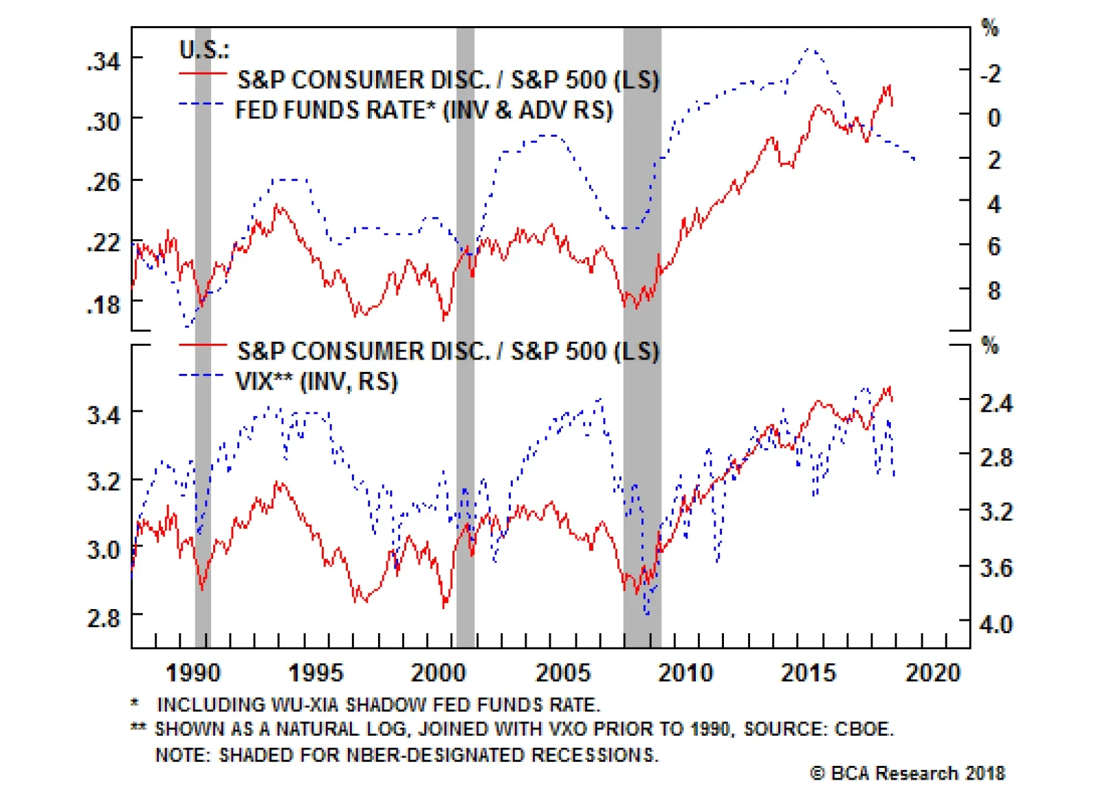
S&P Consumer Discretionary (Underweight) While we remain constructive on financials that benefit from higher rates, we continue to recommend investors avoid the consumer discretionary sector - the other early cyclical - that suffers when interest rates rise. The second panel of Chart 28 depicts this inverse correlation consumer discretionary equities have with interest rates, especially the fed funds rate. Most discretionary equites are levered off of floating rates and thus any increase in the fed funds rates gets reflected immediately in banks' prime lending rate. Also, most consumer debt is floating rate debt and thus tighter monetary conditions, at the margin, dampen consumer debt uptake and as a knock off on effect, weigh on discretionary consumer outlays. Not only are higher interest rates anchoring consumer discretionary stocks but rising energy prices are also dealing a blow to this sector. We show our Consumer Drag Indicator (CDI, comprising mortgage rates and energy prices) in the bottom panel of Chart 28. Historically, our CDI has been an excellent leading indicator of relative share price momentum. Currently, the message is clear: the sinking CDI signals that a bear market in consumer discretionary stocks has likely commenced. All of this is captured by our CMI which has been sinking since the beginning of the year. Meanwhile, our VI has broken out to nearly its highest level ever which we believe is largely a function of the decreasing diversification of the S&P consumer discretionary index as AMZN now represents more than 30% of its market value following the redistribution of the media indexed to the new S&P communication services index. Our TI has been falling from overbought territory recently and now sends a neutral message. Chart 27S&P Consumer Discretionary (Underweight)
S&P Consumer Discretionary (Underweight)
S&P Consumer Discretionary (Underweight)
Chart 28Higher Rates Spell Declines For Consumer Discretionary
Higher Rates Spell Declines For Consumer Discretionary
Higher Rates Spell Declines For Consumer Discretionary
S&P Communication Services (Underweight) As the newly-minted communication services has little more than a month of existence, we do not have adequate history to create a cyclical macro indicator. However, we have created Chart 29 below with a number of valuation indicators, though we caution that they too are less reliable than the other indicators presented in the preceding pages, owing to a dearth of history. Rather, we refer readers to our still-fresh initiation of coverage on the sector and look forward to being able to deliver something more substantive in the future. Chart 29S&P Communication Services (Underweight)
S&P Communication Services (Underweight)
S&P Communication Services (Underweight)
Size Indicator (Favor Large Vs. Small Caps) Our size CMI has been hovering near the boom/bust line, as it has for most of the last two years. Despite the neutral CMI reading, we downgraded small caps earlier this year , and moved to a large cap preference, based on the diverging (and unsustainable) debt levels of small caps vs. their large cap peers (top and second panels, Chart 31). We expect the divergence in leverage and stock price to be rationalized as it usually has: via a fall in the latter. Considering the dramatic valuation gap that has opened between large and small caps, particularly on a Shiller P/E (or cyclically adjusted P/E, CAPE) basis (bottom panel, Chart 31), no space remains for any small cap profit mishaps. Our VI is trending towards small caps being undervalued, though without conviction while our TI is hovering in the neutral zone. Chart 30Size Indicator (Favor Large Vs. Small Caps)
Size Indicator (Favor Large Vs. Small Caps)
Size Indicator (Favor Large Vs. Small Caps)
Chart 31Too Much Debt And High Valuations Should Hurt Small Caps
Too Much Debt And High Valuations Should Hurt Small Caps
Too Much Debt And High Valuations Should Hurt Small Caps
Overweight The S&P consumer finance index, much like their larger financials peers in the S&P banks index, have mostly not participated in the rise in Treasury yields, a relationship that has heretofore been relatively tight (top panel). This is despite credit card interest rate spreads that are pushing close to their post-GFC highs; such moves in the spread have typically heralded bullish sell-side sentiment changes and the current message is no different as earnings estimates have soared (second panel). While rate-driven revenues are climbing, the cost picture remains stable. The credit card delinquency rate has ticked up modestly but remains at severely depressed levels, driven by historically low unemployment (bottom panel). We continue to expect a sector rotation with financials and industrials leading the next phase of the market advance, a result of the bond market selloff gaining steam into year-end and beyond.1 Accordingly, we reiterate our overweight recommendation. The ticker symbols for the stocks in this index are: BLBG: S5CFINX - AXP, DFS, SYF, COF. 1 Please see BCA U.S. Equity Strategy Weekly Report, "The "FIT" Market," dated October 9, 2018, available at uses.bcaresearch.com.
Earnings Are Not The Problem For Consumer Finance
Earnings Are Not The Problem For Consumer Finance
Neutral As a wholly domestic industry, the S&P health care facilities index is well insulated from trade tremors that have been shaking the broad market this year. It is thus understandable that the index has been rallying in 2018. Still, as a particularly labor-intensive industry, rising wages pose a significant risk. On that front, investors have reason to be wary; the employment cost index for hospitals has jumped dramatically in its most recent reading, rising faster than at any point since the financial crisis, now keeping pace with overall payrolls (second panel). Further, job openings are soaring, having doubled in the last five years (third panel) which suggests hospital employment costs have much further to rise. Still, the picture is not all bad. Other input costs, such as the cost of medical equipment and supplies, have fallen steeply and now hover close to the deflation line (bottom panel). This could be enough to sustain margins, everything else being equal. Net, we reiterate our neutral stance on the S&P health care facilities index. The ticker symbols for the stocks in this index are: BLBG: S5HCFA - UHS, HCA.
A Mixed Cost Picture For Health Care Facilities
A Mixed Cost Picture For Health Care Facilities
Feature In the late 1980s, half of the global stock market capitalization resided in Japan Furthermore, almost a third of the Japanese stock market capitalization resided in banks. It followed that to have a view on the global stock market you had to have a view on Japanese banks. Indeed, in 1988, five of the ten largest companies in the world were Japanese banks. Less than ten years later, the weighting of Japanese banks in the global stock market had collapsed to less than one percent, rendering Japanese banks a largely irrelevant part of a global equity portfolio. In the new millennium, it was the turn of European banks to step into the limelight. By 2007, the proportion of the euro area's stock market capitalization in banks had ballooned to a quarter. And then, Europe followed in Japan's footsteps. Today, the weighting of banks in the Euro Stoxx has plunged to around a tenth. Could European banks now become a global investment irrelevance too (Feature Chart)? Feature ChartAre Europe's Banks Following In Japan's Footsteps?
Are Europe's Banks Following In Japan's Footsteps?
Are Europe's Banks Following In Japan's Footsteps?
European banks have performed very poorly. From their peak in 2007, a one dollar investment in euro area banks relative to the world index would now be worth just 15 cents. But Japanese banks have performed abysmally: from their peak in the late 1980s, a one dollar investment in Japanese banks relative to the world index would now be worth a pitiful 3 cents (Chart I-2 and Chart I-3).1 Chart 2Japan Dominated The Global Stock Market In The Late 1980s
Japan Dominated The Global Stock Market In The Late 1980s
Japan Dominated The Global Stock Market In The Late 1980s
Chart 3Banks Have Performed Abysmally
Banks Have Performed Abysmally
Banks Have Performed Abysmally
What turned Japanese bank shares from heroes to zeroes? Some people point to sky-high valuations: in the late 80s, Japanese bank dividend yields dropped below 0.5 percent (Chart I-4), and these high valuations clearly contributed to their subsequent poor investment performance. But this was not the main reason. Chart 4Japanese Banks Offered Miserly Dividend Yields
Japanese Banks Offered Miserly Dividend Yields
Japanese Banks Offered Miserly Dividend Yields
Banks' Lifeblood Is Credit Creation The main reason for the severe underperformance of Japanese banks was that they lost their lifeblood: credit creation. Put simply, if bank assets stop growing structurally, then it is impossible for bank revenues to grow structurally. But in Japan, it was worse: from the 1990s through the mid noughties, private sector indebtedness actually shrank from 220 percent to 160 percent of GDP, and this explains the bulk of the abysmal performance of bank equities (Chart I-5). Chart 5Banks' Lifeblood Is Credit Creation
Banks' Lifeblood Is Credit Creation
Banks' Lifeblood Is Credit Creation
The important lesson is that the structural outlook for bank equities depends first and foremost on the structural outlook for bank credit creation. This is especially true in Europe because the majority of credit intermediation occurs via the banking system rather than via the bond market. So how can we assess the structural outlook for bank credit creation? Basically by noting that there appears to be an upper limit at which all the good lending has been done. Additional bank credit then generates misallocation of capital and mal-investments. At which point, the economy and bank asset quality start to suffer, limiting any further increase in profitable lending. The precise point at which this happens is not set in stone, because high levels of public indebtedness, through 'crowding out', can pull down the limit of productive private indebtedness. And vice-versa. Nevertheless when private indebtedness, as a percentage of GDP, reaches the mid-200s, the evidence suggests that the scope for further growth becomes limited. On this basis, the outlook for bank asset growth in Europe is a mixed bag. In Switzerland, Sweden and Norway, private indebtedness already stands at 250 percent of GDP, implying that the stock of profitable bank assets is close to its upper limit (Chart I-6). Chart 6In Switzerland, Sweden And Norway, Private Indebtedness Is Very High
In Switzerland, Sweden And Norway, Private Indebtedness Is Very High
In Switzerland, Sweden And Norway, Private Indebtedness Is Very High
Meanwhile in the euro area, private indebtedness ratios in the Netherlands and Belgium are already well above 200 percent, and in France at 200 percent. On the other hand, the ratios in Germany and Italy - the largest and third largest euro area economies - are barely above 100 percent (Chart I-7). This bestows on them the honour of the lowest privately indebted major economies in the world (Chart I-8), with considerable theoretical capacity for bank asset growth. Admittedly, Italy has a high level of public indebtedness. Nevertheless, it is hard to deny that if the banking system in Italy could be unfrozen, there is great scope for economically productive lending. Chart 7In Germany And Italy, Private Indebtedness Is Very Low
In Germany And Italy, Private Indebtedness Is Very Low
In Germany And Italy, Private Indebtedness Is Very Low
Chart 8In Japan, Private Indebtedness Has Plunged
In Japan, Private Indebtedness Has Plunged
In Japan, Private Indebtedness Has Plunged
Having said all that, we now turn to something that bank investors everywhere in the world should fear: blockchain. Blockchain Is A Mortal Threat To Banks The internet's major innovation was to decentralize and democratize information. Before the internet, the creation, ownership and dissemination of information was a function centralized to privileged organizations: governments, media and entertainment companies. But after the internet, anybody and everybody could create, receive and share content - and this has proved to be a game changer for the governments, media and entertainment companies that previously owned and/or controlled the information. In the same way, blockchain's major innovation is to decentralize and democratize trust. The Economist even described blockchain as "the trust machine".2 It follows that blockchain will be a game changer for the privileged organizations whose raison d'être is to supply trust and integrity in transactions - essentially, those that act as a middleman. Clearly, one such privileged organization is the banking system, because the banking system is really nothing more than a middleman that provides trust and integrity in the transaction between the people with savings and the people who want to borrow those savings. Granted, banks also assess and price the credit risk of borrowers as well as provide a degree of insurance for savers. But with the prevalence of universal credit scoring systems and compensation schemes, there is a growing tendency to decentralize those functions too. Put simply, blockchain removes the need for a middleman. Until now, counterparties without an established trust relationship could only transact through a middleman who could add the trust and integrity overlay. But once each participant in the transaction trusts the blockchain itself, they no longer need to use a costly intermediary, like a bank. Therefore, just as the internet has revolutionized politics, media and entertainment, it is our very high conviction view that blockchain will revolutionize the way that money, assets and securities are held, transferred and accounted for. And the major casualty will be the banking system as we now know it. Investment Considerations The structural case for European banks is that Germany and Italy - the largest and third largest euro area economies - have considerable scope for bank credit expansion. The structural case against is that the other European economies have very limited scope for bank credit expansion. Furthermore, we confidently predict that within a decade blockchain will have decentralized and democratized financial intermediation, transforming it to something that is unrecognizable from today. Overall, this will not be a good thing for bank investors. With this in mind, German and Italian real estate and real estate equities are a much cleaner structural play on the potential for increased private indebtedness in those economies, whether intermediated by the banking system or not (Chart I-9 and Chart I-10). Chart 9The Evolution Of Private Indebtedness...
European Banks: The Case For And Against
European Banks: The Case For And Against
Chart 10...Drives The Real Estate Market
Drives The Real Estate Market
Drives The Real Estate Market
We end with another important lesson from Japan. Even in a three decade long bear market, the banks had the capacity for countertrend bursts of outperformance from oversold levels, sometimes by as much as 50 percent in a year. This is because even within a structural bear trend, there are cycles of excessive depression. European banks could be ripe for such a countertrend burst of outperformance. This year, European banks sank by 35 percent versus European healthcare. However, the sharp deceleration in global credit growth which dragged them down has now clearly reversed (Chart I-11). On this basis, the next six months could be a countertrend phase: a brief opportunity to own some European banks, at least relative to other equity sectors. Chart 11European Banks Are Ripe For A Burst Of Outperformance
European Banks Are Ripe For A Burst Of Outperformance
European Banks Are Ripe For A Burst Of Outperformance
Dhaval Joshi, Senior Vice President Chief European Investment Strategist dhaval@bcaresearch.com 1 Performances are calculated in common currency terms. 2 Please see 'the trust machine', The Economist, October 31, 2015.
Highlights China's old economy continues to slow in the leadup to the negative effect of U.S. import tariffs on Chinese export growth. Weaker trade data over the coming few months is likely to weigh further on investor sentiment. Our Li Keqiang leading indicator has risen off of its low, but not in a broad-based fashion. While the RMB depreciation has caused Chinese monetary conditions indexes to move sharply higher, money and credit growth remain weak. The recent breakdown in Chinese consumer staples stocks is an exception to the broad trend of low-beta sector outperformance. Fears have risen that the Chinese consumer is faltering, a concern that we will address in a Special Report next week. Feature Tables 1 and 2 highlight key developments in China's economy and its financial markets over the past month. On the growth front, the September update to Bloomberg's measure of the Li Keqiang index (LKI), and our newly created alternative LKI, makes it clear that China's economy continues to slow in the leadup to the negative shock from the external sector. The fact that both LKIs peaked early in 2017 highlights that the slowdown was precipitated by monetary tightening, which has only recently reversed. This easing in monetary conditions has likely improved the liquidity situation in China, but it remains to be seen whether it will prompt any meaningful acceleration in credit growth. Table 1The Trend In Domestic Demand, And The Outlook For Trade, Is Negative
Checking In On The Data
Checking In On The Data
Table 2Financial Market Performance Summary
Checking In On The Data
Checking In On The Data
From an investment strategy perspective, our recommendations remain unchanged. Despite deeply oversold conditions in China's stock markets, investors should avoid outright long positions for now due to the high odds of additional negative catalysts over the coming few months. We expect further weakness in the RMB, and expect USD-CNY to break through 7, suggesting that investors trading within the Chinese equity universe should only favor domestic stocks in currency-hedged terms for now. Finally, we continue to recommend an overweight stance towards low-beta sectors within the investable market, and believe that onshore corporate bonds are a buy despite pervasive default concerns. In reference to Tables 1 and 2, we provide several detailed observations concerning developments in China's macro and financial market data below: Bloomberg's measure of the Li Keqiang index (LKI) fell in September, confirming that activity in China's old economy is trending lower. A downtrend in industrial activity is even more apparent in our alternative LKI (Chart 1), which is constructed using total freight (instead of railway freight) and secondary industry electricity consumption (instead of overall electricity production). Chart 1China's Old Economy Is Slowing, Before The Trade Shock Hits
China's Old Economy Is Slowing, Before The Trade Shock Hits
China's Old Economy Is Slowing, Before The Trade Shock Hits
Our BCA Li Keqiang leading indicator has risen somewhat from its June low, driven by the two monetary conditions indexes (MCIs) included in the indicator. Both of these MCIs have, in turn, been driven by the substantial weakness in the RMB over the past four months. This sharp improvement has not been matched by the other components of the indicator: Chart 2 illustrates that the low end of the component range remains quite weak, in contrast to mid-2015 when both the high and low ends of the range were in a clear uptrend. Chart 2A Narrow Pickup In Our LKI Leading Indicator
A Narrow Pickup In Our LKI Leading Indicator
A Narrow Pickup In Our LKI Leading Indicator
Nearly all of the housing market indicators included in Table 1 are above their 12-month moving average, with the exception of pledged supplementary lending by the PBOC. Pledged supplementary lending itself sequentially increased quite meaningfully in October, underscoring that policymakers are keen to avoid the risk of overtightening the economy at a time when external demand is likely to weaken considerably. Still, smoothed residential sales volume growth has ticked down for two months in a row, suggesting that the extremely stretched pace of floor space started is likely to moderate over the coming months. Chinese export growth remains buoyant, despite several manufacturing and general business condition surveys showing a substantial deterioration over the past few months. As we go to press, China's October trade data has not yet been released, but we expect exports to weaken considerably in the coming few months. This could further weigh on investor sentiment if the slowdown exceeds the market's expectations. Within China's equity market universe, both domestic and investable stocks are deeply oversold in absolute terms, having declined 30% and 28% from their late-January peaks, respectively. Our technical indicators for both markets suggest that Chinese stocks have actually reached 1 standard deviation oversold, a level that has historically served as a platform for a rebound. Still, this speaks merely to the odds of a rebound, not when one will occur, and we can identify further negative catalysts for the equity over the coming 3 months. Avoid outright long positions for now. Despite having fallen significantly themselves, Taiwan and Hong Kong's equity markets have materially outperformed Chinese investable stocks since the beginning of the year (Chart 3). However, Taiwan's outperformance trend has recently moved in the opposite direction, as global investors begin to price in the fact that tensions between the U.S. and China are strategic and long-term in nature, not merely focused on trade.1 Taiwan is extremely exposed to this rivalry, warranting a higher equity risk premium. Chart 3Taiwan's Recent Outperformance Is Likely Reversing
Taiwan's Recent Outperformance Is Likely Reversing
Taiwan's Recent Outperformance Is Likely Reversing
Within Chinese investable stocks, low-beta equity sectors have in general continued to outperform over the past month. Our long MSC China low-beta sectors / short MSCI China trade is up 10% since initiation on June 27, and we expect further gains in the near-term. One exception to this trend is the relative performance of domestic and investable consumer staples stocks, which have recently underperformed their respective broad markets (Chart 4). The selloff has been sharp in the case of the domestic market, and has been in response to heightened fears that household consumption is weakening, a sector of the economy that heretofore had been reliably strong. In response to these developments, please note that BCA's China Investment Strategy service will be publishing a Special Report outlook detailing the outlook for the Chinese consumer next week. Chart 4Fears About Chinese Consumers Are Growing
Fears About Chinese Consumers Are Growing
Fears About Chinese Consumers Are Growing
The Chinese government bond yield curve has bull steepened considerably since the middle of the year, although it has oscillated without a trend over the past month. To the extent that traditional interpretations of the yield curve apply similarly to China, this suggests that domestic investors are pessimistic about the growth outlook, and expect monetary policy to remain easy. For now, this supports our recommendation to avoid outright long positions in Chinese stocks. Domestic Chinese and global investors remain deeply averse to Chinese corporate bonds, and we continue to disagree that aversion is warranted. Chart 5 highlights that the ChinaBond Corporate Bond total return index remains in a solid uptrend, even for bonds rated AA-. Incredibly, panel 2 of Chart 5 illustrates that global investors who have access to onshore corporate bonds have not lost money this year in unhedged terms, despite the material weakness in the RMB since the middle of the year. We continue to recommend onshore corporate bond positions over the coming 6-12 months.2 Chart 5Chinese Corporate Bonds: A Contrarian Long
Chinese Corporate Bonds: A Contrarian Long
Chinese Corporate Bonds: A Contrarian Long
CNY-USD rose materially last week, in response to speculation that the U.S. is readying a possible trade deal with China. Our geopolitical strategists recommend fading the odds of a near-term trade truce, implying that the odds of USD-CNY breeching 7 over the coming months are substantial. While economically meaningless in and of itself, the threshold is psychologically important and its failure to hold could spark meaningful renewed fears of uncontrolled capital outflow from China. Jonathan LaBerge, CFA, Vice President Special Reports jonathanl@bcaresearch.com 1 Please see Emerging Markets Strategy Weekly Report "EMs Are In A Bear Market," published October 18, 2018. Available at ems.bcaresearch.com. 2 Please see China Investment Strategy Weekly Report "Investing In The Middle Of A Trade War," published September 19, 2018. Available at cis.bcaresearch.com. Cyclical Investment Stance Equity Sector Recommendations
Underweight Marriott International, the hotel heavyweight of the S&P hotels, resorts and cruise lines index reported results on Monday and the company's outlook was grim, calling for revenue growth below analyst forecasts on the back of higher room growth. This is confirmed by our leading data which shows capacity growth accelerating, leading us to be concerned that a recent resurgence in pricing power is primed for a collapse (second panel). Meanwhile, labor costs, which are a relatively greater part of overall industry costs, have visibly shifted higher (third panel). A top line squeeze combined with ballooning costs does not bode well for profit growth. Thus while the valuation multiple has significantly contracted (bottom panel), we remain afraid of falling into a value trap. Stay underweight. The ticker symbols for the stocks in this index are: BLBG: S5HOTL - MAR, CCL, RCL, HLT, WYN, NCLH.
Still Checked Out Of Hotels
Still Checked Out Of Hotels
Underweight While we remain constructive on financials that benefit from higher rates, we continue to recommend investors avoid the consumer discretionary sector - the other early cyclical - that suffers when interest rates rise. The second panel of our chart depicts this inverse correlation consumer discretionary equities have with interest rates, especially the fed funds rate. Most discretionary equites are levered off of floating rates and thus any increase in the fed funds rate gets reflected immediately in banks' prime lending rate. Also, most consumer debt is floating rate debt and thus tighter monetary conditions, at the margin, dampen consumer debt uptake and, as a knock-on effect, weigh on discretionary consumer outlays. Not only are higher interest rates anchoring consumer discretionary stocks but rising energy prices are also dealing a blow to this sector. Our Consumer Drag Indicator (CDI, comprising mortgage rates and energy prices) has been an excellent leading indicator of relative share price momentum and currently, the message is clear: the sinking CDI signals that a bear market in consumer discretionary stocks has likely commenced (bottom panel). Bottom Line: The path of least resistance is lower for the S&P consumer discretionary index, stay underweight. Please see Monday's Weekly Report for more details.
Consumer Discretionary Stocks Are Still A Sell
Consumer Discretionary Stocks Are Still A Sell
The above chart depicts this inverse correlation consumer discretionary equities have with interest rates, especially the fed funds rate. Most discretionary equites are levered off of floating rates and thus any increase in the fed funds rates gets reflected…