United States

Executive Summary High profile economists Larry Summers and Olivier Blanchard have recently cast doubt on the Federal Reserve’s claim that a soft landing is possible for the US economy. We explore the arguments from both sides of the debate and conclude that the economic data will likely support the Fed’s soft landing thesis during the next six months. However, the unemployment rate will rise more significantly as we move deeper into 2023 and the Fed continues to run a restrictive monetary policy. This report also provides an update on our recommended portfolio duration and high-yield positioning, and suggests a tweak to our recommended positioning across the Treasury curve. Specifically, we advise clients to enter a duration-matched position long the 5/30 barbell and short the 10-year bullet. The Beveridge Curve
Peak Fed Funds?
Peak Fed Funds?
Bottom Line: Investors should keep portfolio duration close to benchmark and maintain a neutral (3 out of 5) allocation to high-yield bonds. Investors should also exit positions long the 2-year bullet versus a duration-matched cash/5 barbell and enter a position long a 5/30 barbell versus the 10-year bullet. Feature This week’s report digs into a recent macro debate between two high profile economists – Larry Summers and Olivier Blanchard – and the Federal Reserve about whether a “soft landing” is possible for the US economy. We summarize the debate below and offer our own thoughts on its implications for investment strategy. But first, we provide a quick update on our recent thinking about US bond portfolio construction, including a change to our recommended yield curve positioning. Positioning Update Portfolio Duration In recent reports we have written that we would reduce our recommended portfolio duration stance from “at benchmark” to “below benchmark” if the 10-year Treasury yield falls to 2.5% or if core inflation converges to our 4%-5% estimate of its underlying trend (Chart 1).1 The 10-year yield came close to hitting our 2.5% trigger last week but then quickly reversed course. It moved even higher after Friday’s extremely strong employment report, and it now sits at 2.78%. We are sticking with our plan. Despite July’s blockbuster job gains, trends in both initial and continuing jobless claims suggest that the unemployment rate is more likely to rise than fall during the next few months (Chart 2). Supply chain indicators also point toward falling inflation (Chart 2, bottom panel). Against this backdrop, it wouldn’t be too surprising to see bond yields experience another downleg. Chart 1Stay Neutral For Now
Stay Neutral For Now
Stay Neutral For Now
Chart 2Unemployment Has Bottomed
Unemployment Has Bottomed
Unemployment Has Bottomed
High-Yield Turning to credit, we continue to recommend an underweight allocation to spread product (including investment grade corporate bonds) versus Treasuries, but with a slightly higher allocation (neutral) to high-yield. We think that high-yield spreads can tighten in the near-term as recession fears are allayed and inflation rolls over. However, the medium-to-long run macro environment is negative for spread product and we will be quick to reduce junk exposure if spreads reach their 2017-19 average (Chart 3) or if core inflation converges with our 4%-5% estimate of trend. Chart 3Tracking The Junk Rally
Tracking The Junk Rally
Tracking The Junk Rally
Treasury Curve Chart 4Buy A 5/30 Flattener
Buy A 5/30 Flattener
Buy A 5/30 Flattener
Finally, this week we tweak our recommended yield curve positioning by closing our prior recommendation: long 2-year bullet versus duration-matched cash/5 barbell, and by initiating a new trade: long 5/30 barbell versus a duration-matched 10-year bullet. We only initiated that 2 over cash/5 trade a couple weeks ago on the view that 2/5 Treasury curve inversions don’t tend to last very long.2 However, it has since become clear that our timing was premature. In fact, we probably shouldn’t anticipate a significant 2/5 steepening until the Fed’s tightening cycle is near its end, which we do not believe to be the case. Instead, we recommend that investors shift into a duration-matched position that is overweight a 5/30 barbell versus the 10-year bullet. This trade offers a positive yield differential of 16 bps (Chart 4) and will profit from a flattening of the 5-year/30-year Treasury slope. The 5/30 slope has steepened in recent weeks, but further steepening is only likely to occur near the end of a Fed tightening cycle. Given that we see significant further tightening ahead, it’s much more likely that the 5/30 slope will fall to zero or even turn negative (Chart 4, top panel). The Battle Of The Beveridge Curves Our battle begins with a speech from Fed Governor Christopher Waller that was given back in May.3 In that speech, Waller made the case for why the large number of job vacancies gave him “reason to hope that policy tightening in current circumstances can tame inflation without causing a sharp increase in unemployment.” Waller’s argument was based on the historical relationship between the job vacancy rate and the unemployment rate, a relationship known as the Beveridge Curve (Chart 5). In essence, Waller’s argument for a “soft landing” boils down to the observation that the Beveridge Curve shown in Chart 5 has shifted up since the pandemic. That is, since March 2020 we have consistently seen more job vacancies for any given unemployment rate. His contention is that, as economic activity slows, rather than moving to the right along the Beveridge Curve, the curve will shift down toward its pre-pandemic level. In other words, the job vacancy rate will decline significantly without a large uptick in the unemployment rate. Chart 5The Beveridge Curve
The Great Soft Landing Debate
The Great Soft Landing Debate
Objection! In a paper published this month, Olivier Blanchard, Alex Domash and Larry Summers (BDS) take issue with Waller’s claims from two different angles, a theoretical one and an empirical one.4 First, from a theoretical perspective, BDS describe three factors that lead to either movements along the Beveridge Curve or shifts in the curve itself. 1) Economic Activity. Stronger economic activity leads to more job vacancies and a lower unemployment rate. In other words, a shift to the left along the Beveridge Curve, illustrated as the journey from point A to point B in Chart 6. Chart 6An Illustrated Beveridge Curve
The Great Soft Landing Debate
The Great Soft Landing Debate
2) Matching Efficiency. If available jobs are a worse match for the skills of the unemployed labor force, then it will lead to a higher job vacancy rate for any given unemployment rate. In other words, a shift up in the Beveridge Curve from point B to point C in Chart 6. 3) Reallocation Intensity. If people switch jobs more frequently, then there will also tend to be more vacancies for any given level of unemployment. Again, this would shift the Beveridge Curve up from point B to point C in Chart 6. Using a model and data from the JOLTS survey, BDS attempt to decompose how much of these three factors have contributed to the current positioning of the Beveridge Curve. The authors estimate that economic activity has increased significantly since the end of 2019, but also that the labor market’s matching efficiency has declined, and that reallocation intensity has increased (Chart 7). Chart 7An Illustrated Beveridge Curve
An Illustrated Beveridge Curve
An Illustrated Beveridge Curve
While monetary tightening can weaken economic activity, it cannot change the labor market’s matching efficiency or its reallocation intensity. Therefore, the authors argue, unless matching efficiency and reallocation intensity naturally revert to their pre-COVID levels, weaker economic activity will manifest as a movement to the right along the post-2020 Beveridge Curve, leading to a higher unemployment rate. This, in our view, is the crux of the “soft landing” debate. Are the recent changes in labor market matching efficiency and reallocation intensity temporary or permanent? Next, we move to BDS’ empirical arguments. The authors construct a time series of the job vacancy rate going back to the 1950s and then examine changes in both the job vacancy rate and the unemployment rate following cyclical peaks in the vacancy rate. Their results show that a falling job vacancy rate almost always coincides with a rising unemployment rate (Table 1). In other words, if history is any guide, it is very unlikely that the Fed will be able to push the job vacancy rate down without seeing an increase in unemployment. Table 1Average Change In The Unemployment Rate And The Vacancy Rate After A Peak In The Vacancy Rate
The Great Soft Landing Debate
The Great Soft Landing Debate
That said, the authors’ results also reveal a dynamic known as the Beveridge Loop. Notice in Table 1 that a drop in the vacancy rate leads to a much smaller increase in the unemployment rate during the first six months following the vacancy rate peak than it does during the first 12 months or first 24 months. In other words, there is some empirical validity to Fed Governor Waller’s argument that the early impact of Fed tightening will be felt primarily through a falling job vacancy rate. The 2018/19 Example We can illustrate the Beveridge Loop with a recent example, one that interestingly was not included in BDS’ empirical analysis. The job vacancy rate peaked in November 2018 and then trended lower until the pandemic struck in early 2020. Interestingly, this 2018-19 drop in the job vacancy rate occurred alongside a modest decline in the unemployment rate. Chart 8 shows what the Beveridge Curve looked like during this period. Notice that, rather than moving back to its January 2018 point in a straight line, the Beveridge Curve formed a loop after peaking in November 2018. Chart 8The 2018/19 Beveridge Loop
The Great Soft Landing Debate
The Great Soft Landing Debate
What allowed the labor market to achieve this “soft landing” in 2018/19? The most likely answer is that labor force participation rose significantly during this period (Chart 9). The influx of workers into the labor force allowed the unemployment rate to keep falling even as continuing unemployment claims bottomed out. Chart 9The 2018/19 Soft Landing
The 2018/19 Soft Landing
The 2018/19 Soft Landing
The BCA Verdict Our view is that the incoming economic data will appear to validate the Fed’s “soft landing” view during the next six months, but that the unemployment rate will start to rise more significantly as we move deeper into 2023. As we have stated in prior reports, a significant increase in the unemployment rate will eventually be required to tame inflation, but that increase likely won’t occur as soon as many market participants expect.5 In essence, we anticipate a large Beveridge Loop. A loop that, in fact, appears to already be forming (Chart 5). We have shown that the empirical evidence supports the idea that a Beveridge Loop will occur during the early stages of a slowdown. Further, theory and empirical evidence demonstrate that the Beveridge Curve is convex. This suggests that the Beveridge Loop could be particularly large in this cycle given that the vacancy rate is starting from such a high level. Perhaps the bigger question, though, is whether the Beveridge Curve will re-converge with its pre-pandemic level during the next 6-12 months. On this question we side more with Blanchard, Domas and Summers. While we think that matching efficiency can continue to improve along its current trend (Chart 7, panel 2), the widespread adoption of work-from-home suggests that the labor market has probably experienced a permanent increase in reallocation intensity. On matching efficiency, the best evidence for continued improvement comes from a breakdown of employment by industry (Table 2). Notice that the three sectors (other than government) that have experienced the greatest job losses since the pandemic – Health Care, Leisure & Hospitality and Other Services – also have three of the highest job openings rates. This suggests that there shouldn’t be a permanent friction between matching those missing workers to available jobs. Table 2Employment By Industry
The Great Soft Landing Debate
The Great Soft Landing Debate
Finally, working from our 2018/19 example, we can assess the likelihood that an increase in labor force participation will cushion the upside in the unemployment rate. Here, we see some potential for the prime age participation rate to rise back to its pre-COVID level, but the re-entry of recently retired workers over the age of 55 is more in doubt. Overall, it’s highly unlikely that the overall participation rate will re-gain its pre-pandemic level (Chart 10). Chart 10Labor Force Participation
Labor Force Participation
Labor Force Participation
The bottom line is that the next six months will likely look more like a soft landing than a hard one. The job vacancy rate will fall quickly and the unemployment rate will stay relatively low, causing the Beveridge Curve to form a large loop. However, the Beveridge Curve will not revert to its pre-COVID level any time soon. As we move deeper into 2023, the Beveridge Curve will stop looping and the unemployment rate will rise significantly. Ryan Swift US Bond Strategist rswift@bcaresearch.com Footnotes 1 Please see US Bond Strategy Weekly Report, “Recession Now Or Recession Later?”, dated July 26, 2022. 2 Please see US Bond Strategy / Global Fixed Income Strategy Weekly Report, “A Low Conviction US Bond Market”, dated July 12, 2022. 3https://www.federalreserve.gov/newsevents/speech/files/waller20220530a.pdf 4https://www.piie.com/publications/policy-briefs/bad-news-fed-beveridge-space#:~:text=The%20Federal%20Reserve%20seeks%20to,together%20and%20remain%20unlikely%20now. 5 Please see US Bond Strategy Weekly Report, “Three Conjectures About The US Economy”, dated July 19, 2022. Recommended Portfolio Specification Other Recommendations Treasury Index Returns Spread Product Returns
S&P 500 Chart 1Macroeconomic Backdrop
Macroeconomic Backdrop
Macroeconomic Backdrop
Chart 2Profitability
Profitability
Profitability
Chart 3Valuations And Technicals
Valuations And Technicals
Valuations And Technicals
Chart 4Uses Of Cash
Uses Of Cash
Uses Of Cash
Cyclicals Vs Defensives Chart 5Macroeconomic Backdrop
Macroeconomic Backdrop
Macroeconomic Backdrop
Chart 6Profitability
Profitability
Profitability
Chart 7Valuation And Technicals
Valuation And Technicals
Valuation And Technicals
Chart 8Uses Of Cash
Uses Of Cash
Uses Of Cash
Growth Vs Value Chart 9Macroeconomic Backdrop
Macroeconomic Backdrop
Macroeconomic Backdrop
Chart 10Profitability
Profitability
Profitability
Chart 11Valuations And Technicals
Valuations And Technicals
Valuations And Technicals
Chart 12Uses Of Cash
Uses Of Cash
Uses Of Cash
Small Vs Large Chart 13Macroeconomic Backdrop
Macroeconomic Backdrop
Macroeconomic Backdrop
Chart 14Profitability
Profitability
Profitability
Chart 15Valuations and Technicals
Valuations and Technicals
Valuations and Technicals
Chart 16Uses Of Cash
Uses Of Cash
Uses Of Cash
Table 1Performance
Chartbook: Style Chart Pack
Chartbook: Style Chart Pack
Table 2Valuations And Forward Earnings Growth
Chartbook: Style Chart Pack
Chartbook: Style Chart Pack
Recommended Allocation
Executive Summary The constructive economic view that has us at odds with the consensus rests on three premises: excess pandemic savings will allow consumption to grow at trend, despite inflation; inflation will soon peak, moving to around 4% by year end; and inflation expectations will remain well anchored, keeping the Fed from moving immediately to stifle the economy. Our consumption thesis remains intact. Real consumption has kept pace despite falling real incomes, thanks to a steady, modest drawdown of excess savings. Though our calls for an inflation peak have been consistently premature, recent data suggest that inflation pressures are abating. Gasoline prices have been falling for seven weeks; the fever has broken in ISM survey price measures; and the labor market, notwithstanding July's potent employment report, is becoming less tight. Longer-run inflation expectations have resisted becoming unmoored despite soaring measured inflation and a breakout does not appear to be imminent. A Mighty Savings Cushion
A Mighty Savings Cushion
A Mighty Savings Cushion
Bottom Line: We continue to expect the economy will be surprisingly resilient, allowing equities to rally further before the Fed squashes the expansion. We doubt the rally will persist very far into 2023, however, so we are reducing equities to equal weight over a twelve-month timeframe. Feature We will be holding our quarterly webcast next Monday, August 15th at 9:00 a.m. Eastern time in lieu of publishing a Weekly Report. Please join us with your questions to make it a fully interactive event. We will resume our regular publication schedule on the 22nd. Last week, an investor we were meeting for the first time asked us how anyone could have published on a weekly basis this year. “Things are so uncertain and they’re moving so fast, how do you keep up? What have you been writing about?” At long last, we felt seen. Feeding the weekly beast is not easy under the best of circumstances and investors know that this year has been far from ideal. Related Report US Investment StrategyThe High Bar For Getting Worse Once the warm glow of unexpected empathy receded, we replied that we’ve been doing our best to anticipate how the key macro issues will impact financial markets over our cyclical 3-to-12-month timeframe, paying particular attention to consumers, inflation and the Fed. The outlook for consumption has been our primary focus from a growth perspective; we’ve been trying to assess how representative the key drivers of inflation are and how persistent they’ll be; and we’ve continuously monitored longer-run inflation expectations to determine if inflation has gotten far enough into economic agents’ heads to become self-reinforcing and compel the Fed to dislodge it, no matter the near-term economic cost. We review what we see on all three fronts in today’s report, and how events are unfolding relative to our expectations. The direction remains especially uncertain, but our theses remain intact, and we are sticking with our constructive outlook on risk assets and the economy for the rest of the year. We are pulling in our horns on our twelve-month optimism, however, in line with the BCA house view and the dawning realization that twelve months of equity outperformance is overly ambitious. We continue to believe the recession will arrive too late for the gloomy consensus of investors judged by their quarterly performance, forcing them back into risk assets, but the rebound may not persist beyond the FOMC’s first 2023 meeting at the beginning of February. The Consumer’s Staying Power Since CARES Act transfer payments began driving a surge in personal savings, we have viewed them as dry powder to support consumption once households regained the freedom to spend as they see fit. When the payments stopped flowing and the pandemic continued to delay a return to normal, that view came under some fire. We are of the mind that households merely deferred much of the services demand they would otherwise have slaked in 2020 and 2021; others argue that consumption deferred is consumption destroyed, as households will be reluctant to spend windfall transfers that they’d mentally sorted as savings. While it will take a while for data to confirm either thesis, we are encouraged by what we’ve seen so far. The savings rate has declined considerably so far in 2022, supporting the view that households would be willing to reach into their savings to maintain trend consumption (Chart 1). It dipped to 5.2% in the second quarter from 5.6% in the first quarter, well below February 2020’s 8.3% pre-pandemic level and 2011 to 2019’s 7.4% quarterly mean (Chart 2). Based on the series’ stability over the previous nine years, 2020’s and 2021’s forced savings rates amounted to 11- and 6-sigma post-crisis events and this year’s approximately -2.5-sigma drawdown suggests the pendulum has further to swing in the direction of dissaving. We disagree with knee-jerk conclusions that spending in excess of income is unsustainable – it’s plenty sustainable for households who socked away a mountain of savings over the previous eight quarters while bars, restaurants, stadiums, concert venues and resorts were idled. Chart 1Right On Target
Right On Target
Right On Target
Chart 22020 And 2021 Savings Were Enormous
2020 And 2021 Savings Were Enormous
2020 And 2021 Savings Were Enormous
The estimates of excess savings that we’ve been calculating every month since the summer of 2020 peaked just above $2.3 trillion last August and remained around that level before embarking on a steady decline in the first half to reach our current estimate above $2 trillion (Chart 3, bottom panel). Quoting that figure has been nagging at us lately, however, as one of the two assumptions we used to calculate households’ no-pandemic savings baseline – annualized disposable income growth of 4% – took 2% annual inflation as given, a condition that no longer applies after a twelve-month stretch in which year-over-year CPI inflation has averaged 7.1%. Chart 3Nominal Excess Savings
Taking Stock
Taking Stock
To determine how much households' purchasing power has eroded, we deflated our monthly excess savings estimates to a level equating to 2% annualized inflation (Chart 4, top panel). The adjustment knocked $450 billion off our current estimate, trimming it to $1.6 trillion (Chart 4, bottom panel). Perhaps more importantly for the outlook, our adjustment doubled the year-to-date burn rate to $500 billion. We have always worked with the (deliberately conservative) assumption that households would spend half of their excess savings; if inflation doesn’t decelerate soon, their cushion may not last very far beyond the end of the year. Chart 4Adjusted Excess Savings
Taking Stock
Taking Stock
Bottom Line: Households have been willing to dip into savings to maintain trend consumption so far this year, in line with our hypothesis. We expect they will continue to do so, and the savings rate will remain around 5% or fall even lower, but inflation has eaten up some of their dry powder. Will Inflation Ever Peak? Shredding widely shared expectations that inflation would peak sometime in the first half, the year-over-year increase in headline CPI has kept climbing, all the way to 9% in June. July should finally provide some relief, as the average national retail gasoline price has fallen for seven consecutive weeks and ended July 13% below its June 30 level (Chart 5). Last week’s ISM manufacturing and services PMIs also suggested that inflation has begun to ease its grip somewhat, with the manufacturing input prices series plunging by nearly 20 points to its two-decade mean (Chart 6, top panel) and the services prices component cooling by 8 points, though it remains quite high (Chart 6, bottom panel). Chart 5Four Bucks A Gallon Is High, But Not Unfamiliar
Four Bucks A Gallon Is High, But Not Unfamiliar
Four Bucks A Gallon Is High, But Not Unfamiliar
Chart 6The Fever May Have Broken ...
The Fever May Have Broken ...
The Fever May Have Broken ...
Chart 7... Though The Job Market Is Still Quite Hot
... Though The Job Market Is Still Quite Hot
... Though The Job Market Is Still Quite Hot
The tight-as-a-drum labor market has been a fertile source of inflation worries, but there are signs that it is becoming less tight. Job openings remain 40% above their pre-COVID high but declined by 600,000 in June and are 10% off of March’s all-time peak (Chart 7). Elevated quits reveal that it's still easy to get a job, but the net share of small businesses in the NFIB survey planning to hire in the next three months is down 40% from its peak last summer (Chart 8). The July employment report challenged the under-the-radar indicators’ implication that the labor market is cooling, as net payroll expansion reaccelerated along with average hourly earnings growth (Chart 9). We are confident that net payroll growth will slow but compensation clearly has the cyclical wind at its back, and it is not certain that labor’s structural headwind will largely offset it, as per our thesis. Chart 8Hiring Intentions Are Back To More Normal Levels ...
Hiring Intentions Are Back To More Normal Levels ...
Hiring Intentions Are Back To More Normal Levels ...
Chart 9... But Wage Growth Remains Elevated
... But Wage Growth Remains Elevated
... But Wage Growth Remains Elevated
Inflation Expectations Longer-run inflation expectations are a critical piece of the puzzle because they are the pathway for rising inflation to become self-reinforcing. If they expect persistently higher inflation, workers will negotiate more fiercely for larger compensation increases to stay ahead of it; businesses will push more vigorously to pass on their increased costs to preserve profit margins; lenders and bond investors will demand higher interest rates to protect their real returns; and consumers will seek to buy more now to get the most from their dwindling purchasing power, exacerbating supply-demand imbalances and keeping the heat on near-term inflation readings. We are therefore closely watching inflation expectations. Market-based measures like TIPS break-evens and CPI swaps shed some light on investor and business expectations, while the monthly University of Michigan consumer sentiment survey offers insight into households’ views. Market-based measures remain well-anchored: intermediate-term expectations as implied by TIPS break-evens are just nosing above the top of the Fed’s preferred 2.3-2.5% range (Chart 10, middle panel) while long-term expectations remain below it, as they have for most of the year (Chart 10, bottom panel). Intermediate- and long-term expectations derived from CPI swaps remain 20 to 30 basis points higher but are in the same position relative to their year-to-date path (Chart 11, bottom two panels). Chart 10Market-Based Inflation Expectations ...
Market-Based Inflation Expectations ...
Market-Based Inflation Expectations ...
Chart 11... Are Not Problematic
... Are Not Problematic
... Are Not Problematic
Chart 12Just Say No (To Bottleneck Prices)
Just Say No (To Bottleneck Prices)
Just Say No (To Bottleneck Prices)
The Michigan survey doesn’t betray any pressing long-run concerns. The preliminary 3.3% June reading hinting at a breakout turned out to be a false alarm, as June’s final figure was 3.1% and July’s was 2.9%. Survey respondents continue to shun big-ticket purchases because they expect prices will fall from their current levels (Chart 12). 2-year TIPS and swaps price in an optimistic near-term outlook that is likely to be disappointed, as we think inflation will prove to be sticky around the 4% level, and that disappointment could bleed into higher longer-run expectations. While expectations are not problematic now, investors will need to watch them carefully going forward. Investment Implications It was policy, monetary and fiscal, that inspired our bullish turn in 2020 once we digested the COVID shock. We thought the macro backdrop would come down to policymakers versus the virus and our money was on the former. We remained bullish across 2021 on the idea that monetary and fiscal support would remain in place well after they ceased to be necessary. Mindful that there is no such thing as a free lunch, we expected that the emergency pandemic measures would ultimately have the effect of overstimulating demand, but we entered 2022 thinking that equities and credit would enjoy one more year of sizable excess returns over Treasuries and cash before the overstimulation manifested itself. Overweighting (underweighting) equities in a multi-asset portfolio is our default position when monetary policy is easy (tight), though we will override that default when appropriate. We have no appetite for overriding it once it becomes clear that market expectations for 2023 rate cuts are going to be disappointed and tight policy is just around the bend. Given our view that inflation will linger around 4% after easing smartly over the rest of this year, we expect that the Fed will impose restrictive monetary policy settings by the second half of 2023 in its quest to drive inflation back down to its 2% target. Markets’ overly rosy Fed expectations look sure to be disappointed and they could face a reckoning after the FOMC’s January 31-February 1 meeting. Chart 13Consolidation Now, 10%+ By The End Of The Year
Consolidation Now, 10%+ By The End Of The Year
Consolidation Now, 10%+ By The End Of The Year
That meeting could herald an inflection for risk assets’ relative performance and we are therefore joining our colleagues in adopting a neutral 12-month view on equities. We continue to differ from the BCA consensus, however, in expecting a meaningful equity rally before year end. While we expect technical resistance at 4,200 will restrain the S&P 500 in the immediate term (Chart 13), we think it will find its way back into the mid-to-high 4,000s before the Fed signals that it will take the funds rate to 4% or above, dashing hopes for a February peak around 3.5%. We still want to overweight equities in multi-asset portfolios, but only until year-end or 4,500 to 4,600, whichever comes first. Doug Peta, CFA Chief US Investment Strategist dougp@bcaresearch.com
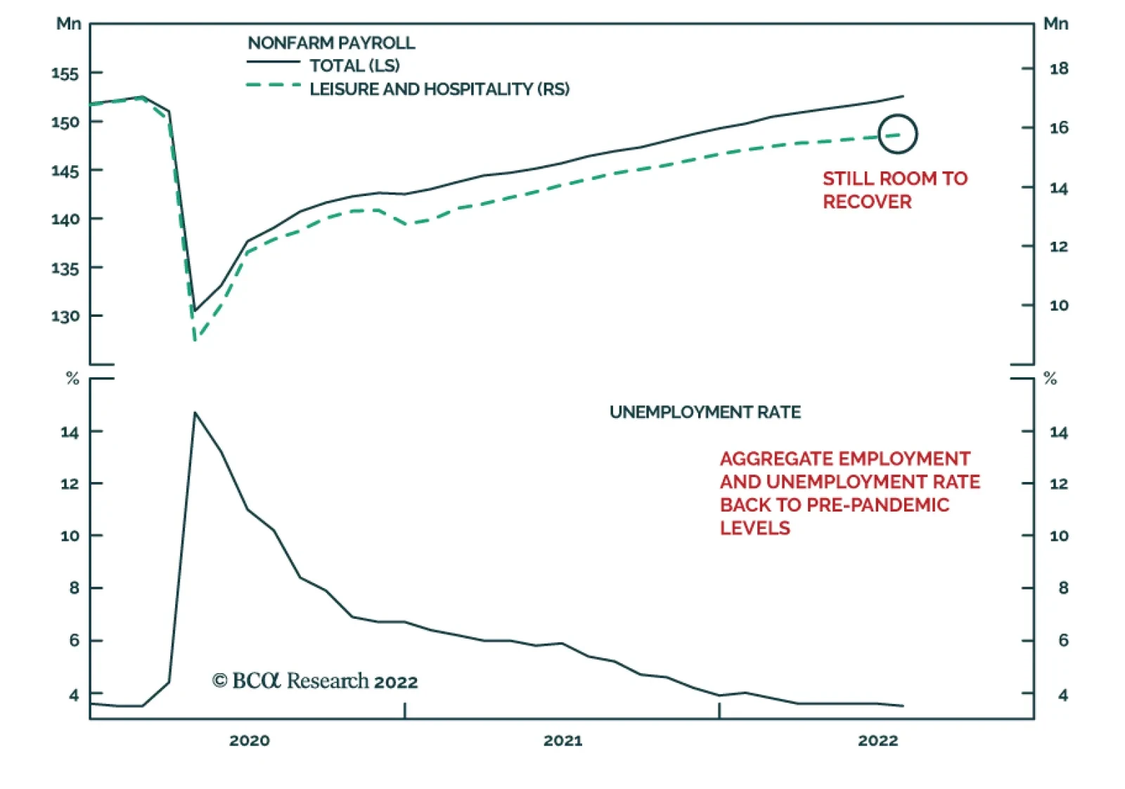
The US Employment Report sent a robust signal about US economic conditions. US nonfarm payroll employment surged by 528 thousand in July – more than twice the amount expected – from an upwardly-revised 398 thousand in June. Job gains were widespread and…
Although US total nonfarm payroll employment and the unemployment rate recovered to their pre-pandemic levels in July (see The Numbers), the participation rate remains 1.3 ppt below where it stood in February 2020. Results from the BLS Household Survey…
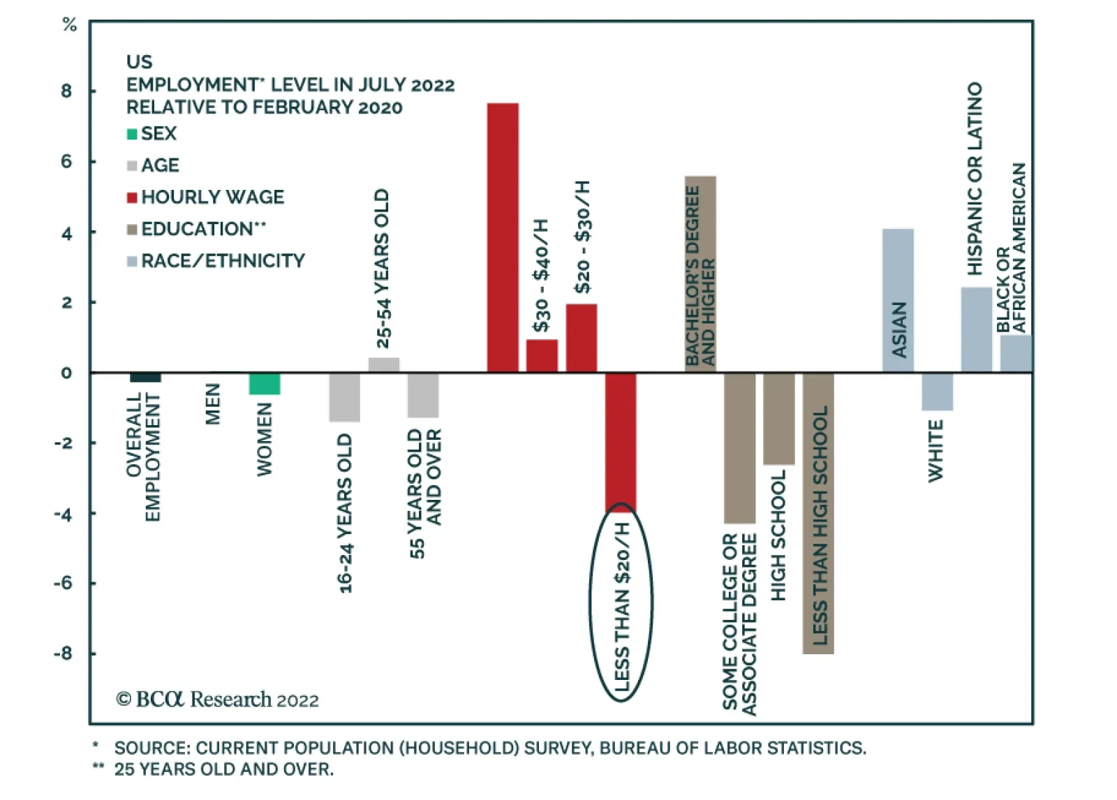
The US labor market is extremely tight. There are 1.8 job openings for every unemployed worker. This is a source of upside pressure on inflation as it boosts workers’ bargaining power and ultimately wages and firms’ labor costs. Indeed, the latest employment…
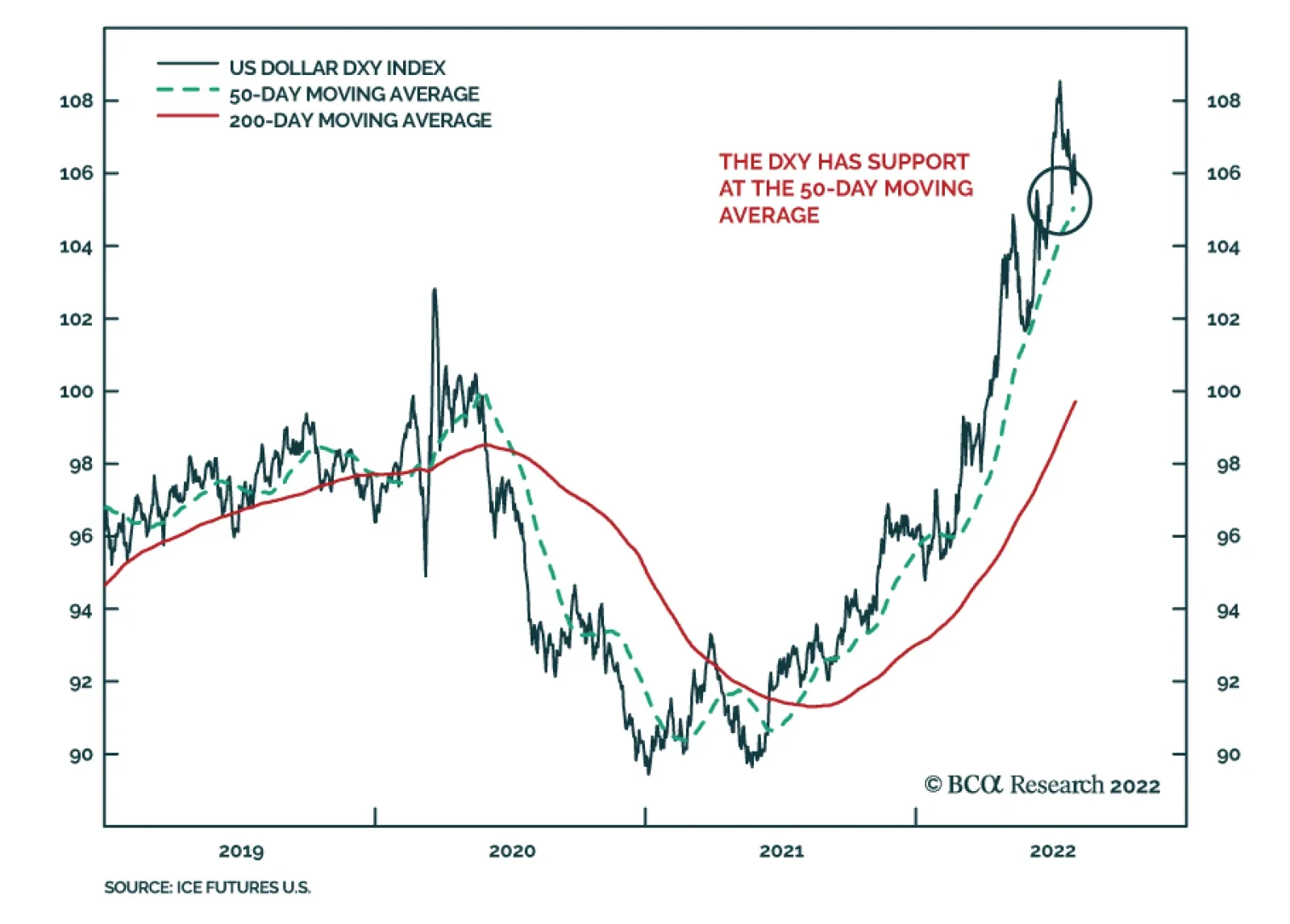
BCA Research’s Foreign Exchange Strategy service is neutral on the dollar over the next three-to-six months. The drivers of dollar downside have been clear. First, long-term interest rates in the US have fallen substantially. The US 10-year Treasury yield…
Listen to a short summary of this report. Executive Summary The Euro And The Chinese Credit Impulse
The Euro And The Chinese Credit Impulse
The Euro And The Chinese Credit Impulse
The US dollar has bounced off its 50-day moving average. In the recent past, that had led to a period of cyclical strength. The yen rally can be explained by the decline in Treasury yields and the fall in energy prices. Where next for the yen will depend on the time horizon. For investors trying to time the bottom, the euro is not yet a buy, but the common currency is incredibly cheap. Much depends on global/Chinese growth (Feature Chart). One of the key drivers of the dollar is volatility, and the correlation with the MOVE index. Less uncertainty will ease safe-haven demand. Stay short EUR/JPY and CHF/JPY. Remain long EUR/GBP. Maintain a limit sell on CHF/SEK at 10.76. RECOMMENDATIONS inception date RETURN Short EUR/JPY 2022-07-21 3.68 Bottom Line: We are tactically neutral the dollar but will be sellers on strength. Questions And Answers Chart 1Currencies And Yield Differentials
Currencies And Yield Differentials
Currencies And Yield Differentials
It is rare that we receive clients in our Montreal office. This has obviously been doubly the case due to the pandemic and the general hassle of travel nowadays. But when we do, it is a delight. In this week’s report, we got asked a few difficult questions on a tea date. The most important was not surprisingly the dollar view, but also our highest conviction trades in FX markets. We enjoyed the conversation and the intellectual debate, so we thought we would share this with our clients. Hopefully, this answers some of the most pressing questions. We have sliced this into as brief and concise a conversation as we could. Question: It is hard not to notice the steep decline in the dollar over the last few weeks. Should we fade this decline or lean into it? That is a tough question, but our educated guess is to fade it for now. That said, longer-term asset allocators should really be looking at buying extremely cheap G10 currencies on any declines. The drivers of dollar downside have been clear. First, long-term interest rates in the US have fallen substantially. The US 10-year Treasury yield has fallen from 3.5% to 2.7%. In real terms, they have also declined. The 10-year TIPS yield has fallen from 0.85% to 0.23%. On a relative basis, the market is also pricing in that the Fed will cut interest rates next year much faster than other central banks. More simply put, 2-year real bond yields in the US are rolling over, relative to the euro area and Japan, the biggest components of the DXY index (Chart 1). Related Report Foreign Exchange StrategyHow Deep A Recession Is The Dollar Pricing In? Specific to Japan and the euro area, there has also been another critical factor – the decline in energy import costs. Germany’s trade balance improved markedly in June (Chart 2). This has been the first genuine improvement in a year. There is also discussion to extend the life of existing nuclear power plants, which will help assuage energy import costs. In Japan, trade balance data comes out on Monday next week, so we will see what it reveals. But what has been clear is a political drive to restart nuclear power and wean the Japanese economy off its dependence on oil and gas (Chart 3). Japanese prime minister Fumio Kishida has been very vocal about this in recent speeches. Chart 2Euro Area And Japanese Trade Balances Are Improving
Euro Area And Japanese Trade Balances Are Improving
Euro Area And Japanese Trade Balances Are Improving
Chart 3A Nuclear Renaissance In Japan?
A Nuclear Renaissance In Japan?
A Nuclear Renaissance In Japan?
Turning to the more important part of your question, should we fade the decline or lean into it? We are of two minds on this to be honest, and here is why. The DXY has bounced off its 50-day moving average, which has been a sign in the past that the rally is not over (Chart 4). Our Geopolitical and Commodity & Energy colleagues are telling us not to trust the decline in oil prices. Our bond strategists think US yields are heading higher, with a whisper floor of 2.5%. Chart 4The DXY Has Support At The 50-Day Moving Average
The DXY Has Support At The 50-Day Moving Average
The DXY Has Support At The 50-Day Moving Average
Given these crosscurrents, there are many better opportunities that exist in FX at the crosses, rather than playing the dollar outright. But of course, the dollar call is critical. We would be neutral over the next three-to-six months but be incremental sellers of the dollar on strength. Question: Okay, neutral dollar for now, but bearish long term. We tend to consider longer-term investments as well, and we are confused about the euro, but even more so about the yen. Would you buy the yen today? If so, why? Our starting point for many currencies is valuation. On this basis, the yen is incredibly cheap. So, if you have a five-to-ten-year horizon, you can unlock incredible value in Japan, simply on a buy-and-hold basis. Our in-house curated model shows that the yen is at a multi-general low in value terms (Chart 5). Currencies mean-revert. Consider this for a minute – we are not equity experts, but Toyota trades at a P/E of 10.75, while Tesla trades at a P/E of 109.15. And yes, Toyota has electric cars. Chart 5The Japense Yen Is Incredibly Cheap
The Japense Yen Is Incredibly Cheap
The Japense Yen Is Incredibly Cheap
Chart 6The Yen Is A Favorite Short
The Yen Is A Favorite Short
The Yen Is A Favorite Short
It is true that a winner-takes-all mantra can be attributed to Tesla’s valuation over Toyota, but our colleagues in the Global Investment Strategy are telling us this era is over. As such, at a 40% discount, the yen is a long-term buy in our books. Interestingly, nobody likes the yen, at least by our preferred measure – net speculative positions. It is one of the most shorted G10 currencies (Chart 6). A cheap currency that is the most shorted ranks quite well in our evaluation of bargains in currency markets. Given my discussion above about the dollar, we have played the yen at the crosses. We are short EUR/JPY and CHF/JPY. On the euro, Japanese car manufacturers are simply becoming more competitive than their eurozone or US counterparts. This is not only related to the car industry, but according to the OECD, EUR/JPY is expensive on a purchasing power parity basis (Chart 7). Meanwhile, a short EUR/JPY trade is a perfect hedge for a pro-cyclical portfolio. The DXY index has historically traded in perfect inverse correlation to the euro-yen exchange rate (Chart 8). This suggests the collapse in the yen, relative to the euro, is very much overdone. In a risk-off environment, EUR/JPY will sell off. Meanwhile, there are also fundamental reasons to suggest that the yen should trade higher vis-à-vis the euro. Chart 7Remain Short ##br##EUR/JPY
Remain Short EUR/JPY
Remain Short EUR/JPY
Chart 8The DXY And EUR/JPY Usually Track Each Other
The DXY And EUR/JPY Track Each Other EUR/JPY And The DXY: Unsustainable Gap
The DXY And EUR/JPY Track Each Other EUR/JPY And The DXY: Unsustainable Gap
Question: Okay, let’s switch to the euro. I know you are short EUR/JPY, which has been working out well in the last few days. But the euro touched parity and I get a sense that it has bottomed. You have often mentioned that the euro has priced in one of the deepest recessions in the eurozone. I am surprised you are not trumpeting this currency and a once-in-a-lifetime buying opportunity. We agree somewhat with your conclusion but not the premise. Let’s consider the narrative over the last few months in the media. The first was that eurozone inflation will never catch up to the US, because the economy was structurally weak. Well, it did, albeit due to an exogenous shock. So, among a ranking of stagflationary candidates, the euro area is a top contender. If you believe in the idea that currencies are driven by real interest rates, rising inflation, and falling growth are an anathema for the exchange rate. When we typically have doubts about the euro area economy, and the outlook for its financial markets, we consult with our European Investment Strategy colleagues. We did just that and Mathieu Savary, who heads the service, mentioned two things: one – Chinese import volumes are imploding. For net creditor nations, this is a negative as their source of income is waning. The euro area falls into that category. The second thing to consider is that the dollar is a momentum currency. So is the euro. We mentioned earlier that the dollar bounced off its 50-day moving average, which explains euro weakness in recent trading days. In the end, Mathieu and the FX team did not really disagree, but I highlighted two charts to track. The euro tracks the Chinese credit impulse due to the importance of Chinese import demand for the euro area. It looks like our measure of that impulse has bottomed (Chart 9). If it has, you buy the euro on a long-term view. Relatedly, financial conditions are easing in China. As the Chinese bond market becomes more open and liberalized, bond yields become a financial conditions valve. That has been the case and has perfectly tracked the propensity for imports in the last few years (Chart 10). Chart 9The Euro And The Chinese Credit Impulse
The Euro And The Chinese Credit Impulse
The Euro And The Chinese Credit Impulse
Chart 10Financial Conditions Are Easing In China
Financial Conditions Are Easing In China
Financial Conditions Are Easing In China
In short, we will buy the euro if it touches parity, and even more so below parity with a 5–10-year view, but we think EUR/USD could touch 0.95 in the near term. I guess what we are saying is that a 5%-7% move is big in FX markets, but a 26% move (the undervaluation of the euro) is a whale. We do not see the catalyst for a whale in our current compass. Question: We have talked about the yen and the euro. I do not want to get into the pound, Australian dollar, and other currencies as you have told me your team has upcoming reports on those. But the Chinese yuan is very important in my investment portfolio. Any ideas on its next move? USD/CNY topped out near 6.8 in May. Since then, it has been in a trading range despite the DXY breaking to multi-decade highs (Chart 11). When a pattern like this emerges, it is always useful to revisit fundamentals. Those fundamentals are real interest rate differentials. We care about the yuan because China is a big trading partner of the US. As such, it is also a huge weight in the broad trade-weighted dollar index. China has huge problems, especially related to the property market, which need to be resolved. Bond yields have also collapsed. But the real interest rate in China is very attractive (Chart 12). It is also important to consider that if the dollar is the global safe haven, that means that the yuan could be becoming the haven in Asia. So, yuan downside is not a big risk for our long-term dollar bearish call. That said, we will be short CNY versus the yen, but not the dollar. Chart 11The RMB Has Been Relatively Resilient
The RMB Has Been Relatively Resilient
The RMB Has Been Relatively Resilient
Chart 12The RMB Has Undershot Real Rate Differentials
The RMB Has Undershot Real Rate Differentials
The RMB Has Undershot Real Rate Differentials
Question: I think I could sit with you all morning to discuss other aspects of FX, but I respect you have a tight stop due to the BLU meeting. Any concluding thoughts? I have one. Very often, we debate with our colleagues about capital flows. The dollar rises (in general), as capital inflows accelerate into the US and vice versa. It is often said that getting the dollar call right gets everything else right. So, if you can predict the path of the dollar, the performance of, say, US versus non-US equities becomes easy. Chart 13The Dollar And Earnings Revisions
The Dollar And Earnings Revisions
The Dollar And Earnings Revisions
We agree that the dollar is a real-time indicator of relative fundamentals. But here is one important observation: relative earnings revisions are deteriorating in the US vis-à-vis other countries (Chart 13). That has historically had an impact on exchange rates, as it affects equity capital flows. If the Federal Reserve also cut rates next year as the market is predicting, that will also be a negative for bond inflows. We think the global economy will avoid a deep recession, and that will allow growth to pick up outside the US. When the euro area and China bottom, then the dollar will truly peak, as capital flows to these economies will accelerate. So we are watching relative earnings and bond yield differentials closely. Chester Ntonifor Foreign Exchange Strategist chestern@bcaresearch.com Trades & Forecasts Strategic View Cyclical Holdings (6-18 months) Tactical Holdings (0-6 months) Limit Orders Forecast Summary
Executive Summary The US economy is experiencing a period of stagflation: booming nominal economic growth amid a lack of volume expansion. Very strong nominal growth (due to high inflation), a tight labor market, and more evidence of a wage-price spiral will cause the Fed to err on the side of hawkishness. Global trade volumes will contract and commodity prices will drop further. The former is bearish for Emerging Asian financial markets and the latter is negative for Latin American markets. Equities are currently rallying from very oversold levels and the rebound could continue in the coming weeks. However, if we are correct about our outlook on US inflation, Fed policy and global trade, then risk assets will resume their decline and the US dollar will rally. Strong Nominal, Weak Real Growth = Stagflation
Strong Nominal, Weak Real Growth = Stagflation
Strong Nominal, Weak Real Growth = Stagflation
Bottom Line: Stay defensive and continue underweighting EM in global equity and credit portfolios. The greenback will resume its uptrend sooner rather than later. This will depress EM share prices and fixed-income markets. Financial markets interpreted Fed chairman Powell’s comments in last Wednesday’s (July 27) FOMC press conference as a dovish pivot, catalyzing a sharp rebound in the S&P500. Is the bear market over? Should investors buy risk assets, including EM ones? Chart 1No Strong Rebound In EM Share Prices
No Strong Rebound In EM Share Prices
No Strong Rebound In EM Share Prices
We are hesitant to declare an end to the bear market and to recommend higher exposure to EM risk assets and currencies. In fact, the rebound in EM stocks has been feeble (Chart 1, top panel). As a result, the relative performance of EM equities versus their DM peers has fallen back to its lows of earlier this year (Chart 1, bottom panel). Overall, we reiterate what we wrote two weeks ago “…our macro themes of Fed tightening amid slowing global growth, the US dollar overshooting, and China’s disappointing recovery remain intact. These factors still warrant a defensive investment strategy, despite a possible near-term rebound in the S&P 500. EMs will lag and underperform in this rebound.” Can The Fed Afford To Pivot? With entrenched and persistent inflation in the US running well above the Fed’s target, the Fed cannot afford to – and will not – pivot for now. A simple rollover in inflation that reflects falling commodity and goods prices will not be sufficient for the Fed to make a policy U-turn and cut rates by 50 basis points next year (as fixed-income markets expect). We have been arguing that the US is already experiencing broad-based genuine inflation and has developed a wage-price spiral. Chart 2US Wage Growth Is At Its Fastest Rate In 40 years
US Wage Growth Is At Its Fastest Rate In 40 years
US Wage Growth Is At Its Fastest Rate In 40 years
US wage growth has surged to a 40-year high of 5.7% (Chart 2). Even though the labor market is set to soften on the margin, its tightness will keep wage growth elevated. Importantly, real wages have fallen significantly, and employees will be demanding higher wages to offset lost purchasing power. US companies have been raising their prices at the fastest rate in decades. Prices charged by non-farm businesses rose at an annual rate of 8-9% in Q2, the highest in the past 40 years (Chart 3). Chart 3US Companies Are Raising Their Prices At Their Fastest Rate In 40 years
US Companies Are Raising Their Prices At Their Fastest Rate In 40 years
US Companies Are Raising Their Prices At Their Fastest Rate In 40 years
Chart 4Strong Nominal, Weak Real Growth = Stagflation
Strong Nominal, Weak Real Growth = Stagflation
Strong Nominal, Weak Real Growth = Stagflation
Even though volumes have stagnated, corporate profits have been holding up because companies have been able to raise prices. Final sales to domestic purchasers in real terms registered zero growth in Q2 from Q1(Chart 4). This entails that the US economy is currency experiencing stagflation. Given that companies are able to raise prices (generating strong nominal sales) and are facing very tight labor market conditions, they might be willing to raise wages further. In brief, a wage-price spiral is unfolding in the US. US core inflation is running well above the Fed’s 2% target. The average of seven core PCE and CPI measures – our “super core” gauge of consumer price inflation − stands at 5.5% (Chart 5). Although falling commodity and goods prices (Chart 6) could cap the upside in core inflation, they are unlikely to bring it down below 4%. Hence, core inflation will remain well above the Fed’s target of 2%. This will lead the Fed to keep tightening monetary policy. Chart 5US Super Core Inflation Is At 5.5% and Rising
US Super Core Inflation Is At 5.5% and Rising
US Super Core Inflation Is At 5.5% and Rising
Chart 6US Import Prices From Asia Will Fall
US Import Prices From Asia Will Fall
US Import Prices From Asia Will Fall
Finally, in our opinion, financial markets are underappreciating how entrenched and persistent US inflation has become and are overlooking the unfolding wage-price spiral. The latest easing in US financial conditions will cause the Fed to refocus on inflation rather than growth. That is why we maintain our theme that the Fed and US equity markets remain on a collision course. We are open to the idea that the Fed could ultimately pivot earlier than required and eventually cut rates. However, odds are that the Fed has not yet pivoted and will ramp up its hawkishness in the coming months. The bar for the Fed to turn dovish is currently much higher than at any other time in the past 35 years, as inflation is much more entrenched and higher today. In our view, Powell would not like to be remembered as the chairman under whose watch inflation became enduring. He would prefer to be remembered as Paul Volcker, and not as Arthur Burns. Under the latter’s watch in the 1970s, the US experienced a devastating era of high and persistent inflation. Global equities, credit markets and US Treasurys were very oversold a few weeks ago. That is why even a minor hint from the Fed of a possible end to the hiking cycle produced such a strong rebound in stocks and fixed-income markets. This rally could persist in the coming weeks. However, if we are correct about the outlook on US inflation, Fed policy and global trade (see the section below), then risk assets will resume their decline and the US dollar will rally. Bottom Line: The US economy is experiencing a period of stagflation: booming nominal economic growth amid a lack of volume expansion. Very strong nominal growth (due to high inflation) a tight labor market, and more evidence of a wage-price spiral will cause the Fed to err on the side of hawkishness. As a result, the current rally in risk assets is unsustainable. Global Manufacturing / Trade Contraction Global manufacturing and trade are entering a period of contraction: According to manufacturing PMI data for July, Taiwanese new export orders for overall manufacturing and the semiconductor industry have plunged to 37 and 34, respectively (Chart 7). Meanwhile, their customer inventories have surged to a 10-year high (Chart 8). Taiwan is a major supplier of semiconductors and other inputs to many industries around the world. Hence, these data suggest that industrial companies globally have stopped ordering chips and other inputs. This development is a sign of broad-based industrial weakness. Therefore, we believe that global trade volumes are set to shrink in H2 this year. Chart 7Taiwan: Overall And Semiconductor New Orders Have Plunged...
Taiwan: Overall And Semiconductor New Orders Have Plunged...
Taiwan: Overall And Semiconductor New Orders Have Plunged...
Chart 8...And Customer Inventories Have Surged
...And Customer Inventories Have Surged
...And Customer Inventories Have Surged
A similar situation is unfolding in the Korean semiconductor sector. The DRAM DXI index (revenue proxy) is falling, and DRAM and NAND spot prices are deflating (Chart 9). Notably, Korea’s overall export sector is also reeling. Business confidence among Korean exporters is plunging – this includes the latest datapoint from August (Chart 10, top panel). The nation’s export volume growth is already close to zero and export value growth is only holding up because of higher prices (Chart 10, bottom panel). Chart 9Korea: Semiconductor Prices Are Deflating
Korea: Semiconductor Prices Are Deflating
Korea: Semiconductor Prices Are Deflating
Chart 10Downside Risks For Korean Exports
Downside Risks For Korean Exports
Downside Risks For Korean Exports
Chart 11US Goods Imports Are Set To Contract
US Goods Imports Are Set To Contract
US Goods Imports Are Set To Contract
US import volumes are set to shrink in the coming months. This will deepen the global trade slump. Chart 11 illustrates that US consumption of goods-ex autos has been contracting and retail inventory of goods ex-autos has skyrocketed. Together, these developments foreshadow a major contraction in US imports and global trade volumes. Commodity prices are heading south. Chinese commodity consumption will remain in the doldrums, and US/EU demand for commodities will weaken as global manufacturing contracts. The sanctions imposed on Russia initially led buyers to increase their precautionary and speculative purchases of various commodities, creating a tailwind for prices earlier this year. However, these precautionary and speculative purchases have since been halted or reversed, causing commodity prices to plunge. We made the case for falling oil prices in our July 21 report, and BCA’s China Investment Strategy’s Special Report on copper from July 27 concludes that copper prices will decline further. Chart 12China: Has The Post-Reopening Bounce Ran Its Course?
China: Has The Post-Reopening Bounce Ran Its Course?
China: Has The Post-Reopening Bounce Ran Its Course?
Finally, the Chinese manufacturing PMI rolled over in July following the rebound in May and June. New orders, backlog orders and import subcomponents have relapsed anew (Chart 12). The Chinese economy is facing considerable headwinds from the property market, rolling lockdowns resulting from the dynamic zero-COVID policy and a contraction in exports. As we argued in our July 13 report, policy stimulus has so far been insufficient. Bottom Line: Global trade volumes will contract and commodity prices will drop further. The former is bearish for Emerging Asian financial markets and the latter is negative for Latin American markets. Investment Strategy Although the rebound in global risk assets could persist for several weeks, their risk-reward profile is not attractive. Stay defensive and continue underweighting EM in global equity and credit portfolios. The Fed’s hawkish bias as well as contracting global trade are bullish for the US dollar. As a result, the greenback will resume its uptrend sooner rather than later. This will cap the upside in EM stocks and fixed-income markets. We continue to short the following currencies versus the USD: ZAR, COP, PEN, PLN, PHP, and IDR. In addition, we recommend shorting HUF vs. CZK, KRW vs. JPY, and BRL vs. MXN. Although we find good value in many EM local yields, we do not yet recommend buying them aggressively. The basis is our view on EM currencies versus the US dollar. For now, we prefer to bet on flattening yield curves. Our current favorite markets for flatteners are Mexico and Colombia. Arthur Budaghyan Chief Emerging Markets Strategist arthurb@bcaresearch.com Strategic Themes (18 Months And Beyond) Equities Cyclical Recommendations (6-18 Months) Cyclical Recommendations (6-18 Months)
Counterpoint’s August schedule: Next week, I am travelling to see clients in Australia, New Zealand, and Singapore, so we will send you a report on China’s 20th National Party Congress written by our Chief Geopolitical Strategist, Matt Gertken. Given that the outlook for the $100 trillion Chinese real estate market is crucial for the global economy and markets, Matt’s insights will be very interesting. Then on August 18, I will host the monthly Counterpoint webcast, which I hope you can join. We will then take a week’s summer holiday and return with a report on September 1. Executive Summary In the topsy-turvy recession of 2022, real wages have collapsed. This means profits have stayed resilient and firms have not laid off workers. Making this recession a ‘cost of living crisis’ rather than a ‘jobs crisis’. If inflation comes down slowly, then the ‘cost of living crisis’ will persist. But if inflation comes down quickly while wage inflation remains sticky, firms will lay off workers to protect their profits, turning the ‘cost of living crisis’ into a ‘jobs crisis’. Either way, this will keep a choke on consumer spending, and particularly the spending on goods, which is likely to remain in recession. Meanwhile, until mortgage rates move meaningfully lower, housing investment will also remain in recession. The double choke on growth means that the bear market in the 30-year T-bond is likely over. This suggests that the bear market in stock market valuations is also over, but that ‘cyclical value’ is now vulnerable to profit downgrades. Hence, equity investors should stick with ‘defensive growth’, specifically healthcare and biotech. Fractal trading watchlist: GBP/USD and Hungarian versus Polish bonds. In The 2008 Recession, Real Wage Rates ##br##Went Up So Employment Went Down…
In The 2008 Recession, Real Wage Rates Went Up So Employment Went Down...
In The 2008 Recession, Real Wage Rates Went Up So Employment Went Down...
…But In The 2022 Recession, Real Wage Rates##br##Went Down So Employment Went Up!
...But In The 2022 Recession, Real Wage Rates Went Down So Employment Went Up!
...But In The 2022 Recession, Real Wage Rates Went Down So Employment Went Up!
Bottom Line: The bear market in the 30-year T-bond and stock market valuations is likely over, but equity investors should stick with ‘defensive growth’, specifically healthcare and biotech. Feature The US economy has just contracted for two consecutive quarters, meeting the rule-of-thumb definition of a recession. Other major economies are likely to follow. Yet many economists and strategists are in denial. This cannot be a ‘proper’ recession, they say, because the economy remains at full employment. But the recession-deniers are wrong. It is a recession, albeit it is a ‘topsy-turvy’ recession in which employment remains high (so far) because real wage rates have collapsed, circumventing the need for lay-offs. This contrasts with a typical recession when real wage rates remain high, forcing the need for lay-offs.1 The Topsy-Turvy Recession Of 2022 When do firms lay off workers? The answer is, when they need to protect their profits. Profits are nothing more than revenues minus costs, and in a typical recession revenues slow much faster than the firms’ biggest cost, the wage bill. In this event, the only way that firms can protect their profits is to lay off workers. Chart I-1 confirms that every time that nominal sales have shrunk relative to wage rates, the unemployment rate has gone up. Without exception. Chart I-1Unemployment Goes Up Whenever Firms' Wage Rates Rise Faster Than Their Revenues...
Unemployment Goes Up Whenever Firms' Wage Rates Rise Faster Than Their Revenues...
Unemployment Goes Up Whenever Firms' Wage Rates Rise Faster Than Their Revenues...
But what happens during a recession in which nominal sales do not shrink relative to wage rates? In this event, profits stay resilient, so firms do not need to lay off workers. Welcome to the topsy-turvy recession of 2022! In the topsy-turvy recession of 2022, there has been much greater inflation in consumer prices and nominal sales than in nominal wage rates (Chart I-2). The result is that real wage rates have collapsed, profits have stayed resilient, and firms have not needed to lay off workers… so far. Chart I-2...But In The 2022 Recession, Wage Rates Have Risen Slower Than Revenues, So Unemployment Hasn't Gone Up
...But In The 2022 Recession, Wage Rates Have Risen Slower Than Revenues, So Unemployment Hasn't Gone Up
...But In The 2022 Recession, Wage Rates Have Risen Slower Than Revenues, So Unemployment Hasn't Gone Up
In a typical recession, the pain falls on the minority of workers who lose their jobs, as well as on profits. Paradoxically, for the majority that keep their jobs, real wages go up. This is because sticky wage inflation tends to hold up more than collapsing price inflation. For example, in the 2008 recession, the real wage rate surged by 4 percent (Chart I-3), and in the 2020 recession it rose by 2 percent. Chart I-3In The 2008 Recession, Real Wage Rates Went Up So Employment Went Down...
In The 2008 Recession, Real Wage Rates Went Up So Employment Went Down...
In The 2008 Recession, Real Wage Rates Went Up So Employment Went Down...
Yet in the 2022 recession, the real wage rate has shrunk by 4 percent, meaning that the pain of the recession has fallen on all of us (Chart I-4). In one sense therefore, this recession is ‘fairer’ because ‘we’re all in it together’. This is confirmed by the current malaise being characterised not as a ‘jobs crisis’, but as a ‘cost of living crisis’. In another sense though, the recession is unfair because the pain has not been shared by corporate profits, which have remained resilient… so far. Chart I-4...But In The 2022 Recession, Real Wage Rates Went Down So Employment Went Up!
...But In The 2022 Recession, Real Wage Rates Went Down So Employment Went Up!
...But In The 2022 Recession, Real Wage Rates Went Down So Employment Went Up!
The crucial question is, what happens next? Using the US as our template, wage rates are growing at 5-6 percent, and this growth rate is typically stickier than sales growth. Assuming inflation drifts lower, nominal sales growth will also drift lower from its current 7 percent clip, meaning that it could soon dip below sticky wage growth. Once the growth in firms’ revenues has dipped below that in nominal wage rates, profits will finally keel over. To repeat, profits are nothing more than revenues minus costs, where the biggest cost is the wage bill (Chart I-5).2 Chart I-5Profits Are Nothing More Than Revenues Minus Costs
Profits Are Nothing More Than Revenues Minus Costs
Profits Are Nothing More Than Revenues Minus Costs
At this point, the downturn will become more conventional. To protect profits, firms will be forced to lay off workers who will bear the pain of the downturn alongside falling profits. Meanwhile, with inflation easing, real wage growth for the majority that keep their jobs will turn positive. But to repeat, this is the typical pattern in a recession. Accelerating real wage rates are entirely consistent with a contracting economy as we witnessed in both 2008 and 2020. As Two Huge Imbalances Correct, Demand Will Be Pegged Back All of this assumes that real demand will remain under pressure, so the question is what is pegging back real demand? The answer is: corrections in two huge imbalances in the global economy. A breakdown of the -1.3 percent contraction in the US economy reveals these two corrections:3 Spending on goods, which contributed -1.2 percent Housing investment, which contributed -0.7 percent. These corrections are not over. As we presciently explained back in February in A Massive Economic Imbalance, Staring Us In The Face: “The pandemic overspend on goods constitutes one of the greatest imbalances in economic history. An overspend on goods is corrected by a subsequent underspend; but an underspend on services is not corrected by a subsequent overspend. The pandemic overspend on goods constitutes one of the greatest imbalances in economic history. This unfortunate asymmetry means that the recent overspend on goods at the expense of services makes the economy vulnerable to a recession. And the risk is exacerbated by central banks’ intentions to hike rates in response to inflation” (Chart I-6). Chart I-6The Pandemic Overspend On Goods Constitutes One Of The Greatest Imbalances In Economic History
The Pandemic Overspend On Goods Constitutes One Of The Greatest Imbalances In Economic History
The Pandemic Overspend On Goods Constitutes One Of The Greatest Imbalances In Economic History
Then, in The Global Housing Boom Is Over, As Buying Becomes More Expensive Than Renting, we identified a second major imbalance that is starting to correct. Specifically, the global housing boom of the past decade, which has doubled the worth of global real estate to $370 trillion, was predicated on ultra-low mortgage rates that made buying a home more attractive than renting. But in many parts of the world now, buying a home has become more expensive than renting (Chart I-7). Disappearing US and European homebuyers combined with a flood of home-sellers will weigh on home prices and housing investment – at least until policymakers are forced to bring down mortgage rates (Chart I-8 and Chart I-9). Chart I-7Buying A Home Has Become More Expensive Than Renting!
Buying A Home Has Become More Expensive Than Renting!
Buying A Home Has Become More Expensive Than Renting!
Chart I-8Homebuyers Have Disappeared...
Homebuyers Have Disappeared...
Homebuyers Have Disappeared...
Chart I-9...While Home-Sellers Are Flooding The Market
...While Home-Sellers Are Flooding The Market
...While Home-Sellers Are Flooding The Market
Meanwhile, as Chinese policymakers try and gently let the air out of the $100 trillion Chinese real estate market, a collapse in Chinese property development and construction activity will have negative long-term implications for commodities, emerging Asia, and developing countries that produce raw materials. More Investment Conclusions In addition to the long-term investment conclusions just described, we can draw some shorter-term conclusions: If inflation comes down slowly, then the current ‘cost of living crisis’, which is pummelling everyone’s real incomes, will persist. But if inflation comes down quickly while wage inflation remains sticky, firms will be forced to lay off workers to protect their profits, turning the ‘cost of living crisis’ into a ‘jobs crisis’. Either way, this will keep a choke on consumer spending, and particularly the spending on goods, which is likely to remain in recession. Meanwhile, until mortgage rates move meaningfully lower, housing investment will also remain in recession. Equityinvestors should stick with ‘defensive growth’, specifically healthcare and biotech. This double choke on growth is likely to keep a lid on ultra-long bond yields, even if central banks need to hike short-term rates more than expected to slay inflation. Our proprietary fractal analysis confirms that the sell-off in the 30-year T-bond is likely over (Chart I-10). Chart I-10The Bear Market In The 30-Year T-Bond Is Likely Over
The Bear Market In The 30-Year T-Bond Is Likely Over
The Bear Market In The 30-Year T-Bond Is Likely Over
For the stock market, this suggests that the valuation bear market is now over, but that ‘cyclical value’ sectors are now vulnerable to profit downgrades. Hence, equity investors should stick with ‘defensive growth’, specifically healthcare and biotech. Fractal Trading Watchlist This week we noticed that the sudden 20 percent collapse of Hungarian versus Polish 10-year bonds, has reached the point of short-term fractal fragility that suggests an imminent rebound. Hence, we are adding this to our watchlist. Go long GBP/USD. But our trade is GBP/USD. UK political risk is diminishing, the BoE is likely to be as, or more, hawkish than the Fed, and the 260-day fractal structure of GBP/USD is at the point of fragility that has signalled major turning points in 2014, 15, 16, 18 and 21 (Chart I-11). Accordingly the recommendation is long GBP/USD, setting the profit target and symmetrical stop-loss at 5 percent. Chart I-11Go Long GBP/USD
Go Long GBP/USD Go Long GBP/USD
Go Long GBP/USD Go Long GBP/USD
Expect Hungarian Bonds To Rebound
Expect Hungarian Bonds To Rebound
Expect Hungarian Bonds To Rebound
Chart 1CNY/USD At A Potential Turning Point
CNY/USD At A Potential Turning Point
CNY/USD At A Potential Turning Point
Chart 2Expect Hungarian Bonds To Rebound
Expect Hungarian Bonds To Rebound
Expect Hungarian Bonds To Rebound
Chart 3Copper's Selloff Has Hit Short-Term Resistance
Copper's Selloff Has Hit Short-Term Resistance
Copper's Selloff Has Hit Short-Term Resistance
Chart 4US REITS Are Oversold Versus Utilities
US REITS Are Oversold Versus Utilities
US REITS Are Oversold Versus Utilities
Chart 5CAD/SEK Is Reversing
CAD/SEK Is Reversing
CAD/SEK Is Reversing
Chart 6Financials Versus Industrials Has Reversed
Financials Versus Industrials Has Reversed
Financials Versus Industrials Has Reversed
Chart 7The Outperformance Of Resources Versus Biotech Has Ended
The Outperformance Of Resources Versus Biotech Has Ended
The Outperformance Of Resources Versus Biotech Has Ended
Chart 8The Outperformance Of Resources Versus Healthcare Has Ended
The Outperformance Of Resources Versus Healthcare Has Ended
The Outperformance Of Resources Versus Healthcare Has Ended
Chart 9FTSE100 Outperformance Vs. Euro Stoxx 50 Is Vulnerable To Reversal
FTSE100 Outperformance Vs. Euro Stoxx 50 Is Vulnerable To Reversal
FTSE100 Outperformance Vs. Euro Stoxx 50 Is Vulnerable To Reversal
Chart 10Netherlands' Underperformance Vs. Switzerland Has Ended
Netherlands' Underperformance Vs. Switzerland Has Ended
Netherlands' Underperformance Vs. Switzerland Has Ended
Chart 11The Sell-Off In The 30-Year T-Bond At Fractal Fragility
The Sell-Off In The 30-Year T-Bond At Fractal Fragility
The Sell-Off In The 30-Year T-Bond At Fractal Fragility
Chart 12The Sell-Off In The NASDAQ Is Approaching Fractal Fragility
The Sell-Off In The NASDAQ Is Approaching Fractal Fragility
The Sell-Off In The NASDAQ Is Approaching Fractal Fragility
Chart 13Food And Beverage Outperformance Is Exhausted
Food And Beverage Outperformance Is Exhausted
Food And Beverage Outperformance Is Exhausted
Chart 14German Telecom Outperformance Has Started To Reverse
German Telecom Outperformance Has Started To Reverse
German Telecom Outperformance Has Started To Reverse
Chart 15Japanese Telecom Outperformance Vulnerable To Reversal
Japanese Telecom Outperformance Vulnerable To Reversal
Japanese Telecom Outperformance Vulnerable To Reversal
Chart 16ETH Is Approaching A Possible Capitulation
ETH Is Approaching A Possible Capitulation
ETH Is Approaching A Possible Capitulation
Chart 17The Strong Trend In The 18-Month-Out US Interest Rate Future Has Ended
The Strong Trend In The 18-Month-Out US Interest Rate Future Has Ended
The Strong Trend In The 18-Month-Out US Interest Rate Future Has Ended
Chart 18The Strong Downtrend In The 3 Year T-Bond Has Ended
The Strong Downtrend In The 3 Year T-Bond Has Ended
The Strong Downtrend In The 3 Year T-Bond Has Ended
Chart 19A Potential Switching Point From Tobacco Into Cannabis
A Potential Switching Point From Tobacco Into Cannabis
A Potential Switching Point From Tobacco Into Cannabis
Chart 20Biotech Is A Major Buy
Biotech Is A Major Buy
Biotech Is A Major Buy
Chart 21Norway's Outperformance Has Ended
Norway's Outperformance Has Ended
Norway's Outperformance Has Ended
Chart 22Cotton Versus Platinum Has Reversed
Cotton Versus Platinum Has Reversed
Cotton Versus Platinum Has Reversed
Chart 23Switzerland's Outperformance Vs. Germany Is Exhausted
Switzerland's Outperformance Vs. Germany Is Exhausted
Switzerland's Outperformance Vs. Germany Is Exhausted
Chart 24USD/EUR Is Vulnerable To Reversal
USD/EUR Is Vulnerable To Reversal
USD/EUR Is Vulnerable To Reversal
Chart 25The Outperformance Of MSCI Hong Kong Versus China Has Ended
The Outperformance Of MSCI Hong Kong Versus China Has Ended
The Outperformance Of MSCI Hong Kong Versus China Has Ended
Chart 26A Potential New Entry Point Into Petcare
A Potential New Entry Point Into Petcare
A Potential New Entry Point Into Petcare
Chart 27US Utilities Outperformance Vulnerable To Reversal
US Utilities Outperformance Vulnerable To Reversal
US Utilities Outperformance Vulnerable To Reversal
Chart 28The Outperformance Of Oil Versus Banks Is Exhausted
The Outperformance Of Oil Versus Banks Is Exhausted
The Outperformance Of Oil Versus Banks Is Exhausted
Dhaval Joshi Chief Strategist dhaval@bcaresearch.com Footnotes 1 The best measure of wage rates is the employment cost index (ECI) because it includes all forms of compensation including benefits and bonuses. 2 In fact, stock market profits are even more cyclical because, as well as wages, there are other sticky deductions from revenues such as interest and taxes. 3 All expressed as annualised rates. Fractal Trading System Fractal Trades
Welcome To The Topsy-Turvy Recession Of 2022!
Welcome To The Topsy-Turvy Recession Of 2022!
Welcome To The Topsy-Turvy Recession Of 2022!
Welcome To The Topsy-Turvy Recession Of 2022!
6-12 Month Recommendations Structural Recommendations Closed Fractal Trades Indicators To Watch - Bond Yields Chart II-1Indicators To Watch - Bond Yields - Euro Area
Indicators To Watch - Bond Yields - Euro Area
Indicators To Watch - Bond Yields - Euro Area
Chart II-2Indicators To Watch - Bond Yields - Europe Ex Euro Area
Indicators To Watch - Bond Yields - Europe Ex Euro Area
Indicators To Watch - Bond Yields - Europe Ex Euro Area
Chart II-3Indicators To Watch - Bond Yields - Asia
Indicators To Watch - Bond Yields - Asia
Indicators To Watch - Bond Yields - Asia
Chart II-4Indicators To Watch - Bond Yields - Other Developed
Indicators To Watch - Bond Yields - Other Developed
Indicators To Watch - Bond Yields - Other Developed
Indicators To Watch - Interest Rate Expectations Chart II-5Indicators To Watch - Interest Rate Expectations
Indicators To Watch - Interest Rate Expectations
Indicators To Watch - Interest Rate Expectations
Chart II-6Indicators To Watch - Interest Rate Expectations
Indicators To Watch - Interest Rate Expectations
Indicators To Watch - Interest Rate Expectations
Chart II-7Indicators To Watch - Interest Rate Expectations
Indicators To Watch - Interest Rate Expectations
Indicators To Watch - Interest Rate Expectations
Chart II-8Indicators To Watch - Interest Rate Expectations
Indicators To Watch - Interest Rate Expectations
Indicators To Watch - Interest Rate Expectations