United States
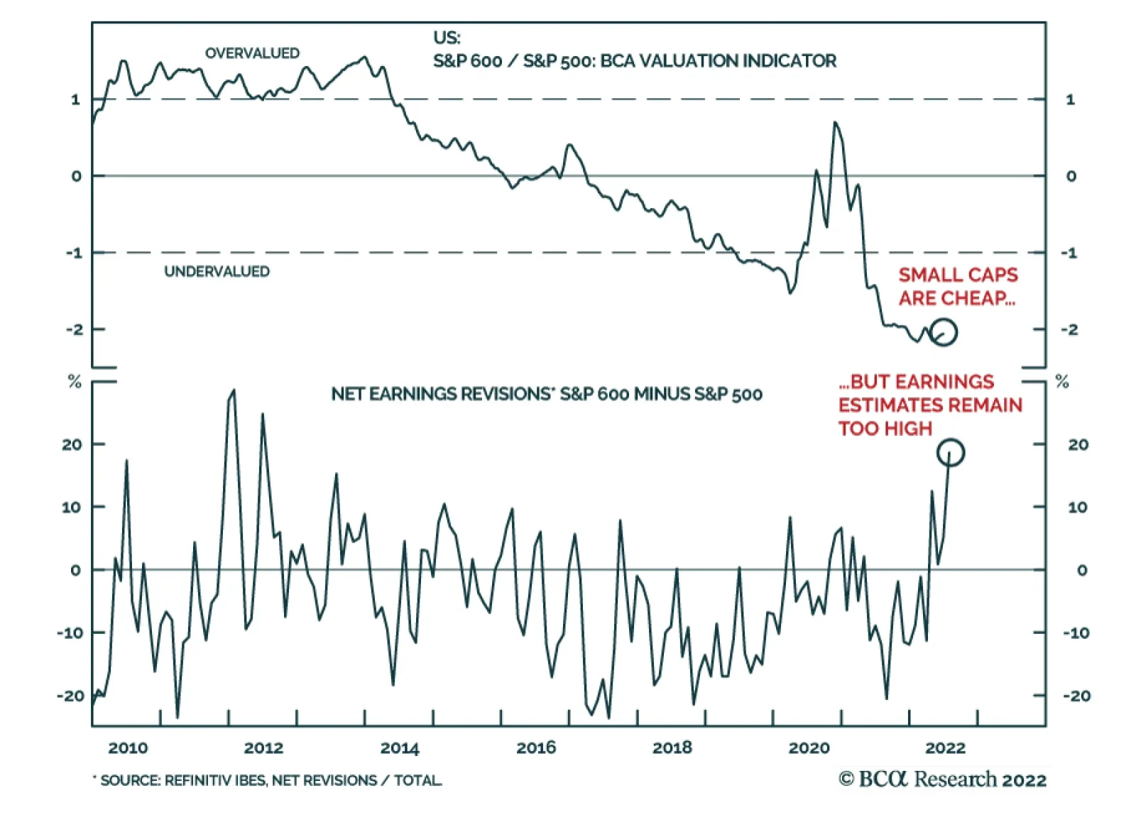
Small caps have been underperforming their large cap counterparts since October 2021. Indeed, these highly cyclical stocks tend to underperform larger companies when the business cycle slows down. Their relatively higher allocation to regional banks also…
A decision is expected shortly on whether President Joe Biden will roll back some of the Trump-era tariffs on imports from China. Voices within President Biden’s administration are divided. US Treasury Secretary Janet Yellen is among those in favor of…

Executive Summary Bond investors can’t seem to decide whether the US economy is in the midst of an inflationary boom or hurtling toward recession. Our sense is that, while US economic growth is clearly slowing, we don’t see the unemployment rate rising enough for the Fed to abandon its tightening cycle any time soon. The 5-year US Treasury yield has tightened relative to the rest of the curve in recent weeks, and the 2-year maturity now looks like the most attractive spot for investors. TIPS breakeven inflation rates have also declined markedly in recent weeks, and TIPS no longer look expensive on our models. TIPS Are No Longer Expensive
TIPS Are No Longer Expensive
TIPS Are No Longer Expensive
Bottom Line: US bond investors should keep portfolio duration close to benchmark. They should also shift Treasury curve allocations from the 5-year maturity to the 2-year maturity and upgrade TIPS from underweight to neutral. Whipsaw Inflationary boom or recession? US bond investors can’t seem to decide and yields are swinging back and forth depending on the latest economic data. Just in the past month we’ve seen the 10-year US Treasury yield peak at 3.49%, fall to 2.82% and then finally move back above 3% following last week’s strong employment report. Not surprisingly, implied interest rate volatility is the highest it’s been since the Global Financial Crisis (Chart 1). Our sense is that, while US economic growth is clearly slowing, we don’t see the unemployment rate rising enough for the Fed to abandon its tightening cycle any time soon. This is especially true because the Fed will tolerate a significant rise in the unemployment rate as long as inflation stays above target.1 Turning to the evidence, decelerating US economic activity is apparent in the manufacturing and non-manufacturing PMIs, which are both falling rapidly from high levels (Chart 2). Though both indexes remain firmly above the 50 boom/bust line, trends in financial conditions suggest that they could dip below 50 within the next few months. Chart 1A Highly Volatile Rates Market
A Highly Volatile Rates Market
A Highly Volatile Rates Market
Chart 2US Growth Is Slowing
US Growth Is Slowing
US Growth Is Slowing
The employment components of both indexes are already in contractionary territory (Chart 2, bottom panel), but this is due to concerns about labor supply, not demand. For example, last week’s ISM non-manufacturing PMI release included three representative quotes from respondents about labor market conditions.2 All three quotes reference concerns about labor supply: Unable to fill positions with qualified applicants. Extremely hard to find truck drivers. Demand for talent is higher, but availability of candidates to fill open roles continues to keep employment levels from increasing. This doesn’t sound like an economy that is on the cusp of surging unemployment, and this is exactly what the Fed is counting on. The Fed’s hope is that slower demand will bring down the large number of job openings without leading to a significant increase in layoffs or a significant rise in the unemployment rate. In that regard, it is notable that job openings ticked down in May, both in absolute terms and relative to the number of unemployed. Meanwhile, the rates of hiring and layoffs held steady (Chart 3). Chart 3Some Hope For A Soft Landing
Some Hope For A Soft Landing
Some Hope For A Soft Landing
Investment Implications Our investment strategy hinges on two key economic views related to the labor market and inflation. First, while a surge doesn’t seem imminent, slowing economic activity means that the unemployment rate is more likely to edge higher between now and the end of the year than it is to fall. Second, as we’ve written in previous reports, US inflation has a relatively easy path back to its underlying trend of approximately 4%.3 After that, it will be more difficult for policymakers to bring inflation from 4% back down to 2%, and we could see the Fed push rates above 4% next year to accomplish this task. Taken together, these two views suggest that growth will be slowing and inflation falling between now and the end of the year. This combination could easily push bond yields lower, especially if recession worries flare up again. High frequency bond yield indicators such as the CRB Raw Industrials / Gold ratio and the relative performance of cyclical versus defensive equities also suggest that bond yields have room to fall (Chart 4). That said, the market is currently priced for the fed funds rate to peak at 3.74% in May 2023 and to fall back to 3.19% by the end of 2023. We see strong odds that inflation will be sticky enough (and the labor market resilient enough) for the Fed to push rates above those levels next year. This leaves us with an ‘at benchmark’ stance on portfolio duration for the time being, with an inclination to turn more bearish on bonds later this year if our base case forecast pans out. More specifically, we would likely reduce portfolio duration if the 10-year Treasury yield falls back to 2.5% or if inflation reverts to its 4% underlying trend. Conversely, we will turn more bullish on bonds if we see signs in the labor market data that point to a Fed pause (or Fed rate cuts) being necessary. For now, growth in nonfarm employment and aggregate weekly payrolls (wages x hours x employment) suggest we aren’t close to this outcome (Chart 5). Chart 4High-Frequency Bond Yield Indicators
High-Frequency Bond Yield Indicators
High-Frequency Bond Yield Indicators
Chart 5The US Labor Market Is Strong
The US Labor Market Is Strong
The US Labor Market Is Strong
Sliding Down The Yield Curve Since early April we’ve been recommending that investors position long the 5-year Treasury note and short a duration-matched barbell consisting of the 2-year and 10-year notes to take advantage of a US yield curve that was quite steep out to the 5-year maturity point and quite flat beyond that. That trade is now played out. The 5 over 2/10 butterfly spread has tightened back to zero and the 2-year note is now the most attractively priced security on the US Treasury curve. Chart 6 shows that the spread between the 2-year note and a duration-matched barbell consisting of cash and the 5-year note offers an extraordinary yield advantage of 92 bps. What’s more, Table 1 shows that, with the exception of the unloved 20-year bond, the 2-year note offers the most attractive 12-month carry on the curve, largely a result of the 18 bps of rolldown attributable to the still-steep slope between the 1-year and 2-year maturity points. Chart 6Shift Into 2s
Shift Into 2s
Shift Into 2s
Table 112-Month Carry Across The US Treasury Curve
A Low Conviction US Bond Market
A Low Conviction US Bond Market
This large shift in relative pricing compels us to close our prior position (long 5-year bullet versus 2/10 barbell) and open a new position: long the 2-year note and short a duration-matched cash/5 barbell. This new position (long 2yr over cash/5) offers attractive 12-month carry, but given the current volatile interest rate environment, it should mainly be expected to profit in the event of a steepening of the 2/5 Treasury slope. With that in mind, it’s notable that the 2/5 slope recently inverted. Inversions of the 2/5 slope are historically rare. They tend to occur near the end of Fed tightening cycles and, with the exception of the early-1980s, they tend to not last that long (Chart 7). Chart 72/5 Inversions Are Rare And Fleeting
2/5 Inversions Are Rare And Fleeting
2/5 Inversions Are Rare And Fleeting
Going forward, we see three plausible scenarios for the 2/5 slope during the next 6-12 months. First, the Fed achieves something close to the soft landing it is aiming for. Inflation starts to fall and the unemployment rate edges higher. However, unemployment never reaches levels that necessitate a complete reversal of Fed tightening. The 2/5 Treasury slope bear-steepens in this scenario as the market discounts that the Fed will have to push rates above 4% to hit its inflation target. Second, a deep recession and complete reversal of Fed tightening occur much more quickly than we anticipate. The 2/5 Treasury slope would bull-steepen in this scenario as the front-end of the curve is pulled down by the Fed’s pivot. Third, inflation shows no signs of reversing course. Long-dated inflation expectations jump and the Fed determines that it has no choice but to follow the example of Paul Volcker and tighten, even if the economy falls into a deep recession. As was the case in the early-1980s, the 2/5 Treasury slope could become deeply inverted in this scenario. Our sense is that the first two scenarios are much more likely than the third. We have written in prior reports about how the current spate of inflation is much different than what was seen in the early 1980s.4 This makes us willing to bet against a prolonged deep inversion of the 2/5 slope. Bottom Line: US Treasury curve investors should exit their positions long the 5-year bullet versus a duration-matched 2/10 barbell. They should initiate a position long the 2-year bullet versus a duration-matched cash/5 barbell. Upgrade US TIPS To Neutral Finally, we note that TIPS breakeven inflation rates have declined markedly during the past month. The 10-year TIPS breakeven inflation rate is currently 2.38%, near the lower-end of the Fed’s 2.3%-2.5% target range, and the 5-year/5-year forward TIPS breakeven inflation rate is a mere 2.12%, well below target (Chart 8). We also note that the 5-year/5-year forward TIPS breakeven inflation rate is back below survey estimates of what inflation will be 5-10 years in the future (Chart 8, bottom panel). Chart 8TIPS Breakevens
TIPS Breakevens
TIPS Breakevens
We have been recommending an underweight position in TIPS versus nominal US Treasuries since early April, but the recent valuation shift means it’s time to add some exposure. Critically, our TIPS Breakeven Valuation Indicator has also increased to +0.6, moving into “TIPS cheap” territory (Chart 9). Historically, the 10-year TIPS breakeven inflation rate has averaged an increase of 28 bps in the 12 months following a reading between +0.5 and +1.0 from our Indicator (Table 2). Chart 9TIPS Are No Longer Expensive
TIPS Are No Longer Expensive
TIPS Are No Longer Expensive
Table 2TIPS Breakeven Valuation Indicator Track Record
A Low Conviction US Bond Market
A Low Conviction US Bond Market
The drop in TIPS breakeven inflation rates has been most prominent at the front-end of the curve. The 2-year TIPS breakeven inflation rate is down to 3.22% from a peak of 4.93%. The high correlation between short-maturity TIPS breakevens and realized CPI inflation means that short-dated breakevens can fall further as inflation continues to trend down, but already we see that 3.22% looks like a much more reasonable estimate of average inflation for the next two years than did the 4.93% peak. While we advise investors to upgrade TIPS from underweight to neutral relative to nominal US Treasuries, we continue to recommend an outright short position in 2-year TIPS. The 2-year TIPS yield has risen sharply since its 2021 low (Chart 10), but recent comments from Fed officials imply that the Fed would like to see positive real yields across the entire curve before it declares monetary policy sufficiently restrictive.5 This means that there is still some room for the 2-year TIPS yield to increase, from its current level of -0.10% back into positive territory. Such a move should also lead to more flattening of the 2/10 TIPS curve, and we continue to recommend holding that position as well (Chart 10, bottom panel). Chart 10Stay Short 2-Year TIPS
Stay Short 2-Year TIPS
Stay Short 2-Year TIPS
Bottom Line: Investors should upgrade TIPS from underweight to neutral relative to nominal US Treasuries but maintain outright short positions in 2-year TIPS. 2/10 TIPS curve flatteners and 2/10 inflation curve steepeners also continue to make sense. Ryan Swift US Bond Strategist rswift@bcaresearch.com Footnotes 1 For more details on how to think about the tradeoff between the Fed’s inflation and employment goals please see US Bond Strategy Weekly Report, “When The Dual Mandates Clash”, dated June 28, 2022. 2 https://www.ismworld.org/supply-management-news-and-reports/reports/ism-report-on-business/services/june/ 3 Please see US Bond Strategy / Global Fixed Income Strategy Weekly Report, “No End In Sight For Fed Tightening”, dated June 21, 2022. 4 Please see US Bond Strategy Weekly Report, “No Relief From High Inflation”, dated June 14, 2022. 5 Please see US Bond Strategy Weekly Report, “When The Dual Mandates Clash”, dated June 28, 2022. Recommended Portfolio Specification Other Recommendations Treasury Index Returns Spread Product Returns
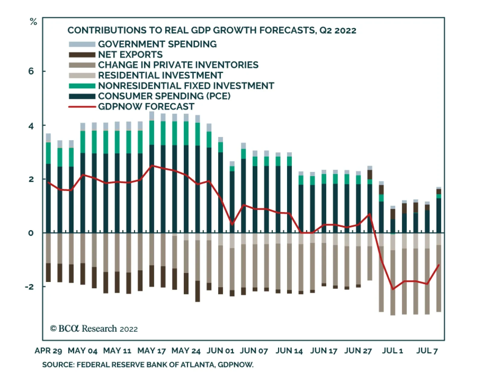
The Atlanta Fed’s GDPNow model is sending an extremely pessimistic signal about the US economy. Since mid-May, its estimates of Q2 GDP growth have been consistently deteriorating. Although June’s robust non-farm payroll release led to an upward revision, the…
Stronger-than-expected job gains in June increase the odds that the Fed will lift interest rates by another 75bps when it meets again in two weeks. Data released this week will either cement the case for another mega hike, or instead provide support for a…
Dear client, In lieu of July 18 publication, I will be hosting our quarterly webcast that I invite you to join. Our regular weekly publication will resume Monday, July 25. Kind Regards, Irene Tunkel Chief Strategist, US Equity Strategy Deploy Fresh Capital Into Growth At The Expense Of Value In early June, we closed our Growth/Value underweight by moving the ratio to benchmark allocation and crystallizing just under 9% in gains. At the time, we also wrote that we would upgrade Growth and downgrade Value once uncertainty about inflation and the Fed’s action recedes. Today, we believe that the time is ripe for making a move: We are upgrading Growth to overweight, and downgrade Value to underweight. The following are the reasons for a change in positioning: Chart 1Deploy Fresh Capital Into Growth At The Expense Of Value
Deploy Fresh Capital Into Growth At The Expense Of Value
Deploy Fresh Capital Into Growth At The Expense Of Value
Inflationary pressures will ease: There are early signs that inflation is about to turn - prices of energy and commodities are down 20% and 13% off their peaks respectively. A turn in inflation heralds a change in market leadership from Value to Quality and Growth (Chart 1). Chart 2
Deploy Fresh Capital Into Growth At The Expense Of Value
Deploy Fresh Capital Into Growth At The Expense Of Value
Economic growth is slowing: The market focus has shifted away from inflation and has turned towards worries about growth as is evident in the falling 10-year Treasury yield, which decreased from its peak at 3.5% to 3.0% over the past couple of weeks. The environment of slowing growth and falling rates is a tailwind for growth stocks. In a world where growth is becoming scarcer, companies that can deliver growth will shine. These are “growth” companies, i.e., large, stable companies with strong balance sheets that are able to generate positive cash flow and churn out strong earnings even under economic duress. Quality growth outperforms during slowdowns (Chart 2). Earnings Growth Expectations: Analysts expect earnings of Value to grow by over 10% over the next twelve months and Growth by 8.0%. While earnings growth expectations for value stocks appear more attractive, we believe that they will be downgraded. Value stocks are dominated by cyclicals (Chart 3), and as we wrote in the Tuesday's publication, this is the area of the market in which analysts have the least certainty in their estimates and downgrades are imminent. Growth is oversold relative to Value: The Growth/Value ratio is extremely oversold sitting at a level exceeded only during the dot-com crash and on par with the 1970-1980 inflationary era (Chart 4). Chart 3
Deploy Fresh Capital Into Growth At The Expense Of Value
Deploy Fresh Capital Into Growth At The Expense Of Value
Chart 4
Deploy Fresh Capital Into Growth At The Expense Of Value
Deploy Fresh Capital Into Growth At The Expense Of Value
Bottom Line: Slowing growth, impending turn in inflation, and attractive technicals are key reasons for our upgrade of Growth to overweight at the expense of Value.
While BCA Research’s Emerging Markets Strategy service is not entirely convinced that US tech stocks are a bubble waiting to burst, they view the odds of this happening as nontrivial. There are a lot of similarities between dynamics prevailing in US tech…
Executive Summary Global risk assets are oversold, and investor sentiment is downbeat. In this context, a technical equity rebound cannot be ruled out. However, we do not think it will be the beginning of a major cyclical rally. The Fed and the stock market remain on a collision course. An equity rally and easing financial conditions would make the Fed even more resolute to continue hiking interest rates. There are many similarities between dynamics that prevailed in US tech stocks and in previous bubbles. While it is not our baseline view, the odds of a protracted bear market are nontrivial. Resource prices and commodity plays have more downside. The History Of Financial Bubbles: Is This Time Different?
On A Bull Case, Bubbles And Commodity Prices
On A Bull Case, Bubbles And Commodity Prices
Bottom Line: The decline in commodity prices and the relentless US dollar rally will ensure that EM currencies, bonds and stocks continue to sell off even if the US equity market rebounds in the near term. Feature Among the most frequently discussed topics in recent client calls are the upside and downside risks to our baseline view. We elaborate on these risks in this report. To recap, our baseline view is as follows: EM and DM stocks have another 15% downside in USD terms, the US dollar will continue overshooting and commodity prices will fall. Global yields are topping out, and the US yield curve will soon invert. Hence, defensive positioning for absolute-return investors is still warranted, and global equity and fixed-income portfolios should continue to underweight EM. The rationale is that US and EU demand for goods ex-autos, and hence global trade, is about to contract while the Fed is straightjacketed by high and broad-based inflation. China’s economy will be struggling to recover. In EM ex-China, domestic demand will relapse. Chart 1Will The S&P 500's Technical Support Hold?
Will The S&P 500's Technical Support Hold?
Will The S&P 500's Technical Support Hold?
If one believes that the US equity bull market that began in 2009 is still alive (i.e. the March 2020 selloff is a short-lived red herring), odds are that the S&P 500 drawdown is over. The reasoning is that the S&P 500 is already down 23% from its 2021 peak, on par with the selloffs that occurred in 2011, 2015-16 and 2018 (Chart 1). However, if one believes that the structural bull market is over, the magnitude of the current equity selloff is likely to exceed the ones in 2011, 2015-16 and 2018. Hence, a bearish stance is still warranted. As we argue below, after a 12-year bull run, the excesses in the US equity market in general, and US tech stocks in particular, have become extreme. There are many signs of a bubble, or at least of a major top. Even though we risk overstaying in our negative view, our bias is that the global equity market rout is not yet over. A Bullish Scenario A (hypothetical) bullish case would look something like this: Weakening global and US growth and falling commodity prices bring down US inflation and Treasury yields. As US bond yields drop further, the S&P 500 rallies given their negative correlation of the past 18 months or so. As US inflation declines rapidly, the Fed makes a dovish pivot, reinforcing the risk asset rally and reversing the US dollar’s uptrend. Finally, Chinese stimulus produces a robust business cycle recovery in China that propels commodity prices higher and lifts the rest of EM out of the abyss. Chart 2Keep An Eye On Rising US Trimmed-Mean Inflation
Keep An Eye On Rising US Trimmed-Mean Inflation
Keep An Eye On Rising US Trimmed-Mean Inflation
In our opinion, this scenario has no more than a 25% chance of playing out. Even if there are apparent signs of a US/global slowdown, elevated US core inflation and accelerating wages and unit labor costs would keep the Fed from dialing down its hawkishness Critically, even though US core PCE inflation has rolled over and will likely decline further, its trimmed-mean PCE inflation is rising (Chart 2). The latter means that inflation is broadening even as some volatile items like food, energy and used-auto prices deflate. As we have written extensively, wages and inflation are lagging variables. Despite the ongoing slowdown in the US economy, it will take many months before the underlying core inflation rate drops below 3%. We maintain that the Fed and the stock market remain on a collision course. An equity rally and easing financial conditions would make the Fed even more resolute to hike interest rates. The basis is that even if core inflation falls in the coming months, it would still be well above the Fed’s target of 2%. Notably, the Fed has recently communicated that its commitment to bring down inflation to 2% is unconditional. Chart 3The Anatomy Of The US Equity Bear Market In 2000-2002
The Anatomy Of The US Equity Bear Market In 2000-2002
The Anatomy Of The US Equity Bear Market In 2000-2002
This policy stance represents a major departure from the past several decades when the Fed was very sensitive to any tightening in financial conditions and often eased preemptively. In short, with inflation still well above its target, the Fed will, for now, err on the side of hawkishness if financial conditions ease. Importantly, US corporate profits will likely contract even if US real GDP does not shrink. As US corporate top-line growth slows and unit labor costs accelerate, profit margins will shrink. For example, the 2001-2002 recession was very mild – consumer spending did not contract at all, and housing boomed (Chart 3, top two panels). Yet, the S&P 500 operating earnings dropped by 30%, and the S&P 500 fell by 50% (Chart 3, bottom two panels). In brief, a devastating bear market does not necessarily require a hard landing. Concerning China, the recovery will likely be U-shaped rather than V-shaped with risks skewed to the downside. Finally, contracting global trade and falling commodity prices will continue, which are negative for EM currencies and assets. Notably, industry data from Taiwan’s manufacturing PMI suggest that the slowdown in the Asian and global economies is widespread. Taiwan’s substantial trade linkages with mainland China signify that the slowdown is not limited to the US and the EU but includes China too. Taiwanese PMI export orders of both semiconductor and basic material producers have plunged to 40 and 30, respectively (Chart 4). Barring a quick turnaround, global semiconductor and basic materials stocks have more downside. Even as US Treasury yields drop, the dollar will continue firming versus EM currencies, including those of Emerging Asian countries. In such a scenario, EM stocks and bonds will weaken further (Chart 5). Chart 4A Broad-Based Contraction In Global Trade Is In The Cards
A Broad-Based Contraction In Global Trade Is In The Cards
A Broad-Based Contraction In Global Trade Is In The Cards
Chart 5A Free Fall In EM Ex-China Stocks And Currencies
A Free Fall In EM Ex-China Stocks And Currencies
A Free Fall In EM Ex-China Stocks And Currencies
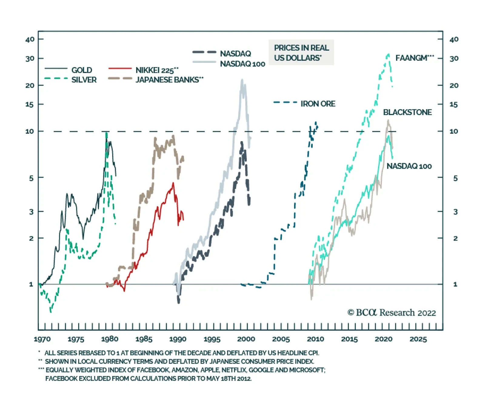
Bottom Line: The S&P 500 is oversold, and investor sentiment is downbeat. In this context, a technical equity rebound can occur at any moment. However, we do not think it will be the beginning of a major cyclical rally. A Bearish Case: Are US TMT Stocks A Bubble? What is a more bearish scenario than our baseline case? The bursting of bubbles or the unwinding of excesses would entail a more protracted and devastating bear market than the 15% drop in global share prices we currently expect. We can identify two major excesses in the global economy and financial system: In US TMT (Technology, Media & Entertainment and Internet & Catalog Retail) stocks and private equity In Chinese real estate. We have written extensively about property market excesses in China. Below we discuss the recent sharp selloff in commodities, which is partially linked to Chinese property construction. We also present the case for major excesses in US stocks. Chart 6 illustrates the history of bubbles of the past several decades: The Nifty-fifty (involving the 50 US large-cap stocks) bubble occurred in the 1960s and burst in the 1970s (not shown in the chart). The commodity bubble took place in the 1970s and burst in the 1980s. Japanese equity and property prices rose exponentially in the 1980s and deflated in the 1990s. The Nasdaq bubble occurred in the 1990s and was shattered in the early 2000s. Commodities/EM/China were the leaders of the 2000s, and they were devastated in the 2010s. We use iron ore in this chart because its price surged the most in the 2000s. FAANGM stocks, the Nasdaq 100 index and private equity were by far the biggest beneficiaries of the 2010s. No one can be certain about bubbles in real time because there are always superior fundamentals or persuasive stories that justify exponential price appreciation. That said, there are a lot of similarities between dynamics prevailing in US tech and private equity and in previous bubbles: In the past decade, FAANGM stocks, the Nasdaq 100 index and private equity companies registered gains comparable to the bubbles of the previous 60 years. Furthermore, as Chart 6 illustrates, the equal-weighted FAANGM index in inflation-adjusted terms rose 30-fold, much more than the bubbles of the previous decades. The Nasdaq 100 index and share prices of Blackstone, the largest private equity company, have risen by nearly 10-fold in real (inflation-adjusted terms) between 2010 and the end of 2021. Chart 6The History Of Financial Bubbles: Is This Time Different?
On A Bull Case, Bubbles And Commodity Prices
On A Bull Case, Bubbles And Commodity Prices
The final phase of bubbles is often characterized by growing retail investor participation. This is exactly what happened with US tech/new economy stocks. Chart 7US TMT Stocks: Exponential Growth Rarely Ends Well
US TMT Stocks: Exponential Growth Rarely Ends Well
US TMT Stocks: Exponential Growth Rarely Ends Well
Toward the end of the decade, not only retail but also institutional capital stampedes into the winners of the decade. This played out with US large-cap tech stocks as well as in private equity and private debt spaces. Inflows into private equity and private debt have been enormous. As a result of these inflows into US large-cap stocks, the market cap share of US TMT stocks as a percentage of total US market cap has surpassed 40%, its peak in 2000 (Chart 7). Bubbles often thrive during periods of low interest rates and crash when the cost of capital rises. This is exactly what has been happening in global financial markets since early 2019. The parameters of the overall US equity market were also excessive prior to this bear market. As of last year, the S&P 500 stock prices in real (inflation-adjusted) terms became as elevated relative to their long-term time trend as they were in the late 1960s and the late 1990s − the peaks of previous secular bull markets (Chart 8, top panel). Chart 8The S&P 500 and Operating Profits: A Long-Term Perspective
The S&P 500 and Operating Profits: A Long-Term Perspective
The S&P 500 and Operating Profits: A Long-Term Perspective
Chart 9Equity Issuance Marks Market Tops
Equity Issuance Marks Market Tops
Equity Issuance Marks Market Tops
The S&P 500’s operating earnings in real terms have surpassed two standard deviations above its time trend (Chart 8, bottom panel). Some sort of mean reversion to its long-term trend is in the cards. US corporate profits have benefited from fiscal/monetary stimulus, low labor costs and pricing power. All of these are now working against profits. Finally, new share issuance in the US mushroomed in 2021, another sign of a major top (Chart 9). Bottom Line: We are not entirely convinced that US TMT stocks are a bubble waiting to burst. Yet, the odds of this happening are nontrivial. This time might not be different. A Word On Commodities The selloff in the commodity space has been broad-based. Odds are that it will continue for the following reasons: A global business cycle downtrend is always bearish for commodity prices. In fact, oil prices are often lagging and are typically the last shoe to drop during global slowdowns. US sales of gasoline have started to contract. Besides, Saudi Arabia will likely increase its oil output and shipments following President Biden’s visit to the Kingdom next week. Chart 10Investors Have Been Long Commodity Futures
Investors Have Been Long Commodity Futures
Investors Have Been Long Commodity Futures
As we have argued in recent months, China’s demand for commodities was contracting and, in our opinion, the rally in resource prices over the past 12 months was supported by investment demand for commodities, i.e., financial inflows into the commodity space. Many portfolios have bought commodities as an inflation hedge. When a hedge becomes a consensus trade and crowded, it stops being a hedge. Chart 10 demonstrates that net long positions in 17 commodities have been very elevated. The speed at which liquidation is taking place corroborates our thesis that it is investors not producers or consumers who have been caught being long commodities. China’s business cycle recovery will be U-shaped at best. Domestic orders point to weaker import volumes in the months ahead (Chart 11, top panel). Corporate loan demand has plunged suggesting that liquidity provisions by the PBoC might fail to produce a meaningful recovery in credit growth (Chart 11, bottom panel). Finally, technicals bode ill for commodity prices. As Chart 12 illustrates, copper prices and global material stocks have probably formed medium-term tops, and risks are skewed to the downside. Chart 11China: The Economy Is Struggling To Gain Traction
China: The Economy Is Struggling To Gain Traction
China: The Economy Is Struggling To Gain Traction
Chart 12A Major Top In Commodity Prices?
A Major Top In Commodity Prices?
A Major Top In Commodity Prices?
Bottom Line: Commodity prices and their plays have more downside. Investment Strategy The decline in commodity prices and the relentless US dollar rally will ensure that EM currencies, bonds and stocks continue to sell off even if the US equity market rebounds in the near term driven by lower Treasury yields. Global equity and fixed-income portfolios should continue underweighting EM. We also continue to short the following currencies versus the USD: ZAR, COP, PEN, PLN, PHP and IDR; as well as HUF vs. CZK, and KRW vs. JPY. Arthur Budaghyan Chief Emerging Markets Strategist arthurb@bcaresearch.com Strategic Themes (18 Months And Beyond) Equities Cyclical Recommendations (6-18 Months) Cyclical Recommendations (6-18 Months)
Executive Summary Buying a home is now more expensive than renting in many parts of the world. In the US and UK, disappearing homebuyers combined with a flood of home-sellers will weigh on home prices over the next 6-12 months. Falling employment and falling house prices risk becoming a self-reinforcing negative feedback loop that turns a mild recession into a severe recession. To stop such a vicious cycle running out of control, policymakers will eventually bring down mortgage rates. For this reason, on a time horizon of 6-12 months, overweight bonds. A collapse in Chinese property development and construction activity will have negative long-term implications for commodities, emerging Asia, and developing countries that produce raw materials. Structurally underweight. On the other hand, stay structurally overweight the China 30-year government bond. Fractal trading watchlist: US Biotech versus Utilities. Buying A Home Is Now More Expensive Than Renting!
Buying A Home Is Now More Expensive Than Renting!
Buying A Home Is Now More Expensive Than Renting!
Bottom Line: The decade-long global housing boom is over. Feature For the first time since 2018, the number of Brits wanting to buy a home is less than the number of Brits wanting to sell their home. The balance of homebuyers versus homes for sale is the main driver of any housing market. When multiple homebuyers are competing for a home for sale, the subsequent bidding war puts upward pressure on house prices. But when, multiple homes for sale are competing for a homebuyer, the subsequent discounting war puts downward pressure on house prices. The balance of homebuyers versus homes for sale is the main driver of any housing market. This makes the number of homebuyers versus homes for sale the best leading indicator of house prices. The recent collapse of this leading indicator in the UK warns that UK house prices are likely to soften through the remainder of 2022 and into 2023 (Chart I-1). Chart I-1With Fewer UK Homebuyers Than UK Home-Sellers, UK House Prices Are Set To Drop
With Fewer UK Homebuyers Than UK Home-Sellers, UK House Prices Are Set To Drop
With Fewer UK Homebuyers Than UK Home-Sellers, UK House Prices Are Set To Drop
Homebuyers Are Disappearing While Home-Sellers Are Flooding The Market Disappearing homebuyers combined with a flood of home-sellers is also evident in the US. According to Realtor.com: “Weary US homebuyers face not only sky-high home prices but also rising mortgage rates, and that financial double whammy is hitting homebuyers hard: Compared with just a year ago, the cost of financing 80 percent of a typical home rose 57.6 percent, amounting to an extra $745 per month.” Compared with just a year ago, the cost of financing 80 percent of a typical US home rose 57.6 percent, amounting to an extra $745 per month. Unsurprisingly, US mortgage applications for home purchase have recently plunged by a third (Chart I-2) and homebuyer demand has declined by 16 percent since last June.1 Meanwhile, the inventory of homes actively for sale on a typical day in June has increased by 19 percent, the largest increase in the data history. Chart I-2With The Cost Of Financing A US Home Purchase Surging, Mortgage Applications Have Collapsed
With The Cost Of Financing A US Home Purchase Surging, Mortgage Applications Have Collapsed
With The Cost Of Financing A US Home Purchase Surging, Mortgage Applications Have Collapsed
The flood of new homes on the market means that the dwindling pool of homebuyers will have more negotiating leverage on the asking price (Chart I-3 and Chart I-4). This will balance the highly lopsided negotiating dynamics in the raging seller’s market of the past two years. The shape of things to come can be seen in Austin, Texas, which was one of the hottest markets during the early pandemic real estate frenzy. Chart I-3US Homebuyers Are Disappearing...
US Homebuyers Are Disappearing...
US Homebuyers Are Disappearing...
Chart I-4...While US Home-Sellers Are Flooding The Market
...While US Home-Sellers Are Flooding The Market
...While US Home-Sellers Are Flooding The Market
“Prices are definitely starting to go down again… last Friday, an Austin home was listed at $825,000. The next day, at the open house, no one came. A few months ago, there would have been 20 or more buyers showing up. The sellers didn’t want to test the market, so on Sunday, they dropped it to $790,000. It sold for $760,000.” Buying A Home Is Now More Expensive Than Renting The nub of the problem for homebuyers is that the mortgage rate is higher than the rental yield. In simple terms, buying a home is now more expensive than renting (Chart I-5). The housing bulls counter that the high mortgage rate will force rental yields to adjust upwards by rents going up, but this argument is flawed. Chart I-5Buying A Home Is Now More Expensive Than Renting!
Buying A Home Is Now More Expensive Than Renting!
Buying A Home Is Now More Expensive Than Renting!
The most important driver of rent inflation is the unemployment rate (inversely). Because, to put it bluntly, you need a steady job to pay the rent! Today, the Federal Reserve’s inflation problem, in a nutshell, is that rent inflation is too high even versus the tight jobs market (Chart I-6). Chart I-6The Fed Needs To Push Up Unemployment To Pull Down Rent Inflation
The Fed Needs To Push Up Unemployment To Pull Down Rent Inflation
The Fed Needs To Push Up Unemployment To Pull Down Rent Inflation
Although the Fed cannot say this explicitly, its mechanism to bring down inflation is to push up unemployment, and thereby to pull down rent inflation, which constitutes almost half of the core inflation basket. In this case, the rental yield (rent divided by house price) would adjust upwards by the denominator – house prices – going down. The most important driver of rent inflation is the unemployment rate (inversely). Yet the housing bulls also argue that the housing boom is the result of a structural undersupply of homes. They claim that as this structural undersupply persists, it will underpin house prices. But this ‘housing shortage’ narrative is another myth, which we can debunk with two simple observations. Through the past decade, home prices have risen simultaneously and exponentially everywhere in the world. Now ask yourself, is it plausible that there could be a structural undersupply of homes everywhere in the world at the precisely the same time? If this doesn’t debunk the housing shortage narrative, then try this second observation. Through the past decade, gross rents have tracked nominal GDP. Theory says that gross rents should track nominal GDP, because the quality of the housing stock improves broadly in line with GDP, and therefore so too should rents. If there really was a structural undersupply of housing, then gross rents would be structurally outperforming nominal GDP. But that hasn’t happened in any major economy (Chart I-7). Chart I-7Rents Have Tracked GDP, So There Is No 'Structural Undersupply' Of Homes
Rents Have Tracked GDP, So There Is No 'Structural Undersupply' Of Homes
Rents Have Tracked GDP, So There Is No 'Structural Undersupply' Of Homes
As an aside, if rents track GDP, then why do they constitute almost half of the core inflation basket? The answer is that the rents included in inflation are ‘hedonically adjusted’, meaning that are supposedly deflated for quality improvements – though there is always a niggling doubt whether the statisticians do this adjustment correctly! Pulling all of this together, the synchronized global housing boom of the past decade was not the result of a structural undersupply. Instead, it was the result of a valuation boom – meaning, plummeting rental yields, which in turn were the result of plummeting mortgage rates, which in turn were the result of plummeting bond yields. But now that mortgage rates are much higher than rental yields, this ‘virtuous’ cycle risks turning vicious. Falling employment and falling house prices risk becoming a self-reinforcing negative feedback loop that turns a mild recession into a severe recession. To stop such a vicious cycle running out of control, policymakers will eventually have no other choice than to bring down mortgage rates. For this reason, on a time horizon of 6-12 months, overweight bonds. But The Prize For The Biggest Housing Boom Goes To… China The housing booms in the UK, US and other Western economies, extreme as they are, are small fry compared to the housing boom in China. Chinese real estate, now worth $100 trillion, is by far the largest asset-class in the world. And Chinese rental yields, at around 1 percent, are well below the yield on cash. Begging the question, how can Chinese real estate valuations be in such stratospheric territory, with a yield even less than that on ‘risk-free’ cash? The simple answer is that investors have been led to believe that Chinese real estate is a risk-free investment! Without a social safety net and with limited places to park their money, Chinese savers have for years been encouraged to buy homes, in the widespread belief that property is the safest investment, whose price is only supposed to go up (Chart I-8). Chart I-8Chinese Real Estate Is Perceived To Be A 'Risk Free' Investment
Chinese Real Estate Is Perceived To Be A 'Risk Free' Investment
Chinese Real Estate Is Perceived To Be A 'Risk Free' Investment
With the bulk of Chinese households’ wealth in property acting as a perceived economic safety net, even a 10 percent decline in house prices would constitute a major shock to the household sector’s hopes and expectations of what property is. In turn, the ensuing ‘negative wealth effect’ would be catastrophic for household spending in the world’s second largest economy. Therefore, in contrast to the US housing debacle in 2008, the Chinese government will ensure that its property market adjustment does not come from a collapse in home prices. Rather, it will come from a collapse in property development and construction activity, combined with keeping interest rates structurally low. This will have negative long-term implications for commodities, emerging Asia, and developing countries that produce raw materials. Structurally underweight. On the other hand, Chinese bonds are an excellent investment for those investors who can accept the capital control risks. Stay structurally overweight the China 30-year government bond. Fractal Trading Watchlist Biotech and Utilities are both defensive sectors, based on the insensitivity of theirs profits to economic fluctuations. But whereas Biotech is ‘long duration’, Utilities is ‘shorter duration’. Over the coming months, as the economy falters and bond yields back down, long duration defensives, such as Biotech, are likely to be the winners. This is supported by the recent underperformance reaching the point of fractal fragility that has indicated previous major turning points (Chart I-9). The recommended trade is long US Biotech versus Utilities, setting a profit target and symmetrical stop-loss at 20 percent. This replaces our long US Biotech versus Tech position, which achieved its 17.5 percent profit target, and is now closed. Chart I-9Biotech Is Set To Be A Big Winner
Biotech Is Set To Be A Big Winner
Biotech Is Set To Be A Big Winner
Chart 1CNY/USD Has Reversed
CNY/USD Has Reversed
CNY/USD Has Reversed
Chart 2US REITS Are Oversold Versus Utilities
US REITS Are Oversold Versus Utilities
US REITS Are Oversold Versus Utilities
Chart 3CAD/SEK Reversal Has Started
CAD/SEK Reversal Has Started
CAD/SEK Reversal Has Started
Chart 4Financials Versus Industrials To Reverse
Financials Versus Industrials To Reverse
Financials Versus Industrials To Reverse
Chart 5The Outperformance Of Resources Versus Biotech Has Started To Reverse
The Outperformance Of Resources Versus Biotech Has Started To Reverse
The Outperformance Of Resources Versus Biotech Has Started To Reverse
Chart 6The Outperformance Of Resources Versus Healthcare Is Vulnerable To Reversal
The Outperformance Of Resources Versus Healthcare Is Vulnerable To Reversal
The Outperformance Of Resources Versus Healthcare Is Vulnerable To Reversal
Chart 7FTSE100 Outperformance Vs. Euro Stoxx 50 Is Reversing
FTSE100 Outperformance Vs. Euro Stoxx 50 Is Reversing
FTSE100 Outperformance Vs. Euro Stoxx 50 Is Reversing
Chart 8Netherlands Underperformance Vs. Switzerland Has Been Exhausted
Netherlands Underperformance Vs. Switzerland Has Been Exhausted
Netherlands Underperformance Vs. Switzerland Has Been Exhausted
Chart 9The Sell-Off In The 30-Year T-Bond Is Approaching Fractal Fragility
The Sell-Off In The 30-Year T-Bond Is Approaching Fractal Fragility
The Sell-Off In The 30-Year T-Bond Is Approaching Fractal Fragility
Chart 10The Sell-Off In The NASDAQ Is Approaching Fractal Fragility
The Sell-Off In The NASDAQ Is Approaching Fractal Fragility
The Sell-Off In The NASDAQ Is Approaching Fractal Fragility
Chart 11Food And Beverage Outperformance Has Been Exhausted
Food And Beverage Outperformance Has Been Exhausted
Food And Beverage Outperformance Has Been Exhausted
Chart 12AT REVERSAL
AT REVERSAL
AT REVERSAL
Chart 13AT REVERSAL
AT REVERSAL
AT REVERSAL
Chart 14The Strong Trend In The 18-Month-Out US Interest Rate Future Is Fragile
The Strong Trend In The 18-Month-Out US Interest Rate Future Is Fragile
The Strong Trend In The 18-Month-Out US Interest Rate Future Is Fragile
Chart 15The Strong Trend In The 3 Year T-Bond Is Fragile
The Strong Trend In The 3 Year T-Bond Is Fragile
The Strong Trend In The 3 Year T-Bond Is Fragile
Chart 16A Potential Switching Point From Tobacco Into Cannabis
A Potential Switching Point From Tobacco Into Cannabis
A Potential Switching Point From Tobacco Into Cannabis
Chart 17Biotech Is A Major Buy
Biotech Is A Major Buy
Biotech Is A Major Buy
Chart 18Norway's Outperformance Could End
Norway's Outperformance Could End
Norway's Outperformance Could End
Chart 19Cotton's Outperformance Is Vulnerable To Reversal
Cotton's Outperformance Is Vulnerable To Reversal
Cotton's Outperformance Is Vulnerable To Reversal
Chart 20Fractal Trading Watch List
Fractal Trading Watch List
Fractal Trading Watch List
Chart 21The Rally In USD/EUR Could End
The Rally In USD/EUR Could End
The Rally In USD/EUR Could End
Chart 22The Outperformance Of MSCI Hong Kong Versus China Is Vulnerable To Reversal
The Outperformance Of MSCI Hong Kong Versus China Is Vulnerable To Reversal
The Outperformance Of MSCI Hong Kong Versus China Is Vulnerable To Reversal
Chart 23A Potential New Entry Point Into Petcare
A Potential New Entry Point Into Petcare
A Potential New Entry Point Into Petcare
Chart 24GBP/USD At A Turning Point
GBP/USD At A Turning Point
GBP/USD At A Turning Point
Chart 25Fractal Trading Watch List
Fractal Trading Watch List
Fractal Trading Watch List
Chart 26Fractal Trading Watch List
Fractal Trading Watch List
Fractal Trading Watch List
Dhaval Joshi Chief Strategist dhaval@bcaresearch.com Footnotes 1 Realtor.com gauge homebuyer demand by so-called ‘pending listings’, the number of listings that are at various stages of the selling process that are not yet sold. Fractal Trading System Fractal Trades
The Global Housing Boom Is Over, As Buying Becomes More Expensive Than Renting
The Global Housing Boom Is Over, As Buying Becomes More Expensive Than Renting
The Global Housing Boom Is Over, As Buying Becomes More Expensive Than Renting
The Global Housing Boom Is Over, As Buying Becomes More Expensive Than Renting
6-12 Month Recommendations Structural Recommendations Closed Fractal Trades Indicators To Watch - Bond Yields Chart II-1Indicators To Watch - Bond Yields - Euro Area
Indicators To Watch - Bond Yields - Euro Area
Indicators To Watch - Bond Yields - Euro Area
Chart II-2Indicators To Watch - Bond Yields - Europe Ex Euro Area
Indicators To Watch - Bond Yields - Europe Ex Euro Area
Indicators To Watch - Bond Yields - Europe Ex Euro Area
Chart II-3Indicators To Watch - Bond Yields - Asia
Indicators To Watch - Bond Yields - Asia
Indicators To Watch - Bond Yields - Asia
Chart II-4Indicators To Watch - Bond Yields - Other Developed
Indicators To Watch - Bond Yields - Other Developed
Indicators To Watch - Bond Yields - Other Developed
Indicators To Watch - Interest Rate Expectations Chart II-5Indicators To Watch - Interest Rate Expectations
Indicators To Watch - Interest Rate Expectations
Indicators To Watch - Interest Rate Expectations
Chart II-6Indicators To Watch - Interest Rate Expectations
Indicators To Watch - Interest Rate Expectations
Indicators To Watch - Interest Rate Expectations
Chart II-7Indicators To Watch - Interest Rate Expectations
Indicators To Watch - Interest Rate Expectations
Indicators To Watch - Interest Rate Expectations
Chart II-8Indicators To Watch - Interest Rate Expectations
Indicators To Watch - Interest Rate Expectations
Indicators To Watch - Interest Rate Expectations
Minutes of the FOMC’s June policy meeting underscore that for now, taming inflation and salvaging the central bank’s credibility remains the Fed’s top priority. Notably, “many participants judged that a significant risk now facing the Committee was that…